school magazine evaluation
TRANSCRIPT

Charlotte McBride 12N
*School Magazine Evaluation

*Which tools did I use to create my
magazine?*When creating my school magazine I used the tools
available to me on Photoshop to create an eye-catching magazine.

When creating the Masthead I used the Horizontal Type Tool to give me the option of text.
I put the school logo in the top corner. To do so I cropped around the image to get just the logo. I used the crop tool.
To crop Shannon for my feature article photo so there is no background image I used the Quick Selection Tool. This way I am able to only select Shannon and can go over any bits I have missed quickly.
To create the background for my magazine I used the paint bucket tool. This way I can make my background all one colour and an even tone.
The cover line was created using the horizontal text tool.
The plug was also created using the horizontal text tool.
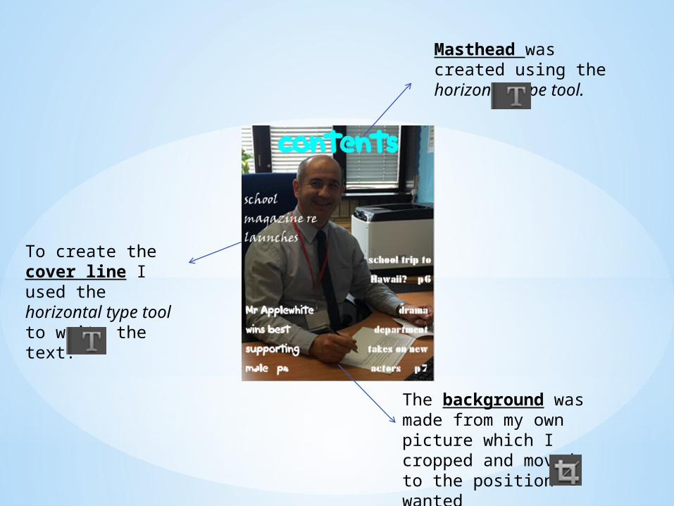
Masthead was created using the horizontal type tool.
The background was made from my own picture which I cropped and moved to the position wanted
To create the cover line I used the horizontal type tool to write the text.

*What conventions did I use?
Cover lines: Information about major articles given on the front page of a magazine.Feature article photograph: the photograph used on the front cover to attract attention to the main article (usually a celebrity that will appeal to the target audience).Masthead: The title of a magazine or newspaper usually place at the top of the front cover.Plug: Information about the contents of a magazine or newspaper given on the front cover.Typography: The typeface or font that is used in print texts.Mise-en-scene: Anything in the frame of an image that provides meaning; costume, background, facial expressions etc.

*How I would improve my
magazineTo improve my magazine I would use images that go with the theme of the magazine. As well as this I would create the texts as one font, colour and size. The texts used already look “unprofessional” and tacky. The background images need improving because the colour on the front page does not fit in with the image and also looks cheap.I have used the wrong font colours to make my magazine look presentable or worthy.