seeing: the portfolio of brooks hassig v1
DESCRIPTION
Design Portfolio. Case studies of branding, packaging, environment, print & web.TRANSCRIPT

SEEINGPORTFOLIO
Brooks Hassig
designbyseeing.com


Various Logos
BRIEF
BRANDING Logos for projects ranging from real to hypothetical.

MENTORING AMERICA

Deepening Roots


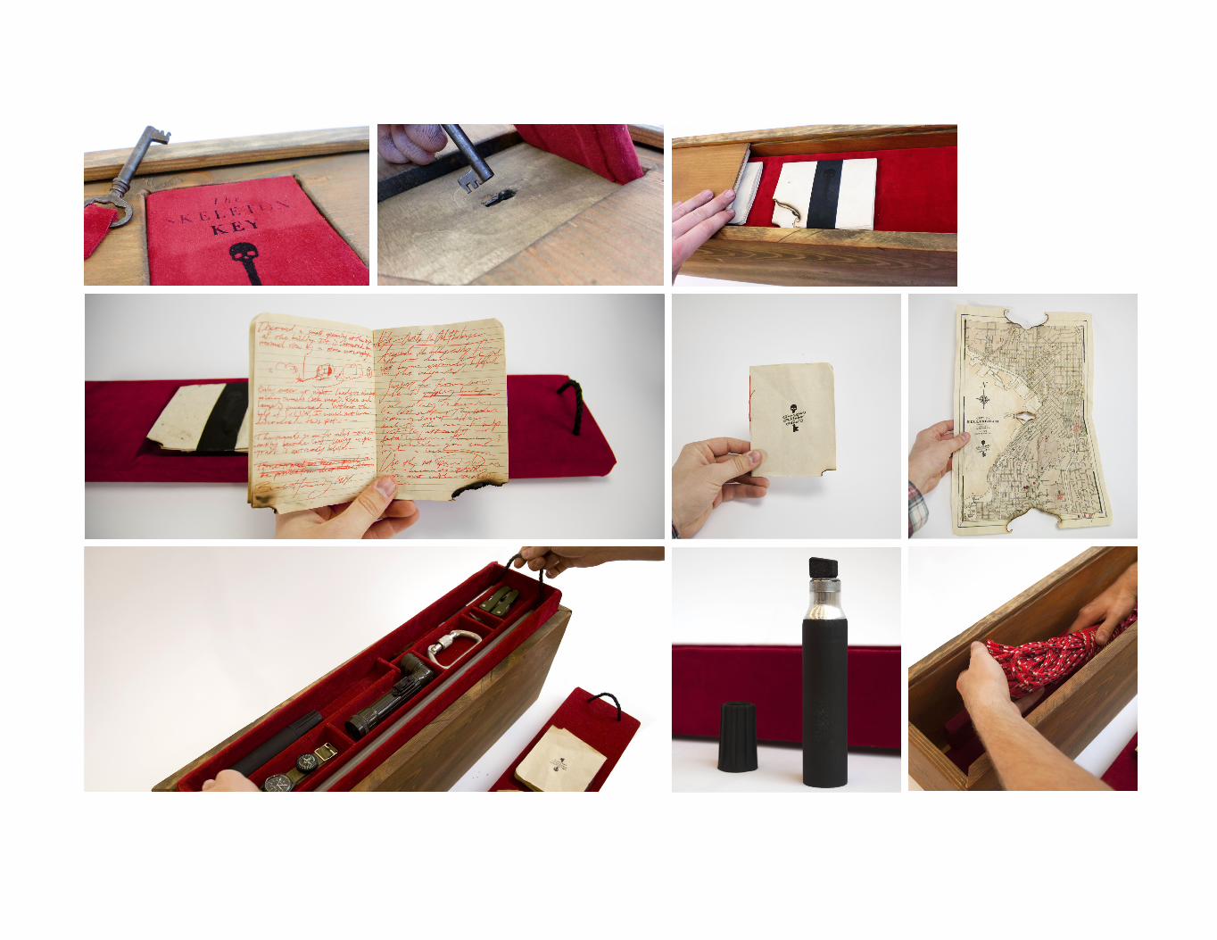
The Skeleton Key
BRIEF
PACKAGINGBRANDINGWRITINGCONCEPTSCREENPRINT
The Skeleton Key is a conceptual package for mischief in the urban context. I wanted to create a container for something more than a product, instead an idea that would tell a story.
The Skeleton Key was found in the attic of the International House. It’s log reveals that it’s been used in Bellingham by clandestine individuals for generations to explore and discover the secret, forgotten places of the urban landscape.
The objects contained within were obviously chosen with care, each seems to have a unique function that would lend itself to an adventure.


Pip-Pop Popcorn
BRIEF
PACKAGINGLOGOWRITINGPRODUCTION
Pip-Pop is a natural, premium, pre-popped popcorn that doesn’t want to be too gourmet or too normal looking.
The package actually contains two packages, held together by a mild adhesive, that are mixed and matched before delivery. People can choose the two-pack that suites them best and share – one for you and one for me.
I wanted to explore perspective with this project, so each box talks directly to whoever is holding it, and does so differently at different angles.


Infographics x2
BRIEF
DATASYSTEMSWRITINGPRINTPRODUCTIONGROUP
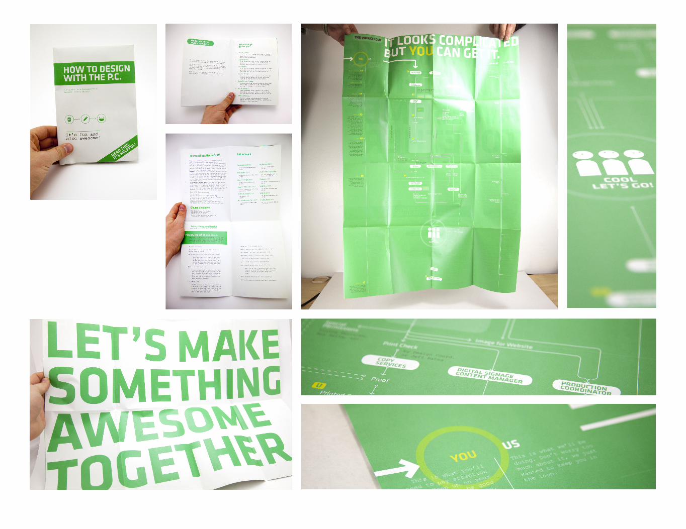
1. How to Design with The Publicity Center
A booklet/infographic that helps clients understand how to get the most out of working with the PC, including how the mysterious and convoluted system works behind the scenes. I handled the copy as well, trying to keep it in a friendly, per-sonal voice.
2. Dean’s Unit Report
Infographics and collaboration on an annual report for the AS Dean of Students. Although my primary contribution was the data visualization, I did attend meetings, helped shape the document.
‘’


Antoine Fauré
BRIEF
WEBPHOTOCONCEPTGROUPART DIRECTION
Antoine Fauré is a hypothetical road biking clothing and life-style company created in as a group project.
It was important to us that know exactly what we were doing, so we spent considerable time knocking out the concept.
The site and photography reflect the brand profile, which is classy and clean in an a way that is unattainable and seductive.
The juxtaposition of two cultures, that of high fashion and down-to-earth cyclists, was essential to our concept. By placing them in such stark contrast, seemingly the same, we wanted to highlight the personalities of the lifestyles, both ridiculous and intriguing.


Outdoor Center
BRIEF
BRANDINGWRITINGPRINTENVIRONMENTMARKETING
A rebrand for a 40 year old organization called The Outdoor Center.
The project entailed a new look and an update of all materials.
The logo is a reaction to its predecessor, in an attempt to main-tain brand recognition, while making the brand sleeker, hipper, and friendlier.
Poster templates, a style guide and other materials make sure that consistency is maintained with room for improvement.
This is a selection of my work for them, I actually can’t show everything I’ve done for them because there is just too much.


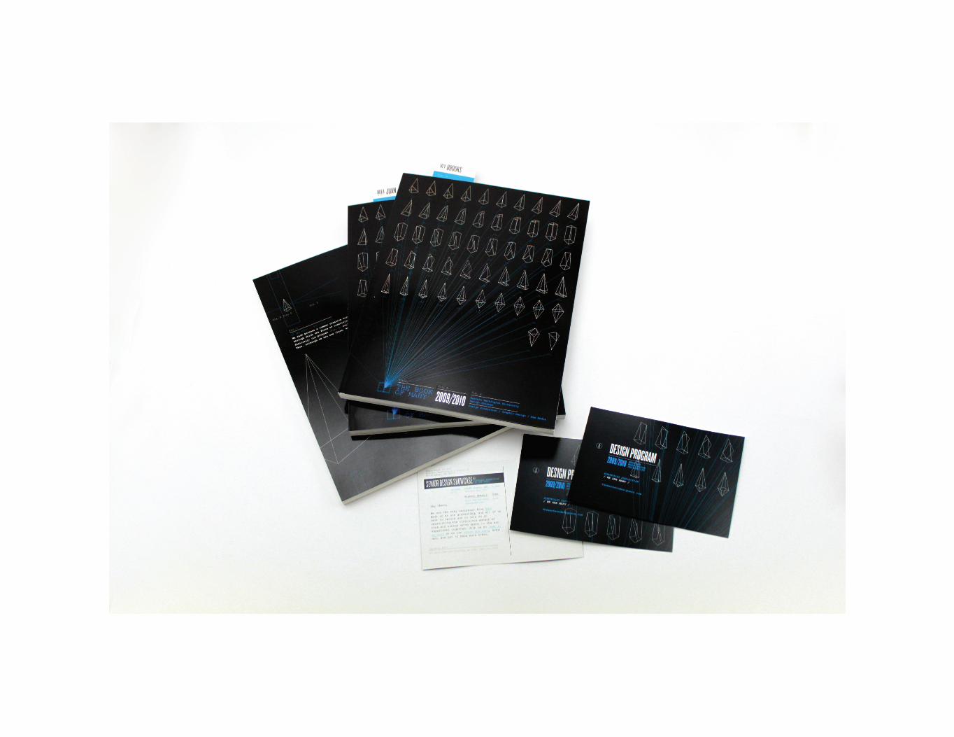
The Senior Show
BRIEF
CONCEPTART DIRECTIONENVIRONMENTPRINT
I developed the aesthetic of this show out of a desire to get to the core of each of us and find the common creative element that expresses itself in entirely different ways.
We stand out from other programs because we are encouraged to explore our individual approach to problem solving. We all bring something different to the table, and I want to showcase that. Therefore I tried to create an aesthetic that is not artificial but rather one that comes from the core of who we are.
The show’s statement:
We each possess a common creative core, a metaphorical prism, through which the force of creativity is refracted in unique ways. Similarly, our program cultivates an individual approach to design. Thus, although we are one class, we are far from the same, we are Many.