signs as a help in public spaces - lu
TRANSCRIPT

Signs as a Help in Public Spaces
A Comparative Study of Signage Systems for
Disadvantaged Groups in East and West
A Master’s Thesis for the Degree
“Master of Arts (Two Years) in Visual Culture”
CUI Yuzhu
May 2010
Grader: Kassandra Wellendorf
Faculty of Humanities
Department of Arts and Cultural Studies
University of Copenhagen 1

2
LUND UNIVERSITY
ABSTRACT
DIVISION OF ART HISTORY AND VISUAL STUDIES / FILM STUDIES
MASTER OF ARTS IN VISUAL CULTURE
Signs as a Help in Public Spaces
A Comparative Study of Signage Systems for Disadvantaged Groups in East and West
by CUI Yuzhu
Disadvantaged groups, defined in this study as senior citizens, illiterate persons,
physically, mentally and culturally challenged individuals, are a concern for the
whole society. Signage for disadvantaged groups is presented differently worldwide.
They are indicating different kinds of information, presented in different ways,
emphasizing different disadvantaged groups in different countries. This research
attempts to answer the question how this kind of signage is designed and presented in
a selection of Eastern and Western countries.
The research approach is mainly comparative. Different signage systems and
signages for disadvantaged groups will be analyzed in the first two chapters
separately. The comparison of signage in different countries will be analyzed in the
last chapter.
Cultural diversity is the underpinning for the diversities of signage and
disadvantaged group. For example, there is special toilet signage for the
transgendered individuals, or kathoey, in Thailand; and the image of senior citizens
represented differently due to cultural diversity. Cultural backgrounds, ethics, and
even physiology influence signage representation.
In conclusion, signage is not only a shortcut to the information, but also a shortcut to
the culture behind it.

3
Contents
Introduction ................................................................................................................ 4 Chapter 1. Signage system ......................................................................................... 9
1.1 Content ........................................................................................................... 9 1.1.1 Typography.......................................................................................... 9 1.1.2 Pictogram .......................................................................................... 12 1.1.3 Direction guide.................................................................................. 12 1.1.4 Cartography....................................................................................... 13
1.2 Form ............................................................................................................. 13 1.2.1 Colour................................................................................................ 13 1.2.3 Font.................................................................................................... 16 1.2.4 Size .................................................................................................... 17 1.2.5 Space ................................................................................................. 18
1.3 Positioning ................................................................................................... 19 Chapter 2. Signage for disadvantaged groups ....................................................... 21
2.1 Physically challenged groups....................................................................... 21 2.1.1 Perceptual challenged group ............................................................. 22 2.1.1.1 Visual challenged group ................................................................. 22 2.1.1.2 Hearing challenged group .............................................................. 25 2.1.2 Mobility challenged group ................................................................ 25
2.2 Non-physically challenged groups ............................................................... 27 2.2.1 Cognitive impaired group.................................................................. 27 2.2.2 Illiterate group ................................................................................... 29 2.2.3 Minority group .................................................................................. 30
Chapter 3. Signage for disadvantaged groups in different cultures .................... 32 3.1 International signage for “Disabled”.......................................................... 32 3.2 Signages for priority seats............................................................................ 35
3.2.1 Common priority seats ...................................................................... 35 3.2.2 Priority seats for particular minority groups ..................................... 37
3.3 Gender representation in signages............................................................... 38 3.3.1 Male representation ........................................................................... 39 3.3.2 Female representation ....................................................................... 39 3.3.3 Transgender representation ............................................................... 39
3.4 Typographic-Pictographic signage .............................................................. 41 Conclusion................................................................................................................. 44 Illustrations ............................................................................................................... 47 Bibliography ............................................................................................................. 53

4
Introduction
Motivation
When I arrived in Sweden two years ago, I was shocked by two phenomena on the
street here. First, the number of people with physical challenges in public is much
larger than in my mother country, China. Second, senior citizens here are much more
independent than those in China. They almost do everything by themselves without
anyone’s help. I’ve also seen some senior citizens falling down on the street which is
seldom seen in China.
These two phenomena reflect the differences in public facilities and cultural
backgrounds: in Sweden, public facilities take more considerations for people with
physical challenges than we do in China, so in Sweden these type of people are more
visible. In China, influenced by Confucian, filial piety is our basic principle in daily
life. We always accompany and protect senior citizens whether they are in public or
at home. What I found interesting is that these differences are presented by signage.
In Sweden, we can see a lot of signages for “disability” but not many about helping
senior citizens; however, the situation is quite different in China. I think it might be
very helpful for disadvantaged groups, if we could learn from each other’s signage.
Problem diagnosis
Public image signages are very accessible and helpful in our daily life. However,
sometimes it is not accessible enough for the disadvantaged group, for example with
senior citizens, people with physical challenges and foreigners. In particular, the
number of these people is sizable: “there are some 600 million people with disabilities
worldwide, or 10% of the world population, with 400 million of the estimated to live in
the Asia and Pacific region. Taking into consideration of the impact on families, the
lives and livelihood of more than 800 million people, or about 25% of the population,

5
are affected.”1 In some area, the issue of aging of the population is very serious and
urgent. In the estimation from the United Nations, in the year of 2050, 2 billion of the
world’s population will be senior citizens over 60-years-old.2 Thus, it is necessary and
significant to improve the accessibility of public signages to provide these people
more assistance. Because of the diversity in cultural backgrounds, signages in the East
and West are presented in different ways. In addition, the information they are
delivering can be quite varied sometimes.
Research questions
This research attempts to answer the following questions, by comparing signage
design systems and analyzing signage case studies in semiotic and cross-cultural
dimensions.
How many different disadvantaged groups do we need to take into consideration
in the design and placement of image signages?
What is the demand for the disadvantaged groups from image signages?
What are the special signages for disadvantaged groups?
What kind of signage is more accessible for the disadvantaged groups?
What is the difference between these signages in East and West? How does the
culture background influence signage designs?
Relevance of the work and current state of research
Many scholars, such as Edo Smitshuijzen, Per Mollerup, Andreas Uebele, Karin
Schmidt-Friderichs, Paul Arthur and Romedi Passini and associations, for instance,
Canadian Standard Association (CSA), International Standard Organization (ISO),
US Department of Transportation (DOT), European Economic Community (EEC)
and so on have done in-depth studies in the field of signage design systems and
signage standardizations. Some of them have mentioned signages for the
1 Asian Development Bank, Disability brief: identifying and addressing the needs of disabled people, 2005, p1. 2 Online Q&A by World Health Organization, http://www.who.int/features/qa/42/en/index.html.

6
disadvantaged groups in their previous work. However, since their main goals are
constructing the system of signage, most of them don't go further in the aspect of
signage for disadvantaged groups.
The topic of disadvantaged groups has been studied for a long time and in different
fields, such as medical studies, law studies, social studies and so on. Since the
symbol of accessibility was established in 1969 and the concept of “Barrier-free” was
constructed in 1974, a lot of studies, both in practices and academia, have been done in
the design field, particularly in architectural design but not many in the signage field.
Basic linguistic studies, medical knowledge and psychology, especially Gestalt
psychology, is involved in this research, such as the structure of Chinese characters,
definition of body impairment, colour emotion, cognitive competence and so on.
Meanwhile, signage is always delivering the message of its cultural background. For
example in the countries with Confucian background, you can find more signages
about taking care of the senior citizens since filial piety is a basic principle for all the
people in Confucian societies. However, this kind of friendly and considerate tips
might be seen as a kind of discrimination in Europe, since the concept of taking care
of the senior citizen is implying they are not healthy, strong or independent enough.
Cultural study is a main relevant subject in this thesis.
Theoretical underpinnings and methodological approach
Signage design theory:
This thesis is a research mainly in signage design system and its cultural reflection.
Signage design theories are the underpinnings of the signage analysis, especially in
the first chapter.
Gestalt psychology:
As the famous principle of Gestalt psychology pointed out, “the whole differs from

7
the sum of the parts”.3 Signage should be considered as a whole, within the
background and environment. According to Gestalt psychology, balance and
symmetry are very important in signage. This theory is used for analyzing the
balance and symmetry of signage for the disadvantaged groups.
Semiology:
In this thesis, signages are analyzed by two semiotics theories: image rhetoric of
Roland Barthes and Isotype of Otto Neurath. The signifier and signified of signage,
the interaction between linguistic message and iconic message, the natural feature
together with linguistic features of pictographic signage are discussed based on these
two theories.
Cultural and anthropological theory:
Comparative method is used in all chapters, in the comparison of alphabetic language
and logographic language, image representation of senior citizens, male and female
in different cultures.
Case studies
There are four case studies analyzed by different theoretical underpinnings in this
thesis:
Signage for “Disabled”
This international signage for “Disabled” is a convincing example of Isotype
idea and semiotics theory. It will be analyzed by Semiology and Isotype theory
in its historical background.
Signage for priority seats
In this case study, the signages of priority seat from London and Singapore are
analyzed in semiotics and cultural studies. Both of these two signages are about
pregnant women, people with a baby and senior citizens in the pictograms, but
3 Sternberg Robert, Cognitive Psychology, Wadsworth Publishing, 2002, p476.

8
they are different in some ways because of different cultural supports. Moreover,
there is a particular image in Brazilian priority seating sign, which is the reflex
of the social problem.
Gender representation in signage
Gender representation in media and art is an essential subject in humanity
studies. There are diverse images in signages worldwide, to represent male,
female and transgender.
Logographic typography signage.
Besides Isotype signage, there is a kind of typographic-pictographic signage in
China, which profits from logographic language. In this section, this kind of
signage will be analyzed in the semiotics theoretical underpinnings.

9
Chapter 1. Signage system
Signage is presented to society succinctly and simply, but it is supported by a
complicated yet scientific system behind it. It is important to understand the whole
signage system before going deeper to the discussion of signage for disadvantaged
groups.
Content, form and positioning constitute the signage system.
1.1 Content
Generally speaking, signage can be divided into four types by their contents:
typography, pictograms, direction guide and cartography.4 Two or more content types
can be combined in the same signage.5
1.1.1 Typography
Legibility of typography in signages is more important than that in books since the
information is more urgent and sometimes users have limited time and visual field,
for example, the traffic signage on highways.6
The basic anatomies of the roman letterform are x-height, ascender, descender, bowl,
stern and serif in the examples below.7
4 Per Mollerup, Wayshowing: A Guide to Environmental Signage Principles and Practices, Lars Muller Publishers, 2005, p127. 5 Ibid, p127. 6 Ibid, p129. 7 Paul Gutjahr and Megan Benton, Illuminating Letter: Typography and Literary Interpretation, University of Massachusetts Press, 2001, pp7-8.

10
c b f p x
↓serif
ascender bowl
←x-height
descender stern
Ascender length and descender length of Roman alphabet are very important to the
legibility in alphabetic writing.8 For instance, if the descender length of P is short, it
is hard to distinguish from D. This kind of ascender and descender length doesn’t
matter in square characters, such as the alphabetic language Korean and logographic
languages like Chinese and Japanese, because they need more complicated systems
to standardize their complex characters. Ascender and descender lengths could not
simply dispel the confusions of “日” (sun) and “曰”(say), “未”(have not) and 末
(end), “人”(people) and “入”(enter), “戉”(Yue, an ancient weapon) and“戊”(Wu, the
fifth of the ten Celestial Stems), “戍”(garrison), and “戌”(Xu, the eleventh of the
Earthly Branches) in Chinese and Japanese, or “모”(mo) and “보”(bo) in Korean.
The consistency of the characters is important for these languages.9
In Japanese, font is determined by the width of ‘Square canvas’(仮想ボディ), which
is the common size for all characters and slightly bigger square of a character.10
Common traditional Chinese characters are around 4800 in Hong Kong11 and
8 Per Mollerup, Wayshowing: A Guide to Environmental Signage Principles and Practices, Lars Muller Publishers, 2005, p129 9 Zhan Yinxin, “The Principle and Font of Chinese Character”, translated by author, in Applied Linguistics, Volume No. 1 of February 2008 10 Yasuo Suzuki, translated by Erika Fujiwara, http://www.kanazawa-bidai.ac.jp/~suzuki/Q/edu/typo/01.html
Original text:文字サイズは欧文の場合アセンダからディセンダまでの高さで指定するのに対し、和
文フォントは仮想ボディの幅できめる。
仮想ボディ:字面よりやや大きな共通サイズの正方形。11 Hong Kong Education and Manpower Bureau: Standardized Forms of Common Chinese Characters (《常用字字形表》), 2000

11
Taiwan12, and common simplified Chinese characters are around 3500 in Mainland
China.13 It’s much more than around 2000 common Japanese characters, including
1945 Chinese characters and 96 Kana14, so the Chinese character standardization
system is more complicated.
The same strokes, in the same normal characteristic conditions, except length
and width, their main appearance should be uniform, in addition, in the case
of the same mutated characteristic conditions, their mutation should be
uniform, and the same combination of strokes in the same characteristic
conditions, the way they are combined should be uniform. If the character
consists of either one part or a combination of multiple parts, both strokes and
different parts should be unified.”15
A similar case is for all capitals, which is only used for alphabetic characters, since
there is no “Caps Lock key” in logographic language at all. However, a case could be
considered as case sensitive in Chinese, which is the numbers. For instance, the
capitalization figure of “1” is “壹”in Chinese while the lower case character is
“一”.16 It is the same for typography in upper caps which emphasizes authority more
than legibility in both alphabetic language and the logographic language Chinese,
such as “STOP”, “WARNING” and the capital Chinese numbers in formal
12 Taiwan Ministry of Education, Chart of Standard Forms of Common National Characters (《常用
國字標準字體表》), 1996. 13 State Language Affairs Commission of China, Chart of Common Characters of Modern Chinese (《现代汉语常用字表》), 1988. 14 Japanese Ministry of Education: jōyō kanji(「常用漢字」), 1981. 15 Fei Jinchang and Xu Lili, “Research of Standardization of Printed Songti of Normative Chinese Characters”, translated by Guo Songxi, in Applied Linguistics, Volume No. 3 of August 2003.
Original text: (1)同一笔画形状,在相同的正常字形环境中,除了长短粗细外,其主要外形特征
应该统一;(2) 同一笔画形状,在相同的变异字形环境中,除了长短粗细外,其变形特征应该
统一;(3) 同一笔画组合,在相同的字形环境中,除了长短粗细外,其组合方式应该统一;(4)单个部件独立构字或多个部件合成组字时,构字部件在相同的字形环境中,除了高矮宽窄外,
其构成笔画的形状和笔画之间、部件之间的组合方式应该统一。 16 Online Xinhua Dictionary: http://xh.5156edu.com/html3/7516.html.

12
documents, especially in the financial field.17
1.1.2 Pictogram
Pictogram is prior to typography in signage, as a result of the universality and
concision.18 Thus, conciseness, impressiveness and convention are required for
pictograms.19 The best pictographic signage has to meet the criteria in two aspects.20
First, it must be understood immediately for the users who see it for the first time.
Second, it must be remembered in the users’ minds, in order that users can recognize
it as soon as they see the signage. Convention is a good solution for conciseness and
also time-saving to recognize and remember. Nevertheless, this is not easy to achieve
because of cultural diversity. For example, it is quite clear for most of the intended
users that the pictographic signage for ticket office in Swedish railway stations
indicates ticket selling (see figure 1). However my father interpreted it as a man
cutting another man’s arm, when he saw it for the first time, since the size of the
ticket is exaggerated in order to be more accessible in this signage, which makes it
look exactly like a Chinese kitchen knife.
1.1.3 Direction guide
As direction guides, arrows including directive graphic footprints on the floor, and
colourful guidelines are applied to indicate the directions. The former one is used for
one way direction and the latter one is bidirectional, connecting two places in the
building.21
17 Per Mollerup, Wayshowing: A Guide to Environmental Signage Principles and Practices, Lars Muller Publishers, 2005, p127. 18 Andreas Uebele and Karin Schmidt-Friderichs, Signage Systems and Information Graphics A Professional Sourcebook, Thames & Hudson Ltd, 2009, p60. 19 Per Mollerup, Wayshowing: A Guide to Environmental Signage Principles and Practices, Lars Muller Publishers, 2005, p137. 20 Ibid, p137. 21 Ibid, pp143-151.

13
1.1.4 Cartography
In Cartography, maps are defined by the way they deal with three abstractions:
projection, scale, and signature standing for the objects in real world. 22 It is
important to depict the location of the intended user. Direction signs in maps are also
essential some times: in the cities with a rectangular system of city planning, such as
Beijing and Kyoto, geographical direction helps a lot in showing the way, because it
is easy to figure out north and south, east and west. In these cities, it is really easy to
arrive at the destination after acquiring the direction of your destination.
Take the address system in Kyoto as example: The address of your destination in
Kyoto is “AB 上り”. A is the name of an east-west avenue and B is the name of a
north-south street. “上り” means in the north. Thus, your task is to find out the cross
of Avenue A and Street B, and then go along with the northern direction until your
destination appears. On the contrary, it is rare to see geographical direction signs in
Europe, at least in public urban spaces.
1.2 Form
Contents determine the type of signage, while form plays an important role in the
accessibility. Colour, shape, font, size, and space are the basic elements of signage
form design.
1.2.1 Colour
Colours are instrumental to most kinds of visual signage. “The physical fact is that
graphic design is all about variations in colour on a surface. Colours can be seen
from longer distance than other graphic elements.”23 Meanwhile, colour does not
22 Per Mollerup, Wayshowing: A Guide to Environmental Signage Principles and Practices, Lars Muller Publishers, 2005, p153. 23 Ibid, p161.

work alone, without the combination with form and other factors.24 There are three
main functions of colour: attracting the user, distinguishing from other signage, and
highlighting the content by colour contrast.25 “Human beings do not have the ability
to register colours”26, so colour contrast is significant in highlighting the information
that the signage try to deliver and distinguish from the background.
Colours have their own language. Sometimes they are universal but sometimes
distinct in different cultures. This will be discussed in the third chapter (see section
3.3.3). The rank of colour contrast is universal since it is based on human
physiological sight. However, the colour selection is not dogmatic. For example, red
is a very noticeable colour for humans in most cases, but is not useful during a fire
accident. Thus, the signage for “EXIT” is always with a green background. 27
The diagram below demonstrates the different levels of legibility in colour contrast
by the degree of light reflectancy (LR). The numbers in the table present the LR
extent, through the formula ×ValueDarker
ValueLighter - ValueDarker 100 = LR. The acceptable
brightness differential we get from this formula should be 70 percent or higher. 28
The numbers of the colours in the first line present the light reflectancy percentage of
each colour.
24 Andreas Uebele and Karin Schmidt-Friderichs, Signage Systems and Information Graphics A Professional Sourcebook, Thames & Hudson Ltd, 2009, p60. 25 Per Mollerup, Wayshowing: A Guide to Environmental Signage Principles and Practices, Lars Muller Publishers, 2005, p161 and Andreas Uebele and Karin Schmidt-Friderichs, Signage Systems and Information Graphics A Professional Sourcebook, Thames & Hudson Ltd, 2009, pp60-61. 26 Andreas Uebele and Karin Schmidt-Friderichs, Signage Systems and Information Graphics A Professional Sourcebook, Thames & Hudson Ltd, 2009,p60.
27 Paul Arthur and Romedi Passini, Wayfinding: People, Signs, and Architecture, McGrau-Hill Ryerson Limited, 2002, p179. 28 Ibid, p179.
14

15
LR 61 85 19 8 14 30 18 17 34 15 71 13
Red 78 84 32 38 7 57 28 24 62 13 82 0
Yellow 14 16 73 89 80 58 75 76 52 79 0
Blue 75 82 21 47 7 50 17 12 56 0
Orange 44 60 44 76 59 12 47 50 0
Green 72 80 11 53 18 43 6 0
Purple 70 79 5 56 22 40 0
Pink 51 65 37 73 53 0
Brown 77 84 26 43 0
Black 89 91 58 0
Grey 69 78 0
White 28 0
Beige 0
Do not use
Acceptable
Environmental brightness also influences the accessibility of colour contrast. The
diagram below shows the priority of the colour contrast in high level, middle level,
and low level for three different brightness conditions.29
Optimal Ranking High bright Middle bright Low bright
1 Contrast Contrast Contrast
2 Contrast Contrast Contrast
3 Contrast Contrast Contrast
4 Contrast Contrast Contrast
29 Cheng Bin, “The Barrier-free Designing Research of Marking System for the Senior Citizen Housing”, in Sichuan Building Science, Volume 32, 2006.

16
1.2.2 Shape
According to their information contents, typographic and map signages are mostly in
the shape of a square, whereas direction guide signages are in the shape of an arrow
or a line. The shape of pictograms is more liberal and diverse. Circle, triangle, and
square shapes are more commonly used, compared with the diamond, oval and
irregular shapes. 30 The standard of signage shape influences signage design
worldwide, which was established by the Canadian Standard Association in the
mid-70s.31 The circle, represented by the diagonal slash, signifies restriction and
inhibition. The triangle, marked by its sharpness, is often applied to indicate warning.
The square, on the other hand, which is employed to deliver the information of
approval, is the most prevalent of all the above shapes; however, it is the only unique
shape that is available after supervision and notification have claimed the circle and
the triangle.32
1.2.3 Font
In typography signages, font influences a lot in legibility. Nevertheless, there are
totally different font systems in different languages. Taking a logographic language,
such as Chinese, and an alphabetic language, English, as an example, there are
characters in different fonts in the diagram below.
From the comparative diagram below, it is obvious that the common features of the
optimal fonts are bold, vertical and sans serif.
30 Paul Arthur and Romedi Passini, Wayfinding: People, Signs, and Architecture, McGrau-Hill Ryerson Limited, 2002, p171. 31 Ibid, p171. 32 Ibid, p171.

1.2.4 Size
Apparently in common signage conditions, as long as the visual field is substantial
and unobstructed enough, the bigger the size is, the better the accessibility is. In
order to keep the environmental aesthetics and reduce costs, the size of signage has
to be limited to some extent.33
Generally speaking, the size of signage should be 1/300 to 1/600 of the distance
between the signage and the observer.34 For example, the distance between the gate
and the signage is 60m, and the size of the information is supposed to be from 10cm
to 20cm. However, the proper size of signage for visually impaired users or foreign
users who are not familiar with the local signages is different from normal users.
This issue will be discussed in the second chapter.
33 Per Mollerup, Wayshowing: A Guide to Environmental Signage Principles and Practices, Lars Muller Publishers, 2005, p168. 34 Edo Smitshuijzen, Signage Design Manual, Lars Muller Publishers, 2007, p317.
17

1.2.5 Space
Space is essential for accessibility and legibility in typography. It is distinguished by
different languages again in typographic signage. In alphabetic languages, both the
spaces between words and letters are important whereas the spaces between
characters and structures play the key role in square character languages, such as
Korean and Chinese. Computers solve the space problem perfectly in alphabetic
language. “The VisuCom 10-unit inter-line spacing system is extremely easy to use
and guarantees consistent vertical spacing of all lines on a sign.”35
The principle of this system: The line or “message module” is 10 units high
and that the cap-height is 6. Cap-height is 1.5 units from the top of the
“message module” and x-line is 2.5 units from the bottom. The space
between the x-line of one message and the top of the massage below is 4
units.36
In this system, the confusion of “rn” and “m” is easily solved and it is hard to
combine two words into one word.
18
一
合
酥
A box of cookies
In Chinese, especially in ancient
Chinese writing, spaces between
characters could mislead the
meaning of the whole sentence.
There is a famous story in the
classical Chinese novel Romance
of the Three Kingdoms, written by
LUO Guanzhong. YANG Xiu shared the king CAO Cao’s cookies with the others,
because he insisted the sign “a box of cookies” on the cookie box was “everyone a
一
人
一
口
酥
Everyone a bite of cookies
35 Paul Arthur and Romedi Passini, Wayfinding: People, Signs, and Architecture, McGrau-Hill Ryerson Limited, 2002, p167. 36 Ibid, p167.

19
bite of cookies” (see the Chinese characters above). At that time, the third century,
Chinese was written from up to down. There are three characters in the former but
five in the latter. This confusion is avoided in computer typing.
1.3 Positioning
How to present the designed signage in reality is mainly dependent on conditions of
the environment. 37 Location and lighting are the two key factors of signage
positioning.38
First of all, signage should be put in the location where people need information. As
Per Mollerup summarized, there are four situations in which people need signage39:
When they must choose among alternatives,
When they are in new situations,
When they are unsure or insecure,
When their actions will affect safety.
Signage is supposed to be positioned in the places where these situations are
happening.
Secondly, in order to attract and present the information to more people, eyelevel is
an important element. Generally speaking, average eyelevel is 160cm when people
are standing up and looking ahead, but it is not a good location for signage height,
because in most cases our eyesight is not straight forward.40 The optimal locations in
the unobstructed place near to the users, for example for room signs at the door, it is
37 Chris Calori, Signage and Wayfinding Design : a Complete Guide to Creating Environmental Graphic Design Systems, Wiley, 2007, p76. 38 Per Mollerup, Wayshowing: A Guide to Environmental Signage Principles and Practices, Lars Muller Publishers, 2005, p179. 39 Ibid, p179. 40 Andreas Uebele and Karin Schmidt-Friderichs, Signage Systems and Information Graphics A Professional Sourcebook, Thames & Hudson Ltd, 2009, p.12.

20
145cm suggested by Andreas Uebele and Karin Schmidt-Friderichs41 and 170cm
suggested by Per Mollerup.42 When the signage is facing towards a group of users,
such as in the airport, the bottom height of the sign should be between 210cm and
240cm.43
Thirdly, signage could not be seen without any lights, including sunlight, candle,
fluorescence and so on. Signs can be lit both externally by environmental light and
internally by themselves, in the way of fluorescent tubes or filament bulbs.44 Light is
related to the colour contrast thus it influences the accessibility as mentioned before.
It is also a very important element to influence the accessibility for “legally blind”
people, which refers to those with visual impairment. This will be discussed in the
next chapter.
41 Andreas Uebele and Karin Schmidt-Friderichs, Signage Systems and Information Graphics A Professional Sourcebook, Thames & Hudson Ltd, 2009, p.12. 42 Per Mollerup, Wayshowing: A Guide to Environmental Signage Principles and Practices, Lars Muller Publishers, 2005, p181. 43 Ibid, p185. 44 Ibid, p190.

21
Chapter 2. Signage for disadvantaged groups
Before the discussion about the signage for disadvantaged groups, we have to clear
the definition of the disadvantaged group. In this research, disadvantaged groups are
only referring to the people who are disadvantaged during the signage approach.
Disadvantaged groups are defined into two categories in this thesis: physically
challenged groups and non-physically challenged groups. The former one mainly
consists of senior citizens, people with perceptual impairment and mobility
impairment. The latter, mentally and culturally challenged groups, mainly includes
cognitive impaired users, children, illiterate, culturally discriminated groups.
However, these two categories could overlap sometimes, for example children could
be both physically challenged and culturally challenged when they are immature.
Moreover, as Paul Arthur and Romedi Passini pointed out, “Nobody is always
‘unimpaired’.”45 Because everyone could be classified as mobility impaired when
they are carrying heavy luggage or they become illiterate when travelling in a strange
country without any local language knowledge. Sometimes, anger, confusion, threat,
and grief may reduce the cognitive ability.46
2.1 Physically challenged groups
The groups, who are physically challenged only during image signage access, are
defined as physically challenged groups in this thesis. It means the groups whose
45 Paul Arthur and Romedi Passini, Wayfinding: People, Signs, and Architecture, McGrau-Hill Ryerson Limited, 2002, p63. 46 Ibid, p63.

22
impairment doesn’t affect their signage approach such as arm impaired people, and
the groups who don’t have capacity for action such as vegetative patients, are not
involved in this research.
2.1.1 Perceptual challenged group
Among all perceptual impairments, only visual impairments and hearing
impairments influence the access to signage.47 According to the statistics of World
Health Organization of the United Nations, about 314 million people are visually
impaired48 and 278 million people are estimated to have moderate to profound
hearing loss in both ears49.
2.1.1.1 Visually challenged groups
Visual impairments, blindness and hearing impairments are the most obvious and the
most serious perceptual impairments in the affection of approaching signage. There
are three subcategories in visual impairment: loss of general sharp vision, including
poor eyesight such as myopia, hypermetropia, astigmatism, nyctalopia and so on,
loss of vision in particular areas, such as central field loss, peripheral field loss and
colour deficiency.50 The blind are not involved in this thesis since this project is
about visual signage.
Signs must be more legible, visible, comprehensive and easy to find for visual
impaired group, since they couldn’t be aware of the situation as well as others
could.51 These criteria help signages concern and take care of visually impaired users
more, for all types of signage:
47 Edo Smitshuijzen, Signage Design Manual, Lars Muller Publishers, 2007, pp36-37. 48 Statistics from World Health Organization of the United Nations, http://www.who.int/mediacentre/factsheets/fs282/en/index.html. 49 Statistics from World Health Organization of the United Nations, http://www.who.int/features/factfiles/deafness/01_en.html. 50 Per Mollerup, Wayshowing: A Guide to Environmental Signage Principles and Practices, Lars Muller Publishers, 2005, p196. 51 Ibid, p193.

23
Strong colour contrast
The colour contrast priority mentioned earlier in the last chapter is not suitable for
colour deficiency group. There are different types of colour deficiency, stating as
total colour blindness and partial colour blindness respectively.52 For some of the
former, they could only recognize black, white, and the shades of grey. Brightness is
more important than colour for them. Partial colour blindness is mainly constituted of
red-green deficiency which is dichromacy (protanopia and deuteranopia) and
anomalous trichromacy (protanomaly and deuteranomaly), and blue-yellow
deficiency which is dichromacy (tritanopia) and anomalous trichromacy
(tritanomaly).
Figure 2 depicts the colours of the rainbow viewed by different colour deficiency
groups. Comparing this figure and referring to the colour contrast diagram in the
second chapter, it is obvious that the colour contrast looks different between people
without colour deficiency and the colour deficiency groups. Yellow background with
black foreground is the sharpest colour contrast for all the people, although it turns
into the contrast of light pink and black for blue deficiency group. White background
with red foreground is not a good choice for green deficiency group. Similarly, red
signages in the loess area are hard to recognize for the red deficiency group. These
signages should be reduced in the signage application, according to the local
conditions.
More legible font
Treatments such as vision correction operations and wearing glasses are helpful for
some people with visual impairment. Unfortunately, there are people who can not be
cured by any kind of treatment.53 Eyesight declination is unavoidable for everyone.
52 Kokotailo R, Kline D. "Congenital Colour Vision Deficiencies." University of Calgary, Department of Psychology, Vision & Aging Lab. Retrieved September 29, 2006, http://psychology.ucalgary.ca/pace/VA-Lab/colourperceptionweb/congenital.htm. 53 Edo Smitshuijzen, Signage Design Manual, Lars Muller Publishers, 2007, p34.

24
As Edo Smitshuijzen describes vividly in figure 3, eyesight of senior citizens
declined seriously. What is crueler is that their eyesight can not be corrected by any
means, because of the organ aging.
Optimal font for senior citizens might be different from the other users. Take Chinese
typography as an example, bold New Songti rather than Heiti is the optimal font in
Chinese signage.54
Proper size and space
Another significant factor for eyesight declined groups is the bigger size and bigger
spaces between words and letters. Nevertheless, it is hard to balance among budget,
aesthetics and increasing size and space of signage. Accessibility of signage is the
most important, especially in the public areas where senior citizens or visually
impaired users need more guidance.55
Bright environment
Adequate light level determines the vision ability. Reduced eyesight requires lighter
conditions. After studying the research by Richesin and the Transportation Research
Board by the National Research Council of Canada, Paul Arthur and Romedi Passini
conclude: “Optometrists say that a 50-year-old needs almost twice as much light to
see clearly as does a 20-year-old. People who are 70 or older need four times as
much light.”56
Another considerable aspect is the unification of the environment brightness. As we
know from physiology, strong light contrasts caused temporary blindness. When we
54 Cheng Bin, “The Barrier-free Designing Research of Marking System for the Senior Citizen Housing”, in Sichuan Building Science, Volume 32, 2006. 55 Per Mollerup, Wayshowing: A Guide to Environmental Signage Principles and Practices, Lars Muller Publishers, 2005, p198.
56 Paul Arthur and Romedi Passini, Wayfinding: People, Signs, and Architecture, McGrau-Hill Ryerson Limited, 2002, p167.

25
are moving from light to dark or dark to light, we suffer from temporary blindness.
Senior citizens need longer time on dark adaptation. The chart (figure 4)
demonstrates dark adaptation as a function of age and time in dark, from which we
can see the disadvantage of senior citizens’ eyesight.57
According to physiology and Gestalt psychology experiment, it is hard to keep
balance when we are temporary blind58. This temporary blindness is very dangerous
for senior citizens. Thus, consistency and high level of the brightness environment is
very important in the signage approach of disadvantaged groups. In a closed
architecture, the light at the entrance is the connection of the inside brightness and
the outside brightness, which is very important in dark adaptation.
2.1.1.2 Hearing challenged group
Hearing challenged people, is another huge group who need to be concerned by
signage particularly.
Sound replace
Visual signage has to replace the role of sound for them. Since alarm and
announcement do not work well for the hearing challenged groups, some audio
information has to be transferred into the visual form, pictograms or typography. For
example, signages can present the repeating announcements of “Dear passengers
please take care of your belongings” in airports. This kind of signage functions
everywhere no matter if there is audio equipment or not (see figure 5 and 6).
2.1.2 Mobility challenged group
The wheelchair is one of the most commonly used assistive devices for mobility
challenged people. An estimated of 1% of the world's population, which is over 65
57 Richard Schulz and Timothy Salthouse, Adult Development and Aging: Myths and Emerging Realities, Pearson Education, 1998, p84. 58 Kurt Koffka, Principle of Gestalt Psychology, Kegan Paul, Trench, Trubner & CO., Ltd, 1935, p389.

26
million people, need wheelchairs.59 For the other temporary or permanent mobility
challenged people, they can actually walk but with such difficulties as walking with
crutches, pushing a pram, carrying heavy luggage, and so on. All these people,
sometimes including you and me, compose the huge mobility challenged group.
Proper position for different eyelevel users
According to statistics, the average eyelevel of people standing up is around 160cm,
whereas it is 125cm for people who sit in wheelchairs. The cone of vision of normal
eyesight is 55 degree.60 The position of signage should be set according to both
standing up users and sitting down users. Taking into considerations of all users of
different eyelevel, 145cm is a better choice for the position of signage at door, rather
than 170cm (see section 1.3).
Signages on the floor, such as guiding direction arrows, have to be longer or wider in
order to apply to the perspective of the users observing from lower eyelevel.
The screening mirror effect or the veiling glare effect is another problem often
encountered by mobility challenged groups.61 On one hand, it is not easy for them to
manage to get rid of the glare effects as other people do. On the other hand, the
difference in visual angles between wheelchair users and standing up users
determines the complicated positioning of signage, to avoid light reflection.
Sometimes this problem is complex to solve because of the diverse light environment
in different places.
59 Statistics from World Health Organization of the United Nations, http://www.who.int/disabilities/publications/technology/wheelchairguidelines/en/. 60 Edo Smitshuijzen, Signage Design Manual, Lars Muller Publishers, 2007, p160. 61 Paul Arthur and Romedi Passini, Wayfinding: People, Signs, and Architecture, McGrau-Hill Ryerson Limited, 2002, p73.

27
2.2 Non-physically challenged groups
Some of the disadvantaged groups are not physically challenged, but instead they are
mentally, culturally and socially challenged. It’s hard to calculate the number of
people who are mentally, culturally and socially challenged during the signage access.
Everyone could experience such challenge as cognitive impairment because of
extreme anger or anxiety, travelling in a foreign country without local language
knowledge, or discrimination by the majority in some cases.
2.2.1 Cognitive impaired group
Some cognitive impairment is permanent because of illness, genetics, and age while
some impairment is temporary, caused by anxiety, stress, anger, grief and so on. All
these incentives arouse inappropriate decisions and damage to normal capabilities.
Inaccessibility of signage caused by cognitive impairments can be reduced in two
aspects:
On one hand, high simplicity and self-evidence of signage are required to increase
the accessibility.
Simple and explicit words
In typographic signage, small, simple, and explicit words function well both in
comprehension and legibility, rather than complicated and ambiguous words.
Obviously, the signage in figure 7 is more accessible than figure 8, although they are
indicating the same information: Please take care of your belongings.
On the other hand, calming and balanced signage is advantageous to users’ emotions.
“Since we depend on so much for our very balance on a fixed framework, any
instability or change of it will have profound effects on our behaviour.”62 A fixed
62 Kurt Koffka, Principle of Gestalt Psychology, Kegan Paul, Trench, Trubner & CO., Ltd, 1935, p390.

28
framework means a fixed and balanced signage, which means a good figure here. A
better figure is constructed by a good shape, which is “more articulated and coloured
than poor shapes.”63
Symmetric shape
As M. Wertheimer defined, symmetry is one of the properties of Law of Prägnanz,
which is the fundamental principle of Gestalt psychology64. Symmetric signage as a
balanced physical field has an effect on the psychological field.65 It is impossible and
unnecessary to design signage into symmetry, but we can layout the information in
the center at least, which is a way of achieving symmetry. As Kurt Koffka pointed
out, “the balance of the whole field would be most stable if the figure were in the
center, since this is the condition of greatest symmetry”66
Positive emotion colours
Based on the results obtained from Naz Kaya and Helen H. Epps’ experiment, green
is associated with positive emotions mostly (95.9%), including the feeling of
relaxation, followed by happiness, comfort, peace and hope. For the achromatic
colors, white attained a large number of positive responses (61.2%), compared with
only 19.4% and 7.1% positive responses for the colors of black and gray,
respectively.67 Although white background is not as functional as a black background,
it can be used in the signage with dark and gloomy environments to impact users’
emotion positively.
63 Kurt Koffka, Principle of Gestalt Psychology, Kegan Paul, Trench, Trubner & CO., Ltd, 1935, p206. 64 Ibid, p110. 65 Ibid, p43. 66 Ibid, pp311-312. 67 Naz Kaya and Helen H. Epps, “Color-emotion Associations: Past Experience and Personal Preference”, Color and Paints, Interim Meeting of the International Color Association, Proceedings, 2004, p32.

29
2.2.2 Illiterate group
For all of the readers of this thesis, the situation where we become illiterate is when
travelling in other countries. Sometimes we know a little about the language,
sometimes we are totally illiterate and don’t know the language at all. In the former
situation, since we are not familiar with the language on the signage, the legibility of
the language is influenced by the size of the signage.
There is also priority in typography signage; international punctuation is legible for
most users. For example, the signage for the big letter “i” presents information
centers in many countries. In most of these countries, “information” in their
languages also start with “i”. However, the information desk signage is always “?” in
China (see figure 9), since the word for “information center” in Chinese is “问讯处”,
nothing related with “i”. Question mark “?”, as an international punctuation, is
presenting “question”.
However, this is not the majority of the illiterate group. Data in a literacy report from
the United Nations Educational, Scientific and Cultural Organization claimed that
today, in addition of children of preschool age and 100 million children have no
access to school; there is one illiterate in every five adults.68
There is no doubt that typographic signage has little or even no effect on this 20
percent of adults worldwide and numerous foreign travelers. Symbolic signage,
including pictograms and direction guides are superior in front of the illiterate group
(compare figure 6 and figure 8). Such as Ellen Lupton summarized, Otto Neurath the
initiator of Isotype (International System of TYpographic Picture Education) pointed
out that “vision is the saving link between language and nature, and that, hence,
pictorial signs would provide a universal bridge between symbolic, generic language
68 Report from the United Nations Educational, Scientific and Cultural Organization, http://www.unesco.org/en/literacy/.

30
and direct, empirical experience”69.
However, pictographic signages also have their own problems. The limits in
expressiveness and ambiguity caused by diverse cultural background including two
main shortcomings of pictographic signage 70 : first, proper nouns, abstract
information and complex meanings are isolated from pictograms. The shape of the
Mickey Mouse could present Disneyland but there is no way to present Los Angeles
in a simple signage (see figure 10). Second, some information is hard to be
transferred into images, such as “Please flush the toilet” is hard to be presented in
pictograms. Thus it is always presented typographically worldwide (see figure 11).
Figure 12 is an intelligent and considerate creation for local residents in Malaysia but
confusing for others. Can you guess what it means? It means there is a shelter for
motorcycle drivers 200 meters ahead. It rains too much in Malaysia, thus it brings a
lot of troubles for motorcycle riders. Motorcycle riders are somehow disadvantaged
compared with car drivers. This issue will be discussed in the following section.
2.2.3 Minority group
The concept of minority discussed in this thesis, is not defined by the amount of
population, but by the evaluation of their condition. They could be the minority of
their population, and they could also be opposite to the so called mainstream of the
society. Motorcycle riders are defined as disadvantaged group according to their
driving environment, which is more dangerous, more uncomfortable and more
influenced by the weather and road conditions rather than car drivers. Animals are
also included in this definition, since some times they are injured by humans (see
figure 13), although the signage users are human instead of animals themselves.
The conditions of minority are diverse in different cultures and different areas.
69 Ellen Lupton, “Reading Isotype” in Design Discourse: History, Theory, Criticism, edited by Victor Margolin, University of Chicago Press, 1989, p145. 70 Per Mollerup, Wayshowing: A Guide to Environmental Signage Principles and Practices, Lars Muller Publishers, 2005, p137.

31
Potential victims of the offence from the others, such as violence, indecency, sexual
harassment and natural disasters and victims of social discrimination are different
worldwide. Correspondingly, signages for them are diverse all over the World.

32
Chapter 3. Signage for disadvantaged groups in different cultures
Along with the process of globalization, more and more international signages are
applied all over the world, such as the signage of a person in a wheelchair indicating
physically challenged groups (see figure 14) and the signage for a cross denoting
medical assistance. The international signage for “disabled” is discussed in the first
section of this chapter.
However, there are still substantial unique signages due to cultural diversity. In
different regions, the minority groups are different. In the society where robbery and
theft happen frequently, there is signage for “beware of your belongings” for the
potential victims (see figure 6); there is signage for exhibitionism for passengers, to
warn them that exhibitionists always hang around in this area (see figure 16); there is
discriminatory signage for different religious beliefs (see figure 17); there is also
signage warning people to be vigilant of terrorists in the areas menaced by terrorism
(see figure 18), etc. Due to different cultural background, signages with same
information are presented differently. A distinct example is the
typographic-pictographic signage for “No drunk driving” in China (see figure 19). It
is the combination of typography and pictogram. The cultural diversity behind the
signages is discussed in the last three sections.
3.1 International signage for “Disabled”
The most famous signage for disadvantaged groups, or rather disabled groups, is the
signage of a person in wheelchair (see figure 14). It was originally created in the year
of 1969. In that year, the world focused on the issues of the physically challenged

33
groups, with the 11th World Congress on Rehabilitation of the Disabled.71 The
International Society for Rehabilitation of the Disabled subcommittee conducted an
enquiry to find a device suitable for international use.72 Figure 15, designed by a
Danish student Susanne Kofoed, is the most successful among all the applications.73
It is also the prototype of the contemporary international “Disabled” signage.
Signage presents the three dimensional space by two dimensions. The designer
chooses the profile, which is the most representative and recognizable figure of
wheelchair users, rather than the angles from their front or back. The image is
constituted of six lines: the vertical (a little bit lean) line, the horizontal line above,
the horizontal line in the middle, two oblique lines in the below corner representing
the upper body, arm, thigh, shank and foot. Or else, they can be interpreted as a
wheelchair: the back, arm rest, seat, bracket and footboard. The three quarters of a
circle represents the wheel of a wheelchair.
However, the jury committee was not satisfied with this design, thus they improved
the signage by adding a head (see figure 14). As Gestalt psychology claimed, the
whole is greater than the sum of the parts.74 Compared with the original one, the new
signage is not only the addition of a head, but also “a weak and ineptly modified
version of the original.” 75 The head vitalizes the image by enhancing the
interpretation of a person in wheelchair while eliminating the possibility of the
wheelchair interpretation. At the same time, the message of danger and weak is
presented by “a person on an unstable wheel”. From basic physics knowledge and
71 Paul Arthur and Romedi Passini, Wayfinding: People, Signs, and Architecture, McGrau-Hill Ryerson Limited, 2002, p173. 72 Selwyn Goldsmith, Designing for Disabled, Royal Institute of British Architects, London, 1976, p56. 73 Ibid, p56 74 Kurt Koffka, Principle of Gestalt Psychology, Kegan Paul, Trench, Trubner & CO., Ltd, 1935, p176. 75 Selwyn Goldsmith, Designing for Disabled, Royal Institute of British Architects, London, 1976, p353.

34
daily experience, it is dangerous to sit on a circle.
This signage is very successful according to the rules of Viennese School: not
providing more information after three glances.76 For the first glance, this signage is
signaled by its Isotype style, which signals it as public information rather than
advertisement or decoration. Secondly, this signage delivers the message of
“handicapped man”, which represent “disabled” group internationally. Finally, the
concept of this signage stands for the access or assistance for disabled people.77 It is
hard to find more details after three glances.
This signage is not successful in a way since it represents only groups with severe
mobility impairment, instead of all kinds of disabled groups. However, as Selwyn
Goldsmith indicates, another function of this signage is to arouse the concern of the
whole society:
[…]to make an impression on normal able-bodied people. The intention is
that normal people should, by being confronted by unambiguous signs, be
encouraged to think about the nature and implications of disablement, and
should develop a more realistic appreciation of the circumstances of disabled
people.78
This revised version was finally established in 1969 and applied in many places,
especially in “barrier-free” architectures.
76 Frank Hartmann, “Visualizing Social Facts: Otto Neurath’s ISOTYPE Project”, in European Modernism and the Information Society: Informing the Present, Understanding the Past, edited by W. Boyd Rayward, Ashgate Publishing Limited, 2008, p286. 77 Ellen Lupton, “Reading Isotype” in Design Discourse: History, Theory, Criticism, edited by Victor Margolin, University of Chicago Press, 1989, p149. 78 Selwyn Goldsmith, A symbol for disabled people: Symbol Application Manual, Royal Institute of British Architects, 1969, p28.

3.2 Signages for priority seats
Priority seats implicate the disadvantaged group in a particular space, for example in
mass transit system, such as subways, metros, busses, and regional trains. The image
of senior citizens, pregnant women, mobility impaired people, are very common in
priority seat signages, but sometimes they are presented differently worldwide.
3.2.1 Common priority seats
In this section, we are going to compare the signages in London Underground (see
figure 20) and in Singapore SMRT (see figure 21). Both of them are in typography
and with three pictograms at the same time, delivering the same message that the
some disadvantaged groups have priority for seats than do able-bodied people.
The six icons of these images are described, interpreted and compared in the diagram
below:
Description Interpretation
A person with
breast and skirt =
women
A big belly
woman =pregnant
Profile is a good angle to outline pregnant women:
breast and big belly. From the bottom of this signage,
it seems that this pregnant woman is wearing high
heels.
This signage also implies the tradition of “lady first”.
The first two images are woman, followed by a
senior man signage.
A woman with a
baby in arm =
people with
babies
These three people are all presented in negative form
(white glyph on a blue field) whereas the baby is
positive, distinct from the negative woman. The
woman in this signage looks strong since she can use
one hand to hold a baby.
35

A person with a
walking stick
=mobility
impaired people
There are lots of features that can present aging from
appearance: wrinkles, white hair (which is not
obvious for blond people) and so on, holding stick is
not the only feature.
Holding a walking stick is even not necessary for all
the senior citizens, but priority seats are for the
mobility impaired senior citizens.
A person with
skirt =women
A big belly
woman=pregnant
It might be a coincidence that pregnant women’s
breasts as an important gender trait are not
emphasized at all in priority seat signages in some
Asian countries such as China, Japan, Korea and
Singapore. It might because Asian women are not as
buxom as Caucasians.
A person holding
a small person
= people with
babies
Gender trait is not emphasized in this image. There is
a gap between the baby and the man, but it is not
misleading observers that the man is holding the baby
by only arms. It is obvious that the baby is sitting on
the man’s knees, just like the man is sitting on the
seat.
A person with a
walking stick and
crookback
=senior citizens
This image is at the first place in the whole signage.
The implication is the Confucian background. Three
quarters of Singaporean are originally Chinese.79 Not
only Singaporean are influenced by Confucian, but
also Singaporean government has been promoting
movements, such as a week for respecting and
honoring the senior, to disseminate Confucian since
the late 1970s.80
79 Statistic from US Central Intelligence Agency, https://www.cia.gov/library/publications/the-world-factbook/geos/sn.html. 80 Wang Wenqin: “Three features of Singaporean Confucianism”, translated by author, http://www.sginsight.com/xjp/index.php?id=4614.
36

37
Crookback is not indignity in Confucian culture.
Crookback always appears in the priority seat
signages in Confucian counties such as China and
Japan (see figure 22 and 23).
Senior image presented before the pregnant woman
and people with babies, is not a coincidence in a
society considering “there should be a proper order
between seniors and juniors(长幼有序)” as one of the
most basic ethic principles.81 In Chinese, another
name for priority seating is “Seats for senior, weak,
ill, disabled, and pregnant people”, senior must be in
the first place of the order.
In the London signage, it is written in typography: “for people who are disabled,
pregnant or less able to stand”, which is not the same with the pictographic signage
order: pregnant, person with a baby, then mobility impaired. The isolation of
linguistic message and iconic message might not be a problem when they are
separately self-evident in the signages, such as in this case.
Singapore signage says “Be considerate. Give up this seat to a passenger with special
needs.” It is not indicating who these beneficiaries are indeed. In this signage,
linguistic message and iconic message complement each other: pictograms explain
the signified of the typographic context and the typography expands the
disadvantaged groups which are not included in the pictograms, such as the mobility
impaired group.
3.2.2 Priority seats for particular minority groups
Besides the common disadvantaged groups including senior citizens, mobility
impaired people, pregnant women, and people with babies; there are also special
81 Mencius: Tengwen Gong (《孟子•滕文公上》), http://www.tianyabook.com/gudian/mengzi.htm

38
disadvantaged groups in particular areas.
Figure 24 is the priority seat signage in Brazil. The signified of the first image in this
signage is hard to be self-evident. It could be a pregnant woman or an obese person,
since there is no gender trait in this image. With the explanation of typographic
signage and the comparison of the second image which is a woman with a big belly,
it is easy to tell this signage is representing obese people.
Is this signage implying that the obese people in Brazil are more severe than those in
the other countries? This question is answered by the statistics from Brazil's Health
Ministry: 13% of Brazilian adults are obese, and almost half (47.3%) of adult males
and 39.5% of females are considered overweight, according to the study, which was
carried out in the year of 2008 among 54,000 people.82 There are also bigger seats
especially for obese people in Brazil.83
3.3 Gender representation in signages
Gender is a domain where one can examine the ideas surrounding internal and
external images.84 Gender is even involved in Isotype signage, which eliminates
perspective and interior of the objects.85 Generally speaking, “in sex/gender systems,
physiology, anatomy, and body codes (clothing, cosmetics, behaviours, miens,
affective and sexual object choices) are taken over by institutions that use bodily
difference to define and to coerce gender identity.”86 In signage, gender is defined by
82 Andrew Downie and Sao Paulo, Time, April. 10. 2009, http://www.time.com/time/world/article/0,8599,1890260,00.html. 83 Ibid. 84 Michael Forrester, Psychology of the Image, Routledge, 2000, p103. 85 Ellen Lupton, “Reading Isotype” in Design Discourse: History, Theory, Criticism, edited by Victor Margolin, University of Chicago Press, 1989, p152. 86 Michael Forrester, Psychology of the Image, Routledge, 2000, p103.

39
cliché, such as person with skirt or dress as a woman, without skirt or dress as a man.
(We even don’t know if the man is wearing trousers or naked.). However, the
characteristics and roles of different gender are the same in signage or other kinds of
media.
3.3.1 Male representation
Almost in every culture in the world, males are the dominant and more important
gender.87 It is also reflected in the visual images. As Michael Forrester depicts, the
images of man are always dominant, active and powerful.88 Thus, in the signage for
disadvantaged groups, they are not the disadvantaged side but the opposite side. In
the warning signages, men are always the criminal: terrorists, robbers and
exhibitionists.
3.3.2 Female representation
Different from the image and role of a male, the cliché of the weak and passive
female image is also reflected in signage: the victims in beware of robbery signages,
and the victims in the signages for sexual harassment forbidden (see figure 25).
There is one stereotype and function of female representation that is deficient in
signage, compared with other media, which is the object of male desire.89 For
example, the way of “putting on her face” is an important approach in magazine to
attract readers,90 but this is not feasible or necessary in signage.
3.3.3 Transgender representation
Transgender is another important gender identity. However, it is not common to see it
87 Paul Martin Lester, Visual Communication: Image with Messages, Wadsworth Publishing, 2010, p99. 88 Michael Forrester, Psychology of the Image, Routledge, 2000, p103.
89 Sylvia Blood, Body Work: The Social Construction of Women's Body Image, Routledge, 2005, p100.
90 Michael Forrester, Psychology of the Image, Routledge, 2000, p104.

40
in signage, since there is no need to identify transgender groups in most of the
signages: they cannot be pregnant so they lose the opportunity to appear in priority
seat signage, their stereotype is not as weak as women so they are not playing the
role of victims in signage about robbery, etc.
However, there is a particular signage for them, which is the signage for their own
toilet in Thailand. For example, this group, originally called kathoey (กะเทย), is an
important and plentiful minority group in Thailand. According to the informal
estimation by Sam Winter, the number of Thai kathoey is as high as 300,000.91 Due
to Buddhist cultural background, which proposes a high value on tolerance, these
transgender people are accepted to a greater extent than those in the other
countries. 92 However, they are still disadvantaged in the hierarchical and
heterosexual society, suffering discrimination and sexual harassment. An inevitable
daily embarrassment for them is the public restroom. Comfortingly, in the year of
2004 Chiang Mai Technology School allocated a separated restroom for 15 kathoey
students, with a half blue male and half red female symbol on the door93 (see figure
26).
The relationship between colour and gender has been studied since early times. An
early study by Jastrow in 1897 found men preferred blue to red while women red to
blue and St. George maintained in 1938 that blue for men stands out far more than
for women. 94 It is common that blue represents men and red represents women
internationally. In this signage, half blue and half red imply the “half and half”
identity of the kathoey, just like the half man and half woman image. Colour
representation is regional sometimes. For example, blue is also the color for the
91 Sam Winter, Counting Kathoey, Research and Discussion Paper of Hong Kong University, 2002, http://web.hku.hk/~sjwinter/TransgenderASIA/paper_counting_kathoey.htm. 92 Totman Richard, The Third Sex: Kathoey: Thailand's Ladyboys, Souvenir Press, 2003, p57. 93 “Transvestites Get Their Own School Bathroom”, Associated Press, June 22, 2004. 94 Natalia Khouw, “The Meaning of Colour for Gender”, http://www.colormatters.com/khouw.html.

41
Buddhist God Shukra, but blue in the toilet signage is not associated with God
Shukra.
3.4 Typographic-Pictographic signage
According to the road safety statistics from the United Nations, among all the traffic
accident victims, almost half of them are disadvantaged road users, which consist of
pedestrians, cyclists and two-wheeled vehicle drivers.95 In low income and middle
income countries, 80% of these victims are disadvantaged road users.96 Drunk
driving is a very important factor for traffic accidents. It is not only harmful for the
disadvantaged road users, but also for the drivers themselves, who also belong to the
disadvantaged group during the accidents.
The signages of “No drunk driving” are presented by typography, pictogram or both
of them in many countries. These typographic signages are not as efficient as
pictographic signages as discussed in last chapter (see section 2.2.2). In those
pictographic signages, a bottle, a wine glass, a car, and stream are common symbols.
Doubtless, bottles and wine glasses are presenting the alcohol and the behavior of
drinking alcohol and cars are presenting all kinds of vehicles. The image of the
stream might be presenting both alcohol and blood. There are also some complex
signages, with more information threatening the drivers or trying to arouse their
sympathy.
Figure 19 is a combination of typographic and pictographic signage, which is called
typographic-pictographic signage in this thesis. This signage is delivering the literal
message and the symbolic massage at the same time. The whole signage presents the
image of the Chinese character “酒”, which means alcohol in English. “氵” part
95 Report from the United Nations, http://www.un.org/chinese/esa/roadsafety/status2.html. 96 Ibid.

(vividly presenting liquid in Chinese) is divided into two dots (maybe two drops of
blood or red wine) and a red bottle (maybe a red bottle or a bottle with red wine).
“酉” part is an intelligent creation. Because “酉” is originally presenting fermented
food or Chinese white spirit cup.97 are the original
written forms of “酉” in ancient Chinese writing called Jiaguwen (甲骨文) in the
14th century B.C.98 The designer didn’t stand on the stereotype, but creatively
transformed it into the image of a car, with lamps and wheels.
For people who can not read Chinese, this signage is delivering three signs. First, red
drops and bottle are signified the dangerous accident and tragedy. Second, car with
red forbidden line represents: in order to avoid this tragedy, drunk driving is
forbidden. Third, both the colour of red and black are signified death: red represents
blood and black represents funeral and mourn in western culture which is the
globalized colour representation.99 For people who can read Chinese, it is a Chinese
character “Alcohol” with a red forbidden line on the right part, but not equal to
“Alcohol”. Literal linguistic interpretation of this signage is “氵”(liquid, including
alcohol) is retained while “酉”(cup) is deleted, as well as paying attention to the two
dots and the bottle and to forbid car driving.
As Roland Barthes claims, “all images are polysemous; they imply, underlying their
signifiers, a ‘floating chain’ of signifieds, the reader able to choose some and ignore
others.”100 The anchorage and relay function of linguistic message is very important
to help us “choose the correct level of perception”, permit us “to focus not simply my
97 Xu Shen: Origin of Chinese Characters(《说文解字》), http://shuowen.chinese99.com/index.php?action=displaychar&num=9756. 98 Yi Yasu: “Tracking the Trail of Jiaguwen(《寻找甲骨文的踪迹》)”, translated by author, in the official website of The Institute of Archaeology Chinese Academy of Social Science: http://www.kaogu.cn/cn/detail.asp?ProductID=8223. 99 http://www.webexhibits.org/pigments/intro/reds.html. 100 Roland Barthes: “Rhetoric of the Image”, in Visual Culture: the Reader, edited by Jessica Evans and Stuart Hall, Sage Publications Ltd, London, 1999, p37.
42

43
gaze but also my understanding”.101 The bilingual typographic signage “严禁酒后驾
车” and “NO DRUNKEN DRIVING” anchor the signified to the pictogram.
If the reader reads this pictographic signage from left to right gradually, it can be
interpreted as after “drink (a bottle of red wine and two drops of red wine)”, then
“forbidden car”. With the correction by the bilingual typographic signage, it is not
hard to understand the signified of this signage.
101 Ibid, p37.

44
Conclusion
Design and present principles
Chapter 1 and Chapter 2 mainly discuss about the signage system for disadvantaged
groups. After the discussion, the principles of signage design and present are
summed up below. These principles are based on signage design system and the
demand of disadvantaged groups.
Principles for all the signages:
Strong colour contrast
Positive emotion colours
Proper size and space
Symmetric shape
Bright environment
Proper position for different eyelevel users
Sound replace
Pictographic signage priority
Principles for the signages which can not be presented in pictograms but have to be
presented in typography:
More legible font
Simple and explicit words
The principles established by international standards committees, such as CSA, DOT,
EEC, ISO and so on, may help the society standardize signages, thus signage users
won’t waste much time on learning new signages.

45
Isotype signage
Although Isotype is not only applied in public signage, contemporary signages are
almost the most common Isotype for daily life. This is a new world between
linguistic world and natural world, related to both worlds but isolated from both
worlds at the same time.102 The legibility of this semi-natural Isotype signage is very
obvious for illiterate groups. The linguistic barrier becomes fragile when it is
knocked by Isotype.
However, a cultural barrier is still firm unless the cultural communication and
globalization development moved forward a huge step. Neurath suggests reduction
and consistency as the two rules of Isotype pictures to generate the international
pictures. The former rule is “determining the style of individual signs” and the latter
one is “giving a group of signs the appearance of a coherent system”103. The latter
rule is significant in signages for the disadvantaged groups, especially temporary
illiterate groups. Actually, some standardization made by international associations is
contributing to the consistency of the Isotype picture system. Public signage as a
wide and inevitable textbook is everyday contributing to the communication between
all kinds of people.
Cultural implication of Signage
Signage is not only a shortcut to the information it is presenting, but also a shortcut to
the society behind it.
First of all, signages are the mirror of the social façade. Such as the obesity problem
reflected in Brazilian priority seats, lots of social façade can be exposed by the
102 Ellen Lupton, “Reading Isotype” in Design Discourse: History, Theory, Criticism, edited by Victor Margolin, University of Chicago Press, 1989, p148. 103 Ibid, p151.

46
signages. The signage for motorcycle drivers in Malaysia tells the plentiful rain; the
signage for priority seat in Vienna (see figure 27) demonstrates how the common
walker looks like; the signage for a restroom (see figure 28) in Iran depicts the local
dress for women; the signage for beware of robber and exhibitionism implies the
poor public security; etc.
Second, signages are the indicators of the cultural background of the society. Such as
the Confucianism indicated by Singapore priority signage, many signages are
implying the cultural backgrounds. Figure 19 implies and expands the Chinese
language while figure 17 implies the characteristics of the monotheistic Islamic
religion.
However, we have to refrain from over interpretation. For example in figure 27, from
the women’s hair, it can be interpreted that this signage is designed in a society with
blond people, or else the women are presenting old ladies whose hair become light
due to aging. It can not be interpreted assertively that Austrian women are blond and
Austrian men are always wearing glasses.

Illustrations
Figure 1
Ticket office in Swedish railway stations,
By author,
2010-5-16
Figure 2
No color deficiencies Protanopia
Deuteranopia Tritanopia
Rainbow colours viewed by different
groups,
Download at 2010-5-14, at
http://www.colormatters.com/v_colorbl
ind.html
Figure 3
“The quality of our visual perception
deteriorates with age. From top to bottom: our
ability to focus gets reduced, our ability to see
details gets less and in the second half of our
life we need up to 4 times more light to
perceive the same contrast.”
By Edo Smitshuijzen, Signage Design
Manual, Lars Muller Publishers, 2007, p317.
47

Figure 4
Time in minute
Chart of Dark Adaptation,
Crit
ical
stre
ngth
of l
ight
Age
By Richard Schulz and Timothy
Salthouse, Adult Development and
Aging: Myths and Emerging Realities,
Pearson Education, 1998, p84
.
Figure 5
Signage for beware of thief,
Tallinn, Estonia,
Download at 2010-5-14, at
http://spicyfish.wordpress.com/2008/04
/03/tallinn-sign-nb/
Figure 6
Signage for beware of thief,
Kuala Lumpur, Malaysia,
Download at 2010-5-16, at
http://www.chineseenglish.com/2009/1
1/17/beware-of-snatch-thief/
Figure 7
Signage for “Please take care of your
belongings.” Download at 2010-5-16, at
http://pic2.nipic.com/20090429/1565618_
48

121054042_2.jpg
Figure 8
Signage for “Please take care of your
belongings.” Download at 2010-5-16, at
http://show.ooopic.com/pic/769312/
Figure 9
Information center signage
Download at 2010-5-12, at
http://ynkmlw.com/cp.aspx?leid=5
Figure 10
Disney signage, Los Angeles, USA,
Download at 2010-5-10, at
http://www.answers.com/topic/mickey-
mouse
Figure 11
Toilet signage for flushing
University of Central Florida, USA,
Download at 2010-5-10, at
http://itsaghosttown.wordpress.com/20
09/10/14/so-this-is-college/
Figure 12
Signage for motorcycle driver
Malaysia, Download at 2010-5-11, at
http://blog.roodo.com/wanderinglife/ar
chives/792119.html
49

Figure 13
Signage for protecting animals
Download at 2010-4-7, at
http://file.qip.ru/file/124597108/80e1ad
db/15e9800aPhotopodborka_064.html
Figure 14
International signage for “disabled”,
Paul Arthur and Romedi Passini,
Wayfinding: People, Signs, and
Architecture, McGrau-Hill Ryerson
Limited, 2002, p173
Figure 15
Signage for “disabled”,
Designed by Susanne Kofoed
Paul Arthur and Romedi Passini,
Wayfinding: People, Signs, and
Architecture, McGrau-Hill Ryerson
Limited, 2002, p173
Figure 16
Signage for beware of exhibitionism
Download at 2010-5-12, at
http://www.woostercollective.com/200
6/11/29/morfi1.jpg
Figure 17
Traffic signage in Mecca, Saudi Arabia, Download at 2010-5-1, at
http://img112.imageshack.us/img112/7893/waytomecca13hm.jpg
50

Figure 18
Signage for beware of terrorism,
Download at 2010-5-11.
http://wtf.thebizzare.com/funny-articles
/pay-attention-to-warning-signs/
Figure 19
Signage for no drunk driving,
Changchun, China,
By Cui Changhe
2009-12-12
Figure 20
Priority seat signage, London, UK,
Download at 2010-5-11, at
http://londondailyphoto.owenaj.com/20
09/09/priority-seat-on-the-london-unde
rground/
Figure 21
Priority seat signage, Singapore,
Download at 2010-5-11, at
http://www.krisandro.com/tag/priority-seats/
Figure 22
Priority seat signage, Hong Kong,
Download at 2010-5-11, at
http://www.hkitalk.net/HKiTalk2/viewt
hread.php?tid=444803
Figure 23
Priority seat signage, Tokyo, Japan
Download at 2010-5-11, at
http://www.pkusky.com/post/xuexi/126
2.html
51
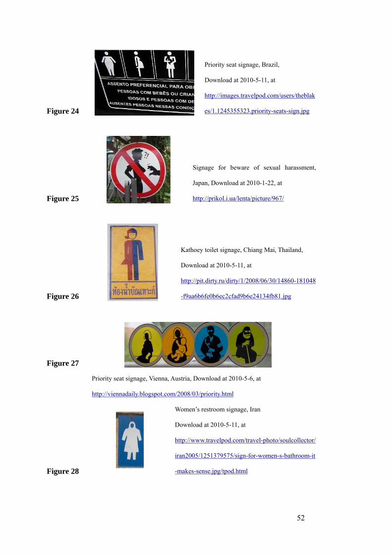
Figure 24
Priority seat signage, Brazil,
Download at 2010-5-11, at
http://images.travelpod.com/users/theblak
es/1.1245355323.priority-seats-sign.jpg
Figure 25
Signage for beware of sexual harassment,
Japan, Download at 2010-1-22, at
http://prikol.i.ua/lenta/picture/967/
Figure 26
Kathoey toilet signage, Chiang Mai, Thailand,
Download at 2010-5-11, at
http://pit.dirty.ru/dirty/1/2008/06/30/14860-181048
-f9aa6b6fe0b6ec2cfad9b6e24134fb81.jpg
Figure 27
Priority seat signage, Vienna, Austria, Download at 2010-5-6, at
http://viennadaily.blogspot.com/2008/03/priority.html
Figure 28
Women’s restroom signage, Iran
Download at 2010-5-11, at
http://www.travelpod.com/travel-photo/soulcollector/
iran2005/1251379575/sign-for-women-s-bathroom-it
-makes-sense.jpg/tpod.html
52

53
Bibliography
Books: Arthur, Paul and Passini, Romedi, Wayfinding: People, Signs, and Architecture, McGrau-Hill Ryerson Limited, 2002
Asian Development Bank, Disability brief: identifying and addressing the needs of disabled people, 2005
Blood, Sylvia, Body Work: The Social Construction of Women's Body Image, Routledge, 2005
Calori, Chris, Signage and Wayfinding Design : a Complete Guide to Creating Environmental Graphic Design Systems, Wiley, 2007
Evans, Jessica and Hall, Stuart(ed.), Visual Culture: the Reader, Sage Publications Ltd, London, 1999
Forrester, Michael, Psychology of the Image, Routledge, 2000
Goldsmith, Selwyn, Designing for Disabled, Royal Institute of British Architects, London, 1976
Goldsmith, Selwyn, A symbol for disabled people: Symbol Application Manual, Royal Institute of British Architects, 1969
Gutjahr, Paul and Benton, Megan, Illuminating Letter: Typography and Literary Interpretation, University of Massachusetts Press, 2001
Hong Kong Education and Manpower Bureau, Standardized Forms of Common Chinese Characters (《常用字字形表》), 2000
Japanese Ministry of Education, jōyō kanji(「常用漢字」), 1981.
Koffka, Kurt, Principle of Gestalt Psychology, Kegan Paul, Trench, Trubner & CO., Ltd, 1935
Margolin, Victor,(ed.) Design Discourse: History, Theory, Criticism, University of Chicago Press, 1989
Martin Lester, Paul, Visual Communication: Image with Messages, Wadsworth Publishing, 2010

54
Mencius, Tengwen Gong (《孟子•滕文公上》)
Mollerup, Per, Wayshowing: A Guide to Environmental Signage Principles and Practices, Lars Muller Publishers, 2005
Richard, Totman, The Third Sex: Kathoey: Thailand's Ladyboys, Souvenir Press, 2003
Robert, Sternberg, Cognitive Psychology, Wadsworth Publishing, 2002
Smitshuijzen, Edo, Signage Design Manual, Lars Muller Publishers, 2007
State Language Affairs Commission of China, Chart of Common Characters of Modern Chinese (《现代汉语常用字表》), 1988.
Schulz, Richard and Salthouse, Timothy, Adult Development and Aging: Myths and Emerging Realities, Pearson Education, 1998
Taiwan Ministry of Education, Chart of Standard Forms of Common National Characters (《常用國字標準字體表》), 1996.
Uebele, Andreas and Schmidt-Friderichs, Karin, Signage Systems and Information Graphics A Professional Sourcebook, Thames & Hudson Ltd, 2009
W Boyd Rayward(ed.), European Modernism and the Information Society: Informing the Present, Understanding the Past, Ashgate Publishing Limited, 2008
Xu, Shen, Origin of Chinese Characters(《说文解字》), http://shuowen.chinese99.com/index.php?action=displaychar&num=9756
Articles:
Associated Press, “Transvestites Get Their Own School Bathroom”, June 22, 2004.
Cheng, Bin “The Barrier-free Designing Research of Marking System for the Senior Citizen Housing”, in Sichuan Building Science, Volume 32, 2006.
Fei, Jinchang and Xu, Lili, “Research of Standardization of Printed Songti of Normative Chinese Characters”, in Applied Linguistics, Volume No. 3 of August 2003.
Kaya, Naz and Epps, Helen H, “Color-emotion Associations: Past Experience and Personal Preference”, Color and Paints, Interim Meeting of the International Color Association, Proceedings, 2004.
Kokotailo R, Kline D. "Congenital Colour Vision Deficiencies." University of Calgary, Department of Psychology, Vision & Aging Lab. Retrieved September 29,

55
2006: http://psychology.ucalgary.ca/pace/VA-Lab/colourperceptionweb/congenital.htm.
Wang, Wenqin: “Three features of Singaporean Confucianism”, http://www.sginsight.com/xjp/index.php?id=4614
Winter, Sam Counting Kathoey, Research and Discussion Paper of Hong Kong University, 2002: http://web.hku.hk/~sjwinter/TransgenderASIA/paper_counting_kathoey.htm.
Yasu, Yi: “Tracking the Trail of Jiaguwen(《寻找甲骨文的踪迹》)”, in the official website of The Institute of Archaeology Chinese Academy of Social Science: http://www.kaogu.cn/cn/detail.asp?ProductID=8223
Yasuo, Suzuki, translated by Erika Fujiwara, http://www.kanazawa-bidai.ac.jp/~suzuki/Q/edu/typo/01.html
Zhan, Yinxin, “The Principle and Font of Chinese Character”, translated by author, in Applied Linguistics, Volume No. 1 of February 2008
Websites:
Downie, Andrew and Paulo, Sao, Time, April. 10. 2009, http://www.time.com/time/world/article/0,8599,1890260,00.html
Khouw, Natalia “The Meaning of Colour for Gender”, http://www.colormatters.com/khouw.html
Online Xinhua Dictionary: http://xh.5156edu.com/html3/7516.html.
United Nations: http://www.un.org/chinese/esa/roadsafety/status2.html
United Nations Educational, Scientific and Cultural Organization: http://www.unesco.org/en/literacy/
US Central Intelligence Agency: https://www.cia.gov/library/publications/the-world-factbook/geos/sn.html
World Health Organization, http://www.who.int
Webexhibits: http://www.webexhibits.org/pigments/intro/reds.html