signs & signifiers, textual analysis of music magazines
TRANSCRIPT
Jade Mason
SIGNS AND SIGNIFIERS: MUSIC MAGAZINE
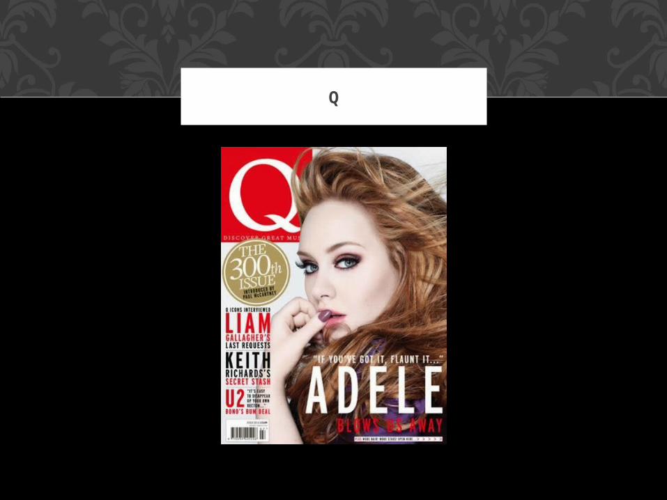
Q
The genre of Q is pop/rock which mainly concentrated on the rock side. I expect to see artists that major in pop/rock music such as top 40 artists
and rock bands. An iconic sign in this magazine cover is the master head 'Q' because it is a physical
representation of the letter Q and is a logo which is a physical representation of the brand. The graphic 'Q' would have a preferred reading of how the sign is so easily recognizable that everyone should be able to see that 'Q' and immediately think of the brand and
what the brand represents (pop/rock music.) The curved typography of the Q isn't as formal as other masterheads which shows that it is more accessible
to everyone rather than more formal audiences.
Q: COVER PAGE
The main image of Adele is iconic because it is a literal photograph of the pop star Adele. She is iconic for her
fans and to an audience due to the fact that if you saw a picture of her you would instantly recognize her .
The colours used in the front cover is a symbolic sign: the use of red represent love and passion which is shown in
Adele's body language being very flirtatious and her look of lust in her eyes. Adele's music is mostly about love and lust and this is transferred to her pose and the colours in
the cover. Women are tend to be seen as sexual beings and Adele's pose is showing that she is very flirtatious
however she represents a large majority of women who feel like they are not the stereotypical 'beautiful'.
Oppositional readers will see this image of Adele and feel that she isn't representing herself in a good way as she is posing very flirtatiously and in a sense sexually, which is
what she is supposed to be avoiding.
Her body language is an indexical sign as she very sultry and seductive which suggests her flirtatious side. The side angle could show that she is hiding
something or is trying to be flirtatious and innocent. The preferred reading to this is that she is powerful and independent which would encourage girls who wish to be like her to be the same. The oppositional reading would be that she is contradicting what she stands for and should be promoting her career and
music rather than being flirtatious and concentrating on becoming a sexual object.
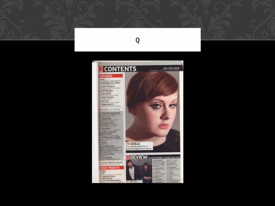
Q
The masterhead has the iconic Q which represents the brand and is in contrasting colours to the Black and White title 'Contents' which makes the brand stand out which could suggest that the brand Q
doesn't want to stick to the stereotype and wants to draw in readers who want to stand out from the
crowd.The main image of Adele is iconic, symbolic and
indexical for many reason.It is iconic because it is an actual photograph of the
artist Adele and it represents her as an artist.
Q: CONTENTS PAGE
The size of the photo is indexical as the image is the largest thing on the page which could link to the size
of her as an artist being very large and influential and how she is growing bigger and bigger with more and more fans. The shadows on her face is indexical as it suggests that she may still be hiding a side of
her which is intriguing as you as the reader wants to find out more about her and find out what she is
hiding. Her facial expression is very relaxed which contrasts to the cover page spoken about above. The preferred reading will like the fact that she appears
very relaxed and conserved and very poised and formal looking.
Q: CONTENTS PAGE
The typography of her name ADELE is very bold and formal which links to her pose and her costume and makeup being very formal and sophisticated which
could suggest her as an artist at the moment or could foreshadow where she wants to go as an artist in the
future. The oppositional reading may feel that her pose seems very catty, malicious and venomous, the
same as her looking her eyes.
Q: CONTENTS PAGE
Q
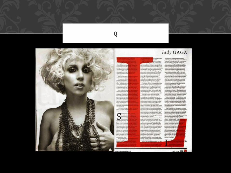
The image of Lady Gaga is Iconic as is the Letter L; the image is iconic as it is a physical representation of Lady Gaga as it is a photograph of her and the letter L is iconic as it is the initial of her first name. It is also symbolic because the L is very large and it is in bold
typography to show that she is a large and well known artist as well as very defined and professional. The use of red suggest lust and love which is shown and linked
to her pose being very flirtatious and sexual.
Q: DOUBLE PAGE SPREAD
The photograph of Lady Gaga can also be indexical. Her pose is very sexual and symbolizes what viewers would find attractive. Her hands on her breasts could show that she is
empowered and is loving the skin that she is in (which is what her as an artist represents) however oppositional readers can say that she is promoting and encouraging
others to view her as a sexual object rather than a classy, influential woman. They could also say that because she is
such a large artist and has many fans that she is a bad influence on them and should be aware that her actions
could have an impact on her fans (some being young). The use of black and white is symbolic because it suggests class and a vintage appeal which suggests that she is branching as an artist and will become a vintage artist in the future.
Q: DOUBLE PAGE SPREAD
NME
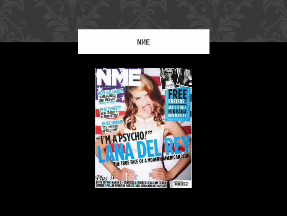
This cover has many iconic signs: firstly the Masterheads and Logo 'NME' is iconic as it is a
physical representation of the brand and the magazine- when audiences see this logo they will immediately think of the brand and the magazine.
The image of Lana Del Rey is also iconic because it is a physical photograph of her. She is iconic for her
fans also.There are also symbolic signs; the American flag symbolizes Nationalism and will endear American
readers to want to read it. It suggests that this issue will include many American artists which could
encourage international readers to want to read so that they can find out more about American artists also. Her pose is symbolic because it suggests her being strong and powerful (which is normally what
'hands-on-hips' normally suggests. Preferred readers will see this as influential and inspiring.
NME: COVER PAGE

Her facial expressions however are indexical; they can be viewed in two ways. Firstly it could suggest that she is taking more of a rock approach to her music
now as more heavy metal and rock artists stick their tongue out as a symbol of rebellion. It could also
suggest that she, as an artist, is trying to break out of the stereotypical cut-out pop artist. She is also
juxtaposing her own style as she is seen to be a very classically beautiful women, her hair is golden and shiny and styled the way it would have been in the
1950's which juxtaposes with the 'modern' rock pose with the tongue. The words 'I'M A PSYCHO!' links with
her pose as she appears to be a bit crazy and out there. The pun 'true face of a modern American' literally means that people are using this facial
expression more and more which metaphorically suggests that audiences are changing the music that
they are listening to. Oppositional readers will say that her facial expression is too harsh and may be ruining
her beauty and poise, and encourage the wrong mindset.
NME: COVER PAGE
NME
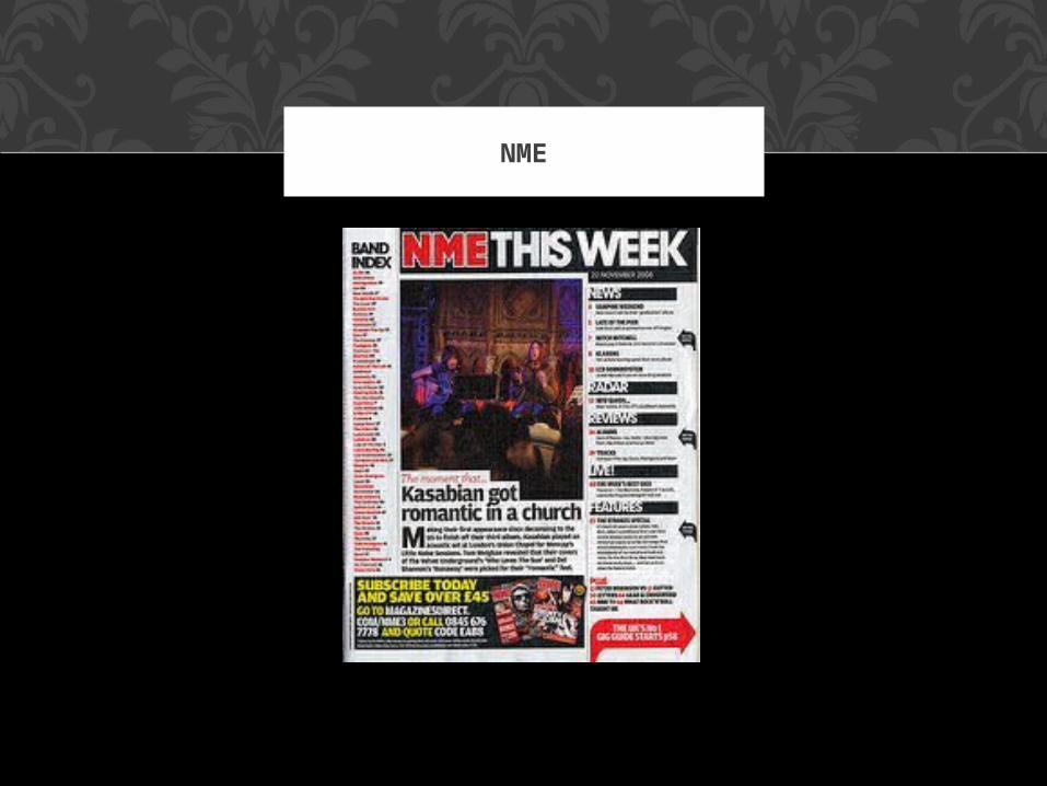
The iconic signs in this contents page are the Logo 'NME' is iconic as it is a physical representation of the brand and the magazine- when audiences see this logo
they will immediately think of the brand and the magazine. The image of Kasabian is also iconic because
it is a photograph of the artist which is a physical representation.
The use of colour is a symbolic sign; red symbolizes love which is linked to the title of the article 'Kasbian
got ROMANTIC in a church.' This would attract women because women stereo typically are attracted to
anything related to love and romance however men would also be attracted to the article if they listen to the artist. The image is also symbolic as the backdrop
of the church will suggest that the artist is very wholesome and sophisticated as a church symbolizes
religion and purity which could attract readers that may not necessarily have heard the artists music.
NME: CONTENTS PAGE
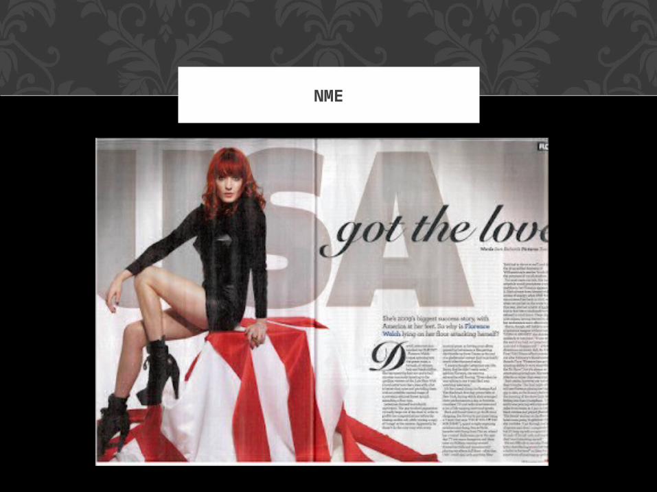
The image of Florence Welch is an iconic sign because it is a physical representation of the artist and she is
an iconic sign to her fans. The use of red is symbolic because it symbolizes love
and lust which is shown in her pose. The words 'got the love' is symbolic as it links to the colour red being
linked to love and indexical as it links to her as one of her songs included that lyric. She appears very sultry and flirtatious and she is showing lots of skin on her legs. Her pose an indexical sign as she is very strong and empowering which could link to the 'USA' in the background suggesting that America is strong and
powerful also.
NME: DOUBLE PAGE SPREAD
The curved typography of the letter 'D' is symbolic and indexical as it is typical feminine and pretty which also links to the theme of love and her as she is feminine. Preferred readers will feel that she is representing women in a good way as she appears powerful and
strong however Oppositional readers will feel that she is teaching women to show less skin and view her as a
sexual object.
NME: DOUBLE PAGE SPREAD