sitemaps, storyboards, and specifications: a …onemvweb.com/sources/ethnography/sitemaps.pdf263...
TRANSCRIPT
263
Sitemaps, Storyboards, and Specifications: A Sketch of Web Site Design Practice
Mark W. Newman and James A. Landay Group for User Interface Research, Computer Science Division
University of California, Berkeley Berkeley, CA 94720-1776 USA
+1 510 643-3043 {newman, landay}@cs.berkeley.edu
ABSTRACT Through a study of web site design practice, we observed
that designers employ multiple representations of web
sites as they progress through the design process, and that
these representations allow them to focus on different
aspects of the design. Designers also employ multiple
tools during the course of a project, including graphic
design, web development, presentation, and word
processing software, as well as pen and paper. Sketching
on paper is especially important during the design
exploration phase of a project, when designers wish to
explore many design possibilities quickly without
focusing on low-level details. Web site design tools
intended to support the early phases of the design process
should employ informal interaction techniques, should
support multiple site representations, and should integrate
well with other applications that designers use regularly.
Keywords Ethnography, Work Analysis, Web Site Design,
Information Architecture, Informal Interfaces.
INTRODUCTION We undertook a study to identify current practices in the
field of web design. The goal of this study was to
illuminate issues that would guide the design of informal
tools for supporting web site design. By “informal” we
mean tools whose user interfaces are designed to support
natural, ambiguous forms of human-computer interaction
[7]. Examples of interaction modes that informal
interfaces support include speaking, writing, gesturing,
and sketching.
We are interested in the exploration of informal interfaces
in general, and in our research group we have developed
informal applications to support graphical user interface
design [10] and group note taking [9]. We know that
designers in general employ ambiguous means of
expression and communication (such as sketching on
paper) when they are exploring design ideas [11, 18].
Since web design is an emerging field, the tools to support
it are not yet mature. We believe that there is a real
opportunity for improving the state of the art.
In the remainder of this paper we present related work,
describe the study that was conducted, present the picture
of web design that was observed through the study,
discuss the implications of our study towards future web
design tools, and briefly describe DENIM, an informal
web site design tool that we have developed based on the
results of this study.
RELATED WORK Several work practice studies have appeared in the
literature that are relevant to our study of web site
designers. Sumner and Stolze’s study of speech
application designers [17] and Bellotti and Rogers’ study
of editorial staff at several publishing companies [1]
showed that designers and editors use multiple
intermediate representations of products during their
creation, some similar to the representations found in this
study.
A certain amount can be learned about web design
practice by reading the growing body of literature that
covers it [6, 13-15]. Unfortunately, much of this literature
is prescriptive rather than descriptive, and may not
accurately reflect what designers are actually doing in the
field. To learn what designers do, there is no substitute for
direct contact. We elected to conduct our investigation
into web design practice through field visits and
interviews with professional designers. Our approach was
inspired by the methods proposed in, for example, [3, 8].
DESCRIPTION OF STUDY We interviewed eleven designers involved in the web site
design process. Ten of these designers were at five
different companies and one was a freelance designer. We
also collected and studied many artifacts of the design
process, including sketches, prototypes, written
documents, presentations, finished web sites, and several
other types of artifacts, some of which will be discussed
later. All interviews were conducted in the designers’
offices, which facilitated the observation of artifacts and
allowed us to observe their working environments.
Permission to make digital or hard copies of all or part of this work for
personal or classroom use is granted without fee provided that copies are
not made or distributed for profit or commercial advantage and that
copies bear this notice and the full citation on the first page. To copy
otherwise, or republish, to post on servers or to redistribute to lists,
requires prior specific permission and/or a fee.
DIS ’00, Brooklyn, New York.
Copyright 2000 ACM 1-58113-219-0/00/0008…$5.00.
264
Who Was Interviewed Four of the five companies we observed were design firms
that are typically contracted by outside clients to design
web sites. The fifth company was a large Internet
directory and search engine (i.e., a “portal”).
The designers represented a range of professional design
experience levels (see Table 1a). All of the designers with
more than five years of experience had been involved in
designing user interfaces for software applications before
getting involved in web site design, and one of them had
been involved in print design as well. Most of the
designers had backgrounds in graphic design in terms of
education and experience (see Table 1b).
In terms of the designers’ current responsibilities, four
were focused almost exclusively on graphic design, three
were focused exclusively on user interface
design/information architecture, and four had
responsibilities that were general enough to incorporate
aspects of both kinds of design (see Table 1c). The
meanings of the terms “graphic design,” “user interface
design,” and “information architecture” are discussed in
the next section. None of the designers were involved in
programming or development of the final, production
versions of the sites they designed.
What Was Asked Each participant was asked to choose a recently
completed or nearly completed project, and to walk the
interviewer through the entire project, explaining what
happened at each phase. The designer was asked to show
examples of documents that he or she produced during
each phase and explain the meaning of the document with
respect to the process as a whole. At the end of some of
the interviews, the designer was asked to give us copies of
the documents discussed during the interview. In this way,
examples of design process artifacts were collected from
four designers.
Examples of projects discussed include corporate identity
and information sites, a state tourism site, a site for an
aquarium, an online clothing catalog, a university site, an
online software tutorial, and sub-sites of an Internet portal.
A Note on Observations The next several sections of this paper present our
observations of web design practice based on this study.
Much of what was observed is not necessarily unique to
web design but probably draws from a broader tradition of
design including fields like architecture, industrial design,
and graphic design. Our intent was not to find what was
unique and new about web design but simply to learn
about current practices in the field to guide the
development of tools to support those practices. We have
not attempted to invent new terminology or redefine
existing terminology—wherever possible we have used
terms as designers used them during the interviews.
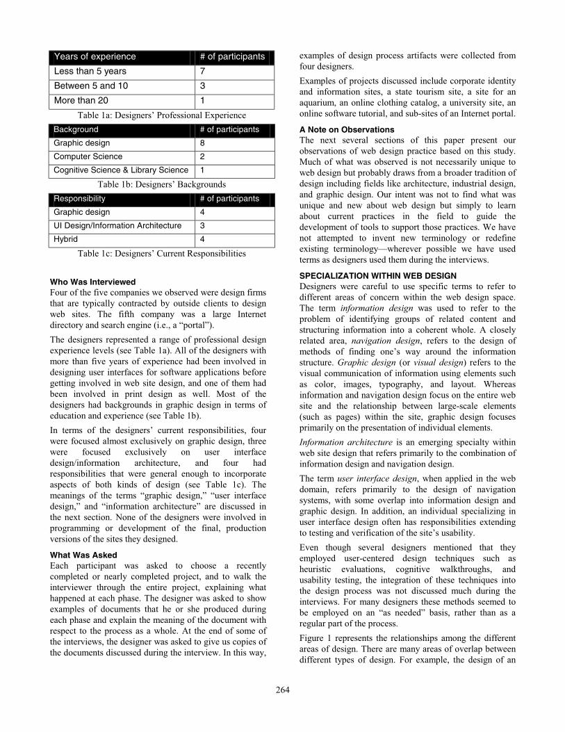
SPECIALIZATION WITHIN WEB DESIGN Designers were careful to use specific terms to refer to
different areas of concern within the web design space.
The term information design was used to refer to the
problem of identifying groups of related content and
structuring information into a coherent whole. A closely
related area, navigation design, refers to the design of
methods of finding one’s way around the information
structure. Graphic design (or visual design) refers to the
visual communication of information using elements such
as color, images, typography, and layout. Whereas
information and navigation design focus on the entire web
site and the relationship between large-scale elements
(such as pages) within the site, graphic design focuses
primarily on the presentation of individual elements.
Information architecture is an emerging specialty within
web site design that refers primarily to the combination of
information design and navigation design.
The term user interface design, when applied in the web
domain, refers primarily to the design of navigation
systems, with some overlap into information design and
graphic design. In addition, an individual specializing in
user interface design often has responsibilities extending
to testing and verification of the site’s usability.
Even though several designers mentioned that they
employed user-centered design techniques such as
heuristic evaluations, cognitive walkthroughs, and
usability testing, the integration of these techniques into
the design process was not discussed much during the
interviews. For many designers these methods seemed to
be employed on an “as needed” basis, rather than as a
regular part of the process.
Figure 1 represents the relationships among the different
areas of design. There are many areas of overlap between
different types of design. For example, the design of an
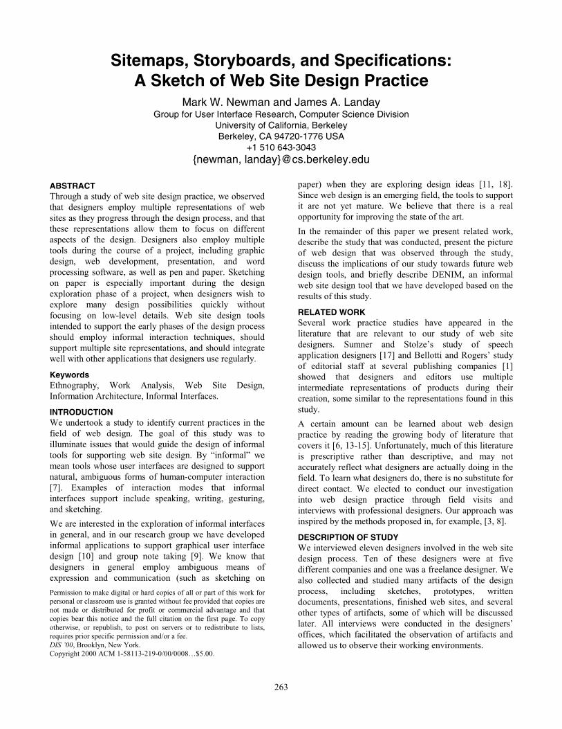
Years of experience # of participants
Less than 5 years 7
Between 5 and 10 3
More than 20 1
Table 1a: Designers’ Professional Experience
Background # of participants
Graphic design 8
Computer Science 2
Cognitive Science & Library Science 1
Table 1b: Designers’ Backgrounds
Responsibility # of participants
Graphic design 4
UI Design/Information Architecture 3
Hybrid 4
Table 1c: Designers’ Current Responsibilities
265
individual page must take into consideration the
information that is to be presented on the page, its relation
to other information found elsewhere on the site, the
support for navigation to other areas of the site, and the
visual presentation of information on the page.
In three of the five companies studied, there were
specialists who focused on particular areas of design. One
of these companies focused exclusively on information
architecture and user interface design and subcontracted
graphic design. Two companies had specialists designated
as “Information Architect/User Interface Designer” (in
both cases a hybrid title was used) and specialists
designated as “Graphic Designer.” The two remaining
companies did not distinguish among the different types of
design, but rather the same individuals would practice
different types of design at different points during the
design process. The independent consultant primarily
focused on graphic design.
In almost all cases, information and navigation design
were done before graphic design. At the web portal, the
graphic designers preferred to have the information
structure worked out before the project reached their
desks. In the firms where a single designer would focus on
different types of design at different phases of the process,
he or she would switch to graphic design only after
working out the information structure and obtaining
approval from the client. One firm tended to work on
graphic design ideas before (or sometimes in place of)
working on information and navigation design. This
discrepancy seems to have arisen from the firm’s
background in print advertising and their emphasis on
novel, entertainment-oriented sites.
THE STORY OF A DESIGN: A SOFTWARE TUTORIAL Before presenting a general description of the design
process, it will be helpful to ground the discussion with a
look at a particular design project. The project described
was a tutorial for a suite of software CAD tools. The
tutorial was designed for deployment on intranets of
companies using the client’s CAD tools, remote access via
the Internet, and distribution on CD-ROM.
This project was one of the shorter projects discussed in
the interviews, although the overall process and the
artifacts produced are representative of the projects
described in other interviews. The durations of each phase
of the design, however, should be taken with a grain of
salt, as there was a great deal of variation among projects.
The relative amounts of time dedicated to each phase is
consistent with projects described by the other designers.
The design team for this project consisted primarily of a
designer, a creative project lead, and an account manager.
The designer carried out most of the design work, in close
consultation with the creative lead and with other
designers in the firm. Other team members were
concerned with client contact, budget, and schedule.
During the first two weeks of the project, the designer
immersed himself in the background information for the
project. This consisted of reviewing the previous version
of the tutorial (as this was a complete redesign of an
existing product) and engaging in extensive discussions
with the client to understand the content of the tutorial and
get feedback about what was desired for the new version.
During this time he also sketched some ideas on paper,
including representations of the structure and navigation
of the previous version, and new structures representing
ideas about how to improve certain aspects. At the end of
the two weeks, a written “Needs Analysis” document,
detailing project goals, schedule, and general design
directions, was delivered to the client.
A meeting with the client was scheduled for the week
following the delivery of the Needs Analysis, at which
initial ideas for the redesigned product were to be
presented. The designer spent the week generating “Initial
Design Variations,” which focused on the high-level
structure of the tutorial and the basic means of navigating
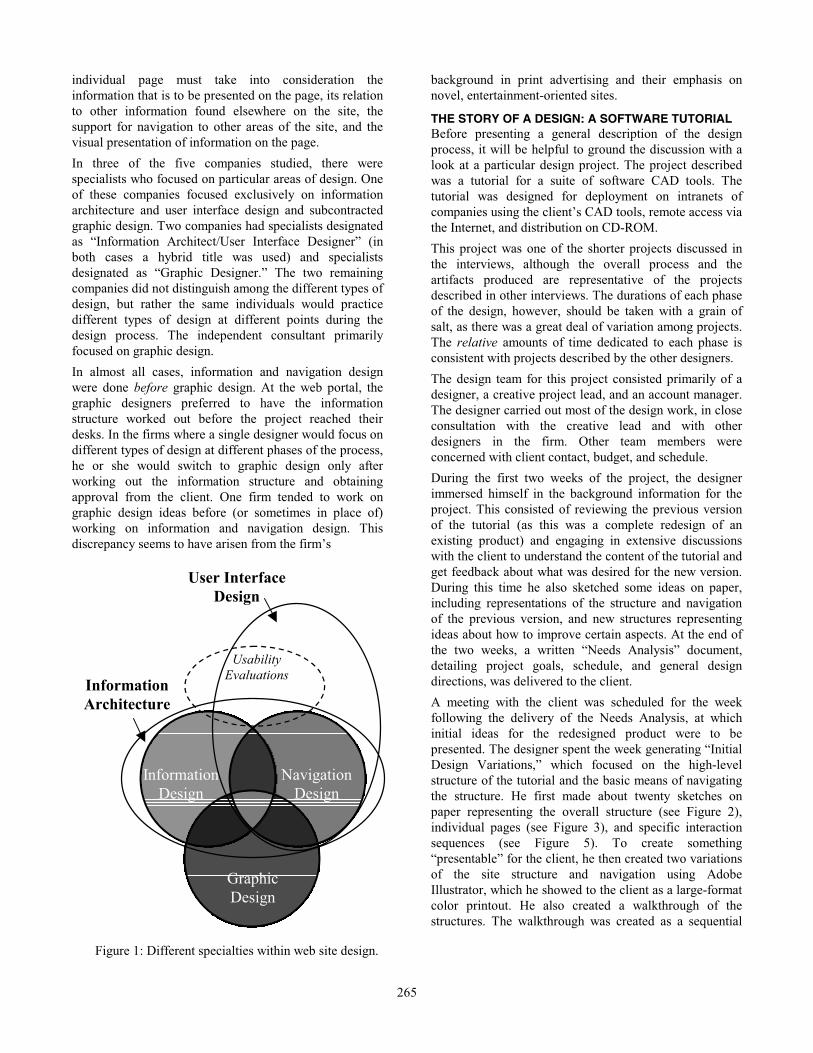
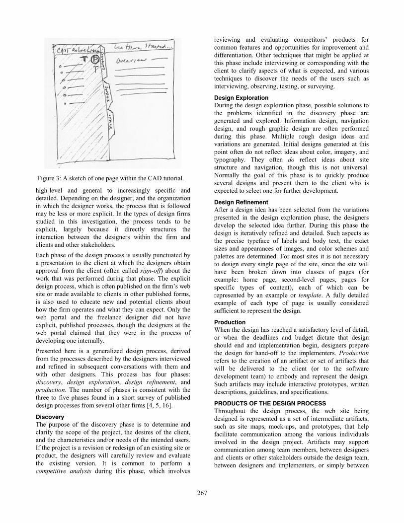
the structure. He first made about twenty sketches on
paper representing the overall structure (see Figure 2),
individual pages (see Figure 3), and specific interaction
sequences (see Figure 5). To create something
“presentable” for the client, he then created two variations
of the site structure and navigation using Adobe
Illustrator, which he showed to the client as a large-format
color printout. He also created a walkthrough of the
structures. The walkthrough was created as a sequential
Information
Design
Navigation
Design
Graphic
Design
Information
Architecture
Usability
Evaluations
User Interface
Design
Figure 1: Different specialties within web site design.
266
presentation in Macromedia Director consisting of images
produced in Illustrator.
The images presented in the walkthrough were
representations of individual pages in the tutorial. These
representations were devoid of images and icons, used a
simple color scheme consisting of three colors (blue,
green, and black), and contained almost no typographic
variation. The designer said he chose blue and green for
these initial images simply “because blue is different from
green.” He intended to show that different regions of
certain pages would be colored differently from each other
in order to distinguish the content, but he did not intend to
propose what the final colors would be. Similarly, the
bland typography and lack of images were not intended to
represent decisions about the final product, but were used
intentionally to keep the focus on the “mental model” of
the tutorial, i.e., the overall structure and the means of
navigating that structure.
After the presentation of the initial design variations, the
designer had a week to prepare the first round of “Visual
Design Variations.” Whereas the initial design variations
were intentionally devoid of graphic details, the visual
variations were intended to address these details. In
particular, high-fidelity mock-ups of the home page and
one second level page were created (figures not available
but see Figure 7 for an example of a mock-up). These
mock-ups contained images, icons, rich typography, and
sophisticated color schemes, and these details of the visual
presentation were meant to be taken literally.
To produce the visual variations, the designer made a few
“very quick” sketches on paper, and then created mock-
ups using the “Paint” window of Director. In addition,
three other designers within the firm were asked to create
mock-ups to give the client a wide range of options from
which to choose. All of the mock-ups were based on the
initial design variations. As was done the previous week, a
Director presentation was made to the client, this time
showing electronic mock-ups of five different design
ideas. The client selected two designs for further
development and a meeting was set for the following
week.
The designer spent the next week refining and developing
the selected designs using Director. The next presentation
included not only the refined home pages and second level
pages, but several other “content pages” as well. The goal
of this presentation was for the client to select a single
design for development into a prototype. It turned out that
the client liked aspects of both designs, so the two were
merged and the hybrid design was selected for further
development.
At this point, the client announced that they wanted a
prototype produced as soon as possible for an upcoming
trade show in three weeks time. This shortened the amount
of time that the designer could spend refining and
developing the visual design ideas and forced an early
transition into “production mode.” He worked on the
mock-ups for a little bit longer before beginning to code
the prototype in HTML. He said that his normal practice
is to flesh out the mock-ups as completely as possible
before starting to code since he likes to “in Photoshop
make this as complete as [he] can and then switch [his]
mind from visual design into coding.” Once he begins
coding, he does not work on the mock-ups anymore.
For the two weeks while working on the prototype, he
used Photoshop to work on images and icons and Bare
Bones Software’s BBEdit to write the HTML. He also
used Netscape Navigator to preview the prototype.
According to the designer, the development of a prototype
is usually followed by the writing of guidelines to
accompany and specify the prototype. Such a document
would be handed off to whomever would develop the
design into a working product. At the time of the
interview, however, the guidelines had not been written.
The clients had not determined whether they wished to
develop the prototype into a product, or whether the
prototype was to be used to convince the client
organization’s management to pursue a more serious
redesign. Without knowing the ultimate fate of the design,
neither the client nor the design firm thought it worthwhile
to devote time and effort to producing guidelines.
THE DESIGN PROCESS As was seen in the preceding story, designers follow a
process of iterative refinement that moves the design from
Figure 2: A portion of the sketch of the overall
structure of the CAD software tutorial.
267
high-level and general to increasingly specific and
detailed. Depending on the designer, and the organization
in which the designer works, the process that is followed
may be less or more explicit. In the types of design firms
studied in this investigation, the process tends to be
explicit, largely because it directly structures the
interaction between the designers within the firm and
clients and other stakeholders.
Each phase of the design process is usually punctuated by
a presentation to the client at which the designers obtain
approval from the client (often called sign-off) about the
work that was performed during that phase. The explicit
design process, which is often published on the firm’s web
site or made available to clients in other published forms,
is also used to educate new and potential clients about
how the firm operates and what they can expect. Only the
web portal and the freelance designer did not have
explicit, published processes, though the designers at the
web portal claimed that they were in the process of
developing one internally.
Presented here is a generalized design process, derived
from the processes described by the designers interviewed
and refined in subsequent conversations with them and
with other designers. This process has four phases:
discovery, design exploration, design refinement, and
production. The number of phases is consistent with the
three to five phases found in a short survey of published
design processes from several other firms [4, 5, 16].
Discovery The purpose of the discovery phase is to determine and
clarify the scope of the project, the desires of the client,
and the characteristics and/or needs of the intended users.
If the project is a revision or redesign of an existing site or
product, the designers will carefully review and evaluate
the existing version. It is common to perform a
competitive analysis during this phase, which involves
reviewing and evaluating competitors’ products for
common features and opportunities for improvement and
differentiation. Other techniques that might be applied at
this phase include interviewing or corresponding with the
client to clarify aspects of what is expected, and various
techniques to discover the needs of the users such as
interviewing, observing, testing, or surveying.
Design Exploration During the design exploration phase, possible solutions to
the problems identified in the discovery phase are
generated and explored. Information design, navigation
design, and rough graphic design are often performed
during this phase. Multiple rough design ideas and
variations are generated. Initial designs generated at this
point often do not reflect ideas about color, imagery, and
typography. They often do reflect ideas about site
structure and navigation, though this is not universal.
Normally the goal of this phase is to quickly produce
several designs and present them to the client who is
expected to select one for further development.
Design Refinement After a design idea has been selected from the variations
presented in the design exploration phase, the designers
develop the selected idea further. During this phase the
design is iteratively refined and detailed. Such aspects as
the precise typeface of labels and body text, the exact
sizes and appearances of images, and color schemes and
palettes are determined. For most sites it is not necessary
to design every single page of the site, since the site will
have been broken down into classes of pages (for
example: home page, second-level pages, pages for
specific types of content), each of which can be
represented by an example or template. A fully detailed
example of each type of page is usually considered
sufficient to represent the design.
Production When the design has reached a satisfactory level of detail,
or when the deadlines and budget dictate that design
should end and implementation begin, designers prepare
the design for hand-off to the implementers. Production
refers to the creation of an artifact or set of artifacts that
will be delivered to the client (or to the software
development team) to embody and represent the design.
Such artifacts may include interactive prototypes, written
descriptions, guidelines, and specifications.
PRODUCTS OF THE DESIGN PROCESS Throughout the design process, the web site being
designed is represented as a set of intermediate artifacts,
such as site maps, mock-ups, and prototypes, that help
facilitate communication among the various individuals
involved in the design project. Artifacts may support
communication among team members, between designers
and clients or other stakeholders outside the design team,
between designers and implementers, or simply between
Figure 3: A sketch of one page within the CAD tutorial.
268
the designer and herself. Often an individual artifact will
support multiple dimensions of communication.
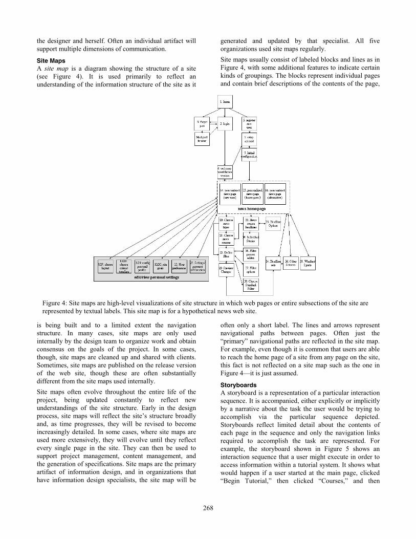
Site Maps A site map is a diagram showing the structure of a site
(see Figure 4). It is used primarily to reflect an
understanding of the information structure of the site as it
is being built and to a limited extent the navigation
structure. In many cases, site maps are only used
internally by the design team to organize work and obtain
consensus on the goals of the project. In some cases,
though, site maps are cleaned up and shared with clients.
Sometimes, site maps are published on the release version
of the web site, though these are often substantially
different from the site maps used internally.
Site maps often evolve throughout the entire life of the
project, being updated constantly to reflect new
understandings of the site structure. Early in the design
process, site maps will reflect the site’s structure broadly
and, as time progresses, they will be revised to become
increasingly detailed. In some cases, where site maps are
used more extensively, they will evolve until they reflect
every single page in the site. They can then be used to
support project management, content management, and
the generation of specifications. Site maps are the primary
artifact of information design, and in organizations that
have information design specialists, the site map will be
generated and updated by that specialist. All five
organizations used site maps regularly.
Site maps usually consist of labeled blocks and lines as in
Figure 4, with some additional features to indicate certain
kinds of groupings. The blocks represent individual pages
and contain brief descriptions of the contents of the page,
often only a short label. The lines and arrows represent
navigational paths between pages. Often just the
“primary” navigational paths are reflected in the site map.
For example, even though it is common that users are able
to reach the home page of a site from any page on the site,
this fact is not reflected on a site map such as the one in
Figure 4—it is just assumed.
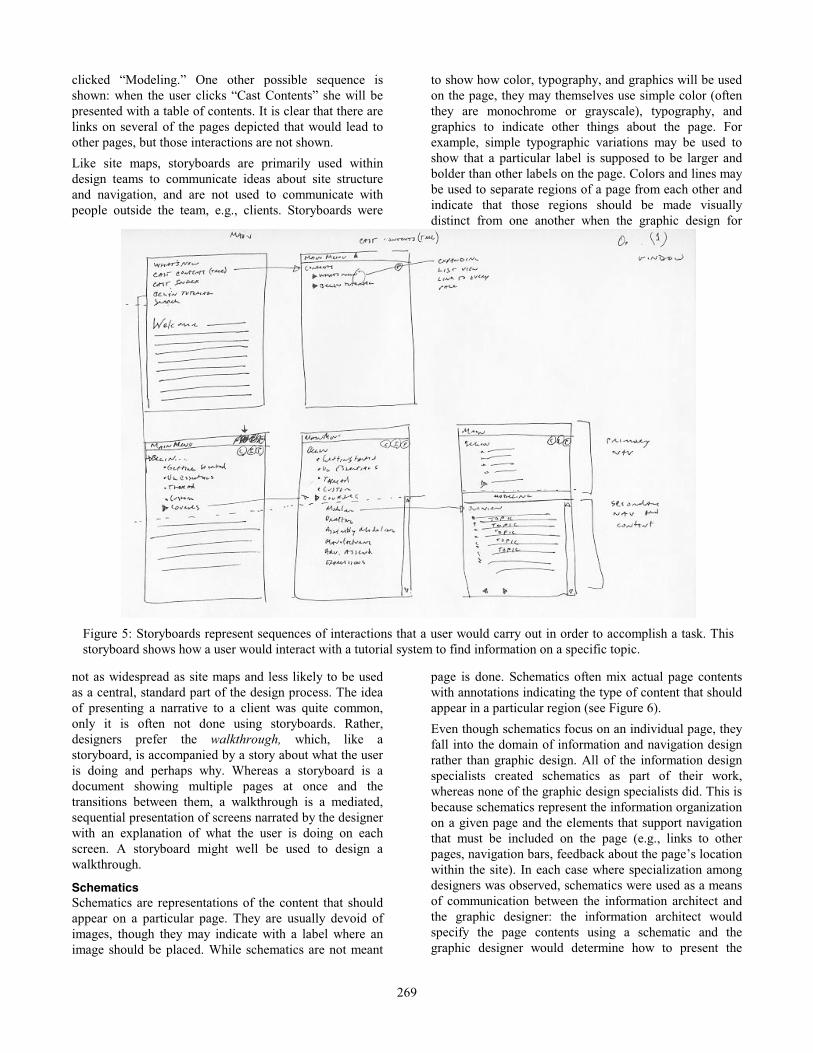
Storyboards A storyboard is a representation of a particular interaction
sequence. It is accompanied, either explicitly or implicitly
by a narrative about the task the user would be trying to
accomplish via the particular sequence depicted.
Storyboards reflect limited detail about the contents of
each page in the sequence and only the navigation links
required to accomplish the task are represented. For
example, the storyboard shown in Figure 5 shows an
interaction sequence that a user might execute in order to
access information within a tutorial system. It shows what
would happen if a user started at the main page, clicked
“Begin Tutorial,” then clicked “Courses,” and then
Figure 4: Site maps are high-level visualizations of site structure in which web pages or entire subsections of the site are
represented by textual labels. This site map is for a hypothetical news web site.
269
clicked “Modeling.” One other possible sequence is
shown: when the user clicks “Cast Contents” she will be
presented with a table of contents. It is clear that there are
links on several of the pages depicted that would lead to
other pages, but those interactions are not shown.
Like site maps, storyboards are primarily used within
design teams to communicate ideas about site structure
and navigation, and are not used to communicate with
people outside the team, e.g., clients. Storyboards were
not as widespread as site maps and less likely to be used
as a central, standard part of the design process. The idea
of presenting a narrative to a client was quite common,
only it is often not done using storyboards. Rather,
designers prefer the walkthrough, which, like a
storyboard, is accompanied by a story about what the user
is doing and perhaps why. Whereas a storyboard is a
document showing multiple pages at once and the
transitions between them, a walkthrough is a mediated,
sequential presentation of screens narrated by the designer
with an explanation of what the user is doing on each
screen. A storyboard might well be used to design a
walkthrough.
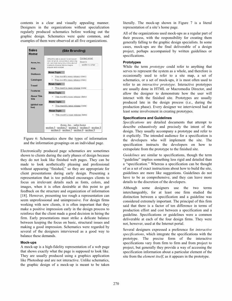
Schematics Schematics are representations of the content that should
appear on a particular page. They are usually devoid of
images, though they may indicate with a label where an
image should be placed. While schematics are not meant
to show how color, typography, and graphics will be used
on the page, they may themselves use simple color (often
they are monochrome or grayscale), typography, and
graphics to indicate other things about the page. For
example, simple typographic variations may be used to
show that a particular label is supposed to be larger and
bolder than other labels on the page. Colors and lines may
be used to separate regions of a page from each other and
indicate that those regions should be made visually
distinct from one another when the graphic design for
page is done. Schematics often mix actual page contents
with annotations indicating the type of content that should
appear in a particular region (see Figure 6).
Even though schematics focus on an individual page, they
fall into the domain of information and navigation design
rather than graphic design. All of the information design
specialists created schematics as part of their work,
whereas none of the graphic design specialists did. This is
because schematics represent the information organization
on a given page and the elements that support navigation
that must be included on the page (e.g., links to other
pages, navigation bars, feedback about the page’s location
within the site). In each case where specialization among
designers was observed, schematics were used as a means
of communication between the information architect and
the graphic designer: the information architect would
specify the page contents using a schematic and the
graphic designer would determine how to present the
Figure 5: Storyboards represent sequences of interactions that a user would carry out in order to accomplish a task. This
storyboard shows how a user would interact with a tutorial system to find information on a specific topic.
270
contents in a clear and visually appealing manner.
Designers in the organizations without specialization
regularly produced schematics before working out the
graphic design. Schematics were quite common, and
examples of them were observed at all five organizations.
Electronically produced page schematics are sometimes
shown to clients during the early phases of design because
they do not look like finished web pages. They can be
made to look aesthetically pleasing and professional
without appearing “finished,” so they are appropriate for
client presentations during early design. Presenting a
representation that is too polished encourages clients to
focus on irrelevant details such as fonts, colors, and
images, when it is often desirable at this point to get
feedback on the structure and organization of information
[18]. However, presenting too rough a representation can
seem unprofessional and unimpressive. For design firms
working with new clients, it is often important that they
make a positive impression early in the design process to
reinforce that the client made a good decision in hiring the
firm. Early presentations must strike a delicate balance
between keeping the focus on basic, structural issues and
making a good impression. Schematics were regarded by
several of the designers interviewed as a good way to
balance these demands.
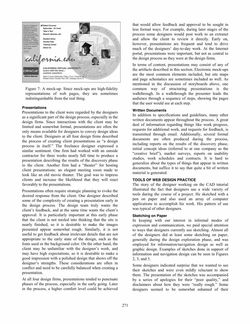
Mock-ups A mock-up is a high-fidelity representation of a web page
that shows exactly what the page is supposed to look like.
They are usually produced using a graphics application
like Photoshop and are not interactive. Unlike schematics,
the graphic design of a mock-up is meant to be taken
literally. The mock-up shown in Figure 7 is a literal
representation of a site’s home page.
All of the organizations used mock-ups as a regular part of
their process, with the responsibility for creating them
generally falling to the graphic design specialists. In some
cases, mock-ups are the final deliverable of a design
project, perhaps accompanied by written guidelines or
specifications.
Prototypes While the term prototype could refer to anything that
serves to represent the system as a whole, and therefore is
occasionally used to refer to a site map, a set of
schematics, or a set of mock-ups, it is most often used to
refer to an interactive prototype. Interactive prototypes
are usually done in HTML or Macromedia Director, and
allow the designer to demonstrate how the user will
interact with the finished site. Prototypes are usually
produced late in the design process (i.e., during the
production phase). Every designer we interviewed had at
least some involvement in creating prototypes.
Specifications and Guidelines Specifications are detailed documents that attempt to
describe exhaustively and precisely the intent of the
design. They usually accompany a prototype and refer to
it explicitly. The intended audience for a specification is
the developers who will implement the site. The
specification instructs the developers on how to
extrapolate from the prototype to the finished site.
Guidelines are similar to specifications, though the term
“guideline” implies something less rigid and detailed than
a “specification.” Whereas a specification can be thought
of as a set of exact instructions about how to build the site,
guidelines are more like suggestions. Guidelines do not
have to be as comprehensive, and they can leave more
details to the discretion of the developers.
Although some designers use the two terms
interchangeably, for at least one firm studied the
distinction between a specification and a guideline was
considered extremely important. The principal of this firm
said that there is a factor of ten difference in terms of
production effort and cost between a specification and a
guideline. Specifications or guidelines were a common
deliverable at each of the four design firms. They were
not, however, used at the Internet portal.
Several designers expressed a preference for interactive
specifications, which integrate the specifications with the
prototype. The precise form of the interactive
specifications vary from firm to firm and from project to
project, but generally they provide a way of accessing the
specification information about a particular element of the
site from the element itself, as it appears in the prototype.
Figure 6: Schematics show the types of information
and the information groupings on an individual page.
271
Presentations Presentations to the client were regarded by the designers
as a significant part of the design process, especially in the
design firms. Since interactions with the client may be
limited and somewhat formal, presentations are often the
only means available for designers to convey design ideas
to the client. Designers at all four design firms described
the process of creating client presentations as “a design
process in itself.” The freelance designer expressed a
similar sentiment. One firm had worked with an outside
contractor for three weeks nearly full time to produce a
presentation describing the results of the discovery phase
to the client. Another firm had a “theater” for hosting
client presentations: an elegant meeting room made to
look like an old movie theater. The goal was to impress
clients and increase the likelihood that they will react
favorably to the presentations.
Presentations often require strategic planning to evoke the
desired response from the client. One designer described
some of the complexity of creating a presentation early in
the design process. The design team truly wants the
client’s feedback, and at the same time wants the client’s
approval. It is particularly important at this early phase
that the client is not misled into thinking that the site is
nearly finished, so it is desirable to make the images
presented appear somewhat rough. Similarly, it is not
useful to get feedback about irrelevant details that are not
appropriate to the early state of the design, such as the
fonts used or the background color. On the other hand, the
client may be unfamiliar with the designer’s work, and
may have high expectations, so it is desirable to make a
good impression with a polished design that shows off the
designer’s strengths. These considerations are often in
conflict and need to be carefully balanced when creating a
presentation.
At all four design firms, presentations tended to punctuate
phases of the process, especially in the early going. Later
in the process, a higher comfort level could be achieved
that would allow feedback and approval to be sought in
less formal ways. For example, during later stages of the
process some designers would post work to an extranet
and allow the client to review it directly. Early on,
however, presentations are frequent and tend to drive
much of the designers’ day-to-day work. At the Internet
portal, presentations were important, but not as central to
the design process as they were at the design firms.
In terms of content, presentations may consist of any of
the artifacts described in this section. Electronic mock-ups
are the most common elements included, but site maps
and page schematics are sometimes included as well. As
mentioned in the discussion of storyboards above, one
common way of structuring presentations is the
walkthrough. In a walkthrough the presenter leads the
audience through a sequence of steps, showing the pages
that the user would see at each step.
Written Documents In addition to specifications and guidelines, many other
written documents appear throughout the process. A great
deal of information regarding things like work progress,
requests for additional work, and requests for feedback, is
transmitted through email. Additionally, several formal
documents are often produced during the process,
including reports on the results of the discovery phase,
initial concept ideas (referred to at one company as the
“creative brief”), market surveys, reports on usability
studies, work schedules and contracts. It is hard to
generalize about the types of things that appear in written
documents, but suffice it to say that quite a bit of written
material is generated.
TOOLS OF WEB DESIGN PRACTICE The story of the designer working on the CAD tutorial
illustrated the fact that designers use a wide variety of
tools during the course of a project. He sketched with a
pen on paper and also used an array of computer
applications to accomplish his work. His pattern of use
was typical of other designers.
Sketching on Paper In keeping with our interest in informal modes of
expression and communication, we paid special attention
to ways that designers currently use sketching. Almost all
of the designers did at least some sketching on paper,
generally during the design exploration phase, and was
employed for information/navigation design as well as
graphic design. Examples of sketches done in support of
information and navigation design can be seen in Figures
2, 3, and 5.
Some designers indicated surprise that we wanted to see
their sketches and were even mildly reluctant to show
them. The presentation of the sketches was accompanied
by a series of apologies for their “poor quality,” and
disclaimers about how they were “really rough.” Some
designers seemed to be somewhat ashamed of their
Figure 7: A mock-up. Since mock-ups are high-fidelity
representations of web pages, they are sometimes
indistinguishable from the real thing.
272
sketches, or perhaps they had misgivings about showing
them to a relative stranger. According to several
designers, anything presented to a client must look
“professional,” which means at a minimum a color
printout or photocopy of a high-resolution mock up, and
usually it means a mock-up presented on a computer.
Several designers reported that they “used to sketch
more.” While it wasn’t clear exactly what was behind this
reduction in sketching, one designer said that he began
working with Illustrator and Photoshop earlier and earlier
in projects because he knew he would have to produce
something to present to the client very early on. Knowing
this, it was easier to work in an electronic medium from
the start. Several other designers agreed that early
deadlines drove them to switch from paper to electronic
media earlier in the project than they might have liked.
Another designer reported that she switched to working
with computer-based tools when she thought she would be
making incremental variations to a single general idea.
She said:
The beginning of each step I’ll do on paper. As soon
as I feel like I’m going to be starting any design
revisions, then I’ll move to [an electronic tool]…
because it’s easier to make changes to these things.
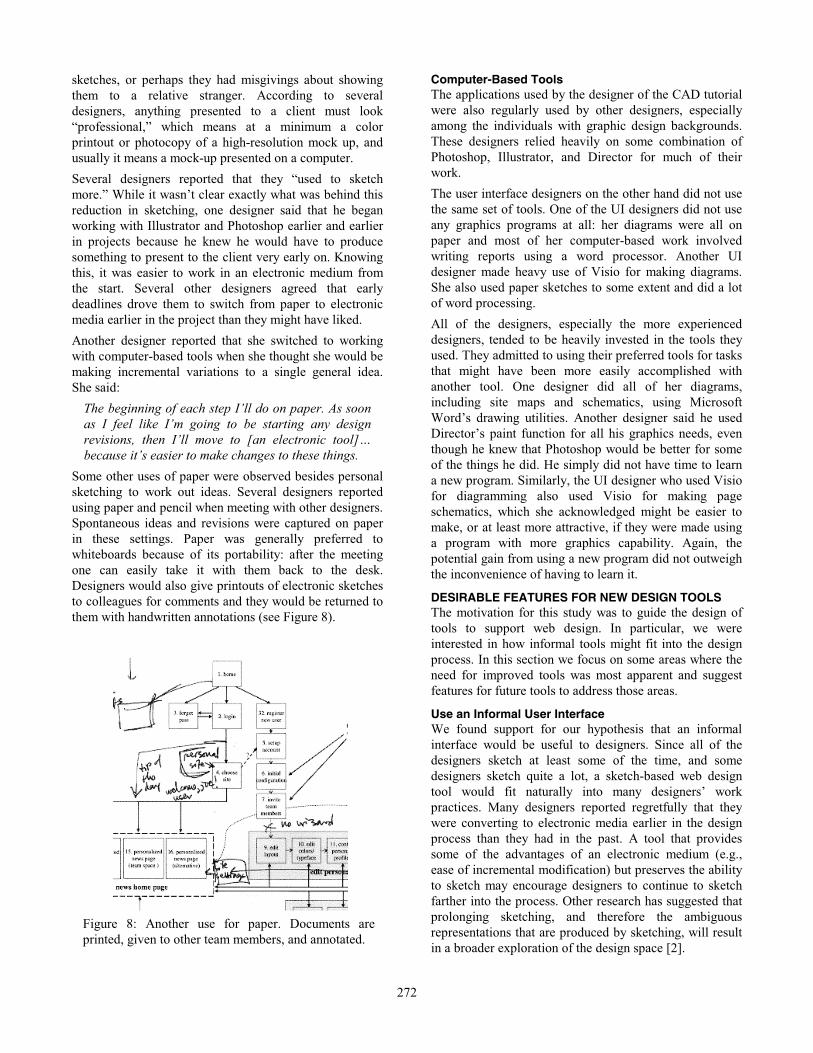
Some other uses of paper were observed besides personal
sketching to work out ideas. Several designers reported
using paper and pencil when meeting with other designers.
Spontaneous ideas and revisions were captured on paper
in these settings. Paper was generally preferred to
whiteboards because of its portability: after the meeting
one can easily take it with them back to the desk.
Designers would also give printouts of electronic sketches
to colleagues for comments and they would be returned to
them with handwritten annotations (see Figure 8).
Computer-Based Tools The applications used by the designer of the CAD tutorial
were also regularly used by other designers, especially
among the individuals with graphic design backgrounds.
These designers relied heavily on some combination of
Photoshop, Illustrator, and Director for much of their
work.
The user interface designers on the other hand did not use
the same set of tools. One of the UI designers did not use
any graphics programs at all: her diagrams were all on
paper and most of her computer-based work involved
writing reports using a word processor. Another UI
designer made heavy use of Visio for making diagrams.
She also used paper sketches to some extent and did a lot
of word processing.
All of the designers, especially the more experienced
designers, tended to be heavily invested in the tools they
used. They admitted to using their preferred tools for tasks
that might have been more easily accomplished with
another tool. One designer did all of her diagrams,
including site maps and schematics, using Microsoft
Word’s drawing utilities. Another designer said he used
Director’s paint function for all his graphics needs, even
though he knew that Photoshop would be better for some
of the things he did. He simply did not have time to learn
a new program. Similarly, the UI designer who used Visio
for diagramming also used Visio for making page
schematics, which she acknowledged might be easier to
make, or at least more attractive, if they were made using
a program with more graphics capability. Again, the
potential gain from using a new program did not outweigh
the inconvenience of having to learn it.
DESIRABLE FEATURES FOR NEW DESIGN TOOLS The motivation for this study was to guide the design of
tools to support web design. In particular, we were
interested in how informal tools might fit into the design
process. In this section we focus on some areas where the
need for improved tools was most apparent and suggest
features for future tools to address those areas.
Use an Informal User Interface We found support for our hypothesis that an informal
interface would be useful to designers. Since all of the
designers sketch at least some of the time, and some
designers sketch quite a lot, a sketch-based web design
tool would fit naturally into many designers’ work
practices. Many designers reported regretfully that they
were converting to electronic media earlier in the design
process than they had in the past. A tool that provides
some of the advantages of an electronic medium (e.g.,
ease of incremental modification) but preserves the ability
to sketch may encourage designers to continue to sketch
farther into the process. Other research has suggested that
prolonging sketching, and therefore the ambiguous
representations that are produced by sketching, will result
in a broader exploration of the design space [2].
Figure 8: Another use for paper. Documents are
printed, given to other team members, and annotated.
273
Informal interfaces leverage modes of interaction that are
already familiar to users. This means that a good informal
interface should be relatively easy to learn and use. As
described in the above discussion about computer-based
tools, ease of learning and use will be critical to the
acceptance of any new design tool.
Support Multiple Representations This study found that designers use multiple
representations throughout the course of the design
process. These representations depict the site at different
levels of detail. A design tool should support a similar
range of representations. Such a tool would be an
improvement over the current state of the art, in which
different representations are created using separate, poorly
integrated tools. Several designers expressed a wish that
the different representations could be tied together in a
unified framework so that consistency and coherent
project management strategies could be more easily
maintained.
Focus on Early Design Phases Through this study, we were able to focus our
understanding of where in the process an informal tool
would fit best, and which specific aspects of design it
would best support. We found it most appropriate to focus
on the design exploration phase, and on information and
navigation design. Later phases place a greater emphasis
on graphic design, require greater precision, and would
not benefit greatly from a tool with an informal interface.
Existing tools such as Photoshop, Illustrator, and
Dreamweaver do a much better job of supporting the
activities of later design phases (e.g., graphic design and
prototyping) than those of early phases. A tool that
focuses on early-phase information and navigation design
should concentrate on supporting the production of the
artifacts that are most relevant to those activities, e.g., site
maps, storyboards, and schematics.
Integrate with Other Tools While an informal tool may not explicitly support later
design phases, it should support transitions into them. One
way to do this is through integration with other tools and
representations. Since the need to present polished design
ideas to clients early in the process is one of the factors
driving an early conversion to formal representations, a
sketch-based tool should support the integration of
sketches with more formal representations produced in
other tools such as Photoshop or Illustrator. It should also
strive to integrate well with other types of applications
that designers use regularly, such as presentation and word
processing software.
Manage History and Variations Designers expressed a desire to have a unified way to
manage different variations of design ideas. Variations
play a key role during the design exploration phase, and it
would behoove an effective design tool to help support
their creation and management.
In order to keep track of project milestones and variations,
designers are forced to invent ad-hoc methods of their
own, usually involving saving multiple versions of files
and using complex, cryptic file names to encode the
relevance of each version. Several designers were
interested in having a tool that would help them keep track
of project histories so that they could refer back to
decisions made early in the process and better understand
the context under which these decisions were made.
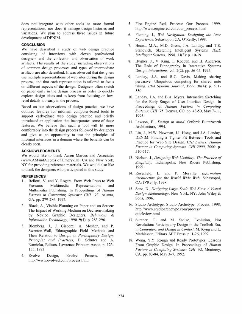
DENIM: AN INFORMAL WEB SITE DESIGN TOOL Based on the results of this study, we developed DENIM,
a sketch-based tool supporting information and navigation
design of web sites. We only present a brief overview of
DENIM here, but a more complete description of the
system and initial feedback from designers who used the
system is presented in [12].
DENIM (see Figure 9) supports sketching input, allows
design at different refinement levels, and unifies the levels
through zooming. In particular, DENIM supports
visualizations matching the site map, storyboard, and
schematic representations described in this paper. DENIM
also allows designers to interact with their site designs
through a “run mode,” which displays the sketched pages
in a limited functionality “browser” that allows the user to
navigate the site by clicking active regions of the sketches
and linking to other pages within the site.
The current version of DENIM is focused on addressing
the first three implications mentioned above. It uses an
informal interface, supports multiple representations, and
focuses on the early phases of design. At present, DENIM
Figure 9: DENIM, shown here in “Storyboard View,”
allows designers to design web sites by sketching and
integrates site map, storyboard, and individual page
representations through zooming.
274
does not integrate with other tools or more formal
representations, nor does it manage design histories and
variations. We plan to address these issues in future
development of DENIM.
CONCLUSION We have described a study of web design practice
consisting of interviews with eleven professional
designers and the collection and observation of work
artifacts. The results of the study, including observations
of common design processes and types of intermediate
artifacts are also described. It was observed that designers
use multiple representations of web sites during the design
process, and that each representation is tailored to focus
on different aspects of the design. Designers often sketch
on paper early in the design process in order to quickly
explore design ideas and to keep from focusing on low-
level details too early in the process.
Based on our observations of design practice, we have
outlined features for informal computer-based tools to
support early-phase web design practice and briefly
introduced an application that incorporates some of those
features. We believe that such a tool will fit more
comfortably into the design process followed by designers
and give us an opportunity to test the principles of
informal interfaces in a domain where the benefits can be
clearly seen.
ACKNOWLEDGMENTS We would like to thank Aaron Marcus and Associates
(www.AMandA.com) of Emeryville, CA and New York,
NY for providing reference materials. We would also like
to thank the designers who participated in this study.
REFERENCES 1. Bellotti, V. and Y. Rogers. From Web Press to Web
Pressure: Multimedia Representations and
Multimedia Publishing. In Proceedings of Human
Factors in Computing Systems: CHI ’97. Atlanta,
GA. pp. 279-286, 1997.
2. Black, A., Visible Planning on Paper and on Screen:
The Impact of Working Medium on Decision-making
by Novice Graphic Designers. Behaviour &
Information Technology, 1990. 9(4): p. 283-296.
3. Blomberg, J., J. Giacomi, A. Mosher, and P.
Swenton-Wall, Ethnographic Field Methods and
Their Relation to Design, in Participatory Design:
Principles and Practices, D. Schuter and A.
Namioka, Editors. Lawrence Erlbaum Assoc. p. 123-
155, 1993.
4. Evolve Design, Evolve Process, 1999.
http://www.evolved.com/process.html
5. Fire Engine Red, Process: Our Process, 1999.
http://www.enginered.com/our_process.html
6. Fleming, J., Web Navigation: Designing the User
Experience. Sebastopol, CA: O’Reilly, 1998.
7. Hearst, M.A., M.D. Gross, J.A. Landay, and T.E.
Stahovich, Sketching Intelligent Systems. IEEE
Intelligent Systems, 1998. 13(3): p. 10-19.
8. Hughes, J., V. King, T. Rodden, and H. Andersen,
The Role of Ethnography in Interactive Systems
Design, interactions, vol. 2(2): pp. 56-65, 1995.
9. Landay, J.A. and R.C. Davis, Making sharing
pervasive: Ubiquitous computing for shared note
taking. IBM Systems Journal, 1999. 38(4): p. 531-
550.
10. Landay, J.A. and B.A. Myers. Interactive Sketching
for the Early Stages of User Interface Design. In
Proceedings of Human Factors in Computing
Systems: CHI ’95. Denver, CO. pp. 43-50, May 7–11,
1995.
11. Lawson, B., Design in mind. Oxford: Butterworth
Architecture, 1994.
12. Lin, J., M.W. Newman, J.I. Hong, and J.A. Landay,
DENIM: Finding a Tighter Fit Between Tools and
Practice for Web Site Design. CHI Letters: Human
Factors in Computing Systems, CHI 2000, 2000: p.
510-517.
13. Nielsen, J., Designing Web Usability: The Practice of
Simplicity. Indianapolis: New Riders Publishing,
1999.
14. Rosenfeld, L. and P. Morville, Information
Architecture for the World Wide Web. Sebastopol,
CA: O’Reilly, 1998.
15. Sano, D., Designing Large-Scale Web Sites: A Visual
Design Methodology. New York, NY: John Wiley &
Sons, 1996.
16. Studio Archetype, Studio Archetype: Process, 1998.
http://www.studioarchetype.com/process/
quickview.html
17. Sumner, T. and M. Stolze, Evolution, Not
Revolution: Participatory Design in the Toolbelt Era,
in Computers and Design in Context, M. Kyng and L.
Mathiassen, Editors. MIT Press. p. 1-26, 1997.
18. Wong, Y.Y. Rough and Ready Prototypes: Lessons
From Graphic Design. In Proceedings of Human
Factors in Computing Systems: CHI ’92. Monterey,
CA. pp. 83-84, May 3–7, 1992.