sketchup fun
TRANSCRIPT

I wanted to share some thoughts about sketchup

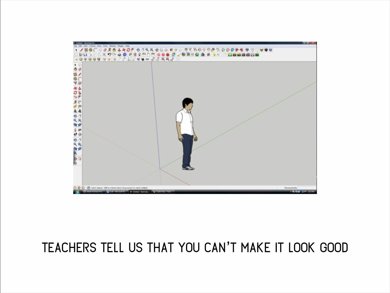
teachers tell us that you can’t make it look good

but they teach it to us anyway
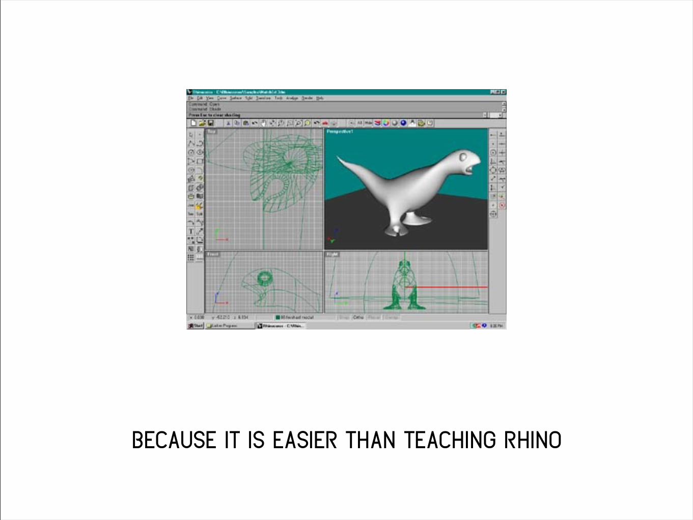
because it is easier than teaching rhino
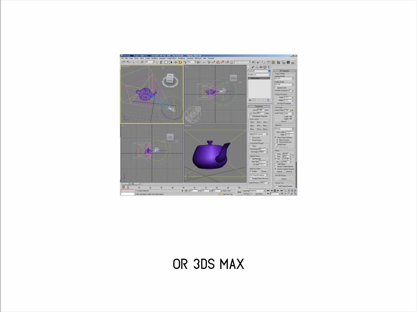
or 3ds max

or maya
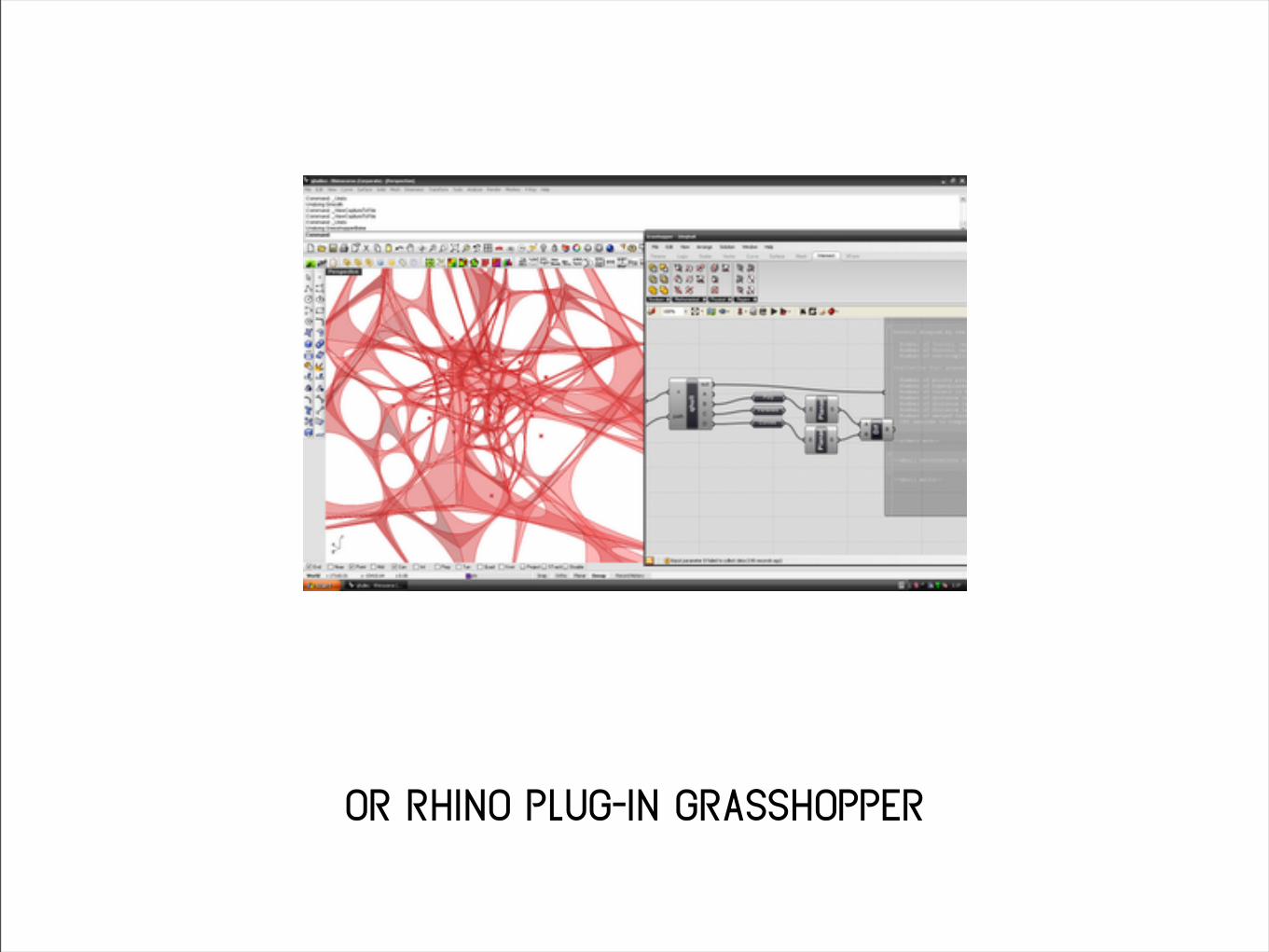
or rhino plug-in grasshopper

and ultimately, teachers are lazy.

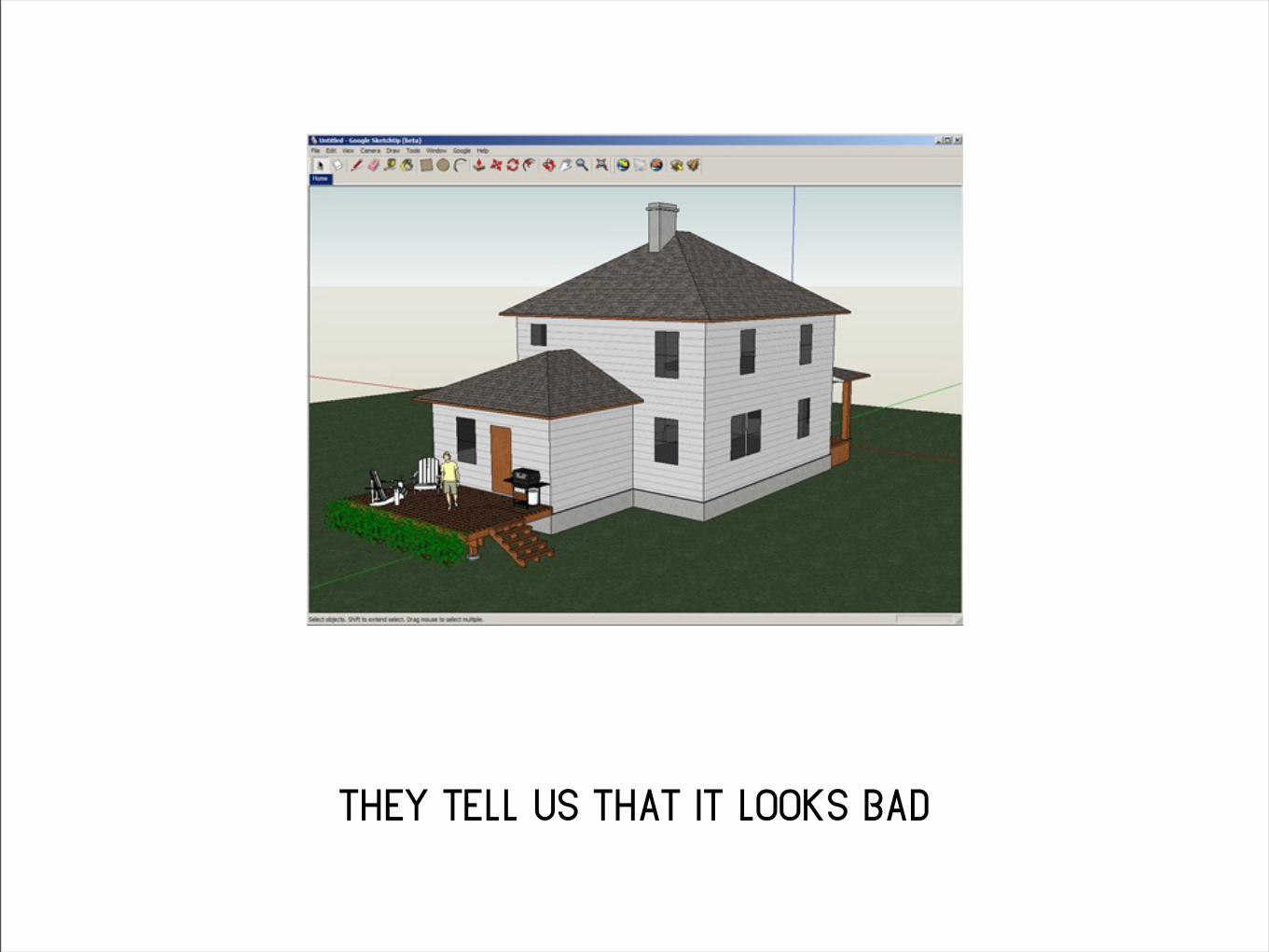
they tell us that it looks bad

they’re afraid we’ll spend too long on our model
and not enough time on our design

these are legitimate reasons

but they teach it to us anyway

because they are lazy.

so i wanted to share some thoughts

on how to make sketchup look a little better
this isn’t a substitute for learning a better 3d
program
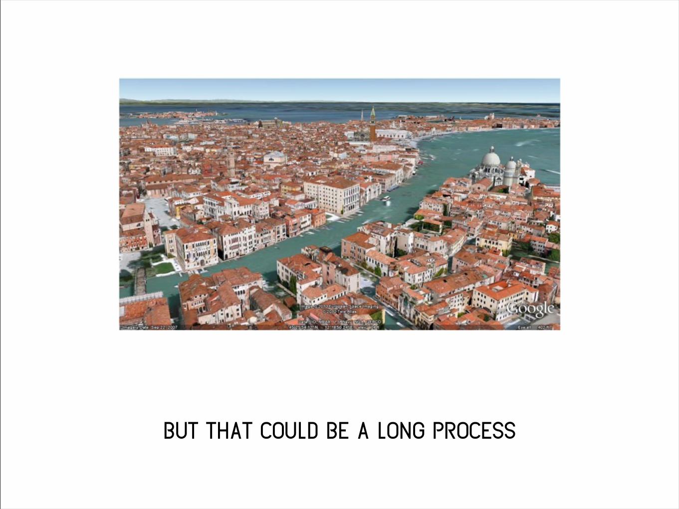
but that could be a long process

and we want results now

because we are lazy.


1. outlines

This one should be obvious

but i think i can explain it so it makes
a deeper sense.

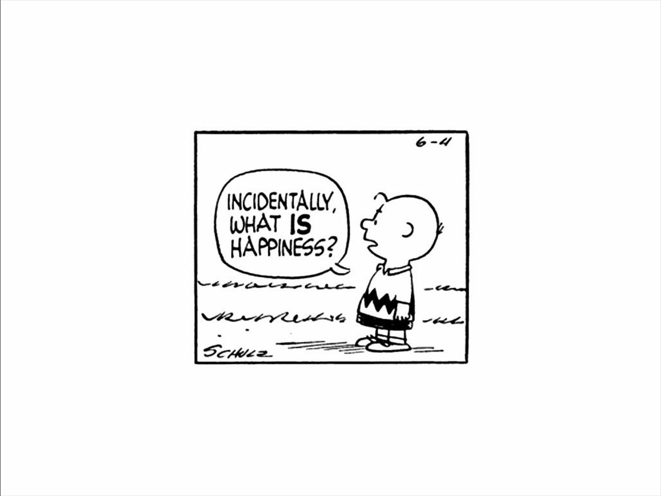
when we see the world, there aren’t any outlines

obviously

but when we draw,

unless we are very good,

we use outlines.


so we say that outlines make a rendering
“cartoon-y”
but you should know that
if your rendering has outlines,
it looks “bad cartoon-y”

here look.

here are some classic cartoons without
background outlines:

coyote & road runner
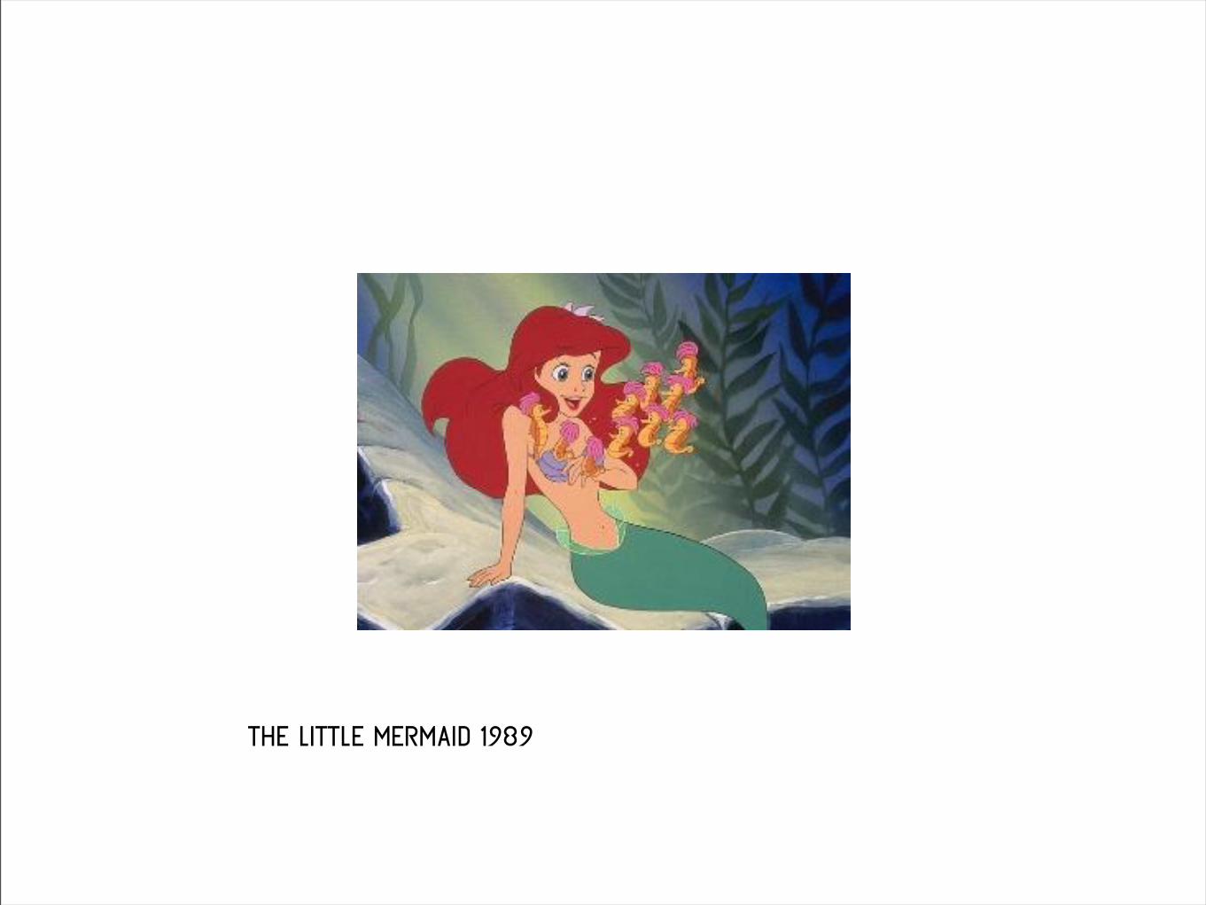
the little mermaid 1989

the iron giant 1999

samurai jack 2001

and here are some cartoons that feature
background outlines:


see the difference?

let’s see this in sketchup.

here we’ve got a gabion, with outlines.

and here is a gabion without outlines.

see the difference?

2. textures


we all know that the textures in sketchup suck.


they don’t harmonize with each other.
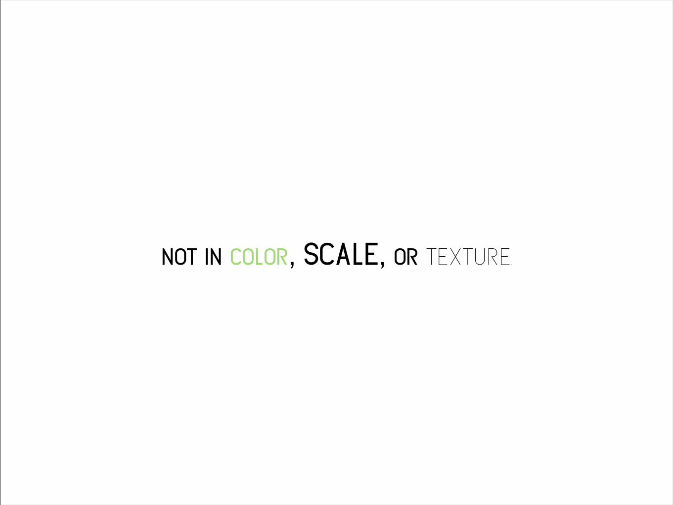
not in color, scale, or texture.

but we don’t do anything about it.


so let’s do something about it.

we can make our own textures.

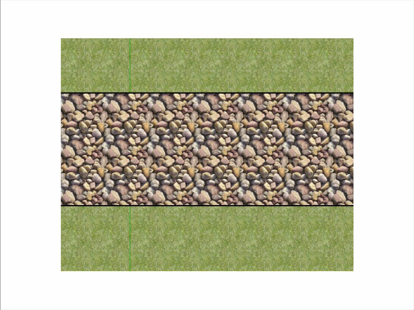
let’s look at that gabion again.

here i’ve used the closest
texture in sketchup
here i’ve pulled in an image
that i found on google.

here i’ve used the closest
texture in sketchup
here i’ve pulled in an image
that i found on google.

open the materials window
and click new texture
to import

that rock and that grass
don’t harmonize at all.
after editing in photoshop
these colors are cool
and pleasing.

but we can go a step further.

here, i’ve pulled in a gabion texture that i drew.


it isn’t quite the right scale, though.

so, i right clicked, and then i’ll click position.

i’m gonna click and drag on the green pin.

there, that looks better
[i scaled the grass, too].

and when we turn off the outlines.

it’s starting to look like something.


3. contours & landform

now we have a nice retaining wall.

but what are we retaining?

probably somekind of trapezoid like this.

like this.

we can do better.


we know that we can import autocad docs.

and we can also export autocad docs from illustrator.

and we all kicked ass in site construction.
so, with a little tweaking

we should be able to -

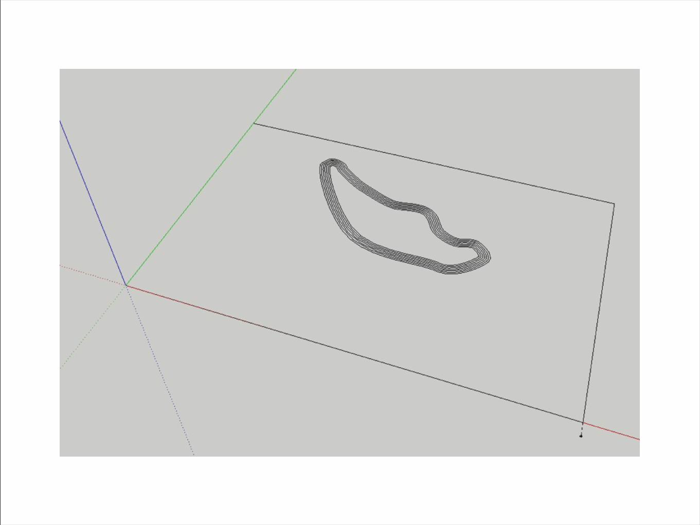

setting elevations with the move tool.
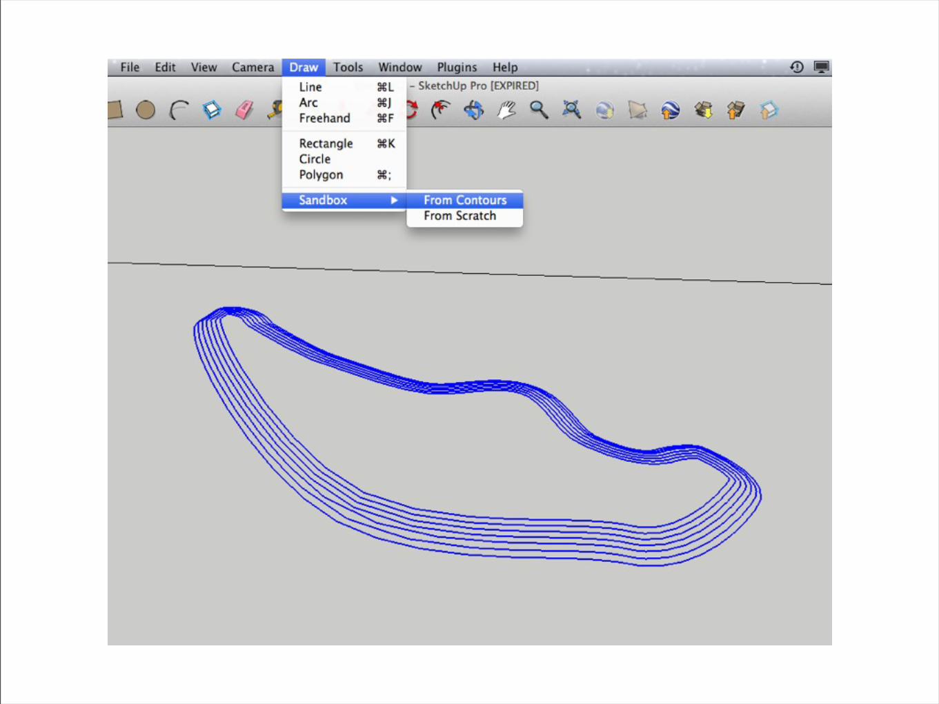

and when we’re finished,

we should be able to get some nice smooth landform.


that’s it for now.

try some of these techniques

and see what kind of results you get.

work together with your friends.


next time, we’ll try to build on this.

see you then.