somewhere over the rainbow: an empirical assessment of...
TRANSCRIPT

Somewhere Over the Rainbow: An Empirical Assessmentof Quantitative Colormaps
Yang LiuUniversity of Washington
Seattle, WA, [email protected]
Jeffrey HeerUniversity of Washington
Seattle, WA, [email protected]
ABSTRACTAn essential goal of quantitative color encoding is the accuratemapping of perceptual dimensions of color to the logical struc-ture of data. Prior research identifies weaknesses of “rainbow”colormaps and advocates for ramping in luminance, whilerecent work contributes multi-hue colormaps generated usingperceptually-uniform color models. We contribute a compar-ative analysis of different colormap types, with a focus oncomparing single- and multi-hue schemes. We present a suiteof experiments in which subjects perform relative distancejudgments among color triplets drawn systematically fromeach of four single-hue and five multi-hue colormaps. Wecharacterize speed and accuracy across each colormap, andidentify conditions that degrade performance. We also findthat a combination of perceptual color space and color namingmeasures more accurately predict user performance than eitheralone, though the overall accuracy is poor. Based on theseresults, we distill recommendations on how to design moreeffective color encodings for scalar data.
ACM Classification KeywordsH.5.m. Information Interfaces and Presentation (e.g. HCI):Miscellaneous
Author KeywordsColormaps; Color Models; Graphical Perception;Visualization; Quantitative Methods; Lab Study.
INTRODUCTIONThe rainbow colormap – a scheme spanning the most saturatedcolors in the spectrum – has been a staple (or depending onone’s perspective, eyesore) of visualization practice for manyyears. Despite its popularity, researchers have documented anumber of deficiencies that may hinder accurate reading ofthe visualized data [4, 26, 36, 42]. They raise the followingcriticisms: the rainbow colormap is unfriendly to color-blindusers [26], it lacks perceptual ordering [4], it fails to capture
Permission to make digital or hard copies of all or part of this work for personal orclassroom use is granted without fee provided that copies are not made or distributedfor profit or commercial advantage and that copies bear this notice and the full citationon the first page. Copyrights for components of this work owned by others than ACMmust be honored. Abstracting with credit is permitted. To copy otherwise, or republish,to post on servers or to redistribute to lists, requires prior specific permission and/or afee. Request permissions from [email protected] 2018, April 21–26, 2018, Montréal, QC, Canada.Copyright is held by the owner/author(s). Publication rights licensed to ACM.ACM ISBN 978-1-4503-5620-6/18/04 ...$15.00.http://dx.doi.org/10.1145/3173574.3174172
(a) (b) (c)
Figure 1: Colormaps under study. We evaluate four single-hue, three perceptually-uniform multi-hue, a diverging, anda rainbow colormap(s). We divide them into (a) assorted,(b) single-hue and (c) multi-hue groups, with two colormapsrepeated across groups for replication.
the nuances of variations for data with high spatial frequen-cies [36], and it is ineffective at conveying gradients due tobanding effects at hue boundaries [4, 42].
Each of these problems may be traced to a naïve rampingthrough the space of color hues. In response, a common colordesign guideline for scalar quantitative data is to use a single-hue colormap that ramps primarily in luminance [6] (fromdark to light, or vice versa). Changes in luminance providea strong perceptual cue for ordering, consistent across indi-viduals and cultures. Moreover, the human visual system hashigher-resolution processing pathways for achromatic visionthan for chromatic vision [23], supporting discrimination ofhigher spatial frequencies in the luminance channel.
These considerations raise a natural question: are the abovecriticisms specific to the rainbow colormap, or do they applyto multi-hue colormaps more generally? Defenders of rainbowand other multi-hue colormaps may cite not only aesthetic con-cerns, but also a potential for increased visual discrimination.By ramping through hue in addition to luminance, might view-ers benefit from greater color separation across a colormap andthereby discern both small and large value differences morereliably? New multi-hue colormaps – the viridis colormapand its variants [38] – have recently been adopted by manyvisualization tools as a replacement for rainbow colormaps.These colormaps were formed by tracing curves through aperceptually-uniform color model, simultaneously ramping inboth hue and luminance, while avoiding red-green contrast torespect the most common form of color vision deficiency.
Though existing guidelines and designs for quantitative colorderive from both first principles and experience, they have notbeen comprehensively evaluated. In this work, we investigate

the efficacy of a range of colormaps for encoding quantitativeinformation. We examine a space of colormaps including arainbow colormap, single-hue colormaps that vary primarilyin luminance, multi-hue colormaps that vary both in hue andluminance, and (for comparison) a diverging colormap thatcombines opposing single-hue colormaps to convey distancefrom a neutral mid-point.
Our primary contribution is a comparative performance profileof quantitative color encodings. We analyze the speed andaccuracy of each colormap in supporting relative similarityjudgments across varying scale locations and value spans. Wefind that, when judiciously designed, single- and multi-hue col-ormaps both support accurate decoding. However, we find thatsingle-hue colormaps exhibit higher error over small data valueranges, supporting the argument that multi-hue colormaps canprovide improved resolution. In addition, we identify con-ditions that degrade accuracy across colormaps, notably thatdark regions set against a white background afford much worsecolor discrimination than that predicted by perceptual colorspace models. We also confirm that a naïve rainbow colormapperforms the worst among all colormaps considered. Theseresults provide guidance for selecting effective quantitativecolormaps and further improving their design.
As a secondary contribution, we construct statistical modelsto predict user performance on triplet comparions tasks, basedon color theory measures. We consider both perceptual colorspaces such as CIE LAB [24] and CAM02-UCS [28], as wellas a model of color naming [21]. We find that combiningperceptual measures with color naming measures leads tohigher predictive accuracy than either alone. However, we alsoobserve that our models fail to account for a large proportionof the variance observed in our experiments, suggesting theneed for future work on refined color measures applicable toautomated design and evaluation.
RELATED WORKWe draw on both the century-long research on color theory,and more recent work on colormap design and evaluation.
Color ModelsPerceptually-uniform color spaces attempt to model equal per-ceptual differences as equal distances in a vector space [43].The color science community has progressively refined a seriesof models for improved estimation accuracy over a wider vari-ety of viewing conditions. Example models include CIELAB[24], ∆E94 [30], DE2000 [29], and CAM02-UCS [28].
Despite being one of the earliest perceptually uniform models,CIELAB remains a popular choice in visualization research(e.g. [25, 40]), thanks to its relatively simple color distancecalculation equation, which is the L2 Euclidean norm betweentwo points in the space. CAM02-UCS is a recent variantthat builds upon the CIECAM02 color appearance model andprovides better estimation of lightness and hue. Dozens ofempirical datasets, which contain pairs of color differencevalues with an average of 10 ∆E∗
ab units, were employed inthe development of the CAM02-UCS model. In this paper,we use CIELAB and CAM02-UCS for our analyses. We usethe LAB implementation of D3 [5], which assumes a D65
standard illuminant as the white point. For CAM02-UCS, weuse Connor Gramazio’s JavaScript implementation [16].
While uniform color models offer useful approximations ofperceived color difference, they omit factors that may influ-ence color perception. Properties of the color stimuli, suchas the size of the color patches [10, 39], the spatial distancebetween two colors [9], and the geometric mark types [40] canmodulate color discriminability. In addition, the surroundingcontext in which the color is presented can result in large dis-tortions of color perception due to simultaneous contrast [7,11, 42]. Even when model predictions rigorously align withperceived differences, color distance models do not accountfor visual aesthetic experiences as in color harmony [11] andaesthetic preference [32] theories. Demographics and colorvision variations of the viewers may also affect our ability todiscriminate colors [34]. In our experiments, where possiblewe seek to control factors that may interfere with color per-ception, but we acknowledge we have limited environmentalcontrol given our use of crowdsourcing platforms.
In addition to perceptual modeling efforts, psychologists haveinvestigated the extent to which the linguistic labels assignedto colors shape our perception (see Regier & Kay [33] for asurvey). A number of controlled experiments find that colornaming can affect categorization and memory. For example,Russian speakers may more quickly discriminate two differentshades of blue, as the Russian vocabulary contains two basiccolor terms for blue [45].
To quantify the association of names to color, researchers haveproposed various models. Chuang et al. [12] formulate a non-parametric probabilistic model and introduce a measure ofname saliency based on the entropy of the probability distri-bution. Heer & Stone [21] extend this model to introducesimilarity metrics of color names, and contribute a mappingbetween colors and names by applying the model to a largeweb survey containing over 3 million responses. We use theirmodel in our analyses of color naming in this paper. Thesemodels provide measures to quantitatively analyze categoricalperception effects due to color names.
Colormap Design & EvaluationAs color is an important visual channel in visualization, thedesign of appropriate colormaps has received much attention(see [37] or [46] for surveys). Predefined colormaps are devel-oped based on perceptual and cognitive heuristics, designerexperience, application of color models, empirical data fromexperiments, or a combination thereof. For example, the Col-orBrewer [18] schemes are informed by color theory, with thefinal colors hand-tuned for aesthetic appearance. The designof the viridis [38] colormap focuses on perceptual uniformity,ramping in both hue and luminance through equal steps in theCAM02-UCS color space.
A number of interactive systems and algorithms also existto aid users in constructing or selecting color schemes. Theearly PRAVDA system [3] takes into consideration data types,anticipated tasks, and perceptual properties when recommend-ing appropriate colormaps. Subsequent research focuses onperceptual saliency [25], separation [19], semantic resonance

of color/category associations [27], visual aesthetics [41] andenergy consumption of display devices [13]. Colorgorical [17]combines the scores of perceptual distances, color names, andaesthetic models to automatically generate categorical palettes.
Prior work has also sought to empirically evaluate univari-ate quantitative color encodings [7, 20, 31]. Ware [42] con-ducts multiple experiments to evaluate (1) how accurately dopeople extract metric information from color encodings and(2) how well do colormaps preserve the form, or gradientof the underlying data. A recent work by Ware et al. [44]compares six colormaps, testing the highest visible spatialfrequencies at varying locations. Brewer et al. [8] evaluateeight discrete schemes in supporting visualization tasks onchoropleth maps. While we also provide a comparative analy-sis of quantitative colormaps, we instead focus on comparingsingle- and multi-hue colormaps in supporting similarity judg-ments. The “Which Blair Project” [35] develops an interestingperceptual method to evaluate luminance monotonicity of col-ormaps, which relies on our ability to distinguish human faces.Kindlmann et al. [22] further extend the idea to propose atechnique for luminance matching. These two studies focuson luminance; here we are interested in assessing judgmentperformance across both hue and luminance.
EXPERIMENTAL METHODSOur objective was to assess the effectiveness of each colormapfor encoding scalar information. As prior work establishes thatcolor is a poor visual channel for precise magnitude estima-tion [14], we are less interested in how well people extract theexact metric quantity from the colormap. Instead, we focus onordinal judgments of relative difference: given a reference datapoint, how well can people judge which other points are mostsimilar? We carried out a suite of three experiments to com-pare the perception of relative distances encoded by colormaps.Each experiment focused on a subset of colormaps in a within-subjects design; we ran a separate experiment for each groupof colormaps in order to mitigate fatigue effects. To check therobustness of our results, we replicated two colormaps acrossgroups. The general methods of each experiment are identical.
TaskOur experiments used an ordinal triplet judgment task: givena reference color and two alternative stimuli sampled on eitherside of the reference, participants judged which of the responsestimuli is closest in distance to the reference. We selectedthis task for multiple reasons. First, compared to direct valueestimation, a binary forced-choice response shifts the emphasisto more rapid, perceptual judgments. We are less interestedin value estimation because other visual channels, such asposition and length, are far superior than color in this task [14].For example, viewers of a choropleth map of employment datalikely spend more time comparing colored regions than theydo resolving these to absolute values, answering questionssuch as “which U.S. state has a rate most similar to Michigan:Wisconsin or Ohio?” Second, compared to a simpler pair-wiseordinal task (i.e., participants see two stimuli and judge whichrepresents a larger value), triplets allow us to assess distance,not just ranking relationships. Triplet judgments are more
Figure 2: Experiment interface. Participants see a referencestimulus along with two choices, and pick which of thesealternatives is closer in distance to the reference.
difficult than simple rank-order judgments, and so more likelyto reveal discrepancies in colormap performance.
A color legend was included for reference in each presenta-tion. We supplied the legend because legends influence colorjudgments in real world visualization tasks, potentially withconflicts between what one perceives with the colors aloneand what one effortfully “reads” from the legend.
StimuliWe included four single-hue and five multi-hue colormaps inour studies, grouped into the three sets shown in Figure 1. Weuse the term single-hue to denote colormaps varying primar-ily in luminance. Due to hand-tuning, the ColorBrewer [18]sequential colormaps we chose have subtle variations in hue,with the exception of greys. The first group (assorted col-ormaps) aimed to compare representative colormaps fromfour distinct types, following an extended version of Brewer’staxonomy [6]. We picked viridis from the multi-hue sequentialtype, blues from the single-hue sequential type, blueorangefrom the diverging type, and jet – long the default in MAT-LAB – to represent rainbow colormaps. The other groupsfocus on single-hue and multi-hue sequential variants. Thesecond group (single-hue colormaps) includes greys (a base-line condition with purely achromatic shades), along withblues, greens, and oranges, three hues that occupy relativelyopposing regions of LAB space. The third group (multi-hueUCS colormaps) includes multi-hue colormaps created usingthe UCS color space: viridis, magma, and plasma.
We rendered each visual stimulus as a 50× 50 pixel colorsquare against a white background. Admittedly, placing largecolor patches on a uniform background differs from manyreal-world heatmaps, and one might see additional effects inscalar field contexts (e.g., due to gradients). For this study, wechose to stay closer to the conditions for which the underlyingcolor models are defined, contributing an actionable baselinefor comparing colormaps and a comparison point for futurestudies. We controlled the size of the color patches, the back-ground color, and the spatial layout of the stimuli to mitigate
potential confounds with mark size, simultaneous contrast,and spatial distance [9, 39]. We focused on white backgroundsas they are most common in both print and on-screen.
We generated the trial stimuli for each colormap in the fol-lowing way. Assuming a data domain of [0,100], we firstsampled reference points along uniform data value steps of10 units along the color scale. For each reference point, wethen sampled comparison values: one of lower value than thereference, and one higher. In each trial, one of these points issystematically farther away than the other.
We generated comparison points offset from the referencepoint using spans (total difference between highest and lowestpoint) of 15, 30, and 60. We included two trials for eachcombination of reference and span: one in which the lowervalue is nearer the reference, and vice versa. As a concreteexample, for a reference of 50 and span 60 the sampled tripletsare (30, 50, 90) and (10, 50, 70). To encourage a similardifficulty across spans, we adopted the logic of the Weber-Fechner Law [15], which predicts that the perceived changeis in constant ratio to the intensity of the initial stimuli. Inour case, we placed the more distant response stimulus attwice the distance (in data units) from the nearer. Pilot studiesconfirmed that this choice resulted in reasonable yet suitablydifficult tasks; an earlier iteration with an offset half this sizeresulted in roughly double the error rate.
After generating all triplets, we discarded reference/span com-binations with values outside the [0,100] domain. This re-sulted in too few trials in the span 60 condition, so we intro-duced two additional reference values (45, 55) for this spanlevel only. This procedure produced 42 trials per colormap.
ParticipantsWe recruited subjects via Amazon’s Mechanical Turk (MTurk)crowdsourcing platform. Prior research has established the va-lidity of crowdsourcing experiments for controlled quantitativemodeling in color perception [34, 40]. While we sacrificedcontrol over monitor display and situational lightning con-ditions, we gained samples from a wider variety of displayconditions in the real-world web user population. In addi-tion, the variance introduced by viewing conditions is partlyaccounted for by per-subject random terms in our statisticalmodels. Each experiment run was implemented as a singleHuman Intelligent Task (HIT) to ensure a within-subjects de-sign. We restricted the participants to be within the UnitedStates and to have an acceptance rate over 95%.
ProcedureWe first screened the participants for color vision deficienciesusing four Ishihara plates. As factors including uncalibrateddisplays and image compression can make Ishihara plates un-reliable, we also stated in the consent page that participantsmust have normal color vision. The participants then read a tu-torial page with a sample question, which encouraged them touse the color legend, explaining that the correct answer shouldbe deduced from value differences in the legend. Prior to theexperiment, we administrated a practice session consisting of5 trials from an irrelevant colormap to reduce learning effects.
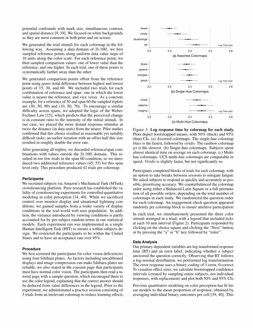
3.2 3.3 3.4 3.5 3.6
blues
viridis
blueorange
jet Log Time (ms)
(a) Assorted Colormaps
3.2 3.3 3.4 3.5 3.6
blues
greens
oranges
greys Log Time (ms)
(b) Single-Hue Colormaps
3.2 3.3 3.4 3.5 3.6
viridis
plasma
magma Log Time (ms)
(c) Multi-Hue Colormaps
Figure 3: Log response time by colormap for each study.Plots depict bootstrapped means, with 50% (thick) and 95%(thin) CIs. (a) Assorted colormaps. The single-hue colormapblues is the fastest, followed by viridis. The rainbow colormapjet is the slowest. (b) Single-hue colormaps. Subjects spentalmost identical time on average on each colormap. (c) Multi-hue colormaps. UCS multi-hue colormaps are comparable inspeed. Viridis is slightly faster, but not significantly so.
Participants completed blocks of trials for each colormap, withan option to take breaks between sessions to mitigate fatigue.We asked subjects to respond as quickly and accurately as pos-sible, prioritizing accuracy. We counterbalanced the colormaporder using either a Balanced Latin Square or a full permuta-tion of all possible orders, depending on the total number ofcolormaps in each study. We randomized the question orderfor each colormap. An engagement check question appearedrandomly per colormap block to ensure attentive participation.
In each trial, we simultaneously presented the three colorstimuli arranged in a triad, with a legend that included ticksat each 10 unit interval (Figure 2). Participants responded byclicking on the choice square and clicking the “Next” button,or by pressing the “a” or “b” key followed by “enter”.
Data AnalysisOur primary dependent variables are log-transformed responsetime (RT) and an error label, indicating whether a subjectanswered the question correctly. Observing that RT followsa log-normal distribution, we performed log transformation.The error response uses a binary coding of 1:error, 0:correct.To visualize effect sizes, we calculate bootstrapped confidenceintervals (created by sampling entire subjects, not individualresponses, with replacement) and plot both 50% and 95% CIs.
Previous quantitative modeling on color perception has fit lin-ear models to the mean proportion of response, obtained byaveraging individual binary outcomes per cell [39, 40]. This
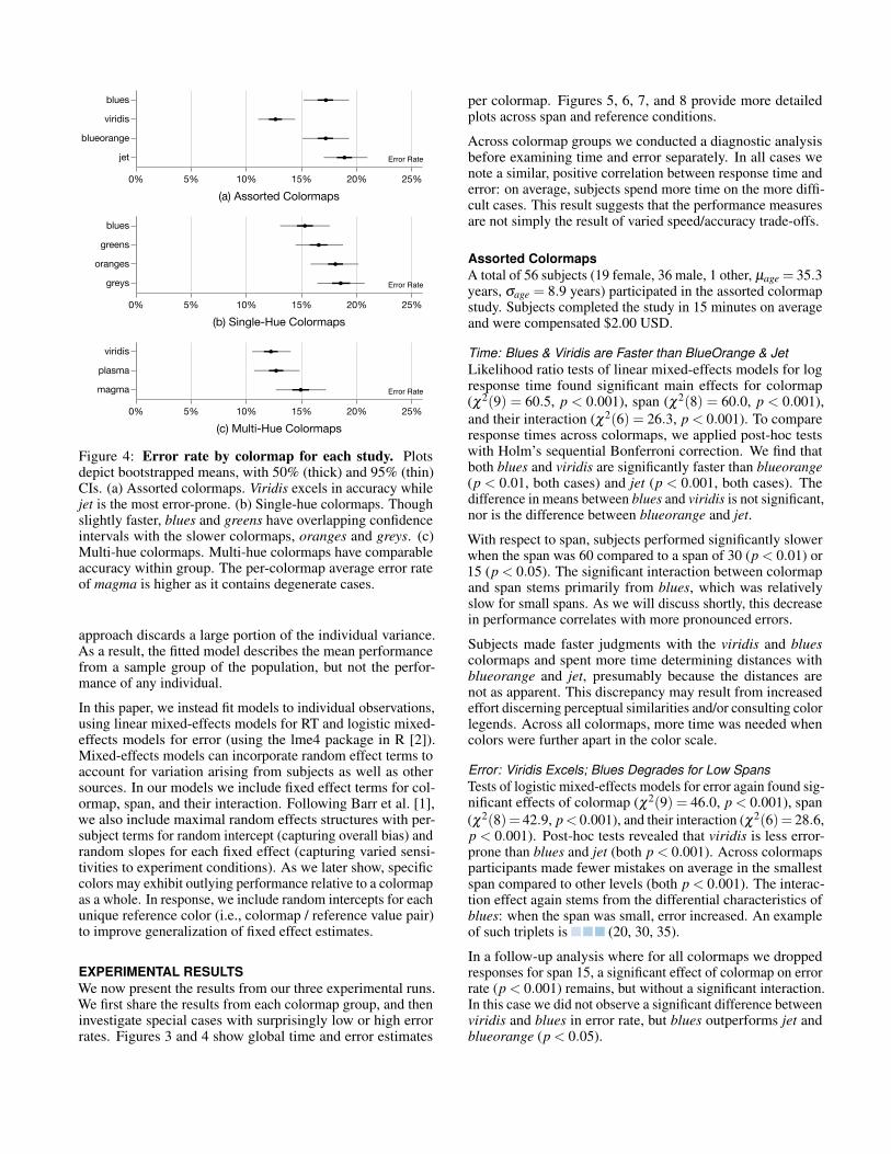
0% 5% 10% 15% 20% 25%
blues
viridis
blueorange
jet Error Rate
(a) Assorted Colormaps
0% 5% 10% 15% 20% 25%
blues
greens
oranges
greys Error Rate
(b) Single-Hue Colormaps
0% 5% 10% 15% 20% 25%
viridis
plasma
magma Error Rate
(c) Multi-Hue Colormaps
Figure 4: Error rate by colormap for each study. Plotsdepict bootstrapped means, with 50% (thick) and 95% (thin)CIs. (a) Assorted colormaps. Viridis excels in accuracy whilejet is the most error-prone. (b) Single-hue colormaps. Thoughslightly faster, blues and greens have overlapping confidenceintervals with the slower colormaps, oranges and greys. (c)Multi-hue colormaps. Multi-hue colormaps have comparableaccuracy within group. The per-colormap average error rateof magma is higher as it contains degenerate cases.
approach discards a large portion of the individual variance.As a result, the fitted model describes the mean performancefrom a sample group of the population, but not the perfor-mance of any individual.
In this paper, we instead fit models to individual observations,using linear mixed-effects models for RT and logistic mixed-effects models for error (using the lme4 package in R [2]).Mixed-effects models can incorporate random effect terms toaccount for variation arising from subjects as well as othersources. In our models we include fixed effect terms for col-ormap, span, and their interaction. Following Barr et al. [1],we also include maximal random effects structures with per-subject terms for random intercept (capturing overall bias) andrandom slopes for each fixed effect (capturing varied sensi-tivities to experiment conditions). As we later show, specificcolors may exhibit outlying performance relative to a colormapas a whole. In response, we include random intercepts for eachunique reference color (i.e., colormap / reference value pair)to improve generalization of fixed effect estimates.
EXPERIMENTAL RESULTSWe now present the results from our three experimental runs.We first share the results from each colormap group, and theninvestigate special cases with surprisingly low or high errorrates. Figures 3 and 4 show global time and error estimates
per colormap. Figures 5, 6, 7, and 8 provide more detailedplots across span and reference conditions.
Across colormap groups we conducted a diagnostic analysisbefore examining time and error separately. In all cases wenote a similar, positive correlation between response time anderror: on average, subjects spend more time on the more diffi-cult cases. This result suggests that the performance measuresare not simply the result of varied speed/accuracy trade-offs.
Assorted ColormapsA total of 56 subjects (19 female, 36 male, 1 other, µage = 35.3years, σage = 8.9 years) participated in the assorted colormapstudy. Subjects completed the study in 15 minutes on averageand were compensated $2.00 USD.
Time: Blues & Viridis are Faster than BlueOrange & JetLikelihood ratio tests of linear mixed-effects models for logresponse time found significant main effects for colormap(χ2(9) = 60.5, p < 0.001), span (χ2(8) = 60.0, p < 0.001),and their interaction (χ2(6) = 26.3, p < 0.001). To compareresponse times across colormaps, we applied post-hoc testswith Holm’s sequential Bonferroni correction. We find thatboth blues and viridis are significantly faster than blueorange(p < 0.01, both cases) and jet (p < 0.001, both cases). Thedifference in means between blues and viridis is not significant,nor is the difference between blueorange and jet.
With respect to span, subjects performed significantly slowerwhen the span was 60 compared to a span of 30 (p < 0.01) or15 (p < 0.05). The significant interaction between colormapand span stems primarily from blues, which was relativelyslow for small spans. As we will discuss shortly, this decreasein performance correlates with more pronounced errors.
Subjects made faster judgments with the viridis and bluescolormaps and spent more time determining distances withblueorange and jet, presumably because the distances arenot as apparent. This discrepancy may result from increasedeffort discerning perceptual similarities and/or consulting colorlegends. Across all colormaps, more time was needed whencolors were further apart in the color scale.
Error: Viridis Excels; Blues Degrades for Low SpansTests of logistic mixed-effects models for error again found sig-nificant effects of colormap (χ2(9) = 46.0, p < 0.001), span(χ2(8)= 42.9, p< 0.001), and their interaction (χ2(6)= 28.6,p < 0.001). Post-hoc tests revealed that viridis is less error-prone than blues and jet (both p < 0.001). Across colormapsparticipants made fewer mistakes on average in the smallestspan compared to other levels (both p < 0.001). The interac-tion effect again stems from the differential characteristics ofblues: when the span was small, error increased. An exampleof such triplets is (20, 30, 35).
In a follow-up analysis where for all colormaps we droppedresponses for span 15, a significant effect of colormap on errorrate (p < 0.001) remains, but without a significant interaction.In this case we did not observe a significant difference betweenviridis and blues in error rate, but blues outperforms jet andblueorange (p < 0.05).
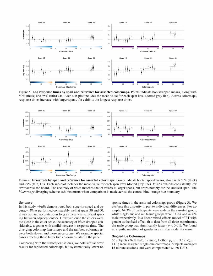
3.2
3.3
3.4
3.5
3.6Lo
g Ti
me
(ms)
0 50 100
Span: 15
0 50 100
Span: 30
0 50 100
Span: 60
Colormap: Blue
3.2
3.3
3.4
3.5
3.6
0 50 100
Span: 15
0 50 100
Span: 30
0 50 100
Span: 60
Colormap: Viridis
3.2
3.3
3.4
3.5
3.6
Log
Tim
e (m
s)
0 50 100
Span: 15
0 50 100
Span: 30
0 50 100
Span: 60
Colormap: BlueOrange
3.2
3.3
3.4
3.5
3.6
0 50 100
Span: 15
0 50 100
Span: 30
0 50 100
Span: 60
Colormap: Jet
Figure 5: Log response times by span and reference for assorted colormaps. Points indicate bootstrapped means, along with50% (thick) and 95% (thin) CIs. Each sub-plot includes the mean value for each span level (dotted grey line). Across colormaps,response times increase with larger spans. Jet exhibits the longest response times.
0%
10%
20%
30%
40%
50%
Erro
r Rat
e
0 50 100
Span: 15
0 50 100
Span: 30
0 50 100
Span: 60
Colormap: Blue
0%
10%
20%
30%
40%
50%
0 50 100
Span: 15
0 50 100
Span: 30
0 50 100
Span: 60
Colormap: Viridis
0%
10%
20%
30%
40%
50%
Erro
r Rat
e
0 50 100
Span: 15
0 50 100
Span: 30
0 50 100
Span: 60
Colormap: BlueOrange
0%
10%
20%
30%
40%
50%
0 50 100
Span: 15
0 50 100
Span: 30
0 50 100
Span: 60
Colormap: Jet
Figure 6: Error rate by span and reference for assorted colormaps. Points indicate bootstrapped means, along with 50% (thick)and 95% (thin) CIs. Each sub-plot includes the mean value for each span level (dotted grey line). Viridis exhibits consistently lowerror across the board. The accuracy of blues matches that of viridis at larger spans, but drops notably for the smallest span. Theblueorange diverging scheme exhibits errors when comparison is made across the central blue-orange hue boundary.
SummaryIn this study, viridis demonstrated both superior speed and ac-curacy. Blues performed comparably well at spans 30 and 60:it was fast and accurate so as long as there was sufficient spac-ing between adjacent colors. However, once the colors weretoo close in the color scale, the accuracy of blues dropped con-siderably, together with a mild increase in response time. Thediverging colormap blueorange and the rainbow colormap jetwere both slower and more error-prone. We examine specialcases affecting these latter two colormaps later in the paper.
Comparing with the subsequent studies, we note similar errorresults for replicated colormaps, but systematically lower re-
sponse times in the assorted colormaps group (Figure 3). Weattribute this disparity in part to individual differences. For ex-ample, 64.3% of participants were male in the assorted group,while single-hue and multi-hue groups were 33.9% and 42.6%male respectively. In a linear mixed-effects model of RT withgender as the fixed effect, fit to data from all three experiments,the male group was significantly faster (p < 0.01). We foundno significant effect of gender in a similar model for error.
Single-Hue Colormaps56 subjects (36 female, 19 male, 1 other, µage = 37.2, σage =11.1) were assigned single-hue colormaps. Subjects averaged15 minute sessions and were compensated $1.60 USD.

0%
10%
20%
30%
40%
50%Er
ror R
ate
0 50 100
Span: 15
0 50 100
Span: 30
0 50 100
Span: 60
Colormap: Blue
0%
10%
20%
30%
40%
50%
0 50 100
Span: 15
0 50 100
Span: 30
0 50 100
Span: 60
Colormap: Green
0%
10%
20%
30%
40%
50%
Erro
r Rat
e
0 50 100
Span: 15
0 50 100
Span: 30
0 50 100
Span: 60
Colormap: Orange
0%
10%
20%
30%
40%
50%
0 50 100
Span: 15
0 50 100
Span: 30
0 50 100
Span: 60
Colormap: Grey
Figure 7: Error rate by span and reference for single-hue colormaps. Points indicate bootstrapped means, along with 50%(thick) and 95% (thin) CIs. Each sub-plot includes the mean value for each span level (dotted grey line). All single-hue colormapssimilarly suffer from resolution issues when the span is small. Greys degenerates in low luminance regions.
0%
10%
20%
30%
40%
50%
Erro
r Rat
e
0 50 100
Span: 15
0 50 100
Span: 30
0 50 100
Span: 60
Colormap: Viridis
0%
10%
20%
30%
40%
50%
Erro
r Rat
e
0 50 100
Span: 15
0 50 100
Span: 30
0 50 100
Span: 60
Colormap: Plasma
0%
10%
20%
30%
40%
50%
Erro
r Rat
e
0 50 100
Span: 15
0 50 100
Span: 30
0 50 100
Span: 60
Colormap: Magma
Figure 8: Error rate by span and reference for multi-hueUCS colormaps. Points indicate bootstrapped means, with50% (thick) and 95% (thin) CIs. Each sub-plot includes themean value for each span level (dotted grey line). We observesimilar dynamics across colormaps. Performance degrades inthe dark region of magma, and to a lesser extent of plasma.
Time: No Differences in Single-Hue ResponsesIn a linear mixed-effects model of RT, we found a signifi-cant effect of span (χ2(8) = 39.9, p < 0.001), but not forcolormap or their interaction. This result is consistent withthe per-colormap means plotted in Figure 3: participants havesimilar response times (∼ 103.39 = 2,454 milliseconds) foreach colormap in the single-hue group.
Error: Single-Hue Colormaps Suffer from Low ResolutionTests with a logistic mixed-effects model of error found asignificant effect of span (χ2(8) = 86.0, p < 0.001), but nosignificant colormap or interaction effect. This result is con-sistent with Figure 4: despite lower means, 95% CIs for bluesand greens overlap with those for oranges and greys. Lookingacross studies, we see very similar error profiles for blues inFigures 6 and 7, indicating successful replication.
Post-hoc comparisons confirmed that error rates for span 15are significantly higher than span 30 (p < 0.05) or span 60(p < 0.05). This result corroborates the increased errors forblues in low-span cases in the prior study, and extends it to alarger family of single-hue colormaps. These colormaps sufferfrom poor resolution for nearer value comparisons.
To further test this claim, we calculated the LAB distances be-tween the reference stimulus and the two choices respectively,and subtracted them to obtain a difference measure in unitsof ∆E. We found that in low-span conditions where accuracyplummets, the ∆E difference is around 5, close to the just-noticeable difference (JND) found in practical situations [39,40]. Though the ∆E between each stimulus is large enough forthe colors to be distinguishable, the difference in ∆E betweenpairs is hard to discriminate, leading to increased error.
Multi-Hue UCS Colormaps54 subjects (31 female, 23 male, µage = 36.7, σage = 10.1)participated in the multi-hue colormap study. We discarded

data from 1 subject (2%) due to missing responses. Subjectsaveraged 12 minute sessions and paid $1.20 USD.
Time & Error: Multi-Hue Colormaps are ComparableAnalysis of the multi-hue UCS colormaps detected no signifi-cant differences between colormaps in terms of either responsetime or error rate. Figure 3 shows that the mean response timesalign around 2.82 seconds (103.45 milliseconds). Similarly, themean error rates of viridis and plasma are slightly lower thanthat of magma, but exhibit overlapping 95% CIs (Figure 4).The more detailed plots in Figure 8 reveal spikes in error ratefor magma, and to a lesser extent plasma, around low referencevalues. We examine this issue further in the next section.
Multi-Hue UCS Colormaps have Lowest Error Across StudiesComparing across studies, the error profiles for viridis in Fig-ures 6 and 8 are quite similar, indicating successful replication.We see that across studies the UCS colormaps exhibit thelowest error rates, though with slightly longer response times.
Analysis of Special CasesThe above section analyzes colormaps in terms of their meanperformance, with models that include random effects to ac-count for some of the larger swings among specific referencepoints. Here we perform a complementary analysis, investigat-ing the specific conditions in which error rates are surprisinglyhigh or low. We take a closer look at (1) error increases inlow luminance conditions (greys, magma, plasma), (2) theperformance of the diverging blueorange colormap, and (3) aspecial case where jet – the colormap with worst performanceoverall – exhibits extremely low error.
Performance Degrades in Low Luminance RegionsAn obvious abnormality across studies and colormaps is adramatic increase of error rates in the black regions, particu-larly greys, magma, and, to a lesser degree, plasma (Figures 7and 8). For example, the magma triplets (0, 10, 15)and (5, 10, 20) exhibit high error. The affected condi-tions all involve small values in the luminance channel; thelow luminance level appears to afford much worse color dis-crimination than that predicted by either the LAB or UCSperceptual models. This observation is likely specific to ourchoice of a white background, with the high contrast impedingthe discrimination of dark shades. We hypothesize that ananalogous shortcoming will occur for high luminance shadesset against a dark background.
BlueOrange Suffers when Values Straddle the Mid-PointA closer look at blueorange suggests a primary source oferrors (Figure 6). When all three triplet colors lie on a single-hue half of blueorange, the performance closely matches thatof the corresponding single-hue colormap. For example, thefirst three points in the small span plot of blueorange averageabout 10%, similar to the mean error rates of blues for themedium span (Figure 6, 7). Note that we double the spanto compare to single-hue colormaps, as each hue takes upone-half of the range of the diverging colormap. As indicatedby the high error rates in the middle of blueorange, subjectswere prone to mistakes when making comparisons across theblue-orange boundary. A representative triplet is (50,60, 80), where the lower, achromatic option is closer than the
similarly-hued, but much more saturated, option. This resultsuggests that diverging colormaps may be less accurate insituations involving comparisons with the mid-point, perhapsdue to erroneous grouping of chromatic colors versus a nearerachromatic color.
Where the Rainbow Shines: Color Name AssociationThough the majority of reference stimuli in jet lead to highererror than other colormaps, reference value 50 performs re-markably well at span 15 (Figure 6). In the small span con-dition this reference point has a mean error rate as low as3.5%, which is among the lowest in all observations! Thecorresponding color triplets are (40, 50, 55) and(45, 50, 60). These triplets lie in an isoluminant region of jet:there are no luminance cues that might suggest ordering. In-stead, these triplets happen to straddle color name boundariesthat align with the underlying value differences. Color namedistances [21] from the reference average 0.23 and 0.94 forthe nearer and further values, respectively. The first triplet hasmodal names of cyan versus two greens, while the secondtriplet has two greens versus yellow. This result suggeststhat categorical effects, or banding by name, can contribute toimproved discrimination if applied in the right direction and,conversely, may hamper perception if dischordant with thetrue value difference.
COLOR MODEL ANALYSISIn addition to empirical characterization of user performance,we would like to have a theoretical model. For example, givena previously untested colormap, might we predict its relativeperformance? If so, we could use the model to automaticallyoptimize colormap designs. To assess this question we con-struct a series of models that attempt to generalize beyond thespecific colormaps using a set of three color distance models:
• LAB: The CIELAB color space [24].• UCS: The CAM02-UCS uniform color space model [28].• Name: The color name model of Heer & Stone [21].
The first two color models (LAB and UCS) provide perceptualcolor spaces that approximately model perceptually uniformcolor distances. We include both for comparison. For LAB,we use Euclidean distance (∆E) to measure color distance.The third model (Name) is a model of categorical effects thatmeasures color difference by comparing the distributions ofobserved color terms (e.g., orange, blue, fuchsia) that peopleuse to label color swatches. The Name model is included tocapture categorical effects of color naming that may not bereflected by the perceptual models. Following prior work [21],we use a cosine distance measure between color term vectors.
To apply these measures to a triplet comparison task, we firstcompute the color model differences between the referencestimulus and the two response stimuli. We then calculate thedifference of the predicted color model distances; i.e., we sim-ply subtract the distance value for the correct answer from thedistance value for the incorrect answer. A negative differenceindicates that the correct answer (the more similar data value)is further away according to the distance measure. A positivedifference indicates a larger distance for the incorrect answer(the more dissimilar data value).

Model df AIC BIC logLik deviance
LAB 24 21668 21863 -10810 21619UCS 24 21665 21860 -10808 21617Name 24 21585 21781 -10769 21537UCS + Name 63 21308 21821 -10591 21182UCS * Name 288 21377 23723 -10401 20801
Table 1: Diagnostics for error models based on color modeldistances. Columns indicate degrees of freedom (df), AICand BIC model selection scores, log-likelihood (logLik) anddeviance. An additive model with UCS and color name dif-ference terms achieves the best balance of fit and parsimonyaccording to AIC and BIC scores (lower is better).
Error AnalysisTo predict error rates, we fit a logistic regression model. Weuse mixed-effects models with random effect terms for bothsubject (to account for variance due to individual differences)and colormap (each trial includes presentation of a color leg-end, and we account for this in order to estimate more gen-eralizable fixed effects). We use maximal random effectsstructures [1], with intercepts for each random effect and cor-responding random slope terms for each fixed effect.
We first assessed which form the predictor should take. Weexamined both direct use of color model difference estimates(a continuous, linear predictor) and binned factors based onquartile boundaries (a discrete, potentially non-linear predic-tor). All fitted models exhibit statistically significant fixedeffect estimates, via both Wald z-tests and Likelihood Ratiotests. The binned predictor leads to better models for all colordifference types: with improved fit (log-likelihood and de-viance) and lower model selection scores (AIC, BIC). As aresult, we focus on the discrete predictors.
Next, we compare these single-effect models to assess perfor-mance differences among color difference types. Which colormodel most accurately predicts performance? Table 1 showsthe resulting model diagnostics. We see that name differenceperforms the best according to all measures. The UCS modeloutperforms LAB, but by a miniscule margin. Overall, thedifferences between the three models are small.
We then fitted two-factor models that include perceptual andcategorical terms. For the perceptual term we chose UCSrather than LAB for two reasons. First, UCS performs slightlybetter than LAB as a single predictor. Second, the color namemodel internally applies a fine-grained discretization of theLAB color space, and so is likely to exhibit higher correlationwith LAB. We built models both with and without interactionterms. The last two rows of Table 1 show the resulting modeldiagnostics. Both models improve upon the single-factor mod-els in terms of fit and AIC score. The model with interactionterms exhibits improved fit (higher log-likelihood and lowerdeviance), but this is unsurprising given the greater degrees offreedom. The additive model has lower AIC and BIC scoresthan the full model, indicating a more parsimonious model.To avoid overfitting, we stop with the additive model.
Parameter Estimate Std. Error P-Value
Intercept -1.0848 0.1804 < 0.001 ***UCS_Q2 -0.4031 0.2043 0.048 *UCS_Q3 -0.5298 0.1618 0.001 **UCS_Q4 -0.4452 0.2482 0.073 .Name_Q2 -0.5009 0.1641 0.002 **Name_Q3 -0.6309 0.1621 < 0.001 ***Name_Q4 -0.6207 0.1336 < 0.001 ***
Table 2: Fixed effect parameter estimates and p-values for alogistic regression model (UCS + Name) of judgment error.Increasing UCS and Name difference lead to lower error, butthis effect attenuates in the highest quartile.
Table 2 shows the coefficients of the resulting model. Theintercept term is the logit value for triplets with difference val-ues residing in the first quartiles for both UCS and Name. Asthe color differences increase, we see increasingly negative co-efficients, indicating lower error rates. However, for both UCSand Name this trend tapers off for the highest quartile (Q4):relative to the earlier quartile (Q3), the error slightly increasesfor the largest color differences. This effect may stem fromissues with large distances in perceptual color spaces: percep-tually uniform color spaces were constructed in accordancewith empirical color discrimination judgments at a small scale(e.g., 10-20 ∆E [28]). As a result, longer scale distances inthese models are known to be more inaccurate.
How well do these color models predict user performanceoverall? To assess this question, we can use the additive modelto predict the average performance across all experimentalconditions. While this is “testing on the training data” and sonot a means of assessing generalization, it nevertheless servesas a useful diagnostic. Comparing the model’s predicted errorrates with the observed rates via standard linear regression,we achieve of an R2 value of 0.108. In other words, our fittedmodel only explains about 10% of the observed variance.
We can also examine model predictions for the average perfor-mance of each colormap: does our model rank the colormapsin an order similar to the observed error rates? The Spear-man rank correlation between the model predictions and theobserved empirical error rates (ρ = 0.45) is not high and notstatistically significant. In short, the fitted model does an un-satisfactory job of predicting overall colormap performance.
Time AnalysisTo analyze timing responses, we followed a similar procedureas we did for the error analysis, but using linear mixed-effectsmodels of the log-transformed response times rather than lo-gistic regression. Once again, the binned variants outperformthe linear predictors. For the single-factor models, UCS out-performs LAB, which outperforms Name. Comparing a fullmodel with UCS, Name, and interaction terms to a modelwithout an interaction term again finds that the full modelexhibits worse AIC and BIC scores.
Using the additive (UCS + Name) model to predict per-condition average response times in the log domain results in

an R2 value of 0.244, accounting for 24% of the observed vari-ance. The rank correlation of observed per-colormap averageresponses with model predictions (ρ = 0.67) is higher thanfor error, but again is not statistically significant.
SummaryCombining perceptual color models and color naming modelsleads to higher predictive accuracy for both time and errorthan either alone. This suggests that lower-level perceptionand language-level processes may both play a role in the in-terpretation of quantitative color encodings. We also observethat increasing perceptual and name differences correlate withhigher judgment accuracy, but that this trend is non-linear,tapering off among the highest quartile of differences for bothmeasures. That said, we believe the primary take-away is aneed for caution, as neither the error model nor time modellead to accurate prediction of the observed experimental results(let alone for new, unseen conditions).
Improved models or measures could lead to more accuratepredictions of user performance. Some issues may arise fromthe triplet comparison task: perceptual color models are fitto pairwise discrimination judgments, and so may be lesswell-suited for the comparison tasks studied here. Moreover,our measures of difference do not take into account eitherthe relative color space locations or the magnitude of theunderlying color distances, only their difference. In addition,the inclusion of color legends in each trial may affect thepredictive utility of color models. If our experiments werere-run without a visible color legend – such that subjects mustmake similarity judgments based on perception alone – it ispossible that the results might align more closely with colormodel predictions. We leave exploration of these possibilitiesto future research.
DISCUSSION AND FUTURE WORKIn this work we evaluated nine quantitative colormaps usinga relative similarity judgment task across varied spans of thedata domain. We found that more recent multi-hue colormapscreated using the CAM02-UCS color space – particularlyviridis – perform well in terms of time and error. Single-huecolormaps perform well for larger data spans (i.e., judgmentsmade over larger scale ranges), but exhibit issues of insufficientresolution at smaller spans. These results suggest that, byramping in both luminance and hue, multi-hue colormaps canprovide improved discrimination while preserving perceptionof order. We found that a diverging blueorange colormapperforms similarly to the single-hue colormaps from which itis composed, but exhibits increased error for comparisons thatstraddle the mid-point. Finally, we confirmed that a rainbowcolormap (jet) does indeed perform the worst overall in termsof both time and error, and should be jettisoned.
Our results provide actionable guidance for colormap designand selection. First, we establish benefits for judiciously de-signed multi-hue colormaps. In situations involving use ofa continuous color scale to visualize a scalar field (e.g., inheatmaps), multi-hue colormaps may be preferable to single-hue given their improved resolution. For applications involv-ing discrete color scales (i.e., with 5-7 colors), single-hue
colormaps may still be acceptable; however, using a largernumber of bins can result in color differences that fall withinthe low-span conditions studied here.
Second, we identify issues with low luminance regions setagainst a white background. Across colormaps (greys, magma,plasma), we observed much higher error rates despite similardistance estimates from perceptual color space models. Weadvise designers to avoid using these colormaps in situationswith a high-luminance background, and warn that similar is-sues may arise when visualizing data using high-luminancecolors against a dark background.
In a subsequent modeling exercise, we found that a combi-nation of perceptually-uniform color models and categoricaleffects due to color naming can more accurately predict userperformance than either alone. Larger perceptual and categori-cal differences correlate with improved accuracy, though withslightly diminishing effects for extreme differences. However,more work is needed to form more accurate models if we wishto advance automated colormap design and evaluation.
One limitation of the present work arises from our exchange ofexperimental control for ecological validity: through MTurk,we give up control of the viewing environments, the visualangle of the stimuli, along with other situational factors thatconfound color perception. Another limitation comes from ourchoice to present isolated color patches on a white background.Though white backgrounds are the most common both inprint and on screen, our current setup is limited in its scope.Our experiments might be extended to other backgrounds, forexample to see if analogous performance degradation occursfor light colors set in a dark context.
We chose to conduct an experiment on triplet comparisontasks in an abstracted context, configured to align with a stan-dard observer model. However, visualizations in the wildinvolve a larger array of simultaneously presented colors, of-ten involving variably sized marks across a variety of spatialconfigurations, and used for multiple perceptual tasks. Thesedifferences may very well affect colormap performance, forexample due to simultaneous contrast. Similarly, while manyof our findings likely still hold in scalar field visualizations,dedicated experiments in scalar field contexts might uncoveradditional effects of spatial frequency and gradients. Thoughour results provide actionable insights regarding the perfor-mance of colormaps in comparison tasks, future work mightextend the findings to more real-world visualization examples.
ACKNOWLEDGMENTSWe thank both the anonymouse reviewers and members of theUW Interactive Data Lab for their helpful comments. Thiswork was supported by a Paul G. Allen Family FoundationAllen Distinguished Investigator Award and a Moore Founda-tion Data-Driven Discovery Investigator Award.
REFERENCES1. Dale J. Barr, Roger Levy, Christoph Scheepers, and
Harry J. Tily. 2013. Random effects structure forconfirmatory hypothesis testing: Keep it maximal.

Journal of Memory and Language 68, 3 (2013), 255 –278.
2. Douglas Bates, Martin Mächler, Ben Bolker, and SteveWalker. 2015. Fitting linear mixed-effects models usinglme4. Journal of Statistical Software 67, 1 (2015), 1–48.
3. Lawrence D. Bergman, Bernice E. Rogowitz, andLloyd A. Treinish. 1995. A rule-based tool for assistingcolormap selection. In Proc. IEEE Vis. 118–125.
4. David Borland and Russell M. Taylor II. 2007. Rainbowcolor map (still) considered harmful. IEEE ComputerGraphics and Applications 27, 2 (2007), 14–17.
5. Michael Bostock, Vadim Ogievetsky, and Jeffrey Heer.2011. D3 data-driven documents. IEEE Trans. onVisualization and Comp. Graphics 17, 12 (2011),2301–2309.
6. Cynthia A. Brewer. 1994. Color use guidelines formapping. Visualization in Modern Cartography (1994),123–148.
7. Cynthia A. Brewer. 1997. Evaluation of a model forpredicting simultaneous contrast on color maps. TheProfessional Geographer 49, 3 (1997), 280–294.
8. Cynthia A. Brewer, Alan M. MacEachren, Linda W.Pickle, and Douglas Herrmann. 1997. Mapping mortality:Evaluating color schemes for choropleth maps. Annals ofthe Association of American Geographers 87, 3 (1997),411–438.
9. Alžbeta Brychtová and Arzu Çöltekin. 2017. The effectof spatial distance on the discriminability of colors inmaps. Cartography and Geographic Information Science44, 3 (2017), 229–245.
10. Robert C. Carter and Louis D. Silverstein. 2010. Sizematters: Improved color-difference estimation for smallvisual targets. Journal of the Society for InformationDisplay 18, 1 (2010), 17–28.
11. Michel E. Chevreul. 1860. The Principles of Harmonyand Contrast of Colours, and Their Applications to theArts (3 ed.). Henry G. Bohn, York Street, Covent Garden,London.
12. Jason Chuang, Maureen Stone, and Pat Hanrahan. 2008.A probabilistic model of the categorical associationbetween colors. In Color and Imaging Conference, Vol.2008. 6–11.
13. Johnson Chuang, Daniel Weiskopf, and Torsten Möller.2009. Energy aware color sets. Comp. Graphics Forum28, 2 (2009), 203–211.
14. William S. Cleveland and Robert McGill. 1984.Graphical perception: Theory, experimentation, andapplication to the development of graphical methods. J.Amer. Statist. Assoc. 79, 387 (1984), 531–554.
15. Gustav T. Fechner, Edwin G. Boring, Davis H. Howes,and Helmut E. Adler. 1966. Elements of Psychophysics.Holt, Rinehart and Winston.
16. Connor C. Gramazio. 2016. CIECAM02 Color. (2016).http://gramaz.io/d3-cam02/
17. Connor C. Gramazio, David H. Laidlaw, and Karen B.Schloss. 2017. Colorgorical: Creating discriminable andpreferable color palettes for information visualization.IEEE Trans. on Visualization and Comp. Graphics 23, 1(2017), 521–530.
18. Mark Harrower and Cynthia A. Brewer. 2003.ColorBrewer.org: An online tool for selecting colourschemes for maps. The Cartographic Journal 40, 1(2003), 27–37.
19. Christopher G. Healey. 1996. Choosing effective coloursfor data visualization. In Proc. IEEE Vis. 263–270.
20. R. B. Heath, A. M.and Flavell. 1985. Colour codingscales and computer graphics. Springer Japan, Tokyo,307–318.
21. Jeffrey Heer and Maureen Stone. 2012. Color namingmodels for color selection, image editing and palettedesign. In Proc. ACM Human Factors in ComputingSystems. 1007–1016.
22. Gordon Kindlmann, Erik Reinhard, and Sarah Creem.2002. Face-based luminance matching for perceptualcolormap generation. In Proc. IEEE Vis. 299–306.
23. Helga Kolb, Ralph Nelson, Eduardo Fernandez, andBryan Jones. 1995. The Organization of the Retina andVisual System. University of Utah Health Sciences Center,Salt Lake City, UT.
24. C. I. D. L’Eclairage. 1977. CIE recommendations onuniform color spaces, color-difference equations, andmetric color terms. Color Research & Application 2, 1(1977), 5–6.
25. Sungkil Lee, Mike Sips, and Hans-Peter Seidel. 2013.Perceptually driven visibility optimization for categoricaldata visualization. IEEE Trans. on Visualization andComp. Graphics 19, 10 (2013), 1746–1757.
26. Adam Light and Patrick J. Bartlein. 2004. The end of therainbow? Color schemes for improved data graphics. Eos,Trans. American Geophysical Union 85, 40 (2004),385–391.
27. Sharon Lin, Julie Fortuna, Chinmay Kulkarni, MaureenStone, and Jeffrey Heer. 2013. Selectingsemantically-resonant colors for data visualization. InProc. IEEE EuroVis. 401–410.
28. M. Ronnier Luo, Guihua Cui, and Changjun Li. 2006.Uniform colour spaces based on CIECAM02 colourappearance model. Color Research & Application 31, 4(2006), 320–330.
29. M. Ronnier Luo, Guihua Cui, and B. Rigg. 2001. Thedevelopment of the CIE 2000 colour-difference formula:CIEDE2000. Color Research & Application 26, 5 (2001),340–350.

30. R. McDonald and K J Smith. 1995. CIE94-a newcolour-difference formula. Journal of the Society of Dyersand Colourists 111, 12 (1995), 376–379.
31. Judy M. Olson and Cynthia A. Brewer. 1997. Anevaluation of color selections to accommodate map userswith color-vision impairments. Annals of the Associationof American Geographers 87, 1 (1997), 103–134.
32. Stephen E. Palmer, Karen B. Schloss, and JonathanSammartino. 2013. Visual Aesthetics and HumanPreference. Annual Review of Psychology 64, 1 (2013),77–107.
33. Terry Regier and Paul Kay. 2009. Language, thought, andcolor: Whorf was half right. Trends in Cognitive Sciences13, 10 (2009), 439 – 446.
34. Katharina Reinecke, David R. Flatla, and ChristopherBrooks. 2016. Enabling designers to foresee which colorsusers cannot see. In Proc. ACM Human Factors inComputing Systems. 2693–2704.
35. Bernice E. Rogowitz and Alan D. Kalvin. 2001. The"Which Blair project": a quick visual method forevaluating perceptual color maps. In Proc. IEEE Vis.183–556.
36. Bernice E. Rogowitz and Lloyd A. Treinish. 1998. Datavisualization: the end of the rainbow. IEEE Spectrum 35,12 (1998), 52–59.
37. Samuel Silva, Beatriz Sousa Santos, and JoaquimMadeira. 2011. Using color in visualization: A survey.Computers & Graphics 35, 2 (2011), 320 – 333.
38. Nathaniel Smith and Stéfan van der Walt. 2015. A BetterDefault Colormap for Matplotlib. (2015).https://www.youtube.com/watch?v=xAoljeRJ3lU
39. Maureen Stone, Danielle A. Szafir, and Vidya Setlur.2014. An engineering model for color difference as afunction of size. Color and Imaging Conference 2014, 6(2014), 253–258.
40. Danielle A. Szafir. 2018. Modeling color difference forvisualization design. IEEE Trans. on Visualization andComp. Graphics 24, 1 (2018), 392–401.
41. Lujin Wangg, Joachim Giesen, Joachim Giesen, PeterZolliker, and Klaus Mueller. 2008. Color design forillustrative visualization. IEEE Trans. on Visualizationand Comp. Graphics 14, 6 (2008), 1739–1754.
42. Colin Ware. 1988. Color sequences for univariate maps:theory, experiments and principles. IEEE ComputerGraphics and Applications 8, 5 (1988), 41–49.
43. Colin Ware. 2013. Information Visualization: Perceptionfor Design (3 ed.). Morgan Kaufmann, Waltham, MA.
44. Colin Ware, Terece L. Turton, Francesca Samsel, RoxanaBujack, and David H. Rogers. 2017. Evaluating theperceptual uniformity of color sequences for featureDiscrimination. In EuroVis Workshop on Reproducibility,Verification, and Validation in Visualization (EuroRV3).
45. Jonathan Winawer, Nathan Witthoft, Michael C. Frank,Lisa Wu, Alex R. Wade, and Lera Boroditsky. 2007.Russian blues reveal effects of language on colordiscrimination. Proceedings of the National Academy ofSciences 104, 19 (2007), 7780–7785.
46. Liang Zhou and Charles D. Hansen. 2016. A survey ofcolormaps in visualization. IEEE Trans. on Visualizationand Comp. Graphics 22, 8 (2016), 2051–2069.