spanish inflation and unemployment from...
TRANSCRIPT
1
Spanish Inflation and Unemployment from 1945-2013
Macroeconomics FE312
Professor Buttinger
11/4/13

2
The Philips Curve- Abstract Page
The Phillips Curve represents the relationship between the inflation rate and
unemployment rate. William Phillips was the one who first observed the inverse relationship
between money, wage changes, and unemployment. He found that when inflation was high,
unemployment was low, and when inflation was low unemployment was high. In this paper I
will discuss the potential reasoning behind the inflation and unemployment rates in Spain from
1945-2013, and I will observe the changes in inflation as well. I believe that the Phillips curve
will not show ideal conditions because Spain is known for having strikingly high unemployment
rates.
3
Table of Contents
The Philips Curve-‐ Abstract Page..................................................................................................................2
Table of Contents .....................................................................................................................................3
The Philips Curve Applied to Spain-‐ A Mathematical Proposition................................................................4
History of Spain from 1945 to 2013-‐ Literature Search................................................................................5
The Phillips Curve Displayed-‐ Application of Macroeconomic Mathematical Propositions and Results .....9
Sources and Uses of Data ...........................................................................................................................15
Compare & Contrast...................................................................................................................................16
References..................................................................................................................................................20

4
The Philips Curve Applied to Spain- A Mathematical Proposition
In this research report I am trying to prove if the Phillips Curve can apply to Spain. I will
analyze how it works, and or how ideal its conditions are. The original Phillips curve as stated
earlier is the relationship between unemployment and inflation, but there other modified Phillips
curves as well. The Expectations Augmented Phillips Curve was created in the 1970s after the
outbreak of stagflation. This relationship represents the change in inflation verses
unemployment. Stagflation is the simultaneous occurrence of both high inflation and high
unemployment. Stagflation occurred in many countries, and in a sense it disproved the original
Phillips curve, because clearly these countries were not experiencing inverse relationships when
it came to inflation and unemployment. The Expectations Augmented Phillips Curve was thus
the recognition that the curves shits when inflation rises. Another Phillips curve to examine is the
Long Run Phillips Curve, also called the NAIRU- Nonaccelerating inflation rate of
Unemployment, which occurs due to the shift from the Expectations Augmented Phillips Curve.
In the long run there is a set rate of unemployment that occurs when inflation is stable. Thus the
change in inflation rate is zero. It is the rate of unemployment at which prices will rise at the
same rate each year. This curve gets criticized though, because few believe in a fixed natural rate
of unemployment. I will apply these models to the Spanish economy, and see if they stand true
for Spain. I predict I will find a significant amount of stagflation given my previous knowledge
on the high unemployment and high inflation in Spain’s troubled economy.
5
History of Spain from 1945 to 2013- Literature Search
The Spanish Economy from 1945- 2013 can be divided into three distinct periods.
Leading up to 1945 Spain was over going many political and economic changes, including a
deathly civil war. The Spanish Civil War began in July 1936 and lasted until April 1939. The
war was fought between the Republicans who were loyal to the Spanish Republic, and the
Nationalist rebel group led by General Francisco Franco. Franco and the Nationalists won and
Franco became the Head of the Spanish state from 1936 until his death in 1975. Franco was an
authoritarian dictator and while under his leadership the Spanish economy made drastic setbacks.
The Civil War had hurt the disrupted the economy a lot. The whole economy had been shifted
toward assisting the war, and growth on a whole was smaller due to the contraction on private
investment, and the elimination of the foreign exchange reserves. With every other country in
Europe also preparing for World War II, supplies were low, and there were shortages of raw
materials that Spain had needed. The Nationalist party had won under the help of Adolf Hitler
and Benito Mussolini, and after the Spanish Civil War ended, they had very little interest to
continue to support Spain through recovery. Spain was thus left isolated and in a major
depression. The 1940s were seen with high inflation and negative growth rates.
Then after a decade of economic stagnation gradual improvement began to appear in the
early 1950s.However due to Franco’s poor reform programs and a corrupt and inefficient
government, “by the mid-1950s the inflation began to rise again, and foreign currency reserves
that had stood at US$58 million in 1958 plummeted to US$6 million by mid-1959.”1 This drastic
drop in economic improvement halted the economy again to reach economic stability. In order to
1 "Spain-‐The Franco Era, 1939-‐75." Spain Index.

6
fix this problem In 1959 Spain unveiled its Stabilization plan. The plan set out to take monetary
and fiscal measures to contain inflation, and to increase forging trade and investment. The plan
worked. From 1959 through 1974 Spain encountered a “Spanish Miracle.” Spain had the second
fastest economic growth rate in the world after Japan.
But like all successes, the boom came to an end with the oil shocks of the 1970s. The oil
crisis of 1973 occurred when the Organization of Arab Petroleum Exporting Countries
proclaimed an oil embargo on the world. This embargo caused the supply of oil to decrease
significantly, and thus the oil prices had to be raised to reduce the demand for oil. The market
“price of oil quadrupled by 1974 to nearly $12 per 42 US gallon barrel.”2 As a result oil prices
continued to rise over the next decade, and inflation soared all over the world. The political
instability that was also seen due to the transition to Democracy under Juan Carlos led to an
inefficient government. This lack of proper government programs and assistance during the oil
crisis helped lead to the high unemployment, and thus portrays why unemployment never
decreased. There was also extreme unsteadiness after the death of Franco in 1975, and the
transition to Democracy under Juan Carlos. Franco skipped a generation and named Juan Carlos
as his personal successor to the throne. Juan Carlos quickly began reforms, and in 1977 he held
the first Democratic elections since Franco’s death, and in 1978 a new constitution was made
that legitimized his authority. Juan Carlos still rules today, and he helped create the development
of the current government standing today, the Spanish constitutional Monarchy. This
improvement of Spain’s government received many supporters from within and also many
foreign countries. These foreign countries began to trust Spain more and foreign trade increased.
2 "Origins of the 1973 world oil shock." 1973 Oil Crisis.
7
Although there were improvements in the Democratic system it took time for this
improvement to show. And much of the latter half of the century was seen with economic trouble
and despair. The unemployment rate which was only around 4% in 1975 rose to over 20% in
1985. The late 1980’s were seen with a good increase in economic growth; however the inflation
and unemployment rates remained high. Spain had a growth rate that was one of the highest in
Western Europe, presumably after Britain, Germany, and France. The economy stabilized in the
90’s and the unemployment declined mostly due to the expansion of the services sector.
In 1999 Spain transitioned to the Euro, which helped boost the credibility of Spain.
Having the Spanish economy attached to the credible Euro proved to be very beneficial. Trade
was made much easier when all the Western European countries transitioned to the same
currency, thus exports grew and so did the economy of Spain. Foreign investment in Spain also
increased, “Foreign direct investment in the country tripled from 1990 to 2000.”3 There was a lot
of immigration to Spain during this period that helped contribute to the growing industries.
Spanish tourism also increased at this time which helped bring more income into the country as
well.
Yet again the Spanish economy along with every country in the world took a drastic hit in
the 2008 financial crisis that put most countries in a drastic slump. It was considered by many to
be the worst financial disaster since the Great Depression. The crisis ultimately started due to the
bursting of the U.S. housing bubble. This led to a bailout of banks by national governments
across the world, and the decline in stock markets around the world. The Euro zone experienced
a period of uncertainty that was instigated by the high levels of debt in many of the European
countries. Spain was hit very hard by the crisis and unemployment rose drastically as stimulus
3 "Spain." Britannica . Economy. Britannica Academic Edition.
8
plans proved insufficient. After the financial crisis Spain has struggled to reduce its debt and
unemployment problems, and in 2012 Spain accepted a €100 billion bailout package from the
European Union.4 Juan Carlos still the King of Spain has been blamed for many of the country’s
economic short comings, and his lack of action to fix Spain’s never ending unemployment crisis.
4 "Spain to accept bailout package of up to $125 billion." The Chronicle Herald
9
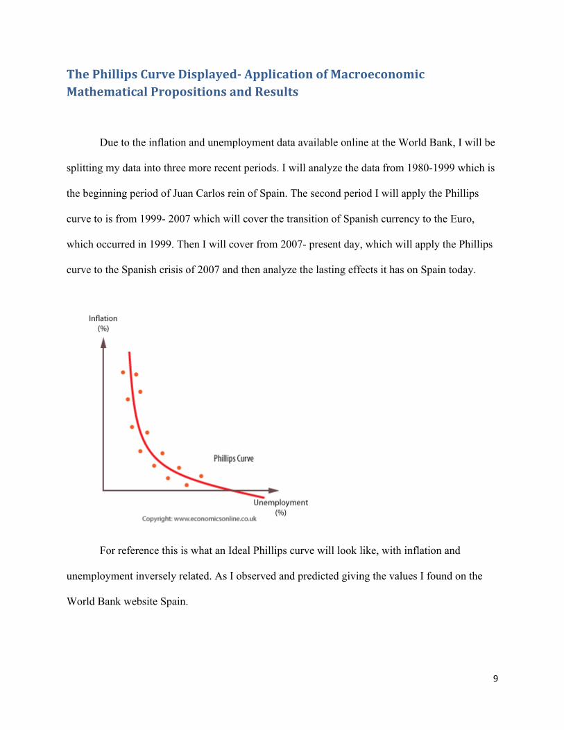
The Phillips Curve Displayed- Application of Macroeconomic Mathematical Propositions and Results
Due to the inflation and unemployment data available online at the World Bank, I will be
splitting my data into three more recent periods. I will analyze the data from 1980-1999 which is
the beginning period of Juan Carlos rein of Spain. The second period I will apply the Phillips
curve to is from 1999- 2007 which will cover the transition of Spanish currency to the Euro,
which occurred in 1999. Then I will cover from 2007- present day, which will apply the Phillips
curve to the Spanish crisis of 2007 and then analyze the lasting effects it has on Spain today.
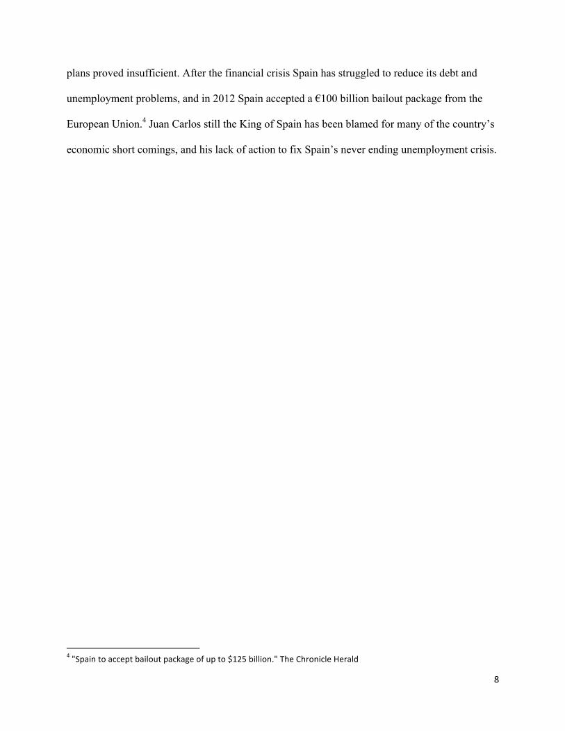
For reference this is what an Ideal Phillips curve will look like, with inflation and
unemployment inversely related. As I observed and predicted giving the values I found on the
World Bank website Spain.

10
My first graph displays the Phillips curve from 1980 until 1989. Clearly the data here
does not display an Original Phillips Curve. The data here is not a downward sloping curve, but
rather a more circular plot of data that has s steep linear regression. This graph displays that
unemployment and inflation are not proportional. As inflation changes unemployment stays
roughly the same. It appears as if the natural rate of unemployment is about 17%. That is an
extremely high unemployment rate, which is probably mostly due to the economic slump that
occurred during the 1970s due to the 1973 oil crisis and the political instability at the beginning
of Juan Carlos’s rein.

11
This graph above displays the ideal change in inflation vs. unemployment graph. Where
the natural rate of unemployment occurs at roughly 6% and the change in inflation is a non-steep
linear downward sloping curve.
The graph above displays the change in inflation from 1980-1999. This is the
Expectations Augmented Phillips Curve, which I used to further prove the fact that this time

12
period in Spain does not correctly display the Phillips Curve. This graph displays a vertical trend
instead of a steep downward linear curve, thus further displaying that allowing prices to be high
does not alleviate unemployment. Even a large change in inflation kept the unemployment rate at
roughly the same high amount.
The next period I will display with a Phillips Curve is 2000-2007, from the transition to
the Euro in 1999 to the financial crisis in 2007.
Clearly here it is obvious that inflation is more flat and stagnant. This graph also
disproves the ideal Phillips curve and shows us the Phillips Curve cannot be applied to Spain for
this period. Unemployment is independent of inflation. Inflation is not drastically wavering like
it did from 1980-1999. This graph does show that there is more stability in this era. The inflation
is not wavering and unemployment is drastically lower than what it was from 1980-1999. This is
due to the fact that when Spain transitioned to the Euro the creditably of the Euro helped boost
the value of the Spanish Economy.

13
Observing the change in inflation we see that again the Phillips curve cannot be used to
satisfy the Spanish model, but Spain is closer to an ideal Phillips curve in this time period than it
was from 1980-1999. From the linear regression the slope of this graph is -.1986 and the slope
from the Expectations Augmentation Phillips Curve from 1980-1999 was -.118. The slope got
steeper making it closer to the ideal rate. The unemployment here is also roughly 10% which is
close to the ideal unemployment rate of 6%.
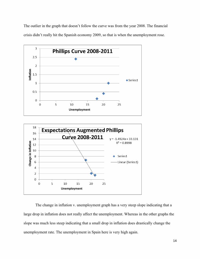
Next I will observe the Phillips curve from 2008-2011. The significance of this period
was the global financial crisis that hit the world in 2008. It is clear in the graph that
unemployment grew drastically in this time period and this is defiantly not an appropriate
Phillips Curve. It actually appears to be the inverse of the Phillips curve. As Unemployment
increases, inflation increases as well. This is very dangerous for any economy. However it
should be noted that inflation is very low in this time period. If Spain had made any progress
after they had switched to the Euro it was defiantly halted at the outbreak of the financial crisis.
14
The outlier in the graph that doesn’t follow the curve was from the year 2008. The financial
crisis didn’t really hit the Spanish economy 2009, so that is when the unemployment rose.
The change in inflation v. unemployment graph has a very steep slope indicating that a
large drop in inflation does not really affect the unemployment. Whereas in the other graphs the
slope was much less steep indicating that a small drop in inflation does drastically change the
unemployment rate. The unemployment in Spain here is very high again.

15
Sources and Uses of Data
For the Application portion of this paper I gathered data from the World Bank website.
From there I found the raw inflation and unemployment figures and constructed my Phillips
curve graphs from that data. The only data that was online was form 1980-2011. I could not find
any data from before 1980. That is why I could not fully analyze the Spanish economy from
1945-2013. I also could not find data on 2012 and 2013, the most recent years. To find the
change in the inflation I just constructed a mathematical equation in Microsoft Excel and
calculated the data. For each time period I made two graphs in excel observing both the original
Phillips Curve and the Expectations Augmented Phillips Curve. I also used the textbook to
observe what an ideal Original and Expectations Augmented Phillips curve should look like to
help me estimate the accuracy of the Spanish Phillips Curve.
16
Compare & Contrast

17
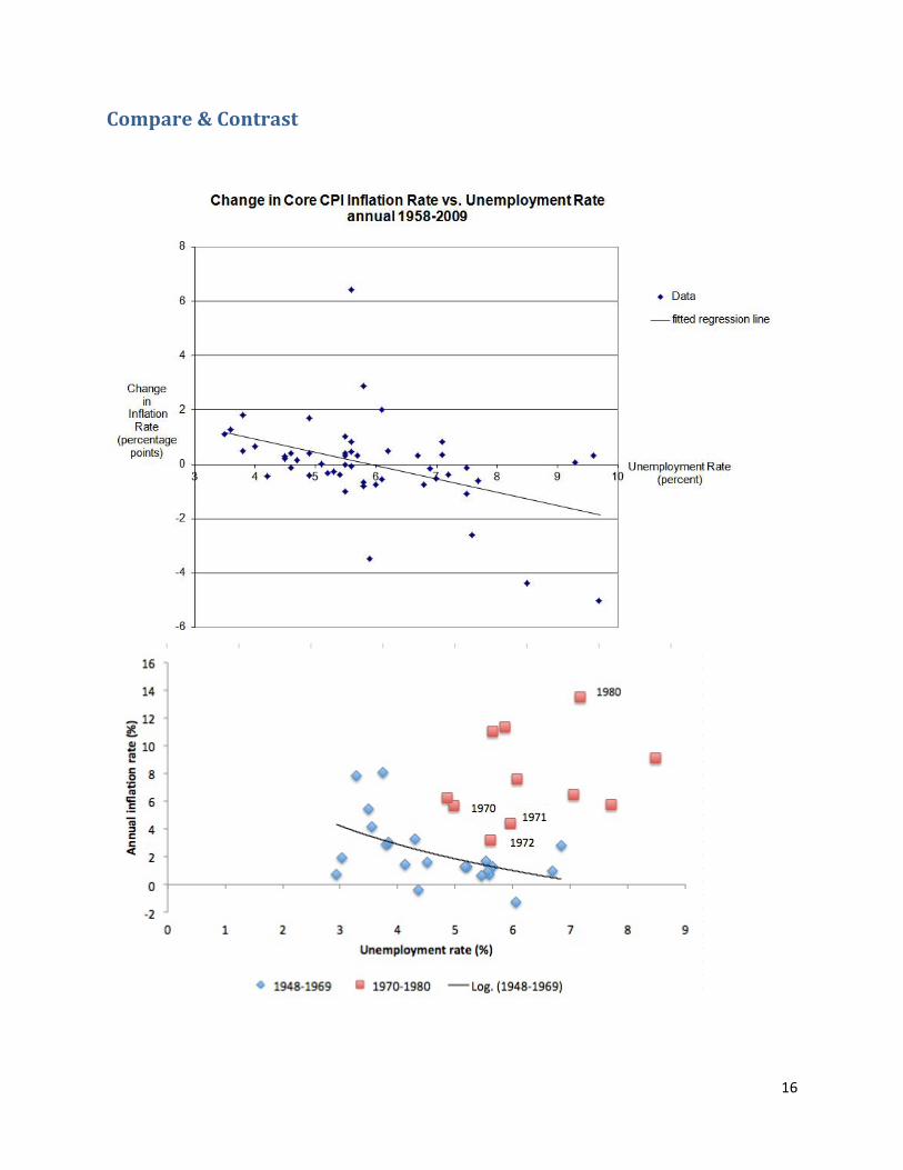
These three graphs represent the three different Phillips Curves I focused on…The
Original Phillips Curve, the Expectations Augmented Phillips Curve, and the Long Run
(NAIRU) Phillips Curve. As found in the text book, during the 1960’s the original Phillips Curve
was used to display the relationship between unemployment and inflation, because it worked.
The 60’s were a prosperous time, and the Phillips Curve proved to be a reliable guide. This
proposition that the original Phillips curve no longer be reliable after the 1970’s is the reasoning
behind why my graphs I made from the data on the World Bank website did not cohere with the
original Phillips Curve theory.
In the 1970’s the worldwide oil shock caused the Phillips curve to lose its credibility as a
reliable guide to describing the relationship between inflation and unemployment. The oil shock
caused an increase in non-labor costs, which forced firms to increase their markup which made
inflation increase while keeping unemployment constant. The 70’s were also seen by a persistent
increase in inflation annually; thus the “change in expectation formation changed the nature of

18
the relation between unemployment and inflation.”5 I believe the Original Phillips Curve lost all
credibility after the 60’s. It was no longer feasible just take into consideration that relationship,
because now there were so many other variables to consider. This created the concept of the
change in inflation vs. unemployment graph which is now used today. It represents that for low
unemployment the change in inflation is positive, and for high unemployment the change in
inflation is negative. So when applied to the Modified Phillips curve, the graphs for Spain seem
to fit more appropriately. Yet the Spanish unemployment was still so large through most of the
late 20th century that the modified Philips curve didn’t necessarily prove to be that reliable.
The next modified Phillips Curve relation is the non-accelerating inflation rate of
unemployment (NAIRU). This relationship describes that the natural rate of unemployment is
the rate of unemployment required to keep the inflation constant. That rate has been found to be
6% for the United States. Based on my data I collected from Spain from 1980-1999, the natural
rate of unemployment appears to be roughly 17%. At 17% the inflation seems to not waiver as
much. The Phillips curve graph is almost a vertical relationship with little change in
unemployment.
From my overall findings I would say that Spanish Economy is not accurately portrayed
by any of the three Phillips Curves graphs. Frankly, unemployment is just too high, and the
inflation in Spain is consistently wavering. The U.S. graphs I had listed above contrast
drastically with all my Spanish graphs from 1980-2013. The Original Phillips curve is not
portrayed at all by any of my three Spanish Original Phillips Curves. But there is one graph
similarity. In the Modified Philips Curve I created for 1980-1999 has a very similar relationship
5 Blanchard, Oliver. “Ch.8 The Philips Curve, the Natural Rate of Unemployment, and Inflation.”

19
to the modified Phillips Curve of the U.S. from 1958-2009. The only difference being the natural
rate of unemployment in both of them.
In conclusion, the Spanish economy appears to not accurately display any of the models
of the Phillips Curve that I observed from the 1980-2013. The data from 1980-1999 may suggest
a relation to the long run Phillips Curve, but the natural rate of unemployment is very high at
around 17%. The direct correlation between the Spanish inflation and unemployment appear to
be the reason as to the economic uncertainty and instability Spain has had over the past century.
Spain continues to have one of the world’s highest unemployment rates for developed countries.
Inflation has been high on average, but since the financial crisis in 2008, the inflation has
lowered in an attempt to stimulate the economy. The political stability of the U.S. economy
allows for the application of the Phillips curves to be more readily applicable to its
unemployment and inflation.
20
References
Blanchard, Oliver. “Ch.8 The Philips Curve, the Natural Rate of Unemployment, and Inflation.” Macroeconomics. 6 ed. Pearson, 2013. 164-‐170.
"Employment Outlook 2011-‐ How does Spain compare?." OECD. Web. 13 Nov. 2005.
<http://www.oecd.org/spain/48682976.pdf>.
"Employment policies and data -‐ Organization for Economic Co-‐operation and Development." Impact of
the economic crisis on employment and unemployment in the OCED countries. OECD, Web. 4 Nov.
2013.
<http://www.oecd.org/els/emp/impactoftheeconomiccrisisonemploymentandunemploymentintheoecd
countries.htm>.
"Employment, Interest, and Money." The Phillips Curve Today: Beware the White Swan. Web. 10 Nov.
2013. <http://blog.andyharless.com/2010/06/phillips-‐curve-‐today-‐beware-‐white-‐swan.html>.
"Inflation, GDP deflator (annual %)." Data. The World Bank, Web. 6 Nov. 2013.
<http://data.worldbank.org/indicator/ny.gdp.defl.kd.zg>.
"Oil Embargo 1973-‐1974." Office of the Historian-‐ U.S. Department of State. Web. 13 Nov. 2013.
<http://history.state.gov/milestones/1969-‐1976/oil-‐embargo>.
"Origins of the 1973 world oil shock." 1973 Oil Crisis. Web. 15 Nov. 2013.
<http://www.actionforex.com/articles-‐library/financial-‐glossary/1973-‐oil-‐crisis-‐20041204320/>.
"Spain." An overview of Spain's Economy. Web. 13 Nov. 2013. <http://www.euro-‐
challenge.org/doc/Spain.pdf>.
"Spain." Britannica . Economy. Britannica Academic Edition. Web. 13 Nov. 2008.
"Spain profile." BBC News. BBC, 16 July 2013. Web. 14 Nov. 2013. <http://www.bbc.co.uk/news/world-‐
europe-‐17941641>.
"Spain-‐The Franco Era, 1939-‐75." Spain Index. Web. 13 Nov. 2013.
<http://www.mongabay.com/history/spain/spain-‐the_franco_era,_1939-‐75.html>.

21
"Spain to accept bailout package of up to $125 billion." The Chronicle Herald. Web. 14 Nov. 2013.
<http://thechronicleherald.ca/business/105513-‐spain-‐to-‐accept-‐bailout-‐package-‐of-‐up-‐to-‐125-‐billion>.
"The Cause of the 2008 Financial Crisis." Accuracy In Media. Web. 12 Nov. 2013.
<http://www.aim.org/guest-‐column/the-‐cause-‐of-‐the-‐2008-‐financial-‐crisis/>.
“The Economic History of Spain Since 1800” Joseph Harrison. The Economic History Review , New Series,
Vol. 43, No. 1 (Feb., 1990), pp. 79-‐89.<http://www.jstor.org/stable/2596514>
"The History of the Phillips Curve." Consensus and Bifurcation. Web. 9 Nov. 2013. <http://faculty-‐
web.at.northwestern.edu/economics/gordon/Pre-‐NBER_forComments_Combined_090307.pdf>.
"The Phillips curve." Economics Online. Web. 14 Nov. 2013.
<http://www.economicsonline.co.uk/Global_economics/Phillips_curve.html>.
"The Spanish Economic Crisis: Key Factors and Growth Challenges in the Euro Area." Banco De Espana.
Web. 3 Nov. 2013.
<http://www.bde.es/f/webbde/SES/Secciones/Publicaciones/PublicacionesSeriadas/DocumentosOcasio
nales/12/Fich/do1201e.pdf>.
"Unemployment and Inflation Part 7." Bill Mitchell Billy blog. Web. 10 Nov. 2013.
<http://bilbo.economicoutlook.net/blog/?p=22900>.
"Unemployment, total (% of total labor force)." Data. The World Bank, Web. 8 Nov. 2013.
<http://data.worldbank.org/indicator/SL.UEM.TOTL.ZS>.