spring 2008 writing workshops your writing project: use of illustrations & data displays (ce)...
TRANSCRIPT
Spring 2008Writing Workshops
Your Writing Project: Use OF Illustrations & Data Displays (CE)
Mike Werle, Ph.D., Associate Professor, Anatomy & Cell Biology, KU SOM
Outline
• What are common problems associated with publishing graphs?
• Possible causes of these problems.
• Possible solutions for these problems.
• Examples of good graphing principles.
• Use of images and color.

Survey of Scientific Editorsn=25
• Eileen K. Schofield, 2002, Quality of Graphs in Scientific Journals: An Exploratory Study. Science Editor 25:39-41.
• Is quality of graphs a criterion for acceptance of manuscripts by your journal?– 16 Yes– 9 No

Schofield, 2002continued
• Do your instructions to authors include details about preparation of graphs? – 18 Yes– 7 No
• How do you handle poor-quality graphs?– 22 Return them to authors with instructions– 7 Make Corrections in your office– 2 Publish them without corrections
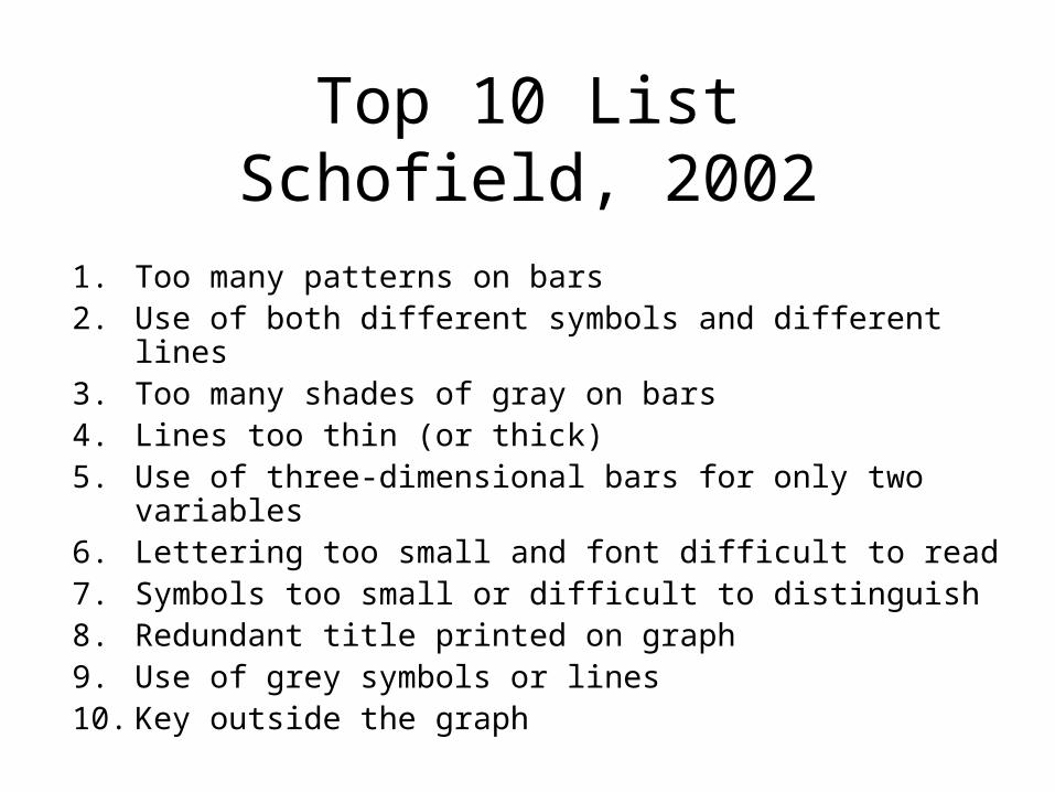
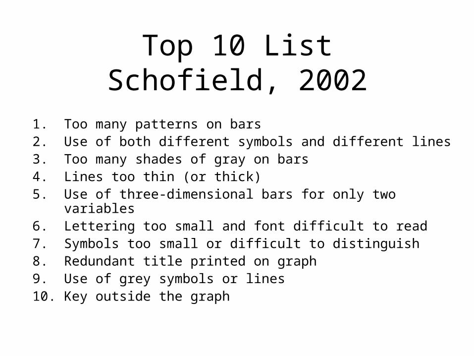
Top 10 ListSchofield, 2002
1. Too many patterns on bars2. Use of both different symbols and different lines3. Too many shades of gray on bars4. Lines too thin (or thick)5. Use of three-dimensional bars for only two variables6. Lettering too small and font difficult to read7. Symbols too small or difficult to distinguish8. Redundant title printed on graph9. Use of grey symbols or lines10. Key outside the graph

What are possible causes of these problems?
Lack of clear and consistent instructions to authors???
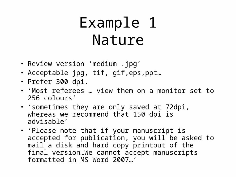
Example 1Nature
• Review version ‘medium .jpg’• Acceptable jpg, tif, gif,eps,ppt…• Prefer 300 dpi.• ‘Most referees … view them on a monitor set to 256
colours’• ‘sometimes they are only saved at 72dpi, whereas we
recommend that 150 dpi is advisable’• ‘Please note that if your manuscript is accepted for
publication, you will be asked to mail a disk and hard copy printout of the final version…We cannot accept manuscripts formatted in MS Word 2007…’
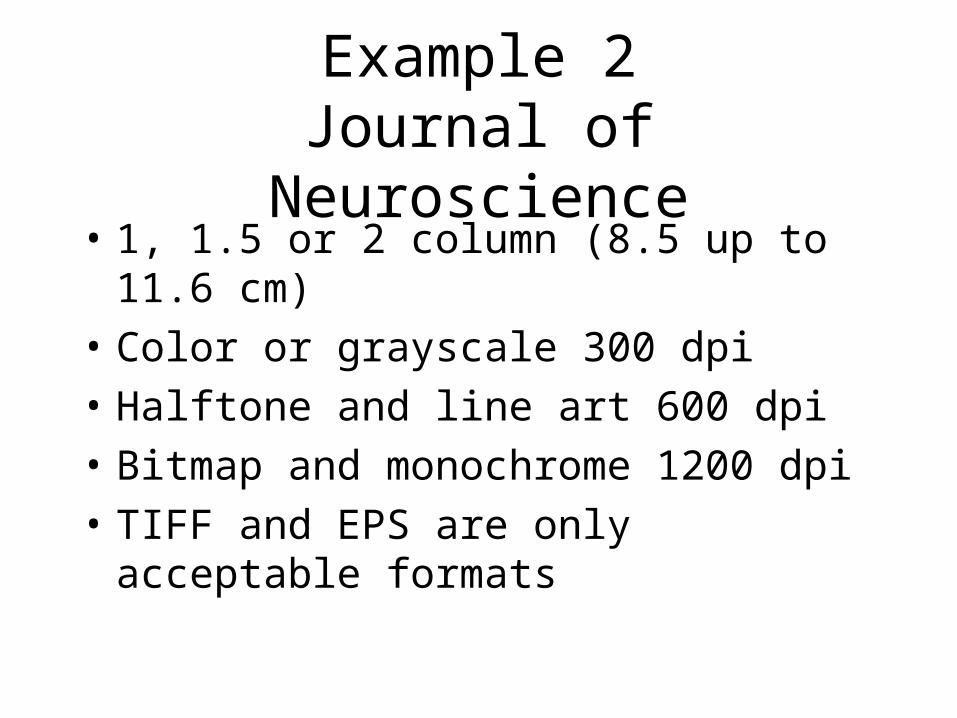
Example 2Journal of Neuroscience
• 1, 1.5 or 2 column (8.5 up to 11.6 cm)
• Color or grayscale 300 dpi
• Halftone and line art 600 dpi
• Bitmap and monochrome 1200 dpi
• TIFF and EPS are only acceptable formats
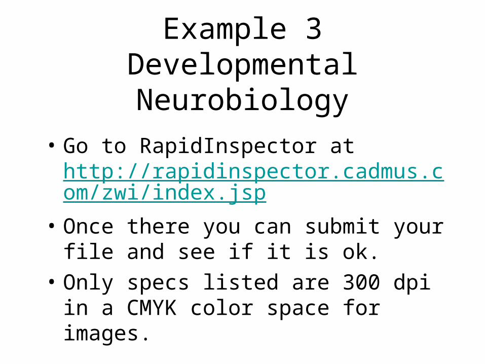
Example 3Developmental Neurobiology
• Go to RapidInspector at http://rapidinspector.cadmus.com/zwi/index.jsp
• Once there you can submit your file and see if it is ok.
• Only specs listed are 300 dpi in a CMYK color space for images.
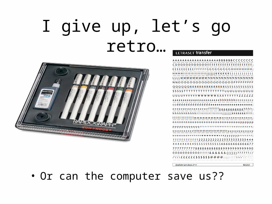
I give up, let’s go retro…
• Or can the computer save us??
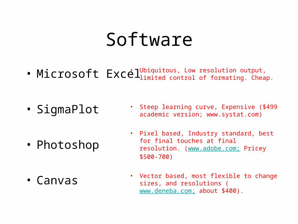
Software
• Ubiquitous, Low resolution output, limited control of formating. Cheap.
• Steep learning curve, Expensive ($499 academic version; www.systat.com)
• Pixel based, Industry standard, best for final touches at final resolution. (www.adobe.com; Pricey $500-700)
• Vector based, most flexible to change sizes, and resolutions (www.deneba.com; about $400).
• Microsoft Excel
• SigmaPlot
• Photoshop
• Canvas

Softwarecontinued
• Easy to learn and use. Limited output options; (www.synergy.com) relatively cheap ($140).
• No WYSIWYG, steep learning curve (expensive).
• KaleidaGraph
• SAS
• Others?
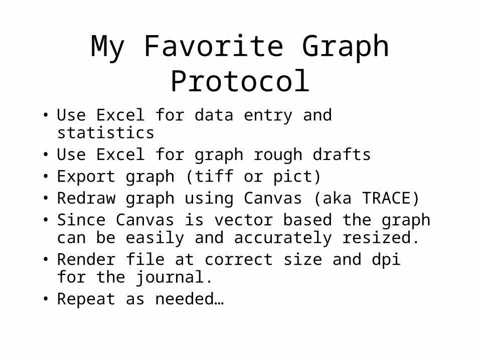
My Favorite Graph Protocol
• Use Excel for data entry and statistics• Use Excel for graph rough drafts• Export graph (tiff or pict)• Redraw graph using Canvas (aka TRACE)• Since Canvas is vector based the graph can
be easily and accurately resized.• Render file at correct size and dpi for the
journal. • Repeat as needed…
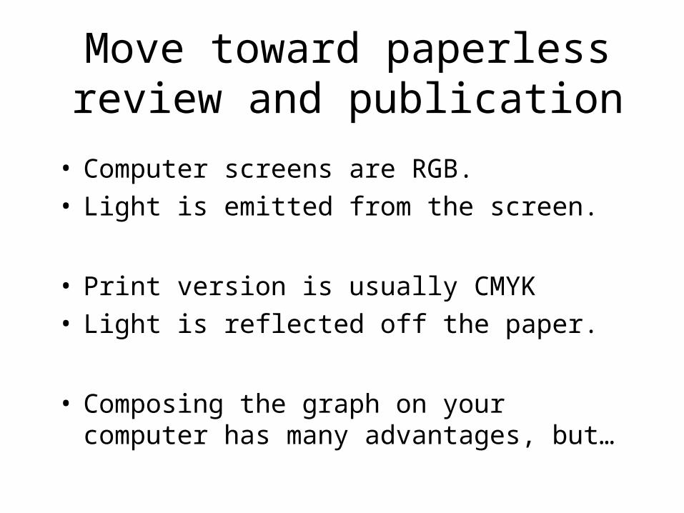
Move toward paperless review and publication
• Computer screens are RGB.• Light is emitted from the screen.
• Print version is usually CMYK• Light is reflected off the paper.
• Composing the graph on your computer has many advantages, but…
WYSIWYGBNWTRS
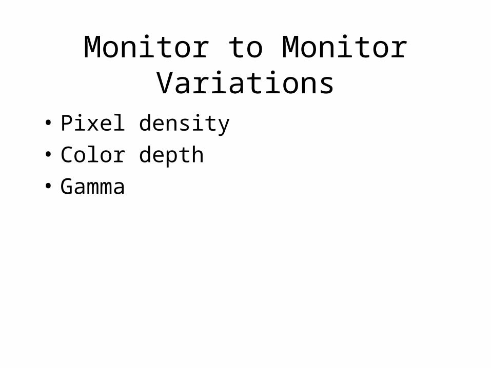
Monitor to Monitor Variations
• Pixel density
• Color depth
• Gamma
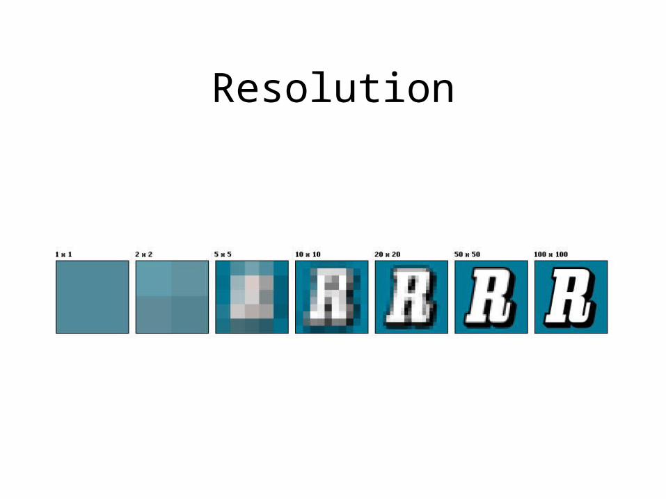
Resolution

Resolution
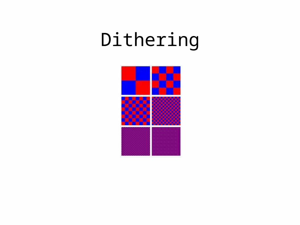
Dithering

Outstanding Definitions
http://rapidinspector.cadmus.com/
RapidInspector/docs/index.html

Ideas for Better Graphs

Excellent TextbookThe Visual Display of Quantitative Information, 2nd edition (Hardcover)
by Edward R. Tufte
($32.80 @ Amazon.com)
Why Graphs?
• Clearly show the details and patterns in your data.
• Images show relationships between data points.
• Words are best for abstract concepts.
Some Guidelines
• The golden rectangle– Aim for around 1 unit tall by 1.6 units wide
• Ink to information ratio• Don’t have a lot of empty space• Make it easy for the casual reader• Horizontal format
– Size should be dictated by the data
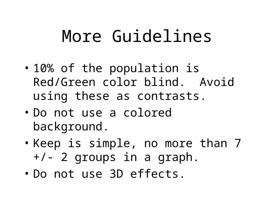
More Guidelines
• 10% of the population is Red/Green color blind. Avoid using these as contrasts.
• Do not use a colored background.
• Keep is simple, no more than 7 +/- 2 groups in a graph.
• Do not use 3D effects.
From: Visualizing Data, Raymond R. Balise, Ph.D., Stanford University.
Top 10 ListSchofield, 2002
1. Too many patterns on bars2. Use of both different symbols and different lines3. Too many shades of gray on bars4. Lines too thin (or thick)5. Use of three-dimensional bars for only two variables6. Lettering too small and font difficult to read7. Symbols too small or difficult to distinguish8. Redundant title printed on graph9. Use of grey symbols or lines10. Key outside the graph

The Good
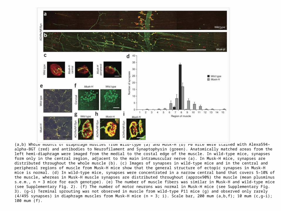
(a,b) Whole mounts of diaphragm muscles from wild-type (a) and Musk-H (b) P0 mice were stained with Alexa594–alpha-BGT (red) and antibodies to Neurofilament and Synaptophysin (green). Anatomically matched areas from the left hemi-diaphragm were imaged from the medial to the costal edge of the muscle. In wild-type mice, synapses form only in the central region, adjacent to the main intramuscular nerve (a). In Musk-H mice, synapses are distributed throughout the whole muscle (b). (c) Images of synapses in wild-type mice and in the central and peripheral regions of muscle from Musk-H mice show that the general structure of ectopic synapses in Musk-H mice is normal. (d) In wild-type mice, synapses were concentrated in a narrow central band that covers 5–10% of the muscle, whereas in Musk-H muscle synapses are distributed throughout (approx90%) the muscle (mean plusminus s.e.m., n = 3 mice for each genotype). (e) The number of muscle fibers was similar in Musk-H and wild-type mice (see Supplementary Fig. 2). (f) The number of motor neurons was normal in Musk-H mice (see Supplementary Fig. 3). (g–i) Terminal sprouting was not observed in muscle from wild-type P11 mice (g) and observed only rarely (4/495 synapses) in diaphragm muscles from Musk-H mice (n = 3; i). Scale bar, 200 mum (a,b,f); 10 mum (c,g–i); 100 mum (f).
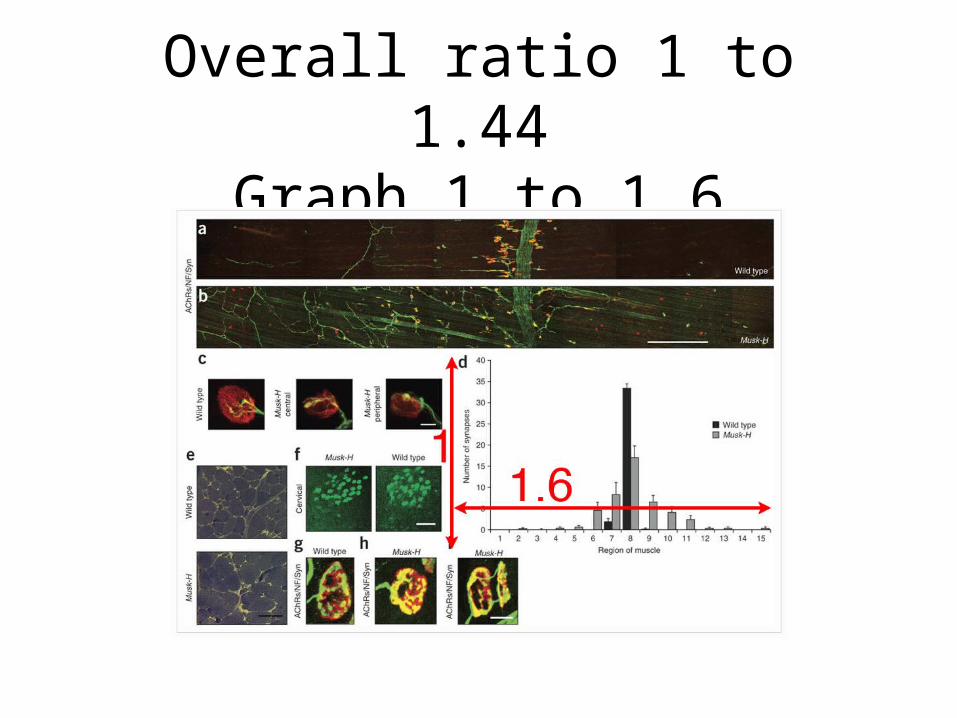
Overall ratio 1 to 1.44Graph 1 to 1.6

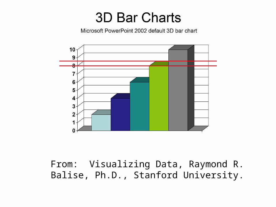
The Scary
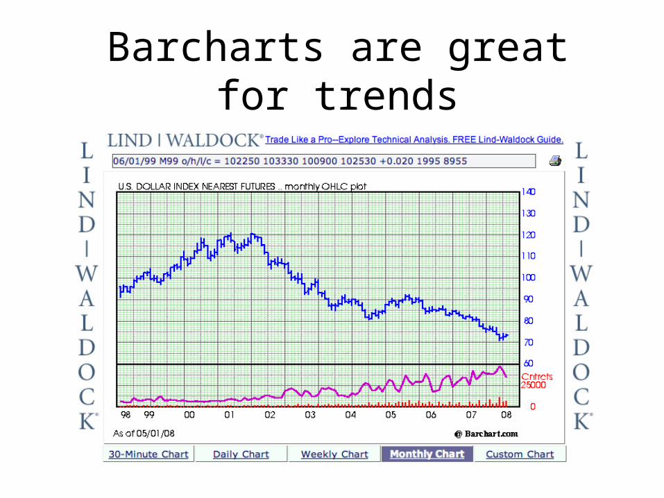
Barcharts are great for trends
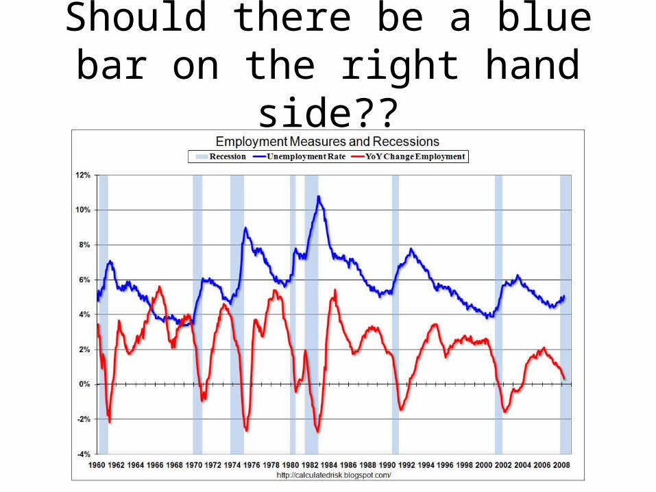
Should there be a blue bar on the right hand side??

The Bad
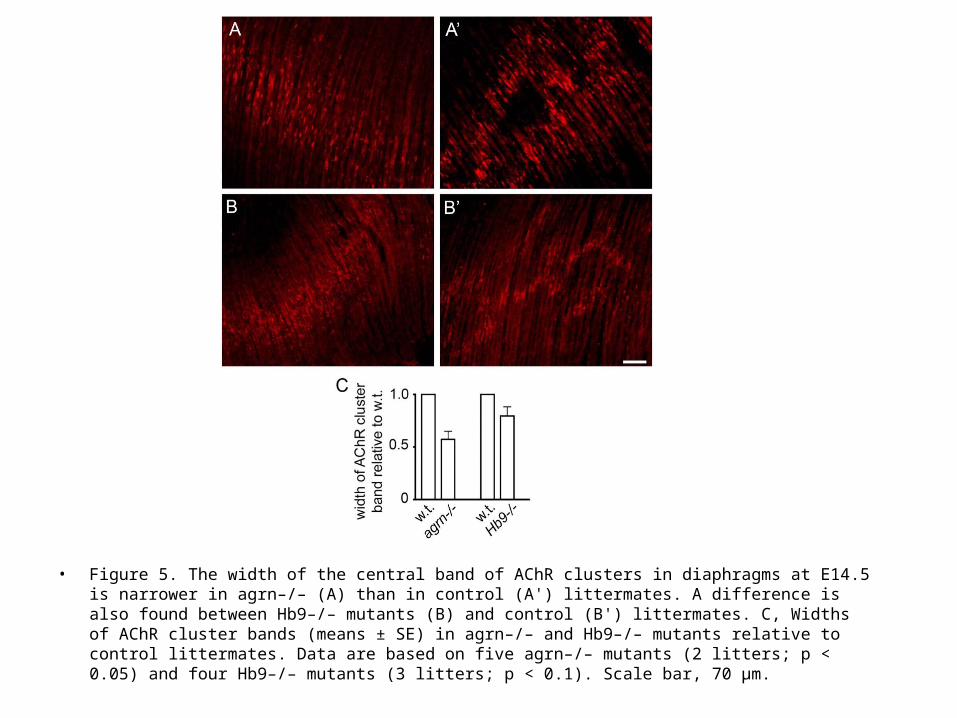
• Figure 5. The width of the central band of AChR clusters in diaphragms at E14.5 is narrower in agrn–/– (A) than in control (A') littermates. A difference is also found between Hb9–/– mutants (B) and control (B') littermates. C, Widths of AChR cluster bands (means ± SE) in agrn–/– and Hb9–/– mutants relative to control littermates. Data are based on five agrn–/– mutants (2 litters; p < 0.05) and four Hb9–/– mutants (3 litters; p < 0.1). Scale bar, 70 µm.
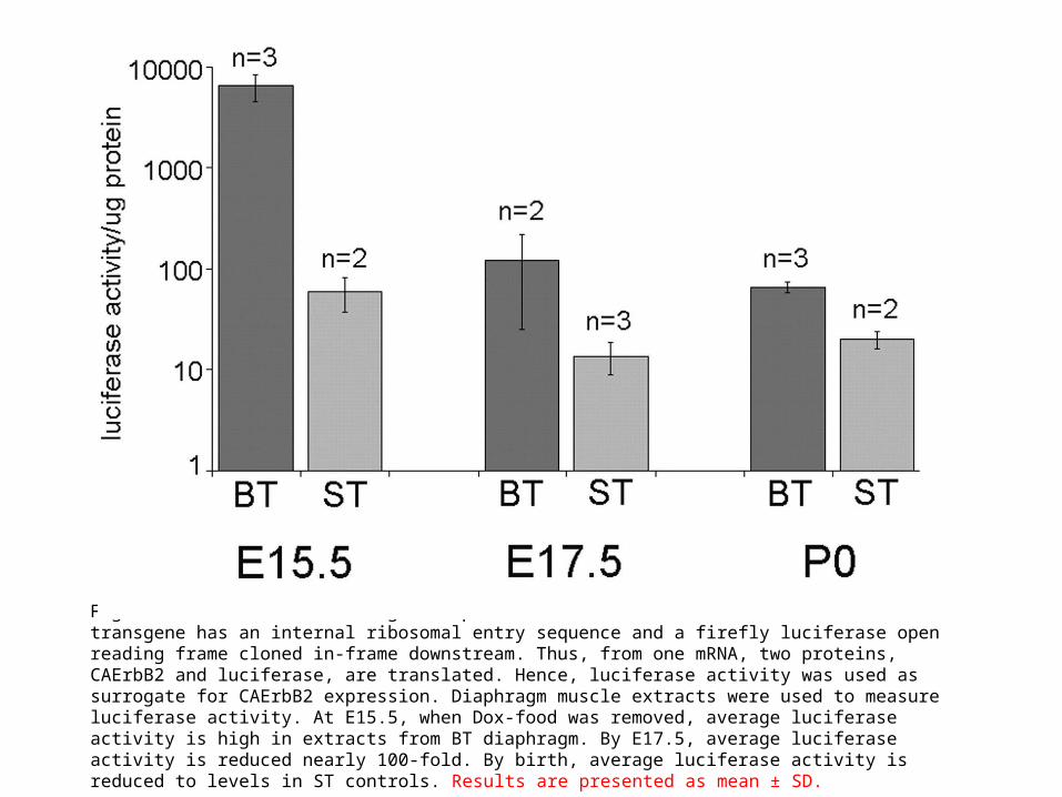
Figure 2. Reduction in transgene expression after Dox withdrawal. The CAErbB2 transgene has an internal ribosomal entry sequence and a firefly luciferase open reading frame cloned in-frame downstream. Thus, from one mRNA, two proteins, CAErbB2 and luciferase, are translated. Hence, luciferase activity was used as surrogate for CAErbB2 expression. Diaphragm muscle extracts were used to measure luciferase activity. At E15.5, when Dox-food was removed, average luciferase activity is high in extracts from BT diaphragm. By E17.5, average luciferase activity is reduced nearly 100-fold. By birth, average luciferase activity is reduced to levels in ST controls. Results are presented as mean ± SD.

The Ugly
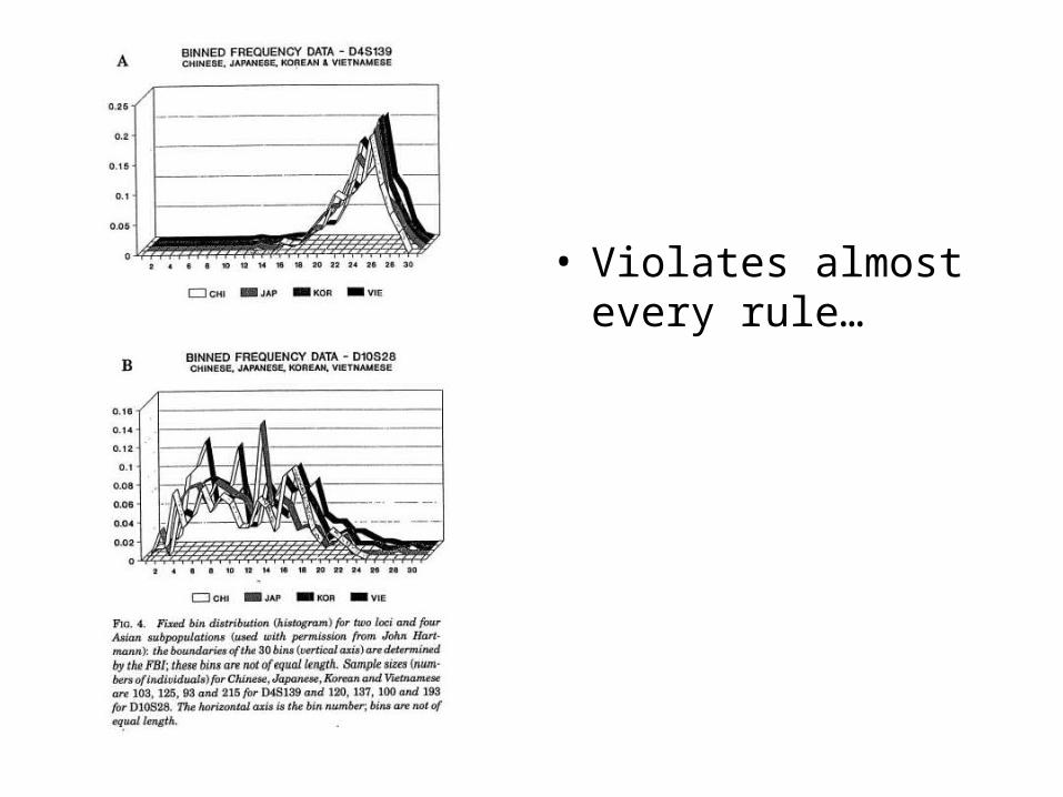
• Violates almost every rule…
Images
• You can never never never have too many pixels.
• Use Photoshop to enhance contrast, brightness and colorize.
• Add labels and scale bars as layers, you can change these easily.
• Use Photoshop to reduce the image as needed.
• Keep the original for future adjustments
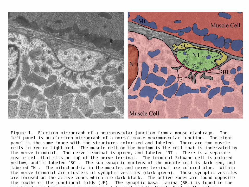
Figure 1. Electron micrograph of a neuromuscular junction from a mouse diaphragm. The left panel is an electron micrograph of a normal mouse neuromuscular junction. The right panel is the same image with the structures colorized and labeled. There are two muscle cells in red or light red. The muscle cell on the bottom is the cell that is innervated by the nerve terminal. The nerve terminal is green, and labeled “NT”. There is a separate muscle cell that sits on top of the nerve terminal. The terminal Schwann cell is colored yellow, and is labeled “SC”. The sub synaptic nucleus of the muscle cell is dark red, and labeled “N”. The mitochondria in the muscles and nerve terminal are colored blue. Within the nerve terminal are clusters of synaptic vesicles (dark green). These synaptic vesicles are focused on the active zones which are dark black. The active zones are found opposite the mouths of the junctional folds (JF). The synaptic basal lamina (SBl) is found in the unlabeled area between the nerve terminal (green) and the Muscle Cell on the bottom.


Outline
• What are common problems associated with publishing graphs?
• Possible causes of these problems.
• Possible solutions for these problems.
• Examples of good graphing principles.
• Use of images and color.