spss 2: central tendency and dispersion
DESCRIPTION
SPSS 2: Central Tendency and Dispersion. Frequency Distribution - PowerPoint PPT PresentationTRANSCRIPT

SPSS 2: Central Tendency and Dispersion
• Frequency Distribution• A summary which gives
an account of the frequency of answers in each category of response to a question (e.g., how many “yes,” “no,” or “maybe” answers; how many “strongly agree,” “agree,” “neither agree nor disagree,” “disagree,” or “strongly disagree,” etc. The elements described are the question, the categories or response alternatives of the question, and the distribution of responses
Example from our previous practice2 data set; this is a perfectly heterogeneous distribution (each scale value has the same number of people endorsing it)

Frequency DistributionsExample from the full St. Barnabas data set
Note that there is a missing case-one of the 140 Ss did not answer this item; hence we have percent and “valid “percent”. Note also that this is a much more homogeneous distribution (has an obvious central tendency) What would a narrative account of this
frequency distribution say if you were writing it up for a paper?

Conventions in the Presentation of Tabled Frequency Data• Categories of the response variable are listed in the left-most
column• Frequencies are listed to the right• Table is numbered and provided with a title• Frequencies are listed in ascending or descending order
Table 3
Student and Instructor Participation in Finland and U.S. Conferences

Conventions in the Presentation of Tabled Frequency Data, cont’d• It is convenient to the reader to provide both the raw frequencies and
the percentages for each category, plus the totals• When there are many potential categories, for example, number grades
or annual income, it is customary to group the data into categories like 90-100, $10,000-15,000, etc. in a grouped frequency distribution: class intervals• With class intervals we construct a range that has an upper and lower limit.
For example, for the class interval 80-90 the actual values are 79.5-89.5. Each class interval has a midpoint which stands for the class
• Some frequency tables use the letter f to stand for frequencies and the letters cf to stand for cumulative frequencies (total number of cases having a score of x or lower) in the column headings, and similarly with % and c% for cumulative data
• For most grouped data, class intervals of equal size are used, but in some cases, for example income data, intervals of unequal size may be more appropriate
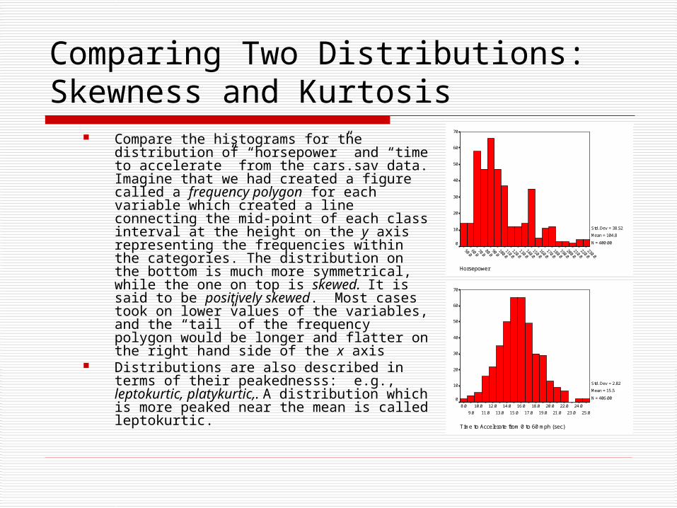
Comparing Two Distributions: Skewness and Kurtosis
Compare the histograms for the distribution of “horsepower” and “time to accelerate” from the cars.sav data. Imagine that we had created a figure called a frequency polygon for each variable which created a line connecting the mid-point of each class interval at the height on the y axis representing the frequencies within the categories. The distribution on the bottom is much more symmetrical, while the one on top is skewed. It is said to be positively skewed. Most cases took on lower values of the variables, and the “tail” of the frequency polygon would be longer and flatter on the right hand side of the x axis
Distributions are also described in terms of their peakednesss: e.g., leptokurtic, platykurtic,. A distribution which is more peaked near the mean is called leptokurtic.
Horsepower
230.0220.0
210.0200.0
190.0180.0
170.0160.0
150.0140.0
130.0120.0
110.0100.0
90.080.0
70.060.0
50.0
70
60
50
40
30
20
10
0
Std. Dev = 38.52
Mean = 104.8
N = 400.00
Time to Accelerate from 0 to 60 mph (sec)
25.0
24.0
23.0
22.0
21.0
20.0
19.0
18.0
17.0
16.0
15.0
14.0
13.0
12.0
11.0
10.0
9.0
8.0
70
60
50
40
30
20
10
0
Std. Dev = 2.82
Mean = 15.5
N = 406.00

Kurtosis Examples
Vehicle Weight (lbs.)
5200.0
4800.0
4400.0
4000.0
3600.0
3200.0
2800.0
2400.0
2000.0
1600.0
1200.0
800.0
Vehicle Weight (lbs.)
Fre
qu
en
cy
60
50
40
30
20
10
0
Std. Dev = 849.83
Mean = 2969.6
N = 406.00
Horsepower
230.0220.0
210.0200.0
190.0180.0
170.0160.0
150.0140.0
130.0120.0
110.0100.0
90.080.0
70.060.0
50.0
Horsepower
Fre
qu
en
cy
70
60
50
40
30
20
10
0
Std. Dev = 38.52
Mean = 104.8
N = 400.00
Time to Accelerate from 0 to 60 mph (sec)
25.0
24.0
23.0
22.0
21.0
20.0
19.0
18.0
17.0
16.0
15.0
14.0
13.0
12.0
11.0
10.0
9.0
8.0
Time to Accelerate from 0 to 60 mph (sec)
Fre
qu
en
cy
70
60
50
40
30
20
10
0
Std. Dev = 2.82
Mean = 15.5
N = 406.00
Engine Displacement (cu. inches)
450.0425.0
400.0375.0
350.0325.0
300.0275.0
250.0225.0
200.0175.0
150.0125.0
100.075.0
50.025.0
0.0
Engine Displacement (cu. inches)
Fre
qu
en
cy
100
80
60
40
20
0
Std. Dev = 105.21
Mean = 194.0
N = 406.00
Statistics
406 400 406 406 398
0 6 0 0 8
2969.56 104.83 15.50 194.04 23.51
.468 1.044 .211 .692 .457
.121 .122 .121 .121 .122
-.752 .591 .389 -.791 -.511
.242 .243 .242 .242 .244
Valid
Missing
N
Mean
Skewness
Std. Error of Skewness
Kurtosis
Std. Error of Kurtosis
VehicleWeight (lbs.) Horsepower
Time toAccelerate
from 0 to 60mph (sec)
EngineDisplacement(cu. inches)
Miles perGallon
Note that the distributions that are more peaked near the mean have larger positive values of kurtosis

How to Obtain a Frequency Distribution in SPSS
• Download today’s data set here• In the Data View, you will go to Analyze/Descriptive Statistics/Frequencies; a dialog box
will appear. Make sure the “display frequency tables” box is checked.• On the left-hand side, you will highlight the variable for which you want to create a
frequency table and press the right arrow button to move the variable to the right-hand side. (buttons work both ways) If you want a chart, you will click the charts tab and select a chart type such as “pie” or “bar” and click continue. Then you will click OK in the frequencies dialog box. Your output will appear in a separate Output viewer.
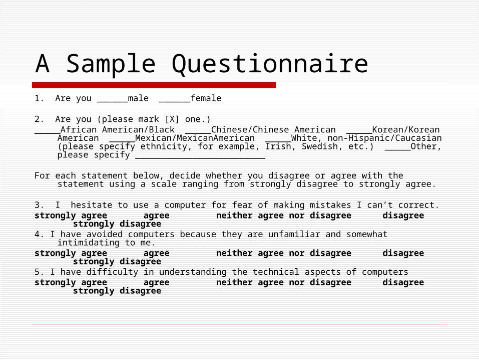
A Sample Questionnaire1. Are you ______male ______female
2. Are you (please mark [X] one.)_____African American/Black _____Chinese/Chinese American _____Korean/Korean
American _____Mexican/MexicanAmerican _____White, non-Hispanic/Caucasian (please specify ethnicity, for example, Irish, Swedish, etc.) _____Other, please specify _________________________
For each statement below, decide whether you disagree or agree with the statement using a scale ranging from strongly disagree to strongly agree.
3. I hesitate to use a computer for fear of making mistakes I can’t correct.strongly agree agree neither agree nor disagree disagree
strongly disagree4. I have avoided computers because they are unfamiliar and somewhat intimidating
to me.strongly agree agree neither agree nor disagree disagree
strongly disagree5. I have difficulty in understanding the technical aspects of computersstrongly agree agree neither agree nor disagree disagree
strongly disagree
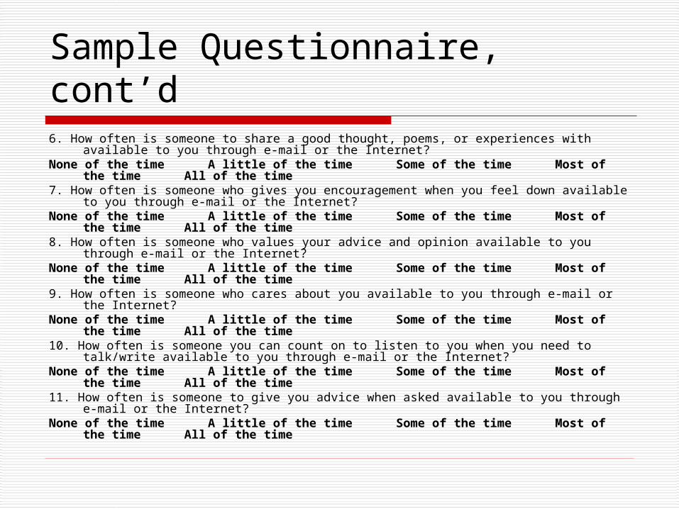
Sample Questionnaire, cont’d6. How often is someone to share a good thought, poems, or experiences with available to you
through e-mail or the Internet? None of the time A little of the time Some of the time Most of the time
All of the time7. How often is someone who gives you encouragement when you feel down available to you
through e-mail or the Internet? None of the time A little of the time Some of the time Most of the time
All of the time8. How often is someone who values your advice and opinion available to you through e-mail
or the Internet? None of the time A little of the time Some of the time Most of the time
All of the time9. How often is someone who cares about you available to you through e-mail or the Internet?
None of the time A little of the time Some of the time Most of the time
All of the time10. How often is someone you can count on to listen to you when you need to talk/write
available to you through e-mail or the Internet? None of the time A little of the time Some of the time Most of the time
All of the time11. How often is someone to give you advice when asked available to you through e-mail or
the Internet? None of the time A little of the time Some of the time Most of the time
All of the time

Data from Sample Questionnaire
Let’s consider the data from the Lesson3.sav data set.When you have opened the data set in the SPSS Data Editor, go to Data View and then select View/Value Labels to see what the numbers mean. Uncheck Value Labels to return to the raw numbers
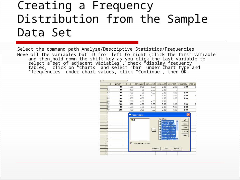
Creating a Frequency Distribution from the Sample Data SetSelect the command path Analyze/Descriptive Statistics/FrequenciesMove all the variables but ID from left to right (click the first variable and then
hold down the shift key as you click the last variable to select a set of adjacent variables), check “display frequency tables,” click on “charts” and select “bar” under chart type and “frequencies” under chart values, click “Continue”, then OK.

Sample from the Output Viewer
Check to see if you got these results:
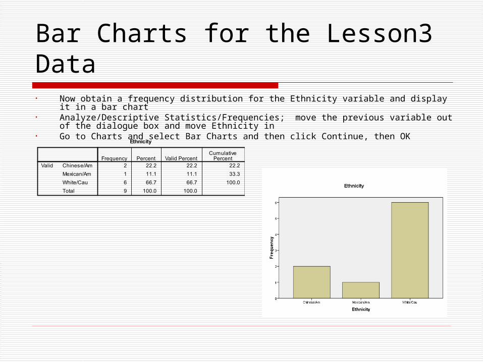
Bar Charts for the Lesson3 Data• Now obtain a frequency distribution for the Ethnicity variable and display it in a bar chart• Analyze/Descriptive Statistics/Frequencies; move the previous variable out of the dialogue
box and move Ethnicity in• Go to Charts and select Bar Charts and then click Continue, then OK
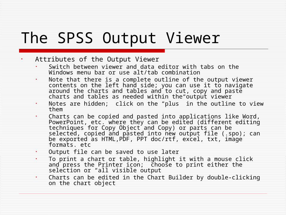
The SPSS Output Viewer• Attributes of the Output Viewer
• Switch between viewer and data editor with tabs on the Windows menu bar or use alt/tab combination
• Note that there is a complete outline of the output viewer contents on the left hand side; you can use it to navigate around the charts and tables and to cut, copy and paste charts and tables as needed within the output viewer
• Notes are hidden; click on the “plus” in the outline to view them• Charts can be copied and pasted into applications like Word,
PowerPoint, etc. where they can be edited (different editing techniques for Copy Object and Copy) or parts can be selected, copied and pasted into new output file (.spo); can be exported as HTML,PDF, PPT doc/rtf, excel, txt, image formats. etc
• Output file can be saved to use later• To print a chart or table, highlight it with a mouse click and press the
Printer icon; choose to print either the selection or “all visible output”• Charts can be edited in the Chart Builder by double-clicking on the
chart object
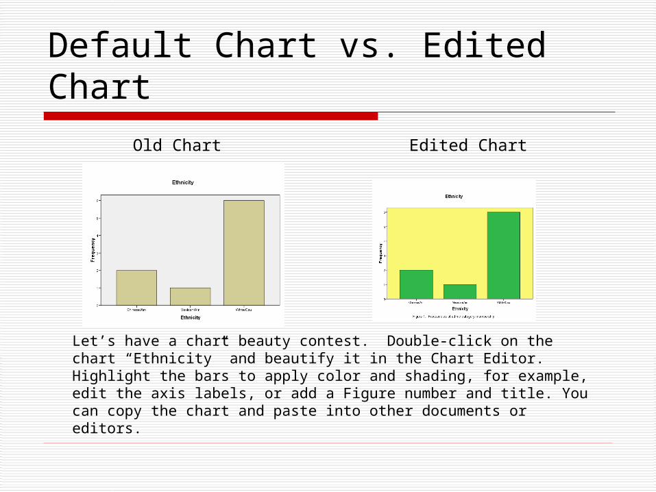
Default Chart vs. Edited Chart
Old Chart Edited Chart
Let’s have a chart beauty contest. Double-click on the chart “Ethnicity” and beautify it in the Chart Editor. Highlight the bars to apply color and shading, for example, edit the axis labels, or add a Figure number and title. You can copy the chart and paste into other documents or editors.

Exploring Charts and Graphs• Alternatives for visualizing data are
available from the Graphs menu; use the Legacy option to view the various types (these are the older individual chart types that are now available through a single interface, the Chart Builder)
• For example, click on the bar chart icon, then examine the various options (simple, clustered, stacked) for bar charts.
• Make a bar chart for Gender in the Lesson3.sav data file: Graphs/Legacy Dialogs/Bar/. Select the simple option and “summaries for groups of cases” and click Define. Highlight the “Gender” variable and move it to the right into the Category Axis box by clicking the right arrow, then click OK. Can leave out missing values with the Options dialog.
• Note that the response categories of the variable are along the x axis and the count within categories are along the y axis
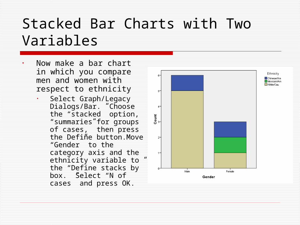
Stacked Bar Charts with Two Variables• Now make a bar chart in
which you compare men and women with respect to ethnicity• Select Graph/Legacy
Dialogs/Bar. Choose the “stacked” option, “summaries for groups of cases,” then press the Define button.Move “Gender” to the category axis and the ethnicity variable to the “Define stacks by” box. Select “N of cases” and press OK.
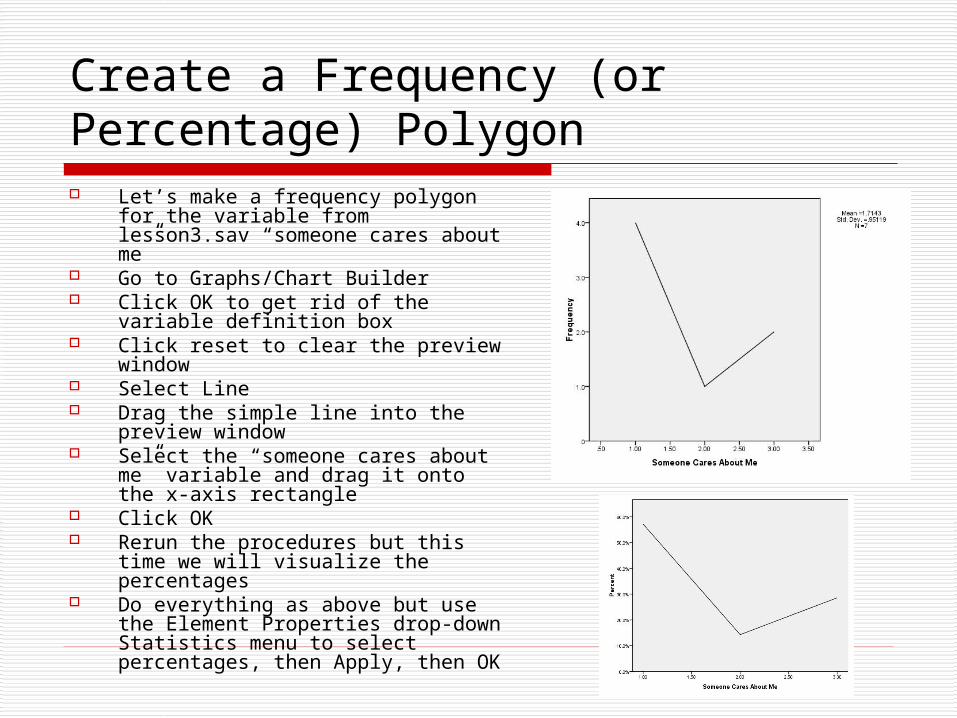
Create a Frequency (or Percentage) Polygon Let’s make a frequency polygon for
the variable from lesson3.sav “someone cares about me”
Go to Graphs/Chart Builder Click OK to get rid of the variable
definition box Click reset to clear the preview
window Select Line Drag the simple line into the preview
window Select the “someone cares about me”
variable and drag it onto the x-axis rectangle
Click OK Rerun the procedures but this time
we will visualize the percentages Do everything as above but use the
Element Properties drop-down Statistics menu to select percentages, then Apply, then OK
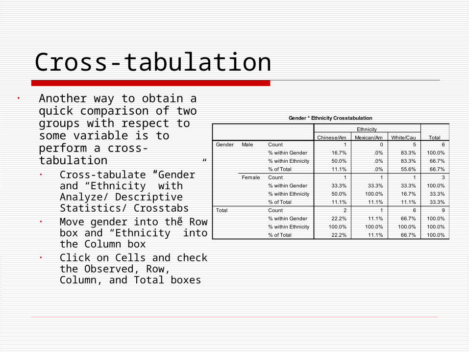
Cross-tabulation• Another way to obtain a
quick comparison of two groups with respect to some variable is to perform a cross-tabulation• Cross-tabulate “Gender”
and “Ethnicity” with Analyze/ Descriptive Statistics/ Crosstabs
• Move gender into the Row box and “Ethnicity” into the Column box
• Click on Cells and check the Observed, Row, Column, and Total boxes
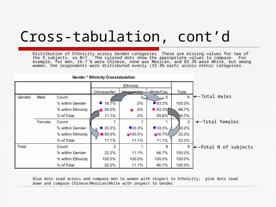
Cross-tabulation, cont’d• Distribution of Ethnicity across Gender categories There are missing values for two of the 9
subjects, so N=7. The colored dots show the appropriate values to compare. For example, for men, 16.7 % were Chinese, none was Mexican, and 83.3% were White, but among women, the respondents were distributed evenly (33.3% each) across ethnic categories.
Total N of subjects
Total males
Total females
Blue dots read across and compare men to women with respect to Ethnicity; pink dots read down and compare Chinese/Mexican/White with respect to Gender
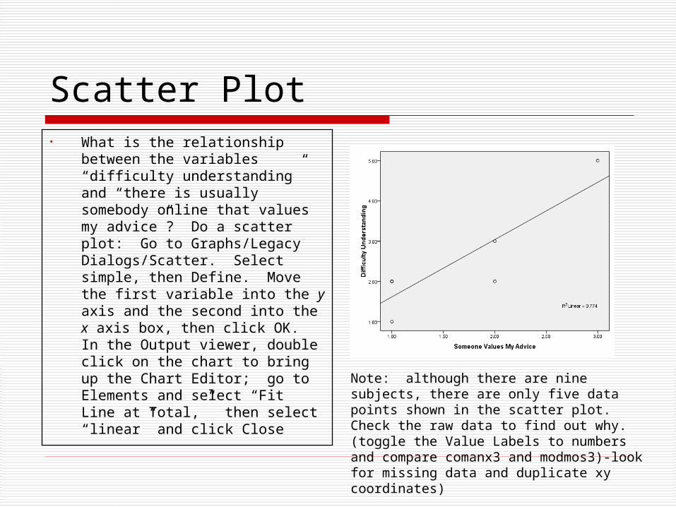
Scatter Plot• What is the relationship
between the variables “difficulty understanding” and “there is usually somebody online that values my advice”? Do a scatter plot: Go to Graphs/Legacy Dialogs/Scatter. Select simple, then Define. Move the first variable into the y axis and the second into the x axis box, then click OK. In the Output viewer, double click on the chart to bring up the Chart Editor; go to Elements and select “Fit Line at Total,” then select “linear” and click Close
Note: although there are nine subjects, there are only five data points shown in the scatter plot. Check the raw data to find out why. (toggle the Value Labels to numbers and compare comanx3 and modmos3)-look for missing data and duplicate xy coordinates)

View Distribution after Splitting the Data on a Variable• How do the responses for the variable “difficulty understanding the technical
aspects of computers” compare for men and women? Split the file on gender and compare the resulting distributions. Go to Data/Split File. Select Compare groups. Then select Gender and move it into the “groups based on” box and click OK. Then Go to Analyze/Descriptive Statistics/Frequencies. Use reset to remove previous variables. Highlight the “difficulty variable” and move it Variables Box and click OK. Undo the split with the Data/Split File/ reset option so that further analyses will be on the combined cases.
• To restore the original order in the data editor viewer, you can sort the cases on ID in ascending order by right clicking on the ID variable column and selecting “sort ascending”
Difficulty Understanding
1 16.7 16.7 16.7
4 66.7 66.7 83.3
1 16.7 16.7 100.0
6 100.0 100.0
2 66.7 66.7 66.7
1 33.3 33.3 100.0
3 100.0 100.0
Strongly Agree
Agree
Neither
Total
Valid
Agree
Strongly Disagree
Total
Valid
GenderMale
Female
Frequency Percent Valid PercentCumulative
PercentWhat sort of differences do you think there appear to be between males and females with respect to this variable?

Recoding Data to Collapse Categories of the Response Scale• Under some circumstances we might wish to reduce the
number of response categories to a variable after we have collected the data. To do so we need to recode the old variables into new ones using SPSS.
• Suppose that we want to collapse the agreement and disagreement categories for variable companx1, so that you only have three response categories, “agree,” “disagree,” and “neither agree nor disagree:”
OLD Item companx1: I hesitate to use a computer for fear of making mistakes I can’t correct.
strongly agree (1) agree (2) neither agree nor disagree(3) disagree(4) strongly disagree (5)
NEW Item newcomp1: I hesitate to use a computer for fear of making mistakes I can’t correct.
agree (1) neither agree nor disagree(2) disagree(3)

Recoding Data to Collapse Categories of the Response Scale, cont’d
• In SPSS, go to the the Transform menu and select Recode/Into Different Variables
• In the dialog box that opens, highlight “fear of mistaking mistakes” and use the black arrow to move it into the Input Variable > Output Variable box
• Give the variable to be recoded a new name and label in the Output Variable boxes: give it the name “newcomp1” and the label “recoded Fear of Making Mistakes”, then click on the Change button
• Click on Old and New Values button to open up the Recode into Different Variables: Old and New Values Box to enter information as to how you want to regroup the response categories
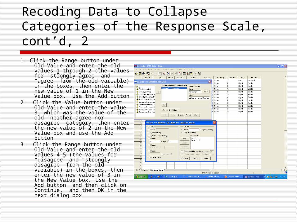
Recoding Data to Collapse Categories of the Response Scale, cont’d, 21. Click the Range button under Old
Value and enter the old values 1 through 2 (the values for “strongly agree” and “agree” from the old variable) in the boxes, then enter the new value of 1 in the New Value box. Use the Add button
2. Click the Value button under Old Value and enter the value 3, which was the value of the old “neither agree nor disagree” category, then enter the new value of 2 in the New Value box and use the Add button
3. Click the Range button under Old Value and enter the old values 4-5 (the values for “disagree” and “strongly disagree” from the old variable) in the boxes, then enter the new value of 3 in the New Value box. Use the Add button and then click on Continue, and then OK in the next dialog box

Recoding Data to Collapse Categories of the Response Scale, cont’d, 3
• Go to the Variable View and find the new variable, newcomp1. Review the variable definitions and establish new value labels:
Frequency Distributions for Old and New Variables
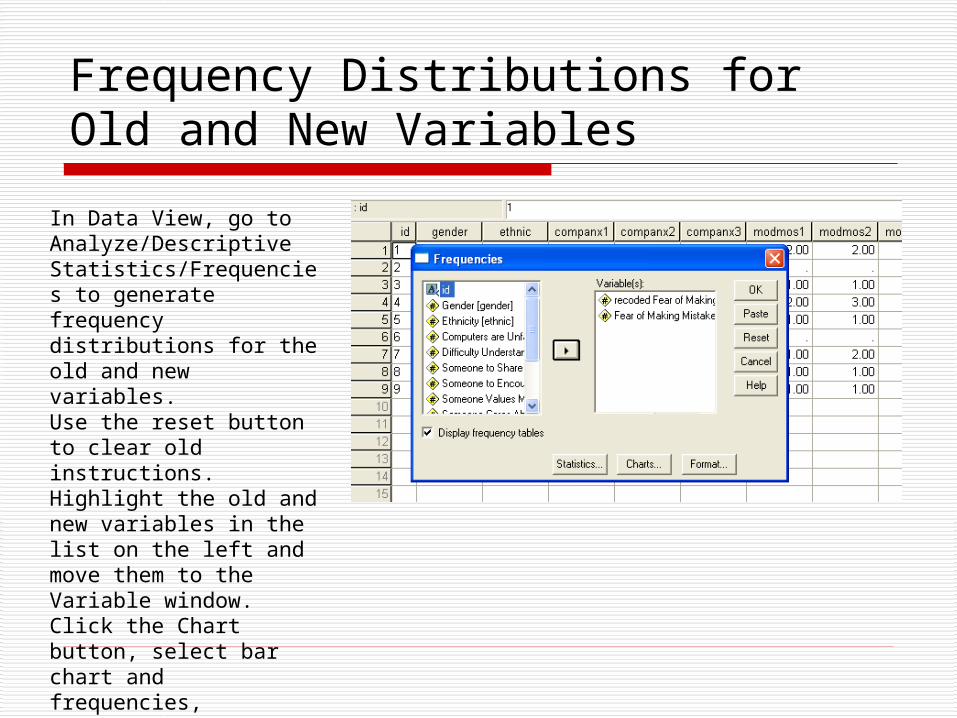
In Data View, go to Analyze/Descriptive Statistics/Frequencies to generate frequency distributions for the old and new variables.Use the reset button to clear old instructions. Highlight the old and new variables in the list on the left and move them to the Variable window. Click the Chart button, select bar chart and frequencies, Continue, then OK.
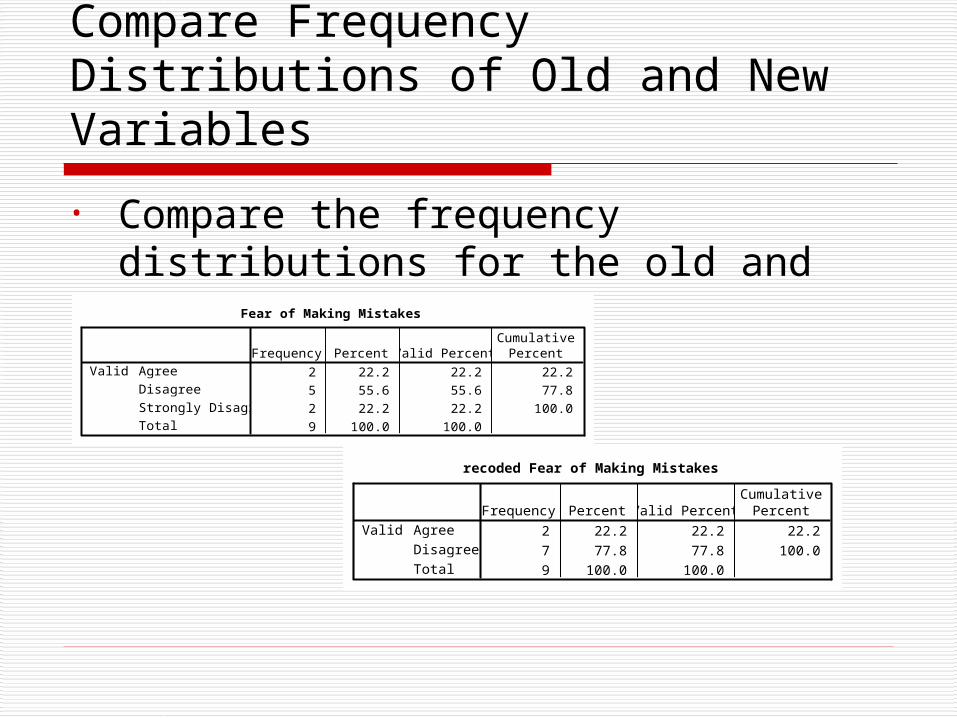
Compare Frequency Distributions of Old and New Variables
• Compare the frequency distributions for the old and new variables:
Fear of Making Mistakes
2 22.2 22.2 22.2
5 55.6 55.6 77.8
2 22.2 22.2 100.0
9 100.0 100.0
Agree
Disagree
Strongly Disagree
Total
ValidFrequency Percent Valid Percent
CumulativePercent
recoded Fear of Making Mistakes
2 22.2 22.2 22.2
7 77.8 77.8 100.0
9 100.0 100.0
Agree
Disagree
Total
ValidFrequency Percent Valid Percent
CumulativePercent
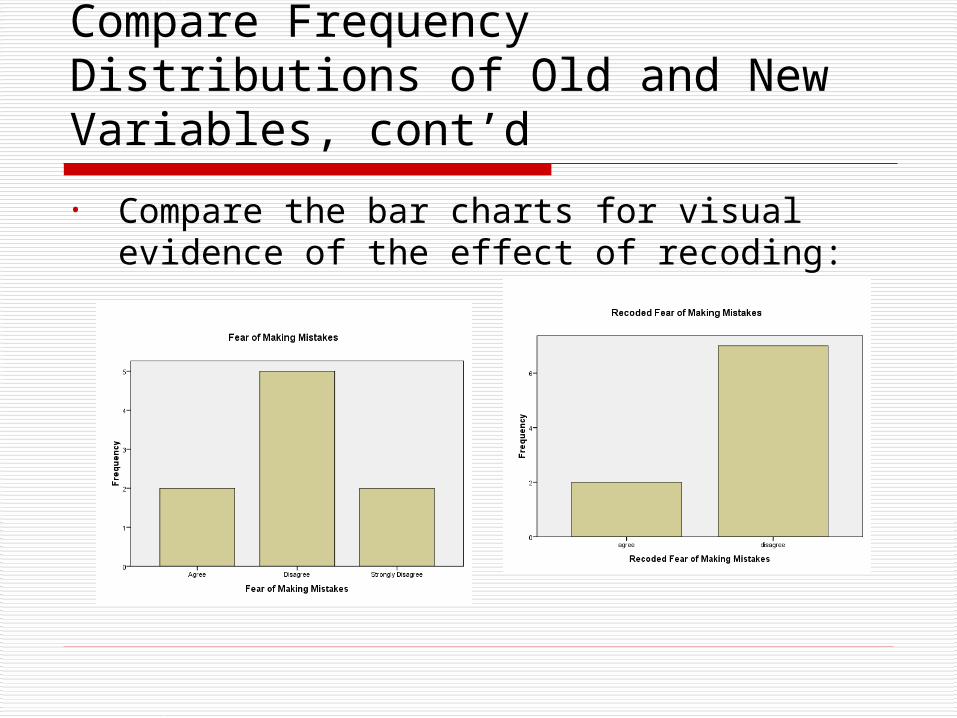
Compare Frequency Distributions of Old and New Variables, cont’d
• Compare the bar charts for visual evidence of the effect of recoding:
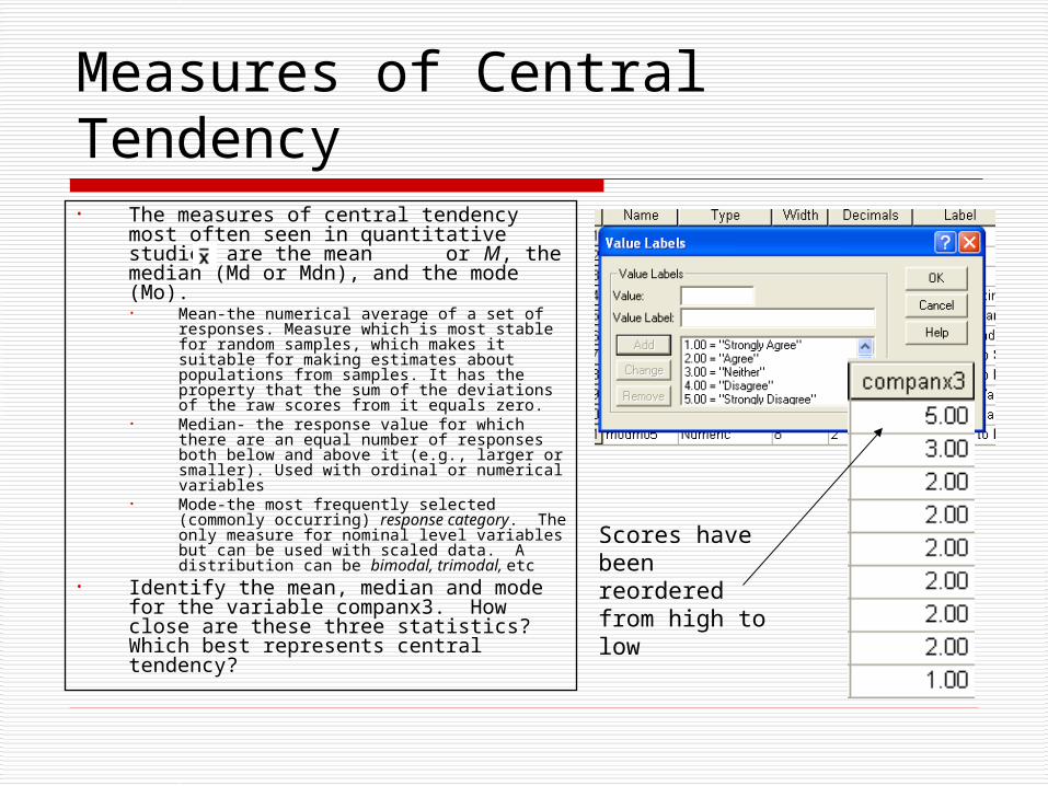
Measures of Central Tendency• The measures of central tendency most
often seen in quantitative studies are the mean or M, the median (Md or Mdn), and the mode (Mo).• Mean-the numerical average of a set of
responses. Measure which is most stable for random samples, which makes it suitable for making estimates about populations from samples. It has the property that the sum of the deviations of the raw scores from it equals zero.
• Median- the response value for which there are an equal number of responses both below and above it (e.g., larger or smaller). Used with ordinal or numerical variables
• Mode-the most frequently selected (commonly occurring) response category. The only measure for nominal level variables but can be used with scaled data. A distribution can be bimodal, trimodal, etc
• Identify the mean, median and mode for the variable companx3. How close are these three statistics? Which best represents central tendency?
Scores have been reordered from high to low

Median versus Mode when Outliers are Present• The median, unlike the mean, is
not affected by extreme scores or outliers. Consider the data on the right, where scores on the variable could range from 1 to 9. Which statistic, the median or mean, best represents central tendency? Go here for an interactive demonstration of the effect of skew in the distribution on measures of central tendency. Note that regardless of skew the relative positions of mode, median and mean remain the same, with mode at the peak of the curve, then median, then mean, going in the direction of the flatter tail.
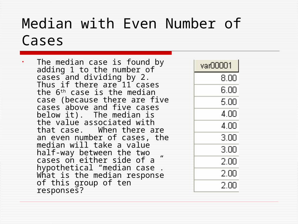
Median with Even Number of Cases• The median case is found by
adding 1 to the number of cases and dividing by 2. Thus if there are 11 cases the 6th case is the median case (because there are five cases above and five cases below it). The median is the value associated with that case. When there are an even number of cases, the median will take a value half-way between the two cases on either side of a hypothetical “median case”. What is the median response of this group of ten responses?

Using SPSS to Find Measures of Central Tendency• Go to Analyze/ Descriptive
Statistics/ Frequencies• Highlight the variable of
interest (say companx1, “fear of making mistakes,” and use the arrow to move it into the Variable window
• Click on the Statistics button and check Mean, Median and Mode; click Continue and then OK
• You can also get these measures of central tendency and more from Analyze/Descriptive Statistics/Explore
Statistics
Fear of Making Mistakes9
0
3.7778
4.0000
4.00
Valid
Missing
N
Mean
Median
Mode
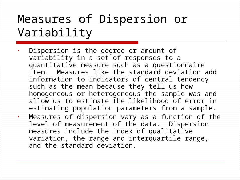
Measures of Dispersion or Variability• Dispersion is the degree or amount of variability in a
set of responses to a quantitative measure such as a questionnaire item. Measures like the standard deviation add information to indicators of central tendency such as the mean because they tell us how homogeneous or heterogeneous the sample was and allow us to estimate the likelihood of error in estimating population parameters from a sample.
• Measures of dispersion vary as a function of the level of measurement of the data. Dispersion measures include the index of qualitative variation, the range and interquartile range, and the standard deviation.
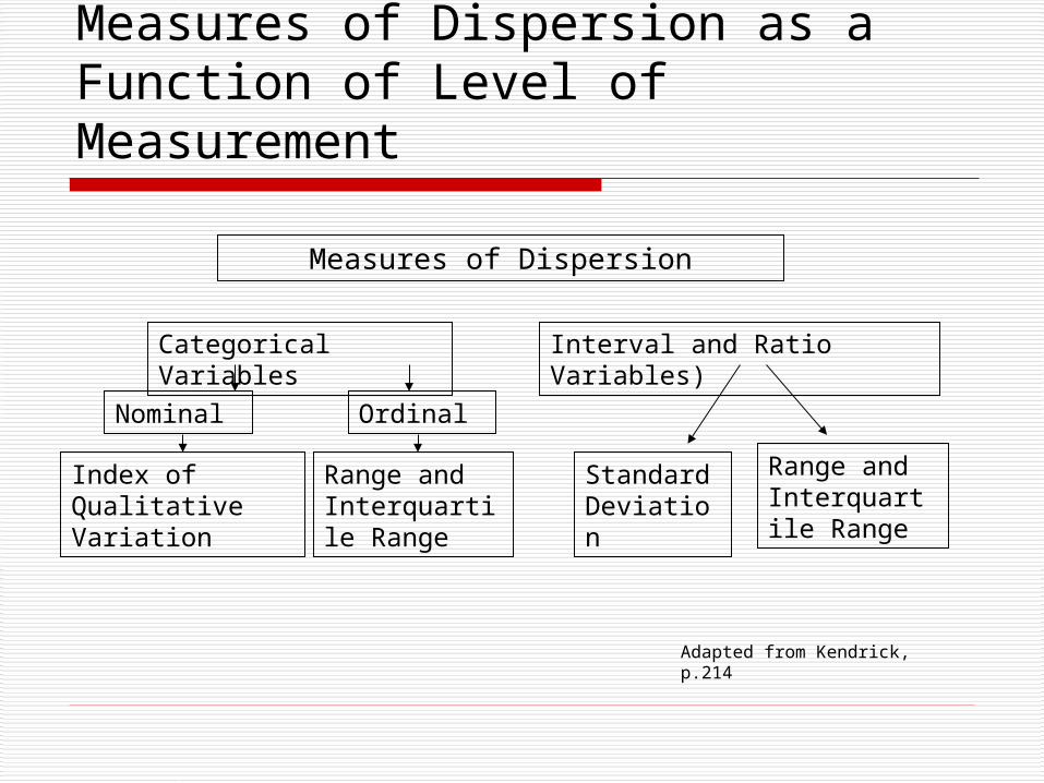
Measures of Dispersion as a Function of Level of Measurement
Measures of Dispersion
Categorical Variables Interval and Ratio Variables)
Nominal Ordinal
Index of Qualitative Variation
Range and Interquartile Range
Standard Deviation
Range and Interquartile Range
Adapted from Kendrick, p.214
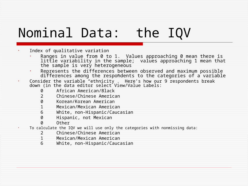
Nominal Data: the IQV• Index of qualitative variation
• Ranges in value from 0 to 1. Values approaching 0 mean there is little variability in the sample; values approaching 1 mean that the sample is very heterogeneous
• Represents the differences between observed and maximum possible differences among the respondents to the categories of a variable
• Consider the variable “ethnicity”. Here’s how our 9 respondents break down (in the data editor select View/Value Labels:
0 African American/Black2 Chinese/Chinese American 0 Korean/Korean American1 Mexican/Mexican American 6 White, non-Hispanic/Caucasian 0 Hispanic, not Mexican0 Other
• To calculate the IQV we will use only the categories with nonmissing data:2 Chinese/Chinese American 1 Mexican/Mexican American 6 White, non-Hispanic/Caucasian
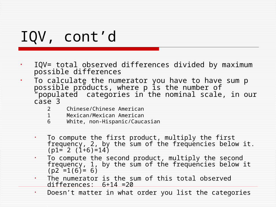
IQV, cont’d
• IQV= total observed differences divided by maximum possible differences
• To calculate the numerator you have to have sum p possible products, where p is the number of “populated” categories in the nominal scale, in our case 3
2 Chinese/Chinese American 1 Mexican/Mexican American 6 White, non-Hispanic/Caucasian
• To compute the first product, multiply the first frequency, 2, by the sum of the frequencies below it. (p1= 2 (1+6)=14)
• To compute the second product, multiply the second frequency, 1, by the sum of the frequencies below it (p2 =1(6)= 6)
• The numerator is the sum of this total observed differences: 6+14 =20
• Doesn’t matter in what order you list the categories

IQV, cont’d, 2• The denominator is equal to K (K-1)/2,
where K is the number of populated categories, times the square of N, the number of subjects, divided by K. The denominator equals 3 (2)/2 times 9/3 squared, or 3x9=27.
• The value of the IQV is 20/27 or .74, which is fairly heterogeneous. Does this seem an accurate reflection? What would happen if you included the four unpopulated categories in the equation?• The numerator would remain the same, but
the denominator would be 7(6)/2 X (9/7)2, or about 34, which would reduce the IQV to about .59 (more homogeneous). Does this seem more accurate?
• The problem is that there is no distribution of values of IQV to consult to see how likely you are to get a result of .74 or .59
(K (K-1)/2) (N/K)2
∑fifj (in this case 20)
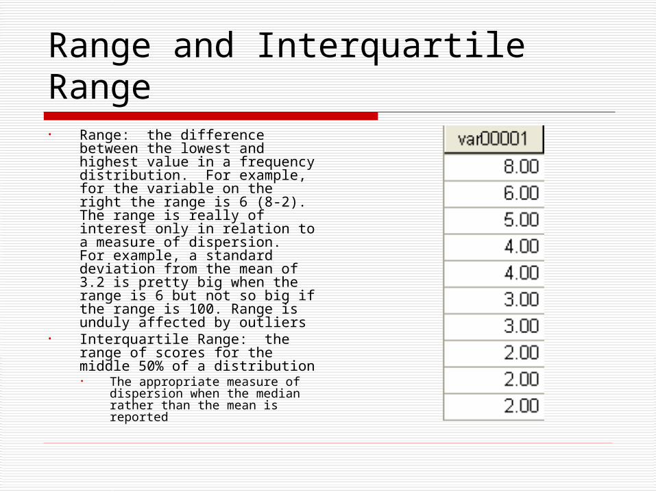
Range and Interquartile Range• Range: the difference between
the lowest and highest value in a frequency distribution. For example, for the variable on the right the range is 6 (8-2). The range is really of interest only in relation to a measure of dispersion. For example, a standard deviation from the mean of 3.2 is pretty big when the range is 6 but not so big if the range is 100. Range is unduly affected by outliers
• Interquartile Range: the range of scores for the middle 50% of a distribution• The appropriate measure of
dispersion when the median rather than the mean is reported

Interquartile Range
• Open the data set cars.sav and look at the variable “vehicle weight.” What are the range and interquartile range for this variable? Go to Analyze/ Descriptive Statistics/ Frequencies and move the vehicle weight variable into the Variable box. Click on Statistics and select Range, Quartiles, click Continue, then OK.
Statistics
Vehicle Weight (lbs.)406
0
4408
2222.25
2811.00
3614.75
Valid
Missing
N
Range
25
50
75
Percentiles
Vehicle Weight (lbs.)
Vehicle Weight (lbs.)
Fre
qu
en
cy
60
50
40
30
20
10
0
Std. Dev = 849.83
Mean = 2969.6
N = 406.00
IQR = Q3 – Q 1 =3614.75 – 2222.25 = 1392.5

Boxplot
You can further visualize the data by creating a boxplot (with the cars dataset open, go to Graphs/Boxplot. Highlight Simple in the dialog box, select “summaries of separate variables”, and click on Define. Move the variable “vehicle weight” into the “boxes represent” window and click OK. The black line represents the median. The beige box represents the cases in the interquartile range. The larger the box relative to the range, the more heterogeneous the distribution

Variance• The variance (s2) is the sum of the squared deviations from the sample mean,
divided by N-1 where N is the number of cases. (Note: in the formula for the population variance, the denominator is N rather than N-1)
• Reopen lesson3.sav and determine the variance, mean, range and standard deviation (square root of the variance) of the three computer anxiety variables using Analyze/Descriptive Statistics/Frequencies. All other things being equal, the larger the variance, the greater the heterogeneity of the sample. Which measure seems to have drawn the most homogeneous responses?
Formula for sample variance

Standard Deviation and Normal Distribution
• The standard deviation is the square root of the variance. It is a measure which is very useful because it allows you to make comparisons between samples with respect to their variability (how much a respondent from the sample typically departs from the mean). The size of the SD is generally about one-sixth the size of the value of the range
• The standard deviation becomes meaningful in the context of the normal distribution. In a normal distribution• The mean, median and mode of responses for a
variable coincide• The distribution is symmetrical in that it divides into
two equal halves at the mean, so that 50% of the scores fall below the mean and 50% above it
• 68.26 % of the scores in a normal distribution fall within plus or minus one standard deviation of the mean. 95.44% fall within 2 SDs• Thus we are able to use the SD to assess the relative
standing of a score within a distribution, to say that it is 2 SDs above or below the average, for example
• The normal distribution has a kurtosis equal to zero

Finding the Variance and Standard Deviation with SPSS• Open the cars.sav file. Use the command Analyze/ Descriptive Statistics/
Frequencies, hit the reset button to clear the Variables box, and move the variable “time to accelerate” into the Variables box. Click on Statistics and standard deviation, range, variance, mean, skewness, kurtosis, and quartiles, then click Continue and then OK. Note that the standard deviation is about 1/6 the size of the range, which is typical of a normal distribution
Variance
Standard deviation(s or SD-if SD (population) then N in the denominator)

Histogram with Superimposed Normal Curve• Next, create a histogram by the
command Graphs/ Chart Builder. Bypass the first dialog Highlight the variable “time to accelerate” and drag the simple histogram icon into the preview window. Drag the “time to accelerate” variable onto the X axis. In the Element Properties window check Display Normal Curve and then click “Apply” and then OK. Note that there is a curve superimposed on the histogram. This is what a normal distribution of a variable with the same mean and standard deviation would look like. Is the obtained sample distribution skewed? Is the distribution more platykurtic than the normal distribution? (see slides 5-6)
• Definition: “Kurtosis is a measure of whether the data are peaked or flat relative to a normal distribution. That is, data sets with high kurtosis tend to have a distinct peak near the mean, decline rather rapidly, and have heavy tails. Data sets with low kurtosis tend to have a flat top near the mean rather than a sharp peak. A uniform distribution would be the extreme case.”