statistical analysis - graphical techniques
DESCRIPTION
Systems Engineering Program. Department of Engineering Management, Information and Systems. EMIS 7370/5370 STAT 5340 : PROBABILITY AND STATISTICS FOR SCIENTISTS AND ENGINEERS. Statistical Analysis - Graphical Techniques. Dr. Jerrell T. Stracener, SAE Fellow. Leadership in Engineering. - PowerPoint PPT PresentationTRANSCRIPT

1
Statistical Analysis - Graphical Techniques
Dr. Jerrell T. Stracener, SAE Fellow
Leadership in Engineering
EMIS 7370/5370 STAT 5340 : PROBABILITY AND STATISTICS FOR SCIENTISTS AND ENGINEERS
Systems Engineering ProgramDepartment of Engineering Management, Information and Systems
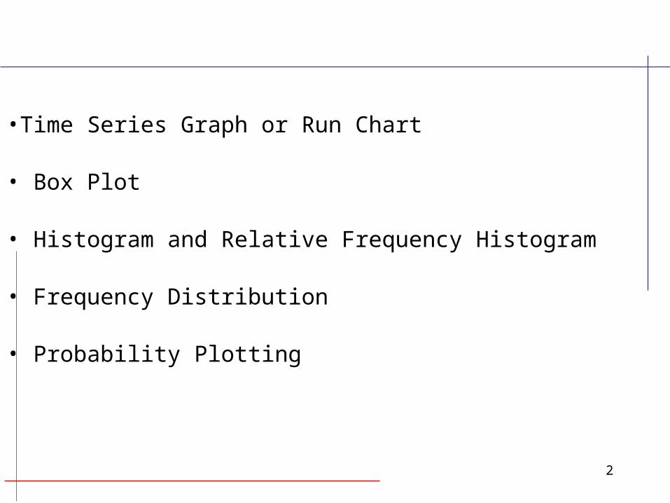
2
•Time Series Graph or Run Chart
• Box Plot
• Histogram and Relative Frequency Histogram
• Frequency Distribution
• Probability Plotting

3
• A plot of the data set x1, x2, …, xn in the order in which the data were obtained
•Used to detect trends or patterns in the dataover time
Time Series Graph or Run Chart

4
• A pictorial summary used to describe the most prominent statistical features of the data set, x1, x2, …, xn, including its:
- Center or location- Spread or variability- Extent and nature of any deviation from symmetry- Identification of ‘outliers’
Box Plot

5
• Shows only certain statistics rather than all thedata, namely
- median- quartiles- smallest and greatest values in the sample
• Immediate visuals of a box plot are the center,the spread, and the overall range of the data
Box Plot

6
Given the following random sample of size 25:
38, 10, 60, 90, 88, 96, 1, 41, 86, 14, 25, 5, 16,22, 29, 34, 55, 36, 37, 36, 91, 47, 43, 30, 98
Arranged in order from least to greatest:
1, 5, 10, 14, 16, 22, 25, 29, 30, 34, 36, 36, 37, 38, 41, 43, 47, 55, 60, 86, 88, 90, 91, 96, 98
Box Plot

7
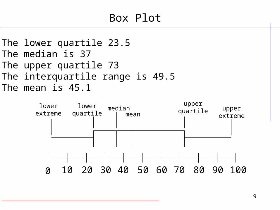
•First, find the median, the value exactly in themiddle of an ordered set of numbers.
The median is 37
• Next, we consider only the values to the left ofthe median:
1, 5, 10, 14, 16, 22, 25, 29, 30, 34, 36, 36
We now find the median of this set of numbers. The median for this group is (22 + 25)/2 = 23.5,which is the lower quartile.
Box Plot

8
• Now consider the values to the right of themedian.
38, 41, 43, 47, 55, 60, 86, 88, 90, 91, 96, 98
The median for this set is (60 + 86)/2 = 73, whichis the upper quartile.
We are now ready to find the interquartile range (IQR), which is the difference between the upperand lower quartiles, 73 - 23.5 = 49.5
49.5 is the interquartile range
Box Plot
9
The lower quartile 23.5The median is 37The upper quartile 73 The interquartile range is 49.5The mean is 45.1
upperquartile
0 10 20 30 40 50 60 70 80 90 100
lowerextreme
upperextreme
lowerquartile
medianmean
Box Plot
10
A graph of the observed frequencies in the dataset, x1, x2, …, xn versus data magnitude tovisually indicate its statistical properties, including
- shape- location or central tendency- scatter or variability
Histogram
Guidelines for Constructing Histograms – Discrete Data

11
• If the data x1, x2, …, xn are from a discrete random variable with possible values y1, y2, …, yk
count the number of occurrences of each valueof y and associate the frequency fi with yi, for i = 1, …, k,
Note that
k
ii nf
1
Guidelines for Constructing Histograms – Discrete Data

12
• If the data x1, x2, …, xn are from a continuousrandom variable
- select the number of intervals or cells, r,to be a number between 3 and 20, as an initial value use r = (n)1/2, where n is the number of observations- establish r intervals of equal width, startingjust below the smallest value of x- count the number of values of x withineach interval to obtain the frequency associated with each interval- construct graph by plotting (fi, i) for i = 1, 2, …, k
Guidelines for Constructing Histograms – Continuous Data

13
2.2 4.1 3.5 4.5 3.2 3.7 3 2.63.4 1.6 3.1 3.3 3.8 3.1 4.7 3.72.5 4.3 3.4 3.6 2.9 3.3 3.9 3.13.3 3.1 3.7 4.4 3.2 4.1 1.9 3.44.7 3.8 3.2 2.6 3.9 3 4.2 3.5
Car Battery Lives
To illustrate the construction of a relative frequency distribution,consider the following data which represent the lives of 40 carbatteries of a given type recorded to the nearest tenth of a year.The batteries were guaranteed to last 3 years.
Histogram and Relative Frequency Example

14
For this example, using the guidelines for constructing a histogram,the number of classes selected is 7 with a class width of 0.5. Thefrequency and relative frequency distribution for the data are shownin the following table.
Class Class Frequency Relativeinterval midpoint f frequency1.5-1.9 1.7 2 0.0502.0-2.4 2.2 1 0.0252.5-2.9 2.7 4 0.1003.0-3.4 3.2 15 0.3753.5-3.9 3.7 10 0.2504.0-4.4 4.2 5 0.1254.5-4.9 4.7 3 0.075
Total 40 1.000
Relative Frequency Distribution ofBattery Lives
Histogram and Relative Frequency Example
15
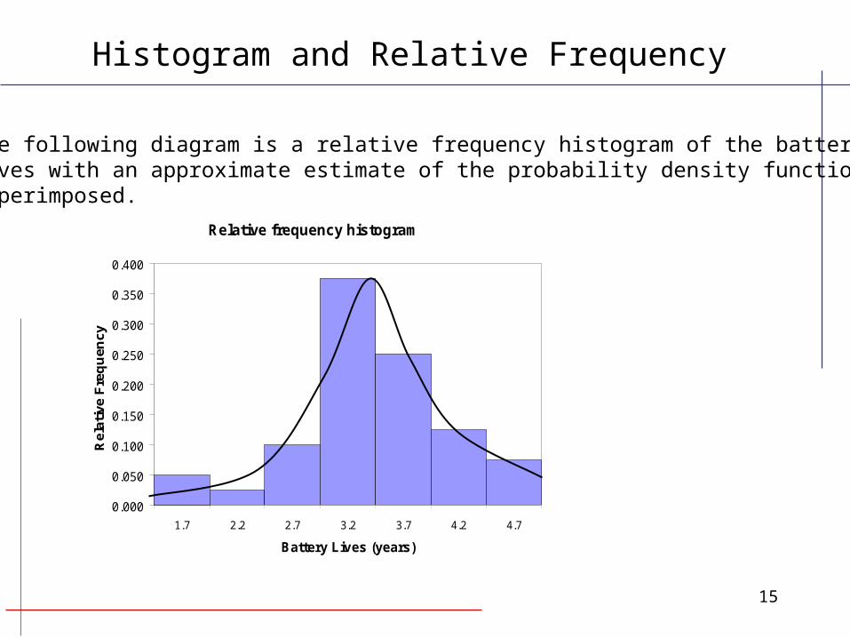
The following diagram is a relative frequency histogram of the batterylives with an approximate estimate of the probability density functionsuperimposed.
Relative frequency histogram
0.000
0.050
0.100
0.150
0.200
0.250
0.300
0.350
0.400
1.7 2.2 2.7 3.2 3.7 4.2 4.7
Battery Lives (years)
Rel
ativ
e F
req
uen
cy
Histogram and Relative Frequency

16
• Data are plotted on special graph paper designed for a particular distribution
- Normal - Weibull- Lognormal - Exponential
• If the assumed model is adequate, the plotted points will tend to fall in a straight line
• If the model is inadequate, the plot will not be linear and the type & extent of departures can be seen
• Once a model appears to fit the data reasonably well, percentiles and parameters can be estimated from the plot
Probability Plotting
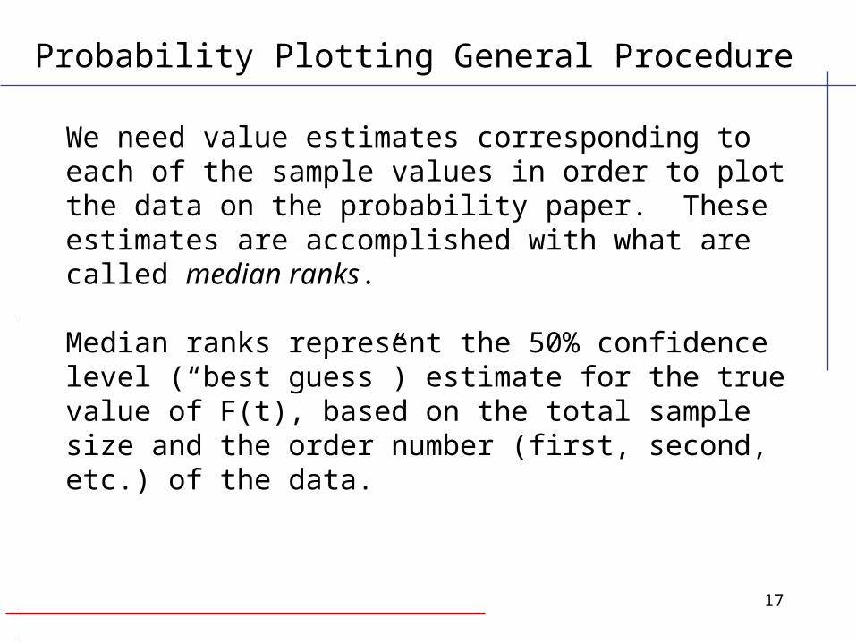
17
We need value estimates corresponding to each of the sample values in order to plot the data on the probability paper. These estimates are accomplished with what are called median ranks.
Median ranks represent the 50% confidence level (“best guess”) estimate for the true value of F(t), based on the total sample size and the order number (first, second, etc.) of the data.
Probability Plotting General Procedure
18
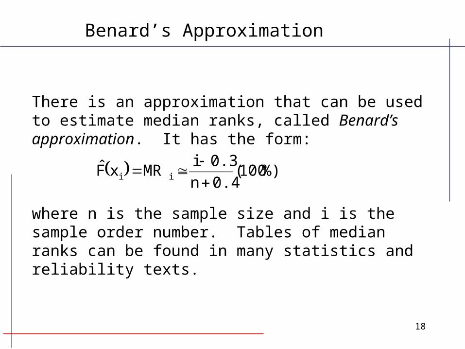
There is an approximation that can be used to estimate median ranks, called Benard’s approximation. It has the form:
where n is the sample size and i is the sample order number. Tables of median ranks can be found in many statistics and reliability texts.
%)100(0.4n
0.3iMRxF̂ ii
Benard’s Approximation

19
• Step 1: Obtain special graph paper, known asprobability paper, designed for the distribution underexamination. Weibull, Lognormal and Normal paper are available at:http://www.weibull.com/GPaper/index.htm
• Step 2: Rank the sample values from smallest to largest in magnitude i.e., X1 X2 ..., Xn.
Probability Plotting Procedure

20
• Step 3: Plot the Xi’s on the paper versus or ,
depending on whether the marked axis on the paper refers to the % or the proportion of observations. The axis of the graph paper on which the Xi’s are plotted is referred to as the observational scale, and the axis for as the cumulative scale.
%100*4.0
3.0)(
n
ixF i 40
30
.n
.i)F(x
^
i
%100*4.0
3.0)(
^
n
ixF i
Probability Plotting General Procedure
21
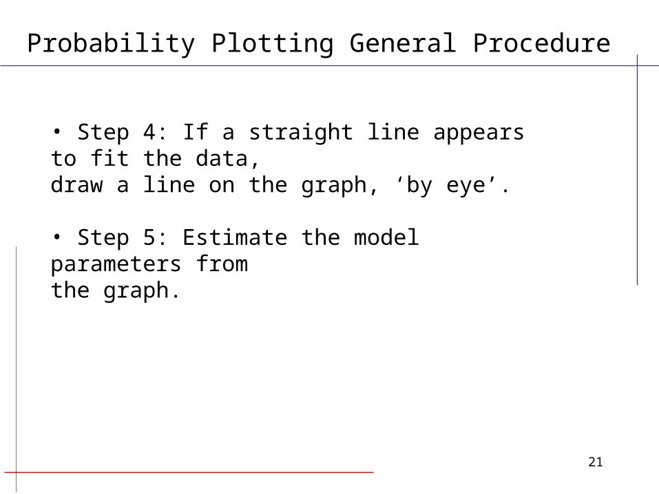
Probability Plotting General Procedure
• Step 4: If a straight line appears to fit the data, draw a line on the graph, ‘by eye’.
• Step 5: Estimate the model parameters from the graph.

22
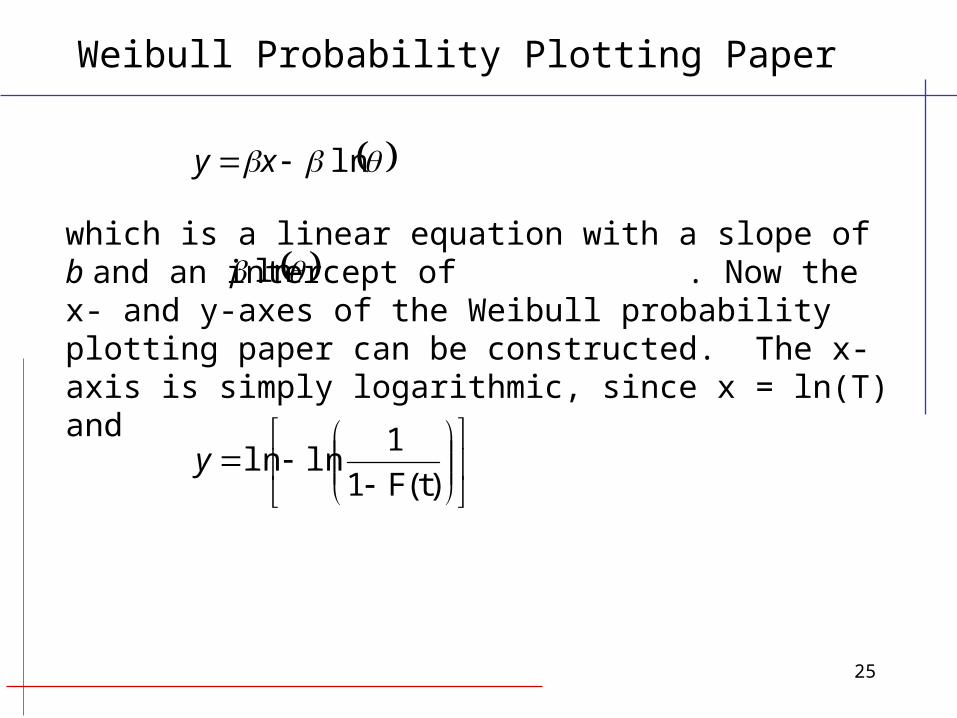
If
the cumulative probability distribution function is
We now need to linearize this function into the form y = ax +b
t
et 1)(F
θβ,W~T
Weibull Probability Plotting Paper

23
Then
which is the equation of a straight line of the form y = ax +b
lnln)T(F1
1lnln
ln)T(F1lnln
)T(F1ln
ln)T(F1ln
x
x
x
ex
Weibull Probability Plotting Paper

24
where
and
)t(F1
1lnlny
a
tx ln
i.e., ,ln b
Weibull Probability Plotting Paper
25
which is a linear equation with a slope of b and an intercept of . Now the x- and y-axes of the Weibull probability plotting paper can be constructed. The x-axis is simply logarithmic, since x = ln(T) and
ln xy
ln
)t(F1
1lnlny
Weibull Probability Plotting Paper

26
cumulativeprobability
(in %)
x
Weibull Probability Plotting Paper

27
To illustrate the process let 10, 20, 30, 40, 50, and 80 be a random sample of size n = 6.
Probability Plotting - Example

28
Based on Benard’s approximation,
we can now calculate F(t) for each observed value of X.
For example, for x2=20,
%6.26
%100*0.46
0.3220F̂
^
Probability Plotting - Example
%)100(0.4n
0.3iMRxF̂ ii

29
i xi F(xi)
1 10 10.9%2 20 26.6%3 30 42.2%4 40 57.8%5 50 73.4%6 80 89.1%
In summary,
Probability Plotting - Example
^
30
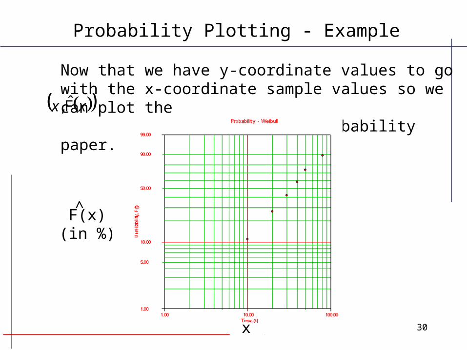
Now that we have y-coordinate values to go with the x-coordinate sample values so we can plot the points on Weibull probability paper. xx F̂,
F(x)(in %)
x
^
Probability Plotting - Example

31
The line represents the estimated relationship between x and F(x):
x
F(x)(in %)
^
Probability Plotting - Example

32
In this example, the points on Weibull probability paper fall in a fairly linear fashion, indicating that the Weibull distribution provides a good fit to the data. If the points did not seem to follow a straight line, we might want to consider using another probability distribution to analyze the data.
Probability Plotting - Example

33
Probability Plotting - Example

34
Probability Plotting - Example
35
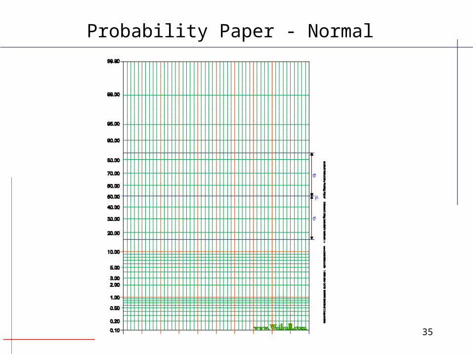
Probability Paper - Normal

36
Probability Paper - Lognormal

37
Probability Paper - Exponential

38
Given the following random sample of size n=8, which probability distribution provides the best fit?
i x i
1 79.409682 88.120933 91.063944 98.730945 104.15366 105.10197 106.50368 112.0354
Example - Probability Plotting
39
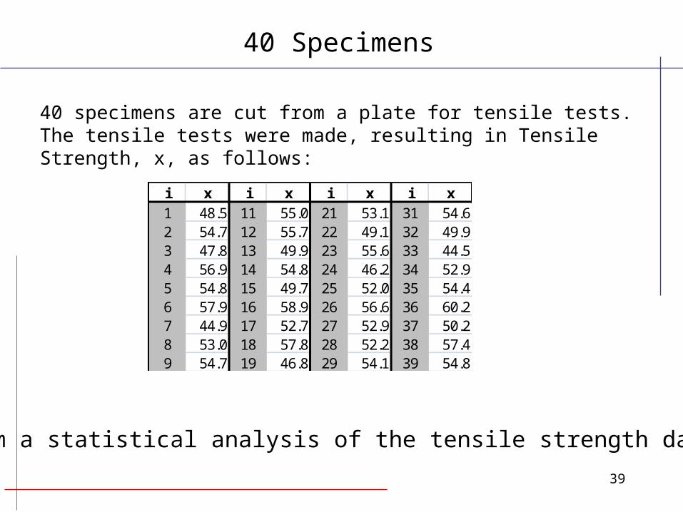
40 specimens are cut from a plate for tensile tests. The tensile tests were made, resulting in Tensile Strength, x, as follows:
i x i x i x i x1 48.5 11 55.0 21 53.1 31 54.62 54.7 12 55.7 22 49.1 32 49.93 47.8 13 49.9 23 55.6 33 44.54 56.9 14 54.8 24 46.2 34 52.95 54.8 15 49.7 25 52.0 35 54.46 57.9 16 58.9 26 56.6 36 60.27 44.9 17 52.7 27 52.9 37 50.28 53.0 18 57.8 28 52.2 38 57.49 54.7 19 46.8 29 54.1 39 54.8
Perform a statistical analysis of the tensile strength data.
40 Specimens

40
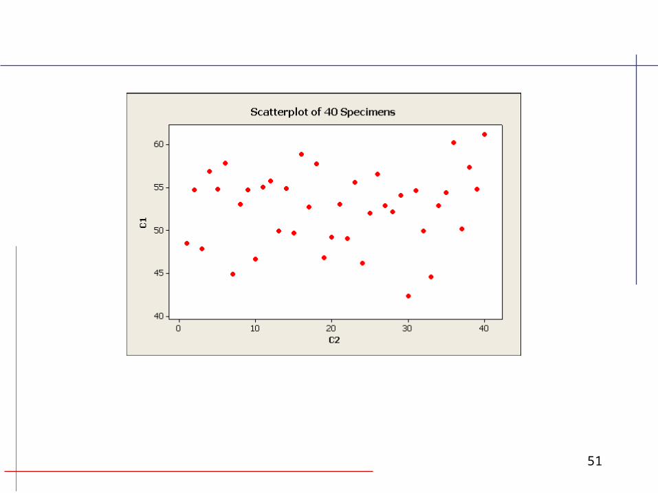
Time Series plot:
By visual inspection of the scatter plot, there seems to be no trend.Therefore, sample appears to be a random sample.
40 Specimens
30.0
35.0
40.0
45.0
50.0
55.0
60.0
65.0
0 5 10 15 20 25 30 35 40
41
40 Specimens
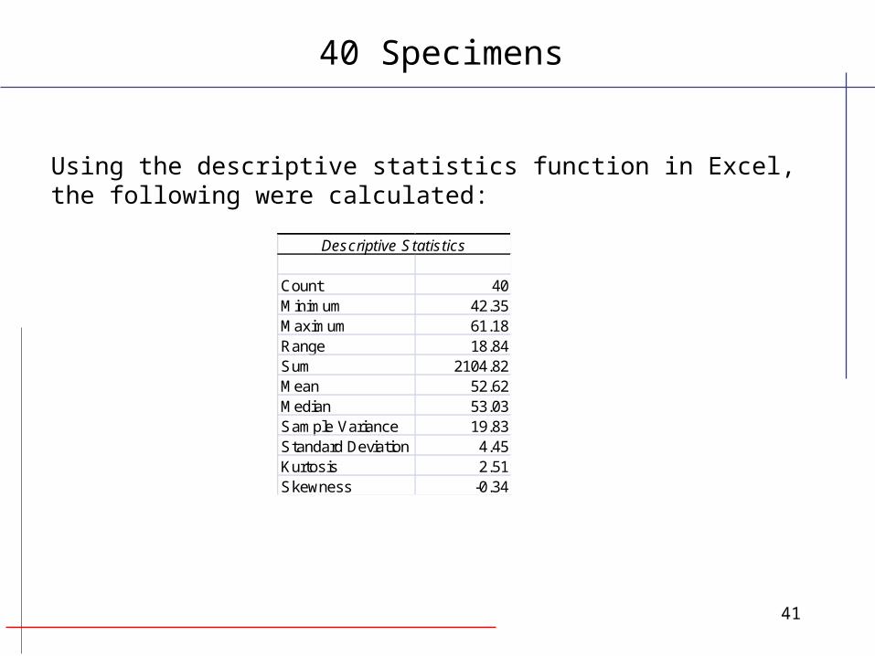
Descriptive Statistics
Count 40Minimum 42.35Maximum 61.18Range 18.84Sum 2104.82Mean 52.62Median 53.03Sample Variance 19.83Standard Deviation 4.45Kurtosis 2.51Skewness -0.34
Using the descriptive statistics function in Excel, the following were calculated:

42
40 Specimens
From looking at the Histogram and the Normal Probability Plot, we see that the tensile strength can be estimated by a normal distribution.
Using the histogram feature of excel the following data was calculated:
and the graph:
Bin Frequency40 045 350 1055 1660 9
More 2
Histogram of Tensile Strengths
0
2
4
6
8
10
12
14
16
18
40 45 50 55 60 More

43
40 Specimens
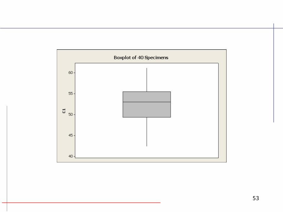
Box Plot
The lower quartile 49.45The median is 53.03The mean 52.6The upper quartile 55.3The interquartile range is 5.86
40 45 50 55 60 65
lowerextreme upper
extreme
lowerquartile
upperquartile
medianmean

44
40 Specimens
Normal Probability Plot
0.10%
1%
5%
10%
20%
30%
40%
50%
60%
70%
80%
90%
95%
99%
99.90%
40 45 50 55 60 65

45
40 Specimens
LogNormal Probability Plot
0.10%
1%
5%
10%
20%
30%
40%
50%
60%
70%
80%
90%
95%
99%
99.90%
10 100

46
40 Specimens
Weibull Probability Plot
0.10%
0.20%
0.30%
0.50%
1%
2%
3%
5%
10%
20%
30%
40%50%60%70%80%
90%95%
99%
99.90%
41 44 48 52 56 61
47
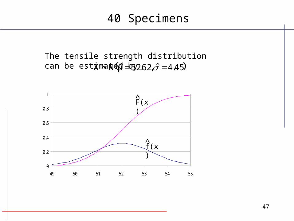
The tensile strength distribution can be estimated by
40 Specimens
45.4ˆ,62.52μ̂N~X
0
0.2
0.4
0.6
0.8
1
49 50 51 52 53 54 55
f(x)
F(x)
^
^
48
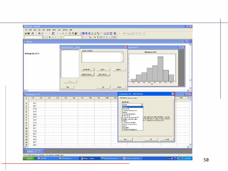
Solve the Example using Minitab
http://www.minitab.com/en-US/default.aspx

49
50
51

52
53

54

55

56