statistical process control charts as a tool for analyzing...
TRANSCRIPT
Statistical Process Control Charts as a Tool for Analyzing Big Data
Peihua Qiu
Department of Biostatistics
University of Florida
Abstract
Big data often take the form of data streams with observations of certain processes collected
sequentially over time. Among many different purposes, one common task to collect and analyze
big data is to monitor the longitudinal performance/status of the related processes. To this end,
statistical process control (SPC) charts could be a useful tool, although conventional SPC charts
need to be modified properly in some cases. In this paper, we introduce some basic SPC charts
and some of their modifications, and describe how these charts can be used for monitoring
different types of processes. Among many potential applications, dynamic disease screening and
profile/image monitoring will be discussed in some detail.
Key Words: Curve data; Data stream; Images; Longitudinal data; monitoring; Profiles; Se-
quential process; Surveillance.
1 Introduction
Recent advances in data acquisition technologies have led to massive amounts of data being collected
routinely in different scientific disciplines (e.g., Martin and Priscila 2011, Reichman et al. 2011).
In addition to volume, big data often have complicated structures. In applications, they often
take the form of data streams. Examples of big sets of data streams include those obtained from
complex engineering systems (e.g., production lines), sequences of satellite images, climate data,
website transaction logs, credit card records, and so forth. In many such applications, one major
goal to collect and analyze big data is to monitor the longitudinal performance/status of the related
processes. For such big data applications, statistical process control (SPC) charts could be a useful
tool. This paper tries to build a connection between SPC and big data analysis, by introducing some
representative SPC charts and by describing their (potential) use in various big data applications.
SPC charts are widely used in manufacturing and other industries for monitoring sequential
1
processes (e.g., production lines, internet traffics, operation of medical systems) to make sure
that they work stably and satisfactorily (cf., Hawkins and Olwell 1998, Qiu 2014). Since the
first control chart was proposed in 1931 by Walter A. Shewhart, many control charts have been
proposed in the past more than eighty years, including different versions of the Shewhart chart,
CUSUM chart, EWMA chart, and the chart based on change-point detection (CPD). See, for
instance, Champ and Woodall (1987), Crosier (1988), Crowder (1989), Hawkins (1991), Hawkins
et al. (2003), Lowry et al. (1992), Page (1954), Roberts (1959), Shewhart (1931), and Tracy et
al. (1992). Control charts discussed in these and many other relatively early papers are based
on the assumptions that the process distribution is normal and process observations at different
time points are independent. Some recent SPC charts are more flexible in the sense that they can
accommodate data autocorrelation and non-normality (e.g., Apley and Lee 2003, Qiu and Hawkins
2001, 2003, Qiu 2008).
The conventional control charts mentioned above are designed mainly for monitoring processes
whose observations at individual time points are scalars/vectors and whose observation distributions
are unchanged when the processes run stably. In applications, especially in those with big data
involved, process observations could be images or other types of profiles (see Section 4 for a detailed
description). When processes are stable, their observation distributions could change over time due
to seasonality and other reasons. To handle such applications properly, much research effort has
been made in the literature to extend/generalize the conventional control charts. After some basic
SPC concepts and control charts are discussed in Section 2, these extended/generalized control
charts will be discussed in Sections 3 and 4. Some remarks conclude the article in Section 5.
2 Conventional SPC Charts
In the past several decades, SPC charts were mainly used for monitoring production lines in the
manufacturing industry, although they also found many applications in infectious disease surveil-
lance, environment monitoring and other areas. When a production line is first installed, SPC
charts can be used to check whether the quality of a relatively small amount of products produced
by the production line meets the quality requirements. If some products are detected to be defec-
tive, then the root causes need to be figured out and the production line is adjusted accordingly.
After the proper adjustment, a small amount of products is produced again for quality inspection.
2
This trial-and-adjustment process continues until all assignable causes are believed to be removed
and the production line works stably. This stage of process control is often called phase-I SPC in
the literature. At the end of phase-I SPC, a clean dataset is collected under stable operating condi-
tions of the production line for estimating the distribution of the quality variables when the process
is in-control (IC). This dataset is called an IC dataset hereafter. The estimated IC distribution can
then be used for designing a control chart for online monitoring of the production line operation.
The online monitoring phase is called phase-II SPC. Its major goal is to guarantee that the produc-
tion line is IC, and give a signal as quickly as possible after the observed data provide a sufficient
evident that the production line has become out-of-control (OC). Most big data applications with
data streams involved concern phase-II SPC only because new observations are collected in daily
basis. However, the IC distribution of the quality variables still needs to be properly estimated
beforehand in a case-by-case basis. See related discussions in Sections 3 and 4 for some examples.
Next, we introduce some basic control charts for phase-II SPC. We start with cases with only
one quality variable X involved. Its distribution is assumed to be normal, and its observations
at different time points are assumed independent. When the process is IC, the process mean
and standard deviation are assumed to be µ0 and σ0, respectively. These parameters are assumed
known in phase-II SPC. But, they need to be estimated from an IC dataset in practice, as mentioned
above. At time n, for n ≥ 1, assume that there is a batch of m observations of X, denoted as
Xn1, Xn2, . . . , Xnm. Then, by the X Shewhart chart, the process has a mean shift if
|Xn − µ0| > Z1−α/2σ0√m, (1)
where α is a significance level and Z1−α/2 is the (1 − α/2)-th quantile of the standard normal
distribution. In the SPC literature, the performance of a control chart is often measured by the IC
average run length (ARL), denoted as ARL0, and the OC ARL, denoted as ARL1. ARL0 is the
average number of observations from the beginning of process monitoring to the signal time when
the process is IC, and ARL1 is the average number of observations from the occurrence of a shift
to the signal time after the process becomes OC. Usually, the value of ARL0 is pre-specified, and
the chart performs better for detecting a given shift if the value of ARL1 is smaller. For the X
chart (1), it is obvious that ARL0 = 1/α. For instance, when α is chosen 0.0027 (i.e., Z1−α/2 = 3),
ARL0 = 370.
The X chart (1) detects a mean shift at the current time n using the observed data at that
time point alone. This chart is good for detecting relatively large shifts. Intuitively, when a shift
3
is small, it should be better to use all available data by the time point n, including those at time n
and all previous time points. One such chart is the cumulative sum (CUSUM) chart proposed by
Page (1954), which gives a signal of mean shift when
C+n > h or C−n < −h, for n ≥ 1, (2)
where h > 0 is a control limit,
C+n = max
(0, C+
n−1 + (Xn − µ0)√m
σ0− k), C−n = min
(0, C−n−1 + (Xn − µ0)
√m
σ0+ k
), (3)
and k > 0 is an allowance constant. From the definition of C+n and C−n in (3), it can be seen that
(i) both of them use all available observations by the time n, and (ii) a re-starting mechanism is
introduced in their definitions so that C+n (C−n ) is reset to 0 each time when there is little evidence
of an upward (downward) mean shift. For the CUSUM chart (2), the allowance constant k is often
pre-specified, and its control limit h is chosen such that a pre-specified ARL0 level is reached.
An alternative control chart using all available observations is the exponentially weighted mov-
ing average (EWMA) chart originally proposed by Roberts (1959). This chart gives a signal of
mean shift if
|En| > ρE
√λ
2− λ, for n ≥ 1, (4)
where ρE > 0 is a parameter,
En = λ(Xn − µ0)√m
σ0+ (1− λ)En−1, (5)
E0 = 0, and λ ∈ (0, 1] is a weighting parameter. Obviously, En = λ∑n
i=1(1−λ)n−i(Xn−µ0)√m/σ0
is a weighted average of {(Xi−µ0)√m/σ0, i ≤ n} with the weights decay exponentially fast when i
moves away from n. In the chart (4), λ is usually pre-specified, and ρE is chosen such that a given
ARL0 level is reached.
All the charts (1), (2) and (4) assume that the IC parameters µ0 and σ0 have been properly
estimated beforehand. The CPD chart proposed by Hawkins et al. (2003) does not require this
assumption. However, its computation is more demanding, compared to that involved in the charts
(1), (2) and (4), which makes it less feasible for big data applications. For this reason, it is not
introduced here.
Example 1 The data shown in Figure 1(a) denote the Ethernet data lengths (in log scale) of
the 1 million Ethernet packets received by a computing facility. The x-axis denotes the time (in
4
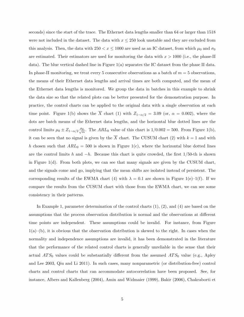
seconds) since the start of the trace. The Ethernet data lengths smaller than 64 or larger than 1518
were not included in the dataset. The data with x ≤ 250 look unstable and they are excluded from
this analysis. Then, the data with 250 < x ≤ 1000 are used as an IC dataset, from which µ0 and σ0
are estimated. Their estimators are used for monitoring the data with x > 1000 (i.e., the phase-II
data). The blue vertical dashed line in Figure 1(a) separates the IC dataset from the phase II data.
In phase-II monitoring, we treat every 5 consecutive observations as a batch of m = 5 observations,
the means of their Ethernet data lengths and arrival times are both computed, and the mean of
the Ethernet data lengths is monitored. We group the data in batches in this example to shrink
the data size so that the related plots can be better presented for the demonstration purpose. In
practice, the control charts can be applied to the original data with a single observation at each
time point. Figure 1(b) shows the X chart (1) with Z1−α/2 = 3.09 (or, α = 0.002), where the
dots are batch means of the Ethernet data lengths, and the horizontal blue dotted lines are the
control limits µ0 ± Z1−α/2σ0√m
. The ARL0 value of this chart is 1/0.002 = 500. From Figure 1(b),
it can be seen that no signal is given by the X chart. The CUSUM chart (2) with k = 1 and with
h chosen such that ARL0 = 500 is shown in Figure 1(c), where the horizontal blue dotted lines
are the control limits h and −h. Because this chart is quite crowded, the first 1/50-th is shown
in Figure 1(d). From both plots, we can see that many signals are given by the CUSUM chart,
and the signals come and go, implying that the mean shifts are isolated instead of persistent. The
corresponding results of the EWMA chart (4) with λ = 0.1 are shown in Figure 1(e)–1(f). If we
compare the results from the CUSUM chart with those from the EWMA chart, we can see some
consistency in their patterns.
In Example 1, parameter determination of the control charts (1), (2), and (4) are based on the
assumptions that the process observation distribution is normal and the observations at different
time points are independent. These assumptions could be invalid. For instance, from Figure
1(a)–(b), it is obvious that the observation distribution is skewed to the right. In cases when the
normality and independence assumptions are invalid, it has been demonstrated in the literature
that the performance of the related control charts is generally unreliable in the sense that their
actual ATS0 values could be substantially different from the assumed ATS0 value (e.g., Apley
and Lee 2003, Qiu and Li 2011). In such cases, many nonparametric (or distribution-free) control
charts and control charts that can accommodate autocorrelation have been proposed. See, for
instance, Albers and Kallenberg (2004), Amin and Widmaier (1999), Bakir (2006), Chakraborti et
5
500 1000 1500 2000 2500 3000
4.5
5.0
5.5
6.0
6.5
7.0
Arrival Time
Eth
erne
t Dat
a le
ngth
(a)
1000 1500 2000 2500 3000
45
67
Arrival Time
Eth
erne
t Dat
a le
ngth
(b)
1000 1500 2000 2500 3000
−10
010
2030
Arrival Time(c)
1000 1010 1020 1030 1040
−5
05
1015
2025
30
Arrival Time(d)
1000 1500 2000 2500 3000
−2
−1
01
2
Arrival Time(e)
1000 1010 1020 1030 1040
−1.
0−
0.5
0.0
0.5
1.0
1.5
2.0
Arrival Time(f)
Figure 1: (a) Original observations of the Ethernet data lengths, with the vertical blue dashed
line separating the IC dataset from the phase II observations. b) X chart with ATS0 = 500 for
monitoring the mean of every five consecutive observations. (c) CUSUM chart with k = 1 and
ARL0 = 500. d) First 1/50-th of the plot c). e) EWMA chart with λ = 0.1 and ARL0 = 500. f)
First 1/50-th of the plot e). The horizontal blue dotted lines in plots (b)–(f) are control limits.
6
al. (2001), Chatteejee and Qiu (2009), Hawkins and Deng (2010), Lu and Reynolds (1999), Ross
et al. (2011), Timmer et al. (1998), Yashchin (1993), and Zou and Tsung (2010). More recent
research on nonparametric SPC can be found in Chapters 8 and 9 of Qiu (2014) and the special
issue of Quality and Reliability Engineering International that was edited by Chakraborti et al.
(2015, ed.).
In applications, especially in those with big data involved, the number of quality variables could
be large. In such cases, many multivariate SPC charts have been proposed (cf., Qiu 2014, Chapter
7). Most early ones are based on the normality assumption (e.g., Healy 1987, Hawkins 1991, Lowry
et al. 1992, Woodall and Ncube 1985). Some recent ones are nonparametric or distribution-free
(e.g., Liu 1995, Qiu 2008, Qiu and Hawkins 2001, 2003, Zou and Tsung 2011). There are also some
multivariate SPC charts proposed specifically for cases with a large number of quality variables,
based on LASSO and some other variable selection techniques (e.g., Capizzi and Masarotto 2011,
Wang and Jiang 2009, Zou et al. 2015, Zou and Qiu 2009).
3 Dynamic Statistical Screening
The conventional SPC charts described in the previous section are mainly for monitoring processes
with a stable process distribution when the process is IC. In many applications, however, the
process distribution would change even when the process is IC. For instance, in applications with
infectious disease surveillance, the incidence rate of an infectious disease would change over time
even in time periods without disease outbreaks, due mainly to seasonality and other reasons. For
such applications, the conventional SPC charts cannot be applied directly. Recently, Qiu and
Xiang (2014) proposed a new method called dynamic screening system (DySS) for handling these
applications, which is discussed in this section. A completely nonparametric version is discussed
recently in Li and Qiu (2016). A multivariate DySS procedure is proposed in Qiu and Xiang (2015).
Its applications for monitoring the incidence rates of the hand, foot and mouth disease in China
and the AIDS epidemic in US are discussed in Zhang et al. (2015, 2016).
The DySS method is a generalization of the conventional SPC charts for cases when the IC mean
and variance change over time. It can be used in the following two different scenarios. First, it can
be used for early detection of diseases based on the longitudinal pattern of certain disease predictors.
In this scenario, if each person is regarded as a process, then many processes are involved. The IC
7

(or regular) longitudinal pattern of the disease predictors can be estimated from an observed dataset
of a group of people who do not have the disease in question. Then, we can sequentially monitor the
disease predictors of a given person, and use the cumulative difference between her/his longitudinal
pattern of the disease predictors and the estimated regular longitudinal pattern for disease early
detection. The related sequential monitoring problem in this scenario is called dynamic screening
(DS) in Qiu and Xiang (2014). Of course, the DS problem exists in many other applications,
including performance monitoring of durable goods (e.g., airplanes, cars). For instance, we are
required to check many mechanical indices of an airplane each time when it arrives a city, and
some interventions should be made if the observed values of the indices are significantly worse than
those of a well-functioning airplane of the same type and age. Second, the DySS method can also
be used for monitoring a single process whose IC distribution changes over time. For instance,
suppose we are interested in monitoring the incidence rate of an infectious disease in a region over
time. As mentioned in the previous paragraph, the incidence rate will change over time even in
years when no disease outbreaks occur. For such applications, by the DySS method, we can first
estimate the regular longitudinal pattern of the disease incidence rate from observed data in time
periods without disease outbreaks, and the estimated regular longitudinal pattern can then be used
for future disease monitoring.
From the above brief description, the DySS method consists of three main steps described
below.
(i) Estimation of the regular longitudinal pattern of the quality variables from a properly chosen
IC dataset.
(ii) Standardization of the longitudinal observations of a process in question for sequential mon-
itoring of its quality variables, using the estimated regular longitudinal pattern obtained in
step (i).
(iii) Dynamic monitoring of the standardized observations of the process, and giving a signal
as soon as all available data suggest a significant shift in its longitudinal pattern from the
estimated regular pattern.
In the DySS method, step (i) tries to establish a standard for comparison purposes in step (ii). By
standardizing the process observations, step (ii) actually compares the process in question cross-
sectionally and longitudinally with other well-functioning processes (in scenario 1) or with the same
8
process during the time periods when it is IC (in scenario 2). Step (iii) tries to detect the significant
difference between the longitudinal pattern of the process in question and the regular longitudinal
pattern based on their cumulative difference. Therefore, the DySS method has made use of the
current data and all history data in its decision making process. It should provide an effective tool
for solving the DS and other related problems.
Example 2 We demonstrate the DySS method using a dataset obtained from the SHARe
Framingham Heart Study of the National Heart Lung and Blood Institute (cf., Cupples et al.
2007, Qiu and Xiang 2014). Assume that we are interested in early detecting stroke based on the
longitudinal pattern of people’s total cholesterol level (in mg/100ml). In the data, there are 1028
non-stroke patients. Each of them was followed 7 times, and the total cholesterol level, denoted as
y, was recorded at each time. The observation times of different patients are all different. So, by
the DySS method, we first need to estimate the regular longitudinal pattern of y based on this IC
data. We assume that the IC data follow the model
y(tij) = µ(tij) + ε(tij), for j = 1, 2, . . . , Ji, i = 1, 2, . . . ,m, (6)
where tij is the jth observation time of the ith patient, y(tij) is the observed value of y at tij ,
µ(tij) is the mean of y(tij), and ε(tij) is the error term. In the IC data, m = 1028, Ji = 7, for
all i, and tij take theirs values in the interval [9, 85] years old. We further assume that the error
term ε(t), for any t ∈ [9, 85], consists of two independent components, i.e., ε(t) = ε0(t) + ε1(t),
where ε0(·) is a random process with mean 0 and covariance function V0(s, t), for any s, t ∈ [9, 85],
and ε1(·) is a noise process satisfying the condition that ε1(s) and ε1(t) are independent for any
s, t ∈ [9, 85]. In this decomposition, ε1(t) denotes the pure measurement error, and ε0(t) denotes
all possible covariates that may affect y but are not included in model (6). In such cases, the
covariance function of ε(·) is
V (s, t) = Cov (ε(s), ε(t)) = V0(s, t) + σ21(s)I(s = t), for any s, t ∈ [9, 85],
where σ21(s) = Var(ε1(s)), and I(s = t) = 1 when s = t and 0 otherwise. In model (6), observations
of different individuals are assumed to be independent. By the four-step procedure discussed in
Qiu and Xiang (2014), we can obtain estimates of the IC mean function µ(t) and the IC variance
function σ2y(t) = V0(t, t) + σ21(t), denoted as µ(t) and σ2y(t), respectively.
The estimated regular longitudinal pattern of y can then be described by µ(t) and σ2y(t). For
a new patient, assume that his/her y observations are {y(t∗j ), j = 1, 2, . . .}, and their standardized
9
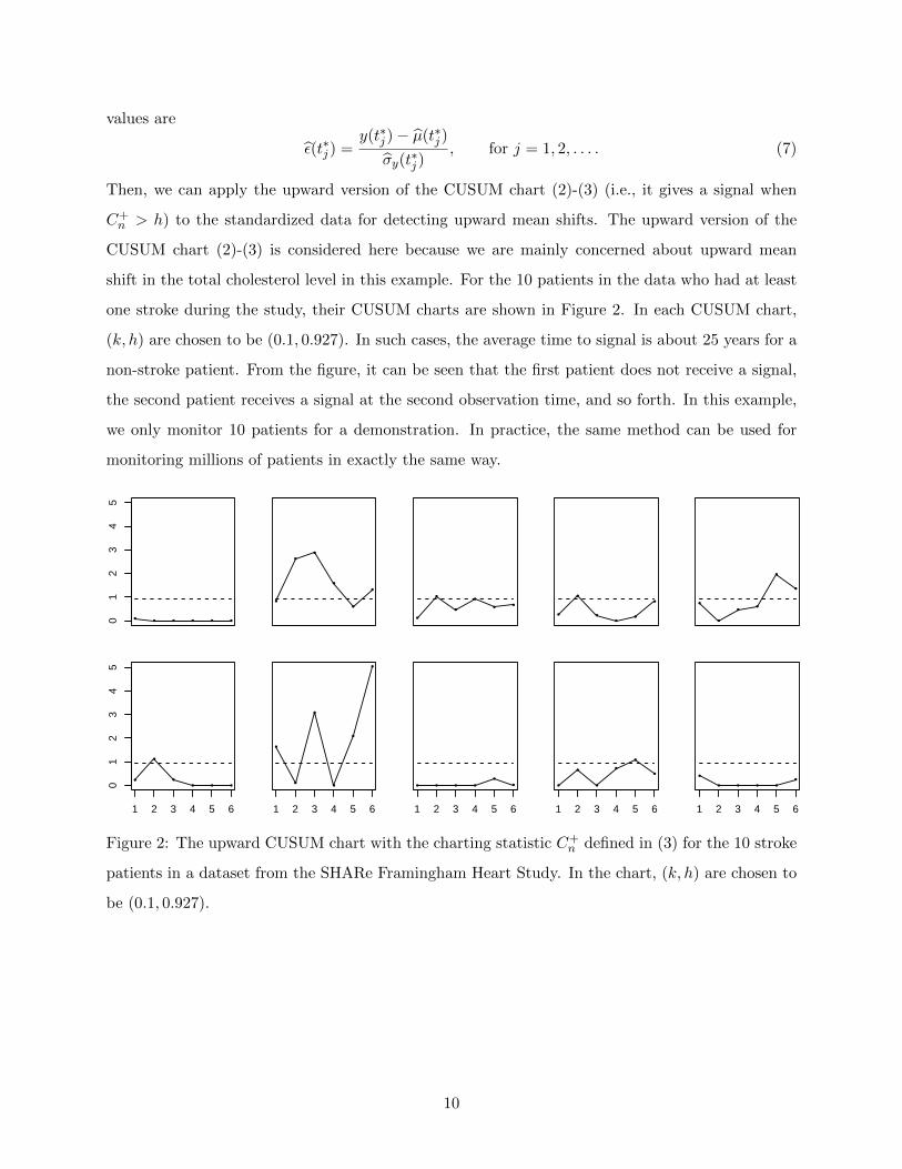
values are
ε(t∗j ) =y(t∗j )− µ(t∗j )
σy(t∗j ), for j = 1, 2, . . . . (7)
Then, we can apply the upward version of the CUSUM chart (2)-(3) (i.e., it gives a signal when
C+n > h) to the standardized data for detecting upward mean shifts. The upward version of the
CUSUM chart (2)-(3) is considered here because we are mainly concerned about upward mean
shift in the total cholesterol level in this example. For the 10 patients in the data who had at least
one stroke during the study, their CUSUM charts are shown in Figure 2. In each CUSUM chart,
(k, h) are chosen to be (0.1, 0.927). In such cases, the average time to signal is about 25 years for a
non-stroke patient. From the figure, it can be seen that the first patient does not receive a signal,
the second patient receives a signal at the second observation time, and so forth. In this example,
we only monitor 10 patients for a demonstration. In practice, the same method can be used for
monitoring millions of patients in exactly the same way.
●● ● ● ● ●0
12
34
5
Cn
●
●
●
●
●
●
●
●
●
●
●●
●
●
●
●
●
●●
●
●●
●
●
●
●
●
● ● ●
1 2 3 4 5 6
01
23
45
Cn
●
●
●
●
●
●
1 2 3 4 5 6
● ● ● ●
●
●
1 2 3 4 5 6
●
●
●
●
●
●
1 2 3 4 5 6
●
● ● ● ●
●
1 2 3 4 5 6
Figure 2: The upward CUSUM chart with the charting statistic C+n defined in (3) for the 10 stroke
patients in a dataset from the SHARe Framingham Heart Study. In the chart, (k, h) are chosen to
be (0.1, 0.927).
10
4 Profiles/Images Monitoring
In the previous two sections, process observations are assumed to be scalars (i.e., univariate SPC) or
vectors (i.e., multivariate SPC). In some applications, product quality is reflected in the relationship
among two or more variables. In such cases, one observes a set of data points (or called a profile)
of these variables for each sampled product. The major goal of SPC is to check the stability of the
relationship over time based on the observed profile data. This is the so-called profile monitoring
problem in the literature (Qiu 2014, Chapter 10).
The early research in profile monitoring is under the assumption that the relationship among
variables is linear, which is called linear profile monitoring in the literature (e.g., Jensen et al. 2008,
Kang and Albin 2000, Kim et al. 2003, Zou et al. 2006). For a given product, assume that we
are concerned about the relationship between a response variable y and a predictor x. For the i-th
sampled product, the observed profile data are assumed to follow the linear regression model
yij = ai + bixij + εij , for j = 1, 2, . . . , ni, i = 1, 2, . . . , (8)
where ai and bi are coefficients, and {εij , j = 1, 2, . . . , ni} are random errors. In such cases,
monitoring the stability of the relationship between x and y is equivalent to monitoring the stability
of {(ai, bi), i = 1, 2, . . .}. Then, the IC values of ai and bi can be estimated from an IC dataset, and
the linear profile monitoring can be accomplished by using a bivariate SPC chart.
In some applications, the linear regression model (8) is too restrictive to properly describe
the relationship between x and y. Instead, we can use a nonlinear model based on certain physi-
cal/chemical theory. In such cases, the linear model (8) can be generalized to the nonlinear model
yij = f(xij ,θi) + εij , for j = 1, 2, . . . , ni, i = 1, 2, . . . , (9)
where f(x,θ) is a known parametric function with parameter vector θ. For such a nonlinear profile
monitoring problem, we can estimate the IC value of θ from an IC dataset, and apply a conventional
SPC chart to the sequence {θi, i = 1, 2, . . .} for monitoring their stability (e.g., Chicken et al. 1998,
Ding et al. 2006, Jensen and Birch 2009, Jin and Shi 1999, Zou et al. 2007).
In many applications, the linear profile model (8) is inappropriate and it is difficult to specify
the nonlinear profile model (9) either. For instance, Figure 3 is about a manufacturing process of
aluminum electrolytic capacitors (AECs) considered in Qiu et al. (2010). This process transforms
11
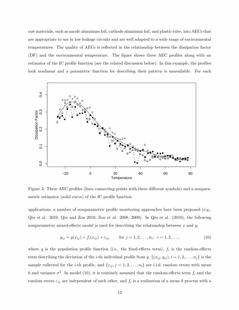
raw materials, such as anode aluminum foil, cathode aluminum foil, and plastic tube, into AECs that
are appropriate to use in low leakage circuits and are well adapted to a wide range of environmental
temperatures. The quality of AECs is reflected in the relationship between the dissipation factor
(DF) and the environmental temperature. The figure shows three AEC profiles along with an
estimator of the IC profile function (see the related discussion below). In this example, the profiles
look nonlinear and a parametric function for describing their pattern is unavailable. For such
−20 0 20 40 60 80
0.0
0.1
0.2
0.3
0.4
Temperature
Dis
sipa
tion
Fac
tor
Figure 3: Three AEC profiles (lines connecting points with three different symbols) and a nonpara-
metric estimator (solid curve) of the IC profile function.
applications, a number of nonparametric profile monitoring approaches have been proposed (e.g.,
Qiu et al. 2010, Qiu and Zou 2010, Zou et al. 2008, 2009). In Qiu et al. (2010), the following
nonparametric mixed-effects model is used for describing the relationship between x and y:
yij = g(xij) + fi(xij) + εij , for j = 1, 2, . . . , ni, i = 1, 2, . . . , (10)
where g is the population profile function (i.e., the fixed-effects term), fi is the random-effects
term describing the deviation of the i-th individual profile from g, {(xij , yij), i = 1, 2, . . . , nj} is the
sample collected for the i-th profile, and {εij , j = 1, 2, . . . , ni} are i.i.d. random errors with mean
0 and variance σ2. In model (10), it is routinely assumed that the random-effects term fi and the
random errors εij are independent of each other, and fi is a realization of a mean 0 process with a
12
common covariance function
γ(x1, x2) = E[fi(x1)fi(x2)], for any x1, x2.
Then, the IC functions of g(x) and γ(x1, x2), denoted as g0(x) and γ0(x1, x2), and the IC value
of σ2, denoted as σ20, can be estimated from an IC dataset. At the current time point t, we can
estimate g by minimizing the following local weighted negative-log likelihood:
WL(a, b; s, λ, t) =
t∑i=1
ni∑j=1
[yij − a− b(xij − s)]2Kh (xij − s) (1− λ)t−i/ν2(xij),
where λ ∈ (0, 1] is a weighting parameter, and ν2(x) = γ(x, x) + σ2 is the variance function of
the response. Note that WL(a, b; s, λ, t) combines the local linear kernel smoothing procedure (cf.,
Subsection 2.8.5, Qiu 2014) with the exponential weighting scheme used in EWMA through the
term (1 − λ)t−i. At the same time, it takes into account the heteroscedasticity of observations
by using ν2(xij). Then, the local linear kernel estimator of g(s), defined as the solution to a of
the minimization problem mina,bWL(a, b; s, λ, t) and denoted as gt,h,λ, can be obtained. Process
monitoring can then be performed based on the charting statistic
Tt,h,λ =
∫[gs,h,λ − g0(s)]2
ν2(s)Γ1(s)ds,
where Γ1 is some pre-specified density function.
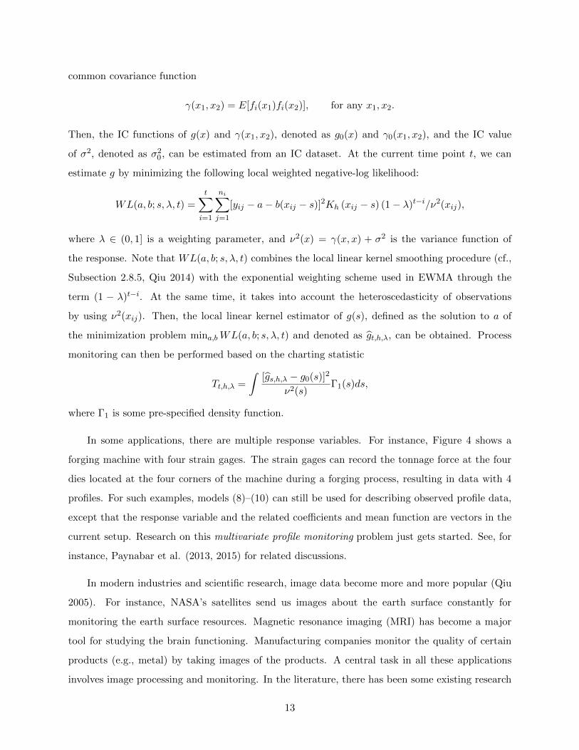
In some applications, there are multiple response variables. For instance, Figure 4 shows a
forging machine with four strain gages. The strain gages can record the tonnage force at the four
dies located at the four corners of the machine during a forging process, resulting in data with 4
profiles. For such examples, models (8)–(10) can still be used for describing observed profile data,
except that the response variable and the related coefficients and mean function are vectors in the
current setup. Research on this multivariate profile monitoring problem just gets started. See, for
instance, Paynabar et al. (2013, 2015) for related discussions.
In modern industries and scientific research, image data become more and more popular (Qiu
2005). For instance, NASA’s satellites send us images about the earth surface constantly for
monitoring the earth surface resources. Magnetic resonance imaging (MRI) has become a major
tool for studying the brain functioning. Manufacturing companies monitor the quality of certain
products (e.g., metal) by taking images of the products. A central task in all these applications
involves image processing and monitoring. In the literature, there has been some existing research
13

Figure 4: A forging machine with four strain gages.
on effective image monitoring (cf., Chiu et al. 2004, Tong et al. 2005). Most existing methods
construct their control charts based on some summary statistics of the observed images or some
detected image features. Some important (spatial) structures of the image sequences, however,
have not been well accommodated yet in these methods, and no general SPC methods and practical
guidelines have been proposed/provided for image monitoring. Therefore, in my opinion, the image
monitoring area is still mostly open. Next, I will use one example to address one important issue
that has not been taken into account in the existing research.
Example 3 The U.S. Geological Survey and NASA have launched 8 satellites since 1972
to gather earth resource data and for monitoring changes in the earth’s land surface and in the
associated environment (http://landsat.gsfc.nasa.gov). The most recent satellite Landsat-8 can
give us images of different places in the entire earth every 16 days. In about a year, we can get 23
images of a given place of interest. These images have been widely used in studying agriculture,
forestry and range resources, land use and mapping, geology, hydrology, coastal resources, and
environmental monitoring. In Figure 5, the upper-left and upper-right panels denote two satellite
images of the San Francisco bay area, taken in 1990 and 1999, respectively. Assume that we are
interested in detecting earth surface change over time in this area. In the two images, the larger and
smaller boxes highlight two regions in the bay area where obvious changes can be noticed between
the two images. Basically, the highlighted regions in the second image have more dark pixels. To
detect the earth surface change in the bay area between the two time points, a simple and commonly
used method is to compute the difference of the two images, which is shown in the lower-left panel.
From this “difference” image, it seems that the bay area changed quite dramatically from 1990
14
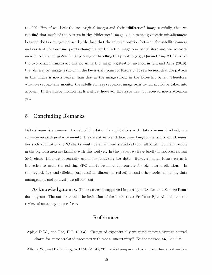
to 1999. But, if we check the two original images and their “difference” image carefully, then we
can find that much of the pattern in the “difference” image is due to the geometric mis-alignment
between the two images caused by the fact that the relative position between the satellite camera
and earth at the two time points changed slightly. In the image processing literature, the research
area called image registration is specially for handling this problem (e.g., Qiu and Xing 2013). After
the two original images are aligned using the image registration method in Qiu and Xing (2013),
the “difference” image is shown in the lower-right panel of Figure 5. It can be seen that the pattern
in this image is much weaker than that in the image shown in the lower-left panel. Therefore,
when we sequentially monitor the satellite image sequence, image registration should be taken into
account. In the image monitoring literature, however, this issue has not received much attention
yet.
5 Concluding Remarks
Data stream is a common format of big data. In applications with data streams involved, one
common research goal is to monitor the data stream and detect any longitudinal shifts and changes.
For such applications, SPC charts would be an efficient statistical tool, although not many people
in the big data area are familiar with this tool yet. In this paper, we have briefly introduced certain
SPC charts that are potentially useful for analyzing big data. However, much future research
is needed to make the existing SPC charts be more appropriate for big data applications. In
this regard, fast and efficient computation, dimension reduction, and other topics about big data
management and analysis are all relevant.
Acknowledgments: This research is supported in part by a US National Science Foun-
dation grant. The author thanks the invitation of the book editor Professor Ejaz Ahmed, and the
review of an anonymous referee.
References
Apley, D.W., and Lee, H.C. (2003), “Design of exponentially weighted moving average control
charts for autocorrelated processes with model uncertainty,” Technometrics, 45, 187–198.
Albers, W., and Kallenberg, W.C.M. (2004), “Empirical nonparametric control charts: estimation
15

Figure 5: The upper-left and upper-right panels denote two satellite images of the San Francisco bay
area, taken in 1990 and 1999, respectively. The lower-left panel is their difference. The lower-right
panel is their difference after proper image registration.
16
effects and corrections,” Journal of Applied Statistics, 31, 345–360.
Amin, R.W., and Widmaier, O. (1999), “Sign control charts with variable sampling intervals,”
Communications in Statistics: Theory and Methods, 28, 1961–1985.
Bakir, S.T. (2006), “Distribution-free quality control charts based on signed-rank-like statistics,”
Communications in Statistics – Theory and Methods, 35, 743–757.
Capizzi, G., and Masarotto, G. (2011), “A least angle regression control chart for multidimensional
data,” Technometrics, 53, 285–296.
Chakraborti, S., Qiu, P., and Mukherjee, A. (2015, ed.), “Special issue on nonparametric statistical
process control charts,” Quality and Reliability Engineering International, 31, 1–151.
Chakraborti, S., van der Laan, P. and Bakir, S.T. (2001), “Nonparametric control charts: an
overview and some results,” Journal of Quality Technology, 33, 304–315.
Champ, C.W., and Woodall, W.H. (1987), “Exact results for Shewhart control charts with sup-
plementary runs rules,” Technometrics, 29, 393–399.
Chatterjee, S., and Qiu, P. (2009), “Distribution-free cumulative sum control charts using bootstrap-
based control limits,” Annals of Applied Statistics, 3, 349–369.
Chicken, E., Pignatiello, J.J., Jr., and Simpson, J.R. (1998), “Statistical process monitoring of
nonlinear profiles using wavelets,” Journal of Quality Technology, 41, 198–212.
Chiu, D., Guillaud, M., Cox, D., Follen, M., and MacAulay, C. (2004), “Quality assurance system
using statistical process control: an implementation for image cytometry,” Cellular Oncology,
26, 101–117.
Crosier, R.B. (1988), “Multivariate generalizations of cumulative sum quality-control schemes,”
Technometrics, 30, 291-303.
Crowder, S.V. (1989), “Design of exponentially weighted moving average schemes,” Journal of
Quality Technology, 21, 155–162.
Cupples, L.A. et al. (2007), “The Framingham heart study 100K SNP genome-wide association
study resource: overview of 17 phenotype working group reports,” BMC Medical Genetics,
8, S1.
17
Ding, Y., Zeng, L., and Zhou, S. (2006), “Phase I analysis for monitoring nonlinear profiles in
manufacturing processes,” Journal of Quality Technology, 38, 199–216.
Hawkins, D.M. (1991), “Multivariate quality control based on regression-adjusted variables,” Tech-
nometrics, 33, 61-75.
Hawkins, D.M., and Deng, Q. (2010), “A nonparametric change-point control chart,” Journal of
Quality Technology, 42, 165–173.
Hawkins, D.M., and Olwell, D.H. (1998), Cumulative Sum Charts and Charting for Quality Im-
provement, New York: Springer-Verlag.
Hawkins, D.M., Qiu, P., and Kang, C.W. (2003), “The changepoint model for statistical process
control,” Journal of Quality Technology, 35, 355–366.
Healy, J.D. (1987), “A note on multivariate CUSUM procedures,” Technometrics, 29, 409-412.
Jensen, W.A., and Birch, J.B. (2009), “Profile monitoring via nonlinear mixed models,” Journal
of Quality Technology, 41, 18–34.
Jensen, W.A., Birch, J.B., and Woodall, W.H. (2008), “Monitoring correlation within linear pro-
files using mixed models,” Journal of Quality Technology, 40, 167–183.
Jin, J., and Shi, J. (1999), “Feature-preserving data compression of stamping tonnage information
using wavelets,” Technometrics, 41, 327–339.
Kang, L., and Albin, S.L. (2000), “On-line monitoring when the process yields a linear profile,”
Journal of Quality Technology, 32, 418–426.
Kim, K., Mahmoud, M.A., and Woodall, W.H. (2003), “On the monitoring of linear profiles,”
Journal of Quality Technology, 35, 317–328.
Li, J., and Qiu, P. (2016), “Nonparametric dynamic screening system for monitoring correlated
longitudinal data,” IIE Transactions, in press.
Liu, R.Y. (1995), “Control charts for multivariate processes,” Journal of the American Statistical
Association, 90, 1380–1387.
Lowry, C.A., Woodall, W.H., Champ, C.W., and Rigdon, S.E. (1992), “A multivariate exponen-
tially weighted moving average control chart,” Technometrics, 34, 46–53.
18

Lu, C.W., and Reynolds, M.R., Jr. (1999), “Control charts for monitoring the mean and variance
of autocorrelated processes,” Journal of Quality Technology, 31, 259-274.
Martin, H., and Priscila, L. (2011). “The world’s technological capacity to store, communicate,
and compute information,” Science, 332, 60–65.
Page, E.S. (1954), “Continuous inspection scheme,” Biometrika, 41, 100–115.
Paynabar, K., Jin, J., and Pacella, M. (2013), “Analysis of multichannel nonlinear profiles using
uncorrelated multilinear principal component analysis with applications in fault detection and
diagnosis,” IIE Transactions, 45, 1235–1247.
Paynabar, K., Qiu, P., and Zou, C. (2015), “A change point approach for phase-I analysis in
multivariate profile monitoring and diagnosis,” Technometrics, in press.
Qiu, P. (2005), Image Processing and Jump Regression Analysis, New York: John Wiley & Sons.
Qiu, P. (2008), “Distribution-free multivariate process control based on log-linear modeling,” IIE
Transactions, 40, 664–677.
Qiu, P. (2014), Introduction to Statistical Process Control, Boca Raton, FL: Chapman Hall/CRC.
Qiu, P., and Hawkins, D.M. (2001), “A rank based multivariate CUSUM procedure,” Technomet-
rics, 43, 120-132.
Qiu, P., and Hawkins, D.M. (2003), “A nonparametric multivariate CUSUM procedure for detect-
ing shifts in all directions,” JRSS-D (The Statistician), 52, 151-164.
Qiu, P., and Li, Z. (2011), “On nonparametric statistical process control of univariate processes,”
Technometrics, 53, 390–405.
Qiu, P., and Xiang, D. (2014), “Univariate dynamic screening system: an approach for identifying
individuals with irregular longitudinal behavior,” Technometrics, 56, 248–260.
Qiu, P., and Xiang, D. (2015), “Surveillance of cardiovascular diseases using a multivariate dy-
namic screening system,” Statistics in Medicine, 34, 2204–2221.
Qiu, P., and Xing, C. (2013), “On nonparametric image registration,” Technometrics, 55, 174–188.
Qiu, P., and Zou, C. (2010), “Control chart for monitoring nonparametric profiles with arbitrary
design,” Statistica Sinica, 20, 1655–1682.
19
Qiu, P., Zou, C., and Wang, Z. (2010), “Nonparametric profile monitoring by mixed effects mod-
eling (with discussions),” Technometrics, 52, 265–293.
Reichman, O.J., Jones, M.B., Schildhauer, M.P. (2011), “Challenges and opportunities of open
data in ecology,” Science, 331, 703–705.
Roberts, S.V. (1959), “Control chart tests based on geometric moving averages,” Technometrics,
1, 239–250.
Ross, G.J., Tasoulis, D.K., and Adams, N.M. (2011), “Nonparametric monitoring of data streams
for changes in location and scale,” Technometrics, 53, 379–389.
Shewhart, W.A. (1931), Economic Control of Quality of Manufactured Product, New York: D.
Van Nostrand Company.
Timmer, D.H., Pignatiello, J., and Longnecker, M. (1998), “The development and evaluation of
CUSUM-based control charts for an AR(1) process,” IIE Transactions, 30, 525–534.
Tong, L.-I., Wang, C.-H., and Huang, C.-L. (2005), “Monitoring defects in IC fabrication using a
Hotelling T2 control chart,” IEEE Transactions on Semiconductor Manufacturing, 18, 140–
147.
Tracy, N.D., Young, J.C. , and Mason, R.L. (1992), “Multivariate control charts for individual
observations,” Journal of Quality Technology, 24, 88–95.
Wang, K., and Jiang, W. (2009), “High-dimensional process monitoring and fault isolation via
variable selection,” Journal of Quality Technology, 41, 247–258.
Woodall, W.H. (2000), “Controversies and contradictions in statistical process control,” Journal
of Quality Technology, 32, 341-350.
Woodall, W.H., and Ncube, M.M. (1985), “Multivariate CUSUM quality-control procedures,”
Technometrics, 27, 285–292.
Zhang, J., Kang, Y., Yang, Y., and Qiu, P. (2015), “Statistical monitoring of the hand, foot and
mouth disease in China,” Biometrics, 71, 841–850.
Zhang, J., Qiu, P., and Chen, X. (2016), “Statistical monitoring-based alarming systems in mod-
eling the AIDS epidemic in the US, 1985-2011,” Current HIV Research, in press.
20
Zou, C., Jiang, W., Wang, Z., and Zi, X. (2015), “An efficient on-line monitoring method for
high-dimensional data streams,” Technometrics, in press.
Zou, C., and Qiu, P. (2009), “Multivariate statistical process control using LASSO,” Journal of
the American Statistical Association, 104, 1586–1596.
Zou, C., Qiu, P., and Hawkins, D. (2009), “Nonparametric control chart for monitoring profiles
using change point formulation and adaptive smoothing,” Statistica Sinica, 19, 1337–1357.
Zou, C., and Tsung, F. (2010), “Likelihood ratio-based distribution-free EWMA control charts,”
Journal of Quality Technology, 42, 1-23.
Zou, C., and Tsung, F. (2011), “A multivariate sign EWMA control chart,” Technometrics, 53,
84–97.
Zou, C., Tsung, F., and Wang, Z. (2007), “Monitoring general linear profiles using multivariate
EWMA schemes,” Technometrics, 49, 395–408.
Zou, C., Tsung, F., and Wang, Z. (2008), “Monitoring profiles based on nonparametric regression
methods,” Technometrics, 50, 512–526.
Zou, C., Zhang, Y., and Wang, Z. (2006), “Control chart based on change-point model for moni-
toring linear profiles,” IIE Transactions, 38, 1093–1103.
21