statistical process control dr. ron lembke. statistics
Post on 19-Dec-2015
223 views
TRANSCRIPT

Statistical Process Control
Dr. Ron Lembke

Statistics

Measures of Variability Range: difference between largest and smallest
values in a sample Very simple measure of dispersion R = max - min
Variance: Average squared distance from the mean Population (the entire universe of values) variance:
divide by N Sample (a sample of the universe) var.: divide by N-1
Standard deviation: square root of variance

Skewness Lack of symmetry Pearson’s coefficient
of skewness:0246810121416
0246810121416
0246810121416
Skewness = 0 Negative Skew < 0
Positive Skew > 0
s
Medianx )(3

Kurtosis Amount of peakedness
or flatness
Kurtosis < 0 Kurtosis > 0
Kurtosis = 04
4)(
ns
xx
0
0.05
0.1
0.15
0.2
0.25
0.3
0.35
0.4
0.45
-6 -4 -2 0 2 4 6
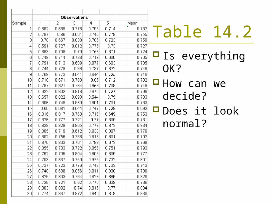
Table 14.2 Is everything
OK? How can we
decide? Does it look
normal?

Histogram of 150 data points Histogram looks pretty normal, but definitely not perfect. Looks like 2 peaks, actually, but pretty normal.
0
5
10
15
20
25
30
35
40
45
0.5 0.55 0.6 0.65 0.7 0.75 0.8 0.85 0.9 0.95 1 1.05

Is it Normal? Sorted all 150 data points, plotted Mean = 0.7616, stdv = 0.0738
0.5
0.55
0.6
0.65
0.7
0.75
0.8
0.85
0.9
0.95
1
1 10 19 28 37 46 55 64 73 82 91 100 109 118 127 136 145

Compute 1,2,3 sigma limits

Is it Normal?
F(m-3s) = 0 F(m+1s) = 129/150 = 0.86 F(m-2s) = 7/150 = 0.0467 F(m+2s) = 149/150 = 0.993 F(m-1s) = 24/150 = 0.16 F(m+3s) = 150/150 = 1.00 F(m) = 71/150 = 0.473

Is it Normal? Data Theoretical F(m-3s) = 0 0.001 F(m-2s) = 0.0467 0.023 F(m-1s) = 0.160 0.159 F(m) = 0.473 0.500 F(m+1s) = 0.860 0.841 F(m+2s) = 0.993 0.977 F(m+3s) = 1.000 0.999
Values we get are pretty close to a normal distribution.

Real Test of Normality Kolmologorov-Smirnov Anderson-Darling
Sadly, we don’t have time for either today You need SAS or something like it. Excel can’t do everything.

Process Capability UTL = 1.0 LTL = 0.5 Cpk > 1.0 Process
capable, but barely
Is everything OK?
0
5
10
15
20
25
30
35
40
45
0.5 0.55 0.6 0.65 0.7 0.75 0.8 0.85 0.9 0.95 1 1.05

Plot Data over time
No significant trend to data?
y = 0.0005x + 0.7237
R2 = 0.0804
0
0.2
0.4
0.6
0.8
1
1.2
1 8 15 22 29 36 43 50 57 64 71 78 85 92 99 106 113 120 127 134 141
Series1
Linear (Series1)

Plot Data over time
Data is in sets of 5, all taken at same time. Plotting individual points makes us see
trends that aren’t really there. Solution – plot averages of each sample

Sample Means
0.650
0.670
0.690
0.710
0.730
0.750
0.770
0.790
0.810
0.830
0.850
1 3 5 7 9 11 13 15 17 19 21 23 25 27 29
Series1

Control Chart Control Limits are mean +/- 3 std. dev.
0.650
0.670
0.690
0.710
0.730
0.750
0.770
0.790
0.810
0.830
0.850
1 3 5 7 9 11 13 15 17 19 21 23 25 27 29
Data
LCL
UCL

We have Out-of-Control Points Looks like the mean has shifted. Something is definitely wrong.

Control Limits catch early In fact, we
should compute control limits using first 17 data points
0.650
0.670
0.690
0.710
0.730
0.750
0.770
0.790
0.810
0.830
0.850
1 2 3 4 5 6 7 8 9 10 11 12 13 14 15 16 17 18
Series1
Series2
Series3
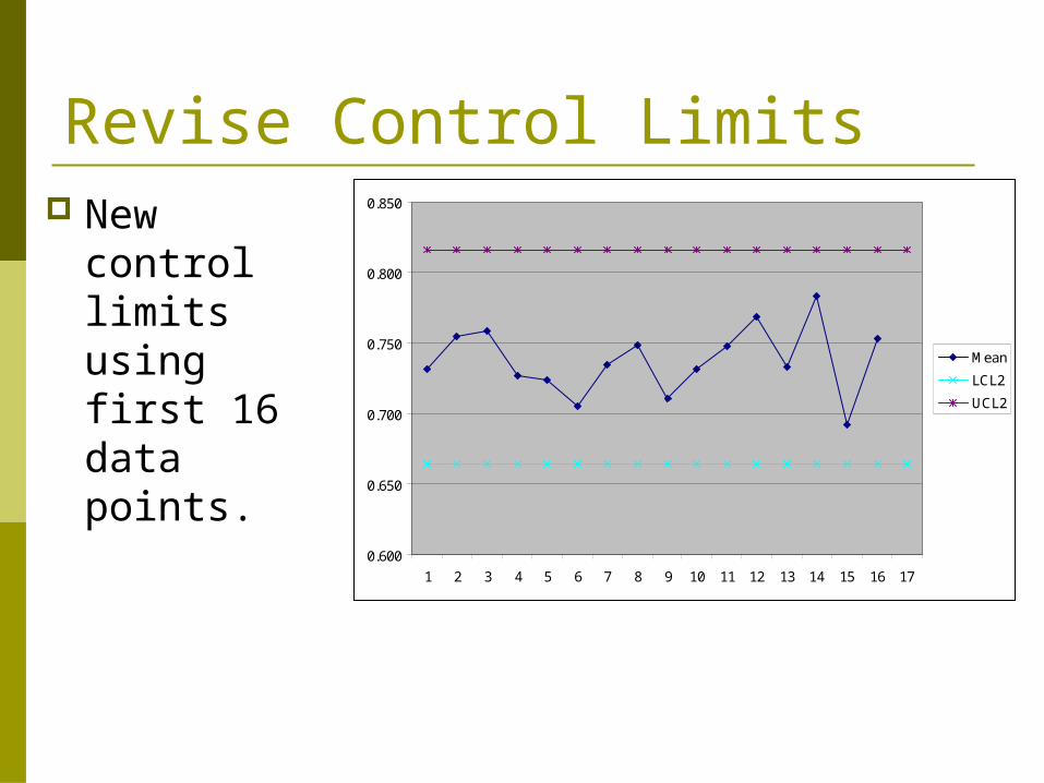
Revise Control Limits New control
limits using first 16 data points.
0.600
0.650
0.700
0.750
0.800
0.850
1 2 3 4 5 6 7 8 9 10 11 12 13 14 15 16 17
Mean
LCL2
UCL2

Control Chart Usage Only data from one process on each chart Putting multiple processes on one chart
only causes confusion 10 identical machines: all on same chart
or not?
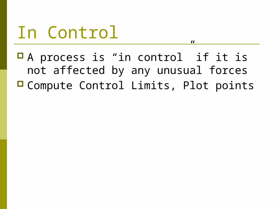
In Control A process is “in control” if it is not affected
by any unusual forces Compute Control Limits, Plot points

X-bar Chart for Averages
RAXLCL
RAXUCL
X
X
2
2
k
RR
k
XX
k
ii
k
ii
11

Definitions of Out of Control1. No points outside control limits2. Same number above & below center line3. Points seem to fall randomly above and
below center line4. Most are near the center line, only a few
are close to control limits1. 8 Consecutive pts on one side of centerline2. 2 of 3 points in outer third3. 4 of 5 in outer two-thirds region

You’re manager of a 500-room hotel. You want to analyze the time it takes to deliver luggage to the room. For 7 days, you collect data on 5 deliveries per day. Is the process in control?
Hotel Example

Hotel Data
Day Delivery Time
1 7.30 4.20 6.10 3.455.552 4.60 8.70 7.60 4.437.623 5.98 2.92 6.20 4.205.104 7.20 5.10 5.19 6.804.215 4.00 4.50 5.50 1.894.466 10.108.10 6.50 5.066.947 6.77 5.08 5.90 6.909.30
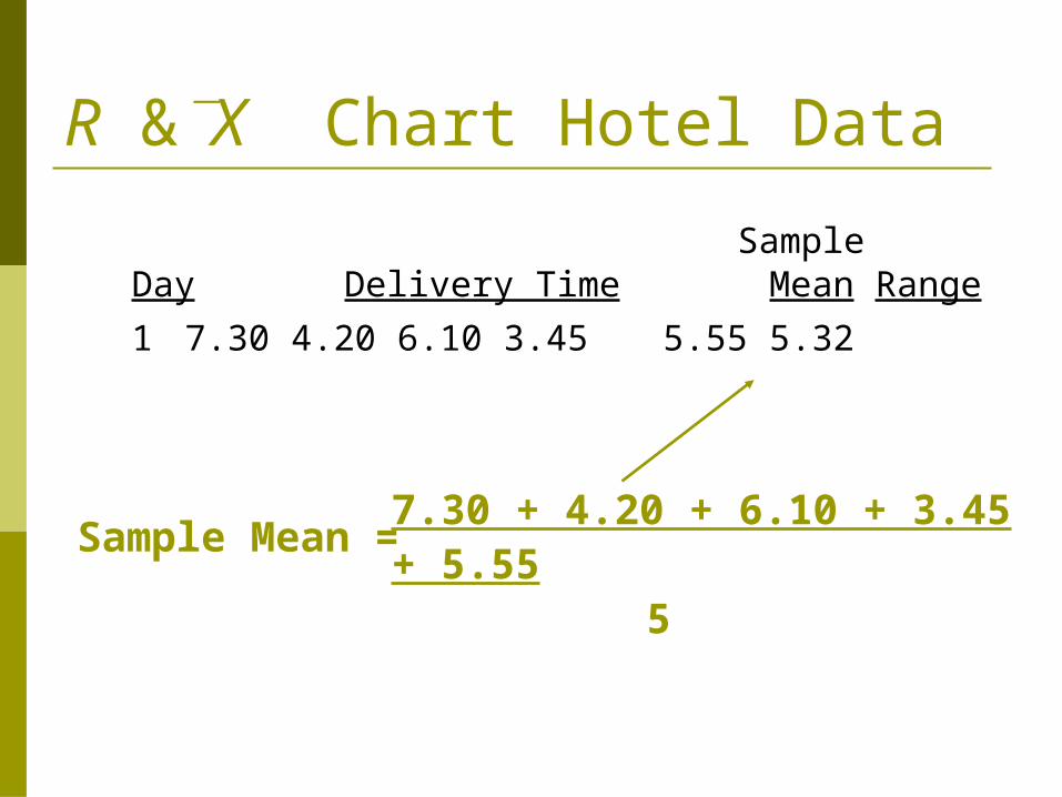
R &X Chart Hotel Data
Sample
Day Delivery TimeMean Range
1 7.30 4.20 6.10 3.45 5.555.32
7.30 + 4.20 + 6.10 + 3.45 + 5.55 5
Sample Mean =

R &X Chart Hotel Data
Sample
Day Delivery TimeMean Range
1 7.30 4.20 6.10 3.45 5.555.32 3.85
7.30 - 3.45Sample Range =
Largest Smallest

R &X Chart Hotel Data
Sample
Day Delivery TimeMean Range
1 7.30 4.20 6.10 3.45 5.555.32 3.85
2 4.60 8.70 7.60 4.43 7.626.59 4.27
3 5.98 2.92 6.20 4.20 5.104.88 3.28
4 7.20 5.10 5.19 6.80 4.215.70 2.99
5 4.00 4.50 5.50 1.89 4.464.07 3.61
6 10.108.10 6.50 5.06 6.947.34 5.04
7 6.77 5.08 5.90 6.90 9.306.79 4.22

R
R Chart Control Limits
R
k
ii
k
1 3 85 4 27 4 227
3 894. . .
.
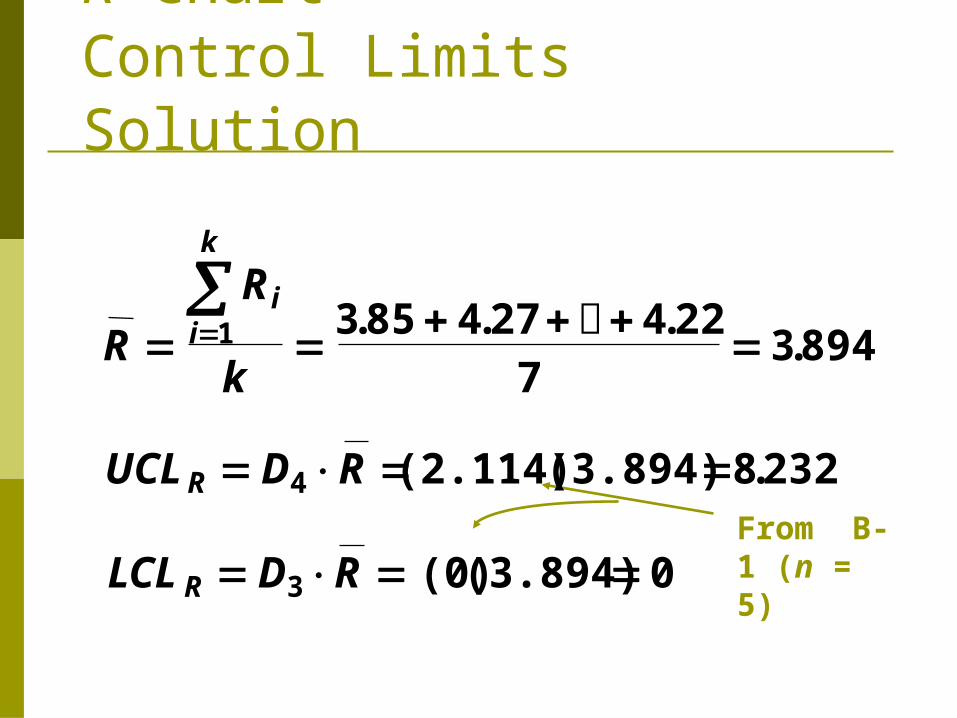
R Chart Control Limits Solution
From B-1 (n = 5)
R
R
k
UCL D R
LCL D R
ii
k
R
R
1
4
3
3 85 4 27 4 227
3 894
(2.114) (3.894) 8 232
(0)(3.894) 0
. . ..
.

02468
1 2 3 4 5 6 7
R, Minutes
Day
R Chart Control Chart Solution
UCL

X Chart Control Limits
k
RR
k
XX
RAXUCL
k
ii
k
ii
X
11
2
Sample Range at Time i
# Samples
Sample Mean at Time i

X Chart Control Limits
UCL X A R
LCL X A R
X
X
kR
R
k
X
X
ii
k
ii
k
2
2
1 1
From Table B-1

R &X Chart Hotel Data
Sample
Day Delivery TimeMean Range
1 7.30 4.20 6.10 3.45 5.555.32 3.85
2 4.60 8.70 7.60 4.43 7.626.59 4.27
3 5.98 2.92 6.20 4.20 5.104.88 3.28
4 7.20 5.10 5.19 6.80 4.215.70 2.99
5 4.00 4.50 5.50 1.89 4.464.07 3.61
6 10.108.10 6.50 5.06 6.947.34 5.04
7 6.77 5.08 5.90 6.90 9.306.79 4.22
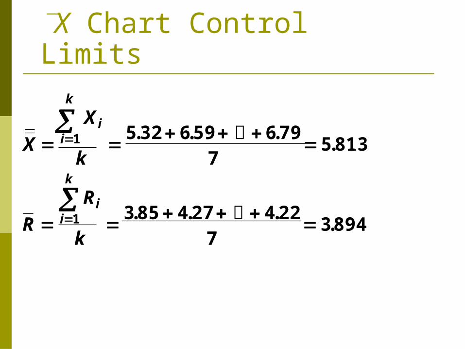
X Chart Control Limits
X
X
k
R
R
k
ii
k
ii
k
1
1
5 32 6 59 6 797
5 813
3 85 4 27 4 227
3 894
. . ..
. . ..

X Chart Control Limits
From B-1 (n = 5)
X
X
k
R
R
k
UCL X A R
ii
k
ii
k
X
1
1
2
5 32 6 59 6 797
5 813
3 85 4 27 4 227
3 894
5 813 0 58 * 3 894 8 060
. . ..
. . ..
. . . .

X Chart Control Limits Solution
From Table B-1 (n = 5)
X
X
k
R
R
k
UCL X A R
LCL X A R
ii
k
ii
k
X
X
1
1
2
2
5 32 6 59 6 797
5 813
3 85 4 27 4 227
3 894
5 813 (0 58)
5 813 (0 58)(3.894) = 3.566
. . ..
. . ..
. .
. .
(3.894) = 8.060

X ChartControl Chart Solution*
02468
1 2 3 4 5 6 7
` X, Minutes
Day
UCL
LCL

Subgroup Size All data plotted on a control chart represents the
information about a small number of data points, called a subgroup.
Variability occurs within each group Only plot average, range, etc. of subgroup Usually do not plot individual data points Larger group: more variability Smaller group: less variability Control limits adjusted to compensate Larger groups mean more data collection costs

General Considerations, X-bar, R Operational definitions of measuring
techniques & equipment important, as is calibration of equipment
X-bar and R used with subgroups of 4-9 most frequently 2-3 if sampling is very expensive 6-14 ideal
Sample sizes >= 10 use s chart instead of R chart.

Single Data Points? What if you only have one data point on a
process? Inspect every single item There is no range. R=0?
Charts for Individuals (x-Chart) CL: x-bar +/- 3R-bar/d2 R = difference between consecutive units Draw control limits on the chart We can also put User specification limits on, for
reference purposes Doesn’t catch trends as quickly Normality assumption must hold

Attribute Control Charts Tell us whether points in tolerance or not
p chart: percentage with given characteristic (usually whether defective or not)
np chart: number of units with characteristic c chart: count # of occurrences in a fixed area
of opportunity (defects per car) u chart: # of events in a changeable area of
opportunity (sq. yards of paper drawn from a machine)

p Chart Control Limits
# Defective Items in Sample i
Sample iSize
UCLp p zp 1 p
n
p X i
i1
k
ni
i1
k

p Chart Control Limits
# Defective Items in Sample i
Sample iSize
z = 2 for 95.5% limits; z = 3 for 99.7% limits
# Samples
UCLp p zp 1 p
n
p X i
i1
k
ni
i1
k
n ni
i1
k
k

p Chart Control Limits
# Defective Items in Sample i
# Samples
Sample iSize
z = 2 for 95.5% limits; z = 3 for 99.7% limits
UCLp p zp 1 p
n
LCLp p zp 1 p
n
n ni
i1
k
k
p X i
i1
k
ni
i1
k

p Chart ExampleYou’re manager of a 500-room hotel. You want to achieve the highest level of service. For 7 days, you collect data on the readiness of 200 rooms. Is the process in control (use z = 3)?
© 1995 Corel Corp.

p Chart Hotel Data
No. No. NotDay Rooms Ready Proportion1 200 16 16/200 = .0802 200 7 .0353 200 21 .1054 200 17 .0855 200 25 .1256 200 19 .0957 200 16 .080

p Chart Control Limits
n ni
i1
k
k
1400
7200

p Chart Control Limits
16 + 7 +...+ 16
p X i
i1
k
ni
i1
k
121
14000.0864
n ni
i1
k
k
1400
7200

p Chart Control Limits Solution
16 + 7 +...+ 16
p X i
i1
k
ni
i1
k
121
14000.0864
n ni
i1
k
k
1400
7200
p zp 1 p
n 0.0864 3
0.0864 1 0.0864 200

p Chart Control Limits Solution
16 + 7 +...+ 16
p zp 1 p
n 0.0864 3
0.0864 1 0.0864 200
0.0864 3* 0.01984 0.0864 0.01984
0.1460, and 0.0268
p X i
i1
k
ni
i1
k
121
14000.0864
n ni
i1
k
k
1400
7200

0.00
0.05
0.10
0.15
1 2 3 4 5 6 7
P
Day
p Chart Control Chart Solution
UCL
LCL

P-Chart Example Enter the data, compute the average, calculate
standard deviation, plot lines
P Chart of Number Cracked
0
0.02
0.04
0.06
0.08
0.1
0.12
0.14
0.16
1 3 5 7 9 11 13 15 17 19 21 23 25 27 29
Sample
Pro
port
ion

Dealing with out of control Two points were out of control. Were there
any “assignable causes?” Can we blame these two on anything
special? Different guy drove the truck just those 2 days. Remove 1 and 14 from calculations. p-bar down to 5.5% from 6.1%, st dev, UCL,
LCL, new graph

Revised p-ChartP Chart of Number Cracked
0
0.02
0.04
0.06
0.08
0.1
0.12
0.14
0.16
1 3 5 7 9 11 13 15 17 19 21 23 25 27 29
Sample
Pro
port
ion

Different Sample sizes Standard error varies inversely with sample size Only difference is re-compute for each data
point, using its sample size, n. Why do this? The bigger the sample is, the more
variability we expect to see in the sample. So, larger samples should have wider control limits.
If we use the same limits for all points, there could be small-sample-size points that are really out of control, but don’t look that way, or huge sample-size point that are not out of control, but look like they are.
Judging high school players by Olympic/NBA/NFL standards.
n
pp )1(

Different Sample SizesP Chart of Exact Change, p.202
0.200
0.250
0.300
0.350
0.400
0.450
0.500
0.550
0.600
1 2 3 4 5 6 7 8 9 10 11 12 13 14 15 16 17 18 19 20
Sample
Pro
portio
n

How not to do it If we calculate n-bar, average sample size,
and use that to calculate a standard deviation value which we use for every period, we get: One point that really is out of control, does not
appear to be OOC 4 points appear to be OOC, and really are not.
Only potentially do this if all values fall within 25% of the average But with computers, why not do it right?

5 false readingsFig. 7.6 DONE WRONG!!
0.20
0.25
0.30
0.35
0.40
0.45
0.50
0.55
0.60
1 2 3 4 5 6 7 8 9 10 11 12 13 14 15 16 17 18 19 20
Sample
Pro
port
ion

np Charts – Number Nonconforming Counts number of defectives per sample Sample size must be constant

C-Chart Control Limits # defects per item needs a new chart How many possible paint defects could
you have on a car? C = average number defects / unit Each unit has to have same number of
“chances” or “opportunities” for failure
UCL c zC c
LCL zC cc

Paint BlemishesC Chart Blemishes, p.211
0
2
4
6
8
10
12
14
16
1 3 5 7 9 11 13 15 17 19 21 23 25
Sample
Sam
ple

Number of data points Ideally have at least 2 defective points per
sample for p, c charts Need to have enough from each shift, etc.,
to get a clear picture of that environment At least 25 separate subgroups for p or np
charts

Small Average Counts For small averages, data likely not
symmetrical. Use Table 7.8 to avoid calculating UCL, LCL
for averages < 20 defects per sample Aside:
Everyone has to have same definitions of “defect” and “defective”
Operational Definitions: we all have to agree on what terms mean, exactly.

U charts: areas of opportunity vary Like C chart, counts number of defects per
sample No. opportunities per sample may differ Calculate defects / opportunity, plot this. Number of opportunities is different for every
data point ni = # square feet in sample i
in
uu 3

U Chart of Defects, p. 222
0.00
1.00
2.00
3.00
4.00
5.00
6.00
7.00
8.00
9.00
1 2 3 4 5 6 7 8 9 10 11 12 13 14 15 16 17 18 19 20 21 22 23 24 25 26 27 28 29 30
Sample