stats data and models - test bank go!---all free!! · 2 part i exploring and understanding data...
TRANSCRIPT

Boston Columbus Hoboken Indianapolis New York San Francisco Amsterdam Cape Town Dubai London Madrid Milan Munich Paris Montreal Toronto
Delhi Mexico City São Paulo Sydney Hong Kong Seoul Singapore Taipei Tokyo
INSTRUCTOR’S SOLUTIONS MANUAL
WILLIAM CRAINE III
STATS: DATA AND MODELS FOURTH EDITION
Richard De Veaux Williams College
Paul Velleman Cornell University
David Bock Cornell University
From https://testbankgo.eu/p/Solution-Manual-for-Stats-Data-and-Models-4th-Edition-by-De-Veaux

The author and publisher of this book have used their best efforts in preparing this book. These efforts include the
development, research, and testing of the theories and programs to determine their effectiveness. The author and
publisher make no warranty of any kind, expressed or implied, with regard to these programs or the documentation
contained in this book. The author and publisher shall not be liable in any event for incidental or consequential
damages in connection with, or arising out of, the furnishing, performance, or use of these programs.
Reproduced by Pearson from electronic files supplied by the author.
Copyright © 2016, 2012, 2008 Pearson Education, Inc.
Publishing as Pearson, 501 Boylston Street, Boston, MA 02116.
All rights reserved. No part of this publication may be reproduced, stored in a retrieval system, or transmitted, in any
form or by any means, electronic, mechanical, photocopying, recording, or otherwise, without the prior written
permission of the publisher. Printed in the United States of America.
ISBN-13: 978-0-321-98994-9
ISBN-10: 0-321-98994-5
www.pearsonhighered.com
From https://testbankgo.eu/p/Solution-Manual-for-Stats-Data-and-Models-4th-Edition-by-De-Veaux

Contents Chapter 1 Stats Starts Here 1Chapter 2 Displaying and Describing Categorical Data 6Chapter 3 Displaying and Summarizing Quantitative Data 23Chapter 4 Understanding and Comparing Distributions 40Chapter 5 The Standard Deviation as a Ruler and the Normal Model 57Review of Part I Exploring and Understanding Data 79 Chapter 6 Scatterplots, Association, and Correlation 97Chapter 7 Linear Regression 112Chapter 8 Regression Wisdom 144Chapter 9 Re-expressing Data: Get It Straight! 162Review of Part II Exploring Relationships Between Variables 180 Chapter 10 Understanding Randomness 203Chapter 11 Sample Surveys 213Chapter 12 Experiments and Observational Studies 223Review of Part III Gathering Data 241 Chapter 13 From Randomness to Probability 255Chapter 14 Probability Rules! 267Chapter 15 Random Variables 289Chapter 16 Probability Models 309Review of Part IV Randomness and Probability 340 Chapter 17 Sampling Distribution Models 360Chapter 18 Confidence Intervals for Proportions 390Chapter 19 Testing Hypotheses About Proportions 407Chapter 20 Inferences About Means 428Chapter 21 More About Tests and Intervals 449Review of Part V From the Data at Hand to the World at Large 467 Chapter 22 Comparing Groups 491Chapter 23 Paired Samples and Blocks 536Chapter 24 Comparing Counts 556Chapter 25 Inferences for Regression 582Review of Part VI Accessing Associations Between Variables 609 Chapter 26 Analysis of Variance 652Chapter 27 Multifactor Analysis of Variance 664Chapter 28 Multiple Regression 675Review of Part VII Inferences When Variables Are Related 684Chapter 29 Multiple Regression Wisdom 708
From https://testbankgo.eu/p/Solution-Manual-for-Stats-Data-and-Models-4th-Edition-by-De-Veaux

From https://testbankgo.eu/p/Solution-Manual-for-Stats-Data-and-Models-4th-Edition-by-De-Veaux
Chapter 1 Stats Starts Here 1
Copyright © 2016 Pearson Education, Inc.
Chapter 1 – Stats Starts Here
Section 1.1
1. Grocery shopping. Discount cards at grocery stores allow the stores to collect information about the products that the customer purchases, what other products are purchased at the same time, whether or not the customer uses coupons, and the date and time that the products are purchased. This information can be linked to demographic information about the customer that was volunteered when applying for the card, such as the customer’s name, address, sex, age, income level, and other variables. The grocery store chain will use that information to better market their products. This includes everything from printing out coupons at the checkout that are targeted to specific customers to deciding what television, print, or Internet advertisements to use.
2. Online shopping. Amazon hopes to gain all sorts of information about customer behavior, such as how long they spend looking at a page, whether or not they read reviews by other customers, what items they ultimately buy, and what items are bought together. They can then use this information to determine which other products to suggest to customers who buy similar items, to determine which advertisements to run in the margins, and to determine which items are the most popular so these items come up first in a search.
Section 1.2
3. Super Bowl. When collecting data about the Super Bowl, the games themselves are the who.
4. Nobel laureates. Each year is a case, holding all of the information about that specific year. Therefore, the year is the who.
Section 1.3
5. Grade level.
a) If we are, for example, comparing the percentage of first-graders who can tie their own shoes to the percentage of second-graders who can tie their own shoes, grade-level is treated as categorical. It is just a way to group the students. We would use the same methods if we were comparing boys to girls or brown-eyed kids to blue-eyed kids.
b) If we were studying the relationship between grade-level and height, we would be treating grade level as quantitative.
From https://testbankgo.eu/p/Solution-Manual-for-Stats-Data-and-Models-4th-Edition-by-De-Veaux

2 Part I Exploring and Understanding Data
Copyright © 2016 Pearson Education, Inc.
6. ZIP codes.
a) ZIP codes are categorical in the sense that they correspond to a location. The ZIP code 14850 is a standardized way of referring to Ithaca, NY.
b) ZIP codes generally increase as the location gets further from the east coast of the United States. For example, one of the ZIP codes for the city of Boston, MA is 02101. Kansas City, MO has a ZIP code of 64101, and Seattle, WA has a ZIP code of 98101.
7. Voters. The response is a categorical variable.
8. Job hunting. The answer is a categorical variable.
9. Medicine. The company is studying a quantitative variable.
10. Stress. The researcher is studying a quantitative variable.
Chapter Exercises
11. The News. Answers will vary.
12. The Internet. Answers will vary.
13. Gaydar. Who – 40 undergraduate women. What – Whether or not the women could identify the sexual orientation of men based on a picture. Population of interest – All women.
14. Hula-hoops. Who – An unknown number of participants. What – Heart rate, oxygen consumption, and rating of perceived exertion. Population of interest – All people.
15. Bicycle Safety. Who – 2,500 cars. What – Distance from the bicycle to the passing car (in inches). Population of interest – All cars passing bicyclists.
16. Investments. Who – 30 similar companies. What – 401(k) employee participation rates (in percent). Population of interest – All similar companies.
17. Honesty. Who – Workers who buy coffee in an office. What – amount of money contributed to the collection tray. Population of interest – All people in honor system payment situations.
18. Blindness. Who – 24 patients. What – Whether the patient had Stargardt’s disease or dry age-related macular degeneration, and whether or not the stem cell therapy was effective in treating the condition. Population of interest – All people with these eye conditions.
19. Not-so-diet soda. Who – 474 participants. What – whether or not the participant drank two or more diet sodas per day, waist size at the beginning of the study, and waist size at the end of the study. Population of interest – All people.
From https://testbankgo.eu/p/Solution-Manual-for-Stats-Data-and-Models-4th-Edition-by-De-Veaux
Chapter 1 Stats Starts Here 3
Copyright © 2016 Pearson Education, Inc.
20. Molten iron. Who – 10 crankshafts at Cleveland Casting. What – The pouring temperature (in degrees Fahrenheit) of molten iron. Population of interest – All crankshafts at Cleveland Casting.
21. Weighing bears. Who – 54 bears. What – Weight, neck size, length (no specified units), and sex. When – Not specified. Where – Not specified. Why - Since bears are difficult to weigh, the researchers hope to use the relationships between weight, neck size, length, and sex of bears to estimate the weight of bears, given the other, more observable features of the bear. How – Researchers collected data on 54 bears they were able to catch. Variables – There are 4 variables; weight, neck size, and length are quantitative variables, and sex is a categorical variable. No units are specified for the quantitative variables. Concerns – The researchers are (obviously!) only able to collect data from bears they were able to catch. This method is a good one, as long as the researchers believe the bears caught are representative of all bears, in regard to the relationships between weight, neck size, length, and sex.
22. Schools. Who – Students. What – Age (probably in years, though perhaps in years and months), race or ethnicity, number of absences, grade level, reading score, math score, and disabilities/special needs. When – This information must be kept current. Where – Not specified. Why – Keeping this information is a state requirement. How – The information is collected and stored as part of school records. Variables – There are seven variables. Race or ethnicity, grade level, and disabilities/special needs are categorical variables. Number of absences, age, reading test score, and math test score are quantitative variables. Concerns – What tests are used to measure reading and math ability, and what are the units of measure for the tests?
23. Arby’s menu. Who – Arby’s sandwiches. What – type of meat, number of calories (in calories), and serving size (in ounces). When – Not specified. Where – Arby’s restaurants. Why – These data might be used to assess the nutritional value of the different sandwiches. How – Information was gathered from each of the sandwiches on the menu at Arby’s, resulting in a census. Variables – There are three variables. Number of calories and serving size are quantitative variables, and type of meat is a categorical variable.
24. Age and party. Who – 1180 Americans. What – Region, age (in years), political affiliation, and whether or not the person voted in the 2006 midterm Congressional election. When – First quarter of 2007. Where – United States. Why – The information was gathered for presentation in a Gallup public opinion poll. How – Phone Survey. Variables – There are four variables. Region, political affiliation, and whether or not the person voted in 1998 are categorical variables, and age is a quantitative variable.
From https://testbankgo.eu/p/Solution-Manual-for-Stats-Data-and-Models-4th-Edition-by-De-Veaux

4 Part I Exploring and Understanding Data
Copyright © 2016 Pearson Education, Inc.
25. Babies. Who – 882 births. What – Mother’s age (in years), length of pregnancy (in weeks), type of birth (caesarean, induced, or natural), level of prenatal care (none, minimal, or adequate), birth weight of baby (unit of measurement not specified, but probably pounds and ounces), gender of baby (male or female), and baby’s health problems (none, minor, major). When – 1998-2000. Where – Large city hospital. Why – Researchers were investigating the impact of prenatal care on newborn health. How – It appears that they kept track of all births in the form of hospital records, although it is not specifically stated. Variables – There are three quantitative variables: mother’s age, length of pregnancy, and birth weight of baby. There are four categorical variables: type of birth, level of prenatal care, gender of baby, and baby’s health problems.
26. Flowers. Who – 385 species of flowers. What – Date of first flowering (in days). When – Not specified. Where – Southern England. Why – The researchers believe that this indicates a warming of the overall climate. How – Not specified. Variables – Date of first flowering is a quantitative variable. Concerns - Hopefully, date of first flowering was measured in days from January 1, or some other convention, to avoid problems with leap years.
27. Herbal medicine. Who – experiment volunteers. What – herbal cold remedy or sugar solution, and cold severity. When – Not specified. Where – Major pharmaceutical firm. Why – Scientists were testing the efficacy of an herbal compound on the severity of the common cold. How – The scientists set up a controlled experiment. Variables – There are two variables. Type of treatment (herbal or sugar solution) is categorical, and severity rating is quantitative. Concerns – The severity of a cold seems subjective and difficult to quantify. Also, the scientists may feel pressure to report negative findings about the herbal product.
28. Vineyards. Who – American Vineyards. What – Size of vineyard (in acres), number of years in existence, state, varieties of grapes grown, average case price (in dollars), gross sales (probably in dollars), and percent profit. When – Not specified. Where – United States. Why – Business analysts hoped to provide information that would be helpful to producers of American wines. How – Not specified. Variables – There are five quantitative variables and two categorical variables. Size of vineyard, number of years in existence, average case price, gross sales, and percent profit are quantitative variables. State and variety of grapes grown are categorical variables.
29. Streams. Who – Streams. What – Name of stream, substrate of the stream (limestone, shale, or mixed), acidity of the water (measured in pH), temperature (in degrees Celsius), and BCI (unknown units). When – Not specified. Where – Upstate New York. Why – Research was conducted for an Ecology class. How – Not specified. Variables – There are five variables. Name and substrate of the stream are categorical variables, and acidity, temperature, and BCI are quantitative variables.
From https://testbankgo.eu/p/Solution-Manual-for-Stats-Data-and-Models-4th-Edition-by-De-Veaux

Chapter 1 Stats Starts Here 5
Copyright © 2016 Pearson Education, Inc.
30. Fuel economy. Who – Every model of automobile in the United States. What – Vehicle manufacturer, vehicle type, weight (probably in pounds), horsepower (in horsepower), and gas mileage (in miles per gallon) for city and highway driving. When – This information is collected currently. Where – United States. Why – The Environmental Protection Agency uses the information to track fuel economy of vehicles. How – The data is collected from the manufacturer of each model. Variables – There are six variables. City mileage, highway mileage, weight, and horsepower are quantitative variables. Manufacturer and type of car are categorical variables.
31. Refrigerators. Who – 353 refrigerators. What – Brand, cost (probably in dollars), size (in cu. ft.), type, estimated annual energy cost (probably in dollars), overall rating, and repair history (in percent requiring repair over the past five years). When – 2013. Where – United States. Why – The information was compiled to provide information to the readers of Consumer Reports. How – Not specified. Variables – There are 7 variables. Brand, type, and overall rating are categorical variables. Cost, size, estimated energy cost, and repair history are quantitative variables.
32. Walking in circles. Who – 32 volunteers. What – Sex, height, handedness, the number of yards walked before going out of bounds, and the side of the field on which the person walked out of bounds. When – Not specified. Where – Not specified. Why – The researcher was interested in whether people walk in circles when lost. How – Data were collected by observing the people on the field, as well as by measuring and asking the participants. Variables – There are 5 variables. Sex, handedness, and side of the field are categorical variables. Height and number of yards walked are quantitative variables.
33. Kentucky Derby 2014. Who – Kentucky Derby races. What – Year, winner, jockey, trainer, owner, and time (in minutes, seconds, and hundredths of a second. When – 1875 – 2013. Where – Churchill Downs, Louisville, Kentucky. Why – It is interesting to examine the trends in the Kentucky Derby. How – Official statistics are kept for the race each year. Variables – There are 6 variables. Winner, jockey, trainer and owner are categorical variables. Date and duration are quantitative variables.
34. Indianapolis 500 . Who – Indy 500 races. What – Year, driver, time (in minutes, seconds, and hundredths of a second), and speed (in miles per hour). When – 1911 – 2013. Where – Indianapolis, Indiana. Why – It is interesting to examine the trends in Indy 500 races. How – Official statistics are kept for the race every year. Variables – There are 4 variables. Driver is a categorical variable. Year, time, and speed are quantitative variables.
From https://testbankgo.eu/p/Solution-Manual-for-Stats-Data-and-Models-4th-Edition-by-De-Veaux

6 Part I Exploring and Understanding Data
Copyright © 2016 Pearson Education, Inc.
Chapter 2 – Displaying and Describing Categorical Data
Section 2.1
1. Automobile fatalities.
Subcompact and Mini 0.1128Compact 0.3163Intermediate 0.3380Full 0.2193Unknown 0.0137
2. Non-occupant fatalities.
0.841
0.121 0.038
0
0.2
0.4
0.6
0.8
1
Pedestrian Pedalcyclist Other
Rel
ativ
e Fr
equ
ency
Type of Fatality
Non-occupant fatalities
3. Movie genres.
a) 2008 b) 1996 c) 2006 d) 2012
4. Marriage in decline.
a) People Living Together Without Being Married (ii)
b) Gay/Lesbian Couples Raising Children (iv)
c) Unmarried Couples Raising Children (iii)
d) Single Women Having Children (i)
Section 2.2
5. Movies again.
a) 170/348 ≈ 48.9% of these films were rated R.
b) 41/348 ≈ 11.8% of these films were R-rated comedies.
c) 41/170 ≈ 24.1% of the R-rated films were comedies.
d) 41/90 ≈ 45.6% of the comedies were R-rated.
From https://testbankgo.eu/p/Solution-Manual-for-Stats-Data-and-Models-4th-Edition-by-De-Veaux

Chapter 2 Displaying and Describing Categorical Data 7
Copyright © 2016 Pearson Education, Inc.
6. Labor force.
a) 14,824/237,828 ≈ 6.2% of the population was unemployed.
b) 8858/237,828 ≈ 3.7% of the population was unemployed and between 25 and 54.
c) 12,699/21,047 ≈ 60.3% of those 20 to 24 years old were employed.
d) 4378/139,063 ≈ 3.1% of employed people were between 16 and 19.
Chapter Exercises
7. Graphs in the news. Answers will vary.
8. Graphs in the news II. Answers will vary.
9. Tables in the news. Answers will vary.
10. Tables in the news II. Answers will vary.
11. Movie genres.
a) A pie chart seems appropriate from the movie genre data. Each movie has only one genre, and the 193 movies constitute a “whole”.
b) “Other” is the least common genre. It has the smallest region in the chart.
12. Movie ratings.
a) A pie chart seems appropriate for the movie rating data. Each movie has only one rating, and the 20 movies constitute a “whole”. The percentages of each rating are different enough that the pie chart is easy to read.
b) The most common rating is PG-13. It has the largest region on the chart.
13. Genres, again.
a) SciFi/Fantasy has a higher bar than Action/Adventure, so it is the more common genre.
b) This is easier to see on the bar chart. The percentages are so close that the difference is nearly indistinguishable in the pie chart.
14. Ratings, again.
a) The least common rating was G. It has the shortest bar.
b) The bar chart does not support this claim. These data are for a single year only. We have no idea if the percentages of G and PG-13 movies changed from year to year.
15. Magnet Schools.
There were 1755 qualified applicants for the Houston Independent School District’s magnet schools program. 53% were accepted, 17% were wait-listed, and the other 30% were turned away for lack of space.
From https://testbankgo.eu/p/Solution-Manual-for-Stats-Data-and-Models-4th-Edition-by-De-Veaux
8 Part I Exploring and Understanding Data
Copyright © 2016 Pearson Education, Inc.
16. Magnet schools again.
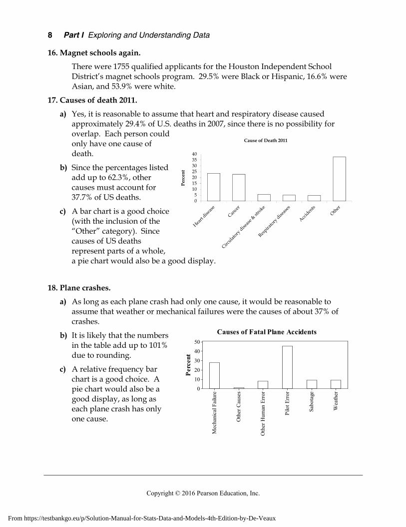
There were 1755 qualified applicants for the Houston Independent School District’s magnet schools program. 29.5% were Black or Hispanic, 16.6% were Asian, and 53.9% were white.
17. Causes of death 2011.
a) Yes, it is reasonable to assume that heart and respiratory disease caused approximately 29.4% of U.S. deaths in 2007, since there is no possibility for overlap. Each person could only have one cause of death.
b) Since the percentages listed add up to 62.3%, other causes must account for 37.7% of US deaths.
c) A bar chart is a good choice (with the inclusion of the “Other” category). Since causes of US deaths represent parts of a whole, a pie chart would also be a good display.
18. Plane crashes.
a) As long as each plane crash had only one cause, it would be reasonable to assume that weather or mechanical failures were the causes of about 37% of crashes.
b) It is likely that the numbers in the table add up to 101% due to rounding.
c) A relative frequency bar chart is a good choice. A pie chart would also be a good display, as long as each plane crash has only one cause.
05
10152025303540
Per
cen
t
Cause of Death 2011
Wea
ther
Sabo
tage
Pilo
t Erro
r
Oth
er H
uman
Erro
r
Oth
er C
ause
s
Mec
hani
cal F
ailur
e
50403020100
Perc
ent
Causes of Fatal Plane Accidents
From https://testbankgo.eu/p/Solution-Manual-for-Stats-Data-and-Models-4th-Edition-by-De-Veaux

Chapter 2 Displaying and Describing Categorical Data 9
Copyright © 2016 Pearson Education, Inc.
19. Oil spills as of 2013.
a) Grounding, accounting for approximately 150 spills, is the most frequent cause of oil spillage for these 459 spills. A substantial number of spills, approximately 140, were caused by Collision. Less prevalent causes of oil spillage in descending order of frequency were Hull or equipment failures, Fire & Explosions, and Other/Unknown causes.
b) A pie chart is an appropriate display of the data, since there is only a single cause attributed to each spill, and all spills are represented in some category.
c) There were more spills due to Grounding than Collisions. This is much easier to see on the bar chart.
20. Winter Olympics 2010.
a) There are too many categories to construct an appropriate display. In a bar chart, there are too many bars. In a pie chart, there are too many slices. In each case, we run into difficulty trying to display those countries that didn’t win many medals.
b) Perhaps we are primarily interested in countries that won many medals. We might choose to combine all countries that won fewer than 6 medals into a single category. This will make our chart easier to read. We are probably interested in number of medals won, rather than percentage of total medals won, so we’ll use a bar chart. A bar chart is also better for comparisons.
21. Global warming.
Perhaps the most obvious error is that the percentages in the pie chart only add up to 93%, when they should, of course, add up to 100%. Furthermore, the three-dimensional perspective view distorts the regions in the graph, violating the area principle. The regions corresponding to No Solid Evidence and Due to Human Activity should be roughly the same size, at 32% and 34% of respondents, respectively. However, the angle for the 32% region looks much bigger. Always use simple, two-dimensional graphs. Additionally, the graph does not include a title.
22. Modalities.
a) The bars have false depth, which can be misleading. This is a bar chart, so the bars should have space between them. Running the labels on the bars from top to bottom and the vertical axis labels from bottom to top is confusing.
From https://testbankgo.eu/p/Solution-Manual-for-Stats-Data-and-Models-4th-Edition-by-De-Veaux

10 Part I Exploring and Understanding Data
Copyright © 2016 Pearson Education, Inc.
b) The percentages sum to 100%. Normally, we would take this as a sign that all of the observations had been correctly accounted for. But in this case, it is extremely unlikely. Each of the respondents was asked to list three modalities. For example, it would be possible for 80% of respondents to say they use ice to treat an injury, and 75% to use electric stimulation. The fact that the percentages total greater than 100% is not odd. In fact, in this case, it seems wrong that the percentages add up to 100%, rather than correct.
23. Teen smokers.
According to the Monitoring the Future study, teen smoking brand preferences differ somewhat by region. Although Marlboro is the most popular brand in each region, with about 58% of teen smokers preferring this brand in each region, teen smokers from the South prefer Newports at a higher percentage than teen smokers from the West, 22.5% to approximately 10%, respectively. Camels are more popular in the West, with 9.5% of teen smokers preferring this brand, compared to only 3.3% in the South. Teen smokers in the West are also more likely to have no particular brand than teen smokers in the South. 12.9% of teen smokers in the West have no particular brand, compared to only 6.7% in the South. Both regions have about 9% of teen smokers that prefer one of over 20 other brands.
24. Handguns.
76.4% of handguns involved in Milwaukee buyback programs are small caliber, while only 20.3% of homicides are committed with small caliber handguns. Along the same lines, only 19.3% of buyback handguns are of medium caliber, while 54.7% of homicides involve medium caliber handguns. A similar disparity is seen in large caliber handguns. Only 2.1% of buyback handguns are large caliber, but this caliber is used in 10.8% of homicides. Finally, 2.2% of buyback handguns are of other calibers, while 14.2% of homicides are committed with handguns of other calibers. Generally, the handguns that are involved in buyback programs are not the same caliber as handguns used in homicides in Milwaukee.
25. Movies by genre and rating.
a) The table uses column percents, since each column adds to 100%, while the rows do not.
b) 25.86% of these movies are comedies.
c) 28.57% of the PG-rated movies were comedies.
d) i) 27.36% of the PG-13 movies were comedies.
ii) You cannot determine this from the table.
iii) None (0%) of the dramas were G-rated.
iv) You cannot determine this from the table.
From https://testbankgo.eu/p/Solution-Manual-for-Stats-Data-and-Models-4th-Edition-by-De-Veaux

Chapter 2 Displaying and Describing Categorical Data 11
Copyright © 2016 Pearson Education, Inc.
26. The last picture show.
a) Since neither the columns nor the rows total 100%, but the table itself totals 100%, these are table percentages.
b) The most common genre/rating combination was the R-rated drama. 18.68% of the 348 movies had this combination.
c) 5.17% of the 348 movies, or 18 movies, were PG-rated comedies.
d) A total of 2.59% of the 348 movies, or 9 movies, were rated G.
e) 2.59% of the movies were rated G, and 18.10% of them were rated PG. So patrons under 13 can see only 20.69% of these movies. This supports the assertion that approximately three-quarters of movies can only be seen by patrons 13 years old or older.
27. Seniors.
a) A table with marginal totals is to the right. There are 268 White graduates and 325 total graduates. 268/325 ≈ 82.5% of the graduates are white.
b) There are 42 graduates planning to attend 2-year colleges. 42/325 ≈ 12.9%
c) 36 white graduates are planning to attend 2-year colleges. 36/325 ≈ 11.1%
d) 36 white graduates are planning to attend 2-year colleges and there are 268 whites graduates. 36/268 ≈ 13.4%
e) There are 42 graduates planning to attend 2-year colleges, and 36 of them are white. 36/42 ≈ 85.7%
28. Politics.
a) There are 192 students taking Intro Stats. Of those, 115, or about 59.9%, are male.
b) There are 192 students taking Intro Stats. Of those, 27, or about 14.1%, consider themselves to be “Conservative”.
c) There are 115 males taking Intro Stats. Of those, 21, or about 18.3%, consider themselves to be “Conservative”.
d) There are 192 students taking Intro Stats. Of those, 21, or about 10.9%, are males who consider themselves to be “Conservative”.
Plans White Minority TOTAL 4-year college 198 44 242 2-year college 36 6 42
Military 4 1 5 Employment 14 3 17
Other 16 3 19 TOTAL 268 57 325
From https://testbankgo.eu/p/Solution-Manual-for-Stats-Data-and-Models-4th-Edition-by-De-Veaux

12 Part I Exploring and Understanding Data
Copyright © 2016 Pearson Education, Inc.
29. More about seniors.
a) For white students, 73.9% plan to attend a 4-year college, 13.4% plan to attend a 2-year college, 1.5% plan on the military, 5.2% plan to be employed, and 6.0% have other plans.
b) For minority students, 77.2% plan to attend a 4-year college, 10.5% plan to attend a 2-year college, 1.8% plan on the military, 5.3% plan to be employed, and 5.3% have other plans.
c) A segmented bar chart is a good display of these data.
d) The conditional distributions of plans for Whites and Minorities are similar: White – 74% 4-year college, 13% 2-year college, 2% military, 5% employment, 6% other. Minority – 77% 4-year college, 11% 2-year college, 2% military, 5% employment, 5% other. Caution should be used with the percentages for Minority graduates, because the total is so small. Each graduate is almost 2%. Still, the conditional distributions of plans are essentially the same for the two groups. There is little evidence of an association between race and plans for after graduation.
30. Politics revisited.
a) The females in this course were 45.5% Liberal, 46.8% Moderate, and 7.8% Conservative.
b) The males in this course were 43.5% Liberal, 38.3% Moderate, and 18.3% Conservative.
c) A segmented bar chart comparing the distributions is at the right.
d) Politics and sex do not appear to be independent in this course. Although the percentage of liberals was roughly the same for each sex, females had a greater percentage of moderates and a lower percentage of conservatives than males.
Post High School Plans
4-year college 4-year college
2-year college 2-year college
Other OtherEmployment Employment
0%10%20%30%40%50%60%70%80%90%
100%
White Minority
Military
Politics of an Intro Stats Course
LiberalLiberal
ModerateModerate
ConservativeConservative
0%
10%
20%
30%
40%
50%
60%
70%
80%
90%
100%
Female Male
Perc
ent
From https://testbankgo.eu/p/Solution-Manual-for-Stats-Data-and-Models-4th-Edition-by-De-Veaux

Chapter 2 Displaying and Describing Categorical Data 13
Copyright © 2016 Pearson Education, Inc.
31. Magnet schools revisited.
a) There were 1755 qualified applicants to the Houston Independent School District’s magnet schools program. Of those, 292, or about 16.6% were Asian.
b) There were 931 students accepted to the magnet schools program. Of those, 110, or about 11.8% were Asian.
c) There were 292 Asian applicants. Of those, 110, or about 37.7%, were accepted.
d) There were 1755 total applicants. Of those, 931, or about 53%, were accepted.
32. More politics.
a)
b) The percentage of males and females varies across political categories. The percentage of self-identified Liberals and Moderates who are female is about twice the percentage of Conservatives who are female. This suggests that sex and politics are not independent.
33. Back to school.
There were 1,755 qualified applicants for admission to the magnet schools program. 53% were accepted, 17% were wait-listed, and the other 30% were turned away. While the overall acceptance rate was 53%, 93.8% of Blacks and Hispanics were accepted, compared to only 37.7% of Asians, and 35.5% of whites. Overall, 29.5% of applicants were Black or Hispanics, but only 6% of those turned away were Black or Hispanic. Asians accounted for 16.6% of applicants, but 25.3% of those turned away. It appears that the admissions decisions were not independent of the applicant’s ethnicity.
0%
10%
20%
30%
40%
50%
60%
70%
80%
90%
100%
Lib Mod Con
Distribution of Sex Across Political Categories
M MM
F F
F
Perc
ent
Politics
From https://testbankgo.eu/p/Solution-Manual-for-Stats-Data-and-Models-4th-Edition-by-De-Veaux
14 Part I Exploring and Understanding Data
Copyright © 2016 Pearson Education, Inc.
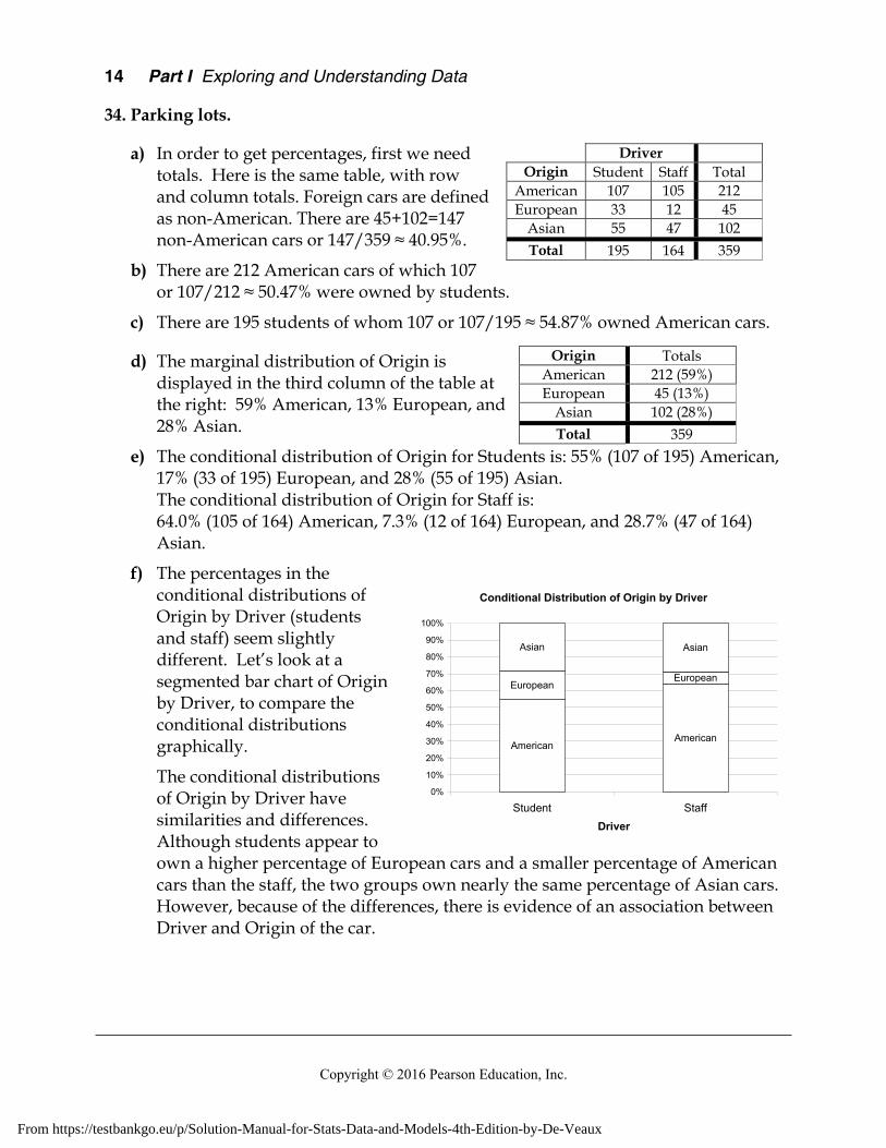
34. Parking lots.
a) In order to get percentages, first we need totals. Here is the same table, with row and column totals. Foreign cars are defined as non-American. There are 45+102=147 non-American cars or 147/359 ≈ 40.95%.
b) There are 212 American cars of which 107 or 107/212 ≈ 50.47% were owned by students.
c) There are 195 students of whom 107 or 107/195 ≈ 54.87% owned American cars.
d) The marginal distribution of Origin is displayed in the third column of the table at the right: 59% American, 13% European, and 28% Asian.
e) The conditional distribution of Origin for Students is: 55% (107 of 195) American, 17% (33 of 195) European, and 28% (55 of 195) Asian. The conditional distribution of Origin for Staff is: 64.0% (105 of 164) American, 7.3% (12 of 164) European, and 28.7% (47 of 164) Asian.
f) The percentages in the conditional distributions of Origin by Driver (students and staff) seem slightly different. Let’s look at a segmented bar chart of Origin by Driver, to compare the conditional distributions graphically.
The conditional distributions of Origin by Driver have similarities and differences. Although students appear to own a higher percentage of European cars and a smaller percentage of American cars than the staff, the two groups own nearly the same percentage of Asian cars. However, because of the differences, there is evidence of an association between Driver and Origin of the car.
Driver Origin Student Staff Total
American 107 105 212 European 33 12 45
Asian 55 47 102
Total 195 164 359
Origin Totals American 212 (59%) European 45 (13%)
Asian 102 (28%)
Total 359
Conditional Distribution of Origin by Driver
AmericanAmerican
EuropeanEuropean
Asian Asian
0%
10%
20%
30%
40%
50%
60%
70%
80%
90%
100%
Student StaffDriver
From https://testbankgo.eu/p/Solution-Manual-for-Stats-Data-and-Models-4th-Edition-by-De-Veaux

Chapter 2 Displaying and Describing Categorical Data 15
Copyright © 2016 Pearson Education, Inc.
35. Weather forecasts.
a) The table shows the marginal totals. It rained on 34 of 365 days, or 9.3% of the days.
b) Rain was predicted on 90 of 365 days. 90/365 ≈ 24.7% of the days.
c) The forecast of Rain was correct on 27 of the days it actually rained and the forecast of No Rain was correct on 268 of the days it didn’t rain. So, the forecast was correct a total of 295 times. 295/365 ≈ 80.8% of the days.
d) On rainy days, rain had been predicted 27 out of 34 times (79.4%). On days when it did not rain, forecasters were correct in their predictions 268 out of 331 times (81.0%). These two percentages are very close. There is no evidence of an association between the type of weather and the ability of the forecasters to make an accurate prediction.
36. Twin births.
a) Of the 278,000 mothers who had twins in 1995-1997, 63,000 had inadequate health care during their pregnancies. 63,000/278,000 = 22.7%
b) There were 76,000 induced or Caesarean births and 71,000 preterm births without these procedures. (76,000 + 71,000)/278,000 = 52.9%
c) Among the mothers who did not receive adequate medical care, there were 12,000 induced or Caesarean births and 13,000 preterm births without these procedures. 63,000 mothers of twins did not receive adequate medical care. (12,000 + 13,000)/63,000 = 39.7%
Actual Weather Total
Fore
cast
Rain No Rain Rain 27 63 90
No Rain 7 268 275 Total 34 331 365
Twin Births 1995-97 (in thousands) Level of Prenatal Care
Preterm (Induced or Caesarean)
Preterm (without
procedures)
Term or Postterm
Total Intensive 18 15 28 61 Adequate 46 43 65 154
Inadequate 12 13 38 63
Total 76 71 131 278
Weather Forecast Accuracy
Correct Correct
Wrong Wrong
0%10%
20%30%40%50%
60%70%80%
90%100%
Rain No RainActual Weather
From https://testbankgo.eu/p/Solution-Manual-for-Stats-Data-and-Models-4th-Edition-by-De-Veaux

16 Part I Exploring and Understanding Data
Copyright © 2016 Pearson Education, Inc.
d)
e) 52.9% of all twin births were preterm, while only 39.7% of births in which inadequate medical care was received were preterm. This is evidence of an association between level of prenatal care and twin birth outcome. If these variables were independent, we would expect the percentages to be roughly the same. Generally, those mothers who received adequate medical care were more likely to have preterm births than mothers who received intensive medical care, who were in turn more likely to have preterm births than mothers who received inadequate health care. This does not imply that mothers should receive inadequate health care do decrease their chances of having a preterm birth, since it is likely that women that have some complication during their pregnancy (that might lead to a preterm birth), would seek intensive or adequate prenatal care.
37. Blood pressure.
a) The marginal distribution of blood pressure for the employees of the company is the total column of the table, converted to percentages. 20% low, 49% normal and 31% high blood pressure.
b) The conditional distribution of blood pressure within each age category is: Under 30 : 28% low, 49% normal, 23% high 30 – 49 : 21% low, 51% normal, 28% high Over 50 : 16% low, 47% normal, 37% high
Blood pressure
under 30
30 - 49 over 50 Total
low 27 37 31 95 normal 48 91 93 232
high 23 51 73 147
Total 98 179 197 474
Twin Birth Outcome 1995-1997
Preterm (Induced
or C-section)
Preterm (Induced
or C-section)
(Induced or
C-section)
Preterm (no proc.)
Preterm (no proc.)
Preterm (no proc.)
Term or Postterm
Term or Postterm
Term or Postterm
0%
10%
20%
30%
40%
50%
60%
70%
80%
90%
100%
Intensive Adequate Inadequate
Level of Prenatal Care
From https://testbankgo.eu/p/Solution-Manual-for-Stats-Data-and-Models-4th-Edition-by-De-Veaux

Chapter 2 Displaying and Describing Categorical Data 17
Copyright © 2016 Pearson Education, Inc.
Blood Pressure of Employees
low low low
normalnormal
normal
high highhigh
0%
10%
20%
30%
40%
50%
60%
70%
80%
90%
100%
under 30 30 - 49 over 50
Age in Years
c) A segmented bar chart of the conditional distributions of blood pressure by age category is at the right.
d) In this company, as age increases, the percentage of employees with low blood pressure decreases, and the percentage of employees with high blood pressure increases.
e) No, this does not prove that people’s blood pressure increases as they age. Generally, an association between two variables does not imply a cause-and-effect relationship. Specifically, these data come from only one company and cannot be applied to all people. Furthermore, there may be some other variable that is linked to both age and blood pressure. Only a controlled experiment can isolate the relationship between age and blood pressure.
38. Obesity and exercise.
a) Participants were categorized as Normal, Overweight or Obese, according to their Body Mass Index. Within each classification of BMI (column), participants self reported exercise levels. Therefore, these are column percentages. The percentages sum to 100% in each column, not across each row.
b) A segmented bar chart of the conditional distributions of level of physical activity by Body Mass Index category is at the right.
c) No, even though the graphical displays provide strong evidence that lack of exercise and BMI are not independent. All three BMI categories have nearly the same percentage of subjects who report “Regular, not intense” or “Irregularly active”, but as we move from Normal to Overweight to Obese we see a decrease in the percentage of subjects who report “Regular, intense” physical activity (16.8% to 14.2% to 9.1%), while the percentage of subjects who report themselves as “Inactive” increases. While it may seem logical that lack of exercise causes obesity, association between variables does not imply a cause-and-effect relationship. A lurking variable (for example, overall health) might influence
Body Mass Index and Level of Physical Activity
Inactive InactiveInactive
Irreg.activeIrreg.
activeIrreg. active
Regular, not
intenseRegular,
not intense
Regular, not
intense
IntenseIntenseIntense
0%
10%
20%
30%
40%
50%
60%
70%
80%
90%
100%
Normal Overweight Obese
Body Mass Index
From https://testbankgo.eu/p/Solution-Manual-for-Stats-Data-and-Models-4th-Edition-by-De-Veaux

18 Part I Exploring and Understanding Data
Copyright © 2016 Pearson Education, Inc.
both BMI and level of physical activity, or perhaps lack of exercise is caused by obesity. Only a controlled experiment could isolate the relationship between BMI and level of physically activity.
39. Anorexia.
These data provide no evidence that Prozac might be helpful in treating anorexia. About 71% of the patients who took Prozac were diagnosed as “Healthy”, while about 73% of the patients who took a placebo were diagnosed as “Healthy”. Even though the percentage was higher for the placebo patients, this does not mean that Prozac is hurting patients. The difference between 71% and 73% is not likely to be statistically significant.
40. Antidepressants and bone fractures.
These data provide evidence that taking a certain class of antidepressants (SSRI) might be associated with a greater risk of bone fractures. Approximately 10% of the patients taking this class of antidepressants experience bone fractures. This is compared to only approximately 5% in the group that were not taking the antidepressants.
41. Driver’s licenses 2011.
a) There are 10.0 million drivers under 20 and a total of 208.3 million drivers in the U.S. That’s about 4.8% of U.S. drivers under 20.
b) There are 103.5 million males out of 208.4 million total U.S. drivers, or about 49.7%.
c) Each age category appears to have about 50% male and 50% female drivers. The segmented bar chart shows a pattern in the deviations from 50%. At younger ages, males form the slight majority of drivers. This percentage shrinks until the percentages are 50% male and 50% for middle aged drivers. The percentage of male drivers continues to shrink until, at around age 45, female drivers hold a slight majority. This continues into the 85 and over category.
d) There appears to be a slight association between age and gender of U.S. drivers. Younger drivers are slightly more likely to be male, and older drivers are slightly more likely to be female.
Registered U.S. Drivers by Age and Gender
0%10%20%30%40%50%60%70%80%90%
100%
19 a
nd u
nder
20-2
4
25-2
9
30-3
4
35-3
9
40-4
4
45-4
9
50-5
4
55-5
9
60-6
4
65-6
9
70-7
4
75-7
9
80-8
4
85 a
nd o
ver
Age in Years
FemaleMale
From https://testbankgo.eu/p/Solution-Manual-for-Stats-Data-and-Models-4th-Edition-by-De-Veaux
Chapter 2 Displaying and Describing Categorical Data 19
Copyright © 2016 Pearson Education, Inc.
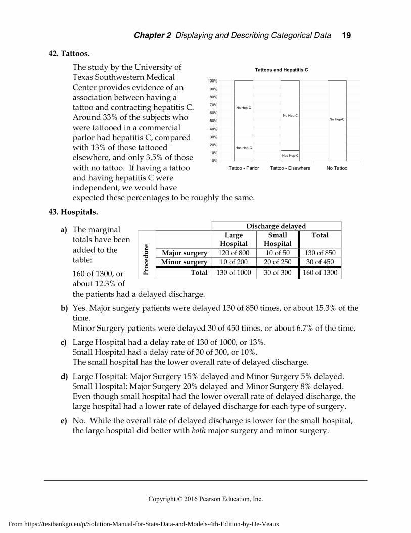
42. Tattoos.
The study by the University of Texas Southwestern Medical Center provides evidence of an association between having a tattoo and contracting hepatitis C. Around 33% of the subjects who were tattooed in a commercial parlor had hepatitis C, compared with 13% of those tattooed elsewhere, and only 3.5% of those with no tattoo. If having a tattoo and having hepatitis C were independent, we would have expected these percentages to be roughly the same.
43. Hospitals.
a) The marginal totals have been added to the table:
160 of 1300, or about 12.3% of the patients had a delayed discharge.
b) Yes. Major surgery patients were delayed 130 of 850 times, or about 15.3% of the time. Minor Surgery patients were delayed 30 of 450 times, or about 6.7% of the time.
c) Large Hospital had a delay rate of 130 of 1000, or 13%. Small Hospital had a delay rate of 30 of 300, or 10%. The small hospital has the lower overall rate of delayed discharge.
d) Large Hospital: Major Surgery 15% delayed and Minor Surgery 5% delayed. Small Hospital: Major Surgery 20% delayed and Minor Surgery 8% delayed. Even though small hospital had the lower overall rate of delayed discharge, the large hospital had a lower rate of delayed discharge for each type of surgery.
e) No. While the overall rate of delayed discharge is lower for the small hospital, the large hospital did better with both major surgery and minor surgery.
Discharge delayed
Pro
ced
ure
Large
Hospital Small
Hospital Total
Major surgery 120 of 800 10 of 50 130 of 850 Minor surgery 10 of 200 20 of 250 30 of 450
Total 130 of 1000 30 of 300 160 of 1300
Tattoos and Hepatitis C
Has Hep-C
Has Hep-C
No Hep-C
No Hep-CNo Hep-C
0%
10%
20%
30%
40%
50%
60%
70%
80%
90%
100%
Tattoo - Parlor Tattoo - Elsewhere No Tattoo
From https://testbankgo.eu/p/Solution-Manual-for-Stats-Data-and-Models-4th-Edition-by-De-Veaux
20 Part I Exploring and Understanding Data
Copyright © 2016 Pearson Education, Inc.
f) The small hospital performs a higher percentage of minor surgeries than major surgeries. 250 of 300 surgeries at the small hospital were minor (83%). Only 200 of the large hospital’s 1000 surgeries were minor (20%). Minor surgery had a lower delay rate than major surgery (6.7% to 15.3%), so the small hospital’s overall rate was artificially inflated. Simply put, it is a mistake to look at the overall percentages. The real truth is found by looking at the rates after the information is broken down by type of surgery, since the delay rates for each type of surgery are so different. The larger hospital is the better hospital when comparing discharge delay rates.
44. Delivery service.
a) Pack Rats has delivered a total of 28 late packages (12 Regular + 16 Overnight), out of a total of 500 deliveries (400 Regular + 100 Overnight). 28/500 = 5.6% of the packages are late. Boxes R Us has delivered a total of 30 late packages (2 Regular + 28 Overnight) out of a total of 500 deliveries (100 Regular + 400 Overnight). 30/500 = 6% of the packages are late.
b) The company should have hired Boxes R Us instead of Pack Rats. Boxes R Us only delivers 2% (2 out of 100) of its Regular packages late, compared to Pack Rats, who deliver 3% (12 out of 400) of its Regular packages late. Additionally, Boxes R Us only delivers 7% (28 out of 400) of its Overnight packages late, compared to Pack Rats, who delivers 16% of its Overnight packages late. Boxes R Us is better at delivering Regular and Overnight packages.
c) This is an instance of Simpson’s Paradox, because the overall late delivery rates are unfair averages. Boxes R Us delivers a greater percentage of its packages Overnight, where it is comparatively harder to deliver on time. Pack Rats delivers many Regular packages, where it is easier to make an on-time delivery.
45. Graduate admissions.
a) 1284 applicants were admitted out of a total of 3014 applicants. 1284/3014 = 42.6%
b) 1022 of 2165 (47.2%) of males were admitted. 262 of 849 (30.9%) of females were admitted.
c) Since there are four comparisons to make, the table at the right organizes the percentages of males and females accepted in each program. Females are accepted at a higher rate in every program.
Program
Males Accepted(of applicants)
Females Accepted (of applicants)
Total
1 511 of 825 89 of 108 600 of 933 2 352 of 560 17 of 25 369 of 585 3 137 of 407 132 of 375 269 of 782 4 22 of 373 24 of 341 46 of 714
Total 1022 of 2165 262 of 849 1284 of 3014
Program Males Females 1 61.9% 82.4% 2 62.9% 68.0% 3 33.7% 35.2% 4 5.9% 7%
From https://testbankgo.eu/p/Solution-Manual-for-Stats-Data-and-Models-4th-Edition-by-De-Veaux

Chapter 2 Displaying and Describing Categorical Data 21
Copyright © 2016 Pearson Education, Inc.
d) The comparison of acceptance rate within each program is most valid. The overall percentage is an unfair average. It fails to take the different numbers of applicants and different acceptance rates of each program. Women tended to apply to the programs in which gaining acceptance was difficult for everyone. This is an example of Simpson’s Paradox.
46. Be a Simpson!
Answers will vary. The three-way table below shows one possibility. The number of local hires out of new hires is shown in each cell.
Company A Company B Full-time New Employees
40 of 100 = 40% 90 of 200 = 45%
Part-time New Employees
170 of 200 = 85% 90 of 100 = 90%
Total 210 of 300 = 70% 180 of 300 = 60%
From https://testbankgo.eu/p/Solution-Manual-for-Stats-Data-and-Models-4th-Edition-by-De-Veaux

From https://testbankgo.eu/p/Solution-Manual-for-Stats-Data-and-Models-4th-Edition-by-De-Veaux

Chapter 3 Displaying and Summarizing Quantitative Data 23
Copyright © 2016 Pearson Education, Inc.
Chapter 3 – Displaying and Summarizing Quantitative Data
Section 3.1
1. Details.
Boxplots don’t tell us much about the shape of a distribution, beyond a basic idea of symmetry or skewness. The given boxplot could be displaying a distribution that has multiple modes (the first histogram), is reasonably unimodal (the second histogram), has gaps and clusters (the third histogram), or has outliers (the fourth histogram). We simply can’t determine shape from a boxplot.
2. Opposites.
a) The tallest bars on the histogram are where the vertical lines on the boxplot are closest together.
b) The boxplot indicates a skewed distribution when the vertical lines on one side of the median are closer together than the vertical lines on the other side. The histogram indicates a skewed distribution when the bars on one side of the histogram are generally taller than the bars on the other side of the histogram.
c) The histogram shows a second mode in the distribution, as well as clusters and gaps. The boxplot does not show this.
d) The boxplot shows the quartiles and the median, as well as showing outliers. These cannot be determined from the histogram.
Section 3.2
3. Outliers.
IQR = Q3 – Q1 = 116 – 98 = 18. Using the Outlier Rule (1.5 IQRs beyond quartiles):
Upper Fence:
Since the maximum, 160 minutes, is above the upper fence, there is at least one high outlier.
Lower Fence: Since the minimum, 43 minutes, is below the lower fence, there is at least one low outlier.
Q3+1.5(IQR)=116+1.5(18)=116+27=143
Q1 1.5(IQR)=98 1.5(18)=98 27=71
From https://testbankgo.eu/p/Solution-Manual-for-Stats-Data-and-Models-4th-Edition-by-De-Veaux

24 Part I Exploring and Understanding Data
Copyright © 2016 Pearson Education, Inc.
4. Adoptions.
Since the mean age at adoption is higher than the median age at adoption, the distribution of adoption ages is likely to be skewed to the right, with many adoptions happening when children are relatively young, with fewer adoptions of older children.
Section 3.3
5. Adoptions II.
The mean number of adoptions is expected to by higher than the median number of adoptions, since the distribution of the number of adoptions is skewed to the right.
6. Test score centers.
The median test score will not be affected, but the mean test score will increase by 0.4 points.
Section 3.4
7. Test score spreads.
The IQR of the test scores will not be affected, but the standard deviation of the test scores will increase.
8. Fuel economy.
If the outlier is removed, the standard deviation will decrease. The IQR will not change substantially. (It may change slightly, since removing one value from the data set may change the quartiles, which would change the IQR.)
Chapter Exercises
9. Histogram. Answers will vary.
10. Not a histogram. Answers will vary.
11. In the news. Answers will vary.
12. In the news II. Answers will vary.
13. Thinking about shape.
a) The distribution of the number of speeding tickets each student in the senior class of a college has ever had is likely to be unimodal and skewed to the right. Most students will have very few speeding tickets (maybe 0 or 1), but a small percentage of students will likely have comparatively many (3 or more?) tickets.
b) The distribution of player’s scores at the U.S. Open Golf Tournament would most likely be unimodal and slightly skewed to the right. The best golf players in the game will likely have around the same average score, but some golfers might be off their game and score 15 strokes above the mean. (Remember that high scores are undesirable in the game of golf!)
From https://testbankgo.eu/p/Solution-Manual-for-Stats-Data-and-Models-4th-Edition-by-De-Veaux

Chapter 3 Displaying and Summarizing Quantitative Data 25
Copyright © 2016 Pearson Education, Inc.
c) The weights of female babies in a particular hospital over the course of a year will likely have a distribution that is unimodal and symmetric. Most newborns have about the same weight, with some babies weighing more and less than this average. There may be slight skew to the left, since there seems to be a greater likelihood of premature birth (and low birth weight) than post-term birth (and high birth weight).
d) The distribution of the length of the average hair on the heads of students in a large class would likely be bimodal and skewed to the right. The average hair length of the males would be at one mode, and the average hair length of the females would be at the other mode, since women typically have longer hair than men. The distribution would be skewed to the right, since it is not possible to have hair length less than zero, but it is possible to have a variety of lengths of longer hair.
14. More shapes.
a) The distribution of the ages of people at a Little League game would likely be bimodal and skewed to the right. The average age of the players would be at one mode and the average age of the spectators (probably mostly parents) would be at the other mode. The distribution would be skewed to the right, since it is possible to have a greater variety of ages among the older people, while there is a natural left endpoint to the distribution at zero years of age.
b) The distribution of the number of siblings of people in your class is likely to be unimodal and skewed to the right. Most people would have 0, 1, or 2 siblings, with some people having more siblings.
c) The distribution of pulse rate of college-age males would likely be unimodal and symmetric. Most males’ pulse rates would be around the average pulse rate for college-age males, with some males having lower and higher pulse rates.
d) The distribution of the number of times each face of a die shows in 100 tosses would likely be uniform, with around 16 or 17 occurrences of each face (assuming the die had six sides).
15. Sugar in cereals.
a) The distribution of the sugar content of breakfast cereals is bimodal, with a cluster of cereals with sugar content around 6% sugar and another cluster of cereals around 48% sugar. The lower cluster shows a bit of skew to the right. Most cereals in the lower cluster have between 0% and 10% sugar. The upper cluster is symmetric, with center around 45% sugar.
b) There are two different types of breakfast cereals, those for children and those for adults. The children’s cereals are likely to have higher sugar contents, to make them taste better (to kids, anyway!). Adult cereals often advertise low sugar content.
From https://testbankgo.eu/p/Solution-Manual-for-Stats-Data-and-Models-4th-Edition-by-De-Veaux
26 Part I Exploring and Understanding Data
Copyright © 2016 Pearson Education, Inc.
16. Singers.
a) The distribution of the heights of singers in the chorus is bimodal, with a mode at around 65 inches and another mode around 71 inches. No chorus member has height below 60 inches or above 76 inches.
b) The two modes probably represent the mean heights of the male and female members of the chorus.
17. Vineyards.
a) There is information displayed about 36 vineyards and it appears that 28 of the vineyards are smaller than 90 acres. That’s around 78% of the vineyards. (75% would be a good estimate!)
b) The distribution of the size of 36 Finger Lakes vineyards is skewed to the right. Most vineyards are smaller than 90 acres, with a few larger ones, from 90 to 160 acres. One vineyard was larger than all the rest, over 240 acres. The mode of the distribution is between 0 and 30 acres.
18. Run times.
The distribution of runtimes is skewed to the right. The shortest runtime was around 28.5 minutes and the longest runtime was around 35.5 minutes. A typical run time was between 30 and 31 minutes, and the majority of runtimes were between 29 and 32 minutes. It is easier to run slightly slower than usual and end up with a longer runtime than it is to run slightly faster than usual and end up with a shorter runtime. This could account for the skew to the right seen in the distribution.
19. Heart attack stays.
a) The distribution of length of stays is skewed to the right, so the mean is larger than the median.
b) The distribution of the length of hospital stays of female heart attack patients is bimodal and skewed to the right, with stays ranging from 1 day to 36 days. The distribution is centered around 8 days, with the majority of the hospital stays lasting between 1 and 15 days. There are a relatively few hospital stays longer than 27 days. Many patients have a stay of only one day, possibly because the patient died.
c) The median and IQR would be used to summarize the distribution of hospital stays, since the distribution is strongly skewed.
20. Emails.
a) The distribution of the number of emails sent is skewed to the right, so the mean is larger than the median.
From https://testbankgo.eu/p/Solution-Manual-for-Stats-Data-and-Models-4th-Edition-by-De-Veaux

Chapter 3 Displaying and Summarizing Quantitative Data 27
Copyright © 2016 Pearson Education, Inc.
b) The distribution of the number of emails received from each student by a professor in a large introductory statistics class during an entire term is skewed to the right, with the number of emails ranging from 1 to 21 emails. The distribution is centered at about 2 emails, with many students only sending 1 email. There is one outlier in the distribution, a student who sent 21 emails. The next highest number of emails sent was only 8.
c) The median and IQR would be used to summarize the distribution of the number of emails received, since the distribution is strongly skewed.
21. Super Bowl points 2013.
a) The median number of points scored in the first 48 Super Bowl games is 45 points.
b) The first quartile of the number of points scored in the first 48 Super Bowl games is 35 points. The third quartile is 54.5 (or 55) points.
c) In the first 48 Super Bowl games, the lowest number of points scored was 21, and the highest number of points scored was 75. The median number of points scored was 45, and the middle 50% of Super Bowls has between 35 and 55 points scored.
22. Super Bowl wins 2013.
a) The median winning margin in the first 48 Super Bowl games is 12 points.
b) The first quartile of the winning margin in the first 48 Super Bowl games is 4.5 points. The third quartile is 19 points.
c) In the first 48 Super Bowl games the lowest winning margin was 1 point and the highest winning margin was 45 points, which was an outlier. The second highest winning margin was only 36 points. The median winning margin was 12 points, with the middle 50% of winning margins between 4.5 and 19 points.
23. Summaries.
a) The mean cost of the compact refrigerators is $144.44.
b) The median cost of the compact refrigerators is $150. The first quartile is $130, and the third quartile is $150.
c) The range of the cost of the compact refrigerators is $180 – $120 = $60. The IQR is $150 – $130 = $20.
24. Tornadoes 2013.
a) The mean number of annual deaths from tornadoes in the United States from 1998 through 2013 is 125.1.
b) The median number of deaths is 60.5. The first quartile is 40 deaths and the third quartile is 109.5 deaths.
From https://testbankgo.eu/p/Solution-Manual-for-Stats-Data-and-Models-4th-Edition-by-De-Veaux

28 Part I Exploring and Understanding Data
Copyright © 2016 Pearson Education, Inc.
c) The range is 555 – 21 = 534 deaths. The IQR is 109.5 – 40 = 69.5 deaths.
25. Mistake. a) As long as the boss’s true salary of $200,000 is still above the median, the median
will be correct. The mean will be too large, since the total of all the salaries will decrease by $2,000,000 - $200,000 = $1,800,000, once the mistake is corrected.
b) The range will likely be too large. The boss’s salary is probably the maximum, and a lower maximum would lead to a smaller range. The IQR will likely be unaffected, since the new maximum has no effect on the quartiles. The standard deviation will be too large, because the $2,000,000 salary will have a large squared deviation from the mean.
26. Sick days.
The company probably uses the mean, while the union uses the median number of sick days. The mean will likely be higher, since it is affected by probable right skew. Some employees may have many sick days, while most have relatively few.
27. Standard deviation I.
a) Set 2 has the greater standard deviation. Both sets have the same mean (6) but set two has values that are generally farther away from the mean. SD(Set 1) = 2.24 SD(Set 2) = 3.16
b) Set 2 has the greater standard deviation. Both sets have the same mean (15), maximum (20), and minimum (10), but 11 and 19 are farther from the mean than 14 and 16. SD(Set 1) = 3.61 SD(Set 2) = 4.53
c) The standard deviations are the same. Set 2 is simply Set 1 + 80. Although the measures of center and position change, the spread is exactly the same. SD(Set 1) = 4.24 SD(Set 2) = 4.24
28. Standard deviation II.
a) Set 2 has the greater standard deviation. Both sets have the same mean (7), maximum (10), and minimum (4), but 6 and 8 are farther from the mean than 7. SD(Set 1) = 2.12 SD(Set 2) = 2.24
b) The standard deviations are the same. Set 1 is simply Set 2 + 90. Although the measures of center and position are different, the spread is exactly the same. SD(Set 1) = 36.06 SD(Set 2) = 36.06
From https://testbankgo.eu/p/Solution-Manual-for-Stats-Data-and-Models-4th-Edition-by-De-Veaux

Chapter 3 Displaying and Summarizing Quantitative Data 29
Copyright © 2016 Pearson Education, Inc.
c) Set 2 has the greater standard deviation. The central 4 values of Set 2 are simply the central 4 values of Set 1 + 40, but the maximum and minimum of Set 2 are farther away from the mean than the maximum and minimum of Set 1. Range(Set 1) = 18 and Range(Set 2) = 22. Since the Range of Set 2 is greater than the Range of Set 1, the standard deviation is also larger. SD(Set 1) = 6.03 SD(Set 2) = 7.24
29. Pizza prices.
The mean and standard deviation would be used to summarize the distribution of pizza prices, since the distribution is unimodal and symmetric.
30. Neck size.
The mean and standard deviation would be used to summarize the distribution of neck sizes, since the distribution is unimodal and symmetric.
31. Pizza prices again.
a) The mean pizza price is closest to $2.60. That’s the balancing point of the histogram.
b) The standard deviation in pizza prices is closest to $0.15, since that is the typical distance to the mean. There are no pizza prices as far as $0.50 or $1.00.
32. Neck sizes again.
a) The mean neck size is closest to 15 inches. That’s the balancing point of the histogram.
b) The standard deviation in neck sizes is closest to 1 inch, because a typical value lies about 1 inch from the mean. There are a few points as far away as 3 inches from the mean, and none as far away as 5 inches. Those are too large to be the standard deviation.
33. Movie lengths 2010.
a) A typical movie would be a little over 100 minutes long. This is near the center of the unimodal and slightly skewed histogram, with the outlier set aside.
b) You would be surprised to find that your movie ran for 150 minutes. Only 3 movies ran that long.
c) It’s difficult to say which would be higher. While the distribution of movie lengths is generally skewed to the right, which would raise the mean, there is a low outlier, which would lower the mean. (The actual mean of 107.07 minutes is a bit higher than the median of 104.50 minutes.)
34. Golf drives 2013.
a) The distribution of golf drives is roughly unimodal and symmetric, with a typical drive of a little over 290 yards. Professional golfers on the men’s PGA tour had drives that were as short as about 255 yards, and as long as about 320 yards.
From https://testbankgo.eu/p/Solution-Manual-for-Stats-Data-and-Models-4th-Edition-by-De-Veaux

30 Part I Exploring and Understanding Data
Copyright © 2016 Pearson Education, Inc.
b) Approximately 25% of professional male golfers drive less than 280 yards.
c) According to the graph, the mean drive is between 285 and 295 yards.
d) The distribution of golf drives is approximately symmetric, so the mean and the median should be relatively close.
35. Movie lengths II 2010.
a) i) The distribution of movie running times is fairly consistent, with the middle 50% of running times between 98 and 116 minutes. The interquartile range is 18 minutes.
ii) The standard deviation of the distribution of movie running times is 16.6 minutes, which indicates that movies typically have running times fairly close to the mean running time.
b) Since the distribution of movie running times is generally skewed to the right and contains an outlier, the standard deviation is a poor choice of numerical summary for the spread. The interquartile range is better, since it is resistant to outliers.
36. Golf drives II 2013.
a) i) The distribution of PGA golf drives is fairly consistent, with the middle 50% of the drives having distances between 282.5 and 295.6 yards. The interquartile range is 13.1 yards.
ii) The standard deviation of the distribution of PGA golf drives is 11.2 yards, which indicates that golf drives are typically within 11.2 yards of the mean gold drive.
b) Since the distribution of golf drives is reasonably symmetric, both the standard deviation and the interquartile range are reasonable measures of spread.
37. Movie earnings 2013.
The industry publication is using the median, while the watchdog group is using the mean. It is likely that the mean is pulled higher by a few high earning movies.
38. Cold weather.
a) The mean temperature will be lower. The median temperature will not change, since the incorrect temperature is still the lowest temperature, and the median is based only on position.
b) The range and standard deviation in temperature will both increase, since the incorrect temperature is more extreme than the correct temperature. The IQR will not change, since the both the correct and incorrect scores are below the first quartile, and the IQR measures the distance between the first and third quartiles.
From https://testbankgo.eu/p/Solution-Manual-for-Stats-Data-and-Models-4th-Edition-by-De-Veaux

Chapter 3 Displaying and Summarizing Quantitative Data 31
Copyright © 2016 Pearson Education, Inc.
39. Payroll.
a) The mean salary is 1200 700 6(400) 4(500)
$52512
.
The median salary is the middle of the ordered list: 400 400 400 400 400 400 500 500 500 500 700 1200 The median is $450.
b) Only two employees, the supervisor and the inventory manager, earn more than the mean wage.
c) The median better describes the wage of the typical worker. The mean is affected by the two higher salaries.
d) The IQR is the better measure of spread for the payroll distribution. The standard deviation and the range are both affected by the two higher salaries.
40. Singers full choir.
a) 5-number summary: 60, 65, 66, 70, 76, so the median is 66 inches and the IQR is 70 – 65 = 5 inches.
b) The mean height of the singers is 67.12 inches, and the standard deviation of the heights is 3.79 inches.
c) The histogram of heights of the choir members is at the right.
d) The distribution of the heights of the choir members is bimodal (probably due to differences in height of men and women) and skewed slightly to the right. The median is 66 inches. The distribution is fairly spread out, with the middle 50% of the heights falling between 65 and 70 inches. There are no gaps or outliers in the distribution.
41. Gasoline 2014.
a)
60 65 70 75
5
10
15
20
Heights (inches)
fre
quen
cy
From https://testbankgo.eu/p/Solution-Manual-for-Stats-Data-and-Models-4th-Edition-by-De-Veaux

32 Part I Exploring and Understanding Data
Copyright © 2016 Pearson Education, Inc.
b) The distribution of gas prices is bimodal, with two clusters, one centered around $3.45 per gallon, and another centered around $3.25 per gallon. The lowest and highest prices were $3.11 and $3.46 per gallon.
c) There is a gap in the distribution of gasoline prices. There were no stations that charged between $3.28 and $3.39.
42. The Great One.
a)
b) The distribution of the number of games played by Wayne Gretzky is skewed to the left.
c) Typically, Wayne Gretzky played about 80 games per season. The number of games played is tightly clustered in the upper 70s and low 80s.
d) Two seasons are low outliers, when Gretzky played fewer than 50 games. He may have been injured during those seasons. Regardless of any possible reasons, these seasons were unusual compared to Gretzky’s other seasons.
43. States.
a) The distribution of state populations is skewed heavily to the right. Therefore, the median and IQR are the appropriate measures of center and spread.
b) The mean population must be larger than the median population. The extreme values on the right affect the mean greatly and have no effect on the median.
c) There are 50 entries in the stemplot, so the median must be between the 25th and 26th population values. Counting in the ordered stemplot gives median = 4.5 million people. The middle of the lower 50% of the list (25 state populations) is the 13th population, or 2 million people. The middle of the upper half of the list (25 state populations) is the 13th population from the top, or 7 million people. The IQR = Q3 – Q1 = 7 – 2 = 5 million people.
Wayne Gretzsky – Games played per season 8 000000122 7 8899 7 0344 6 6 4 Key: 5 7 | 8 = 78 5 games 4 58 4
From https://testbankgo.eu/p/Solution-Manual-for-Stats-Data-and-Models-4th-Edition-by-De-Veaux

Chapter 3 Displaying and Summarizing Quantitative Data 33
Copyright © 2016 Pearson Education, Inc.
d) The distribution of population for the 50 U.S. States is unimodal and skewed heavily to the right. The median population is 4.5 million people, with 50% of states having populations between 2 and 7 million people. There are two outliers, a state with 37 million people, and a state with 25 million people. The next highest population is only 19 million.
44. Wayne Gretzky. a) The distribution of the number of games played per season by Wayne Gretzky is skewed
to the left, and has low outliers. The median is more resistant to the skewness and outliers than the mean.
b) The median, or middle of the ordered list, is 79 games. Both the 10th and 11th values are 79, so the median is the average of these two, also 79.
c) The mean should be lower. There are two seasons when Gretzky played an unusually low number of games. Those seasons will pull the mean down.
45. A-Rod 2013.
The distribution of the number of homeruns hit by Alex Rodriguez during the 1994 – 2013 seasons is reasonably symmetric, with the exception of a second mode around 10 homeruns. A typical number of homeruns per season was in the high 30s to low 40s. With the exception of 3 seasons in which A-Rod hit 0 , 5, and 7 homeruns, his total number of homeruns per season was between 16 and the maximum of 57.
46. Bird species 2013.
a) The results of the 2013 Laboratory of Ornithology Christmas Bird Count are displayed in the stem and leaf display at the right.
b) The distribution of the number of birds spotted by participants in the 2013 Laboratory of Ornithology Christmas Bird Count is skewed right, with a median of 117 birds. There are three high potential outliers, with participants spotting 150, 166, and 184 birds. With the exception of these outliers, most participants saw between 82 and 136 birds.
47. Major Hurricanes 2013.
a) A dotplot of the number of hurricanes each year from 1944 through 2013 is displayed. Each dot represents a year in which there were that many hurricanes. 876543210
Number of Hurricanes
Major Hurricanes - 1944 - 2013
From https://testbankgo.eu/p/Solution-Manual-for-Stats-Data-and-Models-4th-Edition-by-De-Veaux

34 Part I Exploring and Understanding Data
Copyright © 2016 Pearson Education, Inc.
b) The distribution of the number of hurricanes per year is unimodal and skewed to the right, with center around 2 hurricanes per year. The number of hurricanes per year ranges from 0 to 8. There are no outliers. There may be a second mode at 5 hurricanes per year, but since there were only 6 years in which 5 hurricanes occurred, this may simply be natural variability.
48. Horsepower.
The distribution of horsepower of cars reviewed by Consumer Reports is nearly uniform. The lowest horsepower was 65 and the highest was 155. The center of the distribution was around 105 horsepower.
49. A-Rod again 2013.
a) This is not a histogram. The horizontal axis should the number of home runs per year, split into bins of a convenient width. The vertical axis should show the frequency; that is, the number of years in which A-Rod hit a number of home runs within the interval of each bin. The display shown is a bar chart/time plot hybrid that simply displays the data table visually. It is of no use in describing the shape, center, spread, or unusual features of the distribution of home runs hit per year by A-Rod.
b) The histogram is at the right.
6050403020100
4
3
2
1
0
Homeruns
# of
seas
ons
Alex Rodriguez 1994-2013
From https://testbankgo.eu/p/Solution-Manual-for-Stats-Data-and-Models-4th-Edition-by-De-Veaux

Chapter 3 Displaying and Summarizing Quantitative Data 35
Copyright © 2016 Pearson Education, Inc.
50. Return of the birds 2013.
a) This is not a histogram. The horizontal axis should split the number of counts from each site into bins. The vertical axis should show the number of sites in each bin. The given graph is nothing more than a bar chart, showing the bird count from each site as its own bar. It is of absolutely no use for describing the shape, center, spread, or unusual features of the distribution of bird counts.
b) The histogram is below.
51. Acid rain.
The distribution of the pH readings of water samples in Allegheny County, Penn. is bimodal. A roughly uniform cluster is centered around a pH of 4.4. This cluster ranges from pH of 4.1 to 4.9. Another smaller, tightly packed cluster is centered around a pH of 5.6. Two readings in the middle seem to belong to neither cluster.
18016014012010080
4
3
2
1
0
Number of Species
Num
ber
of S
ites
Christmas Bird Count
5.75.45.14.84.54.2
4
3
2
1
0
pH
Freq
uenc
y
Acidity of Water Samples
From https://testbankgo.eu/p/Solution-Manual-for-Stats-Data-and-Models-4th-Edition-by-De-Veaux

36 Part I Exploring and Understanding Data
Copyright © 2016 Pearson Education, Inc.
52. Marijuana 2007.
The distribution of the percentage of 16-year-olds in 34 countries who have used marijuana is somewhat bimodal, with 9 countries having between 3% and 10% of 16-year-olds having used marijuana. Another group of 12 countries has between 15% and 25% of teens who have used marijuana. Armenia, at 3%, had the lowest percentage of 16-year-olds who have tried marijuana. Czech Republic had the highest percentage, at 45%. A typical country might have a percentage of approximately 20%.
53. Final grades.
The width of the bars is much too wide to be of much use. The distribution of grades is skewed to the left, but not much more information can be gathered.
54. Final grades revisited.
a) This display has a bar width that is much too narrow. As it is, the histogram is only slightly more useful than a list of scores. It does little to summarize the distribution of final exam scores.
b) The distribution of test scores is skewed to the left, with center at approximately 170 points. There are several low outliers below 100 points, but other than that, the distribution of scores is fairly tightly clustered.
55. Zip codes.
Even though zip codes are numbers, they are not quantitative in nature. Zip codes are categories. A histogram is not an appropriate display for categorical data. The histogram the Holes R Us staff member displayed doesn’t take into account that some 5-digit numbers do not correspond to zip codes or that zip codes falling into the same classes may not even represent similar cities or towns. The employee could design a better display by constructing a bar chart that groups together zip codes representing areas with similar demographics and geographic locations.
56. Zip codes revisited
The statistics cannot tell us very much since zip codes are categorical. However, there is some information in the first digit of zip codes. They indicate a general East (0-1) to West (8-9) direction. So, the distribution shows that a large portion of their sales occurs in the West and another in the 32000 area. But a bar chart of the first digits would be the appropriate display to show this information.
454035302520151050
76543210
Percentage of 16-year-olds who have used marijuana
Num
ber o
f cou
ntrie
s
Teen Marijuana Use
From https://testbankgo.eu/p/Solution-Manual-for-Stats-Data-and-Models-4th-Edition-by-De-Veaux

Chapter 3 Displaying and Summarizing Quantitative Data 37
Copyright © 2016 Pearson Education, Inc.
57. Math scores 2013.
a) Median: 285 IQR: 9 Mean: 284.36 Standard deviation: 6.84
b) Since the distribution of Math scores is skewed to the left, it is probably better to report the median and IQR.
c) The distribution of average math achievement scores for eighth graders in the United States is skewed slightly to the left, and roughly unimodal. The distribution is centered at 285. Scores range from 269 to 301, with the middle 50% of the scores falling between 280 and 289.
58. Boomtowns 2011.
a) A histogram of the job growth rates of NewGeography.com’s best cities for job growth is at the right. A boxplot, stemplot, or dotplot would also have been an acceptable display.
b) The mean weighted job rating index is 73.03% and the median weighted job rating index is 71.80%. The mean is higher because distribution is skewed to the right.
c) The median would be the appropriate measure of center of the distribution of weighted job rating indices, since the distribution is skewed to the right.
d) The standard deviation of the distribution of weighted job rating indices is 7.61% and the IQR is 10.10%.
e) The IQR is the appropriate measure of spread, because the skewness influences the standard deviation.
9288848076726864
76543210
Weighted job rating index
Num
ber o
f citi
es
Job growth 2011
300295290285280275270
9876543210
Score
# of
stat
es
US Math Test Scores
From https://testbankgo.eu/p/Solution-Manual-for-Stats-Data-and-Models-4th-Edition-by-De-Veaux

38 Part I Exploring and Understanding Data
Copyright © 2016 Pearson Education, Inc.
f) If 49.23% were subtracted from each of the weighted job rating indices, the mean and median would each decrease by 49.23%. The standard deviation and the IQR would not change.
g) If we were to set aside Austin-Round Rock-San Marcos, the highest weighted job rating index, the mean would decrease. The skewness was pulling it up. The standard deviation would decrease, since the skewness gave the impression of more spread. The median and IQR would be relatively unaffected, since those measures are resistant to the presence of skewness, although they would change slightly, since they are each based upon relative position. With the highest rating removed, there would only be 19 rating indices, instead of 20. This would cause the median and the quartiles to shift down slightly.
h) The distribution of weighted job rating indices is roughly unimodal and skewed to the right. The median weighted job rating index for these cities is 71.80%. The middle 50% of the cities had weighted job rating indices between 67.25% and 77.35%, for an interquartile range of 10.10%. The median and IQR are the best measures of spread, since the distribution is skewed.
59. Population growth 2010.
The distribution of population growth among the 50 United States and the District of Columbia is unimodal and skewed to the right. Most states experienced modest growth, as measured by percent change in population between 2000 and 2010. Nearly every state experienced positive growth, with the exception of Michigan. The median population growth was 7.8%, with the middle 50% of states experiencing between 4.30% and 14.10% growth, for an IQR of 9.80. The distribution contains one high outlier. Nevada experienced population growth of 35.1%.
403020100
1614121086420
Percent Change
# of
Sta
tes
Population Growth - 2000 to 2010
From https://testbankgo.eu/p/Solution-Manual-for-Stats-Data-and-Models-4th-Edition-by-De-Veaux
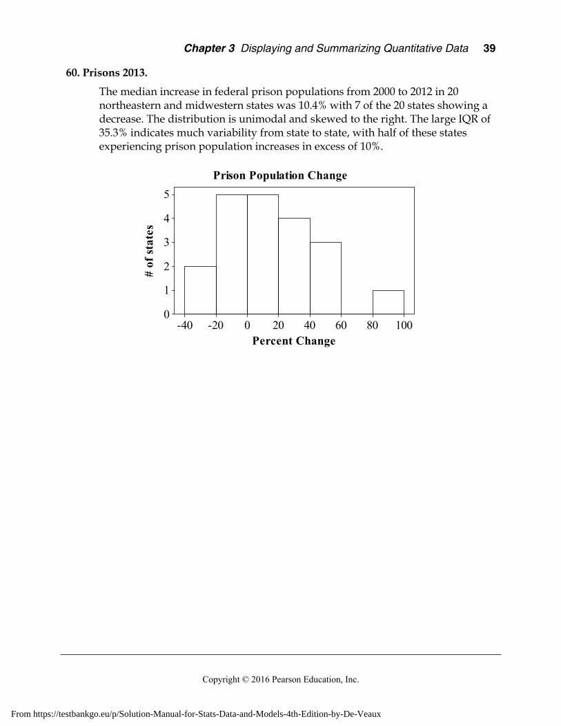
Chapter 3 Displaying and Summarizing Quantitative Data 39
Copyright © 2016 Pearson Education, Inc.
60. Prisons 2013.
The median increase in federal prison populations from 2000 to 2012 in 20 northeastern and midwestern states was 10.4% with 7 of the 20 states showing a decrease. The distribution is unimodal and skewed to the right. The large IQR of 35.3% indicates much variability from state to state, with half of these states experiencing prison population increases in excess of 10%.
100806040200-20-40
5
4
3
2
1
0
Percent Change
# of
stat
es
Prison Population Change
From https://testbankgo.eu/p/Solution-Manual-for-Stats-Data-and-Models-4th-Edition-by-De-Veaux
40 Part I Exploring and Understanding Data
Copyright © 2016 Pearson Education, Inc.
Chapter 4 – Understanding and Comparing Distributions
Section 4.1
1. Load factors, 2013.
The distribution of domestic load factors and the distribution of international load factors are both unimodal and skewed to the left. The distribution of international load factors may contain a low outlier. Because the distributions are skewed, the median and IQR are the appropriate measures of center and spread. The medians are very close, which tell us that typical international and domestic load factors are about the same. The IQRs show a bit more variability in the domestic load factors.
2. Load factor, 2013 by season.
The distribution of Spring/Summer load factors and the distribution of Fall/Winter load factors are both unimodal and skewed to the left. Load factors in the Fall/Winter period vary less than load factors in the Spring/Summer period, but are generally higher. The center of the distribution of Fall/Winter load factors is around 82, while the center of the distribution of Spring/Summer load factors is around 77.
Section 4.2
3. Load factors 2013 by month.
Load factors are generally higher and less variable in the summer months (June – August). They are lower and more variable in the winter and spring.
4. Load factors 2013 by year.
Load factors have generally increased steadily since 2001. They may have become less variable in recent years.
Section 4.3
5. Extraordinary months.
Air travel immediately after the events of 9/11 was not typical of air travel in general. If we want to analyze monthly patterns, it might be best to set these months aside.
6. Extraordinary months again.
Outliers are dependent on context. The low outlier evident in the single boxplot must be the lowest value from 2001, but load factors were generally lower in 2001 than they were overall. That value wasn’t an outlier when compared to the other low values of 2001, but it stood out overall, as load factors increased.
From https://testbankgo.eu/p/Solution-Manual-for-Stats-Data-and-Models-4th-Edition-by-De-Veaux

Chapter 4 Understanding and Comparing Distributions 41
Copyright © 2016 Pearson Education, Inc.
Section 4.4
7. Load factors 2013 over time.
a) After a period of little change in 2000-2001, load factors have been increasing steadily.
b) We would never assume that a pattern like this would continue. This case illustrates one of the reasons why we wouldn’t assume this. Since load factors are percentages, they cannot exceed 100%. At the very least, the load factors would have to level out in the future.
8. Load factors 2013 over time, a second look.
a) With the median smoother, the seasonal pattern that was witnessed in Exercise 3 becomes evident. Higher load factors are expected in the summer months.
b) Yes, we can expect this pattern to persist, because it reflects seasonal effects, such as summer vacation time, that will probably continue.
Section 4.5
9. Exoplanets.
It is difficult to summarize data with a distribution this skewed. The extremely large values will dominate any summary or description.
10. Exoplanets re-expressed.
a) Yes, this re-expressed scale is better for understanding these distances. The log scale provides a nearly symmetric distribution, and points out that the sun was included in the data, probably accidentally.
b) The sun should not be included in data about extra-solar planets.
Chapter Exercises
11. In the news. Answers will vary.
12. In the news. Answers will vary.
13. Time on the Internet. Answers will vary.
14. Groups on the Internet. Answers will vary.
15. Pizza prices.
a) Pizza prices appear to be both higher on average, and more variable, in Baltimore than in the other three cities. Prices in Chicago may be slightly higher on average than in Dallas and Denver, but the difference is small.
b) There are low outliers in the distribution of pizza prices in Baltimore and Chicago. There is one high outlier in the distribution of pizza prices in Dallas. These outliers do not affect the overall conclusions reached in the previous part.
From https://testbankgo.eu/p/Solution-Manual-for-Stats-Data-and-Models-4th-Edition-by-De-Veaux