success factors of a web site
DESCRIPTION
Analysis of Autoweek.comTRANSCRIPT

Maddie Pospisil
Introduction to Web Publishing
Jacquie Lamer
16 September 2015
My Site: Autoweek.com
WEB SITE OVERVIEW
Content Analysis:
Autoweek.com is a website dedicated to car enthusiasts. It provides the latest in car
reviews, car news, and racing. Autoweek.com has a print companion, Autoweek magazine, which
is published every two weeks. Autoweek.com covers many aspects of the automotive industry –
acting as a one-stop-shop for enthusiasts.
The articles featured on the home page were primarily published the day of – in this case,
September 9. There were no articles featured on the home page that were published more than
two days earlier. I checked this again on September 13, a Sunday. Again most articles were
published on that day but none were published before September 11. The content on the home
page is consistently new, fresh, and updated. The photos featured in articles, and on the home
page, are large and brightly colored, drawing in the visitor. The headlines do tend to be pretty
long. Although this makes them descriptive, it also makes me less likely to read the full thing.

Articles have a side-panel to the right of them that provides “Related Stories.”
This side panel of related stories gives visitors the opportunity to stay engaged with the site.
Instead of searching for articles they would be interested in, risking frustration or running out of

time, the articles are conveniently provided for them. It’s a great strategy. Autoweek doesn’t
have to guess what the reader is interested in – the fact that they’re reading a certain article
shows automatically at least one facet of their interest.
Another reason I believe Autoweek keeps its content fresh is based off the additional
navigation that appears on the left side of the home page. The side navigation offers different
categories from the top navigation for its visitors to explore. Not only does this provide more
access-points for visitors to get involved with the site, it provides a chance for the website to be
even more user-friendly and up-to-date. I visited Autoweek.com on September 9, 2015 and four
days later, the side navigation had changed. A category had been added: “Frankfurt Motor
Show.”

It had been added because the 2015 Frankfurt Motor Show opens to the press on September 15.
Interest and speculation are increasing around this event, and Autoweek gave visitors to its site a
quick, easy way to directly access the information.
Autoweek does provide a “My Account” feature on its site that allows you to log in and, I
imagine, customize the site. I was going to create an account and explore this feature, but a
magazine subscription is required. Without being able to play with this feature, it is hard to
comment on its effectiveness, but typically, a “My Account” feature only adds to a website’s
engagement.
The top navigation has the following categories: News, Reviews, Racing, Photos, Videos,
and Store. Car news, reviews, and racing are the three categories Autoweek actively publicizes
that it specializes in, and are also the three that most site visitors are probably interested in. The
“Reviews” page has a sidebar navigation that allows you to filter the reviews by car company.
The car companies provided are exhaustive. In total, forty different car companies are listed
alphabetically. They provide reviews for luxury, sport, and leisure cars alike - i.e. Rolls Royces,
Land Rovers, and Fords. Under “Racing”, all different types are available to filter results. These
include Formula One, IndyCar, IMSA, three branches of NASCAR, NHRA, and Rally. For both
reviews and racing, the impressive thing is that each separate page is full of articles. There isn’t a
car brand or racing group that gets noticeably more or less attention. This shows the expansive
breadth and depth of information Autoweek.com covers.
If you follow the links to the “Photos” and “Videos” pages, you get exactly that. These
are pages dedicated solely to the visual aspects. The photo page is mainly galleries of new cars,
showing every aspect of the car featured. Most pictures in the galleries feature the cars in motion,
but a few display interiors. When you click on a gallery, the photos fill the entire page, only

leaving room for the logo and navigation at the top. This shows off the incredible detail in each
picture and immerses the viewer in the photos – no distractions.
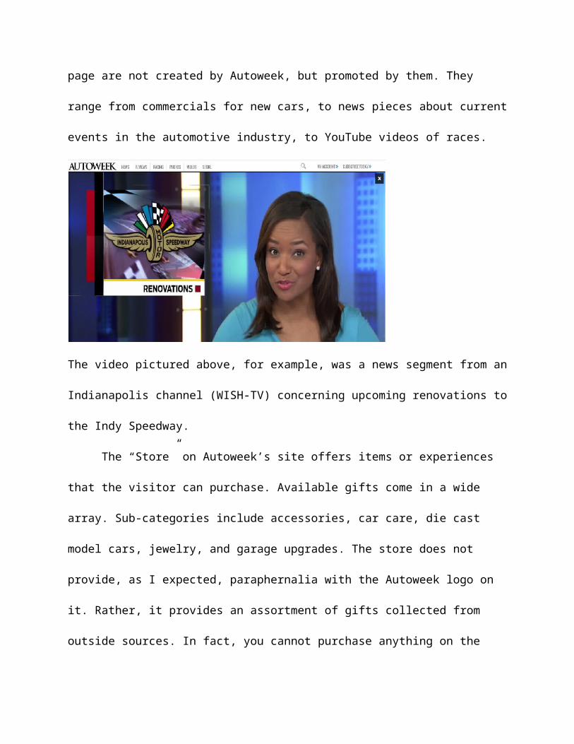
The videos showcased on the “Videos” page are not created by Autoweek, but promoted by
them. They range from commercials for new cars, to news pieces about current events in the
automotive industry, to YouTube videos of races.

The video pictured above, for example, was a news segment from an Indianapolis channel
(WISH-TV) concerning upcoming renovations to the Indy Speedway.
The “Store” on Autoweek’s site offers items or experiences that the visitor can purchase.
Available gifts come in a wide array. Sub-categories include accessories, car care, die cast model
cars, jewelry, and garage upgrades. The store does not provide, as I expected, paraphernalia with
the Autoweek logo on it. Rather, it provides an assortment of gifts collected from outside
sources. In fact, you cannot purchase anything on the actual Autoweek site – you will be
redirected to another website from where the gift originates. Additionally, there is more available
to purchase than simply items. Autoweek has packages and driving experiences offered by
driving schools or racing tracks. This cool feature gives car enthusiasts the chance to get hands-
on with their hobby. I find this to be a very interesting and unique part of the Autoweek website
that is a great example of their dedication to engagement.
General Company Information:
The first issue of what would become Autoweek magazine was published on July 16,
1958 as Competition Press (Kozak). It was, and is, published bi-weekly – the only car enthusiast
magazine in America to be printed this way. In 1964, the name of the magazine was upgraded to
Competition Press & Autoweek. In 1975 it was shortened Autoweek. In 1977, Autoweek was
purchased by Crain Communications, Inc., a publishing company. With Crain’s influence and
budget, Autoweek gained a new look and with it, new customers. In fact, AutoWeek's circulation
rose from 25,000 to nearly 280,000 (“Crain Communications…”). Autoweek became “Crain’s
largest circulation publication, a distinction that holds true for the company today,” (“A Proud
Heritage.”).
In 2014, Autoweek.com was relaunched with a new look and responsive web design
(Autoweek Media Kit). I could not find when Autoweek.com was first launched, but the
relaunch shows me that they are always looking to improve upon what they have.

Crain publishes other magazines covering different topics. These include healthcare,
human resources, advertising, investments, insurance, and plastics and rubber (“Brands”). For
example, Crain is the parent company of Advertising Age, a successful advertising magazine.
Most of its publications are BtoB or trade magazines. Autoweek is Crain’s main consumer
magazine.
Crain does publish other automotive-related magazines, however. Automotive News is a
trade publication that is “the go-to place for all the news that is happening among automotive
retailers, suppliers and manufacturers,” (“Automotive”). Crain also publishes Automotive News
Europe and Automobilwoche, a German BtoB newspaper for its automotive industry.
Competing Site:
I chose Automobilemag.com as the competing site for Autoweek.com.
Automobilemag.com and Autoweek.com are incredibly similar sites. Both provide reviews of
cars, the latest news in the automobile industry, and information about the big car shows. There
are many overlapping categories and pages between Autoweek.com and AutomobileMag.com.
For example, both websites have a sub-category under car reviews titled “Classic Cars.” These
sites aim to be a one-stop-shop for car enthusiasts.
There are discrepancies between the sites, though. Both cover something the other lacks
in. A primary component of Autoweek is its coverage of the racing world, specifically:
NASCAR, Formula One, Indy, Rally, NHRA, and IMSA. AutomobileMag focuses more on
consumer vehicles and does not follow racing. This focus on consumer vehicles is why they
provide a feature that Autoweek does not – Car Buying Guides. You can research cars, get price

quotes for new cars, and browse new and used cars for sale. These contrasting focuses are the
largest differences between Autoweek.com and AutomobileMag.com.
DESIGN & LAYOUT ANALYSIS
Responsive/Mobile:
Autoweek.com does not have a mobile-compatible version. When I went to the site on
my iPhone 6, the URL did not include a “m.” or a “mobile.”
Their site is, however, responsive. When comparing the mobile/tablet window sizes to the
desktop window size, a noticeable difference is that the mobile and tablet sizes are missing the
“My Account” and “Subscribe Today” section that appears in the top right corner of the desktop
version. As you scroll down the homepage, opportunities for subscribing appear, but the design
makes them seem like an ad. As for the “My Account” section, it is only at the very bottom of
the both versions that I had the option of going to that page. Another piece missing from both
the tablet and mobile versions is the sidebar. All elements of the sidebar do appear further down

the page. A big difference I noticed in only the mobile size is that there are significantly less ads
that appear – next to none, in fact. Both the desktop and tablet windows had ads in essentially the
same spots. If you look at the screenshots, for example, the desktop and tablet versions have a
banner ad at the top while the mobile version does not.


Layout:


Page Elements
Autoweek.com has many of the common elements of a website. The eye is immediately
drawn to the header. The header for Autoweek consists of its nameplate and logo. The name is a
black serif font in all uppercase lettering. It is arguably the biggest, boldest thing on the home
page –the feature photo is the biggest competitor. Immediately following the nameplate is the
logo, an old fashioned racing helmet. The helmet is, in fact, an allusion to Jean Behra’s racing
helmet and has been the logo of the magazine since it was Competition Press (Kozak). Jean
Behra was a Formula One racer, so the logo is a nice nod to the roots of the magazine. The feel
of the site is established using the black-and-white theme and the crisp, subdued font choices. It
immediately feels flashy, clean, and credible.
The main navigation is an extremely important part of the site. In fact, the book says
“navigation is essential for a site’s usability.” This means navigation should always be
accessible. When I started scrolling down the home page, the header and main navigation
collapsed into a smaller version that fit in a neat line across the top of the page. It was always
there, but it didn’t take up as much space as at the top of the page. The book always stresses that
the header and navigation should not distract the user. The main navigation of Autoweek appears
in small, light grey font. This makes sure the actual content is not overpowered. The sections in
the navigation are: News, Reviews, Racing, Photos, Videos, Store. These are the places visitors
are looking for most often, and are also the most general categories. The navigation area of
Autoweek also features a search bar, a great tool for usability, and a section to subscribe or log
into your account if you already are a subscriber. These are the calls to action that the book
mentions as being a part of a header. It gets the user actively involved in the site. These sections,
too, stay accessible as you scroll down.

The feature section of Autoweek is dominated by a photo. The headline of the story the
photo belongs to appears under the photo in relatively small type. The book says the feature
usually has some element of motion but that does not hold true for this page. The featured photos
are always brightly colored with great detail, and I think that creates enough of a focal point
when compared to the rest of the “above the fold” content existing mainly on a grayscale.
The body of Autoweek takes up a long stretch of the site. There are breaks in content
which the book says allows users to skim the page quickly. However, the breaks do not appear as
just white space. In fact, the breaks are created using mainly large photos and advertisements.
This is an interesting and unique way to let the user skim. Subheadings are not prevalent in the
body of the site.
The sidebar starts directly under the header and continues down the page for quite a
while. At the top is a section titled “Editor’s Picks.” This gives users a peek into what someone
with potentially more experience views as important and well-written. The second official
section in the sidebar is called “From Around the Web.” It provides links to blogs/articles written
by other people on other sites – still related to cars, of course. I found this an interesting thing to
place so high on the page. However, I do think it promotes a sense of credibility. Autoweek is
confident enough in their own content that they feel comfortable promoting good, solid content
from other sources. After this are a couple sections wanting users to subscribe to the magazine or
sign up for a newsletter. Following these is a live Twitter feed and then the general social media
section – where Autoweek lists all their various social media sites. Showing their Twitter feed,
which seems to be quite active, positions them as young and tech-savvy. Interspersed in the
sidebar are big box advertisements.

Autoweek also has a sidebar to the left of the feature/body of the site. This sidebar
doubles as a secondary navigation, however. It offers links to more niche parts of the site, such
as Supercars, Classic Cars, and Recalls. These categories aren’t as wide ranging as the ones
presented in the main navigation, but they must represent things the users of Autoweek.com are
particularly interested in. This sidebar navigation not only provides more entry points into the
site, but make it feel more personal and specialized. The sidebar navigation does not follow
down the page as you scroll.
The footer holds important information and links. It is black, in contrast to the rest of the
site, showing that you reached the end. The nameplate and logo appear at the very middle-
bottom. To the right is a copyright by Autoweek’s parent company Crain Communications, Inc.
There are many links in the left of the footer. These are less based on content and more based on
advertising and user engagement. For example, some links are: Media Kit, Content Licensing,
Send Us Your Tips, RSS Feed, and Privacy Policy and Terms of Use. These are all important
links to provide, but they aren’t really the most interesting and certainly don’t get visited as often
as links provided in the main navigation.
Autoweek’s background is plain white: no patterns or distracting images. This
emphasizes the feel initiated by the header.
Above the Fold
The content that appears above the fold in the Autoweek site is the most important
content. It’s the content that will draw in users. The header and main navigation exist above the
fold. It’s obviously important for the user to know where they are and what their options are for
exploring the site and/or finding the information they came looking for. The feature is also above

the fold. This is the bold picture discussed earlier. The photo is what draws the eye, but the story
featured is also important. It’s the story that is the most interesting, relevant, and fresh. If it
wasn’t, it wouldn’t be above the fold. In today’s case, September 14, it is a story about a Jaguar
model that has been released early in anticipation of a car show that starts tomorrow. Also
included above the fold is the sidebar navigation. Having this above the fold gives the user
numerous entry points to the site.
The content in the left sidebar above the fold is the “Editor’s Picks” section and an
advertisement that changes with each reload of the site. I think it is very appropriate to have the
articles that the editor prefers above the fold. It makes the site feel personal, like the editor
picked these pieces special for you.
Two advertisements appear above the fold. The main one actually appears above the
header. This one is consistently an advertisement for Autoweek magazine subscriptions.
Leaderboard ads can be distracting when placed so prominently on a page, so the fact that it’s an
ad for their own product helps curb that distraction. The second ad appears under the “Editor’s
Picks” section in the sidebar. This ad changes with each reload of the site. It is much smaller than
the banner ad, but some ads that appear are brightly colored and that draws the eye as the rest of
the page is mainly on a grayscale – excepting the feature photo.
Upper left
The upper left corner of Autoweek is sparse. The logo appears in the top middle and the
main navigation is under the logo, offset a little to the left. The main navigation does extend to
the upper left a bit, but it is not prominent in that area. The sidebar navigation is the item that I
believe most exists in the upper left. Even then, it is still below the header. It is an interesting

choice to leave the upper left so bare. The header draws the eye very well, though. And enough
navigation is provided on the top and to the left that it makes up for what lacks in the true upper
left. Another thing to note: when I start scrolling down the page, then the logo moves from the
middle to the left.
Ads
Multiple ads appear on Autoweek’s site. The most noticeable ad on Autoweek.com is a
leaderboard across the very top of the page. It appears on every page. Its color scheme is
primarily based on subdued blues, so it is not terribly intrusive or ugly. Besides pushing the
header down, it doesn’t disrupt content since it shows up above everything else. It is a consistent
ad for an Autoweek subscription. I think it is an interesting choice to place their own ad at the top
of the page. It is the very top of the page, it’s above the fold, and it will hopefully generate new
subscriptions. Additionally, banner ads are a common ad to place on a website, so at least by
making this one their own ad they have some control over what it looks like, ensuring that it isn’t
too ugly.

The other ads on Autoweek.com appear mainly in the sidebar. There are usually two big
boxes per page. With each refresh of the page, new ads appear in the big boxes. Most of the time,
these are ads for other companies. Sometimes, however, they are similar to the banner ad at the
top of the page in that they advertise subscriptions. Another place ads appear is in the middle of
the page breaking up content. These are smaller leaderboards. Like the sidebar ads, these are
most often for other companies but can be for Autoweek subscriptions.

TRAFFIC ANALYSIS
Traffic Sources: Compete.com and Quantcast.com
Autoweek.com AutomobileMag.com
Average Monthly Uniques: Compete 425,342 371,690
Average Monthly Uniques: Quantcast 468,855 717,045
Analysis of Autoweek.com:

The average monthly uniques from Compete.com was calculated using data from
September 2014 to August 2015. Looking at the data on a graph showed a relatively consistent
monthly rise in unique visitors. There were noticeable decreases in September, December,
February, and May. In contrast, the largest and quickest increase in unique visitors occurred
between December 2014 and January 2015. According to the Center for Automotive Research’s
event calendar, which catalogues industry wide events, almost nothing happens in the automotive
industry in December. In contrast, January holds the annual Consumer Electronics Show, the
North American International Auto Show, and the Washington Auto Show. The very beginning
of February is also typically when the Super Bowl is held, and new car models are often
announced during that time. I believe the drop in February is more a reaction to the extremely
high traffic in January than a representation of February’s traffic, because traffic is still higher
than it was in December. CAR’s Calendar shows no important industry wide events happening in
May. This could account for the drop there, as well.

The average monthly uniques from Quantcast.com was calculated using data from
September 2014 to August 2015. The graph from this site appeared less like a trend and more
sporadic. Like Compete, there was a sharp drop in visitors that occurred in December which
likely can be attributed to the lack of car events going on. Also, numbers did go down in May
2015, but they dropped even more in June 2015. Additionally, Quantcast shows an extreme loss
in unique visitors from July 2015 to August 2015 – August had almost 200,000 less unique
visitors. Looking at CAR’s calendar again, June, July and August are all months with less events
happening than in the early months of the year. This graph also shows that the 2014 months of
October and November did extremely well (the same holds true for October in the Compete
data). This can easily be attributed to the fact that October is when new car models for the next
calendar year are available to be bought. People want to read reviews of the new cars before they
commit to them, and Autoweek.com is a great place to go for that.
Analysis of AutomobileMag.com:
The Compete average of monthly uniques was calculated using data from August 2014 to
July 2015. From August 2014 to January 2015, their visitor count had been increasing – with the

zenith in January. A high point in January makes sense, due to the high number of automotive
and electronic shows that occur during that month. This trend appears in Autoweek.com’s traffic
numbers as well. Visitors dropped to their lowest in March 2015. Then from March to May,
there is a significant increase in monthly visitors. This trend appears in Quantcast as well and is
something I discuss in more detail later.
The Quantcast data for AutomobileMag.com was calculated using both mobile web and
online data from April 2015 to August 2015. The data for previous months’ unique visitors were
not available. As you can see above, the graphs for AutomobileMag.com and Autoweek.com are
very different. AutomobileMag.com’s has many more details and options to look at. I wonder if
in April, AutomobileMag.com started paying Quantcast for their services. Otherwise it appears
that Quantcast just naturally offers double the services for this specific site and has wiped their
data from before April 2015. I tried to find out if AutomobileMag.com did a web-relaunch in
April of 2015, as both Compete and Quantcast show a significant increase in visitors during this
month, but I could not find anything about it. It would be my guess that something significant

happened to AutomobileMag.com in April 2015 – whether that was a redesign or a relaunch. The
Quantcast graph shows a pretty steady increase in visitors, except for between July and August,
when it decreased by about 20,000. This is not a terribly steep decrease, but nonetheless one to
be noted.
Traffic Source: Media Kit
Autoweek.com
Average Monthly Unique Visitors 1,236,226
Analysis:
The number provided by the Autoweek media kit was calculated using Google Analytics
data from January to March of 2015. This data, compared to both Quantcast and Compete, is
marginally higher. In fact, it’s almost triple both those averages. The media kit average also takes
into account only three months. And according to trends in Quantcast and Compete, unique
visitors tend to decrease heavily in December and May, with pretty solid increases in between
those months. So choosing those three specific months set them up to have heavy unique visitor
traffic. It is important to remember, though, that this data was accrued using Google Analytics,
the most reliable source for traffic numbers. It is a high number, but Compete and Quantcast at
the end of the day are just estimating. Only Autoweek.com can be positive of its traffic.

Traffic Source: Alexa.com
Autoweek.com Automobilemag.com
Bounce Rate % 59.5% 53.9%
Page Views Per Visitor 2.00 1.99
Daily Time on Site 3:20 3:06
Analysis of Autoweek.com:
The average bounce rate for websites is 50%, so Autoweek has a slightly above average
bounce rate. In this case, that is not a great thing. Lower bounce rates are better, as is means
more people load more than one page and stay on the site. To lower the bounce rate,
Autoweek.com should focus on creating eye-grabbing headlines that make the user want to read
the story. The two page views per visitor seems low when a huge aspect of Autoweek is articles.
However, if a person comes to the site looking for a specific article or piece of information, it
might indeed take only two page views to reach that article/information. Also, comparatively, it
is on par with the competing site. The daily time on site puts Autoweek.com ahead of the
competing site. Three minutes and twenty seconds is a good amount of time – allowing for an
article or two to be read.
Analysis of AutomobileMag.com:
AutomobileMag.com has a bounce rate that is almost 6% lower than Autoweek.com’s. It
is still above the average bounce rate, though. AutomobileMag.com and Autoweek.com have
what is essentially the same page views per visitor. This is good news for both of them – it shows
a standard and shows they are both meeting it. AutomobileMag.com users spend 14 seconds on
the site less per day than Autoweek.com users.

Traffic Conclusions
Autoweek.com outperforms AutomobileMag.com in terms of traffic. Simply put,
Autoweek.com receives more unique visitors. Autoweek.com also has a higher daily time spent
on their site. In a few areas, AutomobileMag.com was above Autoweek.com.
AutomobileMag.com had a lower bounce rate and a higher average monthly uniques according
to Quantcast. However, that number was calculated using only five months, as opposed to a
twelve months for Autoweek.com’s. AutomobileMag.com and Autoweek.com had very similar
page views per visitor.
It was difficult to determine which average monthly uniques number was most accurate.
Compete and Quantcast for Autoweek.com had similar averages, but the graphs differ greatly.
The media kit for Autoweek.com shared a number much higher than all the others. And for
AutomobileMag.com, Compete and Quantcast produced very different averages. I wish I had
access to Google Analytics for each site so I could calculate a truthful average from the last year.
For this paper, though, I took each average with a grain of salt. For example, the media kit did
have access to Google Analytics, but it only took the average of three typically high-traffic
months. Ultimately, I found it more helpful and interesting to look at the trends shown in the
Compete and Quantcast graphs than the actual numbers themselves. A constant across all
variables was the decrease of traffic in December and then an increase in January. I attribute this
to the lack of automotive industry events – particularly auto shows - in December followed by a
surge of them in January.
POPULARITY ANALYSIS

Link Popularity Analysis
Autoweek.com AutomobileMag.com
No. of Referring Domains 19,482 16,501
No. of External Backlinks 2,256182 683,679
Analysis of Autoweek.com:
Majestic.com shows the numbers and breakdowns of Autoweek.com’s popularity.
Autoweek.com has over 19,000 referring domains and within those domains exist about
2,250,000 external backlinks. Seven of those domains are governmental, and those contain 255
referring backlinks. Eight-six are educational domains which contain 6,197 referring backlinks.
These make up a small portion of the total domains and backlinks, but still offer credibility to
Autoweek.com. The quality of Autoweek.com can be determined by examining some of the
referring domains. Of the ten I could view, six domains are relevant to the content in
Autoweek.com and can be considered quality referring links. One is the International Motor
Sports Association’s website, IMSA.com. Second is the Consumer Electronic Show’s website,
CESWeb.org. The annual Consumer Electronic Show focuses on innovation and technology in
many industries – automotive electronics is a popular one. A third quality referring domain is
Jalopnik, a blog about automobile news. The Wikipedia article for Jeep is one I considered high-
quality and relevant. Although Wikipedia is often looked down upon in the academic world, the
average person puts a lot of trust in Wikipedia and goes to its pages for credible information.
Another credible referring backlink comes from a website called QuartoKnows.com. Quarto is a
publishing company that is the parent company of Motorbooks, a transportation publication
company. The final good backlink comes from WirtschaftsBlatt.at. WirtschaftsBlatt is a financial

newspaper published in Vienna, Austria. Even though it is foreign, it is a reputable new source.
And car enthusiasm does not just exist in America.
There was one bad referral, and three questionable ones. First, the bad. FreeRepublic.com
is a conservative forum. The design is horrible and the content is not related to Autoweek.com at
all. The first questionable one is the Auto News section of Topix.com. Although it has related
content, Topix.com is a website that is a local news aggregator, a forum, and a community news
editing system all at once. I question the quality of the content it produces. The second comes
from FeedBurner.com. FeedBurner.com is a site that tracks people who subscribe to blogs using
RSS. The particular FeedBurner.com page where the backlink appears is a Car and Driver page,
but it is just filled with code. Car and Driver is a competing magazine, but this backlink does not
seem to be as good as others. The final questionable backlink comes from Autoweek.com’s
parent company, Crain Communications, Inc. While it’s understandable why they would refer to
each other, it still isn’t the best backlink due to conflict of interest.
Analysis of AutomobileMag.com
I also looked into the breakdown of AutmobileMag.com’s referring domains and
backlinks. Six of AutomobileMag.com’s referring domains are governmental, with those holding
513 referring backlinks. Seventy are educational, with 358 backlinks in them. Of the ten
backlinks I could investigate, there were six quality links that are related to AutomobileMag.com
or the automotive industry. They are VW.com, FuelEconomy.gov, TeslaMotors.com,
CarAndDriver.com, the Volkswagen Golf Wikipedia page, and egmCarTech.com. I was really
impressed by these. All of these have a strong relationship to AutomobileMag.com’s content and
are incredibly credible websites - especially VW.com, FuelEconomy.gov, TeslaMotors.com, and

CarAndDriver.com. The four other backlinks were bad. One was a cheesy, poorly designed blog.
Another was based on “Automated Story-Telling Homepage” software – seemed like a glorified
forum. One was a page for the Chinese National Geography, all in Chinese. Finally, there was a
solid page of code.
Social Media Analysis
Page-based Social Sharing Efforts
Autoweek.com AutomobileMag.com
Facebook Share Tools Yes Yes
Twitter Share Tools Yes Yes
Google Plus Share Tools Yes No
Other Share Tools Pinterest Tumblr, 294 Misc. Tools
Analysis
Autoweek.com has email, Facebook, Twitter, Pinterest, and Google+ as sharing options
on every article, photo gallery, and video – in that order. I found it strange that email was the
first option for sharing, when email does nothing for increasing link popularity or social media
presence. I think Facebook is the most conducive social media site for Autoweek.com, as
Facebook is a great place for article and video sharing and Autoweek.com features primarily
articles and videos. However, with Autoweek.com’s tendency toward big, bold photos, I think
Pinterest is the next best option – above Twitter. A suggestion I would have would be to switch
the order around to Facebook, Pinterest, Twitter, Google+, then email.
Autoweek.com has embraced Pinterest as an asset to popularity. It appears as a sharing
option on every article. Additionally, when I would hover over pictures, both in official galleries

and articles, a small “Pin It” widget would appear. I think this is so smart on Autoweek.com’s
part. Even though there is still another Pinterest sharing option on the page, putting one on the
actual pictures lends itself extremely well to Pinterest’s focus on image sharing. It’s also a huge
convenience factor. I was very impressed by Autoweek.com’s strides in Pinterest sharing.
AutomobileMag.com uses an “AddThis” widget on its pages. The share widget appears
in the photo of the article, and you have to click on it to expand it. The three main social media
sites immediately available to share to are Tumblr, Twitter, and Facebook. Something I found
interesting is that the widget has two sharing options for email (“Email” and “Gmail”) and one
option for Google readily available, but not Google+. However, there is a button you can click to
get access to 294 more sharing options and Google+ is included in the 294 other options. I find
the AddThis widget less appealing and user-friendly than individual sharing tools. When I first
clicked on it, I wasn’t sure what was going to happen. Additionally, I find their choice of
featured social media sites strange. Facebook and Twitter are the best choices. Having two email

options is redundant. Featuring Google instead of Google+ makes me wonder if they know the
difference between the two. And finally, I think there are better-suited social media sites to share
AutomobileMag.com’s content on than Tumblr – like Pinterest or Instagram.

Popularity Conclusions:
Overall, Autoweek.com is doing a better job than AutomobileMag.com in most
popularity areas, but there are definitely areas that Autoweek.com lacks in. Autoweek.com has
more referring domains and more external backlinks. They also have slightly more educational
referring domains and noticeably more educational external backlinks. The two sites have
basically the same amount of governmental referring domains, but AutomobileMag.com has
more than double Autoweek.com’s amount of governmental external backlinks. I would also
argue that AutomobileMag.com has better quality external backlinks that come from better
quality domains. The backlinks come from domains are not only reputable but that have a direct,
obvious relation to the automotive industry – two were even car company websites and one was
a government site.
In terms of social media popularity, I believe Autoweek.com is definitely ahead of
AutomobileMag.com. Autoweek.com has a better handle of the social media sharing options that
best fit their content and audience. AutomobileMag.com does offer considerably more sharing

tools, but the format in which they are offered is less appealing. In this case, quantity does not
trump quality. I also believe that, for both sites, Pinterest is a great social media site to put their
content and links on. Autoweek.com has realized this while AutomobileMag.com has not.
Instead, they are promoting Tumblr, which is not as good of a fit for their content and users.
Overall, Autoweek.com is more popular than AutomobileMag.com. There is room for
improvement, as always, but Autoweek.com has more referring domains, more external
backlinks, and better social media sharing tools.
SUCCESS CONCLUSIONS
Autoweek.com and AutomobileMag.com are two car-enthusiast sites focused on car
reviews and reviews. Autoweek.com has a section on racing and AutomobileMag.com has a
section on car buying – this is the biggest content difference between the sites. The best way to
judge which site is more successful and credible is objectively. Observing and analyzing data
encourages objectivity. Therefore, because of the data associated with traffic and popularity, I
believe Autoweek.com is more successful and credible than AutomobileMag.com. Indeed,
AutomobileMag.com surpasses Autoweek.com in some areas. But as a whole, Autoweek.com is
superior. They receive more unique visitors, have more referring domains and external
backlinks, and offer better social media sharing tools.
Autoweek.com can still improve upon their success and credibility. One way their
credibility can improve is by having higher quality backlinks. It was this area in particular that I
believe AutomobileMag.com really outshone Autoweek.com. A way to improve their success is
by lowering their bounce rate. If they could get it below 50%, the average, that would be ideal.
However, even getting it on the lower end of the 50s would be an improvement. Finally,

Autoweek.com does have high traffic numbers. But, trying to prevent the severe decrease in
traffic in December would help their average. They could prevent the decrease by finding
unique, if off-the-beaten-path, events to cover in the slump or creating a site involvement-based
game/contest for subscribers. Overall though, I find Autoweek.com to be a successful, credible,
well-designed website.

Works Cited
“A Proud Heritage.” Crain Communications, Inc. Crain Communications, Inc., 2006. Web. 13
Sept. 2015.
“Automotive.” Crain Communications, Inc. Crain Communications, Inc., n.d. Web. 13 Sept.
2015.
Autoweek Media Kit. Autoweek Media Group, 2015. Web. 13 Sept. 2015.
“Brands.” Crain Communications, Inc. Crain Communications, Inc., n.d. Web. 16 Sept. 2015.
“Crain Communications, Inc. History.” FundingUniverse.com. n.p., n.d. Web. 13 Sept. 2015.
Kozak, Graham. “Celebrate Autoweek's birthday with the first issue of Competition Press.”
Autoweek. Crain Communications, Inc. 18 Jul, 2014. Web. 13 Sept. 2015.