supplementary materials for -...
TRANSCRIPT

Supplementary Materials for
Avoiding common pitfalls when clustering biological data
Tom Ronan, Zhijie Qi, Kristen M. Naegle*
*Corresponding author. Email: [email protected]
Published 14 June 2016, Sci. Signal. 9, re6 (2016)
DOI: 10.1126/scisignal.aad1932
The PDF file includes:
File S1. Output of the iPython Notebook that generates all examples in this review.
www.sciencesignaling.org/cgi/content/full/9/432/re6/DC1

File S1. Output of the iPython Notebook that generates all examples in this review. Executable
code and file dependencies are available for checkout from the github repository:
https://github.com/knaegle/clusteringReview

Clustering Review
March 10, 2016
In [1]: ## Avoiding Common Pitfalls When Clustering Biological Data
## A guide to avoiding common pitfalls when clustering high-throughput biological data.
## Authors: Tom Ronan, Zhijie Qi, Kristen M. Naegle
##
## Supplemental Materials: iPython Notebook with data analysis and code
## to generate toy data sets, and all toy and real data analysis.
## requires ’Common_Affy.txt’ and ’Common_miRNA.txt’ from Lu, et al. (2005), and
## ’MRM_export_exp30_10_11_11_noStddev.txt’ from Naegle, et al. (2009)
## Dependencies
%matplotlib inline
import matplotlib.pyplot as plt
import pandas as pd
import numpy as np
import pylab
from matplotlib import colors
import matplotlib.patches as patches
import scipy.cluster.hierarchy as sch
import scipy.spatial.distance as ssd
from sklearn.decomposition import PCA as sklearnPCA
import sklearn.metrics.pairwise as pwdist
from mpl_toolkits.mplot3d import Axes3D
from sklearn import cluster, datasets
from sklearn.neighbors import kneighbors_graph
from sklearn.preprocessing import StandardScaler
from sklearn import mixture
from scipy.cluster.hierarchy import fcluster
import itertools as it
# change to reflect input file location
inputdir = ’./’
### Data processing for Lu (2005)
## load mRNA
1

fileName = ’Common_Affy.txt’
raw_mRNA89 = pd.read_csv(fileName, sep=’\t’,skiprows=2)
raw_mRNA89.set_index(’Name’, inplace=True)
raw_mRNA89.drop(’Description’, axis=1, inplace=True)
raw_mRNA89_filtered=raw_mRNA89[~(raw_mRNA89<7.25).all(axis=1)]
## load miRNA
fileName = ’Common_miRNA.txt’
raw_miRNA89 = pd.read_csv(fileName, sep=’\t’,skiprows=2)
raw_miRNA89.set_index(’Name’, inplace=True)
raw_miRNA89.drop(’Description’, axis=1, inplace=True)
raw_miRNA89_filtered=raw_miRNA89[~(raw_miRNA89<7.25).all(axis=1)]
### Data Processing for Naegle (2009)
## load mRNA
fileName = ’MRM_export_exp30_10_11_11_noStddev.txt’
raw_phosprot = pd.read_csv(fileName, sep=’\t’,skiprows=0)
raw_phosprot.set_index([’gene_site’,’MS_id’,’pep’], inplace=True)
raw_phosprot.drop(’run’, axis=1, inplace=True)
# function necessary to plot subnested axes in matplotlib
def add_subplot_axes(ax,rect,axisbg=’w’):
fig = plt.gcf()
box = ax.get_position()
width = box.width
height = box.height
inax_position = ax.transAxes.transform(rect[0:2])
transFigure = fig.transFigure.inverted()
infig_position = transFigure.transform(inax_position)
x = infig_position[0]
y = infig_position[1]
width *= rect[2]
height *= rect[3]
subax = fig.add_axes([x,y,width,height],axisbg=axisbg)
return subax
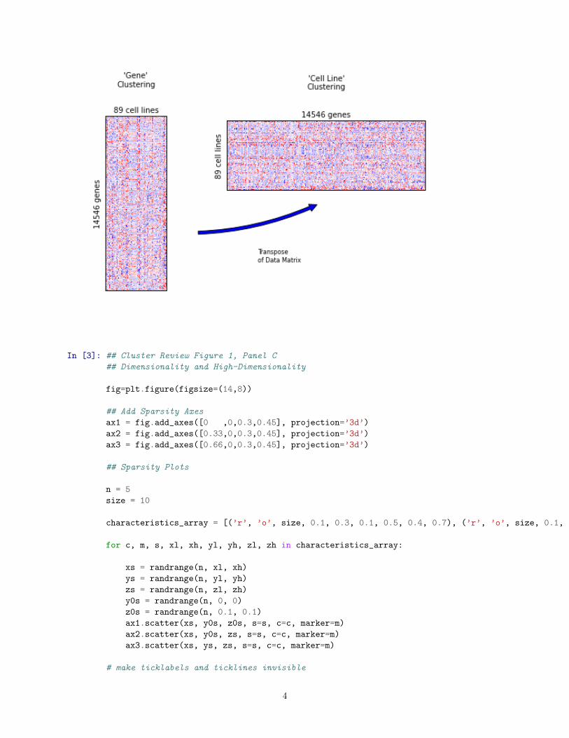
In [2]: ## Cluster Review Figure 1, Panels A and B
## Dimensionality
np.random.seed(7)
def randrange(n, vmin, vmax):
return (vmax-vmin)*np.random.rand(n) + vmin
fig=plt.figure(figsize=(14,8))
## Data Schema
D2 = raw_mRNA89_filtered
D2_mc = D2.sub(D2.mean(axis=1),axis=0)
D2_norm = D2_mc.div(D2.std(axis=1),axis=0)
2

D2_norm.dropna(thresh=2, inplace=True)
D2_column_labels = D2.columns.tolist()
# Lu row diagram
axmatrix = fig.add_axes([0,0.5,.08,.4])
hm = D2_norm
im = axmatrix.matshow(hm, aspect=’auto’, origin=’upper’, cmap=’bwr’, vmin=-3, vmax=3)
axmatrix.set_xticks([])
axmatrix.set_yticks([])
axmatrix.set_title(’\’Gene\’\nClustering’, y=1.15,size=10)
axmatrix.set_ylabel(str(raw_mRNA89_filtered.shape[0])+’ genes’)
axmatrix.set_xlabel(str(raw_mRNA89_filtered.shape[1])+’ cell lines’)
axmatrix.xaxis.set_label_position(’top’)
# Lu column diagram
axmatrix2 = fig.add_axes([.16,.73,.26,.16])
hm = D2_norm.transpose()
im = axmatrix2.matshow(hm, aspect=’auto’, origin=’upper’, cmap=’bwr’, vmin=-3, vmax=3)
axmatrix2.set_xticks([])
axmatrix2.set_yticks([])
axmatrix2.set_title(’\’Cell Line\’\nClustering’, y=1.4,size=10)
axmatrix2.set_ylabel(str(raw_mRNA89_filtered.shape[1])+’ cell lines’)
axmatrix2.set_xlabel(str(raw_mRNA89_filtered.shape[0])+’ genes’)
axmatrix2.xaxis.set_label_position(’top’)
# Lu transpose arrow
ax_arrow = fig.add_axes([.08,0.5,.4,.22])
ax_arrow.axis(’off’)
p = patches.FancyArrowPatch(
(0.10, 0.6),
(0.50, 0.9),
connectionstyle=’arc3,rad=0.1’, # Default
mutation_scale=20
)
ax_arrow.add_patch(p)
ax_arrow.text(0.3,0.30,’Transpose\nof Data Matrix’,fontsize=8)
plt.show()
3
In [3]: ## Cluster Review Figure 1, Panel C
## Dimensionality and High-Dimensionality
fig=plt.figure(figsize=(14,8))
## Add Sparsity Axes
ax1 = fig.add_axes([0 ,0,0.3,0.45], projection=’3d’)
ax2 = fig.add_axes([0.33,0,0.3,0.45], projection=’3d’)
ax3 = fig.add_axes([0.66,0,0.3,0.45], projection=’3d’)
## Sparsity Plots
n = 5
size = 10
characteristics_array = [(’r’, ’o’, size, 0.1, 0.3, 0.1, 0.5, 0.4, 0.7), (’r’, ’o’, size, 0.1, 0.4, 0.5, 1, 0.5, 0.7), (’r’,’o’, size, 0.3, 0.6, 0.3, 0.6, 0.1, 0.5)]
for c, m, s, xl, xh, yl, yh, zl, zh in characteristics_array:
xs = randrange(n, xl, xh)
ys = randrange(n, yl, yh)
zs = randrange(n, zl, zh)
y0s = randrange(n, 0, 0)
z0s = randrange(n, 0.1, 0.1)
ax1.scatter(xs, y0s, z0s, s=s, c=c, marker=m)
ax2.scatter(xs, y0s, zs, s=s, c=c, marker=m)
ax3.scatter(xs, ys, zs, s=s, c=c, marker=m)
# make ticklabels and ticklines invisible
4

for axn in [ax1,ax2,ax3]:
for a in axn.w_xaxis.get_ticklines()+axn.w_xaxis.get_ticklabels():
a.set_visible(False)
for a in axn.w_yaxis.get_ticklines()+axn.w_yaxis.get_ticklabels():
a.set_visible(False)
for a in axn.w_zaxis.get_ticklines()+axn.w_zaxis.get_ticklabels():
a.set_visible(False)
if axn == ax1 or axn == ax2:
axn.dist+=-3
axn.set_xlim(0,0.7)
axn.set_ylim(0.3,0.8)
axn.set_zlim(0,0.8)
axn.elev=0
axn.azim=270
if axn == ax3:
axn.dist+=-1
axn.set_xlim(0,0.5)
axn.set_ylim(0.3,0.8)
axn.set_zlim(0,0.8)
plt.show()
/Users/knaegle/anaconda/lib/python2.7/site-packages/matplotlib/collections.py:590: FutureWarning: elementwise comparison failed; returning scalar instead, but in the future will perform elementwise comparison
if self. edgecolors == str(’face’):
In [4]: ## Cluster Review Figure 1, Panel D
## Dimensionality
fig=plt.figure(figsize=(7,4))
## Add 3 sigma plot axis
ax4 = fig.add_subplot(111)
## 3 Sigma Coverage Plot
coverage = np.ones((2000,), dtype=np.int) * 0.997
plot_power = np.arange(1,2001)
plot_data = np.power(coverage,plot_power)
ax4.plot(plot_data)
5
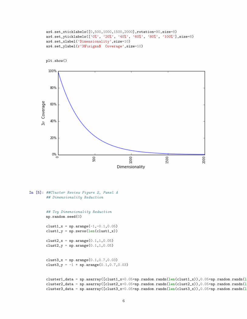
ax4.set_xticklabels([0,500,1000,1500,2000],rotation=90,size=8)
ax4.set_yticklabels([’0%’, ’20%’, ’40%’, ’60%’, ’80%’, ’100%’],size=8)
ax4.set_xlabel(’Dimensionality’,size=10)
ax4.set_ylabel(r’3$\sigma$ Coverage’,size=10)
plt.show()
In [5]: ##Cluster Review Figure 2, Panel A
## Dimensionality Reduction
## Toy Dimensionality Reduction
np.random.seed(0)
clust1_x = np.arange(-1,-0.1,0.05)
clust1_y = np.zeros(len(clust1_x))
clust2_x = np.arange(0.1,1,0.05)
clust2_y = np.arange(0.1,1,0.05)
clust3_x = np.arange(0.1,0.7,0.03)
clust3_y = -1 * np.arange(0.1,0.7,0.03)
cluster1_data = np.asarray([clust1_x+0.05*np.random.randn(len(clust1_x)),0.05*np.random.randn(len(clust1_x))+clust1_y])
cluster2_data = np.asarray([clust2_x+0.05*np.random.randn(len(clust2_x)),0.05*np.random.randn(len(clust2_x))+clust2_y])
cluster3_data = np.asarray([clust3_x+0.05*np.random.randn(len(clust3_x)),0.05*np.random.randn(len(clust3_x))+clust3_y])
6

fig=plt.figure(figsize=(10,10))
# original data space
ax = fig.add_subplot(111)
ax.scatter(cluster1_data[0],cluster1_data[1],s=4,color=’darkseagreen’)
ax.scatter(cluster2_data[0],cluster2_data[1],s=4,color=’maroon’)
ax.scatter(cluster3_data[0],cluster3_data[1],s=4,color=’orange’)
#ax.scatter(noisy_data[0],noisy_data[1],color=’k’)
ax.set_xlim(-2,2)
ax.set_ylim(-2,2)
ax.set_xticklabels([])
ax.set_yticklabels([])
# PCA projection
pca_data = np.hstack([cluster1_data,cluster2_data,cluster3_data]).T
pca = sklearnPCA(n_components=1)
pca_soln = pca.fit_transform(pca_data)
# plot direction of highest variance
ax.plot([0,pca.components_[0][0]*1.5],[0,pca.components_[0][1]*1.5],’--r’)
ax.plot([0,-pca.components_[0][0]*1.5],[0,-pca.components_[0][1]*1.5],’--r’)
ax.set_xlim(-2,2)
ax.set_ylim(-2,2)
plt.show()
7

In [6]: ##Cluster Review Figure 2, Panel B
## Dimensionality Reduction
fig=plt.figure(figsize=(10,10))
# PCA dimensionality reduction
ax = fig.add_subplot(111)
ax.scatter(pca_soln[0:18], np.zeros(18), s=4, color=’darkseagreen’, alpha=1, label=’Cluster1’)
ax.scatter(pca_soln[18:36], np.zeros(18), s=4,color=’maroon’, alpha=1, label=’Cluster2’)
ax.scatter(pca_soln[36:54], np.zeros(18), s=4,color=’orange’, alpha=0.3, label=’Cluster3’)
#ax.scatter(pca_soln[54:79], np.zeros(25), color=’k’, alpha=0.5, label=’Cluster4’)
ax.set_xticklabels([])
ax.set_yticklabels([])
ax.plot([-1.5,1.5],[0,0],’--r’)
8
plt.show()
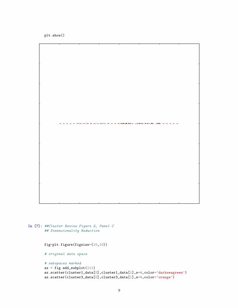
In [7]: ##Cluster Review Figure 2, Panel C
## Dimensionality Reduction
fig=plt.figure(figsize=(10,10))
# original data space
# subspaces marked
ax = fig.add_subplot(111)
ax.scatter(cluster1_data[0],cluster1_data[1],s=4,color=’darkseagreen’)
ax.scatter(cluster3_data[0],cluster3_data[1],s=4,color=’orange’)
9

ax.scatter(cluster2_data[0],cluster2_data[1],s=4,color=’maroon’)
#ax.scatter(noisy_data[0],noisy_data[1],color=’k’)
ax.set_xlim(-2,2)
ax.set_ylim(-2,2)
ax.set_xticklabels([])
ax.set_yticklabels([])
ax.plot([1.7,1],[1,1.7],’--r’)
ax.plot([-1.4,-1.4],[-0.7,0.7],’--r’)
ax.plot([0.4,1.6],[-1.6,-0.6],’--r’)
plt.show()
In [8]: ##Cluster Review Figure 2, Panel D
## Dimensionality Reduction
10

fig=plt.figure(figsize=(13,12))
## Dimensionality Reduction applied to Lu (2005) mRNA GI clustering results
#mRNA from Lu (2005)
D = raw_mRNA89_filtered
D_mc = D.sub(D.mean(axis=1),axis=0)
D_norm = D_mc.div(D.std(axis=1),axis=0)
D_norm.dropna(thresh=2, inplace=True)
D_mRNA_column_labels = D.columns.tolist()
D_mRNA = D_norm.transpose()
#mRNA after applying PCA
D = raw_mRNA89_filtered
D_mc = D.sub(D.mean(axis=1),axis=0)
D_norm = D_mc.div(D.std(axis=1),axis=0)
D_norm.dropna(thresh=2, inplace=True)
D_mRNApca_column_labels = D.columns.tolist()
pca_model = sklearnPCA(n_components=10)
pca_model.fit(D_norm.transpose())
D_mRNApca = pca_model.transform(D_norm.transpose())
#mRNA dim reduction (feature selection)
D = raw_mRNA89_filtered
D_mc = D.sub(D.mean(axis=1),axis=0)
D_norm = D_mc.div(D.std(axis=1),axis=0)
D_norm.dropna(thresh=2, inplace=True)
D_mRNAdimred_column_labels = D.columns.tolist()
mRNA_gi_dimension_list = [4914,7677,5373,3533,3786,9222,268,39,12017,9130]
D_mRNAdimred = D_norm.transpose().iloc[:,mRNA_gi_dimension_list]
# these are lists for the EP and GI tracks
GI_list = [’_LVR_’,’_COLON_’,’_STOM_’,’_PAN_’]
###
### mRNA, as in Lu (2005)
###
# Compute and plot dendrogram, clustering cell lines for mRNA
ax_mRNA1 = fig.add_axes([0,0.1,1,.30])
lnk2 = sch.linkage(D_mRNA, method=’average’,metric=’correlation’)
Z_cl = sch.dendrogram(lnk2,color_threshold=0)
idx_cl = Z_cl[’leaves’]
ax_mRNA1.axis(’off’)
ax_mRNA1.set_title(’mRNA\n’)
# Add color strip to indicate GI status
ax_mRNA2 = fig.add_axes([0,0,1,0.10])
list_vals = [0 if any(cl in val for cl in GI_list) else 1 for val in D_mRNA_column_labels]
unsorted_list = np.array(list_vals)
sorted_list= unsorted_list[np.array(idx_cl)]
11
ax_mRNA2.matshow([sorted_list], aspect=’auto’, origin=’lower’, cmap = colors.ListedColormap([’blue’, ’yellow’]))
ax_mRNA2.axis(’off’)
plt.show()
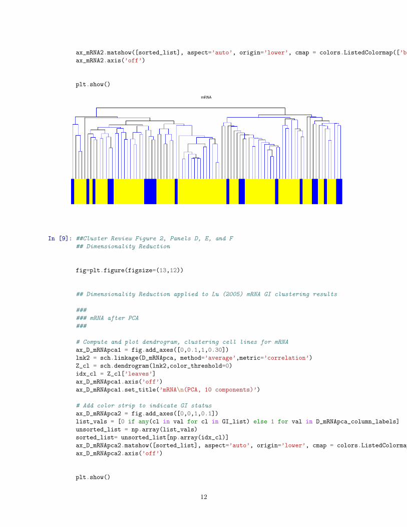
In [9]: ##Cluster Review Figure 2, Panels D, E, and F
## Dimensionality Reduction
fig=plt.figure(figsize=(13,12))
## Dimensionality Reduction applied to Lu (2005) mRNA GI clustering results
###
### mRNA after PCA
###
# Compute and plot dendrogram, clustering cell lines for mRNA
ax_D_mRNApca1 = fig.add_axes([0,0.1,1,0.30])
lnk2 = sch.linkage(D_mRNApca, method=’average’,metric=’correlation’)
Z_cl = sch.dendrogram(lnk2,color_threshold=0)
idx_cl = Z_cl[’leaves’]
ax_D_mRNApca1.axis(’off’)
ax_D_mRNApca1.set_title(’mRNA\n(PCA, 10 components)’)
# Add color strip to indicate GI status
ax_D_mRNApca2 = fig.add_axes([0,0,1,0.1])
list_vals = [0 if any(cl in val for cl in GI_list) else 1 for val in D_mRNApca_column_labels]
unsorted_list = np.array(list_vals)
sorted_list= unsorted_list[np.array(idx_cl)]
ax_D_mRNApca2.matshow([sorted_list], aspect=’auto’, origin=’lower’, cmap = colors.ListedColormap([’blue’, ’yellow’]))
ax_D_mRNApca2.axis(’off’)
plt.show()
12

In [10]: ##Cluster Review Figure 2, Panels D, E, and F
## Dimensionality Reduction
fig=plt.figure(figsize=(13,12))
## Dimensionality Reduction applied to Lu (2005) mRNA GI clustering results
###
### mRNA after dimensionality reduction (feature selection)
###
# Compute and plot dendrogram, clustering cell lines for mRNA
ax_D_mRNAdimred1 = fig.add_axes([0,0.1,1,0.30])
lnk2 = sch.linkage(D_mRNAdimred, method=’average’,metric=’correlation’)
Z_cl = sch.dendrogram(lnk2,color_threshold=0)
idx_cl = Z_cl[’leaves’]
ax_D_mRNAdimred1.axis(’off’)
ax_D_mRNAdimred1.set_title(’mRNA\n(10 selected features)’)
# Add color strip to indicate GI status
ax_D_mRNAdimred2 = fig.add_axes([0,0,1,0.1])
list_vals = [0 if any(cl in val for cl in GI_list) else 1 for val in D_mRNAdimred_column_labels]
unsorted_list = np.array(list_vals)
sorted_list= unsorted_list[np.array(idx_cl)]
ax_D_mRNAdimred2.matshow([sorted_list], aspect=’auto’, origin=’lower’, cmap = colors.ListedColormap([’blue’, ’yellow’]))
ax_D_mRNAdimred2.axis(’off’)
plt.show()
13

In [11]: ##Cluster Review Figure 3, Panels A and B
## Transformations and Distance Metrics
## Toy Transformation and Distance Metric Panel
np.random.seed(0)
# Generate datasets. We choose the size big enough to see the scalability
# of the algorithms, but not too big to avoid too long running times
n_samples = 200
#create interesting data set
np.random.seed(1)
mean1 = [0.05,0.05]
cov1 = [[0.0001,0],[0,0.0001]]
x1,y1 = np.random.multivariate_normal(mean1,cov1,n_samples/2).T
mean2 = [0.5,0.03]
cov2 = [[0.0001,0],[0,0.0001]]
x2,y2 = np.random.multivariate_normal(mean2,cov2,n_samples/2).T
mean3 = [0.4,1]
cov3 = [[0.02,0.015],[0.015,0.02]]
x3,y3 = np.random.multivariate_normal(mean3,cov3,n_samples/2).T
mean4 = [2,2]
cov4 = [[0.005,0.003],[0.003,0.005]]
x4,y4 = np.random.multivariate_normal(mean4,cov4,n_samples/2).T
coordinates = np.transpose(np.vstack((np.hstack((x1,x2,x3,x4)), np.hstack((y1,y2,y3,y4)))))
categories = np.hstack((np.zeros(len(x1)),np.ones(len(x2)),1+np.ones(len(x3)),2+np.ones(len(x4))))
example_data = (coordinates,categories)
# dataset creation
X,y = example_data
X_raw = X
X_log2 = np.log2(X)
14

X_exp = np.exp(X)
X_Zscore = np.divide(X-np.mean(X),np.std(X))
X_range = np.divide(X-np.mean(X),np.max(X)-np.min(X))
X_vast = np.divide(X-np.mean(X),np.std(X))*np.divide(np.mean(X),np.std(X))
data_types = [X_raw, X_log2, X_exp]
y_names = [’No transformation’,’Log base 2’,’Exponential’]
# create clustering estimators
agglom = cluster.AgglomerativeClustering(n_clusters=4, linkage=’average’)
agglom_manhattan = cluster.AgglomerativeClustering(n_clusters=4, linkage=’average’,affinity="manhattan")
agglom_cosine = cluster.AgglomerativeClustering(n_clusters=4, linkage=’average’,affinity="cosine")
clustering_algorithms = [’gold’,agglom,agglom_manhattan,agglom_cosine]
x_names = [’Actual Clusters’,’Euclidean’,’Manhattan’,’Cosine’]
fig=plt.figure(figsize=(13,13))
plt.subplots_adjust(left=.02, right=.98, bottom=.001, top=.96, wspace=.05,hspace=.01)
# no transformation, no clustering
clustcolors = np.array([’darkseagreen’,’dodgerblue’,’orange’,’khaki’])
ax = plt.subplot2grid((10,10), (0,1), colspan=2, rowspan=2)
y_pred = np.asarray(y).astype(int)
ax.set_title(’Reference \nData’, size=10)
ax.set_ylabel(’No \nTransformation’)
ax.scatter(X[:, 0], X[:, 1], color=clustcolors[y_pred].tolist(), s=2)
ax.set_xticks(())
ax.set_yticks(())
ax.text(0.2,0.6,’A’, ha=’center’, va=’center’, transform=ax.transAxes, fontsize=10)
ax.text(0.1,0.2,’B’, ha=’center’, va=’center’, transform=ax.transAxes, fontsize=10)
ax.text(0.4,0.2,’C’, ha=’center’, va=’center’, transform=ax.transAxes, fontsize=10)
ax.text(0.9,0.7,’D’, ha=’center’, va=’center’, transform=ax.transAxes, fontsize=10)
# log base2, no clustering
clustcolors = np.array([’darkseagreen’,’dodgerblue’,’orange’,’khaki’])
ax = plt.subplot2grid((10,10), (2,1), colspan=2, rowspan=2)
y_pred = np.asarray(y).astype(int)
ax.set_ylabel(’Log base 2’)
ax.scatter(X_log2[:, 0], X_log2[:, 1], color=clustcolors[y_pred].tolist(), s=2)
ax.set_xticks(())
ax.set_yticks(())
ax.text(0.4,0.9,’A’, ha=’center’, va=’center’, transform=ax.transAxes, fontsize=10)
ax.text(0.15,0.6,’B’, ha=’center’, va=’center’, transform=ax.transAxes, fontsize=10)
ax.text(0.7,0.2,’C’, ha=’center’, va=’center’, transform=ax.transAxes, fontsize=10)
ax.text(0.9,0.8,’D’, ha=’center’, va=’center’, transform=ax.transAxes, fontsize=10)
15
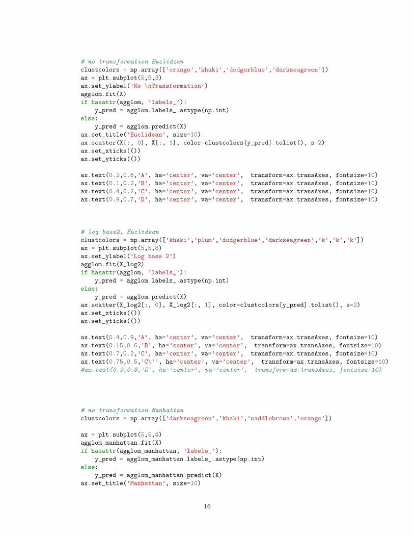
# no transformation Euclidean
clustcolors = np.array([’orange’,’khaki’,’dodgerblue’,’darkseagreen’])
ax = plt.subplot(5,5,3)
ax.set_ylabel(’No \nTransformation’)
agglom.fit(X)
if hasattr(agglom, ’labels_’):
y_pred = agglom.labels_.astype(np.int)
else:
y_pred = agglom.predict(X)
ax.set_title(’Euclidean’, size=10)
ax.scatter(X[:, 0], X[:, 1], color=clustcolors[y_pred].tolist(), s=2)
ax.set_xticks(())
ax.set_yticks(())
ax.text(0.2,0.6,’A’, ha=’center’, va=’center’, transform=ax.transAxes, fontsize=10)
ax.text(0.1,0.2,’B’, ha=’center’, va=’center’, transform=ax.transAxes, fontsize=10)
ax.text(0.4,0.2,’C’, ha=’center’, va=’center’, transform=ax.transAxes, fontsize=10)
ax.text(0.9,0.7,’D’, ha=’center’, va=’center’, transform=ax.transAxes, fontsize=10)
# log base2, Euclidean
clustcolors = np.array([’khaki’,’plum’,’dodgerblue’,’darkseagreen’,’k’,’k’,’k’])
ax = plt.subplot(5,5,8)
ax.set_ylabel(’Log base 2’)
agglom.fit(X_log2)
if hasattr(agglom, ’labels_’):
y_pred = agglom.labels_.astype(np.int)
else:
y_pred = agglom.predict(X)
ax.scatter(X_log2[:, 0], X_log2[:, 1], color=clustcolors[y_pred].tolist(), s=2)
ax.set_xticks(())
ax.set_yticks(())
ax.text(0.4,0.9,’A’, ha=’center’, va=’center’, transform=ax.transAxes, fontsize=10)
ax.text(0.15,0.6,’B’, ha=’center’, va=’center’, transform=ax.transAxes, fontsize=10)
ax.text(0.7,0.2,’C’, ha=’center’, va=’center’, transform=ax.transAxes, fontsize=10)
ax.text(0.75,0.5,’C\’’, ha=’center’, va=’center’, transform=ax.transAxes, fontsize=10)
#ax.text(0.9,0.8,’D’, ha=’center’, va=’center’, transform=ax.transAxes, fontsize=10)
# no transformation Manhattan
clustcolors = np.array([’darkseagreen’,’khaki’,’saddlebrown’,’orange’])
ax = plt.subplot(5,5,4)
agglom_manhattan.fit(X)
if hasattr(agglom_manhattan, ’labels_’):
y_pred = agglom_manhattan.labels_.astype(np.int)
else:
y_pred = agglom_manhattan.predict(X)
ax.set_title(’Manhattan’, size=10)
16

ax.scatter(X[:, 0], X[:, 1], color=clustcolors[y_pred].tolist(), s=2)
ax.set_xticks(())
ax.set_yticks(())
ax.text(0.2,0.6,’A’, ha=’center’, va=’center’, transform=ax.transAxes, fontsize=10)
ax.text(0.55,0.55,’A\’’, ha=’center’, va=’center’, transform=ax.transAxes, fontsize=10)
ax.text(0.1,0.2,’B’, ha=’center’, va=’center’, transform=ax.transAxes, fontsize=10)
#ax.text(0.4,0.2,’C’, ha=’center’, va=’center’, transform=ax.transAxes, fontsize=10)
ax.text(0.9,0.7,’D’, ha=’center’, va=’center’, transform=ax.transAxes, fontsize=10)
# log base2, Manhattan
clustcolors = np.array([’khaki’,’plum’,’darkseagreen’,’dodgerblue’])
ax = plt.subplot(5,5,9)
agglom_manhattan.fit(X_log2)
if hasattr(agglom_manhattan, ’labels_’):
y_pred = agglom_manhattan.labels_.astype(np.int)
else:
y_pred = agglom_manhattan.predict(X)
ax.scatter(X_log2[:, 0], X_log2[:, 1], color=clustcolors[y_pred].tolist(), s=2)
ax.set_xticks(())
ax.set_yticks(())
ax.text(0.4,0.9,’A’, ha=’center’, va=’center’, transform=ax.transAxes, fontsize=10)
ax.text(0.15,0.6,’B’, ha=’center’, va=’center’, transform=ax.transAxes, fontsize=10)
ax.text(0.7,0.2,’C’, ha=’center’, va=’center’, transform=ax.transAxes, fontsize=10)
ax.text(0.75,0.5,’C\’’, ha=’center’, va=’center’, transform=ax.transAxes, fontsize=10)
#ax.text(0.9,0.8,’D’, ha=’center’, va=’center’, transform=ax.transAxes, fontsize=10)
# no transformation Cosine
clustcolors = np.array([’darkseagreen’,’dodgerblue’,’orange’,’khaki’])
ax = plt.subplot(5,5,5)
agglom_cosine.fit(X)
if hasattr(agglom_cosine, ’labels_’):
y_pred = agglom_cosine.labels_.astype(np.int)
else:
y_pred = agglom_cosine.predict(X)
y_pred = np.asarray(y).astype(int)
ax.set_title(’Cosine’, size=10)
ax.scatter(X[:, 0], X[:, 1], color=clustcolors[y_pred].tolist(), s=2)
ax.set_xticks(())
ax.set_yticks(())
ax.text(0.2,0.6,’A’, ha=’center’, va=’center’, transform=ax.transAxes, fontsize=10)
ax.text(0.1,0.2,’B’, ha=’center’, va=’center’, transform=ax.transAxes, fontsize=10)
ax.text(0.4,0.2,’C’, ha=’center’, va=’center’, transform=ax.transAxes, fontsize=10)
ax.text(0.9,0.7,’D’, ha=’center’, va=’center’, transform=ax.transAxes, fontsize=10)
# log base2, Cosine
clustcolors = np.array([’orange’,’dodgerblue’,’darkseagreen’,’khaki’])
ax = plt.subplot(5,5,10)
agglom_cosine.fit(X_log2)
if hasattr(agglom_cosine, ’labels_’):
17
y_pred = agglom_cosine.labels_.astype(np.int)
else:
y_pred = agglom_cosine.predict(X)
ax.scatter(X_log2[:, 0], X_log2[:, 1], color=clustcolors[y_pred].tolist(), s=2)
ax.set_xticks(())
ax.set_yticks(())
ax.text(0.4,0.9,’A’, ha=’center’, va=’center’, transform=ax.transAxes, fontsize=10)
ax.text(0.15,0.6,’B’, ha=’center’, va=’center’, transform=ax.transAxes, fontsize=10)
ax.text(0.7,0.2,’C’, ha=’center’, va=’center’, transform=ax.transAxes, fontsize=10)
ax.text(0.9,0.8,’D’, ha=’center’, va=’center’, transform=ax.transAxes, fontsize=10)
#######
###endplot
#######
fig.text(0.05,1,’A’,fontsize=20)
fig.text(.33,1,’B’,fontsize=20)
plt.show()
In [12]: ##Cluster Review Figure 3, Panel C
## Transformations and Distance Metrics
fig=plt.figure(figsize=(13,13))
plt.subplots_adjust(left=.02, right=.98, bottom=.001, top=.96, wspace=.05,hspace=.01)
## Differential Clustering of GI cell lines from Lu (2005) based on Transformation
#miRNA from Lu (2005)
D = raw_miRNA89_filtered
D_mc = D.sub(D.mean(axis=1),axis=0)
18

D_norm = D_mc.div(D.std(axis=1),axis=0)
D_miRNA_column_labels = D.columns.tolist()
D_miRNA = D_norm.transpose()
#miRNA before log2 transformation
D = 2 ** raw_miRNA89_filtered
D_mc = D.sub(D.mean(axis=1),axis=0)
D_norm = D_mc.div(D.std(axis=1),axis=0)
D_norm.dropna(thresh=2, inplace=True)
D_miRNAprelog_column_labels = D.columns.tolist()
D_miRNAprelog = D_norm.transpose()
# these are lists for the EP and GI tracks
GI_list = [’_LVR_’,’_COLON_’,’_STOM_’,’_PAN_’]
###
### miRNA, as in Lu (2005)
###
# Compute and plot dendrogram, clustering cell lines for miRNA
ax_miRNA1 = fig.add_axes([0,.1,1,.30])
lnk1 = sch.linkage(D_miRNA, method=’average’,metric=’correlation’)
Z_cl = sch.dendrogram(lnk1,color_threshold=0)
idx_cl = Z_cl[’leaves’]
ax_miRNA1.axis(’off’)
ax_miRNA1.set_title(’miRNA\n’)
# Add color strip to indicate GI status
ax_miRNA2 = fig.add_axes([0,0,1,0.1])
list_vals = [0 if any(cl in val for cl in GI_list) else 1 for val in D_miRNA_column_labels]
unsorted_list = np.array(list_vals)
sorted_list= unsorted_list[np.array(idx_cl)]
ax_miRNA2.matshow([sorted_list], aspect=’auto’, origin=’lower’, cmap = colors.ListedColormap([’blue’, ’yellow’]))
ax_miRNA2.axis(’off’)
plt.show()
19

In [13]: ##Cluster Review Figure 3, Panel D
## Transformations and Distance Metrics
fig=plt.figure(figsize=(13,13))
plt.subplots_adjust(left=.02, right=.98, bottom=.001, top=.96, wspace=.05,hspace=.01)
###
### miRNA before log transformation
###
# Compute and plot dendrogram, clustering cell lines for mRNA
ax_miRNA_prelog1 = fig.add_axes([0,.1,1,.30])
lnk2 = sch.linkage(D_miRNAprelog, method=’average’,metric=’correlation’)
Z_cl = sch.dendrogram(lnk2,color_threshold=0)
idx_cl = Z_cl[’leaves’]
ax_miRNA_prelog1.axis(’off’)
ax_miRNA_prelog1.set_title(’miRNA\n(before log_2 transformation)’)
# Add color strip to indicate GI status
ax_miRNA_prelog2 = fig.add_axes([0,0,1,0.1])
list_vals = [0 if any(cl in val for cl in GI_list) else 1 for val in D_miRNAprelog_column_labels]
unsorted_list = np.array(list_vals)
sorted_list= unsorted_list[np.array(idx_cl)]
ax_miRNA_prelog2.matshow([sorted_list], aspect=’auto’, origin=’lower’, cmap = colors.ListedColormap([’blue’, ’yellow’]))
ax_miRNA_prelog2.axis(’off’)
plt.show()
20

In [14]: ##Cluster Review Figure 4
## Algorithms
# adapted from Scikit Learn, "Comparing different clustering algorithms on toy datasets"
# found at http://scikit-learn.org/stable/auto_examples/cluster/plot_cluster_comparison.html
np.random.seed(0)
## Generate datasets.
n_samples = 800
noisy_circles = datasets.make_circles(n_samples=n_samples, factor=.3,noise=.07)
noisy_moons = datasets.make_moons(n_samples=n_samples, noise=.05)
blobs = datasets.make_blobs(n_samples=n_samples, random_state=10,centers=3,cluster_std=1)
#create noisy parallel lines
mean1 = [0,1]
cov1 = [[5,0],[0,0.1]]
x1,y1 = np.random.multivariate_normal(mean1,cov1,n_samples/2).T
mean2 = [0,-1]
cov2 = [[5,0],[0,.1]]
x2,y2 = np.random.multivariate_normal(mean2,cov2,n_samples/2).T
coordinates = np.transpose(np.vstack((np.hstack((x1,x2)), np.hstack((y1,y2)))))
categories = np.hstack((np.zeros(len(x1)),np.ones(len(y1))))
noisy_lines = (coordinates,categories)
#create data with no structure
no_structure = np.random.rand(n_samples, 2), None
clustcolors = np.array([’darkseagreen’,’dodgerblue’,’orange’,’khaki’,’darkred’,’b’,’g’,’r’,’c’,’m’,’y’])
clustcolors = np.hstack([clustcolors] * 20)
clustering_names = [’K-Means’, ’Ward’, ’DBSCAN’, ’Mixture Models’]
fig=plt.figure(figsize=(13, 13))
21

plt.subplots_adjust(left=.02, right=.98, bottom=.001, top=.96, wspace=.05,
hspace=.01)
plot_num = 1
dataset_list = [no_structure, blobs, noisy_lines, noisy_moons, noisy_circles]
for i_dataset, dataset in enumerate(dataset_list):
X, y = dataset
# estimate bandwidth for mean shift
bandwidth = cluster.estimate_bandwidth(X, quantile=0.3)
# connectivity matrix for structured Ward
connectivity = kneighbors_graph(X, n_neighbors=10, include_self=False)
# make connectivity symmetric
connectivity = 0.5 * (connectivity + connectivity.T)
# create clustering estimators
two_means = cluster.MiniBatchKMeans(n_clusters=2)
three_means = cluster.MiniBatchKMeans(n_clusters=3)
ward_two = cluster.AgglomerativeClustering(n_clusters=2, linkage=’ward’,connectivity=connectivity)
ward_three = cluster.AgglomerativeClustering(n_clusters=3, linkage=’ward’,connectivity=connectivity)
dbscan = cluster.DBSCAN(eps=.3)
#mixture model results
gmm2 = mixture.GMM(n_components=2, covariance_type=’full’)
gmm3 = mixture.GMM(n_components=3, covariance_type=’full’)
#clustering_algorithms = [two_means, affinity_propagation, ms, spectral, ward, average_linkage,dbscan, birch]
clustering_algorithms = [’kmeans’,’ward’,’dbscan’,’mixturemodels’]
for name, algorithm_name in zip(clustering_names, clustering_algorithms):
# predict cluster memberships
if dataset is no_structure or dataset is noisy_lines or dataset is noisy_moons or dataset is noisy_circles:
if algorithm_name == ’kmeans’:
algorithm = two_means
if algorithm_name == ’ward’:
algorithm = ward_two
if algorithm_name == ’dbscan’:
algorithm = dbscan
if algorithm_name == ’mixturemodels’:
algorithm = gmm2
if dataset is blobs:
if algorithm_name == ’kmeans’:
algorithm = three_means
if algorithm_name == ’ward’:
algorithm = ward_two
if algorithm_name == ’dbscan’:
algorithm = dbscan
if algorithm_name == ’mixturemodels’:
algorithm = gmm3
22

algorithm.fit(X)
if hasattr(algorithm, ’labels_’):
y_pred = algorithm.labels_.astype(np.int)
else:
y_pred = algorithm.predict(X)
# plot
ax = plt.subplot(len(dataset_list), len(clustering_algorithms), plot_num)
if i_dataset == 0:
ax.set_title(name, size=11)
if plot_num == 1:
ax.set_ylabel(’No\nStructure’)
if plot_num == 5:
ax.set_ylabel(’Three\nClusters’)
if plot_num == 9:
ax.set_ylabel(’Two\nWide Clusters’)
if plot_num == 13:
ax.set_ylabel(’Two\nHalf Moons’)
if plot_num == 17:
ax.set_ylabel(’Two\nNested Circles’)
ax.scatter(X[:, 0], X[:, 1], color=clustcolors[y_pred].tolist(), s=1)
ax.set_xticks(())
ax.set_yticks(())
ax.axis("equal")
plot_num += 1
plt.show()
/Users/knaegle/anaconda/lib/python2.7/site-packages/sklearn/cluster/hierarchical.py:205: UserWarning: the number of connected components of the connectivity matrix is 2 > 1. Completing it to avoid stopping the tree early.
connectivity, n components = fix connectivity(X, connectivity)
23

In [15]: ##Cluster Review Figure 5, Panel A
## Ensemble Clustering Toy Example
np.random.seed(0)
n_samples = 300
blobs = datasets.make_blobs(n_samples=n_samples, random_state=10,centers=5,cluster_std=2)
clustcolors = np.array([’darkseagreen’,’dodgerblue’,’darkred’,’b’,’orange’,’lightcoral’,’g’,’r’,’c’,’m’,’y’])
clustcolors = np.hstack([clustcolors] * 200)
clustering_names = [’k=2’,’k=3’,’k=4’,’k=5’,’k=6’,’k=7’,’k=8’,’k=9’,’k=10’]
fig=plt.figure(figsize=(10,10))
plt.subplots_adjust(left=.02, right=.98, bottom=.001, top=.96, wspace=.1,
hspace=.1)
24

X, y = blobs
# normalize dataset for easier parameter selection
X = StandardScaler().fit_transform(X)
# create clustering estimators
kmeans2 = cluster.MiniBatchKMeans(n_clusters=2)
kmeans3 = cluster.MiniBatchKMeans(n_clusters=3)
kmeans4 = cluster.MiniBatchKMeans(n_clusters=4)
kmeans5 = cluster.MiniBatchKMeans(n_clusters=5)
kmeans6 = cluster.MiniBatchKMeans(n_clusters=6)
kmeans7 = cluster.MiniBatchKMeans(n_clusters=7)
kmeans8 = cluster.MiniBatchKMeans(n_clusters=8)
kmeans9 = cluster.MiniBatchKMeans(n_clusters=9)
kmeans10 = cluster.MiniBatchKMeans(n_clusters=10)
clustering_algorithms = [kmeans2,kmeans3,kmeans4,kmeans5,kmeans6,kmeans7,kmeans8,kmeans9,kmeans10]
plot_num=0
for name, algorithm in zip(clustering_names, clustering_algorithms):
# predict cluster memberships
#t0 = time.time()
algorithm.fit(X)
#t1 = time.time()
if hasattr(algorithm, ’labels_’):
y_pred = algorithm.labels_.astype(np.int)
else:
y_pred = algorithm.predict(X)
# plot
plt.subplot(3, 3, plot_num)
plt.scatter(X[:, 0], X[:, 1], color=clustcolors[y_pred].tolist(), s=2)
plt.xlim(-2.5, 2.5)
plt.ylim(-2.5, 2.5)
plt.xticks(())
plt.yticks(())
plt.axis("equal")
plt.text(.95, .84, (name),transform=plt.gca().transAxes, size=10,horizontalalignment=’right’)
plot_num+=1
#############################################
plt.show()
/Users/knaegle/anaconda/lib/python2.7/site-packages/matplotlib/axes/ subplots.py:69: MatplotlibDeprecationWarning: The use of 0 (which ends up being the last sub-plot) is deprecated in 1.4 and will raise an error in 1.5
mplDeprecation)
25

In [16]: ##Cluster Review Figure 5, Panel B
## Ensemble Clustering Toy Example
fig=plt.figure(figsize=(10,10))
plt.subplots_adjust(left=.02, right=.98, bottom=.001, top=.96, wspace=.1,
hspace=.1)
##############################################################
#co-occurrence matrix
##############################################################
dend_colors=[’darkseagreen’,’dodgerblue’,’darkred’,’b’,’orange’,’gray’,’g’,’r’,’c’,’m’,’y’]
sch.set_link_color_palette(dend_colors)
dim=n_samples
26

co_matrix = np.zeros(shape=(dim,dim))
for algorithm in clustering_algorithms:
algorithm.fit(X)
clustering_solution = algorithm.predict(X)
clusterid_list = np.unique(clustering_solution)
#print clusterid_list
for clusterid in clusterid_list:
itemindex = np.where(clustering_solution==clusterid)
#print itemindex
for i,x in enumerate(itemindex[0][0:-2]):
for j,y in enumerate(itemindex[0][i+1:]):
#print i,j,x,y
co_matrix[x,y]+=1
co_matrix[y,x]+=1
#D=ssd.squareform(co_matrix)
D=co_matrix
dendrogram_distance = 35
# Compute and plot first dendrogram.
#fig = pylab.figure(figsize=(8,8))
ax1 = fig.add_axes([0,0,0.09,0.80])
Y = sch.linkage(D, method=’average’)
Z1 = sch.dendrogram(Y, orientation=’right’, color_threshold=dendrogram_distance)
ax1.set_xticks([])
ax1.set_yticks([])
fig.gca().invert_yaxis() # this plus the y-axis invert in the heatmap flips the y-axis heatmap orientation
ax1.axis(’off’)
# Compute second dendrogram.
Y = sch.linkage(D, method=’average’)
Z2 = sch.dendrogram(Y, color_threshold=dendrogram_distance, no_plot=True)
# Plot distance matrix.
axmatrix = fig.add_axes([0.10,0,0.80,0.80])
idx1 = Z1[’leaves’]
idx2 = Z2[’leaves’]
sorted_co_matrix = co_matrix[idx1,:]
sorted_co_matrix = sorted_co_matrix[:,idx2]
im = axmatrix.matshow(sorted_co_matrix/np.amax(sorted_co_matrix), aspect=’auto’, origin=’lower’, cmap=pylab.cm.YlGnBu)
axmatrix.set_xticks([])
axmatrix.set_yticks([])
fig.gca().invert_yaxis() # this plus the x-axis invert in the right-flipped dendrogram flips the y-axis
# Plot colorbar.
axcolor = fig.add_axes([0.96,0,0.02,0.80])
cbar=pylab.colorbar(im, cax=axcolor)
axcolor.tick_params(labelsize=10)
axcolor.set_yticklabels([’0%’,’10%’,’20%’,’30%’,’40%’,’50%’,’60%’,’70%’,’80%’,’90%’,’100%’,])
27
plt.show()
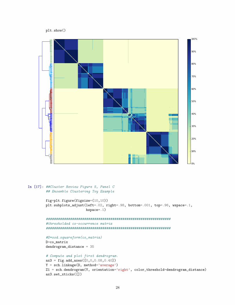
In [17]: ##Cluster Review Figure 5, Panel C
## Ensemble Clustering Toy Example
fig=plt.figure(figsize=(10,10))
plt.subplots_adjust(left=.02, right=.98, bottom=.001, top=.96, wspace=.1,
hspace=.1)
##############################################################
#thresholded co-occurrence matrix
##############################################################
#D=ssd.squareform(co_matrix)
D=co_matrix
dendrogram_distance = 35
# Compute and plot first dendrogram.
ax3 = fig.add_axes([0,0,0.08,0.40])
Y = sch.linkage(D, method=’average’)
Z1 = sch.dendrogram(Y, orientation=’right’, color_threshold=dendrogram_distance)
ax3.set_xticks([])
28

ax3.set_yticks([])
fig.gca().invert_yaxis() # this plus the y-axis invert in the heatmap flips the y-axis heatmap orientation
ax3.axis(’off’)
# Compute second dendrogram.
Y = sch.linkage(D, method=’average’)
Z2 = sch.dendrogram(Y, color_threshold=dendrogram_distance, no_plot=True)
# Plot distance matrix.
axmatrix2 = fig.add_axes([0.10,0,0.40,0.40])
idx1 = Z1[’leaves’]
idx2 = Z2[’leaves’]
sorted_co_matrix = co_matrix[idx1,:]
sorted_co_matrix = sorted_co_matrix[:,idx2]
im2 = axmatrix2.matshow(sorted_co_matrix/np.amax(sorted_co_matrix), aspect=’auto’, origin=’lower’, cmap=pylab.cm.Greys, vmin=.49, vmax=.51)
axmatrix2.set_xticks([])
axmatrix2.set_yticks([])
fig.gca().invert_yaxis() # this plus the x-axis invert in the right-flipped dendrogram flips the y-axis
##############################################################
#ensemble result
##############################################################
ind = sch.fcluster(Y, dendrogram_distance, ’distance’)
axensemble = fig.add_axes([0.55,0,0.4,0.4])
plt.scatter(X[:, 0], X[:, 1], color=np.asarray(dend_colors)[ind-1].tolist(), s=5)
#plt.title("Ensemble Result", size=12)
plt.xlim(-2.5, 2.5)
plt.ylim(-2.5, 2.5)
plt.xticks(())
plt.yticks(())
plt.axis("equal")
plt.show()
29

In [18]: ##Cluster Review Figure 5, Panel D
## Ensemble Clustering Toy Example
fig=plt.figure(figsize=(10,10))
plt.subplots_adjust(left=.02, right=.98, bottom=.001, top=.96, wspace=.1,
hspace=.1)
#############################################
#zoomed co-occ matrix
#############################################
dend_colors=[’orange’,’gray’,’b’,’orange’,’k’,’k’,’k’]
sch.set_link_color_palette(dend_colors)
khaki_items= ind==4
orange_items = ind==5
blue_items = ind==6
interesting_items = khaki_items + orange_items + blue_items
D2=co_matrix[interesting_items,:]
D2=D2[:,interesting_items]
#dendrogram_distance = 35
# Compute and plot first dendrogram.
ax5 = fig.add_axes([0,0,0.08,0.40])
Y = sch.linkage(D2, method=’average’)
Z1 = sch.dendrogram(Y, orientation=’right’, color_threshold=dendrogram_distance)
ax5.set_xticks([])
ax5.set_yticks([])
fig.gca().invert_yaxis() # this plus the y-axis invert in the heatmap flips the y-axis heatmap orientation
ax5.axis(’off’)
# Compute second dendrogram.
Y = sch.linkage(D2, method=’average’)
Z2 = sch.dendrogram(Y, color_threshold=dendrogram_distance,no_plot=True)
# Plot distance matrix.
axmatrix3 = fig.add_axes([0.10,0,0.40,0.40])
idx1 = Z1[’leaves’]
idx2 = Z2[’leaves’]
sorted_co_matrix = D2[idx1,:]
sorted_co_matrix = sorted_co_matrix[:,idx2]
im3 = axmatrix3.matshow(sorted_co_matrix/np.amax(sorted_co_matrix), aspect=’auto’, origin=’lower’, cmap=pylab.cm.YlGnBu, vmin=0, vmax=1)
axmatrix3.set_xticks([])
axmatrix3.set_yticks([])
fig.gca().invert_yaxis() # this plus the x-axis invert in the right-flipped dendrogram flips the y-axis
#axmatrix3.set_title(’Zoom’)
#plt.text(.95, .90, (’50% Threshold’),transform=plt.gca().transAxes, size=12,horizontalalignment=’right’)
#Plot colorbar.
#axcolor3 = fig.add_axes([.75,0.2,0.01,0.20])
30

#cbar=pylab.colorbar(im3, cax=axcolor3)
#############################################
#partially fuzzy result
#############################################
axpf = fig.add_axes([0.55,0,0.4,0.4])
axpf.set_xticks([])
axpf.set_yticks([])
dend_colors=[’white’,’white’,’white’,’b’,’orange’,’gray’,’g’,’r’,’c’,’m’,’y’]
sch.set_link_color_palette(dend_colors)
orange_centroid=np.asarray([-1.3,-0.9])
blue_centroid=np.asarray([0.55,-0.4])
plt.scatter(X[:, 0], X[:, 1], color=np.asarray(dend_colors)[ind-1].tolist(), s=5)
plt.scatter(orange_centroid[0],orange_centroid[1],marker=’D’,edgecolor = ’k’,color=’darkorange’,s=60) # centroid orange
plt.scatter(blue_centroid[0],blue_centroid[1],marker=’D’,edgecolor = ’k’,color=’dodgerblue’,s=60) # centroid blue
# equidistant line from centroids
plt.plot([-1, 0.5],[0.7,-2.2],’--r’)
#plt.title("Partially Fuzzy Result", size=12)
plt.xlim(-2.3, 1.2)
plt.ylim(-2.3, 0.8)
plt.xticks(())
plt.yticks(())
plt.show()
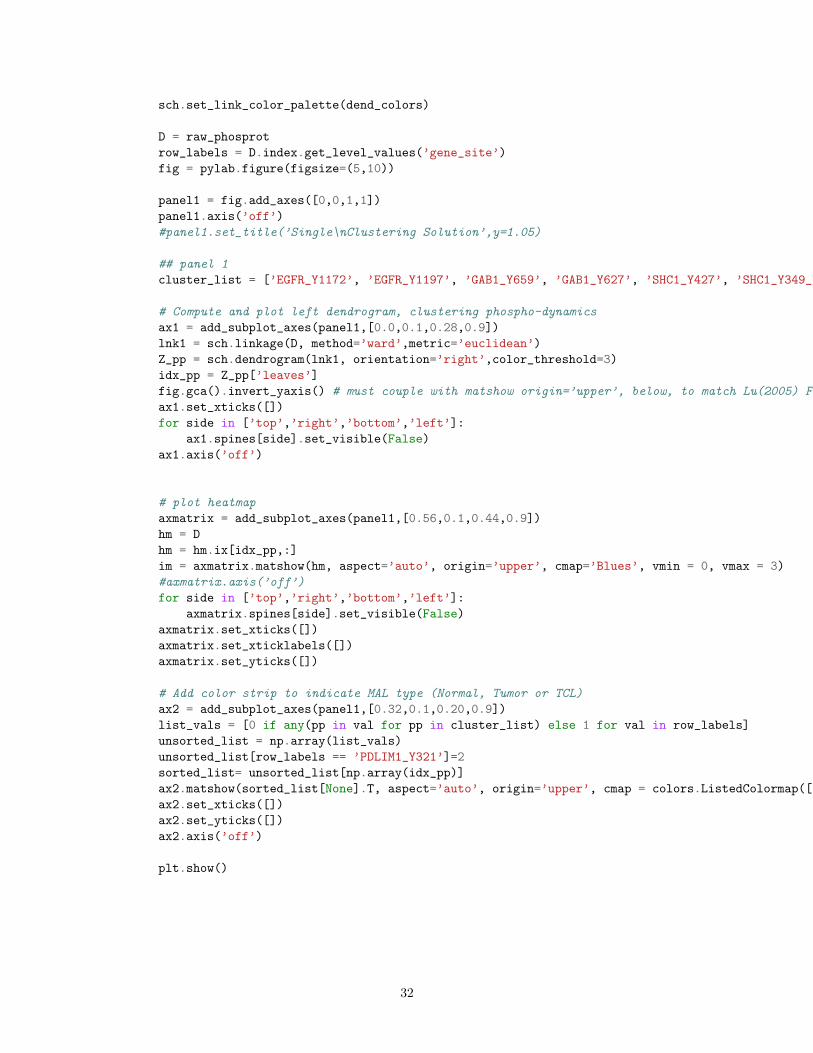
In [19]: ##Cluster Review Figure 6, Panel A
## Ensemble Clustering Example
plt.rcParams[’lines.linewidth’] = 1
dend_colors=[’darkseagreen’,’dodgerblue’,’darkred’,’b’,’orange’,’gray’,’g’,’r’,’c’,’m’,’y’]
31
sch.set_link_color_palette(dend_colors)
D = raw_phosprot
row_labels = D.index.get_level_values(’gene_site’)
fig = pylab.figure(figsize=(5,10))
panel1 = fig.add_axes([0,0,1,1])
panel1.axis(’off’)
#panel1.set_title(’Single\nClustering Solution’,y=1.05)
## panel 1
cluster_list = [’EGFR_Y1172’, ’EGFR_Y1197’, ’GAB1_Y659’, ’GAB1_Y627’, ’SHC1_Y427’, ’SHC1_Y349_Y350’, ’CDV3_Y244’, ’PDLIM1_Y321’]
# Compute and plot left dendrogram, clustering phospho-dynamics
ax1 = add_subplot_axes(panel1,[0.0,0.1,0.28,0.9])
lnk1 = sch.linkage(D, method=’ward’,metric=’euclidean’)
Z_pp = sch.dendrogram(lnk1, orientation=’right’,color_threshold=3)
idx_pp = Z_pp[’leaves’]
fig.gca().invert_yaxis() # must couple with matshow origin=’upper’, below, to match Lu(2005) Fig S4
ax1.set_xticks([])
for side in [’top’,’right’,’bottom’,’left’]:
ax1.spines[side].set_visible(False)
ax1.axis(’off’)
# plot heatmap
axmatrix = add_subplot_axes(panel1,[0.56,0.1,0.44,0.9])
hm = D
hm = hm.ix[idx_pp,:]
im = axmatrix.matshow(hm, aspect=’auto’, origin=’upper’, cmap=’Blues’, vmin = 0, vmax = 3)
#axmatrix.axis(’off’)
for side in [’top’,’right’,’bottom’,’left’]:
axmatrix.spines[side].set_visible(False)
axmatrix.set_xticks([])
axmatrix.set_xticklabels([])
axmatrix.set_yticks([])
# Add color strip to indicate MAL type (Normal, Tumor or TCL)
ax2 = add_subplot_axes(panel1,[0.32,0.1,0.20,0.9])
list_vals = [0 if any(pp in val for pp in cluster_list) else 1 for val in row_labels]
unsorted_list = np.array(list_vals)
unsorted_list[row_labels == ’PDLIM1_Y321’]=2
sorted_list= unsorted_list[np.array(idx_pp)]
ax2.matshow(sorted_list[None].T, aspect=’auto’, origin=’upper’, cmap = colors.ListedColormap([’orange’,’white’,’blue’]))
ax2.set_xticks([])
ax2.set_yticks([])
ax2.axis(’off’)
plt.show()
32

33

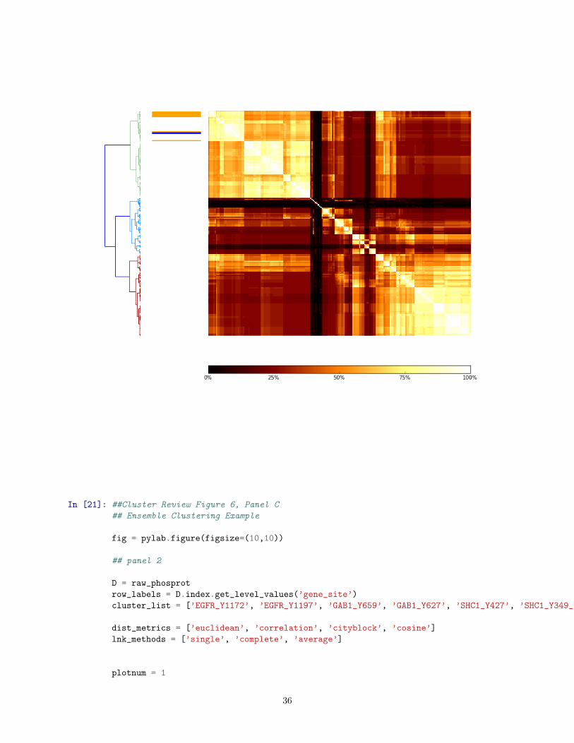
In [20]: ##Cluster Review Figure 6, Panel B
## Ensemble Clustering Example
fig = pylab.figure(figsize=(10,10))
panel3 = fig.add_axes([0,0,1,1])
panel3.axis(’off’)
## Panel 3
D = raw_phosprot
row_labels = D.index.get_level_values(’gene_site’)
cluster_list = [’EGFR_Y1172’, ’EGFR_Y1197’, ’GAB1_T659’, ’GAB1_Y627’, ’SHC_Y427’, ’SHC_Y349_Y350’, ’CDV3_Y244’, ’PDLIM1_Y321’]
dist_metrics = [’euclidean’, ’correlation’, ’cityblock’, ’cosine’, ’braycurtis’, ’canberra’, ’chebyshev’, ’sqeuclidean’]
bool_dist_metrics = [’dice’, ’jaccard’, ’kulsinski’, ’matching’, ’rogerstanimoto’, ’russellrao’, ’sokalmichener’, ’sokalsneath’, ’yule’]
lnk_methods = [’single’, ’complete’, ’average’, ’weighted’, ’median’, ’centroid’, ’ward’]
final_clust_soln = np.zeros([len(raw_phosprot),len(raw_phosprot)])
for dist_metric in dist_metrics:
for lnk_method in lnk_methods:
if (lnk_method == ’ward’ or lnk_method == ’centroid’ or lnk_method == ’median’) and dist_metric != ’euclidean’:
continue
else:
lnk1 = sch.linkage(D, method=lnk_method, metric = dist_metric)
## define clusters here
k=14
cluster_soln = [dist_metric, lnk_method,fcluster(lnk1, k, criterion=’maxclust’)]
bin_clust_soln = np.zeros((max(cluster_soln[2]),len(cluster_soln[2])))
for i,entry in enumerate(cluster_soln[2]):
bin_clust_soln[entry-1,i] = 1 ## assigns 1 to category column, corrected for zero-indexed
coocc_single = bin_clust_soln.T.dot(bin_clust_soln)
final_clust_soln = final_clust_soln + coocc_single
final_clust_soln_df = pd.DataFrame(final_clust_soln.astype(int))
# these are separate, not in creation clause, due to super odd floating point errors
final_clust_soln_df.index = row_labels
final_clust_soln_df.columns = row_labels
D = final_clust_soln_df
row_labels = D.index.get_level_values(’gene_site’)
34
cluster_list = [’EGFR_Y1172’, ’EGFR_Y1197’, ’GAB1_Y659’, ’GAB1_Y627’, ’SHC1_Y427’, ’SHC1_Y349_Y350’, ’CDV3_Y244’, ’PDLIM1_Y321’]
# Compute and plot left dendrogram
ax1 = add_subplot_axes(panel3,[0.0,0.3,0.10,.6])
lnk1 = sch.linkage(D, method=’ward’,metric=’euclidean’)
Z_pp = sch.dendrogram(lnk1, orientation=’right’)
idx_pp = Z_pp[’leaves’]
#ax1.set_yticklabels(row_labels[idx_pp],size=3)
ax1.set_yticks([])
fig.gca().invert_yaxis() # must couple with matshow origin=’upper’, below, to match Lu(2005) Fig S4
ax1.set_xticks([])
for side in [’top’,’right’,’bottom’,’left’]:
ax1.spines[side].set_visible(False)
#ax1.axis(’off’)
# plot heatmap
axmatrix = add_subplot_axes(panel3,[0.28,0.3,0.7,.6])
hm = D.divide(35)
hm = hm.ix[idx_pp,idx_pp]
im = axmatrix.matshow(hm, aspect=’auto’, origin=’upper’, cmap=’afmhot’)
axmatrix.axis(’off’)
# Add color strip to indicate PDLIM1 cluster presence
ax2 = add_subplot_axes(panel3,[0.13,0.3,0.13,0.6])
list_vals = [0 if any(pp in val for pp in cluster_list) else 1 for val in row_labels]
unsorted_list = np.array(list_vals)
unsorted_list[row_labels == ’PDLIM1_Y321’]=2
sorted_list= unsorted_list[np.array(idx_pp)]
ax2.matshow(sorted_list[None].T, aspect=’auto’, origin=’upper’, cmap = colors.ListedColormap([’orange’,’white’,’blue’]))
ax2.set_xticks([])
ax2.set_yticks([])
ax2.axis(’off’)
# Plot colorbar indicating scale
axcolor = add_subplot_axes(panel3,[0.28,0.2,0.7,.02]) # [xmin, ymin, dx, and dy]
h=pylab.colorbar(im, cax=axcolor,orientation=’horizontal’)
h.ax.tick_params(labelsize=10)
h.set_ticks([0,.25,.50,.75,1])
h.set_ticklabels([’0%’,’25%’,’50%’,’75%’,’100%’])
plt.show()
35
In [21]: ##Cluster Review Figure 6, Panel C
## Ensemble Clustering Example
fig = pylab.figure(figsize=(10,10))
## panel 2
D = raw_phosprot
row_labels = D.index.get_level_values(’gene_site’)
cluster_list = [’EGFR_Y1172’, ’EGFR_Y1197’, ’GAB1_Y659’, ’GAB1_Y627’, ’SHC1_Y427’, ’SHC1_Y349_Y350’, ’CDV3_Y244’, ’PDLIM1_Y321’]
dist_metrics = [’euclidean’, ’correlation’, ’cityblock’, ’cosine’]
lnk_methods = [’single’, ’complete’, ’average’]
plotnum = 1
36

for dist_metric in dist_metrics:
for lnk_method in lnk_methods:
#make subplot
panel2 = fig.add_subplot(len(dist_metrics),len(lnk_methods),plotnum)
panel2.axis(’off’)
# Add dendrogram axis
subpos = [0.0,0.22,1,0.78]
subax1 = add_subplot_axes(panel2,subpos)
lnk1 = sch.linkage(D, method=lnk_method, metric = dist_metric)
Z = sch.dendrogram(lnk1,color_threshold = 0.15*max(lnk1[:,2]))
idx_leaves = Z[’leaves’]
subax1.set_xticks([])
subax1.set_yticks([])
subax1.spines[’top’].set_visible(False)
subax1.spines[’right’].set_visible(False)
subax1.spines[’bottom’].set_visible(False)
subax1.spines[’left’].set_visible(False)
if plotnum in [1,2,3]:
subax1.set_title(lnk_method.title(),size=12)
if plotnum in [1,4,7,10]:
subax1.set_ylabel(dist_metric.title(),size=12)
# Add color strip axis
subpos = [0,0,1,0.2]
subax2 = add_subplot_axes(panel2,subpos)
list_vals = [0 if any(pp in val for pp in cluster_list) else 1 for val in row_labels]
unsorted_list = np.array(list_vals)
unsorted_list[row_labels == ’PDLIM1_Y321’]=2
sorted_list= unsorted_list[np.array(idx_leaves)]
subax2.matshow([sorted_list], aspect=’auto’, origin=’lower’, cmap = colors.ListedColormap([’orange’,’white’,’blue’]))
subax2.set_xticks([])
subax2.set_yticks([])
subax2.axis(’off’)
plotnum+=1
plt.show()
37

In [ ]:
38