task 1a, 1b, 1c: analysis of music magazine one: nme
TRANSCRIPT
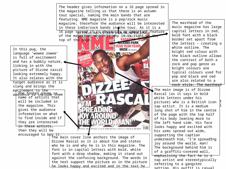
The header gives information on a 16 page spread in the magazine telling us that there is an autumn tour special, naming the main bands that are featuring. NME magazine is a pop/rock music magazine; therefore the audience will be interested in these indie/rock bands in the tour. As it is a 16 page spread it is obviously an important feature of the magazine, which is why it is right at the top of the page.
The masthead of the music magazine has large capital letters in red, bold font with a black border set apart from the letters – creating a white outline. The bright red colour with the black outline allows the contrast of both a rock and pop genre as bright colours are typical colours used for pop and black and red are also related to a rock style. The masthead has been placed in the top left hand corner, following conventions and rule of thirds as it is in a hotspot and will immediately catch a reader’s eye.
The main image is of Dizzee Rascal (as it says in bold white letters under his picture) who is a British icon rap artist. It is a medium long shot of him in the centre of the page with the top half of his body leaning more to the left hand side. His face looks happy and excited with his arms spread out wide, supporting the caption underneath him, “I’m spreading joy around the world, man!” The background behind him is of a graffiti-covered wall, emphasising the fact he is a rap artist and stereotypically referring to a gangster setting. His outfit is casual and laid back – a white vest and baggy jeans – connecting with his teenage fans and the teenage audience.
The main cover line anchors the image of Dizzee Rascal as it is about him and states who he is and why he is in this magazine. The font is in capital letters with bold, white font with a drop shadow, making it stand out against the confusing background. The words in the text support the picture as in the picture he looks happy and excited and in the text he is saying he is going to spread joy around the world. His wide arms also support ‘all around the world man’
The footer gives us name of artists that will be included in the magazine. This gives the audience information on what to find inside and if they are interested in these artists, then they will be encouraged to buy it.
In this pug, the language ‘wowee zowee’ is full of excitement and has a bubbly nature, linking in with the picture of Dizzee rascal looking extremely happy. It also relates with the target audience as it is slang and brings the excitement to the audience to include them
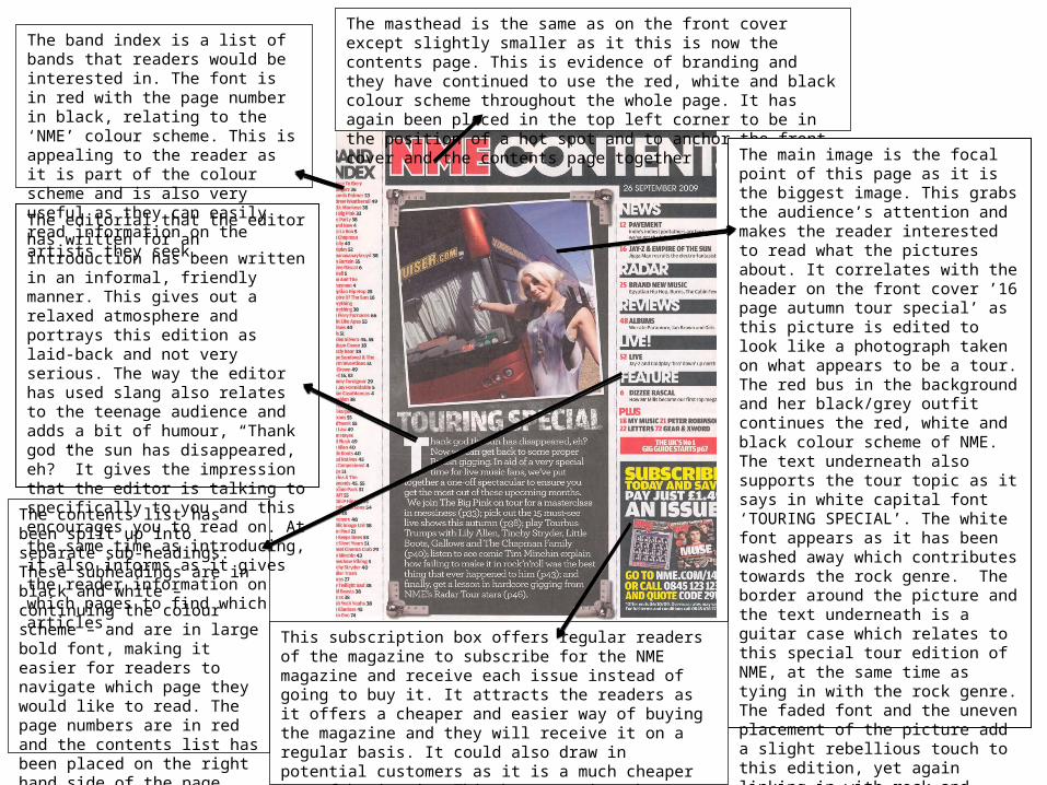
The masthead is the same as on the front cover except slightly smaller as it this is now the contents page. This is evidence of branding and they have continued to use the red, white and black colour scheme throughout the whole page. It has again been placed in the top left corner to be in the position of a hot spot and to anchor the front cover and the contents page together
The main image is the focal point of this page as it is the biggest image. This grabs the audience’s attention and makes the reader interested to read what the pictures about. It correlates with the header on the front cover ’16 page autumn tour special’ as this picture is edited to look like a photograph taken on what appears to be a tour. The red bus in the background and her black/grey outfit continues the red, white and black colour scheme of NME. The text underneath also supports the tour topic as it says in white capital font ‘TOURING SPECIAL’. The white font appears as it has been washed away which contributes towards the rock genre. The border around the picture and the text underneath is a guitar case which relates to this special tour edition of NME, at the same time as tying in with the rock genre. The faded font and the uneven placement of the picture add a slight rebellious touch to this edition, yet again linking in with rock and tours. The main image has been placed almost in the centre of the page – following conventions as it is in a hotspot and will catch the reader’s eye immediately. The girl is in the right hand side of the picture, again following conventions.
The contents list has been split up into separate sub-headings. These subheadings are in black and white – continuing the colour scheme – and are in large bold font, making it easier for readers to navigate which page they would like to read. The page numbers are in red and the contents list has been placed on the right hand side of the page. This follows conventions because it’s on the right hand side
This subscription box offers regular readers of the magazine to subscribe for the NME magazine and receive each issue instead of going to buy it. It attracts the readers as it offers a cheaper and easier way of buying the magazine and they will receive it on a regular basis. It could also draw in potential customers as it is a much cheaper way of buying it. This box contains the details to subscribe to make it simple for a customer to apply for it – again influencing people to apply.
The editorial that the editor has written for an introduction has been written in an informal, friendly manner. This gives out a relaxed atmosphere and portrays this edition as laid-back and not very serious. The way the editor has used slang also relates to the teenage audience and adds a bit of humour, “Thank god the sun has disappeared, eh?” It gives the impression that the editor is talking to specifically to you and this encourages you to read on. At the same time as introducing, it also informs as it gives the reader information on which pages to find which articles.
The band index is a list of bands that readers would be interested in. The font is in red with the page number in black, relating to the ‘NME’ colour scheme. This is appealing to the reader as it is part of the colour scheme and is also very useful as they can easily read information on the artists they seek.
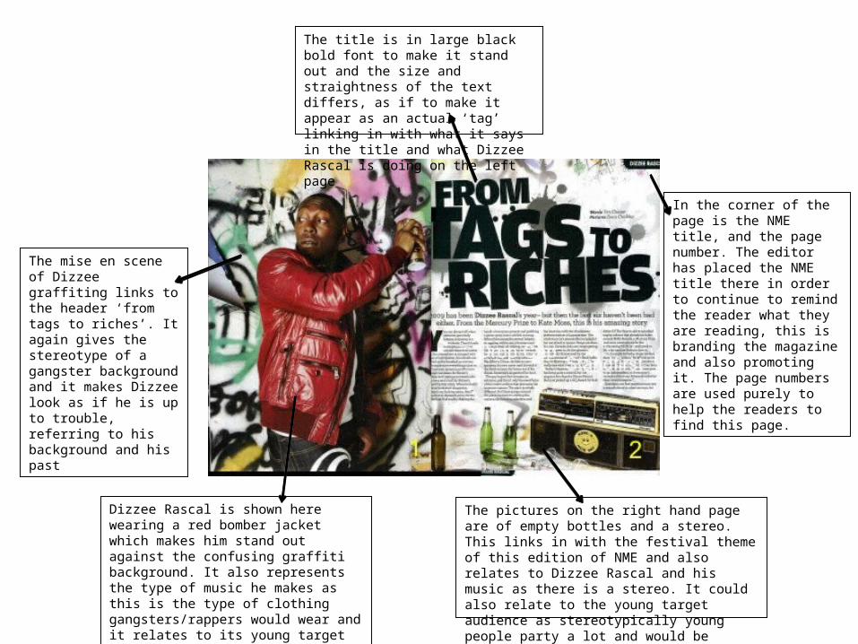
The mise en scene of Dizzee graffiting links to the header ‘from tags to riches’. It again gives the stereotype of a gangster background and it makes Dizzee look as if he is up to trouble, referring to his background and his past
In the corner of the page is the NME title, and the page number. The editor has placed the NME title there in order to continue to remind the reader what they are reading, this is branding the magazine and also promoting it. The page numbers are used purely to help the readers to find this page.
Dizzee Rascal is shown here wearing a red bomber jacket which makes him stand out against the confusing graffiti background. It also represents the type of music he makes as this is the type of clothing gangsters/rappers would wear and it relates to its young target audience
The pictures on the right hand page are of empty bottles and a stereo. This links in with the festival theme of this edition of NME and also relates to Dizzee Rascal and his music as there is a stereo. It could also relate to the young target audience as stereotypically young people party a lot and would be interested in dirnking and music
The title is in large black bold font to make it stand out and the size and straightness of the text differs, as if to make it appear as an actual ‘tag’ linking in with what it says in the title and what Dizzee Rascal is doing on the left page