technical analysis
TRANSCRIPT

Technical analysis & Forecasting Theory
Introduction
Technical analysis is research of market dynamics that is done mainly with the help of charts and with the purpose of forecasting future price development. Technical analysis comprises several approaches to the study of price movement which are interconnected in the framework of one harmonious theory. This type of analysis studies the price movement on the market by means of analyzing three market factors: price, volumes, and, in case of study of futures contracts’ market, of an open interest (number of open positions). Of these three factors the primary one for technical analysis is the prices, while the alterations in other factors are studies mainly in order to confirm the correctness of the identified price trend. This technical theory, just like any theory, has its core postulates.
Technical analysts base their research on the following three axioms:
Market movement considers everythingThis is the most important postulate of technical analysis. It is crucial to understand it in order to grasp rightly the procedures of analysis. The gist of it is that any factor that influences the price of securities, whether economic, political, or psychological, has already been taken into account and reflected in the price chart. In other words, every price change is accompanied by a change in external factors. The main inference of this premise is the necessity to follow closely the price movements and analyze them. By means of analyzing price charts and multiple other indicators, a technical analyst comes to the point that the market itself shows to her/him the trend it will most likely follow.This premise is in conflict with fundamental analysis where the attention is primarily paid to the study of factors, and later on, after the analysis of the factors, to conclusions as to the market trends are made. Thus, if the demand is higher than the supply, a fundamental analyst will come to the conclusion that the price will grow. Technical analyst, however, makes her/his conclusions in the opposite sequence: since the price has grown, it means the demand is higher than the supply.
The prices move with the trendThis assumption is the basis for all methods of technical analysis, as a market that moves in accordance with trends can be analyzed, unlike a chaotic market. The postulate that the price movement is a result of a trend has two effects. The first one implies that the current trend will most likely continue and will not reverse itself, thus, excluding disorderly chaotic movement of the market. The second one implies that the current trend will go on until the opposite trend sets in.
The history repeats itselfTechnical analysis and studies of market dynamics are closely related to the studies of human psychology. Thus, the graphical price models identified and classified within the last hundred years depict core characteristics of the psychological state of the market. First of all, they show the moods currently prevailing in the market, whether bullish or bearish. Since these models worked in the past, we have reasons to suppose that they will work in the future, for they are based on human psychology which remains almost

unchanged over years. We can reword the last postulate — the story repeats itself — in a slightly different way: the key to understanding the future lies in the studies of the past.
Timeframes
Regardless of the "timeframes" of the data in your charts (i.e., hourly, daily, weekly, monthly, etc.), the basic principles of technical analysis endure. Opportunities exist in any time frame. But customized settings of the technical analysis tools are needed for each time period.
On the weekly chart, the scale interval on the time axis is one week. On the monthly chart, correspondingly, every bar shows price behavior for one complete month. It is obvious that in order to cover a longer period of time and to be able to analyze long-term trends, one has to compress the price behavior. A weekly chart, for example, can cover a period of five years and more, the monthly chart can cover twenty years or more. This is how the analyst manages to see far ahead of her-/himself and that is how s/he can assess the market in terms of the long-term opportunities, which are really valuable while conducting the technical analysis.
The order of studying price chart is very important for deep analysis. It is wise to start by analyzing long-term charts and then move slowly to short-term charts. There is less "noise" on the long periods, that is why graphic models, basic trend lines and different levels of support or resistance are seen more clearly. This accounts for the type of work with data time periods. If we start studying short-term market, later on, as the volume of analyzed data expands, we will have to reconsider the conclusions several times at least. In the long run, short-term results may even change completely after long-term charts have been studied. If we start analyzing longer periods first, we can establish where the market is in terms of a long-term perspective. After that, we could then turn to chart studies which cover shorter periods of time. That is how an analyst goes from "macro" to "micro" analysis. At the final stage of the analysis, we determine the point of "entry into the market", i.e., the point of opening a position. The shorter the last analysis stage is, the more precisely one can determine this entrance point.
Line Studies
In technical analysis, lines and various geometric figures to be plotted in price charts or in indicator charts are called line studies. Those include the Support/Resistance Lines and Trend Lines described above, along with:
Fibonacci Tools
Leonardo Fibonacci was an Italian mathematician born 1170 AD. He is considered to have invented numerical series during his studies of Great Pyramid of Giza. Fibonacci Numbers are a numeric sequence where each next number can be got by adding the last two ones: 1, 1, 2, 3, 5, 8, 13, 21, 34, 55, 89, 144, etc.

These numbers are interrelated with a series of curious correlations. For example, each number in the series is approximately 1.618 times more than the previous one, and each preceding one makes approximately 0.618 of the consequent one.
There are several widespread instruments of technical analysis based on Fibonacci Numbers. The general interpretation principle of these instruments consists in the fact that, when the price approximates to lines built with their help, the changes in trend development should be expected.
Fibonacci Arcs Fibonacci Fan Fibonacci Retracement Fibonacci Time Zones Fibonacci Expansion Fibonacci Channel
Gann Tools
W.D. Gann (1878-1955) developed a number of unique methods of price chart analysis. He paid the most attention to geometrical angles reflecting the interrelation between the time and the price. Gann believed that certain geometrical figures and angles have specific features to be used for forecasting price dynamics.
Gann considered that there was an ideal ratio between time and price if the price grew or fell at an angle of forty-five degrees to the time axis. This angle is designated as "1х1" and corresponds with unit price increase for each unit time interval.
Gann Fan Gann Line Gann Grid
Other analytical tools
There are line studies being largely used in technical analysis and helping to define channels and trend changes. These instruments are:
Linear Regression Channel Equidistant Channel Standard Deviation Channel Andrews` Pitchfork
Fibonacci Arcs
Fibonacci Arcs are built as follows: first, the trend line is drawn between two extreme points, for example, from the trough to the opposing peak. Then three arcs are built having their centers in

the second extreme point and intersecting the trend line at Fibonacci levels of 38.2, 50, and 61.8 per cent.
Fibonacci arcs are considered to be potential support and resistance levels. Fibonacci Arcs and Fibonacci Fans are usually plotted together on the chart, and support and resistance levels are determined by the points of intersection of these lines.
It should be noted that the points of intersection of Arcs and the price curve can change depending on the chart scale since an arc is a part of a circumference, and its form is always the same.
Fibonacci Fun
Fibonacci Fan as a line instrument is built as follows: a trend line — for example from a trough to the opposing peak is drawn between two extreme points. Then, an "invisible" vertical line is automatically drawn through the second extreme point. After that, three trend lines intersecting this invisible vertical line at Fibonacci levels of 38.2, 50, and 61.8 percent are drawn from the first extreme point.
These lines are considered to represent support and resistance levels. For getting a more precise forecast, it is recommended to use other Fibonacci instruments along with the Fan.

Fibonacci Retracement
Fibonacci Retracement are built as follows: first, a trend line is built between two extreme points, for example, from the trough to the opposing peak. Then, nine horizontal lines intersecting the trend line at Fibonacci levels of 0.0, 23.6, 38.2, 50, 61.8, 100, 161.8, 261.8, and 423.6 per cent are drawn. After a significant rise or decline, prices often return to their previous levels correcting an essential part (and sometimes completely) of their initial movement. Prices often face support/resistance at the level of Fibonacci Retracements or near them in the course of such a reciprocal movement.

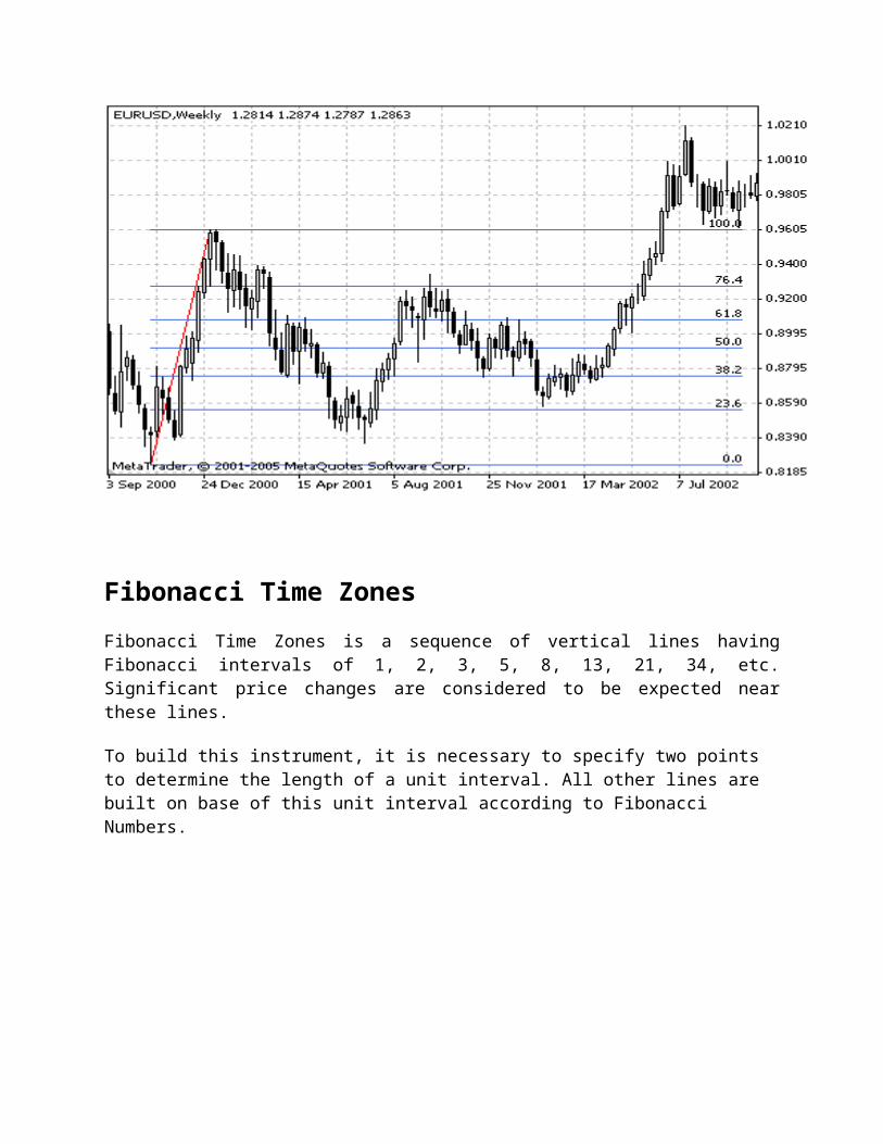
Fibonacci Time Zones
Fibonacci Time Zones is a sequence of vertical lines having Fibonacci intervals of 1, 2, 3, 5, 8, 13, 21, 34, etc. Significant price changes are considered to be expected near these lines.
To build this instrument, it is necessary to specify two points to determine the length of a unit interval. All other lines are built on base of this unit interval according to Fibonacci Numbers.

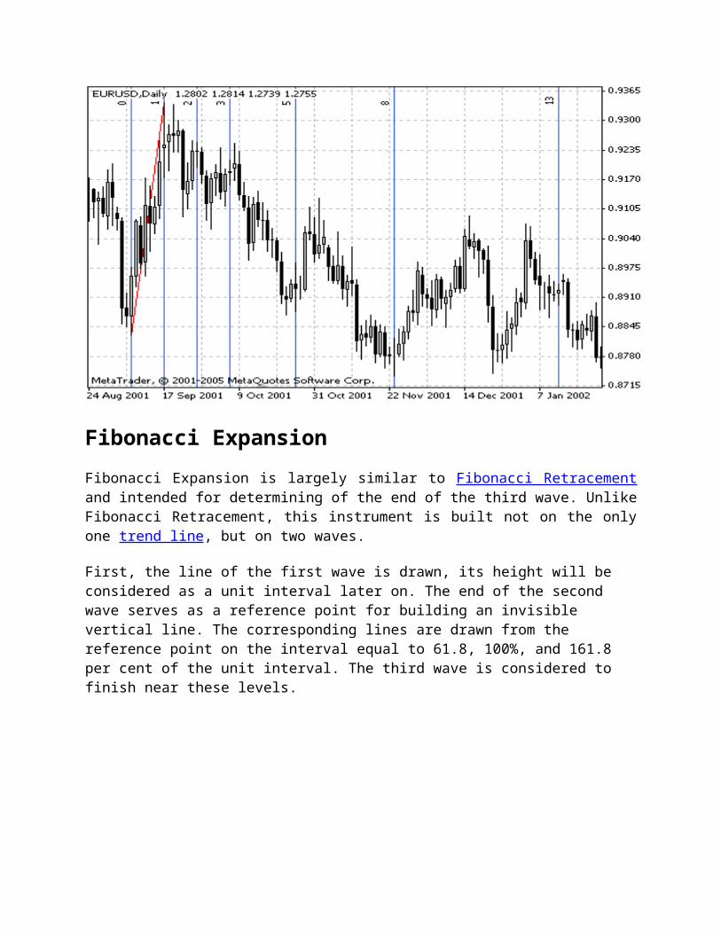
Fibonacci Expansion
Fibonacci Expansion is largely similar to Fibonacci Retracement and intended for determining of the end of the third wave. Unlike Fibonacci Retracement, this instrument is built not on the only one trend line, but on two waves.
First, the line of the first wave is drawn, its height will be considered as a unit interval later on. The end of the second wave serves as a reference point for building an invisible vertical line. The corresponding lines are drawn from the reference point on the interval equal to 61.8, 100%, and 161.8 per cent of the unit interval. The third wave is considered to finish near these levels.
Fibonacci Channel
Fibonacci Channels are built using several parallel trend lines. To build this instrument, the channel having the width taken as a unit width is used. Then, parallel lines are drawn at the values equal to the Fibonacci Numbers, beginning with 0.618-fold size of the channel, then 1.000-fold, 1.618-fold, 2.618-fold, 4.236-fold, etc. As soon as the fifth wave finishes, correction in the direction opposite to the trend can be expected.
It is necessary to remember for a correct Fibonacci Channel building: base line limits the upper part of the channel when trend is ascending, and the lower part of it when trend is descending.
Gann Fan
Lines of Gann Fan are built at different angles from an important base or peak at the price chart. The trend line of 1х1 was considered by Gann the most important. If the price curve is located above this line, it is the indication of the bull market, if it is below this line it is that of the bear market. Gann thought that the ray of 1x1 is a powerful support line when the trend is ascending, and he considered the breaking this line as an important turn signal. Gann emphasized the following nine basic angles, the angle of 1x1 being the most important of all:
1х8 — 82.5 degree 1х4 — 75 degree 1х3 — 71.25 degree 1х2 — 63.75 degree 1х1 — 45 degree 2х1 — 26.25 degree 3х1 — 18.75 degree 4х1 — 15 degree 8х1 — 7.5 degree
The considered ratios of price and time increments to have corresponding angles of slope in degrees, X and Y axes must have the same scales. It means that a unit interval on X axis (i.e., hour, day, week, month) must correspond with the unit interval on Y axis. The simplest method of chart calibration consists in checking the angle of slope of the ray of 1х1: it must make 45 degrees.

Gann noted that each of the above-listed rays can serve as support or resistance depending on the price trend direction. For example, ray of 1x1 is usually the most important support line when the trend is ascending. If prices fall below 1х1 line, it means the trend turns. According to Gann, prices should then sink down to the next trend line (in this case, it is the ray of 2х1). In other words, if one of rays is broken, the price consolidation should be expected to occur near the next ray.
Gann Line
Gann Line represents a line drawn at the angle of 45 degrees. This line is also called "one to one" (1x1) what means one change of the price within one unit of time.
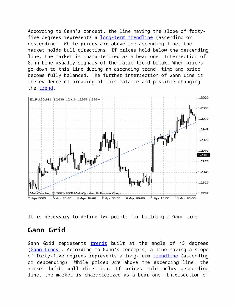
According to Gann’s concept, the line having the slope of forty-five degrees represents a long-term trendline (ascending or descending). While prices are above the ascending line, the market holds bull directions. If prices hold below the descending line, the market is characterized as a bear one. Intersection of Gann Line usually signals of the basic trend break. When prices go down to this line during an ascending trend, time and price become fully balanced. The further intersection of Gann Line is the evidence of breaking of this balance and possible changing the trend.
It is necessary to define two points for building a Gann Line.
Gann Grid

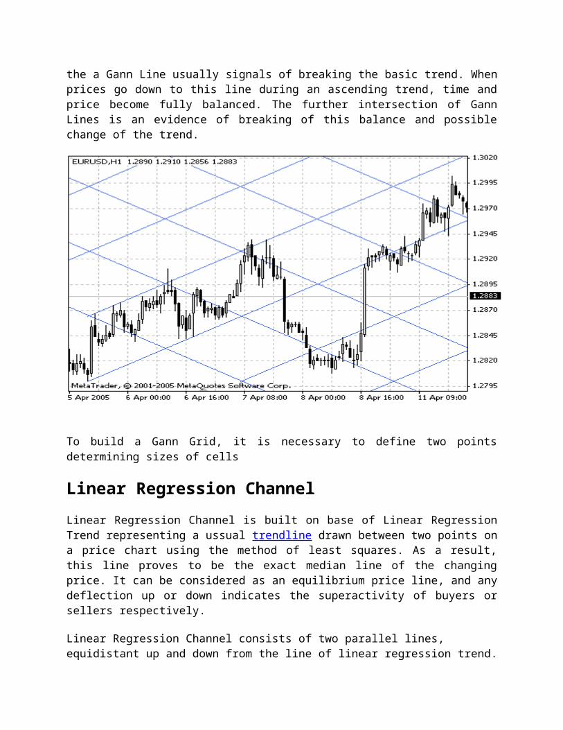
Gann Grid represents trends built at the angle of 45 degrees (Gann Lines). According to Gann’s concepts, a line having a slope of forty-five degrees represents a long-term trendline (ascending or descending). While prices are above the ascending line, the market holds bull direction. If prices hold below descending line, the market is characterized as a bear one. Intersection of the a Gann Line usually signals of breaking the basic trend. When prices go down to this line during an ascending trend, time and price become fully balanced. The further intersection of Gann Lines is an evidence of breaking of this balance and possible change of the trend.
To build a Gann Grid, it is necessary to define two points determining sizes of cells
Linear Regression Channel
Linear Regression Channel is built on base of Linear Regression Trend representing a ussual trendline drawn between two points on a price chart using the method of least squares. As a result, this line proves to be the exact median line of the changing price. It can be considered as an equilibrium price line, and any deflection up or down indicates the superactivity of buyers or sellers respectively.
Linear Regression Channel consists of two parallel lines, equidistant up and down from the line of linear regression trend. The distance between frame of the channel and regression line equals to the value of maximum close price deviation from the regression line. All price changes take place within Regression Channel, where the lower frame works as support line, and the upper one does as resistance line. Prices usually exceed the channel frames for a short time. If they

keep outside of the channel frames for a longer time than usually, it forecasts the possibility of trend turn.
Equidistant Channel
Equidistant Channel represents two parallel trend lines connecting extreme maximum and minimum close prices. Market price jumps, draws peaks and troughs forming the channel in the trend direction. Early identification of the channel can give a valuable information including that about changes in the trend direction what allows to estimate possible profits and losses. It is necessary to give the direction of the channel and its width to build the instrument.
Standard Deviation Channel
Standard Deviation Channel is built on base of Linear Regression Trend representing a ussual trendline built between two points on the price chart using the method of least squares. As a result, this line proves to be the exact median line of the changing price. It can be considered as an equilibrium price line, and any deflection up or down indicates the superactivity of buyers or sellers respectively.
Standard Deviation Channel consists of two parallel lines, equidistant up and down from the Linear Regression Trend. The distance between frame of the channel and regression line equals to the value of standard close price deviation from the regression line. All price changes take place within Standard Deviation Channel, where the lower frame works as support line, and the upper one does as resistance line. Prices usually exceed the channel frames for a short time. If they keep outside of the channel frames for a longer time than usually, it forecasts the possibility of trend turn.
Support and Resistance
Think of prices for financial instruments as a result of a head-to-head battle between a bull (the buyer) and a bear (the seller). Bulls push prices higher, and bears lower them. The direction prices actually move shows who wins the battle.

Support is a level at which bulls (i.e., buyers) take control over the prices and prevent them from falling lower.
Resistance, on the other hand, is the point at which sellers (bears) take control of prices and prevent them from rising higher. The price at which a trade takes place is the price at which a bull and bear agree to do business. It represents the consensus of their expectations.
Support levels indicate the price where the most of investors believe that prices will move higher. Resistance levels indicate the price at which the most of investors feel prices will move lower.
But investor expectations change with the time, and they often do so abruptly. The development of support and resistance levels is probably the most noticeable and reoccurring event on price charts. The breaking through support/resistance levels can be triggered by fundamental changes that are above or below investor's expectations (e.g., changes in earnings, management, competition, etc.) or by self-fulfilling prophecy (investors buy as they see prices rise). The cause is not so significant as the effect: new expectations lead to new price levels. There are support/resistance levels, which are more emotional.
Supply and demand
There is nothing mysterious about support and resistance: it is classic supply and demand. Remembering ’Econ 101’ class, supply/demand lines show what the supply and demand will be at a given price.
The supply line shows the quantity (i.e., the number of shares) that sellers are willing to supply at a given price. When prices increase, the quantity of sellers also increases as more investors are willing to sell at these higher prices. The demand line shows the number of shares that buyers are willing to buy at a given price. When prices increase, the quantity of buyers decreases as fewer investors are willing to buy at higher prices.
At any given price, a supply/demand chart shows how many buyers and sellers there are. In a free market, these lines are continually changing. Investor's expectations change, and so do the prices buyers and sellers feel are acceptable. A breakout above a resistance level is evidence of an upward shift in the demand line as more buyers become willing to buy at higher prices. Similarly, the failure of a support level shows that the supply line has shifted downward.
The foundation of most technical analysis tools is rooted in the concept of supply and demand. Charts of prices for financial instruments give us a superb view of these forces in action.
Traders’ remorse

After a support/resistance level has been broken through, it is common for traders to ask temselves about to what extent new prices represent the facts. For example, after a breakout above a resistance level, buyers and sellers may both question the validity of the new price and may decide to sell. This creates a phenomenon that is referred to as "traders’ remorse": prices return to a support/resistance level following a price breakout.
The price action following this remorseful period is crucial. One of two things can happen: either the consensus of expectations will be that the new price is not warranted, in which case prices will move back to their previous level; or investors will accept the new price, in which case prices will continue to move in the direction of the breaking through.
In case number one, following traders’ remorse, the consensus of expectations is that a new higher price is not warranted, a classic "bull trap" (or false breakout) is created. For example, the prices broke through a certain resistance level (luring in a herd of bulls who expected prices to move higher), and then prices dropped back to below the resistance level leaving the bulls holding overpriced stock. Similar sentiment creates a bear trap. Prices drop below a support level long enough to get the bears to sell (or sell short) and then bounce back above the support level leaving the bears out of the market.
The other thing that can happen following traders’ remorse is that investors expectations may change causing the new price to be accepted. In this case, prices will continue to move in the direction of the penetration.
A good way to quantify expectations following a breakout is with the volume associated with the price breakout. If prices break through the support/resistance level with a large increase in volume and the traders’ remorse period is on relatively low volume, it implies that the new expectations will rule (a minority of investors are remorseful). Conversely, if the breakout is on moderate volume and the "remorseful" period is on increased volume, it implies that very few investor expectations have changed and a return to the original expectations (i.e., original prices) is warranted.
Resistance becomes support
When a resistance level is successfully broken through, that level becomes a support level. Similarly, when a support level is successfully broken through, that level becomes a resistance level.
The reason for it is that a new "generation" of bulls appears, who refused to buy when prices were low. Now they are anxious to buy at any time the prices return to the previous level. Similarly, when prices drop below a support level, that level often becomes a resistance level that prices have a difficult time breaking through. When prices approach the previous support level, investors seek to limit their losses by selling.
Trendlines

Trendlines are widely used in technical analysis. But it should be noted that there is not consensus of opinions about methods of their building and interpreting. So nobody is surprised at the fact that different analysts using identical data of the same time period draw absolutely different trendlines.
A trendline is a straight line that connects two important minimum or maximum points in the chart. Any amount of secondary and small trends can be found within the main trend. their lengths can vary within a rather wide range. It should be noted that a trendline should not intersect other prices between these two points. A trendline represents a resistance or support pass-through where price changes within the range of the pass-through.
Prices can break through ascending and descending trendlines, as well as support and resistance levels, when the investors' expectations change.
The trendlines can be categorized as follows:
Downtrend is characterized through sequential decreasing of maximum prices. It can also be considered as descending resistance level: Bears set the pace as they push prices down.
Uptrend is characterized through sequential increasing of minimum prices. It can also be considered as ascending support level: Bulls set the pace as they push prices up.
Sideways Trend - price does not practically move at all.

Trendlines can be categorized by their importance using the five indications below:
time scale: the larger is the time scale, the more important is the trendline. The trendline in the weekly chart shows a more important trend than that in the daily chart, and the latter show a more important trend than the trendline in the 1-hour chart;
length: the longer is the trendline, the more reliable it is. The short trendline displays the behavior of masses within a short time interval, and a longer trendline displays their behavior within a longer period of time;
how many times prices touch the trendline: the more is the count of touches, the more reliable is the trendline. A preliminary trendline is drawn through only two points, sp the third point makes it more reliable and four or five points show that the group prevailing in the market at this moment has a significant potential;
slope angle: the angle between the trendline and the horizontal line reflects the intensity of emotions among the prevailing market crowd. An abrupt trendline means that the prevailing crowd is dynamic, and a relatively flat trendline means that the prevailing crowd is rather inert. A flat trend usually develops longer;
volume of transactions: it reflects how serious the players are, as well as the count of participants interested in retaining the existing trend. The increased Volume usually serves as confimation of the preceding trend.
To draw a trendline, it is enough to have two points it to be drawn through, and one more point "to confirm" the trend. The trendline exists until it is broken through due to a price flick up or down. The "dog-legs" in trendlines are relatively rare. If there is no consolidation, the longer it does not happen, the sharper is the subsequent turn.
Moving Averages
Moving averages are one of the oldest and most popular technical analysis tools. A moving average is the average price of a financial instrument over a given time. When calculating a moving average, you specify the time span to calculate the average price. For example, it could be 25 days.
A "simple" moving average is calculated by adding the instrument prices for the most recent "n" time periods and then dividing by "n". For instance, adding the closing prices of an instrument for most recent 25 days and then dividing by 25. The result is the average price of the instrument over the last 25 days. This calculation is done for each period in the chart.
Note that a moving average cannot be calculated until you have "n" time periods of data. For example, you cannot display a 25-day moving average until the 25th day in a chart.
The moving average represents the consensus of investor’s expectations over the indicated period of time. If the instrument price is above its moving average, it means that investor’s current expectations (i.e., the current price) are higher than their average ones over the last 25 days, and that investors are becoming increasingly bullish on the instrument. Conversely, if today’s price is below its moving average, it shows that current expectations are below the average ones over the last 25 days.
The classic interpretation of a moving average is to use it in observing changes in prices. Investors typically buy when the price of an instrument rises above its moving average and sell when the it falls below its moving average.
Advantages
The advantage of moving average system of this type(i.e., buying and selling when prices break through their moving average) is that you will always be on the "right" side of the market: prices

cannot rise very much without the price rising above its average price. The disadvantage is that you will always buy and sell some late. If the trend does not last for a significant period of time, typically twice the length of the moving average, you will lose your money.
Traders’ remorse
Moving averages often demonstrate traders’ remorse. Thus, it is very common for an instrument to break through its long-term moving average, and then return to its average before continuing on its way.
Andrews’ Pitchfork
Andrews’ Pitchfork is an instrument consisting of three parallel Trend Lines. This instrument was developed by Dr. Alan Andrews. Interpretation of Andrews’ Pitchfork is based on standard rules of interpretation of support and resistance lines.
The first trend line starts in a selected extreme left point (it is an important peak or trough) and is drawn exactly between two extreme right points. This line is the "handle" of pitchfork. Then, the second and the third trend line issuing from two above-mentioned extreme right points (important peak and trough) is drawn parallel to the first one. These lines are "tines" of the pitchfork.
Technical Indicators

Technical Indicator is a result of mathematical calculations based on indications of price and/or volume. The values obtained are used to forecast probable price changes. There are many technical indicators already developed. Some of them are described in the subsections here:
Volumes
Accumulation/Distribution Money Flow Index On Balance Volume Price and Volume Trend Volume Rate of Change
Oscillators
Average True Range Chaikin Oscillator Chaikin Volatility DeMarker Detrended Price Oscillator Elder-Rays Envelopes Force Index Ichimoku Kinko Hyo Momentum Moving Average Convergence/Divergence Moving Average of Oscillator Price Rate of Change Relative Strength Index Relative Vigor Index Stochastic Oscillator Ultimate Oscillator Williams` Percent Range
Trends Indicators
Average Directional Movement Index Accumulation Swing Index Bollinger Bands Commodity Channel Index Mass Index Moving Average Pivot Points Support and Resistance Lines Parabolic SAR Standard Deviation

ZigZag Williams` Accumulation/Distribution
Bill Williams
Acceleration/Deceleration Alligator Awesome Oscillator Fractals Gator Oscillator Market Facilitation Index
Accumulation/Distribution Technical Indicator
Accumulation/Distribution Technical Indicator is determined by the changes in price and volume. The volume acts as a weighting coefficient at the change of price — the higher the coefficient (the volume) is, the greater the contribution of the price change (for this period of time) will be in the value of the indicator.
In fact, this indicator is a variant of the more commonly used indicator On Balance Volume. They are both used to confirm price changes by means of measuring the respective volume of sales.
When the Accumulation/Distribution indicator grows, it means accumulation (buying) of a particular security, as the overwhelming share of the sales volume is related to an upward trend of prices. When the indicator drops, it means distribution (selling) of the security, as most of sales take place during the downward price movement.
Divergences between the Accumulation/Distribution indicator and the price of the security indicate the upcoming change of prices. As a rule, in case of such divergences, the price tendency moves in the direction in which the indicator moves. Thus, if the indicator is growing, and the price of the security is dropping, a turnaround of price should be expected.

Calculation:
A certain share of the daily volume is added to or subtracted from the current accumulated value of the indicator. The nearer the closing price to the maximum price of the day is, the higher the added share will be. The nearer the closing price to the minimum price of the day is, the greater the subtracted share will be. If the closing price is exactly in between the maximum and minimum of the day, the indicator value remains unchanged.
A/D(i) =((CLOSE(i) - LOW(i)) - (HIGH(i) - CLOSE(i)) * VOLUME(i) / (HIGH(i) - LOW(i)) + A/D(i-1)
Where:A/D(i) — importance of the Indicator of the Accumulation/Distribution for the current bar;CLOSE(i) — the price of the closing the bar;LOW(i) — the minimum price of the bar;HIGH(i) — the maximum price of the bar;VOLUME(i) — volume;A/D(i-1) — importance of the Indicator of the Accumulation/Distribution for previous bar.
Source Code
Full MQL4 source of Accumulation/Distribution Technical Indicator is available in the Code Base: Accumulation/Distribution Technical Indicator

Money Flow Index
Money Flow Index (MFI) is the technical indicator, which indicates the rate at which money is invested into a security and then withdrawn from it. Construction and interpretation of the indicator is similar to Relative Strength Index with the only difference that volume is important to MFI.
When analyzing the money flow index one needs to take into consideration the following points:
divergences between the indicator and price movement. If prices grow while MFI falls (or vice versa), there is a great probability of a price turn;
Money Flow Index value, which is over 80 or under 20, signals correspondingly of a potential peak or bottom of the market.
Calculation:
The calculation of Money Flow Index includes several stages. At first one defines the typical price (TP) of the period in question.
TP = (HIGH + LOW + CLOSE)/3
Then one calculates the amount of the Money Flow (MF):
MF = TP * VOLUME
If today’s typical price is larger than yesterday’s TP, then the money flow is considered positive. If today’s typical price is lower than that of yesterday, the money flow is considered negative.
A positive money flow is a sum of positive money flows for a selected period of time. A negative money flow is the sum of negative money flows for a selected period of time.
Then one calculates the money ratio (MR) by dividing the positive money flow by the negative money flow:
MR = Positive Money Flow (PMF)/Negative Money Flow (NMF)
And finally, one calculates the money flow index using the money ratio:
MFI = 100 - (100 / (1 + MR))
Source Code
Full MQL4 source of Money Flow Index is available in the Code Base: Money Flow Index
On Balance Volume (OBV)
On Balance Volume Technical Indicator (OBV) is a momentum technical indicator that relates volume to price change. The indicator, which Joseph Granville came up with, is pretty simple. When the security closes higher than the previous close, all of the day’s volume is considered up-volume. When the security closes lower than the previous close, all of the day’s volume is considered down-volume.
The basic assumption, regarding On Balance Volume analysis, is that OBV changes precede price changes. The theory is that smart money can be seen flowing into the security by a rising OBV. When the public then moves into the security, both the security and the On Balance Volume will surge ahead.
If the security’s price movement precedes OBV movement, a "non-confirmation" has occurred. Non-confirmations can occur at bull market tops (when the security rises without, or before, the OBV) or at bear market bottoms (when the security falls without, or before, the On Balance Volume Technical Indicator).

The OBV is in a rising trend when each new peak is higher than the previous peak and each new trough is higher than the previous trough. Likewise, the On Balance Volume is in a falling trend when each successive peak is lower than the previous peak and each successive trough is lower than the previous trough. When the OBV is moving sideways and is not making successive highs and lows, it is in a doubtful trend.
Once a trend is established, it remains in force until it is broken. There are two ways in which the On Balance Volume trend can be broken. The first occurs when the trend changes from a rising trend to a falling trend, or from a falling trend to a rising trend.
The second way the OBV trend can be broken is if the trend changes to a doubtful trend and remains doubtful for more than three days. Thus, if the security changes from a rising trend to a doubtful trend and remains doubtful for only two days before changing back to a rising trend, the On Balance Volume is considered to have always been in a rising trend.
When the OBV changes to a rising or falling trend, a "breakout" has occurred. Since OBV breakouts normally precede price breakouts, investors should buy long on On Balance Volume upside breakouts. Likewise, investors should sell short when the OBV makes a downside breakout. Positions should be held until the trend changes.
Calculation:
If today’s close is greater than yesterday’s close then:
OBV(i) = OBV(i-1)+VOLUME(i)

If today’s close is less than yesterday’s close then:
OBV(i) = OBV(i-1)-VOLUME(i)
If today’s close is equal to yesterday’s close then:
OBV(i) = OBV(i-1)
Where:OBV(i) — is the indicator value of the current period;OBV(i-1) — is the indicator value of the previous period;VOLUME(i) — is the volume of the current bar.
Source Code
Full MQL4 source of On Balance Volume is available in the Code Base: On Balance Volume
Price and Volume Trend (PVT)
Price and Volume Trend (PVT), like On Balance Volume, represents the growing sum of values of the trade volume calculated regarding the change of closing prices. In the case of OBV, we add the current volume to the current value of the indicator if the prices close on a higher level, and subtract the volume otherwise. In the case of PVT, only a part of the current volume is added to the subtracted to be added to PVT, you must guide yourself by the difference between the current price and the closing price of the previous bar.
Many investors think that PVT is more precise than OBV in showing the dynamics of trade volume. It is so because we add one and the same volume to the OBV value disregarding whether the closing price was just a little bit higher or twice as high. In the case of PVT, we add a small part of the volume to the current cumulate value if the relative change of price is not big. If the price changed considerably, a large part of the volume is added to the PVT value.

Calculation:
We get PVT by multiplying the current volume by the relative change of the share price and adding the result to the current cumulate value of the indicator.
PVT (i) = ((CLOSE (i) - CLOSE (i - 1)) / CLOSE (i - 1)) * VOLUME (i) + PVT (i - 1)
Where:CLOSE (i) — the closing price of the current bar;CLOSE (i - n) — the closing price n bars ago;VOLUME (i) — the volume of the current bar;PVT (i) — the current value of PVT indicator;PVT (i - 1) — the value of PVT indicator on the previous bar.
Source Code
Full MQL4 source of On Balance Volume is available in the Code Base: Price and Volume Trend (PVT)
Volume Rate of Change (VROC)
Volume Rate of Change (VROC) is an indicator of the direction where the volume trend moves. Its idea lies in the fact that almost all important graphical formations (peaks, foundations,

breaches, etc.) are accompanied by a dramatic increase of trade volume. The indicator is the difference between current bar volume and the volume n periods ago. If the current bar volume is higher than it was n periods ago, the value of the indicator will be positive. If the current volume is lower, VROC will obtain a negative value. Thus, the indicator gives an idea of the volume change speed.
Determining the calculation period is very important while working with this indicator. Short periods of 10-15 bars show sudden changes of volume. However, for signals that are more realistic it is better to choose periods of 25-30 bars. This gives a smoother and more rounded line and makes the analysis easier. At the same time, using short periods gives a more broken, "noisy" line and complicates the analysis.
Calculation:
VROC = ((VOLUME (i) - VOLUME (i - n)) / VOLUME (i - n)) * 100
Where:VOLUME (i) — is the current bar volume;VOLUME (i - n) — the volume n bars ago;VROC — the Volume Rate of Change indicator value.

Source Code
Full MQL4 source of On Balance Volume is available in the Code Base: Volume Rate of Change (VROC)
Average True Range Technical Indicator (ATR)
Average True Range Technical Indicator (ATR) is an indicator that shows volatility of the market. It was introduced by Welles Wilder in his book "New concepts in technical trading systems". This indicator has been used as a component of numerous other indicators and trading systems ever since.
Average True Range can often reach a high value at the bottom of the market after a sheer fall in prices occasioned by panic selling. Low values of the indicator are typical for the periods of sideways movement of long duration which happen at the top of the market and during consolidation. Average True Range can be interpreted according to the same principles as other volatility indicators. The principle of forecasting based on this indicator can be worded the following way: the higher the value of the indicator, the higher the probability of a trend change; the lower the indicator’s value, the weaker the trend’s movement is.
Calculation:
True Range is the greatest of the following three values:

difference between the current maximum and minimum (high and low); difference between the previous closing price and the current maximum; difference between the previous closing price and the current minimum.
The indicator of Average True Range is a moving average of values of the true range.
Source Code
Full MQL4 source of Average True Range is available in the Code Base: Average True Range
Chaikin Oscillator
Chaikin's oscillator is the difference of moving averages of Accumulation/Distribution.
"The concept of this oscillator is based on three main theses. First: if a share or an index is higher when it closes than it was during the day (you can calculate the average value as [max+min]/2), it means that it was a day of accumulation. The closer the closing index of a share or an index gets to the maximum, the more active the accumulation is. Vice versa, if a share's closing price is lower than the average level of the day, it means that distribution took place. The closer to the minimum the share gets, the more active is the distribution.
Second: stable price growth is accompanied by increase in trade volume and strong accumulation of the volume. As the volume is like fuel that feeds market growth, the lag of volume along with the growth of prices shows that there isn't enough fuel to continue the rise.
Vice versa, a slump in prices is usually accompanied by low amount and ends up in panic liquidation of positions by institutional investors. Therefore, first of all we see a growth of volume, then a slump in prices accompanied by reduced volume and finally, when the market is close to foundation, some accumulation takes place.
Third: with a Chaikin's oscillator you can trace back the volume of money resources coming in to the market and leaving it. Comparing the dynamics of volume and prices allows finding out peaks and foundations of the market, both short- and medium-term.
As there are no correct methods of technical analysis, I would recommend you using this oscillator along with other technical indicators. The reliability of short-term and medium-term trade signals will be higher if you use a Chaikin's oscillator together with, for example, Envelopes based on a 21-day moving average and some oscillator of outbidding/resale.
The most important signal arises when the prices reach a maximum or a minimum level (especially on the level of outbidding/resale), but the Chaikin's oscillator can't overcome its previous extremum and so it turns around.

Signals moving in the direction of the medium-term trend are more reliable than those moving against it.
The fact that an oscillator confirms a new maximum or minimum doesn't mean that the prices will move on in that direction. I regard this event as unimportant.
Another way of using Chaikin's oscillator implies the following: a change in its direction is a signal for purchase or a sale, but only if it coincides with the price trend direction. For example, if a share is on the rise and its price is higher than a 90-day moving average, then an up-turn of the oscillator curve in the area of negative values can be regarded as a signal for purchase (but the share price must be higher than a 90-day moving average - not less.)
A down-turn of the oscillator curve in the area of positive values (above zero) can be regarded as a signal for sale, but the share price must be lower than the 90-day moving average of closing prices."
Mark Chaikin
Calculations:
To calculate the Chaikin's oscillator, you must subtract a 10-period exponential moving average of Accumulation/Distribution indicator from a 3-period exponential moving average of the same indicator.
CHO = EMA (A/D, 3) — EMA (A/D, 10)

Where: EMA — exponential moving average;A/D — Accumulation/Distribution indicator.
Source Code
Full MQL4 source of Average True Range is available in the Code Base: Chaikin Oscillator
Chaikin Volatility
Chaikin's volatility indicator calculates the spread between the maximum and minimum prices. It judges the value of volatility basing on the amplitude between the maximum and the minimum. Unlike Average True Range, Chaikin's indicator doesn't take gaps into account.
According to Chaikin's interpretation, a growth of volume indicator in a relatively short space of time means that the prices approach their minimum (like when the securities are sold in panic), while a decrease of volatility in a longer period of time indicates that the prices are on the peak (for example, in the conditions of a mature bull market).
We recommend using Moving Averages and Envelopes as a confirmation of Chaikin's indicator signals.
A peak of indicator's reading appears when market prices rollaway from the new summit and the market turns flat.
A flat market resembles low volatility. An exit from the side movement (from a flat) is not accompanied by a significant increase of volatility.
Volatility grows along with the increase in price level over the previous maximum. A rise of Chaikin's indicator level continues till a new price peak is reached. A rapid decrease of volatility means that the movement is slowing down and that a back-
roll is possible.

Calculations:
H-L (i) = HIGH (i) - LOW (i)
H-L (i - 10) = HIGH (i - 10) - LOW (i - 10)
CHV = (EMA (H-L (i), 10) - EMA (H-L (i - 10), 10)) / EMA (H-L (i - 10), 10) * 100
Where: HIGH (i) — maximum price of current bar;LOW (i) — minimum price of current bar;HIGH (i - 10) — maximum price of the bar ten positions away from the current one;LOW (i - 10) — minimum price of the bar ten positions away from the current one;H-L (i) — difference between the maximum and the minimum price in the current bar;H-L (i - 10) — difference between the maximum and the minimum price ten bars ago;EMA — exponential moving average.
Source Code
Full MQL4 source of Average True Range is available in the Code Base: Chaikin Volatility

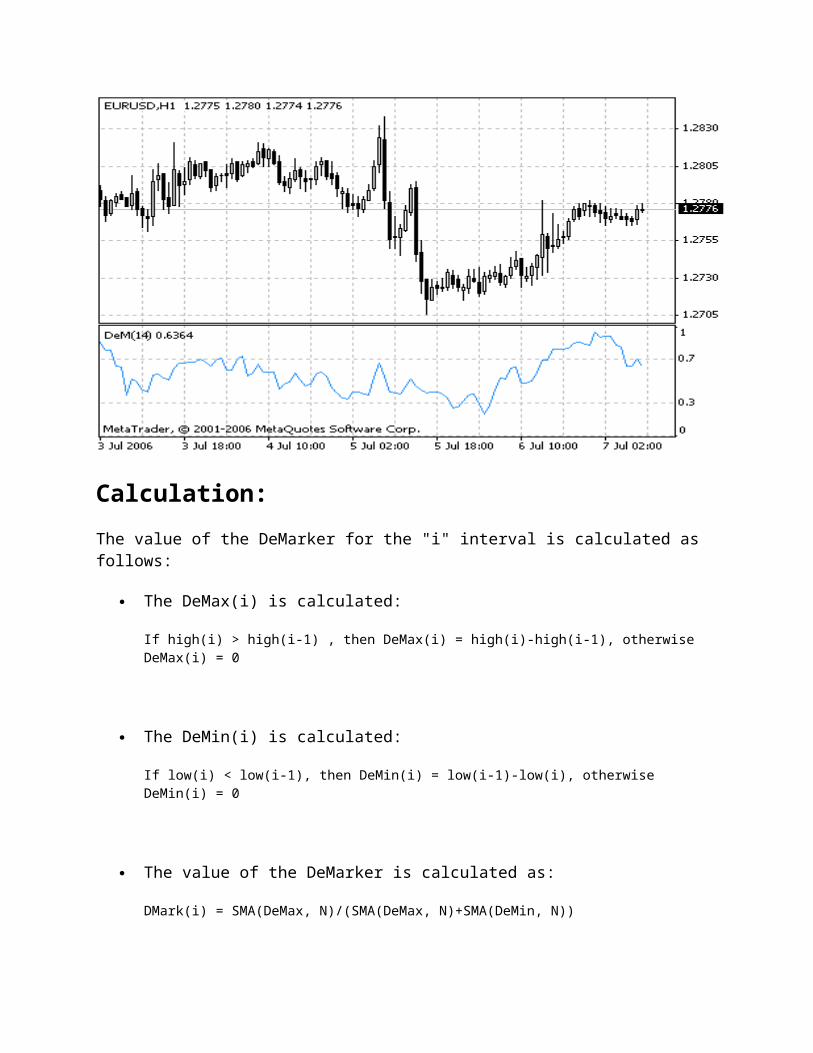
Demarker Technical Indicator
Demarker Technical Indicator is based on the comparison of the period maximum with the previous period maximum. If the current period (bar) maximum is higher, the respective difference between the two will be registered. If the current maximum is lower or equaling the maximum of the previous period, the naught value will be registered. The differences received for N periods are then summarized. The received value is used as the numerator of the DeMarker and will be divided by the same value plus the sum of differences between the price minima of the previous and the current periods (bars). If the current price minimum is greater than that of the previous bar, the naught value will be registered.
When the indicator falls below 30, the bullish price reversal should be expected. When the indicator rises above 70, the bearish price reversal should be expected.
If you use periods of longer duration, when calculating the indicator, you’ll be able to catch the long term market tendency. Indicators based on short periods let you enter the market at the point of the least risk and plan the time of transaction so that it falls in with the major trend.
Calculation:
The value of the DeMarker for the "i" interval is calculated as follows:
The DeMax(i) is calculated:

If high(i) > high(i-1) , then DeMax(i) = high(i)-high(i-1), otherwise DeMax(i) = 0
The DeMin(i) is calculated:
If low(i) < low(i-1), then DeMin(i) = low(i-1)-low(i), otherwise DeMin(i) = 0
The value of the DeMarker is calculated as:
DMark(i) = SMA(DeMax, N)/(SMA(DeMax, N)+SMA(DeMin, N))
Where:SMA — Simple Moving Average;N — the number of periods used in the calculation.
Source Code
Full MQL4 source of DeMarker is available in the Code Base: DeMarker
Detrended Price Oscillator
Detrended Price Oscillator eliminates the trend effect of price movement. This simplifies the process of finding out cycles and levels of outbidding/resale.
Long-term cycles consist of several shorter cycles. Analyzing such short components helps to define crucial moments of the cycle's development. DPO gives a chance to eliminate the influence on prices of long-term cycles.
To calculate DPO you should take a certain period. Remove cycles that are longer than the chosen period from price dynamics, and leave shorter cycles. Half of the cycle's length is used for smoothing. We recommend using a period of 21 or less.
The bounds (overbought/oversold levels) come from the history of previous behavior of prices. It is recommended to stand in a long position if DPO first falls below the resale level and then gets above it. Crossing of the zero point from above followed by a rise above that level is also a signal for opening a long position. Everything is vice versa for short positions.

Calculations:
DPO = CLOSE - SMA (CLOSE, (N / 2 + 1))
Where: SMA — a simple moving average;CLOSE — the closing price;N — the period of the cycle (if N is equal to 12, DPO resembles the DiNapoli Detrend Oscillator).
Source Code
Full MQL4 source of Detrended Price Oscillator is available in the Code Base: Detrended Price Oscillator
Elder-Rays Technical Indicator
Elder-Rays Technical Indicator combine the properties of trend following indicators and oscillators. They use Exponential Moving Average indicator (EMA, the best period is 13) as a
tracing indicator. The oscillators reflect the power of bulls and bears.To plot the Elder-Rays three charts should be used: on one side, the price chart and Exponential Moving Average will be plotted, on two other sides bulls power oscillator (Bulls Power) and bears power oscillator (Bears Power) will be plotted.
Elder-rays are used both individually and together with other methods. If using them individually, one should take into account that the Exponential Moving Average slope determines the trend movement, and position should be opened in its direction. Bulls and bears power oscillators are applied for defining the moment of positions opening/closing. Buy if:
there is an increasing trend (determined with the Exponential Moving Average movement);
the Bears Power oscillator is negative, but increasing at the same time; the last peak of the Bulls Power oscillator is higher than the previous one; the Bears Power oscillator increases after the Bulls divergence.
At the positive values of the Bears Power oscillator, it is better to keep back.
Sell if:
there is a decreasing trend (determined with the Exponential Moving Average movement);
the Bulls Power oscillator is positive, but decreases gradually; the last trough of the Bulls Power oscillator is lower than the previous one; the Bulls Power oscillator decreases leaving the Bears’ divergence.
Do not open short positions when the Bulls Power oscillator is negative.
Divergence between the Bulls and Bears Power and prices is the best time for trading.

Calculation:
BULLS = HIGH - EMA
BEARS = LOW - EMA
Where:BULLS — force of bulls;BEARS — force of bears;HIGH — maximum price of current bar;LOW — minimum price of current bar;EMA — exponential moving average.
Source Code
Full MQL4 source of Bears Power is available in the Code Base: Bears PowerFull MQL4 source of Bulls Power is available in the Code Base: Bulls Power
Envelopes
Envelopes Technical Indicator is formed with two Moving Averages one of which is shifted upward and another one is shifted downward. The selection of optimum relative number of band margins shifting is determined with the market volatility: the higher the latter is, the stronger the shift is.
Envelopes define the upper and the lower margins of the price range. Signal to sell appears when the price reaches the upper margin of the band; signal to buy appears when the price reaches the lower margin.
The logic behind envelopes is that overzealous buyers and sellers push the price to the extremes (i.e., the upper and lower bands), at which point the prices often stabilize by moving to more realistic levels. This is similar to the interpretation of Bollinger Bands.
Calculation:
Upper Band = SMA(CLOSE, N)*[1+K/1000]
Lower Band = SMA(CLOSE, N)*[1-K/1000]
Where: SMA — Simple Moving Average;N — averaging period;K/1000 — the value of shifting from the average (measured in basis points).

Source Code
Full MQL4 source of Envelopes is available in the Code Base: Envelopes
Force Index
Force Index Technical Indicator was developed by Alexander Elder. This index measures the Bulls Power at each increase, and the Bulls Power at each decrease. It connects the basic elements of market information: price trend, its drops, and volumes of transactions. This index can be used as it is, but it is better to approximate it with the help of Moving Average. Approximation with the help a short moving average (the author proposes to use 2 intervals) contributes to finding the best opportunity to open and close positions. If the approximations is made with long moving average (period 13), the index shows the trends and their changes.
It is better to buy when the forces become minus (fall below zero) in the period of indicator increasing tendency;
The force index signalizes the continuation of the increasing tendency when it increases to the new peak;
The signal to sell comes when the index becomes positive during the decreasing tendency;
The force index signalizes the Bears Power and continuation of the decreasing tendency when the index falls to the new trough;
If price changes do not correlate to the corresponding changes in volume, the force indicator stays on one level, which tells you the trend is going to change soon.

Calculation:
The force of every market movement is characterized by its direction, scale and volume. If the closing price of the current bar is higher than the preceding bar, the force is positive. If the current closing price if lower than the preceding one, the force is negative. The greater the difference in prices is, the greater the force is. The greater the transaction volume is, the greater the force is.
FORCE INDEX (i) = VOLUME (i) * ((MA (ApPRICE, N, i) - MA (ApPRICE, N, i-1))
Where: FORCE INDEX (i) — Force Index of the current bar;VOLUME (i) — volume of the current bar;MA (ApPRICE, N, i) — any Moving Average of the current bar for N period: Simple, Exponential, Weighted or Smoothed;ApPRICE — applied price;N — period of the smoothing;MA (ApPRICE, N, i-1) — any Moving Average of the previous bar.
Source Code
Full MQL4 source of Force Index is available in the Code Base: Force Index
Ichimoku Kinko Hyo
Ichimoku Kinko Hyo Technical Indicator is predefined to characterize the market Trend, Support and Resistance Levels, and to generate signals of buying and selling. This indicator works best at weekly and daily charts.
When defining the dimension of parameters, four time intervals of different length are used. The values of individual lines composing this indicator are based on these intervals:
Tenkan-sen shows the average price value during the first time interval defined as the sum of maximum and minimum within this time, divided by two;
Kijun-sen shows the average price value during the second time interval; Senkou Span A shows the middle of the distance between two previous lines shifted
forwards by the value of the second time interval; Senkou Span B shows the average price value during the third time interval shifted
forwards by the value of the second time interval. Chinkou Span shows the closing price of the current candle shifted backwards by the
value of the second time interval.

The distance between the Senkou lines is hatched with another color and called "cloud". If the price is between these lines, the market should be considered as non-trend, and then the cloud margins form the support and resistance levels:
If the price is above the cloud, its upper line forms the first support level, and the second line forms the second support level;
If the price is below cloud, the lower line forms the first resistance level, and the upper one forms the second level;
If the Chinkou Span line traverses the price chart in the bottom-up direction it is signal to buy. If the Chinkou Span line traverses the price chart in the top-down direction it is signal to sell.
Kijun-sen is used as an indicator of the market movement. If the price is higher than this indicator, the prices will probably continue to increase. When the price traverses this line the further trend changing is possible.
Another kind of using the Kijun-sen is giving signals. Signal to buy is generated when the Tenkan-sen line traverses the Kijun-sen in the bottom-up direction. Top-down direction is the signal to sell.
Tenkan-sen is used as an indicator of the market trend. If this line increases or decreases, the trend exists. When it goes horizontally, it means that the market has come into the channel.

Source Code
Full MQL4 source of Ichimoku Kinko Hyo is available in the Code Base: Ichimoku Kinko Hyo
Momentum
The Momentum Technical Indicator measures the amount that a security’s price has changed over a given time span.
There are basically two ways to use the Momentum indicator:
You can use the Momentum indicator as a trend-following oscillator similar to the Moving Average Convergence/Divergence (MACD). Buy when the indicator bottoms and turns up and sell when the indicator peaks and turns down. You may want to plot a short-term moving average of the indicator to determine when it is bottoming or peaking.
If the Momentum indicator reaches extremely high or low values (relative to its historical values), you should assume a continuation of the current trend. For example, if the Momentum indicator reaches extremely high values and then turns down, you should assume prices will probably go still higher. In either case, only trade after prices confirm the signal generated by the indicator (e.g., if prices peak and turn down, wait for prices to begin to fall before selling).
You can also use the Momentum indicator as a leading indicator. This method assumes that market tops are typically identified by a rapid price increase (when everyone expects prices to go higher) and that market bottoms typically end with rapid price declines (when everyone wants to get out). This is often the case, but it is also a broad generalization.
As a market peaks, the Momentum indicator will climb sharply and then fall off — diverging from the continued upward or sideways movement of the price. Similarly, at a market bottom, Momentum will drop sharply and then begin to climb well ahead of prices. Both of these situations result in divergences between the indicator and prices.

Calculation:
Momentum is calculated as a ratio of today’s price to the price several (N) periods ago.
MOMENTUM = CLOSE(i)/CLOSE(i-N)*100
Where: CLOSE(i) — is the closing price of the current bar;CLOSE(i-N) — is the closing bar price N periods ago.
Source Code
Full MQL4 source of Momentum is available in the Code Base: Momentum
Moving Average Convergence/Divergence (MACD)
Moving Average Convergence/Divergence (MACD) is the next trend-following dynamic indicator. It indicates the correlation between two price moving averages.
The Moving Average Convergence/Divergence (MACD) Technical Indicator is the difference between a 26-period and 12-period Exponential Moving Average (EMA). In order to clearly
show buy/sell opportunities, a so-called signal line (9-period indicators` moving average) is plotted on the MACD chart.
The MACD proves most effective in wide-swinging trading markets. There are three popular ways to use the Moving Average Convergence/Divergence: crossovers, overbought/oversold conditions, and divergences.
Crossovers
The basic MACD trading rule is to sell when the MACD falls below its signal line. Similarly, a buy signal occurs when the Moving Average Convergence/Divergence rises above its signal line. It is also popular to buy/sell when the MACD goes above/below zero.
Overbought/oversold conditions
The MACD is also useful as an overbought/oversold indicator. When the shorter moving average pulls away dramatically from the longer moving average (i.e., the MACD rises), it is likely that the security price is overextending and will soon return to more realistic levels.
Divergence
An indication that an end to the current trend may be near occurs when the MACD diverges from the security. A bullish divergence occurs when the Moving Average Convergence/Divergence indicator is making new highs while prices fail to reach new highs. A bearish divergence occurs when the MACD is making new lows while prices fail to reach new lows. Both of these divergences are most significant when they occur at relatively overbought/oversold levels.

Calculation of MACD
The MACD is calculated by subtracting the value of a 26-period exponential moving average from a 12-period exponential moving average. A 9-period dotted simple moving average of the MACD (the signal line) is then plotted on top of the MACD.
MACD = EMA(CLOSE, 12)-EMA(CLOSE, 26)
SIGNAL = SMA(MACD, 9)
Where:EMA — the Exponential Moving Average;SMA — the Simple Moving Average;SIGNAL — the signal line of the indicator.
Moving Average of Oscillator
Moving Average of Oscillator is the difference between the oscillator and oscillator smoothing. In this case, Moving Average Convergence/Divergence base-line is used as the oscillator, and the signal line is used as the smoothing.

OSMA = MACD-SIGNAL
Source Code
Full MQL4 source of Momentum is available in the Code Base: Momentum
Moving Average of Oscillator
Moving Average of Oscillator is the difference between the oscillator and oscillator smoothing. In this case, Moving Average Convergence/Divergence base-line is used as the oscillator, and the signal line is used as the smoothing.
Calculation:
OSMA = MACD-SIGNAL
Source Code
Full MQL4 source of Moving Average of Oscillator is available in the Code Base: Moving Average of Oscillator

Price Rate of Change
As you know, prices drop and grow in ondulatory way, in cycles. This cyclic movement is a result of change in investors' expectations and the price control fight between bulls and bears.
Price Rate of Change (ROC) reflects this ondulatory movement like an oscillator, measuring the difference in prices in a certain period. ROC grows if prices grow and drops along with them. The more the price change is, the more ROC changes.
12- and 25-day ROC are most widely spread. A 12-day ROC is a perfect short-term and medium-term indicator of overbought/oversold. The higher ROC is, the more probable the rise. However, like in the case of using all other overbought/oversold indicators, you should not hurry to open a position until the market changes its direction (turns up or down). The market that seems to be outbidden can remain so for some time. In general, the state of utmost overbought/oversold usually assumes an extension of the current trend.
Calculation:
You can find the speed of price change as a difference between current closing price and the closing price n periods ago.
ROC = ((CLOSE (i) - CLOSE (i - n)) / CLOSE (i - n)) * 100
Where:CLOSE (i) — the closing price of the current bar;

CLOSE (i - n) — the closing price n bars ago;ROC — the value of Price Rate of Change indicator.
Source Code
Full MQL4 source of Moving Average of Oscillator is available in the Book: Price Rate of Change
Relative Strength Index (RSI)
The Relative Strength Index Technical Indicator (RSI) is a price-following oscillator that ranges between 0 and 100. When Wilder introduced the Relative Strength Index, he recommended using a 14-day RSI.. Since then, the 9-day and 25-day Relative Strength Index indicators have also gained popularity.
A popular method of analyzing the RSI is to look for a divergence in which the security is making a new high, but the RSI is failing to surpass its previous high. This divergence is an indication of an impending reversal. When the Relative Strength Index then turns down and falls below its most recent trough, it is said to have completed a "failure swing". The failure swing is considered a confirmation of the impending reversal.
Ways to use Relative Strength Index for chart analysis:
Tops and bottomsThe Relative Strength Index usually tops above 70 and bottoms below 30. It usually forms these tops and bottoms before the underlying price chart;
Chart FormationsThe RSI often forms chart patterns such as head and shoulders or triangles that may or may not be visible on the price chart;
Failure swing ( Support or Resistance penetrations or breakouts)This is where the Relative Strength Index surpasses a previous high (peak) or falls below a recent low (trough);
Support and Resistance levelsThe Relative Strength Index shows, sometimes more clearly than price themselves, levels of support and resistance.
DivergencesAs discussed above, divergences occur when the price makes a new high (or low) that is not confirmed by a new high (or low) in the Relative Strength Index. Prices usually correct and move in the direction of the RSI.
Calculation:
RSI = 100-(100/(1+U/D))
Where:U — is the average number of positive price changes;D — is the average number of negative price changes.
Source Code
Full MQL4 source of RSI is available in the Code Base: Relative Strength Index
Relative Vigor Index (RVI)
The main point of Relative Vigor Index Technical Indicator (RVI) is that on the bull market the closing price is, as a rule, higher, than the opening price. It is the other way round on the bear market. So the idea behind Relative Vigor Index is that the vigor, or energy, of the move is thus established by where the prices end up at the close. To normalize the index to the daily trading range, divide the change of price by the maximum range of prices for the day. To make a more smooth calculation, one uses Simple Moving Average. 10 is the best period. To avoid probable ambiguity one needs to construct a signal line, which is a 4-period symmetrically weighted

moving average of Relative Vigor Index values. The concurrence of lines serves as a signal to buy or to sell.
Calculation:
RVI = (CLOSE-OPEN)/(HIGH-LOW)
Where:OPEN — is the opening price;HIGH — is the maximum price;LOW — is the minimum price;CLOSE — is the closing price.
Source Code
Full MQL4 source of RVI is available in the Code Base: Relative Vigor Index
Stochastic Oscillator
The Stochastic Oscillator Technical Indicator compares where a security’s price closed relative to its price range over a given time period. The Stochastic Oscillator is displayed as two lines. The main line is called %K. The second line, called %D, is a Moving Average of %K. The %K line is usually displayed as a solid line and the %D line is usually displayed as a dotted line.

There are several ways to interpret a Stochastic Oscillator. Three popular methods include:
Buy when the Oscillator (either %K or %D) falls below a specific level (e.g., 20) and then rises above that level. Sell when the Oscillator rises above a specific level (e.g., 80) and then falls below that level;
Buy when the %K line rises above the %D line and sell when the %K line falls below the %D line;
Look for divergences. For instance: where prices are making a series of new highs and the Stochastic Oscillator is failing to surpass its previous highs.
Calculation:
The Stochastic Oscillator has four variables:
%K periods. This is the number of time periods used in the stochastic calculation; %K Slowing Periods. This value controls the internal smoothing of %K. A value of 1 is
considered a fast stochastic; a value of 3 is considered a slow stochastic; %D periods. his is the number of time periods used when calculating a moving average of
%K; %D method. The method (i.e., Exponential, Simple, Smoothed, or Weighted) that is used
to calculate %D.
The formula for %K is:
%K = (CLOSE-LOW(%K))/(HIGH(%K)-LOW(%K))*100

Where:CLOSE — is today’s closing price;LOW(%K) — is the lowest low in %K periods;HIGH(%K) — is the highest high in %K periods.
The %D moving average is calculated according to the formula:
%D = SMA(%K, N)
Where:N — is the smoothing period;SMA — is the Simple Moving Average.
Source Code
Full MQL4 source of Stochastic Oscillator is available in the Code Base: Stochastic Oscillator
Ultimate Oscillator
Usually oscillators compare the smoothened price of a financial tool and its value n periods ago. Larry Williams once noticed that the efficiency of such oscillator can vary and depends on the number of single periods you take for the calculation. So he created the Ultimate Oscillator that uses a weighted total of three oscillators with different calculation periods.
Larry Williams first described the oscillator in 1985 in the Technical Analysis of Stocks and Commodities magazine. The values of the indicator vary in a range from zero to 100 and the center is the 50 value. Values below 30 correspond with the overbought zone, and values between 70 and 100 - with the oversold zone.
The oscillator uses three time spaces that you can set manually. On default, they are equal to 7, 14 and 28 periods. Mind that longer periods comprise shorter ones. That means that 28-period values discount 14-period and 7-period values. Therefore, we use the values of the shortest period three times, so these values influence the result of the oscillator most of all.
Larry Williams recommended that you should open a position when a divergence appears. You should buy if:
a bull divergence appeared: the prices have reached a lower minimum that hasn't been confirmed by a lower minimum of the oscillator;
the oscillator fell below 30 when such bull divergence appeared; then the oscillator rose above the maximum level reached in the time of bull divergence
forming. This is the moment when you should buy.

Close long positions if:
the oscillator rose above 50 and then fell below 45; the oscillator rose above 70 (sometimes you'd better wait till it drops below 70); sale signals appeared.
Sell if:
вa bear divergence appeared: the prices have reached a higher maximum that hasn't been confirmed by a higher maximum of the oscillator;
the oscillator grew above 50 when at a bear divergence; the oscillator fell below the minimum level reached in the time of bear divergence
forming.
Close short positions if:
the oscillator grew above 65; the oscillator fell below 30 purchase signals appeared.
Calculation:
1. Define current "True Low" (TL) — the least of two values: the current minimum and the precious closing price.

TL (i) = MIN (LOW (i) || CLOSE (i - 1))
2. Find current "Buying Pressure" (BP). It is equal to the difference between current closing price and current True Low.
BP (i) = CLOSE (i) - TL (i)
3. Define the "True Range" (TR). It is the greatest of the following differences: current maximum and minimum; current maximum and previous closing price; current minimum and previous closing price.
TR (i) = MAX (HIGH (i) - LOW (i) || HIGH (i) - CLOSE (i - 1) || CLOSE (i - 1) - LOW (i))
4. Find the sum of BP values for all three periods of calculation:
BPSUM (N) = SUM (BP (i), i)
5. Find the sum of TR values for all three periods of calculation:
TRSUM (N) = SUM (TR (i), i)
6. Calculate the "Raw Ultimate Oscillator" (RawUO)
RawUO = 4 * (BPSUM (1) / TRSUM (1)) + 2 * (BPSUM (2) / TRSUM (2)) + (BPSUM (3) / TRSUM (3))
7. Calculate the "Ultimate Oscillator" (UO) value according to the formula:
UO = ( RawUO / (4 + 2 + 1)) * 100
Where:MIN — means the minimum value;

MAX — the maximum value;|| — a logical OR;LOW (i) — the minimum price of the current bar;HIGH (i) — the maximum price of the current bar;CLOSE (i) — the closing price of the current bar;CLOSE (i — 1) — the closing price of the previous bar;TL (i) — the True Low;BP (i) — the Buying Pressure;TR (i) — the True Range;BPSUM (N) — the mathematical sum of BP values for an n period (N equal to 1 corresponds with i=7 bars; N equal to 2 corresponds with i=14 bars; N equal to 3 corresponds with i=28 bars);TRSUM (N) — the mathematical sum of TR values for an n period (N equal to 1 corresponds with i=7 bars; N equal to 2 corresponds with i=14 bars; N equal to 3 corresponds with i=28 bars);RawUO — "Raw Ultimate Oscillator";UO — stands for Ultimate Oscillator.
Source Code
Full MQL4 source of RSI is available in the Code Base: Ultimate Oscillator
Williams’ Percent Range (%R)
Williams’ Percent Range Technical Indicator (%R) is a dynamic technical indicator, which determines whether the market is overbought/oversold. Williams’ %R is very similar to the Stochastic Oscillator. The only difference is that %R has an upside down scale and the Stochastic Oscillator has internal smoothing.
To show the indicator in this upside down fashion, one places a minus symbol before the Williams Percent Range values (for example -30%). One should ignore the minus symbol when conducting the analysis.
Indicator values ranging between 80 and 100% indicate that the market is oversold. Indicator values ranging between 0 and 20% indicate that the market is overbought.
As with all overbought/oversold indicators, it is best to wait for the security’s price to change direction before placing your trades. For example, if an overbought/oversold indicator is showing an overbought condition, it is wise to wait for the security’s price to turn down before selling the security.
An interesting phenomenon of the Williams Percent Range indicator is its uncanny ability to anticipate a reversal in the underlying security’s price. The indicator almost always forms a peak and turns down a few days before the security’s price peaks and turns down. Likewise, Williams

Percent Range usually creates a trough and turns up a few days before the security’s price turns up.
Calculation:
TBelow is the formula of the %R indicator calculation, which is very similar to the Stochastic Oscillator formula:
%R = (HIGH(i-n)-CLOSE)/(HIGH(i-n)-LOW(i-n))*100
Where:CLOSE — is today’s closing price;HIGH(i-n) — is the highest high over a number (n) of previous periods;LOW(i-n) — is the lowest low over a number (n) of previous periods.
Source Code
Full MQL4 source of Williams` Percent Range is available in the Code Base: Williams` Percent Range
Average Directional Movement Index (ADX)

Average Directional Movement Index Technical Indicator (ADX) helps to determine if there is a price trend. It was developed and described in detail by Welles Wilder in his book "New concepts in technical trading systems".
The simplest trading method based on the system of directional movement implies comparison of two direction indicators: the 14-period +DI one and the 14-period -DI. To do this, one either puts the charts of indicators one on top of the other, or +DI is subtracted from -DI. W. Wilder recommends buying when +DI is higher than -DI, and selling when +DI sinks lower than -DI.
To these simple commercial rules Wells Wilder added "a rule of points of extremum". It is used to eliminate false signals and decrease the number of deals. According to the principle of points of extremum, the "point of extremum" is the point when +DI and -DI cross each other. If +DI raises higher than -DI, this point will be the maximum price of the day when they cross. If +DI is lower than -DI, this point will be the minimum price of the day they cross.
The point of extremum is used then as the market entry level. Thus, after the signal to buy (+DI is higher than -DI) one must wait till the price has exceeded the point of extremum, and only then buy. However, if the price fails to exceed the level of the point of extremum, one should retain the short position.
Calculation:
ADX = SUM[(+DI-(-DI))/(+DI+(-DI)), N]/N

Where:N — the number of periods used in the calculation.
Source Code
Full MQL4 source of Average Directional Movement Index (ADX) is available in the Code Base: Average Directional Movement Index (ADX)
Accumulation Swing Index (ASI)
ASI was created by Wales Wilder as an ordinary fluctuations indicator that gets signals from previous maximums and minimums of price. Once, Wilder said: "Somewhere amidst the maze of Open, High, Low and Close prices is a phantom line that is the real market." What helps us reveal this phantom line is the cumulation index.
In his book "New Concepts in Technical Trading Systems", Wilder describes the indicator this way: "When the Index is plotted on the same chart as the daily bar chart, trend lines drawn on the ASI can be compared to trend lines drawn on the bar chart. For those who know how to draw meaningful trend lines, the ASI can be a good tool to confirm trend-line breakouts. Often erroneous breaking of trend lines drawn on bar charts will not be confirmed by the trend lines drawn on the ASI. Since the ASI is heavily weighted in favor of the close price, a quick run up or down during a day's trading does not adversely affect the index."
With the ASI attempting to show the "real market," it closely resembles actual prices. This allows usage of classic support/resistance analysis on the ASI. Standart analysis involves looking for breakouts, new highs and lows, and divergences. Wilder points out the following characteristics of ASI:
It gives quantitation parameters of price changing; It shows the turning points of short-term changing; It gives a possibility to understand the real power and trend of the market.
Calculation:
SI(i) = 50*(CLOSE(i-1) - CLOSE(i) + 0,5*(CLOSE(i-1) - OPEN(i-1)) + 0,25*(CLOSE(i) - OPEN(i)) / R)*(K / T)
ASI(i) = SI(i-1) + SI(i)
Where:SI (i) — current value of Swing Index technical indicator;SI (i - 1) — stands for the value of Swing Index on the previous bar;CLOSE (i) — current close price;CLOSE (i - 1) — previous close price;OPEN (i) — current open price;OPEN (i - 1) — previous open price;R — the parameter we get from a complicated formula based on the ratio between current close price and previous maximum and minimum;K — the greatest of two values: (HIGH (i - 1) - CLOSE (i)) and (LOW (i - 1) - CLOSE (i));T — the maximum price changing during trade session;ASI (i) — the current value of Accumulation Swing Index.
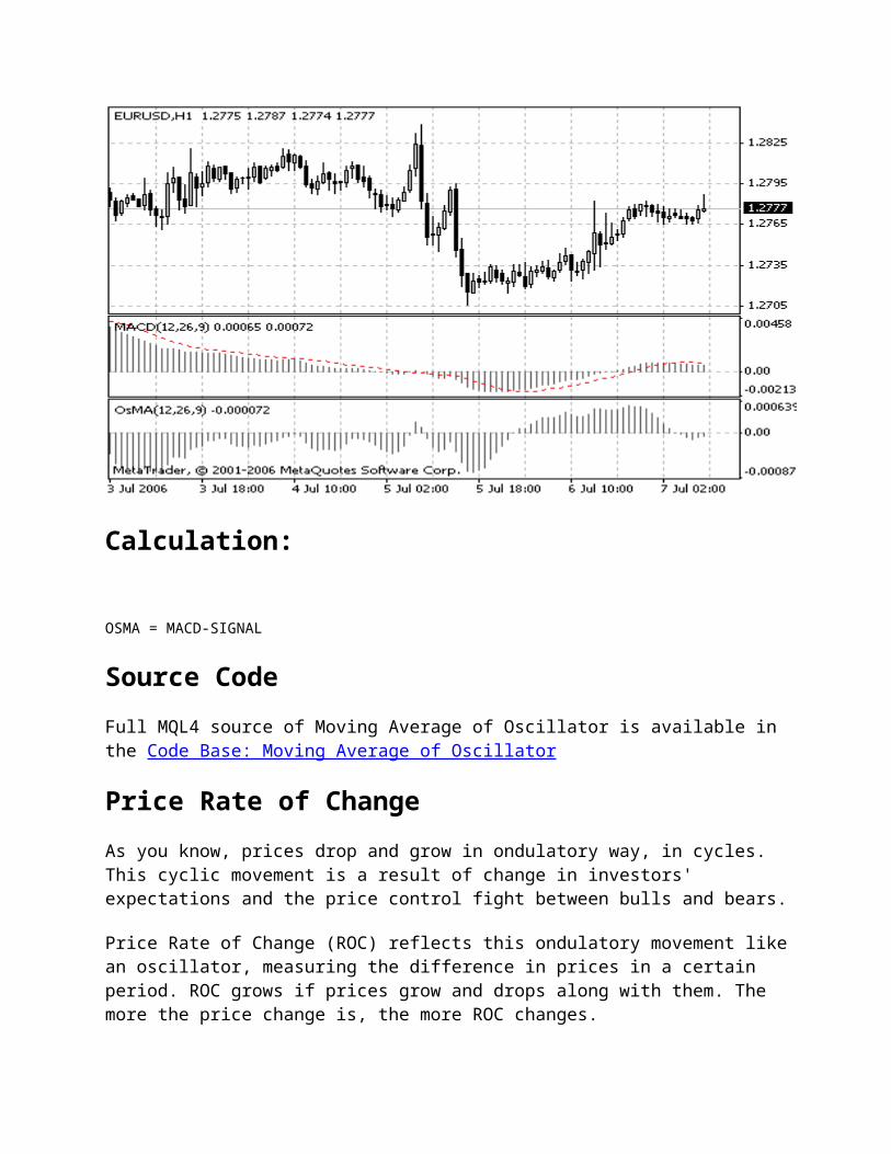
Source Code
Full MQL4 source of RSI is available in the Code Base: Accumulation Swing Index (ASI)
Bollinger Bands® (BB)
Bollinger Bands Technical Indicator (BB) is similar to Envelopes. The only difference is that the bands of Envelopes are plotted a fixed distance (%) away from the moving average, while the Bollinger Bands are plotted a certain number of standard deviations away from it. Standard deviation is a measure of volatility, therefore Bollinger Bands adjust themselves to the market conditions. When the markets become more volatile, the bands widen and they contract during less volatile periods.
Bollinger Bands are usually plotted on the price chart, but they can be also added to the indicator chart (Custom Indicators). Just like in case of the Envelopes, the interpretation of the Bollinger Bands is based on the fact that the prices tend to remain in between the top and the bottom line of the bands. A distinctive feature of the Bollinger Band indicator is its variable width due to the volatility of prices. In periods of considerable price changes (i.e. of high volatility) the bands widen leaving a lot of room to the prices to move in. During standstill periods, or the periods of low volatility the band contracts keeping the prices within their limits.
The following traits are particular to the Bollinger Band:
1. abrupt changes in prices tend to happen after the band has contracted due to decrease of volatility.
2. if prices break through the upper band, a continuation of the current trend is to be expected.
3. if the pikes and hollows outside the band are followed by pikes and hollows inside the band, a reverse of trend may occur.
4. the price movement that has started from one of the band’s lines usually reaches the opposite one. The last observation is useful for forecasting price guideposts.

Calculation:
Bollinger bands are formed by three lines. The middle line (ML) is a usual Moving Average.
ML = SUM [CLOSE, N]/N
The top line, TL, is the same as the middle line a certain number of standard deviations (D) higher than the ML.
TL = ML + (D*StdDev)
The bottom line (BL) is the middle line shifted down by the same number of standard deviations.
BL = ML — (D*StdDev)
Where:N — is the number of periods used in calculation;SMA — Simple Moving Average;StdDev — means Standard Deviation.
StdDev = SQRT(SUM[(CLOSE — SMA(CLOSE, N))^2, N]/N)

It is recommended to use 20-period Simple Moving Average as the middle line, and plot top and bottom lines two standard deviations away from it. Besides, moving averages of less than 10 periods are of little effect.
Source Code
Full MQL4 source of Bollinger Bands is available in the Code Base: Bollinger Bands
Commodity Channel Index (CCI)
Commodity Channel Index Technical Indicator (CCI) measures the deviation of the commodity price from its average statistical price. High values of the index point out that the price is unusually high being compared with the average one, and low values show that the price is too low. In spite of its name, the Commodity Channel Index can be applied for any financial instrument, and not only for the wares.
There are two basic techniques of using Commodity Channel Index:
1. Finding the divergencesThe divergence appears when the price reaches a new maximum, and Commodity Channel Index can not grow above the previous maximums. This classical divergence is normally followed by the price correction.
2. As an indicator of overbuying/overselling Commodity Channel Index usually varies in the range of ±100. Values above +100 inform about overbuying state (and about a probability of correcting decay), and the values below 100 inform about the overselling state (and about a probability of correcting increase).

Calculation:
1. To find a Typical Price. You need to add the HIGH, the LOW, and the CLOSE prices of each bar and then divide the result by 3.
TP = (HIGH + LOW +CLOSE)/3
2. To calculate the n-period Simple Moving Average of typical prices.
SMA(TP, N) = SUM[TP, N]/N
3. To subtract the received SMA(TP, N) from Typical Prices.
D = TP — SMA(TP, N)
4. To calculate the n-period Simple Moving Average of absolute D values.
SMA(D, N) = SUM[D, N]/N

5. To multiply the received SMA(D, N) by 0,015.
M = SMA(D, N) * 0,015
6. To divide M by D
CCI = M/D
Where:SMA — Simple Moving Average;N — number of periods, used for calculation.
Source Code
Full MQL4 source of CCI is available in the Code Base: Commodity Channel Index
Mass Index
The mass index serves for finding turns in trends. It is based on changes between maximum and minimum prices. If the amplitude gets wider, the mass index grows; if it gets narrower, the index gets smaller. The mass index was created by Donald Dorcy.
According to D.Dorcy, the most important mass index signal is a special model formed by the indicator. It is called "reversal bulge". It is formed when a 25-period mass index first rises above 27 and then falls below 26,5. In this case a turn of prices can take place, independently of the general trend (the prices may move up or down or fluctuate within a trade corridor).
To find out which signal — for purchase or for sale — the reverse bulge gives, people often use 9-period exponential moving average of prices. When a reverse bulge appears, you should buy if the moving average falls (in hope of a turn) and sell if it grows.

Calculation:
MI = SUM (EMA (HIGH - LOW, 9) / EMA (EMA (HIGH - LOW, 9), 9), N)
Where:SUM — means a sum;HIGH — the maximum price of the current bar;LOW — the minimum price of the current bar;EMA — the exponential moving average;N — the period of the indicator (the number of values added).
Source Code
Full MQL4 source of Mass Index is available in the Code Base: Mass Index.
Moving Average Technical Indicator
The Moving Average Technical Indicator shows the mean instrument price value for a certain period of time. When one calculates the moving average, one averages out the instrument price for this time period. As the price changes, its moving average either increases, or decreases.
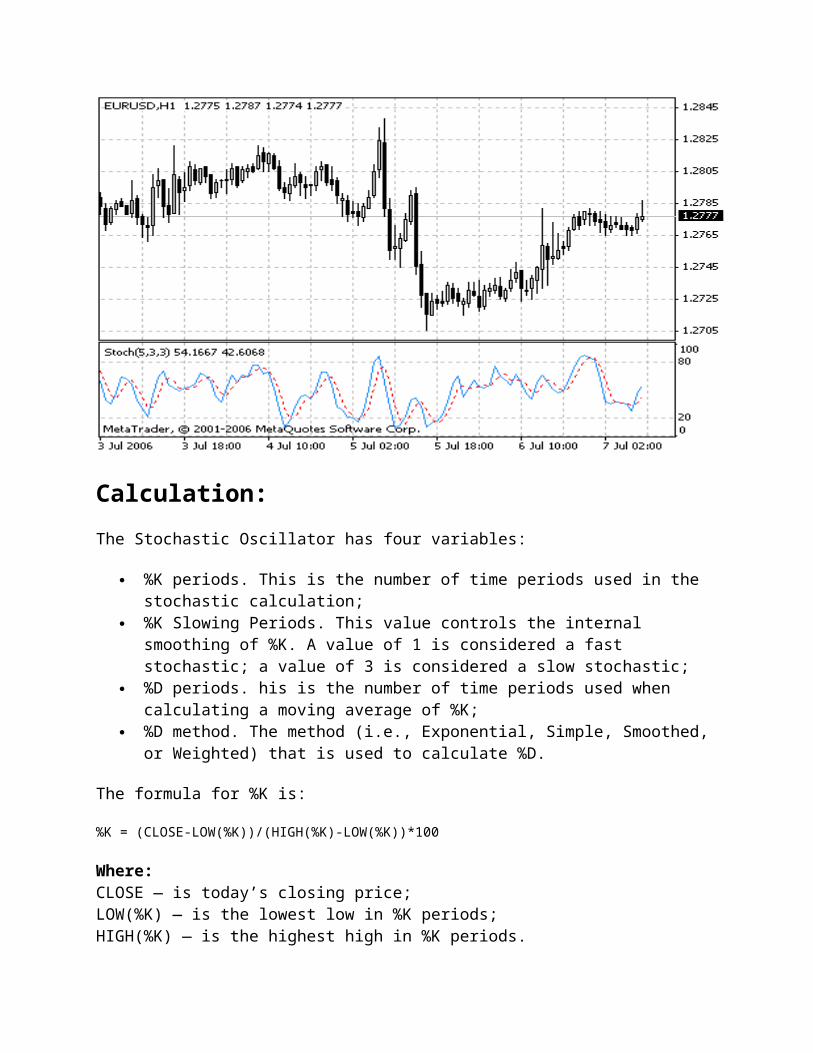
There are four different types of moving averages: Simple (also referred to as Arithmetic), Exponential, Smoothed and Linear Weighted. Moving averages may be calculated for any sequential data set, including opening and closing prices, highest and lowest prices, trading volume or any other indicators. It is often the case when double moving averages are used.
The only thing where moving averages of different types diverge considerably from each other, is when weight coefficients, which are assigned to the latest data, are different. In case we are talking of simple moving average, all prices of the time period in question, are equal in value. Exponential and Linear Weighted Moving Averages attach more value to the latest prices.
The most common way to interpreting the price moving average is to compare its dynamics to the price action. When the instrument price rises above its moving average, a buy signal appears, if the price falls below its moving average, what we have is a sell signal.
This trading system, which is based on the moving average, is not designed to provide entrance into the market right in its lowest point, and its exit right on the peak. It allows to act according to the following trend: to buy soon after the prices reach the bottom, and to sell soon after the prices have reached their peak.
Moving averages may also be applied to indicators. That is where the interpretation of indicator moving averages is similar to the interpretation of price moving averages: if the indicator rises above its moving average, that means that the ascending indicator movement is likely to continue: if the indicator falls below its moving average, this means that it is likely to continue going downward.
Here are the types of moving averages on the chart:
Simple Moving Average (SMA) Exponential Moving Average (EMA) Smoothed Moving Average (SMMA) Linear Weighted Moving Average (LWMA)

Calculation:
Simple Moving Average (SMA)
Simple, in other words, arithmetical moving average is calculated by summing up the prices of instrument closure over a certain number of single periods (for instance, 12 hours). This value is then divided by the number of such periods.
SMA = SUM(CLOSE, N)/N
Where:N — is the number of calculation periods.
Exponential Moving Average (EMA)
Exponentially smoothed moving average is calculated by adding the moving average of a certain share of the current closing price to the previous value. With exponentially smoothed moving averages, the latest prices are of more value. P-percent exponential moving average will look like:

EMA = (CLOSE(i)*P)+(EMA(i-1)*(1-P))
Where: CLOSE(i) — the price of the current period closure;EMA(i-1) — Exponentially Moving Average of the previous period closure;P — the percentage of using the price value.
Smoothed Moving Average (SMMA)
The first value of this smoothed moving average is calculated as the simple moving average (SMA):
SUM1 = SUM(CLOSE, N)
SMMA1 = SUM1/N
The second and succeeding moving averages are calculated according to this formula:
PREVSUM = SMMA(i-1) *N
SMMA(i) = (PREVSUM-SMMA(i-1)+CLOSE(i))/N
Where: SUM1 — is the total sum of closing prices for N periods;PREVSUM — is the smoothed sum of the previous bar;SMMA1 — is the smoothed moving average of the first bar;SMMA(i) — is the smoothed moving average of the current bar (except for the first one);CLOSE(i) — is the current closing price;N — is the smoothing period.
Linear Weighted Moving Average (LWMA)
In the case of weighted moving average, the latest data is of more value than more early data. Weighted moving average is calculated by multiplying each one of the closing prices within the considered series, by a certain weight coefficient.
LWMA = SUM(Close(i)*i, N)/SUM(i, N)

Where: SUM(i, N) — is the total sum of weight coefficients.
Source Code
Full MQL4 source of Moving Averages is available in the Code Base: Moving Averages
Pivot Points Support and Resistance Lines (PP)
Pivot Points Support and Resistance Lines, PP indicate the average price and potential lines of support and resistance in a certain time space. We get current values of the indicator from data received at the previous period.
Very often PP is based on day, week and month periods. The plot period must differ from the indicator period by one time at least. Otherwise, if they coincide, the indicator line will look like a dot and will carry no information. For example, if a PP indicator is laid on a day plot, then by each trade day bar you will see dots instead of lines. And if the indicator period is less than the plot period, you will not see the values at all.
When you analyze the market situation, it is recommended to use several PP indicators based on week, month and year periods. If two or more levels coincide, they intensity each other. Before taking a long or a short position, you should wait until the price crosses all coinciding levels. Before this, you should not open any positions.
Support and resistance levels, received with the help of the indicator, allow predicting possible levels of Stop Loss and Take Profit with high precision.
The following rules are also just:
If the PP is next to the opening price of the currant bar, the probability of getting profit is higher;
On a growing market, when a price drops below the central axis, you should not open a short position immediately as a side trend as possible. Most probably, the price will re-test the level. If the market will not be able to overcome, the turning point, we may speak about a market turn. This thesis is right for the "bear" trend.
To hold long-term trade, you must know the location of week, month and year timeframe central axis. It is obvious that if the price is lower than those turn lines, we may speak about a strong
descending trend. On the other hand, if the price is higher than the week, month and year central axes, it is a glaring example of a bullish trend.

Calculation:
PP = (HIGH + LOW + CLOSE) / 3
R1 = 2 * PP - LOW
R2 = PP + HIGH - LOW
R3 = 2 * PP + HIGH - 2 * LOW
S1 = 2 * PP - HIGH
S2 = PP + LOW - HIGH
S3 = 2 * PP + LOW - 2 * HIGH

Where:PP — the central axis (any price can perform as it);R1, R2, R3 — the 1st, 2nd and 3rd levels of resistance;S1, S2, S3 — the 1st, 2nd and 3rd levels of support;HIGH — the max price in the previous period of the indicator;LOW — the min price in the previous period of indicator;CLOSE — the closing price in the previous period of indicator.
Source Code
Full MQL4 source of RSI is available in the Code Base: Pivot Points Support and Resistance Lines (PP)
Parabolic SAR (Stop & Revers)
Parabolic SAR Technical Indicator was developed for analyzing the trending markets. The indicator is constructed on the price chart. This indicator is similar to the Moving Average Technical Indicator with the only difference that Parabolic SAR moves with higher acceleration and may change its position in terms of the price. The indicator is below the prices on the bull market (Up Trend), when it’s bearish (Down Trend), it is above the prices.
If the price crosses Parabolic SAR lines, the indicator turns, and its further values are situated on the other side of the price. When such an indicator turn does take place, the maximum or the minimum price for the previous period would serve as the starting point. When the indicator makes a turn, it gives a signal of the trend end (correction stage or flat), or of its turn.
The Parabolic SAR is an outstanding indicator for providing exit points. Long positions should be closed when the price sinks below the SAR line, short positions should be closed when the price rises above the SAR line. It is often the case that the indicator serves as a trailing stop line.
If the long position is open (i.e., the price is above the SAR line), the Parabolic SAR line will go up, regardless of what direction the prices take. The length of the SAR line movement depends on the scale of the price movement.

Calculation:
SAR(i) = SAR(i-1)+ACCELERATION*(EPRICE(i-1)-SAR(i-1))
Where:SAR(i-1) — is the value of the indicator on the previous bar;ACCELERATION — is the acceleration factor;EPRICE(i-1) — is the highest (lowest) price for the previous period (EPRICE=HIGH for long positions and EPRICE=LOW for short positions).
The indicator value increases if the price of the current bar is higher than previous bullish and vice versa. The acceleration factor (ACCELERATION) will double at the same time, which would cause Parabolic SAR and the price to come together. In other words, the faster the price grows or sinks, the faster the indicator approaches the price.
Source Code
Full MQL4 source of Parabolic SAR is available in the Code Base: Parabolic SAR

Standard Deviation (StdDev)
Technical indicator named Standard Deviation (StdDev) measures the market volatility. This indicator charactrizes the scale of price changes relating to the Moving Average. Thus, if the indicator value is large, the market is volatile and the bars prices are rather dispersed relating to the moving average. If the indicator value is not large, it means that the market volatility is low and the bars prices are rather close to the moving average.
Normally, this indicator is used as a constituent of other indicators. Thus, when Bollinger Bands is calculated, the value of the symbol standard deviation is added to its Moving Average.
The market behavior represents the interchange of high trading activity and languid market. So, the indicator can be interpreted easily:
if its value is too low, i.e., the market is absolutely inactive, it makes sense to expect a spike soon;
otherwise, if it is extremely high, it most probably means that activity will decline soon.
Calculation:
StdDev (i) = SQRT (AMOUNT (j = i - N, i) / N)

AMOUNT (j = i - N, i) = SUM ((ApPRICE (j) - MA (ApPRICE (i), N, i)) ^ 2)
Where: StdDev (i) — Standard Deviation of the current bar;SQRT — square root;AMOUNT(j = i - N, i) — sum of squares from j = i - N to i;N — smoothing period;ApPRICE (j) — the applied price of the j-th bar;MA (ApPRICE (i), N, i) — any moving average of the current bar for N periods;ApPRICE (i) — the applied price of the current bar.
Source Code
Full MQL4 source of Standard Deviation is available in the Code Base: Standard Deviation
ZigZag
The Zigzag indicator is a series of trend lines connecting significant peaks and foundations at the price plot. Minimum price change parameter determines the percentage for the price to move in order to form a new "Zig" or "Zag" line. This indicator eliminates those changes on the plot we analyze that are less than the given v alue. Therefore, the Zigzag reflects significant changes only.
In most cases, we use Zigzag to facilitate the perception of plots as it shows only the most important changes and turns. You can also reveal Elliot Waves and various figures on the plot with its aid.

It is important to understand that the last section of the indicator may vary depending on the changes of data you analyze. This is one of those indicators, where a change of securities price can provoke a change of the previous value. This ability to correct its values by the following price changes makes Zigzag a perfect tool for analyzing price changes that have already happened. Therefore, you should not try to create a trade system basing on the Zigzag. It is more suitable for analyzing historical data than for making prognoses.
Source Code
Full MQL4 source of ZigZag is available in the Code Base: ZigZag
Williams' Accumulation/Distribution (Williams'A/D)
Williams' AD is the accumulated sum of positive "accumulational" and negative "distributional" price movements. For example, if the current closing price is higher than the previous one, W/AD increases by the difference between the current closing price and the true minimum. If the current closing price is lower than the previous one, W/AD decreases by the difference between the current closing price and the true maximum.
The term "accumulation" denotes a market controlled by purchasers and the term "distribution" means that sellers control the market.

Divergences between the indicator and the price are a signals. Like most indicators, W/AD leads the tool price. In other words, when a divergence appears, the price changes its direction according to the indicator.
If the price reaches a new maximum, but the accumulation/distribution indicator cannot reach a new maximum, it means that the security is distributing itself. It is a signal for sell.
If the price reaches a new minimum, but the accumulation/distribution indicator cannot reach a new minimum, it means that the security is accumulating. It is a signal for buy.
Calculation:
To calculate the accumulation/distribution indicator, first you have to find a "True Range High" (TRH) and "True Range Low" (TRL):
TRH (i) = MAX (HIGH (i) || CLOSE (i - 1))
TRL (i) = MIN (LOW (i) || CLOSE (i - 1))
Then you must find the current value of accumulation/distribution (CurA/D) by comparing today and yesterday's closing prices.
If the current closing price is higher than the previous one, then:

CurА/D = CLOSE (i) - ТRL (i)
If the current closing price is lower than the previous one, then:
CurА/D = CLOSE (i) - ТRH (i)
If current and previous closing prices coincide then:
CurА/D = 0
Williams' accumulation/distribution indicator is a growing sum of these values for each day:
WА/D (i) = CurА/D + WА/D (i - 1)
Where:TRH (i) — the True Range High;TRL (i) — the True Range Low;MIN — the minimum value;MAX — the maximum value;|| — the logical OR;LOW (i) — the minimum price of the current bar;HIGH (i) — the maximum price of the current bar;CLOSE (i) — the closing price of the current bar;CLOSE (i - 1) — the closing price of the previous bar;CurА/D — means current value of accumulation/distribution;WА/D (i) — the current value of William's Accumulation/Distribution indicator;WА/D (i - 1) — the value of William's Accumulation/Distribution indicator on the previous bar.
Source Code
Full MQL4 source of ZigZag is available in the Code Base: Williams' Accumulation/Distribution (Williams'A/D)
Acceleration/Deceleration Technical Indicator (AC)
Acceleration/Deceleration Technical Indicator (AC) measures acceleration and deceleration of the current driving force. This indicator will change direction before any changes in the driving force, which, it its turn, will change its direction before the price. If you realize that Acceleration/Deceleration is a signal of an earlier warning, it gives you evident advantages.

The nought line is basically the spot where the driving force is at balance with the acceleration. If Acceleration/Deceleration is higher than nought, then it is usually easier for the acceleration to continue the upward movement (and vice versa in cases when it is below nought). Unlike in case with Awesome Oscillator, it is not regarded as a signal when the nought line is crossed. The only thing that needs to be done to control the market and make decisions is to watch for changes in color. To save yourself serious reflections, you must remember: you can not buy with the help of Acceleration/Deceleration, when the current column is colored red, and you can not sell, when the current column is colored green.
If you enter the market in the direction of the driving force (the indicator is higher than nought, when buying, or it is lower than nought, when selling), then you need only two green columns to buy (two red columns to sell). If the driving force is directed against the position to be opened (indicator below nought for buying, or higher than nought for selling), a confirmation is needed, hence, an additional column is required. In this case the indicator is to show three red columns over the nought line for a short position and three green columns below the nought line for a long position.
Calculation:
AC bar chart is the difference between the value of 5/34 of the driving force bar chart and 5-period simple moving average, taken from that bar chart.
AO = SMA(median price, 5)-SMA(median price, 34)
AC = AO-SMA(AO, 5)
Where:SMA — Simple Moving Average;AO — Awesome Oscillator.
Source Code
Full MQL4 source of Accelerator/Decelerator Oscillator is available in the Code Base: Accelerator/Decelerator Oscillator
Alligator
"Most of the time the market remains stationary. Only for some 15–30% of time the market generates trends, and traders who are not located in the exchange itself derive most of their profits from the trends. My Grandfather used to repeat: "Even a blind chicken will find its corns, if it is always fed at the same time". We call the trade on the trend "a blind chicken market". It took us years, but we have produced an indicator, that lets us always keep our powder dry until we reach the blind chicken market"
Bill Williams
In principle, Alligator Technical Indicator is a combination of Balance Lines (Moving Averages) that use fractal geometry and nonlinear dynamics.
The blue line (Alligator’s Jaw) is the Balance Line for the timeframe that was used to build the chart (13-period Smoothed Moving Average, moved into the future by 8 bars);
The red line (Alligator’s Teeth) is the Balance Line for the value timeframe of one level lower (8-period Smoothed Moving Average, moved by 5 bars into the future);
The green line (Alligator’s Lips) is the Balance Line for the value timeframe, one more level lower (5-period Smoothed Moving Average, moved by 3 bars into the future).
Lips, Teeth and Jaw of the Alligator show the interaction of different time periods. As clear trends can be seen only 15 to 30 per cent of the time, it is essential to follow them and refrain from working on markets that fluctuate only within certain price periods.
When the Jaw, the Teeth and the Lips are closed or intertwined, it means the Alligator is going to sleep or is asleep already. As it sleeps, it gets hungrier and hungrier — the longer it will sleep, the hungrier it will wake up. The first thing it does after it wakes up is to open its mouth and yawn. Then the smell of food comes to its nostrils: flesh of a bull or flesh of a bear, and the Alligator starts to hunt it. Having eaten enough to feel quite full, the Alligator starts to lose the interest to the food/price (Balance Lines join together) — this is the time to fix the profit.

Source Code
Full MQL4 source of Alligator is available in the Code Base: Alligator
Awesome Oscillator (AO)
Signals to buy
Saucer
This is the only signal to buy that comes when the bar chart is higher than the nought line. One must bear in mind:
the saucer signal is generated when the bar chart reversed its direction from the downward to upward. The second column is lower than the first one and is colored red. The third column is higher than the second and is colored green.
for the saucer signal to be generated the bar chart should have at least three columns.
Keep in mind, that all Awesome Oscillator columns should be over the nought line for the saucer signal to be used.
Nought line crossing
The signal to buy is generated when the bar chart passes from the area of negative values to that of positive. It comes when the bar chart crosses the nought line. As regards this signal:
for this signal to be generated, only two columns are necessary; the first column is to be below the nought line, the second one is to cross it (transition
from a negative value to a positive one);
simultaneous generation of signals to buy and to sell is impossible.
Two pikes
This is the only signal to buy that can be generated when the bar chart values are below the nought line. As regards this signal, please, bear in mind:
another by followed is and line nought the below which minimum lowest (the down pointing pike a have you when generated signal the down-pointing) pike which is somewhat higher (a negative figure with a lesser absolute value, which is therefore closer to the nought line), than the previous down-looking pike.
the bar chart is to be below the nought line between the two pikes. If the bar chart crosses the nought line in the section between the pikes, the signal to buy doesn’t function. However, a different signal to buy will be generated — nought line crossing.
each new pike of the bar chart is to be higher (a negative number of a lesser absolute value that is closer to the nought line) than the previous pike.
if an additional higher pike is formed (that is closer to the nought line) and the bar chart has not crossed the nought line, an additional signal to buy will be generated.
Signals to sell
Awesome Oscillator signals to sell are identical to the signals to buy. The saucer signal is reversed and is below zero. Nought line crossing is on the decrease — the first column of it is over the nought, the second one is under it. The two pikes signal is higher than the nought line and is reversed too.
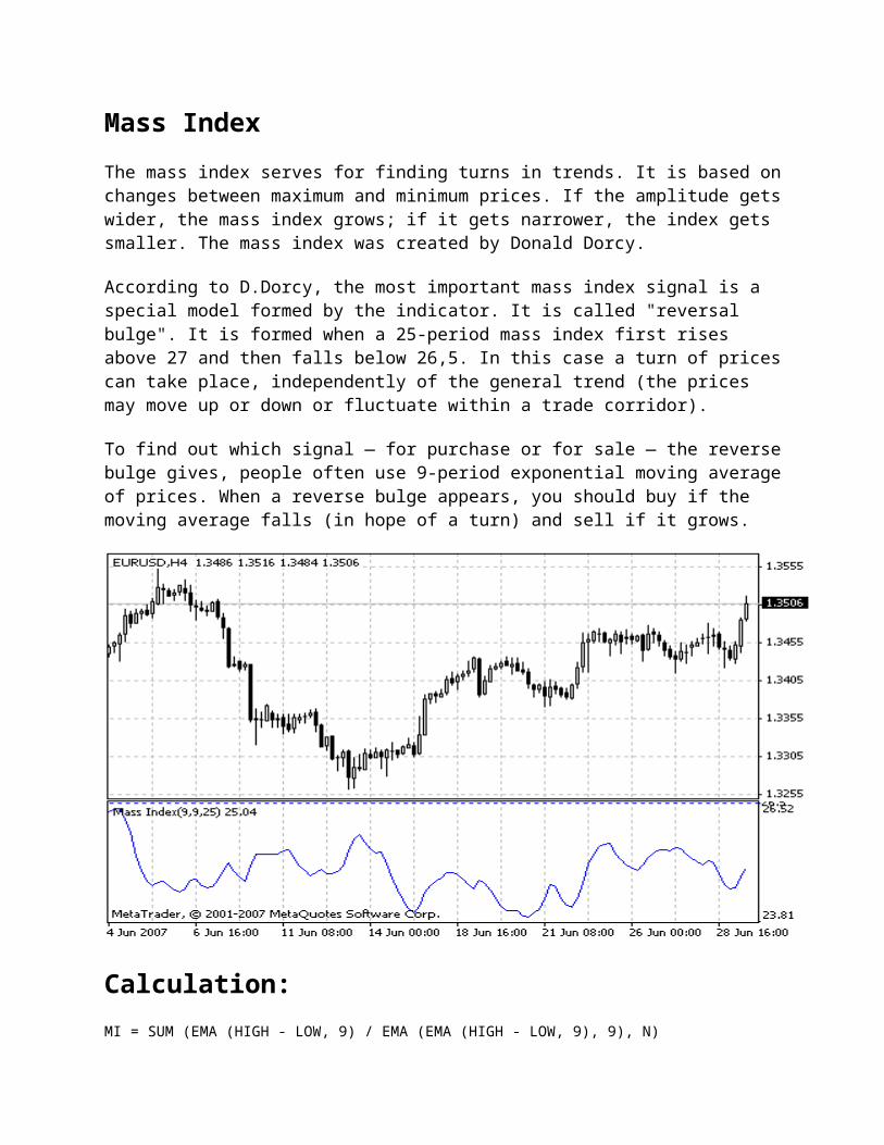
Calculation:
AO is a 34-period simple moving average, plotted through the central points of the bars (H+L)/2, and subtracted from the 5-period simple moving average, graphed across the central points of the bars (H+L)/2.
MEDIAN PRICE = (HIGH+LOW)/2
AO = SMA(MEDIAN PRICE, 5)-SMA(MEDIAN PRICE, 34)
Where:SMA — Simple Moving Average.
Source Code
Full MQL4 source of Awesome Oscillator is available in the Code Base: Awesome Oscillator
Fractals

All markets are characterized by the fact that on the most part the prices do not change too much, and only short periods of time (15–30 percent) account for trend changes. Most lucrative periods are usually the case when market prices change according to a certain trend.
A Fractal is one of five indicators of Bill Williams’ trading system, which allows to detect the bottom or the top.
Fractal Technical Indicator it is a series of at least five successive bars, with the highest HIGH in the middle, and two lower HIGHs on both sides. The reversing set is a series of at least five successive bars, with the lowest LOW in the middle, and two higher LOWs on both sides, which correlates to the sell fractal. The fractals are have High and Low values and are indicated with the up and down arrows.
The fractal needs to be filtrated with the use of Alligator. In other words, you should not close a buy transaction, if the fractal is lower than the Alligator’s Teeth, and you should not close a sell transaction, if the fractal is higher than the Alligator’s Teeth. After the fractal signal has been created and is in force, which is determined by its position beyond the Alligator’s Mouth, it remains a signal until it gets attacked, or until a more recent fractal signal emerges.
Source Code
Full MQL4 source of Fractals is available in the Code Base: Fractals

Gator Oscillator — Gator
Gator Oscillator is based on the Alligator and shows the degree of convergence/divergence of the Balance Lines (Smoothed Moving Averages). The top bar chart is the absolute difference between the values of the blue and the red lines. The bottom bar chart is the absolute difference between the values of the red line and the green line, but with the minus sign, as the bar chart is drawn top-down.
Calculation:
MEDIAN PRICE = (HIGH + LOW) / 2
ALLIGATORS JAW = SMMA (MEDIAN PRICE, 13, 8)
ALLIGATORS TEETH = SMMA (MEDIAN PRICE, 8, 5)
ALLIGATORS LIPS = SMMA (MEDIAN PRICE, 5, 3)
Where:HIGH — is the maximum price;LOW — is the minimum price;SMMA (A, B, C) — smoothed moving average. Parameter А — smoothed data, В — period of smoothing, С — Shift in the future.

Source Code
Full MQL4 source of Gator Oscillator is available in Code Base: Gator Oscillator
Market Facilitation Index (BW MFI)
Market Facilitation Index Technical Indicator (BW MFI) is the indicator which shows the change of price for one tick. Absolute values of the indicator do not mean anything as they are, only indicator changes have sense. Bill Williams emphasizes the interchanging of MFI and volume:
Market Facilitation Index increases and volume increases — this points out that: a) the number of players coming into the market increases (volume increases) b) the new coming players open positions in the direction of bar development, i.e., the movement has begun and picks up speed;
Market Facilitation Index falls and volume falls. It means the market participants are not interested anymore;
Market Facilitation Index increases, but the volume falls. It is most likely, that the market is not supported with the volume from clients, and the price is changing due to traders’ (brokers and dealers) "on the floor" speculations;
Market Facilitation Index falls, but the volume increases. There is a battle between bulls and bears, characterized by a large sell and buy volume, but the price is not changing significantly since the forces are equal. One of the contending parties (buyers vs. sellers) will eventually win the battle. Usually, the break of such a bar lets you know if this bar determines the continuation of the trend or annuls the trend. Bill Williams calls such bar "curtsying".
Calculation:

To calculate Market Facilitation Index you need to subtract the lowest bar price from the highest bar price and divide it by the volume.
BW MFI = RANGE*(HIGH-LOW)/VOLUME
Where: RANGE — is the multiplication factor, which brings the difference in points down to whole numbers.
Source Code
Full MQL4 source of Market Facilitation Index is available in the Code Base: Market Facilitation Index
Elliott Wave Theory
The Elliot Wave Theory represents a development of the well-known Dow theory. It applies to any freely traded assets, liabilities, or goods (shares, obligations, oil, gold, etc.). The Wave Theory was proposed by accountant and business expert Ralph Nelson Elliott in his study titled "The Wave Principle" published in 1938.
After he had retired and a serious illness had been discovered in his organism, Elliott started to observe stock markets and their charts in the hope of understanding the market behavior. After he had performed a large work, he concluded that the market, being a product of predominant psychology of the masses, followed some laws.
The Elliott Wave Theory is based on a certain cyclic laws in human behavior psychology. According to Elliott, the market price behavior can be clearly estimated and shown in the chart as waves (wave is here an explicit price move). The Elliott Wave Theory says that the market can be in two large phases: Bull Market and Bear Market.
Elliott proposes, as well, that all price moves on the market are divided into:
five waves in the direction of the main trend (waves 1 to 5 in Fig. 1); three corrective waves (waves A, B, C in Fig. 1).
The waves are divided into:
impulses that create a directed trend (bull or bear) and cause the market to move very actively (waves 1, 3, 5, А, С in Fig. 1);
corrections (rollbacks) that are characterized by moving against the trend (waves 2, 4, В in Fig. 1).

Figure 1. A part of bear trend.

In his Wave Theory, Eliott was based on the waves subdivision principle. This means that every wave is a part of a longer wave and is subdivided into shorter waves itself (Fig. 2). Every wave is subdivided into 3 or 5 waves. This subdivision depends on the direction of the longer wave.
The main principle in the Elliott's theory is that every impulse wave consists of five shorter waves and every corrective wave (against the trend) is composed of three waves, which can be well seen in Fig. 2. For example, Wave 1 in Fig. 2 is composed of 5 shorter waves since it is an impulse wave that creates the trend.
The longest cycle, according to Elliott, is called Grand Supercycle that is compose of 8 Supercycle waves. The latter ones are each composed of 8 Cycles, etc. For example, Fig. 2 shows 3 basic cycles. It can easily be seen that impulse waves and the subsequent corrective waves are proportional. The stronger impulse is, the stronger correction is, and vice versa.
The Elliott Wave Theory is criticized for there is not always a clear definition of when a wave starts or ends. Corrections are especially difficult in this regard.
Elliott Wave Theory and Fibonacci Numbers
Fibonacci Numbers provide the mathematical foundation for the Elliott Wave Theory. Fibonacci numbers play an important role in the construction of the complete market cycle described with the Elliott's waves. Each of the cycles Elliott defined are comprised of a total wave count that falls within the Fibonacci number sequence.
Under closer examination of Fig. 2, one can notice that the complete market cycle is composed of two large waves, eight middle waves, and 34 small waves. Similarly, at a bull market, we can see that a bull Grand Supercycle is composed of one large wave, five middle waves, and 21 small waves. If we continue this subdivision, we will be able to observe the consequent 89 even smaller waves, etc.
Respectively, a bear Grand Supercycle is composed of one large wave, three middle waves, and 13 small waves. At the next sublevel, there are 55 very small waves, etc.

Figure 2
This principle is normally used in the Elliott Wave Theory as follows: movement in a certain direction should continue until it reaches some point in concordance with the summational Fibonacci number sequence.

For example, if the time, during which the trend does not change, exceeds 3 days, this direction should not reverse until the 5th day begins. Similarly, the trend should continue up to 8 days if it has not changed the direction within 5 days. 9-day trend should not be completed until the 13th day begins, etc. This basic pattern of how the trend movements can be calculated equally applies for both hourly, daily, weekly, or monthly data. However, this is just an "ideal model", and nobody can expect that prices' behavior will be so definite and predictable. Elliott noted that deviations could happen both in time and in amplitude and individual waves would hardly develop exactly in these regular forms.
Characteristics of Waves
Calculations within the Elliott Wave Theory resemble a road-map. Every wave has a set of characteristics. These characteristics are based on market behavior of masses.
In the Elliott Wave Theory, a special attention is paid to individual description of each wave. Besides, there are certain laws used for proportional formations of Elliott waves (Fig. 3). These laws enable proper definition of where the wave starts and how long it is. The wave lengths are measured from high to low of the corresponding wave.
Wave Classical Relations between Waves
1 -
2 0.382, 0.5, or 0.618 of Wave 1 length
3 1.618, 0.618, or 2.618 of Wave 1 length
4 0.382 or 0.5 of Wave 1 length
5 0.382, 0.5, or 0,618 of Wave 1 length
A 1, 0.618 or 0.5 of of Wave 5 length
B 0.382 or 0.5 of Wave A length
C 1.618, 0.618, or 0.5 of Wave A length
Figure 3

The above classical relations between waves are confirmed by actual ones with a 10%-error. Such error can be explained through short-term influences of some technical or fundamental factors. In whole, the data are rather relative. Important is that all relations between all waves can take values of 0.382, 0.50, 0.618, 1.618. Using this, we can calculate relations between both wave heights and wave lengths. Let us consider characteristics of each wave:
Wave 1 Happens when the «market psychology» is practically bearish. News are still negative. As a rule, it is very strong if it represents a leap (change from bear trend to the bull trend, penetration into the might resistance level, etc.). In a state of tranquillity, it usually demonstrates insignificant price moves in the background of general wavering.
Wave 2 Happens when the market rapidly rolls back from the recent, hard-won profitable positions. It can roll back to almost 100% of Wave 1, but not below its starting level. It usually makes 60% of Wave 1 and develops in the background of prevailing amount of investors preferring to fix their profits.
Wave 3 Is what the Elliott's followers live for. Rapid increase of investors' optimism is observed. It is the mightest and the longest wave of rise (it can never be the shortest) where prices are accelerated and the volumes are increased. A typical Wave 3 exceeds Wave 1 by, at least, 1.618 times, or even more.
Wave 4 Often difficult to identify. It usually rolls back by no more than 38% of Wave 3. Its depth and length are normally not very significant. Optimistic moods are still prevailing in the market. Wave 4 may not overlap Wave 2 until the five-wave cycle is a part of the end triangle.
Wave 5 Is often identified using momentum divergences. The prices increases at middle-sized trade volumes. The wave is formed in the background of mass agiotage. At the end of the wave, the trade volumes often rise sharply.
Wave A Many traders still consider the rise to make a sharp come-back. But there appear some traders sure of the contrary. Characteristics of this wave are often very much the same as those of Wave 1.
Wave B Often resembles Wave 4 very much and is very difficult to identify. Shows insignificant movements upwards on the rests of optimism.
Wave C A strong decreasing wave in the background of general persuasion that a new, descreasing trend has started. In the meantime, some investors start buying cautiously. This wave is characterized by high momentum (five waves) and lengthiness up to 1.618-fold Wave 3.
Unfortunately, Elliott's waves are well observed in the "old" market, but they are rather dimmed for the future. This is why practical use of the Elliott Wave Theory is often difficult and requires special knowledge.

Tradingsystems (TS)
A trading system (TS) is a set of instructions which advise opening or closing trading positions based on the results of technical analysis. A trading system allows to exclude randomness in the trading process. Strict adherence to the system permits to rule out the emotional factor in the trade. For this reason, one must follow all recommendations of the system strictly even if for all that a potentially profitable position will not be opened.
The first thing you need to do when creating a trading system is to select time periods, or working timeframes, you will work with. A lot of restrictions in this respect come from the starting deposit and principles of capital management. Long-term periods are accompanied by lesser "financial noise" than shorter periods. Technical analysis performed for long term periods is more accurate and provides a lesser number of false incitements. Long-term periods are preferable in terms of successful working, but, however, they require a larger starting deposit. Shorter timeframes are characterized by greater noise, but, hence, the technical analysis is less accurate and gives out more false signals.
In cases of a modest starting deposit, it is not recommended to direct one’s attention in trading to long timeframes, it is better to try medium and short ones first. On longer time periods price fluctuations are not as evident, but, in fact, these fluctuations may be significant enough so as to "eat up" the entire starting deposit. Thus, the first restriction for the trading system is the starting deposit that determines the choice of the working timeframe. Please bear in mind that the settings of analytical instruments for each of the periods are to be selected individually. Besides, if performing analysis for short timeframes, the requirements to the analytical instruments have to be as exacting as possible.
The second task of the trading system is to define the entry point with the help of technical analysis. In any TS, irrespective of analytical instruments, the analysis must be started from a large timeframe and pass gradually to shorter ones. The first thing to be defined is the current market conditions as a whole.
For instance, if our trade is guided by the trend, we first determine the global trend. Even if a signal to buy comes at the time of a downward trend, a position should not be opened in such a trading system.
After that, the market conditions for periods of lesser order are analyzed. Eventually, the working timeframe is analyzed. If there appears a signal confirmed on long timeframes, one can open position immediately. However, to define the optimal entry point one can perform additional analysis on shorter timeframes.
The most important task of TS’s is to determine the exit point. Any system must provide not only the signal to open a position, but estimated levels of profit, as well. Order Take Profit should be placed next to this level. It is also necessary to identify the level of stop loss for the case when the market starts to move in an opposite direction. Place the Stop Loss order at this level. In other words, the TS must define exactly, up till which level the position should be held open in order

to receive maximal profit, and define mechanisms for loss stopping in case of an unfavorable development of the market.
-----------------------------------------------------END-----------------------------------------------