techniques in pastel art - strathmoreartiststudio.com · objective: create simple and soft...
TRANSCRIPT
Week 4: Portrait in Soft Pastels
Objective: Create simple and soft realistic portrait using delicate soft pastel techniques. Gain
understanding of skin, hair, and body tone values.
Supplies:
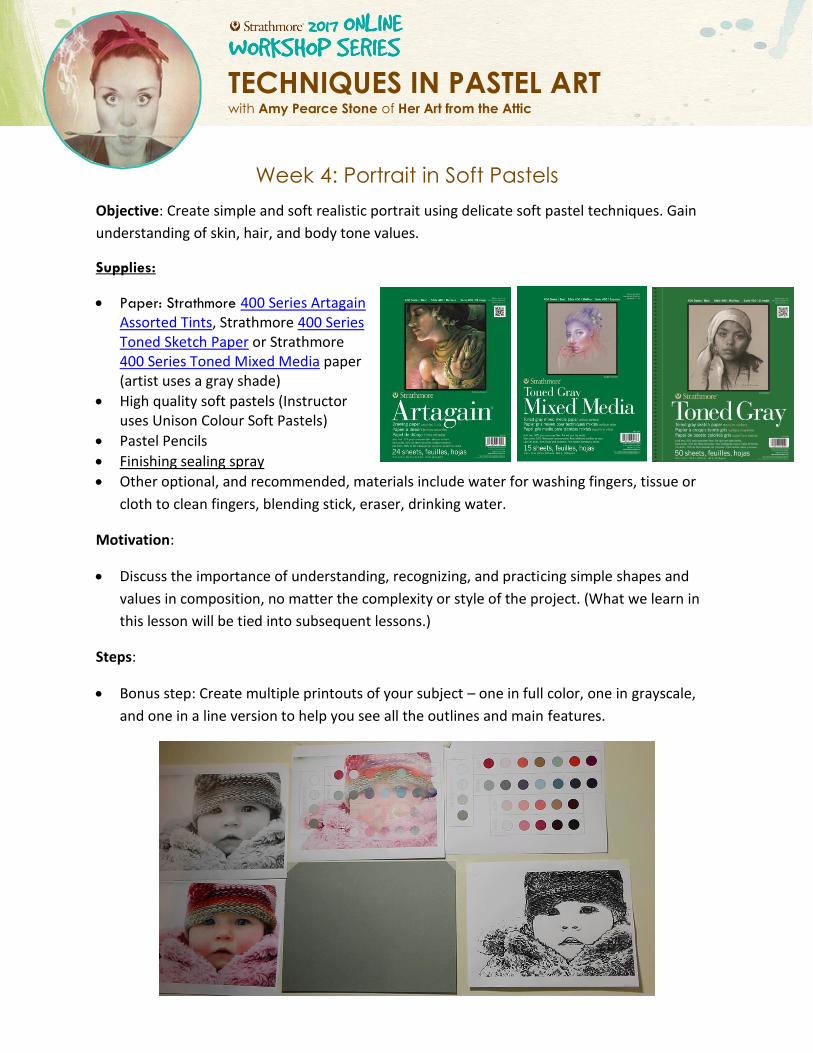
Paper: Strathmore 400 Series Artagain Assorted Tints, Strathmore 400 Series Toned Sketch Paper or Strathmore 400 Series Toned Mixed Media paper (artist uses a gray shade)
High quality soft pastels (Instructor uses Unison Colour Soft Pastels)
Pastel Pencils
Finishing sealing spray
Other optional, and recommended, materials include water for washing fingers, tissue or
cloth to clean fingers, blending stick, eraser, drinking water.
Motivation:
Discuss the importance of understanding, recognizing, and practicing simple shapes and
values in composition, no matter the complexity or style of the project. (What we learn in
this lesson will be tied into subsequent lessons.)
Steps:
Bonus step: Create multiple printouts of your subject – one in full color, one in grayscale,
and one in a line version to help you see all the outlines and main features.
TECHNIQUES IN PASTEL ART with Amy Pearce Stone of Her Art from the Attic
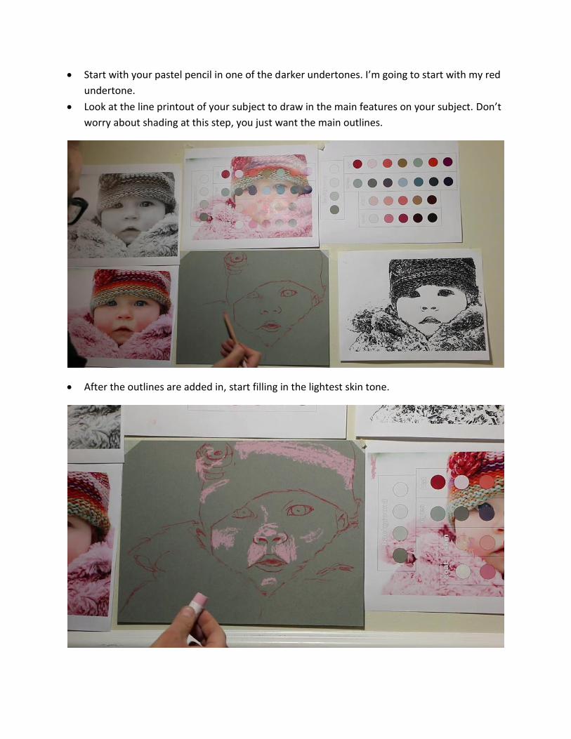
Start with your pastel pencil in one of the darker undertones. I’m going to start with my red
undertone.
Look at the line printout of your subject to draw in the main features on your subject. Don’t
worry about shading at this step, you just want the main outlines.
After the outlines are added in, start filling in the lightest skin tone.
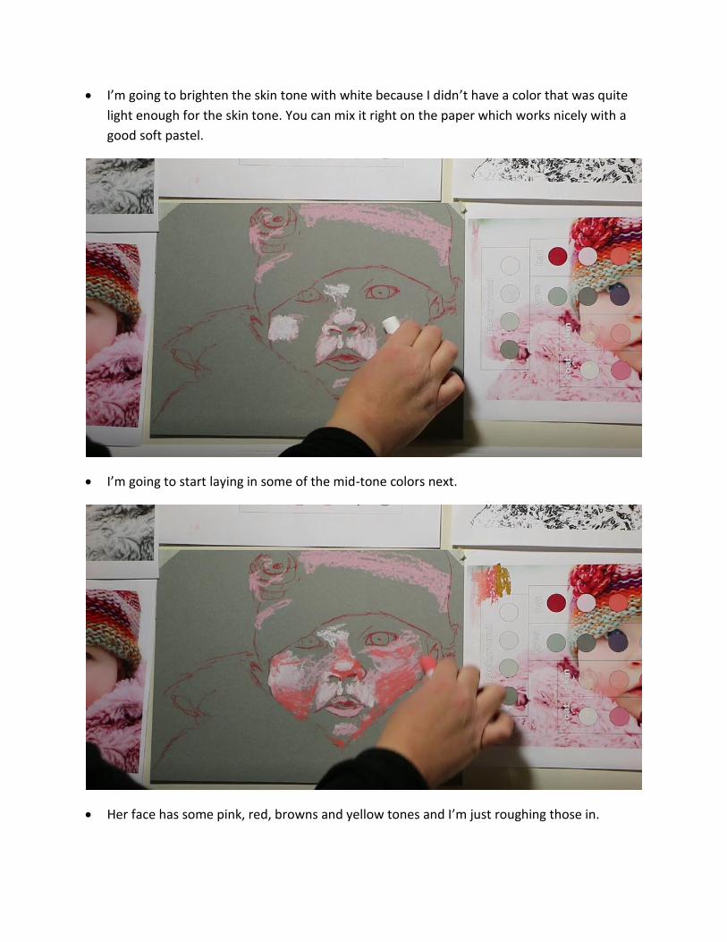
I’m going to brighten the skin tone with white because I didn’t have a color that was quite
light enough for the skin tone. You can mix it right on the paper which works nicely with a
good soft pastel.
I’m going to start laying in some of the mid-tone colors next.
Her face has some pink, red, browns and yellow tones and I’m just roughing those in.
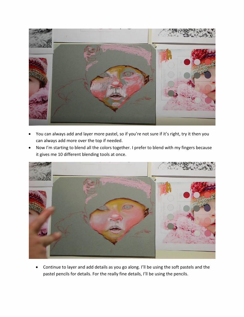
You can always add and layer more pastel, so if you’re not sure if it’s right, try it then you
can always add more over the top if needed.
Now I’m starting to blend all the colors together. I prefer to blend with my fingers because
it gives me 10 different blending tools at once.
Continue to layer and add details as you go along. I’ll be using the soft pastels and the
pastel pencils for details. For the really fine details, I’ll be using the pencils.
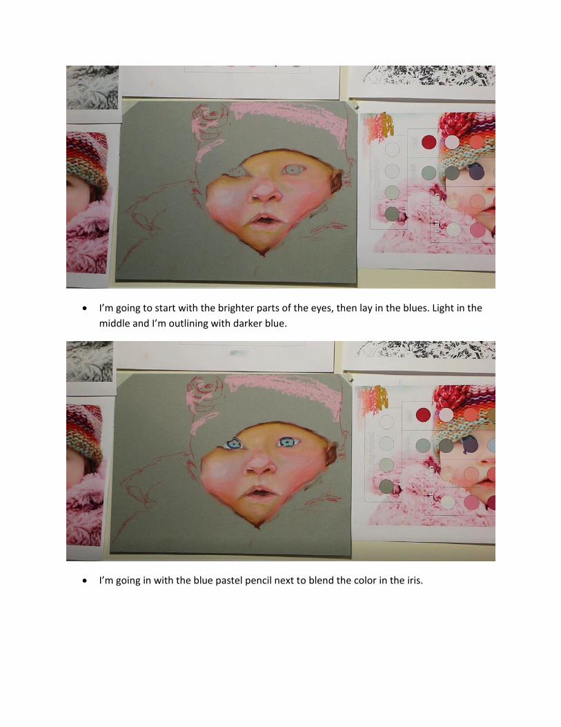
I’m going to start with the brighter parts of the eyes, then lay in the blues. Light in the
middle and I’m outlining with darker blue.
I’m going in with the blue pastel pencil next to blend the color in the iris.
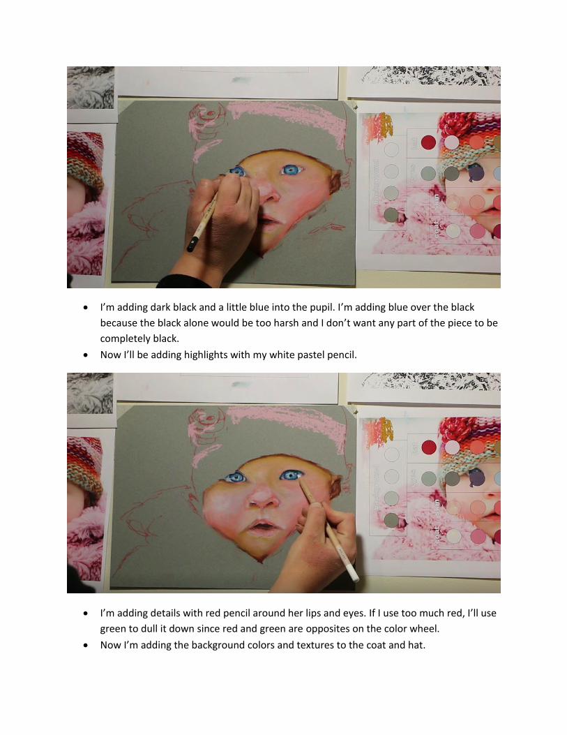
I’m adding dark black and a little blue into the pupil. I’m adding blue over the black
because the black alone would be too harsh and I don’t want any part of the piece to be
completely black.
Now I’ll be adding highlights with my white pastel pencil.
I’m adding details with red pencil around her lips and eyes. If I use too much red, I’ll use
green to dull it down since red and green are opposites on the color wheel.
Now I’m adding the background colors and textures to the coat and hat.
Tips:
Quality matters! All pastels are not created equally. Get yourself a quality set of pastels. You
don’t have to break the bank, but it is worth the investment to spend a few extra bucks on a
nicer set.
Have a color wheel in front of you (you can easily find one on a google image search).
Understanding basic complimentary and opposite colors will help you easily figure out
which colors blend nicely together, and which will muddy together.
It’s okay to trace! Facial and body proportions are extremely particular. When creating a
portrait, it’s totally okay to trace or transfer the image onto your paper, to make sure that
you’ve got it right. A lot of the great ones do it. Tracing safes time and offers precision.
Don’t forget to look at your drawing from a distance, every so often, while you’re creating
it. It’s amazing some of the perspective that you can only gain from standing back and
looking from a different angle.
Don’t draw with your paper horizontal on the table. Have the paper perpendicular to your
face. If you are drawing on a horizontal surface, but your head and eyes are at a vertical
angle, your brain will adjust to the angles so that you can see what you’re drawing, but it’ll
most likely mess with your proportions. This is why sometimes your drawings look great
when you’re sitting there drawing them, but then when you look at them from a different
angle later, they look totally skewed.