telling the story of your process with graphical enhancements of control charts€¦ · ·...
TRANSCRIPT
Paper SAS427-2017
Telling the Story of Your Process with Graphical Enhancementsof Control Charts
Bucky Ransdell, SAS Institute Inc.
ABSTRACT
Have you ever used a control chart to assess the variation in a process? Did you wonder how you could modify the chart to tell a more complete story about the process? This paper explains how you can use the SHEWHART procedure in SAS/QC® software to make the following enhancements: display multiple sets of control limits that visualize the evolution of the process, visualize stratified variation, explore within-subgroup variation with box-and-whisker plots, and add information that improves the interpretability of the chart. The paper begins by reviewing the basics of control charts and then illustrates the enhancements with examples drawn from real-world quality improvement efforts.
INTRODUCTION
Statistical quality improvement is based on three principles:
� All work occurs in a system of interconnected processes.
� Variation is present in all processes.
� Understanding and reducing variation are critical to success.
Statistical process control is a quality improvement method for evaluating and monitoring the variation in a process.Walter Shewhart, the originator of statistical process control, recognized two distinct types of process variation: chancecause (or common cause) variation, which is naturally present in every process; and assignable cause (or specialcause) variation, which is sporadic and occurs for specific, identifiable reasons. Eliminating assignable cause variationresults in a stable, predictable process. However, attempting to eliminate the inherent chance cause variation froma stable process is counterproductive. To solve this dilemma, Shewhart developed the control chart (or Shewhartchart), a graphical and analytical tool that distinguishes between natural process variation and unusual variation dueto assignable causes.
There are many varieties of Shewhart chart, but they fall into two main categories:
� Shewhart charts for variables are used when the quality characteristic of a process is measured on a continuousscale.
� Shewhart charts for attributes are used when the quality characteristic of a process is measured by counting thenumber of nonconformities (defects) in an item or the number of nonconforming (defective) items in a sample.
BASIC CONTROL CHARTS
Figure 1 illustrates the basic features of a Shewhart chart.
1

Figure 1 Basic Features of a Shewhart Chart
All Shewhart charts have the following characteristics:
� Each point represents a summary statistic that is computed from a sample of measurements of a processquality characteristic. For example, the summary statistic might be the average value of a critical dimension offive items selected at random, or it might be the proportion of nonconforming items in a sample of 100 items.
� The samples from which the summary statistics are computed are referred to as rational subgroups or subgroupsamples. The way the data are organized into subgroups is critical to how you interpret a Shewhart chart. Themeasurements within a subgroup should be made under conditions that are as close to identical as possible.The variation within subgroups is used to estimate the process’s common cause variation.
� The central line in a Shewhart chart indicates the average (expected value) of the summary statistic when theprocess is in statistical control.
� The chart’s upper control limit (UCL) and lower control limit (LCL) bound the range of values expected in thesummary statistic when the process is in statistical control. A subgroup statistic that lies outside the controllimits, such as subgroup 6 in Figure 1, indicates unusual variation.
The following statements show the basic PROC SHEWHART syntax:
proc shewhart data=ProcessData;xchart Process * Subgroup;
run;
The input data set ProcessData contains measurements of a process quality characteristic in the variable Process.The subgroup variable Subgroup identifies the subgroup sample to which each measurement belongs. The XCHARTstatement produces a Shewhart chart of the subgroup means, which is called an NX chart. The SHEWHART procedureprovides 13 different chart statements that produce different types of Shewhart charts for variables and for attributes.You must specify both a process variable and a subgroup variable in any PROC SHEWHART chart statement.
2
DISPLAYING STRATIFIED PROCESS DATA
If the data for a Shewhart chart can be classified by factors relevant to the process (such as machines or operators),displaying the classification on the chart can help identify sources of variation that are related to the factors. Kume(1985) refers to this type of classification as “stratification” and describes various ways to create stratified controlcharts.
There are important differences between stratification and subgrouping:
� The data must always be classified into subgroups before a control chart can be produced. Subgrouping affectshow control limits are computed from the data.
� Stratification is optional and involves classification variables other than the subgroup variable. Displayingstratification can influence how the chart is interpreted, but it does not affect the control limits.
This section describes two types of variables that you can specify in PROC SHEWHART to create stratified controlcharts:
� A symbol variable stratifies data into levels of a classification variable.
� Block variables stratify data into blocks of consecutive observations.
Stratification by Levels of a Classification Variable
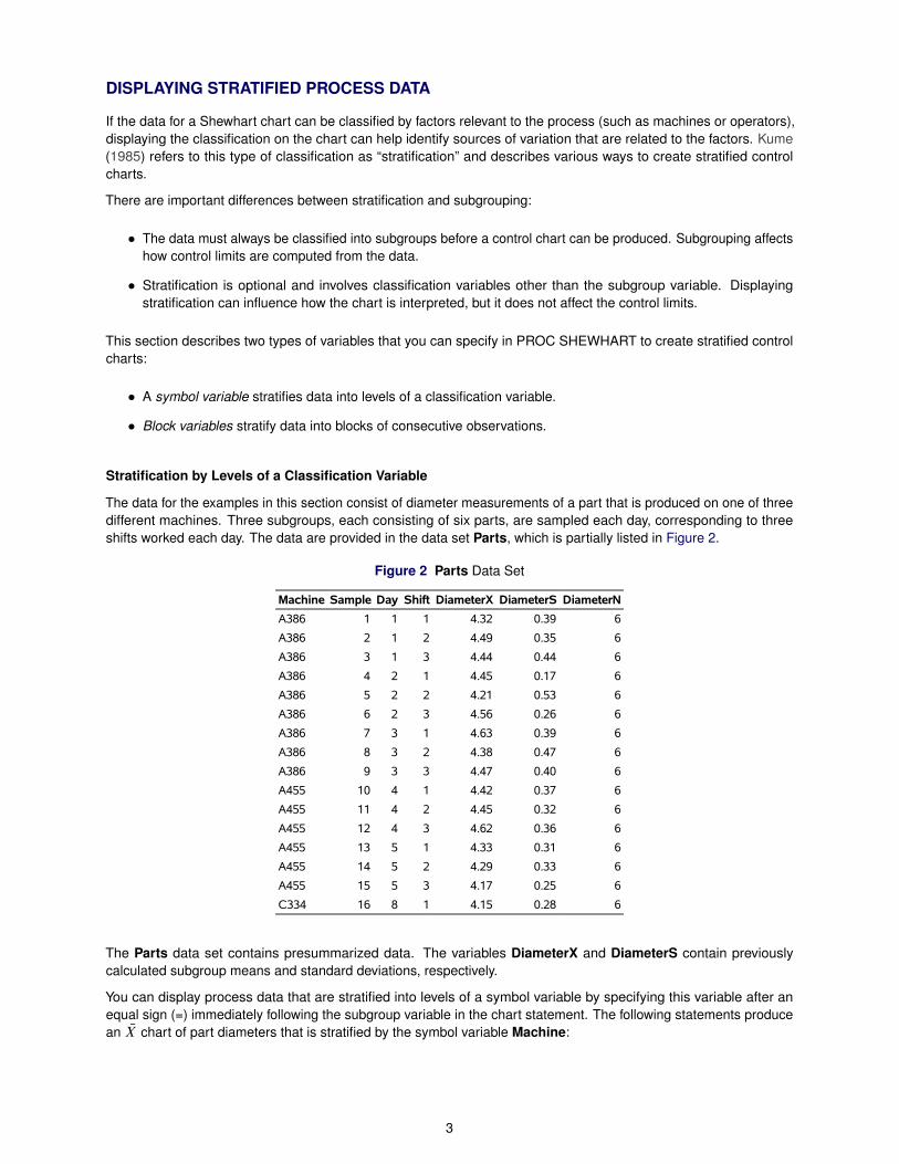
The data for the examples in this section consist of diameter measurements of a part that is produced on one of threedifferent machines. Three subgroups, each consisting of six parts, are sampled each day, corresponding to threeshifts worked each day. The data are provided in the data set Parts, which is partially listed in Figure 2.
Figure 2 Parts Data Set
Machine Sample Day Shift DiameterX DiameterS DiameterN
A386 1 1 1 4.32 0.39 6
A386 2 1 2 4.49 0.35 6
A386 3 1 3 4.44 0.44 6
A386 4 2 1 4.45 0.17 6
A386 5 2 2 4.21 0.53 6
A386 6 2 3 4.56 0.26 6
A386 7 3 1 4.63 0.39 6
A386 8 3 2 4.38 0.47 6
A386 9 3 3 4.47 0.40 6
A455 10 4 1 4.42 0.37 6
A455 11 4 2 4.45 0.32 6
A455 12 4 3 4.62 0.36 6
A455 13 5 1 4.33 0.31 6
A455 14 5 2 4.29 0.33 6
A455 15 5 3 4.17 0.25 6
C334 16 8 1 4.15 0.28 6
The Parts data set contains presummarized data. The variables DiameterX and DiameterS contain previouslycalculated subgroup means and standard deviations, respectively.
You can display process data that are stratified into levels of a symbol variable by specifying this variable after anequal sign (=) immediately following the subgroup variable in the chart statement. The following statements producean NX chart of part diameters that is stratified by the symbol variable Machine:
3
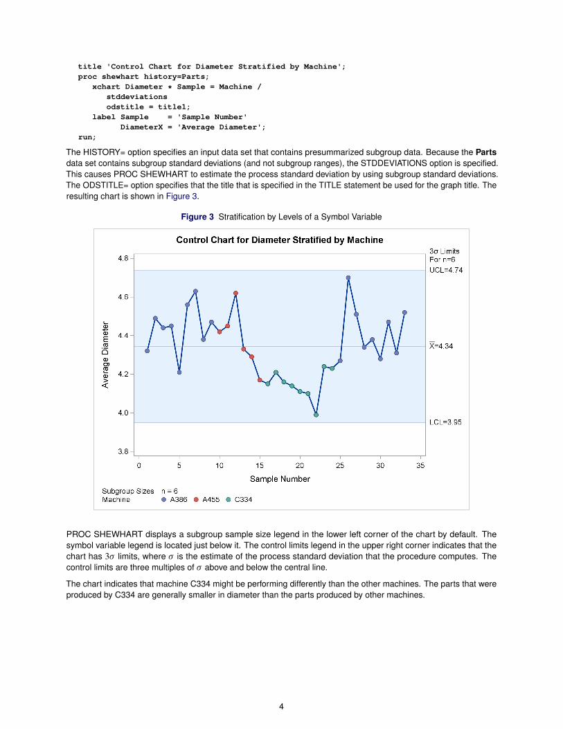
title 'Control Chart for Diameter Stratified by Machine';proc shewhart history=Parts;
xchart Diameter * Sample = Machine /stddeviationsodstitle = title1;
label Sample = 'Sample Number'DiameterX = 'Average Diameter';
run;
The HISTORY= option specifies an input data set that contains presummarized subgroup data. Because the Partsdata set contains subgroup standard deviations (and not subgroup ranges), the STDDEVIATIONS option is specified.This causes PROC SHEWHART to estimate the process standard deviation by using subgroup standard deviations.The ODSTITLE= option specifies that the title that is specified in the TITLE statement be used for the graph title. Theresulting chart is shown in Figure 3.
Figure 3 Stratification by Levels of a Symbol Variable
PROC SHEWHART displays a subgroup sample size legend in the lower left corner of the chart by default. Thesymbol variable legend is located just below it. The control limits legend in the upper right corner indicates that thechart has 3� limits, where � is the estimate of the process standard deviation that the procedure computes. Thecontrol limits are three multiples of � above and below the central line.
The chart indicates that machine C334 might be performing differently than the other machines. The parts that wereproduced by C334 are generally smaller in diameter than the parts produced by other machines.
4
Stratification in Blocks of Observations
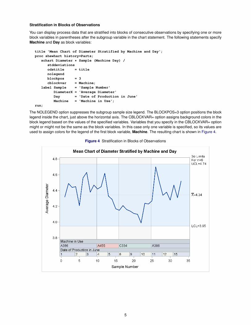
You can display process data that are stratified into blocks of consecutive observations by specifying one or moreblock variables in parentheses after the subgroup variable in the chart statement. The following statements specifyMachine and Day as block variables:
title 'Mean Chart of Diameter Stratified by Machine and Day';proc shewhart history=Parts;
xchart Diameter * Sample (Machine Day) /stddeviationsodstitle = titlenolegendblockpos = 3cblockvar = Machine;
label Sample = 'Sample Number'DiameterX = 'Average Diameter'Day = 'Date of Production in June'Machine = 'Machine in Use';
run;
The NOLEGEND option suppresses the subgroup sample size legend. The BLOCKPOS=3 option positions the blocklegend inside the chart, just above the horizontal axis. The CBLOCKVAR= option assigns background colors in theblock legend based on the values of the specified variables. Variables that you specify in the CBLOCKVAR= optionmight or might not be the same as the block variables. In this case only one variable is specified, so its values areused to assign colors for the legend of the first block variable, Machine. The resulting chart is shown in Figure 4.
Figure 4 Stratification in Blocks of Observations
5
DISPLAYING MULTIPLE SETS OF CONTROL LIMITS
Measurements of a process characteristic can shift over time, as a result of either unknown factors or known orintentional changes in the process. A series of consecutive observations, particularly one that corresponds to a periodbefore or after a change in a process, is called a phase. This example presents a situation in which a process isknown to have shifted. It illustrates how to create a Shewhart chart that displays distinct sets of control limits for thedifferent phases.
A health care provider uses a u chart to report the rate of office visits each month at each of its clinics. The rate iscomputed by dividing the number of visits by patient membership, expressed in units of thousand members per year.The data that are collected for Clinic E are shown in Figure 5.
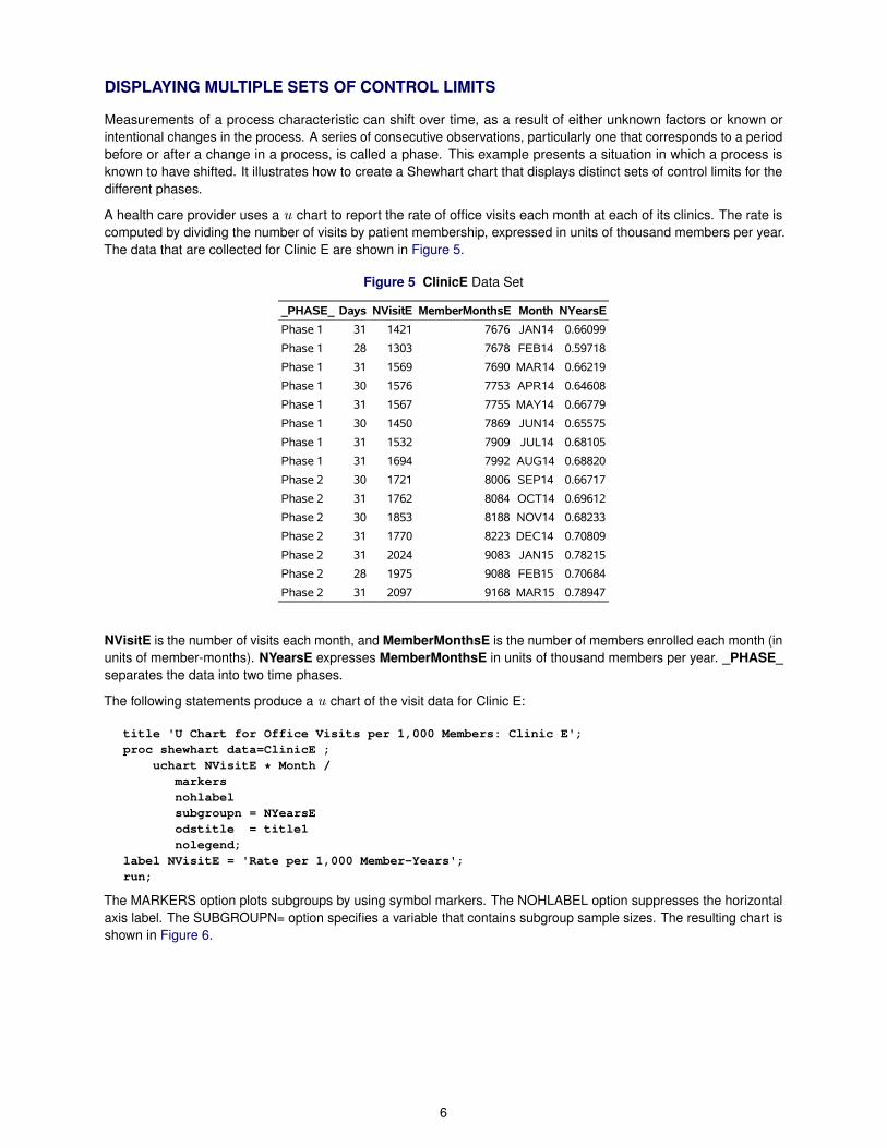
Figure 5 ClinicE Data Set
_PHASE_ Days NVisitE MemberMonthsE Month NYearsE
Phase 1 31 1421 7676 JAN14 0.66099
Phase 1 28 1303 7678 FEB14 0.59718
Phase 1 31 1569 7690 MAR14 0.66219
Phase 1 30 1576 7753 APR14 0.64608
Phase 1 31 1567 7755 MAY14 0.66779
Phase 1 30 1450 7869 JUN14 0.65575
Phase 1 31 1532 7909 JUL14 0.68105
Phase 1 31 1694 7992 AUG14 0.68820
Phase 2 30 1721 8006 SEP14 0.66717
Phase 2 31 1762 8084 OCT14 0.69612
Phase 2 30 1853 8188 NOV14 0.68233
Phase 2 31 1770 8223 DEC14 0.70809
Phase 2 31 2024 9083 JAN15 0.78215
Phase 2 28 1975 9088 FEB15 0.70684
Phase 2 31 2097 9168 MAR15 0.78947
NVisitE is the number of visits each month, and MemberMonthsE is the number of members enrolled each month (inunits of member-months). NYearsE expresses MemberMonthsE in units of thousand members per year. _PHASE_separates the data into two time phases.
The following statements produce a u chart of the visit data for Clinic E:
title 'U Chart for Office Visits per 1,000 Members: Clinic E';proc shewhart data=ClinicE ;
uchart NVisitE * Month /markersnohlabelsubgroupn = NYearsEodstitle = title1nolegend;
label NVisitE = 'Rate per 1,000 Member-Years';run;
The MARKERS option plots subgroups by using symbol markers. The NOHLABEL option suppresses the horizontalaxis label. The SUBGROUPN= option specifies a variable that contains subgroup sample sizes. The resulting chart isshown in Figure 6.
6
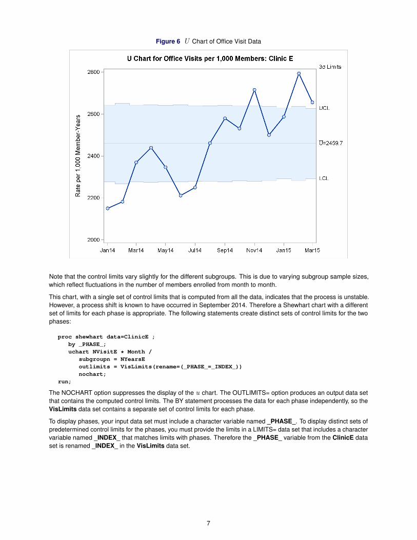
Figure 6 U Chart of Office Visit Data
Note that the control limits vary slightly for the different subgroups. This is due to varying subgroup sample sizes,which reflect fluctuations in the number of members enrolled from month to month.
This chart, with a single set of control limits that is computed from all the data, indicates that the process is unstable.However, a process shift is known to have occurred in September 2014. Therefore a Shewhart chart with a differentset of limits for each phase is appropriate. The following statements create distinct sets of control limits for the twophases:
proc shewhart data=ClinicE ;by _PHASE_;uchart NVisitE * Month /
subgroupn = NYearsEoutlimits = VisLimits(rename=(_PHASE_=_INDEX_))nochart;
run;
The NOCHART option suppresses the display of the u chart. The OUTLIMITS= option produces an output data setthat contains the computed control limits. The BY statement processes the data for each phase independently, so theVisLimits data set contains a separate set of control limits for each phase.
To display phases, your input data set must include a character variable named _PHASE_. To display distinct sets ofpredetermined control limits for the phases, you must provide the limits in a LIMITS= data set that includes a charactervariable named _INDEX_ that matches limits with phases. Therefore the _PHASE_ variable from the ClinicE dataset is renamed _INDEX_ in the VisLimits data set.
7

The following statements combine the data and control limits for both phases in a single u chart, shown in Figure 7:
title 'U Chart for Office Visits per 1,000 Members: Clinic E';proc shewhart data=ClinicE limits=VisLimits;
uchart NVisitE * Month /markerssubgroupn = NYearsEodstitle = title1nohlabelnolegendreadphase = allreadindex = allphaselegendnolimitslegend;
label NVisitE = 'Rate per 1,000 Member-Years';run;
The LIMITS= option specifies an input data set that contains control limits to be used in the control chart. TheREADPHASE=ALL option reads all data for all phases from the DATA= input set. The READINDEX=ALL optionreads all sets of control limits from the LIMITS= data set. The PHASELEGEND option labels the phases. TheNOLIMITSLEGEND suppresses the control limits legend. Figure 7 displays the resulting chart.
Figure 7 Shewhart Chart with Multiple Sets of Control Limits
The new Shewhart chart indicates that the process is stable both before and after the known process shift.
8
EXPLORING VARIATION WITH BOX PLOTS
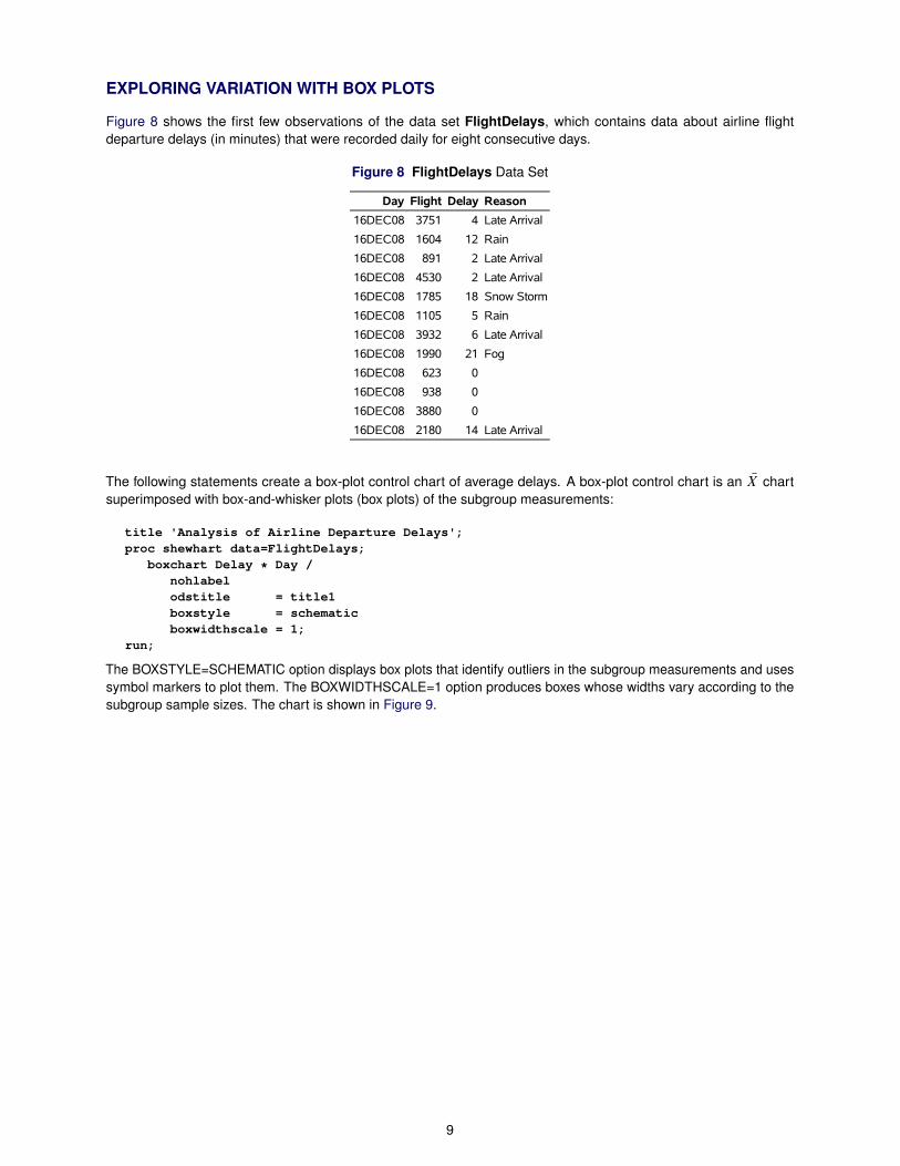
Figure 8 shows the first few observations of the data set FlightDelays, which contains data about airline flightdeparture delays (in minutes) that were recorded daily for eight consecutive days.
Figure 8 FlightDelays Data Set
Day Flight Delay Reason
16DEC08 3751 4 Late Arrival
16DEC08 1604 12 Rain
16DEC08 891 2 Late Arrival
16DEC08 4530 2 Late Arrival
16DEC08 1785 18 Snow Storm
16DEC08 1105 5 Rain
16DEC08 3932 6 Late Arrival
16DEC08 1990 21 Fog
16DEC08 623 0
16DEC08 938 0
16DEC08 3880 0
16DEC08 2180 14 Late Arrival
The following statements create a box-plot control chart of average delays. A box-plot control chart is an NX chartsuperimposed with box-and-whisker plots (box plots) of the subgroup measurements:
title 'Analysis of Airline Departure Delays';proc shewhart data=FlightDelays;
boxchart Delay * Day /nohlabelodstitle = title1boxstyle = schematicboxwidthscale = 1;
run;
The BOXSTYLE=SCHEMATIC option displays box plots that identify outliers in the subgroup measurements and usessymbol markers to plot them. The BOXWIDTHSCALE=1 option produces boxes whose widths vary according to thesubgroup sample sizes. The chart is shown in Figure 9.
9
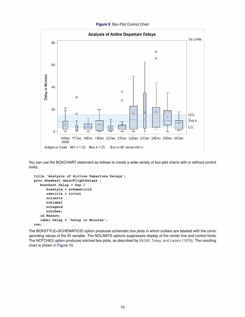
Figure 9 Box-Plot Control Chart
You can use the BOXCHART statement as follows to create a wide variety of box-plot charts with or without controllimits:
title 'Analysis of Airline Departure Delays';proc shewhart data=FlightDelays ;
boxchart Delay * Day /boxstyle = schematicidodstitle = title1nolimitsnohlabelnolegendnotches;
id Reason;label Delay = 'Delay in Minutes';
run;
The BOXSTYLE=SCHEMATICID option produces schematic box plots in which outliers are labeled with the corre-sponding values of the ID variable. The NOLIMITS options suppresses display of the center line and control limits.The NOTCHES option produces notched box plots, as described by McGill, Tukey, and Larsen (1978). The resultingchart is shown in Figure 10.
10
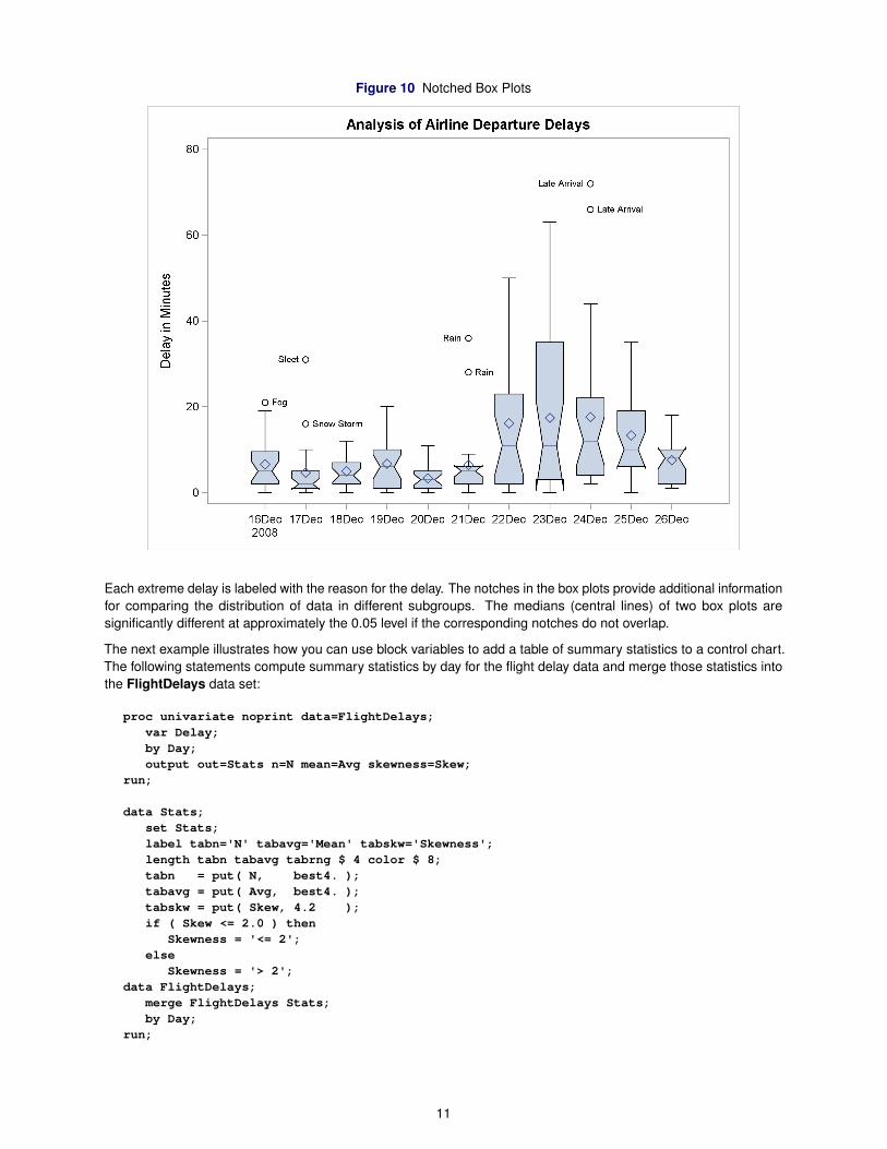
Figure 10 Notched Box Plots
Each extreme delay is labeled with the reason for the delay. The notches in the box plots provide additional informationfor comparing the distribution of data in different subgroups. The medians (central lines) of two box plots aresignificantly different at approximately the 0.05 level if the corresponding notches do not overlap.
The next example illustrates how you can use block variables to add a table of summary statistics to a control chart.The following statements compute summary statistics by day for the flight delay data and merge those statistics intothe FlightDelays data set:
proc univariate noprint data=FlightDelays;var Delay;by Day;output out=Stats n=N mean=Avg skewness=Skew;
run;
data Stats;set Stats;label tabn='N' tabavg='Mean' tabskw='Skewness';length tabn tabavg tabrng $ 4 color $ 8;tabn = put( N, best4. );tabavg = put( Avg, best4. );tabskw = put( Skew, 4.2 );if ( Skew <= 2.0 ) then
Skewness = '<= 2';else
Skewness = '> 2';data FlightDelays;
merge FlightDelays Stats;by Day;
run;
11
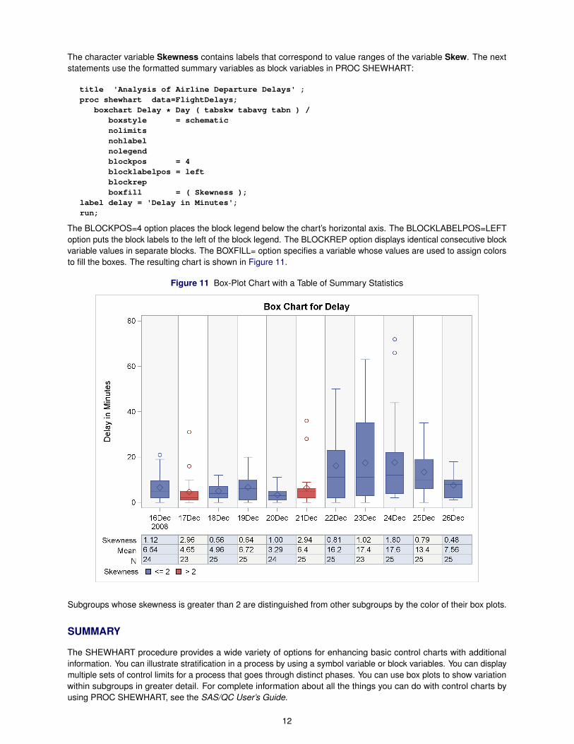
The character variable Skewness contains labels that correspond to value ranges of the variable Skew. The nextstatements use the formatted summary variables as block variables in PROC SHEWHART:
title 'Analysis of Airline Departure Delays' ;proc shewhart data=FlightDelays;
boxchart Delay * Day ( tabskw tabavg tabn ) /boxstyle = schematicnolimitsnohlabelnolegendblockpos = 4blocklabelpos = leftblockrepboxfill = ( Skewness );
label delay = 'Delay in Minutes';run;
The BLOCKPOS=4 option places the block legend below the chart’s horizontal axis. The BLOCKLABELPOS=LEFToption puts the block labels to the left of the block legend. The BLOCKREP option displays identical consecutive blockvariable values in separate blocks. The BOXFILL= option specifies a variable whose values are used to assign colorsto fill the boxes. The resulting chart is shown in Figure 11.
Figure 11 Box-Plot Chart with a Table of Summary Statistics
Subgroups whose skewness is greater than 2 are distinguished from other subgroups by the color of their box plots.
SUMMARY
The SHEWHART procedure provides a wide variety of options for enhancing basic control charts with additionalinformation. You can illustrate stratification in a process by using a symbol variable or block variables. You can displaymultiple sets of control limits for a process that goes through distinct phases. You can use box plots to show variationwithin subgroups in greater detail. For complete information about all the things you can do with control charts byusing PROC SHEWHART, see the SAS/QC User’s Guide.
12
REFERENCES
Kume, H. (1985). Statistical Methods for Quality Improvement. Tokyo: AOTS Chosakai.
McGill, R., Tukey, J. W., and Larsen, W. A. (1978). “Variations of Box Plots.” American Statistician 32:12–16.
ACKNOWLEDGMENTS
Thank you to Ed Huddleston of the Advanced Analytics Division at SAS for editing this paper.
CONTACT INFORMATION
Your comments and questions are valued and encouraged. Contact the author:
Bucky RansdellSAS Institute Inc.SAS Campus DriveCary, NC [email protected]
SAS and all other SAS Institute Inc. product or service names are registered trademarks or trademarks of SASInstitute Inc. in the USA and other countries. ® indicates USA registration.
Other brand and product names are trademarks of their respective companies.
13