temporal-geospatial cooperative visual...
TRANSCRIPT
978-1-5090-5272-1/16/$31.00 ©2016 IEEE
Temporal-Geospatial Cooperative Visual Analysis
James A. Walsh, Joanne Zucco, Ross T. Smith, Bruce H. Thomas
Wearable Computer Lab
University of South Australia
Mawson Lakes, South Australia, Australia
Abstract— Given the diverse set of pervasive tracking tech-
nologies available, temporal-geospatial data is being collected at
an unprecedented rate. However, the effective visualization and
interpretation of this data remains elusive. Visualizations have
focused on showing an object’s location, however more complex
inter-entity queries also need to be supported, e.g. “did X and Y
meet, and if so, where and when?”. We present Cooperative Vis-
ual Analysis, a combination of two novel visualizations, the Paral-
lel Schedule View and the Braille Plot, working in synergy with a
traditional 2D map. The Parallel Schedule View focuses on show-
ing colocation (simultaneous or time separated), with the Braille
Plot used to resolve position ambiguity and identify patterns and
trends within a data trace (in addition to colocation). We present
descriptions of each, and a user study showing support for these
approaches. The study compared Cooperative Visual Analysis
with a current approach, the Space Time Cube, and found the
Cooperative Visual Analysis is an effective means for visualizing
temporal-geospatial relationships in a data set, performing at or
above the Space Time Cube, whilst being preferred by users.
Keywords—Cooperative Visual Analysis; visualizaiton;
temporal; geospatial; Braille plot; proximity;
I. INTRODUCTION
The ever-growing importance [1] and increasing collection [2]
of temporal-geospatial data has introduced the challenge of
developing effective visualizations to explore and better un-
derstand the data [3, 4]. Low accuracy technologies (e.g.
WiFi) are abundant, but the reduced accuracy adds to the
problem and has not addressed to date [4]. The visualizations
presented in this paper improve previous methods to provide
tools that help users understand and interpret temporal-
geospatial data. Our approach is not a single solution for every
temporal-geospatial data query, but it is an investigation into
developing suitable visual analysis tools that expose patterns
that are difficult to identify otherwise. We extend the suite of
visualization tools for a subset of complex queries, such as
“did X and Y meet, and if so, where and when?”. We refer to
these queries as convergence and divergence queries [4].
While automated analysis can help analyze datasets, the analy-
sis is only as good as the parameters. As such, the use of effec-
tive visualizations allows analysts to instantly evaluate
different aspects, enabling them to quickly and repeatedly
query the data set, as opposed to repeatedly performing
automated analysis with different parameters.
The need for visualization in such scenarios has continued the
debate of 2D versus 3D approaches [5]. Approaches using a
single representation show both time and location, with in-
creased information density but reduced readability. To ad-
dress this, approaches such as the Space Time Cube (STC) [6]
enable using the Z-axis of the map to represent time. Howev-
er, this new axis introduces loss of perspective and obfusca-
tion, which require additional user operations to avoid. Cock-
burn and McKenzie [7] found in evaluations that as greater
freedom to find items in the third dimension was given, per-
formance deteriorated. The use of the Z-axis also limits the
use of the visualization for existing domains where the Z-axis
is already utilized (e.g. visualizing air traffic movement).
The Cooperative Visual Analysis (CVA) system addresses
previous limitations, combining two complimentary
visualizations, the Parallel Schedule View (PSV) and the
Braille Plot, which work in synergy with a 2D map to support
visual analysis. There are two time-based visualizations: the
PSV, to explore the colocation of objects, and the Braille Plot
(extending [4]), to explore the relative locations of objects,
reduce uncertainty and identify patterns in the data. Both
visualizations together enable data reconstruction from low
accuracy data sources. The PSV and Braille are supported by a
third visualization technique, a traditional map. Fig. 1 depicts
the application we have developed showing a sample data set.
Our visualizations are validated with a user study, focusing on
a set of higher level concepts, rather than single attributes of
individual traces. We investigate the movement of, and inter-
action between, objects relative to a location of interest, the
identification of idle periods, and periods of colocation. The
contribution of this work is as follows:
1. The introduction of the PSV as means of visualizing
colocation,
2. The adaptation and extension of the Braille Plot as an
interactive means of exploring data, reducing error,
and identifying patterns within it, and
3. A full user evaluation supporting their use.
The next section explores related work. Following this, we
describe the two complimentary visualizations in detail, with
the remainder of the paper describes the study and a discus-
sion of the findings, followed by concluding remarks.
1. RELATED WORK
The amount of temporal-geospatial data being generated is
increasing every day, creating issues often dealt with under the
umbrella of “big data” as the “five Vs” of big data [8] (previ-
ously the “three Vs” [9]). Although the visualization of space
and time are still open research problems [1, 10, 11], many
solutions are focused solely on representing a single object.
Users are needing to analyze spatial relationships between
multiple objects (a higher level problem [12]), and not just aThe work has been supported by the Data to Decisions Cooperative Re-
search Centre whose activities are funded by the Australian Commonwealth
Government’s Cooperative Research Centres Programme.

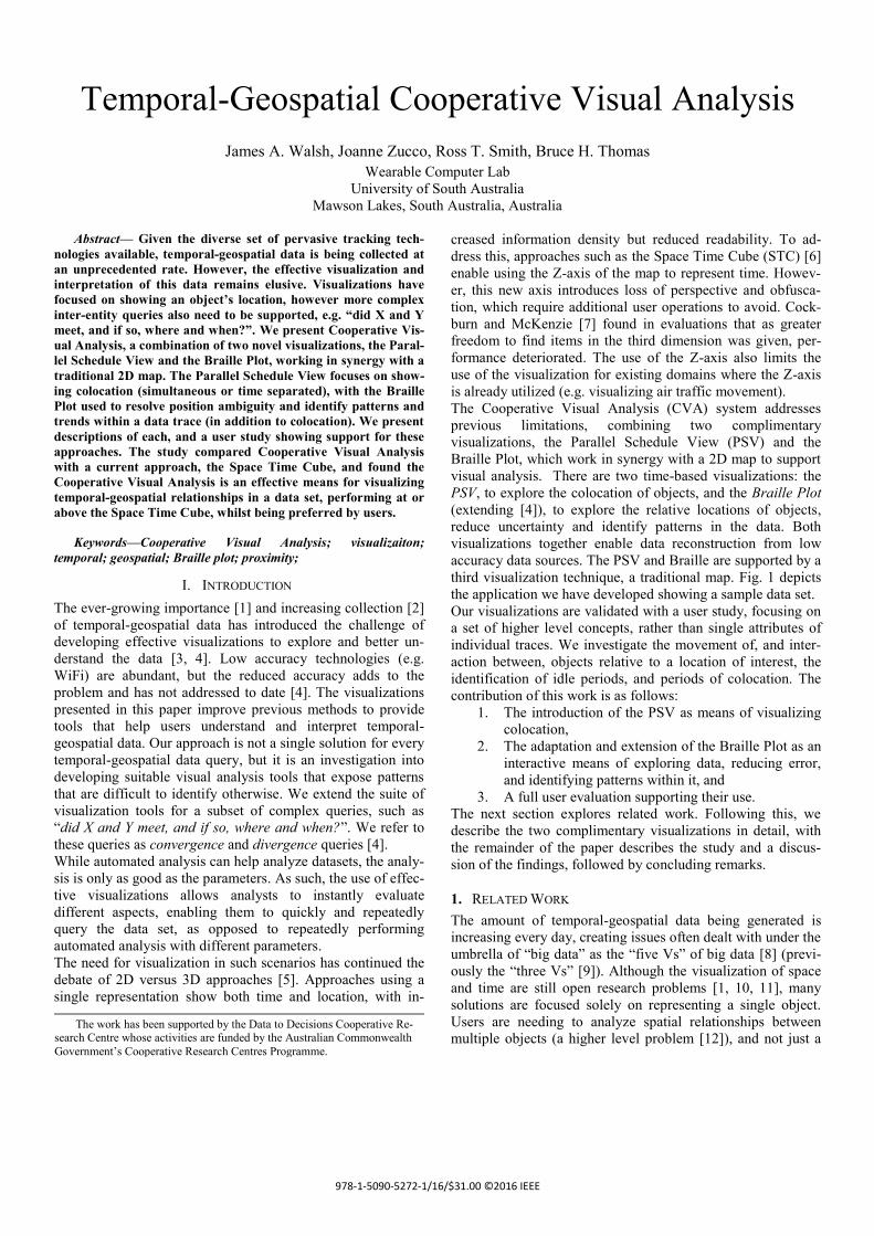
Fig. 1. The Cooperative Visual Analysis user interface showing sample data for five entities, with the PSV in the upper-left panel, the panel
on the upper right is the 2D map, and the panel on the bottom is the Braille Plot.
Single trace [3]. This is compounded by the data type being
visualized, including movements of vehicles [13], vessels
[14], or crime [15], or even object-agnostic events such as data
from environment sensors [4, 16].
When exploring the types of queries for temporal-geospatial
data sets, Bertin, et al. [17] noted there are as many questions
as there are components in a data set, which can be grouped
into levels based on referring to a single element, a group or
the whole. Peuquet [18] identified three components of data:
space (where), time (when) and objects (what).
Although solutions such as STC exist, 2D map visualizations
have been the primary method of visualizing an object’s trace
across a map [3], with four types of 2D maps identified [16].
As such, researchers have continued to investigate appropriate
ways to integrate time into these visualizations [19], and eval-
uate their effectiveness [20].
Aigner, et al. [21] provided a survey of current approaches for
visualizing time-orientated data, breaking them down into
different categories of approaches, looking at time, data, and
representation as criteria. Noting that there is no single ‘best’
representation for data, different views are dedicated to differ-
ent types of analysis. In particular, multiple views can be use-
ful for analyzing time-orientated data. Graphics generated are
not static, but are continuously reconstructed until the underly-
ing relationships between the data becomes apparent [17].
The inclusion of a third dimension of time for a corresponding
latitude and longitude led to the STC [6] and subsequent im-
plementations [22, 23]. This approach utilizes the third dimen-
sion above the map (Z Axis) to represent time for the data
points. This has also been extended show individual events
[24] (a third level question as defined by [16]), as well as the
ability to extract ‘stories’ based on abstractions of the data
[25].
Amini, et al. [3] focused on comparing and contrasting the
approaches for visualizing movement data in 2D and 3D. They
developed and evaluated their own space-time visualizer as an
experimental testbed based on the STC concept. Amini et al.
also presented a taxonomy for classifying questions about
movement-based data sets (building on previous work [17,
18]). They classified questions based on the known or un-
known value, and singular or plural references for times, ob-
jects of interest, and spatial positioning.
A similar study to our investigation (Kristensson et al. [26])
compared the STC against a baseline 2D representation,
finding that for simple questions, error rates were lower for the
2D view, however for more complex questions that required
an understanding of the overall structure of the data set, the
STC was superior.
Andrienko and Andrienko [27] categorized the visualization of
movement from a different perspective, instead of looking at
the visualization itself, they examined what the user was
interested in. By focusing on whether the user was examining
trajectories, detecting movement characteristics, analyzing all
movement, or the interactions between objects, they presented
a survey of visual analytics approaches for movement data.
Utilizing a timeline representation, but augmented with a map,
Thudt, et al. [28] showed small snippets of an object’s idle
location on a map, placed alongside each other. The size of the
map fragment shown on the timeline is representative of the
object’s idle duration at that location. While this is effective in
showing the movement of a single object as a function of time,
it does not support the effective identification of interactions
between objects shown on the map.
Crnovrsanin, et al. [4] presented line graphs for proxemic
visualization (entity movement relative to a location). A simi-
lar concept was also presented by [29], however only
visualized proximity to a “starting point”, e.g. for animal mi-
gration. However, no formal evaluation was performed in ei-
ther. Our work not only provides an evaluation validating of
this approach, but also presents an extended version for the

reduction of error in data sets as well as pattern identification..
Another more recent approach combining both space and time,
however focusing for groups of entities, was presented in [30].
While visualizing temporal data, van Wijk and Van Selow
[31] utilized familiar metaphors and layouts from everyday
calendars to layout data. This involved both using a 3D repre-
sentation for data and time as the X and Y axes, and some
custom data value as Z, as well as traditional calendar month
views view with color coding.
Again in the case of visualizing only temporal data, Reinders,
et al. [32] presented a method for tracking features, and asso-
ciated events for those features, using a modified line-graph,
showing time across the X-axis, with features such as birth,
death, merging, and splitting showing through the line plot
itself. While not spatial, it presented a novel approach for
showing temporal events in an intuitive fashion.
2. COOPERATIVE VISUAL ANALYSIS
Our approach, Cooperative Visual Analysis, is designed to use
complimentary views, separating the visualizations of data
from an object’s geospatial location, and multiple objects’
location or colocations, see Fig. 1. We isolate the time dimen-
sion from the geospatial view that it traditionally omitted or
displayed along another axis. We are particularly interested in
queries relating to identifying multiple unknown objects, at
multiple unknown points in time, at multiple unknown loca-
tions [3].
The first visualization we present is a modification of the tra-
ditional linear schedule view to support additional functions,
known as the Parallel Schedule View. The second is an exten-
sion of [4] for proxemic visualization that we refer to as the
Braille Plot. To support typical geospatial exploration, a
standard map representation is also presented. To support the
quick navigation through data sets, regardless of the temporal
period being visualized, the visualizations support zooming to
reduce/increase the scale and temporal density per-pixel. As
such, selection and navigation of time is provided by means of
an interactive time slider using the Braille Plot as an effective
means of navigation [3]. This section concludes with an ex-
ample use case describing the PSV and Braille Plot visualiza-
tions.
A. Parallel Schedule View
The PSV utilizes the schedule representation for a series
events, as is familiar to users from calendar-focused applica-
tions, such as Microsoft Outlook. Two approaches are
presented. One is object-focused (top-left panel in Fig. 1),
with each column representing an object, and entries within
each column representing each objects’ idle location over
time. The second representation is location-focused, with col-
umns representing single and objects as entries in the columns
moving between them as the objects move from one location
to another.
In addition to the familiar appointment-entry view, we use the
design parameter of parallel plot lines from Parallel Coordi-
nate Plots (PCP) [33]. Each plot line links schedule objects
and entries for the same location/object, allowing the user to
easily view which other objects have visited that same loca-
tion, either at the same time, or different. Hovering over an
entry or plot line highlights the other plot lines for the same
location, allowing the user to quickly identify the links
between different objects. The width of the plot line linking
the entries in each column (either becoming wider/thinner, or
the same) can be an indicator of the relative duration of the
column entries being linked (subject to skewed plot lines).
1) Advantages
Whilst not representing the spatial location of an object over
time, the PSV is effective in communicating when distinct
events are occurring (as a normal schedule does) and also the
interaction between multiple collocated events over time. As
such, the PSV represents idle periods for each object. Repre-
senting an object’s movement between idle periods is relegat-
ed to the Braille Plot or map.
One of the benefits of the STC is in identifying stops and re-
turns along the same path [34]. PSV has these benefits, as
when combined with the normal 2D map representation, the
user easily identifies traces and stops for an individual. The
can also identify the locations where stops occurred, and relate
them between multiple objects in the scenario, but without the
interaction overhead required for 3D manipulation.
Being able to analyze the data we have is just as important as
being able to realize its limitations and data we do not have.
To address this, each column contains horizontal lines mark-
ing when a data point is present (visible in the top of the or-
ange column in Fig. 1). Gaps without lines indicate gaps in the
data set for that object.
1) Limitations
Three limitations of this approach are identified. The first is
the lack of scaling beyond a limited set of objects (8-10 de-
pending on screen dimensions and resolution). However, the
focus of our work was on small teams/groups of objects (8-10
objects). The second limitation is the impact of cross-column
plots, i.e. a plot line linking two non-neighboring columns. To
counter the second limitation, the ordering of the columns is
brute forced for minimal linking between non-neighboring
columns. The third limitation is it relies on idle periods al-
ready having been detected (or detected using algorithms).
Offset errors in the location data will make the automatic clus-
tering of data points difficult. As such, the Braille Plot tech-
nique provides a useful mechanism for this, as discussed later.
Future work could seek to automate this process.
B. Braille Plot
The Braille Plot extends Crnovrsanin et al.’s technique [4],
and focuses on spreading temporal data over a linear view
(using time as the unique dimension and overloading the loca-
tion). While the PSV represents the collocation over time of
multiple objects, the PSV relies on the data set already having
been isolated into a series of discrete visits to each location.
We would like to view the movements of an object relative to
a given location (or two) or another object. The Braille Plot
addresses these requirements. This section describes an ex-
tended one-point version of the Braille Plot (as described by
[4]), and a new two-point version of the visualization.
1) One-Point Braille

Vt = (𝐴 𝑃1⃗⃗ ⃗⃗ ⃗⃗ ⃗⃗ ⃗ + 𝐵 𝑃1⃗⃗ ⃗⃗ ⃗⃗ ⃗⃗ ⃗) / 𝐴 𝑃1⃗⃗ ⃗⃗ ⃗⃗ ⃗⃗ ⃗
The Braille Plot visualizes the proximity of each object from a
given location (Fig. 3) or specified object (set by a right-click
menu), and works as a component of an interactive system, as
opposed to a static image as was the case in [4]. The X-axis
represents time with the distance of an object from the selected
location shown along the Y-axis, increasing bottom-to-top.
Similar approaches have been used to show temporal distribu-
tion [35]. In cases where data is missing or the temporal reso-
lution being visualized is greater than that supported by the
data, the Braille interpolates between the last and next known
locations of the object, showing this interpolated (i.e. estimat-
ed location) as a hollow marker on the plot, a new feature
compared to [4].
When viewing the Braille relative to a location, if objects meet
at that location, their plots will appear to intertwine on the
bottom of plot (as both objects are 0m from that location).
However, if they meet at a location other than the selected
one, their markers will still intertwine, albeit further up the Y-
axis based on the distance of the location (where convergence
occurred) from the location of interest. If viewing the position
of objects relative to the dynamic location of another object of
interest, any colocation will be illustrated with markers entan-
gling on the bottom of the plot.
The Braille provides two distinct advantages over viewing the
same data set on a map not identified by [4]. Viewing data
with large margins of error causes problems for interpreting
that data, especially when combined with the fact that any
repeated travel by objects over a given path will be hid-
den/obscured for the user. For example, Fig. 2 shows an object
making five visits to two locations, however the five visits are
indistinguishable within the two clusters.
Fig. 2. Showing trace data with 5km error for a single object over
five visits to two locations.
However, viewing that same data in the Braille Plot (Fig. 3)
easily identifies the five distinct stops at the two locations.
This is the same problem the STC addresses, however as the
Braille is in 2D it does not suffer the associated perspective
issues the STC has in 3D or the increase 3D manipulation
overhead. In addition, the day/night shading on the timeline
assists in identifying when each visit occurred.
Fig. 3. Showing the five easily identifiable stops across two
destinations for the same object as shown in Fig. 2., with distance
from location of interest increasing up the Y-axis and time
(including highlighted overnight periods) across X.
a) Limitations
As we are visualizing proximity alone, if multiple objects are
equidistant from the Braille centroid, but not at the same loca-
tion, their plots will intertwine, making it appear as if the ob-
jects met at that time, even when they did not. To address this,
the user may employ the map to confirm colocation. Our im-
plementation of the Braille Plot provides a world-in-miniature
map above the mouse cursor on the Braille, showing the loca-
tion of each object, preventing the user from having to adjust
their primary map’s field of view.
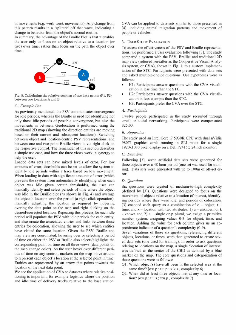
2) Two-Point Braille
The two-point Braille (Fig. 4), a new approach over [4], ena-
bles the user to visualize the movement of an object relative to
two locations of interest, for example where an object might
spend the majority of their day versus the majority of their
night. The two locations are shown as the top and bottom of
the plot. Ideally, users would travel as a bird flies in a direct
path between two locations A and B, shown in Fig. 5 as 𝐴 𝐵⃗⃗ ⃗⃗ ⃗⃗ Depending on the time spent at each location, this would gen-
erate a pattern with a similar appearance to a sine wave.
Fig. 4. Two-Point Braille Plot showing the distance of an object
relative to two locations located as the bottom and top of the plot for
a perfect data set (no error).
Outside of that ideal case, data points can be located ‘inside’ A
and B (P1), or ‘outside’ A and B (P2). To map both of these
cases to a single value to be charted on the braille, we measure
and sum the length of each vector from the data point to each
location (i.e. 𝐴 𝑃1⃗⃗ ⃗⃗ ⃗⃗ ⃗⃗ ⃗ + 𝐵 𝑃1⃗⃗ ⃗⃗ ⃗⃗ ⃗⃗ ⃗) and divide by the length either
vector (depending on which location is plotted on the top or
bottom of the graph), giving a value 0 to 1 inclusive. For
example, if we had A on the bottom on the Braille graph, we
can calculate the position of any data point at time 𝑡 with (1)
as follows:
(1)
As the tracked object moves between the two locations, a pat-
tern similar to a sine wave should occur given any regularity
in movements (e.g. work week movements). Any change from
this pattern results in a ‘splinter’ off that wave, indicating a
change in behavior from the object’s normal routine.
In summary, the advantage of the Braille Plot is that it enables
the user only to focus on an object relative to a location (or
two) over time, rather than focus on the path the object over
time.
Fig. 5. Calculating the relative position of two data points (P1, P2)
between two locations A and B.
C. Example Use
As previously mentioned, the PSV communicates convergence
for idle periods, whereas the Braille is used for identifying not
only those idle periods of possible convergence, but also the
movements in between. Geolocation is performed using the
traditional 2D map (showing the direction entities are moving
based on their current and subsequent locations). Switching
between object and location-centric PSV representations, and
between one and two-point Braille views is via right click on
the respective control. The remainder of this section describes
a simple use case, and how the three views work in synergy to
help the user.
Loaded data sets can have mixed levels of error. For low
amounts of error, thresholds can be set to allow the system to
identify idle periods within a trace based on low movement.
When loading in data with significant amounts of error (which
prevents the system from automatically identifying when each
object was idle given certain thresholds), the user can
manually identify and select periods of time where the object
was idle in the Braille plot (as shown in Fig. 4) and average
the object’s location over the period (a right click operation),
manually adjusting the location as required by hovering
overing the data point on the map and right clicking on the
desired/corrected location. Repeating this process for each idle
period will populate the PSV with idle periods for each entity,
and also create the associated entries and links between those
entries for colocation, allowing the user to see which entities
have visited the same location. Given the PSV, Braille and
map view are coordinated, hovering over or selecting a period
of time on either the PSV or Braille also selects/highlights the
corresponding point on time on all three views (data points on
the map change color). As the user hover over different peri-
ods of time on any control, markers on the map move around
to represent each object’s location at the selected point in time.
Entities are represented by an arrow that points towards the
location of the next data point.
We see the application of CVA to datasets where relative posi-
tioning is important, for example logistics where the position
and idle time of delivery trucks relative to the base station.
CVA can be applied to data sets similar to those presented in
[4], including animal migration patterns and movement of
people or vehicles.
3. USER STUDY EVALUATION
To assess the effectiveness of the PSV and Braille representa-
tions, we performed a user evaluation following [3]. The study
compared a system with the PSV, Braille, and traditional 2D
map view (referred hereafter as the Cooperative Visual Analy-
sis system, or CVA), shown in Fig. 1, to a custom implemen-
tation of the STC. Participants were presented with data sets
and asked multiple-choice questions. Our hypotheses were as
follows:
H1: Participants answer questions with the CVA visuali-
zation in less time than the STC.
H2: Participants answer questions with the CVA visuali-
zation in less attempts than the STC.
H3: Participants prefer the CVA over the STC.
A. Participants
Twelve people participated in the study recruited through
email or social networking. Participants were compensated
$25.00.
B. Apparatus
The study used an Intel Core i7 5930K CPU with dual nVidia
980TI graphics cards running in SLI mode for a single
1920x1080 pixel display on a Dell P2415Q 24inch monitor.
C. Data Sets
Following [3], seven artificial data sets were generated for
three objects over a 48-hour period (one set was used for train-
ing). Data sets were generated with up to 100m of off-set er-
ror.
D. Questions
Six questions were created of medium-to-high complexity
(defined by [3]). Questions were designed to focus on the
movement of objects relative to a location of interest, identify-
ing periods where they were idle, and periods of colocation.
[3] encoded each query as a combination of o – object, t –
time, and x – location with two attributes: 1) u – unknown or k
- known and 2) s – single or p plural, we assign a primitive
number system, assigning values 0-3 for object, time, and
location. Adding the value for each column gives us an ap-
proximate indicator of a question’s complexity (0-9).
Seven variations of these six questions, referencing different
objects, locations, or times, were then generated to create sev-
en data sets (one used for training). In order to ask questions
relating to locations on the map, a single ‘location of interest’
was defined as the center of the CBD as denoted by a blue
marker on the map. The core questions and categorization of
those questions were as follows:
Q1. Which object(s) have all been in the selected area at the
same time? [o:u.p.; t:u.p.; x:k.s., complexity 6)
Q2. When did at least three objects met at any time or loca-
tion? [o:u.p.; t:u.s.; x:u.p., complexity 7)
Q3. How many times has the red object been within 6km of
the selected location? [o:k.s.; t:u.p.; x:k.s., complexity 3)
Q4. What is the closest the red and orange objects have ever
been to each other? [o:k.p.; t:u.p.; x:u.p., complexity 8)
Q5. How many times has the blue object been idle for more
than two hours? [o:k.s.; t:u.p.; x:u.p., complexity level 6)
Q6. Which object has been idle at any location for at least 4
hours? [o:u.s.; t:u.s.; x: u.p., complexity level 4)
E. Design
The independent variables (factors and levels) examined were
as follows:
Factor Levels
Visualization Cooperative Visual Analysis (CVA),
Space Time Cube (STC)
Question 1, 2, 3, 4, 5, 6
Dependent measures were total completion time and number
of errors. The experiment was a 2 (𝑣𝑖𝑠𝑢𝑎𝑙𝑖𝑧𝑎𝑡𝑖𝑜𝑛) ×6 (𝑞𝑢𝑒𝑠𝑡𝑖𝑜𝑛) repeated measures. All participants were tested
on all levels. All conditions were presented in random order.
1) Data Collection
The data recorded for each task included the time in millisec-
onds to when they selected the correct answer. The total num-
ber of errors made were also recorded. Errors are defined as
the number of attempts made, including the correct selection.
The range of errors was 1-3 inclusive.
F. Procedure
Following the reading of the information sheet and consent
approval, participants were seated in front of CVA. Reading
from a script, the PSV and Braille were explained. Instructions
on how to navigate the map control was also provided (pan-
ning, zooming, and scrolling), with a reference sheet provided.
After the PSV and Braille visualizations were described, par-
ticipants ran through a training data set, using variations of the
same six questions previously described. For any question,
participants could attempt it three times. If on the third attempt
the answer was still incorrect, the participant was moved the
next question. Training was then repeated for STC.
Following the STC training set, participants answered the sets
of six questions, alternating between CVA, and the STC ap-
proach. The ordering of the visualizations, the data sets, ques-
tions and multiple choice answers were all randomized.
At the start of each question, all views in the respective system
would be reset, and everything on the screen blocked except
for the question to be answered by a single button. Upon click-
ing that button, the possible answers, along with the rest of the
GUI and associated visualizations were displayed. Users were
timed from when they clicked the button, negating any time
required for reading the question. In total, there were two vis-
ualizations (CVA/STC) multiplied by three data sets per visu-
alization (ignoring training) multiplied by six questions per set
= 36 questions multiplied by 12 participants = 432 trials.
4. USER STUDY RESULTS
This section describes the results of the experiment. Unless
otherwise stated, Analysis of Variance (ANOVA) models
were used in order to determine significance. Mauchly's test
was used to determine whether sphericity had been violated.
Where sphericity had been violated, degrees of freedom were
corrected using Greenhouse-Geisser estimates. A Bonferroni
correction was employed for all post hoc analysis. Statistical
significance is set at 𝛼 = 0.05. The positively skewed comple-
tion times were corrected via a square-root transformation
resulting in distributions being close to normal. Completion
time and error values greater than three standard deviations
away from the mean were removed from the data. Uncomplet-
ed attempts (three incorrect selections) were removed from the
data. In total, 29 out of the 432 (6.7%) data points were re-
moved from the analysis. The empirical results relating to the
mean total completion time and the number of errors are pre-
sented here.
A. Completion Time
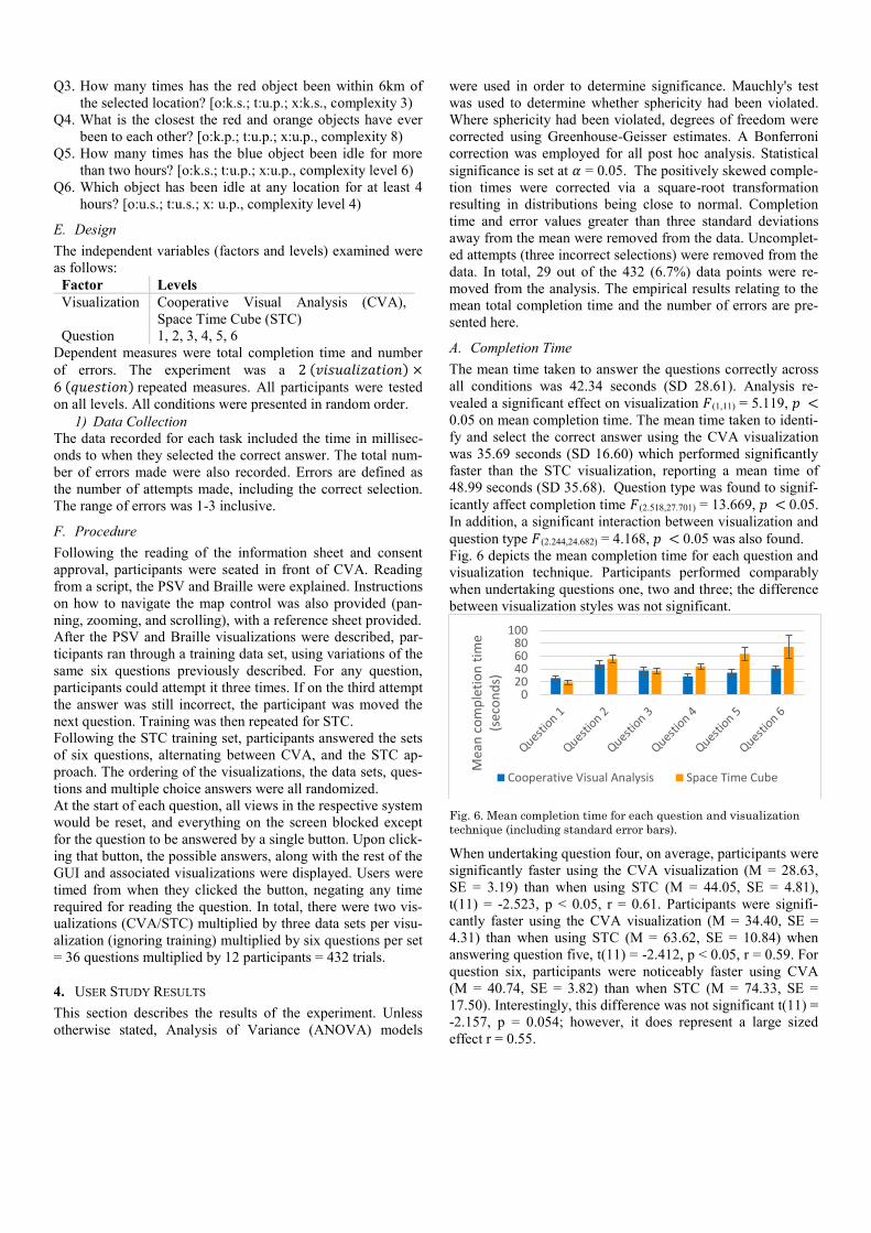
The mean time taken to answer the questions correctly across
all conditions was 42.34 seconds (SD 28.61). Analysis re-
vealed a significant effect on visualization 𝐹(1,11) = 5.119, 𝑝 <
0.05 on mean completion time. The mean time taken to identi-
fy and select the correct answer using the CVA visualization
was 35.69 seconds (SD 16.60) which performed significantly
faster than the STC visualization, reporting a mean time of
48.99 seconds (SD 35.68). Question type was found to signif-
icantly affect completion time 𝐹(2.518,27.701) = 13.669, 𝑝 < 0.05.
In addition, a significant interaction between visualization and
question type 𝐹(2.244,24.682) = 4.168, 𝑝 < 0.05 was also found.
Fig. 6 depicts the mean completion time for each question and
visualization technique. Participants performed comparably
when undertaking questions one, two and three; the difference
between visualization styles was not significant.
Fig. 6. Mean completion time for each question and visualization
technique (including standard error bars).
When undertaking question four, on average, participants were
significantly faster using the CVA visualization (M = 28.63,
SE = 3.19) than when using STC (M = 44.05, SE = 4.81),
t(11) = -2.523, p < 0.05, r = 0.61. Participants were signifi-
cantly faster using the CVA visualization (M = 34.40, SE =
4.31) than when using STC (M = 63.62, SE = 10.84) when
answering question five, t(11) = -2.412, p < 0.05, r = 0.59. For
question six, participants were noticeably faster using CVA
(M = 40.74, SE = 3.82) than when STC (M = 74.33, SE =
17.50). Interestingly, this difference was not significant t(11) =
-2.157, p = 0.054; however, it does represent a large sized
effect r = 0.55.
020406080
100
Mea
n c
om
ple
tio
n t
ime
(sec
on
ds)
Cooperative Visual Analysis Space Time Cube

B. Number of Errors
Across all conditions, the mean total number of errors was
1.33 (SD 0.34). Visualization did not affect the measure of
mean error rate (𝐹(1,11) = 0.085, 𝑝 > 0.05). The number of
errors made was comparable between the CVA (M = 1.32, SD
= 0.31) and STC (M = 1.34, SD = 0.36). Question type signif-
icantly affected mean error rate 𝐹(5,55) = 5.429, 𝑝 < 0.05. An
interaction between visualization and question type was not
found (𝐹(5,55) = 2.334, 𝑝 > 0.05). Fig. 7 depicts the number of
errors made for each question using the different visualization
techniques. Question five reports the largest disparity of errors
(although not significant).
C. Participant Survey and Qualitative Results
Participants were required to complete an exit questionnaire
where they were asked to rate the visualization technique on a
five-point scale in terms of ease of use (scale of 1 being very
easy to use and 5 being very hard). The mean rating across all
questions for the CVA visualization was 1.75 (SD 0.86), while
the STC was 3.44 (SD 1.10). Table 1 summarizes the median
values, along with Wilcoxon Signed-Rank Test results.
Fig. 7. Mean number of errors for each question and visualization
technique (including standard error bars).
Table 1. Median ease of use values for each question and
visualization technique; Wilcoxon Signed-Rank Test.
CVA
Ease of
Use
(Median)
STC
Ease of
Use
(Median)
Wilcoxon Signed-Rank
Test
Q1 1.5 2.5 z=-1.542, p>0.05, r=-0.31
Q2 2 3 z=-1.930, p=0.054, r=-0.39
Q3 1 4 z=-2.262, p<0.05, r=-0.46
Q4 1 4 z=-2.853, p<0.05, r=-0.58
Q5 2 4 z=-2.976, p<0.05, r=-0.61
Q6 2 3.5 z=-2.836, p<0.05, r=-0.59
Participants found visualization techniques for questions one
and two comparable for ease of use. CVA outperformed STC
in questions three, four, five and six with participants report-
ing that the CVA was easier to use than STC.
Participants were asked which visualization they preferred for
each question (Fig. 8), with CVA being the preferred method.
Participants were also asked which visualization technique
was preferred overall; 11 of 12 preferred CVA.
Participants found the Braille useful for measuring relative
distances. They also found the alternative views useful, noting
the appeal of the 2D presentation of information.
1) Written Comments
It was noted that by using the PSV and Braille’s strong points,
they gained a simpler expression of the same information,
reducing map use. The use of an actual timeline to represent
movements was reported by multiple participants as being the
preferred method for representing temporal data.
Fig. 8. Visualization style preferred for each question.
D. Discussion
The evaluation of any visualization will be heavily influenced
by the focus of the questions used to evaluate it [3]. As such,
the questions we selected were designed to evaluate the effec-
tiveness of representing colocation, divergence, and idle peri-
ods of time, and higher complexity questions compared to
previous evaluations of the STC. Given the STC approach has
been shown to be superior in previous studies, there is no rea-
son why the PSV, Braille, and STC cannot be used in conjunc-
tion with each other, leveraging the advantages of each. The
2D digital map in CVA could be replaced with the STC, as
suggested by [3] and [26].
Significant results were found for questions four and five, with
participants performing faster using CVA (H1). CVA per-
formed faster in question six (although not significant). Whilst
significant results were found for two questions, participants
did prefer CVA, specifically for questions three, four, five and
six (H3). In addition, participants overwhelmingly preferred
the CVA overall for selecting a single system to use (H3). The
analysis showed no significant difference between the two
visualizations in error rate (H2).
In our use case where the domain of questions focuses on the
interactions between objects, rather than the attributes of indi-
vidual objects, we have shown that our representations are
superior for specific types of question and preferred by users.
5. CONCLUSION
In this paper we presented two novel visualizations, the Paral-
lel Schedule View and the Braille Plot as two approaches that
work in synergy for visualizing temporal-geospatial relation-
ships within and between objects in a data set. The PSV is
1.00
1.20
1.40
1.60
1.80
2.00
Mea
n n
um
ber
of
erro
rs
Cooperative Visual Analysis Space Time Cube
02468
1012
Nu
mb
er o
f p
arti
cip
ants
Cooperative Visual Analysis Space Time Cube
used to identify periods where objects are idle and visualize
any colocation amongst those idle periods. Similarly, the one-
point Braille Plot is used to visualize idle periods and proximi-
ty, as well as to reduce the impact of a large amount of error
within the data set and supporting the identification of multi-
ple visits to the same location. The two-point Braille can also
be used to identify movements between two locations of
interest, and divergence from that pattern.
As previously mentioned, future work might include
incorporating the STC into the combined system to leverage
the best benefits of each view, possibly being able to switch
between the traditional 2D map representation when viewing
from above, and then transitioning to a 3D representation
when the user views the data set on the map from the side.
Whilst proxemic visualization has been previously presented,
we extended it with new functionality, and presented the first
formal evaluation. In addition, we presented the PSV as a
complimentary tool. Following the results of the user study, it
is clear that both the PSV and Braille Plots provide an effec-
tive approach for visualizing temporal-geospatial relationships
within and between objects in a data set, performing at or
above the STC, whilst being preferred by users to existing
approaches.
REFERENCES
[1] G. Andrienko, N. Andrienko, U. Demsar, D. Dransch, J. Dykes, S. I. Fabrikant, et al., "Space, time and visual analytics," Int. Journal of
Geo. Info. Sci., vol. 24, p. 23 pages, October 2010.
[2] R. Y. Ali, V. Gunturi, and S. Shekhar, "Spatial big data for eco-routing services: computational challenges and accomplishments,"
SIGSPATIAL Special, vol. 6, p. 6 pages, July 2015.
[3] F. Amini, S. Rufiange, Z. Hossain, Q. Ventura, P. Irani, and M. J.
McGuffin, "The Impact of Interactivity on Comprehending 2D and
3D Visualizations of Movement Data," IEEE Trans. Visual. and Comp. Graph., vol. 21, p. 13 pages, June 2015.
[4] T. Crnovrsanin, C. Muelder, C. Correa, and M. Kwan-Liu,
"Proximity-based visualization of movement trace data," in IEEE Symp. Visual Anal. Sci. and Techn., 2009, p. 7.
[5] G. Wang, M. J. McGuffin, F. Bérard, and J. R. Cooperstock, "Pop-up
depth views for improving 3D target acquisition," presented at the Graph. Interface, Newfoundland, Canada, 2011.
[6] T. Hägerstraand, "WHAT ABOUT PEOPLE IN REGIONAL
SCIENCE?," Papers in Regional Science, vol. 24, pp. 7-24, 1970. [7] A. Cockburn and B. McKenzie, "Evaluating the effectiveness of
spatial memory in 2D and 3D physical and virtual environments,"
presented at the Proc. SIGCHI Conf. on Human Fact. in Comp. Sys., Minneapolis, USA, 2002.
[8] Y. Demchenko, C. Ngo, and P. Membrey, "Architecture framework
and components for the big data ecosystem," Journal of System and Network Eng., p. 31 pages, September 2013.
[9] G. Laney, "3D Data Management: Controlling Data Volume,
Velocity, and Veracity," META Group2011. [10] N. Andrienko, G. Andrienko, and P. Gatalsky, "Exploratory spatio-
temporal visualization: an analytical review," Visual Lang. & Comp.,
vol. 14, p. 38, December 2003. [11] C. Zhong, T. Wang, W. Zeng, and S. Müller Arisona,
"Spatiotemporal Visualisation: A Survey and Outlook," in Digital
Urban Modeling and Simulation. vol. 242, S. Arisona, G. Aschwanden, J. Halatsch, and P. Wonka, Eds., ed: Springer Berlin
Heidelberg, 2012, p. 18 pages.
[12] W. Aigner, S. Miksch, H. Schumann, and C. Tominski, Visualization of Time-Oriented Data. London: Springer, 2011.
[13] A. Slingsby, J. Wood, and J. Dykes, "Treemap Cartography for
showing Spatial and Temporal Traffic Patterns," Journal of Maps, vol. 6, p. 11, January 2010.
[14] N. Willems, R. Scheepens, H. van de Wetering, and J. van Wijk, "Visualization of Vessel Traffic," in Situation Awareness with
Systems of Systems, P. van de Laar, J. Tretmans, and M. Borth, Eds.,
ed: Springer New York, 2013, p. 14 pages. [15] J. D. Morgan, "A visual time-geographic approach to crime
mapping," Florida State University, 2010.
[16] U. Turdukulov and M.-J. Kraak, "Visualization of events in time-series of remote sensing data," in Proc. Int. Cart. Conf., Mapping
Approaches Changing World, 2005, p. 7.
[17] J. Bertin, W. J. Berg, and P. Scott, Graphics and Graphic Information Processing. New York: De Gruyter, 1981.
[18] D. J. Peuquet, "It's About Time: A Conceptual Framework for the
Representation of Temporal Dynamics in Geographic Information Systems," Annals of the Association of American Geographers, vol.
84, pp. 441-461, 1994.
[19] D. Peuquet, "Making Space for Time: Issues in Space-Time Data Representation," GeoInformatica, vol. 5, p. 21 pages, March 2001.
[20] A. L. Griffin, A. M. MacEachren, F. Hardisty, E. Steiner, and B. Li,
"A Comparison of Animated Maps with Static Small-Multiple Maps for Visually Identifying Space-Time Clusters," Annals of the Assoc.
of American Geographers, vol. 96, p. 13 pages, December 2006.
[21] W. Aigner, S. Miksch, W. Müller, H. Schumann, and C. Tominski, "Visualizing time-oriented data—A systematic view," Computers &
Graphics, vol. 31, p. 9 pages, June 2007.
[22] N. R. Hedley, C. H. Drew, E. A. Arfin, and A. Lee, "Hagerstrand Revisited: Interactive Space-Time Visualizations of Complex Spatial
Data," Informatica, vol. 23, p. 13 pages, 1999.
[23] U. Demšar and K. Virrantaus, "Space–time density of trajectories: exploring spatio-temporal patterns in movement data," Int. Journal of
Geograph. Info. Sci., vol. 24, p. 15 pages, October 2010.
[24] C. Tominski, P. Schulze-Wollgast, and H. Schumann, "3D information visualization for time dependent data on maps," in Proc.
Info. Vis., 2005, p. 6 pages.
[25] R. Eccles, T. Kapler, R. Harper, and W. Wright, "Stories in GeoTime," Info. Vis., vol. 7, p. 14 pages, March 2008.
[26] P. O. Kristensson, N. Dahlback, D. Anundi, M. Bjornstad, H.
Gillberg, J. Haraldsson, et al., "An Evaluation of Space Time Cube Representation of Spatiotemporal Patterns," IEEE Trans. on Visual.
and Comp. Graph., vol. 15, p. 6 pages, November 2009.
[27] N. Andrienko and G. Andrienko, "Visual analytics of movement: An
overview of methods, tools and procedures," Info. Vis., vol. 12, p. 21,
January 2013. [28] A. Thudt, B. Dominikus, and S. Carpendale, "Visits: A
spatiotemporal visualization of location histories," presented at the
Eurographics Conf. Vis., Leipzig, Germany, 2013. [29] A. Kölzsch, A. Slingsby, J. Wood, B. A. Nolet, and J. Dykes,
"Visualisation design for representing bird migration tracks in time
and space," presented at the Workshop on Visualisation in Environmental Sciences (EnvirVis), 2013.
[30] T. v. Landesberger, F. Brodkorb, P. Roskosch, N. Andrienko, G.
Andrienko, and A. Kerren, "MobilityGraphs: Visual Analysis of Mass Mobility Dynamics via Spatio-Temporal Graphs and
Clustering," IEEE Transactions on Visualization and Computer
Graphics, vol. 22, pp. 11-20, 2016. [31] J. J. van Wijk and E. R. Van Selow, "Cluster and calendar based
visualization of time series data," presented at the IEEE Symp. Info.
Vis., San Francisco, California, 1999.
[32] F. Reinders, F. H. Post, and H. J. W. Spoelder, "Visualization of
time-dependent data with feature tracking and event detection," The
Visual Computer, vol. 17, pp. 55-71, Febraury 2001. [33] A. Inselberg, "A Survey of Parallel Coordinates," in Mathematical
Visualization, H.-C. Hege and K. Polthier, Eds., ed Berlin: Springer,
1998, p. 12 pages. [34] M. Demissie, "Geo-Visualization of Movements: Moving Objects in
Static Maps, Animation and The Space-Time Cube," Masters, Int.
Inst. Geo-Inf. Sci. Earth Observation, Faculty of Geo-Information Science and Earth Observation, University of Twente, Enschede,
Netherlands, 2008.
[35] M. G. d. Oliveira and C. d. Souza Baptista "Geostat- A system for visualization, analysis and clustering of distributed spatiotemporal
data," presented at the Brazilian Symp. Geoinformat., Campos do
Jodao, Brazil, 2012.