the best practice homepage the best practice homepage introduction within an organisation, the...
TRANSCRIPT
The Best Practice Homepage
Greg Randall
eStar Digital Strategist
Brand Experience. Delivered Together.

2
Contents
The Best Practice Homepage 1Introduction 1
Respect the Science 2Defining Page Element 3
Homepage 4Purpose of the Homepage 4
Homepage - Desktop best practice layout 5
Breaking down the desktop homepage layout 6Header 6
Logo 7
Site Search 8
Fixed Main Navigation 11
Customer Service Bar 13
Feature Content Zone 15
Feature Category Zone 16
Footer 19
Mobile Screens 20Rule #1 - Mouse-over (hover) effect 20
Rule #2 - Flat Design 20
Rule #3 – Create finger targets by enlarging interface elements 20
Rule #4 - Emphasise validation on all consumer actions 21
Rule #5 - Content hierarchies and the new Fold 21
Homepage - Smartphone 22Smartphone Header 23
The Menu element 23
Smartphone Site Search 23
Body of Homepage: Feature Banner and Category Tiles 26
Smartphone Footer 29
Conclusion 30

1
The Best Practice Homepage
Introduction
Within an organisation, the Digital/eCommerce leaders (around the world) have a “gut feel” their
page layouts are inadequate but unsure of what changes are required and why.
This whitepaper delivers a high-level commentary into the best practice treatment for the
homepage.
Each page element is scrutinised and analysed to justify its placement, its treatment, and its
behaviour in a way that contributes to creating amazing online experiences for consumers.
This whitepaper is the “highlight reel” of Book 1 of a 4-book series. Each book is dedicated to the
four core pages consumers normally engage with on an eCommerce site:
1. The Homepage
2. The Main Category page
3. The Sub Category (or product listing) page
4. The Product Detail page
One book has been written for each of the eCommerce pages mentioned above providing the
necessary heavy detail required to justify and rationalise the page layouts for each.
This 4-book series is a culmination of 2 years analysing:
1. User research on the nuances of eCommerce best practice and how this influences page element
treatment and compliments business strategy.
2. How page element placement, treatment, and behaviour enhances customer experiences.
3. The conduct of hundreds of the top performing retailers around the world, how they treat page layouts,
and the elements that reside within these pages.
Enjoy your learning journey.
2
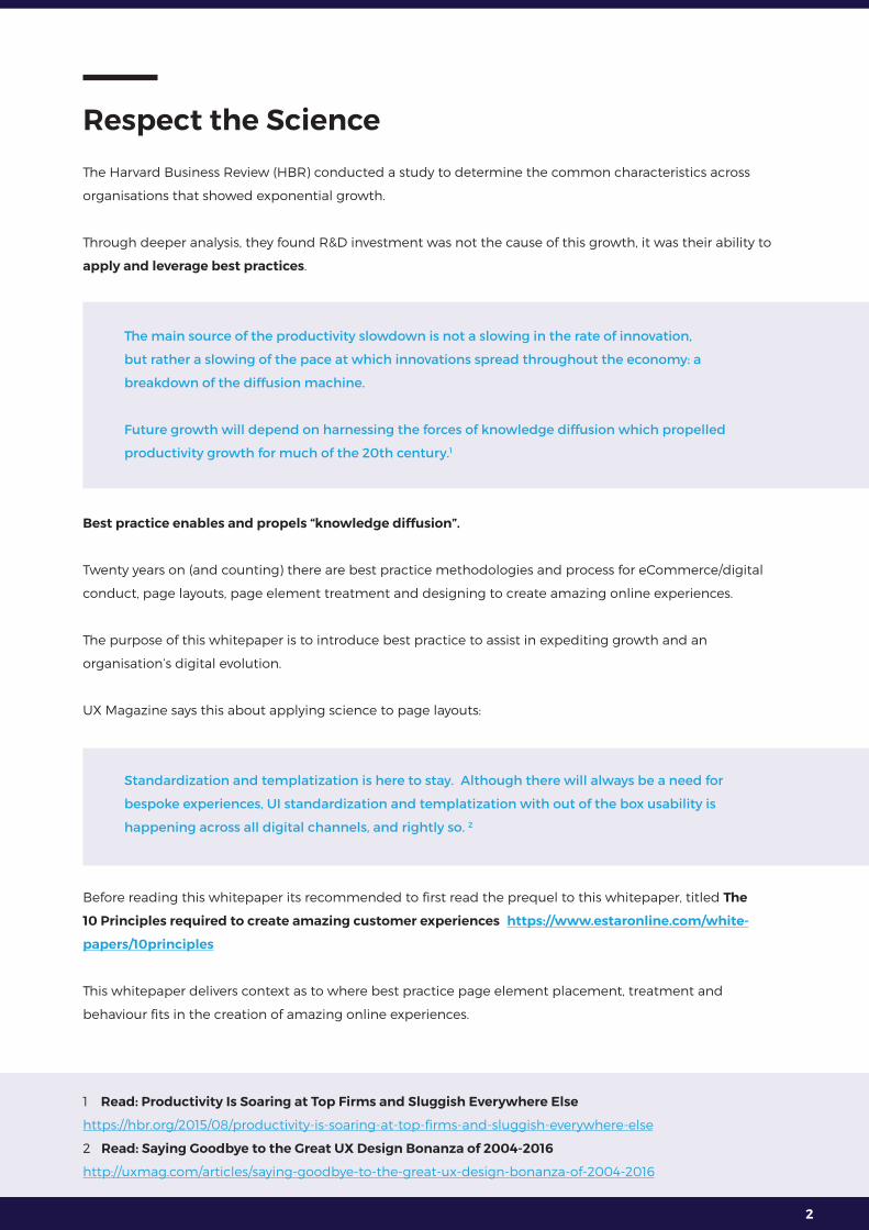
Respect the Science
The Harvard Business Review (HBR) conducted a study to determine the common characteristics across
organisations that showed exponential growth.
Through deeper analysis, they found R&D investment was not the cause of this growth, it was their ability to
apply and leverage best practices.
The main source of the productivity slowdown is not a slowing in the rate of innovation,
but rather a slowing of the pace at which innovations spread throughout the economy: a
breakdown of the diffusion machine.
Future growth will depend on harnessing the forces of knowledge diffusion which propelled
productivity growth for much of the 20th century.1
Best practice enables and propels “knowledge diffusion”.
Twenty years on (and counting) there are best practice methodologies and process for eCommerce/digital
conduct, page layouts, page element treatment and designing to create amazing online experiences.
The purpose of this whitepaper is to introduce best practice to assist in expediting growth and an
organisation’s digital evolution.
UX Magazine says this about applying science to page layouts:
Standardization and templatization is here to stay. Although there will always be a need for
bespoke experiences, UI standardization and templatization with out of the box usability is
happening across all digital channels, and rightly so. 2
Before reading this whitepaper its recommended to first read the prequel to this whitepaper, titled The
10 Principles required to create amazing customer experiences https://www.estaronline.com/white-
papers/10principles
This whitepaper delivers context as to where best practice page element placement, treatment and
behaviour fits in the creation of amazing online experiences.
1 Read: Productivity Is Soaring at Top Firms and Sluggish Everywhere Else
https://hbr.org/2015/08/productivity-is-soaring-at-top-firms-and-sluggish-everywhere-else
2 Read: Saying Goodbye to the Great UX Design Bonanza of 2004-2016
http://uxmag.com/articles/saying-goodbye-to-the-great-ux-design-bonanza-of-2004-2016
3
Defining Page Element
Because this term will be used throughout, it’s important to define. “Page elements” are the micro
components of a page working together to drive consumer engagement for a specific page.
For example, a group of page elements coming together to form a typical desktop header are:
• Brand logo
• Site search box
• Mini cart
• Main navigation
• Information links
There are three characteristics of a page element:
1. It’s placement, where it sits on the page.
2. It’s treatment, how is it visually presented on the page.
3. It’s behaviour, or how does it respond and engage with consumers.
All three are different but equally important.
In the context of the above three characteristics, there are fundamental engagement principles influencing
decision making throughout this whitepaper. There are four principles worth calling out.
1. The evolution and dynamic of The Fold. Respecting the need to prioritise content above and below the
fold.
2. The consumer’s scanning behaviours when first engaging with content. Extensive “eye tracking” studies
prove consistent scanning patterns.
3. Today’s consumer is on a journey and each journey comprises multiple micro steps. To build consumer
buying momentum, each step must produce relevant content. Each step must also be clear and obvious
to deliver intuitive journeys.
4. Consumers exert both physical and mental effort when conducting their micro steps. It is the job of the
retailer to reduce the effort as much as possible. This is known as interaction cost management.
The “10 Principles” whitepaper (mentioned earlier) provides the detail on all four principles explaining how
these and other principles need to work together to contribute to creating amazing experiences.
https://www.estaronline.com/white-papers/10principles

4
Homepage
Purpose of the Homepage
Before embarking on the analysis of homepage elements across screens, it’s important to first define the
purpose of the home page. Clarifying purpose assists in decision-making.
The purpose of the homepage can be summarized to service the following primary functions:3
1. To validate to the consumer, he/she has landed on the right site.
2. To introduce product ranges and support services the brand has to offer.
3. To effectively and efficiently move consumers through to the next step of his/her journey.
4. To communicate feature campaign events (promotions).
3 Read: Homepage Usability: Can Users Infer the Breadth of Your Product Catalog?
https://baymard.com/blog/inferring-product-catalog-from-homepage

5
Homepage - Desktop best practice layout
Figure 1

6
Breaking down the desktop homepage layout
Header
Figure 2
The core page elements to reside within the desktop header are:
1. Logo
2. Global navigation
3. Site search
4. Mini cart
5. Main navigation and mega menu
6. Customer service bar
See Figure 2 above.
Read “Book 1 Best Practice Homepage layout” for the detail behind each of the header elements. This
whitepaper will only call out the key points.

7
Logo
When landing on the site for the first time, the consumer’s eye lands top left looking for validation they have
landed on the right site, making this the prime placement for the brand logo.
Examples of this in action:
Nordstrom
Figure 3
Briscoes
Figure 4
Taking Shape
Figure 5
8
Site Search
The value the site search box brings is in keeping with the purpose of the homepage, effectively and
efficiently moving consumers on to his/her next step.
The two statistics to keep in mind when thinking where to place the site search bar:4
1. Between 25% and 35% of all traffic to your site will use the site search bar.
2. Those consumers who use the site search bar are more than twice as likely to convert compared to
consumers who don’t use it.
To prompt the consumer’s use of this tool, the site search box is to contain the following visual
characteristics:5
1. Size of this header element is visually prominent
2. Keep it away from clutter
3. Apply styles to visually draw the consumers eye
4. Build a strong call to action: a “magnifying glass” icon is not the ideal call to action
Some examples of these characteristics in action:
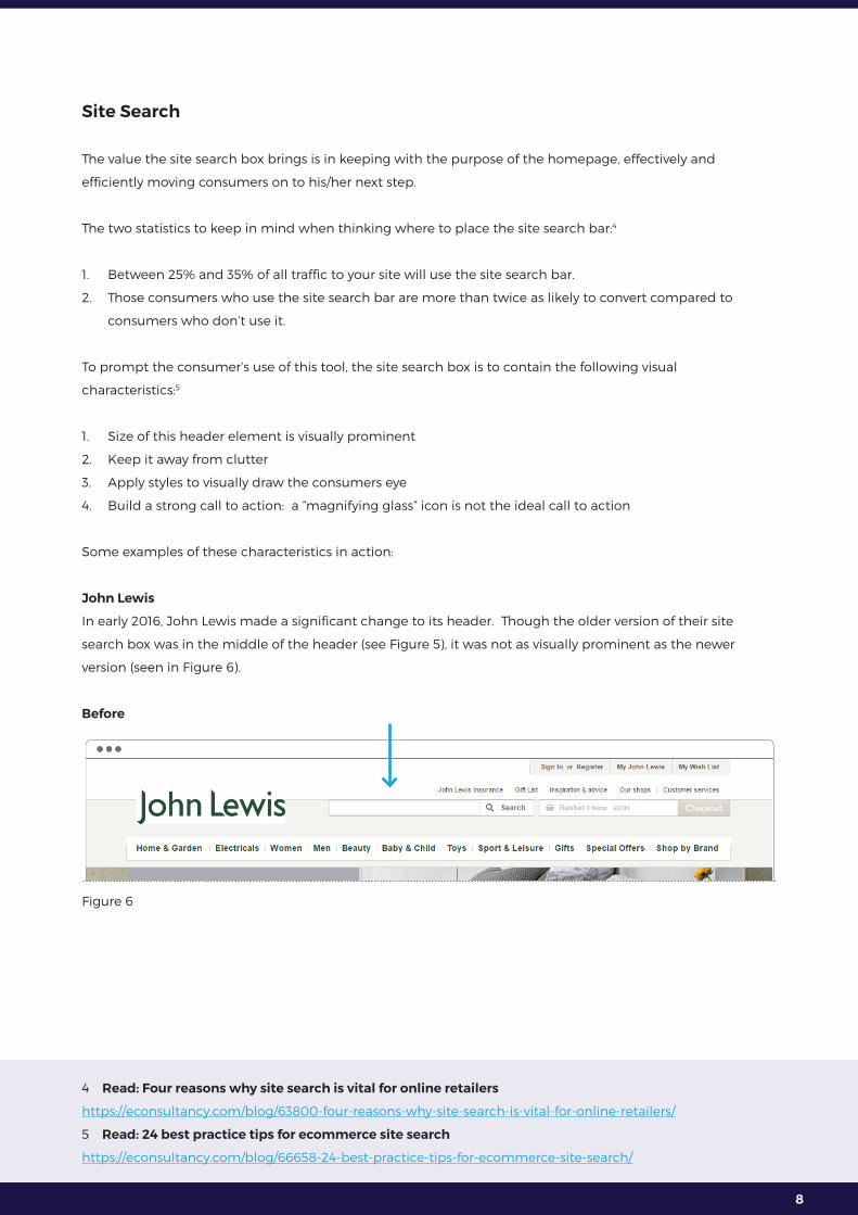
John Lewis
In early 2016, John Lewis made a significant change to its header. Though the older version of their site
search box was in the middle of the header (see Figure 5), it was not as visually prominent as the newer
version (seen in Figure 6).
Before
Figure 6
4 Read: Four reasons why site search is vital for online retailers
https://econsultancy.com/blog/63800-four-reasons-why-site-search-is-vital-for-online-retailers/
5 Read: 24 best practice tips for ecommerce site search
https://econsultancy.com/blog/66658-24-best-practice-tips-for-ecommerce-site-search/

9
After
Figure 7
ASOS
The ASOS search box is not large, but because all clutter is away from this element, it stands out.Figure 8
Taking Shape
Taking Shape is another good example of a search box that is not physically enormous, but is not wrapped
around clutter making it visually stronger. Part of delivering amazing online experiences is the act of delivering obvious and easy actions.
https://www.estaronline.com/white-papers/10principles
10
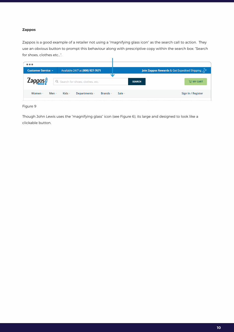
Zappos
Zappos is a good example of a retailer not using a “magnifying glass icon” as the search call to action. They
use an obvious button to prompt this behaviour along with prescriptive copy within the search box: “Search
for shoes, clothes etc…”.
Figure 9
Though John Lewis uses the “magnifying glass” icon (see Figure 6), its large and designed to look like a
clickable button.
11
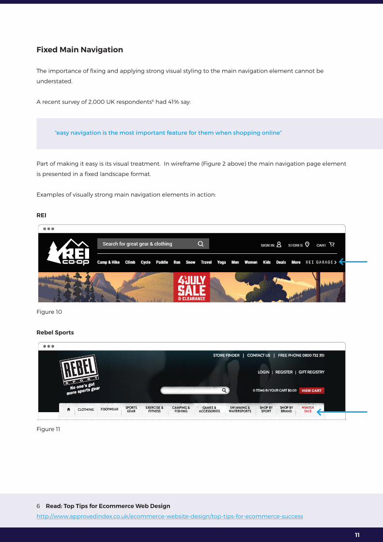
Fixed Main Navigation
The importance of fixing and applying strong visual styling to the main navigation element cannot be
understated.
A recent survey of 2,000 UK respondents6 had 41% say:
“easy navigation is the most important feature for them when shopping online”
Part of making it easy is its visual treatment. In wireframe (Figure 2 above) the main navigation page element
is presented in a fixed landscape format.
Examples of visually strong main navigation elements in action:
REI
Figure 10
Rebel Sports
Figure 11
6 Read: Top Tips for Ecommerce Web Design
http://www.approvedindex.co.uk/ecommerce-website-design/top-tips-for-ecommerce-success

12
The extension to making main navigation “easy” is the visual presence, treatment and behaviour of the mega
menu. This is the dynamic drop down behaviour the main navigation delivers once consumers hover over a
main category.
An example of the mega menu in action:
John Lewis:
John Lewis has one of the better examples of the visual treatment of this element. One of the visual
characteristics they apply is the darkening of the background. This assists in focussing the consumer’s eye.
Figure 12
Read “Book 1 Best Practice Homepage layouts” for the detail behind how best to visually present and treat
the mega menu to deliver amazing online experiences.

13
Customer Service Bar
The “Customer Service Bar” is a content element anchored below the main navigation. Its purpose is
to introduce important service messages above the fold, and is anchored to the header to ensure these
messages are visible regardless of where the consumer lands on the site.
Figure 11
A survey in 2013 polling approximately 6,000 online shoppers found 83% of consumers require some degree
of customer support content while making an online purchase7.
The purpose of this content is to present and communicate support messages important to the consumer
when in “buying mode”. This content instils confidence in the consumer and reduces his/her buying risk.
Some examples of the common anxiety consumers feel8:
1. Will I receive the product at a time that suits my need?
2. What happens if the product is damaged or not my size?
3. How much will delivery cost me if delivered to my home?
4. What other delivery options are available for me?
5. What is the returns policy, and do I pay to return a product?
6. Is there a physical store located near me?
Some examples of the types of content to present within this page element to manage and deal with this
anxiety:
1. Delivery/shipping message (communicating costs, options, and timing)
2. Returns message
3. Toll free phone number
4. Store locator content (if applicable)
7 Read: 83% of online shoppers need support to complete a purchase: stats
https://econsultancy.com/blog/61991-83-of-online-shoppers-need-support-to-complete-a-purchase-stats
8 Read: Top 5 eCommerce fears and how to ease online shopping anxieties
https://www.tradegecko.com/blog/top-5-ecommerce-fears-ease-online-shopping-anxieties

14
Examples of the customer service bar in action:
House of FraserFigure 13
ArgosFigure 14
Swanndri
Figure 15
Bed Bath & BeyondFigure 16
15
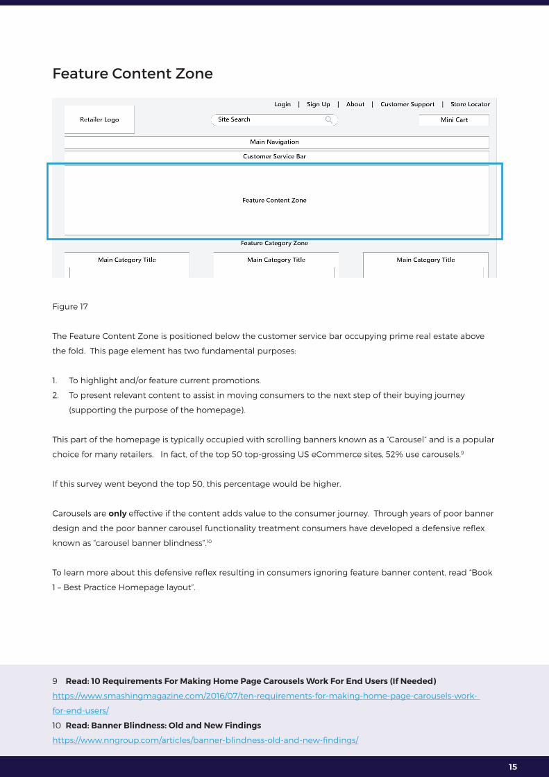
Feature Content Zone
Figure 17
The Feature Content Zone is positioned below the customer service bar occupying prime real estate above
the fold. This page element has two fundamental purposes:
1. To highlight and/or feature current promotions.
2. To present relevant content to assist in moving consumers to the next step of their buying journey
(supporting the purpose of the homepage).
This part of the homepage is typically occupied with scrolling banners known as a “Carousel” and is a popular
choice for many retailers. In fact, of the top 50 top-grossing US eCommerce sites, 52% use carousels.9
If this survey went beyond the top 50, this percentage would be higher.
Carousels are only effective if the content adds value to the consumer journey. Through years of poor banner
design and the poor banner carousel functionality treatment consumers have developed a defensive reflex
known as “carousel banner blindness”.10
To learn more about this defensive reflex resulting in consumers ignoring feature banner content, read “Book
1 – Best Practice Homepage layout”.
9 Read: 10 Requirements For Making Home Page Carousels Work For End Users (If Needed)
https://www.smashingmagazine.com/2016/07/ten-requirements-for-making-home-page-carousels-work-
for-end-users/
10 Read: Banner Blindness: Old and New Findings
https://www.nngroup.com/articles/banner-blindness-old-and-new-findings/
16
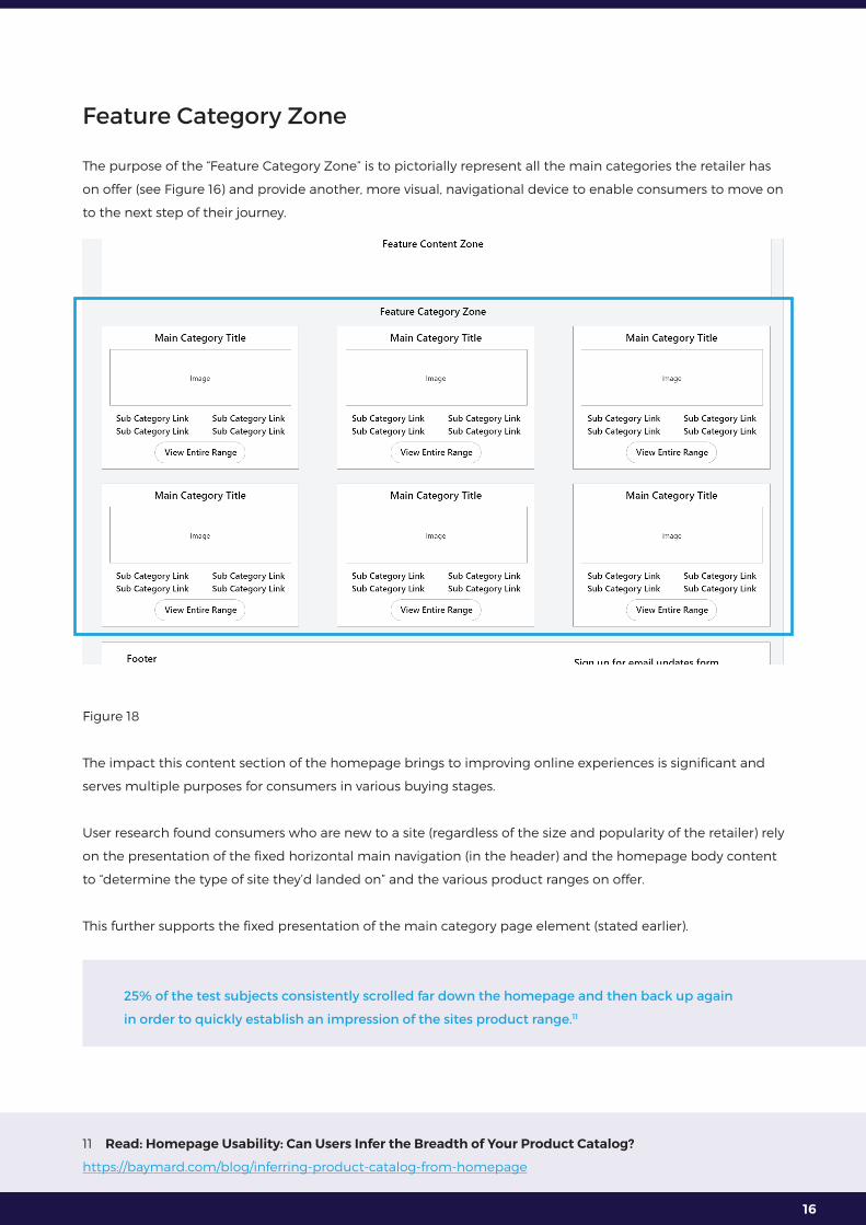
Feature Category Zone
The purpose of the “Feature Category Zone” is to pictorially represent all the main categories the retailer has
on offer (see Figure 16) and provide another, more visual, navigational device to enable consumers to move on
to the next step of their journey.
Figure 18
The impact this content section of the homepage brings to improving online experiences is significant and
serves multiple purposes for consumers in various buying stages.
User research found consumers who are new to a site (regardless of the size and popularity of the retailer) rely
on the presentation of the fixed horizontal main navigation (in the header) and the homepage body content
to “determine the type of site they’d landed on” and the various product ranges on offer.
This further supports the fixed presentation of the main category page element (stated earlier).
25% of the test subjects consistently scrolled far down the homepage and then back up again
in order to quickly establish an impression of the sites product range.11
11 Read: Homepage Usability: Can Users Infer the Breadth of Your Product Catalog?
https://baymard.com/blog/inferring-product-catalog-from-homepage

17
This consumer scanning behaviour created misconceptions of product range offerings for those retailers who
displayed “a very narrow selection of their product catalogue on the homepage”.
To learn more about the benefits this content brings read “Book 1 Best Practice Homepage layout”.
Examples of this visual treatment of main categories in action:
Bed Bath & Beyond
This retailer does a good job of providing more context to specific categories. For example, when looking at
the “Bathroom” tile in Figure 16a, the consumer gains a sense this category contains a broad range of linen
option for their bathroom.
This is something the consumer cannot determine by look at the word “Bathroom” in the main navigation
positioned in the header.
Even though consumers can gain more context from the mega menu, there are three reasons this content
makes a positive impact on the consumer’s experience:
1. This visual content is visible with no further need for the mouse to activate content (such as the mega
menu), making this content easy to view.
2. The human brain is designed to respond to imagery over words, making this more impactful.
3. This content delivers impact for the mobile screens where main navigation and mega menu content is
harder to access (tablet and smartphone screens).Figure 19
Sacha Drake
Sacha Drake is a good example for a few reasons. Below their feature banner content, they have individual

18
tiles representing main categories and have also broken down their Dresses category pictorially to present
sub categories (see the bottom of Figure 17).
Figure 20
Though the Figure 16 wireframe (above) depicts the tile layout in a two-column square format, this should not
be taken literally. Sacha Drake has styled and structured this content in a way they feel is important to their
target consumer.
19
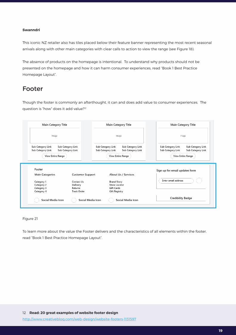
Swanndri
This iconic NZ retailer also has tiles placed below their feature banner representing the most recent seasonal
arrivals along with other main categories with clear calls to action to view the range (see Figure 18).
The absence of products on the homepage is intentional. To understand why products should not be
presented on the homepage and how it can harm consumer experiences, read “Book 1 Best Practice
Homepage Layout”.
Footer
Though the footer is commonly an afterthought, it can and does add value to consumer experiences. The
question is “how” does it add value?12
Figure 21
To learn more about the value the Footer delivers and the characteristics of all elements within the footer,
read “Book 1 Best Practice Homepage Layout”.
12 Read: 20 great examples of website footer design
http://www.creativebloq.com/web-design/website-footers-1131597

20
Mobile Screens
Retailers feel the victim when faced with the challenge of trying to figure how best to render content and
functionality on smaller screens, but think of what the consumers are faced with.
Consumers have lost the use of a mouse, a well-known precise tool used to control and activate content to
drive engagement on larger screens.
The screens are smaller and the activation tool is now bigger (the consumer’s fingers). The consumer must
also apply a cluster of gestures to engage with content: tapping, swiping, dragging and pinching.
All recommendations and guidance presented thus far can and should be applied to both tablet and
smartphone screens, however, there are a specialised set of five experience-enhancing engagement rules
retailers need to consider when creating amazing experiences on smaller mobile touch screens.
These rules will affect the visual treatment and page element behaviour for mobile screens.
They are….
Rule #1 - Mouse-over (hover) effect
The “mouse over” (also known as the “hover”) effect is an effective expectation setting mechanism signalling
to consumers the opportunity to engage with specific page elements and/or content. Consumers lose this
engagement mechanism on smaller screens.
https://econsultancy.com/blog/63361-10-useful-examples-of-mouseover-effects-for-ecommerce-sites/
Rule #2 - Flat Design
Though the flat design trend and has been around now for some time, beware the pitfalls of this visual
approach for screens which do not have mouse over effects to guide/prompt engagement.
https://www.nngroup.com/articles/flat-design/
Rule #3 – Create finger targets by enlarging interface elements
Consumers move from a mouse to their own fingers, a completely different mechanism to activate content.
Ensure the size of all targets are visually obvious and physically easy to select.
https://www.nngroup.com/articles/mobile-site-vs-full-site/

21
This is not only buttons, its…
1. Icons/symbols
2. Font/hyperlinks
3. Form fields and the associated characters to enter into those form fields
4. The whitespace situated around each target give it room
https://www.nngroup.com/articles/tablet-usability/
Rule #4 - Emphasise validation on all consumer actions
Due to the varying actions required of a finger to activate and manipulate content, the site needs to visually
respond and validate consumer actions. This is important across all devices, but becomes imperative on
smaller screens.
https://www.nngroup.com/articles/flat-design-long-exposure/
Visual validation provides the consumer comfort the system has captured and/or acknowledged the
consumer’s request (whatever that may be).
https://www.nngroup.com/reports/mobile-website-and-application-usability/
Rule #5 - Content hierarchies and the new Fold
The concept of the Fold is covered in the prequel “The 10 Principles required to create amazing online
experiences”, but takes on a whole new meaning with the smaller screens. Read the prequel to learn more.
https://www.estaronline.com/white-papers/10principles
For the detail behind each of the above 5 rules, read “Book 1 Best Practice Homepage Layout”.
22
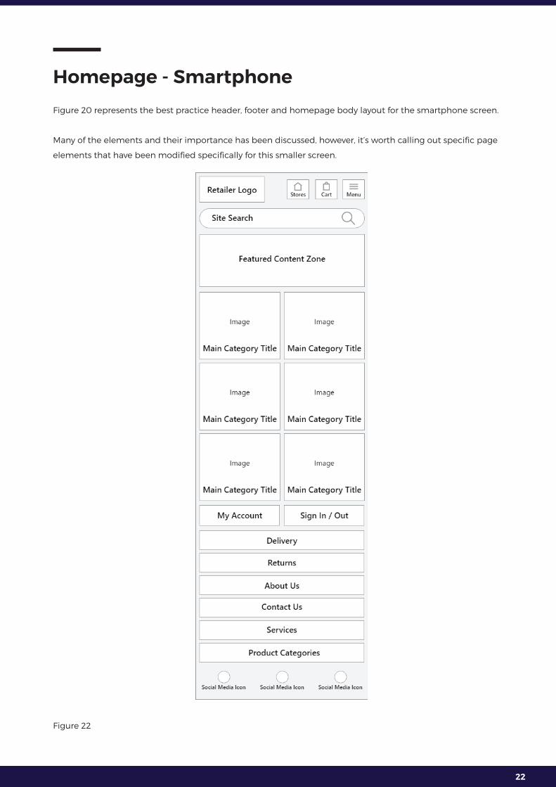
Homepage - Smartphone
Figure 20 represents the best practice header, footer and homepage body layout for the smartphone screen.
Many of the elements and their importance has been discussed, however, it’s worth calling out specific page
elements that have been modified specifically for this smaller screen.
Figure 22

23
Smartphone Header
The importance of the logo sitting in the left-hand corner dips on smartphone screens, but what’s important
is the size of the logo is in proportion to the size of the header.
The challenge of the header is less about logo placement and more about presenting contextually relevant
fixed elements and preserve space to allow for a large region of the page to showcase dynamic page
content above the “smartphone fold”.
https://www.thinkwithgoogle.com/articles/shift-to-constant-connectivity.html
Figure 23
The Menu element
The placement and visual treatment of the menu element is essential to prompt consumer engagement
with the smartphone navigation system because the consumer no longer has a fixed horizontal main
navigation to rely on.
To learn more about the ideal placement and treatment of the menu element read “Book 1 Best Practice
Homepage Layout”.
Smartphone Site Search
The importance of the site search page element is clear, /debate arise around the cost/benefit of permanently
fixing vs hiding this page element within the header.
As seen in Figure 21, this element is permanently presented with a with a call to action. “Book 1 Best Practice
Homepage Layout” explains why.
Some examples of the smartphone header in action:

24
John Lewis
John Lewis has the top row dedicated for its brand and a second row for three elements: menu, search, and
mini cart (see Figure 23). Notice the visual treatment of the hamburger menu of the John Lewis header.
This incorporates both the “hamburger” icon and the term “Menu”. This visual treatment allows for those
consumers who still do not know what the “hamburger” icon represents.
Being obvious in what the page element represents is an important part of creating amazing online
experiences. Consumers won’t exert effort and select a page element unless they know what it represents
and what value it will deliver for him/her.
https://www.estaronline.com/white-papers/10principles
Figure 24
Newegg
Newegg left aligns its logo, and right aligns their hamburger menu, account and mini cart elements all on
the same line. Below is an entire row dedicated to the search box.
Figure 25
25
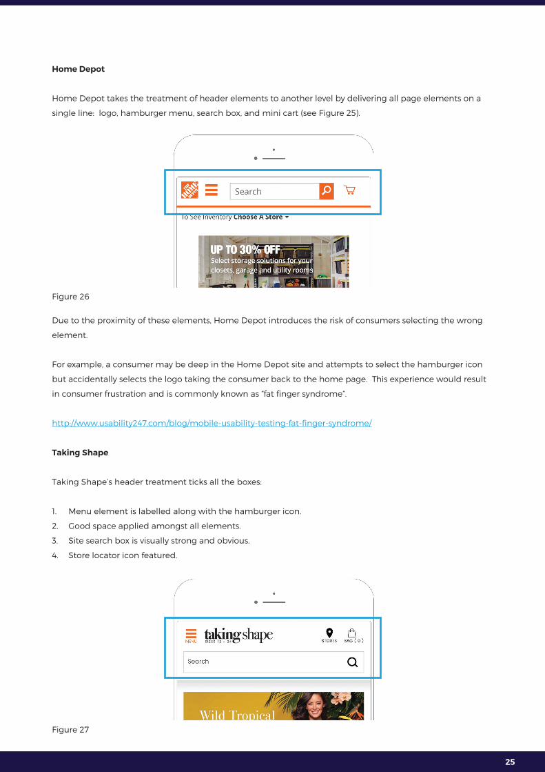
Home Depot
Home Depot takes the treatment of header elements to another level by delivering all page elements on a
single line: logo, hamburger menu, search box, and mini cart (see Figure 25).
Figure 26
Due to the proximity of these elements, Home Depot introduces the risk of consumers selecting the wrong
element.
For example, a consumer may be deep in the Home Depot site and attempts to select the hamburger icon
but accidentally selects the logo taking the consumer back to the home page. This experience would result
in consumer frustration and is commonly known as “fat finger syndrome”.
http://www.usability247.com/blog/mobile-usability-testing-fat-finger-syndrome/
Taking Shape
Taking Shape’s header treatment ticks all the boxes:
1. Menu element is labelled along with the hamburger icon.
2. Good space applied amongst all elements.
3. Site search box is visually strong and obvious.
4. Store locator icon featured.
Figure 27

26
Bed Bath & Beyond
This retailer also ticks all the boxes.
Figure 28
Body of Homepage: Feature Banner and Category Tiles
The rational for placing the feature banner and category content into the body of the home page for the
smartphone is the same as was discussed for the desktop version of the page, however, the impacts of this
content are greater on the smaller screens.
Figure 29
To learn why this content has greater impact read “Book 1 Best Practice Homepage Layout”.

27
Examples of this in action:
John LewisFigure 30

28
Bed Bath & Beyond
Figure 31
29
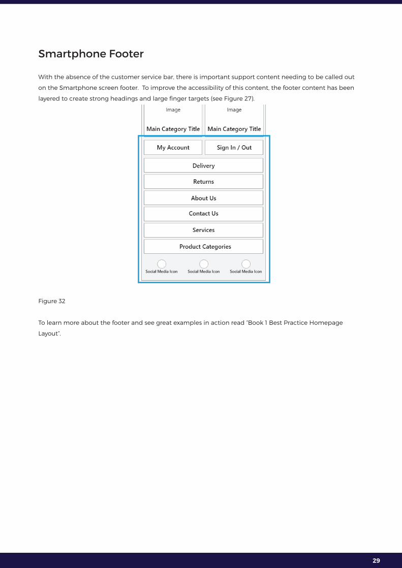
Smartphone Footer
With the absence of the customer service bar, there is important support content needing to be called out
on the Smartphone screen footer. To improve the accessibility of this content, the footer content has been
layered to create strong headings and large finger targets (see Figure 27).
Figure 32
To learn more about the footer and see great examples in action read “Book 1 Best Practice Homepage
Layout”.

30
Conclusion
For a large volume of traffic, the homepage is a retailer’s “store entrance”. In physical retail, Walmart talks
extensively about the importance of their “Store Greeter” program. Employees are stationed at the front of
each of the 5,000 US Walmart stores to greet consumers as they approach the entrance.
One of the primary purposes of their role is to ask consumers what their needs are and point them in the
right direction.
This from Mark Ibbotson, executive vice president central operations Walmart13:
Greeters provide customers with an excellent first impression and is part of Walmart’s broader
strategy to ensure simpler, more convenient shopping.
The digital homepage is no different.
13 Read: Walmart Brings Back Greeters to Improve Service and Fight Theft
http://fortune.com/2016/05/04/walmart-brings-back-greeters-to-improve-service-and-fight-theft/