the best tools for visualization - smith college...the best tools for visualization visualization is...
TRANSCRIPT
Written by Sarah Perez / March 13, 2008 9:25 AM / 48 Comments « Prior Post Next Post »
The Best Tools for Visualization
Visualization is a technique to graphically represent sets of data. When data is large or abstract, visualization can help make the
data easier to read or understand. There are visualization tools for search, music, networks, online communities, and almost
anything else you can think of. Whether you want a desktop application or a web-based tool, there are many specific tools are
available on the web that let you visualize all kinds of data. Here are some of the best:
Visualize Social Networks
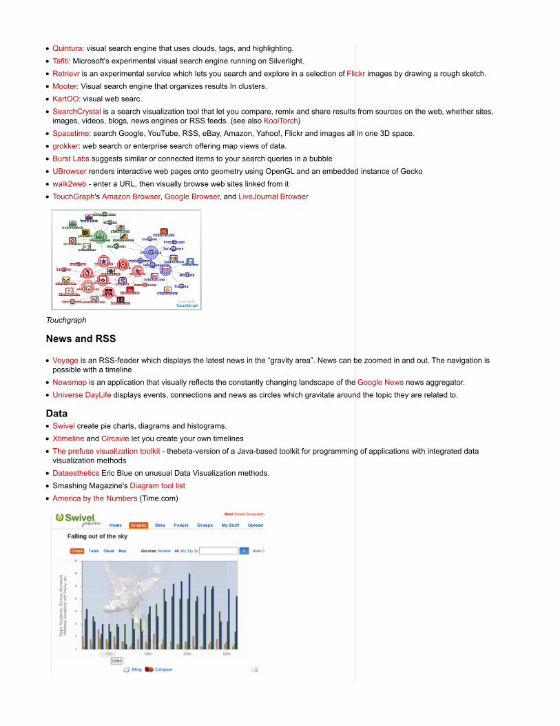
Last.Forward: Thanks to Last.fm's new widget gallery (http://build.last.fm) , you can now explore a wide selection of extras to extend yourLast.fm experience. The gallery hosts widgets for your desktop, for the web, for social networks, and much more. One of the better toolsin the gallery, last.forward, (http://build.last.fm/item/42) is open source software that lets you map out any last.fm user and their connections.The web site (http://lastforward.sourceforge.net/index.html) for the software appears to be in German, but the "Download (http://sourceforge.net/project/showfiles.php?group_id=193845) " button still works. And once it was downloaded and installed, I had no trouble using it myself.
Last Forward
Friends Sociomap: Friends Sociomap (http://build.last.fm/item/287) is another Last.fm tools that generates a map of the music compatibilitybetween you and your Last.fm friends.
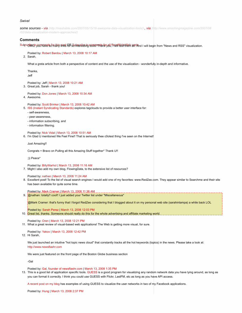
Fidg't: Fidg't (http://www.fidgt.com/visualize) is a desktop application that gives you a way to view your networks tagging habits. You can seewhat kind of music your network is into, or what kind of pictures they are taking. The Fidg't Visualizer allows you to play around with yournetwork. To use Fidg't, you interface with the Visualizer through Flickr and LastFM tags, using any tag to create what they call a "Magnet."Once a Tag Magnet is created, members of the network will gravitate towards it if they have photos or music with that same Tag. You canalso search through the network for certain users, and see their recent photos and music. The Fidg't interface is beautiful, too.
Fidg't

The Digg Tools:
Digg.com has some of the best web-based visualization tools on the net, so they're a must for any visualizationlist.
Pics: Digg Pics is the latest tool that tracks the activity of images on the site with images that slide in from theleft as people submit them and digg them.
Arc: Digg Arc displays stories, topics, and containers wrapped around a sphere. The more diggs, the thicker thearcs.
BigSpy: Digg BigSpy places stories at the top of the screen as they are dugg. Bigger stories have more diggs.
Stack: Digg Stack shows diggs in real time, with diggs falling from the top of the screen. As stories get more diggs, they're shown inbrighter colors.
Swarm: Digg Swarm draws circles for stories as they're dugg. Diggers swarm around stories which makes them grow and get brighter.
One more: Digg Radar. Although this is an unofficial visual aid, Digg Radar is worth a look too. With Digg Radar,you wait and watch for buttons to appear on the map which indicate that a person has Dugg a story. Hover overthe button to see their username. Click it to see details about the story, with links to the Digg page or directly tothe article.
YouTube:
You can discover related videos using YouTube (http://www.youtube.com/) 's visualizations. To use this feature, goto a YouTube video, click on the full-screen button, and then click on the small button that shows a network.You'll see a lot of video balloons appear and the configuration will change when you hover over a button.
Visualize Music
Liveplasma and Musicovery let you discover new music.
Tuneglue music map is a "relationship explorer," similar to LivePlasma. Using data from Amazon and Last.fm, Tuneglue exploresrelationships between musical artists.
Moody lets you tag your music collection with colors. They also have a color-coded web player. (our coverage)
The Echo Nest is an audio analysis tool which takes an mp3 file, breaks it up into little segments, and gives pitch, loudness, andhigh-level timbral descriptions of each one of those segments. The program maps a subset of this audio data onto a visual scale andcreates video playback of the song. (more)
An interactive harmony model of music which geometrically describes relationships in harmony. The model can be a visualization toolfor songwriters or students of music.
Musiclens gives music recommendations and presents your current mood and musical taste as a diagram.
Shape Of Song: What does music look like?
Musicmap: connections are represented as connected lines; they create a web.
Musicovery
Last.fm music visual tools:
Last Graph: Create artist wave graphs from your musical history in PDF and SVG format.

Extra Stats: Colorful Stats and tag clouds.
Visualize the Internet
Opte is a project that lets you graphically map the internet. The data represented and collected here servesa multitude of purposes: Modeling the Internet, analyzing wasted IP space, IP space distribution, detectingthe result of natural disasters, weather, war, and esthetics/art.
Akamai Technologies, who deliver 15-20% of all web traffic offered up some interesting tools last year forviewing their traffic data. (Our coverage) From their flagship app, the Real-time Web Monitor, which showscountries with the most traffic to the Network Performance Comparison app, Akami's tools are an interesting
way to see the web in real time. In all, they offer 6 Flash-based apps to the public.
Other internet traffic visualizations include the Internet Health Report and the Internet Traffic Report.
MantaRay displays the geographical placement of MBONE infrastructure (Multi-cast backbone) of the internet. Otter displaystopological views of the (same) multicast infrastructure.
Packet Garden is an app that watches your Internet traffic and builds a private world that you can later explore.
Mapnet is a Java applet to visualize the topologies of backbones of major U.S. Internet Service Providers.
Websites as graphs. An HTML DOM Visualizer Applet, which displays sites as graphs depending on the amount of links, tables, divtags, images, forms and other tags.
Packet Garden
AmazonLivePlasma: music discovery (see also music section of this list)
Flowser is another flash-based Amazon visualization for search.
BrowseGoods is a visualization that lets you zoom and pan Amazon's catalog of products.
Tuneglue music map is a "relationship explorer," similar to LivePlasma. Using data from Amazon and Last.fm, Tuneglue exploresrelationships between musical artists. (see also music section of this list)
Coverpop is more of an art project that lets you browse Amazon via a collage.
Amaztype, a typographic book search, collects the information from Amazon and presents it in the form of keyword you’ve provided. Toget more information about a given book, simply click on it.
FlickrTaglines lets you to visualize Flickr tags over time
Flickrvision: view real-time flickr photos on a map.
Flickrtime is a tool that uses Flickr API to present the uploaded images in real-time. The images form the clock which shows the currenttime.
Some details on these: see "Alternative ways to browse Amazon" (our coverage (http://www.readwriteweb.com/archives/5_alternative_ways_to_browse_amazon.php) )
Miscellaneous
Visual Thesaurus: The Visual Thesaurus is an interactive dictionary and thesaurus which creates word mapsthat blossom with meanings and branch to related words.
Twittervision: view real-time tweets on a map.

17 More Ways to Visualize Twitter
All the ways to visual del.icio.us collected here.
Three Views shows three views of the earth, in which each country is represented by a circle that shows theamount of money spent on the military (size of circle) and what fraction of the country’s earnings that uses
(color).
We Feel Fine shows human feelings calculated from a large number of weblogs.
Interactive History Timeline presents the history of Great Britain, divided into interactive data blocks.
Winning Lotto Numbers shows the frequency of appearance of every number from one year to the next one.
Language Poster - the history of programming languages
Sites Dedicated to Visualization
IBM's Many Eyes (our coverage) is a shared visualization and discovery service offering all kinds of visualizations you can explore orcreate.
Informationarchitects.jp presents the 200 most successful websites on the web, ordered by category, proximity, success, popularity andperspective in a mindmap.
VisualComplexity.com is an online collection of visualizations (our coverage)
Infosthetics discusses the aesthetics of data visualization
Blogger Anonymous Professor is into visualization, offering visualizations like the 3D visualization/tour of classical music/composers,Visualization of the StumbleUpon network, the value of a Digg and more.
Zip Codes visualized
Many Eyes
Search
Heatmaps:
Heatmaps site CrazyEgg (http://www.crazyegg.com) applies heatmaps to tracking what visitors do on a user's website. Their softwarecaptures user clicks on each page and then presents a summary in the form of a heatmap. Other heatmap sites include Feng-GUI(http://www.feng-gui.com/) and FuseStats (http://www.fusestats.com/) . Summize (http://www.summize.com/) applies heatmaps to shopping viatheir search engine(our coverage here (http://www.readwriteweb.com/archives/summize_search_heatmaps.php) , here(http://www.readwriteweb.com/archives/crazyegg_measuring_website_usability.php) and here (http://www.readwriteweb.com/archives/feng-gui_visual_attention_heatmaps.php) ).
Visualizing the Power Struggle in Wikipedia (http://www.abeautifulwww.com/2007/05/20/visualizing-the-power-struggle-in-wikipedia/) displays themost popular articles and the most frequent search queries in the heatmap.
Visual Search Engines:
Riya's Like.com: first true visual search engine does visual search for shopping.
Searchme: upcoming visual search for the web
Xcavator: A photo search engine which utilizes visual clues that you provide to identify and extract similar pictures from large groups ofdigital images.
ManagedQ: A visual search experiment with some built-in semantics. (our coverage)
oSkope: Visual search engine for finding products that searches Amazon, Ebay, Flickr, Fotolia, Yahoo!Image Search and YouTube.
Quintura: visual search engine that uses clouds, tags, and highlighting.
Tafiti: Microsoft's experimental visual search engine running on Silverlight.
Retrievr is an experimental service which lets you search and explore in a selection of Flickr images by drawing a rough sketch.
Mooter: Visual search engine that organizes results In clusters.
KartOO: visual web searc.
SearchCrystal is a search visualization tool that let you compare, remix and share results from sources on the web, whether sites,images, videos, blogs, news engines or RSS feeds. (see also KoolTorch)
Spacetime: search Google, YouTube, RSS, eBay, Amazon, Yahoo!, Flickr and images all in one 3D space.
grokker: web search or enterprise search offering map views of data.
Burst Labs suggests similar or connected items to your search queries in a bubble
UBrowser renders interactive web pages onto geometry using OpenGL and an embedded instance of Gecko
walk2web - enter a URL, then visually browse web sites linked from it
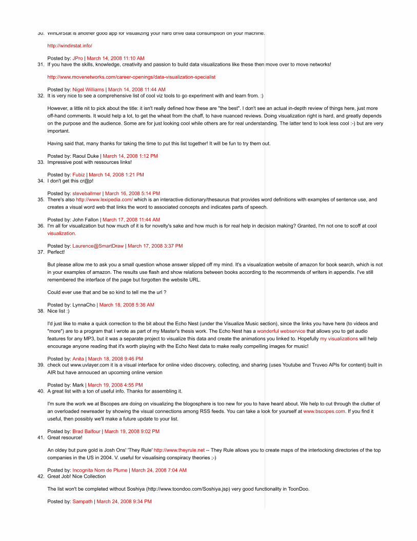
TouchGraph's Amazon Browser, Google Browser, and LiveJournal Browser
Touchgraph
News and RSS
Voyage is an RSS-feader which displays the latest news in the “gravity area”. News can be zoomed in and out. The navigation ispossible with a timeline
Newsmap is an application that visually reflects the constantly changing landscape of the Google News news aggregator.
Universe DayLife displays events, connections and news as circles which gravitate around the topic they are related to.
DataSwivel create pie charts, diagrams and histograms.
Xtimeline and Circavie let you create your own timelines
The prefuse visualization toolkit - thebeta-version of a Java-based toolkit for programming of applications with integrated datavisualization methods
Dataesthetics Eric Blue on unusual Data Visualization methods.
Smashing Magazine's Diagram tool list
America by the Numbers (Time.com)
Swivel
some sources - via (http://mashable.com/2007/05/15/16-awesome-data-visualization-tools/) , via (http://www.smashingmagazine.com/2007/08/02/data-visualization-modern-approaches/)
CommentsSubscribe to comments for this post OR Subscribe to comments for all ReadWriteWeb postsOMG, you have so many links for so interesting tools! Thank you, I will test them all. And I will begin from "News and RSS" visualization.
Posted by: Robert Bardou | March 13, 2008 10:17 AM
1.
Sarah,
What a greta article from both a perspective of content and the use of the visualization - wonderfully in-depth and informative.
Thanks,
Jeff
Posted by: Jeff | March 13, 2008 10:21 AM
2.
Great job, Sarah - thank you!
Posted by: Don Jones | March 13, 2008 10:34 AM
3.
Awesome.
Posted by: Scott Brinker | March 13, 2008 10:42 AM
4.
ISS (Instant Syndicating Standards) explores tagclouds to provide a better user interface for:
- self-awareness,
- peer-awareness,
- information subscribing, and
- information filtering.
Posted by: Nick Vidal | March 13, 2008 10:51 AM
5.
I'm Glad U mentioned We Feel Fine!! That is seriously thee c0olest thing I've seen on the Internet!
Just Amazing!!
Congrats + Bravo on Pulling all this Amazing Stuff together* Thank U!!
;)) Peace*
Posted by: BillyWarhol | March 13, 2008 11:16 AM
6.
Might I also add my own blog, FlowingData, to the extensive list of resources?
Posted by: nathan | March 13, 2008 11:24 AM
7.
Excellent post! To the list of visual search engines I would add one of my favorites: www.RedZee.com. They appear similar to Searchme and their site
has been available for quite some time.
Posted by: Mark Cramer | March 13, 2008 11:38 AM
8.
@nathan: totally!! cool!! I just added your Twitter list under "Miscellaneous"
@Mark Cramer: that's funny that I forgot RedZee considering that I blogged about it on my personal web site (sarahintampa) a while back LOL
Posted by: Sarah Perez | March 13, 2008 12:03 PM
9.
Great list, thanks. Someone should really do this for the whole advertising and affiliate marketing world.
Posted by: Oren | March 13, 2008 12:21 PM
10.
What a great review of visual-based web applications! The Web is getting more visual, for sure.
Posted by: Yakov | March 13, 2008 12:42 PM
11.
Hi Sarah,
We just launched an intuitive "hot topic news cloud" that constantly tracks all the hot keywords (topics) in the news. Please take a look at:
http://www.newsflashr.com
We were just featured on the front page of the Boston Globe business section
-Gal
Posted by: Gal, founder of newsflashr.com | March 13, 2008 1:35 PM
12.
This is a good list of application specific tools. GUESS is a good program for visualizing any random network data you have lying around, as long as
you can format it correctly. I think you could use GUESS with Flickr, LastFM, etc as long as you have API access.
A recent post on my blog has examples of using GUESS to visualize the user networks in two of my Facebook applications.
Posted by: Hung | March 13, 2008 2:37 PM
13.

Thanks - I started to make this list and you have saved me the trouble!!
Posted by: Jo | March 13, 2008 3:30 PM
14.
Our screensaver is a visualization of the real time web... more precise a visualization over the blogosphere, real time, as a world globe.
Read more about it here, and look at the Youtube-movie:
http://www.twingly.com/ScreenSaver.aspx
I think it's worth to mentioning!
Posted by: Anton | March 13, 2008 4:22 PM
15.
Our site http://www.babbleknot.com/home.do visualizes message boards.
Posted by: Billy Bob Bain | March 13, 2008 6:08 PM
16.
Great resource list and many that are new to me.
One I didn't see, but maybe because it's not web based, is Tableau Software. The results can be viewed on the web though I think for the enterprise
version.
http://www.tableausoftware.com/index.php
Posted by: Anne H | March 13, 2008 6:55 PM
17.
There's also http://www.whatareyouwatching.uni.cc which is a visualization of iptv channels as they're watched, it's down currently but it should be up
within the week.
Posted by: Television Spy | March 13, 2008 10:18 PM
18.
Thanks for including xtimeline in your wonderful list, Sarah. We're continuing to improve xtimeline. Soon, we'll have a new timeline and customization
options for embedding on other sites.
Posted by: Lauren | March 13, 2008 10:36 PM
19.
what about spatial maps? like google or yahoo maps
Posted by: phoku | March 14, 2008 12:36 AM
20.
Great article.....but why you don't write something about Inxight.
www.inxight.com, it's a great vizualisation tool....i think it's one of the first company working in this field (maybe 10 years ago)
Posted by: bertrand | March 14, 2008 1:23 AM
21.
This is a great list. Thank you for putting these tools in one place like that. Well done!
Sav
Posted by: Sav Khetan | March 14, 2008 2:20 AM
22.
awesome list! thanks for putting this together!
btw, i think you should've included Gapminder.
http://www.gapminder.org/
~C
Posted by: ~C4Chaos | March 14, 2008 3:48 AM
23.
Thanks for the fantastic tools and recommendations. I will be passing this along to the readers of my blog in the next day or so. Very helpful stuff!
Michael
Instant Car Insurance Quotes Online
Posted by: car_insurance | March 14, 2008 7:04 AM
24.
Oh man, now I'm not going to get anything done today. Off to play.
Posted by: LCD | March 14, 2008 7:07 AM
25.
We're running glTail / glTrail at work on big monitors to easily see how our servers are performing as well as real-time trends on our websites.
Posted by: Erlend Simonsen | March 14, 2008 7:44 AM
26.
Many hours of research obviously went into assembling all of these sources. Thank you for incorporating this level of value into the content of RWW.
Posted by: Jcyreus | March 14, 2008 8:45 AM
27.
Here's another music listening visualization I developed at MyStrands:
http://labs.mystrands.com/artistnet/index.html
Posted by: Justin Donaldson | March 14, 2008 9:05 AM
28.
I have also found that www.TheBudgetGraph.com is a great tool for visualizing the federal government.
Posted by: jess | March 14, 2008 10:13 AM
29.
WinDirStat is another good app for visualizing your hard drive data consumption on your machine.
http://windirstat.info/
Posted by: JPro | March 14, 2008 11:10 AM
30.
If you have the skills, knowledge, creativity and passion to build data visualizations like these then move over to move networks!
http://www.movenetworks.com/career-openings/data-visualization-specialist
Posted by: Nigel Williams | March 14, 2008 11:44 AM
31.
It is very nice to see a comprehensive list of cool viz tools to go experiment with and learn from. :)
However, a little nit to pick about the title: it isn't really defined how these are "the best". I don't see an actual in-depth review of things here, just more
off-hand comments. It would help a lot, to get the wheat from the chaff, to have nuanced reviews. Doing visualization right is hard, and greatly depends
on the purpose and the audience. Some are for just looking cool while others are for real understanding. The latter tend to look less cool :-) but are very
important.
Having said that, many thanks for taking the time to put this list together! It will be fun to try them out.
Posted by: Raoul Duke | March 14, 2008 1:12 PM
32.
Impressive post with ressources links!
Posted by: Fubiz | March 14, 2008 1:21 PM
33.
I don't get this cr@p!
Posted by: steveballmer | March 16, 2008 5:14 PM
34.
There's also http://www.lexipedia.com/ which is an interactive dictionary/thesaurus that provides word definitions with examples of sentence use, and
creates a visual word web that links the word to associated concepts and indicates parts of speech.
Posted by: John Fallon | March 17, 2008 11:44 AM
35.
I'm all for visualization but how much of it is for novelty's sake and how much is for real help in decision making? Granted, I'm not one to scoff at cool
visualization.
Posted by: Laurence@SmartDraw | March 17, 2008 3:37 PM
36.
Perfect!
But please allow me to ask you a small question whose answer slipped off my mind. It's a visualization website of amazon for book search, which is not
in your examples of amazon. The results use flash and show relations between books according to the recommends of writers in appendix. I've still
remembered the interface of the page but forgotten the website URL.
Could ever use that and be so kind to tell me the url ?
Posted by: LynnaCho | March 18, 2008 5:36 AM
37.
Nice list :)
I'd just like to make a quick correction to the bit about the Echo Nest (under the Visualize Music section), since the links you have here (to videos and
"more") are to a program that I wrote as part of my Master's thesis work. The Echo Nest has a wonderful webservice that allows you to get audio
features for any MP3, but it was a separate project to visualize this data and create the animations you linked to. Hopefully my visualizations will help
encourage anyone reading that it's worth playing with the Echo Nest data to make really compelling images for music!
Posted by: Anita | March 18, 2008 9:46 PM
38.
check out www.uvlayer.com it is a visual interface for online video discovery, collecting, and sharing (uses Youtube and Truveo APIs for content) built in
AIR but have annouced an upcoming online version
Posted by: Mark | March 19, 2008 4:55 PM
39.
A great list with a ton of useful info. Thanks for assembling it.
I'm sure the work we at Bscopes are doing on visualizing the blogosphere is too new for you to have heard about. We help to cut through the clutter of
an overloaded newreader by showing the visual connections among RSS feeds. You can take a look for yourself at www.bscopes.com. If you find it
useful, then possibly we'll make a future update to your list.
Posted by: Brad Balfour | March 19, 2008 9:02 PM
40.
Great resource!
An oldey but pure gold is Josh Ons' 'They Rule' http://www.theyrule.net -- They Rule allows you to create maps of the interlocking directories of the top
companies in the US in 2004. V. useful for visualising conspiracy theories ;-)
Posted by: Incognita Nom de Plume | March 24, 2008 7:04 AM
41.
Great Job! Nice Collection
The list won't be completed without Soshiya (http://www.toondoo.com/Soshiya.jsp) very good functionality in ToonDoo.
Posted by: Sampath | March 24, 2008 9:34 PM
42.
Hope this can also be an example of a visualized search, although it's just a concept.
http://petitinvention.wordpress.com/2007/11/28/future-of-search-engine/
Posted by: mac_fun | March 25, 2008 8:52 PM
43.
While reading this article, and I was struck that it probably was relevant to a social networking site, HumanBook, which has over 250 million profiles of
people, including you, your friends, classmates and relatives.
The HumanBook is a mutually managed people directory. People list their own real-life connections, and other connections they have awareness of, to
create a lifelong network. The network houses the connections, and then the collaboratively updated address book nurtures them, assuring that they
need never be lost. HumanBook is the tool that will allow you to cherish and sustain all of the connections of your whole life. So if you're interested, go
to http://www.HumanBook.com and find your profile today!
Posted by: John | March 26, 2008 12:43 PM
44.
Great Job! really nice work..helped me a lot thanks very much
Posted by: elena | March 31, 2008 7:56 AM
45.
Have a look at www.iconocast.fr
They have developped a technology specially dedicated to 3D interactive data visualization on the web.
Posted by: Fred | April 1, 2008 12:42 PM
46.
very interesting read...i will surely try out some of these cool tools...youtube one is pretty neat!
Posted by: dhingana | April 3, 2008 2:20 PM
47.
Check out our interactive Visual Medical Dictionary for mapping drug-disease relationships.
Posted by: Alex | April 4, 2008 2:40 AM
48.