the big bang: stock market capitalization in the long run
TRANSCRIPT
The Big Bang:
Stock Market Capitalization in the Long Run?
Dmitry Kuvshinov and Kaspar Zimmermann §
September 2021
Abstract
We study trends and drivers of long-run stock market growth in 17 advanced economies.Between 1870 and the 1980s, stock market capitalization grew in line with GDP. Butover subsequent decades, an unprecedented expansion saw market cap to GDP ratiostriple and remain persistently high. While most historical stock market growth wasdriven by issuances, this recent expansion was fueled by rising equity prices. We showthat the key driver of this structural break was a profit shift towards listed firms, withlisted firm profit shares in both GDP and capital income doubling to reach their highestlevels in 146 years.
Keywords: stock market capitalization, equity issuance, corporate profits, wealth-to-income ratios, long-run trendsJEL classification: E44, G10, N20, O16
?This work was supported by the German Federal Research Ministry (BMBF) grant number 01UF1505.Part of the research was undertaken while the authors were at Bonn University. We are grateful to theeditor G. William Schwert and the anonymous referee for their insightful comments on the paper. We wouldalso like to thank Michael Bordo, Can Gao, Jan Eeckhout, Leslie Hannah, Yueran Ma, Enrico Perotti, BjornRichter, Kristian Rydqvist, Moritz Schularick, Nikolaus Wolf, the participants of seminars at the University ofAmsterdam, Bonn, Berlin School of Economics, CREI, SAFE, UPF, the 7th CEPR economic history symposium,Paris EHES congress, Oxford FRESH-UPIER meeting, 8th Eurhistock workshop, and the EABH InstitutionalInvestors conference for providing helpful comments. We are indebted to a large number of researcherswho helped with individual country data. Francisco Amaral, Felix Rhiel, Thomas Schwarz, and Maira Talhaprovided excellent research assistance.
§Kuvshinov: Corresponding author. Department of Economics and Business, Universitat Pompeu Fabra;Barcelona School of Economics; and CEPR ([email protected]). Zimmermann: Leibniz Institute forFinancial Research SAFE ([email protected]).
1. Introduction
The past three decades have seen several pronounced changes in the US corporate sector and the
broader macroeconomy. While stock prices, market capitalization, and corporate profits have all
increased markedly, the labor share of income and the rate of economic growth have declined
(Karabarbounis and Neiman, 2013; Barkai, 2020; Greenwald, Lettau, and Ludvigson, 2021). Without
long-run cross-country data, however, one cannot tell whether these developments are a recent
country-specific phenomenon, or are part of a broader secular trend. After all, Rajan and Zingales
(2003) have shown that stock market cycles can be very long, with the 1990s increases in market
capitalization being a reversal to the previously high levels of the early 1900s. Similarly, the
recent labor share declines may be specific to the US (Gutierrez and Piton, 2020), and increases in
corporate profitability may represent mean reversals following profit declines of the 1960s and 1970s
(Nordhaus, 1974; Feldstein and Summers, 1977; Barkai and Benzell, 2018).
This paper studies long-run trends in listed firms’ market capitalization and their drivers.
The unique advantage of focusing on listed companies is that we can obtain the high-quality data
necessary for analyzing corporate sector developments over very long time periods in many countries.
For this purpose, we introduce a new integrated database covering stock market capitalization,
equity issuance, stock prices, and listed firms’ dividends and earnings in 17 advanced economies
from 1870 to 2016.1 These series were constructed from a wide range of primary and secondary
historical sources, with many of these previously unused or newly assembled using hand-collected
archival data. Together with the extensive documentation in the online Data Appendix, they provide
a new resource for researchers to study the development of the stock market, corporate profitability,
and equity finance throughout the last century and a half. The detail of our data also allows us
to not only document the trends, but also to perform a detailed accounting decomposition of the
drivers of long-run stock market growth.
We find that between 1870 and the 1980s, advanced economy stock market capitalization grew
in line with GDP, averaging to around one-third of output. Throughout this period, long-run stock
market growth was driven by equity issuances while real capital gains were on average zero. After
the 1980s, a sharp structural break took place with market cap to GDP ratios across advanced
economies tripling and remaining persistently high. In contrast to the historical period, this recent
growth acceleration was driven by rising stock prices while issuances actually slowed. The key driver
behind these stock price increases was a profit shift away from other parts of the economy towards
listed corporations, with listed firm profit growth far outstripping that in GDP and capital income.
Our findings show that the post-1980s increases in US corporate profits and market capitalization
are part of an unprecedented global expansion, which goes above and beyond the well-documented
increases in advanced economy capital shares.
1The market capitalization and issuance data are newly assembled, and the stock price and dividend dataare updated versions of those in Jorda, Knoll, Kuvshinov, Schularick, and Taylor (2019). Earnings data onlycover the recent decades, whereas all other series cover a long-run cross-section of countries.
1

Our findings speak to three pertinent issues in financial economics. The first of these concerns
the long-run evolution of stock market size. Efforts to document the size of the listed equity market
date back to at least to the 19th century, first conducted through surveys commissioned by wealthy
financiers (Burdett, 1882; Green, 1887) and later through increasingly systematic efforts to map out
the trends in different components of household wealth (Hoffmann, 1965; Roe, 1971; Goldsmith,
1985). The received wisdom is that both the stock market (Rajan and Zingales, 2003) and total wealth
(Piketty and Zucman, 2014) were large in the early and late 20th century, and depressed in-between.
We show that this is indeed the case, but the historical and the current stock market expansion are
more different than they are alike, with the recent expansion being larger, more persistent, and
driven by different forces.
The second issue concerns the drivers of long-run stock market growth. Two literatures have
addressed this question from different angles with the first focusing on the role of institutions and
norms in facilitating household savings and market entry (La Porta, Lopez-de-Silanes, Shleifer,
and Vishny, 1997; Rajan and Zingales, 2003; Piketty and Zucman, 2014), and the second focusing
on growth in profits and stock prices through increases in mark-ups (De Loecker, Eeckhout, and
Unger, 2020; Corhay, Kung, and Schmid, 2020), declines in taxes (McGrattan and Prescott, 2005),
and falls in the labor share (Greenwald et al., 2021). We show that the degree to which each of these
views is applicable depends very much on context and the historical period studied. While norms,
institutions, and issuances are likely to have been key throughout history, the recent period is very
unusual in that most of the stock market growth was driven by rising equity prices, fueled by high
listed firm profits which reflected a redistribution of income within capital.
The third issue relates to the scope and scale of the observed trends. Prior studies document
a number of secular trends for US corporations with some debate on their pervasiveness across
countries and economic sectors: increases in corporate profits and concentration (Barkai, 2020;
Philippon, 2019; De Loecker et al., 2020), falls in corporate issuance (or rising corporate savings;
Gao, Ritter, and Zhu, 2013; Doidge, Karolyi, and Stulz, 2013; Armenter and Hnatkovska, 2017; Chen,
Karabarbounis, and Neiman, 2017), and a rise and fall of the value added share of corporations
(Jensen, 1989; Smith, Yagan, Zidar, and Zwick, 2019; Saez and Zucman, 2020). We show that the
scope of the trends in both capitalization and listed profits is very broad, spanning the major
advanced economies and economic sectors, and that their scale is historically unprecedented. The
slowdown in corporate net equity issuance also extends beyond the US economy. That being said,
the post-1980s trends do show some differences between countries with, for example, high equity
issuances in Portugal, modest capitalization growth in the UK and Italy, and relatively strong stock
market growth in Sweden and Switzerland. But the US is by no means an outlier, ranking around
the middle of advanced economies in terms of the magnitudes of the decline in issuances and
increases in profits and capitalization.
Our detailed analysis starts by documenting long-run cross-country trends in stock market
wealth. The first century of our data saw several pronounced cycles, with the median market cap to
GDP ratio doubling between the early 1890s and 1910, falling back to its 1880s levels after World
2

War I, increasing again in the 1950s and falling to near-historical lows after the 1970s stagflation. But
all these cycles were largely mean-reverting: median stock market capitalization always eventually
returned to its long-run level of around one-third of GDP, and the cross-country interquartile range
stayed between 0.1 and 0.6 of GDP.
Over the last several decades, an unprecedented expansion saw the cross-country median market
cap to GDP ratio increase from 0.2 in 1980 to 1 in 2000. Moreover, this surge in stock market
wealth seems to have been persistent. Despite sharp equity price corrections in the early 2000s and
2008–2009, market cap to GDP ratios today remain around three times larger than the historical
norm. These “big bang” increases in market capitalization took place in all 17 countries, and in each
country bar one (Belgium), they represented the largest structural break in the market cap to GDP
ratio during the entire 146-year historical time period examined here. The observed long-run trends
also underscore a rise in the global importance of the US equity market at the expense of the UK
and France: while all three countries enjoyed roughly equal global market shares in the early 1900s,
by the 1960s the US stock market accounted for close to 70% of the total 17-country capitalization.
Market capitalization growth can be driven by either quantities (i.e., equity issuances) or prices.
We find that throughout the majority of the historical period, long-run capitalization growth was
primarily quantity driven. Before 1985, real market capitalization grew by about 4% per year with
the lion share of this growth accounted for by net equity issuance. Examining its drivers, we find
that net issuance was higher when new markets were being established, and when the cost of equity
was low relative to the cost of debt. While stock prices were volatile both over the short and medium
run, before 1985 these cyclical fluctuations averaged out to around zero.
In contrast to these historical episodes, the post-1980s acceleration in stock market growth was
accompanied by a slowdown in net equity issuance, which was more than compensated for by sharp
increases in real capital gains. We run two counterfactual exercises, which confirm the importance
of stock prices in driving the post-1985 increases in market capitalization. If we ignore the post-1985
changes in issuances by setting issuance levels to their pre-1985 average, the counterfactual evolution
of stock market cap closely follows actual data up to 2000 and results in even larger capitalization
increases afterwards. If we ignore the changes in prices by setting post-1985 capital gains to their
historical average of around zero, the market cap to GDP ratio actually declines due to slowing
issuance. In the cross-section, countries with the highest post-1985 capital gains also recorded the
largest market capitalization increases during this time period.
But the fact that net issuance slowed and capital gains increased does not mean that all these
capital gains accrued to firms already listed in the 1980s. On the contrary, we show that the slowdown
in net issuance hides large gross movements between old and new listings, with the newly listed
firm share generally increasing after 1980. Over the very long run, new listings follow a U-shaped
pattern with large new listing waves in the early 1900s, very few new listings in the mid 20th century,
and a revival of new listings, especially in previously tightly regulated economies, during the 1980s
and 1990s. This lends support to the Rajan and Zingales (2003) “great reversals” theory that links
the mid-20th century stagnation in financial development to an increasing dominance of market
3

incumbents at the expense of new firms.
To map out the deeper underlying drivers of the post-1980s increases in stock prices and
capitalization, we use the dynamic Gordon growth model to decompose the market cap to GDP
ratio into three components: the current ratio of listed firms’ dividends to GDP (the profit sharechannel), future growth of dividends or earnings, and the rate at which these future cashflows to
shareholders are discounted (the discount rate channel). Starting with the growth channel, we find
that high market capitalization does not predict high future dividend growth at cyclical frequency.
Combined with recent evidence of slowing long-run GDP growth and productivity in the US and
globally (Fernald, 2015; Goldin, Koutroumpis, Lafond, and Winkler, 2021), this suggests that high
growth expectations are unlikely to be driving the increases in market cap.
We also show that movements in discount rates can only explain a small share of the observed
capitalization increases. Even though safe interest rates declined markedly during this period,
an increase in the equity risk premium meant that the rate at which future equity cashflows are
discounted fell by less than one percentage point after the 1980s, accounting for about 10% of
the increase in market cap to GDP ratios. This finding is in line with several recent papers that
document a stable rate of return on capital and increases in the equity premium, and connect these
trends to increases in macroeconomic risk and shortages of safe assets (Gomme, Ravikumar, and
Rupert, 2015; Caballero, Farhi, and Gourinchas, 2017a; Farhi and Gourio, 2018).
This leaves one other potential explanation of the post-1980s increases in market capitalization:
an increase in the listed firms’ profit share. We find that this channel is key. Between 1870 and the
1980s, dividends paid by listed firms fluctuated around the level of about 1.3% of GDP. The 1990s
saw listed firm dividends and earnings double, with these increases continuing into the 2000s. Our
counterfactual analysis shows that this channel alone can explain 70% of the post-1980s increases in
the market cap to GDP ratio, and combined with the lower discount rate, it can explain almost all of
the capitalization increase. Digging into the drivers of this profit shift, we show that it was driven
by increases in profit per unit of sales, rather than increases in market shares (sales to gross output).
This is in line with Gutierrez and Philippon (2020), who show that there has not been a significant
increase in the domestic and global market shares of dominant firms in recent decades.
We further show that these profit increases go above and beyond the recently documented
declines in the labor share and increases in capital income relative to GDP (Karabarbounis and
Neiman, 2013). The ratio of listed firms earnings to capital income has more than doubled since
1990, and those countries that experienced the largest capitalization increases during the big bang
also recorded larger increases in the earnings-to-capital-income ratio. This means that the listed
firm profit boom has, at least partially, come at the expense of other types of capital income.
We find that two key counterparts of the profit shift were declines in interest and tax expenses,
which fell sharply after 1980 across advanced economies. The evidence on across-firm income
redistribution is more mixed, with the US listed firm profitability increases happening alongside
those of other businesses. The importance of lower interest and tax costs in fueling listed firm profit
growth helps explain why the post-1980s increases in profits and mark-ups have been accompanied
4

by low levels of consumer price growth and steady or increasing unit labor costs (Syverson, 2019).
Overall, this evidence suggests that within-capital-income shifts play an important role in shaping
the distribution of wealth, and that interest rates can affect wealth not only directly through the
discount rate, but also indirectly by changing corporate cashflows.
The rest of this paper is organized as follows. Section 2 describes the data, Section 3 describes
the trends in market capitalization, Section 4 breaks down these trends into changes in prices
and quantities, and Section 5 studies the underlying drivers of the post-1980s global stock market
expansion.
2. A new cross-country stock market database
This paper introduces a new long-run dataset on stock market size and its drivers. The central
feature of these data is a new annual series of stock market capitalization covering 17 countries
from 1870 to 2016. The countries included are Australia, Belgium, Canada, Denmark, Finland,
France, Germany, Italy, Japan, the Netherlands, Norway, Portugal, Spain, Sweden, Switzerland,
the United Kingdom, and the United States. These are complemented by statistics on sources
of market capitalization growth—issuances and capital gains—and the corresponding corporate
fundamentals in the form of listed firm profits and dividends. Together, these data offer a new
integrated assessment of stock market development and its underlying drivers over the long run.
Our market capitalization data measure the total market value of all ordinary shares of domestic
companies listed on domestic exchanges at the end of each calendar year. We use a wide range of
primary and secondary data sources to construct these series, many of these new and previously
unused. The secondary sources consist of financial history books and research articles, as well as
various publications by stock exchanges, statistical agencies, central banks, and trade bodies. Where
reliable secondary sources are not available, we construct the capitalization measure by aggregating
the total market values of individual stocks, using data on stock prices and number of shares or
listed capital value from stock exchange bulletins and gazettes, stock exchange handbooks, and
companies’ published accounts. Most of these primary source data were newly compiled through
a series of archival visits to the respective countries’ stock exchanges, central banks, and national
libraries, while some were also helpfully shared with us by other researchers. We generally produce
annual estimates of capitalization, but for instances where these were not available, we obtained
capitalization data for benchmark years and constructed the annual series using changes in the book
capital of listed companies and share prices. In the Data Appendix, Tables E.1–E.17 and Figures
E.1–E.17 list the sources used for each country and show a comparison of our estimates to those in
previous studies.
Existing literature identifies four main challenges for deriving stock market capitalization esti-
mates that are consistent across countries and over time. The first challenge is that the capitalization
series should only cover ordinary shares and exclude other securities listed on the stock exchange,
such as preference shares and bonds (Hannah, 2018, discusses these issues for the early London
5

Stock Exchange data). We therefore ensure that our estimates capture ordinary shares only, by
constructing our own benchmark year estimates where necessary, and by using supplementary stock
exchange data and research publications to make this distinction.
The second challenge is that the capitalization measure should sum the value of all shares listed
on every stock exchange within a country, net of any cross listings. Wherever possible, we therefore
rely on data that cover all the major stock exchanges in the country, constructing our own estimates
from microdata when necessary, as in the case of the pre World War I German stock market cap
(see Data Appendix Table E.7). It is, however, not always possible to obtain information on the
capitalization of smaller stock exchanges, especially one that goes beyond benchmark years. For
most countries in our sample, the bias from excluding smaller exchanges is small because by the late
19th century, stock markets in many countries were already quite centralised, and many securities
that were chiefly traded on smaller markets were often also quoted on the main stock exchange.
These issues are most important for the early US data, where several large regional exchanges and
an active curb exchange were in operation (Sylla, 2006). For the US and several other countries
we, therefore, rely on benchmark year estimates to proxy the size of regional and curb exchanges
relative to the main market.
The third challenge relates to excluding foreign stocks. For most of our estimates, the foreign
stock share is either well measured (e.g., in recent data) or small (as for most of the mid-20th century
data), so the measurement issues mainly concern the large international stock exchanges in the early
20th century, in particular the London Stock Exchange. We use secondary sources to adjust the
equity market capitalization for foreign stocks whenever necessary, so the remaining biases should
be small, with the most likely direction leading us to slightly overstate the domestic stock market
capitalization in the financial center countries during the early 20th century. In Appendix D.1, we
discuss the data issues associated with foreign listings in more detail.
The final challenge relates to the definition of a listing. On the one hand, as highlighted by
Rydqvist and Guo (2020) many shares that were listed on the smaller stock exchanges were traded
rather infrequently in the late 19th and early 20th century. On the other hand, some shares that
were actively traded were traded in semi-official markets, such as the New York Curb Exchange.
To be consistent across countries and time, we generally stick to the standard definition of the
listing as being quoted on one of the stock exchanges in the country (i.e., being part of the stock
listing) regardless of whether the stock is traded often or not. The one exception we make is the
New York Curb Exchange, where trading was conducted informally on the street before increasing
formalization of trading activities beginning in the 1920s (Garvy, 1944). Here we follow the typical
approach of US financial historians (Sylla, 2006; O’Sullivan, 2007) and include the Curb Exchange in
our capitalization totals. Excluding the Curb Exchange would reduce our US market capitalization
estimates by around one-fifth for the pre-1920 period, based on data shared with us by Prof. Leslie
Hannah, and trading volume statistics in O’Sullivan (2007).
In addition to the market capitalization series, we construct estimates of, first, net equity issuance
and capital gains, which allow us to decompose market cap movements into prices and quantities;
6

second, the market value of new listings, which allows us to proxy the market share of newly listed
firms; and third, listed firm profits and dividends, which allow us to assess whether changes in
market capitalization are driven by corporate fundamentals or discount rates.
Net equity issuance measures the market value of all new listings and secondary issues net
of delistings and redemptions. These series are constructed from similar sources to our market
capitalization data, with most of the estimates coming from hand-collected microdata, complemented
by estimates of financial historians, statistical agencies, and central banks, and international flow of
funds data constructed by Richter and Diebold (2021). The main challenges when constructing the
net issuance series lie in including all types of issuance, listings and delistings, and accounting for
their market value. To this end, we seek to construct much of these series ourselves from microdata,
but in some cases—as for example with some of the mid-20th century data for Germany—we
combined data on the book value of issuance with estimates of the listed equity market-to-book
ratio. Finally, we complement our net issuance data with an implied issuance estimate computed
as the difference between market capitalization growth and the growth in the value-weighted
equity price index (see Section 4 for more details). This proxy has the advantage that it should
theoretically include all types of issuance, redemptions, and delistings valued at market prices, but
the disadvantage is that it is constructed as a residual and hence subject to larger measurement
error.
The capital gains series are an updated version of the dataset in Jorda et al. (2019) extended to
cover Canada and with the sources for all countries chosen to maximize consistency in coverage
and timing with the market cap data, thus reducing the aforementioned measurement error in the
implied issuance series. The series on the market value of new listings aim to capture the total
end-year market value of all IPOs and direct listings during the calendar year. To construct these,
we primarily rely on microdata, complemented by statistics on IPOs (for example, those in Kunz
and Aggarwal, 1994; Chambers and Dimson, 2009). When we cannot measure the market value of
new listings directly, we rely on supplementing and scaling the IPO proceeds and raw issuance
data. The new listings series are available for five countries, with sources and estimation methods
described in Data Appendix C.
Our data on the profits and dividends of listed firms allow us to link movements in market
capitalization to changes in the underlying firm fundamentals. We compute a long-run series of
dividends paid by listed firms as the market capitalization times the dividend-price ratio from
Jorda et al. (2019), with an additional new series for Canada. Since variation in payout ratios and
means of compensating shareholders makes dividends an imperfect measure of total cashflows to
shareholders (Grullon and Michaely, 2002), we complement these dividend data with estimates of
listed company earnings obtained from Compustat Global and Compustat North America. The
coverage of Compustat firms broadly matches that of our data, but for some of the early observations
in the late 1980s and early 1990s, we drop country-years with insufficient data (less than 30% of
total market cap) and scale the other observations by the ratio of Compustat capitalization to our
aggregate capitalization estimates.
7

The Data Appendix contains a detailed description of the sources for each of the three main
new series—market capitalization, net issuance, and market value of new listings—alongside a
discussion of the various quality checks and comparison with existing estimates. In general, our
market capitalization data are in line with previous country-specific estimates constructed by
financial historians and statisticians. When it comes to the cross-country estimates of Goldsmith
(1985), our estimates are typically below his national balance sheet data, because his estimates often
include unlisted stocks, preference shares or bonds in the capitalization total, whereas ours focus on
listed ordinary shares only. Our estimates are sometimes above and sometimes below those of Rajan
and Zingales (2003), depending on the specific country and time period.
Taken together, we examine the largest and most detailed database of stock market capitalization
and the sources of its growth to date. These data allow us to study the long-run evolution of
stock market size and perform detailed accounting decompositions of its drivers across a broad
representative sample covering 17 advanced economies.
3. Long-run trends in market capitalization
3.1. Aggregate and within-country trends
Figure 1 shows the ratio of stock market capitalization to GDP across the 17 countries in our sample
for years 1870 to 2016. The solid blue line is the median, and the shaded area is the interquartile
range of country-level data. The first century of our data saw several pronounced cycles, with the
median market cap to GDP ratio doubling between the early 1890s and 1910, falling back to its 1880s
levels in the aftermath of World War I, increasing again in the 1950s, and falling to near-historical
lows in the aftermath of the 1970s stagflation. But all these cycles were largely mean-reverting, with
median stock market capitalization always eventually returning to its long-run average level of
around one-third of GDP, and the cross-country interquartile range staying between 0.1 and 0.6 of
GDP.
As a consequence, from the end of the 19th century and up until the late 1980s, the size of
the stock market evolved broadly in line with GDP. Over the subsequent decades however, an
unprecedented market expansion took place. The median market cap to GDP ratio increased from
0.2 in 1980 to 1 in 2000, with some countries’ stock markets growing to three times the size of their
domestic output. Moreover, this surge in stock market cap seems to have been persistent. Despite the
sharp equity price corrections in the early 2000s and the Global Financial Crisis of 2008–2009, market
cap to GDP ratios today remain around three times larger than the historical norm. We loosely term
this post-1980s market expansion as the big bang.2 The left-hand panel of Appendix Figure A.1
shows that this time series pattern—a century of variations around a stable mean followed by a
2Note that our terminology is simply a visual description of the time series pattern observed in the marketcapitalization data, and bears no connection to the big bang market reforms in the UK. Our use of this termdoes not imply that any of the observed rends were driven by market liberalization.
8

Figure 1: Stock market capitalization in advanced economies
0.5
11.
5R
atio
to G
DP
1870 1890 1910 1930 1950 1970 1990 2010
Median Interquartile range
Stock market capitalization to GDP ratio, 17 countries. The solid line and the shaded area are, respectively,the median and interquartile range of the individual country capitalization ratios in each year.
sharp and persistent increase—holds regardless of how we aggregate the individual country data,
though value-weighted average capitalization levels are higher throughout the sample and display
larger cyclical variation than both the median and the unweighted cross-country mean.
Figure 2 shows that the same time series pattern is evident not only across, but also within
individual countries. The solid black lines show the evolution of the market cap to GDP ratio in
each country in our sample. In every single one of these countries, the stock market grew rapidly
during the 1980s and 1990s and sustained this high level of capitalization thereafter. In almost every
country, the capitalization ratios reached during the 1990s and sustained into the 2000s were much
higher than any past historical peaks.
What exactly changed as a result of this post-1980s market expansion? How persistent was the
observed increase in market capitalization, and how does the variation in market cap during the last
three decades compare to the historical peaks and troughs? To help us answer these questions, we
first test for structural breaks in each country’s market capitalization time series using the Bai and
Perron (2003) method. The vertical dashed lines in Figure 2 show the identified breaks in the mean
of the market cap to GDP ratio time series, and the solid horizontal lines show the corresponding
period-specific means. The series shown in the thick red lines are restricted to at most one structural
break per country, and the series in the thin blue lines do not impose a limit on the number of
breaks. When we restrict the time series to having at most one structural break, the recent market
capitalization increase is identified as the most important shift in the mean market cap to GDP ratio
in all countries bar one (Belgium). When we allow for multiple structural breaks, the structural
mean shifts identified for the pre-1980 time period are both much smaller and less persistent, with
9

Figure 2: Stock market capitalization to GDP ratios in individual countries0
.51
1.5
1870 1900 1930 1960 1990 2020
Australia
0.5
11.
52
1870 1900 1930 1960 1990 2020
Belgium
0.5
11.
5
1870 1900 1930 1960 1990 2020
Canada
0.5
11.
5
1870 1900 1930 1960 1990 2020
Denmark
01
23
1870 1900 1930 1960 1990 2020
Finland
0.2
.4.6
.81
1870 1900 1930 1960 1990 2020
France
0.2
.4.6
.8
1870 1900 1930 1960 1990 2020
Germany
0.2
.4.6
.8
1870 1900 1930 1960 1990 2020
Italy
0.5
11.
51870 1900 1930 1960 1990 2020
Japan
0.5
11.
52
1870 1900 1930 1960 1990 2020
Netherlands
0.2
.4.6
.8
1870 1900 1930 1960 1990 2020
Norway
0.2
.4.6
.8
1870 1900 1930 1960 1990 2020
Portugal
0.2
.4.6
.8
1870 1900 1930 1960 1990 2020
Spain
0.5
11.
5
1870 1900 1930 1960 1990 2020
Sweden
01
23
1870 1900 1930 1960 1990 2020
Switzerland
0.5
11.
52
1870 1900 1930 1960 1990 2020
United Kingdom
0.5
11.
5
1870 1900 1930 1960 1990 2020
United StatesRaw data
1 structural break
Flexible structural breaks
10

the historical structural increases typically followed by similarly sized declines.
Without looking ahead into the future, we cannot tell if the post-1980s mean shift is permanent,
but it is already larger and more persistent than the other historical market capitalization increases
both across and within countries. This does not, however, imply that any given post-1980s market
peak is likely to be long-lasting: on the contrary, we have already observed much cyclical mean-
reverting variation around this higher mean, with several pronounced cycles, including the dot-com
boom and bust in the late 1990s/early 2000s. Similarly, the period before the 1980s saw several
short-run cycles alongside a long-run cycle, consistent with the “great reversals” pattern identified
by Rajan and Zingales (2003), with low mid-20th-century levels of capitalization surrounded by the
1900s and 1990s market peaks. We turn to analyze such cyclical variation next.
3.2. Market capitalization cycles
In Figure 3, we examine the volatility and persistence of market capitalization growth across different
historical periods. The left-hand panel confirms that market capitalization displays substantial
cyclical variation throughout our sample period. The standard deviation of real market capitalization
growth—the year-on-year change in market cap relative to previous year’s market cap deflated by
CPI—has been high both before and after 1985: around 20% for annual growth, and 7%–10% for
average growth over horizons of 5 to 10 years.
The variation in market capitalization also tends to be highly persistent. Not only does the
growth volatility remain high at long horizons, but for the full sample (solid red line in the middle
panel), the autocorrelation coefficient of the market cap to GDP ratio does not reach zero even
at the 20-year horizon. This is largely due to the highly persistent shifts in the time series mean
that occurred around the big bang. Within each of the pre- and post-1985 subsamples, market
capitalization does tend to eventually revert to its sample-specific mean—with autocorrelation
coefficients approaching zero over time—but it does so at a very slow pace, reaching zero at horizons
of 7 to 15 years. The faster mean-reversion during the post-1985 period indicates that after the big
bang, the cycles in market capitalization have become somewhat shorter, as for example evidenced
by sharp capitalization increases during the 1990s dot-com boom followed by rapid declines during
the subsequent market correction.
Even though the growth of market capitalization has not become substantially more volatile
after the 1980s, market capitalization movements have become much bigger as a share of GDP
as a consequence of the large level shift in stock market size. The right-hand panel of Figure 3
shows that the variation in market capitalization, when expressed as a share of GDP, more than
doubled between the pre-1985 and post-1985 time periods, both at short and long horizons. Whereas
historically the standard deviation in stock market wealth was on the order of 2%–7% of national
income, depending on the horizon, after 1985 these shocks have amounted to 20% of GDP at
one-year frequency and 5%–8% of GDP at longer horizons. Consequently, similarly-sized percentage
movements in stock prices are likely to have much larger wealth effects today, and are hence more
11

Figure 3: Cyclical variation in market capitalization
010
2030
Perc
ent
1-year 5-year 10-year
Before 1985After 1985
Market cap growthvolatility
-.50
.51
Auto
corre
latio
n co
effic
ient
0 5 10 15 20Horizon, years
Full sampleBefore 1985After 1985
Market cap / GDPautocorrelation
0.0
5.1
.15
.2R
atio
1-year 5-year 10-year
Before 1985After 1985
Market cap shocksas share of GDP
Left panel: Standard deviation of annual, 5-year average, and 10-year average log real market capitalizationgrowth, calculated as log(MCAPt/CPIt)− log(MCAPt−1/CPIt−1). Middle panel: Autocorrelation coefficientobtained by regressing the market cap to GDP ratio in year t + h on the ratio in year t, for different horizonsh = {1, 20} years and subsamples. Error bars show 90% confidence bands. Right panel: Standard deviationof year-on-year, average 5-year, and average 10-year changes in market capitalization as a share of GDP,calculated as (MCAPt −MCAPt−1)/GDPt−1.
likely to influence household spending and real activity (Poterba, 2000; Coronado and Perozek, 2003;
Chodorow-Reich, Nenov, and Simsek, 2021).
3.3. International and institutional comparisons
Previous studies have often focused on capitalization differences across countries, and the associated
links with institutional norms and financial development (Rajan and Zingales, 2003; La Porta,
Lopez-de-Silanes, Shleifer, and Vishny, 1997). The post-1980s increases in stock market wealth took
place across the 17 countries in our sample, but they were not of equal size everywhere. Figure 2
shows that while market cap in Switzerland and Finland increased almost sixfold, the increase in
Belgium was relatively modest and increases in France and the UK took market capitalization back
to previously seen historical peaks rather than all-time historical records. The case of Portugal is
also rather unique since the 1980s market expansion mainly represented the re-emergence of the
stock market after its near disappearance in the aftermath of the Carnation Revolution of 1974. This
means that when we look at the distribution of global market capitalization across countries, we
may see some changes—and this exactly what our data show.
Figure 4 shows the share of each country’s stock market in the total of the 17 economies.
We report separate shares for the US, UK, France, Germany, and Japan and lump the other 12
countries together. In late 19th century, capital markets were roughly equally divided between three
major players: the US, France, and UK. This distribution, however, changed markedly during the
subsequent 50 years. While the US was able to quickly increase its market share between 1880 and
1930, the French stock market’s global importance more or less vanished. The UK’s market share
also dwindled, albeit at a slower pace than France’s. After World War II, global equity markets
12

Figure 4: Global market capitalization shares across advanced economies
0.2
.4.6
.81
Shar
e
1890 1910 1930 1950 1970 1990 2010
United States United Kingdom FranceGermany Japan Other
Shares of individual countries’ capitalization in the advanced-economy total. Capitalization shares arecomputed by transforming the domestic stock market capitalization into US dollars using historical exchangerates and dividing it by the sum of capitalizations of all 17 countries. Shares of the US, the UK, France,Germany, and Japan are shown separately. All other countries are combined together into one joint item.Since data for Japan start in 1899, we assume a constant market share equal to its 1899 value for the earlyhistorical period.
became almost entirely dominated by the US, with US equities accounting for roughly 70% of the
advanced economy market cap in 1950.3
Even though the US stock market has lost some of its global importance over recent decades, its
size is still comparable to that of the other 16 countries grouped together. New equity markets have
gained importance, with other countries slowly catching up and Japan’s market share expanding
during the high growth era after World War II and even temporarily catching up to the US at the
peak of the Japanese stock market bubble before a dramatic collapse. Capitalization of Japanese
listed companies grew from 5% of the global market in 1970 to 40% in 1989, but fell back to around
10% thereafter. These market capitalization share comparisons could be skewed by our exclusion
of foreign companies listed on the country’s exchange—an issue that we investigate in detail in
Appendix D.1. We find that foreign listings are small from the UK, where total market capitalization
of foreign equity is comparable in size to that of domestic equity. This means that the global market
capitalization shares in Figure 4 understate the importance of London as a global financial center,
particularly in the early 20th century.
The increase in stock market cap was common not only across countries, but also across
different economic sectors. Figure 5 shows the shares of different industrial sectors in total market
3This dominance reflected the fact that the US stock market was relatively large in proportion to GDP(Figure 2, as well as the fact that the US economy is large relative to the other countries in the sample, withthe US GDP accounting for about 50% of the 17-country total.
13

Figure 5: Sectoral market capitalization shares0
.2.4
.6.8
1Sh
are
1950 1970 1990 2010
United States
0.2
.4.6
.81
1990 1995 2000 2005 2010 2015
Other countries
Agriculture & Mining Transportation & Utilities ServicesConstruction Trade OtherManufacturing Finance, Insurance and Real Estate
Market capitalization of firms in the specific sector divided by total market capitalization. Data fromCompustat Global and Compustat North America. Right-hand panel shows the unweighted cross-countryaverages of the respective sectoral shares.
capitalization, computed using Compustat data going back to 1950 for the US (left-hand panel)
and back to 1990 for the other countries in our sample (right-hand panel). US sectoral trends are
characterized by a falling market share of manufacturing firms (dark blue area) and an increase
in the market cap of financial and service companies (light and dark green areas). These trends,
however, started before the 1980s and simply continued during the period of the big bang. For other
countries in the sample (Figure 5 right-hand panel), sectoral shares have remained remarkably stable
since 1990, with market capitalization of different industries increasing in tandem with one another.
To explore the connection between broader institutional characteristics and market size, the
left-hand panel of Figure 6 displays the evolution of stock market capitalization separately for
countries with common law legal systems (UK, Canada, US, and Australia) and those operating
under civil law (the rest of our sample). La Porta et al. (1997) hypothesised that stock markets in
common law countries tend to be more developed because of the more market-friendly legal norms.
Consistent with the legal origins hypothesis, common law countries had a persistently higher market
cap to GDP ratio. Nevertheless, the post-1980 increase in stock market cap “takes off” at a similar
time and is similar in magnitude across both country groups.
The right-hand side of Figure 6 compares the evolution of market capitalization to that of two
proxies for banking sector development: total credit to the non-financial sector (green triangles) and
total non-financial business credit (orange circles). Over the very long run, both market capitalization
and credit activity have grown faster than GDP. However both the timing and the duration of the
late 20th century credit expansion are different to those in the stock market cap. Total credit starts
increasing much earlier, and does so at a much slower pace than market capitalization. Moreover,
14

Figure 6: Market capitalization and measures of financial and institutional development0
.51
1.5
Rat
io to
GD
P
1870 1905 1940 1975 2010
Civil law countries Common law countries
Market cap and legal norms
0.4
.81.
2
1870 1905 1940 1975 2010
Market capitalization Total loans Business loans
Market cap and banking sector development
Left-hand panel: Median market cap to GDP ratios for two groups of countries. Common law countries areAustralia, Canada, the UK, and the US. Civil law countries are all other countries in our dataset. Right-handpanel: Median market cap to GDP ratio and the ratios of total loans and total business loans to GDP.
the increase in business credit is much more modest than that in total credit, largely because much
of the secular increase in credit during the second half of the 20th century is driven by higher
household mortgage debt (Jorda, Schularick, and Taylor, 2016). The sharp increases in market
capitalization in the post-1980s period happened at a time of relative stability in the total volume of
business loans.
How do our estimates compare to previous studies? Our Data Appendix includes detailed
country level Figures E.1-E.17 that show our final estimates alongside those of previous researchers.
Appendix Figure A.1 shows that our broad trends mirror those of Rajan and Zingales (2003) using
all countries in their sample (dark triangles) or only those countries present in both ours and their
datasets (light diamonds). Our estimates are somewhat lower than those of Rajan and Zingales
(2003), most likely because we are able to take advantage of recent work by financial historians
(e.g., Lopez, Carreras, and Tafunell, 2005; Annaert, Buelens, and De Ceuster, 2012; Waldenstrom,
2014) and the raw stock listings data to attain an improved measure of the capitalization of ordinary
domestic shares that excludes preference shares and nets out cross listings between exchanges when
necessary. Nevertheless, the general patterns of high capitalization in the 1910s and 1990s, and low
capitalization in mid 20th century and especially around 1980, are clearly visible across alternative
estimates.
Previous studies have often used market capitalization as a proxy for financial development,
but the patterns in our data indicate a substantial divergence between stock market cap and other
financial and institutional development proxies. One reason for this is that financial development
and institutions are more likely to affect quantities of listed equity through factors such as entry
costs and market access, whereas our market capitalization measure captures short and long run
movements in equity prices as well as quantities. In order to gain a more discerned picture of the
15

underlying drivers of stock market growth, we need to decompose it into changes in prices and
quantities, and separately assess the drivers of this price and quantity variation as well as their
relative importance through history. The integrated nature of our database, and the inclusion of
consistent series of stock prices and quantities alongside those of capitalization, allow us to do
exactly that.
4. Trends in prices and quantities of listed equity
4.1. Market capitalization growth decomposition
Market capitalization can grow through either quantities or prices of listed equity. Quantity variation
typically corresponds to firms’ financing decisions, market entry and exit, whereas changes in stock
prices should be linked to changes in company profits and the discount rates used to capitalize the
profit stream into valuations. Decomposing market capitalization growth into changes in prices
and quantities, therefore, gives us a first pass at disentangling the drivers of the long-run trends in
Section 3.
Our price-quantity decomposition follows the standard procedure in the studies of the US stock
market and, more broadly, household wealth (e.g., Goyal and Welch, 2008; Bansal, Kiku, and Yaron,
2007; Piketty and Zucman, 2014; Blanco, Bauluz, and Martınez-Toledano, 2020). To fix ideas, note
that total market capitalization, MCAP, at time t is the sum of the market capitalizations of each
individual share i, in turn calculated as the share price Pi times the quantity of listed shares Qi:
MCAPt =Nt
∑i=1
Pi,tQi,t. (1)
An increase in market capitalization can come about from share issuance by listed companies
(higher Q), new companies entering the listing (higher N), or higher prices of existing listings P.
Put differently, aggregate market capitalization is the sum of last year’s capitalization, MCAPt−1,
times the capital gain during the year, and the net equity issuance consisting of new listings and
secondary issues net of delistings and redemptions:
MCAPt = (1 + Capital gaint) ∗MCAPt−1 + Net issuancet. (2)
Dividing both sides by MCAPt−1 and deflating by CPI, real market capitalization growth, gMCAP, is
16

Figure 7: Market capitalization growth decomposition
-20
-10
010
20Pe
rcen
t
1870 1890 1910 1930 1950 1970 1990 2010
Real market cap growth Real capital gainsNet equity issuance Residual
Decomposition of real market cap growth into real capital gains and net issuance relative to previous year’smarket cap. Centered five-year moving averages of yearly log growth rates. Unweighted averages of 17
countries. Country-level data winsorized at 1%. Real variables are deflated by CPI.
the sum of the real capital gain cgt and net issuance relative to the previous year’s market cap isst:4
gMCAPt = cgt + isst, (3)
where gMCAPt =
MCAPt ∗ CPIt−1
MCAPt−1 ∗ CPIt− 1 and isst =
Net issuancet
MCAPt−1.
The decomposition in equation (3) is a pure accounting exercise and does not rely on any
assumptions about the underlying sources of stock market wealth. Its different components can
be estimated directly from the data. We observe market cap growth g and capital gains cg for all
country-year observations in our sample, and for more than half of the observations we also observe
actual net equity issuance. For countries and years where we do not have actual issuance data, we
calculate it as the difference between market capitalization growth and equity capital gains.5
Figure 7 shows the decomposition of average cross-country market capitalization growth (solid
black line) into real capital gains (dark blue bars) and issuances relative to market cap (light green
bars) following equation (3). The components also include a small residual, which comes about from
either the log approximation or the differences between implied issuance (market capitalization
minus capital gain) and actual issuance. All variables are smoothed using five-year moving averages
of annual data. Stock prices are the main driver of cyclical variation in stock market cap: the stock
market boom of the 1880s, the crashes during the world wars and the 1970s, and the 1990s dot-com
boom all had large impacts on real capitalization growth rates. Appendix Figure B.1 provides
additional evidence on the volatility of the price and quantity component of market cap growth.
4Note that in equation (3), the market cap growth rate g and capital gain cg can be either nominal or real,but for ease of interpretation across time periods, we perform the decomposition with real growth rates.
5This approach is very similar to Bansal et al. (2007) and Goyal and Welch (2008), who calculate netissuance as the difference between CRSP market cap growth and value-weighted capital gains.
17
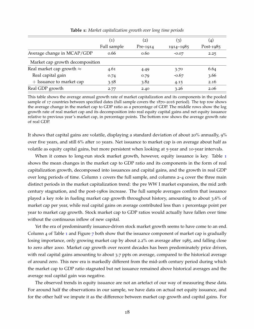
Table 1: Market capitalization growth over long time periods
(1) (2) (3) (4)Full sample Pre-1914 1914–1985 Post-1985
Average change in MCAP/GDP 0.66 0.60 -0.07 2.25
Market cap growth decompositionReal market cap growth ≈ 4.61 4.49 3.70 6.64
Real capital gain 0.74 0.79 -0.67 3.66
+ Issuance to market cap 3.58 3.82 4.15 2.16
Real GDP growth 2.77 2.40 3.26 2.06
This table shows the average annual growth rate of market capitalization and its components in the pooledsample of 17 countries between specified dates (full sample covers the 1870–2016 period). The top row showsthe average change in the market cap to GDP ratio as a percentage of GDP. The middle rows show the loggrowth rate of real market cap and its decomposition into real equity capital gains and net equity issuancerelative to previous year’s market cap, in percentage points. The bottom row shows the average growth rateof real GDP.
It shows that capital gains are volatile, displaying a standard deviation of about 20% annually, 9%
over five years, and still 6% after 10 years. Net issuance to market cap is on average about half as
volatile as equity capital gains, but more persistent when looking at 5-year and 10-year intervals.
When it comes to long-run stock market growth, however, equity issuance is key. Table 1
shows the mean changes in the market cap to GDP ratio and its components in the form of real
capitalization growth, decomposed into issuances and capital gains, and the growth in real GDP
over long periods of time. Column 1 covers the full sample, and columns 2–4 cover the three main
distinct periods in the market capitalization trend: the pre WW I market expansion, the mid 20th
century stagnation, and the post-1980s increase. The full sample averages confirm that issuance
played a key role in fueling market cap growth throughout history, amounting to about 3.6% of
market cap per year, while real capital gains on average contributed less than 1 percentage point per
year to market cap growth. Stock market cap to GDP ratios would actually have fallen over time
without the continuous inflow of new capital.
Yet the era of predominantly issuance-driven stock market growth seems to have come to an end.
Column 4 of Table 1 and Figure 7 both show that the issuance component of market cap is gradually
losing importance, only growing market cap by about 2.2% on average after 1985, and falling close
to zero after 2000. Market cap growth over recent decades has been predominately price driven,
with real capital gains amounting to about 3.7 ppts on average, compared to the historical average
of around zero. This new era is markedly different from the mid-20th century period during which
the market cap to GDP ratio stagnated but net issuance remained above historical averages and the
average real capital gain was negative.
The observed trends in equity issuance are not an artefact of our way of measuring these data.
For around half the observations in our sample, we have data on actual net equity issuance, and
for the other half we impute it as the difference between market cap growth and capital gains. For
18

Figure 8: Counterfactual evolution of market capitalization during the big bang
0.5
11.
5R
atio
to G
DP
1870 1890 1910 1930 1950 1970 1990 2010
Market cap to GDP ratio, actual dataCounterfactual 1: Constant capital gainsCounterfactual 2: Constant net issuance
Constant capital gains counterfactual forces the real capital gains during 1985–2016 to equal the pre-1985
average. Constant net issuance counterfactual forces net issuance relative to market cap during 1985–2016 toequal the pre-1985 average. Data are benchmarked so that the combined growth of the two counterfactualsbetween 1985 and 2016 equals the actual growth in observed market cap data. All data are unweightedaverages of 17 countries.
those countries where we have issuance data, both actual and implied issuance follow similar trends,
with a somewhat larger issuance boom in implied issuance in the 1980s and 1990s, but a similarly
sized fall in recent years (Appendix Figure B.2a). The larger implied issuance boom in the 1980s
and 1990s is most likely because actual issuance does not fully account for revaluations of newly
issued equity at market prices, while these are fully incorporated into implied issuance values. If
we look at trends in equity issuance relative to GDP as opposed to market cap, the slowdown in
issuance starts somewhat later as the rapid market expansion of the 1990s ensured that even though
issuance accounted for a declining share of stock market growth, the increases in the market cap to
GDP ratio meant that it kept growing relative to GDP (Appendix Figure B.2b).
4.2. Decomposing the recent stock market expansion
In this section, we examine the relative contribution of price and quantity changes to the post-
1980s acceleration in stock market growth. To assess this, the top panel of Figure 8 displays two
counterfactual evolutions of the market cap to GDP ratio during this time period, together with the
actual data (solid black line). The first counterfactual, marked by red diamonds, shows what the
market cap evolution after 1985 would have been if we fixed capital gains to their pre-1985 average.
Under this scenario, all changes in the market cap to GDP ratio from 1985 onwards are attributable
to changes in net issuance and real GDP growth. The second counterfactual (blue triangles) instead
fixes issuances to their pre-1985 mean and attributes all the post-1985 variation in the market cap
to GDP ratio to changes in real capital gains and real GDP growth. We benchmark the estimates
so that the combined growth under the two counterfactual scenarios equals the actual growth in
19

Figure 9: Issuance and capital gains by country, before and after the big bang-5
05
1015
Perc
enta
ge p
oint
s
BELGBR
FRADNK
PRTESP
USANOR FIN
AUSCAN
CHESWE
DEUNLD ITA
JPN
Real mcap growth Real capital gainNet equity issuance Residual
Pre-1985 average
-50
510
15
JPN ITA
GBRDEU
CANUSA
CHEAUS
NLDDNKSWE
BELFRA
NORESP FIN
PRT
Post-1985 average
Averages of log growth rates for each country before and after 1985. The sum of the bars can deviate from theorange diamond because of the correlation between issuance and capital gains, and because of differencesbetween implied and actual issuance. Net equity issuance is expressed as a share of previous year’s marketcap.
market cap over 1985–2016.6
Counterfactual 1 in Figure 8 shows that taking the post-1985 increases in capital gains out of the
data eliminates the big bang entirely. If real capital gains had remained at their historical average
of around zero, the market cap to GDP ratio would have declined slightly due to the post-2000
slowdown in net equity issuance. Counterfactual 2 shows that fixing issuance to its historical levels
results in a market cap trend that closely follows actual data until the early 2000s, and then results
in an even stronger market expansion because this counterfactual eliminates the recent issuance
slowdown from the trends.
Figure 9 shows that these aggregate trends are also reflected in country-level data. The left panel
shows the average growth rate of market cap before 1985 decomposed into capital gains and issuance,
and the right panel shows the average growth rate during the post-1985 market expansion. Almost
all of the long-run growth in capitalization before 1985 was driven by issuances. But after 1985, the
picture reverses with only the growth in the Portuguese stock market being issuance driven and the
other countries being dominated by capital gains. The Portuguese case is, however, explained by
country-specific events where the stock market more or less disappeared after the 1970s Carnation
Revolution and reemerged throughout the 1980s (see also the case study in Appendix Figure
B.5). Appendix Figure B.4 confirms that the largest post-1985 increases in the market cap to GDP
6The benchmarking ensures that the different timing of the shocks to issuance and capital gains, and thecorrelation between the two, do not bias our findings. For example, after the burst of the 1980s Japanesebubble, both issuance and capital gains were sharply negative, meaning that any subsequent growth took placefrom a very low base. Ignoring the correlation between these two shocks would overstate the counterfactualmarket cap growth under both scenarios. That being said, data for non-benchmarked counterfactuals showeven higher market cap growth under counterfactual 2 of fixed issuance which further supports our findings.The results are available from authors upon request.
20

ratio were observed in countries with the highest capital gains, rather than those with the highest
issuances. In addition, we estimate counterfactual market cap evolutions identical to Figure 8 for the
individual countries in Appendix Figure B.3. The individual country counterfactuals are similar to
the aggregate in Figure 8, with only Portugal and Australia experiencing substantial market growth
under the fixed capital gain Counterfactual 1, and all countries bar Portugal experiencing much
larger growth under the fixed issuance Counterfactual 2.
Figure 9 also shows that the post-1985 stock price increases in the US are representative of
broader cross-country patterns, with a number of Nordic countries in particular experiencing even
larger real capital gains. The positive contribution of the residual during the big bang period also,
again, shows that revaluations of newly issued equity may have further accelerated this recent
market cap growth. The slowdown in issuance is relatively more pronounced in the US, but it
is by no means an outlier with all countries bar Portugal reporting low issuance levels, and both
Switzerland and Sweden reporting issuance growth contributions smaller than that in the US.
One reason why issuances have slowed so much could be the increasing use of buybacks as
means of compensating shareholders starting in the 1980s (Grullon and Michaely, 2002). Unlike
dividends, buybacks reduce net equity issuance by lowering the number of shares outstanding on
the market. This means that the switch from dividends to buybacks could account for some of the
issuance slowdown. Because the use of buybacks started earlier and was more common in the US
(Megginson and Von Eije, 2008), it could also account for some of the differences between the US and
other countries. We quantify and discuss the contribution of buybacks to the growth decomposition
trends in Section D.2 of the Appendix. We find that without the switch to buybacks, post-1980s
issuances would have been somewhat higher and capital gains somewhat lower, especially in the
US. But the general patterns of falling issuances, less money flowing into the stock market, and
uncharacteristically high capital gains would have remained in place.
The analysis in this section further confirms that the last several decades have been highly
unusual, with large capital gains accelerating stock market growth beyond that of the real economy
despite a slowdown in issuances. That being said, issuances were a key driver of stock market
growth historically and continued to positively contribute to market capitalization growth even after
1985.
4.3. Equity issuance cycles and determinants
We have shown that net issuance and capital gains follow different long-run trends, with issuances
being high historically and relatively modest in recent years and real capital gains being low
historically and high after 1980. It turns out that this disconnect between issuance and capital gains
is true for both the long and the short run. Figure 10 shows the correlation between issuance (in
year t) and past (years t− 4 to t), present (year t), and future (years t + 1 to t + 5) real capital gains.
Issuance and capital gain cycles do not move together: the correlation between past and current
capital gains and issuance in the full sample is close to zero, and the correlation between current
21

Figure 10: Correlations between issuance and capital gains-.3
0.3
Cor
rela
tion
coef
ficie
nt
Pastcap gains
Currentcap gains
Futurecap gains
Full sample
-.30
.3
Pastcap gains
Currentcap gains
Futurecap gains
Pre-1985
-.30
.3
Pastcap gains
Currentcap gains
Futurecap gains
Post-1985
Correlation between equity issuance relative to market cap in year t, and real capital gain between years t− 4and t (past cap gains), year t (current cap gains), and years t + 1 to t + 5 (future cap gains), using pooled datafor the selected time periods. Error bars show the 90% confidence bands.
issuance and future capital gains is negative. This negative correlation confirms the Baker and
Wurgler (2000, 2002) findings that companies tend to time the market and issue equity at market
peaks. We also find that the procyclicality of equity issuance has become stronger in recent decades.
Whereas before 1985 (Figure 10 middle panel) equity and past capital gains were uncorrelated, they
became positively correlated after 1985 (Figure 10 right panel).
The evidence in Figures 10 and 7 shows that both long and short-run variation in issuance is
distinct from that in capital gains. Given the large cyclical volatility in stock prices, this makes it
difficult to infer the time variation in quantities, as well as the associated changes in market access
and financial development, from movements in market capitalization alone. Moreover, even the net
issuance figures may mask large compositional changes between gross and net issues, and between
new and old firms. To provide insight into the underlying trends in issuance and their drivers, we
focus the rest of our analysis in this section on the variation in net issuance and gross new listings.
We investigate the drivers of issuance by regressing different issuance measures on selected country
and time characteristics, economic growth, and the cost of issuance, with results shown in Table 2.
In the regressions for columns 1–3 we stick to our baseline net issuance measure, while columns 4–6
consider net issuance as a share of GDP instead of market cap, and columns 7–9 focus on gross new
listings (IPOs plus direct listings) rather than net issues. A number of robust explanatory variables
for net issuance stand out.
First, as suggested by the procyclicality of net issuance in Figure 10, all three of our proxies
for issuance are strongly correlated with the relative costs of issuing debt and equity. We proxy
the cost of issuing equity by the dividend-price ratio—with higher dividend yields indicating
lower valuations and a higher cost of equity—and the cost of issuing debt by the corporate bond
yield, with bond yield data taken from Kuvshinov (2021). A one percentage point increase in the
22

Table 2: Determinants of equity issuance
(1) (2) (3) (4) (5) (6) (7) (8) (9)
Dependent Variables
Net issuance / Market cap Net issuance / GDP New listings / Market cap
Market establishment 3.86∗
4.14∗
4.42 0.40 0.34 0.61 5.90∗∗
6.19∗∗
4.38
(1.94) (2.15) (3.09) (0.27) (0.47) (0.59) (1.85) (2.97) (3.60)
Pre-1914 dummy 0.78 1.16 0.66∗∗
0.61 0.22 -0.66
(1.08) (1.09) (0.29) (0.41) (0.37) (0.66)
1985–2000 dummy -1.71∗∗∗ -1.46
∗0.09 0.01 0.52 0.81
(0.53) (0.85) (0.25) (0.22) (0.24) (0.59)
Post-2000 dummy -1.79∗∗∗ -1.89
∗∗∗ -0.43 -0.56∗∗
0.50 0.42∗
(0.58) (0.70) (0.26) (0.23) (0.28) (0.23)
Common law country -1.16∗∗
0.46∗∗∗ -0.57
(0.49) (0.12) (0.37)
Dividend-price ratio -0.47 -0.49∗∗∗ -0.52
∗∗∗ -0.09∗∗ -0.13
∗∗∗ -0.15∗∗∗ -0.29
∗∗ -0.31∗∗ -0.68
∗∗∗
(0.32) (0.15) (0.19) (0.04) (0.04) (0.05) (0.07) (0.15) (0.18)
Corporate bond yield 0.57∗∗
0.46∗∗∗
0.63∗∗∗
0.02 0.01 0.02 0.29 0.18∗∗∗
0.34∗∗∗
(0.24) (0.13) (0.23) (0.03) (0.03) (0.05) (0.13) (0.06) (0.11)
Real GDP growth 0.20∗∗∗
0.18∗∗∗
0.18∗∗
0.05∗∗∗
0.04∗∗
0.05∗∗
0.07 0.04 0.03
(0.06) (0.06) (0.07) (0.01) (0.02) (0.02) (0.05) (0.04) (0.04)
Country fixed effects X X X X X XYear fixed effects X X XR2
0.07 0.06 0.16 0.03 0.02 0.13 0.25 0.20 0.42
Observations 1769 1769 1769 1769 1769 1769 394 394 394
This table reports the results of regressing various measures of equity issuance on its potential determinants.Dependent (issuance) variables are in logs. Specifications in columns (1), (4) and (7) are a pooled OLS with country-clustered standard errors. The other columns show panel specifications with country fixed effects [columns (2),(5) and (8)] and both country and year effects [columns (3), (6) and (9)]. Standard errors for these specificationsare clustered by country and year and adjusted for autocorrelation. We set market establishment to equal 1 in thefirst decade of the country-specific market cap sample, and in the decade after a stock market was closed for aconsiderable time period (typically during a war or revolution). Common law countries are Australia, UK, Canadaand US. *, **, and *** denote significance at the 10%, 5%, and 1% levels, respectively.
dividend-price ratio predicts half a percentage point lower issuance relative to market cap (about 0.1
ppts lower relative to GDP) and 0.3–0.7 percentage points lower new listings relative to market cap.
Higher corporate bond yields show similarly-sized effects in the opposite direction, with a higher
cost of debt leading firms to obtain finance through equity markets. We also find some role for the
business cycle. Issuance is positively correlated with GDP growth, but the effect seems stronger for
firms already listed on the market than new listings, as evidenced by larger and more significant
coefficients on GDP growth in columns 1–3 compared to in columns 7–9.
Second, we investigate the role of institutional characteristics. We find that issuance bears little
correspondence to legal norms: common law countries tend to have higher market capitalization
(right panel of Figure 6) but lower net issuance and new listings (columns 1 and 7), perhaps because
the markets are already well established and a large share of the country’s firms are already listed
23

on the exchange. However, because capitalization in these countries tends to be large, their net
issuance is larger as a share of GDP (column 4).
Third, we find some evidence that issuance is particularly high after the establishment of new
equity markets and the reopening of a stock market. The positive coefficients on the market
establishment dummy—set equal to 1 in the first decade of the market data, or after a prolonged
market closure—suggest that when stock markets begin or resume operation, firms look to take
advantage of these new funding opportunities to obtain equity finance. This effect is stronger for
new listings (columns 7–9), but much larger as a share of market cap than GDP pertaining to the
fact that during these times, the country’s stock market tends to be small. The significance of the
market establishment dummy is lower with year fixed effects (columns 3, 6, and 9) because many
markets in our sample were being established at similar time periods, reducing the cross-sectional
variation in this measure. The prevalence of new markets being established helps explain the high
issuance levels observed early in the sample: conditional on the market establishment dummy, the
pre WW I time period (Pre-1914 dummy) does not have significantly higher issuance. Appendix
Figure B.5 shows shows several specific country case studies of market cap growth decomposition,
which highlight that issuance was the driving force of a number of historical market expansions,
including market growth after the foundation of the Helsinki and Oslo stock exchanges, and the
re-establishment of the Lisbon Stock Exchange after the Carnation Revolution.
Finally, the time dummy coefficients in Table 2 confirm the broad secular trends evident in
Figure 7. While the pre-1914 issuance was relatively strong or at least not unusually low, the post
big bang decades saw low levels of issuance, especially conditional on the low cost of issuing equity
during this period. But interestingly, the trend issuance slowdown is much less evident when it
comes to new listings (columns 7–8), suggesting that net and gross equity issuance may follow
different time trends. After all, a post-1980s slowdown in net issuance does not necessarily imply
that all the growth and capital gains accrued to firms already listed on the market in the early 1980s.
To further look into this, we construct a measure of churn—the market cap share of firms
that were listed in the last 10 years—for five stock markets in our sample. There are two ways of
measuring churn in our data. The most accurate method splits the current market capitalization
into firms listed in the last 10 years and those listed beforehand, but the detail of the data only allow
us to construct this measure for the US. For the other countries, we cannot track the capitalization of
individual firms for long periods of time but we know the market cap of new listings taking place
within each year. To calculate the second proxy for churn, we take the ratio of the market cap of new
firms listed in one year to that of old firms, and sum these ratios over a 10-year period. The second
measure ignores post-listing growth differentials between new and old listings, but in practice these
are small (see Appendix Table B.1 and Figure B.6) and in the US, the two churn measures are very
close to each other (Figure 11 top-left panel).
Figure 11 shows the long-run evolution of the new listings market share in five different countries.
We see substantial churn close to the stock market’s establishment and in the part of the sample
period more generally. The market share of newly firms listed was high—close to one-third of old
24

Figure 11: Churn in selected stock markets0
.2.4
1935 1960 1985 2010
United States
0.1
.2.3
1920 1935 1950 1965 1980 1995 2010
United Kingdom0
.2.4
.6R
atio
1880 1905 1930 1955 1980 2005
Switzerland
01
23
1880 1905 1930 1955 1980 2005
Portugal
0.2
.4.6
Rat
io
1920 1935 1950 1965 1980 1995 2010
SwedenChurn: market cap of new listings (past 10years) divided by market cap of old listings
Proxy for churn: 10-year sum of newly listedcap divided by (Total cap - Newly listed cap)
We define churn as the market capitalization of firms listed within the last 10 years divided by the capitalizationof other listings. For the US, we compute the churn in year t by summing the year t market cap of all stockslisted between years t− 9 and t and dividing it by the sum of market caps of stocks listed before year t− 9,using the listing dates for each stock in the CRSP database (dashed orange line). An alternative simpler proxy(solid black line) first calculates the ratio of the cap of new listings in year z to that of old listings (listedbefore year z) for each of the preceding 10 years z = t− 9 to z = t, and then sums these ratios.
listings—in the 1930s US, 1880s Switzerland, and 1920s Sweden. The mid 20th century saw very
little entry from new firms despite relatively high net issuance, suggesting that most of the issuance
throughout this period was from companies that were already listed. This supports Rajan and
Zingales’ (2003) “great reversals” theory that during this period of stagnation in market growth,
stock markets were dominated by incumbents and there was little entry from new firms. Throughout
this time period, the market share of new listings generally remained at or below 10% of the value
of old listings.
The 1980s saw a pickup in the amount of new equity entering the markets, but the size of this
pickup differed materially across countries. The more established markets of the US, UK, and
Switzerland recorded comparatively smaller increases in churn. Sweden and Portugal, however,
saw large market entry and churn, much of it for institutional reasons. In Sweden, IPOs were not
permitted until 1979, although firms could still list directly, which is why the new listings for the
25

pre-1979 period are above zero. Following market liberalization of the 1980s, there was a large surge
in market entry and IPOs, as discussed by Rydqvist and Hogholm (1995). In Portugal, after the
stock market more or less disappeared in the immediate aftermath of the Carnation Revolution, the
eventual market re-establishment saw the market share of new firms become much larger than that
of old firms, by a factor of about 3. Even for the US, where the pick-up in churn was not as strong
as in Sweden and Portugal, by 2015 around half of the total market capitalization was accounted for
by firms listed after 1985 (Appendix Figure B.7).
5. Drivers of the post-1980s stock market growth
This section explores the drivers of the persistent equity price increases that underpin the post-1980s
expansion in stock market wealth. These drivers can be outlined within the framework of the
dynamic Gordon growth model. We first note that the ratio of market capitalization to GDP is
approximately equal to the ratio of aggregate dividends paid by listed firms to GDP, Dagg/GDP,
times the average value-weighted price-dividend ratio of the stock market Pt/Dt:
MCAPt
GDPt=
Nt
∑i=1
(Qi,tDi,t
GDPt∗ Pi,t
Di,t
)≈ Dagg
tGDPt
∗ Pt/Dt, (4)
where Daggt =
Nt
∑i=1
Qi,tDi,t. We can then take logs on both sides and apply the Campbell and Shiller
(1988) decomposition to the log price-dividend ratio:
ln(
MCAPt
GDPt
)≈ ln
(Dagg
tGDPt
)+ E
(∞
∑τ=0
ρτ(dgt+τ+1 − rt+τ+1)
), (5)
where dg is log real dividend growth, r is log real total return, and ρ = P/D1+P/D is a linearization
constant. Intuitively, equation (5) is an approximate present value identity for the entire stock
market. It tells us that the size of the stock market relative to the economy is determined by three
factors.
The first factor is the current profit share of listed firms, Dagg/GDP. If listed firms’ profits and
dividends constitute a large share of economic income, the size of the stock market—which reflects
the present value of these profit and dividend streams—will also be large relative to the rest of the
economy. The second factor is the future profit growth (or dividend growth) dg: stocks can be valued
highly not only because profits are high today, but also if they are expected to be high in the future.
The third factor r is the discount rate, which capitalizes these future profits, with lower discount rates
increasing the present value of the profit stream and leading to higher market capitalization.
We evaluate the relative importance of these three drivers using a two-step procedure. First, we
look at the correlations between market capitalization and its three determinants. As we cannot
measure return and dividend growth expectations directly, we follow previous studies (Campbell
and Shiller, 1988; Cochrane, 2008) and run predictive regressions of future dividends and future
26
returns on current market capitalization. If high market capitalization predicts low future stock
returns or high future dividend growth, this means that r and dg are relevant drivers of fluctuations
in the size of the stock market. These correlations tell us about which forces tend to drive the
year-on-year growth in the market cap to GDP ratio, but they do not necessarily tell us what drives
its long-run trend. To this end, in the second step we look at the trends in those variables that are
correlated with market capitalization in the right direction in order to determine the contribution of
these trends to the long-run evolution of market cap.
5.1. Market capitalization, future returns, and dividends
Figure 12 plots the correlations of market capitalization with the three components of equation
(5): the current share of dividends in GDP, future growth of dividends, and future returns. As
in equation (5), all the variables are in logs, and we calculate present value discounted sums
∑∞τ=0 ρτdgt+τ+1 and ∑∞
τ=0 ρτrt+τ+1 by taking realized returns and dividends between year t and
2016, and assuming returns and dividend growth are equal to the respective country-specific sample
mean after 2016.7 We also adjust market cap and dividends to GDP for structural breaks so that all
variables are stationary to avoid potentially spurious correlations, and postpone the questions of
time series trends until the second step of the analysis in Sections 5.2 and 5.3. Not adjusting for
structural breaks, however, leads to similar results.
The correlation between market capitalization, dividend share in GDP, and future returns is
in line with the theoretical predictions of equation (5): a high market cap to GDP ratio means
high current listed firm dividends relative to GDP, and low future equity returns. But market
capitalization and future dividend growth are, if anything, correlated in the wrong direction: high
market cap actually predicts low rather than high future dividend growth.
We further test these relationships by running predictive regressions of the following form:
rj,t+1 = αrj + βrln(MCAPj,t/GDPj,t) + ur
j,t (6)
dgj,t+1 = αdgj + βdgln(MCAPj,t/GDPj,t) + udg
j,t , (7)
where j is a country index, α is a country fixed effect, and u is a Driscoll and Kraay (1998) standard
error clustered by country and year, and adjusted for serial autocorrelation.
Table 3 reports the corresponding regression coefficients βr and βdg for a range of different
specifications. The Campbell and Shiller (1988) decomposition in equation (5) tells us that the
regression coefficient on future returns βr should be negative, and βdg on dividend growth should
be positive. In the data, βr is negative and statistically and economically significant, with a 10
percentage point increase in the market cap to GDP ratio predicting roughly 4 percentage points
lower returns one year ahead.8 But market capitalization does not predict high future dividend
7In Figure 12, we annualize the discounted sums of r and g by multiplying them by 1− ρ.8A 10 percentage point increase is roughly 25% in relative terms, meaning a 0.25× 0.151× 1.048 ≈ 0.0396
27

Figure 12: Correlations between market cap, current dividend share, future returns, and future dividends-5
.5-5
-4.5
-4ln
(D /
GD
P) a
t t
-2 -1.5 -1 -.5 0ln(MCAP / GDP) at t
Dividend share in GDP
.02
.04
.06
.08
ln(1
+r),
t+1
onw
ards
-2 -1.5 -1 -.5 0ln(MCAP / GDP) at t
Future returns
-.01
0.0
1.0
2.0
3.0
4ln
(1+g
), t+
1 on
war
ds
-2 -1.5 -1 -.5 0ln(MCAP / GDP) at t
Future dividend growth
Binned scatter plots of pooled full sample data (17 countries, 1870–2016), 100 bins. Each point represents thegroup-specific means of both variables after controlling for country fixed effects. All variables are winsorizedat the 1% level. Market cap to GDP and dividends to GDP are adjusted for structural breaks.
Table 3: Stock market capitalization as a predictor of equity returns and dividends
(1) (2) (3) (4) (5) (6)
Baseline Post-1985 Year effects
rt+1 dgt+1 rt+1 dgt+1 rt+1 dgt+1
ln(MCAPt/GDPt) -0.150∗∗∗ -0.074
∗ -0.211∗∗∗ -0.023 -0.098
∗∗∗ -0.060
(0.036) (0.041) (0.048) (0.069) (0.032) (0.053)
R20.063 0.012 0.099 0.001 0.516 0.218
Observations 1869 1869 492 492 1869 1869
(7) (8) (9) (10) (11) (12)
Risk premia 5-year returns No structuraland safe rates Breaks
ert+1 rsa f et+1 rt+1,t+5 dgt+1,t+5 rt+1 dgt+1
ln(MCAPt/GDPt) -0.128∗∗∗ -0.046
∗ -0.097∗∗∗ -0.042
∗∗ -0.039∗∗∗ -0.009
(0.031) (0.026) (0.023) (0.018) (0.011) (0.015)
R20.040 0.011 0.136 0.024 0.018 0.001
Observations 1869 1869 1768 1768 1869 1869
This table reports the results of regressing future equity returns and dividend growth on today’s market cap.The market cap to GDP ratio is adjusted for structural breaks. r is total real return, dg is real dividend growth,er is excess return, and rsa f e is real government bond return, all measured in logs. All regressions includecountry fixed effects, and those in columns (5) and (6) additionally include year fixed effects. Standard errorsare clustered by country and year and adjusted for autocorrelation. *, **, and *** denote significance at the10%, 5% and 1% levels, respectively.
28

growth: in some specifications the dividend predictability is negative, and in others it is statistically
insignificant. These results hold if we restrict the sample to the post-1985 time period (columns
3–4), control for common cross-country variation using year fixed effects (columns 5–6), and look at
longer horizon returns (columns 9–10). Return predictability reflects both future changes in the risk
premium and the safe rate (columns 7–8), and remains significant but somewhat weaker when we
do not adjust for structural breaks (columns 5–6), consistent with US evidence on other stock return
predictors (Lettau and Van Nieuwerburgh, 2008).
Taken together, this means that market capitalization correlates with changes in the current
profit share and future returns, but not with changes in future growth. Together with the evidence
of declining productivity in the US and other advanced economies (Fernald, 2015; Goldin et al.,
2021), this suggests that increases in future expected—but not yet realized—dividend growth are a
rather unlikely driver of the big bang. Therefore, we focus our analysis on the other two drivers and
investigate whether the post-1980s capitalization increases could have been driven by a lower equity
discount rate (Section 5.2) or an increase in the dividend share of GDP (Section 5.3), and assess the
relative contributions of these two factors (Section 5.4).
5.2. A declining discount rate
Safe interest rates have declined markedly over the long run (Schmelzing, 2020; Del Negro et al.,
2019; Holston et al., 2017). Much of this decline happened after 1980, a similar time period to that of
the market expansion during the big bang. This makes declining discount rates a natural candidate
for explaining the cross-country market capitalization increases observed after the 1980s. But the
relevant discount rate for equity is the sum of the safe rate and the market risk premium. Using
the Gordon growth model, we can calculate the equity discount rate E (Rt+1) as the sum of the
expected dividend-price ratio and expected future cashflow growth:9
E (Rt+1) = rsa f e + Risk premium ≈ E (Dt+1/Pt) + E (gi,t+2) . (8)
The left-hand panel of Figure 13 shows the long-run trend in a simple proxy of the equity
discount rate and a lower bound for the expected return on equities if expected cashflow growth is
larger than zero—the dividend-price ratio D/P. The dividend-price ratio has declined over the long
run, falling from 5% in the early 20th century to a low of 2% in 1990 before recovering to around 3%
in 2016. Earnings-price ratios—which allow us to look through changes in corporate payout policy,
such as the increasing use of stock buybacks during recent decades (see Grullon and Michaely, 2002;
Megginson and Von Eije, 2008, and Appendix D.2)—show a similar declining pattern from the 1980s
onwards.
fall in real total return using the coefficients in column 1.9This is a levels version of the Campbell and Shiller (1988) decomposition derived by Blanchard (1993).
Here gi,t+2 is the annuity value of future dividend growth, calculated as gt+2 = w1Egt+2 + w2Egt+3 + ... +wτEgt+τ+1. gt = Dt/Dt−1 − 1 is the year-on-year cashflow growth and wt = (1 + g)τ−1(r− g)/(1 + r)τ arethe weights, where g and r are the average dividend growth and return rates.
29

Figure 13: Simple proxies for the risky and safe discount rate
04
812
16E/
P, p
er c
ent
02
46
8D
/P, p
er c
ent
1870 1905 1940 1975 2010
Dividend-price ratioEarnings-price ratio,5-year MA
Trends in equity price ratios
-10
12
34
5
DNKJP
NUSA
BELDEU
NLD ITASWE
CHEFRA
CANNOR FIN
GBRPRT
ESPAUS
Nominal short-term safe rateDividend-price ratio
Safe rates and dividend-price ratios in 2015
Left-hand panel shows unweighted averages of 17 countries, with earnings-price ratios calculated fromfirm-level microdata in Compustat Global and North America. Right-hand panel shows the level of thedividend-price ratio and nominal short-term interest rate in 2015.
Still, these declines—especially the part that occurred after the 1980s—are not as marked as
the decline in the safe rate, which fell from historically high levels in the aftermath of the 1970s
stagflation to around zero by 2015. The right-hand panel of Figure 13 shows the level of the
dividend-price ratio and the nominal safe rate in 2015. Assuming positive inflation, the nominal
safe rate provides an upper-bound estimate of the real safe rate. For all the countries in our sample,
the dividend-price ratio is much higher than the safe rate and the differences are substantial, on the
order of magnitude of several percentage points. This suggests that even though the equity discount
rate has decreased, equity risk premia were still sizeable and the discount rate was still relatively
high in 2015.
In addition to studying the trends and levels of the raw data, we also estimate the expected
return E(R) and the trend real safe rate rsa f e. To do this, we first estimate expected cashflow growth
by constructing a long-run forecast of future dividends. This forecast is the average of two proxies
from Kuvshinov and Zimmermann (2020), the first of which forecasts future dividends using current
asset valuations within a flexible time-varying VAR specification, and the second of which equates
the long-run dividend growth rate to a long-run GDP growth forecast.10 For the safe rate, we extend
the Del Negro et al. (2019) estimates of the trend long-term real government bond yield to the 17
countries in our sample.
The resulting expected return estimate, pictured as the blue line in the left-hand panel of Figure
10We use the average of these two forecasts to provide a balanced perspective. The trend decline ofexpected returns using the long-run GDP growth forecast is somewhat stronger than that using the VARdividend forecast, since the dividend share in GDP has increased (Section 5.3), but it is not clear whetherthe dividend share will keep increasing over the longer run, hence our use as the GDP growth forecast asan additional metric. For more detail on the expected risky and safe return estimation, see Kuvshinov andZimmermann (2020).
30

Figure 14: Expected equity returns, safe rates, and risk premia0
24
68
Perc
ent
1870 1905 1940 1975 2010
Expected return on equity Risk premiumReal safe rate
Long-run trends
-6-4
-20
24
ESPNLDBEL
USAFRA
DNKGBR
CANCHE
NOR FINPRT ITA
DEUAUS
SWEJP
N
Exp. returnRisk premiumReal safe rate
Post-1980s changes
The expected equity return is the dividend-price ratio plus expected cashflow growth calculated as theaverage of a VAR forecast of future dividends and a forecast of long-run GDP growth. The safe rate is thetrend long-term real government bond rate estimated using the Bayesian VAR method of Del Negro et al.(2019), and the risk premium is the difference between expected return and safe rate. See Kuvshinov andZimmermann (2020) for more details. The left-hand panel shows trends in unweighted cross-country averages.The right-hand panel shows the differences between the levels in the 1980s and 2015.
14, displays a similar trend to the dividend- and earnings-price ratios but a slightly smaller long-run
decline due to moderate increases in the expected cashflow growth offsetting some of the decline
in equity price ratios (equation (8)). Like with the dividend-price and earnings-price ratios, the
post-1980s decline in the expected equity return is much smaller than that in the safe rate (dark
green area). Correspondingly, the difference between the two, the equity risk premium (light blue
area) has increased materially since 1990. These broad cross-country patterns are mirrored in
country-level data. The right-hand panel of Figure 14 shows the change in the real safe rate and
the risk premium, as well as their sum, the expected return, between the 1980s and 2015. In all
countries, the trend real safe rate has declined while in all bar three, the risk premium has increased.
No country registers a large risk premium decline. These patterns hold regardless of the way we
measure the expected risky and safe returns in the data.
The post-1980s trends in risky and safe discount rates are consistent with existing evidence on
the falling safe rate, stable return on productive capital, and a rising equity premium in the US
(Rachel and Summers, 2019; Gomme et al., 2015; Caballero et al., 2017a). Existing literature offers
several explanations for these trends, which center around either a higher demand or a lower supply
of safe investments—both factors that would push down the safe rate and increase the risk premium
(Farhi and Gourio, 2018; Kuvshinov and Zimmermann, 2020; Caballero, Farhi, and Gourinchas,
2017b). The increases in the market cap to GDP ratio may have actually contributed to the increases
in demand for safety by increasing the volatility of equity wealth relative to income (right-hand
panel of Figure 3), thereby increasing the risk exposures of equity investors and risk premia.
31
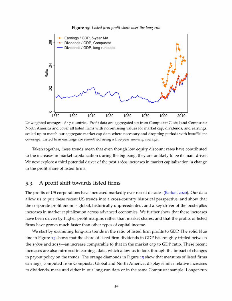
Figure 15: Listed firm profit share over the long run
0.0
2.0
4.0
6R
atio
1870 1890 1910 1930 1950 1970 1990 2010
Earnings / GDP, 5-year MADividends / GDP, CompustatDividends / GDP, long-run data
Unweighted averages of 17 countries. Profit data are aggregated up from Compustat Global and CompustatNorth America and cover all listed firms with non-missing values for market cap, dividends, and earnings,scaled up to match our aggregate market cap data where necessary and dropping periods with insufficientcoverage. Listed firm earnings are smoothed using a five-year moving average.
Taken together, these trends mean that even though low equity discount rates have contributed
to the increases in market capitalization during the big bang, they are unlikely to be its main driver.
We next explore a third potential driver of the post-1980s increases in market capitalization: a change
in the profit share of listed firms.
5.3. A profit shift towards listed firms
The profits of US corporations have increased markedly over recent decades (Barkai, 2020). Our data
allow us to put these recent US trends into a cross-country historical perspective, and show that
the corporate profit boom is global, historically unprecedented, and a key driver of the post-1980s
increases in market capitalization across advanced economies. We further show that these increases
have been driven by higher profit margins rather than market shares, and that the profits of listed
firms have grown much faster than other types of capital income.
We start by examining long-run trends in the ratio of listed firm profits to GDP. The solid blue
line in Figure 15 shows that the share of listed firm dividends in GDP has roughly tripled between
the 1980s and 2015—an increase comparable to that in the market cap to GDP ratio. These recent
increases are also mirrored in earnings data, which allow us to look through the impact of changes
in payout policy on the trends. The orange diamonds in Figure 15 show that measures of listed firms
earnings, computed from Compustat Global and North America, display similar relative increases
to dividends, measured either in our long-run data or in the same Compustat sample. Longer-run
32
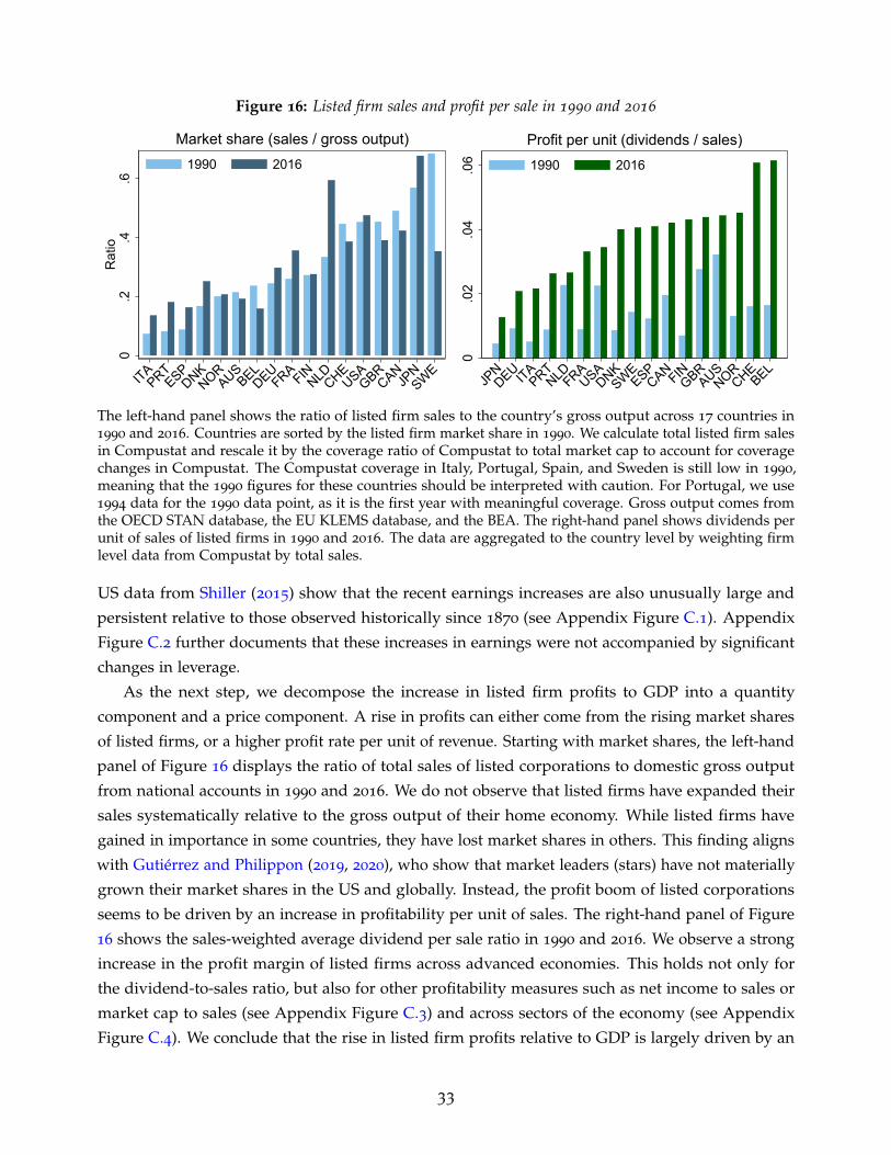
Figure 16: Listed firm sales and profit per sale in 1990 and 20160
.2.4
.6R
atio
ITAPRT
ESPDNK
NORAUS
BELDEU
FRA FINNLDCHE
USAGBR
CANJP
NSWE
Market share (sales / gross output)1990 2016
0.0
2.0
4.0
6
JPNDEU ITA
PRTNLDFRA
USADNK
SWEESP
CAN FINGBR
AUSNOR
CHEBEL
Profit per unit (dividends / sales)1990 2016
The left-hand panel shows the ratio of listed firm sales to the country’s gross output across 17 countries in1990 and 2016. Countries are sorted by the listed firm market share in 1990. We calculate total listed firm salesin Compustat and rescale it by the coverage ratio of Compustat to total market cap to account for coveragechanges in Compustat. The Compustat coverage in Italy, Portugal, Spain, and Sweden is still low in 1990,meaning that the 1990 figures for these countries should be interpreted with caution. For Portugal, we use1994 data for the 1990 data point, as it is the first year with meaningful coverage. Gross output comes fromthe OECD STAN database, the EU KLEMS database, and the BEA. The right-hand panel shows dividends perunit of sales of listed firms in 1990 and 2016. The data are aggregated to the country level by weighting firmlevel data from Compustat by total sales.
US data from Shiller (2015) show that the recent earnings increases are also unusually large and
persistent relative to those observed historically since 1870 (see Appendix Figure C.1). Appendix
Figure C.2 further documents that these increases in earnings were not accompanied by significant
changes in leverage.
As the next step, we decompose the increase in listed firm profits to GDP into a quantity
component and a price component. A rise in profits can either come from the rising market shares
of listed firms, or a higher profit rate per unit of revenue. Starting with market shares, the left-hand
panel of Figure 16 displays the ratio of total sales of listed corporations to domestic gross output
from national accounts in 1990 and 2016. We do not observe that listed firms have expanded their
sales systematically relative to the gross output of their home economy. While listed firms have
gained in importance in some countries, they have lost market shares in others. This finding aligns
with Gutierrez and Philippon (2019, 2020), who show that market leaders (stars) have not materially
grown their market shares in the US and globally. Instead, the profit boom of listed corporations
seems to be driven by an increase in profitability per unit of sales. The right-hand panel of Figure
16 shows the sales-weighted average dividend per sale ratio in 1990 and 2016. We observe a strong
increase in the profit margin of listed firms across advanced economies. This holds not only for
the dividend-to-sales ratio, but also for other profitability measures such as net income to sales or
market cap to sales (see Appendix Figure C.3) and across sectors of the economy (see Appendix
Figure C.4). We conclude that the rise in listed firm profits relative to GDP is largely driven by an
33

Figure 17: Profitability and market shares of listed firms in the US0
.2.4
.6R
atio
1950 1970 1990 2010
Market share (sales / gross output)
0.0
25.0
5.0
75R
atio
1950 1970 1990 2010
Profitability (net income / sales)
The left-hand panel shows the ratio of listed firm sales to gross output in the US. The right-hand panel showsthe sales-weighted average net income per unit of sales. Data cover all listed firms in the CRSP-CompustatMerged (CCM) dataset. To account for changes in coverage in the CCM database, we rescale sales by theratio of CCM mcap to aggregate market cap. This implicitly assumes that the CCM sales to mcap ratio isrepresentative of all listed equities.
increase in the profit margin.
Prior studies suggest that the profit margins of US corporates have been high before (Barkai
and Benzell, 2018; Traina, 2018). We replicate this result in the left-hand panel of Figure 17. The
profit margin of listed firms in the US a U-shaped pattern, with high levels in the 1950s, low levels
in the 1980s and 1990s, and high levels again after 2010. Why did these high profit margins not
translate into high profit shares and market capitalization during the 1950s? The reason for this is
that, even though profit margins were high, listed firm sales were small relative to the rest of the
economy. The right-hand panel of Figure 17 shows the evolution of the estimated market share of
listed corporations in the US, again measured using the sales to gross output ratio. Listed firms’
market share was low in the 1950s at around one-third of gross output, increased in the 1960s and
1970s, and remained at around 50% of gross output throughout subsequent decades. The rising
market share of listed firms was actually part of a much broader shift away from unincorporated
businesses towards corporations (both C-corporations and S-corporations) in the US, which took
place between 1950 and 1980 (see the left-hand panel of Appendix Figure C.5). Thus, the negative
impact of declining profit margins in the 1960s and 1970s was offset by the rising market share, with
these two effects largely cancelling out to leave the listed firms profits and market capitalization
shares and GDP stable throughout this time period.
The post-1980s increases in listed firm profits relative to GDP suggest that there has been
a redistribution of income away from other sectors of the economy towards listed firms. This
redistribution could have come about from either labor income or other forms of capital income.
Karabarbounis and Neiman (2013) have shown that the share of labor income in GDP has fallen
since the 1980s, and in a contemporaneous paper to ours, Greenwald et al. (2021) argue that the
34

Figure 18: Listed firm profits and capital income.1
.2.3
.4.5
Cap
ital i
ncom
e / G
DP
1910 1930 1950 1970 1990 2010
Gross capital shareNet capital shareNet capital share minus rents
Capital shares
0.1
.2.3
Rat
io
1910 1930 1950 1970 1990 2010
Earnings / Net capital incomeDividends / Net capital income,CompustatDividends / Net capital income,long-run data
Listed firm share in net capital income
Unweighted cross-country averages. Data on gross and net capital income are from Bengtsson and Walden-strom (2018) and cover Australia, France, Germany, Sweden, UK, and US. Rent data are from Jorda et al. (2019).Profit data are aggregated up from Compustat Global and Compustat North America and cover all listedfirms with non-missing values for market cap, dividends, and earnings, scaled up to match our aggregatemarket cap data and dropping periods with insufficient coverage. Listed firm earnings are smoothed using afive-year moving average.
decline in the labor share is a key driver of the increase in US stock market capitalization. To
investigate the contribution of this channel to the long-run cross-country increases in capitalization
across countries, the left-hand panel of Figure 18 shows the long-run evolution of three different
capital share measures for six advanced economies. We take gross and net capital shares from
Bengtsson and Waldenstrom (2018), and use the balance sheet net rental income data from Jorda
et al. (2019) to further adjust these for rents.
The trends suggest that changes in the capital share play relatively little role in explaining the
rising listed firm profit share. While the gross capital share (green diamonds) has indeed increased
substantially since the 1980s, the net-of-housing net capital share (blue circles) has remained broadly
flat, in line with evidence in Rognlie (2015) and Gutierrez and Piton (2020). Furthermore, both gross
and net capital shares, if anything, have declined slightly over the long run and were much higher
during the late 1930s—a time of low market capitalization—than they are today. Correspondingly,
the right-hand panel of Figure 18 shows that the ratio of listed firms’ earnings to net capital income
has increased markedly during the recent decades, rising from 10% in 1990 to 25% in 2015. These
increases are historically unprecedented, with the ratio of listed dividends to capital income standing
at an all-time historical high of 15%.
Within-capital-income shifts not only account for a large proportion of the time series trend, but
also for cross-country differences in market capitalization increases during the big bang. Figure
19a shows that countries with the highest post-1980s market capitalization increases also recorded
the largest shifts within capital income towards listed firm profits, but generally did not record
35
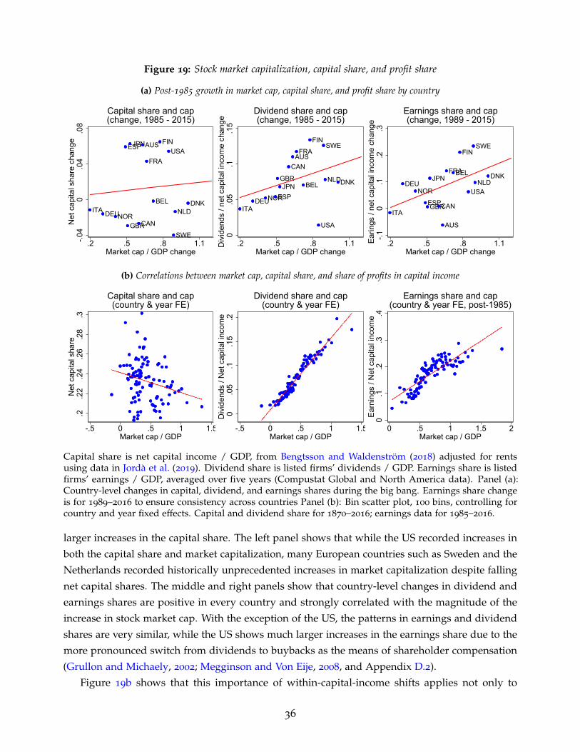
Figure 19: Stock market capitalization, capital share, and profit share
(a) Post-1985 growth in market cap, capital share, and profit share by country
ITA DEUNOR
ESP
GBR
JPN
CAN
AUS
FRA
BEL
FINUSA
SWE
NLDDNK
-.04
0.0
4.0
8N
et c
apita
l sha
re c
hang
e
.2 .5 .8 1.1Market cap / GDP change
Capital share and cap(change, 1985 - 2015)
ITADEUNORESP
GBRJPN
CANAUS
FRA
BEL
FIN
USA
SWE
NLDDNK
0.0
5.1
.15
Div
iden
ds /
net c
apita
l inc
ome
chan
ge
.2 .5 .8 1.1Market cap / GDP change
Dividend share and cap(change, 1985 - 2015)
ITA
DEUNOR
ESPGBR
JPN
CAN
AUS
FRABEL
FIN
USA
SWE
NLDDNK
-.10
.1.2
.3Ea
rings
/ ne
t cap
ital i
ncom
e ch
ange
.2 .5 .8 1.1Market cap / GDP change
Earnings share and cap(change, 1989 - 2015)
(b) Correlations between market cap, capital share, and share of profits in capital income
.2.2
2.2
4.2
6.2
8.3
Net
cap
ital s
hare
-.5 0 .5 1 1.5Market cap / GDP
Capital share and cap(country & year FE)
0.0
5.1
.15
.2D
ivid
ends
/ N
et c
apita
l inc
ome
-.5 0 .5 1 1.5Market cap / GDP
Dividend share and cap(country & year FE)
0.1
.2.3
.4Ea
rnin
gs /
Net
cap
ital i
ncom
e
0 .5 1 1.5 2Market cap / GDP
Earnings share and cap(country & year FE, post-1985)
Capital share is net capital income / GDP, from Bengtsson and Waldenstrom (2018) adjusted for rentsusing data in Jorda et al. (2019). Dividend share is listed firms’ dividends / GDP. Earnings share is listedfirms’ earnings / GDP, averaged over five years (Compustat Global and North America data). Panel (a):Country-level changes in capital, dividend, and earnings shares during the big bang. Earnings share changeis for 1989–2016 to ensure consistency across countries Panel (b): Bin scatter plot, 100 bins, controlling forcountry and year fixed effects. Capital and dividend share for 1870–2016; earnings data for 1985–2016.
larger increases in the capital share. The left panel shows that while the US recorded increases in
both the capital share and market capitalization, many European countries such as Sweden and the
Netherlands recorded historically unprecedented increases in market capitalization despite falling
net capital shares. The middle and right panels show that country-level changes in dividend and
earnings shares are positive in every country and strongly correlated with the magnitude of the
increase in stock market cap. With the exception of the US, the patterns in earnings and dividend
shares are very similar, while the US shows much larger increases in the earnings share due to the
more pronounced switch from dividends to buybacks as the means of shareholder compensation
(Grullon and Michaely, 2002; Megginson and Von Eije, 2008, and Appendix D.2).
Figure 19b shows that this importance of within-capital-income shifts applies not only to
36
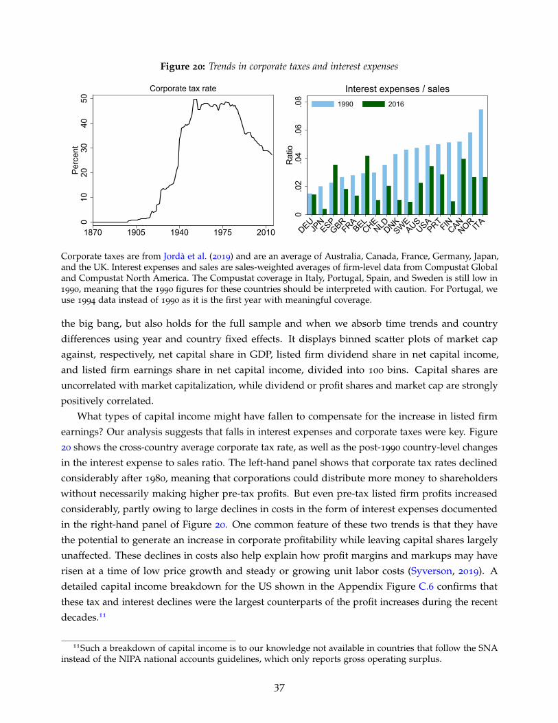
Figure 20: Trends in corporate taxes and interest expenses
010
2030
4050
Perc
ent
1870 1905 1940 1975 2010
Corporate tax rate
0.0
2.0
4.0
6.0
8R
atio
DEUJP
NESP
GBRFRA
BELCHE
NLDDNKSWE
AUSUSA
PRTFIN
CANNOR ITA
Interest expenses / sales1990 2016
Corporate taxes are from Jorda et al. (2019) and are an average of Australia, Canada, France, Germany, Japan,and the UK. Interest expenses and sales are sales-weighted averages of firm-level data from Compustat Globaland Compustat North America. The Compustat coverage in Italy, Portugal, Spain, and Sweden is still low in1990, meaning that the 1990 figures for these countries should be interpreted with caution. For Portugal, weuse 1994 data instead of 1990 as it is the first year with meaningful coverage.
the big bang, but also holds for the full sample and when we absorb time trends and country
differences using year and country fixed effects. It displays binned scatter plots of market cap
against, respectively, net capital share in GDP, listed firm dividend share in net capital income,
and listed firm earnings share in net capital income, divided into 100 bins. Capital shares are
uncorrelated with market capitalization, while dividend or profit shares and market cap are strongly
positively correlated.
What types of capital income might have fallen to compensate for the increase in listed firm
earnings? Our analysis suggests that falls in interest expenses and corporate taxes were key. Figure
20 shows the cross-country average corporate tax rate, as well as the post-1990 country-level changes
in the interest expense to sales ratio. The left-hand panel shows that corporate tax rates declined
considerably after 1980, meaning that corporations could distribute more money to shareholders
without necessarily making higher pre-tax profits. But even pre-tax listed firm profits increased
considerably, partly owing to large declines in costs in the form of interest expenses documented
in the right-hand panel of Figure 20. One common feature of these two trends is that they have
the potential to generate an increase in corporate profitability while leaving capital shares largely
unaffected. These declines in costs also help explain how profit margins and markups may have
risen at a time of low price growth and steady or growing unit labor costs (Syverson, 2019). A
detailed capital income breakdown for the US shown in the Appendix Figure C.6 confirms that
these tax and interest declines were the largest counterparts of the profit increases during the recent
decades.11
11Such a breakdown of capital income is to our knowledge not available in countries that follow the SNAinstead of the NIPA national accounts guidelines, which only reports gross operating surplus.
37

When it comes to shifts from profits of unlisted businesses towards those of listed firms, the
evidence is more mixed. In the US, the increases in profits of listed firms happened alongside those
of other businesses with profit margins of listed and unlisted corporations, and of different forms
of business (C-corporations, S-corporations, partnerships and sole proprietorships) all increasing
materially since the 1980s (see Appendix Figure C.7). In fact, Smith et al. (2019) identify the profit
boom in unlisted “pass-through” businesses as one of the key drivers of income growth at the top of
the income distribution. Outside of the US, countries registered much smaller increases in the total
capital share and gross operating surplus to value added (Figure 19a and Gutierrez and Philippon,
2018) and corporates did not lose market share to non-corporate businesses (Saez and Zucman,
2020). These trends suggest that the growth and profitability increases of unlisted businesses that
we see in the US might be less pronounced in other countries.
To sum up, the big bang was accompanied by large increases in the listed firm profit share—the
ratio of listed firms’ earnings to GDP. These increases in profits were global, happened at a much
faster pace than the economy-wide increase in capital shares, are comparable in size to those in
market cap, and—especially in their cross-country scope—are historically unprecedented.
5.4. Accounting for the big bang
In this section, we quantify the contribution of individual drivers to the increases in the market
cap to GDP ratio since the 1980s. To determine this, we run a simple counterfactual exercise of the
following form: we allow either the profit share or the discount rate to vary with the actual trend
observed in the data, but fix all the other market cap determinants at their 1980s levels. We then
estimate the counterfactual market cap using a constant-growth Gordon model version of equation
(5):MCAPt
GDPt≈ Dagg
tGDPt
∗ 1E(rt+1)−E(gt+1)
. (9)
To ascertain the relative importance of the different channels, we compare the counterfactual increase
in market cap obtained by varying the profit share D/GDP or the discount rate E(r), and keeping
other factors constant to the actual increase observed in the data. Throughout this counterfactual
exercise, we fix expected dividend growth E(g) at its long-run mean level of 2.3% p.a.12
Table 4 shows the actual market cap to GDP ratio before and after the big bang in the top row
and the counterfactual market cap levels under various scenarios in the bottom rows. Column 1
shows the actual and counterfactual market cap levels during the 1980s, the decade before the big
bang. Column 2 shows the average level after the big bang, in 2015. Columns 3 and 4 show the
resulting market cap increases. Starting with column 1, the average level of market cap in the 1980s
was around 30% of GDP. During this period, dividends were around 1% of GDP and expected
12Expected dividend growth is calculated as the average of the long-run forecast of dividends and real GDPgrowth, consistent with our estimate of the expected return in equation (8). See Section 5.2 and Kuvshinovand Zimmermann (2020) for more detail.
38

Table 4: Contribution of shifts in profits and discount rates to the big bang
(1) (2) (3) (4)
1980–1989
average2015 Change in
MCAP/GDPShare of increase
in the data
Actual MCAP/GDP 0.30 0.97 0.67
Counterfactual MCAP/GDP:
Profit shift only 0.26 0.74 0.48 71%Discount rate decline only 0.26 0.32 0.05 8%Combined 0.26 0.89 0.63 94%
This table shows the counterfactual evolution of the market cap to GDP ratio during the big bang underdifferent scenarios. Counterfactual market cap is calculated as D
GDP ∗1
E(r)−E(g) , where D/GDP are dividendspaid by all listed firms relative to GDP, E(r) is the expected return on equities, and E(g) is expected realdividend growth. For all counterfactuals, expected real dividend growth is set to the sample average of2.3%. The profit shift only counterfactual keeps the expected return at its 1980s average and allows thedividend-to-GDP ratio to increase to its 2015 level. The discount rate decline only counterfactual keeps thedividend-to-GDP ratio at its 1980s average and allows the discount rate to fall to its 2015 level. Columns (1)and (2) show the average market cap to GDP ratios for the specific time period across the pooled sample of17 countries, and columns (3) and (4) display, respectively, the absolute and relative change in these ratiosbetween the 1980s and 2015.
equity returns were on average 6.1%. Plugging these into equation (9) gives us a counterfactual
market cap to GDP ratio of 1/(6.1− 2.3) ≈ 0.26, close to the ratio of 0.3 in the data, which is a
starting point for all our counterfactual scenarios.
In the second row of Table 4, we allow the profit share D/GDP to increase to its 2015 average
of 2.8%, while keeping the discount rate constant at 6.1%. This gives us a 2.8/(6.1− 2.3) ≈ 0.74
counterfactual level of market cap in 2015, and a 48% of GDP increase in market cap during the big
bang, which is around 71% of the total. In the third row, we allow the discount rate to fall from
6.1% to 5.5% while keeping dividends-to-GDP constant at 1%, which gives us a 1/(5.5− 2.3) ≈ 0.32
counterfactual 2015 market cap level and a 5% of GDP increase, around 8% of the total. Together,
these two factors amplify each other as higher cashflows are discounted at a lower rate. Allowing for
both the profit shift and the discount rate decline in the bottom row results in a 2.8/(5.5− 2.3) ≈ 0.89
counterfactual 2015 market cap level, and an increase of 63% of GDP accounting for 94% of the total
increase in market cap during the big bang.13
13Note that starting the counterfactual scenario before the 1980s would somewhat increase the relativecontribution of the fall in the discount rate because expected equity returns started falling before 1980 (Figure14). Starting it later would increase the contribution of the profit shift relative to that of the discount rate.But regardless of the starting date, we are always able to explain almost all of the increase in market capduring the big bang, and the profit shift remains the dominant factor. Similarly, increasing the mean expecteddividend growth results in larger counterfactual increases during the big bang and a higher explanatorypower of both the profit shift and the discount rate change.
39

6. Conclusion
This paper introduced a new dataset of stock market capitalization and its drivers—issuances, prices,
dividends, profits and discount rates—covering 17 advanced economies between 1870 and 2016. A
high-level investigation of the data reveals two broad eras of stock market growth: the period before
the 1980s, during which the stock market grew at the same long-run rate as GDP and this growth
was driven by equity issuance; and the period after the 1980s, during which capitalization growth
accelerated far beyond that in GDP, with this acceleration driven by sharp persistent increases in
stock prices at a time of slowing issuance.
We show that the key driver of these post-1980s increases in market capitalization is a profit
shift away from other parts of the economy towards listed firms. This profit shift is driven by higher
profit margins, goes well beyond the recently documented increases in capital income, and has been
aided by falls in interest expenses and corporate taxes. These trends are consistent with broader
patterns of increasing market power and profitability of large firms in the US and globally (Barkai,
2020; De Loecker et al., 2020; De Loecker and Eeckhout, 2018). We also show that low safe rates
and falling discount rates have made a relatively small direct contribution to the big bang, but
generated sizeable falls in interest expenses, which provided an important indirect contribution to
the observed increases in profits and, through this, the expansion in market cap.
References
Annaert, Jan, Frans Buelens, and Marc De Ceuster. 2012. New Belgian Stock Market Returns:1832–1914. Explorations in Economic History 49(2): 189–204.
Armenter, Roc, and Viktoria Hnatkovska. 2017. Taxes and Capital Structure: Understanding Firms’Savings. Journal of Monetary Economics 87: 13–33.
Bai, Jushan, and Pierre Perron. 2003. Computation and Analysis of Multiple Structural ChangeModels. Journal of Applied Econometrics 18(1): 1–22.
Baker, Malcolm, and Jeffrey Wurgler. 2000. The Equity Share in New Issues and Aggregate StockReturns. Journal of Finance 55(5): 2219–2257.
Baker, Malcolm, and Jeffrey Wurgler. 2002. Market Timing and Capital Structure. Journal of Finance57(1): 1–32.
Bansal, Ravi, Dana Kiku, and Amir Yaron. 2007. A Note on the Economics and Statistics ofPredictability: A Long Run Risks Perspective. No. 18, 2007 Meeting Papers, Society for EconomicDynamics.
Barkai, Simcha. 2020. Declining Labor and Capital Shares. Journal of Finance 75(5): 2421–2463.
Barkai, Simcha, and Seth G. Benzell. 2018. 70 Years of US Corporate Profits. Stigler Center for theStudy of the Economy and the State, New Working Paper Series 22.
40

Bengtsson, Erik, and Daniel Waldenstrom. 2018. Capital Shares and Income Inequality: Evidencefrom the Long Run. Journal of Economic History 78(3): 712–743.
Blanchard, Olivier J. 1993. Movements in the Equity Premium. Brookings Papers on Economic Activity1993(2): 75–138.
Blanco, Miguel Artola, Luis Bauluz, and Clara Martınez-Toledano. 2020. Wealth in Spain 1900—2017
A Country of Two Lands. Economic Journal 131(633): 129–155.
Burdett, Henry C. 1882. Burdett’s Official Intelligence for 1882. London: Spottiswoode.
Caballero, Ricardo J., Emmanuel Farhi, and Pierre-Olivier Gourinchas. 2017a. Rents, TechnicalChange, and Risk Premia Accounting for Secular Trends in Interest Rates, Returns on Capital,Earning Yields, and Factor Shares. American Economic Review: Papers & Proceedings 107(5): 614–20.
Caballero, Ricardo J., Emmanuel Farhi, and Pierre-Olivier Gourinchas. 2017b. The Safe AssetsShortage Conundrum. Journal of Economic Perspectives 31(3): 29–46.
Campbell, John Y., and Robert J. Shiller. 1988. The Dividend-Price Ratio and Expectations of FutureDividends and Discount Factors. Review of Financial Studies 1(3): 195–228.
Chambers, David, and Elroy Dimson. 2009. IPO Underpricing over the Very Long Run. Journal ofFinance 64(3): 1407–1443.
Chen, Peter, Loukas Karabarbounis, and Brent Neiman. 2017. The Global Rise of Corporate Saving.Journal of Monetary Economics 89: 1–19.
Chodorow-Reich, Gabriel, Plamen T. Nenov, and Alp Simsek. 2021. Stock Market Wealth and theReal Economy: A Local Labor Market Approach. American Economic Review 111(5): 1613–1657.
Cochrane, John H. 2008. The Dog That Did Not Bark: A Defense of Return Predictability. Review ofFinancial Studies 21(4): 1533–1575.
Corhay, Alexandre, Howard Kung, and Lukas Schmid. 2020. Q: Risk, Rents, or Growth? Workingpaper.
Coronado, Julia, and Maria Perozek. 2003. Wealth Effects and the Consumption of Leisure: Retire-ment Decisions During the Stock Market Boom of the 1990s. Federal Reserve Board Finance andEconomics Discussion Series 2003-2020.
De Loecker, Jan, and Jan Eeckhout. 2018. Global Market Power. NBER Working Paper 24768.
De Loecker, Jan, Jan Eeckhout, and Gabriel Unger. 2020. The Rise of Market Power and theMacroeconomic Implications. Quarterly Journal of Economics 135(2): 561–644.
Del Negro, Marco, Domenico Giannone, Marc P. Giannoni, and Andrea Tambalotti. 2019. GlobalTrends in Interest Rates. Journal of International Economics 118: 248–262.
Doidge, Craig, G. Andrew Karolyi, and Rene M. Stulz. 2013. The US Left Behind? FinancialGlobalization and the Rise of IPOs Outside the US. Journal of Financial Economics 110(3): 546–573.
Driscoll, John C, and Aart C Kraay. 1998. Consistent Covariance Matrix Estimation with SpatiallyDependent Panel Data. Review of Economics and Statistics 80(4): 549–560.
41

Farhi, Emmanuel, and Francois Gourio. 2018. Accounting for Macro-Finance Trends: Market Power,Intangibles, and Risk Premia. Brookings Papers on Economic Activity 2018(2): 147–250.
Feldstein, Martin, and Lawrence Summers. 1977. Is the Rate of Profit Falling? Brookings Papers onEconomic Activity 1977(1): 211–228.
Fernald, John G. 2015. Productivity and Potential Output before, during, and after the GreatRecession. NBER Macroeconomics Annual 29: 1–51.
Gao, Xiaohui, Jay R. Ritter, and Zhongyan Zhu. 2013. Where Have All the IPOs Gone? Journal ofFinancial and Quantitative Analysis 48(6): 1663–1692.
Garvy, George. 1944. Rivals and Interlopers in the History of the New York Security Market. Journalof Political Economy 52(2): 128–143.
Goldin, Ian, Pantelis Koutroumpis, Francois Lafond, and Julian Winkler. 2021. Why is ProductivitySlowing Down? Oxford Martin Working Paper Series on Economic and Technological Change2021-6.
Goldsmith, Raymond W. 1985. Comparative National Balance Sheets: A Study of Twenty Countries,1688–1978. Chicago, Ill.: University of Chicago Press.
Gomme, Paul, B. Ravikumar, and Peter Rupert. 2015. Secular Stagnation and Returns on Capital. StLouis Federal Reserve Economic Synopses (19).
Goyal, Amit, and Ivo Welch. 2008. A Comprehensive Look at the Empirical Performance of EquityPremium Prediction. Review of Financial Studies 21(4): 1455–1508.
Green, Theodor. 1887. Fondsbørsen. Nationaløkonomisk Tidsskrift 5.
Greenwald, Daniel L., Martin Lettau, and Sydney C. Ludvigson. 2021. How the Wealth Was Won:Factor Shares as Market Fundamentals. NBER Working Paper 25769.
Grullon, Gustavo, and Roni Michaely. 2002. Dividends, Share Repurchases, and the SubstitutionHypothesis. Journal of Finance 57(4): 1649–1684.
Gutierrez, German, and Thomas Philippon. 2019. Fading Stars. American Economic Review: Papers &Proceedings 109: 312–16.
Gutierrez, German, and Thomas Philippon. 2020. Some Facts about Dominant Firms. NBER WorkingPaper 27985.
Gutierrez, German, and Thomas Philippon. 2018. How European Markets Became Free: A Study ofInstitutional Drift. NBER Working Paper 24700.
Gutierrez, German, and Sophie Piton. 2020. Revisiting the Global Decline of the (Non-housing)Labor Share. American Economic Review: Insights 2(3): 321–338.
Hannah, Leslie. 2018. The London Stock Exchange, 1869–1929: New Statistics for Old? EconomicHistory Review 71(4): 1349–1356.
Hoffmann, Walther G. 1965. Das Wachstum der Deutschen Wirtschaft seit der Mitte des 19. Jahrhunderts.Berlin: Springer.
42

Holston, Kathryn, Thomas Laubach, and John C. Williams. 2017. Measuring the Natural Rate ofInterest: International Trends and Determinants. Journal of International Economics 108(S1): 59–75.
Jensen, Michael C. 1989. Eclipse of the Public Corporation. Harvard Business Review 5(67): 61–74.
Jorda, Oscar, Katharina Knoll, Dmitry Kuvshinov, Moritz Schularick, and Alan M. Taylor. 2019. TheRate of Return on Everything, 1870–2015. Quarterly Journal of Economics 134(3): 1225–1298.
Jorda, Oscar, Moritz Schularick, and Alan M. Taylor. 2016. The Great Mortgaging: Housing Finance,Crises and Business Cycles. Economic Policy 31(85): 107–152.
Karabarbounis, Loukas, and Brent Neiman. 2013. The Global Decline of the Labor Share. QuarterlyJournal of Economics 129(1): 61–103.
Kunz, Roger M., and Reena Aggarwal. 1994. Why Initial Public Offerings are Underpriced: Evidencefrom Switzerland. Journal of Banking and Finance 18(4): 705–723. Special Issue on Non-US FinancialMarkets.
Kuvshinov, Dmitry. 2021. The Co-Movement Puzzle. Working paper.
Kuvshinov, Dmitry, and Kaspar Zimmermann. 2020. The Expected Return on Risky Assets: Interna-tional Long-run Evidence. CEPR Discussion Paper 15610.
La Porta, Rafael, Florencio Lopez-de-Silanes, Andrei Shleifer, and Robert W. Vishny. 1997. LegalDeterminants of External Finance. Journal of Finance 52(3): 1131–1150.
Lettau, Martin, and Stijn Van Nieuwerburgh. 2008. Reconciling the Return Predictability Evidence.Review of Financial Studies 21(4): 1607–1652.
Lopez, Carlos Barciela, Albert Carreras, and Xavier Tafunell. 2005. Estadısticas Historicas De Espana:Siglos XIX–XX. Madrid: Fundacion BBVA.
McGrattan, Ellen R., and Edward C. Prescott. 2005. Taxes, Regulations, and the Value of U.S. andU.K. Corporations. Review of Economic Studies 72(3): 767–796.
Megginson, William L., and Henk Von Eije. 2008. Dividends and Share Repurchases in the EuropeanUnion. Journal of Financial Economics 89(2): 347 – 374.
Nordhaus, William D. 1974. The Falling Share of Profits. Brookings Papers on Economic Activity1974(1): 169–217.
O’Sullivan, Mary. 2007. The Expansion of the U.S. Stock Market, 1885–1930: Historical Facts andTheoretical Fashions. Enterprise & Society 8(3): 489–542.
Philippon, Thomas. 2019. The Great Reversal: How America Gave Up on Free Markets. Cambridge,Mass.: Harvard University Press.
Piketty, Thomas, and Gabriel Zucman. 2014. Capital is Back: Wealth-Income Ratios in Rich Countries1700–2010. Quarterly Journal of Economics 129(3): 1255–1310.
Poterba, James M. 2000. Stock Market Wealth and Consumption. Journal of Economic Perspectives14(2): 99–118.
43

Rachel, Lukasz, and Lawrence H. Summers. 2019. On Secular Stagnation in the Industrialized World.Brookings Papers on Economic Activity Spring 2019: 1–76.
Rajan, Raghuram G., and Luigi Zingales. 2003. The Great Reversals: the Politics of FinancialDevelopment in the Twentieth Century. Journal of Financial Economics 69(1): 5–50.
Richter, Bjorn, and Lukas Diebold. 2021. When Two Become One: Foreign Capital and HouseholdCredit Expansion. Working paper.
Roe, Alan. 1971. The Financial Interdependence of the Economy, 1957–1966. London: Chapman & Hall.
Rognlie, Matthew. 2015. Deciphering the Fall and Rise in the Net Capital Share. Brookings Papers onEconomic Activity 46(1): 1–69.
Rydqvist, Kristian, and Rong Guo. 2020. Performance and Development of a Thin Stock Market: theStockholm Stock Exchange 1912–2017. Financial History Review 28(1): 26–44.
Rydqvist, Kristian, and Kenneth Hogholm. 1995. Going public in the 1980s: Evidence from Sweden.European Financial Management 1(3): 287–315.
Saez, Emmanuel, and Gabriel Zucman. 2020. Labor and Capital in American Businesses. Preliminaryslides.
Schmelzing, Paul. 2020. Eight Centuries of Global Real Interest Rates, R-G, and the ‘Suprasecular’Decline, 1311–2018. Bank of England Staff Working Paper 845.
Shiller, Robert J. 2015. Irrational Exuberance. Princeton, N.J.: Princeton University Press.
Smith, Matthew, Danny Yagan, Owen Zidar, and Eric Zwick. 2019. Capitalists in the Twenty-firstCentury. Quarterly Journal of Economics 134(4): 1675–1745.
Sylla, Richard. 2006. Schumpeter Redux: a Review of Raghuram G. Rajan and Luigi Zingales’sSaving Capitalism from the Capitalists. Journal of Economic Literature 44(2): 391–404.
Syverson, Chad. 2019. Macroeconomics and Market Power: Context, Implications, and OpenQuestions. Journal of Economic Perspectives 33(3): 23–43.
Traina, James. 2018. Is Aggregate Market Power Increasing? Production Trends Using FinancialStatements. Stigler Center for the Study of the Economy and the State, New Working PaperSeries 17.
Waldenstrom, Daniel. 2014. Swedish Stock and Bond Returns, 1856–2012. In Historical Monetaryand Financial Statistics for Sweden, Volume 2: House Prices, Stock Returns, National Accounts andthe Riksbank Balance Sheet, 1860-2012, edited by Rodney Edvinsson, Tor Jacobson, and DanielWaldenstrom, 223–293. Stockholm: Sveriges Riksbank and Ekerlids forlag.
44

Online Appendix
The Big Bang: Stock Market Capitalizationin the Long Run
Dmitry Kuvshinov and Kaspar Zimmermann
A1
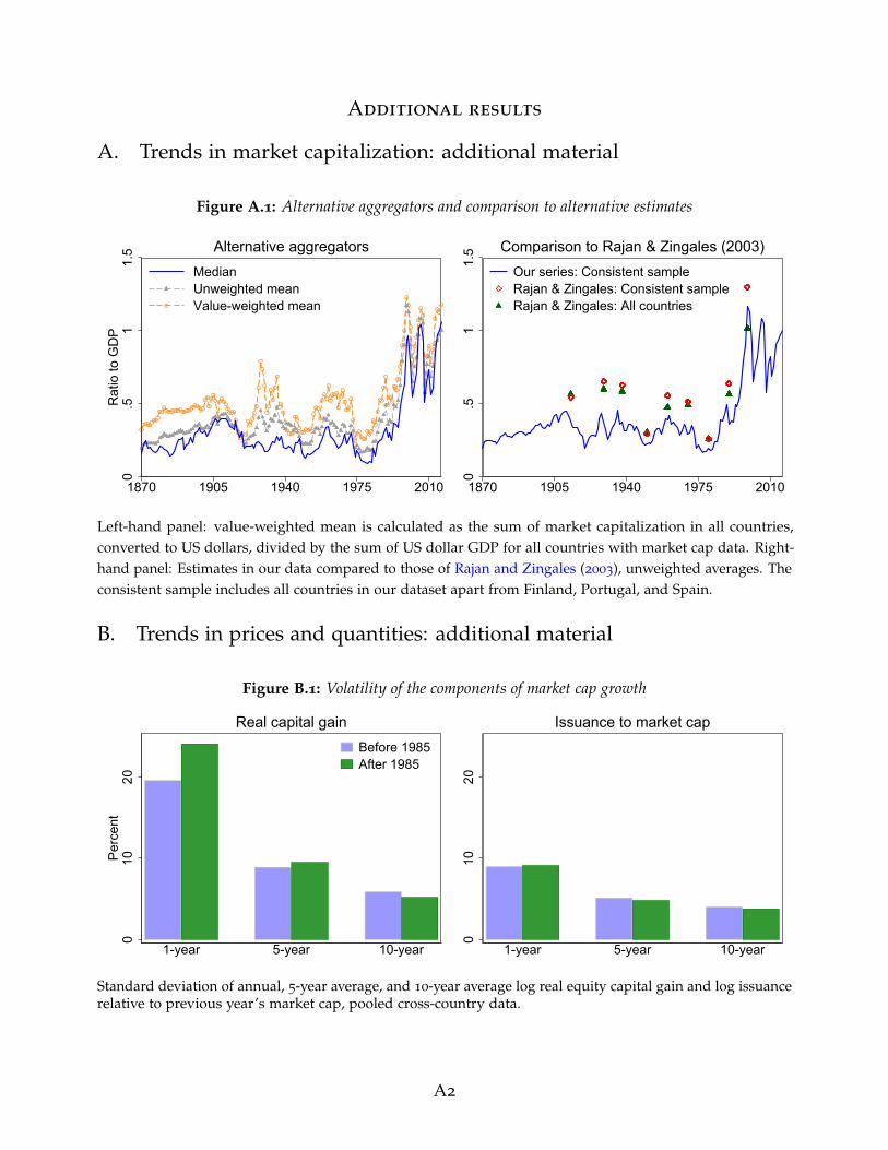
Additional results
A. Trends in market capitalization: additional material
Figure A.1: Alternative aggregators and comparison to alternative estimates
0.5
11.
5R
atio
to G
DP
1870 1905 1940 1975 2010
Median Unweighted mean Value-weighted mean
Alternative aggregators
0.5
11.
5
1870 1905 1940 1975 2010
Our series: Consistent sampleRajan & Zingales: Consistent sampleRajan & Zingales: All countries
Comparison to Rajan & Zingales (2003)
Left-hand panel: value-weighted mean is calculated as the sum of market capitalization in all countries,converted to US dollars, divided by the sum of US dollar GDP for all countries with market cap data. Right-hand panel: Estimates in our data compared to those of Rajan and Zingales (2003), unweighted averages. Theconsistent sample includes all countries in our dataset apart from Finland, Portugal, and Spain.
B. Trends in prices and quantities: additional material
Figure B.1: Volatility of the components of market cap growth
010
20Pe
rcen
t
1-year 5-year 10-year
Before 1985After 1985
Real capital gain
010
20
1-year 5-year 10-year
Issuance to market cap
Standard deviation of annual, 5-year average, and 10-year average log real equity capital gain and log issuancerelative to previous year’s market cap, pooled cross-country data.
A2

Figure B.2: Long-run trends in net equity issuance(a) Net equity issuance relative to market cap
05
1015
Perc
ent o
f mar
ket c
ap
1890 1910 1930 1950 1970 1990 2010
Actual issuance Implied issuance
(b) Net equity issuance relative to GDP
-20
24
6Pe
rcen
t of G
DP
1890 1910 1930 1950 1970 1990 2010
Actual issuanceImplied issuance
Net equity issuance during the year as percentage of previous year’s market capitalization (top panel) andGDP (bottom panel). Unweighted averages of 9 countries: Canada, Germany, Finland, France, Portugal, Spain,Sweden, Switzerland, and US. Implied issuance is the difference between market cap growth and capitalgain. Actual issuance is gross issues and new listings minus redemptions and delistings. Country-level datawinsorized at 1%.
A3

Figure B.3: Counterfactual evolution of market cap in individual countries0
.51
1.5
Rat
io to
GD
P
1870 1900 1930 1960 1990 2020
Australia
0.5
11.
52
1870 1900 1930 1960 1990 2020
Belgium
0.5
11.
5
1870 1900 1930 1960 1990 2020
Canada
0.5
11.
52
Rat
io to
GD
P
1870 1900 1930 1960 1990 2020
Denmark
01
23
1870 1900 1930 1960 1990 2020
Finland
0.5
11.
5
1870 1900 1930 1960 1990 2020
France
0.2
.4.6
.8R
atio
to G
DP
1870 1900 1930 1960 1990 2020
Germany
0.2
.4.6
.8
1870 1900 1930 1960 1990 2020
Italy
0.5
11.
52
1870 1900 1930 1960 1990 2020
Japan
0.5
11.
52
Rat
io to
GD
P
1870 1900 1930 1960 1990 2020
Netherlands
0.2
.4.6
.81
1870 1900 1930 1960 1990 2020
Norway0
.2.4
.6.8
1870 1900 1930 1960 1990 2020
Portugal
0.5
11.
5R
atio
to G
DP
1870 1900 1930 1960 1990 2020
Spain
01
23
4
1870 1900 1930 1960 1990 2020
Sweden
01
23
1870 1900 1930 1960 1990 2020
Switzerland
0.5
11.
52
Rat
io to
GD
P
1870 1900 1930 1960 1990 2020
United Kingdom
0.5
11.
52
2.5
1870 1900 1930 1960 1990 2020
United StatesMarket cap / GDP, actual
Cf 1: Constant capital gains
Cf 2: Constant net issuance
Counterfactual market cap to GDP ratio evolution during the big bang. Constant capital gains counterfactualforces the real capital gains during 1985–2016 to equal the pre-1985 average for the specific country. Constantnet issuance counterfactual forces net issuance relative to market cap during 1985–2016 to equal the pre-1985
average. Data are benchmarked so that the combined growth of the two counterfactuals between 1985 and2016 equals the actual growth in observed market cap data.
A4
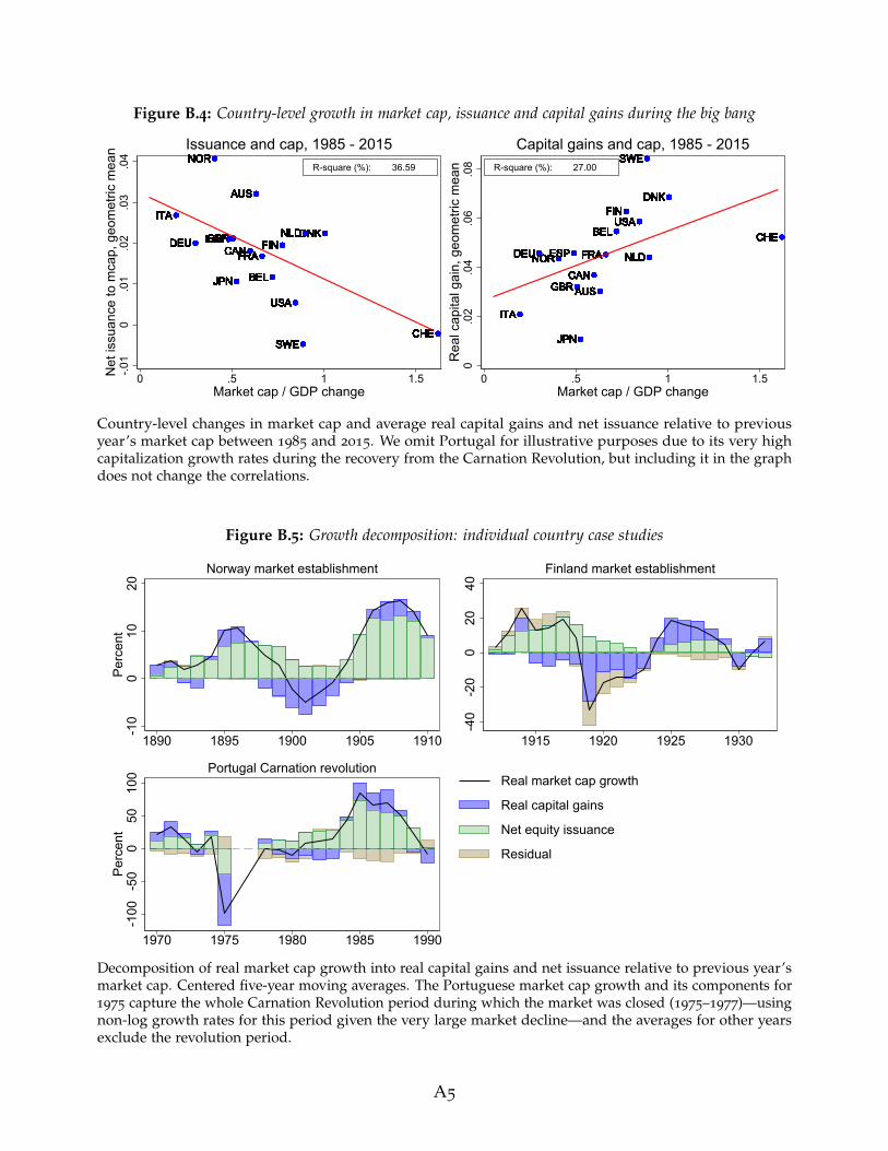
Figure B.4: Country-level growth in market cap, issuance and capital gains during the big bang
USAUSAUSAUSAUSAUSAUSAUSAUSAUSAUSAUSAUSAUSAUSAUSAUSAUSAUSAUSAUSAUSAUSAUSAUSAUSAUSAUSAUSAUSAUSAUSA
GBRGBRGBRGBRGBRGBRGBRGBRGBRGBRGBRGBRGBRGBRGBRGBRGBRGBRGBRGBRGBRGBRGBRGBRGBRGBRGBRGBRGBRGBRGBRGBR
BELBELBELBELBELBELBELBELBELBELBELBELBELBELBELBELBELBELBELBELBELBELBELBELBELBELBELBELBELBELBELBEL
DNKDNKDNKDNKDNKDNKDNKDNKDNKDNKDNKDNKDNKDNKDNKDNKDNKDNKDNKDNKDNKDNKDNKDNKDNKDNKDNKDNKDNKDNKDNKDNK
FRAFRAFRAFRAFRAFRAFRAFRAFRAFRAFRAFRAFRAFRAFRAFRAFRAFRAFRAFRAFRAFRAFRAFRAFRAFRAFRAFRAFRAFRAFRAFRADEUDEUDEUDEUDEUDEUDEUDEUDEUDEUDEUDEUDEUDEUDEUDEUDEUDEUDEUDEUDEUDEUDEUDEUDEUDEUDEUDEUDEUDEUDEUDEU
ITAITAITAITAITAITAITAITAITAITAITAITAITAITAITAITAITAITAITAITAITAITAITAITAITAITAITAITAITAITAITAITA
NLDNLDNLDNLDNLDNLDNLDNLDNLDNLDNLDNLDNLDNLDNLDNLDNLDNLDNLDNLDNLDNLDNLDNLDNLDNLDNLDNLDNLDNLDNLDNLD
NORNORNORNORNORNORNORNORNORNORNORNORNORNORNORNORNORNORNORNORNORNORNORNORNORNORNORNORNORNORNORNOR
SWESWESWESWESWESWESWESWESWESWESWESWESWESWESWESWESWESWESWESWESWESWESWESWESWESWESWESWESWESWESWESWECHECHECHECHECHECHECHECHECHECHECHECHECHECHECHECHECHECHECHECHECHECHECHECHECHECHECHECHECHECHECHECHE
CANCANCANCANCANCANCANCANCANCANCANCANCANCANCANCANCANCANCANCANCANCANCANCANCANCANCANCANCANCANCANCAN
JPNJPNJPNJPNJPNJPNJPNJPNJPNJPNJPNJPNJPNJPNJPNJPNJPNJPNJPNJPNJPNJPNJPNJPNJPNJPNJPNJPNJPNJPNJPNJPN
FINFINFINFINFINFINFINFINFINFINFINFINFINFINFINFINFINFINFINFINFINFINFINFINFINFINFINFINFINFINFINFINESPESPESPESPESPESPESPESPESPESPESPESPESPESPESPESPESPESPESPESPESPESPESPESPESPESPESPESPESPESPESPESP
AUSAUSAUSAUSAUSAUSAUSAUSAUSAUSAUSAUSAUSAUSAUSAUSAUSAUSAUSAUSAUSAUSAUSAUSAUSAUSAUSAUSAUSAUSAUSAUS
-.01
0.0
1.0
2.0
3.0
4N
et is
suan
ce to
mca
p, g
eom
etric
mea
n
0 .5 1 1.5Market cap / GDP change
R-square (%): 36.59
Issuance and cap, 1985 - 2015
USAUSAUSAUSAUSAUSAUSAUSAUSAUSAUSAUSAUSAUSAUSAUSAUSAUSAUSAUSAUSAUSAUSAUSAUSAUSAUSAUSAUSAUSAUSAUSA
GBRGBRGBRGBRGBRGBRGBRGBRGBRGBRGBRGBRGBRGBRGBRGBRGBRGBRGBRGBRGBRGBRGBRGBRGBRGBRGBRGBRGBRGBRGBRGBR
BELBELBELBELBELBELBELBELBELBELBELBELBELBELBELBELBELBELBELBELBELBELBELBELBELBELBELBELBELBELBELBEL
DNKDNKDNKDNKDNKDNKDNKDNKDNKDNKDNKDNKDNKDNKDNKDNKDNKDNKDNKDNKDNKDNKDNKDNKDNKDNKDNKDNKDNKDNKDNKDNK
FRAFRAFRAFRAFRAFRAFRAFRAFRAFRAFRAFRAFRAFRAFRAFRAFRAFRAFRAFRAFRAFRAFRAFRAFRAFRAFRAFRAFRAFRAFRAFRADEUDEUDEUDEUDEUDEUDEUDEUDEUDEUDEUDEUDEUDEUDEUDEUDEUDEUDEUDEUDEUDEUDEUDEUDEUDEUDEUDEUDEUDEUDEUDEU
ITAITAITAITAITAITAITAITAITAITAITAITAITAITAITAITAITAITAITAITAITAITAITAITAITAITAITAITAITAITAITAITA
NLDNLDNLDNLDNLDNLDNLDNLDNLDNLDNLDNLDNLDNLDNLDNLDNLDNLDNLDNLDNLDNLDNLDNLDNLDNLDNLDNLDNLDNLDNLDNLDNORNORNORNORNORNORNORNORNORNORNORNORNORNORNORNORNORNORNORNORNORNORNORNORNORNORNORNORNORNORNORNOR
SWESWESWESWESWESWESWESWESWESWESWESWESWESWESWESWESWESWESWESWESWESWESWESWESWESWESWESWESWESWESWESWE
CHECHECHECHECHECHECHECHECHECHECHECHECHECHECHECHECHECHECHECHECHECHECHECHECHECHECHECHECHECHECHECHE
CANCANCANCANCANCANCANCANCANCANCANCANCANCANCANCANCANCANCANCANCANCANCANCANCANCANCANCANCANCANCANCAN
JPNJPNJPNJPNJPNJPNJPNJPNJPNJPNJPNJPNJPNJPNJPNJPNJPNJPNJPNJPNJPNJPNJPNJPNJPNJPNJPNJPNJPNJPNJPNJPN
FINFINFINFINFINFINFINFINFINFINFINFINFINFINFINFINFINFINFINFINFINFINFINFINFINFINFINFINFINFINFINFIN
ESPESPESPESPESPESPESPESPESPESPESPESPESPESPESPESPESPESPESPESPESPESPESPESPESPESPESPESPESPESPESPESP
AUSAUSAUSAUSAUSAUSAUSAUSAUSAUSAUSAUSAUSAUSAUSAUSAUSAUSAUSAUSAUSAUSAUSAUSAUSAUSAUSAUSAUSAUSAUSAUS
0.0
2.0
4.0
6.0
8R
eal c
apita
l gai
n, g
eom
etric
mea
n
0 .5 1 1.5Market cap / GDP change
R-square (%): 27.00
Capital gains and cap, 1985 - 2015
Country-level changes in market cap and average real capital gains and net issuance relative to previousyear’s market cap between 1985 and 2015. We omit Portugal for illustrative purposes due to its very highcapitalization growth rates during the recovery from the Carnation Revolution, but including it in the graphdoes not change the correlations.
Figure B.5: Growth decomposition: individual country case studies
-10
010
20Pe
rcen
t
1890 1895 1900 1905 1910
Norway market establishment
-40
-20
020
40
1915 1920 1925 1930
Finland market establishment
-100
-50
050
100
Perc
ent
1970 1975 1980 1985 1990
Portugal Carnation revolutionReal market cap growth
Real capital gains
Net equity issuance
Residual
Decomposition of real market cap growth into real capital gains and net issuance relative to previous year’smarket cap. Centered five-year moving averages. The Portuguese market cap growth and its components for1975 capture the whole Carnation Revolution period during which the market was closed (1975–1977)—usingnon-log growth rates for this period given the very large market decline—and the averages for other yearsexclude the revolution period.
A5

Table B.1: Average market cap growth of newly listed and other firms in the US
Pre 1985 Post 1985 Difference
(1) (2) (3) (4) (5) (6) (7)
ListingsNew
ListingsOld
(1) - (2)Difference
ListingsNew
ListingsOld
(4) - (5)Difference
(6) - (3)Pre vs post
Market cap growth ≈ 5.02 3.03 1.99 9.32 6.26 3.06 1.07
Seasoned issuance 3.10 1.43 1.67∗∗∗
5.47 0.93 4.55∗∗∗
2.87∗∗∗
+ Capital gains 2.50 1.77 0.73 4.33 5.53 -1.20 -1.93
+ Interaction -0.41 -0.09 -0.32∗ -0.56 -0.08 -0.48 -0.16
Observations 50 50 32 32
This table shows the average annual real market cap growth for new listings (shares of firms listed within thelast 10 years) and old listings (shares of all other firms), decomposed into issuance and real capital gains. Tocalculate the growth rates, we collapse the CRSP microdata to value-weighted annual observations (e.g., newlisting market cap growth is the sum of the market cap of all newly listed firms in year t relative to marketcap of the same firms at t− 1, net of inflation). *, **, and *** denote significance at the 10%, 5% and 1% levels,respectively.
Figure B.6: Market cap growth and its components, US newly listed vs. other firms
-20
-10
010
2030
Perc
ent
1935 1955 1975 1995 2015
Mcap growth IssuanceCapital gain Interaction
Listed in the last 10 years-1
00
1020
30
1935 1955 1975 1995 2015
Listed more than 10 years ago
Data for the US sourced from CRSP and aggregated across individual firms. New listings are firms that arenewly listed within the last 10 years, old listings are all other firms.
Figure B.7: US market capitalization by listing date
0.5
11.
5R
atio
1930 1950 1970 1990 2010
Listed in 1925 Listed after 1985
Listed after 1925 Coverage extensions(unknown listing date)
Listed after 1955
Ratio to GDP
0.2
.4.6
.81
Shar
e
1930 1950 1970 1990 2010
Share of market cap
Market capitalization of firms listed on or before the specific date, as a share of GDP (left panel)—withaggregate CRSP capitalization scaled up to match our US total—and as share of total market cap (right panel).
A6

C. Drivers of the post-1980s market expansion: additional material
Figure C.1: Earnings and dividends of listed firms in the US
05
1015
20Pe
rcen
t
1870 1905 1940 1975 2010
Earnings-price ratio, 5-year MAEarnings-price ratio, annualDividend-price ratio
Earnings-price and dividend-price ratios
0.0
3.0
6.0
9R
atio
to G
DP
1900 1930 1960 1990 2020
Earnings / GDP, 5-year MAEarnings / GDP, annualDividends / GDP
Earnings and dividends relative to GDP
Left-hand panel: dividend-price ratio and the cyclically adjusted total return earnings-price ratio (inverse ofP/E10 CAPE) from Shiller (2015), December values. Right-hand panel: earnings to GDP calculated as marketcap to GDP times the earnings-price ratio.
Figure C.2: Book equity values and firm leverage
0.2
.4.6
.81
1.2
Rat
io to
GD
P
1870 1890 1910 1930 1950 1970 1990 2010
Market cap to GDPEquity book value to GDP
Equity book values
0.1
.2.3
Book
equ
ity /
asse
ts
1990 1995 2000 2005 2010 2015
Cross-country meanCross-country interquantile range
Capital ratio of listed firms
Left-hand panel: market and book value of listed firm equity, unweighted average of 17 countries. Right-handpanel: capital ratio of listed firms. The capital ratio is calculated by dividing book equity by total assets. Bookequity and total assets data are aggregated up from Compustat Global and Compustat North America andcover all listed firms with non-missing values for market cap, dividends and earnings, scaled up to matchour aggregate market cap data where necessary. We drop country-year observations at the beginning of thesample with less than than 30% of market cap covered. The data include both financial and non-financialfirms. To arrive at the country-level mean, firm-level observations are weighted by total assets.
A7

Figure C.3: Alternative listed firm profitability measures in 1990 and 2016
0.0
2.0
4.0
6.0
8.1
Rat
io
AUSNOR ITA
PRTGBR
DEUJP
NBEL
ESPNLD FIN
FRASWE
CANDNK
USACHE
Net income / sales1990 2016
0.5
11.
52
ITA
PRTJP
NDEU
NLDFRA FINGBR
NORESP
SWEAUS
CANUSA
BELDNK
CHE
MCap / sales1990 2016
The figure shows sales-weighted profit (net income) per unit of sales and market cap per unit of sales in1990 and 2016, computed from firm level data in Compustat Global and Compustat North America. TheCompustat coverage in Italy, Portugal, Spain, and Sweden is still low in 1990, meaning that the 1990 figuresfor these countries should be interpreted with caution. For Portugal, we use 1994 data instead of 1990 as it isthe first year with meaningful coverage.
Figure C.4: Changes in profitability of listed firms in different sectors
0.0
1.0
2.0
3.0
4.0
5R
atio
1990 2016
Dividends / salesConstruction ManufacturingTrade UtilitiesServices Agriculture & Mining
0.5
11.
52
1990 2016
Market cap / sales
The figure shows the ratio of dividends to sales and market cap to sales across different economic sectorsin 1990 and 2016. Sectors are sorted by the dividend to sales ratio in 1990. Compustat firm level data areaggregated to the sector level using SIC industry codes and sales weights in each country. Bars show themedian level across the 17 countries.
A8

Figure C.5: Market shares by form of business in the United States
11.
52
2.5
Rat
io
.4.5
.6.7
Shar
e
1920 1950 1980 2010
Corp. value added shareCorp. receipts to GDP
Share of corporations in the economy
0.2
.4.6
.81
Shar
e
1980 1990 2000 2010
All corporations 1120-RIC/1120-REITC-Corporations PartnershipsS-Corporations Nonfarm sole proprietorships
Receipts share
Left-hand panel shows the value added share of corporations (left axis) and the ratio of corporate receipts toGDP (right axis). Right-hand panel shows total receipt shares by form of business in the US. Corporate valueadded data come from the BEA. Receipts data are from the IRS Statistics of Income.
Figure C.6: Capital income decomposition in the US
0.2
.4.6
.81
Shar
e
1950 1965 1980 1995 2010
Rents Proprietors' income Business transfersInterest Corporate taxes Corporate profits
Capital income components are sourced from the BEA NIPA Table 1.10.
A9

Figure C.7: Profitability of listed firms relative to other business types in the United States
0.0
3.0
6.0
9R
atio
1950 1970 1990 2010
All: IRS net income/receiptsListed: Compustat net income/sales
Listed firm vs all-corporate profit rates
.1.1
5.2
.25
Sole
pro
prie
tors
hips
-.05
0.0
5.1
.15
Partn
ersh
ips
0.0
2.0
4.0
6.0
8C
orpo
ratio
ns
1980 1990 2000 2010
C-corporations PartnershipsS-corporations Nonfarm sole proprietorships
Profit rates by type of incorporation
The left-hand panel displays the profit rates of listed corporations and of all corporations. The blue solidline shows the ratio of after-tax net income to total receipts by all corporations in the US. Data come fromIRS Statistics of Income Reports. The grey dashed line (diamonds) shows the net income per unit of salesof listed firms in CRSP-Compustat Merged database. The right-hand panel shows the ratio of net incometo total receipts. We use different scales for each business type to abstract from level differences due to thedifferential treatment of capital and labor income in partnerships and sole proprietorships. Data are from theIRS and cover 1980–2015.
A10

Data appendix
In this section, we provide the details for the sources for our stock market data, and discusspotential data quality issues alongside a comparison to alternative estimates of stock marketcapitalization. In Section D, we analyze the impact of two important definitional concepts on ourdata: excluding foreign listings, and the impact of the switch from buybacks to dividends on ourmarket capitalization growth decomposition. In Section E, we provide the details of the data sourcesfor each country and compares them to other existing estimates.
D. Further data quality checks
D.1 Foreign listings
Companies in countries with smaller or less developed capital markets may choose to raise fundsin a global financial centre rather than the home country. This means that our domestic marketcapitalization figures may underestimate the size of listed equity finance for those smaller countries,and underestimate the market share of financial centres in global market cap. To see how much ofan issue this might pose, Figure D.1 shows the number of foreign and domestic listed shares acrossthe major exchanges in our dataset at two benchmark years: the pre-WW I market peak in 1913,and the post-big-bang peak in the 2000s, compiled using using data in Moore (2010b), Campbell,Grossman, and Turner (2021), and reports of the World Federation of Exchanges. Foreign listingsare relatively unimportant for the vast majority of stock exchanges including those in a numberof large economies with deep financial markets, such as the US, Germany, and France.14 The big
Figure D.1: Foreign and domestic listings
050
010
0015
00N
umbe
r of s
hare
s
ESPJP
NCHE
FRACAN
AUSUSA
NLD DEUGBR
Foreign ListingsDomestic Listings
January 1914
020
0040
0060
00
ESPJP
NCHE
FRACAN
AUSUSA
NLD DEUGBR
December 2005
Number of listed shares issued by companies domiciled in the home country and abroad. If one firm issuesmultiple shares, these are all counted as separate listings. Data for 1914 are from Campbell et al. (2021) forthe UK and Moore (2010b) for other countries, and cover the main stock exchange (e.g., NYSE) only. Datafor 2005 are from reports of the World Federation of Exchanges and cover all major stock exchanges, withadditional data used to attribute the relevant Euronext listings to Netherlands, Spain, and France.
14Coincidentally, the same is not true for government bond markets: for example, Moore (2010b) showsthat in January 1914, out of the 171 government bonds listed on the Amsterdam Stock Exchange, 168 werethose of foreign countries.
A11

Figure D.2: Foreign and domestic market capitalization in the UK
02
46
Rat
io to
GD
P
1870 1900 1930 1960 1990 2020
Domestic listingsForeign listings
Total market cap / GDP
0.0
02.0
04.0
06.0
08
1870 1900 1930 1960 1990 2020
Domestic listingsForeign listings
Market cap per share / GDP
Left-hand panel: Total capitalization of foreign and domestic stocks relative to GDP. Right-hand panel: Marketcap per share to GDP is calculated as total market capitalization divided by the number of shares and dividedagain by GDP. Data for both panels are from Campbell et al. (2021) for the pre-1930 period (both foreign anddomestic listings are scaled up to match the Moore (2010b) aggregate, see Appendix C and Figure E.16 formore detail), and from the statistical reports and historical statistics of the London Stock Exchange for thepost-1970 period.
exception is the pre World War I London Stock Exchange, where almost half of listed shares wereissued by foreign companies.
In Figure D.2, we look at the long-run trends in the market capitalization of foreign equitylisted in the UK in more detail, and shows that the capitalization of foreign companies wascomparable to that of domestic companies in both the early 20th century and mid to late 20thcentury, even exceeding the domestic market capitalization during the big bang. But whereas foreigncompanies listing in London during the pre World War I era of the first financial globalization wererelatively small, companies which list in London today are relatively large, with the average marketcapitalization of a foreign share 3–10 times that of an average British share. While historically thesesmaller foreign companies may have used the London Stock Exchange as their only source of equityfinance, the foreign stocks listed on the LSE today belong to large companies, which are likely to bealso listed on their corresponding domestic exchanges. Altogether, this evidence suggests that theglobal market capitalization shares in Figure 4 understate the importance of London as a globalfinancial center, particularly in the early 20th century.
D.2 Buybacks
Recent decades saw an increasing use of share buybacks as means of shareholder compensationin the US (Grullon and Michaely, 2002). Even though the use of buybacks outside of the US waslimited during the 1980s and early 1990s, thereafter this method of compensating shareholders hasalso grown in importance in other countries (Megginson and Von Eije, 2008). From the perspectiveof the shareholder, the switch from dividends to buybacks is relatively neutral (tax advantages anddisadvantages aside): they either get cash as dividend or in the form of a company-funded sharerepurchase scheme. But from the perspective of the market cap growth decomposition, this switchis not neutral: whereas dividend payments reduce the share price, buybacks reduce net issuance. It
A12
Figure D.3: The impact of buybacks on market cap growth decomposition-5
05
Perc
ent o
f mar
ket c
ap
1950 1970 1990 2010
5-year MAAnnual data
Net flows into the stock market
-50
510
Perc
enta
ge p
oint
s
ITAPRT
GBRDEU
SWEESP
FRAUSA
BELFIN
NLD DNK
Real mcap growth Net issuanceReal capital gain BuybacksResidual
Post-1989 market cap growth decomposition
Left-hand panel: net flows into the stock market is net issuance minus dividends paid by listed firms, relativeto previous year’s market cap; unweighted average of the 17 countries in our sample. Right-hand panel:averages of log growth rates for each country after 1989. We subtract buybacks (relative to previous year’smarket cap) from capital gains and leave net issuance the same as in our baseline decomposition. Buybackdata for the US are from Boudoukh et al. (2007) and Zeng and Luk (2020). Buybacks for EU countries arefrom Megginson and Von Eije (2008), scaled up based on the ratio of dividends in the Megginson and VonEije (2008) sample to total dividends paid in our sample. Since the Megginson and Von Eije (2008) data stopin 2005, European data after 2005 are a scaled version of the US data.
is therefore important to ascertain the role of this switch in shareholder compensation in driving thepost-1980s net issuance slowdown documented in Figures 7 and B.2.
We do this in two ways. First, we calculate a measure of net capital flows into the stock marketthat—unlike net issuance—is unaffected by the switch from dividends to buybacks. This measure isthe negative of the net payout yield in Boudoukh, Michaely, Richardson, and Roberts (2007), andis calculated as net issuance minus the dividend yield. It measures the net inflow of funds intothe equity market: the amount of funds committed to new issuance minus the funds distributedin the form of dividends. The switch from dividends to buybacks has no effect on this broadermeasure, merely reducing one of its subcomponents at the expense of another. The left-hand panelof Figure D.3 shows the time trend in the net flows into the equity market after 1950, using simpleunweighted cross-country averages. One can see that like net equity issuance, net flows of fundsinto the equity market declined materially over recent decades. This means that even according tothis broader measure, the amount of funds raised through the stock market has decreased at thetime that market cap growth accelerated rapidly.
Another way of assessing the impact of buybacks on our trends is to calculate the buybackyield—the ratio of stock buybacks to previous year’s market cap and subtract it from the capitalgain, identifying this as the third component of the market cap growth decomposition. For the US,we use the buyback yield data from Boudoukh et al. (2007), which is calculated as the change inTreasury holdings in Compustat data to proxy for buyback cashflows not earmarked for employeecompensation, and switch to S & P data after 2007, with the S & P data scaled down slightly tomatch the series in Boudoukh et al. (2007) for overlapping years (since the S & P series likelyinclude preference share buybacks and cashflows from employee compensation schemes). Forthe EU, we use the buyback estimates in Megginson and Von Eije (2008). However, the data in
A13

Megginson and Von Eije (2008) only include industrial companies and may therefore underestimatetotal buybacks, therefore we scale them up based on the ratio of total dividends paid across allcountries in the Megginson and Von Eije (2008) sample to dividends paid for these countries in ourdata at benchmark years, resulting in a scaling up by a factor close to 2. We do not scale up the datafor Finland since this would result in buyback yields similar or greater than those in the US, whichgiven the limited use of buybacks in this country (see, for example Hogholm and Hogholm, 2017)appears unrealistic. Since the Megginson and Von Eije (2008) data cover 1989 to 2005, after 2005 weassume that the buybacks in each country evolve proportionately to the US, using the 2000–2005
period to compute the ratio by which to adjust the US buyback data.The right-hand panel of Figure D.3 shows that buybacks accounted for close to 2% of market cap
growth in the US, and between 0.5% and 1% of market cap growth in most other countries. Removingbuybacks from capital gains and adding them to equity issuance—a possible counterfactual evolutionof the growth components had the switch from dividends to buybacks not occurred—would havereduced the contribution of capital gains and increased the contribution of issuance to the big bang,but the general patterns of the issuance slowdown and the historically high and persistent capitalgains would have remained in place.
A14

E. Country-level data sourcesIn this section, we detail the sources for our estimates of market capitalization, net equity issuance,and new listings data, and compares our market capitalization estimates to alternatives in previousstudies. These alternative estimates are country specific, but we always compare our data to those ofGoldsmith (1985) (sourced from La Porta et al., 2008) and Rajan and Zingales (2003) when available.Unless otherwise stated, all the annual market capitalization estimates reflect end-of-year values,while issuance and new listings cover the entire calendar year.
Australia
Table E.1: Data sources: Australia
Year Data source
Stock market capitalization:1870–1889 Total capitalization of the Melbourne Stock Exchange, from Hall (1968).1899–1924 Total capitalization of the Sydney Stock Exchange, from Moore (2010b). Converted
to AUD using the exchange rates in Jorda et al. (2016).1925–1978 Total capitalization of the Sydney Stock Exchange, from Black, Kirkwood, Williams,
and Rai (2013).1979–2013 Total capitalization of all Australian listed firms, shares listed on Australian ex-
changes. Source: World Bank WDI database. Almost identical to the Sydney cap inthe 1970s; spliced with Black et al. (2013) data in 1979.
2014–2016 Total capitalization of all Australian listed firms, shares on Australian exchanges.Source: World Federation of Exchanges (WFE) Statistical Reports, various years.
Net equity issuance:1989–2016 Net flows of listed equity shares, all sectors, from the Australian Bureau of Statistics
National Accounts: Finance and Wealth, Table 48.
Table E.1 documents the sources of our data for Australia, and Figure E.1 shows the resulting marketcapitalization series alongside alternative existing estimates. The Australian securities market hasgenerally been dominated by two major stock exchanges, located in Sydney and Melbourne. Hall(1968) argued that the Melbourne stock exchange was dominant in the late 19th century, largelybecause of large capitalizations of stocks of mining companies, and the data in Black et al. (2013)and Lamberton (1958) suggest that the Sydney stock exchange became dominant in the early 20thcentury. Based on this, we use the Hall (1968) estimates of the Melbourne stock market capitalizationfor the 19th century data, and switch to the Sydney exchange in the 20th century, using estimates ofMoore (2010b) and Black et al. (2013), which are also consistent with the RBA Historical Statisticsdata in Foster (1996) and the Mathews (2019) estimates of the capitalization of the top 100 firmson the Sydney stock exchange. From the 1970s onwards we switch to the total Australian firmcapitalization estimates provided by the World Federation of Exchanges reports and the World BankWDI database.
The main potential bias in the data for Australia comes from two sources: the fact that until the1970s, we only have data for either the Sydney or the Melbourne exchange, not both; and the fact thatthese data include both foreign and domestic companies (again, up to the 1970s). These two biases
A15

Figure E.1: Australia: Alternative stock market cap estimates
0.2
5.5
.75
11.
251.
5M
arke
t cap
/ G
DP
1870 1890 1910 1930 1950 1970 1990 2010
Our estimates
Rajan & ZingalesGoldsmith / La Porta et al.World Federation of ExchangesWDI databaseBlack et al. (2013)Foster (1996)Moore (2010)Hall (1968)Matthews (2019) top 100 firms
do, however, largely seem to balance each other out: the total Australian exchange capitalizationin the 1970s is very similar to that of the Sydney stock exchange, and Lamberton (1958) indicatesthat the Sydney stock exchange became the most important center for financial activity much earlier.Therefore we do not make any further adjustments to the early Australian data, which focus mostlyon the Sydeny exchange, including both domestic and foreign companies.15
Our approach of focusing on the Melbourne cap in the late 19th century, and the Sydney cap inthe 20th century is in line with that of Rajan and Zingales (2003). As Figure E.1 shows, however,our estimates of market capitalization are somewhat below those of both Rajan and Zingales (2003)and Goldsmith (1985), largely due to better available up-to-date statistics, for example from Moore(2010b) and Black et al. (2013).
We are grateful to the Reserve Bank of Australia, Anna Nietschke and Thomas Matthews forsharing data and providing helpful comments.
15As a side note, adding up the Hall (1968) and Moore (2010b) estimates for 1899 would grossly overestimatethe total cap of Australian firms because it does not adjust for cross-listings.
A16

Belgium
Table E.2: Data sources: Belgium
Year Data source
Stock market capitalization:1870–2002 Total capitalization of all Belgian companies on the Brussels Stock Exchange, SCOB
Database. Data shared by Frans Buelens. See Annaert, Buelens, and De Ceuster(2012) for details.
2003–2016 Market capitalization of all Belgian companies listed in Belgium, from the ECBStatistical Data Warehouse, Security issues statistics.
Net equity issuance:1990–2016 Net equity issuance by all Belgian companies listed in Belgium, from the ECB
Statistical Data Warehouse, Security issues statistics.
Figure E.2: Belgium: Alternative stock market cap estimates
0.2
5.5
.75
11.
251.
5M
arke
t cap
/ G
DP
1870 1890 1910 1930 1950 1970 1990 2010
Our estimates
Rajan & ZingalesGoldsmith / La Porta et al.WDI databaseECB Statistics
Table E.2 documents the sources of our data for Belgium, and Figure E.2 shows the resulting marketcapitalization series alongside alternative existing estimates. The historical data cover the BrusselsStock Exchange, which was the dominant stock exchange throughout the data coverage period inour paper, and are sourced from the security-level SCOB database (see Annaert et al., 2012, for thedescription). These data cover all firms with main economic activities in Belgium, that are listedon the Brussels Stock Exchange. Unlike other existing estimates, the capitalization is aggregated
A17

up from security-level data for each year, and does not rely on estimation or extrapolation. For themodern period, the SCOB estimates are similar to other commonly used sources such as the WDIdatabase and the ECB Statistical Data Warehouse data. We use the ECB statistics for the modernperiod to ensure consistency with the net issuance and capital gains series in our database.
We are grateful to Frans Buelens for sharing the SCOB market capitalization data with us.
A18
Canada
Table E.3: Data sources: Canada
Year Data source
Stock market capitalization:1899–1926 Capitalization of all Canadian firms listed on foreign exchanges. Baseline data from
Moore (2010b), scaled up using own calculations from microdata in the AnnualFinancial Review in years 1900, 1911 and 1926. The scaling accounts for firms missingfrom the listings in Moore (2010b) data, and exclusion of foreign firms. Marketcap growth for 1924–1926 estimated using the change in the share price index andassumed net issuance of 1.2% of market cap (the average of observed issuancefor 1937–2016, using data from the Bank of Canada Statistical Summaries (FinancialSupplement, years 1964–1969) and Banking and Financial Statistics database.
1934–1953 Combined capitalization of the Toronto, Montreal and Canadian stock exchangesfrom Buckley and Urquhart (1993), scaled down to exclude cross-listings, foreignshares and preference shares, using the data on these scaling factors from ourbenchmark estimates based on data from the Annual Financial Review. The scalingfactor is close to 2 (a halving of the gross series).
1954–1989 1990 capitalization extrapolated back using growth in share prices and net issuanceof ordinary shares.
1990–1996 Total capitalization of all Canadian firms listed in Canada, adjusted for cross-listings,from Carpentier, L’Her, and Suret (2009).
1997–2001 2002 capitalization extrapolated back using using growth in share prices and netissuance of ordinary shares.
2002–2016 Total capitalization of all Canadian listed firms, shares listed on all Canadian ex-changes, adjusted for cross-listings, from the World Federation of Exchanges (WFE)Statistical Reports, various years
Net equity issuance:1945–1969 Net issuance of ordinary shares from the Bank of Canada Statistical Summaries.1970–1974 Net equity issuance (listed and unlisted) from the OECD Financial Statistics, sourced
from Richter and Diebold (2021), scaled down using the ratio of listed to total equityissuance for the 1990s.
1975–2016 Net equity issuance of common stocks from the Bank of Canada statistics seriesV111900717 (for overlapping years, the data are very close to the issuance of listedshares from the OECD Financial Statistics).
Table E.3 documents the sources of our data for Canada, and Figure E.3 shows the resultingmarket capitalization series alongside alternative existing estimates. Constructing historical marketcapitalization estimates is especially challenging in the case of Canada, for several reasons. First,throughout the whole of our sample period, Canada has operated at least two large and active stockexchanges, in Toronto and Montreal. The capitalizations of these two exchanges have tended to quitesimilar, with Montreal slightly larger in the early historical period, and Toronto in the latter. Manyavailable statistics provide the gross total value of securities listed on each exchange. But most largecompanies were listed on both of these stock exchanges, which makes adjusting gross estimatesfor cross-listings especially important. Even in the modern data, including the estimates of Rajan
A19
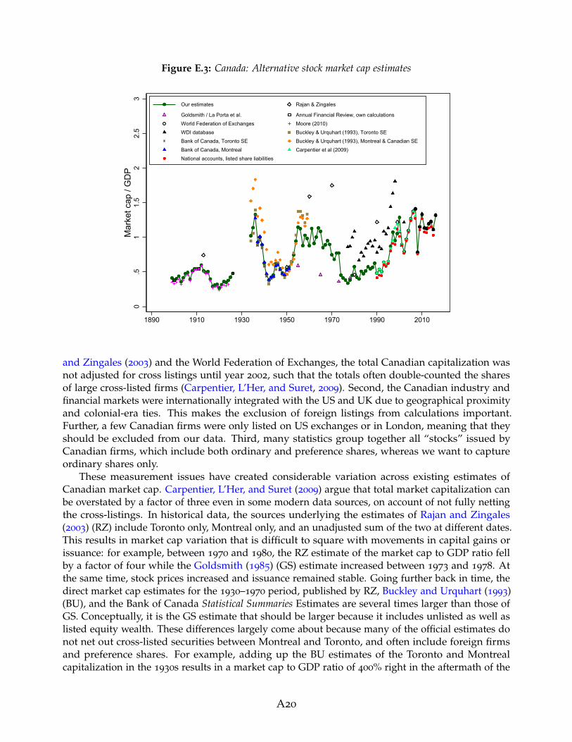
Figure E.3: Canada: Alternative stock market cap estimates
0.5
11.
52
2.5
3M
arke
t cap
/ G
DP
1890 1910 1930 1950 1970 1990 2010
Our estimates Rajan & Zingales
Goldsmith / La Porta et al. Annual Financial Review, own calculationsWorld Federation of Exchanges Moore (2010)WDI database Buckley & Urquhart (1993), Toronto SEBank of Canada, Toronto SE Buckley & Urquhart (1993), Montreal & Canadian SEBank of Canada, Montreal Carpentier et al (2009)National accounts, listed share liabilities
and Zingales (2003) and the World Federation of Exchanges, the total Canadian capitalization wasnot adjusted for cross listings until year 2002, such that the totals often double-counted the sharesof large cross-listed firms (Carpentier, L’Her, and Suret, 2009). Second, the Canadian industry andfinancial markets were internationally integrated with the US and UK due to geographical proximityand colonial-era ties. This makes the exclusion of foreign listings from calculations important.Further, a few Canadian firms were only listed on US exchanges or in London, meaning that theyshould be excluded from our data. Third, many statistics group together all “stocks” issued byCanadian firms, which include both ordinary and preference shares, whereas we want to captureordinary shares only.
These measurement issues have created considerable variation across existing estimates ofCanadian market cap. Carpentier, L’Her, and Suret (2009) argue that total market capitalization canbe overstated by a factor of three even in some modern data sources, on account of not fully nettingthe cross-listings. In historical data, the sources underlying the estimates of Rajan and Zingales(2003) (RZ) include Toronto only, Montreal only, and an unadjusted sum of the two at different dates.This results in market cap variation that is difficult to square with movements in capital gains orissuance: for example, between 1970 and 1980, the RZ estimate of the market cap to GDP ratio fellby a factor of four while the Goldsmith (1985) (GS) estimate increased between 1973 and 1978. Atthe same time, stock prices increased and issuance remained stable. Going further back in time, thedirect market cap estimates for the 1930–1970 period, published by RZ, Buckley and Urquhart (1993)(BU), and the Bank of Canada Statistical Summaries Estimates are several times larger than those ofGS. Conceptually, it is the GS estimate that should be larger because it includes unlisted as well aslisted equity wealth. These differences largely come about because many of the official estimates donot net out cross-listed securities between Montreal and Toronto, and often include foreign firmsand preference shares. For example, adding up the BU estimates of the Toronto and Montrealcapitalization in the 1930s results in a market cap to GDP ratio of 400% right in the aftermath of the
A20

Great Depression.To help deal with these issues, we rely on benchmarking and use of capital gains and net issuance
data to ensure consistency. The benchmarks are constructed using the microdata on individualcompanies in the Annual Financial Review publication for years 1901, 1912, and 1927.16 Because theAnnual Financial Review only has each company enter once, this effectively adjusts for any crosslistings. In addition, these data contain information on company headquarters and operations, aswell as which exchanges the firm is listed on, allowing us to control for factors such as foreignownership. For the purpose of this calculation, we include firms incorporated and governed fromCanada, but with operations overseas, such as the various Mexican tramway companies whichappear in the 1911 listing, but this has little bearing on our results. Net issuance data come fromthe various publications of the Bank of Canada and the OECD Financial Statistics (a cross-countryequivalent of the flow of funds), sourced from Richter and Diebold (2021).
For both the early 20th century, and the recent decades, we are able to calculate the totalcapitalization of Canadian listed firms, with all the necessary adjustments, with a high degree ofaccuracy. The baseline data for the early series come from Moore (2010b), who uses stock listingsdata to compute the total cross-listings-adjusted capitalization of the Toronto and Montreal stockexchanges. Nonetheless, these data include foreign firms, and might not include securities of smallercompanies or those listed on unofficial or curb exchanges. To account for this, we benchmark theMoore (2010b) data to our own benchmark-year estimates from the Annual Financial Review.
Given that the Moore (2010b) estimates for the 1920s are so far below those of BU and Bank ofCanada Statistical Summaries in the 1930s, and the fact that stock price appreciation between late1920s and early 1930s in Canada was very small due to the Great Depression, we construct ourown estimates for the early period, which enable us to benchmark the Moore (2010b) data. Thebenchmark estimates are close to the data from Moore (2010b) (see Figure E.3): around 15%–20%higher for 1900 and 1926, and similar in size for 1911, due to a high number of foreign companieson the market during that year, which we adjust out but Moore (2010b) does not. Based on this,we scale up the Moore (2010b) data slightly to match the adjusted total, and bridge the 1924–1926
gap by using share price appreciation for those years, and an assumed net issuance that equals thelong-run average in Canadian data.
For the recent period, the World Federation of Exchanges provides statistics that measure theadjusted total capitalization of all Canadian firms listed in Canada for 2002–2016. Previous years’estimates from this source include some double-counting, so we do not use them. Instead, weextrapolate the 2002 WFE estimate back using data on capital gains and net issuance (publishedby the Bank of Canada, but the series are also close to the OECD Financial Statistics flow of fundsestimates), and combine them with the series that adjusts from cross-listings from Carpentier et al.(2009).17 The 1990 estimate from Carpentier et al. (2009) is roughly one-third of the unadjustedsum of the capitalization of all shares on all Canadian exchanges, which illustrates the importanceof dealing with these double counting issues. Our estimates match up nicely with the nationalbalance sheet estimates for the market value of listed equity liabilities of Canadian firms (Figure E.3,red diamonds), available from the national accounts data in the CANSIM database of the Bank ofCanada.
We have several sources available to us for the 1934–1989 period: the estimates from the WorldBank’s WDI Database for the 1975–2016 period, historical statistics data for 1934–1959 from BU, theestimates by the Bank of Canada in their Statistical Summaries, which are the underlying source of
16Capitalization data refer to the end of each respective previous calendar year, i.e., end-1900, end-1911
and end-1926.17When extrapolating back using net issuance, we inflate the net issuance data by half the capital gain
during the year to proxy the within-year capital appreciation of newly issued stocks.
A21

the BU data, as well as the computations of RZ and GS. We also have data on net equity issuance,which cover the 1937–2016 period, and national balance sheet estimates of the total equity valueof listed and unlisted Canadian firms. Some of these sources are, however, likely to contain a lotof measurement error. The WDI Database estimates before 2002 are highly noisy and, accordingto Carpentier et al. (2009), their underlying source—the WFE database—double- or triple-countscross-listed securities for this period. The estimates of RZ change their exchange coverage overtime and are also often gross of cross-listings, while the underlying definitions of the GS data areuncertain. As seen from Figure E.3, the data for all three of these sources are also rather noisy. Basedon this, we decide not to use the WDI, RZ, and GS data, and restrict ourselves to the estimates ofBU, Bank of Canada, share prices and net issuance.
For the 1954–1989 period, we extrapolate back the market capitalization value of 1990 usingdata on capital gains and net issuance. The trend is similar to that obtainable from the WDI dataduring the 1970s and 1980s, when the growth trend in the WDI data seems reasonably accurate, anddefinition of the series is consistent from year to year. This gives us confidence that our data trackthe underlying evolution of adjusted Canadian stock market cap during this time period. For theperiod before the 1970s, the growth in the series is generally similar to that of the Montreal- andToronto-only series from the Bank of Canada Statistical Summaries. For the period before 1953, weuse an adjusted version of the BU data. We use our Annual National Review benchmarks to scaledown the series to account for cross-listings, and exclude foreign firms and preference shares. Thisadjusts the BU series down by a factor of roughly two. The value of the scaled-down series in 1954
is very similar to our main series based on net issuance and capital gains extrapolation, which iswhy we make the switch to the scaled BU series in year 1953.
Taken together, our estimates for Canada should go some way towards resolving the considerableuncertainty resulting from the wide range of existing estimates in Figure E.3. That being said, theseverity of the potential measurement issues for Canada mean that, especially for the mid 20thcentury period, the series are likely to contain some measurement error.
A22

Denmark
Table E.4: Data sources: Denmark
Year Data source
Stock market capitalization:1872–1899 Total market cap of all Danish firms listed in Denmark, aggregated up from indi-
vidual firms’ capitalization in the Green’s Dankse Fonds og Aktier yearbooks, variousyears. Ordinary shares only.
1900–1925 Total market cap of all Danish firms listed in Denmark, computed as previousyears’ market cap * the total book cap of listed firms * market-to-book ratio of listedfirms, benchmarked to Parum (1997)’s decennial market cap estimates. Book capof listed firms estimated as book cap of all firms from Hansen and Svendsen (1968)and Statistical Yearbooks (various years), times share of listed firms estimates fromown data in 1899 and Erichsen (1902). Parum’s decennial estimates sourced fromAbildgren (2006).
1926–1975 Market capitalization of large listed Danish firms, scaled up to match capitalizationof all firms at decennial benchmarks. Data for all firms from Parum (1997). Data forlarge firms are from the listings in the Statistical Yearbooks, various years, and contain50–60 firms for each year.
1975–2004 Total capitalization of all Danish listed firms, shares listed on Danish exchanges,from World Bank’s WDI database. Spliced with the scaled-up capitalization of largestfirms over the years 1975–1977 (the two series are very similar).
2005–2016 Total capitalization of ordinary shares on the Copenhagen Stock Exchange, sourcedfrom the OMX Nordic Yearly Nordic Statistics.
Net equity issuance:2003–2016 Net equity issuance by listed firms from the OECD Financial Statistics, sourced from
Richter and Diebold (2021).
Table E.4 documents the sources of our data for Denmark, and Figure E.4 shows the resultingmarket capitalization series alongside alternative existing estimates. Long-run estimates of the totalcapitalization of Danish firms for 1882–2002 are available from Parum (1997) and Abildgren (2006).However, these data are computed at decennial frequency only. To fill the gaps, we construct ourown estimates of the total stock market capitalization of ordinary shared of listed Danish firmsfor each year between 1872 and 1899 using statistics on individual firms’ share prices and bookcapital in Green’s Dankse Fonds og Aktier. Green’s yearbooks contain data on all Danish listed firmsat annual frequency.
For 1900–1925, we combine benchmark year estimates from our own microdata and Parum(1997) with statistics on share prices and book capital of listed firms. We estimate listed firms’ bookcapital using data on total capital of all firms, available in Hansen and Svendsen (1968) up to 1914
and yearly editions of the Statistical Yearbooks thereafter, and estimates of the proportion of firmslisted in Erichsen (1902), as well as those computed by comparing the total book capital estimateswith data on share prices and market cap at benchmark years. We compute the annual change inmarket capitalization as the change in total book capital of all firms, times the change in the share offirms listed, times the capital appreciation in the share price index (for 1900–1914, we also compute
A23

Figure E.4: Denmark: Alternative stock market cap estimates
0.2
5.5
.75
11.
25M
arke
t cap
/ G
DP
1870 1890 1910 1930 1950 1970 1990 2010
Our estimates Rajan & Zingales
Goldsmith / La Porta et al. Parum (1997)Statistical yearbooks, large firms only WDI databaseECB Statistics OMX Nordic Copenhagen cap
the actual market-to-book of listed firms, and use that instead, but the estimation gives us similarnumbers to using the share index). We then adjust the growth rates of capitalization in each year tomatch the data at benchmark dates. The main adjustment concerns the 1915–1922 period, duringwhich the book capital of all firms nearly doubled while the book capital of listed firms remainedflat, presumably following sharp delistings during the banking crisis of the early 1920s. The trendin the book capital of all firms gives us the boom-bust dynamics of high capital issuance duringthe book of the late 1910s, and delisting during the early 1920s, which we then rescale to match theimplied larger delistings by listed firms. For 1923–1925, very little adjustment to growth rates isnecessary.
From 1926 onwards, each yearly edition of the Statistical Yearbook publishes a summary stocklistings, which includes data on capital and market-to-book of all major listed firms in Denmark.We use these data to estimate total market capitalization by scaling it up to match the total cap inParum (1997) at decennial benchmark periods, and scaling the growth rates in-between if necessary.It turns out that the large firms in the Statistical yaerbook listings, which number around 50–60 intotal, consistently represent around half of the total Danish market cap, and track the aggregate datavery well, so very little adjustment to growth rates is necessary to match the capitalization estimatesfor all firms at the benchmark years.
For the recent period, market capitalization estimates for all of Denmark, or the CopenhagenStock Exchange are available from the World Bank’s World Development Indicators, ECB StatisticalData Warehouse and the OMX Noric Yearly Nordic Statistics. We use a compbination of the WDIand OMX Nordic data for our estimates, but the data are similar to the estimates of the ECB.Even though the OMX Nordic data in principle only cover Copenhagen, and cover foreign as wellas domestic firms, in practice these numbers follow total Danish capitalization estimates almostone-for-one, and we use these data rather than the ECB statistics to avoid potential measurementerror when converting the ECB data from euros to kronas.
Our estimates are substantially below those of Goldsmith (1985), with the most likely reason
A24

for the upward bias in the Goldsmith (1985) estimates being the inclusion of unlisted equities anddebt securities. Our estimates are close to those of Rajan and Zingales (2003) for the respectivebenchmark years.
We would like to thank Kim Abildgren for helping us locate and interpret the historical datasources for Denmark.
A25

Finland
Table E.5: Data sources: Finland
Year Data source
Stock market capitalization:1912–1991 Total capitalization of all Finnish companies on the Helsinki Stock Exchange, from
Nyberg and Vaihekoski (2014a), kindly shared by Mika Vaihekoski.1992–2017 Total capitalization of all Finnish firms, shares listed in Finland. Source: ECB
Statistical Data Warehouse, Security issues statistics.
Net equity issuance:1913–1989 Change in the book value of listed equity, from Nyberg and Vaihekoski (2014a),
kindly shared by Mika Vaihekoski.1990–2016 Net equity issuance by all Finnish companies listed in Finland, from the ECB
Statistical Data Warehouse, Security issues statistics.
Figure E.5: Finland: Alternative stock market cap estimates
0.5
11.
52
2.5
3M
arke
t cap
/ G
DP
1870 1890 1910 1930 1950 1970 1990 2010
Our estimates
WDI databaseECB StatisticsNasdaq HelsinkiOSX Nordic HelsinkiNyberg & Vaihekoski (2014)
Table E.5 documents the sources of our data for Finland, and Figure E.5 shows the resulting marketcapitalization series alongside alternative existing estimates. The long-run data come from Nybergand Vaihekoski (2014a), who compiled a database of returns and capitalization on all stocks listedon the Helsinki exchange between its foundation in 1912 and 1991, when modern capitalizationindices are available (see Nyberg and Vaihekoski, 2011, 2014b, for further details on the data). The
A26

Nyberg and Vaihekoski (2014a) series are aggregated up from individual share-level data, obtainedfrom a range of historical sources, and fit the modern day series well for the overlapping period,as shown in Figure E.5. The modern data from the ECB series are very close to Helsinki StockExchange capitalization estimates from Nasdaq and OMX Nordic (Figure E.5).
For net equity issuance, Nyberg and Vaihekoski (2014a) provide estimates of the total book valueof listed stocks in each year. The change in this book value is our proxy for issuance, as it reflectsthe changes in stock market capitalization that are not driven by price appreciation. For more recentyears, we use the net equity issuance statistics of the ECB.
We are grateful to Mika Vaihekoski for sharing data and providing help and support in locatingthe sources for Finland.
A27

France
Table E.6: Data sources: France
Year Data source
Stock market capitalization:1870–1899 Stock market capitalization of the Paris Stock Exchange from Arbulu (1998) and
Le Bris and Hautcoeur (2010), at roughly five-year benchmarks, scaled up to proxyFrance total using data from Bozio (2002) (using the 1904 ratio between the Le Brisand Hautcoeur (2010) Paris series and Bozio (2002) France series as the benchmark),and year-to-year movements between the benchmark years estimated using changesin the capitalization of all French securities from Saint-Marc (1983).
1900–1988 Market capitalization of all shares of French companies listed on French stockexchanges, from Bozio (2002).
1989–2017 Total capitalization of all French firms, shares listed in France, from the ECB StatisticalData Warehouse, Security issues statistics.
Net equity issuance:1964–1989 Change in the book value of listed equity, from Bozio (2002), originally sourced from
various editions of the Annee Boursiere.1990–2016 Net equity issuance by all French companies listed in France, from the ECB Statistical
Data Warehouse, Security issues statistics.
Table E.6 documents the sources of our data for France, and Figure E.6 shows the resulting marketcapitalization series alongside alternative existing estimates. Most of the data are drawn from thecomprehensive study of Bozio (2002), who estimated the total capitalization of French shares listedon all French exchanges between 1900 and 2002. Between 1900 and 1963, Bozio (2002) relied onyearly capitalization of the Cote Officielle for the Parisian bourse, scaled up to match the total forFrance using data for all French stock exchanges at benchmark periods. After 1964, the Bozio (2002)data are a direct estimate of the total capitalization of all French stock exchanges. For the recentperiod, these data match up well with the series from the World Bank’s WDI Database, and ECBStatistical Data Warehouse. We rely on the ECB data for the recent period. The Bozio (2002) andECB data also offer direct estimates of net equity issuance, estimated as changes in the book valueof listed equity capital for the former and actual net issues for the latter.
For the 19th century, we use benchmark year estimates for the total capitalization of the Parisianbourse, from the studies of Arbulu (1998) and Le Bris and Hautcoeur (2010). We scale up these datato proxy the capitalization of all French exchanges, using the ratio of Parisian to total French marketcap in year 1904. This extrapolation, therefore, implicitly assumes that the market share of regionalexchanges did not change too much during the late 19th century. It is possible that the regionalexchanges were somewhat more important during this early period, in which case our data wouldsomewhat understate the total French market cap.18 In-between the benchmark years, we use thechanges in the Saint-Marc (1983) estimates of the total capitalization of French securities, computed
18The Bozio (2002) estimates suggest that the relative importance of the Parisian stock exchange increasedslightly between 1900 and 1913, remained roughly unchanged between 1913 and 1938, and spiked again afterWorld War II.
A28

Figure E.6: France: Alternative stock market cap estimates
0.2
5.5
.75
11.
25M
arke
t cap
/ G
DP
1870 1890 1910 1930 1950 1970 1990 2010
Our estimates
Rajan & ZingalesGoldsmith / La Porta et al.WDI databaseBozio (2002)Arbulu (1998)Le Bris & Hautcoeur (2010)
by scaling up capital income data, to proxy the year-to-year movements in market cap during thelate 19th century.
Figure E.6 also highlights the uncertainty around earlier market capitalization estimates, es-pecially those of Goldsmith (1985), and also to some extent the Rajan and Zingales (2003) data:on average, they tend to overstate the French stock market capitalization, perhaps by includingsecurities which are not common stocks, which can often be the case with national balance sheetestimates such as those of Goldsmith (1985), or foreign securities. In the early 1960s, the Goldsmith(1985) market capitalization estimate is almost five times the size of the Rajan and Zingales (2003)estimate, with our estimate, derived from Bozio (2002) data in-between these two, but closer to thoseof Rajan and Zingales (2003).
We are grateful to Antoine Bozio for providing help in understanding the various sources forthe French market capitalization data.
A29

Germany
Table E.7: Data sources: Germany
Year Data source
Stock market capitalization:1870–1871 1872 total German market cap extrapolated back using the growth in the capitaliza-
tion of 30 largest German listed companies from Ronge (2002).1872–1913 Market capitalization of all German firms listed on all major German exchanges
(Berlin, Frankfurt, Hamburg, Cologne, Leipzig, and Munich), adjusted for cross-listings, computed by authors from microdata helpfully shared by Christian Hirsch atthe Frankfurt Center for Financial Studies. The underlying data are sourced from theregional financial newspapers and stock listings, namely: the Berliner Borsen-Zeitung,Berliner Borsencourier, and Neumann’s Cours-Tabellen; Frankfurt, Munich and LeipzigBorsen-Kursblatt; Frankfurter Zeitung, Hamburgischer Correspondent, Kolnische Zeitung,and Kolner Tageblatt.
1914–1918 Capitalization of 30 largest German listed companies from Ronge (2002) scaled up tomatch all German listed companies (1913 used as benchmark year for scaling).
1919–1924 Total market capitalization of shares listed on the Berlin Stock Exchange from Moore(2010b), scaled up to match all of Germany and down to exclude foreign firms, usingdata for overlapping years between the Moore (2010b) and our all-Germany series inthe early 20th century.
1925 Capitalization of 30 largest German listed companies from Ronge (2002) scaled up tomatch all German listed companies (1913 used as benchmark year for scaling).
1926–1943 Total capitalization of shares listed on the Berlin Stock Exchange from DeutscheBundesbank (1976), scaled up to match all of Germany and down to exclude foreignfirms, using data for overlapping years between the Moore (2010b) Berlin series andour all-Germany series in the early 20th century.
1944–1950 Capitalization of 30 largest German listed companies from Ronge (2002) scaled up tomatch all German listed companies (1943 and 1950 used as benchmark years).
1951–1974 Total market cap of all German listed firms, shares listed on German exchanges,from Deutsche Bundesbank (1976). Spliced with the scaled-up Berlin series over1944–1950.
1975–1998 Total market cap of all German listed firms, shares listed on German exchanges,from World Bank’s WDI Database.
1999–2017 Total market cap of all German listed firms, shares listed on German exchanges,from the Bundesbank database (series BBK01.WU0178).
[Continued overleaf]
A30

Table E.7: Data sources: Germany
Year Data source
Net equity issuance:1873–1914 Net equity issuance by all German firms listed on German exchanges, computed
from microdata helpfully shared by Christian Hirsch at the Frankfurt Center forFinancial Studies.
1926–1989 Change in the book value of listed equity, multiplied by the market-to-book ofequity issuance. Listed equity book values are from Deutsche Bundesbank (1976)for the period before 1972, and from the 1991 Wirtschaft und Statistik yearbook ofthe Statistiches Bundesamt after 1972. Market-to-book data are from the March 2013
Handbook of the Deutsches Aktieninstitut. Before 1970 the market-to-book data covergross issuance by all firms, and after 1970 they cover gross issuance by listed firms.Market-to-book before 1948 is set to equal the 1948–1957 average.
1990–2016 Net equity issuance by all German companies listed in Germany, from the ECBStatistical Data Warehouse, Security issues statistics.
Figure E.7: Germany: Alternative stock market cap estimates
0.2
.4.6
.81
Mar
ket c
ap /
GD
P
1870 1890 1910 1930 1950 1970 1990 2010
Our estimates Rajan & Zingales
Goldsmith / La Porta et al. World Federation of ExchangesWDI database Ronge (2002), 30 largest companiesMoore (2010) Bundesbank (1976), Berlin onlyBundesbank (1976), all of Germany ECB StatisticsBundesbank database
Table E.7 documents the sources of our data for Germany, and Figure E.7 shows the resultingmarket capitalization series alongside alternative existing estimates. For 1873–1914, we constructour own best-practice estimate of the German stock market capitalization, using data on individualsecurities listed on all major German exchanges (Berlin, Frankfurt, Hamburg, Cologne, Leipzig, andMunich), adjusted for cross-listings, and computed from microdata helpfully shared by ChristianHirsch at the Frankfurt Center for Financial Studies. Outside of these data, we rely on a number of
A31

proxies to construct the capitalization of all German companies listed in Germany from a variety ofother sources. These proxies consist of the Ronge (2002) estimates of the capitalization of the largest30 listed German companies, helpfully shared with us by Ulrich Ronge, and covering 1870–1958;and the total capitalization of the Berlin Stock Exchange computed by Moore (2010b) for 1899–1924,and by Deutsche Bundesbank (1976) for 1926–1943. We scale down the Berlin capitalization datato mimic the exclusion of foreign companies, and scale it up to mimic the inclusion of regionalexchanges, by comparing the Berlin capitalization estimates to those for the whole of Germany forvarious benchmark years. Finally, we use the Ronge (2002) series to fill in the remaining gaps.
The different early-period series match up with each other rather well: for example, in the 1870smost of the total market cap can be accounted for by the 30 largest companies (the Ronge, 2002,estimates), and the top-30 share gradually decreases as new listed firms enter the market in thelate 19th and early 20th centuries, before the market becoming more concentrated again during theinterwar period and the 1930s. In the early 20th century, the total Berlin capitalization is actuallysomewhat larger than that of the German companies listed on all German exchanges, due to a largepresence of foreign stocks, and the two measures (Berlin total vs all-Germany German companies)become very similar in the 1920s and 1930s as the share of foreign stocks drops after World War I.
The post-1950 data cover all German company ordinary shares listed on German exchanges, andare sourced from the various Bundesbank publications, namely Deutsche Bundesbank (1976) and theonline statistical database of the Bundesbank. These match up rather well with alternative estimatesfrom the ECB database, the World Bank’s WDI database, and data from the World Federation ofExchanges. Concerning the earlier estimates, both Goldsmith (1985) and Rajan and Zingales (2003)have tended to somewhat overestimate the size of the German stock market relative to GDP.
Our series of net equity issuance generally follows the market capitalization sources, with thepre-1914 series constructed from the microdata at the Frankfurt Center for Financial Studies andpost-1990 data provided by the ECB. In-between these dates, we rely on changes in the book capitalof listed firms provided by the
We are grateful to Christian Hirsch for sharing data, to Ulrich Ronge for sharing data andoffering advice on the historical German seris, and to Carsten Burhop for helping us locate thehistorical data sources.
A32

Italy
Table E.8: Data sources: Italy
Year Data source
Stock market capitalization:1900, 1913 Total stock market capitalization of Italian firms, estimates from Musacchio (2010).1928–1949 Total stock market capitalization of Italian firms, shares listed in Italy, aggregated
from individual stock capitalizations published in Mediobanca (various years).1950–1988 Total stock market capitalization of Italian firms, shares listed in Italy, using aggregate
estimates published in Mediobanca (various years). No data for 1951.1989–2016 Total capitalization of Italian firms, shares listed in Italy, from the ECB Statistical
Data Warehouse, Security issues statistics.
Net equity issuance:1980–1988 Net equity issuance (listed and unlisted) from the OECD Financial Statistics, sourced
from Richter and Diebold (2021), scaled down using the ratio of listed to total equityissuance for the 1990s.
1990–2016 Net equity issuance by all Italian companies listed in Italy, from the ECB StatisticalData Warehouse, Security issues statistics.
Figure E.8: Italy: Alternative stock market cap estimates
0.2
.4.6
.8M
arke
t cap
/ G
DP
1870 1890 1910 1930 1950 1970 1990 2010
Our estimates
Rajan & ZingalesGoldsmith / La Porta et al.WDI databaseECB StatisticsMusacchio (2010)Mediobanca, sum of individual securitiesMediobanca, aggregate statistics
A33

Table E.8 documents the sources of our data for Italy, and Figure E.8 shows the resulting marketcapitalization series alongside alternative existing estimates. Most of the data are sourced fromthe Indici e Dati publication, Mediobanca (various years), which presents various aggregate andsecurity-level statistics on Italian stocks and bonds, as well as further accounting data for the majorItalian companies. For years 1928–1949, this publication publishes the market capitalization ofindividual Italian listed companies, and we compute our market cap measure as an aggregate ofthese security-level data. From 1950 onwards, Indici e Dati publishes aggregate market capitalizationstatistics relating to shares of all Italian firms listed on Italian exchanges, which becomes the mainsource of our data. Even though the individual security listings from the earlier years could missout on some smaller firms, comparison of the two Mediobanca series (dark squares and x crosses inFigure E.8) suggests that these differences are, in practice, negligible. The later-years Mediobancaaggregate series match up well with alternative estimates from the World Bank’s WDI Database andthe ECB Statistical Data Warehouse. We use the ECB series for our estimates from 1989 onwards.
For the early years, we use Musacchio (2010) estimates of the Italian market capitalization in1900 and 1913, with the 1913 estimate being the same as those of Rajan and Zingales (2003). We donot use the earlier Goldsmith (1985) estimates, because in 1910, 1930, and 1940 these seem to vastlyunderestimate the size of the Italian stock market. The Rajan and Zingales (2003) estimates are, onaverage, somewhat higher than those in our paper.
We are grateful to Stefano Battilossi for providing helpful advice in locating the historical datasources for Italy.
A34

Japan
Table E.9: Data sources: Japan
Year Data source
Stock market capitalization:1899–1924 Total capitalization of the Tokyo Stock Exchange from Moore (2010b).1925–1945 The 1924 market capitalization extrapolated forward using changes in the book
capital of business corporations from Bank of Japan (1966), and stock price growthfrom Jorda et al. (2019).
1948–2004 Total capitalization of the Tokyo Stock Exchange first and second sections, from theStatistics Bureau of Japan historical statistics, Tables 14-25a and 14-25b.
2005–2013 Total capitalization of Japanese firms’ shares listed on Japanese exchanges, fromWorld Bank’s WDI Database.
2014–2016 Total capitalization of Japanese firms listed on the Tokyo Stock Exchange, from theWorld Federation of Exchanges Statistical Reports.
Net equity issuance:1945–1969 Net issuance of ordinary shares from the Bank of Canada Statistical Summaries.1980–2016 Net equity issuance of listed firms from the OECD Financial Statistics, sourced from
Richter and Diebold (2021). Data after 1995 are actual listed firm issuance, databefore 1995 are issuance by all firms scaled down using the ratio of listed to totalequity issuance for 1995–2005.
Table E.9 documents the sources of our data for Japan, and Figure E.9 shows the resulting marketcapitalization series alongside alternative existing estimates. For the early historical period, ourmain source are the Moore (2010b) estimates of the total capitalization of the Tokyo Stock Exchange.While these may somewhat understate the total capitalization of Japanese firms because they excluderegional exchanges, they may also overstate it via including foreign shares, with these two biases,to some extent, balancing against each other. The Moore (2010b) data cover 1899–1924. For thesubsequent historical periods, we rely on book capital data that cover both listed and unlistedbusinesses, from Bank of Japan (1966), and stock price data from Jorda et al. (2019). For each year inthe 1925–1945 period, we estimate the change in market cap as the stock price change multipliedby the change in the book capital of listed firms. This implicitly assumes that the share of thebook capital of listed firms relative to that of all firms remains relatively stable. Comparing thedata on book capital with our market capitalization series, there is a rapid growth in book capitalduring the late 19th and early 20th century but the market capitalization and book capital growthseem to stabilise around 1910 and remain consistent throughout the period for which we have bothindependently sourced market cap and book capital series. Our final year estimate for 1945 is higherthan the market capitalization in 1948, which makes sense given the large potential for delistingsduring the stock market closure of 1946–1947.
Alternative estimates for the early period do exist, but they appear somewhat more noisyand less reliable than even our extrapolated data. The estimates of Goldsmith (1985) and Rajanand Zingales (2003) are not too far away from ours in the early 1900s, but report much highercapitalization during the 1930s and around World War II. These very high capitalization ratios are,
A35

Figure E.9: Japan: Alternative stock market cap estimates
0.5
11.
5M
arke
t cap
/ G
DP
1870 1890 1910 1930 1950 1970 1990 2010
Our estimates
Rajan & ZingalesGoldsmith / La Porta et al.WDI databaseStatistics Bureau of JapanMoore (2010)WFE database, Tokyo stock exchange
however, difficult to reconcile with other available data. The implied stock market expansion inthe 1930s goes far beyond both the book capital growth and the increase in the share price index,implying new listings that far exceed the data reported for other periods and countries in oursample. The post World War II data, where our estimates, based on the Statistics Bureau of Japanhistorical statistics, are more consistent with those of Goldsmith (1985) and Rajan and Zingales(2003), again suggest a drop in market size that far exceeds that in the stock price index. Eventhough the Tokyo Stock Exchange was closed during 1946–1947, the market capitalization ratiosreported by Goldsmith (1985) and Rajan and Zingales (2003) in the 1940s are in the region of 1.2–1.8of GDP, whereas those reported in the late 1940s and 1950s by both Statistics Bureau of Japan andRajan and Zingales (2003) are closer to 0.035–0.05 of GDP. In light of these differences, we do notbenchmark our series to the Goldsmith (1985) and Rajan and Zingales (2003) estimates, but withouta doubt, there remains considerable uncertainty around all available estimates for the early periodand in particular the 1930s and 1940s.
For the recent period, we use the Statistics Bureau of Japan estimates of the Tokyo Stock Exchangecapitalization (both the 1st and 2nd sections) during the 1949–2004 period, which match up ratherwell with the total capitalization of all Japanese listed firms reported in the World Bank’s WDIDatabase. For the latest period, we use the World Federation of Exchanges capitalization of Japanesefirms listed on the Tokyo exchange, which is similar to the WDI Database estimates. Even thoughWFE also provide estimates for the Osaka exchange capitalization, a comparison with WDI datasuggests a high degree of cross-listings among the two exchanges, therefore we use the Tokyo onlyseries for the most recent years. We complement these with net issuance data sourced from theOECD flow of funds in the OECD Financial Statistics (Richter and Diebold, 2021), kindly shared withus by Bjorn Richter.
A36

Netherlands
Table E.10: Data sources: Netherlands
Year Data source
Stock market capitalization:1899–1924 Total capitalization of the Amsterdam Stock Exchange from Moore (2010b), scaled
down to proxy domestic firms only (using the proportion of domestic to foreignshares listed on the exchange in Moore, 2010b).
1938 Netherlands stock market cap estimate from Rajan and Zingales (2003).1951–1974 Total capitalization of Dutch firms listed on the Amsterdam Stock Exchange from
the Central Bureau of Statistics (2010).1975–1988 Total capitalization of Dutch firms’ shares listed on Dutch exchanges, from World
Bank’s WDI Database.1989–2017 Total capitalization of Dutch firms, shares listed in the Netherlands, from the ECB
Statistical Data Warehouse, Security issues statistics. Spliced with WDI data for year1989.
Net equity issuance:1990–2016 Net equity issuance by all Dutch companies listed in the Netherlands, from the ECB
Statistical Data Warehouse, Security issues statistics.
Figure E.10: Netherlands: Alternative stock market cap estimates
0.5
11.
52
Mar
ket c
ap /
GD
P
1870 1890 1910 1930 1950 1970 1990 2010
Our estimates Rajan & Zingales
Musacchio (2010) Moore (2010)Central Bureau of Statistics WDI databaseECB Statistics
A37

Table E.10 documents the sources of our data for the Netherlands, and Figure E.10 shows theresulting market capitalization series alongside alternative existing estimates. In the early period,our main source are the Moore (2010b) estimates of the total capitalization of the Amsterdam StockExchange. One issue, however, is that the Amsterdam exchange played an important role in theinternational financial system during this time period, and was used to trade many foreign as wellas domestic stocks, as is clear from examining the stock exchange listings and the summary statisticson foreign and domestic listings in Moore (2010b). The total Amsterdam capitalization estimatesin Moore (2010b) are, therefore, likely to substantially overstate the capitalization of Dutch firms.This also helps explain why the Moore (2010b) market cap estimates are higher than those of Rajanand Zingales (2003) and Musacchio (2010) for the early period, whereas our estimates for the laterperiods are broadly in line with those of Rajan and Zingales (2003). To adjust for this bias, wescale down the total capitalization of the Amsterdam exchange using the statistics on domesticand foreign shares listed in years 1899, 1909, and 1924 in Moore (2010b), calculating capitalizationfor this early period as total Amsterdam cap * number of Dutch shared listed / total number ofshares listed. Depending on the relative size of the average capitalization of domestic and foreignshares, and the accuracy of estimates in-between the benchmark periods, these estimates couldeither somewhat over- or understate the total capitalization of Dutch firms.
For the post-1950 data, we rely on estimates of capitalization of Dutch firms listed on Dutchexchanges from three sources: the 111 year statistics by the Central Bureau of Statistics (2010), andthe data from World Bank’s WDI database and ECB’s Statistical Data Warehouse. These estimatestend to be similar to each other, and to those of Rajan and Zingales (2003). In light of this dataconsistency among the different sources, we also make use of the Rajan and Zingales (2003) estimateof the 1938 Dutch stock market cap.
A38

Norway
Table E.11: Data sources: Norway
Year Data source
Stock market capitalization:1880–1899 Total market capitalization of all Norwegian listed firms’ ordinary shares, own
estimates using individual stock data in the Kierulf Handbook and Oslo Stock Exchangelistings.
1900–1918 Market-to-book of listed firms times an estimate of listed book capital. Changes inlisted book capital proxied using changes in total book capital for years 1900–1911
and 1911–1917. The data for 1912 and 1918 are direct measures of the total marketcapitalization of Norwegian firms, computed in the same way as for the 1880–1899
period. Microdata sourced from Kierulf Handbook and Oslo Kurslisten; aggregate bookcapital data sourced from the statistical yearbooks, various years.
1919–1968 Estimate of the total capitalization of Norwegian firms, computed as share capital ofall Norwegian firms * proxy for share of listed firms * market-to-book of listed firms.The share of listed firms calculated as listed book capital relative to book capital ofall firms in 1918, and as market capitalization of Oslo Stock Exchange relative tomarket value of all firm equity in 1969, and interpolated in-between (the 1918 and1969 listed firm shares are very similar). Sources: Kierulf Handbook, Oslo Kurslisten,statistical yearbooks, various years.
1969–1993 Total capitalization of the Oslo Stock Exchange, data kindly shared by Daniel Walden-strom.
1994–2013 Total capitalization of Norwegian firms’ shares listed in Norway, from World Bank’sWDI Database.
2014–2016 Total capitalization of Norwegian firms’ shares listed in Norway, from World Federa-tion of Exchanges (WFE) reports, various years.
Net equity issuance:1981–2016 Net equity issuance by listed firms from the OECD Financial Statistics, sourced from
Richter and Diebold (2021). Data before 1996 are issuance by all firms (listed andunlisted) scaled down using the ratio of listed to total equity issuance for 1996–2006.
Table E.11 documents the sources of our data for Norway, and Figure E.11 shows the resultingmarket capitalization series alongside alternative existing estimates. For the early historical period,we construct our own estimates of stock market capitalization using data on individual stock pricesand quantities, sourced from various issues of the Kierulf Handbook, and the Oslo Stock Exchangelistings. For the late 19th century, we compute market capitalization in this manner for eachindividual year, and for the early 20th century we compute capitalization at benchmark years anduse changes in book capital of all companies and the market-to-book value of listed companies tocalculate the year-on-year movements in market capitalization. Since the share of listed companycapital relative to book capital of all companies varies little across the different benchmark years, thiscalculation ought to be fairly accurate. The data show a substantial stock market boom in the late1910s, and the subsequent stock market crash of the early 1920s during which market capitalization
A39

Figure E.11: Norway: Alternative stock market cap estimates
0.2
.4.6
.8M
arke
t cap
/ G
DP
1870 1890 1910 1930 1950 1970 1990 2010
Our estimates
Rajan & ZingalesGoldsmith / La Porta et al.WDI databaseWorld Federation of ExchangesOslo stock exchange capitalization
more than halved.For the modern period (1969 onwards), we start off by using the total capitalization of the Oslo
Stock Exchange. Given the negligible presence of non-Norwegian companies on the exchange duringthis time period (which can be seen, for example, by comparing the WDI estimates for Norwegianfirms with the Oslo exchange cap for overlapping years in Figure E.11), this acts as a good proxy forthe total capitalization of Norwegian listed firms. For the 1990s and 2000s, we switch to using theWDI and WFE data, which focus on Norwegian firms only.
To link the 1969 and 1918 measures of stock market cap, we estimate market cap movementsusing changes in the book capital of all firms, the market-to-book value of listed firms, and a proxyfor the proportion of the firms that are listed. The time between the 1920s bust and the 1980s marksa relatively stable period for the Norwegian stock market with, for example, the listed firm sharegrowing by only 4 percentage points, from 30% in 1918 to 34% in 1969, which suggests that ourestimates should have a relatively high degree of accuracy.
Taken together, our market capitalization estimates are substantially below those of Rajan andZingales (2003), and show a pronounced boom-bust cycle that happened around the early 1920sbanking crisis, that is not apparent in the Rajan and Zingales (2003) data. The estimates of Goldsmith(1985) are above ours for the early to mid 20th century period, but similar to ours after 1950.
The net equity issuance data come from the financial accounts digitized from historical publi-cations of the OECD Financial Statistics, kindly shared with us by Bjorn Richter. We would like tothank Jan Tore Klovland for helping us locate and interpret the historical sources for the Norwegianstock price data, and the staff at the Oslo Nasjonalbiblioteket in Oslo for their help in locating thesources.
A40

Portugal
Table E.12: Data sources: Portugal
Year Data source
Stock market capitalization:1870–1987 Total market capitalization of all Portuguese firms listed in Lisbon, own estimates
using individual stock data and company published accounts. Sourced from Diariodo Governo, Boletim da Bolsa, and individual company accounts, various years. For1900–1925, we use changes in book capital for a subset of listed firms to estimate thechanges in book capital of all listed firms. Market capitalization during the CarnationRevolution related stock market closure in 1975–1976 is interpolated linearly usingthe data for 1974 and 1977.
1988 Splice own estimates constructed from microdata in the Boletim da Bolsa and the ECBseries, using the average of 1987 cap * price growth, and 1989 cap / price growth.
1989–2017 Total capitalization of Portuguese firms, shares listed in Portugal, from the ECBStatistical Data Warehouse, Security issues statistics.
Net equity issuance:1871–1987 Net equity issuance (new listings plus secondary issues minus delistings and re-
demptions) computed from share-level microdata using the same sources as thestock market cap.
1990–2016 Net equity issuance by all Portuguese companies listed in Portugal, from the ECBStatistical Data Warehouse, Security issues statistics.
New listings:1871–1987 End-year market capitalization of newly listed firms, computed from share-level
microdata, using the same sources as for stock market cap.1988–2016 Net equity issuance scaled down by the ratio of net issuance to new listings for
the pre-1988 period (around 0.8; also note that there are no negative net issuanceobservations during this period). Figures for 1988–1989 are set to equal the 1990saverages.
Table E.12 documents the sources of our data for Portugal, and Figure E.12 shows the resultingmarket capitalization series alongside alternative existing estimates. Very few estimates of the Por-tuguese market capitalization exist, particularly for the period before 1990. Therefore we constructour own data using the prices and quantities of each stock listed on the Lisbon Stock Exchangeduring this period, and aggregating the individual shares’ market capitalization. Throughout, weexclude preference shares, foreign and colonial companies to arrive at a measure of domestic marketcapitalization. Even though a smaller stock exchange operated in Porto, data from the stock listingssuggest that its size was very small relative to the Lisbon exchange; therefore our estimates providea good measure of the total market capitalization of Portuguese listed firms.
Most of the early period data are sourced from the official stock exchange listing Boletim daBolsa, available for years 1874 to 1987. This listing contains information on both stock prices andquantities. These data are complemented by stock listings and company balance sheets published in
A41

Figure E.12: Portugal: Alternative stock market cap estimates
0.2
.4.6
.8M
arke
t cap
/ G
DP
1870 1890 1910 1930 1950 1970 1990 2010
Our estimates
WDI databaseECB Statistics
the government newspaper Diario do Governo, and balance sheet data in the published accounts oflimited companies. These additional sources are particularly important for the 1900–1925 period,during which the official Boletim stopped publishing share quantity data. For these years, we usea subset of listed companies, for which we have published accounts data, to estimate the changesin share quantities for the entire market. Another approximation is undertaken during 1975–1976,when the stock exchange was closed in the aftermath of the Carnation Revolution. Stock marketcapitalization dropped almost twenty-fold between 1974 and 1977, and we interpolate this dropacross the years during which the stock exchange was closed, so that it this negative shock is notabsent from our data. After the shock of the Carnation Revolution, the market stagnated during the1970s before recovering rapidly in the late 1980s. As shown in Figure 9, Portugal is the only countryin our sample that saw unusually high net issuances during this period—but these trends are ratherspecific to the recovery of the market from the turmoil associated with the 1970s revolution.
The modern data are sourced from the ECB Statistical Data Warehouse, and match up with ourown estimated series, as well as the other modern-day series from the WDI, rather well.
We supplement the market capitalization series with estimates of net issuance and new listingsbased on the same microdata up to 1987, and based on a rescaling of the ECB net issuance seriesafterwards. For our historical data, net issuance and new listings are strongly positively correlatedand similar in magnitude, which gives us some confidence that this estimation method shouldproduce reasonably accurate results for the post-1987 time period. Both the net issuance and newlistings series are dominated by the high issuance in the aftermath of the Carnation Revolution,which saw high levels of entry and churn by newly listed firms.
We are grateful to Jose Rodrigues da Costa and Maria Eugenia Mata for help and advice infinding and interpreting the data sources for the historical Portuguese data. We are also grateful tostaff at the Banco do Portugal archive for helpful advice and sharing data.
A42
Spain
Table E.13: Data sources: Spain
Year Data source
Stock market capitalization:1900–1924 Total market capitalization of all Spanish firms listed in Madrid, own estimates
using microdata helpfully shared by Lyndon Moore. See Moore (2010a,b) for theoriginal source. We exclude preference shares from both our and Moore (2010b)microdata, with the resulting two series matching up very well.
1925–1936;1940
Total market capitalization of all Spanish firms listed in Madrid, own estimatesusing microdata from the Madrid Stock Exchange listings, Boletin de CotizationOficial, various years.
1941–1988 Total capitalization of the major Spanish stock exchanges from Lopez, Carreras, andTafunell (2005). Between 1941 and 1971, data are provided at five-year benchmarks,with the in-between changes in market cap estimated using the changes in thestock price index from Jorda et al. (2019), and changes in the total book capital ofSpanish firms from Lopez et al. (2005). Data are scaled down slightly (factor of0.9, based on the data from Bolsa de Madrid) to proxy for the exclusion of foreigncompanies.
1989–2017 Total capitalization of Spanish firms, shares listed in Spain, from the ECB StatisticalData Warehouse, Security issues statistics.
Net equity issuance:1900–1940 Net equity issuance (new listings plus secondary issues minus delistings and
redemptions) computed from share-level microdata using the same sources as thestock market cap.
1970–1989 Change in the nominal value of listed stocks from Lopez et al. (2005), scaled downto exclude foreign firms using the same factor as for market cap.
1990–2016 Net equity issuance by all Spanish companies listed in Spain, from the ECBStatistical Data Warehouse, Security issues statistics.
Table E.13 documents the sources of our data for Spain, and Figure E.13 shows the resulting marketcapitalization series alongside alternative existing estimates. For the early historical period, weconstruct estimates of total capitalization of ordinary shares of Spanish firms listed on the MadridStock Exchange by aggregating up the capitalizations of individual shares in the official Madridstock list. The data on share prices and quantities for 1925–1941 were sourced directly from theofficial stock list, Boletin de Cotization Oficial. Microdata for the 1899–1924 period were helpfullyshared with us by Lyndon Moore, and are a slightly updated version of the series in Moore (2010b),sourced from Moore (2010a).
The series in Moore (2010b) included some preference shares, which accounted for as muchas half of the market during the early historical period. Excluding these from the data results inmarket capitalization estimates that are lower than those in Moore (2010b). The early Lopez et al.(2005) estimates are higher than both our estimates and those of Moore (2010b), making it likely thatthey include both some preference shares and foreign shares. The importance of preference shares
A43

Figure E.13: Spain: Alternative stock market cap estimates
0.2
.4.6
.81
1.2
Mar
ket c
ap /
GD
P
1900 1920 1940 1960 1980 2000 2020
Our estimates
Rajan & ZingalesMoore (2010)Own calculations using Moore (2010) microdata, no pref sharesOwn calculations using Madrid stock listings microdataLopez, Carreras and Tafunell (2005)WDI databaseECB StatisticsBolsa de Madrid Statistics + own calculations
gradually declined during the 1920s, with these comprising about 20% of the market at the end ofthe Spanish Civil War. A notable market expansion took place during the 1920s, much of it drivenby large stock price increases and some—by increased issuance. Our data, as well as the alternativeseries of Lopez et al. (2005) and Moore (2010b), do not include the Barcelona Stock Exchange. TheBarcelona Stock Exchange listings in the La Vanguardia newspaper do not contain information onquantities, but most stocks traded are also traded in Madrid, and the majority of trades were ingovernment and corporate bonds rather than shares. This suggests that the bias from not includingthe Barcelona exchange is likely to be small.
During the Spanish Civil War, the stock exchange was closed, hence the data for 1937–1939 aremissing, but we collect data on listings in 1936 and 1940, which show that market capitalizationdeclined slightly, but the fall was not comparable to that following other large shocks in the sample,as for example the market decline during the Portuguese Carnation Revolution (Figure E.12). Tomake sure that omitting the Civil War does not upwardly bias our estimates of averages and growthduring this period, we linearly interpolate the market cap to GDP ratio during the Civil War years.
From 1941 onwards, we use estimates of the total capitalization of the major Spanish exchanges—starting with Madrid, and later also including Barcelona, Bilbao and Valencia—provided by Lopezet al. (2005). Before 1970, these are only available at five-year benchmark periods. Because the Lopezet al. (2005) data include foreign shares, we scale these estimates down slightly using modern-perioddata from the Bolsa de Madrid statistical publications, which suggest that the foreign listing sharein Spain before late 1990s was small, leading to a scaling factor of 0.9. It is unclear whether theLopez et al. (2005) data include preference shares, but whereas this seems to be the case for the earlyhistorical period, by the 1930s and 1940 the differences between our ordinary-share-only and theLopez et al. (2005) series scaled down to exclude foreign shares are very small. Based on this, we donot make any further adjustment to exclude preference shares, which constituted around 20% of themarket in 1940 but are likely to be excluded from the post-1940 Lopez et al. (2005) data.
A44

To estimate market cap evolution between benchmark years, we estimate the year-to-year changesin capitalization as the stock price growth times the change in the capital of all Spanish firms, usingdata from Jorda et al. (2019) and Lopez et al. (2005) respectively, with the growth rates scaledup or down to match the capitalization at benchmark years. Accurate interpolation relies on theproportion of listed firms not fluctuating too much from year to year within the five-year benchmarkperiods. Given that book capital of listed firms does not vary dramatically from year to year inother time periods in the Spanish data, or in the data for other countries, the measurement errorfrom this interpolation is unlikely to be large. For 1970 onwards, Lopez et al. (2005) provide annualestimates of Spanish listed firms’ market capitalization. The WDI Database, Bolsa de Madrid andthe ECB Statistical Data Warehouse provide alternative estimates for the modern period. The WDIestimates for Spain, unfortunately, seem to suffer from considerable measurement error (after liaisonwith the WDI database staff some of these were fixed, but some seem to remain in place giventhe difference between the WDI series and all other estimates in Figure E.13). The Bolsa de MadridStatistics estimates are accurate, but the share of foreign firms had to be proxied by us before year2001. In light of this, we use the ECB series for the modern period, which are close to estimatesprovided by Lopez et al. (2005) and Bolsa de Madrid.
The data on net issuance are computed from sources consistent with market cap: listingsmicrodata for the pre-Civil-War period, Lopez et al. (2005) for the mid 20th century, and the ECBStatistical Data Warehouse for the post-1990 period.
We thank Lyndon Moore for sharing the microdata from the Madrid Stock Exchange for theearly historical period as well as offering helpful advice, and Stefano Battilossi in helping locate thehistorical data sources.
A45

Sweden
Table E.14: Data sources: Sweden
Year Data source
Stock market capitalization:1870–1979 Total market capitalization of Swedish firms from Waldenstrom (2014). For 1927–
1929, we interpolate the market cap growth using the growth in the Rydqvist andGuo (2020) series.
1980–2017 Total capitalization of Swedish firms listed on the Stockholm Stock Exchange fromRydqvist and Guo (2020), using data kindly shared by Kristian Rydqvist.
Net equity issuance:1912–2017 Net equity issuance (new listings plus secondary issues minus delistings) from the
database in Rydqvist and Guo (2020), using data kindly shared by Kristian Rydqvist.
New listings:1912–2017 End-year market capitalization of newly listed firms from the database in Rydqvist
and Guo (2020), using data kindly shared by Kristian Rydqvist.
Figure E.14: Sweden: Alternative stock market cap estimates
0.5
11.
52
Mar
ket c
ap /
GD
P
1870 1890 1910 1930 1950 1970 1990 2010
Our estimates
Rajan & ZingalesGoldsmith / La Porta et al.Rydqvist & Guo (2020)Waldenström (2014)WDI databaseECB Statistics
Table E.14 documents the sources of our data for Sweden, and Figure E.14 shows the resultingmarket capitalization series alongside alternative existing estimates. Two high-quality series of
A46

long-run Swedish market capitalization are available from Waldenstrom (2014) and Rydqvist andGuo (2020). The Waldenstrom (2014) series go further back in time, whereas the Rydqvist and Guo(2020) series deal more carefully with those stocks which are traded very infrequently. Rydqvist andGuo (2020) also show that during the early period, most stocks on the exchange were in fact tradedvery infrequently. However, because most of the larger stocks were frequently traded, this hasrelatively little impact on the estimates of value-weighted return indices and on the aggregate stockmarket cap, which are the focus of our paper. Figure E.14 shows that the Waldenstrom (2014) andRydqvist and Guo (2020) market capitalization series are very close to each other. For the modernperiod, we additionally have the estimates from the World bank’s WDI Database and the ECB’sStatistical Data Warehouse.
For the early period, we use the series of Waldenstrom (2014) since this is the only series availablebefore 1912, and it matches up well with other data sources for overlapping years. We continueusing these series for the mid 20th century since they align better with movements in the stock priceindex, therefore resulting in a more accurate price-quantity decomposition of movements in marketcap. The growth in the Waldenstrom (2014) series for years 1927–1929, however, does not align withcapital gains and issuance for these years, and we apply the growth rates of the Rydqvist and Guo(2020) series for these years instead. For 1980 onwards, we switch to the Rydqvist and Guo (2020)series, which better align with the stock price movements for the modern period. None of thesechoices affect the long-run trends documented in the paper, but using a combination of sourcesrather than one of them makes our decomposition of market cap growth into capital gains andissuances more accurate.
In addition to this, we construct a series on equity issuance and new listings from Rydqvist andGuo (2020) using data kindly shared with us by Kristian Rydqvist. The redemptions in the Swedishstock market are almost non-existent and almost entirely apply to preference rather than ordinaryshares, so our net issuance measure consists of new listings plus secondary issues minus delistings.Our new listings measure is a mixture of direct listings and IPOs, but before 1979 these compriseentirely of direct listings due to legal limitations for IPO issuance on the Stockholm Stock Exchange.
We are grateful to Kristian Rydqvist and Daniel Waldenstrom for sharing their data, providinghelpful comments and helping us understand the drivers of market cap movements and theinstitutional details throughout the history of the Swedish stock market.
A47

Switzerland
Table E.15: Data sources: Switzerland
Year Data source
Stock market capitalization:1875–1970 Total market capitalization of all Swiss firms listed in Zurich, own estimates. For 1875–
1898 and 1925–1970, we digitise the stock listings of the Zurich exchange (Kursblattder Zuricher Effektenborse), complemented by data on individual company accounts,and compute the sum of capitalizations of all Swiss companies. For 1899–1925, weuse microdata helpfully shared by Lyndon Moore (Moore, 2010a,b). We scale up thepre-1899 series to match the Lyndon Moore estimates. To match the WDI market capvalue in 1975, we further scale up the annual cap growth rate by around 1 ppt.
1971–1974 1970 stock market cap extrapolated forward using net issuance data from the SwissNational Bank Capital Market Statistics, with growth rates adjusted up by 1 ppt tomatch the 1975 WDI cap value.
1975–1979 Total capitalization of all Swiss listed firms, shares listed on Swiss exchanges, fromthe WDI database.
1980–2017 Total capitalization of the Swiss and Liechtenstein firms listed on the SIX (SwissStock Exchange), from the SNB Capital Market Statistics.
Net equity issuance:1876–1970 Net equity issuance (new listings plus secondary issues minus delistings and re-
demptions) computed from share-level microdata using the same sources as thestock market cap.
1971–2017 Net issuance by all Swiss listed firms from the SNB Capital Market Statistics. Databefore 1996 are gross issues minus redemptions. Data after 1996 are new issues plussecondary issues minus delistings and redemptions.
New listings:1876–1970 End-year market capitalization of newly listed firms, computed from share-level
microdata, using the same sources as for stock market cap.1971–1982 Gross issuance from the SNB Capital Market Statistics scaled down by the share of
gross issues to new listings for the 1970s and 1980s.1983–2017 End-year market capitalization of Swiss IPOs calculated from microdata kindly
shared by Roger Kunz (see Kunz and Aggarwal, 1994, for the original source), scaledup to proxy for direct listings. The scaling factor is calculated by comparing theaggregate IPO market cap series with the new listings series from the WFE, publishedin the March 2013 Handbook of the Deutsches Aktieninstitut (factor of about 1.1).
Table E.15 documents the sources of our data for Switzerland, and Figure E.15 shows the resultingmarket capitalization series alongside alternative existing estimates. For the first 100 years of theseries, we are able to construct estimates of Swiss stock market capitalization, issuance and newlistings based on microdata on stocks listed on the Zurich Stock Exchange. Before 1899, the stocklistings (Kursblatt) do not always have information on the number of shares, and we complement
A48
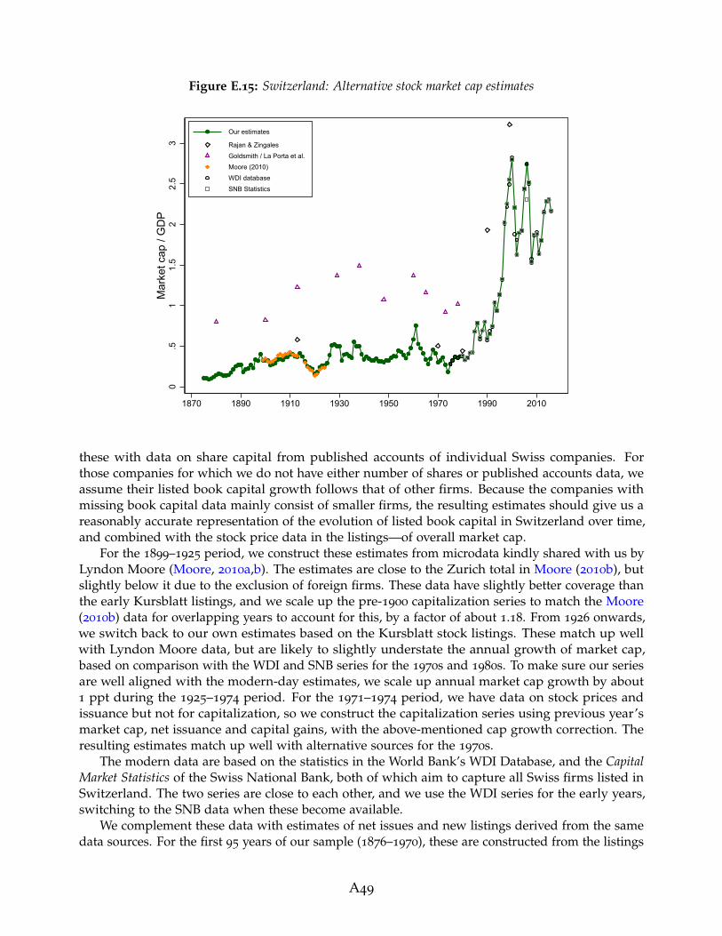
Figure E.15: Switzerland: Alternative stock market cap estimates
0.5
11.
52
2.5
3M
arke
t cap
/ G
DP
1870 1890 1910 1930 1950 1970 1990 2010
Our estimates
Rajan & ZingalesGoldsmith / La Porta et al.Moore (2010)WDI databaseSNB Statistics
these with data on share capital from published accounts of individual Swiss companies. Forthose companies for which we do not have either number of shares or published accounts data, weassume their listed book capital growth follows that of other firms. Because the companies withmissing book capital data mainly consist of smaller firms, the resulting estimates should give us areasonably accurate representation of the evolution of listed book capital in Switzerland over time,and combined with the stock price data in the listings—of overall market cap.
For the 1899–1925 period, we construct these estimates from microdata kindly shared with us byLyndon Moore (Moore, 2010a,b). The estimates are close to the Zurich total in Moore (2010b), butslightly below it due to the exclusion of foreign firms. These data have slightly better coverage thanthe early Kursblatt listings, and we scale up the pre-1900 capitalization series to match the Moore(2010b) data for overlapping years to account for this, by a factor of about 1.18. From 1926 onwards,we switch back to our own estimates based on the Kursblatt stock listings. These match up wellwith Lyndon Moore data, but are likely to slightly understate the annual growth of market cap,based on comparison with the WDI and SNB series for the 1970s and 1980s. To make sure our seriesare well aligned with the modern-day estimates, we scale up annual market cap growth by about1 ppt during the 1925–1974 period. For the 1971–1974 period, we have data on stock prices andissuance but not for capitalization, so we construct the capitalization series using previous year’smarket cap, net issuance and capital gains, with the above-mentioned cap growth correction. Theresulting estimates match up well with alternative sources for the 1970s.
The modern data are based on the statistics in the World Bank’s WDI Database, and the CapitalMarket Statistics of the Swiss National Bank, both of which aim to capture all Swiss firms listed inSwitzerland. The two series are close to each other, and we use the WDI series for the early years,switching to the SNB data when these become available.
We complement these data with estimates of net issues and new listings derived from the samedata sources. For the first 95 years of our sample (1876–1970), these are constructed from the listings
A49

microdata digitised by us and the data helpfully shared by Lyndon Moore. For the post-1970 period,the SNB provide statistics on net issuance in their historical capital market statistics and the moderncapital market database. The modern series has more detail and is more likely to correctly accountfor direct listings and delistings as well as capital issuance, so we switch to it in 1996 when theseseries become available, and use the historical statistics series for the years before. However, wecannot use these modern data to construct our measure of new listings, because they record verylarge gross movements in new listings and delistings, likely driven by minor reclassifications ofalready listed shares and mergers or acquisitions, rather than truly newly listed firms.
For the post-1983 period, we construct our own new listings series based on historical IPO datahelpfully shared with us by Roger Kunz. These data include statistics on each Swiss IPO on theSwiss stock exchanges between 1983 and 2017, as well as the free float proportion and end of firsttrading day share price. We construct an estimate of the end-year IPO market cap by dividing thenumber of issued shares by the free float percentage, multiplying it by the end-of-first-trading-dayshare price, and by a proxy for the stock price growth for the rest of the year derived from theaggregate stock index data. The resulting series may still underestimate new listings however,because they may not count direct listings and some specific types of shares of the listed company.To account for this, we benchmark these series to the aggregate new listings data provided by theWFE, which we are able to obtain from the March 2013 edition of the Handbook of the DeutschesAktieninstitut. The year-on-year movements in the WFE series are likely to be less accurate than inthe microdata-based series, but the average quantity of new listings is likely to be more accurate.By comparing the average quantity of these two series, we scale up the IPO market cap series by afactor of 1.1 to proxy for total new listings.
Compared to other sources, our estimates of Swiss stock market cap are substantially smallerthan the early proxies from Goldsmith (1985), and are similar but slightly below the estimates ofRajan and Zingales (2003) at the corresponding benchmark years.
We thank Lyndon Moore for sharing the microdata from the Zurich Stock Exchange and offeringhelpful advice, to Roger Kunz for sharing data and helping us understand the workings of the SwissIPO market, and to Carmen Hofmann and Rebekka Schefer for helping locate the other historicalsources.
A50

United Kingdom
Table E.16: Data sources: United Kingdom
Year Data source
Stock market capitalization:1870–1929 Total market capitalization of British firms listed on UK exchanges as reported in the
Investor Monthly Manual, from Campbell, Grossman, and Turner (2021), scaled upto account for stocks not included in the IMM. The scaling is done by comparingwith Moore (2010b) data for the London Stock Exchange, scaled up to proxy forprovincial exchanges using data in Campbell, Rogers, and Turner (2016), at five-yearbenchmarks between 1899 and 1924 (factor of 1.3–1.4), helpfully shared with us byRichard Grossman.
1930–1956 Extrapolate market cap growth using the growth in market value of equity of allUK firms (listed and unlisted) from Solomou and Weale (1997), with the aggregategrowth rate adjusted to match the total value of quoted ordinary equity liabilities ofUK firms in 1957, sourced from Roe (1971).
1957–1964 Total value of quoted ordinary equity liabilities of UK firms from Roe (1971).1965–1994 Marked value of all UK and Irish companies listed on the London Stock Exchange,
from LSE Historical Statistics. Spliced with the Roe (1971) data over the 1965–1967
period.1995–2004 Marked value of all UK companies listed on the London Stock Exchange, from LSE
Historical Statistics.2005–2006 Total capitalization of the UK firms listed at the London Stock Exchange, from the
World Federation of Exchanges (WFE) reports, various years.2007–2017 Marked capitalization of all UK listed firms, from the London Stock Exchange Main
Market Factsheets, various years.
Net equity issuance:1870–1929 Change in the book value of British firms listed in the Investor Monthly Manual, using
data from Campbell et al. (2021) kindly shared by Richard Grossman, scaled up bythe same factor as the stock market cap.
2003–2017 Net issuance of ordinary listed shares by all UK firms, from the Bank of EnglandMonetary & Financial Statistics.
New listings:1918–1999 IPO gross proceeds from Chambers and Dimson (2009) scaled up to proxy the total
end-year market cap of IPOs, and direct introductions to the stock exchange. Thescaling for market cap is based on proportion sold figures in Chambers and Dimson(2009), assumed to be 40% up to 1955 and 30% afterwards. The scaling up forintroduction is done by comparing with data on market cap of all newly listed firmsin the LSE Main Market Factsheets before 2004 (factor of about 1.1).
2000–2017 Market capitalization of all newly listed British firms from the LSE Main MarketFactsheets.
A51

Figure E.16: United Kingdom: Alternative stock market cap estimates
0.5
11.
52
2.5
3M
arke
t cap
/ G
DP
1870 1890 1910 1930 1950 1970 1990 2010
Our estimates Rajan & Zingales
Goldsmith / La Porta et al. World Federation of ExchangesWDI database Campbell et al (2021) UK firmsMoore (2010), all firms Musacchio (2010), average of estimatesRoe (1971) LSE StatisticsECB Statistics Revell et al (1967)ONS Flow of Funds Campbell et al (2021) all firms
Table E.16 documents the sources of our data for the UK, and Figure E.16 shows the resulting marketcapitalization series alongside alternative existing estimates. The main difficulty in estimating theUK’s stock market capitalization comes about from two sources. First, since London has been anactive financial center throughout the historical period considered, with an especially active role inthe 19th and early 20th centuries, many stocks listed in London are those of foreign companies andneed to be excluded from the total. Second, especially in the 19th century, the UK had a number ofactive regional exchanges (Campbell, Rogers, and Turner, 2016), whose capitalization needs to beadded to the total.
For the early years in our sample, Campbell, Grossman, and Turner (2021) provide an estimateof UK market capitalization that is very close to our desired definition: it includes all UK firmsin the Investor Monthly Manual (IMM), which should in principle include both the London andprovincial exchanges. However, the coverage of the IMM is incomplete, as shown in Hannah (2018)and Campbell et al. (2021) by comparing the total par value of stocks and bonds in the IMM withthe par value of all UK-traded securities in various issues of the LSE Official Intelligence. The degreeof coverage also varies over time. This means that we have to scale up the IMM-based series toproxy for all UK ordinary shares listed in the UK.
For the scaling, we use the series constructed by Moore (2010b) using stock listings in TheEconomist, Money Market Review, The Times, IMM, The Mining manual and the Official Intelligence.These series cover all shares listed on the London Stock Exchange, not just those of UK companies.But their total is larger than the UK and foreign total in the IMM calculated by Campbell et al. (2021)(the brown triangles vs. grey crosses in Figure E.16). Therefore, we scale up the Campbell et al.(2021) UK-only figures using benchmark-year ratios between the all-share (UK and foreign) Moore(2010b) and Campbell et al. (2021) market capitalization estimates. However, the Moore (2010b)series are for London only and do not include provincial exchanges. This means that we have toscale the resulting total up to proxy for the time-varying importance of provincial exchanges, which
A52

we do by scaling it up by the ratio of all-UK to London-only equity and debt market capitalizationin Campbell et al. (2016). Note that because the Campbell et al. (2016) data include preference sharesand debt, we cannot use their estimates directly, and instead only use them for scaling purposes.The resulting early-period market capitalization series show a similar trend to the Campbell et al.(2021) data, but are larger in levels due to the above-mentioned inclusion of shares not listed in theIMM. They are below the estimates of substantially below those of Goldsmith (1985) and Rajan andZingales (2003), whose proxies are much closer to the London total, unadjusted to exclude foreignshares. Our estimates are also above the benchmark-year estimates in Musacchio (2010).19
For the mid-20th century, we rely on estimates of the national wealth of the UK, published in avariety of sources, and in particular the part of wealth that is attributed to quoted UK shares. Theearly data are sourced from Solomou and Weale (1997), who publish a combined figure that includesthe market value of both listed and unlisted UK firms. We use these series to capture market capgrowth between years 1930 and 1957, for both of which we have estimates of the total listed equitywealth of UK firms. This gives us a value in 1957 which is slightly below the market value of quotedshare liabilities of UK firms published in Roe (1971). Because the Roe (1971) estimates from the1970s onwards align well with alternative data sources (e.g., the capitalization of UK firms estimatedby the London Stock Exchange in the LSE Historical Statistics), we do not scale these series but ratherslightly scale up the market cap growth between 1930 and 1957 so that the 1957 cap is equal to theRoe (1971) estimates. What stands out in these data is the UK stock market boom in the 1930s, whichsaw market capitalization rise to as high as 1.5 times GDP, a value not observed again until the bigbang in the 1990s. The growth in market capitalization in the 1930s was almost entirely driven byrising stock prices—consistent with evidence reported in Section 4 of this paper—and dissipatedclose to the onset of World War II. Even though this boom was not apparent in the benchmark-yearestimates of Goldsmith (1985) and Rajan and Zingales (2003), other annual estimates of UK equityprices and total wealth all show a similar boom-bust pattern in the 1930s.
For the second half of the 20th century and 21st century, we rely on official estimates of thecapitalization of UK, or UK and Irish firms, provided by the London Stock Exchange. We use theUK and Irish capitalization provided in the LSE Historical Statistics between the 1960s and 1994.For the early 1960s, we stick to the Roe (1971) data, given that the LSE statistics estimate for 1962
seems to be an outlier not consistent with other series (Figure E.16). For 1995 onwards, we usedata for UK firms only, with data before 2005 taken from the LSE Historical Statistics, and data after2007—from the LSE Main Market Factsheets, with the 2005–2006 gap plugged using the UK firms’London capitalization estimates provided by the World Federation of Exchanges (WFE) in theirmonthly Statistical Reports. A number of alternative estimates for this later period are shown inFigure E.16. These include national wealth estimates from the Office for National Statistics, WorldBank’s WDI Database, WFE reports and ECB’s Statistical Data Warehouse data. These are generallyclose to our data and the estimates from the LSE, but overall seem somewhat less accurate, withoutliers such as the WDI data for 1975–1976 making us prefer the LSE data overall. Our estimates ofthe capitalization for the 1980s are similar to those of Rajan and Zingales (2003), while those at theheight of the dot-com boom in 1999 are somewhat below theirs.
We complement our estimates of total market capitalization with data on net issuances and newlistings. The net issuance data are only available for the early historical period and the post-2000
period. For the pre-1930 period, we calculate net issuance as the change in book capital of listedfirms in Campbell et al. (2021) scaled up by the same factor as market cap, which allows us toproxy for firms not included in the IMM sample. For the post-2000 period, we use the Monetary& Financial Statistics of the Bank of England. The new listings data are based on long-run series
19Musacchio (2010) offers a range of estimates due to the difficulty of estimating early-period UK marketcapitalization data, with the dark squares in Figure E.16 showing the average of these.
A53

of IPO volumes and prices constructed by Chambers and Dimson (2009). We take the IPO grossproceeds and divide them by the proportion sold to proxy for the total capitalization of IPOs. Thetotal proceeds data are provided by Chambers and Dimson (2009) on annual basis, but proportionsold is not published annually. However, Chambers and Dimson (2009) also show that proportionsold is higher in the earlier than later historical period. To account for this, we proxy proportionsold as 40% before 1955 and 30% afterwards (± 5 ppts of the historical average of 35% reported inChambers and Dimson, 2009). Some new listings on the London Stock Exchange were also directintroductions rather than IPOs, and are not included in the Chambers and Dimson (2009) data. Toaccount for these, we compare our proxy for the IPO market cap based on Chambers and Dimson(2009) with the total market value of new listings published in the LSE Main Market Facthsheets, foryears where the data overlap and are broadly consistent with one another. As a result, we scale upthe IPO cap series slightly by a factor of about 1.1.
The diversity of the UK market, its large size, and the need to account for foreign shares andregional exchanges, make estimating the UK’s market capitalization a tricky task, illustrated by thelarge variety of alternative estimates in Figure E.16. The ability to draw on all this previous work,however, means that we are able to select those estimates that best fit a consistent definition of UKfirms’ listed market cap, and provide a historical series that maps the evolution of the size of the UKequity market with a reasonable degree of accuracy.
We are grateful to Richard Grossman for providing helpful advice and sharing data, and toLeslie Hannah, David Chambers, and John Turner for offering helpful feedback on the data andhistorical sources.
A54

United States
Table E.17: Data sources: United States
Year Data source
Stock market capitalization:1880 Goldsmith (1985) estimate of total equity wealth, scaled down to proxy the market
capitalization of US listed firms, using the ratio of overlapping data for 1900 as thescaling factor.
1899–1924 Total NYSE market capitalization scaled up to reflect all exchanges, and scaled downto exclude foreign stocks. NYSE data from Moore (2010b). Scaling done using thedata on relative importance of the NYSE and other exchanges helpfully shared byLeslie Hannah, and the ratio of NYSE to total cap in the Moody’s manual. Share offoreign firms calculated using NYX historical data.
1925–1935 Total equity wealth of US firms scaled down to capture listed shares only. Equitywealth data from Piketty, Saez, and Zucman (2018). Scaling done by benchmarkingto our pre-1925 estimates, to Moody’s total US capitalization in 1930, and to SEC’sdata on capitalization of all US exchanges in 1936.
1936–1975 Total market capitalization of all US exchanges, from the SEC’s Annual Reports, scaleddown slightly to exclude foreign firms. Share of foreign firms calculated using NYSEHistorical Statistics, and by comparing the SEC and WDI data for the 1970s.
1976–2013 Total capitalization of all US listed firms, shares listed on US stock exchanges, fromthe World Bank’s WDI database.
2014–2016 Total capitalization of all US listed firms, shares listed on US stock exchanges, fromWorld Federation of Exchanges (WFE) reports, various years.
Net equity issuance:1926–2015 Net equity issuance by listed firms from Goyal and Welch (2008), data from Amit
Goyal’s webpage extended to 2015. Net issuance is calculated as the differencesbetween value weighted cap growth and capital gain on the CRSP all share index.
2016–2017 Net equity issuance by listed firms from the OECD Financial Statistics, sourced fromRichter and Diebold (2021).
Table E.17 documents the sources of our stock market capitalization data for the US, and FigureE.17 shows the resulting series alongside alternative existing estimates. Most of the widely availableestimates of US stock market capitalization refer to the New York Stock Exchange only, so the mainchallenge here reflects obtaining capitalization estimates that cover not only NYSE, but also otherstock exchanges, and also adjusting estimates to exclude any foreign listings. Inclusion of non-NYSEstock exchanges is especially important for the early US data, with much of the trading taking placeon the Curb Exchange and regional markets (Sylla, 2006; O’Sullivan, 2007).
Our early data use the Moore (2010b) estimates of the NYSE cap, scale these up to also accountfor other stock exchanges, and scale them down to exclude foreign listings. We rely on a numberof benchmark year estimates to approximate the relative importance of the NYSE. The 1906 NYSEshare was helpfully shared with us by Leslie Hannah, and amounts to around 44% in terms of bookcap. By 1930, comparison of the total capitalization of US firms in Moody’s manual to the NYSE
A55
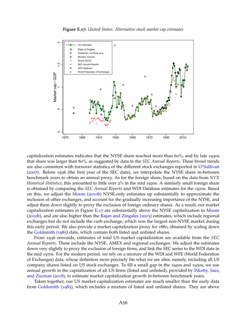
Figure E.17: United States: Alternative stock market cap estimates
0.5
11.
52
Mar
ket c
ap /
GD
P
1870 1890 1910 1930 1950 1970 1990 2010
Our estimates
Rajan & ZingalesGoldsmith / La Porta et al.Moody's manualMoore (2010)SEC Annual ReportsWDI databaseWorld Federation of Exchanges
capitalization estimates indicates that the NYSE share reached more than 60%, and by late 1930sthat share was larger than 80%, as suggested by data in the SEC Annual Reports. These broad trendsare also consistent with turnover statistics of the different stock exchanges reported in O’Sullivan(2007). Before 1936 (the first year of the SEC data), we interpolate the NYSE share in-betweenbenchmark years to obtain an annual proxy. As for the foreign share, based on the data from NYXHistorical Statistics, this amounted to little over 2% in the mid 1920s. A similarly small foreign shareis obtained by comparing the SEC Annual Reports and WDI Database estimates for the 1970s. Basedon this, we adjust the Moore (2010b) NYSE-only estimates up substantially to approximate theinclusion of other exchanges, and account for the gradually increasing importance of the NYSE, andadjust them down slightly to proxy the exclusion of foreign ordinary shares. As a result, our marketcapitalization estimates in Figure E.17 are substantially above the NYSE capitalization in Moore(2010b), and are also higher than the Rajan and Zingales (2003) estimates, which include regionalexchanges but do not include the curb exchange, which was the largest non-NYSE market duringthis early period. We also provide a market capitalization proxy for 1880, obtained by scaling downthe Goldsmith (1985) data, which contain both listed and unlisted shares.
From 1936 onwards, estimates of total US market capitalization are available from the SECAnnual Reports. These include the NYSE, AMEX and regional exchanges. We adjust the estimatesdown very slightly to proxy the exclusion of foreign firms, and link the SEC series to the WDI data inthe mid 1970s. For the modern period, we rely on a mixture of the WDI and WFE (World Federationof Exchanges) data, whose definition more precisely fits what we are after, namely, including all UScompany shares listed on US stock exchanges. To fill a small gap in the 1920s and 1930s, we useannual growth in the capitalization of all US firms (listed and unlisted), provided by Piketty, Saez,and Zucman (2018), to estimate market capitalization growth in-between benchmark years.
Taken together, our US market capitalization estimates are much smaller than the early datafrom Goldsmith (1985), which includes a mixture of listed and unlisted shares. They are above
A56

the estimates of Rajan and Zingales (2003) for the early period, thanks to our inclusion of the curbexchange, and similar to the Rajan and Zingales (2003) estimates for the more recent period.
We complement these with estimates on net equity issuance from CRSP data sourced from Goyaland Welch (2008), and for the most recent years from financial accounts data in the OECD FinancialStatistics. Goyal and Welch (2008) estimate net issuance as the difference between the CRSP marketcap growth and the value weighted price index. Because these two CRSP series are calculated onexactly the same underlying sample, they offer the best proxy of our desired issuance measurein equation (3). We effectively scale up their issuance to match our aggregate market cap series,therefore assuming that the listed firms not covered in the CRSP series (especially early on in thesample) issue equity at the same rate as those included in CRSP.
We would like to thank Leslie Hannah for sharing data and helping us locate and interpret thevarious historical sources for the US.
References
Abildgren, Kim. 2006. Monetary Trends and Business Cycles in Denmark 1875–2005: New Evi-dence Using the Framework of Financial Accounts for Organising Historical Financial Statistics.Danmarks Nationalbank Working Paper 43.
Annaert, Jan, Frans Buelens, and Marc De Ceuster. 2012. New Belgian Stock Market Returns:1832–1914. Explorations in Economic History 49(2): 189–204.
Arbulu, Pedro. 1998. Le marche Parisien des Actions au XIXe Siecle: Performance et Efficience d’un MarcheEmergent. Ph.D. thesis, Orleans.
Bank of Japan. 1966. Hundred-Year Statistics of the Japanese Economy.
Black, Susan, Joshua Kirkwood, Thomas Williams, and Alan Rai. 2013. A History of AustralianCorporate Bonds. Australian Economic History Review 53(3): 292–317.
Boudoukh, Jacob, Roni Michaely, Matthew Richardson, and Michael R. Roberts. 2007. On theImportance of Measuring Payout Yield: Implications for Empirical Asset Pricing. Journal of Finance62(2): 877–915.
Bozio, Antoine. 2002. La Capitalisation Boursiere en France au XXe Siecle. Master’s thesis, EcoleNormale Superieure.
Buckley, Kenneth Arthur Haig, and Malcolm Charles Urquhart. 1993. Historical Statistics of Canada.Statistics Canada.
Campbell, Gareth, Richard S. Grossman, and John D. Turner. 2021. Before the Cult of Equity: theBritish Stock Market, 1829—1929. European Review of Economic History Heab003.
Campbell, Gareth, Meeghan Rogers, and John D. Turner. 2016. The Rise and Decline of the UK’sProvincial Stock Markets, 1869-1929. QUCEH Working Paper 2016-03.
Carpentier, Cecile, Jean-Francois L’Her, and Jean-Marc Suret. 2009. On the Competitiveness of theCanadian Stock Market. Banking & Finance Law Review 24(2): 287.
Central Bureau of Statistics. 2010. 111 Jaar Statistiek in Tijdreeksen, 1899–2010. Den Haag: StatisticsNetherlands.
A57

Chambers, David, and Elroy Dimson. 2009. IPO Underpricing over the Very Long Run. Journal ofFinance 64(3): 1407–1443.
Deutsche Bundesbank. 1976. Deutsches Geld-Und Bankwesen in Zahlen, 1876-1975. Knapp.
Erichsen, Christian. 1902. Green’s Danske Fonds og Aktier 1902. Udgivet og Redigeret af HolmerGreen og Hendrik Stein. Nationaløkonomisk Tidsskrift 3.
Foster, Rob A. 1996. Australian Economic Statistics 1949–50 to 1994–95. Reserve Bank of AustraliaOccasional Paper 8.
Goldsmith, Raymond W. 1985. Comparative National Balance Sheets: A Study of Twenty Countries,1688–1978. Chicago, Ill.: University of Chicago Press.
Goyal, Amit, and Ivo Welch. 2008. A Comprehensive Look at the Empirical Performance of EquityPremium Prediction. Review of Financial Studies 21(4): 1455–1508.
Grullon, Gustavo, and Roni Michaely. 2002. Dividends, Share Repurchases, and the SubstitutionHypothesis. Journal of Finance 57(4): 1649–1684.
Hall, Alan Ross. 1968. The Stock Exchange of Melbourne and the Victorian Economy 1852–1900. Canberra,ACT: Australian National University Press.
Hannah, Leslie. 2018. The London Stock Exchange, 1869–1929: New Statistics for Old? EconomicHistory Review 71(4): 1349–1356.
Hansen, Svend Aage, and Knud Erik Svendsen. 1968. Dansk pengehistorie. 1: 1700–1914. København:Danmarks Nationalbank.
Hogholm, Kenneth, and Victor Hogholm. 2017. Open Market Repurchase Programs – Evidencefrom Finland. International Journal of Economics and Finance 9(12): 13–23.
Jorda, Oscar, Katharina Knoll, Dmitry Kuvshinov, Moritz Schularick, and Alan M. Taylor. 2019. TheRate of Return on Everything, 1870–2015. Quarterly Journal of Economics 134(3): 1225–1298.
Jorda, Oscar, Moritz Schularick, and Alan M. Taylor. 2016. Macrofinancial History and the New Busi-ness Cycle Facts. In NBER Macroeconomics Annual 2016, Volume 31, edited by Martin Eichenbaum,Jonathan A. Parker, pp. 213–263. Chicago, Ill.: University of Chicago Press.
Kunz, Roger M., and Reena Aggarwal. 1994. Why Initial Public Offerings are Underpriced: Evidencefrom Switzerland. Journal of Banking and Finance 18(4): 705–723. Special Issue on Non-US FinancialMarkets.
La Porta, Rafael, Florencio Lopez-de Silanes, and Andrei Shleifer. 2008. The Economic Consequencesof Legal Origins. Journal of Economic Literature 46(2): 285–332.
Lamberton, Donald McLean. 1958. Share Price Indices in Australia: An Examination of the Measurementand Significance of Changes in Share Prices, Together with New Indices for the Period July, 1936-December,1957. Law Book Company of Australia.
Le Bris, David, and Pierre-Cyrille Hautcoeur. 2010. A Challenge to Triumphant Optimists? A BlueChips Index for the Paris Stock Exchange, 1854–2007. Financial History Review 17(2): 141–183.
A58

Lopez, Carlos Barciela, Albert Carreras, and Xavier Tafunell. 2005. Estadısticas Historicas De Espana:Siglos XIX–XX. Madrid: Fundacion BBVA.
Mathews, Thomas. 2019. A History of Australian Equities. RBA Research Discussion Paper RDP2019-04.
Mediobanca. various years. Indici e Dati Relativi ad Investimenti in Titoli Quotati.
Megginson, William L., and Henk Von Eije. 2008. Dividends and Share Repurchases in the EuropeanUnion. Journal of Financial Economics 89(2): 347 – 374.
Moore, Lyndon. 2010a. Financial Market Liquidity, Returns and Market Growth: Evidence fromBolsa and Borse, 1902-–1925. Financial History Review 17(1): 73–98.
Moore, Lyndon. 2010b. World Financial Markets 1900–25. Working paper.
Musacchio, Aldo. 2010. Law and Finance c. 1900. NBER Working Paper 16216.
Nyberg, Peter M., and Mika Vaihekoski. 2011. Descriptive Analysis of Finnish Equity, Bond andMoney Market Returns. Bank of Finland Discussion Paper Series 14/2011.
Nyberg, Peter M., and Mika Vaihekoski. 2014a. Descriptive Analysis of the Finnish Stock market:Part II. Bank of Finland Discussion Paper Series 10/2014.
Nyberg, Peter M., and Mika Vaihekoski. 2014b. Equity Premium in Finland and Long-TermPerformance of the Finnish Equity and Money Markets. Cliometrica 8(2): 241–269.
O’Sullivan, Mary. 2007. The Expansion of the U.S. Stock Market, 1885–1930: Historical Facts andTheoretical Fashions. Enterprise & Society 8(3): 489–542.
Parum, Claus. 1997. Det Danske Organiserede Aktiemarked i Historisk Belysning. CopenhagenBusiness School Department of Finance Working Paper 97-6.
Piketty, Thomas, Emmanuel Saez, and Gabriel Zucman. 2018. Distributional National Accounts:Methods and Estimates for the United States. Quarterly Journal of Economics 133(2): 553–609.
Rajan, Raghuram G., and Luigi Zingales. 2003. The Great Reversals: the Politics of FinancialDevelopment in the Twentieth Century. Journal of Financial Economics 69(1): 5–50.
Richter, Bjorn, and Lukas Diebold. 2021. When Two Become One: Foreign Capital and HouseholdCredit Expansion. Working paper.
Roe, Alan. 1971. The Financial Interdependence of the Economy, 1957–1966. London: Chapman & Hall.
Ronge, Ulrich. 2002. Die Langfristige Rendite Deutscher Standardaktien: Konstruktion eines HistorischenAktienindex ab Ultimo 1870 bis Ultimo 1959. Frankfurt am Main: Lang.
Rydqvist, Kristian, and Rong Guo. 2020. Performance and Development of a Thin Stock Market: theStockholm Stock Exchange 1912–2017. Financial History Review 28(1): 26–44.
Saint-Marc, Michele. 1983. Histoire Monetaire de la France (1800–1980). Paris: Presses Universitairesde France.
Shiller, Robert J. 2015. Irrational Exuberance. Princeton, N.J.: Princeton University Press.
A59

Solomou, Solomos, and Martin Weale. 1997. Personal Sector Wealth in the United Kingdom,1920–1956. Review of Income and Wealth 43(3): 297–318.
Sylla, Richard. 2006. Schumpeter Redux: a Review of Raghuram G. Rajan and Luigi Zingales’sSaving Capitalism from the Capitalists. Journal of Economic Literature 44(2): 391–404.
Waldenstrom, Daniel. 2014. Swedish Stock and Bond Returns, 1856–2012. In Historical Monetaryand Financial Statistics for Sweden, Volume 2: House Prices, Stock Returns, National Accounts andthe Riksbank Balance Sheet, 1860-2012, edited by Rodney Edvinsson, Tor Jacobson, and DanielWaldenstrom, 223–293. Stockholm: Sveriges Riksbank and Ekerlids forlag.
Zeng, Liyu, and Priscilla Luk. 2020. Examining Share Repurchasing and the S & P Buyback Indicesin the US Market. S & P Global Research Note.
A60