the development of “lapa.md” – the first … · 2016-08-23 · in moldova, the most widely...
TRANSCRIPT

MOLDOVA STATE UNIVERSITY
FACULTY OF PHYSICS AND ENGINEERING
DEPARTMENT OF THEORETICAL PHYSICS "IU. PERLIN"
TITUȘCHINA TATIANA
THE DEVELOPMENT OF “LAPA.MD” –
THE FIRST MULTIFUNCTIONAL PORTAL IN MOLDOVA
ABOUT PETS
52. Engineering and engineering activities
MANAGEMENT OF INNOVATION AND TECHNOLOGY TRANSFER
Master’s Thesis
Head of the department ___________
(signature)
Scientific adviser: ___________ Ciobu Victor, senior lecturer
(signature)
Author: ___________
(signature)
CHIȘINĂU-2016

2
Contents
Abbreviations ...................................................................................................................... 3 Introduction ......................................................................................................................... 4
Chapter 1. The General Theory of Development of a Website and a Virtual Bulletin Board... 7 1.1. Content Management of a Website .......................................................................................... 7 1.2. Commercial Open Source CMS ............................................................................................. 10 1.3. CMS WordPress ..................................................................................................................... 12 1.4. CMS Joomla ........................................................................................................................... 13 1.5. CMS Drupal ............................................................................................................................ 14
1.6. Modern Web Design Trends .................................................................................................. 16
1.7. Top Usability Mistakes in Web Design .................................................................................. 18 1.8. History of Bulletin Boards ...................................................................................................... 21
1.9. Virtual Bulletin Boards’ Special Features .............................................................................. 23
Chapter 2. Project’s Management ...................................................................................... 26 2.1. Software Development Activities ........................................................................................... 26
2.2. Analysis of Slovak Websites about Pets................................................................................. 28 2.3. Project’s Form ........................................................................................................................ 31
Summary of the Project ............................................................................................................. 31
Planned Activities ...................................................................................................................... 31 Planned Results and Estimators ................................................................................................. 32
Strategies ................................................................................................................................... 33 The Potential of Administrator to Carry Out Successfully the Project ..................................... 33
SWOT Analysis ......................................................................................................................... 34 2.4. Business Model Canvas .......................................................................................................... 36
Chapter 3. Implementation of the Website about Pets ......................................................... 37 3.1. Technical Task ........................................................................................................................ 37 3.2. Download of a Theme and Management of its Settings ......................................................... 38
3.3. Creating Website’s Main Menu .............................................................................................. 42
3.4. Development of Category “Animals”..................................................................................... 44 3.5. Development of Category “Advertisements” ......................................................................... 57 3.6. Development of Category “Forum” ....................................................................................... 70 3.7. Development of Category “Health” ....................................................................................... 71 3.8. Development of Category “Organizations” ............................................................................ 72
3.9. Development of Category “Entertainment” ........................................................................... 73
Conclusions ........................................................................................................................ 74
Bibliography ...................................................................................................................... 77
Annex 1.............................................................................................................................. 78 Annex 2.............................................................................................................................. 83
Annex 3.............................................................................................................................. 91

3
Abbreviations
CMF (Content Management Framework) – is a system that facilitates the use of customized
software for managing Web content.
CMS (Content Management System) – is a computer application that allows publishing,
editing and modifying content, organizing, deleting as well as maintenance from a central
interface.
PHP (PHP: Hypertext Preprocessor; at the beginning – Personal Home Page Tools) – is a
server-side scripting language designed for web development.
HTML (HyperText Markup Language) – is the standard markup language used to create
web pages.
CSS (Cascading Style Sheets) – is a style sheet language used for describing the
presentation of a document written in a markup language.
HTTP (HyperText Transfer Protocol) – is an application protocol for distributed,
collaborative, hypermedia information systems. HTTP is the foundation of data communication
for the World Wide Web. Hypertext is structured text that uses logical links (hyperlinks)
between nodes containing text. HTTP is the protocol to exchange or transfer hypertext.
Uniform Resource Identifier (URI) – is a string of characters used to identify the name of a
resource. Such identification enables interaction with representations of the resource over a
network, typically the World Wide Web, using specific protocols. The most common form of
URI is the Uniform Resource Locator (URL), frequently referred to informally as a web
address.
IP (Internet Protocol) – is the main communications protocol in the Internet protocol suite
for delivering packets from the source host to the destination host solely based on the IP
addresses in the packet headers.
IP address (Internet Protocol Address) – is a numerical label assigned to each device (e.g.,
computer, printer) participating in a computer network that uses the Internet Protocol for
communication.
FUD factor (Fear, Uncertainty and Doubt) - is generally a strategic attempt to influence
perception by disseminating negative and dubious or false information.

4
Introduction
Nowadays human life in many ways is relating to the use of computers. Someone uses them with
a cognitive aim (looking for a variety of information in the form of text, images, video or audio
files), others – with the purpose of entertainment (games, movies, songs, favorite artists), and the
rest to communicate. Of course, many do their work with the help of computers, that have a huge
potential, and some people have built a business by using various online resources.
However, ordinary users often use computer to access the Internet. The objectives, as I
mentioned earlier, can be very different. To implement any of them, you have to go to a certain
website. Without all these sites would be impossible to do this. So, the urgency of creating more
and more new web pages is not in doubt.
Website is a set of related web pages typically served from a single web domain. A website is
hosted on at least one web server, accessible via a network such as the Internet or a private local
area network through an Internet address known as a uniform resource locator (URL). All publicly
accessible websites collectively constitute the World Wide Web.
Web pages, which are the building blocks of websites, are documents, typically written in plain
text interspersed with formatting instructions of Hypertext Markup Language (HTML, XHTML).
They may incorporate elements from other websites with suitable markup anchors. Webpages are
accessed and transported with the Hypertext Transfer Protocol (HTTP), which may optionally
employ encryption (HTTP Secure, HTTPS) to provide security and privacy for the user of the
webpage content. The user's application, often a web browser, renders the page content according to
its HTML markup instructions onto a display terminal.
The pages of a website can usually be accessed from a simple Uniform Resource Locator (URL)
called the web address. The URLs of the pages organize them into a hierarchy, although
hyperlinking between them guides the reader's navigation of the site, which generally includes a
home page with most of the links to the site's web content, and a supplementary about, contact and
link page.
Some websites require a subscription to access some or all of their content. Examples of
subscription websites include many business sites, parts of news websites, academic journal
websites, gaming websites, file-sharing websites, message boards, web-based email, social
networking websites, websites providing real-time stock market data, and websites providing
various other services.
Tim Berners-Lee created the first website in the world in 1990. He published there the
description of new technology called World Wide Web and based on HTTP protocol, URI and

5
markup language HTML. There were described the principles of installation and work of servers
and browsers, too. This site became the first internet catalogue, because later his author placed there
a list of other sites’ links.
Therefore, there are many websites in Internet nowadays. They are created using HTML, CSS,
PHP and other languages. Besides developers, web-designers work on creation of a website – they
are responsible for its appearance, because it is well known, that from two similar looking products
user choose the most attractive one. So, like on any market, there exists an intense competition
among the websites.
However, sometimes an ordinary user wants to create a website to place there some information
for oher people – for example, an advertisement. Nevertheless, he cannot understand many pages
with long and complex codes and their meanings, because he does not have this knowledge and
necessary skills. Different CMF and developed on its base CMS (platforms for creating websites)
can help him in this task. There is already created website’s framework and are written all codes in
these systems. All that user needs is to have a server at home and download suitable CMS from its
official site. He must choose a name for a new site and launch it by following simple instructions
and selecting necessary points, but not to write long codes to develop an own website. However, if
he wants to change it and to create a complex functionality, he can change site’s code.
Free acquisition and simplicity of installation and operation make the growing popularity of
open CMS, which proves the relevance of their use for the creation of many new web pages or
entire portals. CMS – is an excellent tool for beginning web developers, especially for those who
are invited by different companies to create their websites, where will be exhibited products that are
offered by these firms.
The products are exhibited on the site on a virtual bulletin board. This may be a section of the
website dedicated to specific postings to represent a product or a website fully dedicated to all
possible types of ads.
The virtual board is not the first advertising medium and reminder for public about provided
products and services. Currently, the most common in this area are newspapers and magazines
(specialized or with specific section for advertisement), advertising on radio and television, as well
as actively developing recently method of placing ads on the Internet at a variety of sites.
In Moldova, the most widely used message boards are – newspaper and site "Makler", covering
the 4 city of Moldova (Chishinau, Balti, Tiraspol, Ribnita) and 2 cities of the Ukraine (Odessa,
Nikolaev), and the site 999.md. Rate of this biggest portal in Moldova, dedicated to the sale of any
goods and services in the local market, according to rating.openstat.ru, only in March 2014 was
amounted to 145.659.014 visitors.

6
However, in order to achieve such a huge site traffic, it is necessary from the beginning to
develop a plan for the development of the project. In the course of its preparation, you need to
identify the main goals and objectives of the project, to analyze the market – who are the main
competitors, who may be an investor and who is a potential customer (that is for what part of
society all provided online products would be sent). Only after the preparation of the plan and
carrying out the detailed marketing analysis, taking into account current market trends, you can
begin to create a site.
Before to start, I have set a few goals. The first was to study corresponding to the selected
category of the theory through the literature: basics of management; business planning; marketing
and current trends in the development of sites; the creation of websites using the CMS and basic
tools of HTML and CSS.
The second objective was the acquisition of practical skills through the study of theory. In
particular, I was participating in internship program at Technicel University of Kosice in Slovakia,
where I had the exchange of experience with our Slovak colleagues.
As application of the achieved skills, I set a goal to create my own website about pets using the
selected CMS. It will be the first multifunctional portal in Moldova about pets with the
enciclopedia, a bulletin board (pets’ sales, purchases, etc.), forum, etc.
Finally, the concluding aim was writing a thesis, which will describe all the stages of creating a a
website, its business plan and bulletin boards using funds provided by the selected CMS, as well as
the details of the development.

7
Chapter 1. The General Theory of Development of a Website and a Virtual Bulletin Board
1.1. Content Management of a Website
Content Management Framework (CMF) – is a system that facilitates the use of reusable
components or customized software for managing Web content. It shares aspects of a Web
application framework and a content management system (CMS).
Content management system (CMS) — is a computer application that allows publishing, editing
and modifying content, organizing, deleting as well as maintenance from a central interface. Such
systems of content management provide procedures to manage workflow in a collaborative
environment. These procedures can be manual steps or an automated cascade. CMSs have been
available since the late 1990s. [21]
CMSs are often used to run websites containing blogs, news and shopping. Many corporate and
marketing websites use CMSs. CMSs typically aim to avoid the need for hand coding, but may help
it for specific elements or entire pages. [21]
The main functions of CMS:
Providing tools to create content, collaborate on content;
Content Management: storage, version control, adhearance to the access mode, control of
documents’ flow, etc.;
Publish content;
Presenting information in a form convenient for navigation and search.
The content management system can contain a variety of data: documents, films, photos, phone
numbers, scientific data, etc. Such a system is often used for storing, managing, reviewing and
publishing of documentation. Version control is one of its main advantages, when a group of
individuals changes the content.
There are two types of content management systems:
Enterprise Content Management System (ECMS);
Web Content Management System (WCMS).
Due to the fact that the ECMS have a deep internal classification by subject area, the term CMS
has replaced a WCMS, becoming synonymous with it. These CMS allow you to manage text and
graphic content of a website, providing to the user an interface to work with site content, useful
tools for storage and publication of information by automating the process of placing the
information in databases and its issuance in HTML.

8
There are many ready-made content management systems, including free ones. They can be
divided into three types according to the methods of work:
Generation of pages on a request. Systems of this type operate on the basis of ligament
"Editing module → Database → Presentation module". Presentation module generates a
page with a content when there is a request based on the information from the database.
Editing module changes information in the database. Server re-creates pages for every
request that creates an additional load on system resources. The load may be reduced by
using caching agents that are available in modern web servers.
Generation of pages while editing. Systems of this type are a program for editing pages that
create a set of static pages while you make changes in the content of the site. In this way,
interactivity between the visitor and the site content is sacrificed.
Mixed. As the name implies, it combines the advantages of the first two. It can be realized
by caching – representation module generates a page once, and, in the future, it is several
times faster loaded from the cache. The cache can be updated automatically after a certain
period of time or when changes are made in certain sections of the site, or manually by
administrator. Another approach – the conservation of certain information blocks on the
stage of editing the site and page assembly of these units at the request of the relevant page
by the user.
The content management system (CMS) has two elements:
Content management application (CMA) is the front-end user interface that allows a user,
even with limited expertise, to add, modify and remove content from a Web site without the
intervention of a Webmaster.
Content delivery application (CDA) compiles that information and updates the Web site. [21]
Feature of management system is in that it is a program that provides tools to add, edit and delete
information on the site. There is a huge variety of content management systems, among which there
are both free and paid, built on different technologies. Each site has a control panel that is only a
part of the entire program, but enough to control it.
The term content manager refers to the kind of professional activity – the site editor.
Most modern CMS are implemented in the form of visual (WYSIWYG) editor – a program that
creates a HTML-code from a special simplified layout, allowing the user to format text easier.
Most people use Drupal, WordPress and Joomla, as the top three open CMS [3], but in recent
years more and more open commercial CMS are launched, too. So what are the differences between
all these CMS?

9
Just some years ago, WordPress actually started to build up as a true CMS. However, the other
two, Drupal and Joomla, have always fought for the first place in the community. Both of these
systems are open source, and both are widely developed, and thousands of members in their
community help to develop and expand the possibilities of using these systems for everybody else.
While WordPress is considered weak in the CMS war, it is definitely the king of blogging software
(something that Joomla and Drupal cannot do just as effective). [3]
In contrast, commercial open source systems are based on technology with the open code, but
delivered as software service platform with a large number of standard features built into the
platform. These platforms have a tendency to eliminate the FUD (Fear, Uncertainty and Doubt)
factor, when implementing the latest web technologies. [3] This is an abbreviation accepted in e-
mail. According to the legend, manager of IBM recommended when there are discussins about
competitors' products with customers not to abuse it and to say FUD.
Commercial open source CMS eliminate their own licensing fees and lower the cost of
ownership of web sites on them is carried out by simplifying development and support efforts.
These systems provide a scalable solution that meets the requirements of small and large
businesses, and thus, they are very attractive for both business owners and for web developers alike.
The last point is the key difference between the free open source platforms and the currently
available commercial open source platforms. [3]

10
1.2. Commercial Open Source CMS
I shall start my deeper analysis of CMS from commercial open source CMS.
Commercial open platforms set new standards in the creation of Web sites.
Open source CMS systems like WordPress, Drupal and Joomla are built by a community of
developers and have as such never the-end user in perspective. Commercial open source platforms
are using the same open source tools as Joomla or Drupal, but they have a strong tolerance towards
service and servicing the end-user, being the owner of the website and the viewer, being the
customer of a particular website.
Main advantages of Commercial Open source systems are: the friendliness for all types of users -
Designers, Developers and Administrators, Content Managers or end-users, the use of standard
HTML and CSS coding, time to market for a Complete WEB Systems and a Total service concept,
including Hosting, Training and Helpdesk to help oser, when he stopped in development and
module’s implementation. [3]
In my opinion, the biggest advantage of commercial open source platforms is the time to market
and the implementation time for your website. Once you have a design (which is basically a PSD
File) or once you have picked one of the many available standard templates, implementation time
for the standard modules is a matter of hours. Even more complicated modules like the shopping
cart can be configured in days and be online within a week, not weeks.
The implementation cost of ownership and the risks in the creation and launch quite reasonably
relate to the modularity of the design and content management modules.
In commercial open source CMS is collected all the best: a fascinating and easy to use module
design, fully featured online content management system and extremely user-friendly tools for
administrators and content managers. All this is reflected in the code.
Nowadays one of the main trends in the creation of platforms and content management is the de-
mystification of the content management system of the site and development activities. Anyone
who has information shares knowledge on the Internet, so if you know exactly what you need, you
can quickly find a necessary answer and instantly implement your plans. Commercial open source
CMS plays an important role in this area, due to the extreme attention to users, easy activation of
many modules for content generation and a set of application-driven templates. All this can be
configured as by regular users and by content managers. It does not require in-depth knowledge of
web coding.
However, this is a kind of contradiction, because free open source softwares such as Joomla and
Drupal use the special coding to create templates and web sites, which thus becomes proprietary

11
software. Commercial open source software has a tendency to stick to widespread standards, such
as HTML and CSS, to create templates and manage websites. So much easier is to obtain these
skills rather than learn from the developers about their entire flavor, hidden in the code, because
information about HTML and CSS standards is widespread and well documented in online and
offline publications.
Commercial open source systems are built on open technologies. The set of its software includes
a large number of standard features built into the platform. They reduce the cost of ownership by
simplifying development and maintenance. Also commercial open source CMS deliver a scalable
solution that meets the requirements of small and large enterprises. They provide tolerance to the
end-users and a short time of the sites’ release on the market: for standard templates – just in a few
hours, for more complex modules – setup and launch within a week.
These are main advantages of commercial open source systems:
convenience for all types of users – designers, developers and administrators, content
managers and end-users;
the use of standard HTML and CSS coding;
fast market entry of a complete WEB-system and the overall presentation of the
service, including hosting, training and help.
There are the following disadvantages in such systems:
no access to the source code;
design community is growing more slowly than the Joomla community;
developers and designers need to start thinking in terms of business drivers, not codes
or modules.

12
1.3. CMS WordPress
Now I will analyze three major free open souce CMS.
So, what is a first of them – WordPress?
It is generally accepted that WordPress is an excellent system, if you want to spread quickly your
ideas on the Internet. Therefore, it is often used as a blog. Nevertheless, WordPress can be
configured in different ways. [3]
WordPress is extremely easy to use and configure. Naturally, it can work as a blog. The system
has built-in comments, as well as diagnostic services, multiple blogger profiles, backlinks, and
various other features common to each blog. Most of the functionality is already built into the
system, and therefore allows you to work as expected, without the need to set up. [3]
However, absence of need to set up a web site on WordPress is its limitation. That is, because
very often, if you try to change, or just something to do with the system, this leads to the fact that
the website stops working, or may disappear altogether. WordPress is far from friendly to
developers: too frequent system upgrades made on your website may result to its disappearance, or,
for example, with a simple upgrade and modification of the settings you have made, they can be no
longer available.
Advantages of WordPress:
very easy to use;
requires minimal setup;
excellent for blogging or sharing information in a sequential manner.
Disadvantages of WordPress:
unfriendly for developers;
update can bring more bugs than fixes.
Examples of the most famous websites created using WordPress:
National Geographic
The New York Times
People
Ford
BBC America
Startup Weekend
The Official Star Wars Blog
MTV News

13
1.4. CMS Joomla
Joomla means in Swahili (Urdu) "all together" and to a certain extend they have been living up
their name of being a system that is end-user and developer friendly, also takes care of the design of
your website and the way a CMS should work. [3]
In my opinion, designers choose Joomla because of the amazing capabilities that its engine has
in making websites look so fantastic. Newcomers to Joomla (and website management) love the
fact that it is very easy to use and even customize as more and more developers create tools that are
easier to understand. Developers choose this system because of its large capacity for development
and customization. The new MVC framework was built just so that anyone with the knowledge
could override the core of the CMS without actually modifying the original code. [3]
However, Joomla is not as flexible for developers as Drupal is and it is not as user-friendly as
WordPress. It cannot run multisites from one backend database, because parts of the system have to
be taken as is and cannot be customized or modified. Therefore, you need to learn the limitations of
platform and modules that are in essence self-contained. [3]
Joomla community argues that this system is user friendly, and to a certain extent it is so, but
when you create a website, you have to rely on specific proprietary code of Joomla, and if you are
not a developer or a designer, only a desire to create your website may not be enough.
Therefore, trying to be with all together to build a websites community, Joomla has the risk of
being "caught" by Drupal or WordPress. In other words, people who want simplicity will go to
WordPress, and developers who love to develop and code will choose Drupal.
Advantages of Joomla:
friendly for designers, developers and administrators;
its huge community is awesome for assisting with creation of websites;
has been rapidly growing and improving itself for the past years.
Disadvantages of Joomla:
is not so simple for end-users and content managers like WordPress is;
is not quite as powerful as Drupal;
there are still many features from the old versions.
Examples of the most famous websites created using Joomla:
Hardvard
Linux

14
1.5. CMS Drupal
Finally, I shall analyse a third of the free open source CMS – Drupal.
In my opinion, Drupal is the best platform, if you enjoy tweaking the code that makes up the
framework of a website. This advanced Content Management System is more a developer platform
than a traditional CMS. Although I cannot say that only developers can use it, but they will feel at
home there, but not in two other free CMS. [3]
Unfortunately, being more developer friendly does not automatically make it more user friendly.
Therefore, the developer has to work hard to make the product in that way that he needs.
For those who are not very versed in the code, the creation of a site on such a system can be a
real hard labor, but people who "live" in the code can literally get lost in the very slowly developing
technologies that help to create a website.
CMS Drupal is, in fact, the development of a platform. If you are a developer and are willing to
learn all the nuances of your own system, you will be able to create great and powerful websites
using Drupal. However, it is not easy to get them to look as attractive as they work well. The
underlying technology is perfect, but the usability and design are far from perfect. You can create a
perfectly working website, but, in most cases, it will be difficult to use, and it will not be very
carefully designed. [3]
Advantages of Drupal:
is extremely developer friendly;
there is a strong community to help distinguish the hundreds of functions and tags
available;
can be used to create some really powerful websites that can outstrip a majority of
other sites created by other CMS.
Disadvantages of Drupal:
is not very designer and user-friendly;
hard for someone with little code knowledge;
themes are made by developers, not designers;
publishing a Drupal website could cost more time, and thus more money, than
WordPress or Joomla and certainly compared to commercial open source software.
Because I am a programmer and I like to understand the codes, I choose CMS Drupal to create
my website. Now I shall analyse it more.
Particular attention should be paid to the relevance of using exactly this CMS.

15
Drupal is a free and open-source content-management framework (CMF) written in PHP. It is
used as a back-end framework for at least 2.1% of all Web sites worldwide [14][15] ranging from
personal blogs to corporate, political, and government sites [16] like whitehouse.gov and data.gov.uk.
It is also used for knowledge management and business collaboration. [17]
The standard release of Drupal, known as Drupal core, contains basic features common to all
content management systems (CMS). These include user account registration and maintenance,
menu management, RSS feeds, taxonomy, page layout customization, and system administration.
Drupal can serve as a simple website, a single- or multi-user blog, an Internet forum or a
community website providing for user-generated content.
The Drupal community comprises more than one million members (as of October 2013) [19] and
31,000 developers (as of February 2014) [20]. As of April 2015, the Drupal community has provided
more than 31,000 contributed modules, which alter and extend the core capabilities, behavior and
appearance of a Drupal site [18]. Because of this plug-in extensibility and modular design, Drupal is
described as a content management system. It is defined as a system of web applications, too.
Additional modules allow to add image galleries, custom content types, lists, private messages,
third-party integration tools. Drupal offers a sophisticated programming interface for developers,
without requiring any special skills to launch and manage the default website.
Drupal runs on any computing platform that supports work on PHP and a database to store
content and settings. It isolates core files from the additional modules and themes that, in my
opinion, increases the flexibility, security and allows administrators to upgrade easily to the new
versions without overwriting the settings of the site.
Drupal themes use standard formats with which on the common core can be created new design
themes. Many of them are written in PHPTemplate or engine XTemplate. The system theming
Drupal uses templates to separate HTML and CSS from PHP. Module called "Devel" favored for
the Drupal popularity that provides a GUI for developers and information about setting page.
Distributions help create new Drupal website without having to manually search for and install
third-party plugins or change the configuration parameters. They are a set of modules, themes and
the related with them configuration settings that are "preparing" Drupal for custom operations.

16
1.6. Modern Web Design Trends
Web design is a diverse industry that is changing and evolving very quickly. It is not an end
product. Web design is an asset in the presentation of a product, connecting people with other
people, providing a tool or service.
However, there are some trends in this area each year. Here I shall describe the most popular of
them this year.
1. One-Color Dominance
This means that all things on the site are by the same color: backgrounds, image overlays and
buttons. Strong accent on one color puts emphasis and makes it more memorable as well as easily
associates that color with the brand.
2. Big and Bold Typography
The oversized headlines are very popular, because it works and has an impact on the visitor –
they are easier to remember.
3. Flat Design
Big tech companies quickly adopted flat design and many designers already use this paradigm
by default.
4. Video Backgrounds
Video background is the ultimate experience portraying emotions, intentions and tells us more
than any picture.
5. Unique Navigation Menus
Starting with floating and sticky menus, now we can see more solutions that are creative in
website navigation: slide down, slide up, pop-up, spiced up with imagery, secondary information
and dynamic animations.
6. Illustrations
We all know the iconic Dropbox website with hand-drawn illustrations. Illustrations have always
been a part of web design, because, when beautiful illustrations are implemented in it, they better
represent the brand, tell a story and connect with the visitor.
7. Human Touch
Hand drawn illustrations and type are very trendy, too. Therefore, web designers are taking
advantage of using handwritten font to give that look and feel of human touch that connects with
the visitor.
8. Geometry
Beautiful geometrical shapes and patterns are the hit on the web design scene.

17
9. Cards and Tiles
This design means that all web page is in cards with some information, deviding by subjects, and
user can click on them and see more pcturs or other information on chosen theme. Pinterest is the
leader in this design trend.
10. Fixed Blocks
This means that not only navigation menus can be fixed, but also some other parts like sidebars
or other elements of a design can be fixed and do a great job.
11. Scrolling
Some of the latest research, including “Everybody Scrolls” conducted by Rebecca Gordon of
Huge, shows that people scroll and they love it. Therefore, long one-pagers with various
interactions and transitions that enables scrolling are now very trendy.
12. Big Data and Graphs
Big data is becoming more important in the tech industry as well as in web design. Therefore, it
is trendy to use in web design more sophisticated, complex, unknown, but beautiful and engaging,
graphs, charts and interactive data projections.
13. Product First
Many startups produce complicated physical products and create on their websites interactive,
3D based experiences that allow visitors to move products and observe even the smallest details.
14. Mobile First
The number of mobile web users is growing very quickly. That is, why the responsive design is
no more a feature, it is necessary and designers have to rethink the way they design websites for
mobile users to give the best experiences possible.
15. Micro UX
That means micro copy and little details in design and interactions that surprise and delight the
user: funny images and expressions, hidden functionality, smart personalized data and more.
16. Personal Brands
Personal branding is becoming very important these days. Designers, engineers, bloggers and
entrepreneurs build stronger personal brands online to become more authoritative and findable.
17. Material Design
Material Design, invented by Google, is a subtle modification of the flat design, but more
sophisticated, unified yet universal and very promising.
18. Interactive Digital Experiences
More interaction websites create unique and personalized experiences by playing sound, connecting
camera and microphone and allowing interaction and storytelling based on the viewer’s actions.

18
1.7. Top Usability Mistakes in Web Design
High-quality usability becomes more and more important for users, because it can improve their
opinion about a website or a company. Good usability has been in the past couple of years at the
heart of successful startups. It means making a feature or a product easy to use, while still keeping
its quality at a high level.
Here I shall analyse the most abundant of usability mistakes in web design.
1. Color for links
One of the dumbest mistakes is not highlighted links in a way or another. Users need to know
how to navigate and where they can click. They would not search for links by hovering with the
mouse on all the words in text until the cursor changes to a pointer.
Links must be highlighted in a color near to website colors, but not by color, that stands out too
much from the page’s design.
Visited links must be emphasized in a different way than with the default color, too, because it
helps users know where they have been before and helps them have a better overview of a website.
2. Poor typography
When we think about usability, it is not so important when typography is beautiful, it is more
important when typography makes content easy to read, and it is not only big headings and
beautiful blocks of text.
Non-scannable text gives headaches to many visitors. However, there are many simple things,
which can do text more readable: increasing line height, breaking text into smaller chunks,
increasing the font size or choosing a better font.
Therefore, it does not necessary need to attract visitors visually, it just need to work. Like an
example, there are two latest trends in web design – minimalism and flat design. They are so
popular, because they are simple and work. Still, if there are not some distracting features like flash,
JavaScript, drawings, people will come, read content and go away. Nevertheless, on a first place
text must be readable.
3. Not following design conventions
Designer of a website must know design conventions, usability considerations, and such things,
when navigators do not work or links that bring a pop-up when hovering on them with the mouse,
simply not supposed to happen.
4. Avoiding answering questions
Users browse webpages with a purpose. It can be for entertainment, seeking information, staying
connected with friends and family and for other purposes. They go on Google and Wikipedia to

19
search for something. They go on company websites to learn more about the products. They always
have an aim.
If it is a website about company’s products, there must be their prices, because people visit it
with only one purpose – what kind of products are there and how much they cost. These sites are
useless without such information.
We must know the purpose of your audience when they visit our website. If people visit to
download blog themes, we must guide them to the download section, and so on.
We have to think of our audience’s needs, if we are not going to create a website only for
ourselves.
5. Small clickable areas
Small clickable areas can be uncomfortable, when visitors do not use mice. Therefore, it is
important to make sure, that links are not only visible, but also clickable. The smaller the areas are
the more difficult will be for people to click on them.
When people visit a website from mobile, it adapts to a smaller screen. Therefore, first we must
adapt the buttons – they must be much bigger on a portable device to be easy clickable.
6. Missing contact information
It is a big problem and bad customer service, when there is not a contact information on
company’s website. We must find a way, how customers will contact to us. It is not necessary to
write a personal telephone – it can be e-mail, Twitter or Facebook address. It simply does not
matter, as long as we give visitors an opportunity to get to us in a way or another.
7. Absence of search function
Many users come on a webpage only to get specific information. In this case, a good search
function become a very important tool. It does not mean that we should feature a search bar on all
websites. If it is a single-page website about some project and contact information, we do not need a
search function. However, if it is a big blog or another content-heavy website, people first will go to
the search bar to find the information they need. Studies show that a half of websites’ visitors are
scanning them first with a search bar.
In addition, if we run a website on a CMS platform, there is a built-in search functionality, which
we only must activate. Besides that, we can always use Google’s. Therefore, we do not need to code
a search function on our own that is why it is no excuse for not having it on the website.
8. Registration required all the way
Allowing people to get a demo version of a feature or software before they have to register or
pay is better than asking them to register right away, because they do not want give their personal
information before they would not understand what product is it and is it necessary for them.

20
Therefore, whatever we do, sell or produce, we should not ask users on the internet to commit to
it before they are sure they want to use it. We must offer them a free demo version, and if our
product is good, they will like it and will register and buy a full version.
9. Long registration forms
When registration form is too long, we can lose the potential business customer. The registration
forms should be as short as possible, including only the most important information like e-mail,
password and username. After registration and use of our product user can fill spaces with more
details on his account page.
Also nowadays, there is another even shorter variant – we can use registration with Twitter,
Facebook or another social network API login. Therefore, now user does not need to remember
password and login and fill a registration form, he only should be logged in on one of these social
networks.
10. Inconsistent design
The layout through all website must be the same. The same principle applies to background
colors, link colors, typography, and design principles. That helps user to understand that he remains
on the same website.
11. Wrong usage of images
A basic rule of design is not using elements that we do not really need. The same thing is with
images – they should not be on the page simple to fill empty spaces. There should be only images
about that we want to show users and placed right.
For example, it is very annoing when content is written on a two-column grid and broken by
images as wide as the container, and user must read one column, then the second, and then once
again the first one, but under the picture. Therefore, we should not do such mistakes, because users
do not want to think how to read, they want only to read.
Thus, if we want to be good web designers, we must follow these rules. We must think more of
our visitors and wish to offer them a good experience on our website. In addition, we must keep in
mind that a website just need to be functional, but beauty is on the second place.

21
1.8. History of Bulletin Boards
Advertisement – is small message created by individuals or legal entities and provide a summary
of the proposed product or service, as well as contacts, by which you can connect with those who
put this announcement.
Such messages entered in everyday life in the time of antiquity, although the exact date of their
appearance is not established until now. However, there are so many examples where during
archaeological excavations are found more and more ancient announcements – on clay tablets and
cuneiform, such as "The Inquisition urgently buy fagots," "Shall destroy Carthage. Inexpensive"
and others. They were composed in the interval from 1000 BC to 1650 AD. In addition, the
contemporaries of the first dynasty of the Pharaohs on the walls of tombs touted oil, lipstick,
lapping of different fats, fragrances and other most popular and exclusive products. Due to the
Chinese who invented paper (the earliest findings date back to II century BC, but it passed into
widespread use after the invention paper from cotton by Cai Lun in 105 AD), ads were placed in a
more convenient format.
There is a version that even some famous ancient Greek sage made a great conclusion, that we
can sell, buy, or change anything we want. Greeks so much liked this idea and began to pass it
down from generation to generation. Thus, the ads remained in use to this day.
Currently, all ads are sorted by type. These are the most common areas:
The sale, purchase or exchange of apartments;
The sale, purchase or exchange of any inanimate objects and objects;
Training;
Invitation to job for applicants and search for available jobs;
Consumer services;
Repair service;
Traffic;
Treatment;
Entertainment and leisure;
Meetings;
The sale, purchase or exchange of pets, etc.

22
Nowadays, ads can be found everywhere: in newspapers, magazines, television, radio, on poles,
bus stops, supermarkets or small kiosks, the Internet, transport and, of course, in specialized areas -
on bulletin boards. Such boards have been specially invented to accommodate short messages and
later became the foundation for the entire advertising industry. The most interesting fact is that the
first bulletin board are considered the tablets of the covenant.
Now the bulletin board has several forms – a wooden plate, located in the premises or on the
street, special stand with the inscription "For the ads" at bus stops, online bulletin board on Internet
sites and others.
The greatest recognition among consumers, whos area of activity and daily entertainment is
rapidly moving into the virtual space called the World Wide Web, naturally received a virtual
bulletin board, as you can at any time of the day place there your own advertising message without
the use of glue and prying eyes. There also you should not be afraid that the rain and the wind
quickly lead paper to unsuitable state, or other users are stuck up your information or even strip off
it from the post. The message can be removed from the page only in two cases: if it has been
published a long time ago or if this section is very quickly filled with new and new ads, and your
ad, as published previously, erased when moving abroad, the number of posts available in this
section.
All virtual bulletin boards on the Internet unite with each other by topics in a special section and
work on the principle of free classified ads in newspapers, while now in the newspapers usually
advertise is for money. Thus, electronic bulletin boards are either a web portal, the pages of which
are divided into several thematic sections and subsection, or a separate section of a website
specializing in advertising messages. To place your own ads you only need to register on this
website and fill the required fields by relevant information (details of the advertised product in the
form of text and / or photos, as well as contacts for communication with those who put this
message). Thus, all visitors of this website can read this advertisment.
At the beginning, messages on the virtual bulletin board were placed just to get familiar with the
products. However, now, in order to survive in the harsh conditions of growing competition, the
boards are filled not only by accurate information, but by also all kinds of pictures, screensavers and
other advertising.

23
1.9. Virtual Bulletin Boards’ Special Features
Virtual or electronic bulletin board is a website for online publication and storage of
advertisements placed by visitors of this site. Bulletin board can also be a section of the site that
performs the same function as a separate site, classed as a virtual bulletin board. However, these are
narrowly specialized resources in most cases.
Initially, the concept of virtual boards belonged exclusively to the BBS. BBS (Bulletin Board
System – an electronic bulletin board) is a way to communicate through the computer users
switched by telephone network, which has been widely used in times of scarcity of cable computer
networks. In other words, BBS is a computer system with installed software that allows users to
connect and log into the system using the terminal. Once registered, the user can take advantage of
such features as uploading and downloading software and data, reading news and bulletins, as well
as the exchange of messages with other registered users via e-mail, public forums or chats. Many
systems BBS also offer on-line games, where users can compete against each other, and, in
addition, there are BBS, which involves a lot of telephone lines, thus creating a kind of chat rooms,
allowing users to communicate with each other in an interactive mode.
However, with the spread of the Internet, appeared a great number of sites similar to bulletin
boards and advertising newspapers. They inherited the name of the bulletin boards (but a BBS
abbreviation for similar Russian-language resources is rarely used). Their content is a set of
commercial and / or non-commercial ads, and is located both by paid and free of charge base,
depending on the particular site. Many advertising companies, which have paper publications and
work in television and radio area, also create and maintain their own electronic bulletin boards. For
example, there is a newspaper "Makler" in Moldova and its website makler.md.
By its functionality, a bulletin board is like the ordinary one – it is a site, where each user can put
his ads, and visitors can read it. Generally, according to the content of advertising messages, the
virtual bulletin board is divided into several thematic sections.
Most electronic bulletin boards are free. To place ads user need only to write in a special form
the ads’ theme and his coordinates: e-mail address, mailing address, phone number, URL of his own
site, etc. This set of the requested data depends from the particular resource. As a rule, at the
beginning, visitors can see only the names of the authors and themes of ads and, if they want to
view the full text, they must click on the link leading to it. On some bulletin boards, only registred
users can place their ads, while on others – any visitors. Now there is a great number of bulletin
boards on the Internet. Typically, each of them is dedicated to any particular type of ad. There are

24
national boards, intended for the residents of a particular area – for example, 999.md is a bulletin
board for Moldova.
Most bulletin boards on the Internet are made to place advertisements about sale and purchase of
goods and services. However, there are services that offer to place ads about transfer of an item as a
gift, as well as finding new homes for pets, which are transferred in safe hands free. Free ads are the
best way to express our products, services and ourselves on the Internet.
There are presented thousands of free announcements on the pages of bulletin boards about:
the real estate,
vehicles,
services,
job search,
dating,
buying and selling equipment, computers, and equipment for communications, etc.
There are message boards, which offer placing ads with photos and without additional
registration. You can also place not only free, but also ads on a commercial basis – for maximum
effect.
You can improve the performance of your ad by adding a detailed description of the goods or
services, photos, as well as the exact value of the goods, its location and the conditions of delivery.
It is recommended to specify a maximum number of contacts, which may include a phone number,
e-mail, skype and other data. Using keywords in the title and text of the ad, you can ensure that it
will be displayed in the search engines on the first page of search results for the specified words that
will attract more visitors to the announcement.
Often the placement of ads on only one board does not bring the desired result. Therefore, it
makes sense, as with municipal boards to place ads on multiple resources at once. In cases where
the expected effect is achieved by placing at least then ten boards, this can be done manually.
Nevertheless, if the announcement should reach the widest possible audience, it is advisable to
place it on a large number of electronic boards with the use of automation services.
In addition, as shown by experience and practice, ads located on the first page of the electronic
board rivet the most attention of consumers. Sorting is done in the simplest way – by the date of
receipt that is, older messages are continuously shifted to the second, the third page, and then
completely removed.

25
Therefore, if there is the regular publication of announcements, it is necessary to follow the
constant renewal of the message on the first page. Existing service facilitates this task allowing you
to book the show of the announcement at in the top positions of the first page for a prescribed pay.
Recently, due to the large number of virtual boards we should pay particular attention to certain
criteria when submitting ads to them. First, the board should have a regional attachment; and if it is
not, it is better to not work with this site as it is not moderated, and can contain a lot of unnecessary
messages. Second, each ad should be placed on a separate page optimized for the search engines.
Then these ads can see not only the users of the site, but also people from the search engines, which
are interested in a particular product or service.
In today's Internet, all virtual bulletin boards can be divided into several types. The most
important criterion is the possibility of paid or free ads. Most popular highly frequented boards use
a paid ad type, so a user places an ad and then makes a fixed amount to the announcement that was
published. Therefore, the smaller sites, in order to compete for the visitor, must publish ads for free.
In addition, virtual bulletin boards vary by their specialization: highly specialized and widely
themed. Widely themed bulletin boards represent the independent websites specialized directly on
the performance of the functions of virtual boards and there can be found almost everything.
Narrowly specialized boards are, basically, sections of the thematic sites.
Finally, electronic bulletin boards also can be moderated (those who have a moderator – a person
who controls the work of the board) and unmoderated – running automatically.

26
Chapter 2. Project’s Management
2.1. Software Development Activities
1. Identification of need.
First, we must identificate, what we need for software development. There are many sources of
ideas for this purpose. At the beginning, they are usually evaluated by marketing personnel for
economic feasibility, for fit with existing distribution channels, for possible effects on existing
product lines, required features, and for fit with the company's marketing objectives. This is
marketing evaluation phase, where are elaborated all costs and time assumptions, which we need
and which we have, to decide, what we can develop and what kind of project we shall do.
We all have studies and knowledge only in our disciplines: engineerknow all about something
technical, students from marketing – about marketing, etc. Nevertheless, they rarely know
something about other areas and this is a big problem, because when plan to create a software
product to be a success story we need to have knowledge in different disciplines.
Software development may involve compromising with the client, so, this kind of projecting is
near business development, because of thinking about budgeting, human resources, risk
management, intellectual property, crisis management, etc.
2. Planning.
Planning is an objective of each and every activity, where we want to discover things that belong
to the project. An important task in creating a software program is extracting the requirements or
requirements analysis. Customers typically have an abstract idea of what they want as an end result,
but do not know what software should do. Skilled and experienced software engineers recognize
incomplete, ambiguous, or even contradictory requirements at this point. Frequently demonstrating
live code may help reduce the risk that the requirements are incorrect.
Once the general requirements are gathered from the client, an analysis of the scope of the
development should be determined and clearly stated. This is often called a scope document.
Certain functionality may be out of scope of the project as a function of cost or as a result of
unclear requirements at the start of development. If the development is done externally, this
document can be considered a legal document so that if there are ever disputes, any ambiguity of
what was promised to the client can be clarified.
3. Designing.
Once the requirements are established, the design of the software can be established in a
software design document. This involves a preliminary, or high-level design of the main modules
with an overall picture (such as a block diagram) of how the parts fit together. The language,
27
operating system, and hardware components should all be known at this time. Then a detailed or
low-level design is created, perhaps with prototyping as proof-of-concept or to firm up
requirements.
4. Implementation, testing and documenting
Implementation is the part of the process where software engineers actually program the code for
the project.
Software testing is an integral and important phase of the software development process. This
part of the process ensures that defects are recognized as soon as possible.
Documenting the internal design of software for the purpose of future maintenance and
enhancement is done throughout development. This may also include the writing of an API, be it
external or internal. The software engineering process chosen by the developing team will
determine how much internal documentation is necessary. Plan-driven models generally produce
more documentation than Agile models.
5. Deployment and maintenance
Deployment starts directly after the code is appropriately tested, approved for release, and sold
or otherwise distributed into a production environment. This may involve installation,
customization (such as by setting parameters to the customer's values), testing, and possibly an
extended period of evaluation.
Software training and support is important, as software is only effective if it is used correctly.
Maintaining and enhancing software to cope with newly discovered faults or requirements can take
substantial time and effort, as missed requirements may force redesign of the software.

28
2.2. Analysis of Slovak Websites about Pets
PhD Ing. Zlatica Dolná from TUKE (Technical University of Košice) in Slovakia, where I have
participated in internship program, gave me I list of Slovak websites about animals. Most of them is
dedicated to the dog shelters, like in Moldova, and only two are partially or full dedicated to the
cats. I have made an analyse for each of them and used their good solutions in my website:
1. http://www.utulokziar.sk/index.php/psiky-na-adopciu2?start=14
It is a site of one dog shelter. There are placed photos of each dog on the main page. When you
click on one of them, there appear a new page with the detailed information about the selected dog.
All design of the site is made in several colors and look very good. Site’s title is big and made in
bold characters. In addition, there is a drawn picture near it. So, it is made in modern trends.
There is a main menu under a site’s logo and a secondary one on the left sight of a page, where
are some useful links.
In my opinion, the design of this website is simple, but functional and in modern trends.
2. http://www.slobodazvierat.sk/
It is a site of one dog shelter. There are information about it and some events dedicated to pets
on the main page.
All design of the site is made in four colors: main menu in the top of the page is made from two
sections and one of them is blue, and another one is orange, background of left and right colomns
with some useful links is ligh grey, backround of other parts of the page is white. Therefore, it is
simple, but not boring and all main parts are highlighted that is common to the modern trends.
Useful links in the secondary menu on the left sight of a page go to sections about lost, found
animals, animals that live in this shelter and need home. When we go on these pages – we can see
photoes of these dogs and small informations about each of them in form of their names, sex and
years of life.
In my opinion, the design of this website is simple, but quite good.
3. http://www.oz-zopz.sk/index-sk.htm
Background of this site is light green and it is good for eyes. The site’s main menu is on the left
sight of the page.
However, other things are not good. First, all site’s content is shifted to the right, but not aligned
to the center, as we got accustomed to it. Another mistake consist in sparkling logo. Therefore, it is
not good readable. In addition, if you click on menu items, page does not load. Perhaps this site is
not working now.

29
4. http://www.utulok-piestany.sk/
It is a site of one dog shelter. There is information about it on the main page. All background are
made in tints of blue color, pleasant to eyes. The title of the site on its logo is yellow, big, and very
good visible.
Site’s main menu is under its logo. When you are hovering its section, you can see a pop-up
menu, which parts change color, when you hover them.
Therefore, site is very good and developed in modern trends. There I have seen only one minus –
on the page with dog, which live in tnis shelter, there is only detailed information about each of
them, but no one photoe.
5. http://www.utuloknm.szm.sk/
The design of this site is good, but a little bit old fashion, because now there are sites with
simple designes in trend. Still it is very warm and pretty, with beautiful images.
Main menu is under the site’s logo, and when you hover its sections, they change their color to
the opposite one (from the beginning their background is yellow, but then become light blue).
There are photos and names of dogs on the page with pets, which live in this shelter. When you
click on one of them, you can see large photoe of this dog and detailed information about it in two
languages – Slovak and German. Therefore, it is very good, because more people can understand
this information and can take home this dog.
6. http://www.uvplp.sk/
This is the site for a shelter in Kosice, where live dogs and cats. It has excellent modern design.
It is all in tints of brown color, simple, but not boring, good visible and readable. Site’s logo is on
the top of the page. There is a photoe of a dog on the left sight that is blending in site’s name and
moto on the right one.
There are some main links under it. There is, also, a main menu of the site on its left column, and
other place in the center of the page is dedicated to the site’s content. When you hover links in the
menu, they become lighter.
There are photos and names of dogs and cats on the page with pets, which live in this shelter.
When you click on one of them, appear a new page with a large photoe of this animal and detailed
information. There is a gallery of photos of this pet under this information. Therefore, you can see it
from all sights and make a right decision – who do you like most.
7. http://www.majmesrdce.sk/
This site about dog shelter has the most modern design in the list of links that Ing. Zlatica Dolna
gave me. Perhaps, that is becauseit is developed using one of Slovak hosting services. There is a
site’s logo united to its main menu in the top of the page. Its background is by fuchsia color, but all

30
titles on it are white. When you hover or click links in the main menu, under them appear a blue
line.
There are photos of dogs and a small information about them on the main page. They appear,
when you scroll down the page – that is one of the most popular modern trends. When you hover
one of these photos, appear two signs – one to enlarge this photoe and other to view full
information. When you click the second one, a new page opens with the detailed information and
gallery of photos of this dog.
Therefore, using these modern trends and new technologies, this site is more usable and can
attract more people.
8. http://www.mackysos.sk/
This is a site of a shelter for cats. Its design is very good, too. There is a main menu in the top of
the page. Its background is orange, but all titles – white. When you hover its sections, appear pop-
up menu, and all sections that you hover, change colors – background become white, but titles –
orange.
There is site’s logo under the main menu in the left sight of the page. It consists of a drawn
picture and site’s title. There are contact information and other two languages in the right sight of
this block. Therefore, you can read the information of this site in Slovak, English and German that
can attract more visitors to the site’s information and cats of this shelter have more possibilities to
find a new home.
There are big posters with some useful information behind this block, but under them, there are
main sections of the site, dedicated to the cats: Newcomers, Urgently, Search Home, Articles, and
Stories of cats for adoption. In all sections, you can see small photos and a title. There are cats’
names near the photos, where is situated the information about pets from this shelter. When you
click them, a new page opens with the detailed information and gallery of photos of this cat.
Therefore, you can see this pet from all its sights and make a right decision – who do you like most.
There are all this sections in site’s main menu, too. In addition, there are links to the information
about this shelter, its contacts, and a site’s forum.

31
2.3. Project’s Form
Project’s Title: The First Multifunctional Portal in Moldova About Pets – ”lapa.md”.
Strategic Direction: programming, site’s support, marketing, communication with the customers.
Place of Implementation: Chișinau.
Implementation Period: 1 year (taking into account the promotion of the site).
The Main Activity: development and support to the bulletin board of the pets (from breeders and
from animal shelters): buying, selling, donating, missing and found pets.
Director of the Organization / Administrator: Titushkina Tatiana, [email protected].
The Contact Details of the Persons Responsible for the Project
Titushkina Tatiana | creator, developer, designer and site administrator
Summary of the Project
- create the country's first online advertisement and informational service, fully dedicated to
pets. This niche in the field of online ads is free now. However, the demand for this kind of
offer exists and it is necessary to provide the appropriate service to potential customers.
- give breeders a modern way to place ads for the sale of pets. This will help them to find
buyers more effectively or to buy purebred pets by themselves.
- provide shelters the most modern and popular method for notification of their available
animals and effective search for new owners for them. There are very few people in the
Republic of Moldova, who know that here exists shelters. All animals there are contained
mainly due to the donations of ordinary citizens. There live dozens of homeless animals, and
we need to provide an online platform where people can get to know about them and choose
their future pet by the photo and description. This will solve greatly the problem of the large
number of homeless animals.
Planned Activities
- purchase and installation of the necessary equipment (computer, server, router, printer);
- design of the site layout;
- selection of a suitable CMS platform;
- creation of a site by the appropriate template;
- change the template’s design, according to a predetermined layout;
- installation of additional functional modules;
- set up of modules according to the planned site’s functionality;
- search and download of the original site’s content;

32
- the acquisition of the domain;
- the study of the latest business and marketing trends;
- search for sponsors for the further development and maintenance of the project;
- to inform breeders and managers of shelters for pets about the existence of established
online service;
- administration and support of functioning online service.
Planned Results and Estimators
- installed and attached to each other equipment (computer, server, router, printer);
- layout of the site in the form of color drawings in Paint or Adobe Photoshop, containing:
site’s logo and favicon that is displayed in the browser;
form for site search;
form to register and login;
main menu with all the sections and subsections in the form of drop-down submenus;
pages for each of the sections and subsections of the menu, including pages boards;
quick search menu with the most popular sections;
form for data entry for the ads.
- found, downloaded and installed version of CMS Drupal;
- found and fixed theme with the presence of the pull-down submenu – the theme ZeroPoint;
uploaded logo and icon of the site; developed sections and subsections of menu, templates
for each type of ads;
- the overwrited .css files, associated with the appearance of the site, according to a
predetermined layout;
- found on the official website of Drupal – drupal.org, downloaded and installed modules:
Views, Forum;
- pages of the site created by using the Views module, which will get relevant ads, and link
them to the site menu;
- ads about pets found on the Internet and uploaded to the website;
- set domain md;
- knowledge of the latest trends in business and marketing;
- found sponsors for the further development and maintenance of the project;
- site’s advertising among breeders and shelters for pets;
- authorization of new users of the site, editing the ads and their upload to the site, the
answers to the letters from site’s users by e-mail, eliminating the emerging problems.

33
Strategies
For collaboration with partners: information about partner organizations (canine, feline, animal
shelters, pet stores, veterinary clinics) in a special section on the site.
For attracting investments: advertising of the site in the form of leaflets on poles; the story of the
site in a personal meeting with the heads of shelters, representatives of canine (dog) and feline (cat)
organizations, the administration of leading pet stores, breeders, which sell at the special areas in
the markets; website advertising in newspapers, on radio and television.
For promotion of Park / Incubator and residents: information on the website and in advertising that
the site has been created with the support of the incubator.
The Potential of Administrator to Carry Out Successfully the Project
Human resources: at the initial stage it is sufficient to have one person who will be the developer
and designer, and a site administrator. Further, when this service is more known, and a large
number of people leave there the ads, will be necessary to invite to the team more people (two or
three) as administrators to successfully manage with all incoming requests: timely authorization of
new users, the answer to their letters by email, troubleshooting on the site or conducting
improvements.
Informational resources: training manuals about improvement of the appearance and functionality
of the site, business and marketing; a set of common rules about the use of the site and its support;
database dedicated to the site’s users.
Available materials: computer, server, router, printer, and connections between them, packages with
paper for printing.
The way of Resource Management: machine and manual way, because it is necessary to connect the
machines with each other, specify and set up their programs, parameters, and then they are
themselves working, carrying out the given instructions.
34
SWOT Analysis
A SWOT analysis (or SWOT matrix) is a structured planning method used to evaluate the
strengths, weaknesses, opportunities and threats involved in a project or in a business venture. It can
be done for a product, place, industry or a person. SWOT analysis involves specifying the objective
of the business venture or project and identifying the internal and external factors that are favorable
and unfavorable to achieve that objective. [22]
Strengths (characteristics of the project that give it an advantage over others):
- The first online service of the advertisement only in the field of pets;
- Authorization on the site;
- Quick and easy form to fill in the ad with the information;
- The ability to post photos of animals in ads;
- Online encyclopedia about pets that contain sections about the most popular types of pets,
and allows potential buyers to specify what breed is more appropriate to them;
- Distribution system for the ads that, depending on its type, places them on the relevant
pages;
- Search form;
- Main sections of the site in the main menu;
- Pull-down submenu with subsections;
- Quick search menu to the most popular sections or materials;
- Page with information about the partner organizations of the project;
- A forum for communication between users;
- Receiving letters with users’ requests, suggestions, complaints, and rapid response to them
via e-mail;
- Security procuring, by providing access to the functional of the site only to administrators.
Weaknesses (characteristics that place the project at a disadvantage relative to others):
- Authorization of users on the site is only after the permission of one of the administrators
that comes in a form of a notification on the user’s e-mail;
- A new service, which requires a well thought out and paid advertising campaign.

35
Opportunities (elements, from which the project could take advantage):
- Be the first and most popular online bulletin board service, specializing exclusively on pets;
- Give people a modern service for the sale of pets;
- Provide shelters opportunity to express themselves and to provide information about each of
their pets, to find owners for them;
- Solve in a large extent the problem of the large number of homeless animals.
Threats (elements in the environment that could cause trouble for the project):
- The presence of competitors, such as site 999.md, which has a small section dedicated to ads
about pets;
- If the user requests are too much, the server cannot stand.
The way of risk mitigation:
- Write code in such a way as to prevent cyber attacks, trying to break into a database and
disrupt the function of site;
- To deliver a powerful server from the beginning or closely monitor the growing number of
users of the site and, when is a big amount of visitors, immediately purchase new and more
powerful equipment.

36
2.4. Business Model Canvas
KEY
PARTNERS
- canine
organization;
- feline
organization;
- animal
shelters;
- pet shops;
- breeders;
- veterinary
clinics;
- consultants.
KEY
ACTIVITIES
- website’s
development and
support;
- creating suitable
forms to fill the ads;
- creating pages for
each type of ads;
- communication
with partners;
- user authentica-tion
on the website;
- response to the
customers’ letters.
VALUE
PROPOSITIONS
- the country’s first
online ads and
informational
service, fully
dedicated to pets;
- user authentica-
tion on the site;
- easy form to fill
ads with text and
photos;
- navigation through
sections of site
through the main
menu;
- distribution system
for various types of
ads to their pages;
- site search;
- informative page
about partner
organizations;
- forum;
- response to the
customers’ letters by
e-mail;
- a modern solution
to the problem of
homeless animals.
CUSTOMER
RELATIONSHIPS
- website lapa.md
CUSTOMER
SEGMENTS
- animal
shelters;
- pet shops;
- breeders;
- people who
love animals.
KEY
RESOURCES
- equipment
(computers, server,
router, printer);
- developers and site
administrators.
CHANNELS
- an information
platform on the
site lapa.md
- personal
meetings with
project partners
COST STRUCTURE
- purchase, installation of equipment;
- salary for project employees;
- electricity and Internet;
- promotion.
REVENUE STREAMS
- agreements with project partners;
- a percentage of advertising;
- from the website activities.

37
Chapter 3. Implementation of the Website about Pets
3.1. Technical Task
The main purpose of my work is to create a website about pets with the section as a form of
bulletin board, using features provided by the CMF Drupal.
After the creation of the web site, I should think about its functionality. In addition, all
components must meet the content, and the various types of content should be right distributed on
the relevant pages. All this should be as user-friendly as possible for the end-users of the site for
which everything is created.
First, I need to create an original logo and favicon. Both must comply with the chosen theme of
the website.
Further, the site’s menu should be created that displays its main sections. Almost every section
will have subsections for concretization. They should be presented as a sub-menu that appears,
when you hover or click on the main menu items. Therefore, it is required to develop a multi-level
drop-down menu on the site.
In addition, I need to think about the site’s content. Since the site is about pets, at this stage of
the design is necessary to create the bulletin board and an encyclopedia of animals on it.
The site’s bulletin board should be accessed via the menu’s item Advertisements. After clicking
on it will be given a list of possible types of ads about pets. Each type of ads will have subsections,
each of which should provide information about the different types of animals, the most popular in
a particular type of ad. Moreover, I need to develop simple forms to fill the ads.
Through the menu’s item Animals, visitors must have access to the encyclopedia of pets. After
clicking on it will shown the most popular types of pets. In addition, if you click on this kind, there
should appear the information about each breed.
The most important is to create unique content types and to develop methods for their
distribution by appropriate pages of the sections for the proper display of the information on the
site. It is necessary also to customize the default website’s search bar.
In addition, as a supplement to this web site, I need to create a forum associated with the menu
item Forum, pages about pets’ health and partner-organizations and for visitors’ entertainment with
a photo gallery of animals.

38
3.2. Download of a Theme and Management of its Settings
To begin creation of any site in the CMS Drupal, I need to go to the official website of Drupal –
drupal.org – and download from there the installer of Drupal 7 to my computer. However, first, I
must also download and install a server on my PC – for example, Denwer.
When this all is done, I must think about the website’s area and subject. My website will display
information about pets, therefore, I chose the name lapa.md (лапа, from Russian – paw).
My site is created on the server of university and, until buy a domain, it has the name –
lapa.webtic.info.
Now I need to create an original logo and favicon. I did it with the help of the program Adobe
Photoshop CS5.1. That is what I got:
favicon
logo
Paw on the favicon is light green, because this color is usually used in areas connected with
ecology and animals. Logo of the site contain pictures of the most popular pets: cat, dog, parrot, fish
and rabbits.
Now I need to upload them to the website by myself. However, before doing that, it is necessary
to realize a few things. First, I choose a theme, with which I will create this website. It can be
downloaded free from the official website drupal.org. To the list with themes I can reach following
this: Download & Extend Themes.
However, I know that I need that the chosen for the site theme has embedded multi-level menu,
so, instead of the usual search for themes, I write in the search bar drop-down menu, note the
section Themes and run a search. In selected results I specifie in the section Filter by compatibility:
7x, because I installed Drupal version 7, and hence the desired theme should be compatible with it.
All other items leave the default.

39
Among all themes, which issued because of the search, I stopped on the theme Zero Point, as, at
first, it has an integrated multi-level drop-down menu. Secondly, it can help to represent the
information on the page as one, two or three columns. Thirdly, it includes 18 regions for the
location of site content.
After choosing the theme, is necessary to download it. To do this, I click on the theme’s title and
go to the bottom of the page. There will be heading Downloads. In the column Version I choose
7.x-4.7, as I have set the seventh version of Drupal. In the column Downloads I choose tar.gz (724.5
KB) and click the right button on the mouse. In the appeared context menu, I choose Copy the link.
Next, I need to install the selected theme. To do this, I go to my website lapa.webtic.info and
enter from the registration form. After successful registration, there will appear a black strip with
various items on the top of the page – this is a tool for site management.
Among them, I select the section Appearance. There are shown all installed on the site themes.
At the beginning, there are only some standard themes, and Zero Point is not among them.
Therefore, it needs to be downloaded. To do this, is necessary to unpack the .zip file to a folder on
the server located at lapa.md\sites\all\themes. Then I need to restart the website on the page
Appearance, and the theme Zero Point will be among the inactive site’s themes.
After successful download, theme must be activated. To do this, I find it in the list of all installed
on the site themes and click Enable and set default. Thus, this theme will be not only activated (will
appear in the list Enabled themes), but set as a basic, i.e. current to work with it.
When theme is installed and activated, it is necessary to set up its basic visual settings and add a
previously created icon and logo of the site. To do this, I click Settings near to the selected theme.
In the appeared window, in the graph Toggle display I put a checkmark near Logo, because site has
its logo. Uncheck the Site name, as the separately write the name of the site is not necessary – it is
already on the logo. I uncheck the Site slogan, because I have not it. Put a checkmark at User
pictures in posts, User pictures in comments and User verification status in comments to allow users
to see their avatars in the articles and comments that they leave, and that their status has been seen
in the comments. I put a checkmark at Shortcut icon to make the icon of my site visible near to its
name in the browser. Select the item Main menu to display it. I put a checkmark at the item
Secondary menu to display the pop-up menu.
In the section Logo image settings I uncheck Use the default logo, and in Shortcut icon settings
uncheck Use the default shortcut icon, because I will use the original logo and icon of my site,
which are not installed in the selected theme. After that, there will appear graphs below to download
my own images – Upload logo image / Upload icon image.

40
At section Layout settings in the item Style I choose the color scheme of the site: Lime – the
menu and all the headers of green color, and the background of the logo on the sides of a light
yellow color. In the paragraph Menu style and position I choose the option Center, therefore, site’s
main menu and the same variant the page’s footer, including information about the user's account,
and exit from the account will be placed in the middle. I uncheck Rounded corners to have the
menu items without rounded corners. I uncheck the Header image rotator, too, to make the banner
of the site immovable, as in its place I have set my website logo.
I leave marked the item Display breadcrumb at the section Breadcrumb, so the user can see his
previous passes. This is done for ease of going from one menu level to another.
At section Slideshow, I put a checkmark on Show slideshow to show it only on the front page. In
addition, there I can change titles, images and text near them for three slides. Previously, I go to the
folder lapa.md on the server, find the address sites/all/themes/zeropoint/_custom/sliderimg and
download there pictures for the slides of slideshow. Using the Photoshop I put the sign of my
website – a paw – on all these images.
First image is for the slide 1 – about animals, second – for slide 2 about advertisements, and
third one – for slide 3 about website’s gallery. There is a section for every slide, where I write its
name, text about it, pass to the image and its URL to go from the slide to the defined page.
Then I customized the block with search function and placed it under the site’s logo.
I should also customize the look of site’s date, since the default is in the American version and
does not agree with the perception, taken in our region. I write in the browser the path
admin/config/regional/date-time/locale/en/edit, go on the administration page for the date and time
on the site, and change them on these variants:
Long: Monday, November 2, 19:40
Medium: Mon, 02/11/2015 - 19:40
Short: 27 Nov 2015 - 19:40

41
Therefore, I figured out with the look of my site and downloaded its original icon and logo in the
following way:
icon and the name of the selected page in the browser menu:
logo:
In addition, the block with slideshow is looking this way now:

42
3.3. Creating Website’s Main Menu
Now I need to add the items to the main menu. There will be seven items: Animals (Животные),
Advertisements (Объявления), Organizations (Организации), Health (Здоровье), News
(Новости), Forum (Форум), Entertainment (Развлечения).
At the beginning, I rename the default menu item Home on News (Новости) as there are
displaying all the latest articles on the site. To do this, I go to the Structure, and then choose the
item Menus. I find Main menu in the appeared table and on the opposite of it click list links. I find
Home in the appeared table Menu link and click edit in front of it. It is necessary to introduce a new
menu item name in the opened window under the Menu link title. I write News (Новости).
Everything else I leave the default and click Save to save the changes.
To add a menu item I go to the Content. Click there Add content. To add pages for the main
menu items I will use the type of content Basic page. I click on it and there appears a form to fill. I
write Животные (Animals) at the Title.
I pass into the lower sections. To make page Животные (Animals) a menu item, I put a
checkmark at Provide a menu link in the section Menu settings. In the heading Menu link title
writing its name – Животные (Animals). In Description I write Энциклопедия животных
(Enciclopedia about animals) – this inscription will appear when the mouse arrow cursor howers the
menu item. In the dropdown list Parent item I choose <Main menu> – item Животные (Animals) is
located in the main menu bar of the site. Since the menu item Новости (News) has the default
priority 0, in the graph Weight, indicating the priority of the menu item, I install -2, and this point
will be located most extreme left. At section URL path settings in the heading URL alias I write
animals – this word will be displayed next to the site in the browser, when the user will go to this
page. Under the heading Comment settings I note Closed – it is not allowed to post comments at
this page.
At the Publishing options, I check Publish – the page will be published (visible to the users of
the website). Then I click Save, to save all modifications.
In the same way I create menu items Объявления (Advertisements), Организации
(Organizations), Здоровье (Health), Форум (Forum), Развлечения (Entertainment). The difference
will be in the titles, pop-up explanations of these menu items and the location by the priorities in the
main menu bar: -1, 1, 2, 3, 4, respectively.
I also decided to change the original background color of the website, defined by the chosen
style Lime. At first, to create this, I went to the folder at the address
lapa.md\sites\all\themes\zeropoint\images\lime and changed using Photoshop images: fill_top.png,

43
fill_top_left.png, fill_top_right.png. I changed there its color spectrum from yellow to light green
and saved in the same folder. Thus, I do not need to change the code, and my website now has
another background that is better blending with the other elements.
There are not any drop-down submenus on the site now, but I prescribe the style of their
displaying at the beginning, so when they are added, I will not need to change anything. How my
website is looking now is shown in Annex 1, Figure 8.
At this stage, I was able to realize the following:
main menu items (the item Форум (Forum) is hovered by mouse and looks a little bit lighter
then others, items Животные (Animals), Объявления (Advertisements) and Развлечения
(Entertainment) will have drop-down submenus) :
light green background of the website.

44
3.4. Development of Category “Animals”
So, the main menu is made. Now it is necessary to arrange the drop-down menu. At this stage, it
is expected at three menu items – Animals, Advertisements and Entertainment.
I will start with the menu item Animals (Животные). It will have six subs: Cats (Кошки), Dogs
(Собаки), Birds (Птицы), Fish (Рыбы), Rodents (Грызуны), and Reptiles (Рептилии). Since I
want that content will properly distribute between pages, I cannot create a page for these sub-items
in the same way as for the main menu items. This requires a different approach.
But before to do all the planned activities I need to understand why it is necessary to create
specific types of content, rather than using the built in ones – Basic page or the Article, and why
articles do not get where it is necessary, but only are publishing on the News page.
On the page News, all the added content of the site has no separation by content types, and each
new post added appears at the top of the page and the previous shifts down. However, There are
designed other sections on my website: Animals (with the categories: Cats (Кошки), Dogs
(Собаки), Birds (Птицы), Fish (Рыбы), Rodents (Грызуны), Reptiles (Рептилии)) and
Advertisements (with categories: Buy (Куплю), Sell (Продам), Accept a gift (Приму в дар), Gift
(Подарю), Pairing (Спаривание), Lost / Found (Потерялся / Нашёлся), Temporary housing /
Hotels (Передержка / Гостиницы)).
At first, to do this, I need to create a Vocabulary of Terms for the category Animals. This is the
simplest way to ensure of getting the information about the different breeds of dogs on the Dogs
page (Собаки), of cats – on Cats page (Кошки), etc.
Therefore, I go to the administrative bar on the top of the page and find there Structure
Taxonomy. I click Add vocabulary on the opened page. Then I write its Name (Pets) and
Description (For different species of pets). Thus, the vocabulary Pets is created, and I need to add
terms to it. I click Add term and a new page appears. There I write the Name of new term – Кошки
/ cats. I choose <root> as a parent term in the section Relations. After this, I choose 0 in the list
Weigth. Then I save all this modifications.
To create other terms I do the same operations, but write necessary names and choose other
priorites in the list Weigth: Собаки / dogs – 1, Птицы / birds – 2, Рыбы / fish – 3, Грызуны /
rodents – 4, Рептилии / reptiles – 5. At the end, I save all these terms and the vocabulary Pets is
done.

45
Then I need to create a new content type that will correspond to the menu item Animals. I will
call it Pets. To do this I go to the Structure Content types. Click there Add content type. In the
form that appears in the Name I write Pets – this is a required item, which contains the title of the
content. I place the description of this content type at Description: "For pages about pets". In the
Publishing options section below box Default options are checked items Published and Promoted to
front page (placed on the main page – it is my page News (Новости)).
Then I go to the Display settings section, where uncheck Display author and date information, as
I do not need that to indicate at this content data when and who created it. Under the heading Menu
settings in the box Available menus, I check the Main menu, and in the list Default parent item I
select Animals (Животные), that is, this type of content will relate to the main menu item Animals.
Then I click Save and add fields and go to the editing form for fields that allow to fill in the
content with information. Fields Title and Body I leave the default.
Then I click Add new field. It will be designed for a detailed description of certain breeds of
pets, so in the graph Label I write the name – Детали (Details). Because this title is written of
Russian letters, I must indicate in the Machine name its English analogue – field_about_pet. In the
column Field type, I select from the list field’s type – Long text. Click Save. I write the name of the
field displayed on the site on the next page under the column Label. Again, I write there Детали
(Details). I uncheck Required field, because this field is not mandatory to fill in and display on the
site. I specify the maximum number of rows of text in the column Rows. I write there 400, since in
this field will be a lot of information. I check Filtered text (user selects text format) at Text
processing section to allow users to use HTML tags in text. Everything else I leave the default and
click Save settings to save the changes.

46
Then I need to add another one field – with the name tag, in which I will select the term from the
vocabulary Pets to every type of pets so they will have a possibility to be distributed to the specified
pages: information about dogs – on the page Dogs, about cats – on the page Cats, etc. Therefore, I
choose Term reference from a list at the column Field type. At the opened page, I write tag at the
Label and check Required field, because this field need to be mandatory to fill in and display on the
site, as without it different types of content about diverse specied of pets cannot be distributed to the
specified pages. Everything else I leave the default and click Save settings to save the changes.
I pass on the tab Manage display for adjusting the mode of display fields on the page. At the
column Label, opposite to the field Body is selected <Hidden> – name of this field will not be
displayed on the page. The same variant I choose for the field tag. However, opposite to the field
Детали (Details) I select Above – the title of this field will be written above the text. At the column
Format, I choose Default for the Body and Детали (Details), and Link for tag. Therefore, clicking
on the vocabulary terms under the text, users can see all articles about this species of pets.

47
Therefore, I added all necessary fields in a new content type and managed their display on the
future pages of this type, so I click Save.
Now, I will create a page of this type about dogs without breed, as the most prevalent
representatives of this species. I go to the Content, click there Add content and choose the type of
content Pets. I click on it and there appears a form to fill it with the information.
It is mandatory to fill in the field Title and I write there Без породы (Without breed). In the
section Body I write the text that appears on the page as a teaser, that is a summary of the article. I
choose Full HTML in the list at subparagraph Text format. Then I rise above and write in the field
Body the following:
<div align="justify"><a href = "http://lapa.webtic.info/node/4"><img src =
"http://s8.hostingkartinok.com/uploads/images/2015/12/7028baca74c525678fad799d52a940db.jpg"
alt="Без породы" align="right" hspace="10"/></a>Первым одомашненным видом животных
были волки, ставшие собаками. Поначалу они служили помощниками в охоте, а позже
исполняли и сторожевые функции.
<a href = "http://lapa.webtic.info/dogs">Собаки</a>
<br/><br/><br/><br/>
</div>
Now I need to describe all applied tags. First, I wrote <div align = "justify"> – all the text in the
block <div> is aligned with the width of the page (the simultaneous alignment of the text on its left
and right edge by adding spaces between words by browser).
In the tag <a> in href I specify the path to the desired page, and using <img> tag – the path to the
necessary image and this will be link to the page about dogs without breed. For visitors, going to
the section Dogs, will be able to go to this page by three ways: by clicking on the title of the article,
click on the "Read more", or on the photo of dogs, also shown in the teaser to the right of the text.
To display the picture at the right sight of the teaser, I write at the <img> tag parameter
align="right" – right-aligned. More I specify the parameter hspace = "10" to the right and left of the
picture to be indented 10 pixels. Therefore, the text that appears next to it does not abut closely to it
and does not interfere with your viewing experience.
Below is indicated by a tag <a> another link – to the page Dogs to allow visitors of this page
about dogs without breed to return to the general page with all dogs’ species.
Then I add tag <br/>, to create a blank line for their visual separation between the text of the
summary field and details.
I write text, using tags HTML, in the section Детали (details). I will describe it apart piece by
piece. That is what is written in the title:

48
<head> <meta charset="utf-8" />
<link href="/css/gal5.css" rel="stylesheet" type="text/css" />
</head>
I use the encoding <meta charset = "utf-8" /> for the correct display of Russian letters. The
<link> tag specifies the path to the file with the styles gal5.css, which will display the gallery. I will
describe it later.
I place the text with a detailed description of the breed in the tag <body>. I write <div align =
"justify"> before it toplace the text across the entire width of the page. The item Фото галерея
(Gallery) will be displayed in bold with the tag <strong>. To be able to use gallery styles prescribed
in the file gal5.css for the images, I enclose them in a block <div> and point class = "gallery1",
because in the file with the styles they are applied to the objects of this class.
Now I must decide how the pictures will be positioned on the page. I concluded that it is best to
place them at the center three in a row. The fact is that by checking the results of the gallery display
on the monitors with different extensions, I have noticed that on monitors with a smaller extension
of the screen, close to the square, there are only three images placed in a row, and the fourth one
appears on the next line. Therefore, although on the large-format screens, which are now
increasingly widespread, four pictures are placed in a row, I must take into account the comfort of
site’s viewing for all visitors. That is why I will place from the beginning three images in a row. To
place picture in the center, I use the block <div align = "center">, and include in it three other <div>
tags with the default settings:
<div style="display: inline-block;">
<p><a tabindex = "1"><img src = "/sites/all/themes/zeropoint/images/dogs_bez_porodi/
desktopwallpapers.org.ua-21961.jpg"></a></a></p></div>
Display style inline-block is a block element, streamlined by other elements like a built-in one.
By its action, it looks like built-in elements (such as tag <img>). Withal the internal part is
formatted as a block element, and the element itself – as a built-in one. Each picture in the gallery
will be these block.
I specify with tabindex how images by its priority will be displayed after pressing on the
keyboard button Tab. I note the location of the image below it.
Then I need to deside what kind of styles will be applied to the photos of this gallery. File
gal5.css fully is shown in Annex 2. Now I will describe its aspects.
The rule gallery1 a img responds for the main style. I predetermine radius of curvature on the
edges of the frame around the image using border-radius: 25px. Since the color of the frame is not
specified, it is transparent, and only at the edges is shaded to be evident that the frame exists there.

49
Therefore, it does not strike visitor's eyes and looks very stylish and neat. Then I describe the
appearance of all images on the screen using transition. They appear for 1 second.
Next, I make a shadow around the frame using the parameters box-shadow (because of its
transparent frame will be seen). box-shadow: 0px 2px 4px 1px #DFDFDF – these parameters
indicate the value of the shadow in pixels on each side: there are no shadow on the top, on the right
sight – 2 pixels, on the bottom – 4 pixels, and on the left – 1 pixel. After them there is indicated the
shadow color in the form of one of the shades of gray.
I set the transparency of images: opacity: 1 - the picture will be completely opaque. Next, I
describe the location of the photos themselves:
margin-right:5px;
padding:10px; /* internal paddings */
display:inline-block;
height:150px;
For the behavior of the images when you click on them responds the rule gallery1 a: focus img.
With the help of parameter position: absolute I point positioning of photos, that is, they will be
positioned independently of the other elements on the page, but because of this it is necessary to set
clear location parameters for them after clicking:
margin-top:-250px; /* the up displacement to 250 pixels */
margin-left:-400px; /* the left displacement to 400 pixels*/
Here I had to solve one more problem that could cause a visual discomfort at users. The fact that
with the gradual reduction of the image, when you select another picture, the photo on the right
sight in the row is shifted to the lower row, and then back again, when originally selected picture
permanently reduced and acquires its original form. To correct this, I set up the following
parameter: margin-right:-200px;
Therefore, the selected image, when it is decreasing, comes on 200 pixels behind the left edge of
the picure that is placed righter in the row, and the image situated on the right edge is not shifted to
the bottom row. When the image decreases, it comes out of the left edge of the next picture and
becomes in its place.
Next, I define the height of the image when you click on it: height: 300px;
Because I originally gave its height for 150 pixels, regardless of the actual value of the image,
when user click on the picture, it increases to 300 pixels. Therefore, if visitor want to see all detailes
of the photos, he can click on them to enlarge.
The following indicates the type of cursor – in the form of a hand : cursor: pointer;

50
That is, when an image is enlarged, when user hovers it, the cursor changes from an arrow to a
hand and the user knows that he can again click on the picture and it will decrease.
Then use the transition to describe the increase of all pictures on the screen. They are increasing
quickly – within 1 second: transition: all 1.0s ease.
The size of the shadow around the frame, when it zoomes, changes:
box-shadow: 0px 4px 4px 1px #DFDFDF;
The rule gallery1 a specifies the parameters not for the photos, but for the whole gallery. In
addition, I specify that there will not be any framework around it: outline: 0; border: 0;
The rule gallery1 a:hover img sets the parameters when user hover over the image. It can be
without it, but now when user moves the mouse over the picture, cursor does not change, and the
user cannot guess that he can click on this image. Therefore, I write for it the parameter:
cursor: pointer;
Now, when user hovers over the image, the cursor changes from an arrow to a hand, giving user
understand what he can click there, as well as cursor behaves when you hover over links. The
problem is solved and the gallery is ready to use:
Therefore, the text box is filled. I pass to the lower sections. I choose vocabulary term Собаки /
dogs at the field tag, and now this article is associated with the main page about dogs.
Then I make changes in the column Comment settings, noting Open – users can leave comments
on the page.
At the Publishing options, I put checkmarks near Publish – the page will be published, that is
visible to users of the website, Promoted to front page – the page will appear on the page Новости
(News). Finally, I click Save to save all modifications.
Thus, a page about dogs without breed is ready. However, there is not so much information on it.
The situation is different with the pages of purebred dogs, where are indicated the characterizing
features, how to care of these species of dogs, requirements of canine organization, etc. Because of

51
that, such kind of page should look different and have the content, so that users can easily navigate
through it.
Therefore, I will create a page about the most popular nowadays breed of dogs – golden
retriever. I go to the Content, click Add content and choose the type of content Pets. I write
Золотистый ретривер (Golden Retriever) in the obligatory to fill in field Title in the opened form.
I write the text displayed on the page in the text area Body. I select Full HTML from the drop-
down list Text format behind it. Then I rise above and write the text in the field. This area will not
be different from the page about dogs without breed. Its style will be standard on all pages with
information about animals.
However, heading Детали (Details), in which I write a new text, will concern some changes.
There is this text with HTML tags in it:
<ul><li>О породе</li> /* About breed */
<li>Характер</li> /* Temper */
<li>Содержание</li> /* Keep */
<li>История породы</li> /* History of the breed */
<li>Стандарт FCI</li> /* FCI Standard */
<li>Источники информации</li> /* Information sources */
<li>Фото галерея</li></ul> /* Photo gallery */
Depending on the available information about the breed, the content of articles about different
breeds may be different.
I organize the list with the tag <ul> and use <li> to indicate each list item starting with a point
and from a new line. This list displays the content of the information provided below. Now I need to
make sure that it will act like a real content of the page: when users click on the items, they can
move to the necessary rubrics. To do this, I use tools provided by HTML – anchors. Anchor is a
kind of link, so they also use tag <a>, but it does not lead beyond the current page, it leads to any
part of it. Therefore, I give a unique name for each anchor and write it next to each item on my list,
and it gets the following form:
<ul><li><a href="#about">О породе</a></li>
<li><a href="#character">Характер</a></li>
<li><a href="#keep">Содержание</a></li>
<li><a href="#history">История породы</a></li>
<li><a href="#fci">Стандарт FCI</a></li>
<li><a href="#info">Источники информации</a></li>
<li><a href="#foto">Фото галерея</a></li></ul>

52
Below, using tags <strong> I make these items bold. In addition, in front of them, I write a link
with the appropriate name of the item, but it has a different look. For example, for the item "About
breed": <a name="about"><strong>О породе</strong></a>
Now the content of the page allows user to navigate through it. However, because of the large
volume of information, the user, once he is in the end of the article, in order to return to the top,
should scroll the slider up for a long time that is awkward, and will take some time. Because I want
to create a website as comfortable as possible for its users, I should solve this problem, and the
solution is to use one more anchor.
For this purpose, before the list of contents I place this anchor: <a name="top"> </a>
In its appearance it meets the anchors with titles of sections of the article located in the text, that
is users will come to this anchor when they click on its another end, which I place at the end of the
article with the title "Вверх" (Up): <a href="#top">Вверх</a>. By clicking on it, users will be
instantly at the beginning of the page that is very convenient. Anchor at the top of the page has no
visible title, because visitor can understand and without it that he is at the very beginning of the
article.
Next, filling of this field corresponds to the similar one about dogs without breed – there is a
text, and below – a gallery with pictures, for which at the beginning of this field is defined file with
styles gal5.css, applied to all the galleries on the pages about animals.
Below this area, I select the item Full HTML from the drop-down list box Text format.
I make the same actions in the lower sections, which I have done creating the previous page.
Now it is necessary to make sure that each article on the site (existing or newly added) will be
published not only on the news page, but also on the page corresponding to it by content type
(article about dogs on Dog page, etc.).
To solve this problem by using additional module Views. I download it from the official website
drupal.org. Then I install it at the folder at the directory lapa.md\sites\all\modules on server. Now I
can activate it from a list of available modules of my site, goig on the page Modules. However,
before it I also must download and install in the folder with all modules on server one more module
– Chaos Tools (CTools), because without it I cannot activate module Views. Therefore, I can
activate it now, too. After their downloading and activation, it is possible to create my own unique
look (view) for each type of content. To do this, I go to the Structure -> Views and click Add new
view.
A window appears with a form to fill in. I write the name of a new view in the field View name.
Because I create a view for the page Собаки, I will call it Dogs. Below it, I can add an explanation
(optional item that allows the administrator to know about what responds this view). Then I selecte

53
from the drop-down list content type associated with the view (Pets) and near it select the
vocabulary term – Собаки / dogs. This allows articles about dogs to be on the necessary page.
I define the display order of the articles next to it. I will publish articles in a direct manner for
pages about animals – previously created article will be located above the later, because first I will
create articles about the most popular breeds.
Then I create a separate page, which will get content about dogs. I give it a name Собаки (Dogs)
and point its URL: http://lapa.webtic.info/dogs. I note, in which form articles will be displayed on it
(in the form of teasers or completely, with or without comments). For comfortable and quick
reading information about different breeds will be displayed as a teaser (in the form of a summary
with general information and a picture). I note for them the opportunity to comment, so that users
can communicate with each other and discuss the details of a particular breed. Then I indicate the
number of articles displayed per page (for example, 10), and to view others, use pagination, ie the
eleventh article will be located on the next page.
I save all modifications. There a window with all settings appears on the screen, where you can
change them. In the preview, I can see what content gets to the created page.
However, it is impossible now to find it through the menu of the site. I create for this page a
separate menu item, which is a submenu of the category Животные (Animals). I go to the Structure
-> Menus and opposite to the Main menu click the item list links. In the window that appears, I
click Add link. I write the name of the new menu item in the section Menu link title – Собаки
(Dogs). Below it, I specify the path to the page (Path), which was used to create the view Dogs:
http://lapa.webtic.info/dogs. I specify the text-description that appears, when you hover the cursor
on this menu item, in the Description: Информация о собаках (Info about dogs). I put a checkmark
at Enabled to make this page visible. I select the item --Животные (Animals) as a parent menu at
the list Parent link. I determine its priority in the list Weight - 1. Then I save it.
Similarly, I add other items of the menu Животные (Animals): Кошки (Cats), Птицы (Birds),
Рыбы (Fish), Грызуны (Rodents), Рептилии (Reptiles), previously created the appropriate views
(Cats, Birds, Fish, Rodents, Reptiles). The difference will be the priority – 0, 2, 3, 4, and 5,
respectively. The item Cats will have the priority 0 to locate this item above the item Dogs, because,
as I have studied various Sociological polls, cats are the most popular pets. Other species are also
placed taking into account their popularity - from more popular to less.
Thus, the submenu items are ready, but they are not visible. I must activate drop-down menu. I
hover the cursor at the edge of the main menu. Appears a cog. By clicking on it appears a context
menu, where I select Configure block. I went at the section Region settings and choose Drop Down

54
menu from the list under the theme 0 Point (default theme). I click Save block to save changes in it.
Now the drop down menu appears when you click on the category Animals.
However, it is more comfortable for user not when drop-down menu appears if he clicks on the
main menu item, but when he hovers it with the cursor. To do this, I go into Structure Menus
Main menu list links Animals edit. There I put a checkmark at Show as expanded.
So I activated the option, when you hover over a menu item, appears its submenus, and next to
the name now is an arrow, signifying that main menu item Animals has submenus:
Now there is a transition to the pages with the breeds of pets’ species through the menu items.
Nevertheless, the menu Animals has its own page, so it is logical to organize transitions through it,
too. I click on the menu item Animals and choose Edit on the appeared page. There appeared a form
to fill in. I add text with changes in the field Body. I will describe it sequentially and will start with
the heading:
<head><meta charset="utf-8" />
<link href="/css/bold_links.css" rel="stylesheet" type="text/css" />
</head>
Here I connect to the page the file with styles bold links.css, the appointment of his is to change
the color and the fat of font of links with headings’ names when user hovers the mouse over them.
<head> <meta charset="utf-8" />
<link href="/css/bold_links.css" rel="stylesheet" type="text/css" />
</head>
<body> <div class="links">

55
In addition, to make links changing their color and became with a bold font when you hover
them, I put the entire text into block <div> and, where there were these links, I write to them
class="links". Then, by adding to the header line <link href="/css/bold_links.css" rel="stylesheet"
type="text/css"/>, I connect to the page file with styles bold_links.css. This file describes how the
text of links, when you hover it with the mouse cursor, will become bold and change color from
dark green #006400 (which I also by my own prescribe to it like default) to the chocolate #D2691E.
bold_links.css:
.links a{
color: #006400; /*исходный цвет ссылок – тёмно-зелёный | default color of links*/
text-decoration: underline; /*изначально ссылки изображаются с подчёркиванием*/ }
.links a:hover{ /*при наведении*/
font-weight: bolder; /*шрифт ссылок становится жирным*/
color: #D2691E; /*цвет ссылки меняется на шоколадный | new color, when link is hovered*/
}
Then I write the introductory text. I place pictures with inscriptions below it. Each of them
represents an appropriate heading and species of pets. The blocks with them are located (each with
three items) in the center with the help of <div style="text-align: center;">. Next to each,
individually, I define the parameters of the location on the page and in relation to each other. For
example, for the first picture in the top row I indicate the distance from the beginning of the page –
margin-top: 35px. For the rest of the images in the row I determine the distance of 15 pixels from
the left edge to the previous image – margin-left: 15px. Each picture with explanatory text
underneath it is a separate block, which is determined by the display: inline-block.
I write code to make from pictures and explanatory text below them some links to jump to the
desired pages. The block with links for paragraph Кошки (Cats) looks like that:
<div style="width: 200px; display: inline-block; margin-top: 35px;">
<p><a href = "http://lapa.webtic.info/cats"><img src = "http://s24.postimg.org/5y0jo94dd/
1small_cats_7479d95e35d1350c501cac7bd33915a5.jpg" alt="Кошки"></a></p>
<p style="text-align:center;"><a href = "http://lapa.webtic.info/cats">Кошки</a></p></div>
That is, there is specified a separate link for picture and for the text below it, and with the help of
<p style="text-align: center;"> I place this text in the center of the image below it.
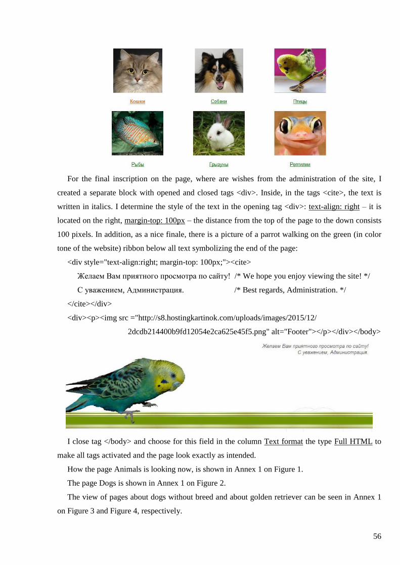
56
For the final inscription on the page, where are wishes from the administration of the site, I
created a separate block with opened and closed tags <div>. Inside, in the tags <cite>, the text is
written in italics. I determine the style of the text in the opening tag <div>: text-align: right – it is
located on the right, margin-top: 100px – the distance from the top of the page to the down consists
100 pixels. In addition, as a nice finale, there is a picture of a parrot walking on the green (in color
tone of the website) ribbon below all text symbolizing the end of the page:
<div style="text-align:right; margin-top: 100px;"><cite>
Желаем Вам приятного просмотра по сайту! /* We hope you enjoy viewing the site! */
С уважением, Администрация. /* Best regards, Administration. */
</cite></div>
<div><p><img src ="http://s8.hostingkartinok.com/uploads/images/2015/12/
2dcdb214400b9fd12054e2ca625e45f5.png" alt="Footer"></p></div></body>
I close tag </body> and choose for this field in the column Text format the type Full HTML to
make all tags activated and the page look exactly as intended.
How the page Animals is looking now, is shown in Annex 1 on Figure 1.
The page Dogs is shown in Annex 1 on Figure 2.
The view of pages about dogs without breed and about golden retriever can be seen in Annex 1
on Figure 3 and Figure 4, respectively.

57
3.5. Development of Category “Advertisements”
There are planned seven sections in the category Advertisements: Buy (Куплю), Sell (Продам),
Accept a gift (Приму в дар), Gift (Подарю), Pairing (Спаривание), Lost / Found (Потерялся /
Нашёлся), Temporary housing / Hotels (Передержка / Гостиницы). All visitors will be able to
view messages there, but to leave their own ads can only registered users. This is done to
immediately view the user’s name and, if desired, all ads, which he placed on the site. In addition,
to increase the speed and comfort of the users finding the necessary announcements, for each of the
sections mentioned above it is necessary to develop areas that will correspond to the animal species,
to which these types of ads are written most frequently.
I cannot create for ads a single content type with the different terms from the vocabulary, as I
have done for pets, because users, when they create their ads, can accidentally select the not that
term, tht should be for this type of advertisement, and the ad will not get to the right page. I have to
create for users the simplest forms to fill the ads that there was no error. For this reason, I will
create a separate content type for each type of ad. In this case, when you click on the button
"Добавить объявление" (Add announcement) at the top of the page with the announcements of one
theme, there can be added only the ad of this type.
Therefore, it is necessary to create appropriate content types. I go to the Structure Content
types and click there Add content type. I write the name of a new type of content in the field Name:
1.1 | Объявление о продаже кошек (The announcement of the sale of cats). I indicate these figures
for the convenience of the administration with further associating of these content types with the
appropriate views. Since the name is in Russian, I should enter its English analogue for the system
in the column Machine name: 1_1_sell_cat. I specify a short description of this content type in the
field Description to know for what it exists: Форма для создания объявлений о продаже кошек
(A form for creating ads about sell of cats).
I put checkmarks in the section Publishing options below the box Default options at Published
and Promoted to front page (to post ads on the main page, which is page Новости (News)). At the
heading Display settings I check Display author and date information, so under the advertisement
will be information about who and when created it. In the Menu settings in the list Available menus
I choose Main menu and from the list Default parent item select Продам (Sell), therefore, this type
of content refers to the sub-menu item Продам (Sell).
I press the button Save and add fields and go to the form for editing fields of the content. I leave
field Title the default. I change the name of the field Body on Описание (Description), as it will be

58
displayed on the page for filling in the ad. The average user will better understand this new title
than the original one that does not carry any meaning relevant to a particular case.
I click Add new field to add the field about the sales region. I write his name in the Label
column – Регион (Region). Since the name is in Russian, I should enter its English analogue in the
Machine name – field_reg_1_1. I select the field type from the list Field type – Text. Than I click
Save. On the next page, I write the name of the field displayed on the site in the column Label –
Регион (Region). I put a checkmark at the Required field – it is a mandatory to fill and display on
the site this field. I leave the default maximum number of rows (60) to fill with the text in the field
Rows, as there will be little information in this area, and the default number is sufficient. I select
Plain text at Text processing, as in this field is not supposed to use HTML tags. In section
DEFAULT VALUE, I specifies it: ---. This dash would mean that the author of the ad did not want
to leave the coordinates of his location. I click Save settings to save this field.
Then, I add a field to indicate the phone number to communicate with the author of the ad. I
click Add new field. I write the name of the field in the column Label – Контакты (Contact) and in
the Machine name indicate its English analogue – field_tel_1_1. I select in the Field type type Text.
Then I produce the same changes as in the creation of the field Регион (Region), since their
difference consist only in titles.
Next, I add one more field – Фото (Photo), so that visitors can see selling pets, as only
description is insufficient. I write its English analogue in the Machine name – field_foto_1_1. I
select the type Image in the Field type. Then I click Save. On the Field settings page, in the Default
image column is available for download the default image that appears when the other is not loaded.
I press Save field settings. On the next page, I write the name in the field Label – Фото (Photo). I
uncheck the option Required field for Photo. I load the default picture, which I previously created in
Photoshop, in section Default image. I check the point Enable Alt field, so that the author could
specify explanatory text associated with a photo, which appears when it absents (for example,
picture does not loaded because of the bad work of the browser). In addition, I put a checkmark next
to Enable Title field, so that the author can specify the name of the picture that appears when you
hover the cursor on it. I choose 5 in the list Number of values to be able to download five images to
the ad, which is especially important when selling a lot of puppies. All other items I leave the
default and click Save settings.
I pass on the Manage display tab to adjust the display of the fields on the page. Opposite to the
Field description in the column Label is selected <Hidden> – name of the field will not be
displayed. I select Inline next to the fields Регион (Region) and Контакты (Contacts) – the names

59
of these areas will be located in one line with the content. In the field Фото (Photo) is selected
Above – the name will be above the content.
I save it and a new type of content is ready. Then I create content types for other categories of
ads, do not forget that all machine names of fields must be unique, not only in the same content, but
also in all together, otherwise errors may occur in the system. However, if you accidentally forget
about it, the system will protect itself by issuing a warning that the machine name for this field is
already set, and you must write another one.
If the authors do not wish to download any image to their ad, on the page will show a standard
image with the inscription ФОТО (PHOTO) created by me using the program Adobe Photoshop:
Now it is necessary to arrange the drop-down menu for the main menu item Объявления
(Advertisements). There are will be seven items: Buy (Куплю), Sell (Продам), Accept a gift
(Приму в дар), Gift (Подарю), Pairing (Спаривание), Lost / Found (Потерялся / Нашёлся),
Temporary housing / Hotels (Передержка / Гостиницы). I will create these items and paged for
them in the same way as the items of main menu item Animals. The difference is that, I select in
paragraph Menu settings in the list Parent item the point -- Объявления (Advertisements). Put the
priorities to display submenu items in the right order: 0, 1, 2, 3, 4, 5, 6, respectively. In addition,
each item will have an appearing explanatory label, when you hover it.
Further, I do that this submenu appears when you hover the cursor on the main menu item
Advertisements. I go to the Structure Menus Main menu list links Объявления
(Announcements) edit and check there Show as expanded. Now this option is activated, and next
to the main menu item Announcements is always an arrow, which helps the user to understand that
the column Ads have the following sections:

60
The menu item Объявления (Ads) has its own page, so it is logical to organize through it
transitions to its rubrics. I click on the menu item Объявления (Ads) and choose Edit. I add text
with changes in the Body field. At the beginning, as well as on the page Животные (Animals), I
connect to the header file with the styles bold_links.css, and, therefore, its purpose will be the same
– to change the color and the fat of font in links with names of headings when you hover the mouse
over them.
Next, I fill the main page’s area in the tag <body>. I connect to it a tag with the class links (<div
class = "links">) for the entire text of a page that links, which are below, can change with the styles
specified in bold_links.css file.
Then I arrange the blocks, each of which will have a picture and explanatory text (display:
inline-block). For each block, separately, I define parameters and location on the page and in
relation to each other. For example, I indicate the distance from the left edge of the page for the first
picture in the top row – margin-left: 15px. I write the distance from the left edge to the previous
image for the rest pictures, depending on its size. The width of each unit – 200 pixels (width:
200px). In addition, I want to make links from explanatory text and the picture itself to the relevant
pages of classified species of ads. That looks like a block with a link to the item Куплю (Buy):
<div style="width: 200px;display: inline-block; margin-left:15px">
<p><a href = "http://lapa.webtic.info/buy"><img src =
"http://s6.postimg.org/chtyn0wgh/obiavlenia_kupliu.png" alt="Куплю"></a></p>
<p style = "text-align: center; margin-right: 5px"> <a href =
"http://lapa.webtic.info/buy">Куплю</a></p></div>
That is, I specifies a separate links for pictures and text below them. I place the text below the
image in center with the help of <p style = "text-align: center;">. In addition, I specify the text that
appears on the page, if the picture is not loaded (alt = "Куплю" (Buy)).
Images for each ad I have created from photos of real animals, changing them by the program
Adobe Photoshop CS5.1.

61
Finally, the bottom of the page I make the standard "footer" as well as on the page Животные
(Animals) with wishes from the administration of the site and a photo of parrot:
<div style="text-align:right; margin-top: 100px;"><cite>
Желаем Вам приятного просмотра по сайту! /* We hope you enjoy viewing the site! */
С уважением, Администрация. /* Best regards, Administration. */
</cite></div>
<div><p><img src ="http://s8.hostingkartinok.com/uploads/images/2015/12/
2dcdb214400b9fd12054e2ca625e45f5.png" alt="Footer"></p></div></body>
I close the tag </body> and choose for this field in the Text format type Full HTML, to have
worked all these tags and the page looks as designed.
How the page Объявления (Advertisements) looks now is shown at Annex 1 in Figure 5.
Now I have to create unique views for each type of content. I go to the Structure -> Views and
click Add new view. A window appears with a form to fill in. I indicate the name of the new view
in the first field. Because I create a view for page about the sale of birds, I call it 1.3 Selling birds

62
(birds come third in the list of pets after cats and dogs). Below it, I can add an explanation (optional
item that allows the administrator to know about what responds this view): Объявления о продаже
птиц (Ads about sale of birds).
Then I indicate what type of content will be associated with this view – I choose it from the drop
down list – 1.3 | Объявления о продаже птиц (Ads about sale of birds).
I define the display order of articles on the page next to it. For pages with ads I use the
publication in reverse order, that is an ad created later than the other will be placed above all the rest
– from the newer one to the previously created. All bulletin boards adhere to theis principle of the
location of the messages as users primarily are interested in the most relevant in the latest ads.
Then I create a separate page, where will be distributed necessary ads, and point the way to it:
http://lapa.webtic.info/1-3-selling-birds. I specify the display of articles on this page (as a teaser or
in full version, with or without comments). For comfortable and quick viewing ads will be shown as
teasers (summary). I also note for it a possibility to comment, so the users can communicate there
with each other and with the author and discuss the details associated with a specific ad.
Further I indicate the number of ads displayed per page (for example, 10), and to view those that
are not on this page it is used pagination, that is, when the user comes to the tenth message on the
page, he will see at the bottom of the page numbers of other pages and can view ads located there.
I save it and a window with all settings appears where you can change them. In particular, the
changes requires the title of the created page. I click on it and a form appears to make changes. In
my opinion, a normal visitor could not understand what content could be on the page that is called
1.3 Selling birds. That is why I change this title to a more appropriate – Объявления о продаже
птиц (Ads about sale of birds).
In addition, it is necessary that before the list of ads was an area with a button, clicking on which
the user will go directly to the form to create the appropriate type of ad. To do this, I find in the
second column the section Header and click Add. I choose as a header that I want to add at the
opened window – Global: Text area, because I can place everything that I needed in it with the help
of HTML tags. Then I fill it after selecting the item below Full HTML:
<head><link href="/sites/all/themes/zeropoint/css/advertisment8.css" rel="stylesheet"
type="text/css" /></head>
<body><a href="http://lapa.webtic.info/#overlay=node/add/ad-sell-bird" class="a-btn">
<span class="a-btn-text">Добавить объявление</span> /* Add an ad in Russian*/
<span class="a-btn-slide-text">Adaugă un anunț</span> /* Add an ad in Romanian*/
<span class="a-btn-icon-right"><span></span></span></a>
<p><img src="/sites/all/themes/zeropoint/images/white_background1.jpg"></p></body>

63
I connect to it the file with the styles advertisement8.css in the header. There are described styles
of the new button in its original state, when it is hovered and pressed. The entire file
advertisment8.css is shown in Annex 2. I will describe its aspects later.
The code in the tags <body> defines the elements, which are located in the established area. The
first element is a reference specified by tag <a> with several parameters. Therefore, when you click
on each of its components, proceeds a transition to the necessary page. As a link is the path to the
page with a form to create a certain type of ads for a specific category of animals (ie the creation of
relevant content). Thus, author is previously protected from erroneous creation of ad of another
type, without being able to choose the type of ad from the general list – registered user can create an
ad just of the type that is defined on the page, from which he decides to create it.
For the link is defined a class a-btn, for which in the attached file of styles is prescribed style as
for a button. Inside the tag <a> three times is applied tag <span>. It determines the line elements of
the document. Unlike block-level elements, such as <table>, <p> or <div>, using the tag <span>
you can mark a part of the data inside the other tags and set its own style, that is required, in fact.
I set a separate class to describe the style for each tag <span>:
for the first – a-btn-text;
for the second – a-btn-slide-text;
for the third – a-btn-icon-right.
First with the text "Добавить объявление" (Add announcement) is the constant label on the
button. The text of the second tag «Adaugă un anunţ» appears below the first title when you hover
the cursor over the button. I set another tag <span> inside the third one. Its element is defined by the
class a-btn-icon-right. There will be a picture with the right arrow, slightly deviating from its
original position when you hover the cursor over the button.
The second element of this area is the picture in the form of a white background, necessary for
the correct action of the button located above, as, otherwise, the content on the page will be located
close to it and will not allow to move apart when you hover the cursor on it. This contrivance can be
added as a separate header with text area beneath the first, too. Both methods are equivalent.
Now I will describe the main aspect of the file advertisment8.css.
The rule a-btn responds for the main style of the button. I define general background color in
background:#699939. I use background:linear-gradient(top,#6b9943 0%,#64992c 100%) to allocate
the button’s color blend from top to bottom from color #6b9943 to color #64992c.
Then I prescribe parameters of the frame around the button:
border:1px solid #5d912f; /* 1px thickness of the frame, the frame is painted in color #5d912f */
border-color:#5d912f #538223 #427319;

64
/* border colors on sides: #5d912f – top, #538223 – right and left, #427319 – below */
border-radius:4px; /* corner radius is 4px */
Then I use the box-shadow option to add shadow tj the button:
box-shadow: 0 1px 1px #707070, /* outer shadow: no horizontal shift, vertical shift down to 1px,
shadow blur radius is 1px, shade color – #707070 */
inset 0 1px 0 #78995a; /* inner shadow: no horizontal shift, vertical shift down from the top
edge of the button to 1px, no shadow blur radius, shadow color – #78995a */
Using the padding, I install the fields around the content (the distance from the inner edge of the
element’s frame to the imaginary rectangle bounding its content):
padding: 0px 80px 10px 10px; /* distance from the top, right, bottom and left edge */
I determine the height of the button – height: 38px. I do so that the inside part of the element is
formatted as a block-level element and the element itself – as a built-in one (display:inline-block).
Button’s position is set at its original location (position:relative). I apply a setting float:left, so that
the element is on the left, and all the other flows around it on the right. I define a space from the
each edge of the button (margin:10px). Margin represents the space from the boundaries of the
current element to the inner edge of the parent element (boundaries of the page with content). Using
the overflow, I control display of the content of a block element (my button) if it does not fit
entirely and goes out of the specified size. I write overflow:hidden to display only the area inside
the element, and the rest is hidden.
Using transition:all 0.3s linear, I determine the effect of the transition between the two states of
the element, which can be determined by a pseudo-element :hover or :active. Transition is made
with the same speed from start to finish, within 0.3 seconds for all style properties. Their value is
controlled to create a transition effect.
Now I define style of the class a-btn-text (the label "Добавить объявление" (Add Ads)) in its
normal state. This is a block element (display:block). I set the size of the font – font-size:18px. By
using the parameter white-space:nowrap, I do so that spaces are not taken into account, line breaks
in HTML are ignored and all text is displayed in one line. I specify the text color:#223612 and the
shadow with a vertical shift down (text-shadow:0 1px 0 #79995d). The effect of the transition
between the two states of the element prescribed using :hover and :active, I define as for the button
itself to make it look natural.
I define styles for the class a-btn-slide-text (sliding label «Adaugă un anunţ») in its normal state.
I specify position:absolute – the element is absolutely positioned, while others appear as if it is not
there. Its position is defined by the properties left, top and right (top:35px; left:0px; right:52px). I
set the width based on the type and element’s content (width:auto). I specify the height:0px. Then,

65
in the normal state of the button, when it does not hovered over with the cursor and do not click, the
inscription «Adaugă un anunţ» is not visible. Background of this label is white – background:#fff,
and text color is dark green – color:#223612. With white-space:nowrap, I doing so all text displays
in one line, spaces and line breaks are not taken into account. I set the font (font-family: Georgia,
serif), writing in italics (font-style:italic) in font-size:13px. Using text-indent:15px, I set the value of
margin of the first line. I specify overflow:hidden to display only the area inside the element, and
the rest is hidden. I prescribe the line spacing of the text, starting from the base line of the font (line-
height:30px). Then I define settings of the shadow from the text:
box-shadow:-1px 0px 1px rgba(255,255,255,0.4), /* outer shadow: a shift to the left by 1px, no
vertical shift, shadow blur radius of 1px, color – white, saturation – 40% */
1px 1px 1px rgba(0,0,0,0.5) inset; /* inner shadow: a shift to the right by 1px, shift
down to 1px, shadow blur radius by 1px, shadow color – black, saturation – 50% */
I use transition:all 0.3s linear to set the element’s transition effect as well as for a whole button.
Now I define styles for the class a-btn-icon-right (right button unit with an icon with an arrow) in
its normal state. I use position:absolute to indicate that the element is absolutely positioned, while
others displayed on the page, if it is not there. Its position is defined by the properties right:0px and
top:0px. I set the width:52px and height:100% (according to the size of the element). I add the left
border via border-left:1px solid #5d912f, so the block, where will be an arrow, was visually
separated from the block with the text. Then I prescribe the inner shadow (box-shadow:1px 0px 1px
rgba(255,255,255,0.4) inset).
I will define styles for element within the class a-btn-icon-right in the tag span (there is in it an
icon arrow), in its normal state. I specify the width:38px, height:38px and opacity:0.7. I use
position:absolute to indicate that the element is absolutely positioned, while others displayed on the
page, if it is not there. Its position is defined by the properties left:50% and top:50%, that is – in the
middle. I set the amount of padding from each edge of the button (top, right, bottom, left) with the
margin:-20px 0px 0px -20px. The icon arrow is a background and I write the way to it (background:
transparent url(/sites/all/themes/zeropoint/images/arrow_right.png) no-repeat 50% 55%). It is
shown in the middle once, without repetition. I use transition:all 0.3s linear to set the transition
effect of the element as well as for the button itself.
Using the rule a-btn:hover, I define the style of behavior of the button when it is hovered by a
cursor. Its height will increase to 65 pixels (height:65px). In addition, there will slightly change the
brightness of the shadow (box-shadow:0px 1px 1px rgba(255,255,255,0.8) inset, 1px 1px 5px
rgba(0,0,0,0.4)).

66
Style of the block with the label "Добавить объявление" (Add announcement), when it is
hovered, is given by the rule a-btn:hover .a-btn-text. I add blur of text-shadow:0px 1px 1px rgba
(0,0,0,0.2). I remove underlining of the link (text-decoration: none). I change color to white (#fff).
I use the rule a-btn:hover .a-btn-slide-text to set a behavioral style of the block with the label
«Adaugă un anunţ» when it is hovered with the cursor. Its height increases from 0 to 30px (height:
30px). Therefore, now this inscription is visible. Also by increasing of the height of the button, is
created the effect that this line is sliding out of the main title.
Using the rule a-btn:hover .a-btn-icon-right span I set a behavioral style of the block with arrow
when I hover it with a cursor. I increase the opacity from 0.7 to 1 (opacity:1). Now it is completely
opaque, the arrow looks brighter. I turn it on 450 counterclockwise (transform: rotate (-45deg)).
Rule a-btn:active defines style of the button’s behavior when it is pressed. The position will be
relative to the original place (position:relative), with the parameter top:1px I move it down. I
change the color of background: #669932, color of background:linear-gradient (top, # 669 932 0%,
# 6a993a 100%), the border-color:#446e1f #3f691b #3c6319, shift and color of the shadow around
the text (text-shadow:0 1px 0 #7c9960), outer and inner shades of button (box-shadow:0 1px 1px
#707070, inset 0 1px 0 #73994c).
Button in the normal state: Button hovered with a mouse:
View is created. The desired content is destributed to the created page (Annex 1, Figure 7).
Now, on the page of each type of ad I need to create links to this type of ad for a particular type
of pet. I write as links the way to the page created with the appropriate view. First, I make these
changes on the page Куплю (Buy). I go on it and click Edit. In the appeared window, I add the
necessary code in the field Body. At the beginning, I write in the header the path to the file with the
styles kategorii9.css, responsible for the display and behavior of the links on this page:
<head><link href="/css/kategorii9.css" rel="stylesheet" type="text/css" /></head>
Code of the file kategorii9.css I will describe later. Fully it can be seen in Annex 2.
Now I need to decide what will be located in the tag <body>. The category Куплю (Buy) will be
five types of ads, for each of which I will made links to the corresponding page: Кошки (Cats),
Собаки (Dogs), Птицы (Birds), Рыбы (Fish), Другие (Other). I use the tag <div> to arrange all
links in one block of 200 pixels wide and with margin from the left edge of the page in 15 px:
<div style="width: 200px; display: inline-block; margin-left:15px">

67
Each link of a particular page is contained in the separate block using <p>:
<p><a href="http://lapa.webtic.info/2-1-buying-cats" class="a-btn">
<img src="/images/kupliu_cat.png" alt="Cats" />
<span class="a-btn-text">Кошки</span>
<span class="a-btn-icon-right"><span></span></span></a></p>
Link is given via tag <a> and has several parameters, so that when you click on each of its
components you can go to the necessary page. For it is defined the class a-btn, for which in the
attached file of styles is defined style as for a button. Inside the tag <a> twice is applied the tag
<span>. It is designed to determine the line elements of the document and to mark a part of data
within other tags and set its own style.
I set a separate class to describe the style for each tag <span>:
for the first – a-btn-text;
for the second – a-btn-icon-right.
In addition, there is a tag <img> within the link before the tags <span>, so that the button has a
picture corresponding to the animal species, about which will give the ads.
The button will look in such way: the picture on the left, then the name of the category (in this
case Кошки (Cats)), and on the right – arrow in the red circle. Normally, the saturation of the image
and the arrow in the circle will be only a half, and they will look pretty bleak, but when you hover
over the button, their intensity will be restored, and the circle around the arrow turns red, which will
give the user know that he chose this button. Moreover, when you click it, the arrow in the circle
make a full rotation around its axis.
Now I will describe main aspects of the file kategorii9.css.
The button’s initial style defines the rule a-btn. General color of background: #699939. I use
background:linear-gradient(top, #699939 0%, #64992c 100%) to determine the background of the
color blend from top to bottom from color #699939 to #64992c. I establish the fields from the left
and right edges of the content of the element using padding-left:90px and padding-right:105px.
Button’s – height: 90px. By using display:inline-block inner part of the button is formatted as a
block element, and the element itself – as built-in. The position of button is relative to its original
location (position:relative). I apply parameter float:left, so that the element is on the left, while the
others flow around his right sight. A margin from the top and bottom edges of the button is 10px,
and from the left and right – 0px (margin: 10px 0px). I prescribe overflow:hidden to display only
the area inside the button, and the rest is hidden.
Next, I define parameters of the frame around the button:
border:1px solid #5d912f; /* 1px thickness of the frame, the frame color #5d912f */

68
border-radius:4px; /* radius of curvature of the corners is 4px */
Then I use a parameter box-shadow to add a shadow to the button:
box-shadow: 1px 1px 3px rgba(0,0,0,0.2), /* outer shadow: a shift to the right and down in 1 px,
shadow blur radius of 3px, shadow color – black with saturation 0,2 */
0px 1px 1px rgba(255,255,255,0.8) inset; /* inner shadow: no horizontal shift, shift
down and the radius of the blur is 1px, color shade – white with saturation 0,8 */
As for the element is specified a radius of curvature with a parameter border-radius, the shadow
will also be with rounded corners. I set a transition effect between states of the element defined by
:hover and :active using transition:box-shadow 0.3s ease-in-out. The animation starts and ends
slowly, lasts 0.3 seconds for the style parameter box-shadow (the shadow of a button). Its value is
controlled to create a transition effect.
Parameter clear:both cancels flow around element at the same time on the right and left edges.
Then I specify the style of picture class a-btn img in the normal state. Due to position: absolute I
show absolute position of the element. His position is set by parameters left:15px and top:13px.
There is not a frame around the picture (border:none). I reduce its intensity by half (opacity:0.5). I
establish a transition effect between states of the element, defined by :hover and :active, with the
help of transition: all 0.3s ease-in-out. The animation starts and ends slowly, lasts 0.3 seconds for
all style parameters. Its value is controlled to create a transition effect.
I define styles of class a-btn-text (the label "Кошки/Cats" or other category of pets) in its normal
state. I set it as a block element (display:block) and font-size:30px. The text color: #fff (white) and
the shadow is with a vertical shift upward and with a 1px blur (text-shadow:0px -1px 1px #5d912f).
I prescribe the styles for the class a-btn-icon-right (right block with an arrow icon) in its normal
state. Element will have the position:absolute. His position I will define by parameters right:0px and
top:0px. I establish its width:80px and height:100% (element’s size). Moreover, I add a left border
via border-left:1px solid #5d912f, to make the block with an arrow visually separated from the
block with the text. I establish an inner shadow with a shift to the right and 1px blur, white color
with 40% opacity: box-shadow:1px 0px 1px rgba(255,255,255,0.4) inset.
I specify styles of element in tag span in class a-btn-icon-right (arrow icon) in its normal state. I
establish the width:38px, height:38px and opacity:0.7. Element has position:absolute. I set the
element’s position by parameters left:50% and top:50% (in the middle). I set the amount of padding
from each edge of the button (on the top, right, bottom and left) by margin:-20px 0px 0px -20px.
Instead of the background will be the arrow icon, situated on the server at the following dirrectory:
background: #5b5b5b url(/sites/all/themes/zeropoint/images/arrow_right.png) no-repeat center
center). It will be shown in the middle once without repetition. The background behind it is gray.

69
A frame around the arrow has 1px thickness, black color and the opacity 50%:
border:1px solid rgba(0,0,0,0.5);
I determine for it a border-radius:20px, whereby around arrow is a gray circle. I use box-shadow
option to add a shadow to the button:
box-shadow: 0px 1px 2px rgba(255,255,255,0.5), /* outer shadow: no horizontal shift, shift down to
1px, shadow blur radius of 2px, color - white with saturation 0,5 */
0px 1px 1px rgba(255,255,255,0.3) inset; /* inner shadow: no horizontal shift, shift
down and shadow blur radius of 1px, shade’s color – white with saturation 0,3 */
For the element is specified a radius of curvature with a parameter border-radius and the shadow
will be with rounded corners, too. I set a transition effect between states of the element defined by
:hover and :active using transition:box-shadow 0.3s ease-in-out. The animation starts and ends
slowly, lasts 0.3 seconds for all style parameters. Its value is controlled to create a transition effect.
The brightness of the inner and outer shadows slightly changes (box-shadow:0px 1px 1px
rgba(255,255,255,0.8) inset, 1px 1px 5px rgba(0,0,0,0.4)).
Then I define the style of behavior of the block with a picture when it is hovered by the cursor
with the rule a-btn:hover img and restore its saturation (opacity:1).
I define the style of behavior of the block with an arrow when it is hovered by the cursor using
the rule a-btn:hover.a-btn-icon-right span. I increase its intensity from 0.7 to 1 (opacity:1). Now it is
opaque, arrow looks brighter. background-color:#bc3532 – red circle’s background around arrow.
Now, I define the style of behavior when you press a button with the rule a-btn:active. I set the
button at its original location (position:relative) and use the top:1px to move it at 1px down. I
establishe a new color of background:#669932. I change the border-color:#3c6319 and inner
shadow of the button (box-shadow:1px 1px 2px rgba(0,0,0,0.4) inset). Rule a-btn:active .a-btn-icon-
right span defines the style of behavior of the block with the arrow when it is clicked – the arrow
will make a full rotation around its axis (transform:rotate(360deg)).
Buttons in the normal state: Buttons hovered with a mouse:
You can view page Куплю (Buy) in Annex 1, Figure 6.

70
3.6. Development of Category “Forum”
The Drupal websites have a built-in module that is responsible for the creation and operation of
the forum. However, initially, when Drupal is downloaded and installed, it is disconnected. To
activate it, I must go to the Modules, found in the list of modules – Forum and check it. Then I click
Save. In a fast navigation menu of the site showing on the left of the page in the orange box,
appeared the item Forums. Now registered users by clicking on it can get on the page with a
standard forum and start communicating, by creating their own discussion topics or joining the
already established ones.
However, I need to go to the forum via the main menu of the site. I have previously created an
item Форум (Forum) in the main menu. Yet when you presse this item, you do not find a forum,
and get on a blank page with the name Forum. In order to fix it, I go to the Structure -> Menus. I
find there Forum and click edit near it. In the window that opens as a Path, I write a path to that
page with a forum where we get clicking on the item Forums in the quick navigation menu:
http://lapa.webtic.info/forum. Everything else I leave unchanged and save. Now I get on the page
clicking on the main menu item Forum with absolutely ready to work forum in which I can add new
topics for discussions. To create new sections in it I go to the Modules -> Forum and click
Configure. On the opened page, I click Add forum and fill in the form of new section of forum.

71
3.7. Development of Category “Health”
Previously I created a main menu item dedicated to pets’ health – Здоровье. First, I develop a
content type for such types of articles. I go to the Structure->Content types and click Add content
type. It will have a title Здоровье (its machine name in English: health). Then I create a page for
this type of articles together with a view. I go to the Structure->Views and click Add view. Its name
will be Health and I write in the description – For articles about health. Then I indicate what type of
content will be associated with this view – Здоровье (Health).
I define the display order of articles on the page next to it – a direct one – previously created
article will be located above the later, because first I will write articles about veterinary clinics.
Then I create a separate page, where will be distributed necessary ads, and point the way to it:
http://lapa.webtic.info/health. I specify the display of articles on this page (as a teaser or in full
version, with or without comments). For comfortable and quick viewing ads will be shown as
teasers (summary). I also note for it a possibility to comment, so the users can communicate there
with each other and discuss the details associated with a specific ad.
Further I indicate the number of ads displayed per page (for example, 10), and to view those that
are not on this page it is used pagination, that is, when the user comes to the tenth message on the
page, he will see at the bottom of the page numbers of other pages and can view ads located there.
I save it and a window with all settings appears where you can change them. In particular, the
changes requires the title of the created page. I click on it and a form appears to make changes. I
change the title of the page on Здоровье (Health) and save it.

72
3.8. Development of Category “Organizations”
Previously I created a main menu item dedicated to organizations for pets – Организации. First,
I develop a content type for such types of articles. I go to the Structure->Content types and click
Add content type. It will have a title Organizations. Then I create a page for this type of articles
together with a view. I go to the Structure->Views and click Add view. Its name will be the same
and I write in the description – For articles about organizations for pets. Then I indicate what type
of content will be associated with this view – Organizations.
I define the display order of articles on the page next to it – by title in a direct order, which will
be very comfortable for users to find and read such information.
Then I create a separate page, where will be distributed necessary ads, and point the way to it:
http://lapa.webtic.info/organizations. I specify the display of articles on this page (as a teaser or in
full version, with or without comments). For comfortable and quick viewing ads will be shown as
teasers (summary). I also uncheck for it a possibility to comment.
Further I indicate the number of ads displayed per page (for example, 10), and to view those that
are not on this page it is used pagination, that is, when the user comes to the tenth message on the
page, he will see at the bottom of the page numbers of other pages and can view ads located there.
I save it and a window with all settings appears where you can change them. In particular, the
changes requires the title of the created page. I click on it and a form appears to make changes. I
change the title of the page on Организации (Organizations) and save it.

73
3.9. Development of Category “Entertainment”
Previously I created a main menu item dedicated to entertainment – Развлечения. Together with
it I developed its page, where I prescribed a link to the page with the gallery of pets’ photos –
http://lapa.webtic.info/gallery. It is possible to go to this page from the submenu item of
Entertainment item – Галерея (Gallery), too. I organized a gallery of pets’ photos there using the
file gal5.css that I used before for articles about pets and attached to the header in the text field,
creating this page. Therefore, the gallery will work in the same way. The titles of pets’ species I
made bold using the tag <strong>.
Creating this page, I noted that to its content would be used Text format type Full HTML, to
have worked all these tags and the page looks as designed.

74
Conclusions
During this work I analyzed commercial and free open source CMS (WordPress, Joomla,
Drupal) and made some conclusions. WordPress is better for blogs; Joomla is very friendly for
designers and Drupal is friendly for developers. Finally, I chose Drupal to develop my site, because
I wanted to deepen the study and configuration of codes to create sophisticated, but fantastic
looking systems.
Moreover, I have analyzed modern web design trends and top usability mistakes. In addition, I
have analyzed the content and design of Slovak websites about pets. I used their good and modern
solutions in my website. For exemple, I created a website’s logo with big, bold and good visible
title of the site. There are photos of different species of pets around it, but not very much. Main
colors of site are from the green palette and well matched, so it does not irritate visitors of the site.
Menu items and links change their colors, when user hovers over them with a mouse. The cursors
are changing, too, when visitor hovers the photos of galleries. Articles have sections and fast
passages between them by using anchors in the contents. Therefore, it is not boring to read them – it
is comfortable and pleasant.
Then I have studied software development activities, and wrote a Business Model Canvas for
this project and filled the Project’s Form. I planned project’s activities and results that I must
achieve. Moreover, I determined project’s strategies and resources, main partners and customers,
and SWOT analysis, where I defined all strengths and weaknesses of my project, riscs, which can
occur, and opportunities, from which I can take advantages.
I have prepared project’s summary, where I wrote, that I create the country's first online
advertisement and informational service, fully dedicated to pets – lapa.md. This niche in the field of
online ads is free now. However, the demand for this kind of offer exists and it is necessary to
provide the appropriate service to potential customers. It give breeders a modern way to place ads
for the sale of pets. This will help them to find buyers more effectively or to buy purebred pets by
themselves. Lapa.md provides shelters the most modern and popular method for notification of their
available animals and effective search for new owners for them. There live dozens of homeless
animals in Moldova, and we need to provide an online platform where people can get to know about
them and choose their future pet by the photo and description. This will solve greatly the problem of
the large number of homeless animals.
After this step, in the practical part, I developed a website lapa.md, that is now situated on the
server of Moldova State University and its online address is lapa.webtic.info. This site was created
on the Drupal platform. I have drawn its original logo and icon following all modern web design

75
trends and the subject of the site. In addition, I changed the default color scheme of the site from the
yellow background to light green that is more suitable for the other elements.
I configured a block with a search function on the top of the page, near the entrance on the site.
Next, I organized website main menu, where I placed seven main sections: Animals,
Advertisements, Organizations, Health, News, Forum, and Entertainment. I also configured the
drop-down menu at the items Animals, Advertisements and Entertainment that appears when users
hover the cursor over these sections. So on the site appeared a multi-level drop-down menu.
On the main page with News, under the main menu, I organized a block with a slideshow with
pictures and text informations about the most popular sections of my site – Animals,
Advertisements and Gallery that is a subitem of the Entertainment. In addition, I placed there the
links to these pages.
Moreover, I took care of the content of my site. Since this is a site about pets, I have created an
encyclopedia of animals on it, arranging access to its main sections from the menu item Animals.
When you go to this page, there appears a list of species of pets in the form of images and
explanatory text below them, by clicking on them you can go to the list of representatives of each
species. I organized a drop-down submenu for this main menu item. When you click on each of
subitems, you can go to the list of representatives of this species, too. Using Views module, I was
able to organize the distribution of content on the necessary pages according to its type and
meaning. Thus, articles about dogs are on the page Dogs, about cats – on the page Cats, etc.
Information aboud breeds is located on the necessary page in the form of teasers (summary) and
images on its right side. Clicking on them users can go to a page with a detailed description of this
breed. The content there is organized with fast transitions through the page, return from the bottom
of the page to the top; the return to a common species list, as well as a gallery with photos with
increasing images of the animals of this breed by clicking on them.
I have also created sections for the main menu item Advertisements divided by types, through
which is organized access to the bulletin board of the website. On the page of each section is placed
a list of animal species, for which this type of ad is created most often. The items of this list
represent animated buttons with images of each animal species, changing their display style, when
are hovered or clicked. This buttons are created using CSS3. Clicking on any of these points there is
a transition to the page of the corresponding type of advertisement about necessary species of pet.
The Views module established proper distribution of content through the pages of a virtual bulletin
board, by creating the unique views and a separate page for each type of content. There is an
animated button above the relevant messages, at the top of each page of ads, which changes its
display style when is hovered or clicked, also created using CSS3. Registered users can, clicking on

76
it, create an ad of type and category of animals determined by the page, on which the button "Add
announcement" was pressed. As an effect of the animation, is used a technique of extension button
down, when you hover it, and disclosure of one more label in Romanian language, representing the
translation of the main line written in Russian. This is especially important in the Republic of
Moldova, as the essence of this button will be clear to all people of our country.
As a complement for the most active users of the site, I organized the section Forum, connecting
it to the appropriate module that helped to create a complete ready-to-use forum. In addition, I
developed a page Organizations with information about organizations for pets, which can become
the partners of this project. Then I have created a page Health with the articles about veterinary
clinics. Moreover, I organized a section Enterntaiment with an amazing Gallery of pets, which can
attract visitors and they will enjoy the time spent on this site.
Thus, during this work, all goals were achieved. I have studied the relevant literature about the
websites development using CMS and the programming languages PHP, HTML and CSS, about top
usability mistakes and modern web design trends, about main software development activities and
writing Project’s Form and Business Model Canvas. I also received the practical skills based on
study of the theory and its application in the development of my own website using the CMS
Drupal. As a result, I wrote a masterate thesis, which describes all my analyses in this field and all
steps of creating a website with a virtual bulletin board on it.
As a result of the work was developed a web site lapa.md with the following composition:
a page with description of the main sections of the site and the rapid transition to them from
slides and with all the latest news of the site;
a full-fledged virtual bulletin board, due of its detail not only by type of ads, but also by animal
species, for which these ads are created, realizes a quick search and creation of ads by these
specific parameters. Newest ads are located above all the latest on the respective pages. There are
also developed convenient forms to add information to creating ads;
an excellent encyclopedia of pets, where users can find a detailed information with a photo
gallery of each breed of the selected species of animals. In addition, the articles in the list of
breeds are represented in the form of a summary with a photo attached to it, allowing the user to
immediately determine, he is looking for a description of this breed, or any other. All breeds in
the list are placed by their popularity, starting with the most attractive for the population;
pages about organizations for pets, their health and with forum and a photo gallery.
Thus, all the functionality, content and color schemes created on this site, I tried to make as
convenient as possible for the end user, taking into account all modern trends and own experience.

77
Bibliography
1. Никсон Р., “Создаем динамические веб-сайты с помощью PHP, MySQL и JavaScript.” –
СПб.: Питер,2011.- 496 с.: ил.- (Серия «Бестселлеры O'Reilly»). ISBN 978-5-4237-0016-4.
2. Хольцер Стивен, “HTML5 за 10 минут, 5-е изд.: Пер. с англ.” – М.: ООО
«И.Д.Вильямс», 2011. – 240 с.: ил. – Парал. тит. англ. ISBN 978-5-8459-1745-4 (рус.).
3. "A comparison between Commercial Open Source Web Development, CMS and E-
Commerce Systems and existing Open Source Systems". http://freewebsitesonline.
wordpress.com/2010/04/16.
4. Nirav Mehta. “Choosing an Open Source CMS. Beginner's Guide.” - Packt, April 2009. - 340
p. - ISBN 978-1-847196-22-4/
5. Martin Brampton. “PHP5 CMS Framework Development.” - PACKT publishing, June 2008. -
328 p. - ISBN 978-1-847193-57-5
6. Денис Колисниченко, “Движок для вашего сайта. CMS Joomla!, Slaed, PHP-Nuke.” -
Петербург: БХВ, 2008. - 352 с. - ISBN 978-5-9775-0258-0.
7. Савельева Н., “Системы управления контентом (рус.)//Открытые системы.”- 2004 - № 4.
8. Хаген Граф, “Создание веб-сайтов с помощью Joomla! 1.5.” - Издательский дом
"Вильямс", 2009. - 312 c. - ISBN 978-5-8459-1506-1.
9. Виктор Ромашев, “CMS Drupal: Система управления содержимым сайта.” - Питер, 2010.
- 255 c. - ISBN 978-5-49807-241-8.
10. Paul Boag, "10 Things To Consider When Choosing The Perfect CMS". SMASHING
MAGAZINE, 2009-05-05.
11. "Licensing FAQ", drupal.org, 2009-04-08.
12. "The Drupal Overview", drupal.org, 2009-04-08.
13. "System Requirements", drupal.org, 2009-04-08.
14. "Usage of content management systems for websites", w3techs.com, 2011-07-15.
15. "Drupal Usage Statistics". trends.builtwith.com/cms/Drupal, 2011-03-28.
16. "The State of Drupal 2010 speech", archive.org, 2001-03-10.
17. Bèr Kessels, "Knowledge management with Drupal", drupal.org, 2004-05-19.
18. "Drupal Homepage", drupal.org, 2014-10-15.
19. "1 Million Users on Drupal.org", drupal.org, 2013-10-11.
20. Sandip Choudhury, "30,000 Developers in Drupal.org and growing", drupal.org, 2013-11-11.
21. https://en.wikipedia.org/wiki/Content_management_system
22. https://en.wikipedia.org/wiki/SWOT_analysis

78
Annex 1
Figure 1. Page of category Animals.

79
Figure 2. Page Dogs.
Figure 3. Page about Dogs without Breed.

80
Figure 4. Page about the breed Golden Retriever.
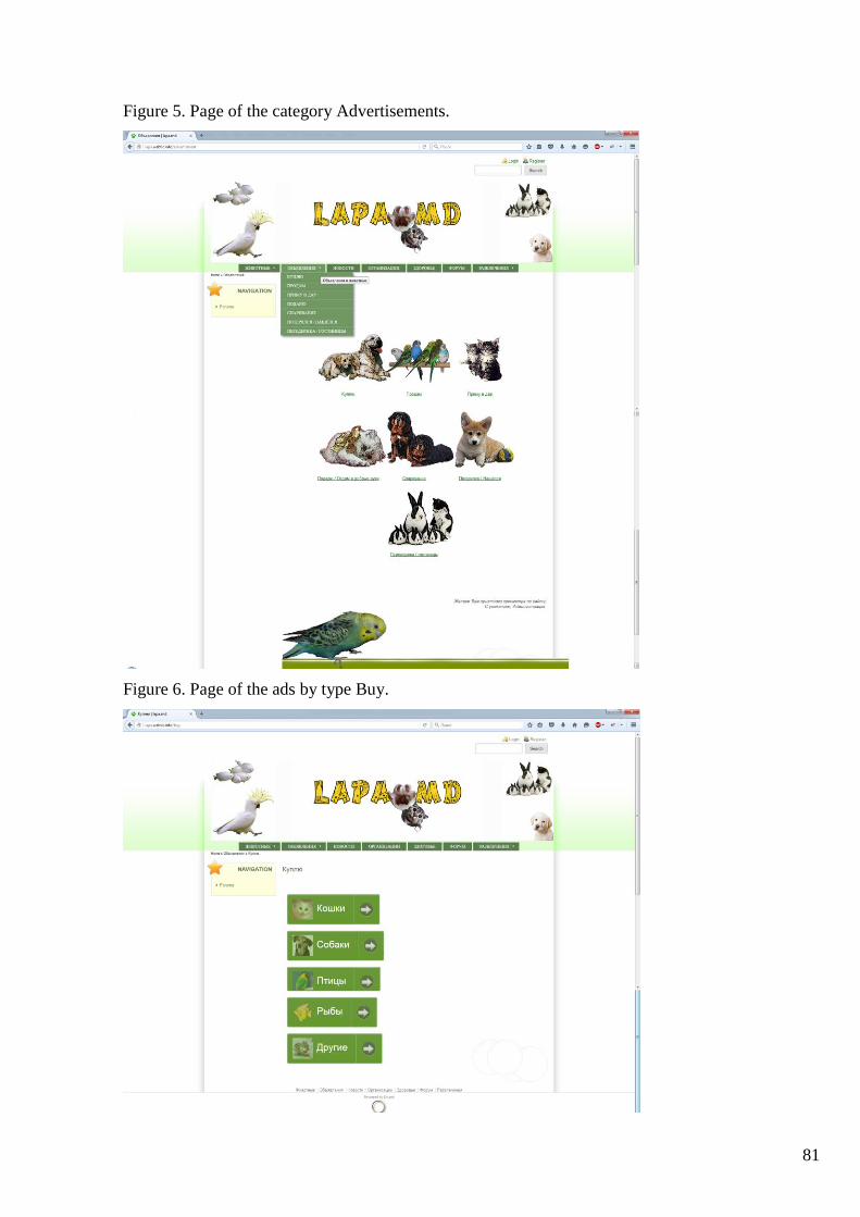
81
Figure 5. Page of the category Advertisements.
Figure 6. Page of the ads by type Buy.

82
Figure 7. Page Advertisements about sell of birds. Button “Add the ad” is hovered by the cursor.
Figure 8. The main page – News.

83
Annex 2
The file with the styles display a photo gallery of various animal species gal5.css:
.gallery1 a img{
-webkit-border-radius: 25px;
-moz-border-radius: 25px;
border-radius: 25px;
-webkit-transition:All 1s ease;
-moz-transition:All 1s ease;
-o-transition:All 1s ease;
transition: all 1.0s ease;
-webkit-box-shadow: 0px 2px 4px 1px #DFDFDF;
-moz-box-shadow: 0px 2px 4px 1px #DFDFDF;
box-shadow: 0px 2px 4px 1px #DFDFDF;
-moz-opacity: 1;
opacity: 1;
-ms-filter:"progid:DXImageTransform.Microsoft.Alpha"(Opacity=100);
margin-right:5px;
padding:10px;
display:inline-block;
height:150px;
}
.gallery1 a:focus img{
position: absolute;
margin-top:-250px;
margin-left:-400px;
margin-right:-200px;
height:300px;
cursor: pointer;
-webkit-transition:All 1s ease;
-moz-transition:All 1s ease;
-o-transition:All 1s ease;
transition: all 1.0s ease;
-webkit-box-shadow: 0px 4px 4px 1px #DFDFDF;

84
-moz-box-shadow: 0px 4px 4px 1px #DFDFDF;
box-shadow: 0px 4px 4px 1px #DFDFDF;
}
.gallery1 a{
outline:0; border:0;
}
.gallery1 a:hover img{
cursor: pointer;
}
The file with the styles display of the button to add the advert advertisment8.css:
.a-btn{ /* original button style */
background:#699939;
background:-webkit-gradient(linear, left top, left bottom, color-stop(#6b9943,0), color-
stop(#64992c,1));
background:-webkit-linear-gradient(top, #6b9943 0%, #64992c 100%);
background:-moz-linear-gradient(top, #6b9943 0%, #64992c 100%);
background:-o-linear-gradient(top, #6b9943 0%, #64992c 100%);
background:linear-gradient(top, #6b9943 0%, #64992c 100%);
filter:progid: DXImageTransform.Microsoft.gradient ( startColorstr = '#6b9943', endColorstr =
'#64992c', GradientType=0 );
border:1px solid #5d912f;
border-color:#5d912f #538223 #427319;
-webkit-box-shadow:0 1px 1px #707070, inset 0 1px 0 #78995a;
-moz-box-shadow:0 1px 1px #707070, inset 0 1px 0 #78995a;
box-shadow:0 1px 1px #707070, inset 0 1px 0 #78995a;
padding:0px 80px 10px 10px;
height:38px;
display:inline-block;
position:relative;
-webkit-border-radius:4px;
-moz-border-radius:4px;
border-radius:4px;
float:left;

85
margin:10px;
overflow:hidden;
-webkit-transition:all 0.3s linear;
-moz-transition:all 0.3s linear;
-o-transition:all 0.3s linear;
transition:all 0.3s linear;
}
.a-btn-text{ /* the original style of the main button’s label */
display:block;
font-size:18px;
white-space:nowrap;
color:#223612;
text-shadow:0 1px 0 #79995d;
-webkit-transition:all 0.3s linear;
-moz-transition:all 0.3s linear;
-o-transition:all 0.3s linear;
transition:all 0.3s linear;
}
.a-btn-slide-text{ /* the original style of the second button’s label */
position:absolute;
top:35px;
left:0px;
width:auto;
right:52px;
height:0px;
background:#fff;
color:#223612;
font-size:13px;
white-space:nowrap;
font-family:Georgia, serif;
font-style:italic;
text-indent:15px;
overflow:hidden;
line-height:30px;

86
-webkit-box-shadow:-1px 0px 1px rgba(255,255,255,0.4), 1px 1px 1px rgba(0,0,0,0.5) inset;
-moz-box-shadow:-1px 0px 1px rgba(255,255,255,0.4), 1px 1px 1px rgba(0,0,0,0.5) inset;
box-shadow:-1px 0px 1px rgba(255,255,255,0.4), 1px 1px 1px rgba(0,0,0,0.5) inset;
-webkit-transition:height 0.3s linear;
-moz-transition:height 0.3s linear;
-o-transition:height 0.3s linear;
transition:height 0.3s linear;
}
.a-btn-icon-right{ /* the original style of the button’s right block */
position:absolute;
right:0px;
top:0px;
height:100%;
width:52px;
border-left:1px solid #5d912f;
-webkit-box-shadow:1px 0px 1px rgba(255,255,255,0.4) inset;
-moz-box-shadow:1px 0px 1px rgba(255,255,255,0.4) inset;
box-shadow:1px 0px 1px rgba(255,255,255,0.4) inset;
}
.a-btn-icon-right span{ /* the original style of the arrow in the button’s right block */
width:38px;
height:38px;
opacity:0.7;
position:absolute;
left:50%;
top:50%;
margin:-20px 0px 0px -20px;
background:transparent url(sites/all/zeropoint/images/arrow_right.png) no-repeat 50% 55%;
-webkit-transition:all 0.3s linear;
-moz-transition:all 0.3s linear;
-o-transition:all 0.3s linear;
transition:all 0.3s linear; }
.a-btn:hover{
height:65px;

87
-webkit-box-shadow:0px 1px 1px rgba(255,255,255,0.8) inset, 1px 1px 5px rgba(0,0,0,0.4);
-moz-box-shadow:0px 1px 1px rgba(255,255,255,0.8) inset, 1px 1px 5px rgba(0,0,0,0.4);
box-shadow:0px 1px 1px rgba(255,255,255,0.8) inset, 1px 1px 5px rgba(0,0,0,0.4);
}
.a-btn:hover .a-btn-text{ /* the main label is hovered */
text-shadow:0px 1px 1px rgba(0,0,0,0.2);
text-decoration: none;
color:#fff;}
.a-btn:hover .a-btn-slide-text{ /* the second label is hovered */
height:30px;}
.a-btn:hover .a-btn-icon-right span{ /* the arrow is hovered */
opacity:1;
-webkit-transform:rotate(-45deg);
-moz-transform:rotate(-45deg);
-ms-transform:rotate(-45deg);
-o-transform:rotate(-45deg);
transform:rotate(-45deg); }
.a-btn:active{ /* button is clicked */
position:relative;
top:1px;
background:#669932;
background:-webkit-gradient(linear, left top, left bottom, color-stop(#669932,0), color-
stop(#6a993a,1));
background:-webkit-linear-gradient(top, #669932 0%, #6a993a 100%);
background:-moz-linear-gradient(top, #669932 0%, #6a993a 100%);
background:-o-linear-gradient(top, #669932 0%, #6a993a 100%);
background:linear-gradient(top, #669932 0%, #6a993a 100%);
filter:progid: DXImageTransform.Microsoft.gradient ( startColorstr = '#669932', endColorstr =
'#6a993a',GradientType=0 );
border-color:#446e1f #3f691b #3c6319;
text-shadow:0 1px 0 #7c9960;
-webkit-box-shadow:0 1px 1px #707070, inset 0 1px 0 #73994c;
-moz-box-shadow:0 1px 1px #707070, inset 0 1px 0 #73994c;
box-shadow:0 1px 1px #707070, inset 0 1px 0 #73994c; }

88
The file with the display style of a button for categories of ads kategorii9.css:
.a-btn{ /* original button style */
background:#699939;
background:-webkit-gradient(linear,left top,left bottom,color-stop(#699939,0),color-
stop(#64992c,1));
background:-webkit-linear-gradient(top, #699939 0%, #64992c 100%);
background:-moz-linear-gradient(top, #699939 0%, #64992c 100%);
background:-o-linear-gradient(top, #699939 0%, #64992c 100%);
background:linear-gradient(top, #699939 0%, #64992c 100%);
filter:progid: DXImageTransform.Microsoft.gradient ( startColorstr = '#699939', endColorstr =
'#64992c',GradientType=0 );
padding-left:90px;
padding-right:105px;
height:90px;
display:inline-block;
position:relative;
border:1px solid #5d912f;
-webkit-box-shadow:0px 1px 1px rgba(255,255,255,0.8) inset, 1px 1px 3px rgba(0,0,0,0.2);
-moz-box-shadow:0px 1px 1px rgba(255,255,255,0.8) inset, 1px 1px 3px rgba(0,0,0,0.2);
box-shadow:0px 1px 1px rgba(255,255,255,0.8) inset, 1px 1px 3px rgba(0,0,0,0.2);
-webkit-border-radius:4px;
-moz-border-radius:4px;
border-radius:4px;
float:left;
clear:both;
margin:10px 0px;
overflow:hidden;
-webkit-transition:box-shadow 0.3s ease-in-out;
-moz-transition:box-shadow 0.3s ease-in-out;
-o-transition:box-shadow 0.3s ease-in-out;
transition:box-shadow 0.3s ease-in-out; }
.a-btn img{ /* original image style */
position:absolute;
left:15px;

89
top:13px;
border:none;
opacity:0.5;
-webkit-transition:all 0.3s ease-in-out;
-moz-transition:all 0.3s ease-in-out;
-o-transition:all 0.3s ease-in-out;
transition:all 0.3s ease-in-out; }
.a-btn-text{ /* original text style */
display:block;
font-size:30px;
text-shadow:0px -1px 1px #5d912f;
color:#fff; }
.a-btn-icon-right{ /* original style of the button’s right block */
position:absolute;
right:0px;
top:0px;
height:100%;
width:80px;
border-left:1px solid #5d912f;
-webkit-box-shadow:1px 0px 1px rgba(255,255,255,0.4) inset;
-moz-box-shadow:1px 0px 1px rgba(255,255,255,0.4) inset;
box-shadow:1px 0px 1px rgba(255,255,255,0.4) inset; }
.a-btn-icon-right span{ /* original style of the arrow in the button’s right block */
width:38px;
height:38px;
opacity:0.7;
-webkit-border-radius:20px;
-moz-border-radius:20px;
border-radius:20px;
position:absolute;
left:50%;
top:50%;
margin:-20px 0px 0px -20px;
border:1px solid rgba(0,0,0,0.5);

90
background:#5b5b5b url(sites/all/zeropoint/images/arrow_right.png) no-repeat center center;
-webkit-box-shadow:0px 1px 1px rgba(255,255,255,0.3) inset, 0px 1px 2px
rgba(255,255,255,0.5);
-moz-box-shadow:0px 1px 1px rgba(255,255,255,0.3) inset, 0px 1px 2px rgba(255,255,255,0.5);
box-shadow:0px 1px 1px rgba(255,255,255,0.3) inset, 0px 1px 2px rgba(255,255,255,0.5);
-webkit-transition:all 0.3s ease-in-out;
-moz-transition:all 0.3s ease-in-out;
-o-transition:all 0.3s ease-in-out;
transition:all 0.3s ease-in-out; }
.a-btn:hover{ /* style of the hovered button */
-webkit-box-shadow:0px 1px 1px rgba(255,255,255,0.8) inset, 1px 1px 5px rgba(0,0,0,0.4);
-moz-box-shadow:0px 1px 1px rgba(255,255,255,0.8) inset, 1px 1px 5px rgba(0,0,0,0.4);
box-shadow:0px 1px 1px rgba(255,255,255,0.8) inset, 1px 1px 5px rgba(0,0,0,0.4);}
.a-btn:hover img{ /* style of the hovered image */
opacity:1; }
.a-btn:hover .a-btn-icon-right span{ /* style of the hovered arrow */
opacity:1;
background-color:#bc3532;}
.a-btn:active{ /* style of the clicked button */
position:relative;
top:1px;
background:#669932;
-webkit-box-shadow:1px 1px 2px rgba(0,0,0,0.4) inset;
-moz-box-shadow:1px 1px 2px rgba(0,0,0,0.4) inset;
box-shadow:1px 1px 2px rgba(0,0,0,0.4) inset;
border-color:#3c6319; }
.a-btn:active .a-btn-icon-right span{ /* style of the clicked arrow */
-webkit-transform:rotate(360deg);
-moz-transform:rotate(360deg);
-ms-transform:rotate(360deg);
-o-transform:rotate(360deg);
transform:rotate(360deg);
}

91
Annex 3
Diploma for the 3rd place in the first round of the conference «Sesiune Naţională de comunicări
ştiinţifice studenţeşti» for the work titled "Content Distribution through the pages of a site on the
CMF Drupal», which principles formed the basis of this thesis and allowed to properly distribute
the ads by their types throw the website pages.

92
Diploma for the 3rd place in the second round of the conference «Sesiune Naţională de
comunicări ştiinţifice studenţeşti» for the work titled "Content Distribution through the pages of a
site on the CMF Drupal», which principles formed the basis of this thesis and allowed to properly
distribute the ads by their types throw the website pages.

93
Statement of Honesty
The undersigned, declare under personal responsibility that the material presented in this
masterate thesis is the result of the personal research and development.
I realize that otherwise will be liable in accordance with the current legislation.
Full name __________________TITUȘCHINA Tatiana_
Signature ______________________________________
Date __________________________________________