the evolution of economic inequality in the united...
TRANSCRIPT
World Economic Review 3: 1-19, 2014 1
World Economic Review
The Evolution of Economic Inequality in the United States, 1969-2012: Evidence from Data on Inter-industrial Earnings and Inter-regional Incomes James K. Galbraith and J. Travis Hale
1
LBJ School of Public Affairs, University of Texas, USA
Abstract
This paper provides measures of earnings inequality in the United States across economic sectors,
measured within states, from 1969 through 2012, and of income inequality across counties, from 1969
through 2007. These measures permit detailed decomposition of changes in inequality, highlighting the major
gainers and losers in relative terms. They illustrate the roles played by the financial sector, by the technology
boom, by war-time public spending and by the real estate bubble in driving the evolution of economic
inequality in the United States.
Between-industry earnings inequality in the United States
In 1955 Simon Kuznets postulated that industrialization first increases inequality because factories pay more
than farms, but that inequality later declines as the weight of agriculture in the employment mix drops. Thus
in Kuznets’ simple model there are two sources of inequality: the difference in average wages between farms
and factories, and the distribution of the population across these sectors. A reduction of either sector or of
the differential will decrease the inequality measured between sectors.2
The famous inverted-U hypothesis is
mainly based on inter-sectoral transitions in the process of economic development, as the balance of
workers in the two sectors first increases and then declines.
In the complex modern U.S. economy we can measure changing earnings inequality using the
same principles. Overall inequality measured across sectors depends on the differentials between average
wages by sector and on their comparative size. As the work of Conceição, Galbraith and Bradford (2001)
shows, classification schemes that break the economy into a relatively small number of sectors often capture
the major dimensions of pay variability. Economic sectors are a particularly sensitive fault line – the relative
fortunes of sectors capture many important economic changes. With sectoral data, for instance, it is true that
pay inequalities among individuals within particular firms and industries are not captured. But while these
inequalities are substantial, they tend (partly for institutional reasons, such as the stability of intra-firm pay
hierarchies) to vary less, over time, than the inequalities between sectors. So even a coarse, sector-level
disaggregation often captures most of the changes that occur.
Method and measurement
The Bureau of Economic Analysis (BEA) publishes annual earnings and employment data for industrial
sectors the nation as the whole and for individual states. Earnings are defined as “the sum of Wage and
Salary Disbursements, supplements to wages and salaries and proprietors’ income” and derive from a virtual
census of employers’ tax records. (BEA 2008). As such, there is almost complete coverage of the (formal)
working population with minimal reporting error.
1 Authors’ contact information: [email protected], [email protected] 2 Kuznets was not interested in inequalities stemming from non-labor sources of income, such as capital gains, and excluded them from his analysis to avoid undue complications. Our sector analysis follows Kuznets in being based on payrolls; however the geographic analysis is based on income tax returns and so includes capital gains and other forms of unearned income.
World Economic Review 3: 1-19, 2014 2
World Economic Review
From 1969 until 2000, data were organized according to the Standard Industrial Classification (SIC)
coding system. Beginning in 2001, the BEA dropped the SIC schema in favor of the North American Industry
Classification System (NAICS). To ease comparisons between the two taxonomies, the BEA released
recoded data for the 1990 to 2000 period using the NAICS categories. Thus, there are two annual datasets
with a decade of overlap, one from 1969 to 2000 and the other from 1990 to 2012.
Many of the standard inequality metrics can be used to describe the distribution of pay; we focus on
Theil’s T in our calculations. Given the wage bills and employment levels for a mutually exclusive and
completely exhaustive set of industries, Theil’s T is:
1
' * *ln( )m
i i iSectors
i
p y yT
P
where pi is the number of jobs in sector i, P is the total number of jobs in the United States, yi is the average
pay in sector i, and is the average pay for all jobs. We refer to the terms within the summation sign, one
for each category, as “Theil elements.” As with Kuznets’ hypothesis, inter-sectoral pay inequality is a
function of the relative size of the sectors and of their relative wages.
In addition to measuring inequality between sectors, Theil’s T Statistic allows us to identify those
sectors most responsible for changing inequality. By examining the Theil elements, we can isolate the
contribution of each sector to total inequality between sectors. The Theil element will be positive or negative,
depending on whether the sector’s average earnings are greater or less than the national average, with the
contribution weighted by sector size. By construction, the sum of the positive elements must be greater than
the sum of the negative elements.
An attractive property of Theil’s T is decomposability. Given two or more groups, total inequality is
made up of two components, a between-group component (T’g) and a within-groups component (Tw
g), each
of them always positive, and the latter a weighted sum of the inequalities measured inside each group.
T = T’g + Tw
g
As a moment’s reflection will confirm, expanding the number of groups transfers inequality from the
within-groups component to the between-groups component, so that T’g grows and becomes a closer
approximation of total inequality as the group structure becomes more fine. However, if we are correct in
thinking that between-sector movements dominate the evolution of inequality, it should not be necessary to
disaggregate too much, before the major movements in the structure of incomes over time become clear. In
practice, Theil’s T measured across fairly coarse group structures is a simple, inexpensive, and robust way to
calculate and track the movement of economic inequalities through time.
The evolution of between-sector earnings inequality
Figure 1 displays earnings inequality calculated on the SIC basis from 1969 to 1990 and the NAICS basis
from 1990 to 2012 (authors’ calculations from BEA data) and Census Bureau measures of household income
inequality over a similar period (DeNavas-Walt et al. 2008). These earnings inequality measures are based
on a relatively fine disaggregation of sectors-within-states -- that is oil drilling in Texas compared to farming in
Utah compared to retail in Rhode Island compared to all the other combinations of states and sectors.

World Economic Review 3: 1-19, 2014 3
World Economic Review
Figure 1. Between State-Sector Earnings Inequality and Household Income Inequality 1969–20123
Earnings inequality rose substantially over the period observed, but the rate of change varied. From 1969 to
1982, the between state-sector measure of Theil’s T increased 61%, but following the sharp rise in the
recessions of the early 1980s, earnings inequality remained flat until 1994. There was another run-up in the
late 1990s, coinciding with the information-technology boom, and then again in the 2000s.
The shift in coding regimes from SIC to NAICS has little effect on the pay inequality metric. On the
other hand, the CPS-based household income inequality measure has a major data break in the early 1990s
(apparently related to the revised treatment of top-coding), as the figure shows. When this is adjusted for, the
two series show approximately similar rates of change through time, though year-to-year fluctuations do vary.
The richness of the BEA data allows us to explore pay inequality through a myriad of lenses – broader or
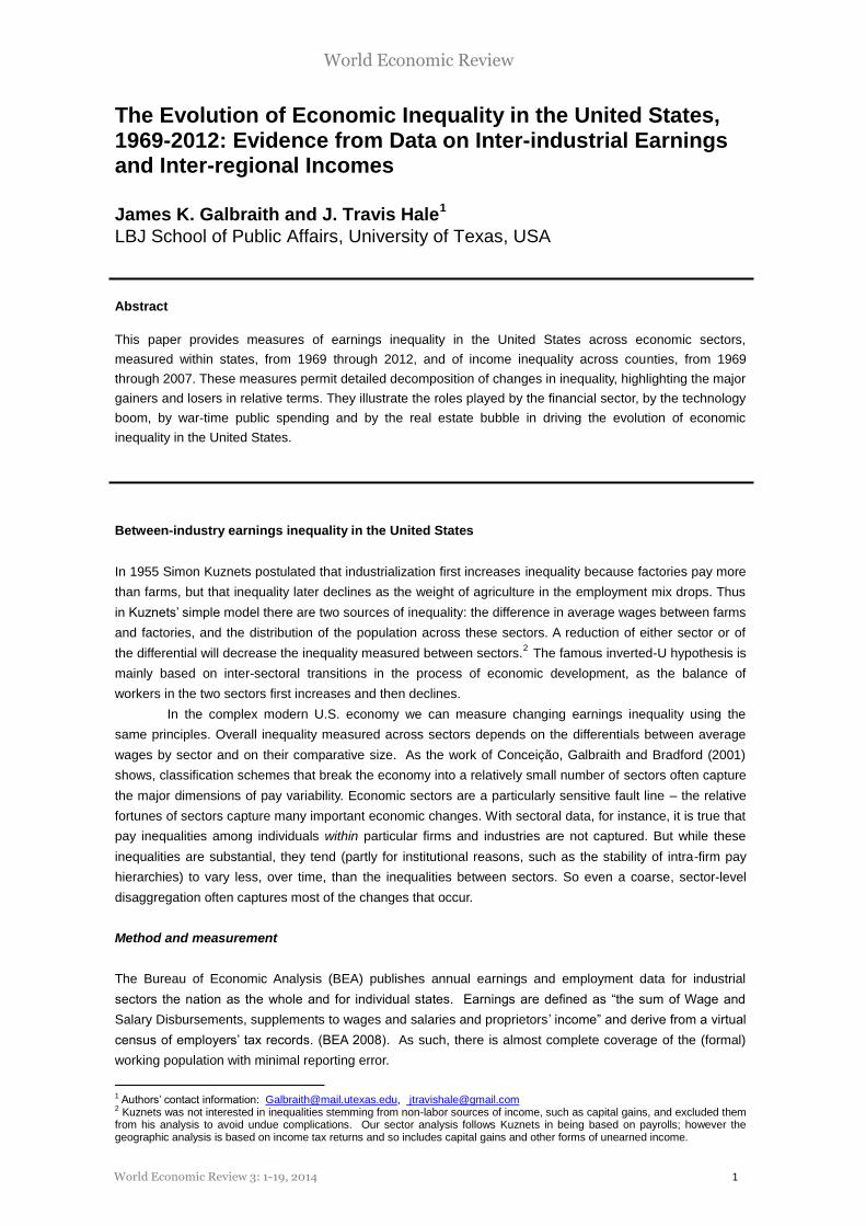
narrower sectorizations at the state and the national level. Figure 2 displays Lorenz Curves for 4 different
group structures in 2007: 51 states (all sectors combined), 21 national sectors, 93 national sectors, and 4389
(very narrow) sectors-within-states.4
3 A change in top-coding values and survey methodology accounts for the break in the Gini series between 1992 and 1993. 4 We variously treat Washington D.C. as a state- and a county-equivalent depending on the context. The Appendix lists the available NAICS-based sectors.
World Economic Review 3: 1-19, 2014 4
World Economic Review
Figure 2. Lorenz Curves for the U.S. Distribution of Pay in 2012 Using Various Group Structures
Each of these Lorenz curves has an associated Gini coefficient – 51 States: 0.089; 21 National
Sectors: 0.259; 93 National Sectors: 0.301; 4389 State Sectors: 0.320. As one adds detail, of course
inequality increases. The graphs and Gini coefficients also show that in the United States, sector matters
more than state. There is greater inequality in pay between industries, even at a fairly coarse level of
disaggregation, than between states. Second, adding sector detail or combining state detail with the sector
detail provides little additional information – the set of 21 national sectors captures the bulk of between-state-
sector pay differences and the set of 93 national sectors captures almost all of it.
Figure 3 displays the evolution of pay inequality from 1990 to 2012 using the same four category
structures. The different measures move together over time, which shows that it is not necessary to
disaggregate in order to capture time-variation. Yet each between-sector metric is useful in its own way. The
21-sector national measure is easier to visualize, while the more detailed measures help to identify those
narrow groups most responsible for changes.
-0.2 -0.1 0 0.1 0.2 0.3 0.4 0.5 0.6 0.7 0.8 0.9 1
-0.2
0
0.2
0.4
0.6
0.8
1
Cumulative Population
Cu
mu
lati
ve E
arn
ings
Equality Diagonal
51 States
24 U.S. Sectors
92 U.S. Sectors
4500 State Sectors

World Economic Review 3: 1-19, 2014 5
World Economic Review
Figure 3. U.S. Pay Inequality 1990 to 20012 Calculated Using Alternative Category Structures
Figure 4 breaks down the annual measures of pay inequality among the 21 broad national sectors
into their constituent Theil Elements. The black line tracks the Theil’s T, while the stacked portions of the bar
graphs show the Theil elements. From the zero line upward, the major contributors to inequality are
manufacturing, professional scientific and technical services, management of companies and enterprises,
federal civilian government, wholesale trade, information, local government, and finance and insurance – the
last being the volatile large blocks toward the top of the diagram5. From the zero line downward, retail trade,
accommodation, other services, waste management and real estate are the leading lower-income sectors.
Health care occupies a thin line just at the zero line: health is a large sector, but with average earnings just at
the national average, and therefore little net effect on inequality.
Several trends emerge clearly. One is the rise of professional, scientific and technical services in
the information-technology boom through 2000. Another is the waning of the public sector, both federal and
local, from 1990 to 2000 and then its recovery as a significant contributor to inequality in the early 2000s. It is
notable that the Democratic years under Presidents Clinton and Obama were not banner ones for
government; this sector fared better under the Republicans. A third trend is the rising importance of finance
and insurance during the boom years from 1990 until 2001 but even more so during the run up to the
financial crisis in 2007. Thereafter, the relative weight of the financial sector shrinks – and overall inequality
also declined a bit. Taken as a whole, the period from 1990 to 2012 was one of rising earnings inequality,
with a peak in 2000 and again in 2007. Inequality then subsides, but quickly recovers and by 2012 it was
near or at its previous peak.
5 Finance and insurance is shown in orange in the color version of the graphic.
0
0.02
0.04
0.06
0.08
0.1
0.12
0.14
0.16 Th
eil's
T S
tati
stic
Pay Inequality Over 51 States
Pay Inequality Over 24 U.S. Sectors
Pay Inequality Over 93 U.S. Sectors
Pay Inequality Over 4500 State Sectors

World Economic Review 3: 1-19, 2014 6
World Economic Review
Figure 4. Theil Elements of Between-Sector Pay Inequality in the U.S. 1990 – 2012
As Kuznets taught, the source of increasing inequality may be either changes in relative wages or
changes in sector employment shares. Though a massive contributor to inequality, finance and insurance
saw a slight decline in jobs over this period. Its contribution to rising inequality came from strong (though
variable) growth in relative earnings. Professional and technical services, spurred (as noted) by the
information technology revolution, gained employment share and also experienced a small increase in
relative earnings. Manufacturing, a high-wage sector, maintained or improved its relative wage position but
lost employment. Administrative and waste services and real estate rental and leasing, which both
-0.15
-0.1
-0.05
0
0.05
0.1
0.15
0.2
0.25

World Economic Review 3: 1-19, 2014 7
World Economic Review
experienced significant employment gains, added the most to growing inequality from below. Relative
average earnings in real estate actually improved, which would tend to reduce inequality, but not enough to
offset the flood of new jobs into what remains a low-paid sector.
Winners and losers during the information-technology and beltway booms
When we expand the number of sectors subject to analysis, from 21 to 93 and beyond, we find that only a
small handful of sub-sectors, with a very small minority of the nation’s workforce, account for the most
significant changes in pay inequality observed at this time.
Common sense can guide the search for these high-impact sectors. The emergence of personal
computing and information technology as major forces in the mid- to late 1990s and the mortgage-finance
bubble of the mid 2000s were the hallmark economic phenomena of those times. From 1996 to 2000, for
example, nominal earnings per reported job in computer and electronics manufacturing rose from $57,268 to
$83,848. From 2001 to 2006, earnings per job for construction of buildings grew from $53,140 to $66,112,
and the sector added more than 300,000 jobs. For these reasons, computer manufacturing and construction
were significant contributors to the increase in earnings inequality during these episodes. Other sectors saw
comparably wide swings in their fortunes, but it turns out that these, taken together, affected only a very
small fraction of the total workforce. Thus pay increases in sectors listed in Table 1, which contained only
3.8% of all workers in 2001, account for the entire rise in pay inequality during the late 1990s.
Table 1. Average Earnings in 1996 and 2001 in 12 High-Growth Sectors
Sector Average Earnings
1996 2001
Computer and electronic product manufacturing $ 57,268 $ 78,198
ISPs, search portals, and data processing $ 44,426 $ 68,175
International organizations; foreign embassies; consulates $ 83,632 $ 107,550
Internet publishing and broadcasting $ 54,116 $ 82,080
Funds, trusts, and other financial vehicles $ 50,132 $ 79,931
Utilities $ 82,384 $ 113,605
Oil and gas extraction $ 49,765 $ 90,958
Broadcasting, except Internet $ 91,831 $ 133,576
Securities, commodity contracts, investments $ 46,249 $ 88,604
Petroleum and coal products manufacturing $ 124,821 $ 200,367
Lessors of nonfinancial intangible assets $ 91,556 $ 192,836
Pipeline transportation $ 93,285 $ 299,978
All other Sectors $ 31,276 $ 38,099

World Economic Review 3: 1-19, 2014 8
World Economic Review
These boom sectors experienced a 58% climb in nominal average earnings in this five year period,
while all other sectors gained 22%. The employment growth rate in the high flyers, on the other hand, was
roughly half that for the rest of the economy. Thus the separation of the boom sectors from the rest of the
economy explains all of the increase in between sector inequality from 1991 to 2001. This is evident in
Figure 5, which parses Theil’s T for between-sector earnings inequality into three components: inequality
among the IT boom sectors, inequality among the sectors in the rest of the economy, and inequality between
the high-growth sectors and the rest of the economy writ large from 1991 to 2001.
Figure 5. Between-Sector Inequality 1991–2001
Inequality between the boom and the not-boom sectors, taken as groups, is clearly the driving force
behind rising inequality overall. Inequality between the 12 sectors in Table 1 that make up the boom sectors
was essentially unchanged from 1991 to 2001. Inequality between the other 82 national sectors actually
declined a bit. But inequality between the booms and the boom-nots rose significantly, accounting for all of
the 17.2% increase in between-sector earnings inequality during this period.
The rise in between-sector pay inequality from 2003 to 2007 reflects wage gains in a wider array of
sectors that contain a higher percentage of employment, so the gains in those years were more broadly
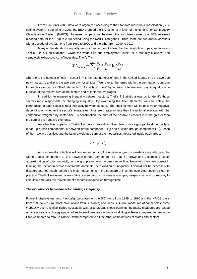
based. But the pattern is similar. Table 2 shows average wages in fifteen high-growth sectors from 2003
to 2007.
These sectors accounted for 7.4% of total jobs in 2007. From 2003 to 2007, average earnings in
these “Bush boom” sectors increased 32%, while earnings in the rest of the economy averaged 13%, barely
keeping pace with inflation. Once again, the rate of job growth in the high-flyers was half of that for the other
sectors. After experiencing brief stagnation in earnings growth during the information-technology bust,
computer and electronic product manufacturing and securities, commodity contracts, and investing
experienced strong rebounds in earnings from 2002 to 2007. However, neither of these sectors regained the
World Economic Review 3: 1-19, 2014 9
World Economic Review
employment levels of 2000. To the contrary, for instance, computer and electronic product manufacturing
shed 29% of its workforce from 2000 to 2007.
Table 2. Average Earnings in 2003 and 2007 in 15 High-Growth Sectors
Sector Average Earnings
2003 2007
Military $ 53,178 $ 71,616
Federal, civilian $ 79,153 $ 98,844
Computer and electronic product manufacturing $ 88,365 $ 108,125
Mining (except oil and gas) $ 66,671 $ 89,371
Water transportation $ 70,634 $ 93,452
Management of companies and enterprises $ 83,618 $ 106,587
Support activities for mining $ 61,650 $ 87,241
Chemical manufacturing $ 97,062 $ 124,020
Utilities $ 127,487 $ 157,138
Securities, commodity contracts, investments $ 83,053 $ 113,907
Broadcasting, except Internet $ 149,362 $ 197,862
Other information services $ 34,490 $ 86,726
Oil and gas extraction $ 98,979 $ 167,418
Pipeline transportation $ 181,197 $ 263,350
Petroleum and coal products manufacturing $ 185,070 $ 363,962
All other sectors $ 38,989 $ 43,949
Figure 6 shows the contributions of inequality among the Bush boom sectors, inequality among all
other sectors, and inequality between the high growth sectors and lower-growth sectors from 2000 to 2007.
Unlike the information technology boom, the Bush boom saw rising inequality among the boom
sectors, among the sectors in the rest of the economy, and also between those sectors that surged ahead
and those that stayed behind. Nonetheless, in this period, as before, the disparity between the booms and
boom-nots explains the majority of the total increase in between-sector earnings inequality.

World Economic Review 3: 1-19, 2014 10
World Economic Review
Figure 6. Between-Sector Inequality 2000 –2007
By coincidence or design, sector performance has an apparent political dimension. Bankers and
technologists were key supporters of President Clinton; those sectors thrived during his presidency. Under
President Bush, workers in extraction industries, the military and government did well, doubtless reflecting
the pro-oil and empire-building policies of those years.
The lagging sectors are also informative. In the 2000s, for instance, declining fortunes in the auto
industry mitigated the effect on total inequality of expansion and earnings gains in other sectors. The motor
vehicles, bodies and trailers, and parts manufacturing sector, which consistently pays high wages, lost jobs
and saw stagnant earnings from 2002 to 2007; thus inequality declined on that account. This is of course
not good news, and sounds a caution against regarding any inequality statistic as per se indicative of social
welfare.
Education as an inequality remedy?
When public discourse admits inequality to be a problem, education is often given as the cure. According to
Treasury Secretary Henry Paulson (2006), for instance, the correct response to rising inequality is to “focus
on helping people of all ages pursue first-rate education and retraining opportunities, so they can acquire the
skills needed to advance in a competitive worldwide environment.” This is a view with powerful support
among economists. But the simple inter-sector dynamics show clearly that, as a solution to inequality,
education is a bust.
As we’ve shown, the last two decades have seen significantly slower job growth in the high-
earnings-growth sectors than in the economy at large. So even if large numbers of young people do “acquire
the skills needed to advance” there is no evidence that the economy will provide them with jobs to suit.
Many will simply end up not using their skills. Moreover, a strategy of investment in education presupposes

World Economic Review 3: 1-19, 2014 11
World Economic Review
advance knowledge of what the education should be for. Years of education in different fields are not perfect
substitutes, and it does little good to train too many people for jobs that, in the short space of four or five
years, may (and do) fall out of fashion. And experience shows clearly that the population does not know, in
advance, what to train for. Rather, education and training have become a kind of lottery, whose winners and
losers are determined, ex post, by the behavior of the economy.
Students who studied information technology in the mid-1990s were lucky; they were a scarce few
who could find places easily in a tiny but lucrative sector. Those who completed identical degrees in (say)
2000 were not so fortunate, as all-too-many of them know. Likewise, who predicted that the public sector
would prosper under President Bush? And what happened to those who then prepared for public service,
under President Obama, the chief executive of the fiscal cliff and the sequester?
The changing geography of American income inequality
Next we turn to a discussion of income inequalities measured across geographic entities, including states
and their subdivisions, the counties. As shown above, variation in earnings across 21 sectors exceeds
variation in earnings across the 51 states. But there is, nevertheless, substantial geographic dispersion of
earnings, and even more of incomes. At the state level, per capita income ranged from $27,028 in
Mississippi to $57,746 in Washington D.C. in 2006; county average income spanned $9,140 per person in
Loup, Nebraska, to $110,292 in New York, New York. In this section we explore these differences.
Method and measurement
The BEA definition of income includes wages and salaries, but also incorporates rent, interest and
dividends, government transfer payments, and other sources.6 As such, income provides a broader picture
of economic well-being than earnings. The ideal dataset for studying income inequality would include regular
measurements of income for all individuals or households along with geographical and demographic
identifiers. Such data exists in the form of income tax returns, at least for those required to file, but
researchers do not have access to individual records. Thus the major work on top incomes (Piketty, 2014)
stratifies by percentiles, a useful procedure but one that leaves much to the imagination.
On the other hand, the BEA uses tax records to produce income estimates for each county in the
United States annually.7 Together with population records, these data are provided through Local Area
Personal Income Statistics in the Regional Economics Accounts (BEA 2008). Given this annual data set, we
can calculate Theil’s T for between-county income inequality.8 Income, contrary to the earnings measure,
includes capital gains and other returns from capital assets. Our logic is the same as before. Changes in
between-county income inequality have two components – changes in relative population and changes in
relative incomes. Inequality declines when poor counties add income faster than rich counties or middle
income counties add population faster than counties at either tail of the distribution. When rich counties get
relatively richer, poor counties get relatively poorer, or middle income counties lose population share,
inequality rises.
6 “Personal Income is the income that is received by all persons from all sources. It is calculated as the sum of wage and salary disbursements, supplements to wages and salaries, proprietors' income with inventory valuation and capital consumption adjustments, rental income of persons with capital consumption adjustment, personal dividend income, personal interest income, and personal current transfer receipts, less contributions for government social insurance. The personal income of an area is the income that is received by, or on behalf of, all the individuals who live in the area; therefore, the estimates of personal income are presented by the place of residence of the income recipients” (BEA 2008). 7 Source data for BEA income estimates come from a host of government sources, including: “The state unemployment insurance programs of the Bureau of Labor Statistics, U.S. Department of Labor; the social insurance programs of the Centers for Medicare and Medicaid Services (CMS, formerly the Health Care Financing Administration), U.S. Department of Health and Human Services, and the Social Security Administration; the Federal income tax program of the Internal Revenue Service, U.S. Department of the Treasury; the veterans benefit programs of the U.S. Department of Veterans Affairs; and the military payroll systems of the U.S. Department of Defense” (BEA 2008). We have not yet updated these measures through 2012. 8 “Counties are considered to be the "first-order subdivisions" of each State and statistically equivalent entity, regardless of their local designations (county, parish, borough, etc.). Thus, the following entities are considered to be equivalent to counties for legal and/or statistical purposes: The parishes of Louisiana; the boroughs and census areas of Alaska; the District of Columbia; the independent cities of Maryland, Missouri, Nevada, and Virginia; that part of Yellowstone National Park in Montana; and various entities in the possessions and associated areas” (National Institute of Standards and Technology 2002).

World Economic Review 3: 1-19, 2014 12
World Economic Review
The evolution of between-county income inequality
From 1969 to 2006, between-county income inequality in the United States increased, but the path was not
smooth. From 1969 to 1976 cross-county inequality declined. A steady rise in inequality occurred until the
mid-1980s, and then accelerated through the end of the decade. 1990 to 1994 saw another decline, but
another reversal pushed inequality to new heights through 2000. An equally steep decline followed through
2003. Figure 7 plots two series of U.S. income inequality, the Census Bureau between-household measure
and our own between-county measure.
Figure 7. U.S. Income Inequality 1969–2006
Since the early 1970s, the two series show similar trends, a sharp rise in income inequality during
the 1980’s and a peak and trough around the information technology boom and bust. Between-county
inequality shows greater relative variability during this period.
The movements of between-state income inequality and between-county income inequality are
closely related, but the volatility of the latter is markedly greater. Figure 8 plots the between-state component
and sum of the within-state components of county income inequality from 1969 to 2006. The height of the bar
represents total between-county inequality, and the white portion represents the between-state component.
Despite the close association in the annual movements of the between-state and between-county
series, state per-capita incomes converged during the 1969 to 2006 period while county and household
incomes grew further apart. The reduction in state income variation occurred as the South became more
closely integrated with the nation as a whole over the last 40 years. For example, although still the lowest in
the nation, per capita income in Mississippi has grown from 62% of national per capita income in 1969 to
74% of national per capita income in 2006. Alabama, Arkansas, Georgia, South Carolina, North Carolina,
and Tennessee made similar gains.

World Economic Review 3: 1-19, 2014 13
World Economic Review
Figure 8. Components of Theil’s T Statistic of Between-County U.S. Income Inequality 1969–2006
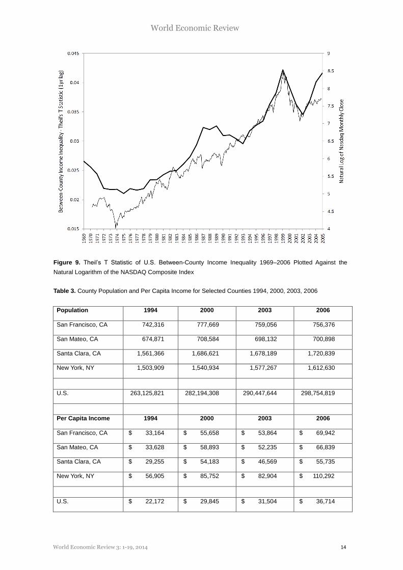
The information-technology boom, the bust, and beyond
From January 1994 to February 2000, the tech-heavy NASDAQ Composite index rose from 776.80 to
4,696.69, a 605% increase. Enthusiasts celebrated the bull market as evidence that the “new economy”
would drive American prosperity into the future. Liberals (and not only liberals) lamented the spectacular
rises in high-end pay and of inequality more generally. Few noted that the two phenomena were identical.
Figure 9 matches the level of between-county income inequality – lagged one year – against the natural
logarithm of the NASDAQ Composite. The two series move together seamlessly from 1992 to 2004, with the
same peaks and troughs and the same proportional change.
As technology firms’ stock prices rose, their employees (especially their executives) and
stockholders reaped the benefits in the form of options realizations and capital gains. If employment and
share ownership in the technology sector had been uniformly distributed, this would have had little impact on
the between-county measure of inequality. But technological firms were and are concentrated around such
cities as San Francisco, Seattle, Raleigh, Austin, and Boston. The financiers are concentrated in Manhattan.
Income growth in the counties comprising these areas accounted for almost all of the inequality increase
between counties in the late 1990s, and when the information technology boom ended in 2000, falling
relative incomes in these same areas reduced aggregate between-county inequality.
In particular, the four counties that contributed most to the increase in between-county income
inequality from 1994 to 2000 also contributed most to the inequality decline from 2000 to 2003 – New York,
NY; Santa Clara, CA; San Mateo, CA; and San Francisco, CA.
World Economic Review 3: 1-19, 2014 14
World Economic Review
Figure 9. Theil’s T Statistic of U.S. Between-County Income Inequality 1969–2006 Plotted Against the
Natural Logarithm of the NASDAQ Composite Index
Table 3. County Population and Per Capita Income for Selected Counties 1994, 2000, 2003, 2006
Population 1994 2000 2003 2006
San Francisco, CA 742,316 777,669 759,056 756,376
San Mateo, CA 674,871 708,584 698,132 700,898
Santa Clara, CA 1,561,366 1,686,621 1,678,189 1,720,839
New York, NY 1,503,909 1,540,934 1,577,267 1,612,630
U.S. 263,125,821 282,194,308 290,447,644 298,754,819
Per Capita Income 1994 2000 2003 2006
San Francisco, CA $ 33,164 $ 55,658 $ 53,864 $ 69,942
San Mateo, CA $ 33,628 $ 58,893 $ 52,235 $ 66,839
Santa Clara, CA $ 29,255 $ 54,183 $ 46,569 $ 55,735
New York, NY $ 56,905 $ 85,752 $ 82,904 $ 110,292
U.S. $ 22,172 $ 29,845 $ 31,504 $ 36,714
World Economic Review 3: 1-19, 2014 15
World Economic Review
The rebound in inequality from 2003 to 2006 was of two pieces. First, many though not all, of the
technology and finance counties experienced renewed income growth – New York County most of all.
Second, there was a concentration of increasing income around Washington D.C., thanks to the federal
government, and in Southern California, New Orleans, Las Vegas, and Southern Florida, areas central to the
mortgage-finance boom.
Thus rising geographic income inequality from 1994 to 2000 was largely an artifact of the
information-technology boom. That bust inflicted large, arbitrary and unnecessary losses on many who were
not prepared to shoulder them. Nevertheless, as Robert Shapiro, former Under Secretary for Economic
Affairs in the Department of Commerce, wrote:
“The American bubble represented an excess of something that in itself has real value for
the economy – information technologies. The bubble began in overinvestment in IT and
spread to much of the stock market; but at its core, much of the IT was economically
sound and efficient. Further, these dynamics also played a role in the capital spending
boom of the 1990s, and much of that capital spending translated into permanently higher
productivity. The result is that the American bubble should not do lasting damage to the
American economy” (2002).
To this, we add that full employment achieved in the late 1990s raised living standards broadly and
engendered lasting productivity gains, as well as demonstrating that full employment can be achieved
without inflation, something much of the economics profession had not believed possible before that time.
From 2003 to 2006, the region around the national capital thrived. Much of this was related to the growth of
military activities with wars in Afghanistan and Iraq. However federal civilian spending also grew rapidly, and
there was also substantial growth in spending by private sector lobbies. Income growth in Southern
California and other areas was likely related to the mortgage-finance boom, the phenomenon that led to the
financial crisis.
The economic consequences should, as with the earlier period, be judged in part by the worth of
the activities undertaken. However, it is already clear that the 2000s saw no very broad revival of private-
sector economic dynamism. A main economic beneficiary of government spending was the government itself
and those associated with it. Given the broad ideology of the incumbent administration, this is, as we've said
before, ironic.
Interpreting inequality
Even before the onset of the financial crisis, economic inequality was on its way to becoming a bipartisan
concern, at least so far as political rhetoric goes. Thus, President Bush:
“I know some of our citizens worry about the fact that our dynamic economy is leaving
working people behind. We have an obligation to help ensure that every citizen shares in
this country's future. The fact is that income inequality is real; it's been rising for more than
25 years. The reason is clear: We have an economy that increasingly rewards education,
and skills because of that education… And the question is whether we respond to the
income inequality we see with policies that help lift people up, or tear others down.” –
President Bush; State of the Economy Report Address at Federal Hall, New York; Jan. 31,
2007
A week later, Federal Reserve Chairman Ben Bernanke put it this way:
“Thus, these three principles seem to be broadly accepted in our society: that economic
opportunity should be as widely distributed and as equal as possible; that economic
outcomes need not be equal but should be linked to the contributions each person makes
World Economic Review 3: 1-19, 2014 16
World Economic Review
to the economy; and that people should receive some insurance against the most adverse
economic outcomes, especially those arising from events largely outside the person's
control.” – Chairman of the Federal Reserve Ben Bernanke, Remarks before the Greater
Omaha Chamber of Commerce; February 6, 2007
Perhaps most striking, in an appearance on the Charlie Rose Show on September 20, 2007, former
Federal Reserve Chairman Alan Greenspan said flatly, “You cannot have a market capitalist system if there
is a significant mood in the population that its rewards are unjustly distributed.” Whether sincerely offered or
not, these comments echo the concerns of policy makers and analysts on the Left (e.g., Neckerman 2004),
who emphasize the effect of inequality on health, education, and democratic participation.
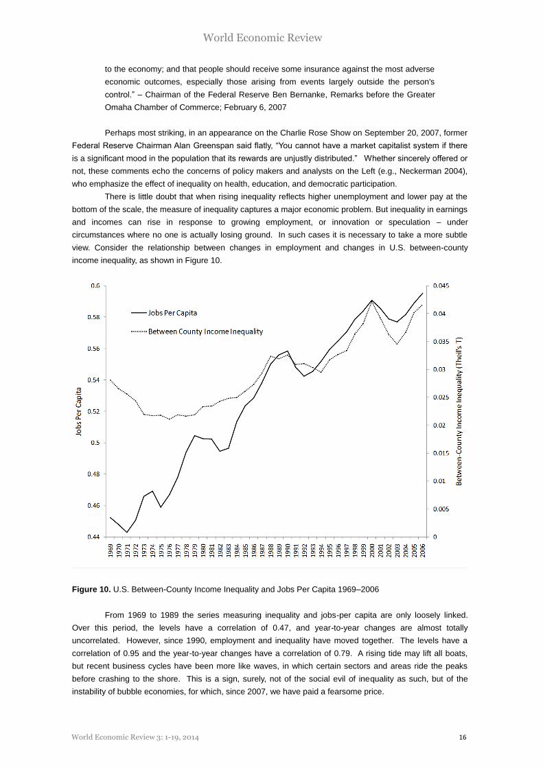
There is little doubt that when rising inequality reflects higher unemployment and lower pay at the
bottom of the scale, the measure of inequality captures a major economic problem. But inequality in earnings
and incomes can rise in response to growing employment, or innovation or speculation – under
circumstances where no one is actually losing ground. In such cases it is necessary to take a more subtle
view. Consider the relationship between changes in employment and changes in U.S. between-county
income inequality, as shown in Figure 10.
Figure 10. U.S. Between-County Income Inequality and Jobs Per Capita 1969–2006
From 1969 to 1989 the series measuring inequality and jobs-per capita are only loosely linked.
Over this period, the levels have a correlation of 0.47, and year-to-year changes are almost totally
uncorrelated. However, since 1990, employment and inequality have moved together. The levels have a
correlation of 0.95 and the year-to-year changes have a correlation of 0.79. A rising tide may lift all boats,
but recent business cycles have been more like waves, in which certain sectors and areas ride the peaks
before crashing to the shore. This is a sign, surely, not of the social evil of inequality as such, but of the
instability of bubble economies, for which, since 2007, we have paid a fearsome price.

World Economic Review 3: 1-19, 2014 17
World Economic Review
Conclusion
In recent decades economic inequality increased, mainly due to extravagant gains by the already-rich. This
type of inequality has consequences; most notably it affects the distribution of political power. Increasing
incomes at the top of distribution may also ratchet up consumption in ways that filter down throughout
society and cause behaviors that reduce social welfare (Frank 2007). Still, relative deprivation is not the
same as absolute deprivation. Rather, the deeper issue with inequality of this type is instability: the rocket
also falls. A problem with the trick of generating prosperity through inequality is that it cannot be repeated
indefinitely, or even often.
Finally, the economic downturn after 2008 led to somewhat larger losses in the absolute earnings,
wealth and incomes of the well-off than those the working poor. As such, the slump led, briefly, to a
decrease in measured inequality within the United States. Schadenfreude aside, this was not especially
good news. The debacle, after all, was a terrible debacle, irrespective of the effect on an inequality number.
But it was not good news either, that inequality then recovered, alongside the stock market, while so little
else did.
References
Bernanke, Ben. 2007. “Remarks before the Greater Omaha Chamber of Commerce,” Omaha, Nebraska, February 6.
Bureau of Economic Analysis. 2008. “Regional Economic Accounts: State Annual Personal Income.” Washington: U.S. Department of Commerce. (http://www.bea.gov/bea/regional/spi/).
Burtless, Gary. 2007. “Demographic Transformation and Economic Inequality” Mimeo.
Bush, George W. 2007. “State of the Economy Report Address,” Federal Hall, New York, January 31.
Conceição, Pedro and Galbraith, James K. 2001. “Toward an Augmented Kuznets Hypothesis,” in James K. Galbraith and Maureen Berner, eds., Inequality and Industrial Change: A Global View. Cambridge,
Cambridge University Press.
Conceição, Pedro, James K. Galbraith, and Peter Bradford. 2000. “The Theil Index in Sequences of Nested and Hierarchic Grouping Structures: Implications for the Measurement of Inequality through Time, with Data Aggregated at Different Levels of Industrial Classification.” Eastern Economic Journal 27: 61–74.
DeNavas-Walt, Carmen, Bernadette D.Proctor, and Jessica C. Smith. 2008. U.S. Census Bureau Current Population Reports, P60-235, Income, Poverty, and Health Insurance Coverage in the United States: 2007,
U.S. Government Printing Office, Washington, DC, 2008.
Ferguson, Thomas, and James K. Galbraith, 1999. “The American Wage Structure, 1920-1946. Research in Economic History. Vol. 19, 205-257.
Frank, Robert H. 2007. Falling Behind: How Rising Inequality Harms the Middle Class. Berkeley, CA, University of California Press, 2007.
Galbraith, James K., 1998. Created Unequal: The Crisis in American Pay. New York, The Free Press.
Galbraith, James K. 2012, Inequality and Instability: A study of the world economy just before the Great Crisis. New York: Oxford University Press.
Goldin, Claudia and Lawrence F. Katz, 2008. The Race Between Technology and Education. Cambridge, Harvard University Press.
Greenspan, Alan and Charlie Rose. 2007. “A Conversation with Alan Greenspan.” The Charlie Rose Show. PBS. WNET, Newark. September 20.
Jones, Arthur, Jr. and Daniel H. Weinberg. 2000. U.S. Census Bureau Current Population Reports, P60-204, The Changing Shape of the Nation’s Income Distribution, U.S. Government Printing Office, Washington, DC, 2000.
Kuznets, Simon. 1955. “Economic growth and income inequality,” American Economic Review, 45(1): 1-28.

World Economic Review 3: 1-19, 2014 18
World Economic Review
McCarty, Nolan, Keith T. Poole, and Howard Rosenthal. 2006. Polarized America: The Dance of Ideology and Unequal Riches. Cambridge, MA: The MIT Press.
National Institute of Standards and Technology. 2002. “Counties and Equivalent Entities of the United States, Its Possessions, and Associated Areas.” Washington: U.S. Department of Commerce. (http://www.itl.nist.gov/fipspubs/fip6-4.htm).
Neckerman, Kathryn, ed. 2004. Social Inequality. New York: Russell Sage Foundation.
Paulson, Henry. 2006. “Remarks at Columbia University,” New York, August 1.
Piketty, Thomas, Capital in the 21st Century, Harvard University Press, 2014
Shapiro, Robert J.: “The American Economy Following the Information-Technology Bubble and Terrorist Attacks”, Fujitsu Research Institute Economic Review, No. 6(1), 2002.
United for a Fair Economy. 2007. “CEO Pay Charts.” Boston, United for a Fair Economy. http://www.faireconomy.org/research/CEO_Pay_charts.html
Appendix: NAICS Sectors
Farming
Forestry, fishing, related activities, and other
Forestry and logging
Fishing, hunting, and trapping
Agriculture and forestry support activities
Other
Mining
Oil and gas extraction
Mining (except oil and gas)
Support activities for mining
Utilities
Construction
Construction of buildings
Heavy and civil engineering construction
Specialty trade contractors
Manufacturing
Wood product manufacturing
Nonmetallic mineral product manufacturing
Primary metal manufacturing
Fabricated metal product manufacturing
Machinery manufacturing
Leather and allied product manufacturing
Paper manufacturing
Printing and related support activities
Petroleum and coal products manufacturing
Chemical manufacturing
Plastics and rubber products manufacturing
Wholesale trade
Retail trade
Motor vehicle and parts dealers
Furniture and home furnishings stores
Electronics and appliance stores
Building material and garden supply stores
Food and beverage stores
Health and personal care stores
Gasoline stations
Clothing and clothing accessories stores
Sporting goods, hobby, book and music stores
General merchandise stores
Miscellaneous store retailers
Nonstore retailers

World Economic Review 3: 1-19, 2014 19
World Economic Review
Transportation and warehousing
Air transportation
Rail transportation
Water transportation
Truck transportation
Transit and ground passenger transportation
Pipeline transportation
Scenic and sightseeing transportation
Support activities for transportation
Couriers and messengers
Warehousing and storage
Information
Publishing industries, except Internet
Motion picture and sound recording industries
Broadcasting, except Internet
Internet publishing and broadcasting
Telecommunications
ISPs, search portals, and data processing
Other information services
Finance and insurance
Monetary authorities - central bank
Credit intermediation and related activities
Securities, commodity contracts, investments
Insurance carriers and related activities
Funds, trusts, and other financial vehicles
Real estate and rental and leasing
Real estate
Rental and leasing services
Lessors of nonfinancial intangible assets
Professional and technical services
Management of companies and enterprises
Administrative and waste services
Administrative and support services
Waste management and remediation services
Educational services
Health care and social assistance
Ambulatory health care services
Hospitals
Nursing and residential care facilities
Social assistance
Arts, entertainment, and recreation
Performing arts and spectator sports
Museums, historical sites, zoos, and parks
Amusement, gambling, and recreation
Accommodation and food services
Accommodation
Food services and drinking places
Other services, except public administration
Repair and maintenance
Personal and laundry services
Membership associations and organizations
Private households
Government and government enterprises
Federal, civilian
Military
State government
Local government