The Mutual Information Diagram - sci.utah.edu · The Mutual Information Diagram ... .\爀屮When the two vari\ൡbles are the same, the joint entropies are the same as the marginal
26
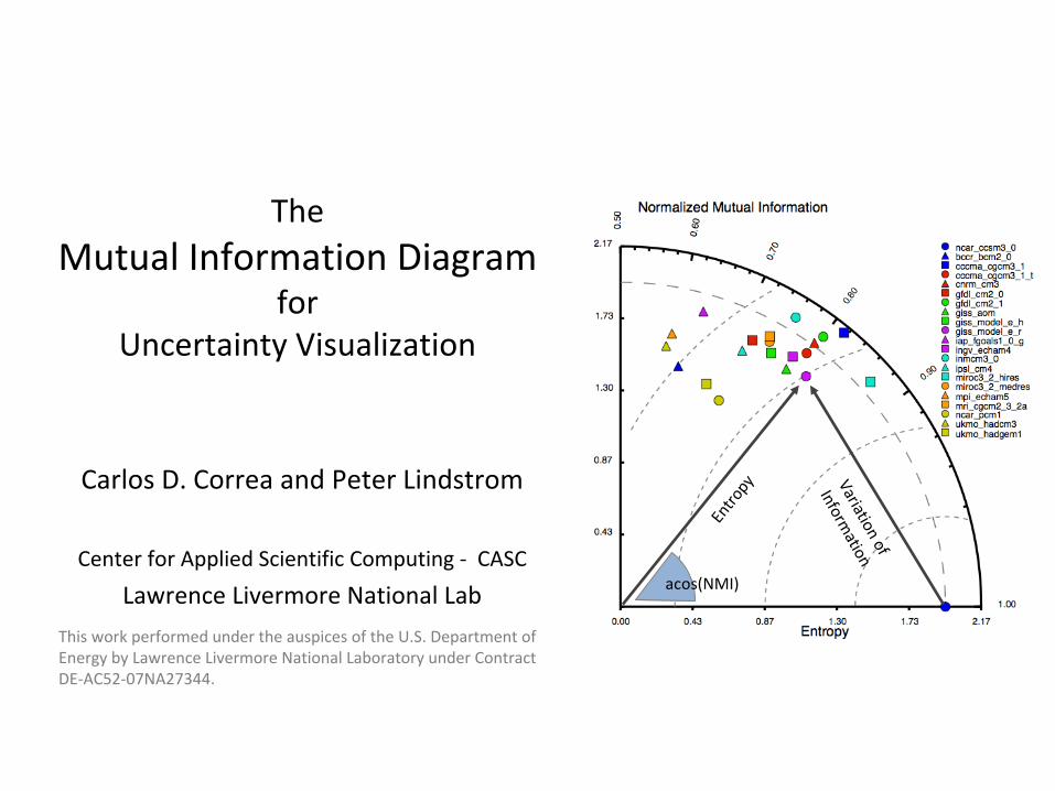
The Mutual Information Diagram for Uncertainty Visualization Carlos D. Correa and Peter Lindstrom Center for Applied Scientific Computing ‐ CASC Lawrence Livermore National Lab Variation of Information Entropy acos(NMI) This work performed under the auspices of the U.S. Department of Energy by Lawrence Livermore National Laboratory under Contract DE‐AC52‐07NA27344.
This work performed under the auspices of the U.S. Department of
Energy by Lawrence Livermore National Laboratory under Contract
DE‐AC52‐07NA27344.
Visualization should help compare models with observations
Average annual temperature 1900‐2000 as
predicted by various climate models.
Which model is more similar
to a reference
model or observations?
Trend plots often do not expose these
aspects. 285
286
287
288
289
290
1900 1920 1940 1960 1980 2000
Tem
pera
ture
Year
ncar‐ccsm3 cnrm‐cm3 bccr‐bcm2bccr‐bcm2
Obs.
Presenter
Presentation Notes
One of the goals of visualization is to allow visual comparison between models. Here’s an example of the sea and land temperature sometime in the 20th century, as predicted by different climate models The goal in studying these models is to find out which model is more similar to the observations. One mechanism is via trend plots, but unfortunately these do not expose a lot of aspects that define the similarity between two timeseries
Visualization should help find correlations of similar outputs –
important for uncertainty quantification
Divide ensembles in 6 latitude zones and 3 temporal averages
•Are there correlations across seasons or latitudes?•Are there large discrepancies in the different outputs?
Northern High Lats
Northern Med. Lats
Northern Low Lats
Southern Low Lats
Southern Med. Lats
Southern High Lats
Annual Dec‐Jan‐Feb Jun‐Jul‐AugZonesSeasons
Presenter
Presentation Notes
Another experiment is to understand how different climate variables affect each other. To this end, scientists perform zonal and seasonal studies, where they compare the averages at different latitudes and different times against each other.
Visualization should help find correlations of similar outputs –
important for uncertainty quantification
ZonesSeasons
Northern High Lats
Northern Med. Lats
Northern Low Lats
Southern Low Lats
Southern Med. Lats
Southern High Lats
Annual Dec‐Jan‐Feb Jun‐Jul‐Aug
Find correlation
between (6+1)x3 =
21 variables
A scatterplot
matrix becomes
impractical
for
many outputs
Find correlation
between (6+1)x3 =
21 variables
A scatterplot
matrix becomes
impractical
for
many outputs
Presenter
Presentation Notes
From a visualization point of view, this would imply the simultaneous visualization of, say, 21 variables. A scatterplot matrix quickly becomes impractical
Visualization should help find correlations of similar outputs –
important for uncertainty quantification
ZonesSeasons
Northern High Lats
Northern Med. Lats
Northern Low Lats
Southern Low Lats
Southern Med. Lats
Southern High Lats
Annual Dec‐Jan‐Feb Jun‐Jul‐Aug
A parallel coordinate visualization is more practicalBut only certain pairwise comparisons
are possibleA parallel coordinate visualization is more practicalBut only certain pairwise comparisons
are possible
Presenter
Presentation Notes
As an alternative, one can use a parallel coordinate system, which, although more practical, restricts the analysis to certain pairwise comparisons.
Visual Summaries• Represent directly
summary quantities, e.g.,
mean, standard deviation,
entropy.
• Box‐plots and their many
variants
• One plot per ensemble
may result in clutter
• Visualizing several statistics
simultaneously in a metric
space: Taylor diagram
medianLower quartile
Upper quartile
Lower percentile
Upper percentile
Potter et al. (Eurovis’2010)
Presenter
Presentation Notes
So, when visualizing multiple models, it becomes more effective to use visual summaries, which directly represent summary statistics of the data, such as the mean, the median, standard deviation, and so on. One example is the box-plot and their many variants There have been some recent generalizations which are able to represent more detailed information to the box plots. However, when many variables or ensembles are visualized, the visualization becomes quickly cluttered. As an alternative, one can represent statistics in a metric space. One such example, and the motivation for our work is the Taylor diagram ----- Meeting Notes (9/23/11 13:58) ----- put tags in boxplots use box for last bullet emphasize metric space important mention PC + SC (previous)
The Taylor DiagramSimultaneously plots
Standard deviation,
Root Mean Square Error
and
Correlation R.
Presenter
Presentation Notes
The Taylor diagram, introduced by Karl Taylor simultaneously plots the standard deviation, the root mean square error and correlation between two variables. They key is that it is possible to find a metric space for these quantities, based on this identity If you look closely, this identity looks like the cosine law of triangles. ----- Meeting Notes (9/23/11 13:58) ----- change E for RMS.
Applications of the Taylor Diagram
Taylor, 2005(Taylor Diagram Primer)
Presenter
Presentation Notes
Now, how do we read a Taylor diagram. Here’s an example of predicted average precipitation according to certain models. Usually, the reference frame is depicted in the horizontal axis, in this case the observation data. Depending on where the other variables appear, each corresponding to the result of a different model, you can tell whether they are more or less correlated to the observation, and if they have less or more standard deviation. And depending on how far they are in the isocontours, you can tell which ones are closer to the observation in terms of error. So for example, the model in a circle, from NCAR and the spiral (Hadley Centre) have a similar correlation to the observation, but the NCAR has practically the same standard deviation, i.e., it accounts for the same variability than the observation.
Anscombe’s TrioVariables B,C,D: same
standard deviation and same
correlation w.r.t. A
Information Theory to the Rescue!
Information Theory to the Rescue!
noise non‐linear outlier
Presenter
Presentation Notes
However, the Taylor diagram is only good for comparisons in terms of correlation. Let’s consider three variables, all of which have the same standard deviation and same correlation with respect to another variable A. These are part of the Anscombe’s quartet, which I call her Anscombe’s trio. Though they are the same in terms of statistics, they are clearly different And they account for different aspects of variability, such as noise, non-linearity, or the presence of outliers Naturally, they appear at the same position in the Taylor diagram. Our solution is to turn to information theory, where we replace statistics for information theoretic properties, such as entropy and mutual information. And voila!, our diagram now can tell the difference between these three distributions. ----- Meeting Notes (9/23/11 13:58) ----- Make text short say something about differences - e.g., noise, non-linearity, outliers
Information Theory Primer• Entropy H(X)
– Measure of information
uncertainty of X
• Joint Entropy H(X,Y)– Uncertainty of X,Y
• Conditional Entropy H(X|Y)– Uncertainty of X given that
I know Y
• Mutual Information I(X;Y)– How much knowing X
reduces the uncertainty of
Y
H(X,Y)
H(X) H(Y)
I(X;Y)H(X|Y) H(Y|X)
Presenter
Presentation Notes
Let me give a little intro to information theory. In general, we want to define variables and distributions in terms of Entropy, a measure of the information uncertainty of a variable X Joint entropy for pairs of variables, which is the uncertainty of knowing these two variables. Conditional entropy which is the uncertainty of X given what you already know about Y Mutual information is how much knowing X reduces the uncertainty of Y ----- Meeting Notes (9/23/11 13:58) ----- independent dependent Same Put three examples: X,Y independent (I(X;Y) = 0) X,Y dependent (I(X,Y!=0)) X,Y are the same I(X;Y) = H(X,Y)) = H(X) = H(Y) Show one at a time: entropy, joint entropy… etc When showing the different variations, explain that a metric of that is VI
Variation of Information VI=H(X | Y) + H(Y | X)
H(X,Y) = H(X) = H(Y) = I(X;Y)
H(X,Y) < H(X) + H(Y)
H(X,Y) = H(X) + H(Y)I(X;Y) = 0
VI=0
VI<H(X;Y)
VI=H(X;Y)
X and Y are the
same
X and Y are the
same
X and Y are
independent
X and Y are
independent
X and Y are different
but dependent
X and Y are different
but dependent
Presenter
Presentation Notes
There is also a notion of variation of information. Let’s look at the interaction between two variables. When the two variables are the same, the joint entropies are the same as the marginal entropies and the mutual information. When they are not the same, but they are dependent, the joint entropy is in general smaller than the sum of their entropies And finally, when they are independent, the mutual information is zero so their joint entropy is equal to the sum of entropies. Knowing X or Y doesn’t help you reduce the uncertainty of the other. The variation of information represents this metric distance, so it’s zero when they are the same and they are equal to the sum of entropies when they are independent.
The Variation of Information VI: a measure of distance in information theory
Presenter
Presentation Notes
There is another way of defining the variation information, in terms of entropies and the mutual information. If we do a simple replacement to root entropies And multiply here and there for this quantity We get an expression that, once again, looks like the cosine law of triangles, where this ratio, the angle theta is the normalized mutual information ----- Meeting Notes (9/23/11 13:58) ----- another slide VI showing VI = sum conditional box around ratio showing NMI
The Variation of Information VI: a measure of distance in information theory
Normalized Mutual
Information (NMI)
Presenter
Presentation Notes
----- Meeting Notes (9/23/11 13:58) ----- another slide VI showing VI = sum conditional box around ratio showing NMI
RVI Diagram
Presenter
Presentation Notes
Now, analogous to the Taylor diagram is our mutual information diagram, Where a given variable is plotted radially, with radius equal to the square root entropy and the angle with the X axis is given by the normalized mutual information. FIX R to R_{XY} Remove CRMS for RMS (instead of E) ----- Meeting Notes (9/23/11 13:58) ----- parallelism -- equivalence -- analogy
RVI DiagramEquivalences
Statistics
Information Theory
Presenter
Presentation Notes
Then we can see some of the equivalences between statistics and information theory. Root mean square error becomes root variation of information Variance becomes entropy Covariance becomes mutual information And correlation becomes normalized mutual information. FIX R to R_{XY} Remove CRMS for RMS (instead of E) ----- Meeting Notes (9/23/11 13:58) ----- parallelism -- equivalence -- analogy
VI Diagram
Presenter
Presentation Notes
Now, the concept of root square entropy may not be intuitive and when you read the diagrams you would have to square in your head However, we can arrive at a similar expression using the actual entropies and variation of information, Where the angle, here c, is now a scaled and biased version of the NMI. The scale and bias makes the diagram to go from 0 to 180 degrees instead. Ok, this is the diagram. Now what? ----- Meeting Notes (9/23/11 13:58) ----- change c to c_xy
Experiment of 2D distributions with outliers
add outliers
Beta (clean) Beta (outliers)
uniform binomial
2D histogram
2D histogram
Presenter
Presentation Notes
There are several aspects of the diagram important to point out. Before, we said that correlation is affected by outliers, so let’s look at an example where we test this. We start from a 2D distribution. Here we plot a 2D histogram, where the height represents frequency, and at the sides we have the corresponding marginal distributions, one of them uniform, and the other a beta distribution. We introduced outliers in a way that they don’t change the marginal distributions, and repeated the same for a uniform and binomial distributions. ----- Meeting Notes (9/23/11 13:58) ----- Show marginal distributions (3D histogram)? make hollow
MI diagram is more resilient to outliers
Outliers have a significant
impact on correlation
Outliers have a significant
impact on correlation
The information in both the
“clean”
and “dirty”
distributions
is essentially the same
The information in both the
“clean”
and “dirty”
distributions
is essentially the same
Presenter
Presentation Notes
Now, we got several random realizations of these distributions and plotted them using a taylor diagram We see that outliers have a significant impact on correlation, so even one outlier makes it look like these distributions are too different. However, in our mutual information diagram, these distributions are essentially the same, since the information encoded in these is pretty much unchanged. ----- Meeting Notes (9/23/11 13:58) ----- Show marginal distributions (3D histogram)? make hollow
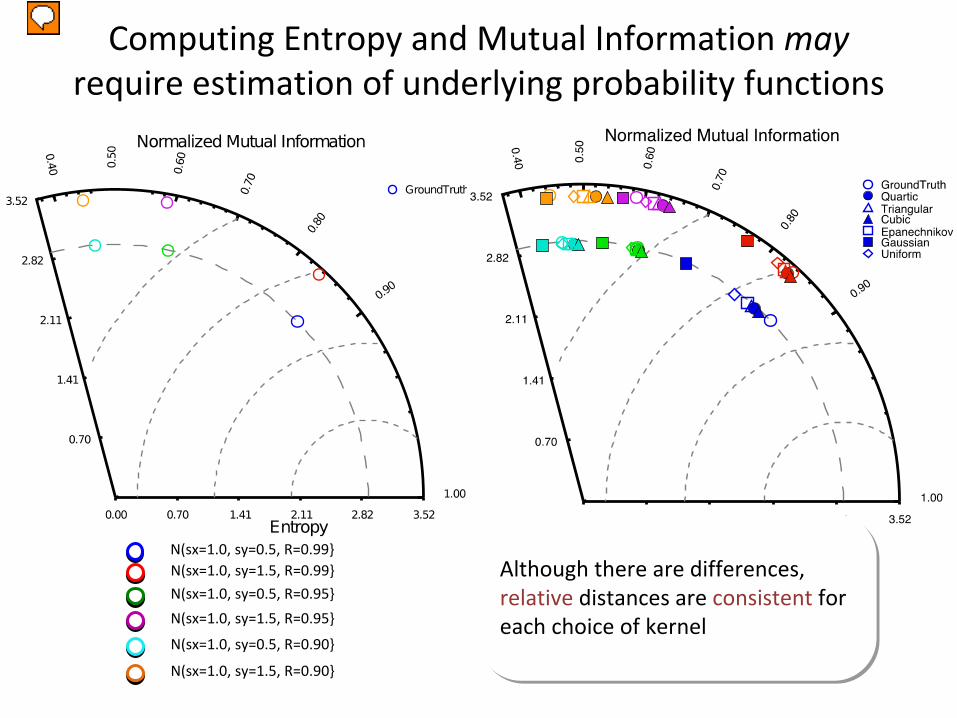
Computing Entropy and Mutual Information may require estimation of underlying probability functions
Another aspect of our diagrams is that entropy and mutual information must be estimated when you have discrete data. In our case we use kernel density estimation to approximate the probability distributions of variables. To see how much they get affected, we plotted the mutual information diagram for some normal bivariate (BYE-VAR-EE-AT) distributions. The interesting thing about normal distributions is that you can actually compute the entropy in closed form and there is a mapping between the taylor and mutual information diagram We computed our diagram with several kernel density methods, and we see that although there’s some variability, they agree with the expected location. More importantly, the relative location is mostly preserved for each choice of kernel. Color is distribution Show ground truth MI diagrams instead of taylor Shape is KDE method Change to VI-diagram
Now let’s move on to some examples. Here’s the summary of a study in uncertainty quantification at the lab. This plot depicts a comparison of seasonal and zonal averages of precipitation. Color indicates a zone and shape indicates a season. The size of the glyph corresponds to one of three studies, each of them with different set of samples. We notice a mapping between the two plots, which is an indication of variables with normal distribution. But some differences are easier to pick up in the MID. Say that when this mapping exists, is an indication of normal distributions ----- Meeting Notes (10/23/11 19:33) ----- REHEARSE THIS
Intercomparison Studies Annual mean temperature 1900‐2000
285
286
287
288
289
290
1900 1920 1940 1960 1980 2000
Tem
pera
ture
Year
Presenter
Presentation Notes
Here’s an intercomparison study of climate in the 20th century. On the top right we show the trend plot of average annual temperature as computed by different models versus observation. And here we see both the taylor and mutual information diagram. First thing we notice is that there is no clear mapping like we saw before, Which may indicate other types of interactions, such as outliers, noise or non-linearity. ----- Meeting Notes (9/23/11 13:58) ----- Normal distributions: monotonic transformation We don't see this here, means ...
Intercomparison Studies Annual mean temperature 1900‐2000
285
286
287
288
289
290
1900 1920 1940 1960 1980 2000
Tem
pera
ture
Year
Presenter
Presentation Notes
For example, we notice that this model, which is ranked as the one with highest error in the taylor diagram, appears as closer in terms of mutual information that most of the others Interestingly, it appears as having highest entropy (compared to the rest), and we see that it is quite a noisy trend. ----- Meeting Notes (9/23/11 13:58) ----- Normal distributions: monotonic transformation We don't see this here, means ...
Intercomparison Studies Annual mean temperature 1900‐2000
285
286
287
288
289
290
1900 1920 1940 1960 1980 2000
Tem
pera
ture
Year
Presenter
Presentation Notes
In this case we see two distributions that appear to have the same correlation and std. dev than observations, But in the MID they appear in quite different places. Looking at the plot, we see that they indeed have different behavior. ----- Meeting Notes (9/23/11 13:58) ----- Normal distributions: monotonic transformation We don't see this here, means ...
MID applies to discrete data: useful when comparing Clustering Results
• Summarize study in
clustering [Filippone et
al. 2009]
• 8 different methods
• 4 classification
problems
Presenter
Presentation Notes
Another aspect of the mutual information diagram is that applies to categorical data. For example, in clustering. When we want to compare the accuracy of a clustering algorithm, in the presence of ground truth, we can compute the entropy and mutual information directly. In this example, we were able to summarize the study of 8 different clustering algorithms for four different classification problems. We see that some of the methods (3,4,5) happen to perform poorly compared to the rest, except for one of the data sets. Change to VI diagram Say something about increasing/decreasing entropy
Concluding Remarks• Taylor
diagram:
– easy to compute.– Well understood
in geophysical sciences, climate.
• MI diagram:– Counterpart using information theory.– requires
an
estimation
step
that
may
introduce
additional
uncertainties.– extends nicely to categorical data, multi‐variate distributions.– exposes non‐linearities, difficult to see via (linear) correlation.
• More informed decisions when combining both diagrams.