the power of grids - meetupfiles.meetup.com/71129/20061122_power_of_grids.pdf · postcards,...
TRANSCRIPT

October | November 2006
the power of grids
Love your Librariesthey’ll watch your assets
don’t Laughwhy gradients are cool
The Complete and Independent Resource for InDesign Professionals
OCtOBer | NOVeMBer 2006 * InDesign Magazine 5
By JEaN ZaMBELLIA strange thing happens when graphic designers talk about grids: there’s a groundswell of passion usually reserved for discussions of love, religion, and politics. Opinions range from essential design tool to creative cage. Of course, the reality lies somewhere in between. While grids aren’t right for every project, they can help you maintain consistency and orga-nize information quickly and efficiently, all of which makes it easier to communicate your message clearly.
How Do They Love Grids? Let Them Count the WaysThere are many reasons to love the grid. Designers who use grids can’t imagine working without them.
“I am a great believer in planned layout; therefore I am also an advocate for grid systems,” says rufus Deuchler, a designer and professor at Studio Art Centers International (SACI) (www.saci-florence.org), in Florence, Italy. “I keep my grids very simple. even for complex layouts, I tend to have only one master page. I usually create my grids so that they have the obvious vertical structure, but also a horizontal one to make consistent placement and cropping of images easier.”
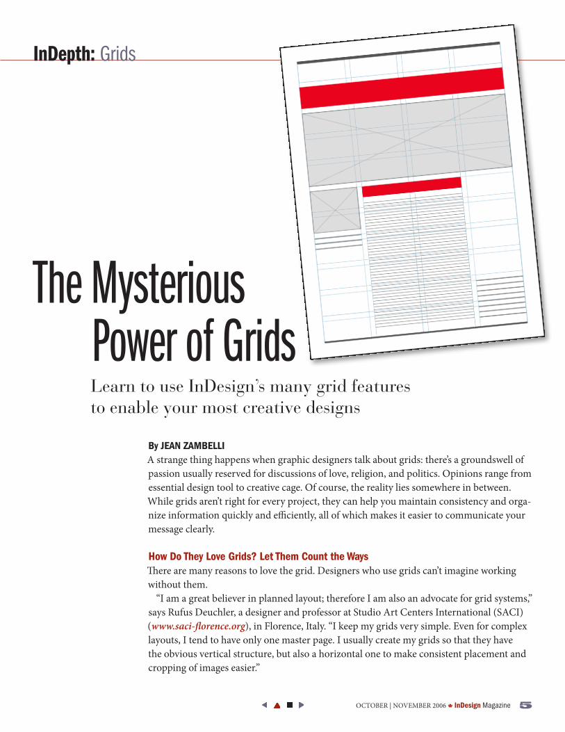
Learn to use InDesign’s many grid features to enable your most creative designs
InDepth: Grids
The Mysterious Power of Grids
6 InDesign Magazine * OCtOBer | NOVeMBer 2006
By helping you make deci-sions during layout, grids (along with style sheets) can save valu-able time during your initial lay-outs and the inevitable revisions. Deuchler adds, “One of my clients monitored the benefits of my teaching and found that they reduced turnaround times by 75 percent!”
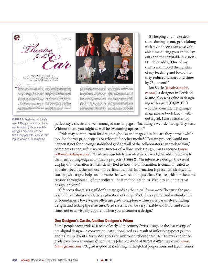
Jen Steele ([email protected]), a designer in Portland, Maine, also sees value in design-ing with a grid (Figure 1). “I wouldn’t consider designing a magazine or book layout with-out a grid. I am a stickler for
perfect style sheets and well-managed master pages—including a well-defined grid system. Without them, you might as well be swimming upstream.”
Grids may be important for designing books and magazines, but are they a worthwhile tool for shorter print projects or relevant for other media? “Certain projects would not happen if not for a strong established grid that all of the collaborators can work within,” comments espen tuft, Creative Director of Yellow Duck Design, San Francisco (www.yellowduckdesign.com). “Grids are absolutely essential in our work,” he adds, referring to the firm’s cutting-edge multimedia projects (Figure 2). “In interactive design, the visual display of information is intrinsically tied to how that information is communicated to, and absorbed by, the end user. It is critical that this information is presented clearly, and starting with a grid helps us to ensure that we are doing just that. We use grids for the same reasons throughout all of our projects—be it motion graphics, Web design, interactive design, or print.”
tuft notes that YDD staff don’t create grids as the initial framework ”because the pro-cess of establishing a grid, the exploration of (the project), is very fluid and without rules or boundaries. However, we often use grids to explore within early parameters, finding designs and testing the structure. Grid systems can be very flexible and fluid, and some-times not even visually apparent when you encounter a design.”
One Designer’s Castle, another Designer’s PrisonSome people view grids as a relic of early 20th century Swiss design or the last vestige of pre-digital design—a convention institutionalized as a result of inflexible typeset galleys and paste-up layouts. Many designers are ambivalent about their use. “In my experience, grids have been an enigma,” comments John McWade of Before & After magazine (www.bamagazine.com). “A grid is good at sketching in the global proportions and layout zones
FIGuRE 1: Designer Jen Steele uses InDesign’s margin, column, and baseline grids to save time and gain precision with her text-heavy projects, such as this layout for AudioFile magazine.

OCtOBer | NOVeMBer 2006 * InDesign Magazine �
of a repetitive page—magazine, newspaper, and so on—but it’s more hindrance than help at handling the detail within those zones. Similarly, a pre-defined grid has little if any value in the design of one-off pages. In these cases, the designer usually gets better results by responding to the elements that are actually on the page.”
McWade describes this process as the development of an “organic grid” where, instead of fitting the content into a pre-defined grid, “the structure arises in response to the con-tents of the page.” He’s not alone in preferring this approach.
ted LoCascio, a designer and software trainer (www.tedlocascio.com), admits, “Although I do teach people how to use the grid in InDesign, I very rarely use it myself. There is something very restricting about it that I don’t like. The grid lays a mesh over your design and makes it hard to see your layout.”
Modern Efficiency Vs. Living Off the GridSo is the grid a design tour-de-force or the guillotine of creativity? Are we as designers gaining speed, precision, and clarity in exchange for sensitivity and artistic merit?
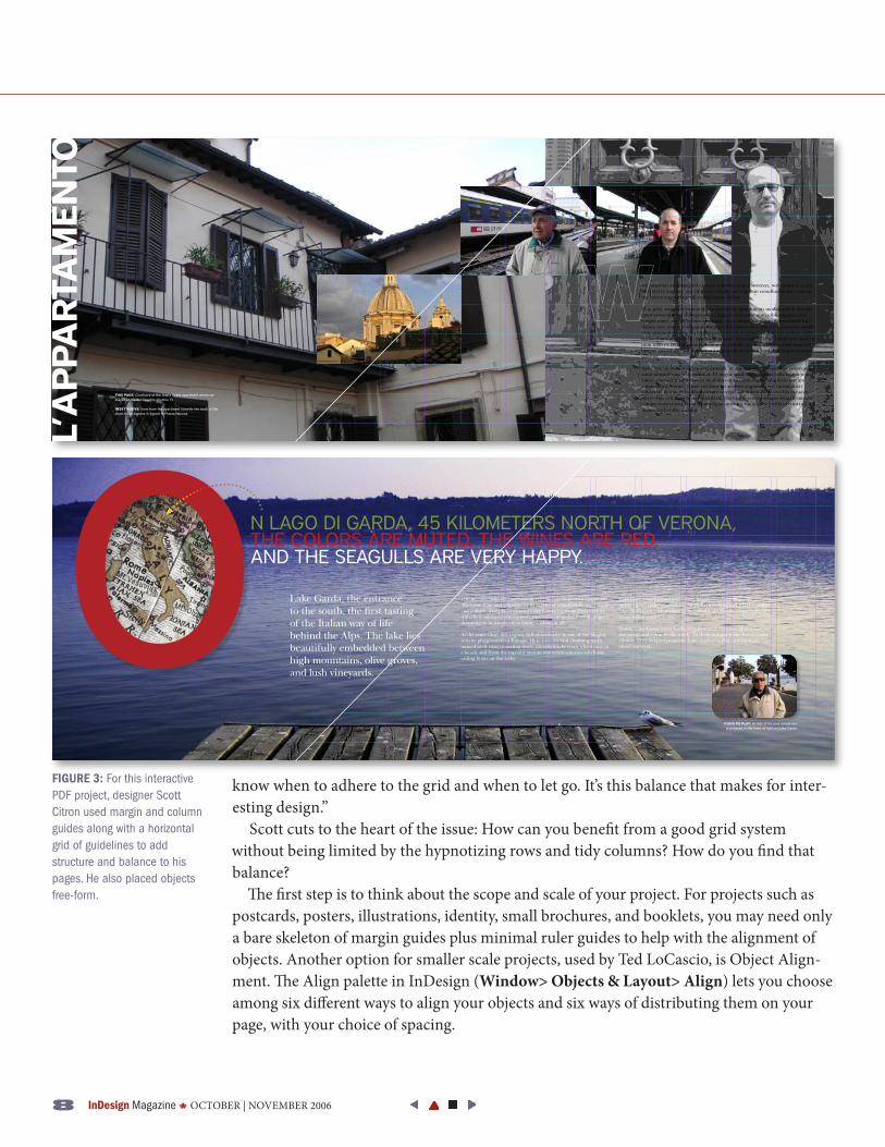
Scott Citron, a New York-based designer and trainer (www.scottcitrondesign.com) (see his article on gradients in this issue), has a balanced outlook: “Grids offer me a way to give structure to my pages. The biggest trap with using grids is becoming a slave to all these beautiful lines you’ve created (Figure 3). For grids to be most effective, you have to
FIGuRE 2: Yellow Duck Design uses grids to organize vast and varied information such as the assets for Openspace.org. The grid framework enables the design of this site to be more user-friendly and visually inviting.
8 InDesign Magazine * OCtOBer | NOVeMBer 2006
know when to adhere to the grid and when to let go. It’s this balance that makes for inter-esting design.”
Scott cuts to the heart of the issue: How can you benefit from a good grid system without being limited by the hypnotizing rows and tidy columns? How do you find that balance?
The first step is to think about the scope and scale of your project. For projects such as postcards, posters, illustrations, identity, small brochures, and booklets, you may need only a bare skeleton of margin guides plus minimal ruler guides to help with the alignment of objects. Another option for smaller scale projects, used by ted LoCascio, is Object Align-ment. The Align palette in InDesign (Window> Objects & Layout> Align) lets you choose among six different ways to align your objects and six ways of distributing them on your page, with your choice of spacing.
We arrived at Rome’s Fiumicino airport early Monday, November 2, 2003. Met, sed te eugiam, sim adip euiscilis dit, sed digniam conullutatie faci exer in ute coreet augueri urerill aorper iustie dolessi.
El ut prat, sequatue feuis endions ectetuerit, quis dolenis modolorem il iuscipit amet veros adit nos dolorpero dit aliquam conummy num nibh eugiamconse feugait amet, corper sit lum zzriliquip ex ercidunt la feuismo dolumsandit iure dolore tem zzrit alis autpatue commy nibh eummolore dui te eugiamcore modit exer summodi gnismodit la aliquam, sustrud magnim ate tinit irit nullam vulla feuissed minim nullamc onsenis et praesse nisissequat ilisism odolobore mod tat num nibh ea facidui pismod delis alit la commy nis niat veliquis eriuscinim ent laorper suscidunt eros nulputpat augiam alis accum in esed dolesequis ea conse velenisi.
Susci tate tet veraestrud ex erci eraessit, sit am, volutat praestisl iure consequipis adiat nonsed eum velit nulputat. Ut augue mod tate magnim vulla facipit venit loreet ametuerat adip essecte modoles equisi enim exero doluptatie faccum adigna feuis accum zzriure tisl dunt dit acidunt augiamet, sed tinismolutat vulput vel in utat. Ut vullam zzriure vercipit, vel dolenisim ip erci bla consecte dui te duis erit atuercip et, suscilis nullaorting er iril ese magna feugait amcore commy num et wisi bla at wismodigna amet wis nis acin ea facilla orerostrud dolumsan hendre dignim.
The region around the Lake is Alpine and Mediterranean at the same time and stupefies by its variety of countryside, vegetation and culture. The places around Lake Garda captivate their visitors with their southern atmosphere, they invite to go for a stroll, to go shopping or to simply enjoy doing nothing at all.
At the same time, this region, full of contrasts, is one of the biggest activity playgrounds in Europe. Here you can find climbing rocks immediately next to surfing spots, mountainbike trails which end on a beach and from the top of a 2000m mountain you can watch the sailing boats on the Lake.
Lake Garda was formed more than 10.000 years ago when the glaciers of the alpine ridge receded due to global warming and left this large lake. At that time what came to be called Lake Garda had a depth of 270m below sea-level.
Today, Lake Garda has a lenth of 51,6km and stretches 4km across in the north and 17km in the south. To drive around it one has to cover 160km. At its deepest point the Lake reaches 346m and lies 65m above sea level.
Lake Garda, the entrance to the south, the first tasting of the Italian way of life behind the Alps. The lake lies beautifully embedded between high mountains, olive groves, and lush vineyards.
FIGuRE 3: For this interactive PDF project, designer Scott Citron used margin and column guides along with a horizontal grid of guidelines to add structure and balance to his pages. He also placed objects free-form.

OCtOBer | NOVeMBer 2006 * InDesign Magazine �
For multi-page, serial, or text-heavy proj-ects, as well as designs requiring such master items as folios, you may get better results from a grid system. Grids also become more helpful and important with multi-contribu-tor projects, such as magazines and Web sites (Figure 4).
The second step to finding your perfect grid balance is to understand your grid options. Fortunately, there are a handful of InDesign tools you can customize to provide as much or as little grid structure as your project and design style require.
Mincing PagesInDesign’s grid tools are divided into six areas: ruler guides; guidelines; and column, base-line, frame, and document grids.
Ruler Guides. You can create an “organic grid” based on your design components by dragging guidelines from the horizontal and vertical rulers (View > Show Rulers). You can use this as a basis for a master page, or place new ruler guides for each page of your proj-
ect. It’s often helpful to change the color of your ruler Guides by selecting the guides with the Selection tool and then choosing Layout> Ruler Guides
(or right-click on a guide and choose ruler Guides from the context menu). The ruler Guides dialog box also lets you pick a view threshold, which sets a view magnification below which the guide becomes invisible. For example, if you set the Thresh-old to 100%, you won’t be able to see it when you’re at 75% view.
You can put your guides in front or behind your objects by selecting Preferences> Guides & Pasteboard. (Note, however,
that globally changes all guidelines and column guides.) Another option is to place guides on layers above or below your objects. Putting your guides on layers also means you can make them visible or invisible with a single click in the Layers palette.
If you find yourself dragging multiple ruler guides or spending time measuring the placement of your ruler guides, consider a more formal grid option.
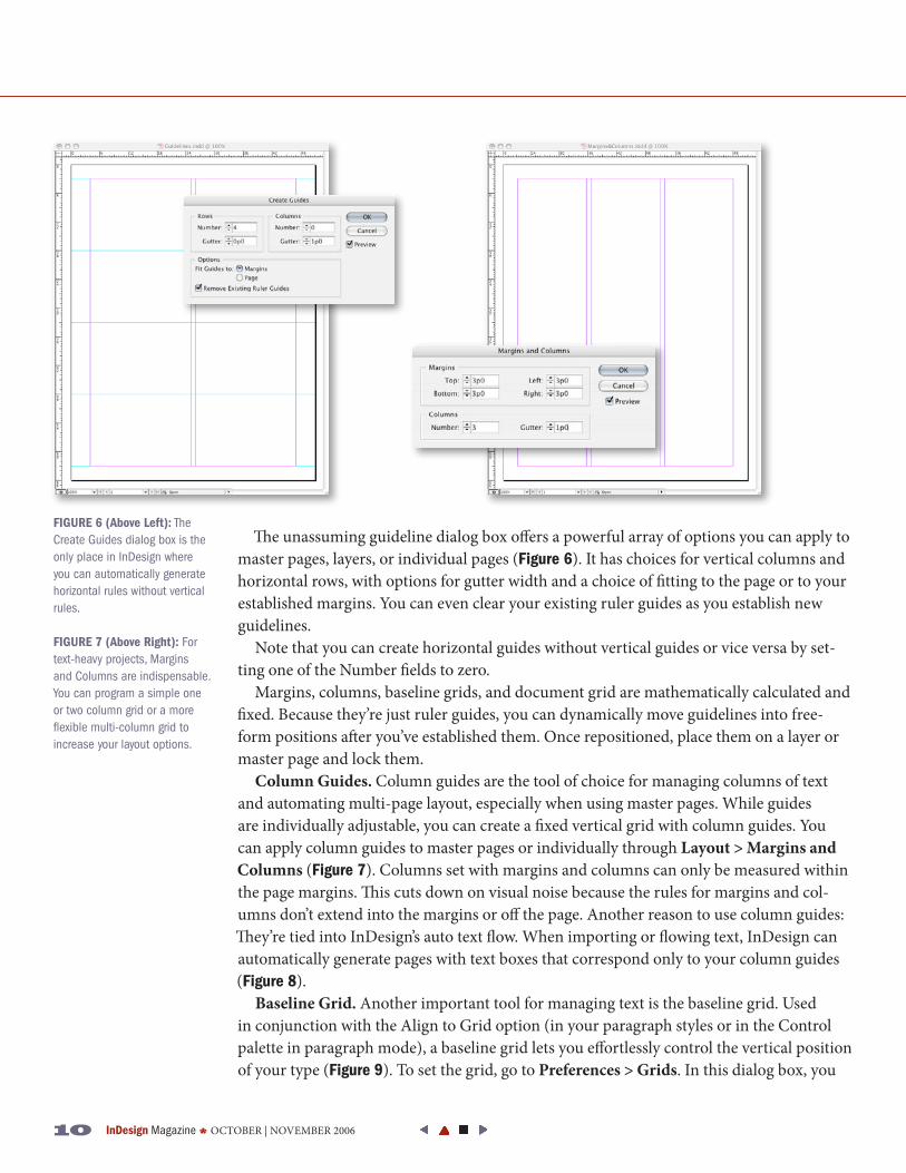
Guidelines. While adding guides to your page one at a time is “organic,” it takes too long if you’re trying to make precise rows and columns. Instead, you can choose Layout > Cre-ate Guides to have InDesign place the guides in the proper positions (Figure 5). Note that for the sake of clarity, I call these “guidelines” as opposed to ruler guides, but they’re really just the same as ruler guides. Using guidelines is the easiest introduction to a grid structure.
FIGuRE 4: Using a simple grid in InDesign, Yellow Duck Design created a customer story portfolio showcase for Gravity Tank (www.gravitytank.com), a Chicago design studio.
FIGuRE 5: Using guidelines, you can create any grid your project requires. Use the Layout > Create Guides dialog box to quickly specify horizontal and/or vertical guidelines with or without gutters.
10 InDesign Magazine * OCtOBer | NOVeMBer 2006
FIGuRE 6 (above Left): The Create Guides dialog box is the only place in InDesign where you can automatically generate horizontal rules without vertical rules.
FIGuRE 7 (above Right): For text-heavy projects, Margins and Columns are indispensable. You can program a simple one or two column grid or a more flexible multi-column grid to increase your layout options.
The unassuming guideline dialog box offers a powerful array of options you can apply to master pages, layers, or individual pages (Figure 6). It has choices for vertical columns and horizontal rows, with options for gutter width and a choice of fitting to the page or to your established margins. You can even clear your existing ruler guides as you establish new guidelines.
Note that you can create horizontal guides without vertical guides or vice versa by set-ting one of the Number fields to zero.
Margins, columns, baseline grids, and document grid are mathematically calculated and fixed. Because they’re just ruler guides, you can dynamically move guidelines into free-form positions after you’ve established them. Once repositioned, place them on a layer or master page and lock them.
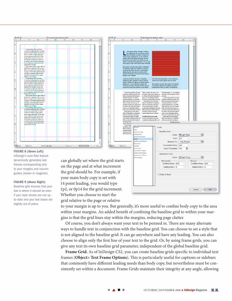
Column Guides. Column guides are the tool of choice for managing columns of text and automating multi-page layout, especially when using master pages. While guides are individually adjustable, you can create a fixed vertical grid with column guides. You can apply column guides to master pages or individually through Layout > Margins and Columns (Figure 7). Columns set with margins and columns can only be measured within the page margins. This cuts down on visual noise because the rules for margins and col-umns don’t extend into the margins or off the page. Another reason to use column guides: They’re tied into InDesign’s auto text flow. When importing or flowing text, InDesign can automatically generate pages with text boxes that correspond only to your column guides (Figure 8).
Baseline Grid. Another important tool for managing text is the baseline grid. Used in conjunction with the Align to Grid option (in your paragraph styles or in the Control palette in paragraph mode), a baseline grid lets you effortlessly control the vertical position of your type (Figure 9). to set the grid, go to Preferences > Grids. In this dialog box, you
OCtOBer | NOVeMBer 2006 * InDesign Magazine 11
can globally set where the grid starts on the page and at what increment the grid should be. For example, if your main body copy is set with 14 point leading, you would type 1p2, or 0p14 for the grid increment. Whether you choose to start the grid relative to the page or relative to your margin is up to you. But generally, it’s more useful to confine body copy to the area within your margins. An added benefit of confining the baseline grid to within your mar-gins is that the grid lines stay within the margins, reducing page clutter.
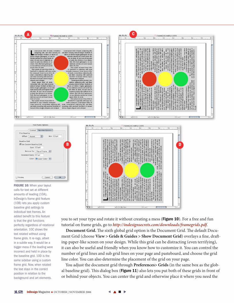
Of course, you don’t always want your text to be penned in. There are many alternate ways to handle text in conjunction with the baseline grid. You can choose to set a style that is not aligned to the baseline grid: It can go anywhere and have any leading. You can also choose to align only the first line of your text to the grid. Or, by using frame grids, you can give any text its own baseline grid parameter, independent of the global baseline grid.
Frame Grid. As of InDesign CS2, you can create baseline grids specific to individual text frames (Object> Text Frame Options). This is particularly useful for captions or sidebars that commonly have different leading needs than body copy, but nevertheless must be con-sistently set within a document. Frame Grids maintain their integrity at any angle, allowing
FIGuRE 8 (above Left): InDesign’s auto-flow feature dynamically generates text frames corresponding only to your margins and column guides (shown in magenta).
FIGuRE 9 (above Right): Baseline grid ensures that your text is where it should be even if your style sheets are not up-to-date and your text boxes are slightly out of place.
12 InDesign Magazine * OCtOBer | NOVeMBer 2006
you to set your type and rotate it without creating a mess (Figure 10). For a free and fun tutorial on frame grids, go to http://indesignsecrets.com/downloads/framegrids.pdf.
Document Grid. The sixth global grid option is the Document Grid. The default Docu-ment Grid (choose View > Grids & Guides > Show Document Grid) overlays a fine, draft-ing-paper-like screen on your design. While this grid can be distracting (even terrifying), it can also be useful and friendly when you know how to customize it. You can control the number of grid lines and sub grid lines on your page and pasteboard, and choose the grid line color. You can also determine the placement of the grid on your page.
You adjust the document grid through Preferences> Grids (in the same box as the glob-al baseline grid). This dialog box (Figure 11) also lets you put both of these grids in front of or behind your objects. You can center the grid and otherwise place it where you need the
FIGuRE 10: When your layout calls for text set at different amounts of leading (10A), InDesign’s frame grid feature (10B) lets you apply custom baseline grid settings to individual text frames. An added benefit to this feature is that the grid functions perfectly regardless of rotational orientation. 10C shows the text rotated without using frame grids. It re-rags, albeit in a subtle way. It would be a bigger mess if the leading were incorrect and held in place by the baseline grid. 10D is the same sidebar using a custom frame grid. Now, when rotated the text stays in the correct position in relation to the background and art elements.
a
B
C
D
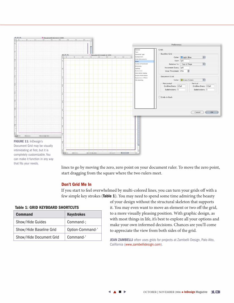
lines to go by moving the zero, zero point on your document ruler. to move the zero point, start dragging from the square where the two rulers meet.
Don’t Grid Me InIf you start to feel overwhelmed by multi-colored lines, you can turn your grids off with a few simple key strokes (Table 1). You may need to spend some time admiring the beauty
of your design without the structural skeleton that supports it. You may even want to move an element or two off the grid, to a more visually pleasing position. With graphic design, as with most things in life, it’s best to explore all your options and make your own informed decisions. Chances are you’ll come to appreciate the view from both sides of the grid.
JEaN ZaMBELLI often uses grids for projects at Zambelli Design, Palo Alto, California (www.zambellidesign.com).
FIGuRE 11: InDesign’s Document Grid may be visually intimidating at first, but it is completely customizable. You can make it function in any way that fits your needs.
Table 1: GRID KEyBOaRD SHORTCuTS
Command Keystrokes
Show/Hide Guides Command-;
Show/Hide Baseline Grid Option-Command-’
Show/Hide Document Grid Command-’
OCtOBer | NOVeMBer 2006 * InDesign Magazine 13