the top mistakes therapists make with websites · the top mistakes therapists make with websites by...
TRANSCRIPT

The Top Mistakes Therapists Make With Websites
by Joe Bavonese, PhD
Licensed Psychologist & Co-Director, Uncommon Practices
Hi, Joe here from Uncommon Practices. Whether we like it or not,
we live in the Internet Age, and websites are the de facto standard
of how we define our identity in that world. While there are
certainly other forms of online presence, the website is the hub
that links it all together.
The Internet has lived up to its promise and its hype. Since the first
Web browser for mass consumption, Mosaic, was released in
1993, in just 15 years over 125 million websites with over 25 billion pages have been
created. Google gets 3000 searches every second. The web’s reach continues to
expand into all areas of 21st century life: music; books; phones; connecting with
family, friends and colleagues; our most important information; our jobs; our money;
our hobbies; our vacations; and our purchasing or all products and services, big and
small. Unfortunately, our graduate training and professional organizations have failed
miserably to keep us up to date with these changes. Almost none of us have gotten
any serious help in terms of understanding business, website design or Internet
marketing. Those of us who have succeeded in this era have mostly done so by our
own costly trial-and-error efforts.
I’m a lucky guy. Two of my favorite things in life are doing psychotherapy and playing
with computers, and I’ve figured out a way to do both in my career (I even partially
paid my way through graduate school by tutoring other doctoral psychology students
in how to use computers for their research and data analysis).
In 1997 I created my first website for my therapy practice. The best I can say about it
is that it was awful. It had 3 pages, no graphics, 2 links, and got a whopping total of 3
visitors in 6 months (and all 3 visitors were from Europe). My timing, however, was
fortuitous: the next year after my pitiful site launched, a small company named
Most Common Website Mistakes - 2
___________________________________________________________________________
© Joe Bavonese, PhD 2008, All Rights Reserved · www.uncommon-practices.com · 800 940 0185
Over time, every one of these mistakes can cost you hundreds of lost referrals.
Google was formed. Ever since then I’ve been tinkering, making tons of mistakes,
studying with experts and learning everything I could about how to create a
successful online presence. These efforts were pretty worthless at first, since almost
no one had a website and even email addresses were still pretty rare. But once the
Internet become more popular in this decade, my efforts have really paid off. I finally
figured out the Internet game and got so many referrals from it that I was able to
expand my solo practice to a group practice with 10 therapists. My website has
generated at least 40 Internet referrals every month for the past 4 years, while
costing me an average of only $20 per referral. It’s the most phenomenal return on
investment I’ve ever gotten in 15 years of practice. I’m not naïve enough to think that
this is the way I’ll get referrals forever, but I do believe that as long as I stay ahead of
the technology curve, the online world will be a rich source of referrals for years to
come.
Since 2005 when Mel Restum and I started Uncommon Practices, I have personally
reviewed over 200 therapist websites. While some of them have been excellent sites,
the vast majority have suffered from a number of serious flaws that greatly limit their
effectiveness in generating referrals.
Websites should be more than online brochures –
they should generate referrals. Lots of them.
In this report I will highlight the most important mistakes I’ve seen therapists make
when creating a website. My goal in this report is for everyone reading this to start
getting more referrals ASAP. If you have a website, correct any of these mistakes you
may be making and you should see an improvement in traffic and/or conversions. If
you don’t have a website, create one soon using these principles and you should be
able to generate referrals more rapidly than many others who already have a site.
And as we go through these items, remember this:

Most Common Website Mistakes - 3
___________________________________________________________________________
© Joe Bavonese, PhD 2008, All Rights Reserved · www.uncommon-practices.com · 800 940 0185
The website game boils down to these 2 factors:
1. You need to get visitors to your site and
2. You need to convert those visitors to a client by getting them to
call or email you
This report will address aspects of both of these topics. The problems and tips will
include information about website content, style and design; navigation; and internal
HTML programming. Some of the tips will inevitably tap into general marketing and
business knowledge as well.
Whenever possible, I’ve used samples from actual therapist websites that I just found
randomly searching the web. I have hidden the names of the therapists but show the
images on the pages of the site to illustrate my points.
So here we go: the 22 Big Mistakes Therapist Make with Websites…
1. Making Your Home Page a Monument to Your Ego
Many therapist Home Pages are nothing more than a picture of themselves and/or a
list of their credentials & training. There’s no mention of problems they can solve or
issues they work with. This approach doesn’t work because most potential clients
FIRST want to know if you can help them and SECOND want to know if you have good
credentials. When your tooth hurts and you’re out of town, do you ask where the
dentist went to dental school?
The cold, cruel reality is this: Nobody cares about you or your site.
Really, they don’t. What most visitors care about is you solving their problems of daily living. They don’t care where you trained or what recent certification you got or what pretty pictures you have on your Home page. Also, you need to know that people’s attention spans online are much shorter than they are offline: studies show that you typically have less than 10 seconds to convince a new visitor that you can help with

Most Common Website Mistakes - 4
___________________________________________________________________________
© Joe Bavonese, PhD 2008, All Rights Reserved · www.uncommon-practices.com · 800 940 0185
their specific problem! Read that again: 10 seconds (actually, I’m being generous here – most studies say 7 seconds). In less than the time it took you to read the last two sentences, people form a complete opinion about you, your practice and your services. Unfair? You bet. But that’s what we have to work with.
So you HAVE to let them know that you understand what they’re going through,
almost instantly. If not, they’re gone…it’s just too easy to check out someone else
online.
To summarize this point, your site is certain to fail if…
All of the following examples are pictures of
actual Home Pages of licensed psychotherapists.
I’m not singling out these sites – I’m merely saying that they could all get a lot more
referrals if they changed some aspects of their websites. The sad thing is that most of
these changes can be accomplished with only a small amount of time and/or money,
and most therapists simply don’t know what to do.
But these sites are typical samples of literally hundreds of such websites from
therapists all over the Internet (see for yourself – just search for psychologist or
therapist in any city in the US and you’ll see the same themes over and over again).
Most Common Website Mistakes - 5
___________________________________________________________________________
© Joe Bavonese, PhD 2008, All Rights Reserved · www.uncommon-practices.com · 800 940 0185
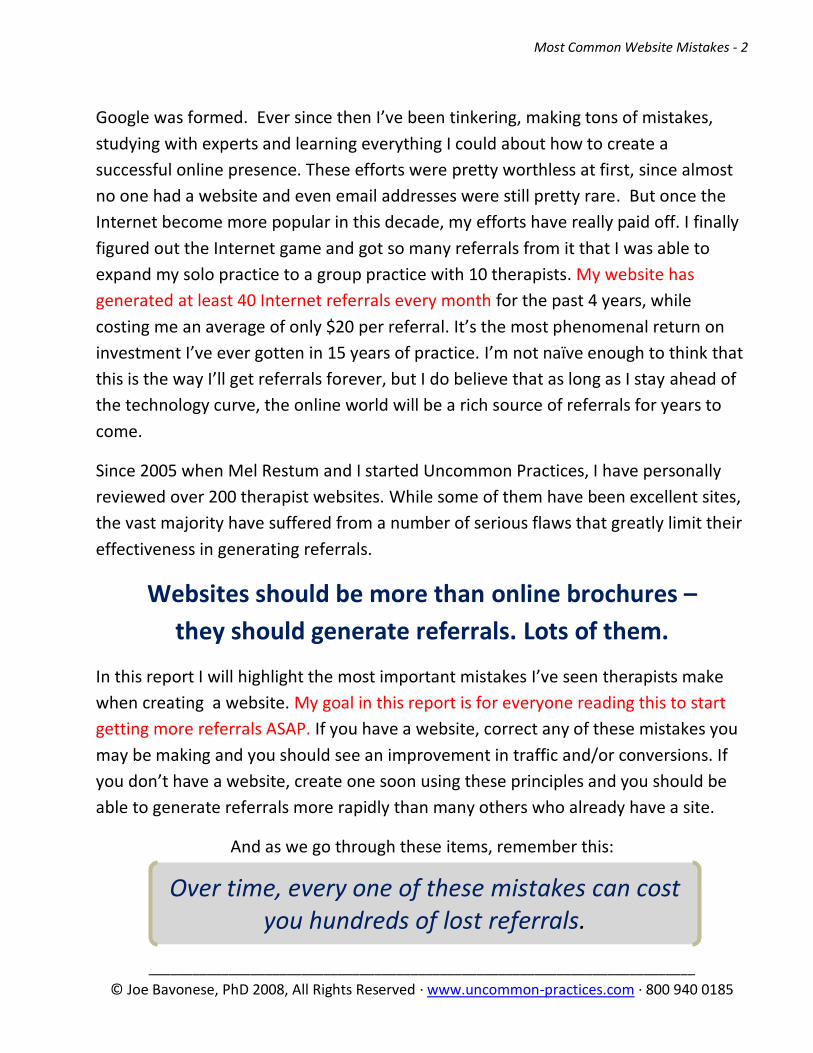
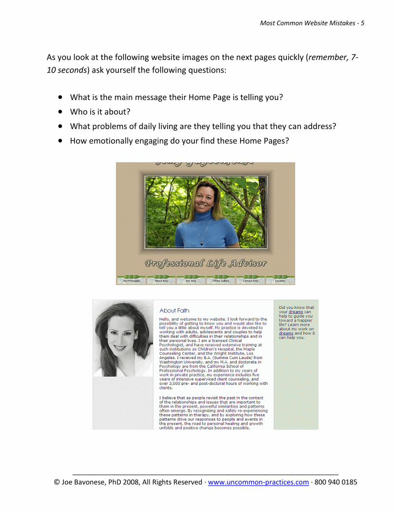
As you look at the following website images on the next pages quickly (remember, 7-
10 seconds) ask yourself the following questions:
What is the main message their Home Page is telling you?
Who is it about?
What problems of daily living are they telling you that they can address?
How emotionally engaging do your find these Home Pages?
Most Common Website Mistakes - 6
___________________________________________________________________________
© Joe Bavonese, PhD 2008, All Rights Reserved · www.uncommon-practices.com · 800 940 0185

Most Common Website Mistakes - 7
___________________________________________________________________________
© Joe Bavonese, PhD 2008, All Rights Reserved · www.uncommon-practices.com · 800 940 0185
Most Common Website Mistakes - 8
___________________________________________________________________________
© Joe Bavonese, PhD 2008, All Rights Reserved · www.uncommon-practices.com · 800 940 0185
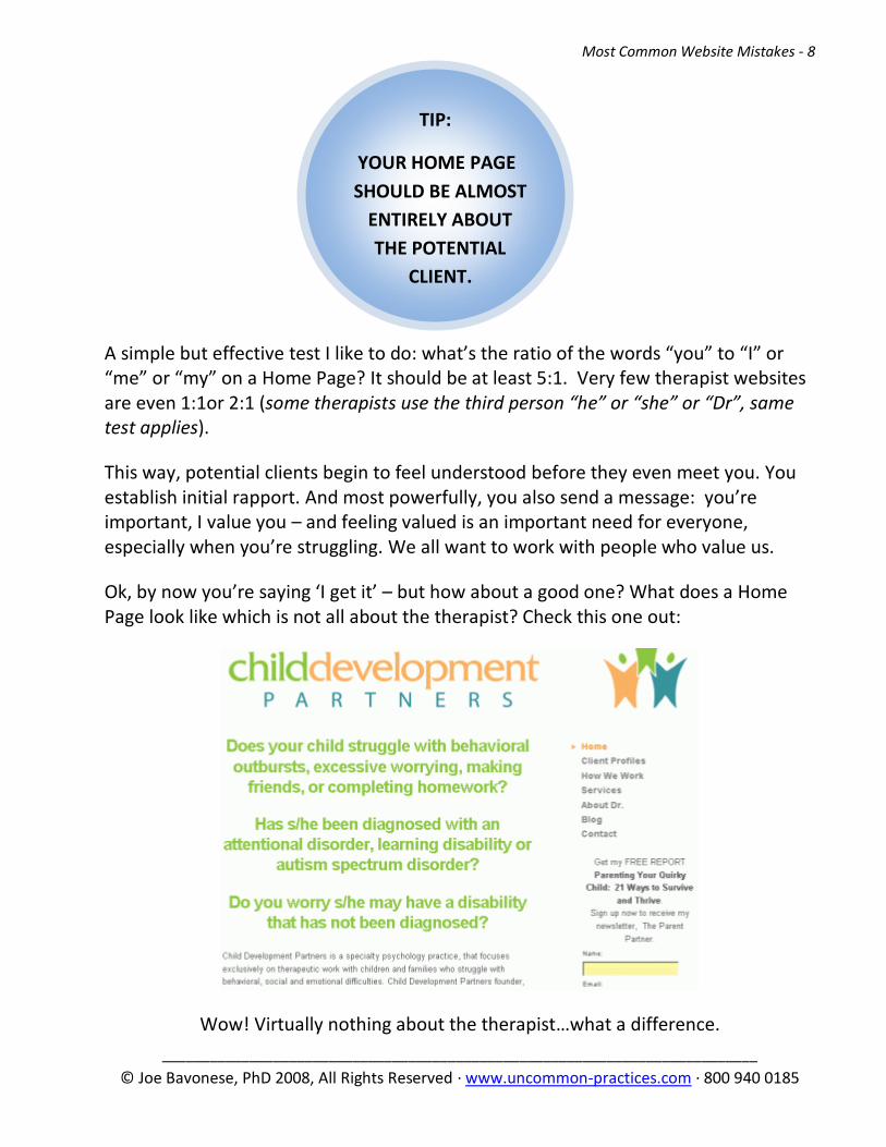
TIP:
YOUR HOME PAGE
SHOULD BE ALMOST
ENTIRELY ABOUT
THE POTENTIAL
CLIENT.
A simple but effective test I like to do: what’s the ratio of the words “you” to “I” or “me” or “my” on a Home Page? It should be at least 5:1. Very few therapist websites are even 1:1or 2:1 (some therapists use the third person “he” or “she” or “Dr”, same test applies).
This way, potential clients begin to feel understood before they even meet you. You establish initial rapport. And most powerfully, you also send a message: you’re important, I value you – and feeling valued is an important need for everyone, especially when you’re struggling. We all want to work with people who value us.
Ok, by now you’re saying ‘I get it’ – but how about a good one? What does a Home Page look like which is not all about the therapist? Check this one out:
Wow! Virtually nothing about the therapist…what a difference.
Most Common Website Mistakes - 9
___________________________________________________________________________
© Joe Bavonese, PhD 2008, All Rights Reserved · www.uncommon-practices.com · 800 940 0185
TIP:
BE VERY
SPECIFIC,
NOT VAGUE OR
GENERAL.
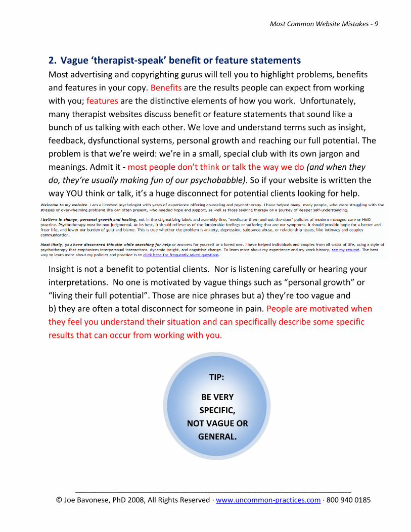
2. Vague ‘therapist-speak’ benefit or feature statements
Most advertising and copyrighting gurus will tell you to highlight problems, benefits
and features in your copy. Benefits are the results people can expect from working
with you; features are the distinctive elements of how you work. Unfortunately,
many therapist websites discuss benefit or feature statements that sound like a
bunch of us talking with each other. We love and understand terms such as insight,
feedback, dysfunctional systems, personal growth and reaching our full potential. The
problem is that we’re weird: we’re in a small, special club with its own jargon and
meanings. Admit it - most people don’t think or talk the way we do (and when they
do, they’re usually making fun of our psychobabble). So if your website is written the
way YOU think or talk, it’s a huge disconnect for potential clients looking for help.
Insight is not a benefit to potential clients. Nor is listening carefully or hearing your
interpretations. No one is motivated by vague things such as “personal growth” or
“living their full potential”. Those are nice phrases but a) they’re too vague and
b) they are often a total disconnect for someone in pain. People are motivated when
they feel you understand their situation and can specifically describe some specific
results that can occur from working with you.
Most Common Website Mistakes - 10
___________________________________________________________________________
© Joe Bavonese, PhD 2008, All Rights Reserved · www.uncommon-practices.com · 800 940 0185
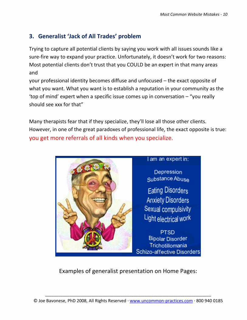
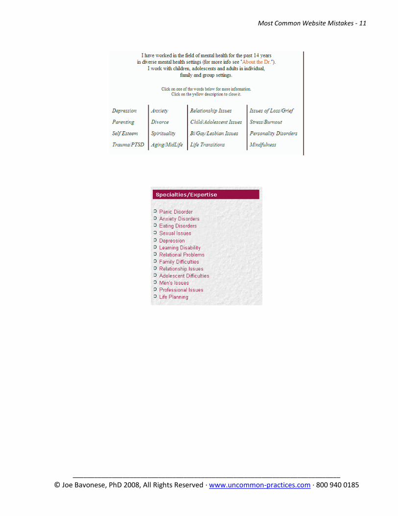
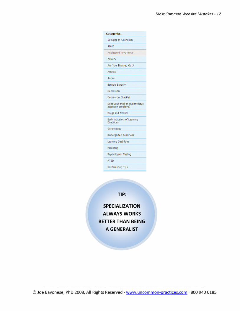
3. Generalist ‘Jack of All Trades’ problem
Trying to capture all potential clients by saying you work with all issues sounds like a
sure-fire way to expand your practice. Unfortunately, it doesn’t work for two reasons:
Most potential clients don’t trust that you COULD be an expert in that many areas
and
your professional identity becomes diffuse and unfocused – the exact opposite of
what you want. What you want is to establish a reputation in your community as the
‘top of mind’ expert when a specific issue comes up in conversation – “you really
should see xxx for that”
Many therapists fear that if they specialize, they’ll lose all those other clients.
However, in one of the great paradoxes of professional life, the exact opposite is true:
you get more referrals of all kinds when you specialize.
Examples of generalist presentation on Home Pages:
Most Common Website Mistakes - 11
___________________________________________________________________________
© Joe Bavonese, PhD 2008, All Rights Reserved · www.uncommon-practices.com · 800 940 0185
Most Common Website Mistakes - 12
___________________________________________________________________________
© Joe Bavonese, PhD 2008, All Rights Reserved · www.uncommon-practices.com · 800 940 0185
TIP:
SPECIALIZATION
ALWAYS WORKS
BETTER THAN BEING
A GENERALIST

Most Common Website Mistakes - 13
___________________________________________________________________________
© Joe Bavonese, PhD 2008, All Rights Reserved · www.uncommon-practices.com · 800 940 0185
4. Visual monotony: all text, 3 – 5 consecutive paragraphs
Because of the short attention span of online browsers, and the cultural need for
‘infotainment’, few people will read website pages that merely contain long
paragraphs of straight text. It’s simply too boring. People will tend to scan your pages
rather than read each word carefully, especially upon the first visit. So use bullet
points, headers, subheaders and graphics to break up the visual monotony.
5. Home page is too busy – no one dominant visual theme
The user must know what your site is about in less than ten seconds. As I’ve
mentioned, attention is one the most valuable and scarcest currencies on the
Internet. If a visitor can’t figure what your site is about in a couple of seconds, they
will probably just go somewhere else. With so much content vying for attention it’s
difficult for the eyes to find a main focal point. And when that happens, people get
confused and they leave.
Look at the following Home Page image, and notice within 10 seconds where your eye
naturally goes. For most people, your eyes jump all over the place. What do you
remember after 10 seconds? What is the specialty? What problems are being
addressed? It’s hard to focus on any one theme because there are two photos and
several clinical issues being addressed – all at the same time.

Most Common Website Mistakes - 14
___________________________________________________________________________
© Joe Bavonese, PhD 2008, All Rights Reserved · www.uncommon-practices.com · 800 940 0185
So another great test is to have a non-therapist friend look at your Home Page for 10
seconds and then tell you what they remember. (Note: this test is not for the faint of
heart. It’s a VERY humbling exercise to see your masterpiece that you’ve slaved over
reduced to a few trivial points that are totally unrelated to what you hoped the
person would remember).
6. You don’t tell the reader what you want them to do
What is your most desired response on any page of your site? Whatever it is, tell the
visitor what to do. In advertising this is called the Call to Action. In general there are
three things you may want a visitor to do:
a) Call or email you; b) sign up for your mailing list or c) gain information about
your practice or some issue you work with. If you want them to do a) or b),
be sure to clearly spell that out. If you don’t, you shouldn’t expect them to do
these things on their own. Planting the suggestion clearly definitely increases
the percentage of visitors who do what you suggest.
Most Common Website Mistakes - 15
___________________________________________________________________________
© Joe Bavonese, PhD 2008, All Rights Reserved · www.uncommon-practices.com · 800 940 0185
7. Site has less than 10 pages of content
If Content is king as most web experts say, you better have lots of it if you hope to
compete with all the other websites in your area. Write articles about your area of
specialization. Or if you don’t like to write, find articles you can legally use on ‘ezine
article’ websites such as www.ezinearticles.com. More content also gives people a
reason to come back to your site.
8. Using Flash, Music, animated GIFs or an Entry ‘Splash’ Home page
Anything that is either annoying or slows down the loading of a page is a very bad
idea. While music and animation may be interesting the first time through, they get
very old very fast and your site is soon associated with annoyance (and of course
annoyed people generally don’t make appointments). Worse still are sites that have
an Intro page which you have to click on to get to the actual first page of the site.
People searching online want access to information and don’t want to wait to get it.
9. Site has outdated information on it
Nothing says ‘out of touch’ more than outdated information on your site. If you did a
workshop last week, change the date to the next one or just remove it entirely.
Remove all past dates of any kind from your site.
10. There’s no way to email you on the site
When people find you online, many prefer to contact you via email instead of calling
you. It’s less scary and more anonymous. But that’s okay – Internet marketing is
about building relationships. I’ve created many new clients from responding to a
simple email. Make sure you give the reader a way to email you. You should create a
sample email response that you can quickly paste into your email program to respond
to such requests for information – and always modify it based on the specific
questions someone may have. It’s yet another opportunity to establish rapport
through the use of language. So if they write “fees”, don’t respond about your
“price”. If they say “counseling”, don’t say “therapy”.

Most Common Website Mistakes - 16
___________________________________________________________________________
© Joe Bavonese, PhD 2008, All Rights Reserved · www.uncommon-practices.com · 800 940 0185
TIP:
IF YOU USE A FORM, ONLY
ASK FOR FIRST NAME AND
EMAIL ADDRESS, AND
OPTIONALLY A
DESCRIPTION OF THEIR
CURRENT SITUATION
Putting your email address on your site as is, such as:
invites much more spam, but generally will elicit more emails vs. a form like this:
In general people are intimidated by forms and find them more invasive. The fewer
things you ask for, the more people will fill them out.
Most Common Website Mistakes - 17
___________________________________________________________________________
© Joe Bavonese, PhD 2008, All Rights Reserved · www.uncommon-practices.com · 800 940 0185
11. No way for visitors to give you their email address
Giving people a way to email you is one end of the spectrum; the other is collecting
their email address with permission. Email marketing is the most cost-effective and
highly targeted method of marketing available today. But for it to work, you need to
have a lot of email addresses – the more the merrier. So start collecting them on your
site. It helps to offer some incentive. Offer a free article; send out a newsletter or ask
people to join your Mailing List to hear about upcoming events.
12. The reader has to hunt for a way to contact you
Don’t make the reader work too hard to find out your phone number or email
address. Best practice – put your contact info on every page. When people with short
attention spans have to hunt, they easily give up and go elsewhere.
13. Test your website on all popular browsers, at least Internet Explorer 7
and Firefox 2, and Safari 3 if possible
Unfortunately, all web pages don’t display exactly the same on all the most common
web browsers. So it’s important to see how your site looks on the top browsers. And
with sales of Apple Mac computers going through the roof, you should include the
Apple Safari browser as well if you can.
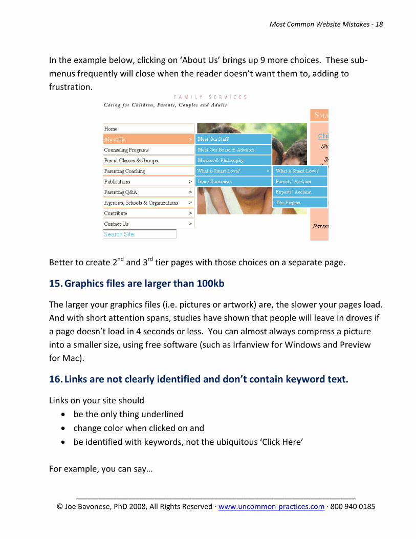
14. Confusing navigation
One of the ways to lose visitors is to have a confusing or laborious navigation system.
Make sure that your website has a single, clear navigation structure. The last thing
you want is to confuse the reader regarding where he should go to find the
information he or she is looking for.
Also, avoid “drop down” menus: the user should be able to see all the navigation
options straight way. Using “drop down” menus might confuse things and hide the
information the reader was actually looking for.
Most Common Website Mistakes - 18
___________________________________________________________________________
© Joe Bavonese, PhD 2008, All Rights Reserved · www.uncommon-practices.com · 800 940 0185
In the example below, clicking on ‘About Us’ brings up 9 more choices. These sub-
menus frequently will close when the reader doesn’t want them to, adding to
frustration.
Better to create 2nd and 3rd tier pages with those choices on a separate page.
15. Graphics files are larger than 100kb
The larger your graphics files (i.e. pictures or artwork) are, the slower your pages load.
And with short attention spans, studies have shown that people will leave in droves if
a page doesn’t load in 4 seconds or less. You can almost always compress a picture
into a smaller size, using free software (such as Irfanview for Windows and Preview
for Mac).
16. Links are not clearly identified and don’t contain keyword text.
Links on your site should
be the only thing underlined
change color when clicked on and
be identified with keywords, not the ubiquitous ‘Click Here’
For example, you can say…

Most Common Website Mistakes - 19
___________________________________________________________________________
© Joe Bavonese, PhD 2008, All Rights Reserved · www.uncommon-practices.com · 800 940 0185
TIP:
MOST KEYWORD
SEARCHES TODAY
ARE 2-3 WORDS,
OFTEN INCLUDING
LOCATION
Read more about Depression
Instead of…
Click Here to read more about Depression.
The Search Engines will index the first one at a much higher rate.
17. Site doesn’t have top keywords in meta tags or page text
Every area of specialization has certain keywords that people will search for. These
top keywords need to show up in the internal site meta tags (see below for what
these are) and at least 3 times on the text of every relevant page.
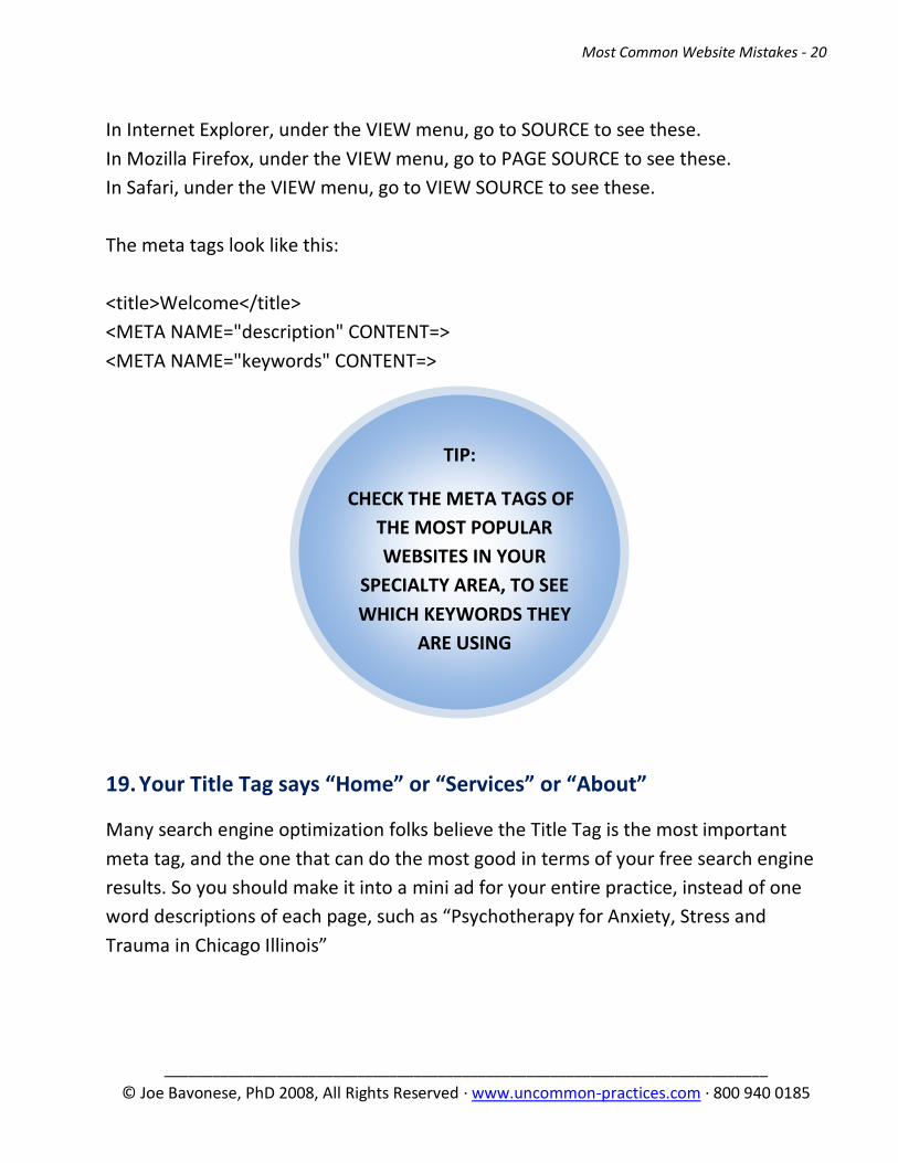
18. Site designer leaves meta tags blank
Every page of every website has 3 internal “tags” that associate certain keywords
from your site to the search engines. They are written in HTML programming code,
the programming language of websites. Many therapist websites leave these entirely
blank. You can easily see if you have them listed in this manner:
Most Common Website Mistakes - 20
___________________________________________________________________________
© Joe Bavonese, PhD 2008, All Rights Reserved · www.uncommon-practices.com · 800 940 0185
TIP:
CHECK THE META TAGS OF
THE MOST POPULAR
WEBSITES IN YOUR
SPECIALTY AREA, TO SEE
WHICH KEYWORDS THEY
ARE USING
In Internet Explorer, under the VIEW menu, go to SOURCE to see these.
In Mozilla Firefox, under the VIEW menu, go to PAGE SOURCE to see these.
In Safari, under the VIEW menu, go to VIEW SOURCE to see these.
The meta tags look like this:
<title>Welcome</title>
<META NAME="description" CONTENT=>
<META NAME="keywords" CONTENT=>
19. Your Title Tag says “Home” or “Services” or “About”
Many search engine optimization folks believe the Title Tag is the most important
meta tag, and the one that can do the most good in terms of your free search engine
results. So you should make it into a mini ad for your entire practice, instead of one
word descriptions of each page, such as “Psychotherapy for Anxiety, Stress and
Trauma in Chicago Illinois”
Most Common Website Mistakes - 21
___________________________________________________________________________
© Joe Bavonese, PhD 2008, All Rights Reserved · www.uncommon-practices.com · 800 940 0185
TIP:
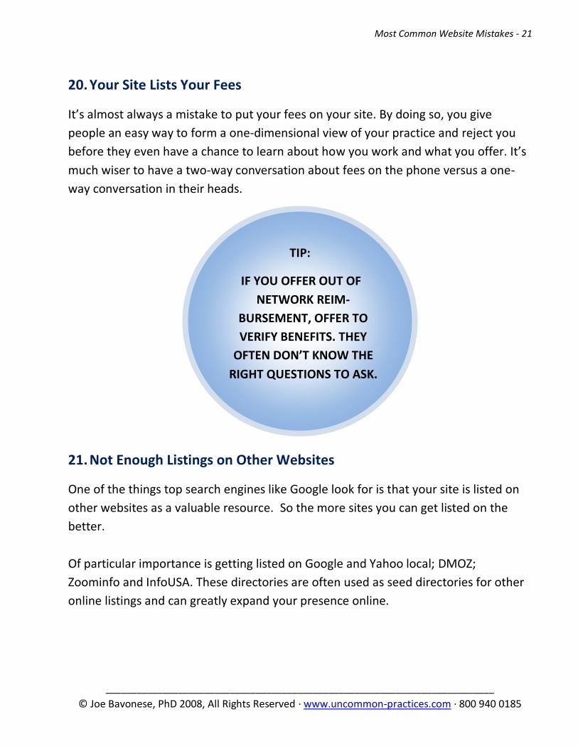
IF YOU OFFER OUT OF
NETWORK REIM-
BURSEMENT, OFFER TO
VERIFY BENEFITS. THEY
OFTEN DON’T KNOW THE
RIGHT QUESTIONS TO ASK.
20. Your Site Lists Your Fees
It’s almost always a mistake to put your fees on your site. By doing so, you give
people an easy way to form a one-dimensional view of your practice and reject you
before they even have a chance to learn about how you work and what you offer. It’s
much wiser to have a two-way conversation about fees on the phone versus a one-
way conversation in their heads.
21. Not Enough Listings on Other Websites
One of the things top search engines like Google look for is that your site is listed on
other websites as a valuable resource. So the more sites you can get listed on the
better.
Of particular importance is getting listed on Google and Yahoo local; DMOZ;
Zoominfo and InfoUSA. These directories are often used as seed directories for other
online listings and can greatly expand your presence online.
Most Common Website Mistakes - 22
___________________________________________________________________________
© Joe Bavonese, PhD 2008, All Rights Reserved · www.uncommon-practices.com · 800 940 0185
TIP:
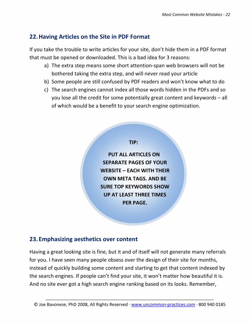
PUT ALL ARTICLES ON
SEPARATE PAGES OF YOUR
WEBSITE – EACH WITH THEIR
OWN META TAGS. AND BE
SURE TOP KEYWORDS SHOW
UP AT LEAST THREE TIMES
PER PAGE.
22. Having Articles on the Site in PDF Format
If you take the trouble to write articles for your site, don’t hide them in a PDF format
that must be opened or downloaded. This is a bad idea for 3 reasons:
a) The extra step means some short attention-span web browsers will not be
bothered taking the extra step, and will never read your article
b) Some people are still confused by PDF readers and won’t know what to do
c) The search engines cannot index all those words hidden in the PDFs and so
you lose all the credit for some potentially great content and keywords – all
of which would be a benefit to your search engine optimization.
23. Emphasizing aesthetics over content
Having a great looking site is fine, but it and of itself will not generate many referrals
for you. I have seen many people obsess over the design of their site for months,
instead of quickly building some content and starting to get that content indexed by
the search engines. If people can’t find your site, it won’t matter how beautiful it is.
And no site ever got a high search engine ranking based on its looks. Remember,
Most Common Website Mistakes - 23
___________________________________________________________________________
© Joe Bavonese, PhD 2008, All Rights Reserved · www.uncommon-practices.com · 800 940 0185
TIP:
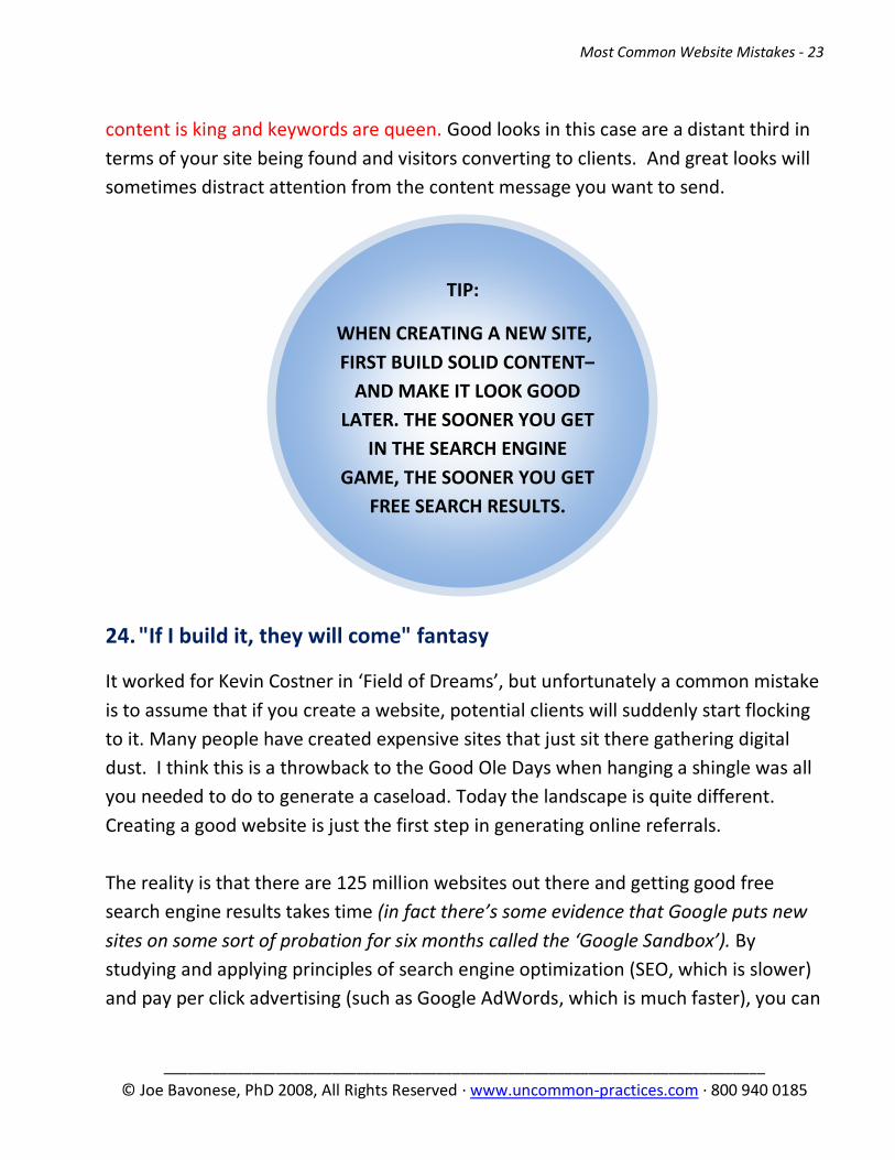
WHEN CREATING A NEW SITE,
FIRST BUILD SOLID CONTENT–
AND MAKE IT LOOK GOOD
LATER. THE SOONER YOU GET
IN THE SEARCH ENGINE
GAME, THE SOONER YOU GET
FREE SEARCH RESULTS.
content is king and keywords are queen. Good looks in this case are a distant third in
terms of your site being found and visitors converting to clients. And great looks will
sometimes distract attention from the content message you want to send.
24. "If I build it, they will come" fantasy
It worked for Kevin Costner in ‘Field of Dreams’, but unfortunately a common mistake
is to assume that if you create a website, potential clients will suddenly start flocking
to it. Many people have created expensive sites that just sit there gathering digital
dust. I think this is a throwback to the Good Ole Days when hanging a shingle was all
you needed to do to generate a caseload. Today the landscape is quite different.
Creating a good website is just the first step in generating online referrals.
The reality is that there are 125 million websites out there and getting good free
search engine results takes time (in fact there’s some evidence that Google puts new
sites on some sort of probation for six months called the ‘Google Sandbox’). By
studying and applying principles of search engine optimization (SEO, which is slower)
and pay per click advertising (such as Google AdWords, which is much faster), you can
Most Common Website Mistakes - 24
___________________________________________________________________________
© Joe Bavonese, PhD 2008, All Rights Reserved · www.uncommon-practices.com · 800 940 0185
greatly increase the number of visitors to your site. Then it’s up to your site content
and structure of each page to convert those visitors into clients.