the true risk story
DESCRIPTION
What if you could measure the risk of a market correction turning into a collapse?True Risk is designed to assist investment managers with their asset allocation, net exposure or hedge decisions. It is an objective measure that does not rely on forecasts.TRANSCRIPT
The True Risk Story
1
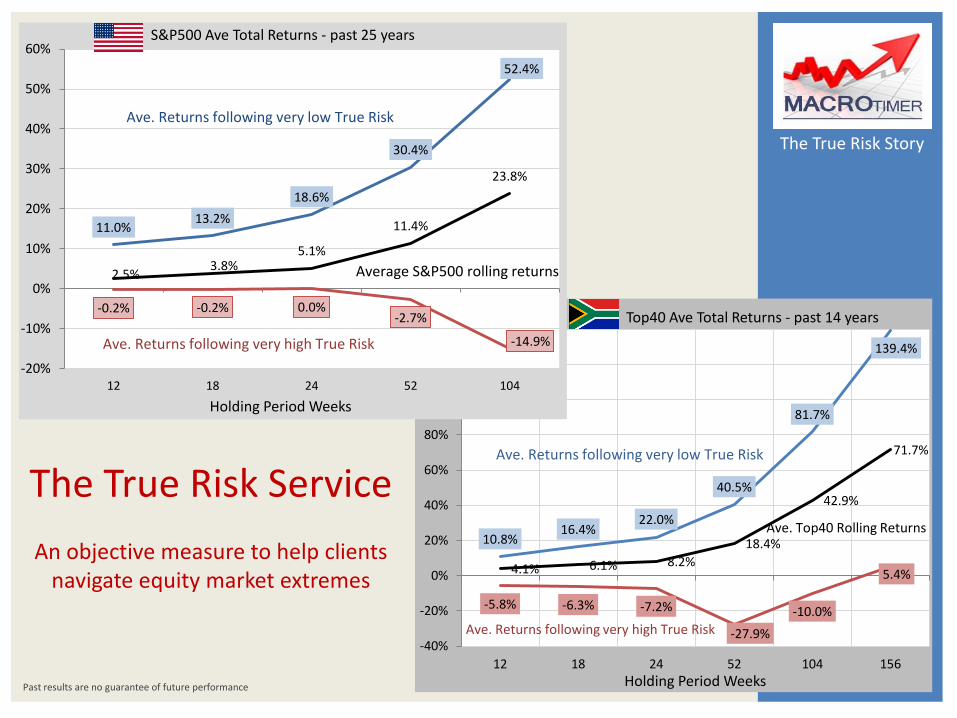
The True Risk Service
An objective measure to help clients navigate equity market extremes
4.1% 6.1% 8.2%
18.4%
42.9%
71.7%
10.8% 16.4%
22.0%
40.5%
81.7%
139.4%
-5.8% -6.3% -7.2%
-27.9%
-10.0%
5.4%
-40%
-20%
0%
20%
40%
60%
80%
100%
120%
140%
12 18 24 52 104 156
Holding Period Weeks
Top40 Ave Total Returns - past 14 years
Ave. Returns following very low True Risk
Ave. Returns following very high True Risk
Ave. Top40 Rolling Returns
-0.2% -0.2% 0.0% -2.7%
-14.9%
2.5% 3.8%
5.1%
11.4%
23.8%
11.0% 13.2%
18.6%
30.4%
52.4%
-20%
-10%
0%
10%
20%
30%
40%
50%
60%
12 18 24 52 104
Holding Period Weeks
S&P500 Ave Total Returns - past 25 years
Ave. Returns following very high True Risk
Ave. Returns following very low True Risk
Average S&P500 rolling returns
Past results are no guarantee of future performance
for many years afterwards, effectively making or breaking an investment management franchise. The True Risk service is designed as an objective input to your investment process. It is not swayed by “group think” and has no “bullish” or “bearish” predilection. It is in no way dependent on forecasts and hence is one of the few truly impartial data sources available. Our goal was to create a service that assists our clients navigate the extremes of the equity market, and make it widely available at a reasonable price.
Who will benefit from the True Risk service: • Hedge Fund managers who actively
manage net exposures and downside risk
• Wealth managers needing insights as to when to deploy cash flows into the market, and when to hedge core equity holdings
• Boutique investment managers with multi-asset mandates
• Experienced investors managing their own portfolios
Who should not subscribe to the True Risk Service: • Very large institutions – no market
moving clients are welcome, sorry • Option Pricing Banks – nothing for you
here, move along please. We need you as future counter-parties making prices the way you always have
The True Risk Story
There are twenty odd pages here providing the complete background to why our True Risk service was conceived, how it is calculated and evaluating how effective it is. I urge you to spend 30 minutes reading this, I have created a unique tool that can be a valuable input into your investment process We use the S&P500 index to illustrate the system, but also show the data relating to the Top40 Index at the end. Subscription enquiries: [email protected]
I find questions like “is this the top of the bull market?” or “Is this the bottom?” are a huge distraction of focus. You see “the top” and “the bottom” are not events that are observable real time, they can only be identified with hind sight, often only a considerable time later. Focus on what is observable real time What True Risk does is focus on what is observable real time. The True Risk score is calculated from current prices, and then compared to historic periods with the same score, showing their subsequent equity return profile.
This is not a statistically parameterised tool True Risk is a deductive model based on our beliefs of how financial markets actually work. All factors included have common-sense causal links with equity returns. It measures Valuation, Fundamentals (liquidity) and Sentiment using spot-price proxies that can be calculated at any time.
Help with your toughest decisions Decisions re equity exposure are notoriously difficult. Appropriate positioning prior to, during & after market collapses can impact client performance 2
Introduction to True Risk - a measure of the risk of an equity price collapse
Contents: 1. Why a stock-picker embarked on a
macro project 2. Why do markets collapse? 3. Measuring the risk of collapse 4. Measuring Sentiment – the Technical
Score 5. The Technical Score & the Vix Index 6. Measuring the Underpin – the
Valuation Score 7. Measuring the Underpin – the
Fundamental Score 8. The Combined Underpin to equity
prices 9. Components of the Minsky Ratio 10. The Minsky Ratio – scoring the level
of True Risk 11. The Minsky Ratio – does it work in
practise? 12. Evaluating the effectiveness of True
Risk 13. Range of rolling returns for the
S&P500 14. Range of Returns after very low True
Risk 15. Range of Returns after very high True
Risk 16. Implied Volatility & very high True
Risk 17. Calibrating the Minsky Ratio to
identify long-term true risk extremes 18. Comparing True Risk with Valuation
alone 19. True Risk measures for the Top40
Index 20. Top40 Range of Returns for very low
True Risk 21. Top40 Range of Returns for very
high true Risk 22. The Top40 in USD

The True Risk Story
How to buy great companies at fair prices
Twenty two years ago, as a "wet behind the ears" chartered accountant, I started work as a trainee equity analyst for a large institution. Over the two decades since then I have managed many types of investment mandates - segregated accounts for pension funds and assurers, mutual funds, hedge funds and proprietary capital. I have run equity-only funds, balanced funds, market neutral and anything goes macro mandates.
But I am still an equity guy at heart. There is nothing I like better than finding a quality company, buying its stock at a fair price and then sitting back and letting compounding work for you. In 1993 when my boss dumped 20 years of Berkshire Hathaway AFS onto my desk, this was a fresh concept. We could take massive stakes in companies with great economics - their good returns on capital funding their growth internally and compounding wealth for shareholders. And we could do it at fair prices, sometimes even give away prices.
Today, almost every equity process seems to be searching for some variant of the same theme - companies with good economics at the right price. There are massive teams of smart, well resourced
1. Why a stock-picker embarked on a macro project
3
and highly incentivised professionals hunting these good companies at fair prices. Team after team chasing the same "holy grail" of investment, as it were. So to find them now, you need to compromise - look far afield in foreign markets, delve into small and micro capitalisation stocks or even compromise on what you call “quality" to find something at a price you can stomach. Because good companies are not available at fair prices, in fact they are usually eye-wateringly expensive.
How can I anticipate the next market collapse? But every few years, after long periods of steady price appreciation, equity markets collapse, rapidly giving back much or even all the upcycle gains in a matter of months or weeks. Now even the name-plate quality companies are available at fair prices. Why does this happen? And more importantly, how can I anticipate the next time it happens, and ensure I have a pile of cash ("dry powder") to take advantage of the quality companies on sale opportunity? These are great questions, and unlike the stock-picking search described above, I don't see team after team of smart people trying to answer them. In March 2014 I sold my shares in my hedge fund employer, and started a sabbatical, my first break longer than
two weeks in 13 years. I had a blank sheet of paper in front of me, and needed a project to work on. One of my strengths is a capacity for in-depth research, and given my equity background and extensive multi-asset experience, I thought who better to try and answer these questions - "Why do equity markets collapse?" and "How can I anticipate the next collapse so I can buy quality companies at fair prices?". And so I gave it a go, and MACROtimer's True Risk service is the result. Hyman Minsky unlocks the key to the forces behind market collapses Over the years when I have read an interesting quote I have jotted down the reference, with the good intention of reading the source material in the future. Well, now I was on sabbatical and had the time, so I started working my way through my reading list. As the financial crisis heated up in 2007/8 Pimco's Paul Mc Culley used the term "Minsky moment" to describe the collapse. By chance one of the first things I read was Hyman Minsky's 1992 working paper, "The Financial Instability Hypothesis", referenced by Mc Culley. While Minsky's paper (only 8 pages long and I urge you to read it) focuses on the real economy and the credit cycle, what struck me, and struck me forcefully - this was a revelation - was how the key elements of his hypothesis also provides a clear insight that starts us on the road to answering my first question - "Why do equity markets collapse?"
simplified example). In this heuristic market participants are one of two types - value-orientated institutions or fast money. Value-orientated institutions do fundamental research to value companies. They buy cheap companies and sell expensive companies. They often focus on flexible or multi-asset mandates that enable them to hold cash if equities are generally over-priced. Fast Money buys stocks that are rising in price, and sells stocks that are falling in price. Examples of fast money (aside from private & bank speculators) include
The True Risk Story
Long periods of prosperity make collapses inevitable
Two themes from Minsky's paper were particularly important for me. The first is that the changing behaviour of market participants during extended periods of prosperity (real economy) or extended periods of price appreciation (financial markets) make a subsequent collapse inevitable. While some external catalyst invariably is blamed for the collapse, the true reason was internal to the market, a proliferation of geared participants, vulnerable in the event of a correction.
Markets can be deviation amplifying Secondly, economists characterise markets as equilibrium seeking, a self-regulating system where higher prices attract more sellers, causing price falls, and lower prices attract more buyers causing price rises. Minsky says that markets also have another state, one he called deviation amplifying - where higher prices attract more buyers pushing prices higher still, and so on, until a collapse happens with the deviation amplification now working in reverse - lower prices force more selling which pushes prices lower.
Further drawing on Minsky's two themes one can use a heuristic of the equity market to help understand collapses (a
Hyman Minsky showed me the way 4
2. Why do markets collapse?
growth mandate equity funds and bank treasuries managing option curves (their delta trades are the epitome of fast money).
Value v. Fast Money In a normal equilibrium-seeking market, value-orientated institutions dominate the price formation process – their selling when prices get expensive moves the market down & their buying when prices are cheap moves prices up. However, long periods of price appreciation attract many new fast money participants – and they gradually start to dominate the price formation process. Now higher prices attract more fast money buyers sending prices higher still. The market is in deviation amplifying mode, and can continue in this mode for extended periods – in the process
moving far above levels where value-orientated institutions are prepared to buy. Fast money has another characteristic – it’s use of gearing, either financial (e.g. margin accounts) or via derivatives. After a long period of price appreciation the benefits of gearing returns are very visible, but the risks are often obscured in the distant past or hidden by recent subdued price volatility.
collapses happen. Importantly it also allows us to easily characterise markets with the highest risk of collapse – those where sentiment is complacent about future equity return prospects, but the underpin to equity prices from valuations and macro-economic fundamentals is very poor. Similarly, a market with a very low risk of collapse will have participants that are very fearful about return prospects (bad sentiment) and a strong underpin to prices from cheap valuations and conducive macro-economic fundamentals. So then it is a relatively easy step to define True Risk as the divergence
The True Risk Story
Now deviation amplification works in reverse…
The reaction of fast money participants to price declines is very different from that of value-orientated institutions. The value players buy stocks based on fundamental research, and declines in price often result in more buying at “even better” valuations. Fast money buys what’s going up, and if prices start falling has an obvious dilemma. This is hugely exacerbated by gearing, where declines in collateral values cause forced selling. Now deviation amplification works in reverse – lower prices force more selling which pushes prices lower still. As fast money players become dominant in the price formation process, the capacity of markets to weather price corrections gradually ebbs away. This process is not visible in normal measures of risk such as implied volatility (on the contrary IV is often near cycle lows in long-established deviation amplifying markets), but is an inevitable result of substantial price appreciation that take stocks to extreme valuations.
Measuring the risk of collapse The risk that a correction turns into a collapse is clearly very different between a market where value-orientated players are Defining the Risk of Collapse or “True Risk” 5
significant in price formation and one where an extended period of deviation amplification has lifted prices to levels where fast money, much of it geared, is determining prices. How can we quantify this difference, and hence measure the risk of a collapse? Of course the real world is more complex than our fast money/value heuristic, with a myriad of market participants involved in price formation. But the simplification provided by the heuristic , together with Minsky’s insights, allows us to understand why
3. Measuring the risk of collapse
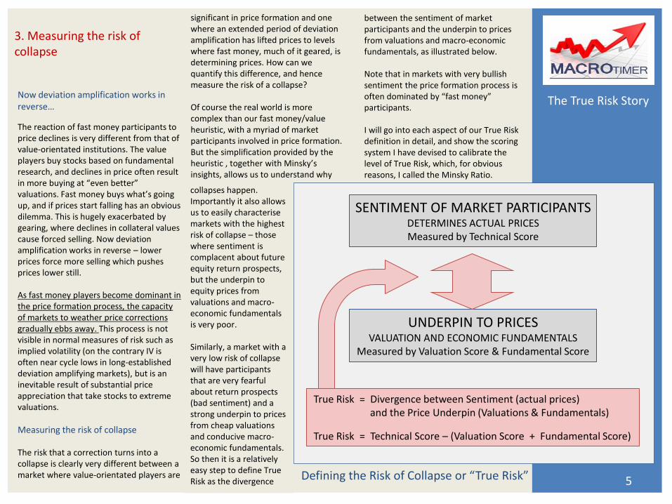
between the sentiment of market participants and the underpin to prices from valuations and macro-economic fundamentals, as illustrated below. Note that in markets with very bullish sentiment the price formation process is often dominated by “fast money” participants. I will go into each aspect of our True Risk definition in detail, and show the scoring system I have devised to calibrate the level of True Risk, which, for obvious reasons, I called the Minsky Ratio.
True Risk = Divergence between Sentiment (actual prices) and the Price Underpin (Valuations & Fundamentals)
True Risk = Technical Score – (Valuation Score + Fundamental Score)
SENTIMENT OF MARKET PARTICIPANTS DETERMINES ACTUAL PRICES Measured by Technical Score
UNDERPIN TO PRICES VALUATION AND ECONOMIC FUNDAMENTALS
Measured by Valuation Score & Fundamental Score
The True Risk Story
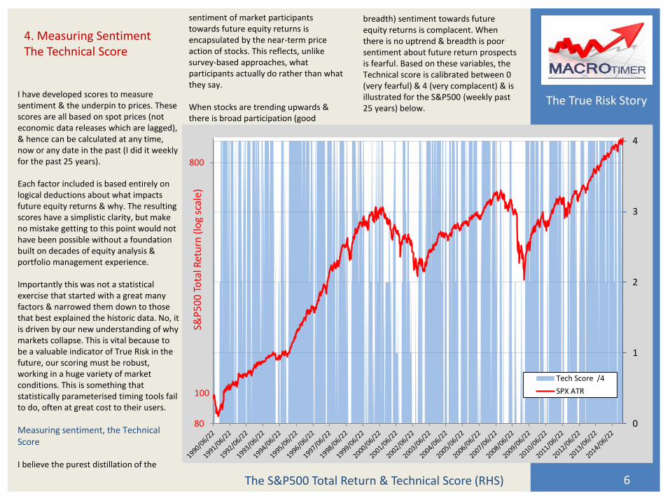
I have developed scores to measure sentiment & the underpin to prices. These scores are all based on spot prices (not economic data releases which are lagged), & hence can be calculated at any time, now or any date in the past (I did it weekly for the past 25 years). Each factor included is based entirely on logical deductions about what impacts future equity returns & why. The resulting scores have a simplistic clarity, but make no mistake getting to this point would not have been possible without a foundation built on decades of equity analysis & portfolio management experience. Importantly this was not a statistical exercise that started with a great many factors & narrowed them down to those that best explained the historic data. No, it is driven by our new understanding of why markets collapse. This is vital because to be a valuable indicator of True Risk in the future, our scoring must be robust, working in a huge variety of market conditions. This is something that statistically parameterised timing tools fail to do, often at great cost to their users.
Measuring sentiment, the Technical Score I believe the purest distillation of the
The S&P500 Total Return & Technical Score (RHS) 6
sentiment of market participants towards future equity returns is encapsulated by the near-term price action of stocks. This reflects, unlike survey-based approaches, what participants actually do rather than what they say. When stocks are trending upwards & there is broad participation (good
4. Measuring Sentiment The Technical Score
0
1
2
3
4
80
800
S&P
50
0 T
ota
l Ret
urn
(lo
g sc
ale)
Tech Score /4
SPX ATR100
breadth) sentiment towards future equity returns is complacent. When there is no uptrend & breadth is poor sentiment about future return prospects is fearful. Based on these variables, the Technical score is calibrated between 0 (very fearful) & 4 (very complacent) & is illustrated for the S&P500 (weekly past 25 years) below.
The True Risk Story
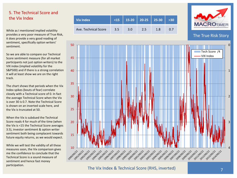
While as I mentioned implied volatility provides a very poor measure of True Risk, it does provide a very good reading of sentiment, specifically option writers’ sentiment. So we are able to compare our Technical Score sentiment measure (for all market participants not just option writers) to the VIX index (implied volatility for the S&P500) and if there is a strong correlation it will at least show we are on the right track. The chart shows that periods when the Vix Index spikes (bouts of fear) correlate closely with a Technical score of 0. In fact the average Technical Score when the Vix is over 30 is 0.7. Note the Technical Score is shown on an inverted scale here, and the Vix is truncated at 50. When the Vix is subdued the Technical Score reads 4 for much of the time (when the Vix is <15 the Technical Score averages 3.5), investor sentiment & option writer sentiment both being complacent towards future equity returns, as we would expect. While we will test the validity of all these measures soon, the Vix comparison gives me the confidence to conclude that the Technical Score is a sound measure of sentiment and hence fast money participation.
The Vix Index & Technical Score (RHS, inverted) 7
5. The Technical Score and the Vix Index
0
1
2
3
410
15
20
25
30
35
40
45
50
Tech Score /4
VIX Index
Vix Index <15 15-20 20-25 25-30 >30
Ave. Technical Score 3.5 3.0 2.5 1.8 0.7
The True Risk Story
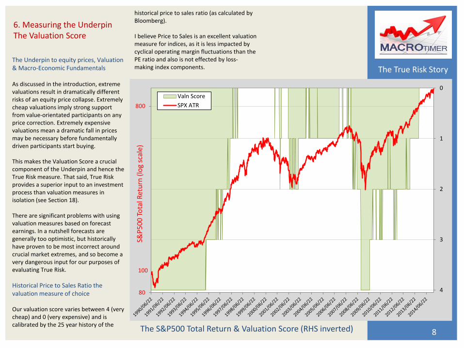
The Underpin to equity prices, Valuation & Macro-Economic Fundamentals As discussed in the introduction, extreme valuations result in dramatically different risks of an equity price collapse. Extremely cheap valuations imply strong support from value-orientated participants on any price correction. Extremely expensive valuations mean a dramatic fall in prices may be necessary before fundamentally driven participants start buying. This makes the Valuation Score a crucial component of the Underpin and hence the True Risk measure. That said, True Risk provides a superior input to an investment process than valuation measures in isolation (see Section 18). There are significant problems with using valuation measures based on forecast earnings. In a nutshell forecasts are generally too optimistic, but historically have proven to be most incorrect around crucial market extremes, and so become a very dangerous input for our purposes of evaluating True Risk.
Historical Price to Sales Ratio the valuation measure of choice Our valuation score varies between 4 (very cheap) and 0 (very expensive) and is calibrated by the 25 year history of the
The S&P500 Total Return & Valuation Score (RHS inverted) 8
6. Measuring the Underpin The Valuation Score
0
1
2
3
480
800
S&P
50
0 T
ota
l Ret
urn
(lo
g sc
ale)
Valn Score
SPX ATR
100
historical price to sales ratio (as calculated by Bloomberg). I believe Price to Sales is an excellent valuation measure for indices, as it is less impacted by cyclical operating margin fluctuations than the PE ratio and also is not effected by loss-making index components.
The True Risk Story
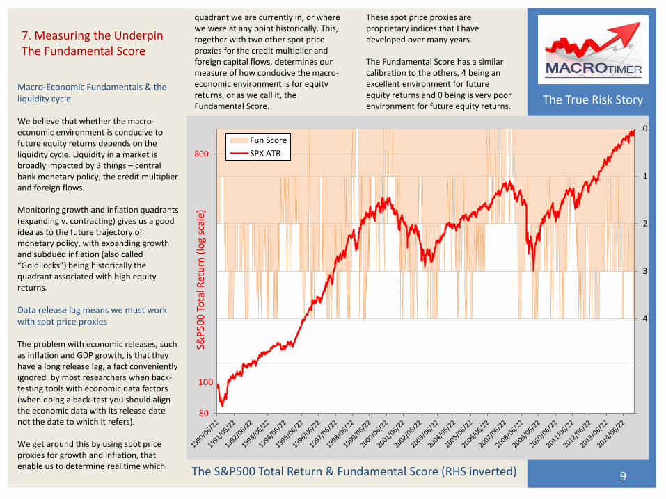
Macro-Economic Fundamentals & the liquidity cycle We believe that whether the macro-economic environment is conducive to future equity returns depends on the liquidity cycle. Liquidity in a market is broadly impacted by 3 things – central bank monetary policy, the credit multiplier and foreign flows. Monitoring growth and inflation quadrants (expanding v. contracting) gives us a good idea as to the future trajectory of monetary policy, with expanding growth and subdued inflation (also called “Goldilocks”) being historically the quadrant associated with high equity returns.
Data release lag means we must work with spot price proxies The problem with economic releases, such as inflation and GDP growth, is that they have a long release lag, a fact conveniently ignored by most researchers when back-testing tools with economic data factors (when doing a back-test you should align the economic data with its release date not the date to which it refers). We get around this by using spot price proxies for growth and inflation, that enable us to determine real time which The S&P500 Total Return & Fundamental Score (RHS inverted) 9
quadrant we are currently in, or where we were at any point historically. This, together with two other spot price proxies for the credit multiplier and foreign capital flows, determines our measure of how conducive the macro-economic environment is for equity returns, or as we call it, the Fundamental Score.
7. Measuring the Underpin The Fundamental Score
0
1
2
3
4
5
680
800
S&P
50
0 T
ota
l Ret
urn
(lo
g sc
ale)
Fun Score
SPX ATR
100
These spot price proxies are proprietary indices that I have developed over many years. The Fundamental Score has a similar calibration to the others, 4 being an excellent environment for future equity returns and 0 being is very poor environment for future equity returns.
The True Risk Story
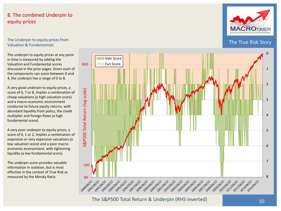
The Underpin to equity prices from Valuation & Fundamentals The underpin to equity prices at any point in time is measured by adding the Valuation and Fundamental scores discussed in the prior pages. Given each of the components can score between 0 and 4, the underpin has a range of 0 to 8. A very good underpin to equity prices, a score of 6, 7 or 8, implies a combination of cheap valuations (a high valuation score) and a macro-economic environment conducive to future equity returns, with abundant liquidity from policy, the credit multiplier and foreign flows (a high fundamental score). A very poor underpin to equity prices, a score of 0, 1 or 2, implies a combination of expensive or very expensive valuations (a low valuation score) and a poor macro-economic environment, with tightening liquidity (a low fundamental score). The underpin score provides valuable information in isolation, but is most effective in the context of True Risk as measured by the Minsky Ratio.
The S&P500 Total Return & Underpin (RHS inverted) 10
8. The combined Underpin to equity prices
0
1
2
3
4
5
6
7
880
800
S&P
50
0 T
ota
l Ret
urn
(lo
g sc
ale)
Valn Score
Fun Score
100
The True Risk Story
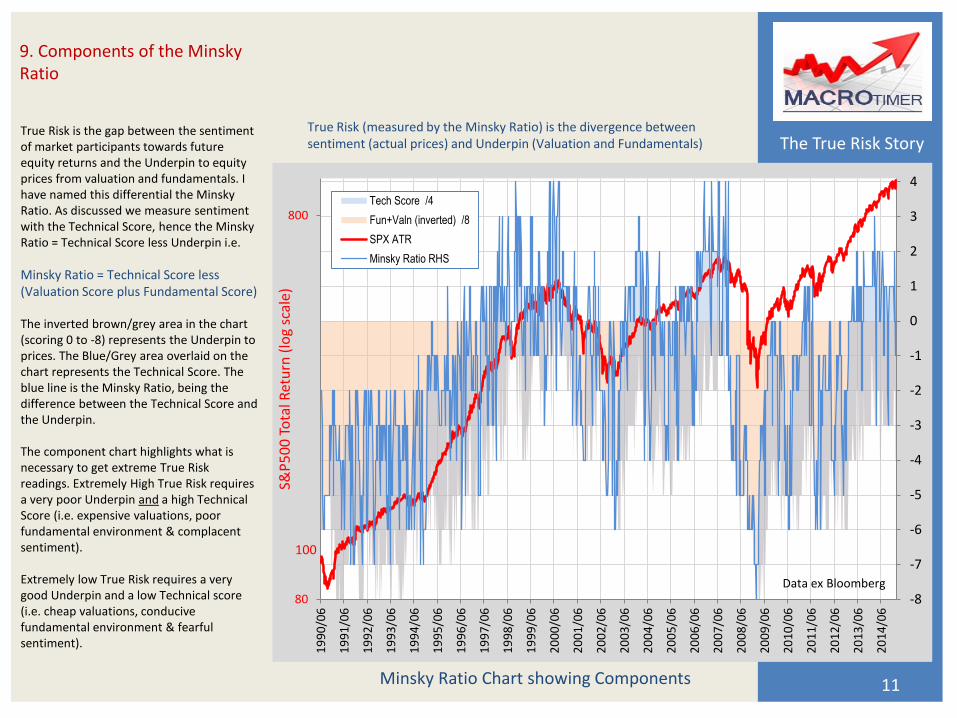
True Risk is the gap between the sentiment of market participants towards future equity returns and the Underpin to equity prices from valuation and fundamentals. I have named this differential the Minsky Ratio. As discussed we measure sentiment with the Technical Score, hence the Minsky Ratio = Technical Score less Underpin i.e.
Minsky Ratio = Technical Score less (Valuation Score plus Fundamental Score) The inverted brown/grey area in the chart (scoring 0 to -8) represents the Underpin to prices. The Blue/Grey area overlaid on the chart represents the Technical Score. The blue line is the Minsky Ratio, being the difference between the Technical Score and the Underpin. The component chart highlights what is necessary to get extreme True Risk readings. Extremely High True Risk requires a very poor Underpin and a high Technical Score (i.e. expensive valuations, poor fundamental environment & complacent sentiment). Extremely low True Risk requires a very good Underpin and a low Technical score (i.e. cheap valuations, conducive fundamental environment & fearful sentiment).
Minsky Ratio Chart showing Components 11
True Risk (measured by the Minsky Ratio) is the divergence between sentiment (actual prices) and Underpin (Valuation and Fundamentals)
9. Components of the Minsky Ratio
-8
-7
-6
-5
-4
-3
-2
-1
0
1
2
3
4
80
800
19
90
/06
19
91
/06
19
92
/06
19
93
/06
19
94
/06
19
95
/06
19
96
/06
19
97
/06
19
98
/06
19
99
/06
20
00
/06
20
01
/06
20
02
/06
20
03
/06
20
04
/06
20
05
/06
20
06
/06
20
07
/06
20
08
/06
20
09
/06
20
10
/06
20
11
/06
20
12
/06
20
13
/06
20
14
/06
S&P
50
0 T
ota
l Ret
urn
(lo
g sc
ale)
Tech Score /4
Fun+Valn (inverted) /8
SPX ATR
Minsky Ratio RHS
Data ex Bloomberg
100
The True Risk Story
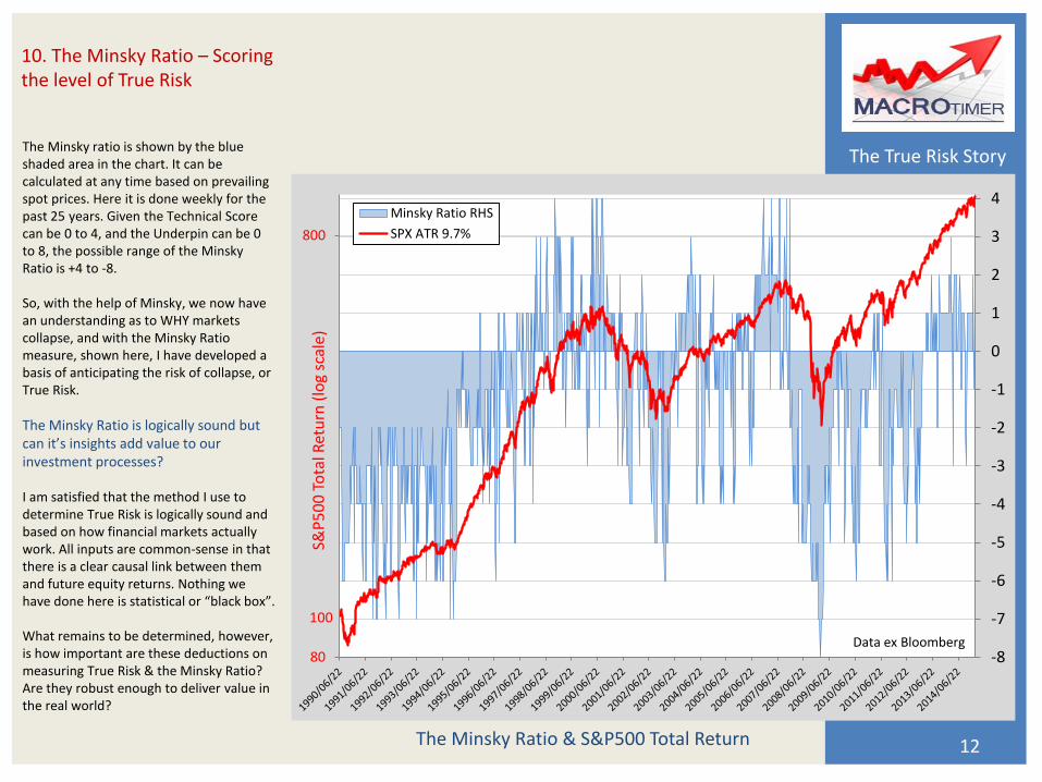
The Minsky ratio is shown by the blue shaded area in the chart. It can be calculated at any time based on prevailing spot prices. Here it is done weekly for the past 25 years. Given the Technical Score can be 0 to 4, and the Underpin can be 0 to 8, the possible range of the Minsky Ratio is +4 to -8. So, with the help of Minsky, we now have an understanding as to WHY markets collapse, and with the Minsky Ratio measure, shown here, I have developed a basis of anticipating the risk of collapse, or True Risk.
The Minsky Ratio is logically sound but can it’s insights add value to our investment processes? I am satisfied that the method I use to determine True Risk is logically sound and based on how financial markets actually work. All inputs are common-sense in that there is a clear causal link between them and future equity returns. Nothing we have done here is statistical or “black box”. What remains to be determined, however, is how important are these deductions on measuring True Risk & the Minsky Ratio? Are they robust enough to deliver value in the real world?
The Minsky Ratio & S&P500 Total Return 12
10. The Minsky Ratio – Scoring the level of True Risk
-8
-7
-6
-5
-4
-3
-2
-1
0
1
2
3
4
80
800
S&P
50
0 T
ota
l Ret
urn
(lo
g sc
ale)
Minsky Ratio RHS
SPX ATR 9.7%
100
Data ex Bloomberg
The True Risk Story
Because the inputs to our True Risk calculation are based on a common-sense deductive approach rather than statistically determined factors, we have few data fitting concerns & it is hence relatively easy to determine whether they are effective.
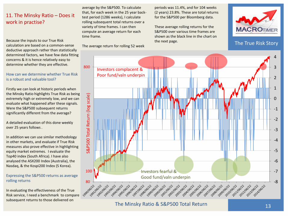
How can we determine whether True Risk is a robust and valuable tool? Firstly we can look at historic periods when the Minsky Ratio highlights True Risk as being extremely high or extremely low, and we can evaluate what happened after these signals. Were the S&P500 subsequent returns significantly different from the average? A detailed evaluation of this done weekly over 25 years follows . In addition we can use similar methodology in other markets, and evaluate if True Risk measures also prove effective in highlighting equity market extremes. I evaluate the Top40 index (South Africa). I have also analysed the ASX200 Index (Australia), the Nasdaq, & the Kospi200 Index (S Korea).
Expressing the S&P500 returns as average rolling returns In evaluating the effectiveness of the True Risk service, I need a benchmark to compare subsequent returns to those delivered on
The Minsky Ratio & S&P500 Total Return 13
11. The Minsky Ratio – Does it work in practise?
-8
-7
-6
-5
-4
-3
-2
-1
0
1
2
3
4
80
800
S&P
50
0 T
ota
l Ret
urn
(lo
g sc
ale)
100
Investors complacent & Poor fund/valn underpin
Investors fearful & Good fund/valn underpin
average by the S&P500. To calculate that, for each week in the 25 year back-test period (1286 weeks), I calculate rolling subsequent total returns over a variety of time frames. I can then compute an average return for each time frame. The average return for rolling 52 week
periods was 11.4%, and for 104 weeks (2 years) 23.8%. These are total returns for the S&P500 per Bloomberg data. These average rolling returns for the S&P500 over various time frames are shown as the black line in the chart on the next page.
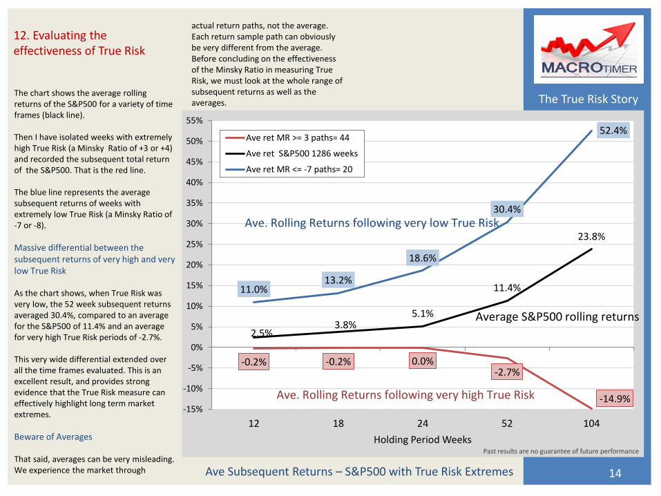
The True Risk Story
The chart shows the average rolling returns of the S&P500 for a variety of time frames (black line). Then I have isolated weeks with extremely high True Risk (a Minsky Ratio of +3 or +4) and recorded the subsequent total return of the S&P500. That is the red line. The blue line represents the average subsequent returns of weeks with extremely low True Risk (a Minsky Ratio of -7 or -8).
Massive differential between the subsequent returns of very high and very low True Risk As the chart shows, when True Risk was very low, the 52 week subsequent returns averaged 30.4%, compared to an average for the S&P500 of 11.4% and an average for very high True Risk periods of -2.7%. This very wide differential extended over all the time frames evaluated. This is an excellent result, and provides strong evidence that the True Risk measure can effectively highlight long term market extremes.
Beware of Averages That said, averages can be very misleading. We experience the market through Ave Subsequent Returns – S&P500 with True Risk Extremes 14
actual return paths, not the average. Each return sample path can obviously be very different from the average. Before concluding on the effectiveness of the Minsky Ratio in measuring True Risk, we must look at the whole range of subsequent returns as well as the averages.
12. Evaluating the effectiveness of True Risk
-0.2% -0.2% 0.0% -2.7%
-14.9%
2.5% 3.8%
5.1%
11.4%
23.8%
11.0% 13.2%
18.6%
30.4%
52.4%
-15%
-10%
-5%
0%
5%
10%
15%
20%
25%
30%
35%
40%
45%
50%
55%
12 18 24 52 104
Holding Period Weeks
Ave ret MR >= 3 paths= 44
Ave ret S&P500 1286 weeks
Ave ret MR <= -7 paths= 20
Ave. Rolling Returns following very high True Risk
Ave. Rolling Returns following very low True Risk
Average S&P500 rolling returns
Past results are no guarantee of future performance
The True Risk Story
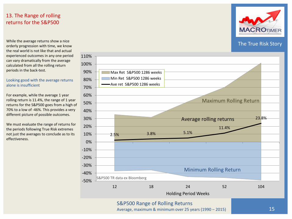
While the average returns show a nice orderly progression with time, we know the real world is not like that and actual experienced outcomes in any one period can vary dramatically from the average calculated from all the rolling return periods in the back-test.
Looking good with the average returns alone is insufficient For example, while the average 1 year rolling return is 11.4%, the range of 1 year returns for the S&P500 goes from a high of 70% to a low of -46%. This provides a very different picture of possible outcomes. We must evaluate the range of returns for the periods following True Risk extremes not just the averages to conclude as to its effectiveness.
S&P500 Range of Rolling Returns Average, maximum & minimum over 25 years (1990 – 2015) 15
13. The Range of rolling returns for the S&P500
2.5% 3.8% 5.1% 11.4%
23.8%
-50%
-40%
-30%
-20%
-10%
0%
10%
20%
30%
40%
50%
60%
70%
80%
90%
100%
110%
12 18 24 52 104
Holding Period Weeks
Max Ret S&P500 1286 weeks
Min Ret S&P500 1286 weeks
Ave ret S&P500 1286 weeks
Average rolling returns
Maximum Rolling Return
Minimum Rolling Return
S&P500 TR data ex Bloomberg
The True Risk Story
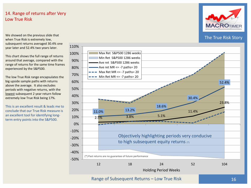
We showed on the previous slide that when True Risk is extremely low, subsequent returns averaged 30.4% one year later and 52.4% two years later. This chart shows the full range of returns around that average, compared with the range of returns for the same time frames experienced by the S&P500. The low True Risk range encapsulates the big upside sample paths with returns above the average. It also excludes periods with negative returns, with the lowest subsequent 2 year return follow extremely low True Risk being 17%.
This is an excellent result & leads me to conclude that our True Risk measure is an excellent tool for identifying long-term entry points into the S&P500.
Range of Subsequent Returns – Low True Risk 16
14. Range of returns after Very Low True Risk
2.5% 3.8% 5.1% 11.4%
23.8%
11.0% 13.2% 18.6%
30.4%
52.4%
-50%
-40%
-30%
-20%
-10%
0%
10%
20%
30%
40%
50%
60%
70%
80%
90%
100%
110%
12 18 24 52 104
Holding Period Weeks
Max Ret S&P500 1286 weeks
Min Ret S&P500 1286 weeks
Ave ret S&P500 1286 weeks
Ave ret MR <= -7 paths= 20
Max Ret MR <= -7 paths= 20
Min Ret MR <= -7 paths= 20
(*) Past returns are no guarantee of future performance
Objectively highlighting periods very conducive to high subsequent equity returns (*)
The True Risk Story
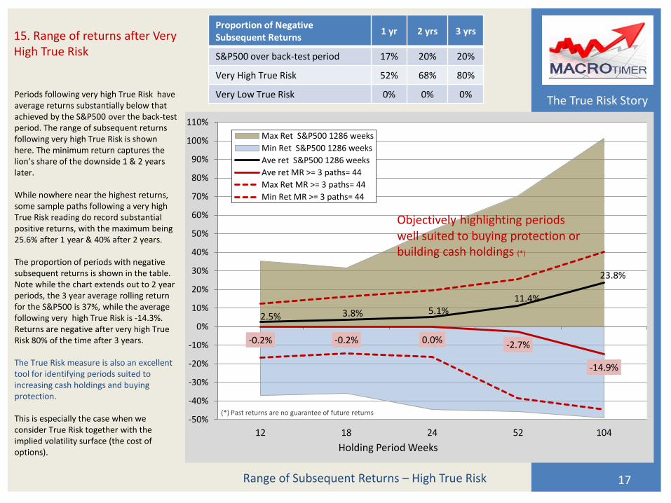
Periods following very high True Risk have average returns substantially below that achieved by the S&P500 over the back-test period. The range of subsequent returns following very high True Risk is shown here. The minimum return captures the lion’s share of the downside 1 & 2 years later. While nowhere near the highest returns, some sample paths following a very high True Risk reading do record substantial positive returns, with the maximum being 25.6% after 1 year & 40% after 2 years. The proportion of periods with negative subsequent returns is shown in the table. Note while the chart extends out to 2 year periods, the 3 year average rolling return for the S&P500 is 37%, while the average following very high True Risk is -14.3%. Returns are negative after very high True Risk 80% of the time after 3 years. The True Risk measure is also an excellent tool for identifying periods suited to increasing cash holdings and buying protection. This is especially the case when we consider True Risk together with the implied volatility surface (the cost of options).
Range of Subsequent Returns – High True Risk 17
15. Range of returns after Very High True Risk
2.5% 3.8% 5.1% 11.4%
23.8%
-0.2% -0.2% 0.0% -2.7%
-14.9%
-50%
-40%
-30%
-20%
-10%
0%
10%
20%
30%
40%
50%
60%
70%
80%
90%
100%
110%
12 18 24 52 104
Holding Period Weeks
Max Ret S&P500 1286 weeks
Min Ret S&P500 1286 weeks
Ave ret S&P500 1286 weeks
Ave ret MR >= 3 paths= 44
Max Ret MR >= 3 paths= 44
Min Ret MR >= 3 paths= 44
(*) Past returns are no guarantee of future returns
Objectively highlighting periods well suited to buying protection or building cash holdings (*)
Proportion of Negative Subsequent Returns
1 yr 2 yrs 3 yrs
S&P500 over back-test period 17% 20% 20%
Very High True Risk 52% 68% 80%
Very Low True Risk 0% 0% 0%
The True Risk Story
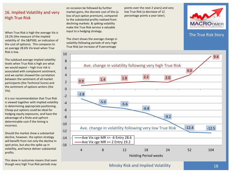
When True Risk is high the average Vix is 19.2% (the measure of the implied volatility of the S&P500, an indication of the cost of options). This compares to an average 28.6% Vix level when True Risk is low. The subdued average implied volatility levels when True Risk is high are what we would expect – high true risk is associated with complacent sentiment, and we earlier showed the correlation between the sentiment of all market participants (the Technical Score) and the sentiment of options writers (the Vix). It is our recommendation that True Risk is viewed together with implied volatility in determining appropriate positioning . Cheap put options could be ideal for hedging equity exposures, and have the advantage of a finite and upfront determinable cost if the timing is incorrect. Should the market show a substantial decline, however, the option strategy will benefit from not only the decline in spot price, but also the spike up in volatility, and hence deliver substantial profits. This skew in outcomes means that even though very high True Risk periods may
18
16. Implied Volatility and very High True Risk
Minsky Risk and Implied Volatility
-2.8
-5.0 -5.6
-6.8
-9.2
-12.4 -12.5
0.9 1.4 1.8 2.2 2.0
4.0
9.4
-16
-14
-12
-10
-8
-6
-4
-2
0
2
4
6
8
10
4 8 12 18 24 52 104
Holding Period weeks
Ave Vix cge MR <= -6 Entry 28.6Ave Vix cge MR >= 2 Entry 19.2
Ave. change in volatility following very low True Risk
Ave. change in volatility following very high True Risk
on occasion be followed by further market gains, the discrete cost of this (a loss of put option premium), compared to the substantial profits realised from declining markets & spiking volatility make the True Risk service a valuable input to a hedging strategy. The chart shows the average change in volatility following periods of very high True Risk (an increase of 9 percentage
points over the next 2 years) and very low True Risk (a decrease of 12 percentage points a year later).

The True Risk Story
The table shows the average, maximum & minimum subsequent returns over 1, 2 & 3 years for each possible Minsky Ratio from +4 (extremely high True Risk) to -8 (extremely low True Risk). The number of times the score occurred on a weekly basis is highlighted in the 2nd column (paths). The proportion of paths that had a negative return is shown in the 4th column for each time period. Of course we have no way of knowing when the exact market tops and bottoms will occur, and we urge clients to cease worrying about this – in our opinion it is a misguided endeavour.
Focus on what is observable real time and position yourself accordingly Using True Risk to assist in focusing on what is observable real time will hugely improve many investment process decisions. While we have no idea whether this is “the bottom”, what do we know? For example should the Minsky Ratio be -6 we know that this has happened on 53 weeks over the past 25 years. The average subsequent returns were strongly positive (+42% 2 yrs) and after not one of those 53 occasions were 19
returns negative for the following 1, 2 or 3 year periods. Positioning “mandate maximum” long equities would surely be appropriate with this backdrop. Equally, while we have no idea whether this is “the top”, should the Minsky Ratio be +3, we know that this has occurred only 30 times out of the past 1286 weeks & subsequent returns over the next 3
17. Calibrating the Minsky Ratio to identify long term True Risk extremes
Subsequent Returns for a given Minsky Ratio
MACROtimer True Risk Service - S&P500 Index
Subsequent 12months Subsequent 24months Subsequent 36months
%age %age %age
Minsky Ratio Total Returns % Paths Total Returns % Paths Total Returns % Paths
Score Paths Ave Max Min < 0 Ave Max Min < 0 Ave Max Min < 0
4 14 -14.7 21.6 -38.7 86 -26.7 28.1 -39.9 93 -22.3 -1.1 -35.4 100
3 30 3.1 25.6 -27.9 37 -9.2 40.2 -44.5 57 -10.5 34.3 -35.1 70
2 83 1.8 29.8 -41.1 37 -11.6 54.7 -44.5 49 -4.7 45.7 -39.9 55
1 195 7.3 41.1 -41.6 23 10.2 67.8 -41.6 28 12.8 116.9 -43.1 34
0 184 13.4 42.3 -26.6 13 22.0 80.6 -49.0 15 24.3 132.7 -39.1 22
-1 192 9.0 43.7 -43.1 21 24.2 81.3 -44.0 23 39.3 135.6 -40.6 21
-2 165 13.9 42.5 -39.6 12 34.2 76.2 -39.3 12 55.6 129.4 -37.7 11
-3 157 11.7 43.9 -43.3 10 30.9 76.8 -25.8 8 50.6 123.5 -37.4 7
-4 107 10.8 50.6 -45.8 17 30.7 85.8 -19.3 14 47.5 126.7 -22.3 5
-5 86 18.9 53.1 -35.8 10 38.0 88.5 -15.9 10 61.4 128.0 -1.1 2
-6 53 23.1 46.2 2.2 0 41.9 92.4 13.5 0 66.4 134.8 29.0 0
-7 18 28.2 70.2 1.7 0 48.9 101.5 17.1 0 65.1 127.3 26.7 0
-8 2 50.4 53.6 47.2 0 84.5 87.2 81.8 0 93.0 97.8 88.2 0
Total 1286 weeks back test 1990 to 2015 Data ex Bloomberg
years had averaged -10%. We also know that returns were negative over the next 3 years 70% of the time. Couple this with an analysis of implied volatility, and you have excellent, objective information as inputs to your investment process when deciding whether to hedge equity exposures and buy protection. But of course we still have no idea whether this is “the top”!
The True Risk Story
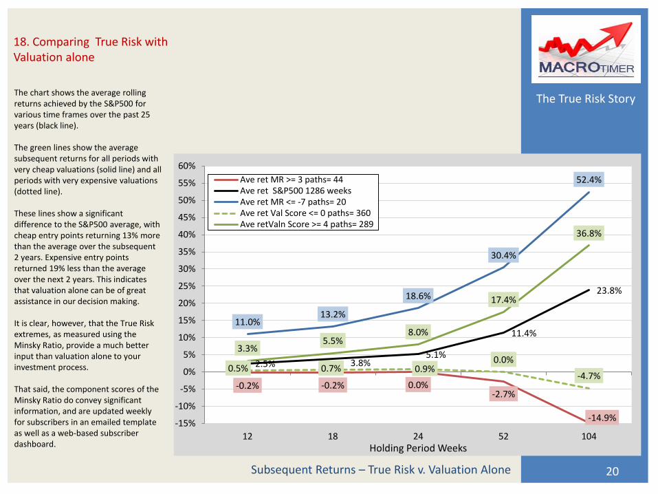
The chart shows the average rolling returns achieved by the S&P500 for various time frames over the past 25 years (black line). The green lines show the average subsequent returns for all periods with very cheap valuations (solid line) and all periods with very expensive valuations (dotted line). These lines show a significant difference to the S&P500 average, with cheap entry points returning 13% more than the average over the subsequent 2 years. Expensive entry points returned 19% less than the average over the next 2 years. This indicates that valuation alone can be of great assistance in our decision making. It is clear, however, that the True Risk extremes, as measured using the Minsky Ratio, provide a much better input than valuation alone to your investment process. That said, the component scores of the Minsky Ratio do convey significant information, and are updated weekly for subscribers in an emailed template as well as a web-based subscriber dashboard.
20
18. Comparing True Risk with Valuation alone
Subsequent Returns – True Risk v. Valuation Alone
-0.2% -0.2% 0.0% -2.7%
-14.9%
2.5% 3.8% 5.1%
11.4%
23.8%
11.0% 13.2%
18.6%
30.4%
52.4%
0.5% 0.7% 0.9% 0.0%
-4.7%
3.3% 5.5%
8.0%
17.4%
36.8%
-15%
-10%
-5%
0%
5%
10%
15%
20%
25%
30%
35%
40%
45%
50%
55%
60%
12 18 24 52 104Holding Period Weeks
Ave ret MR >= 3 paths= 44Ave ret S&P500 1286 weeksAve ret MR <= -7 paths= 20Ave ret Val Score <= 0 paths= 360Ave retValn Score >= 4 paths= 289
The True Risk Story
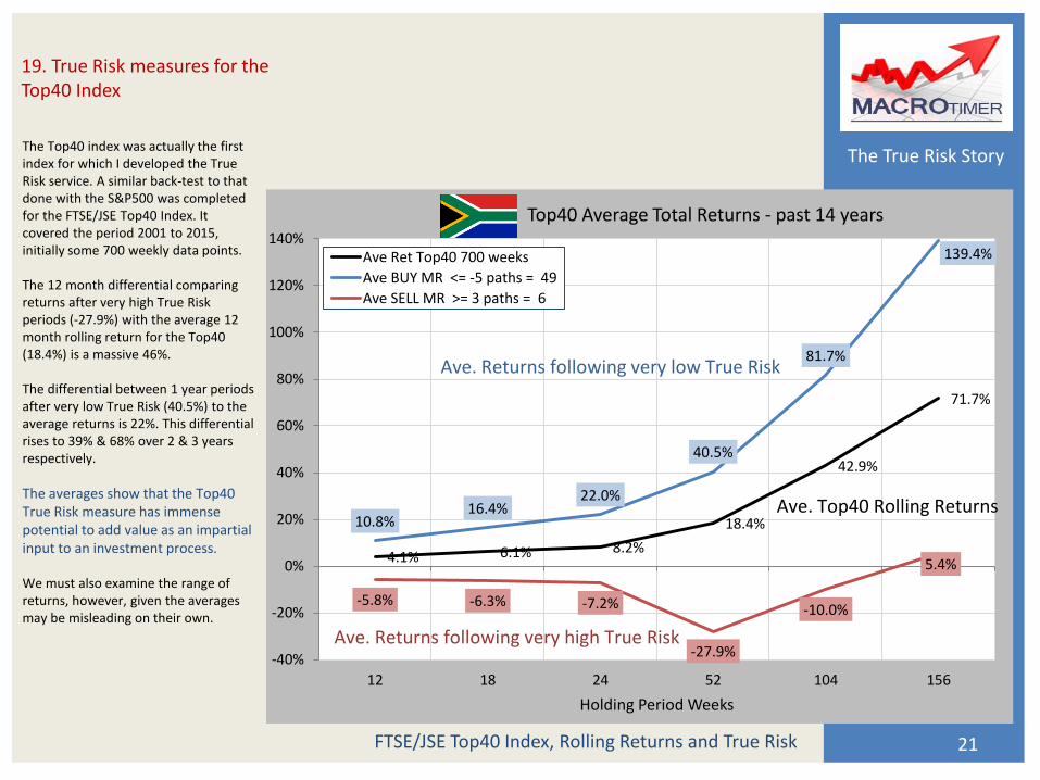
The Top40 index was actually the first index for which I developed the True Risk service. A similar back-test to that done with the S&P500 was completed for the FTSE/JSE Top40 Index. It covered the period 2001 to 2015, initially some 700 weekly data points. The 12 month differential comparing returns after very high True Risk periods (-27.9%) with the average 12 month rolling return for the Top40 (18.4%) is a massive 46%. The differential between 1 year periods after very low True Risk (40.5%) to the average returns is 22%. This differential rises to 39% & 68% over 2 & 3 years respectively.
The averages show that the Top40 True Risk measure has immense potential to add value as an impartial input to an investment process. We must also examine the range of returns, however, given the averages may be misleading on their own.
21
19. True Risk measures for the Top40 Index
FTSE/JSE Top40 Index, Rolling Returns and True Risk
4.1% 6.1% 8.2%
18.4%
42.9%
71.7%
10.8% 16.4%
22.0%
40.5%
81.7%
139.4%
-5.8% -6.3% -7.2%
-27.9%
-10.0%
5.4%
-40%
-20%
0%
20%
40%
60%
80%
100%
120%
140%
12 18 24 52 104 156
Holding Period Weeks
Top40 Average Total Returns - past 14 years
Ave Ret Top40 700 weeks
Ave BUY MR <= -5 paths = 49
Ave SELL MR >= 3 paths = 6
Ave. Returns following very low True Risk
Ave. Returns following very high True Risk
Ave. Top40 Rolling Returns
The True Risk Story
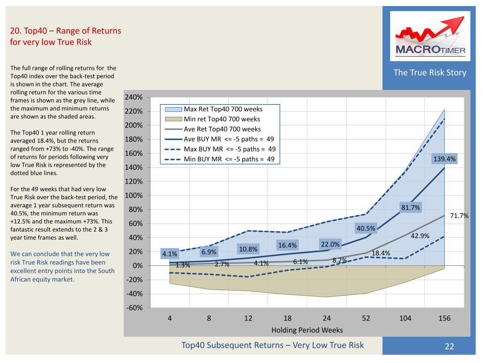
The full range of rolling returns for the Top40 index over the back-test period is shown in the chart. The average rolling return for the various time frames is shown as the grey line, while the maximum and minimum returns are shown as the shaded areas. The Top40 1 year rolling return averaged 18.4%, but the returns ranged from +73% to -40%. The range of returns for periods following very low True Risk is represented by the dotted blue lines. For the 49 weeks that had very low True Risk over the back-test period, the average 1 year subsequent return was 40.5%, the minimum return was +12.5% and the maximum +73%. This fantastic result extends to the 2 & 3 year time frames as well.
We can conclude that the very low risk True Risk readings have been excellent entry points into the South African equity market.
22
20. Top40 – Range of Returns for very low True Risk
Top40 Subsequent Returns – Very Low True Risk
1.3% 2.7% 4.1% 6.1% 8.2% 18.4%
42.9%
71.7%
4.1% 6.9% 10.8% 16.4% 22.0%
40.5%
81.7%
139.4%
-60%
-40%
-20%
0%
20%
40%
60%
80%
100%
120%
140%
160%
180%
200%
220%
240%
4 8 12 18 24 52 104 156
Holding Period Weeks
Max Ret Top40 700 weeks
Min ret Top40 700 weeks
Ave Ret Top40 700 weeks
Ave BUY MR <= -5 paths = 49
Max BUY MR <= -5 paths = 49
Min BUY MR <= -5 paths = 49
The True Risk Story
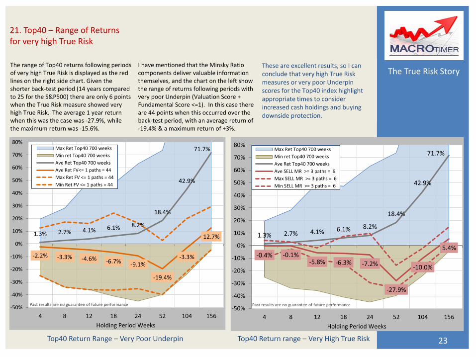
The range of Top40 returns following periods of very high True Risk is displayed as the red lines on the right side chart. Given the shorter back-test period (14 years compared to 25 for the S&P500) there are only 6 points when the True Risk measure showed very high True Risk. The average 1 year return when this was the case was -27.9%, while the maximum return was -15.6%.
23
21. Top40 – Range of Returns for very high True Risk
Top40 Return range – Very High True Risk
1.3% 2.7% 4.1% 6.1% 8.2%
18.4%
42.9%
71.7%
-0.4% -0.1% -5.8% -6.3% -7.2%
-27.9%
-10.0%
5.4%
-50%
-40%
-30%
-20%
-10%
0%
10%
20%
30%
40%
50%
60%
70%
80%
4 8 12 18 24 52 104 156
Holding Period Weeks
Max Ret Top40 700 weeks
Min ret Top40 700 weeks
Ave Ret Top40 700 weeks
Ave SELL MR >= 3 paths = 6
Max SELL MR >= 3 paths = 6
Min SELL MR >= 3 paths = 6
Past results are no guarantee of future performance
1.3% 2.7% 4.1% 6.1% 8.2%
18.4%
42.9%
71.7%
-2.2% -3.3% -4.6% -6.7% -9.1%
-19.4%
-3.3%
12.7%
-50%
-40%
-30%
-20%
-10%
0%
10%
20%
30%
40%
50%
60%
70%
80%
4 8 12 18 24 52 104 156
Holding Period Weeks
Max Ret Top40 700 weeks
Min ret Top40 700 weeks
Ave Ret Top40 700 weeks
Ave Ret FV<= 1 paths = 44
Max Ret FV <= 1 paths = 44
Min Ret FV <= 1 paths = 44
Past results are no guarantee of future performance
Top40 Return Range – Very Poor Underpin
I have mentioned that the Minsky Ratio components deliver valuable information themselves, and the chart on the left show the range of returns following periods with very poor Underpin (Valuation Score + Fundamental Score <=1). In this case there are 44 points when this occurred over the back-test period, with an average return of -19.4% & a maximum return of +3%.
These are excellent results, so I can conclude that very high True Risk measures or very poor Underpin scores for the Top40 index highlight appropriate times to consider increased cash holdings and buying downside protection.
The True Risk Story
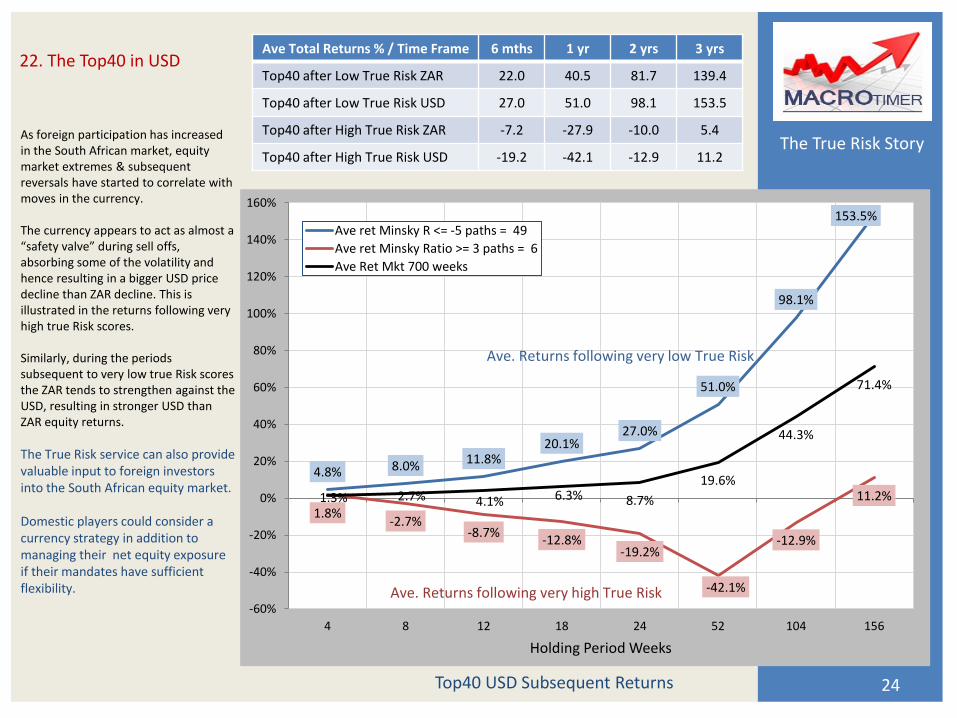
As foreign participation has increased in the South African market, equity market extremes & subsequent reversals have started to correlate with moves in the currency. The currency appears to act as almost a “safety valve” during sell offs, absorbing some of the volatility and hence resulting in a bigger USD price decline than ZAR decline. This is illustrated in the returns following very high true Risk scores. Similarly, during the periods subsequent to very low true Risk scores the ZAR tends to strengthen against the USD, resulting in stronger USD than ZAR equity returns.
The True Risk service can also provide valuable input to foreign investors into the South African equity market. Domestic players could consider a currency strategy in addition to managing their net equity exposure if their mandates have sufficient flexibility.
24
22. The Top40 in USD
Top40 USD Subsequent Returns
4.8% 8.0% 11.8% 20.1%
27.0%
51.0%
98.1%
153.5%
1.8% -2.7%
-8.7% -12.8%
-19.2%
-42.1%
-12.9%
11.2% 1.3% 2.7% 4.1% 6.3% 8.7%
19.6%
44.3%
71.4%
-60%
-40%
-20%
0%
20%
40%
60%
80%
100%
120%
140%
160%
4 8 12 18 24 52 104 156
Holding Period Weeks
Ave ret Minsky R <= -5 paths = 49
Ave ret Minsky Ratio >= 3 paths = 6
Ave Ret Mkt 700 weeks
Ave. Returns following very low True Risk
Ave. Returns following very high True Risk
Ave Total Returns % / Time Frame 6 mths 1 yr 2 yrs 3 yrs
Top40 after Low True Risk ZAR 22.0 40.5 81.7 139.4
Top40 after Low True Risk USD 27.0 51.0 98.1 153.5
Top40 after High True Risk ZAR -7.2 -27.9 -10.0 5.4
Top40 after High True Risk USD -19.2 -42.1 -12.9 11.2
The True Risk Story
If you have made it this far – thank you. I hope you have found the work I have done interesting. If you need to take asset allocation or net exposure decisions about South African or US equities, I believe the True Risk service will be a valuable input to your process. Our pricing is very reasonable and subscriptions are billed quarterly, so you are never tied in for a long period. We also have excellent True Risk models for the Nasdaq, ASX200 (Aussie) and Kospi200 (South Korea) and will be launching these services in due course.
25
Disclaimer
Any interest in subscriptions? Contact us at: [email protected]
Actual future returns can deviate dramatically from historic averages & hence may bear no resemblance to the returns depicted in this presentation. Past returns are no guide to future results. Total returns on the S&P500 and Top40 per Bloomberg data. Based on MACROtimer 25 year S&P500 weekly back-test over 1286 weeks, and 14 year Top40 back-test over 700 weeks.
Conclusion