the ultimate guide to google's mobile friendly algorithm
TRANSCRIPT

How to fix mobile user experience problems and protect your SEO rankings
EDITION 1 - MARCH
2015
Find out what we can do to grow your business. Call us on 0800 088 7486 or visit clickthrough-marketing.com
2
CONTENTS
WHY MOBILE USER EXPERIENCE IS MORE IMPORTANT THAN EVER 3
WHO NEEDS THIS GUIDE? 4
WHAT WE KNOW SO FAR 5
TIMELINE 7
HOW TO CHECK IF YOUR SITE IS MOBILE-FRIENDLY 8
HOW GOOGLE DEFINES A MOBILE-FRIENDLY SITE 9
GOOGLE’S MOBILE USABILITY ERRORS 11
HOW CLOSELY DO I HAVE TO FOLLOW GOOGLE’S GUIDELINES? 20
TECHNICAL SEO CONSIDERATIONS 21
PAID SEARCH CONSIDERATIONS 22
NEED MORE HELP? 23
WEB DEVELOPMENT CASE STUDY 24
ABOUT CLICKTHROUGH 32

Find out what we can do to grow your business. Call us on 0800 088 7486 or visit clickthrough-marketing.com
3
WHY MOBILE USER EXPERIENCE IS MORE IMPORTANT THAN EVER
Mobile user experience has been an important consideration for marketers ever since the rise of the mobile web. Now, with around 30% of website traffic coming from mobile devices, it’s crucial.
Not catering for mobile customers now means giving a third of your customers a hard time.
But catering for mobile customers can improve engagement rates, customer trust and return visits.
It seems to be a no-brainer. But now there’s another big reason to fix mobile usability problems – bad user experiences will soon directly affect your search rankings.
GOOGLE’S MOBILE- FRIENDLY ALGORITHMFrom April 21, 2015, Google will use mobile usability factors to help determine where a page should rank in its mobile search results.
This means that if your site doesn’t use up-to-date technologies to cater to mobile users, affected pages may rank below competitors that do.
Google says it’s doing this to help users find “relevant, high-quality search results that are optimised for their devices”.
It also says the change “will affect mobile searches in all languages worldwide and will have a significant impact in our search results.”
WHAT THIS MEANS FOR YOUYour risk of being negatively affected by the algorithm depends on how mobile-friendly your website already is.
You may only have to make a few small tweaks to certain pages on your website. Or, in the worst-case scenario, you may have to rebuild your site from scratch.
This guide will explain the factors that Google takes into account when determining if a site is mobile-friendly – and how to put their recommendations into practice.

Find out what we can do to grow your business. Call us on 0800 088 7486 or visit clickthrough-marketing.com
4
This guide will be beneficial for marketers and webmasters who:
• Want to understand what makes a mobile website user-friendly in Google’s eyes
• Want to convince web development staff of the need to create mobile-friendly user experiences
• Want to take steps to fix problems themselves
• Want to find a web development agency who can help
“THIS GUIDE WILL EXPLAIN THE FACTORS THAT GOOGLE TAKES INTO ACCOUNT WHEN DETERMINING IF A SITE IS MOBILE-FRIENDLY.”
WHO NEEDS THIS GUIDE?

Find out what we can do to grow your business. Call us on 0800 088 7486 or visit clickthrough-marketing.com
5
; Google’s new mobile-friendly algorithm launches on Saturday April 21, 2015.
; Google says it will have a “significant impact” on mobile search results, and will be bigger than Panda or Penguin.
Google hasn’t provided any figures to show how much impact this new algorithm will have. However, in its initial announcement, the company said it would have a “significant impact” on search results.
Following this, webmaster trends analyst Zineb Ait Bahajji said the algorithm would have more impact than Panda and Penguin, Google’s infamous webspam updates.
For reference, Panda affected up to 12% of search queries when it went live, while Penguin affected around 3.1% of queries at launch.
; The algorithm is related to Google’s ‘Mobile-friendly’ labels that appear in search results.
This means if your web pages appear in search results with this label, you shouldn’t have to worry about the algorithm update.
For more information on the mobile-friendly labels, visit: http://www.clickthrough-
marketing.com/googles-new-mobile-friendly-label-may-come-with-ranking-boost/
; The algorithm is applied on a page-by-page basis.
So if only a few pages are affected by mobile usability issues, you shouldn’t receive a site-wide penalty.
This also means you don’t have to worry about making your site 100% mobile-friendly by the April 21 deadline. You may decide to prioritise problem pages based on their importance or existing search visibility.
WHAT WE KNOW SO FAR

Find out what we can do to grow your business. Call us on 0800 088 7486 or visit clickthrough-marketing.com
6
However, with the growth in mobile usage, it makes sense to make your site as mobile-friendly as possible, as quickly as possible.
; The algorithm runs in real-time.
This means that changes to your website will be taken into account as soon as Google crawls the modified page. It doesn’t mean you’ll instantly receive better rankings if you make recommended improvements.
If it typically takes a long time for Google to crawl your site, you need to work even faster to ensure your site is ready in time.
; The algorithm still uses some desktop signals to determine mobile ‘friendliness’.
For example, the speed of your desktop site is still taken into account when weighing up the usability of your mobile site.
We don’t know exactly which desktop signals Google refers to. So you should assume that if your desktop site has usability issues, it may affect your mobile usability in Google’s eyes.
Find out what we can do to grow your business. Call us on 0800 088 7486 or visit clickthrough-marketing.com
7
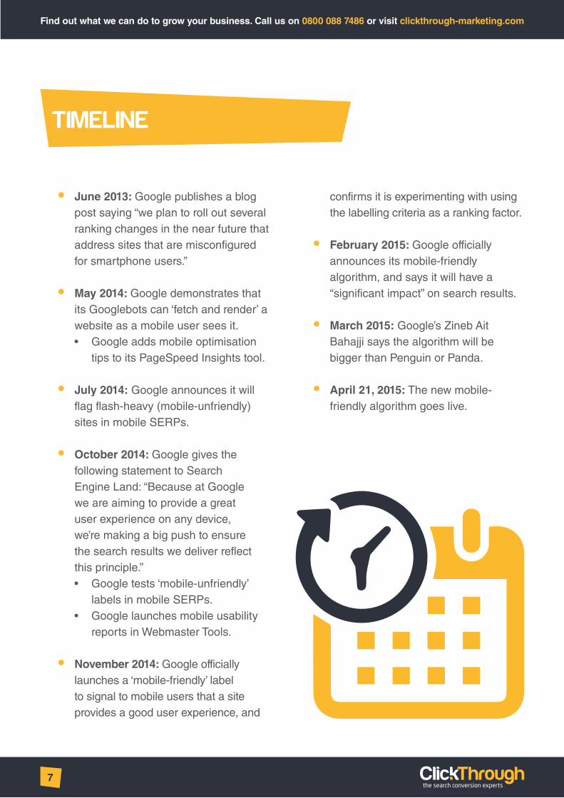
• June 2013: Google publishes a blog post saying “we plan to roll out several ranking changes in the near future that address sites that are misconfigured for smartphone users.”
• May 2014: Google demonstrates that its Googlebots can ‘fetch and render’ a website as a mobile user sees it. • Google adds mobile optimisation
tips to its PageSpeed Insights tool.
• July 2014: Google announces it will flag flash-heavy (mobile-unfriendly) sites in mobile SERPs.
• October 2014: Google gives the following statement to Search Engine Land: “Because at Google we are aiming to provide a great user experience on any device, we’re making a big push to ensure the search results we deliver reflect this principle.” • Google tests ‘mobile-unfriendly’
labels in mobile SERPs. • Google launches mobile usability
reports in Webmaster Tools.
• November 2014: Google officially launches a ‘mobile-friendly’ label to signal to mobile users that a site provides a good user experience, and
confirms it is experimenting with using the labelling criteria as a ranking factor.
• February 2015: Google officially announces its mobile-friendly algorithm, and says it will have a “significant impact” on search results.
• March 2015: Google’s Zineb Ait Bahajji says the algorithm will be bigger than Penguin or Panda.
• April 21, 2015: The new mobile-friendly algorithm goes live.
TIMELINE

Find out what we can do to grow your business. Call us on 0800 088 7486 or visit clickthrough-marketing.com
8
If you have a Google Webmaster Tools account set up, there’s an easy way to check if your site is mobile-friendly, in line with Google’s mobile usability guidelines.
The mobile usability report scans your website for usability errors. Then it presents the problems found, along with the number of pages affected, like this:
You can click on the usability error to see a list of URLs that need action taken.
The mobile usability report can be found under ‘Search Traffic’ on the left sidebar in your site’s Webmaster Tools dashboard.
We recommend running a mobile usability report on your website as your first course of action. You will then be able to reference any errors you see against the explanations on pages 11 to 19.
HOW TO CHECK IF YOUR SITE IS MOBILE-FRIENDLY

Find out what we can do to grow your business. Call us on 0800 088 7486 or visit clickthrough-marketing.com
9
HOW GOOGLE DEFINES A MOBILE-FRIENDLY SITE
A mobile-friendly website should offer a smooth, pain-free experience for all users, whether they’re accessing the website through their desktop, smartphone, games console or wearable device.
There are five areas of mobile usability that Google looks at when determining whether to reward a site with a mobile-friendly label (and search ranking boost):
From Google’s Webmaster Tools Help:
• A defined viewing area (or viewport) that adjusts to the device’s screen size.
• Content that flows in the viewport, so that users don’t have to scroll horizontally or pinch the screen in order to see the entire page.
• Fonts that scale for easier reading on small screens.
• Easy-to-touch elements (e.g. buttons) that are well-spaced from other touch elements.
• Visual design and motion driven by mobile-friendly technology.
A NOTE ON RESPONSIVE DESIGN AND MOBILE SITESThere are two common ways to deliver content to mobile users – responsive design and mobile sites. (There’s also a third option, dynamic sites – but this tends to be less popular than the other two.)

Find out what we can do to grow your business. Call us on 0800 088 7486 or visit clickthrough-marketing.com
10
RESPONSIVE DESIGN
A responsive website serves content to users from the same URLs, regardless of the device they’re using.
However, the site is coded in such a way that elements of the page change according to the size of the screen it’s been viewed on.
The layout, image sizes, or even written content may vary depending on the size of the user’s screen. However, fundamentally, they’re seeing the same page, no matter which device they’re using.
MOBILE SITES
A mobile website serves content to users from different URLs, depending on whether they access the site from a mobile or desktop device.
There is, effectively, a ‘copy’ of the desktop website delivered to – and optimised for – mobile users.
Content can be completely different from, or largely similar to, the desktop site.
Google’s guidelines heavily favour responsive design. Much of the language used in its definition of a mobile-friendly site refers to responsive design – such as ‘content that flows in the viewport’ and ‘a defined viewing area that adjusts to the device’s screen size’.
This said, a mobile site is better than providing no mobile-optimised content at all.
UNSURE WHETHER YOU HAVE A RESPONSIVE SITE OR MOBILE SITE?If you’re not sure which type of mobile site you have, you can use our Responsive Site Checker tool.
This tool is (to our knowledge) the only free tool of its kind that automatically detects mobile sites. If it finds a mobile site on your domain, it will display the message: “Showing the dedicated mobile site at: [URL]”
Try it out here: http://www.clickthrough-marketing.com/sitechecker/

Find out what we can do to grow your business. Call us on 0800 088 7486 or visit clickthrough-marketing.com
11
GOOGLE’S MOBILE USABILITY ERRORS
This section provides more information on the errors Google identifies in its mobile usability reports.
We’ll explain what they mean, and how to fix issues so you can benefit from the SEO effects of having a mobile-friendly site when the algorithm launches.
Bear in mind, Google recommends using responsive design to create mobile-friendly experiences for users. This means all of Google’s recommendations are geared towards creating responsive websites.
If you already have a responsive site, but are still receiving mobile usability errors for certain pages, this information will help you diagnose and fix the problems. With a little coding knowledge, most non-developers will be able to fix basic issues.
If you have a mobile site, and are not planning to build a responsive site anytime soon, your best bet is to apply these recommendations as closely as possible to a non-responsive environment. For example, you may not be able to make content ‘flow’ to fill different screen sizes, as you would with a responsive site, but you will be able to apply recommendations for the size of touch elements, or font scaling.
If you have neither a responsive website nor a mobile website, you need to start thinking seriously about catering to your mobile user base. It’s likely that you’re already losing out on traffic and conversions by not providing a satisfactory mobile user experience, and this will only get worse once Google launches its mobile-friendly algorithm.
Need help creating a responsive site? Get in touch with our experts on 0800 088 7486.
“BEAR IN MIND, GOOGLE RECOMMENDS USING RESPONSIVE DESIGN TO CREATE MOBILE-FRIENDLY EXPERIENCES FOR USERS.”

Find out what we can do to grow your business. Call us on 0800 088 7486 or visit clickthrough-marketing.com
12
FLASH USAGE
Google says:“Most mobile browsers do not render Flash-based content. Therefore, mobile visitors will not be able to use a page that relies on Flash in order to display content, animations, or navigation. We recommend designing your look and feel and page animations using modern web technologies.”
The problemNeither Google nor Apple support Adobe Flash in their tablet and phone browsers. When you consider that Google’s Android and Apple’s iOS are the most widely-used mobile operating systems globally, the problem becomes clear.
Given the rise in Internet connectivity from handheld devices, this lack of support has meant site owners with websites featuring flash content have not been able to fully and effectively communicate their message to a mobile audience.
Coincidentally, since cross-browser HTML5 support came into its own in 2012, the new web standard has provided a mechanism for developers and designers to create flash-like interactive web experiences.
The traditional full-flash site from the early 2000s tended to be a creative-led, experiential-driven online entity. It has taken several years for HTML5 to bed down, but now the same impetus to create interesting online experiences is being developed with HTML5 websites and web apps.
For those who merely want to add a little interactive user experience to their site, modern technologies like HTML5, CSS3, and jQuery are now the best ports of call.
Don’t get us wrong, Flash still has its uses – but not typically for a business website. If your website still uses Flash, you need to think very strongly about replacing these Flash-based elements with modern equivalents.
Content providers like YouTube already detect devices and serve content
“FOR THOSE WHO MERELY WANT TO ADD A LITTLE INTERACTIVE USER EXPERIENCE TO THEIR SITE, MODERN TECHNOLOGIES LIKE HTML5, CSS3, AND JQUERY ARE NOW THE BEST PORTS OF CALL.”

Find out what we can do to grow your business. Call us on 0800 088 7486 or visit clickthrough-marketing.com
13
accordingly. This is why you can view YouTube on your mobile device – its traditional Flash-based video player is now accompanied by a HTML5 equivalent.
The solutionThere are a number of approaches you can take to deal with Google’s ‘Flash usage’ error. However, if you don’t have access to web development expertise, you may find these fixes difficult to implement.
The first approach is to deliver flash content only to supported browsers. Using server-side or client-side code, you can detect what device is looking at your website and deliver content using an appropriate platform. However, this approach may cause difficulties if your site makes heavy use of Flash elements.
The second approach is to replace basic flash animations with CSS or JavaScript
animations. CSS3 now has many native user interface transformations and can do basic animation. JavaScript libraries like JQuery can work with CSS3 to push towards interactivity previously possible through Flash.
The third approach is, simply, to re-build your site without flash elements. This may be your only choice if your site is heavily reliant on Flash to deliver content.
“THERE ARE A NUMBER OF APPROACHES YOU CAN TAKE TO DEAL WITH GOOGLE’S ‘FLASH USAGE’ ERROR. HOWEVER, IF YOU DON’T HAVE ACCESS TO WEB DEVELOPMENT EXPERTISE, YOU MAY FIND THESE FIXES DIFFICULT TO IMPLEMENT.”

Find out what we can do to grow your business. Call us on 0800 088 7486 or visit clickthrough-marketing.com
14
VIEWPORT NOT CONFIGURED
Google says:“Because visitors to your site use a variety of devices with varying screen sizes—from large desktop monitors, to tablets and small smartphones—your pages should specify a viewport using the meta viewport tag. This tag tells browsers how to adjust the page’s dimension and scaling to suit the device.”
The problemThe ‘viewport’ meta tag is an important part of responsive design. It defines how a website should display on a mobile device, and how users can change the way it is displayed.
For example, you might set the viewport to show a ‘zoomed in’ version of your desktop website on a mobile device, where content is resized and the text flows to fit the screen for comfortable viewing.
The solutionIf you see this error in your mobile usability report, it means you haven’t set a viewport meta tag, or your viewport isn’t working correctly.
Refer to the next section for Google’s recommendations for setting the viewport.

Find out what we can do to grow your business. Call us on 0800 088 7486 or visit clickthrough-marketing.com
15
FIXED-WIDTH VIEWPORT
Google says:“This report shows those pages with a viewport set to a fixed width. Some web developers define the viewport to a fixed pixel size in order to adjust a non-responsive page to suit common mobile screen sizes. To fix this error, adopt a responsive design for your site’s pages, and set the viewport to match the device’s width and scale accordingly.”
The problemOne way to set a viewport is to set its width attribute to a fixed number of reference pixels. This makes the page render as if it’s the same width on a desktop and mobile device, even though the mobile device you’re using will likely have a significantly smaller screen.
Google advises against this approach as it doesn’t result in a ‘true’ responsive design – where content will ‘flow’ to fit the whole screen, no matter how wide or narrow its screen.
The solutionGoogle recommends using the width=device-width attribute in your viewport meta tag to ensure the website responds to the size of the user’s screen.
In addition, you should use the initial-scale=1 attribute to establish a 1:1 relationship between hardware pixels and CSS pixels. A CSS pixel is a fixed unit of measurement that appears to be the same size when viewed on different devices, even if the devices have different hardware pixel densities.
This ensures that the content of the page will ‘flow’ to fit the screen, whether it’s viewed in a portrait or landscape orientation.
Google’s recommended viewport meta tag looks like this:
<meta name=”viewport” content=”width=device-width, initial-scale=1”>
Google recommends, for accessibility reasons, not disabling user scaling (in other words, allowing them to ‘pinch and zoom’ when necessary).
This means the following attributes should be avoided:
user-scalable=no – This disables user scalability entirely. Initial-scale=1,Maximum-scale=1 - Setting the maximum scale to match the initial scale also results in user scaling being disabled.

Find out what we can do to grow your business. Call us on 0800 088 7486 or visit clickthrough-marketing.com
16
CONTENT NOT SIZED TO VIEWPORT
Google says:“This report indicates pages where horizontal scrolling is necessary to see words and images on the page. This happens when pages use absolute values in CSS declarations, or use images designed to look best at a specific browser width (such as 980px). To fix this error, make sure the pages use relative width and position values for CSS elements, and make sure images can scale as well.”
The problemThe problem described here will be familiar to most mobile browser users – when a piece of content is too large for the screen, it forces the user to scroll left and right to see the content in its entirety.
This is caused by the content using fixed size values that are larger than the defined viewport, or positional values that place the content outside of the viewport.
This content could be a table, a block of text, or an image, amongst other things.
The solutionGoogle’s ‘content not sized to viewport’ error tends to appear when absolute values are used as part of a responsive design.
It’s an issue that can creep in through forgetfulness. If you already have a responsive site in place, but one blog post mistakenly includes an image with an absolute width that exceeds the size of the
“THE PROBLEM DESCRIBED HERE WILL BE FAMILIAR TO MOST MOBILE BROWSER USERS – WHEN A PIECE OF CONTENT IS TOO LARGE FOR THE SCREEN, IT FORCES THE USER TO SCROLL LEFT AND RIGHT TO SEE THE CONTENT IN ITS ENTIRETY.”
Find out what we can do to grow your business. Call us on 0800 088 7486 or visit clickthrough-marketing.com
17
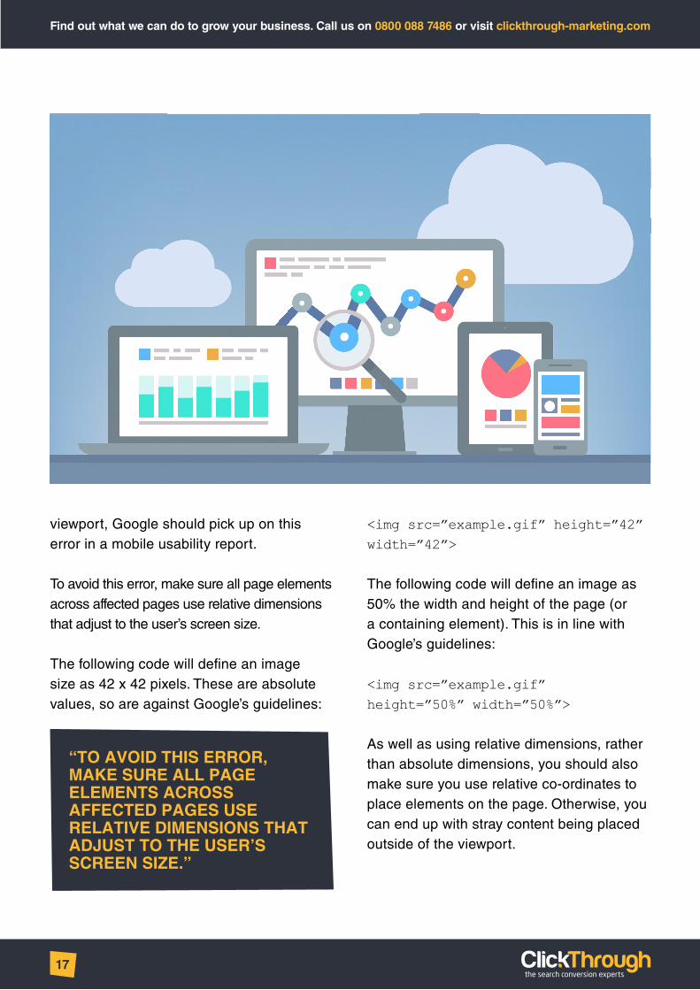
viewport, Google should pick up on this error in a mobile usability report.
To avoid this error, make sure all page elements across affected pages use relative dimensions that adjust to the user’s screen size.
The following code will define an image size as 42 x 42 pixels. These are absolute values, so are against Google’s guidelines:
<img src=”example.gif” height=”42” width=”42”>
The following code will define an image as 50% the width and height of the page (or a containing element). This is in line with Google’s guidelines:
<img src=”example.gif” height=”50%” width=”50%”>
As well as using relative dimensions, rather than absolute dimensions, you should also make sure you use relative co-ordinates to place elements on the page. Otherwise, you can end up with stray content being placed outside of the viewport.
“TO AVOID THIS ERROR, MAKE SURE ALL PAGE ELEMENTS ACROSS AFFECTED PAGES USE RELATIVE DIMENSIONS THAT ADJUST TO THE USER’S SCREEN SIZE.”

Find out what we can do to grow your business. Call us on 0800 088 7486 or visit clickthrough-marketing.com
18
SMALL FONT SIZE
Google says:“This report identifies pages where the font size for the page is too small to be legible and would require mobile visitors to “pinch to zoom” in order to read. After specifying a viewport for your web pages, set your font sizes to scale properly within the viewport.”
The problemThis issue is fairly self-explanatory. If your font sizes are too small for most normal-sighted people to read on a mobile device, then you’re creating a user experience problem. Normal-sighted users shouldn’t have to zoom in on a page to read its text – this defeats the purpose of responsive design, which aims to provide seamless, user-friendly experiences across devices.
The solutionThe answer to this problem isn’t quite as simple as ‘make the text bigger’.
There are two issues to be aware of – the units of measurement that define font sizes, and Google’s recommended font sizes for mobile devices.
Many units of measurement can be used to resize fonts, including inches, centimetres and millimetres. However, the most common are pixels (px), points (pt), EMs (em) and percent (%).
In this context, a pixel refers to a CSS pixel – a defined unit of measurement that will appear to be the same size across all devices.
Google recommends using pixels as your unit of measurement for fonts across your site. Although CSS pixels are a fixed size measurement, they are much less likely to cause confusion than common fixed measurements like millimetres or centimetres.
Google also recommends using a base font size of 16px, then defining other font sizes in your CSS that can be used across your site. These sizes should be defined in direct relation to this base size (for example, a ‘small’ font that’s 75% the size of your base).
In addition, you should:
• Adjust the vertical spacing between lines of text to make it legible on mobile devices. Google recommends the browser-default spacing of 1.2em.
• Be careful with your typographical choices. Using too many fonts can make pages look messy and difficult to read, especially on mobile

Find out what we can do to grow your business. Call us on 0800 088 7486 or visit clickthrough-marketing.com
19
TOUCH ELEMENTS TOO CLOSE
Google says:“This report shows the URLs for sites where touch elements, such as buttons and navigational links, are so close to each other that a mobile user cannot easily tap a desired element with their finger without also tapping a neighboring element. To fix these errors, make sure to correctly size and space buttons and navigational links to be suitable for your mobile visitors.”
The problemAgain, this is self-explanatory. If buttons, links and other ‘touchable’ elements are too close together, the user’s intended input may be misread by the device. This causes obvious usability issues.
The solutionYou need to evaluate behaviour drivers and calls to action on key pages and ensure links and buttons are big enough to press easily with touchscreen devices.
Google recommends that important touch elements are at least 48 by 48 CSS pixels (roughly seven millimetres square). This is based on the average adult finger pad size of 10mm.
Less important touch elements, like links in body text, can be smaller. However, they should be placed far enough from one another that the user doesn’t mistakenly hit the wrong link. Google recommends spacing these elements at least 5mm apart from one another.
“GOOGLE RECOMMENDS THAT IMPORTANT TOUCH ELEMENTS ARE AT LEAST 48 BY 48 CSS PIXELS (ROUGHLY SEVEN MILLIMETRES SQUARE). THIS IS BASED ON THE AVERAGE ADULT FINGER PAD SIZE OF 10MM.”

Find out what we can do to grow your business. Call us on 0800 088 7486 or visit clickthrough-marketing.com
20
Google is quite clear on its recommendations for creating responsive, mobile-friendly websites. But is it necessary to follow them to the letter?
The answer, as far as we can tell, is no.
From the evidence we’ve seen, it’s more important that you achieve the goals Google’s guidelines strive towards, than follow the exact directions Google recommends for achieving these goals.
To recap, here’s what Google considers to be a mobile-friendly website. This is the ideal you should be aiming for:
• A defined viewing area (or viewport) that adjusts to the device’s screen size.
• Content that flows in the viewport, so that users don’t have to scroll horizontally or pinch the screen in order to see the entire page.
• Fonts that scale for easier reading on small screens.
• Easy-to-touch elements (e.g., buttons) that are well-spaced from other touch elements.
• Visual design and motion driven by mobile-friendly technology.
Let’s use the ClickThrough Marketing website as an example. Our site achieves all of the above, but uses methods different to those Google recommends to create a responsive experience.
Despite the different approaches used, the visual result is the same – a site that provides a great user experience across a multitude of devices.
The ClickThrough website receives no usability errors when we run a mobile usability report. So it’s clear that Google values results over strict methodology.
HOW CLOSELY DO I HAVE TO FOLLOW GOOGLE’S GUIDELINES?

Find out what we can do to grow your business. Call us on 0800 088 7486 or visit clickthrough-marketing.com
21
TECHNICAL SEO CONSIDERATIONS
If you use a mobile site, it’s important to implement rel=canonical and rel=alternate media tags to tell Google’s crawlers that the desktop version of the site is the ‘original’. This avoids duplicate content issues, and ensures that backlink strength is passed back to the desktop version.
This is not necessary if you have a responsive site.
REL=CANONICALUse the desktop value for both the mobile and desktop version. This consolidates indexing and ranking signals (such as external links) and prevents confusion about potential duplicate content.
<link rel=”canonical” href=”http://www.example.com/desktop-version/example-page/”/>
REL=ALTERNATE MEDIAThis attribute enables you to map the desktop and mobile URLs. Use this attribute on the desktop page to specify the mobile version. (You don’t include this attribute on the mobile version to specify the desktop version.)
On the desktop page, include the following (where max-width is whatever you’ve set the page to support):
<link rel=”alternate” media=”only screen and (max-width: 640px)”href=”http://m.example.com/example-page/”/>”
SEO
“USE THE DESKTOP VALUE FOR BOTH THE MOBILE AND DESKTOP VERSION. THIS CONSOLIDATES INDEXING AND RANKING SIGNALS (SUCH AS EXTERNAL LINKS) AND PREVENTS CONFUSION ABOUT POTENTIAL DUPLICATE CONTENT.”

Find out what we can do to grow your business. Call us on 0800 088 7486 or visit clickthrough-marketing.com
22
Google has given no indication that the new mobile usability ranking factor will affect AdWords customers.
But Zoe O’Neil, ClickThrough’s director of paid search, reckons Google will focus its attention on PPC in due course:
“Google is quite clear in its intentions with its new ranking factor – it wants to provide users with ‘the most relevant and timely results’.
“Although the new ranking factor only affects organic search, it makes sense that Google will, at some point, also take mobile usability into account when ranking PPC ads. After
all, they’re an integral part of the search experience, and are inherently more visible than organic results.
“I expect that Google will soon factor in mobile usability when calculating Quality Score for ads, if it doesn’t already do so.
“If this ends up happening, having a mobile-unfriendly site will mean settling for lower Quality Scores – and, in turn, paying more to secure the same ad positions.”
PAID SEARCH CONSIDERATIONS

Find out what we can do to grow your business. Call us on 0800 088 7486 or visit clickthrough-marketing.com
23
Are you concerned about Google’s upcoming mobile usability ranking factor, and the affect it may have on your site’s traffic and search rankings?
Have you wanted to create a mobile-friendly website, but don’t have the time or expertise available to put it in place?
ClickThrough Marketing has more than ten years’ web development experience, helping trusted brands like Merc Clothing, Gtech and Helping Hands create responsive, mobile-friendly websites.
Our web development philosophy is led by our unique 35-step framework, which ensures marketing goals, SEO and user experience inform every stage of the development process.
The result? Great-looking websites that perform in search engines and provide great ROI through increased traffic, conversions and revenue.
To find out more, call our experts on: 0800 088 7486
NEED MORE HELP?
DOWNLOAD YOUR FREE EBOOK – HOW TO BRIEF A WEB DESIGN AGENCY: PART ONE
When planning a new website, your initial brief to your web development agency is crucial.
Successful websites are built on solid briefs. But getting your brief wrong could lead to a stretched budget, missed
deadlines, and a website that won’t support your marketing goals.
Start by learning what not to do. Download your FREE eBook today and learn how to avoid the pitfalls that doom web build projects before they start.
Get your copy here: http://clikth.ru/Brief-Web-Design-P1

Find out what we can do to grow your business. Call us on 0800 088 7486 or visit clickthrough-marketing.com
24
WEB DEVELOPMENT CASE STUDY:
HELPING HANDS HOMECAREHome care provider Helping Hands asked ClickThrough Marketing to create a responsive, user-friendly website to cater for its growing mobile audience. In this case study, we show how our unique 35-step web build process helped Helping Hands fall in love with its website all over again…
BackgroundHelping Hands is an award-winning provider of live-in care services. The family-run company has provided high-quality care to customers across England and Wales for more than 25 years, and boasts a five-star rating on NHS Choices.
ClickThrough Marketing has worked with Helping Hands since 2013, providing expert support for its SEO strategy.
The ChallengeFollowing an in-depth analytics audit in June 2014, Helping Hands noted that a significant proportion of its website traffic came from mobile users.
The company realised a website redevelopment was crucial. Their new website would have to cater to these mobile users, whilst improving conversion rates.
“The key objective was to get a responsive website to give our customers a better user journey.” Dal Dosanjh, marketing manager at Helping Hands
Helping Hands was also having trouble with its content management system (CMS). The platform they were using… “Wasn’t very user friendly,” says Dal.
“Most of the time we had to ask our existing web agency to do things. Even adding documents, or PDF downloads to the website was difficult.”
In terms of design, Dal emphasised it was important that Helping Hand’s new website had a “fresh, modern appeal”, whilst maintaining the brand’s established ‘look and feel’.
“The brief called for evolution, rather than revolution. We wanted to retain the existing look and feel but put a responsive, mobile-friendly design in place.” Dal Dosanjh
Despite already having a web development agency on board, Helping Hands decided to take the project to pitch. On the strength of their existing relationship, Helping Hands

Find out what we can do to grow your business. Call us on 0800 088 7486 or visit clickthrough-marketing.com
25
WEB DEVELOPMENT CASE STUDY:
invited ClickThrough, along with its existing web development agency, and several agencies it hadn’t previously worked with.
The PitchClickThrough’s pitch focussed on its metric-led approach to web development – supported by its five-phase, 35-step web build process.
The 35-step process is built on years of marketing and web development and
experience, and is designed to ensure every aspect of a website supports its marketing goals – from planning to design to delivery.
PROVEN PROCESS: BEST PRACTICE WEB DEVELOPMENT

Find out what we can do to grow your business. Call us on 0800 088 7486 or visit clickthrough-marketing.com
26
WEB DEVELOPMENT CASE STUDY:
Alan Rowe, ClickThrough’s head of web development, explains:
“With regard to design, we know that most customers like to see the design as early as possible. We appreciate this, but find this to be inefficient. By having the design process quite late in the 35-step process, it ensures we have thought long and hard about the challenges of a new website.
“By the time we start working on the design, we’ve already considered what target audiences are looking for, and how they might behave. We’ve already thought about how we can organise information to keep the user journey as simple as possible, allowing quick and easy access to information. And we’ve already scoped out how we can support SEO strategies.
“Having gone through the planning process, we are in a much better position to know what the website should look like. And, invariably, get it right first time.”
Despite strong competition, ClickThrough’s structured web development process, and the strength of its existing relationship with Helping Hands convinced the care company that ClickThrough was the right choice.
“We only invited a couple of agencies that we hadn’t worked with before. One of the pitches was absolutely fantastic, but ClickThrough was by far the best.
“What was really impressive was that ClickThrough was very, very structured. We liked that you could always look at the 35 steps and see where we are in the timeline. That was impressive.
“We also liked the fact that all key members of staff were present at the pitch. All directors, and all specialists made the effort to come along and get involved.” Dal Dosanjh

Find out what we can do to grow your business. Call us on 0800 088 7486 or visit clickthrough-marketing.com
27
WEB DEVELOPMENT CASE STUDY:
The ProcessA key facet of ClickThrough’s 35-step process is integration between separate marketing disciplines – from design to content, from conversion optimisation to SEO.
This approach ensures that every website ClickThrough creates is built to technical, conversion and SEO best practices – but necessitates tight communication between teams, and with clients.
Having worked together on SEO for more than a year, Helping Hands was confident ClickThrough could deliver on organic search. However, the new website presented a new challenge – how to implement
conversion rate optimisation (CRO) techniques in a uniquely challenging market.
The first point of contact for many of our customers is usually through online advertising. By the time they visit our site, they’re in a position where they’re at a very emotional point in their conversion journey.
“Obviously, it’s important that we are compassionate to these customers, whilst also being a trusted source of information and a viable business. The website needs to play many different roles to be successful. After all, 70% of our business is online.” Dal Dosanjh
ClickThrough also had a tight deadline to deal with. Helping Hands’ peak season was fast approaching, so the entire project would have to be delivered in just three months.
A KEY FACET OF CLICKTHROUGH’S 35-STEP PROCESS IS INTEGRATION BETWEEN SEPARATE MARKETING DISCIPLINES – FROM DESIGN TO CONTENT, FROM CONVERSION OPTIMISATION TO SEO.

Find out what we can do to grow your business. Call us on 0800 088 7486 or visit clickthrough-marketing.com
28
WEB DEVELOPMENT CASE STUDY:
The ResultsClickThrough delivered the project to deadline and to brief. The finished website used a responsive design that presented Helping Hands as a modern family-run business – supported by the detailed technical and marketing considerations laid out in the 35-step process.

Find out what we can do to grow your business. Call us on 0800 088 7486 or visit clickthrough-marketing.com
29

Find out what we can do to grow your business. Call us on 0800 088 7486 or visit clickthrough-marketing.com
30
WEB DEVELOPMENT CASE STUDY:
The feedback from Helping Hands was outstanding.
“The ClickThrough ‘A Team’. Give them a challenge, they’ll get it done. Give them a deadline – ‘yep, no problem’. Ask for the plus-1s in service – already there. That’s our experience of working with ClickThrough and we offer our sincere thanks for a job well done. It really has been an absolute pleasure working with you all.” Jo Wright, Helping Hands’ head of marketing
“I just wanted to give my sincerest thanks to Alan, Neil, Matt, Lily, Zoe, Jordan, Lisa, Richard and I’m sure a whole host of others at ClickThrough, who have been instrumental in producing an awesome looking and functioning website.”
“Selecting ClickThrough as our web development partner was the best decision Helping Hands made. The whole process – and the journey you’ve taken us through – has been fun and educational. It’s been a real pleasure working with such a fantastic professional team.” Dal Dosanjh
The Helping Hands team also praised ClickThrough’s high standards of communication. Jo Wright said:
“The technical know-how at ClickThrough is industry-leading, but what really sets you apart in my opinion is your communication. Just plain old communication; and not just keeping us informed at all times but we also notice it between yourselves as a team.
“As very demanding clients we know what we want and you listened, took the time to understand and then actioned.”
As Alan Rowe explains:
“By ensuring as many people across disciplines were involved in key stages of the build, we were able to work together with CTM an extension of Helping Hands’ marketing department as a single team, all working to close off snags to reach the end game.”
As for Helping Hands’ content management system, ClickThrough identified at an early stage that a simple, easy-to-use platform like WordPress would suit the care company’s needs. Helping Hands’ team were frustrated that their current CMS prevented them from editing content themselves, and they had no need for a complex e-Commerce system

Find out what we can do to grow your business. Call us on 0800 088 7486 or visit clickthrough-marketing.com
31
WEB DEVELOPMENT CASE STUDY:
that would require extensive training and investment.
ClickThrough built the website using WordPress, and according to Dal Dosanjh, “It’s so friendly to use. From a user perspective now, I’m instantly very clear as to where I’m at on the site.”
The final challenge to overcome was how to optimise the site for conversion, whilst being sensitive to the needs and emotions of Helping Hands’ user base. ClickThrough’s previous experience creating Helping Hands content, as well as the built-in audience research of the 35-step process, ensured this wasn’t an obstacle. Richard Chapman, ClickThrough’s conversion and analytics manager, explains:
“Helping Hands’ website was particularly challenging. It had to communicate to and convert multiple and very different personas – growing business, showing empathy and recruiting new staff. For websites like this,
you have to be able to adjust what you do based on the specific challenges of the client, user base and sector.
“That’s why our 35-step process includes in-depth persona analysis at an early stage. This ensures our audience research informs every step of the design and conversion processes.
“Through careful use of empathetic content and imagery, we were able to satisfy the needs of Helping Hands as a business, and the emotional needs of its users.”
For the final word, we’ll turn to Dal Dosanjh:
“I’m still in love with the website. I think it’s great.”
Are you in the market for a new website, but can’t find a web development agency that understands your marketing plans?
Let our experts show you how our unique 35-step web build process can support and improve your marketing efforts. Call now on 0808 159 7730.

Find out what we can do to grow your business. Call us on 0800 088 7486 or visit clickthrough-marketing.com
32
ClickThrough is a digital marketing agency, providing web development, search engine optimisation, pay per click management, conversion optimisation and content marketing services.
Since 2004, ClickThrough has helped several companies from big brands to small start-ups grow Google rankings, boost conversions, increase return on digital marketing investment, and stretch Internet marketing budgets to get value for money.
We pride ourselves on giving honest advice based on the latest digital marketing best practices. Our RITE core values of Results, Innovation, Trust and Excellence drive everything we do.
; A proven and trusted agency since 2004
; Creators of BidCops.com - Europe’s leading free AdWords Auditing Tool
; We are a Top 100 Agency on Recommended Agency Register
; We have published several books on digital marketing, sold on Amazon
; Proven track record from our work with clients including Peugeot, Dunelm, Biffa and Halfords Autocentres
; Our people all receive our industry-leading, Digital Academy training
; Active members of the IAB, eConsultancy and SEMPO
; Thought leaders, giving clients the inside track on what matters in search, social media and the digital marketplace... before it happens!
Whether you are thinking of changing your search or digital marketing agency, or just looking to improve your online conversion rate, our team of search conversion experts can help.
Find out what we can do to grow your business. Call us on 0800 088 7486 or visit www.clickthrough-marketing.com
ABOUT CLICKTHROUGH