the universal windows platform -...
TRANSCRIPT
The UniversalWindows PlatformBroaden your apprsquos reach with ease
2
ContentsIntroduction
Getting started
Inclusive design accessibility globalization and more
Device families
Cross-platform development
Publishing Your App
Monetization and marketing
Optimization
Thank you
Appendix Source code
User experience
01
02
07
06
03
04
08
09
10
05
Setting up your machineChoosing a languageOptional tools emulators and downloads
Device family strategies Desktop device family Xbox device family Mobile device family HoloLens device family
Cross-platform development with Xamarin
Universal controls - Adding controls - Styling controls
Layout panelsCommon input handling Adaptive scaling Visual state triggers
Figuring out what to build Layout Anatomy of a UWP App Plan your UWP app Styling your app - Color - Icons - Motion - Sound - Typography
Introducing the new Visual Layer
Success by designcreating the app users want to use
Accessibility testing Accessibility in the store Globalization and localization App settingsIn-app help
Create your app by reserving a new name Create a submission CertificationRelease Confirmation
Monetizing your appMarketing your app
3
Welcome to a Windows built for your success
Succeeding in the crowded world of app development today means making the most of your creativity and delivering great user experiences across a wide range of devices The Universal Windows Platform (UWP) is designed to help you do all that and more quickly and efficiently
This guide gives you an easy-to-digest overview of UWPrsquos key features so you can get started quickly even if you have never developed for Windows before Windows is for more than just PCs
Today the Windows ecosystem spans a wide range of successful devices It includes innovative 2-in-1s and tablets such as Microsoft Surface huge HD touchscreen devices such as Surface Hub the immersive mixed-reality HoloLens device Xbox and Internet of Things devices With UWP you can be everywhere users are looking for the latest innovations
How to use this guide
The UWP Guidebook takes you step-by-step through the key features of UWP from imagining and designing an app all the way through packaging marketing and monetization Along the way yoursquoll find tips and resources to accelerate your success Yoursquoll also find code examples from our Lunch Planner app available on GitHub
Do I have to know Windows
Nope This guide is designed for any developer to understand Yoursquoll find most of the concepts are familiar so yoursquoll get more information on those features unique to UWP
The best way to succeed with UWP is to dive inmdashso letrsquos get started
01 Introduction
4
bull UWP provides a common app platform available on every device that runs Windows 10
bull Apps that target the UWP can call WinRT APIs common to all devices as well as APIs specific to the device family the app is running on including Win32 APIs found in classic desktop apps
bull The UWP provides a guaranteed core API layer across devices so a single app package can be installed onto a wide range of devices from the Windows Store
What is UWP
The Universal Windows Platform was introduced with Windows 10 Itrsquos an evolution of the Windows Runtime (WinRT) model introduced in Windows 81 bringing that model into the Windows 10 Core
5
Setting up your machine
Here are a few basic things yoursquoll need to do to set up your environment for writing a UWP app
If you have a PC
1 Get Windows 10 To develop UWP apps you need the latest RTM version of Windows (that is not the Insider Preview or Preview SDK)
2 Download or update Visual Studio Microsoft Visual Studio 2015 helps you design code test and debug your apps If you donrsquot already have Visual Studio 2015 install the free Microsoft Visual Studio Community 2015 It includes device and phone simulators for testing your apps Download Windows 10 developer tools
3 (Optional) Enable your device for development Visual Studio provides a wide range of great emulators for testing If you want to test your apps on an actual device you must enable it for development Find instructions at the following link Enable your device for development
4 Register as an app developer You can start developing apps now but before you can submit them to the store you need a developer account To get a developer account go to the Sign up page
Get everything you need in one VMStart coding sooner with a virtual machine prepped for Windows 10 development It has the latest versions of Windows the developer tools SDKs and samples ready to go Get the Windows 10 development VM here
Using a MacWith popular third-party solutions like Apple Boot Camp Oracle VirtualBox VMware Fusion and Parallels Desktop you can install Windows 10 and Microsoft Visual Studio on your Apple computer Once you have Windows 10 running on your Mac follow the instructions under ldquoIf you have a PCrdquo above
Resources
bull More on getting started with Visual Studio httpsmsdnmicrosoftcomen-uswindowsuwpportinggetting-started-creating-a-project
bull Donrsquot want to use Visual Studio Download the standalone Windows SDK for Windows 10 installer
bull Options for developing on a Mac httpsmsdnmicrosoftcomen-uswindowsuwpportingsetting-up-your-mac-with-windows-10
bull Windows 10 development VM httpsdevelopermicrosoftcomen-uswindowsdownloadsvirtual-machines
When you install Visual Studio use the custom option and make sure all Universal Windows App Development Tools options are selected as shown here
This section covers the basics of getting started with UWP including how to set up your development environment and which language to choose
02 Getting started
6
Choosing a language
You can choose from a wide range of common coding languages to develop in UWP including C++ C Microsoft Visual Basic or JavaScript You even write components in different languages and combine them
How to chooseThe language you choose dictates your UI options
bull For Visual C++ C and Visual Basic you can use XAML for a full-fidelity native UI experience
bull Visual C++ adds the option to use DirectX for more intensive graphics
bull For JavaScript your presentation layer is HTML5
Other considerations
bull Intensive graphics and high-performance apps lend themselves to Visual C++ and DirectX
bull JavaScript and HTML5 are great for universal web apps
Optional tools emulators and downloads
There are many great tools to help you create a successful innovative UWP app Below are a few highlights
bull Remote Tools for Visual Studio 2015 Run debug and test an app that is running on one device from another device that is running Visual Studio Download Remote Tools
bull Microsoft Emulator for Windows 10 Mobile Test your universal app using a unique Windows 10 Mobile emulator image The emulator requires Visual Studio 2015 and is not backward compatible with earlier versions Download the emulator
bull HoloLens Emulator and Templates The Microsoft HoloLens Emulator enables you to run UWP apps targeting HoloLens on your PC The Windows Holographic app templates simplify the creation UWP apps for HoloLens using DirectX Using the HoloLens emulator
bull Multilingual App Toolkit Tools to help you localize your Store app with translation support translation file management and editor tools Get details and additional languages
bull Microsoft Store Services SDK Use this SDK to add features to your apps that help you make more money and gain customers such as displaying ads in your apps and running experiments with AB testing Get the Microsoft Store Services SDK
bull UWP Community Toolkit
bull Multilingual App Toolkit
bull Package Analyzer
bull Free Telerik Control
Resources
bull Windows developer downloads httpsdevelopermicrosoftcomen-uswindowsdownloads
7
03 Device families
Beautiful user experiences across multiple form factors
UWP apps target device families A device family specifies the APIs system characteristics and behaviors you can expect across a set of devices It also determines the set of devices on which your app can be installed from the Store
All child device families inherit the set of APIs in the universal device family If you write an app using only universal device family APIs it will run on every Windows 10 device
Each child device family adds its APIs to the ones it inherits The resulting union of APIs in a child device family is guaranteed to be present in the OS based on that device family and on every device running that OS
bull You can write your app for any or even all of a variety of devices including phones tablets desktop computers Internet of Things (IoT) devices Xbox consoles and HoloLens
bull Your app can also use adaptive code to dynamically detect and use features of a device that are outside of the universal device family
bull The device families you choose also determine what types of devices can download your app from the Windows Store
bull You can use adaptive code to detect the device type and call APIs outside the device family yoursquore targeting if you want to enable specific features
Changing the targeted device familyBy default Microsoft Visual Studio targets the universal device family in the app package manifest file By default your app will run on PC Xbox mobile HoloLens and Windows IoT without any extra configuration To restrict the device family or device families that your app is offered to from within the Store manually configure the TargetDeviceFamily element in your Packageappxmanifest file
ltDependenciesgt ltTargetDeviceFamily Name=rdquoWindowsUniversalrdquo MinVersion=rdquo10000rdquo MaxVersionTested=rdquo10000rdquo gtltDependenciesgt
Code example
Universaldevice family
Desktopdevice family
Mobiledevice family
Xbox devicefamily
IoT devicefamily
IoT headlessdevice family
HoloLensdevice family
8
Device family strategies
The decision about which device family (or families) your app will target is yours to make This decision determines
bull The set of APIs that your app can assume to be present when it runs (and can therefore call freely)
bull The set of API calls that are safe only inside conditional statements
The set of devices on which your app can be installed from the Store (and consequently the form factors that you need to consider)
Options for targeting device families
bull To reach the most devices target the Universal device family
bull Specialized apps can be limited to one device family For example if you target the desktop device family the APIs guaranteed to be available to your app include the APIs inherited from the universal device family plus the APIs that are specific to the desktop device family
bull Instead of targeting the universal device family or targeting one of the child device families you can instead target two (or more) child device families
bull Your app can be targeted to run everywhere except on devices with a specific version of a specific device family
Desktop device family
Windows PCs and laptops include a wide array of devices and screen sizes With screens typically 13rdquo or larger PCs and laptops can display more information than phones or tablets
bull Apps can have a windowed view the size of which is determined by the user Depending on window size there can be between one and three frames On larger monitors the app can have more than three frames
bull When using an app on a desktop or laptop the user has control over app files As an app designer be sure to provide the mechanisms to manage your apprsquos content Consider including commands and features such as ldquoSave Asrdquo ldquoRecent filesrdquo and so on
bull The system back button is optional When if you choose to show it it appears in the app title bar
Xbox device family
Tailoring and optimizing your app to work great on Xbox One and TV screens requires special considerations The experience of sitting on your couch across the room using a gamepad or remote to interact with your TV is called the 10-foot experience As you bring your app to life in the 10-foot environment consider the following design principles
bull Simple The amount of information displayed on a TV should be comparable to what yoursquod see on a mobile phone rather than on a desktop
bull Coherent Make the focus clear and unmistakable Arrange content so that movement across space is consistent and predictable Give people the shortest path to what they want to do
bull Captivating The most immersive cinematic experiences take place on the big screen Edge-to-edge scenery elegant motion and vibrant use of color and typography take your apps to the next level
bull Understand gamepad and remote control input The quality of gamepad and remote behavior that you get out-of-the-box depends on keyboard support in your app A good way to ensure that your app works well with gamepadremote is to make sure that it works well with the keyboard on PC and then test with gamepadremote to find weak spots in your UI
Resources
bull UWP on Xbox One httpsmsdnmicrosoftcomen-uswindowsuwpxbox-appsindex
bull Xbox best practices httpsmsdnmicrosoftcomen-uswindowsuwpxbox-appstailoring-for-xbox
bull Gamepad and remote control interactions httpsmsdnmicrosoftcomen-uswindowsuwpinput-and-devicesgamepad-and-remote-interactions
bull Interoperability with third-party game engines httpsblogsmsdnmicrosoftcomsomasegar20150417visual-studio-for-game-development-new-partnerships-with-unity-unreal-engine-and-cocos2d
9
Mobile device family
The most widely-used of all computing devices phones can do a lot with limited screen real estate and basic inputs Phones are available in a variety of sizes App experiences on larger phones enable some key changes in content consumption
With Continuum for Phones a new experience for compatible Windows 10 mobile devices users can connect their phones to a monitor and even use a mouse and keyboard to make their phones work like a laptop Primarily used in portrait orientation mostly due to the ease of holding the phone with one hand and being able to fully interact with it that way but there are some experiences that work well in landscape such as viewing photos and video reading a book and composing text
bull The small size of a phonersquos screen allows only one frame at a time to be viewed in both portrait and landscape orientations All hierarchical navigation patterns on the phone use the ldquodrill downrdquo model with the user navigating through single-frame UI layers
bull With larger phones users can rotate to landscape orientation and stay there so a navigation frame and menu can be visible at a time
bull In both landscape and portrait orientations be sure that therersquos enough screen real estate for the app bar when the on-screen keyboard is up
TabletsTablets typically have touchscreens cameras microphones and accelerometers Tablet screen sizes usually range from 7rdquo to 133rdquo
bull In both landscape and portrait orientations tablets allow two frames at a time
bull The system back button is located on the navigation bar
HoloLens device family
Cutting-edge mixed-reality experiences made easy with UWPMicrosoft HoloLens is the first self-contained holographic computer enabling you to engage with your digital content and interact with holograms in the world around you All apps built for Microsoft HoloLens run on the Universal Windows Platform (UWP)
For HoloLens TV-like viewing distances are recommended to produce the best readability and interaction with gazegesture HoloLens defaults to a resolution of 1280x720150DPI (853x480 effective pixels) about the same information density as a tablet or small desktop It also matches fixed DPI and effective pixels for UWP apps running on Xbox One
To ensure your app looks good on HoloLens follow the Windows 10 Human Interface Guidelines for effective pixels Windows scaling will handle sizing pixels for usability across devices resolutions DPI and so on
Resources
bull Holographic Academy httpsdevelopermicrosoftcomen-uswindowsholographicacademy
bull 2D vs holographic views httpsdevelopermicrosoftcomen-uswindowsholographicapp_views_on_hololens
bull Windows 10 Human Interface Guidelines httpsdevwindowscomen-usdesign
bull Responsive design best practices httpsmsdnmicrosoftcomen-uslibrarywindowsappsdn958435aspx
bull HoloLens emulator httpsdevelopermicrosoftcomen-uswindowsholographicusing_the_hololens_emulator
10
If yoursquore coming to UWP from Android or iOS good newsmdashthere are tools and approaches that make it relatively easy to port apps from those platforms to UWP and even to develop for multiple platforms at the same time
04 Cross-platform development
Cross-platform development with Xamarin
Xamarin lets you build C apps for Windows Android and iOS Xamarin also provides the XamarinForms technology which lets you share logic and user-interface code across platforms It supports iOS Android and UWP along with some older Windows operating systems
bull Learn more about using Xamarin with UWP httpsdeveloperxamarincomguidescross-platformwindowsuniversal
11
05 User experience
Make your app work as good as it looks
A UWP app can run on many kinds of devices that have different forms of input screen resolutions DPI density and other unique characteristics Windows helps you target your UI to multiple devices with the following features
bull Universal controls and layout panels help you optimize your UI for the screen resolution of the device
bull Common input handling allows an app to receive input from a range of devices such as touch pen mouse keyboards and game controllers
bull Tooling helps you to design UI that can adapt to different screen resolutions
bull Adaptive scaling adjusts to resolution and DPI differences across devices
Universal controls
Universal controls are designed to work well on larger screens adapt themselves based on the number of screen pixels available on the device and integrate with multiple types of input such as keyboard mouse touch pen and controllers such as the Xbox controller
In UWP app development a control is a UI element that displays content or enables interaction You create the UI for your app by using controls such as buttons text boxes and combo boxes to display data and get user input A pattern is a recipe for modifying a control or combining several controls to make something new For example the Nav pane pattern is a way that you can use a SplitView control for app navigation
Code example Nav pane pattern
ltSplitView IsPaneOpen=rdquoTruerdquo DisplayMode=rdquoInlinerdquo OpenPaneLength=rdquo250rdquogt ltSplitViewPanegt ltTextBlock Text=rdquoPanerdquo FontSize=rdquo24rdquo VerticalAlignment=rdquoCenterrdquo HorizontalAlignment=rdquoCenterrdquogt ltSplitViewPanegt ltGridgt ltTextBlock Text=rdquoContentrdquo FontSize=rdquo24rdquo VerticalAlignment=rdquoCenterrdquo HorizontalAlignment=rdquoCenterrdquogt ltGridgt ltSplitViewgt
Pane Content
12
1 Add a control
You can add a control to an app in several ways
bull Use a design toolrsquos toolbox like Blend for Visual Studio or the Microsoft Visual Studio Extensible Application Markup Language (XAML) designer
bull Add the control to the XAML markup in the Visual Studio XAML editor
bull Add the control in code Controls that you add in the code are visible when the app runs but are not visible in the Visual Studio XAML designer
2 Set control properties
You use properties to specify the appearance content and other attributes of controls When you add a control using a design tool some properties that control size position and content might be set for you by Visual Studio You can change some properties such as Width Height or Margin by selecting and manipulating the control in the Design view
You can set the control properties in the Properties window in XAML or in code For example to change the foreground color for a Button you set the controlrsquos Foreground property This illustration shows how to set the Foreground property by using the color picker in the Properties window
XAML Properties window
Adding controlsThere are 3 key steps to adding controls to your app
1 Add a control to your app UI
2 Set properties on the control
3 When relevant add code to the controlrsquos event handlers so that it does something
Code example XAML Markup
ltToggleSwitch IsOn=rdquoTruerdquo Header=rdquoLunch RemindersrdquogtLunch Reminders
On
13
3 Add an event handler
Each control has events that enable you to respond to actions from your user or other changes in your app For example a Button control has a Click event that is raised when a user clicks the Button You can associate a controlrsquos event with an event handler method in the Properties window in XAML or in code
Code example Options page
lt-- OptionsPagexaml --gt ltPageDataContextgtltviewModelsOptionsViewModel xName=rdquoViewModelrdquogtltPageDataContextgtltButton xName=rdquoCheckStatusButtonrdquo Content=rdquocheck background task statusrdquo Click=rdquoxBind ViewModelGetStatusButton_OnClickrdquo Margin=rdquo10rdquogt
Code example Options view model
lt-- OptionsViewModelcs --gt
public void GetStatusButton_OnClick(object sender RoutedEventArgs e) object obj if (localSettings = null ampamp localSettingsValuesTryGetValue(ConstantsBackgroundTaskStatusSettingsKey out obj)) LastTaskStatusMessage = objToString()
14
Styling controls
XAML controls separate logic and appearance so you can modify them individually to fit your needs Use styles to extract visual property settings into reusable resources Herersquos an example that shows 3 buttons with a style that sets the BorderBrush BorderThickness and Foreground properties By applying a style you can make the controls appear the same without having to set these properties on each control separately
You can define a style inline in the XAML for a control or as a reusable resource Define resources in an individual pagersquos XAML file in the Appxaml file or in a separate resource dictionary XAML file A XAML resource dictionary can be shared across apps and more than one resource dictionary can be merged in a single app
ButtonButton Button Button
15
Code example In Appxamlrsquos Resources with an Explicit Style using an xKey and an Implicit Style
Apply an implicit or explicit style If you define a style as a resource there are two ways to apply it to your controls
bull Implicitly by specifying only a TargetType for the Style
bull Explicitly by specifying a TargetType and an xKey attribute for the Style and then by setting the target controlrsquos Style property with a StaticResource markup extension reference that uses the explicit key
bull If a style contains the xKey attribute you can only apply it to a control by setting the Style property of the control to the keyed style In contrast a style without an xKey attribute is automatically applied to every control of its target type that doesnrsquot otherwise have an explicit style setting
ltApplication xClass=rdquoUWPGuideApprdquo xmlns=rdquohttpschemasmicrosoftcomwinfx2006xamlpresentationrdquo xmlnsx=rdquohttpschemasmicrosoftcomwinfx2006xamlrdquo RequestedTheme=rdquoLightrdquogt
ltApplicationResourcesgt
lt--An Explicit Style--gt ltStyle xKey=rdquoMyExplicitStylerdquo TargetType=rdquoTextBlockrdquogt ltSetter Property=rdquoForegroundrdquo Value=rdquoGreenrdquo gt ltStylegt
lt-- An Implicit Style--gt ltStyle TargetType=rdquoContentPresenterrdquogt ltSetter Property=rdquoHortizontalAlignmentrdquo Value=rdquoStretchrdquo gt ltSetter Property=rdquoVerticalAlignmentrdquo Value=rdquoStretchrdquo gt ltStylegt ltApplicationResourcesgtltApplicationgt
16
Resources
bull Nav Pane pattern example httpsmsdnmicrosoftcomen-uswindowsuwpcontrols-and-patternsnav-pane
bull Controls listing httpsmsdnmicrosoftcomen-uswindowsuwpcontrols-and-patternscontrols-by-function
bull Events and routed events overview httpsmsdnmicrosoftcomen-uswindowsuwpxaml-platformevents-and-routed-events-overview
Code example Now in any XAML page we can use the explicit Style by itrsquos key For the implicit Style we donrsquot need to do anything
lt--Any page in the app--gt
lt-- This TextBlock uses the named explicit style --gtltTextBlock Style=rdquoStaticResource MyExplicitStylerdquo gt
lt-- This ContentPresenter will use the implicit style --gtltContentPresenter gt
17
Layout panelsYou can use layout panels to arrange and group UI elements in your app The built-in XAML layout panels include RelativePanel StackPanel Grid VariableSizedWrapGrid and Canvas Here yoursquoll learn about each panel and show how to use it to layout XAML UI elements
bull How the panel positions its child elements
bull How the panel sizes its child elements
bull How overlapping child elements layer on top of each other (z-order)
bull The number and complexity of nested panel elements needed to create your desired layout
For example StackPanel orders its children sequentially (horizontally or vertically)
Code example A horizontal StackPanel
lt-- Horizontal --gtltStackPanelgt ltRectangle Fill=rdquoRedrdquo Height=rdquo44rdquogt ltRectangle Fill=rdquoBluerdquo Height=rdquo44rdquogt ltRectangle Fill=rdquoGreenrdquo Height=rdquo44rdquogt ltRectangle Fill=rdquoYellowrdquo Height=rdquo44rdquogtltStackPanelgt
Code example A vertical StackPanel
lt-- Vertical --gtltStackPanel Orientation=rdquoHorizontalrdquogt ltRectangle Fill=rdquoRedrdquo Width=rdquo44rdquo Height=rdquo44rdquogt ltRectangle Fill=rdquoBluerdquo Width=rdquo44rdquo Height=rdquo44rdquogt ltRectangle Fill=rdquoGreenrdquo Width=rdquo44rdquo Height=rdquo44rdquogt ltRectangle Fill=rdquoYellowrdquo Width=rdquo44rdquo Height=rdquo44rdquogtltStackPanelgt
18
ltRelativePanel BorderBrush=rdquoGrayrdquo BorderThickness=rdquo1rdquo Background=rdquoBlackrdquogtltRectangle xName=rdquoRedRectrdquo Fill=rdquoRedrdquo Height=rdquo44rdquo Width=rdquo44rdquogt ltRectangle xName=rdquoBlueRectrdquo Fill=rdquoBluerdquo Height=rdquo44rdquo Width=rdquo88rdquo RelativePanelRightOf=rdquoRedRectrdquo gtltRectangle xName=rdquoGreenRectrdquo Fill=rdquoGreenrdquo Height=rdquo44rdquo RelativePanelBelow=rdquoRedRectrdquo RelativePanelAlignLeftWith=rdquoRedRectrdquo RelativePanelAlignRightWith=rdquoBlueRectrdquogt ltRectangle Fill=rdquoYellowrdquo RelativePanelBelow=rdquoGreenRectrdquo RelativePanelAlignLeftWith=rdquoBlueRectrdquo RelativePanelAlignRightWithPanel=rdquoTruerdquo RelativePanelAlignBottomWithPanel=rdquoTruerdquogtltRelativePanelgt
Code example A Grid places its children into cells
ltGridgt ltGridRowDefinitionsgt ltRowDefinitiongt ltRowDefinition Height=rdquo44rdquogt ltGridRowDefinitionsgt ltGridColumnDefinitionsgt ltColumnDefinition Width=rdquoAutordquogt ltColumnDefinitiongt ltGridColumnDefinitionsgt ltRectangle Fill=rdquoRedrdquo Width=rdquo44rdquogt ltRectangle Fill=rdquoBluerdquo GridRow=rdquo1rdquogt ltRectangle Fill=rdquoGreenrdquo GridColumn=rdquo1rdquogt ltRectangle Fill=rdquoYellowrdquo GridRow=rdquo1rdquo GridColumn=rdquo1rdquogtltGridgt
Code example The RelativePanel eases the process of rearranging elements by defining relationships between elements which allows you to build more dynamic UI without using nested layouts
19
Resources
bull Layout panels httpsmsdnmicrosoftcomen-uswindowsuwplayoutlayout-panels
bull Attached properties httpsmsdnmicrosoftcomen-uswindowsuwpxaml-platformattached-properties-overview
Code example The Canvas panel positions its child elements using fixed coordinate points
ltCanvas Width=rdquo120rdquo Height=rdquo120rdquogt ltRectangle Fill=rdquoRedrdquo Height=rdquo44rdquo Width=rdquo44rdquogt ltRectangle Fill=rdquoBluerdquo Height=rdquo44rdquo Width=rdquo44rdquo CanvasLeft=rdquo20rdquo CanvasTop=rdquo20rdquogt ltRectangle Fill=rdquoGreenrdquo Height=rdquo44rdquo Width=rdquo44rdquo CanvasLeft=rdquo40rdquo CanvasTop=rdquo40rdquogt ltRectangle Fill=rdquoYellowrdquo Height=rdquo44rdquo Width=rdquo44rdquo CanvasLeft=rdquo60rdquo CanvasTop=rdquo60rdquogtltCanvasgt
20
Common input handlingCommon input handling allows your app to receive input through a variety of devices and interfaces The way UWP handles inputs is designed to help you give users distinctive experiences For example you can enable ink with touch and pointer inputs as well as pen Inking is supported on many devices (including mobile devices) and is easily incorporated with a few lines of code
Out-of-the-box vs customized input UWP apps automatically handle a wide variety of inputs across a variety of devicesmdashtherersquos nothing extra you need to do to enable touch input or make your app run on a phone for example
However in many cases you might want to optimize your app for certain types of input or devices
Maximize inputs and accessibility To accommodate the broadest range of users and devices design your apps to work with as many input types as possible (gesture speech touch touchpad mouse and keyboard) Doing so maximizes flexibility usability and accessibility
Resources
bull Interaction primer httpsmsdnmicrosoftcomen-uswindowsuwpinput-and-devicesinput-primer
21
Adaptive scaling Windows 10 introduces an evolution of the existing scaling model In addition to scaling vector content there is a unified set of scale factors that provides a consistent size for UI elements across a variety of screen sizes and display resolutions The scale factors are also compatible with the scale factors of other operating systems such as iOS and Android making it easier to share assets between these platforms The Store picks the assets to download based in part of the DPI of the device Only the assets that best match the device are downloaded
Effective pixels and scalingUWP apps automatically adjust the size of controls fonts and other UI elements so that they are legible on all devices When your app runs on a device the system uses an algorithm to normalize the way UI elements display on the screen This scaling algorithm considers viewing distance and screen density (pixels per inch) to optimize for perceived size (rather than physical size)
When you design your UWP app yoursquore designing in effective pixels not actual physical pixels That means
bull You can ignore the pixel density and the actual screen resolution when designing Instead design for the effective resolution (the resolution of effective pixels) for a size class
bull When the system scales your UI it does so by multiples of 4 To ensure a crisp appearance snap your designs to the 4x4 pixel grid make margins sizes and positions of UI elements and the position (but not the sizemdashtext can be any size) of text a multiple of 4 effective pixels
Resources
bull Effective pixels httpsmsdnmicrosoftcomen-uswindowsuwplayoutdesign-and-ui-introeffective-pixels-and-scaling
Thumbnail for a grid layout ThumbnailModepictureView 200x137
Thumbnail for a single picture ThumbnailModesingleitem 256x170
Thumbnail for a list layout ThumbnailModelistView 200x200
Adaptive scaling example
22
Visual state triggers
Your UI may need to adapt to changes in window size Adaptive visual states allow you to change the visual state in response to changes in the size of the window StateTriggers define a threshold at which a visual state activates which then sets layout properties as appropriate for the window size that triggered the state change
Maximize inputs and accessibility To accommodate the broadest range of users and devices design your apps to work with as many input types as possible (gesture speech touch touchpad mouse and keyboard) Doing so maximizes flexibility usability and accessibility
Resources
bull Visual state triggers httpsmsdnmicrosoftcomlibrarywindowsappswindowsuixamlvisualstatestatetriggersaspx
Code example Visual state triggers
Code example Visual state triggers
ltVisualStateManagerVisualStateGroupsgt ltVisualStateGroupgt ltVisualState xName=rdquowideStaterdquogt ltVisualStateStateTriggersgt ltAdaptiveTrigger MinWindowWidth=rdquo641rdquo gt ltVisualStateStateTriggersgt ltVisualStateSettersgt ltSetter Target=rdquoHeaderGridVisibilityrdquo Value=rdquoCollapsedrdquo gt ltVisualStateSettersgt ltVisualStategt ltVisualState xName=rdquonarrowStaterdquogt ltVisualStateStateTriggersgt ltAdaptiveTrigger MinWindowWidth=rdquo0rdquo gt ltVisualStateStateTriggersgt ltVisualStateSettersgt ltSetter Target=rdquoHeaderGridVisibilityrdquo Value=rdquoVisiblerdquo gt ltVisualStateSettersgt ltVisualStategt ltVisualStateGroupgt ltVisualStateManagerVisualStateGroupsgt
23
06 Success by design creating the app users want to use
The power of design-led development The right design can set your app apart from the rest by giving users powerful memorable interactions they return to again and again This section covers inspiration planning sketching layout style and some tips for working with the visual layer in UWP To kick things off look at the Microsoft Design Language principles These arenrsquot meant to tell you how to designmdashjust as inspiration for thinking about your own set of design principles and how to create apps that stand out
bull Keep it simple We start with simplicity as the ultimate unifier When design is intuitive we just know We can feel it The result is an experience thatrsquos honest and timeless
bull Make it personal Next we challenge ourselves to create an emotional connection with the user We design for the ways people live and think and act The result is an experience that feels like it is created for an individualrsquos specific needs
bull Think universal We design to embrace the things that make us human Itrsquos more far more than an attitude for making stuff ndash and into creating a world that makes lives better The result is technology thatrsquos inclusive
bull Create delight Our final principle is about energy within a structure Itrsquos how you know the experience is made by a real person The result is an experience that surprises and has a sense of place
Figuring out what to buildWhether yoursquore building for money fame passion or charity it pays to spend some time considering what the current market landscape looks like for the idea Who are your competitors How popular are they Whatrsquos their value-add Conducting a market analysis before you build an app can greatly increase the discoverability of your app and lead to an increased number of downloads and users There are many resources available to help in analyzing the current landscape of the market Choosing a category with less competition or adding features a competitor may not have helps make your app stand out more
Using a service such as AppAnnie you can analyze the breakdown by category across various app stores To better interpret the data look at the number of apps as well as the number of ratings and reviews You may find that some categories are disproportionately represented in the top app charts relative to their overall app count indicating potential opportunities
Looking at the market data you may notice a category where there is relatively little competition You may have also found a few missing apps or app types that seem to be currently popular on other platforms Use this information to augment and better prioritize your ideas list Once you have this you can start looking at the competition in that space
Take your top ideas and brainstorm a few keywords For example if you wanted to make a Solitaire game you might have keywords such as Solitaire Spider Solitaire Cards Casino etc Take these keywords and look at the Top Charts Do you already see one or more extremely popular apps of this type Is there something that these apps are missing What do users mostly criticize about the app This information can point to opportunities that result in a much more competitive app
24
Layout Anatomy of a UWP AppA modern user interface is a complex thing To make things simpler letrsquos define the anatomy of an app from a design perspective Letrsquos say that an app is made up of screens and pages Each page has a user interface made up of three types of UI elements navigation commanding and content elements
Navigation elementsNavigation elements help users choose the content they want to display Examples of navigation elements include tabs and pivots hyperlinks and nav panes
Command elementsCommand elements initiate actions such as manipulating saving or sharing content Examples of command elements include button and the command bar Command elements can also include keyboard shortcuts that arenrsquot visible on the screen
Content elementsContent elements display the apprsquos content For a painting app the content might be a drawing for a news app the content might be a news article
At a minimum an app has a splash screen and a home page that defines the user interface A typical app has multiple pages and screens Navigation command and content elements might change from page to page
bull To make the most effective use of space and reduce the need to navigate If you design an app to look good on a device that has a small screen such as a phone the is usable on a PC with a much bigger display but there may be some wasted space You can customize the app to display more content when the screen is above a certain size
bull To take advantage of devicesrsquo capabilities Your app can detect which capabilities are available and enable features that use them
bull To optimize for input The universal control library works with all input types (touch pen keyboard mouse) but you can still optimize for certain input types by re-arranging your UI elements
25
RepositionYou can alter the location and position of app UI elements to get the most out of each device
Responsive design techniquesWhen you optimize your apprsquos UI for specific screen widths we say that yoursquore creating a responsive design Here are six responsive design techniques you can use to customize your apprsquos UI
Reflow By changing the flow of UI elements based on device and orientation your app can offer an optimal display of content
ResizeYou can optimize the frame size by adjustingthe margins and size of UI elements
RevealYou can reveal UI based on screen real estate or when the device supports additional functionality specific situations or preferred screen orientations
26
ReplaceThis technique lets you switch the user interface for a specific device size-class or orientation
Resources
bull Navigation elements httpsmsdnmicrosoftcomwindowsuwplayoutnavigation-basics
bull Command elements httpsmsdnmicrosoftcomwindowsuwplayoutcommanding-basics
bull Content elements httpsmsdnmicrosoftcomwindowsuwplayoutcontent-basics
bull Responsive Design on UWP httpcodingforlifeazurewebsitesnet20160427responsive-design-on-uwp
bull UI Design httpsmsdnmicrosoftcomen-usmagazinemt590973aspx
bull Scaling httpsblogswindowscombuildingapps20160627scaling-your-phone-app-design-to-all-uwp-device-families
Re-architect You can collapse or fork the architecture of your app to better target specific devices
27
Plan your UWP appOn Microsoft design teams our process for creating apps consists of five distinct stages concept structure dynamics visual and prototype We encourage you to adopt a similar process and have fun making new experiences for the world to enjoy
VisualOnce yoursquove established the dynamics of your app you can make your app shine with the right visual polish Great visuals define not only how your app looks but how it feels and comes alive through animation and motion Your choice of color palette icon and artwork are just a few examples of this visual language All apps have their own unique identity so explore the visual directions you can take with your app Let the content guide the look and feel donrsquot let the look dictate your content PrototypeA prototype might be a flow of hand-drawn screens shown to a user The person running the test might respond to cues from the user by placing different screens down or sticking or unsticking smaller pieces of UI on the pages to simulate a running app Or a prototype might be a very simple app that simulates some workflows provided the operator sticks to a script and pushes the right buttons
ConceptWhen planning your Universal Windows Platform (UWP) app you should determine not only what your app will do and who itrsquos for but also what your app will be great at At the core of every great app is a strong concept that provides a solid foundation
bull Start with a broad concept and list all the things that you want to help users do with your app
bull Take a step back and look at your list of ideas to see if a scenario really jumps out at you
bull Challenge yourself to trim the list to just a single scenario that you want to focus on
bull After you choose a single scenario decide how you would explain to an average person what your app is great at by writing it down in one sentence
StructureWhen yoursquore happy with your concept yoursquore ready for the next stagemdashcreating your apprsquos blueprint Information architecture (IA) gives your content the structural integrity it needs It helps define your apprsquos navigational model and ultimately your apprsquos identity By planning how your content will be organizedmdashand how your users will discover that contentmdashyou can get a better idea of how users will experience your app
DynamicsIf the concept stage is about defining your apprsquos purpose the dynamics stage is all about executing that purpose This can be accomplished in many ways such as using wireframes to sketch out your page flows (how you get from one place to the next within the app to achieve their goals) and thinking about the voice and the words used throughout your apprsquos UI Wireframes are a quick low-fidelity tool to help you make critical decisions about your apprsquos user flow Common techniques to help with this step include
bull Outline the flow What comes first what comes next
bull Storyboard the flow How should users move through your UI to complete the flow
bull Prototype Try out the flow with a quick prototype
28
Styling your appStyle gives your app a unique look and personality Key places to style your app include color icons motion sound and typography
Icons
Good icons harmonize with typography and with the rest of the design language They donrsquot mix metaphors and they communicate only whatrsquos needed as speedily and simply as possible
Common shapes Icons should generally maximize their given space with little padding These shapes provide starting points for sizing basic shapes
The user may also choose between a light or dark theme for the system Some apps choose to change their theme based on the userrsquos preference while others opt out You can change themes easily by changing the RequestedTheme property in your Appxaml Use the shape that corresponds to the iconrsquos orientation
and compose around these basic parameters Icons donrsquot necessarily need to fill or fit completely inside the shape and may be adjusted as needed to ensure optimal balance
ltColor xKey=rdquoSystemAccentColorrdquogtFFCB2128ltColorgt
Code example
Code example
Common shapes
Color
Color provides intuitive wayfinding through an apprsquos various levels of information and serves as a crucial tool for reinforcing the interaction model In Windows color is also personal Users can choose a color and a light or dark theme to be reflected throughout their experience
When users choose an accent color it appears as part of their system theme The areas affected are Start Taskbar window chrome selected interaction states and hyperlinks within common controls Each app can further incorporate the accent color through their typography backgrounds and interactionsmdashor override it to preserve their specific branding
Removing the RequestedTheme means that your application will honor the userrsquos app mode settings and they will be able to choose to view your app in either the dark or light theme
ltApplication xClass=rdquoUWPGuideApprdquo
xmlns=rdquohttpschemasmicrosoftcomwinfx2006xamlpresentationrdquo
xmlnsx=rdquohttpschemasmicrosoftcomwinfx2006xamlrdquo
RequestedTheme=rdquoLightrdquo gt
ltApplicationgt
29
Motion
Make sure animation serves a purpose in your app The best Universal Windows Platform (UWP) apps use animation to bring the UI to life Animation should
bull Give feedback based on the userrsquos behavior
bull Teach the user how to interact with the UI
bull Indicate how to navigate to previous or succeeding views
Animation types available in UWP include
bull Add and delete Insert or remove single or multiple items from a collection
bull Drag and drop Enable users to move objects such as moving an item within a list
bull Edge Show or hide UI that originates from the edge of the screen
bull Fade Bring items into a view or to take items out of a view The two common fade animations are fade-in and fade-out
bull Pointer Provide users with visual feedback when the user taps on an item
bull Pop-up animations Show and hide pop-up UI for flyouts or custom pop-up UI elements
bull Reposition Move elements into a new position
Curves Curved lines are constructed from sections of a whole circle and should not be skewed unless needed to snap to the pixel grid
Geometric construction We recommend using only pure geometric shapes when constructing icons Status badges utilize a filled colored object that is on top of the icon whereas action badges are integrated into the icon in the same monochrome style and line weight
Angle examples
Curve examples
Angles In addition to using the same grid and line weight icons are constructed with common elements Using only these angles in building shapes creates consistency across all our icons and ensures the icons render correctly These lines can be combined joined rotated and reflected in creating icons
30
Herersquos an example of coding motion into a UWP app
bull Invoking an Element The most common control-triggered sound in our system today is the Invoke sound This sound plays when a user invokes a control through a tapclickenterspace or press of the lsquoArsquo button on a gamepad
bull Showing amp Hiding Content There are many flyouts dialogs and dismissible UIs in XAML and any action that triggers one of these overlays should call a Show or Hide sound
bull Navigation Within a Page When navigating between panels or views within an apprsquos page typically you can move to the next viewpanel or the previous one without leaving the current app page yoursquore on The audio experience around this navigation concept is encompassed by the MovePrevious and MoveNext sounds
bull Back Navigation When navigating from the current page to the previous page within an app the GoBack sound should be called
bull Focusing on an Element Set up a control to play the Focus sound when your control receives focus
Herersquos an example of invoking sound in a UWP app
Sound There are many ways to use sound to enhance your app You can use the sound to supplement other UI elements enabling users to recognize events audibly Sound can be an effective user interface element for people with visual disabilities You can use sound to create an atmosphere that immerses the user UWP provides the ElementSoundPlayer an integrated sound system within XAML and when turned on all default controls will play sounds automatically
Sound and the user experience Each sound relates to a certain basic user interaction and although sounds can be customized to play on any interaction this section serves to illustrate the scenarios where sounds should be used to maintain a consistent experience across all UWP apps
The ElementSoundPlayer has three different states On Off and Auto
If set to Off no matter where your app is run sound will never play If set to On sounds for your app will play on every platform
ltGridgt ltGridResourcesgt lt-- Sets up a RepositionThemeAnimation using the FromHorizontalOffset property to start the animation from the old location --gt ltStoryboard xName=rdquoPointerReleasedStoryboardrdquogt ltRepositionThemeAnimation StoryboardTargetName=rdquomyRectanglerdquo FromHorizontalOffset=rdquo-400rdquogt ltStoryboardgt ltGridResourcesgt
ltRectangle xName=rdquomyRectanglerdquo HorizontalAlignment=rdquoLeftrdquo Width=rdquo200rdquo Height=rdquo200rdquo Fill=rdquoBluerdquo PointerReleased=rdquoRectangle_PointerReleasedrdquo gtltGridgt
ElementSoundPlayerState = ElementSoundPlayerStateOn
ElementSoundPlayerPlay(ElementSoundKindInvoke)
Code example
31
Typography
While you can style your typography however you like at Microsoft we use Segoe UI for all digital designs Segoe UI provides a wide range of characters and is designed to maintain optimal legibility across sizes and pixel densities It offers a clean light and open aesthetic that complements the content of the system We use a minimum of weights and sizes and a clear hierarchy
Line spacing should be calculated at 125 of the font size rounding to the closest multiple of four when necessary Try to round up to stay on the 4px grid This ensures a good reading experience and adequate space for diacritical marks
Generally visual elements and columns of type should be left-aligned In most instances this flush-left and ragged-right approach provides consistent anchoring of the content and a uniform layout
If a line is too short the eye must travel left and right too often breaking the readerrsquos rhythm If possible 50ndash60 letters per line is best for ease of reading
Resources on styling your app
bull Color httpsmsdnmicrosoftcomwindowsuwpstylecolor
bull Icons httpsmsdnmicrosoftcomwindowsuwpstyleicons
bull Motion httpsmsdnmicrosoftcomwindowsuwpstylemotion
bull Sound httpsmsdnmicrosoftcomwindowsuwpstylesound
bull Typography httpsmsdnmicrosoftcomwindowsuwpstyletypography
32
Introducing the new Visual LayerIn Windows 10 significant work was done to create a new unified compositor and rendering engine for all Windows applications The WindowsUIComposition namespace offers access to new lightweight Composition objects along with new Compositor driven Animations and Effects WindowsUIComposition is a declarative Retained-Mode API that can be called from any Universal Windows Platform (UWP) Application to create composition objects animations and effects directly in an application The API is a powerful supplement to existing frameworks such as XAML to give developers of UWP applications a familiar C surface to add to their application These APIs can also be used to create DX style framework-less applications Herersquos an example
Resource
bull In-depth information on the Visual Layer httpsmsdnmicrosoftcomen-uswindowsuwpgraphicsvisual-layer
Add lsquousing WindowsUICompositionrsquovar compositor = new Compositor ()var root = compositorCreateContainerVisual()
Create a visual elementvar element = compositorCreateSpriteVisual()elementSize = new Vector2(1000f 1000f)
Create an outer white rectanglevar visual = compositorCreateSpriteVisual()elementChildrenInsertAtTop(visual)visualBrush = compositorCreateColorBrush(ColorsWhite)visualSize = new Vector2(1000f 1000f)
Create an inner red rectanglevar child = compositorCreateSpriteVisual()visualChildrenInsertAtTop(child)childOffset = new Vector3(30f 30f 00f)childSize = new Vector2(940f 940f)childBrush = compositorCreateColorBrush(ColorsRed)elementopacity = 08f
Add the entire element to the root visualrootChildrenInsertAtTop(element)
Code example
33
07 Inclusive design accessibility globalization and more
Making your app work for everyone
There are many possible ways to develop for individuals with disabilities or impairments including limitations in mobility vision color perception hearing speech cognition and literacy You can address most requirements by following the guidelines offered here This means providing
bull Support for keyboard interactions and screen readers
bull Support for user customization such as font zoom setting (magnification) color and high-contrast settings
bull Alternatives or supplements for parts of your UI
Controls for XAML provide built-in keyboard support and support for assistive technologies such as screen readers which take advantage of accessibility frameworks that already support UWP apps HTML and other UI technologies This built-in support enables a basic level of accessibility that you can customize with very little work by setting just a handful of properties
In addition data binding style and template features make it easy to implement support for dynamic changes to display settings and text for alternative UIs UI Automation
Accessibility support comes primarily from the integrated support for the Microsoft UI Automation framework That support is provided through base classes and the built-in behavior of the class implementation for control types and an interface representation of the UI Automation provider API Assistive technology
This includes functionality such as screen readers screen magnification and high-contrast settings Assistive technology products include a wide variety of software and hardware These products work through the standard keyboard interface and accessibility frameworks that report information about the content
and structure of a UI to screen readers and other assistive technologies
Apps that have good keyboard and screen reader support usually work well with various assistive technology products In many cases a UWP app works with these products without additional modification of information or structure However you may want to modify some settings for optimal accessibility experience or to implement additional support
Screen reader support and basic accessibility information
Screen readers provide access to the text in an app by rendering it in some other format such as spoken language or Braille output The exact behavior of a screen reader depends on the software and on the userrsquos configuration of it
The most important information that a screen reader or any other assistive technology needs to help users understand or navigate an app is an accessible name for the element parts of the app In many cases a control or element already has an accessible name that is calculated from other property values that you have otherwise provided The most common case in which you can use an already-calculated name is with an element that supports and displays inner text For other elements you sometimes need to account for other ways to provide an accessible name by following best practices for element structure
34
Keyboard support To provide good keyboard support you must ensure that every part of your application can be used with a keyboard If your app uses mostly the standard controls and doesnrsquot use any custom controls you are most of the way there already The basic XAML control model provides built-in keyboard support including tab navigation text input and control-specific support The elements that serve as layout containers (such as panels) use the layout order to establish a default tab order That order is often the correct tab order to use for an accessible representation of the UI
If you use ListBox and GridView controls to display data they provide built-in arrow-key navigation Or if you use a Button control it already handles the Spacebar or Enter keys for button activation
Media and captioning You typically display audiovisual media through a MediaElement object You can use MediaElement APIs to control the media playback For accessibility purposes provide controls that enable users to play pause and stop the media as needed Sometimes media includes additional components that are intended for accessibility such as captioning or alternative audio tracks that include narrative descriptions
Accessible text You Three main aspects of text are relevant to accessibility
bull Tools must determine whether the text is to be read as part of a tab-sequence traversal or only as part of an overall document representation You can help control this determination by choosing the appropriate element for displaying the text or by adjusting properties of those text elements
bull Accessibility recommendations that were originally made for web content define standards for contrast that can help sight-limited users interact with your application Following web standards for contrast can help mitigate this issue For apps that display large quantities of text ensure that the app correctly interacts with the system features that can scale up the display so that any text in apps scales up along with it
Supporting high-contrast UI controls use a visual representation that is defined as part of a XAML resource dictionary of themes One or more of these themes is specifically used when the system is set for high contrast When the user switches to high contrast by looking up the appropriate theme from a resource dictionary dynamically all your UI controls will use an appropriate high-contrast theme too Just make sure that you havenrsquot disabled the themes by specifying an explicit style or using another styling technique that prevents the high-contrast themes from loading and overriding your style changes
Design for alternative UI When you design your apps consider how they may be used by people with limited mobility vision and hearing Because assistive technology products make extensive use of standard UI it is particularly important to provide good keyboard and screen-reader support even if you make no other adjustments for accessibilityIn many cases you can convey essential information by using multiple techniques to widen your audience For example you can highlight information using both icon and color information to help users who are color blind and you can display visual alerts along with sound effects to help users who are hearing impairedIf necessary you can provide alternative accessible user interface elements that completely remove nonessential elements and animations and provide other simplifications to streamline the user experience
Resources
bull UI Automation Overview httpsmsdnmicrosoftcomlibrarywindowsdesktopee684076
bull Keyboard accessibility httpsmsdnmicrosoftcomwindowsuwpaccessibilitykeyboard-accessibility
bull Accessible text requirements httpsmsdnmicrosoftcomwindowsuwpaccessibilityaccessible-text-requirements
bull High-contrast themes httpsmsdnmicrosoftcomwindowsuwpaccessibilityhigh-contrast-themes
35
Accessibility in the store
While submitting your app to the Windows Store for certification you can declare your app as accessible Declaring your app as accessible makes it easier to discover for users who are interested in accessible apps such as users who have visual impairments Users discover accessible apps by using the Accessible filter while searching the Windows Store Declaring your app as accessible also adds the Accessible tag to your apprsquos description
By declaring your app as accessible you state that it has the basic accessibility information that users need for primary scenarios using one or more of the following
bull The keyboard
bull A high contrast theme
bull A variable DPI setting
bull Common assistive technology such as the Windows accessibility features including Narrator Magnifier and On-Screen Keyboard
Resources
bull Accessibility in the Store httpsmsdnmicrosoftcomwindowsuwpaccessibilityaccessibility-in-the-store
Globalization and localization
Windows is used worldwide by audiences that vary in culture region and language A user may speak any language or even multiple languages A user may be located anywhere in the world and may speak any language in any location You can increase the potential market for your app by designing it to be readily adaptable using globalization and localization
Globalization is the process of designing and developing your app to act appropriately for different global markets without any changes or customization
For example you can
bull Design the layout of your app to accommodate the different text lengths and font sizes of other languages in labels and text strings
bull Retrieve text and culture-dependent images from resources that can be adapted to different local markets instead of hard-coding them into your apprsquos code or markup
bull Use globalization APIs to display data that are formatted differently in different regions such as numeric values dates times and currencies
bull Localization is the process of adapting your app to meet the language cultural and political requirements of a specific local market
Localization is the process of adapting your app to meet the language cultural and political requirements of a specific local market
For example
bull Translate the text and labels of the app for the new market and create separate resources for its language
bull Modify any culture-dependent images as necessary and place in separate resources
Resources
bull More on localization and globalization httpsmsdnmicrosoftcomen-uswindowsuwpglobalizingglobalizing-portal
bull Multi-lingual toolkit httpsdevelopermicrosoftcomen-uswindowsdevelopmultilingual-app-toolkit
36
App settings
App settings are the user-customizable portions of your app and live within an app settings page For example app settings in a news reader app might let the user specify which news sources to display or how many columns to display on the screen Here are examples of app options that belong on an app settings page
bull Configuration options that affect the behavior of the app and donrsquot require frequent readjustment
bull Options that depend on the userrsquos preferences such as music sound effects or color themes
bull App information that isnrsquot accessed very often such as privacy policy help app version or copyright info
Commands that are part of the typical app workflow (for example changing the brush size in an art app) shouldnrsquot be on a settings page
General recommendations
bull Keep settings pages simple and make use of binary (onoff) controls A toggle switch is usually the best control for a binary setting
bull For settings that let users choose one item from a set of up to 5 mutually exclusive related options use radio buttons
bull Create an entry point for all app settings on your app settingrsquos page
bull When a user changes a setting the app should immediately reflect the change
bull Donrsquot include commands that are part of the common app workflow
Resources
bull More on app settings httpsmsdnmicrosoftcomen-uswindowsuwpapp-settingsapp-settings-and-data
In-app help
There are three primary categories of help content each with varying strengths and suitable for different purposes You can use any combination of them in your app depending on your needs
bull Instructional UI Educate users with directions on how to perform specific tasksIn-app help Display help within the application at the userrsquos request There are several ways in which this can be implemented such as help pages or informative descriptions
bull External help Provide external links to detailed tutorials advanced functions or libraries
37
08 Publishing your app
Making it real
This section provides a step-by-step guide to submitting your app in the Windows Store The submission process has 5 steps
1 Create your app by reserving a name
2 Create a submission
3 Certification
4 Release
5 Confirmation
Create your app by reserving a new name
Reserving a name is the first step in creating an app in the dashboard You can do this even if you havenrsquot started to build your app yet You should do it as soon as possible so that nobody else can use the name
1 From the Dashboard overview or All apps page click Create a new app
2 In the text box enter the name that you want to use and then click the Check availability link If the name is available yoursquoll see a green check mark (If the name you entered is already reserved or in use by another developer yoursquoll see a message that the name is not available)
3 Click Reserve app name
Create a submission
Once yoursquove created your app by reserving a name you can start working on getting it published The first step is to create a submission You can start your submission when your app is complete and ready to publish or you can start entering info even before you have written a single line of code The submission will be saved in your dashboard so you can work on it whenever yoursquore ready
bull Pricing and availability lets you determine how much your app will cost whether yoursquoll offer a free trial and how when and where it will be available to customers
bull App properties lets you define your apprsquos category and indicate hardware preferences or other declarations
bull Age ratings lets you provide information about your app so it can receive the appropriate age and content ratings administered by the International Age Ratings Coalition (IARC) rating system These ratings are about the suitability of the content in the app
bull App packages is where you upload all the package files (appx appxupload appxbundle or xap) for the app that yoursquore submitting You can upload packages for any operating system that your app targets in this step When a customer downloads your app the Store will automatically provide each customer with the package that works best for their device To upload packages drag them into the upload field or click to browse your files For Windows 10 you should always upload the appxupload file here not the appx or appxbundle
bull Device family availability After your packages have been successfully uploaded the Device family availability section will display a table that indicates which packages will be offered to specific Windows 10 device families (and earlier OS versions if applicable) in ranked order This section also lets you choose whether to offer the submission to customers on specific Windows 10 device families Yoursquoll also see a checkbox where you can indicate whether you want to allow Microsoft to make the app available to future Windows 10 device families Keep this box checked so that your app can be available to more potential customers as new device families are introduced
bull Store listings In this section you indicate the category and subcategory which the Store should use to categorize your app any product declarations and system requirements
38
Certification
As you submit your app you have the option to use the Notes for certification page to provide additional info to the certification testers This info can help ensure that your app is tested correctly
After you successfully upload the apprsquos packages and submit the app for certification the packages are queued for testing Yoursquoll see a message if any errors are detected during preprocessing During this phase several tests are conducted
bull Security tests This first test checks your apprsquos packages for viruses and malware If your app fails this test yoursquoll need to check your development system by running the latest antivirus software then rebuild your apprsquos package on a clean system
bull Technical compliance tests Technical compliance is tested by the Windows App Certification Kit This test can be performed from Visual Studio before uploading which will help prevent certification failures
bull Content compliance The amount of time this takes varies depending on how complex your app is how much visual content it has and how many apps have been submitted recently
After the certification process is complete yoursquoll get a certification report telling you whether your app passed certification If it didnrsquot pass the report will indicate which test failed or which policy was not met After you fix the problem you can create a new submission for your app to start the certification process again
Release
When your app passes certification itrsquos ready to move to the to the Publishing process If yoursquove indicated that your submission should be published as soon as possible this will happen right away If yoursquove specified that it should not be released until a certain date itrsquos published on that date unless you click the link to Change release date If yoursquove indicated that you want to publish the submission manually then it wonrsquot be published until you click the button to Publish now or if you click the link to Change release date and pick a specific date
Your apprsquos packages are digitally signed to protect them against tampering after they have been released Once this phase has begun you can no longer cancel your submission or change its release date
While your app is in the publishing phase the Show details link in the Status column for your apprsquos submission will let you know when your new packages and Store listing details become available to customers on each of your supported OS versions Your app will remain in the publishing phase until the new packages and listing details are available to all your apprsquos potential customers which can take up to 16 hours
Confirmation
After successfully going through the steps above the submissionrsquos status will change from Publishing to In the Store Your submission will then be available in the Windows Store for customers to download unless you have chosen another distribution option
Resources
bull Complete app publishing guide httpsmsdnmicrosoftcomen-uswindowsuwppublishindex
39
09 Monetization and marketing
Use SDKs from other ad networks in your UWP apps Increase your revenue by displaying video ads from Vungle or banner ads from AdDuplex or Smaato in your Universal Windows Platform (UWP) apps
Paid apps Charge a price for your app up front including the option to set per-market prices
In-app purchases and free trials Offer products and features that customers can buy from within your app and limit features in a free trial version to entice customers to buy your app
New API for in-app purchases Windows 10 version 1607 introduces a new API in the WindowsServicesStore namespace for performing in-app purchases and accessing license info for your app
Windows Store Services SDK This SDK provides the libraries and tools that you need to display ads in your UWP apps run experiments with AB testing and collect user feedback about your app This SDK will evolve over time to include new features
Resources
bull Download the Vungle SDK httpsvvunglecomsdk
bull Download the Smaato SDK httpswwwsmaatocomresourcessdksdownload
bull Download the AdDuplex SDK httpsvisualstudiogallerymsdnmicrosoftcom6930860a-e64b-4b46-9d72-62d7fddda077
bull In-app purchases and trials httpsmsdnmicrosoftcomwindowsuwpmonetizein-app-purchases-and-trials
bull Microsoft Store Services SDK httpakamsstore-em-sdk
If yoursquore like most developers yoursquore interested in making money with your apps and ensuring they reach as many users as possible The Windows Store provides a wide range of options for monetizing and marketing your apps
Code example Ad control
lt-- AdControlxaml --gt
ltStackPanel Background=rdquoThemeResource ApplicationPageBackgroundThemeBrushrdquo Margin=rdquo12101212rdquogt ltTextBlock Text=rdquoDescriptionrdquo Style=rdquoStaticResource SampleHeaderTextStylerdquogt ltTextBlock Style=rdquoStaticResource ScenarioDescriptionTextStylerdquo TextWrapping=rdquoWraprdquogt Create an ad control in markup ltTextBlockgt lt-- Set the application id and ad unit id via markup The application id and ad unit id can be obtained from Dev Center See ldquoMonetize with Adsrdquo at httpsmsdnmicrosoftcomen-uslibrarywindowsappsmt170658aspx OnAdRefreshed increments the ad count so that the message changes at every refresh OnErrorOccured is an error handler for the interstitial ad --gt ltadsAdControl ApplicationId=rdquod25517cb-12d4-4699-8bdc-52040c712cabrdquo AdUnitId=rdquo10043058rdquo Width=rdquo300rdquo Height=rdquo250rdquo AdRefreshed=rdquoOnAdRefreshedrdquo ErrorOccurred=rdquoOnErrorOccurredrdquogt ltStackPanelgt
40
Marketing your app
Engage with more customers and get the word out about your app with ad campaigns sale pricing badges and more
Ad campaigns Launch an ad campaign to get the word out about your app right from your Dev Center dashboard You can create paid campaigns free house campaigns or free community campaigns
Windows Store badges Let customers know your app is in the Store with a custom badge in the style and language of your choice
Promotional codes Promotional codes are an easy way to give customers free access to your app or add-on You can use them for review purposes customer service scenarios or other promotional giveaways
Sale pricing Put your app on sale to entice new customers When you schedule a sale the lowered price is displayed in your apprsquos Store listing for customers on Windows 10
App feedback Invite your Windows 10 customers to tell you what they think by directing them to the Feedback Hub where they can submit problems suggestions and upvotes Then review and respond to their feedback in the Dev Center Feedback report
Respond to reviews Follow up and connect with your customers by responding publicly or privately to their reviews
Custom promotion campaigns Add custom tracking codes into links to your apprsquos Store listing to find out which channels are driving the most downloads for customers on Windows 10
Affiliate marketing The Microsoft Affiliate Program makes it easy for affiliates to earn commissions for purchases they refer to the Windows Store
Resources
bull Create an ad campaign httpsmsdnmicrosoftcomlibrarywindowsappsmt148569aspx
bull Supported markets and other common questions httpsmsdnmicrosoftcomlibrarywindowsappsmt148568aspx
bull Get your badge httpsdevelopermicrosoftcomstorebadges
bull Download a PDF of our app marketing guidelines httpsgomicrosoftcomfwlinkpLinkId=529769
bull Create promotional codes httpsmsdnmicrosoftcomwindowsuwppublishgenerate-promotional-codes
bull Put apps and add-ons on sale httpsmsdnmicrosoftcomwindowsuwppublishput-apps-and-add-ons-on-sale
bull Manage feedback httpgomicrosoftcomfwlinkpLinkId=746306
bull Respond to customer reviews httpsmsdnmicrosoftcomwindowsuwppublishrespond-to-customer-reviews
bull Create a custom promotion campaign httpsmsdnmicrosoftcomwindowsuwppublishcreate-a-custom-app-promotion-campaign
bull Affiliate marketing website httpgomicrosoftcomfwlinkpLinkId=617665
41
10
You can view detailed analytics for your apps in the Windows Dev Center dashboard Statistics and charts let you know how your apps are doing from how many customers yoursquove reached to how theyrsquore using your app and what they say about it You can also find info on app health ad usage and more View the reports in the dashboard or download the reports you need to analyze your data offline There are also several ways for you to access your analytics data without using the dashboard
In addition to the dashboard reports you can programmatically access some analytics data by using the Windows Store analytics REST API
Analytics for all your appsTo view key analytics about your most downloaded apps in the top navigation menu select Analytics gt Overview By default the Analytics overview page shows info about your five apps that have the most lifetime acquisitions To choose different apps to show select Change filters
Windows Store analytics APIUse the Windows Store analytics API to programmatically retrieve analytics data for your apps This REST API enables you to retrieve data for app and add-on acquisitions errors app ratings and reviews This API uses Azure Active Directory (Azure AD) to authenticate the calls from your app or service
Use the Windows Store analytics API to programmatically retrieve analytics data for apps that are registered to your or your organizationrsquos Windows Dev Center account This API enables you to retrieve data for app and add-on (also known as in-app product or IAP) acquisitions errors app ratings and reviews This API uses Azure Active Directory (Azure AD) to authenticate the calls from your app or service
Analytics for all your appsPublishing your app through the Windows Store and the Windows Phone Store is just the first step in your apprsquos relationship with its customers To learn about usersrsquo specific behavior inside your app you can implement telemetry which is a form of automated remote measurement and data collection Combined with appropriate analytics telemetry can tell you things such as
bull How are customers engaging with the app
bull Where are they spending (or not spending) their time
bull What device configurations do your users prefer The easiest way to implement telemetry in your app is to register with a third-party analytics provider Incorporate their SDK into your app make calls to their API as needed and spend most of your time using the analytics to create better apps
Resources
bull Find telemetry providers at the Windows Partner Directory httpserviceswindowsstorecom
bull How to use the Windows Store analytics API httpsmsdnmicrosoftcomen-uswindowsuwpmonetizeaccess-analytics-data-using-windows-store-services
Optimization
42
Thank you
Happy developing We hope yoursquove enjoyed this overview of UWP and how it can help you succeed as an app developer Wersquore interested in your feedbackmdashplease contact us at ltcontact informationgt if you have suggestions requests or need help making the most of UWP
And you can always visit the Windows Dev Center for the latest httpsmsdnmicrosoftcomen-uswindowsuwpget-starteduniversal-application-platform-guide
43
Appendix
Source codehttpsgithubcomLanceMcCarthyLunchSchedulerhttpsgithubcomMicrosoftWindows-universal-samples
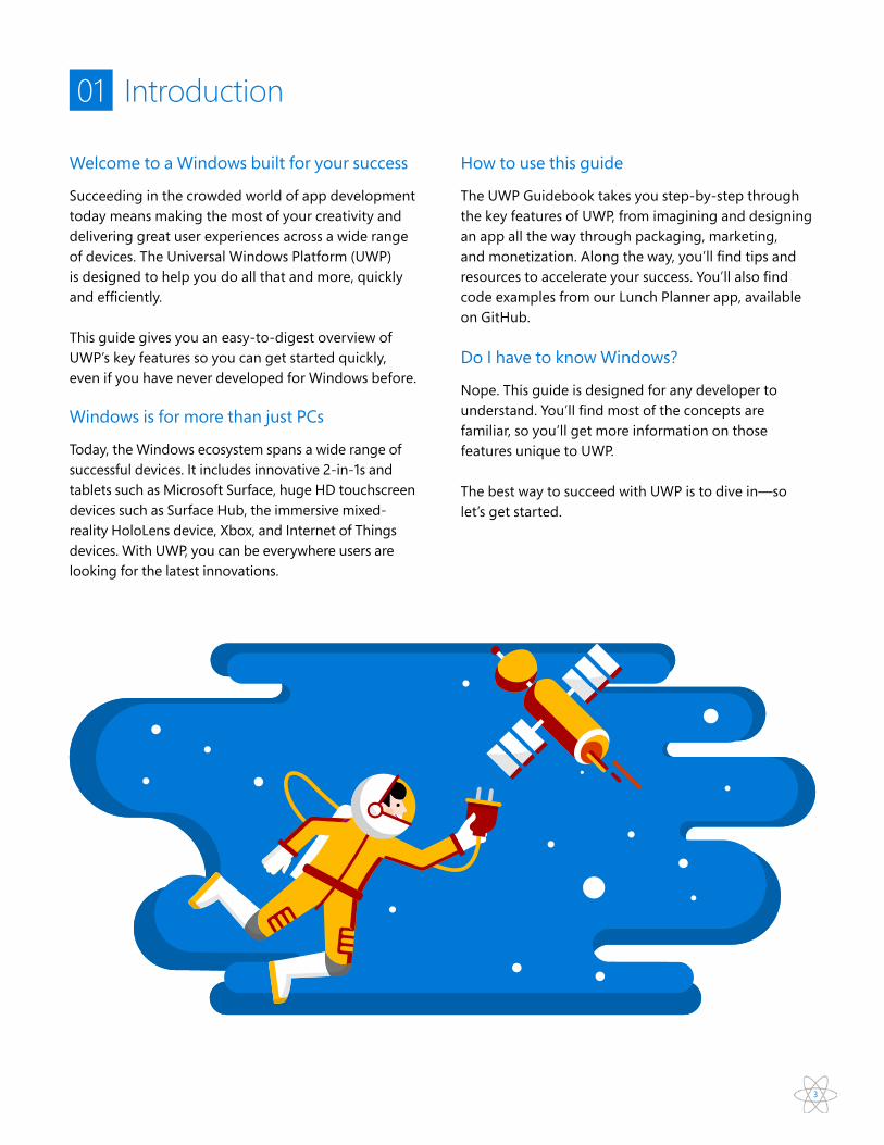
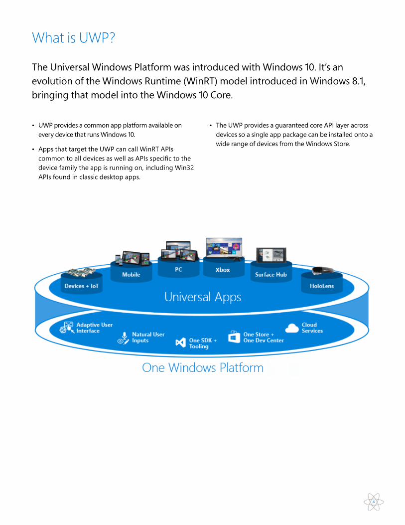
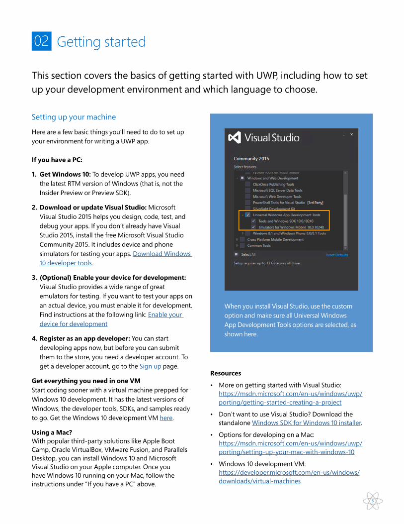
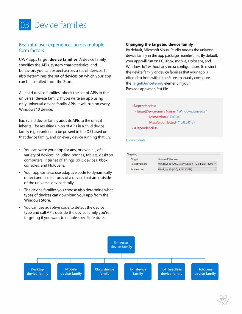

10
If yoursquore coming to UWP from Android or iOS good newsmdashthere are tools and approaches that make it relatively easy to port apps from those platforms to UWP and even to develop for multiple platforms at the same time
04 Cross-platform development
Cross-platform development with Xamarin
Xamarin lets you build C apps for Windows Android and iOS Xamarin also provides the XamarinForms technology which lets you share logic and user-interface code across platforms It supports iOS Android and UWP along with some older Windows operating systems
bull Learn more about using Xamarin with UWP httpsdeveloperxamarincomguidescross-platformwindowsuniversal
11
05 User experience
Make your app work as good as it looks
A UWP app can run on many kinds of devices that have different forms of input screen resolutions DPI density and other unique characteristics Windows helps you target your UI to multiple devices with the following features
bull Universal controls and layout panels help you optimize your UI for the screen resolution of the device
bull Common input handling allows an app to receive input from a range of devices such as touch pen mouse keyboards and game controllers
bull Tooling helps you to design UI that can adapt to different screen resolutions
bull Adaptive scaling adjusts to resolution and DPI differences across devices
Universal controls
Universal controls are designed to work well on larger screens adapt themselves based on the number of screen pixels available on the device and integrate with multiple types of input such as keyboard mouse touch pen and controllers such as the Xbox controller
In UWP app development a control is a UI element that displays content or enables interaction You create the UI for your app by using controls such as buttons text boxes and combo boxes to display data and get user input A pattern is a recipe for modifying a control or combining several controls to make something new For example the Nav pane pattern is a way that you can use a SplitView control for app navigation
Code example Nav pane pattern
ltSplitView IsPaneOpen=rdquoTruerdquo DisplayMode=rdquoInlinerdquo OpenPaneLength=rdquo250rdquogt ltSplitViewPanegt ltTextBlock Text=rdquoPanerdquo FontSize=rdquo24rdquo VerticalAlignment=rdquoCenterrdquo HorizontalAlignment=rdquoCenterrdquogt ltSplitViewPanegt ltGridgt ltTextBlock Text=rdquoContentrdquo FontSize=rdquo24rdquo VerticalAlignment=rdquoCenterrdquo HorizontalAlignment=rdquoCenterrdquogt ltGridgt ltSplitViewgt
Pane Content
12
1 Add a control
You can add a control to an app in several ways
bull Use a design toolrsquos toolbox like Blend for Visual Studio or the Microsoft Visual Studio Extensible Application Markup Language (XAML) designer
bull Add the control to the XAML markup in the Visual Studio XAML editor
bull Add the control in code Controls that you add in the code are visible when the app runs but are not visible in the Visual Studio XAML designer
2 Set control properties
You use properties to specify the appearance content and other attributes of controls When you add a control using a design tool some properties that control size position and content might be set for you by Visual Studio You can change some properties such as Width Height or Margin by selecting and manipulating the control in the Design view
You can set the control properties in the Properties window in XAML or in code For example to change the foreground color for a Button you set the controlrsquos Foreground property This illustration shows how to set the Foreground property by using the color picker in the Properties window
XAML Properties window
Adding controlsThere are 3 key steps to adding controls to your app
1 Add a control to your app UI
2 Set properties on the control
3 When relevant add code to the controlrsquos event handlers so that it does something
Code example XAML Markup
ltToggleSwitch IsOn=rdquoTruerdquo Header=rdquoLunch RemindersrdquogtLunch Reminders
On
13
3 Add an event handler
Each control has events that enable you to respond to actions from your user or other changes in your app For example a Button control has a Click event that is raised when a user clicks the Button You can associate a controlrsquos event with an event handler method in the Properties window in XAML or in code
Code example Options page
lt-- OptionsPagexaml --gt ltPageDataContextgtltviewModelsOptionsViewModel xName=rdquoViewModelrdquogtltPageDataContextgtltButton xName=rdquoCheckStatusButtonrdquo Content=rdquocheck background task statusrdquo Click=rdquoxBind ViewModelGetStatusButton_OnClickrdquo Margin=rdquo10rdquogt
Code example Options view model
lt-- OptionsViewModelcs --gt
public void GetStatusButton_OnClick(object sender RoutedEventArgs e) object obj if (localSettings = null ampamp localSettingsValuesTryGetValue(ConstantsBackgroundTaskStatusSettingsKey out obj)) LastTaskStatusMessage = objToString()
14
Styling controls
XAML controls separate logic and appearance so you can modify them individually to fit your needs Use styles to extract visual property settings into reusable resources Herersquos an example that shows 3 buttons with a style that sets the BorderBrush BorderThickness and Foreground properties By applying a style you can make the controls appear the same without having to set these properties on each control separately
You can define a style inline in the XAML for a control or as a reusable resource Define resources in an individual pagersquos XAML file in the Appxaml file or in a separate resource dictionary XAML file A XAML resource dictionary can be shared across apps and more than one resource dictionary can be merged in a single app
ButtonButton Button Button
15
Code example In Appxamlrsquos Resources with an Explicit Style using an xKey and an Implicit Style
Apply an implicit or explicit style If you define a style as a resource there are two ways to apply it to your controls
bull Implicitly by specifying only a TargetType for the Style
bull Explicitly by specifying a TargetType and an xKey attribute for the Style and then by setting the target controlrsquos Style property with a StaticResource markup extension reference that uses the explicit key
bull If a style contains the xKey attribute you can only apply it to a control by setting the Style property of the control to the keyed style In contrast a style without an xKey attribute is automatically applied to every control of its target type that doesnrsquot otherwise have an explicit style setting
ltApplication xClass=rdquoUWPGuideApprdquo xmlns=rdquohttpschemasmicrosoftcomwinfx2006xamlpresentationrdquo xmlnsx=rdquohttpschemasmicrosoftcomwinfx2006xamlrdquo RequestedTheme=rdquoLightrdquogt
ltApplicationResourcesgt
lt--An Explicit Style--gt ltStyle xKey=rdquoMyExplicitStylerdquo TargetType=rdquoTextBlockrdquogt ltSetter Property=rdquoForegroundrdquo Value=rdquoGreenrdquo gt ltStylegt
lt-- An Implicit Style--gt ltStyle TargetType=rdquoContentPresenterrdquogt ltSetter Property=rdquoHortizontalAlignmentrdquo Value=rdquoStretchrdquo gt ltSetter Property=rdquoVerticalAlignmentrdquo Value=rdquoStretchrdquo gt ltStylegt ltApplicationResourcesgtltApplicationgt
16
Resources
bull Nav Pane pattern example httpsmsdnmicrosoftcomen-uswindowsuwpcontrols-and-patternsnav-pane
bull Controls listing httpsmsdnmicrosoftcomen-uswindowsuwpcontrols-and-patternscontrols-by-function
bull Events and routed events overview httpsmsdnmicrosoftcomen-uswindowsuwpxaml-platformevents-and-routed-events-overview
Code example Now in any XAML page we can use the explicit Style by itrsquos key For the implicit Style we donrsquot need to do anything
lt--Any page in the app--gt
lt-- This TextBlock uses the named explicit style --gtltTextBlock Style=rdquoStaticResource MyExplicitStylerdquo gt
lt-- This ContentPresenter will use the implicit style --gtltContentPresenter gt
17
Layout panelsYou can use layout panels to arrange and group UI elements in your app The built-in XAML layout panels include RelativePanel StackPanel Grid VariableSizedWrapGrid and Canvas Here yoursquoll learn about each panel and show how to use it to layout XAML UI elements
bull How the panel positions its child elements
bull How the panel sizes its child elements
bull How overlapping child elements layer on top of each other (z-order)
bull The number and complexity of nested panel elements needed to create your desired layout
For example StackPanel orders its children sequentially (horizontally or vertically)
Code example A horizontal StackPanel
lt-- Horizontal --gtltStackPanelgt ltRectangle Fill=rdquoRedrdquo Height=rdquo44rdquogt ltRectangle Fill=rdquoBluerdquo Height=rdquo44rdquogt ltRectangle Fill=rdquoGreenrdquo Height=rdquo44rdquogt ltRectangle Fill=rdquoYellowrdquo Height=rdquo44rdquogtltStackPanelgt
Code example A vertical StackPanel
lt-- Vertical --gtltStackPanel Orientation=rdquoHorizontalrdquogt ltRectangle Fill=rdquoRedrdquo Width=rdquo44rdquo Height=rdquo44rdquogt ltRectangle Fill=rdquoBluerdquo Width=rdquo44rdquo Height=rdquo44rdquogt ltRectangle Fill=rdquoGreenrdquo Width=rdquo44rdquo Height=rdquo44rdquogt ltRectangle Fill=rdquoYellowrdquo Width=rdquo44rdquo Height=rdquo44rdquogtltStackPanelgt
18
ltRelativePanel BorderBrush=rdquoGrayrdquo BorderThickness=rdquo1rdquo Background=rdquoBlackrdquogtltRectangle xName=rdquoRedRectrdquo Fill=rdquoRedrdquo Height=rdquo44rdquo Width=rdquo44rdquogt ltRectangle xName=rdquoBlueRectrdquo Fill=rdquoBluerdquo Height=rdquo44rdquo Width=rdquo88rdquo RelativePanelRightOf=rdquoRedRectrdquo gtltRectangle xName=rdquoGreenRectrdquo Fill=rdquoGreenrdquo Height=rdquo44rdquo RelativePanelBelow=rdquoRedRectrdquo RelativePanelAlignLeftWith=rdquoRedRectrdquo RelativePanelAlignRightWith=rdquoBlueRectrdquogt ltRectangle Fill=rdquoYellowrdquo RelativePanelBelow=rdquoGreenRectrdquo RelativePanelAlignLeftWith=rdquoBlueRectrdquo RelativePanelAlignRightWithPanel=rdquoTruerdquo RelativePanelAlignBottomWithPanel=rdquoTruerdquogtltRelativePanelgt
Code example A Grid places its children into cells
ltGridgt ltGridRowDefinitionsgt ltRowDefinitiongt ltRowDefinition Height=rdquo44rdquogt ltGridRowDefinitionsgt ltGridColumnDefinitionsgt ltColumnDefinition Width=rdquoAutordquogt ltColumnDefinitiongt ltGridColumnDefinitionsgt ltRectangle Fill=rdquoRedrdquo Width=rdquo44rdquogt ltRectangle Fill=rdquoBluerdquo GridRow=rdquo1rdquogt ltRectangle Fill=rdquoGreenrdquo GridColumn=rdquo1rdquogt ltRectangle Fill=rdquoYellowrdquo GridRow=rdquo1rdquo GridColumn=rdquo1rdquogtltGridgt
Code example The RelativePanel eases the process of rearranging elements by defining relationships between elements which allows you to build more dynamic UI without using nested layouts
19
Resources
bull Layout panels httpsmsdnmicrosoftcomen-uswindowsuwplayoutlayout-panels
bull Attached properties httpsmsdnmicrosoftcomen-uswindowsuwpxaml-platformattached-properties-overview
Code example The Canvas panel positions its child elements using fixed coordinate points
ltCanvas Width=rdquo120rdquo Height=rdquo120rdquogt ltRectangle Fill=rdquoRedrdquo Height=rdquo44rdquo Width=rdquo44rdquogt ltRectangle Fill=rdquoBluerdquo Height=rdquo44rdquo Width=rdquo44rdquo CanvasLeft=rdquo20rdquo CanvasTop=rdquo20rdquogt ltRectangle Fill=rdquoGreenrdquo Height=rdquo44rdquo Width=rdquo44rdquo CanvasLeft=rdquo40rdquo CanvasTop=rdquo40rdquogt ltRectangle Fill=rdquoYellowrdquo Height=rdquo44rdquo Width=rdquo44rdquo CanvasLeft=rdquo60rdquo CanvasTop=rdquo60rdquogtltCanvasgt
20
Common input handlingCommon input handling allows your app to receive input through a variety of devices and interfaces The way UWP handles inputs is designed to help you give users distinctive experiences For example you can enable ink with touch and pointer inputs as well as pen Inking is supported on many devices (including mobile devices) and is easily incorporated with a few lines of code
Out-of-the-box vs customized input UWP apps automatically handle a wide variety of inputs across a variety of devicesmdashtherersquos nothing extra you need to do to enable touch input or make your app run on a phone for example
However in many cases you might want to optimize your app for certain types of input or devices
Maximize inputs and accessibility To accommodate the broadest range of users and devices design your apps to work with as many input types as possible (gesture speech touch touchpad mouse and keyboard) Doing so maximizes flexibility usability and accessibility
Resources
bull Interaction primer httpsmsdnmicrosoftcomen-uswindowsuwpinput-and-devicesinput-primer
21
Adaptive scaling Windows 10 introduces an evolution of the existing scaling model In addition to scaling vector content there is a unified set of scale factors that provides a consistent size for UI elements across a variety of screen sizes and display resolutions The scale factors are also compatible with the scale factors of other operating systems such as iOS and Android making it easier to share assets between these platforms The Store picks the assets to download based in part of the DPI of the device Only the assets that best match the device are downloaded
Effective pixels and scalingUWP apps automatically adjust the size of controls fonts and other UI elements so that they are legible on all devices When your app runs on a device the system uses an algorithm to normalize the way UI elements display on the screen This scaling algorithm considers viewing distance and screen density (pixels per inch) to optimize for perceived size (rather than physical size)
When you design your UWP app yoursquore designing in effective pixels not actual physical pixels That means
bull You can ignore the pixel density and the actual screen resolution when designing Instead design for the effective resolution (the resolution of effective pixels) for a size class
bull When the system scales your UI it does so by multiples of 4 To ensure a crisp appearance snap your designs to the 4x4 pixel grid make margins sizes and positions of UI elements and the position (but not the sizemdashtext can be any size) of text a multiple of 4 effective pixels
Resources
bull Effective pixels httpsmsdnmicrosoftcomen-uswindowsuwplayoutdesign-and-ui-introeffective-pixels-and-scaling
Thumbnail for a grid layout ThumbnailModepictureView 200x137
Thumbnail for a single picture ThumbnailModesingleitem 256x170
Thumbnail for a list layout ThumbnailModelistView 200x200
Adaptive scaling example
22
Visual state triggers
Your UI may need to adapt to changes in window size Adaptive visual states allow you to change the visual state in response to changes in the size of the window StateTriggers define a threshold at which a visual state activates which then sets layout properties as appropriate for the window size that triggered the state change
Maximize inputs and accessibility To accommodate the broadest range of users and devices design your apps to work with as many input types as possible (gesture speech touch touchpad mouse and keyboard) Doing so maximizes flexibility usability and accessibility
Resources
bull Visual state triggers httpsmsdnmicrosoftcomlibrarywindowsappswindowsuixamlvisualstatestatetriggersaspx
Code example Visual state triggers
Code example Visual state triggers
ltVisualStateManagerVisualStateGroupsgt ltVisualStateGroupgt ltVisualState xName=rdquowideStaterdquogt ltVisualStateStateTriggersgt ltAdaptiveTrigger MinWindowWidth=rdquo641rdquo gt ltVisualStateStateTriggersgt ltVisualStateSettersgt ltSetter Target=rdquoHeaderGridVisibilityrdquo Value=rdquoCollapsedrdquo gt ltVisualStateSettersgt ltVisualStategt ltVisualState xName=rdquonarrowStaterdquogt ltVisualStateStateTriggersgt ltAdaptiveTrigger MinWindowWidth=rdquo0rdquo gt ltVisualStateStateTriggersgt ltVisualStateSettersgt ltSetter Target=rdquoHeaderGridVisibilityrdquo Value=rdquoVisiblerdquo gt ltVisualStateSettersgt ltVisualStategt ltVisualStateGroupgt ltVisualStateManagerVisualStateGroupsgt
23
06 Success by design creating the app users want to use
The power of design-led development The right design can set your app apart from the rest by giving users powerful memorable interactions they return to again and again This section covers inspiration planning sketching layout style and some tips for working with the visual layer in UWP To kick things off look at the Microsoft Design Language principles These arenrsquot meant to tell you how to designmdashjust as inspiration for thinking about your own set of design principles and how to create apps that stand out
bull Keep it simple We start with simplicity as the ultimate unifier When design is intuitive we just know We can feel it The result is an experience thatrsquos honest and timeless
bull Make it personal Next we challenge ourselves to create an emotional connection with the user We design for the ways people live and think and act The result is an experience that feels like it is created for an individualrsquos specific needs
bull Think universal We design to embrace the things that make us human Itrsquos more far more than an attitude for making stuff ndash and into creating a world that makes lives better The result is technology thatrsquos inclusive
bull Create delight Our final principle is about energy within a structure Itrsquos how you know the experience is made by a real person The result is an experience that surprises and has a sense of place
Figuring out what to buildWhether yoursquore building for money fame passion or charity it pays to spend some time considering what the current market landscape looks like for the idea Who are your competitors How popular are they Whatrsquos their value-add Conducting a market analysis before you build an app can greatly increase the discoverability of your app and lead to an increased number of downloads and users There are many resources available to help in analyzing the current landscape of the market Choosing a category with less competition or adding features a competitor may not have helps make your app stand out more
Using a service such as AppAnnie you can analyze the breakdown by category across various app stores To better interpret the data look at the number of apps as well as the number of ratings and reviews You may find that some categories are disproportionately represented in the top app charts relative to their overall app count indicating potential opportunities
Looking at the market data you may notice a category where there is relatively little competition You may have also found a few missing apps or app types that seem to be currently popular on other platforms Use this information to augment and better prioritize your ideas list Once you have this you can start looking at the competition in that space
Take your top ideas and brainstorm a few keywords For example if you wanted to make a Solitaire game you might have keywords such as Solitaire Spider Solitaire Cards Casino etc Take these keywords and look at the Top Charts Do you already see one or more extremely popular apps of this type Is there something that these apps are missing What do users mostly criticize about the app This information can point to opportunities that result in a much more competitive app
24
Layout Anatomy of a UWP AppA modern user interface is a complex thing To make things simpler letrsquos define the anatomy of an app from a design perspective Letrsquos say that an app is made up of screens and pages Each page has a user interface made up of three types of UI elements navigation commanding and content elements
Navigation elementsNavigation elements help users choose the content they want to display Examples of navigation elements include tabs and pivots hyperlinks and nav panes
Command elementsCommand elements initiate actions such as manipulating saving or sharing content Examples of command elements include button and the command bar Command elements can also include keyboard shortcuts that arenrsquot visible on the screen
Content elementsContent elements display the apprsquos content For a painting app the content might be a drawing for a news app the content might be a news article
At a minimum an app has a splash screen and a home page that defines the user interface A typical app has multiple pages and screens Navigation command and content elements might change from page to page
bull To make the most effective use of space and reduce the need to navigate If you design an app to look good on a device that has a small screen such as a phone the is usable on a PC with a much bigger display but there may be some wasted space You can customize the app to display more content when the screen is above a certain size
bull To take advantage of devicesrsquo capabilities Your app can detect which capabilities are available and enable features that use them
bull To optimize for input The universal control library works with all input types (touch pen keyboard mouse) but you can still optimize for certain input types by re-arranging your UI elements
25
RepositionYou can alter the location and position of app UI elements to get the most out of each device
Responsive design techniquesWhen you optimize your apprsquos UI for specific screen widths we say that yoursquore creating a responsive design Here are six responsive design techniques you can use to customize your apprsquos UI
Reflow By changing the flow of UI elements based on device and orientation your app can offer an optimal display of content
ResizeYou can optimize the frame size by adjustingthe margins and size of UI elements
RevealYou can reveal UI based on screen real estate or when the device supports additional functionality specific situations or preferred screen orientations
26
ReplaceThis technique lets you switch the user interface for a specific device size-class or orientation
Resources
bull Navigation elements httpsmsdnmicrosoftcomwindowsuwplayoutnavigation-basics
bull Command elements httpsmsdnmicrosoftcomwindowsuwplayoutcommanding-basics
bull Content elements httpsmsdnmicrosoftcomwindowsuwplayoutcontent-basics
bull Responsive Design on UWP httpcodingforlifeazurewebsitesnet20160427responsive-design-on-uwp
bull UI Design httpsmsdnmicrosoftcomen-usmagazinemt590973aspx
bull Scaling httpsblogswindowscombuildingapps20160627scaling-your-phone-app-design-to-all-uwp-device-families
Re-architect You can collapse or fork the architecture of your app to better target specific devices
27
Plan your UWP appOn Microsoft design teams our process for creating apps consists of five distinct stages concept structure dynamics visual and prototype We encourage you to adopt a similar process and have fun making new experiences for the world to enjoy
VisualOnce yoursquove established the dynamics of your app you can make your app shine with the right visual polish Great visuals define not only how your app looks but how it feels and comes alive through animation and motion Your choice of color palette icon and artwork are just a few examples of this visual language All apps have their own unique identity so explore the visual directions you can take with your app Let the content guide the look and feel donrsquot let the look dictate your content PrototypeA prototype might be a flow of hand-drawn screens shown to a user The person running the test might respond to cues from the user by placing different screens down or sticking or unsticking smaller pieces of UI on the pages to simulate a running app Or a prototype might be a very simple app that simulates some workflows provided the operator sticks to a script and pushes the right buttons
ConceptWhen planning your Universal Windows Platform (UWP) app you should determine not only what your app will do and who itrsquos for but also what your app will be great at At the core of every great app is a strong concept that provides a solid foundation
bull Start with a broad concept and list all the things that you want to help users do with your app
bull Take a step back and look at your list of ideas to see if a scenario really jumps out at you
bull Challenge yourself to trim the list to just a single scenario that you want to focus on
bull After you choose a single scenario decide how you would explain to an average person what your app is great at by writing it down in one sentence
StructureWhen yoursquore happy with your concept yoursquore ready for the next stagemdashcreating your apprsquos blueprint Information architecture (IA) gives your content the structural integrity it needs It helps define your apprsquos navigational model and ultimately your apprsquos identity By planning how your content will be organizedmdashand how your users will discover that contentmdashyou can get a better idea of how users will experience your app
DynamicsIf the concept stage is about defining your apprsquos purpose the dynamics stage is all about executing that purpose This can be accomplished in many ways such as using wireframes to sketch out your page flows (how you get from one place to the next within the app to achieve their goals) and thinking about the voice and the words used throughout your apprsquos UI Wireframes are a quick low-fidelity tool to help you make critical decisions about your apprsquos user flow Common techniques to help with this step include
bull Outline the flow What comes first what comes next
bull Storyboard the flow How should users move through your UI to complete the flow
bull Prototype Try out the flow with a quick prototype
28
Styling your appStyle gives your app a unique look and personality Key places to style your app include color icons motion sound and typography
Icons
Good icons harmonize with typography and with the rest of the design language They donrsquot mix metaphors and they communicate only whatrsquos needed as speedily and simply as possible
Common shapes Icons should generally maximize their given space with little padding These shapes provide starting points for sizing basic shapes
The user may also choose between a light or dark theme for the system Some apps choose to change their theme based on the userrsquos preference while others opt out You can change themes easily by changing the RequestedTheme property in your Appxaml Use the shape that corresponds to the iconrsquos orientation
and compose around these basic parameters Icons donrsquot necessarily need to fill or fit completely inside the shape and may be adjusted as needed to ensure optimal balance
ltColor xKey=rdquoSystemAccentColorrdquogtFFCB2128ltColorgt
Code example
Code example
Common shapes
Color
Color provides intuitive wayfinding through an apprsquos various levels of information and serves as a crucial tool for reinforcing the interaction model In Windows color is also personal Users can choose a color and a light or dark theme to be reflected throughout their experience
When users choose an accent color it appears as part of their system theme The areas affected are Start Taskbar window chrome selected interaction states and hyperlinks within common controls Each app can further incorporate the accent color through their typography backgrounds and interactionsmdashor override it to preserve their specific branding
Removing the RequestedTheme means that your application will honor the userrsquos app mode settings and they will be able to choose to view your app in either the dark or light theme
ltApplication xClass=rdquoUWPGuideApprdquo
xmlns=rdquohttpschemasmicrosoftcomwinfx2006xamlpresentationrdquo
xmlnsx=rdquohttpschemasmicrosoftcomwinfx2006xamlrdquo
RequestedTheme=rdquoLightrdquo gt
ltApplicationgt
29
Motion
Make sure animation serves a purpose in your app The best Universal Windows Platform (UWP) apps use animation to bring the UI to life Animation should
bull Give feedback based on the userrsquos behavior
bull Teach the user how to interact with the UI
bull Indicate how to navigate to previous or succeeding views
Animation types available in UWP include
bull Add and delete Insert or remove single or multiple items from a collection
bull Drag and drop Enable users to move objects such as moving an item within a list
bull Edge Show or hide UI that originates from the edge of the screen
bull Fade Bring items into a view or to take items out of a view The two common fade animations are fade-in and fade-out
bull Pointer Provide users with visual feedback when the user taps on an item
bull Pop-up animations Show and hide pop-up UI for flyouts or custom pop-up UI elements
bull Reposition Move elements into a new position
Curves Curved lines are constructed from sections of a whole circle and should not be skewed unless needed to snap to the pixel grid
Geometric construction We recommend using only pure geometric shapes when constructing icons Status badges utilize a filled colored object that is on top of the icon whereas action badges are integrated into the icon in the same monochrome style and line weight
Angle examples
Curve examples
Angles In addition to using the same grid and line weight icons are constructed with common elements Using only these angles in building shapes creates consistency across all our icons and ensures the icons render correctly These lines can be combined joined rotated and reflected in creating icons
30
Herersquos an example of coding motion into a UWP app
bull Invoking an Element The most common control-triggered sound in our system today is the Invoke sound This sound plays when a user invokes a control through a tapclickenterspace or press of the lsquoArsquo button on a gamepad
bull Showing amp Hiding Content There are many flyouts dialogs and dismissible UIs in XAML and any action that triggers one of these overlays should call a Show or Hide sound
bull Navigation Within a Page When navigating between panels or views within an apprsquos page typically you can move to the next viewpanel or the previous one without leaving the current app page yoursquore on The audio experience around this navigation concept is encompassed by the MovePrevious and MoveNext sounds
bull Back Navigation When navigating from the current page to the previous page within an app the GoBack sound should be called
bull Focusing on an Element Set up a control to play the Focus sound when your control receives focus
Herersquos an example of invoking sound in a UWP app
Sound There are many ways to use sound to enhance your app You can use the sound to supplement other UI elements enabling users to recognize events audibly Sound can be an effective user interface element for people with visual disabilities You can use sound to create an atmosphere that immerses the user UWP provides the ElementSoundPlayer an integrated sound system within XAML and when turned on all default controls will play sounds automatically
Sound and the user experience Each sound relates to a certain basic user interaction and although sounds can be customized to play on any interaction this section serves to illustrate the scenarios where sounds should be used to maintain a consistent experience across all UWP apps
The ElementSoundPlayer has three different states On Off and Auto
If set to Off no matter where your app is run sound will never play If set to On sounds for your app will play on every platform
ltGridgt ltGridResourcesgt lt-- Sets up a RepositionThemeAnimation using the FromHorizontalOffset property to start the animation from the old location --gt ltStoryboard xName=rdquoPointerReleasedStoryboardrdquogt ltRepositionThemeAnimation StoryboardTargetName=rdquomyRectanglerdquo FromHorizontalOffset=rdquo-400rdquogt ltStoryboardgt ltGridResourcesgt
ltRectangle xName=rdquomyRectanglerdquo HorizontalAlignment=rdquoLeftrdquo Width=rdquo200rdquo Height=rdquo200rdquo Fill=rdquoBluerdquo PointerReleased=rdquoRectangle_PointerReleasedrdquo gtltGridgt
ElementSoundPlayerState = ElementSoundPlayerStateOn
ElementSoundPlayerPlay(ElementSoundKindInvoke)
Code example
31
Typography
While you can style your typography however you like at Microsoft we use Segoe UI for all digital designs Segoe UI provides a wide range of characters and is designed to maintain optimal legibility across sizes and pixel densities It offers a clean light and open aesthetic that complements the content of the system We use a minimum of weights and sizes and a clear hierarchy
Line spacing should be calculated at 125 of the font size rounding to the closest multiple of four when necessary Try to round up to stay on the 4px grid This ensures a good reading experience and adequate space for diacritical marks
Generally visual elements and columns of type should be left-aligned In most instances this flush-left and ragged-right approach provides consistent anchoring of the content and a uniform layout
If a line is too short the eye must travel left and right too often breaking the readerrsquos rhythm If possible 50ndash60 letters per line is best for ease of reading
Resources on styling your app
bull Color httpsmsdnmicrosoftcomwindowsuwpstylecolor
bull Icons httpsmsdnmicrosoftcomwindowsuwpstyleicons
bull Motion httpsmsdnmicrosoftcomwindowsuwpstylemotion
bull Sound httpsmsdnmicrosoftcomwindowsuwpstylesound
bull Typography httpsmsdnmicrosoftcomwindowsuwpstyletypography
32
Introducing the new Visual LayerIn Windows 10 significant work was done to create a new unified compositor and rendering engine for all Windows applications The WindowsUIComposition namespace offers access to new lightweight Composition objects along with new Compositor driven Animations and Effects WindowsUIComposition is a declarative Retained-Mode API that can be called from any Universal Windows Platform (UWP) Application to create composition objects animations and effects directly in an application The API is a powerful supplement to existing frameworks such as XAML to give developers of UWP applications a familiar C surface to add to their application These APIs can also be used to create DX style framework-less applications Herersquos an example
Resource
bull In-depth information on the Visual Layer httpsmsdnmicrosoftcomen-uswindowsuwpgraphicsvisual-layer
Add lsquousing WindowsUICompositionrsquovar compositor = new Compositor ()var root = compositorCreateContainerVisual()
Create a visual elementvar element = compositorCreateSpriteVisual()elementSize = new Vector2(1000f 1000f)
Create an outer white rectanglevar visual = compositorCreateSpriteVisual()elementChildrenInsertAtTop(visual)visualBrush = compositorCreateColorBrush(ColorsWhite)visualSize = new Vector2(1000f 1000f)
Create an inner red rectanglevar child = compositorCreateSpriteVisual()visualChildrenInsertAtTop(child)childOffset = new Vector3(30f 30f 00f)childSize = new Vector2(940f 940f)childBrush = compositorCreateColorBrush(ColorsRed)elementopacity = 08f
Add the entire element to the root visualrootChildrenInsertAtTop(element)
Code example
33
07 Inclusive design accessibility globalization and more
Making your app work for everyone
There are many possible ways to develop for individuals with disabilities or impairments including limitations in mobility vision color perception hearing speech cognition and literacy You can address most requirements by following the guidelines offered here This means providing
bull Support for keyboard interactions and screen readers
bull Support for user customization such as font zoom setting (magnification) color and high-contrast settings
bull Alternatives or supplements for parts of your UI
Controls for XAML provide built-in keyboard support and support for assistive technologies such as screen readers which take advantage of accessibility frameworks that already support UWP apps HTML and other UI technologies This built-in support enables a basic level of accessibility that you can customize with very little work by setting just a handful of properties
In addition data binding style and template features make it easy to implement support for dynamic changes to display settings and text for alternative UIs UI Automation
Accessibility support comes primarily from the integrated support for the Microsoft UI Automation framework That support is provided through base classes and the built-in behavior of the class implementation for control types and an interface representation of the UI Automation provider API Assistive technology
This includes functionality such as screen readers screen magnification and high-contrast settings Assistive technology products include a wide variety of software and hardware These products work through the standard keyboard interface and accessibility frameworks that report information about the content
and structure of a UI to screen readers and other assistive technologies
Apps that have good keyboard and screen reader support usually work well with various assistive technology products In many cases a UWP app works with these products without additional modification of information or structure However you may want to modify some settings for optimal accessibility experience or to implement additional support
Screen reader support and basic accessibility information
Screen readers provide access to the text in an app by rendering it in some other format such as spoken language or Braille output The exact behavior of a screen reader depends on the software and on the userrsquos configuration of it
The most important information that a screen reader or any other assistive technology needs to help users understand or navigate an app is an accessible name for the element parts of the app In many cases a control or element already has an accessible name that is calculated from other property values that you have otherwise provided The most common case in which you can use an already-calculated name is with an element that supports and displays inner text For other elements you sometimes need to account for other ways to provide an accessible name by following best practices for element structure
34
Keyboard support To provide good keyboard support you must ensure that every part of your application can be used with a keyboard If your app uses mostly the standard controls and doesnrsquot use any custom controls you are most of the way there already The basic XAML control model provides built-in keyboard support including tab navigation text input and control-specific support The elements that serve as layout containers (such as panels) use the layout order to establish a default tab order That order is often the correct tab order to use for an accessible representation of the UI
If you use ListBox and GridView controls to display data they provide built-in arrow-key navigation Or if you use a Button control it already handles the Spacebar or Enter keys for button activation
Media and captioning You typically display audiovisual media through a MediaElement object You can use MediaElement APIs to control the media playback For accessibility purposes provide controls that enable users to play pause and stop the media as needed Sometimes media includes additional components that are intended for accessibility such as captioning or alternative audio tracks that include narrative descriptions
Accessible text You Three main aspects of text are relevant to accessibility
bull Tools must determine whether the text is to be read as part of a tab-sequence traversal or only as part of an overall document representation You can help control this determination by choosing the appropriate element for displaying the text or by adjusting properties of those text elements
bull Accessibility recommendations that were originally made for web content define standards for contrast that can help sight-limited users interact with your application Following web standards for contrast can help mitigate this issue For apps that display large quantities of text ensure that the app correctly interacts with the system features that can scale up the display so that any text in apps scales up along with it
Supporting high-contrast UI controls use a visual representation that is defined as part of a XAML resource dictionary of themes One or more of these themes is specifically used when the system is set for high contrast When the user switches to high contrast by looking up the appropriate theme from a resource dictionary dynamically all your UI controls will use an appropriate high-contrast theme too Just make sure that you havenrsquot disabled the themes by specifying an explicit style or using another styling technique that prevents the high-contrast themes from loading and overriding your style changes
Design for alternative UI When you design your apps consider how they may be used by people with limited mobility vision and hearing Because assistive technology products make extensive use of standard UI it is particularly important to provide good keyboard and screen-reader support even if you make no other adjustments for accessibilityIn many cases you can convey essential information by using multiple techniques to widen your audience For example you can highlight information using both icon and color information to help users who are color blind and you can display visual alerts along with sound effects to help users who are hearing impairedIf necessary you can provide alternative accessible user interface elements that completely remove nonessential elements and animations and provide other simplifications to streamline the user experience
Resources
bull UI Automation Overview httpsmsdnmicrosoftcomlibrarywindowsdesktopee684076
bull Keyboard accessibility httpsmsdnmicrosoftcomwindowsuwpaccessibilitykeyboard-accessibility
bull Accessible text requirements httpsmsdnmicrosoftcomwindowsuwpaccessibilityaccessible-text-requirements
bull High-contrast themes httpsmsdnmicrosoftcomwindowsuwpaccessibilityhigh-contrast-themes
35
Accessibility in the store
While submitting your app to the Windows Store for certification you can declare your app as accessible Declaring your app as accessible makes it easier to discover for users who are interested in accessible apps such as users who have visual impairments Users discover accessible apps by using the Accessible filter while searching the Windows Store Declaring your app as accessible also adds the Accessible tag to your apprsquos description
By declaring your app as accessible you state that it has the basic accessibility information that users need for primary scenarios using one or more of the following
bull The keyboard
bull A high contrast theme
bull A variable DPI setting
bull Common assistive technology such as the Windows accessibility features including Narrator Magnifier and On-Screen Keyboard
Resources
bull Accessibility in the Store httpsmsdnmicrosoftcomwindowsuwpaccessibilityaccessibility-in-the-store
Globalization and localization
Windows is used worldwide by audiences that vary in culture region and language A user may speak any language or even multiple languages A user may be located anywhere in the world and may speak any language in any location You can increase the potential market for your app by designing it to be readily adaptable using globalization and localization
Globalization is the process of designing and developing your app to act appropriately for different global markets without any changes or customization
For example you can
bull Design the layout of your app to accommodate the different text lengths and font sizes of other languages in labels and text strings
bull Retrieve text and culture-dependent images from resources that can be adapted to different local markets instead of hard-coding them into your apprsquos code or markup
bull Use globalization APIs to display data that are formatted differently in different regions such as numeric values dates times and currencies
bull Localization is the process of adapting your app to meet the language cultural and political requirements of a specific local market
Localization is the process of adapting your app to meet the language cultural and political requirements of a specific local market
For example
bull Translate the text and labels of the app for the new market and create separate resources for its language
bull Modify any culture-dependent images as necessary and place in separate resources
Resources
bull More on localization and globalization httpsmsdnmicrosoftcomen-uswindowsuwpglobalizingglobalizing-portal
bull Multi-lingual toolkit httpsdevelopermicrosoftcomen-uswindowsdevelopmultilingual-app-toolkit
36
App settings
App settings are the user-customizable portions of your app and live within an app settings page For example app settings in a news reader app might let the user specify which news sources to display or how many columns to display on the screen Here are examples of app options that belong on an app settings page
bull Configuration options that affect the behavior of the app and donrsquot require frequent readjustment
bull Options that depend on the userrsquos preferences such as music sound effects or color themes
bull App information that isnrsquot accessed very often such as privacy policy help app version or copyright info
Commands that are part of the typical app workflow (for example changing the brush size in an art app) shouldnrsquot be on a settings page
General recommendations
bull Keep settings pages simple and make use of binary (onoff) controls A toggle switch is usually the best control for a binary setting
bull For settings that let users choose one item from a set of up to 5 mutually exclusive related options use radio buttons
bull Create an entry point for all app settings on your app settingrsquos page
bull When a user changes a setting the app should immediately reflect the change
bull Donrsquot include commands that are part of the common app workflow
Resources
bull More on app settings httpsmsdnmicrosoftcomen-uswindowsuwpapp-settingsapp-settings-and-data
In-app help
There are three primary categories of help content each with varying strengths and suitable for different purposes You can use any combination of them in your app depending on your needs
bull Instructional UI Educate users with directions on how to perform specific tasksIn-app help Display help within the application at the userrsquos request There are several ways in which this can be implemented such as help pages or informative descriptions
bull External help Provide external links to detailed tutorials advanced functions or libraries
37
08 Publishing your app
Making it real
This section provides a step-by-step guide to submitting your app in the Windows Store The submission process has 5 steps
1 Create your app by reserving a name
2 Create a submission
3 Certification
4 Release
5 Confirmation
Create your app by reserving a new name
Reserving a name is the first step in creating an app in the dashboard You can do this even if you havenrsquot started to build your app yet You should do it as soon as possible so that nobody else can use the name
1 From the Dashboard overview or All apps page click Create a new app
2 In the text box enter the name that you want to use and then click the Check availability link If the name is available yoursquoll see a green check mark (If the name you entered is already reserved or in use by another developer yoursquoll see a message that the name is not available)
3 Click Reserve app name
Create a submission
Once yoursquove created your app by reserving a name you can start working on getting it published The first step is to create a submission You can start your submission when your app is complete and ready to publish or you can start entering info even before you have written a single line of code The submission will be saved in your dashboard so you can work on it whenever yoursquore ready
bull Pricing and availability lets you determine how much your app will cost whether yoursquoll offer a free trial and how when and where it will be available to customers
bull App properties lets you define your apprsquos category and indicate hardware preferences or other declarations
bull Age ratings lets you provide information about your app so it can receive the appropriate age and content ratings administered by the International Age Ratings Coalition (IARC) rating system These ratings are about the suitability of the content in the app
bull App packages is where you upload all the package files (appx appxupload appxbundle or xap) for the app that yoursquore submitting You can upload packages for any operating system that your app targets in this step When a customer downloads your app the Store will automatically provide each customer with the package that works best for their device To upload packages drag them into the upload field or click to browse your files For Windows 10 you should always upload the appxupload file here not the appx or appxbundle
bull Device family availability After your packages have been successfully uploaded the Device family availability section will display a table that indicates which packages will be offered to specific Windows 10 device families (and earlier OS versions if applicable) in ranked order This section also lets you choose whether to offer the submission to customers on specific Windows 10 device families Yoursquoll also see a checkbox where you can indicate whether you want to allow Microsoft to make the app available to future Windows 10 device families Keep this box checked so that your app can be available to more potential customers as new device families are introduced
bull Store listings In this section you indicate the category and subcategory which the Store should use to categorize your app any product declarations and system requirements
38
Certification
As you submit your app you have the option to use the Notes for certification page to provide additional info to the certification testers This info can help ensure that your app is tested correctly
After you successfully upload the apprsquos packages and submit the app for certification the packages are queued for testing Yoursquoll see a message if any errors are detected during preprocessing During this phase several tests are conducted
bull Security tests This first test checks your apprsquos packages for viruses and malware If your app fails this test yoursquoll need to check your development system by running the latest antivirus software then rebuild your apprsquos package on a clean system
bull Technical compliance tests Technical compliance is tested by the Windows App Certification Kit This test can be performed from Visual Studio before uploading which will help prevent certification failures
bull Content compliance The amount of time this takes varies depending on how complex your app is how much visual content it has and how many apps have been submitted recently
After the certification process is complete yoursquoll get a certification report telling you whether your app passed certification If it didnrsquot pass the report will indicate which test failed or which policy was not met After you fix the problem you can create a new submission for your app to start the certification process again
Release
When your app passes certification itrsquos ready to move to the to the Publishing process If yoursquove indicated that your submission should be published as soon as possible this will happen right away If yoursquove specified that it should not be released until a certain date itrsquos published on that date unless you click the link to Change release date If yoursquove indicated that you want to publish the submission manually then it wonrsquot be published until you click the button to Publish now or if you click the link to Change release date and pick a specific date
Your apprsquos packages are digitally signed to protect them against tampering after they have been released Once this phase has begun you can no longer cancel your submission or change its release date
While your app is in the publishing phase the Show details link in the Status column for your apprsquos submission will let you know when your new packages and Store listing details become available to customers on each of your supported OS versions Your app will remain in the publishing phase until the new packages and listing details are available to all your apprsquos potential customers which can take up to 16 hours
Confirmation
After successfully going through the steps above the submissionrsquos status will change from Publishing to In the Store Your submission will then be available in the Windows Store for customers to download unless you have chosen another distribution option
Resources
bull Complete app publishing guide httpsmsdnmicrosoftcomen-uswindowsuwppublishindex
39
09 Monetization and marketing
Use SDKs from other ad networks in your UWP apps Increase your revenue by displaying video ads from Vungle or banner ads from AdDuplex or Smaato in your Universal Windows Platform (UWP) apps
Paid apps Charge a price for your app up front including the option to set per-market prices
In-app purchases and free trials Offer products and features that customers can buy from within your app and limit features in a free trial version to entice customers to buy your app
New API for in-app purchases Windows 10 version 1607 introduces a new API in the WindowsServicesStore namespace for performing in-app purchases and accessing license info for your app
Windows Store Services SDK This SDK provides the libraries and tools that you need to display ads in your UWP apps run experiments with AB testing and collect user feedback about your app This SDK will evolve over time to include new features
Resources
bull Download the Vungle SDK httpsvvunglecomsdk
bull Download the Smaato SDK httpswwwsmaatocomresourcessdksdownload
bull Download the AdDuplex SDK httpsvisualstudiogallerymsdnmicrosoftcom6930860a-e64b-4b46-9d72-62d7fddda077
bull In-app purchases and trials httpsmsdnmicrosoftcomwindowsuwpmonetizein-app-purchases-and-trials
bull Microsoft Store Services SDK httpakamsstore-em-sdk
If yoursquore like most developers yoursquore interested in making money with your apps and ensuring they reach as many users as possible The Windows Store provides a wide range of options for monetizing and marketing your apps
Code example Ad control
lt-- AdControlxaml --gt
ltStackPanel Background=rdquoThemeResource ApplicationPageBackgroundThemeBrushrdquo Margin=rdquo12101212rdquogt ltTextBlock Text=rdquoDescriptionrdquo Style=rdquoStaticResource SampleHeaderTextStylerdquogt ltTextBlock Style=rdquoStaticResource ScenarioDescriptionTextStylerdquo TextWrapping=rdquoWraprdquogt Create an ad control in markup ltTextBlockgt lt-- Set the application id and ad unit id via markup The application id and ad unit id can be obtained from Dev Center See ldquoMonetize with Adsrdquo at httpsmsdnmicrosoftcomen-uslibrarywindowsappsmt170658aspx OnAdRefreshed increments the ad count so that the message changes at every refresh OnErrorOccured is an error handler for the interstitial ad --gt ltadsAdControl ApplicationId=rdquod25517cb-12d4-4699-8bdc-52040c712cabrdquo AdUnitId=rdquo10043058rdquo Width=rdquo300rdquo Height=rdquo250rdquo AdRefreshed=rdquoOnAdRefreshedrdquo ErrorOccurred=rdquoOnErrorOccurredrdquogt ltStackPanelgt
40
Marketing your app
Engage with more customers and get the word out about your app with ad campaigns sale pricing badges and more
Ad campaigns Launch an ad campaign to get the word out about your app right from your Dev Center dashboard You can create paid campaigns free house campaigns or free community campaigns
Windows Store badges Let customers know your app is in the Store with a custom badge in the style and language of your choice
Promotional codes Promotional codes are an easy way to give customers free access to your app or add-on You can use them for review purposes customer service scenarios or other promotional giveaways
Sale pricing Put your app on sale to entice new customers When you schedule a sale the lowered price is displayed in your apprsquos Store listing for customers on Windows 10
App feedback Invite your Windows 10 customers to tell you what they think by directing them to the Feedback Hub where they can submit problems suggestions and upvotes Then review and respond to their feedback in the Dev Center Feedback report
Respond to reviews Follow up and connect with your customers by responding publicly or privately to their reviews
Custom promotion campaigns Add custom tracking codes into links to your apprsquos Store listing to find out which channels are driving the most downloads for customers on Windows 10
Affiliate marketing The Microsoft Affiliate Program makes it easy for affiliates to earn commissions for purchases they refer to the Windows Store
Resources
bull Create an ad campaign httpsmsdnmicrosoftcomlibrarywindowsappsmt148569aspx
bull Supported markets and other common questions httpsmsdnmicrosoftcomlibrarywindowsappsmt148568aspx
bull Get your badge httpsdevelopermicrosoftcomstorebadges
bull Download a PDF of our app marketing guidelines httpsgomicrosoftcomfwlinkpLinkId=529769
bull Create promotional codes httpsmsdnmicrosoftcomwindowsuwppublishgenerate-promotional-codes
bull Put apps and add-ons on sale httpsmsdnmicrosoftcomwindowsuwppublishput-apps-and-add-ons-on-sale
bull Manage feedback httpgomicrosoftcomfwlinkpLinkId=746306
bull Respond to customer reviews httpsmsdnmicrosoftcomwindowsuwppublishrespond-to-customer-reviews
bull Create a custom promotion campaign httpsmsdnmicrosoftcomwindowsuwppublishcreate-a-custom-app-promotion-campaign
bull Affiliate marketing website httpgomicrosoftcomfwlinkpLinkId=617665
41
10
You can view detailed analytics for your apps in the Windows Dev Center dashboard Statistics and charts let you know how your apps are doing from how many customers yoursquove reached to how theyrsquore using your app and what they say about it You can also find info on app health ad usage and more View the reports in the dashboard or download the reports you need to analyze your data offline There are also several ways for you to access your analytics data without using the dashboard
In addition to the dashboard reports you can programmatically access some analytics data by using the Windows Store analytics REST API
Analytics for all your appsTo view key analytics about your most downloaded apps in the top navigation menu select Analytics gt Overview By default the Analytics overview page shows info about your five apps that have the most lifetime acquisitions To choose different apps to show select Change filters
Windows Store analytics APIUse the Windows Store analytics API to programmatically retrieve analytics data for your apps This REST API enables you to retrieve data for app and add-on acquisitions errors app ratings and reviews This API uses Azure Active Directory (Azure AD) to authenticate the calls from your app or service
Use the Windows Store analytics API to programmatically retrieve analytics data for apps that are registered to your or your organizationrsquos Windows Dev Center account This API enables you to retrieve data for app and add-on (also known as in-app product or IAP) acquisitions errors app ratings and reviews This API uses Azure Active Directory (Azure AD) to authenticate the calls from your app or service
Analytics for all your appsPublishing your app through the Windows Store and the Windows Phone Store is just the first step in your apprsquos relationship with its customers To learn about usersrsquo specific behavior inside your app you can implement telemetry which is a form of automated remote measurement and data collection Combined with appropriate analytics telemetry can tell you things such as
bull How are customers engaging with the app
bull Where are they spending (or not spending) their time
bull What device configurations do your users prefer The easiest way to implement telemetry in your app is to register with a third-party analytics provider Incorporate their SDK into your app make calls to their API as needed and spend most of your time using the analytics to create better apps
Resources
bull Find telemetry providers at the Windows Partner Directory httpserviceswindowsstorecom
bull How to use the Windows Store analytics API httpsmsdnmicrosoftcomen-uswindowsuwpmonetizeaccess-analytics-data-using-windows-store-services
Optimization
42
Thank you
Happy developing We hope yoursquove enjoyed this overview of UWP and how it can help you succeed as an app developer Wersquore interested in your feedbackmdashplease contact us at ltcontact informationgt if you have suggestions requests or need help making the most of UWP
And you can always visit the Windows Dev Center for the latest httpsmsdnmicrosoftcomen-uswindowsuwpget-starteduniversal-application-platform-guide
43
Appendix
Source codehttpsgithubcomLanceMcCarthyLunchSchedulerhttpsgithubcomMicrosoftWindows-universal-samples
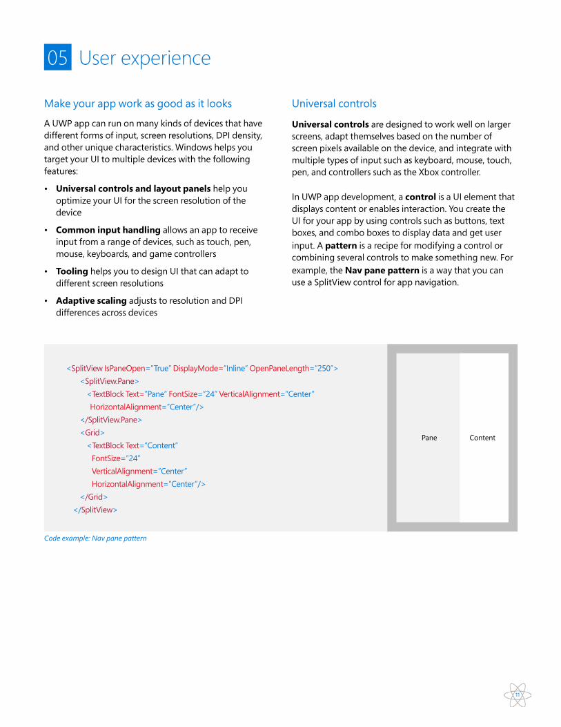
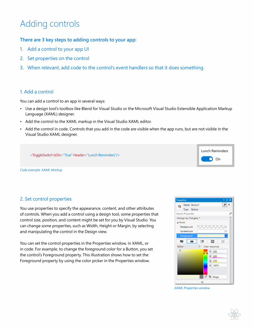
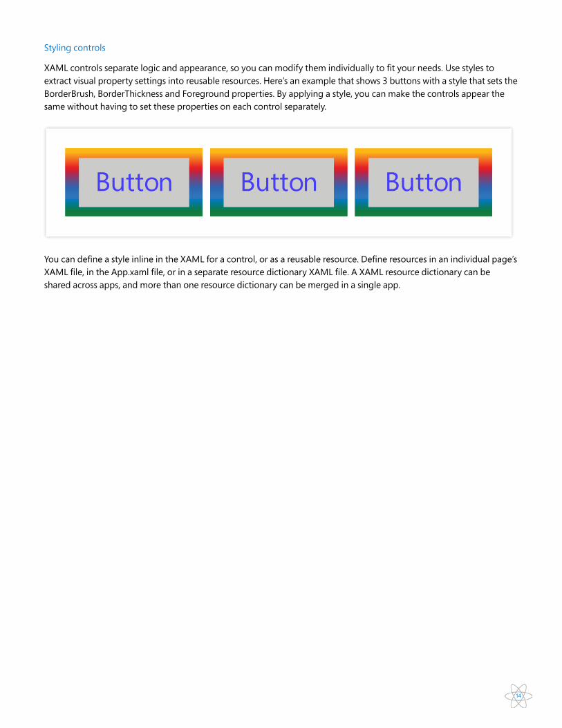
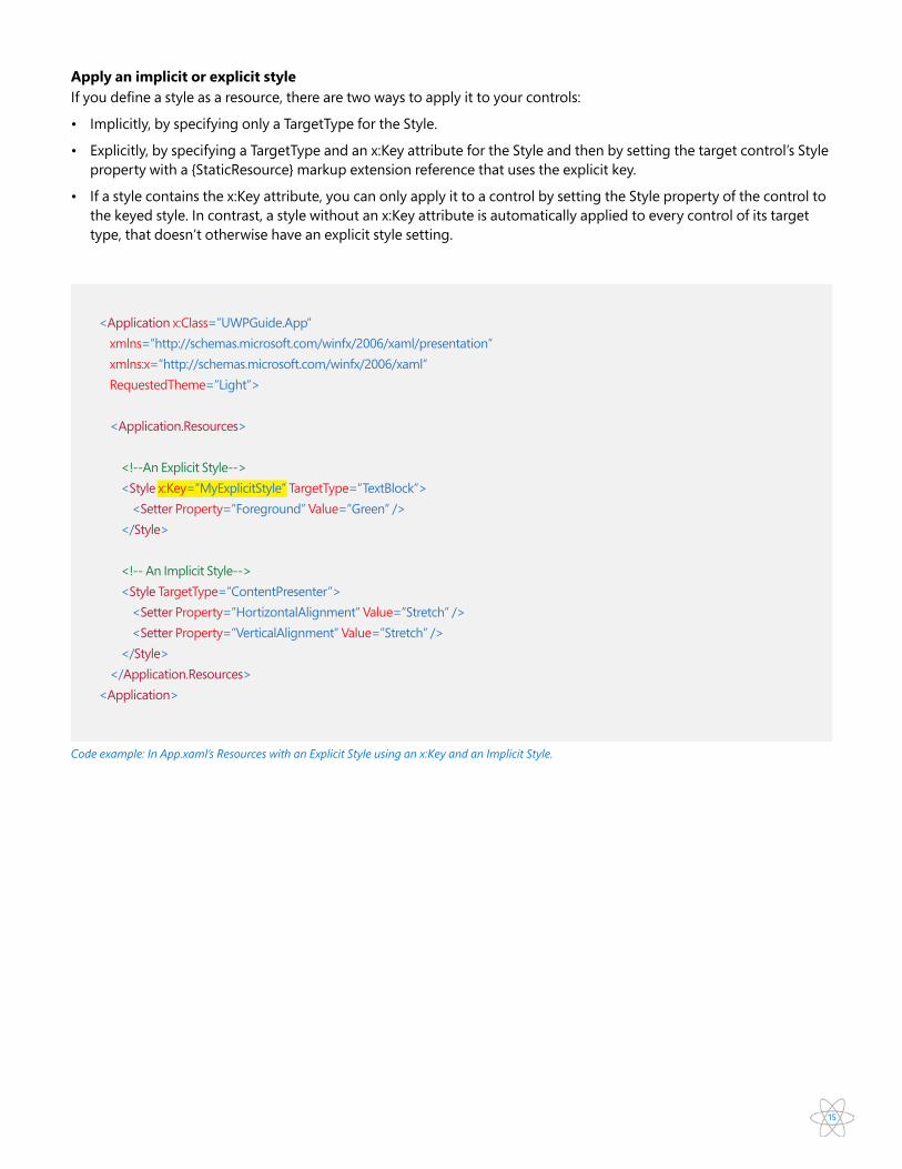
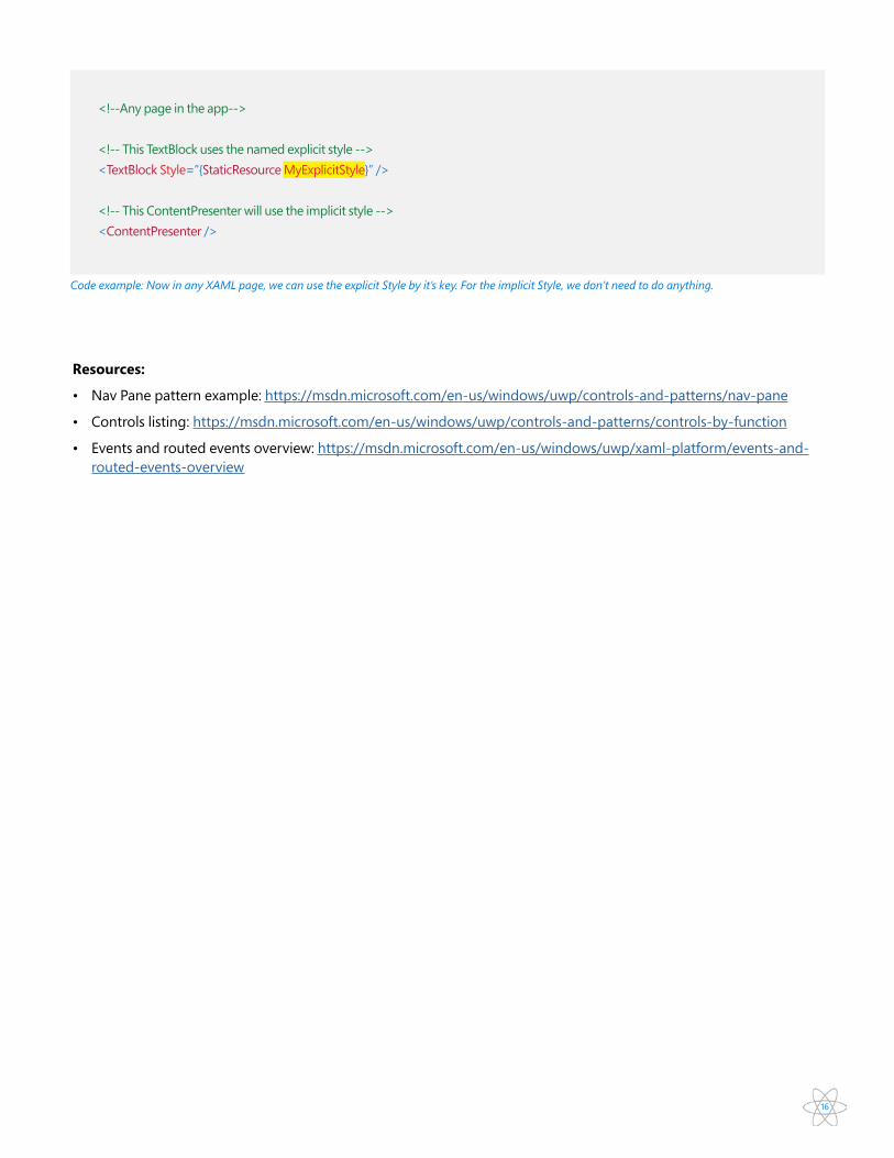
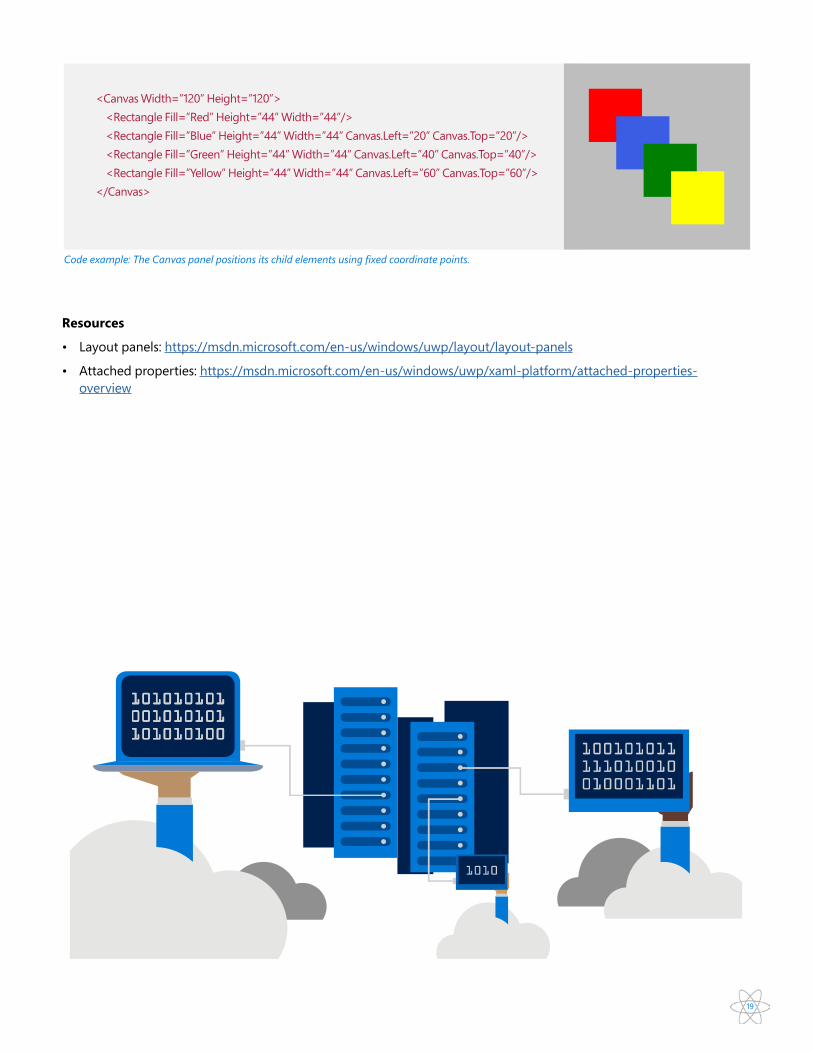
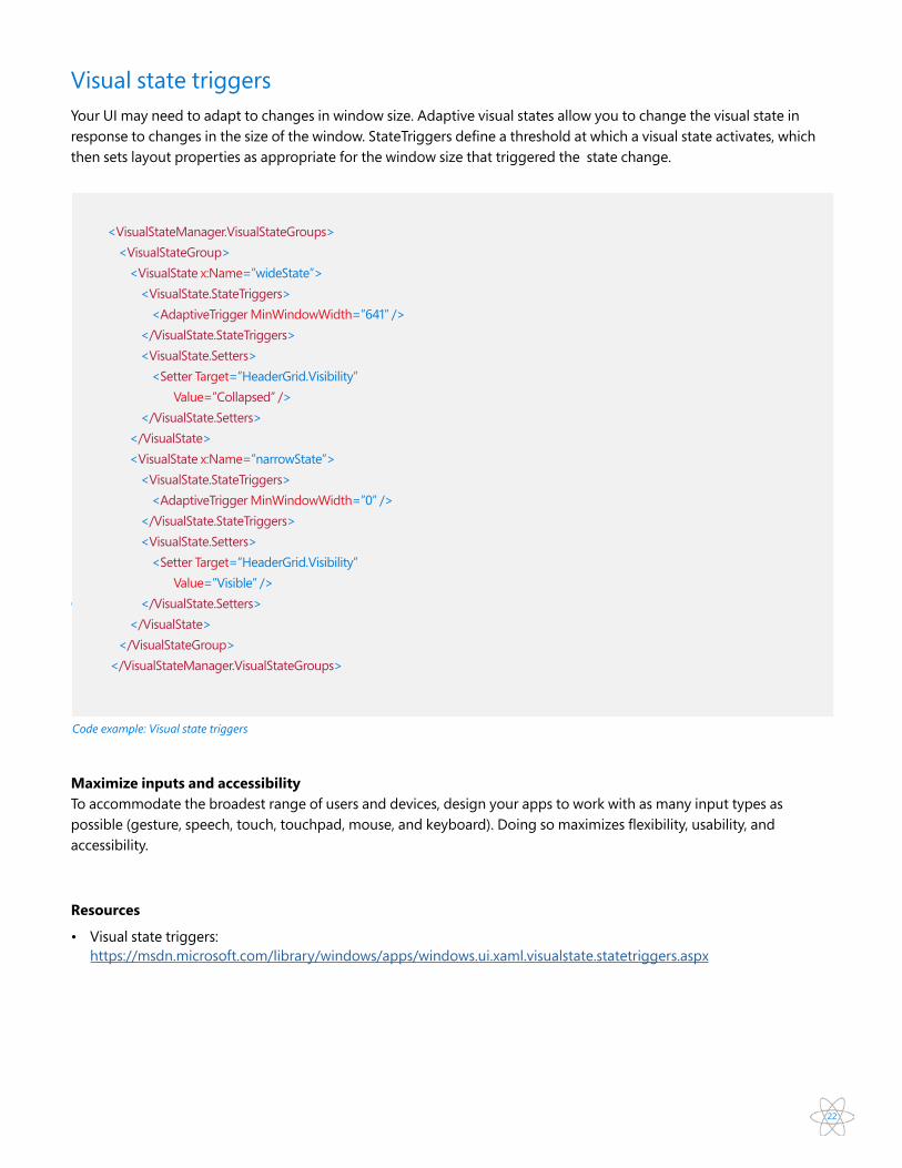
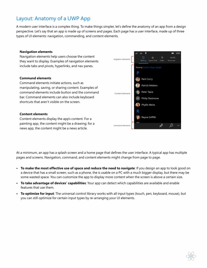
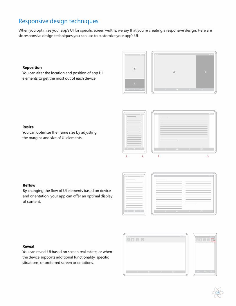
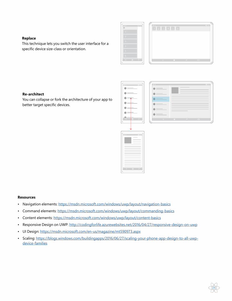
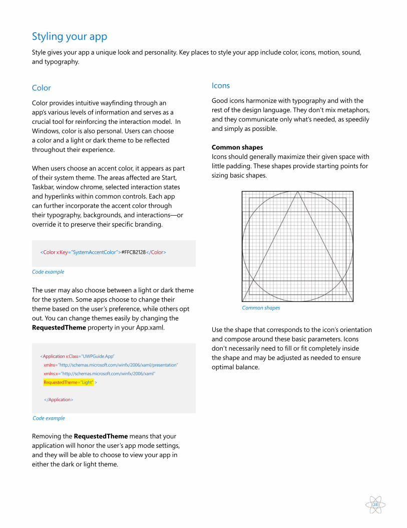
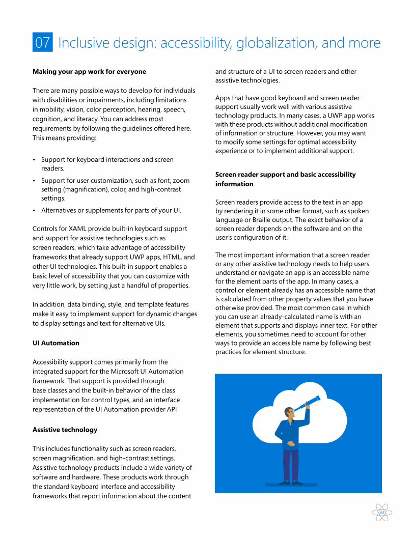
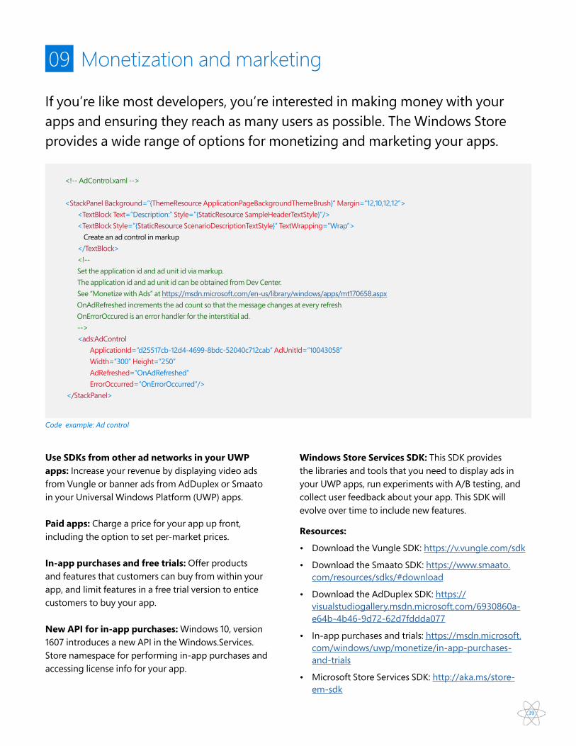

43
Appendix
Source codehttpsgithubcomLanceMcCarthyLunchSchedulerhttpsgithubcomMicrosoftWindows-universal-samples