tim bavington
TRANSCRIPT

TIM
BA
VIN
GT
ON
SC
OT
T W
HIT
E C
ON
TE
MP
OR
AR
Y A
RT

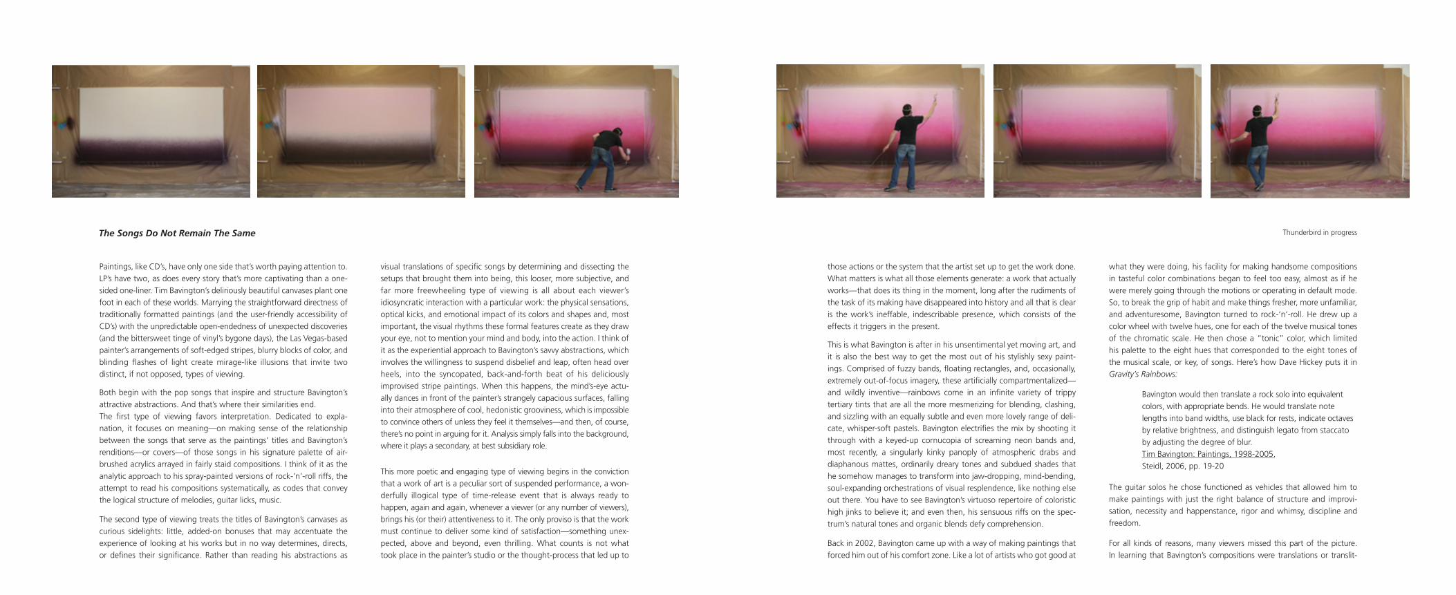
Cover: Detail of Thunderbird


CHANGES
Paintings, like CD’s, have only one side that’s worth paying attention to.
LP’s have two, as does every story that’s more captivating than a one-
sided one-liner. Tim Bavington’s deliriously beautiful canvases plant one
foot in each of these worlds. Marrying the straightforward directness of
traditionally formatted paintings (and the user-friendly accessibility of
CD’s) with the unpredictable open-endedness of unexpected discoveries
(and the bittersweet tinge of vinyl’s bygone days), the Las Vegas-based
painter’s arrangements of soft-edged stripes, blurry blocks of color, and
blinding flashes of light create mirage-like illusions that invite two
distinct, if not opposed, types of viewing.
Both begin with the pop songs that inspire and structure Bavington’s
attractive abstractions. And that’s where their similarities end.
The first type of viewing favors interpretation. Dedicated to expla-
nation, it focuses on meaning—on making sense of the relationship
between the songs that serve as the paintings’ titles and Bavington’s
renditions—or covers—of those songs in his signature palette of air-
brushed acrylics arrayed in fairly staid compositions. I think of it as the
analytic approach to his spray-painted versions of rock-’n’-roll riffs, the
attempt to read his compositions systematically, as codes that convey
the logical structure of melodies, guitar licks, music.
The second type of viewing treats the titles of Bavington’s canvases as
curious sidelights: little, added-on bonuses that may accentuate the
experience of looking at his works but in no way determines, directs,
or defines their significance. Rather than reading his abstractions as
visual translations of specific songs by determining and dissecting the
setups that brought them into being, this looser, more subjective, and
far more freewheeling type of viewing is all about each viewer’s
idiosyncratic interaction with a particular work: the physical sensations,
optical kicks, and emotional impact of its colors and shapes and, most
important, the visual rhythms these formal features create as they draw
your eye, not to mention your mind and body, into the action. I think of
it as the experiential approach to Bavington’s savvy abstractions, which
involves the willingness to suspend disbelief and leap, often head over
heels, into the syncopated, back-and-forth beat of his deliciously
improvised stripe paintings. When this happens, the mind’s-eye actu-
ally dances in front of the painter’s strangely capacious surfaces, falling
into their atmosphere of cool, hedonistic grooviness, which is impossible
to convince others of unless they feel it themselves—and then, of course,
there’s no point in arguing for it. Analysis simply falls into the background,
where it plays a secondary, at best subsidiary role.
This more poetic and engaging type of viewing begins in the conviction
that a work of art is a peculiar sort of suspended performance, a won-
derfully illogical type of time-release event that is always ready to
happen, again and again, whenever a viewer (or any number of viewers),
brings his (or their) attentiveness to it. The only proviso is that the work
must continue to deliver some kind of satisfaction—something unex-
pected, above and beyond, even thrilling. What counts is not what
took place in the painter’s studio or the thought-process that led up to
those actions or the system that the artist set up to get the work done.
What matters is what all those elements generate: a work that actually
works—that does its thing in the moment, long after the rudiments of
the task of its making have disappeared into history and all that is clear
is the work’s ineffable, indescribable presence, which consists of the
effects it triggers in the present.
This is what Bavington is after in his unsentimental yet moving art, and
it is also the best way to get the most out of his stylishly sexy paint-
ings. Comprised of fuzzy bands, floating rectangles, and, occasionally,
extremely out-of-focus imagery, these artificially compartmentalized—
and wildly inventive—rainbows come in an infinite variety of trippy
tertiary tints that are all the more mesmerizing for blending, clashing,
and sizzling with an equally subtle and even more lovely range of deli-
cate, whisper-soft pastels. Bavington electrifies the mix by shooting it
through with a keyed-up cornucopia of screaming neon bands and,
most recently, a singularly kinky panoply of atmospheric drabs and
diaphanous mattes, ordinarily dreary tones and subdued shades that
he somehow manages to transform into jaw-dropping, mind-bending,
soul-expanding orchestrations of visual resplendence, like nothing else
out there. You have to see Bavington’s virtuoso repertoire of coloristic
high jinks to believe it; and even then, his sensuous riffs on the spec-
trum’s natural tones and organic blends defy comprehension.
Back in 2002, Bavington came up with a way of making paintings that
forced him out of his comfort zone. Like a lot of artists who got good at
what they were doing, his facility for making handsome compositions
in tasteful color combinations began to feel too easy, almost as if he
were merely going through the motions or operating in default mode.
So, to break the grip of habit and make things fresher, more unfamiliar,
and adventuresome, Bavington turned to rock-’n’-roll. He drew up a
color wheel with twelve hues, one for each of the twelve musical tones
of the chromatic scale. He then chose a “tonic” color, which limited
his palette to the eight hues that corresponded to the eight tones of
the musical scale, or key, of songs. Here’s how Dave Hickey puts it in
Gravity’s Rainbows:
Bavington would then translate a rock solo into equivalent
colors, with appropriate bends. He would translate note
lengths into band widths, use black for rests, indicate octaves
by relative brightness, and distinguish legato from staccato
by adjusting the degree of blur.
Tim Bavington: Paintings, 1998-2005,
Steidl, 2006, pp. 19-20
The guitar solos he chose functioned as vehicles that allowed him to
make paintings with just the right balance of structure and improvi-
sation, necessity and happenstance, rigor and whimsy, discipline and
freedom.
For all kinds of reasons, many viewers missed this part of the picture.
In learning that Bavington’s compositions were translations or translit-
The Songs Do Not Remain The Same Thunderbird in progress

erations of specific songs, they assumed that the analytical perspective
was sufficient and settled for treating the paintings referentially, as if
they depicted, in variously encoded forms, the songs in their titles.
To a certain extent, the poetry was lost as reading the lyrics replaced
dancing to the music. The transformations that took place in the shift
from sound to sight, which are essential to Bavington’s canvases, not to
mention his way of thinking, fell out of the foreground and sometimes
disappeared altogether, lost in the background. Looking at his synthetic
rainbows, jam-packed with eye-grabbing incidents, often became a
matter of recognizing the songs they referred to and recollecting some
of the memories associated with them.
Over the last ten years, Bavington has gone out of his way to nudge
his art out of the confines of such narrowly analytical readings. His lat-
est paintings play up their non-representational features, emphasizing
that although their sources are popular songs, the rhythms they set
in motion are visual: silent, but never quiet dramas that play out in
the mind’s-eye as they pulse through a viewer’s perceptual organs and
come alive in the feel of their beat. The act of translation transforms
the particular song into something distinct from the original, which the
painting does not represent or portray so much as it uses it as a spring-
board to go somewhere else.
Bavington’s new works fall into five groups:
Stripes, like the six-foot-long Eagles (Wolfmother), the six-foot-tall Thick
as Thieves, and the seven-foot-long Magic hark back to his beginnings.
Their seemingly straightforward arrangement of hazy tertiaries in
various widths, cycles, and refrain-like repetitions are most closely
linked to the songs from which they originate. But the simplicity of
these pieces is deceptive, tweaked by more subtle improvisations and
intuitive highlights than before. In the past, each band of color was
uniform, a consistent tone from top to bottom. As it faded out at its
edges, it blended with the tints on its left and right, creating nuanced
gradations that recall sunsets and the fades in Ed Ruscha’s paintings.
In Bavington’s most recent pieces, he sprays thin, racing-stripe-style
lines over selected bands, adding pictorial depth, sculptural volume,
and psychological complexity to his compositions. Sometimes a rosy
red zip inflects a fat band of burgundy. At others, a razor-thin slice of
chartreuse sets off a serene section of olive drab. And at still others,
hazy grays and gorgeous golds put visual kinks in the sensuous pinks,
lovely lavenders, and diaphanous aquas that swim in and out of focus
in Bavington’s increasingly hallucinatory paintings.
Dissolving Stripes, like Secret Agent (Solo) and Thunderbird, resem-
ble Bavington’s classic Stripes, except for the blurry expanses of dull,
light-swallowing color (teal grey and dusty grape) that run across their
bottom edges. These uninterrupted swathes of emptiness bring time
and transience front and center. Their blank uniformity, at the base of
the picture-plane, threatens to cancel out the playful energy of the jaun-
ty arrangements above and suggests that such lively energy and ani-
mated movement can easily—and instantly—disappear into the void,
go silent, and die. Mortality and melancholy enter the picture, making
the rollicking pleasures Bavington’s art delivers all the more cherished
and dear because they are fleeting, unguaranteed, and human.
Stacked Stripes, like Ball & Biscuit and Changes, compress songs
that unfold over time into untraditional, vertically formatted diptychs
and, even rarer, double-diptychs. Bavington transforms flowing, linear
narratives into time-defying setups that allow viewers to skip, skim,
and skid all around each composition, mixing—and re-mixing—pas-
sages from the beginning, middle, and end like nobody’s business.
His colored bands segue gracefully from one to the next and also jump
abruptly, creating both harmonious and dissonant visual symphonies that
sometimes suggest duets and at others intimate choruses. In every case,
these perfectly square paintings leave viewers with more room to maneu-
ver than their dimensions and tidy geometry imply.
Mirages, like Kosmos, Manic, and Magic Pie, are among Bavington’s
most pictorial and illusionistically sophisticated works. Like his Dissolv-
ing Stripes, they physically bring time into the picture. But rather than
hinting at the fact that the music will inevitably end, they suggest the
opposite: that the high points overwhelm the senses, creating intoxi-
cating moments of flashbulb-bright brilliance that are both blinding and
thrilling, too hot to handle rationally and too cool to stay away from.
In Magic Pie, a handful of bands, in yellow, orange, blue, and pink,
runs top to bottom, like digital renditions of Barnett Newman’s zips.
Behind them, the rest of the painting resembles an ethereal ver-
sion of Clyfford Still’s sublimely electrifying abstractions, as if filtered
through Gerhard Richter’s seductively out-of-focus oils-on-canvas.
Kosmos and Manic riff off of Ed Ruscha’s paintings containing EKG-
style diagrams, transforming their linear simplicity into pulsating jolts
of sizzling energy.
Receding Grids, like Blue Fretboard, break Bavington’s habit of
basing his paintings on songs. Rather than referring to a song at
all, this painting is based on electronic toys like Guitar Hero, which
guide fun-seeking kids of all age through rock-’n’-roll’s greatest hits
by flashing lights on the right chords at the right times. Bavington’s
nearly ten-foot-long painting combines the sumptuous, coloristic so-
lidity of Donald Judd’s wall sculptures with the dreamy intangibility
of Howard Arkley’s pop paintings, tweaking both by embracing in-
consistency and asymmetry. This out-of-sync, improvisational quality
is integral to Bavington’s art, as is its DIY, participatory impulse that
Blue Fretboard highlights.
Taking greater liberties with the structures his art starts out with,
Bavington amplifies the mystery and the magic. Aimed at viewers
of all stripes, his latest paintings make ample room for unexpected
discoveries that resonate with everyone differently.
David Pagel


Magic Pie, 2011synthetic polymer on canvas
96 x 78 inches

Thunderbird, 2011synthetic polymer on canvas
72 x 144 inches

Blue Fretboard, 2011synthetic polymer on canvas
12 x 112.5 inches


Kosmos, 2011synthetic polymer on canvas
84 x 64 inches

Changes, 2011synthetic polymer on canvas
60 x 60 inches
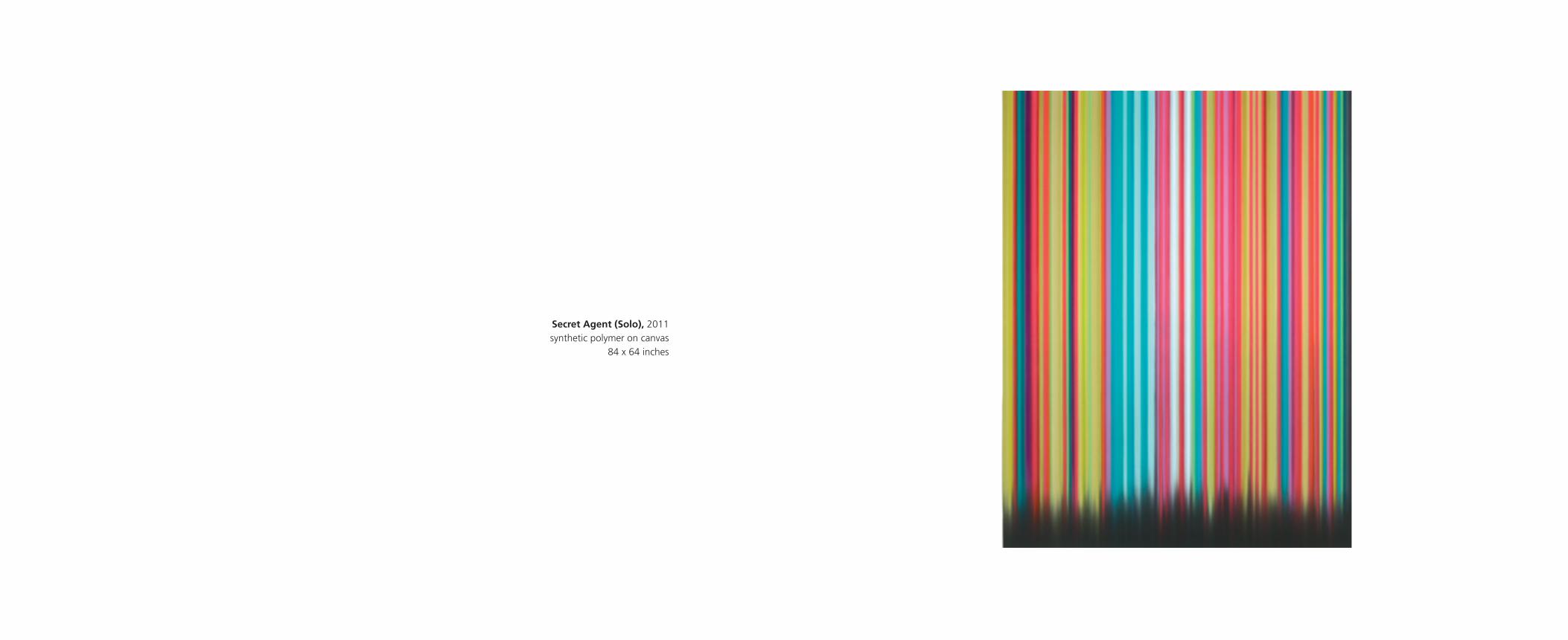
Secret Agent (Solo), 2011synthetic polymer on canvas
84 x 64 inches

Eagles (Wolfmother) 2011synthetic polymer on canvas
24 x 72 inches

Manic, 2011synthetic polymer on canvas
64 x 64 inches
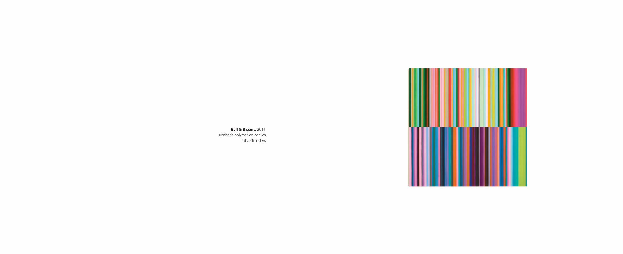
Ball & Biscuit, 2011synthetic polymer on canvas
48 x 48 inches

Magic, 2011synthetic polymer on canvas
36 x 84 inches
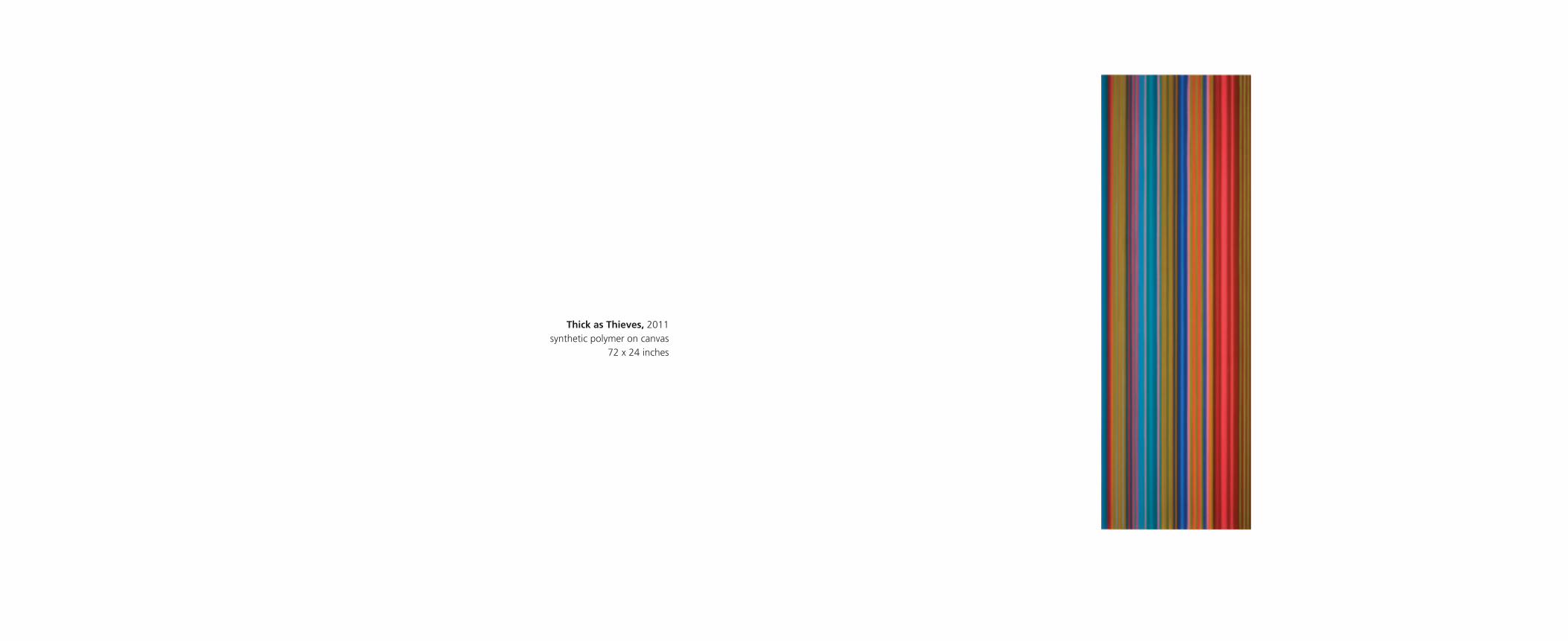
Thick as Thieves, 2011synthetic polymer on canvas
72 x 24 inches

1966 Born in England; lives in the United States
EDUCATION
1999 M.F.A. University of Nevada, Las Vegas
1990 B.F.A. Art Center College of Design, Pasadena, California
SELECTED SOLO EXHIBITIONS
2011 CHANGES, Scott White Contemporary Art, San Diego,
California
2010 Decade, Mark Moore Gallery, Santa Monica, California
Out of Time, Out of Tune, Greg Kucera Gallery, Seattle,
Washington
2009 Up In Suze’s Room, Jack Shainman Gallery, New York,
New York
2008 Hello, Hello, LeeAhn Gallery, Seoul, South Korea
There We Were, Now Here We Are, Mark Moore Gallery,
Santa Monica, California
2007 Recent Paintings, Jack Shainman Gallery, New York
So It Goes, Eleven Fine Art, London, England
2006 Drawings: 1998-2006, G-C Arts, Las Vegas, Nevada
2005 Galerie Richard, Paris, France
Jack Shainman Gallery, New York, New York
Space Gallery, London, England
Heather Marx Gallery, San Francisco, California
2004 Mark Moore Gallery, Santa Monica, California
2003 Greg Kucera Gallery, Seattle, Washington
Pulliam Deffenbaugh Gallery, Portland, Oregon
2002 Mark Moore Gallery, Santa Monica, California
James Kelly Contemporary, Santa Fe, New Mexico
2001 Feigen Contemporary, New York, New York
2000 Mark Moore Gallery, Santa Monica, California
Angstrom Gallery, Dallas, Texas
SELECTED GROUP EXHIBITIONS
2011 OPEN, Mark Moore Gallery, Culver City, California
softcore HARD EDGE, Claremont Graduate University,
Claremont, California, forthcoming
2010 Borderland Abstraction, Bemis Center for Contemporary
Arts, Omaha, Nebraska
Interval: Gene Davis, Kenneth Noland & Tim Bavington,
Scott White Contemporary Art, San Diego, California
Tim Bavington & John Chamberlain, Gallery Seomi,
Seoul, South Korea
softcore HARD EDGE, The Art Gallery of Calgary, Calgary,
Alberta, Canada
2009 Seeing Songs, Museum of Fine Arts, Boston, Massachusetts
Small Is Beautiful, Seomi & Tuus, Seoul, South Korea
Bowie, Clark & Faria, Toronto, Canada
2008 Las Vegas Diaspora, Laguna Art Museum, Laguna Beach,
California, curated by Dave Hickey (catalogue)
2007 Las Vegas Diaspora, Las Vegas Art Museum, Las Vegas,
Nevada, curated by Dave Hickey (catalogue)
SOUNDWAVES: The Art of Sampling, Museum of
Contemporary Art San Diego, San Diego, California,
organized by Stephanie Hanor
Painting <=> Design, Claremont Graduate University,
Claremont, California, curated by David Pagel (catalogue)
2005 EXTREME abstraction, Albright-Knox Art Gallery, Buffalo,
New York, curated by Louis Grachos & Claire Schneider
(catalogue)
Pattern, Dae Jun City Museum, Dae Jun, Korea (catalogue)
2004 Specific Objects: The Minimalist Influence, Museum of
Contemporary Art San Diego, San Diego, California,
curated by Hugh Davies
2003 Structure, Patricia Faure Gallery, Santa Monica, California
Flair, Heather Marx Gallery, San Francisco, California
Drawings, James Kelly Contemporary, Santa Fe, New Mexico
2002 New In Town, Portland Art Museum, Portland, Oregon,
curated by Bruce Guenther
Neo Painting, Young Eun Museum of Contemporary Art,
Kwang ju-city, Korea, (catalogue)
2001 The Magic Hour, Neue Galerie Graz am Landesmuseum
Joanneum, Graz, Austria, curated by Alex Farquharson
(catalogue)
2000 New American Talent, The Jones Center for Contemporary
Art, Austin, Texas, curated by David Pagel (catalogue)
Ultralounge, University of South Florida Museum of
Contemporary Art, Tampa, Florida, curated by Dave Hickey
(catalogue)
COLLECTIONS
Allbright-Knox Art Gallery, Buffalo, New York
Arkansas Art Center, Little Rock, Arkansas
Blake Byrne Collection, Los Angeles, California
William H. Brady III, Los Angeles, California
Cleveland Clinic, Cleveland, Ohio
Creative Artists Agency, Beverly Hills, California
Denver Art Museum, Denver, Colorado
General Mills Corporation, Minneapolis, Minnesota
Istanbul Modern, Istanbul, Turkey
Joslyn Art Museum, Omaha, Nebraska
MGM Mirage Corporation, Las Vegas, Nevada
Marnell Corrao Corporation, Las Vegas, Nevada
Museum of Contemporary Art, San Diego, California
Museum of Modern Art, New York, New York
Neiman Marcus Corporation, Dallas, Texas
Nevada Cancer Institute, Las Vegas, Nevada
Palm Springs Art Museum, Palm Springs, California
Portland Art Museum, Portland, Oregon
Progressive Insurance Corporation, Cleveland, Ohio
Sammlung Mondstudio, Hamburg, Germany
Thomas & Mack Co., Las Vegas, Nevada
United Talent Agency, Beverly Hills, California
Vivendi Universal, Los Angeles, California
Frederick R. Weisman Art Foundation, Los Angeles, California
Steve and Elaine Wynn Collection, Las Vegas, Nevada
The Museum of Fine Arts, Houston, Texas
TIM BAVINGTON
BIOGRAPHICAL INFORMATION

SELECTED ARTICLES / REVIEWS
Kilston, Lyra. “Exhibition Reviews”, Art In America, (September 2010).
Pagel, David. “Tim Bavington at Mark Moore Gallery”, Los Angeles Times,
Friday, April 30, 2010.
Pincus, Robert L. “Stars and Stripes: three painters’ colorfield paintings”, The
San Diego Union-Tribune, Thursday, April 29, 2010.
Johnson, Ken. “Tim Bavington: ‘Up in Suze’s Room’”, The New York Times,
Friday, September 25th, 2009.
Moriarity, Bridget. “My Brilliant Career: Tim Bavington”, Art + Auction
(September 2009): 32.
Knight, Christopher. “His Stripes are a Wonderwall”, Los Angeles Times,
Friday, March 21, 2008.
Swenson, Kirsten. “Sin City Slickers,” Art in America (February 2008): 62.
Knight, Christopher. “Embracing and refining Las Vegas gaudy,” Los Angeles
Times, Tuesday, November 20th, 2007, sec E, 1.
Baker, Kenneth. “Tim Bavington at Heather Marx,” ARTnews, (May 2005): 148.
Pagel, David. “Colorful stripes to music, like a rock ‘n’ roll EKG”, Los Angeles
Times, Friday, April 9th, 2004, sec E, 34.
Miles, Christopher. “Tim Bavington at Mark Moore Gallery”, Artforum
(November 2002): 192.
King, Sarah S. “Sin City Sampler”, Art In America (July 2002): 51- 53.
Pagel, David. “Aperto Las Vegas”, Flash Art (March-April 2002): 57.
Indyke, Dottie. “(Las) Vegans”, Art News (May 2002): 176.
Knight, Christopher. “Tim Bavington Sprays Exhuberant Visual Music”,
Los Angeles Times, Friday, July 12th, 2002, sec F, 19.
Smith, Roberta. “Tim Bavington and Yek”, New York Times, Friday, September
28th, 2000.
CATALOGUES
Las Vegas Diaspora. Curated by Dave Hickey, published by Las Vegas Art
Museum, Las Vegas, Nevada, 2007.
Gene Davis: Interval. Essays by Jean Lawlor Cohen and Andrea Pollen, pub-
lished by The Kreeger Museum, Washington, DC, 2007.
Optic Nerve, Perceptual Art of the 1960’s. Essay by Joe Houston, published by
the Columbus Museum of Art/Merrill, Columbus, Ohio, 2007.
Painting <=> Design. Essays by Libby Lumpkin and David Pagel, published by
Claremont Graduate University, Claremont, California, 2007.
Tim Bavington, Paintings 1998-2005. Essay by Dave Hickey, published by
Steidl, Gottingen, Germany, 2005.
EXTREME Abstraction. Curated by Louis Grachos & Claire Schneider, pub-
lished by Albright-Knox Art Gallery, Buffalo, New York, 2005.
Lorser Feitleson and the invention of hard edge painting. Essays by Henry
T. Hopkins and Michael Duncan, published by Louis Stern Fine Arts, West Hol-
lywood, California, 2003.
Neo Painting. Published by the Young Eun Museum of Contemporary Art,
Quangju-City, Korea, 2002.
The Magic Hour, The Convergence of Art and Las Vegas. Edited by Alex
Farquharson, published by Neue Galerie, Graz, Austria, 2001.
New American Talent 15. Essay by David Pagel, published by the Texas Fine
Arts Association, Dallas, Texas, 2000.
Ultralounge, The Return of Social Space (with cocktails). Essays by Dave
Hickey and David Pagel, published by DiverseWorks, Houston, Texas, 1998.
ACKNOWLEDGEMENTS
Scott White, Director
Kathleen Crain, Associate Director
Haley Crone, Assistant Curator
Brian Lockhart, Preparator
Joan Adams, Studio Manager, Tim Bavington Studio
Published in conjunction with the exhibition
CHANGES
Scott White Contemporary Art, San Diego, California.
March 12 - May 7, 2011
Scott White Contemporary Art
939 West Kalmia Street
San Diego, CA 92101
www.scotttwhiteart.com
619.501.5689
ISBN 978-0-9817385-2-9
© 2011 Scott White Contemporary Art
Essay by David Pagel, art critic for the Los Angeles Times
Photography by Tim Bavington, Joan Adams, and Lancasterphoto.com
Design by Lemke Design
Printed in the United States by L+L Printing Company
San Diego, California.

