transcending image into reality - … · architecture is no different. ... this report aims to...
TRANSCRIPT

Transcending Image Into RealityA Tension Between Brand and Design
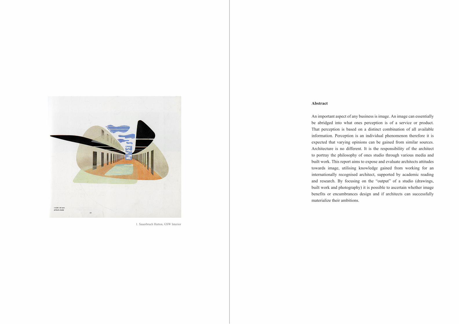
1. Sauerbruch Hutton, GSW Interior
Abstract
An important aspect of any business is image. An image can essentially be abridged into what ones perception is of a service or product. That perception is based on a distinct combination of all available information. Perception is an individual phenomenon therefore it is expected that varying opinions can be gained from similar sources. Architecture is no different. It is the responsibility of the architect to portray the philosophy of ones studio through various media and built work. This report aims to expose and evaluate architects attitudes towards image, utilising knowledge gained from working for an internationally recognised architect, supported by academic reading and research. By focusing on the “output” of a studio (drawings, built work and photography) it is possible to ascertain whether image benefits or encumbrances design and if architects can successfully materialize their ambitions.

2. Sauerbruch Hutton, Brandhorst Museum
Contents
Inroduction
Keeping up with the ChipperfieldsBranding in architecture
Curvy and ColourfulSauerbruch Hutton
I want that, but this will doDrawings to built works to photography
That’s original…Imitating a concept
It’s not all we do!Future of Sauerbruch Hutton
How do I look?Concluding thoughts
Seven steps to heavenHow to establish an image
8
9
12
17
22
24
28
31
8
Introduction:
“Words and texts are seductions. Wonderful, but meaningless” Jacques Herzog
Jacques Herzog, co-founder of Herzog de Meuron, discusses in depth with Adam Hubertus the responsibility of great architects. Herzog is firmly of the opinion that the most effective and sustainable communicative architecture tool is architecture itself.1 Within the parameters of built architecture an expansive knowledge, depth and meaning can be assembled. Architecture is a containment and expression of all urban, economic, political, social, cultural, ecological, and technological processes that intertwine in succession to create a piece of built work. Context varies depending on situation and also time. An identical site would succumb to a vast differentiation of issues between present date and ten, twenty, thirty years from now. With limitless sources of inspiration combined with responsibilities for sympathetic original design, the notion that no two buildings conceptual agenda would coincide is not an outrageous proposal. Yet within the profession it is a social faux pa to acknowledge these basic principles of design are often neglected at the crucial early stages. An interesting point of discussion lies between these fundamental principles colliding with architects need to differentiate and establish their practice into the market.
By first understanding studio brands within architecture, it becomes possible to establish the positive or negative benefits of image to the business side of a practice. Following this, the implementation of studio image and philosophies into built work becomes a fundamental discussion in order to discern the implications of working around a brand. This paper is a reaction to analyse architects core design intentions, whether that be contextual or more stylistic, and to deconstruct three connecting stages of architecture - drawings, built work and photography -with relation to branding/image.
1 Hubertus, B., Architecture + Dialog: Position, Concepts, Vision (Sulgen, Niggli 2011)
7
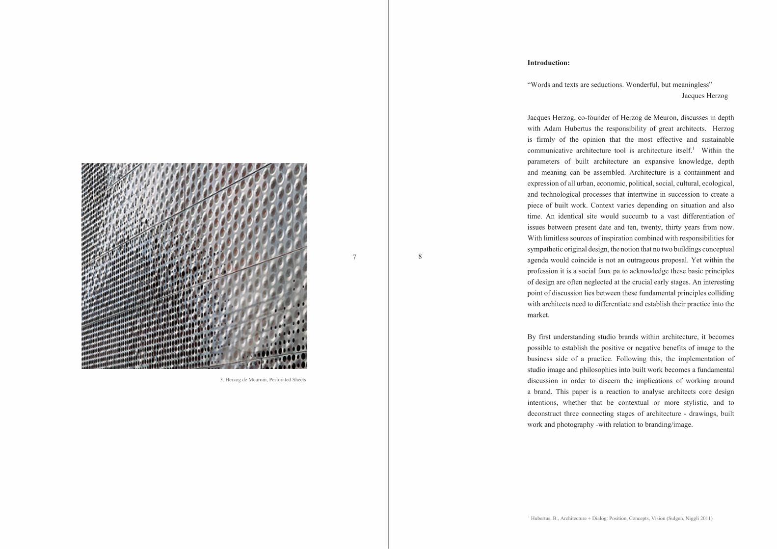
3. Herzog de Meurom, Perforated Sheets
10
Keeping up with the Chipperfields“Branding” in architecture
Branding in architecture has been translated into an overall image, an identity or profile, encompassing the entire practice from the texture of paper through to the built architecture. Although distinctly different matters, for this writing the idea and term “image” will compound every aspect of a studio - inclusive of branding.
Architect’s often measure the success of a building through publication, there is a culture obsessed with publicity. Publications are almost solely read by other architects, so clearly the value of peer status is highly regarded through the profession.2 This is no surprise considering the majority of commissions and invites to competitions are based on architect’s identity and past endeavours. Branding is the interface between architect and public that can be controlled and distorted in order to change perception of a practice. Architecture is a remarkably self-sufficient industry in creating reputations unlike music or fashion that rely on reviews and endorsements. Common techniques used to differentiate practices from “boring” studios are their name and associative logo/colouring and font. However, this is merely superficial and although perhaps necessary, cosmetic branding holds no substance. To truly understand an architect one has to critically view their work with the utmost scrutiny from project conception to completion.
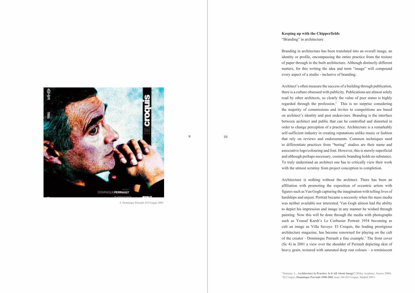
Architecture is nothing without the architect. There has been an affiliation with promoting the exposition of eccentric artists with figures such as Van Gogh capturing the imagination with telling lives of hardships and unjust. Portrait became a necessity when the mass media was neither available nor interested. Van Gogh almost had the ability to depict his impression and image in any manner he wished through painting. Now this will be done through the media with photographs such as Yousuf Karsh’s Le Corbusier Portrait 1954 becoming as cult an image as Villa Savoye. El Croquis, the leading prestigious architecture magazine, has become renowned for playing on the cult of the creator - Dominique Perrault a fine example.3 The front cover (fic 4) in 2001 a view over the shoulder of Perrault depicting skin of heavy grain, textured with saturated deep rust colours – a reminiscent
2 Iloniemi, L., Architecture in Practice: Is it All About Image? (Wiley Academy, Sussex 2006)3 El Croquis, Dominique Perrault 1990-2001 issue 104 (El Croquis, Madrid 2001)
9
4. Dominque Perrault, El Croquis 2001

12
materiality of his proposed extension to Queen Sofia Art Centre in Madrid. It is imperative that self-character and identity are established before embarking upon a studio agenda. This fact is yet another oddity, a distraction, from accentuating the core desire to create emotional, true architecture.
Allsopp proclaims in his Modern Theory of Architecture, however unsubstantiated, that the “responsibility for architecture rests upon the people in society who commission it.” 4 With an abundance of top architects to select, competition is fierce to gain commissions and a result of that has been an increased awareness to image and PR. Architect’s often relate more to artists than business people and reluctantly they have to find a balance that allows for appropriate exposure whilst maintaining artistic integrity. Apple provides an extreme example of the benefits of exposure creating spectacles 5of self-indulgence during release events that draws mass media attention for months prior to launch. While this is at a scale beyond any architect the underlying principles remain comparable. It is common thought that the better known a product then the better the product. Therefore it is the architect’s duty to supply the information so the consumer is best placed to create an impression of their practice. A good image is not insurance against rough times. But to cultivate a good image and maximise its inherent value, strengthens ones position should rough times hit.6
Curvy and ColourfulSauerbruch Hutton
Sauerbruch Hutton is an international agency for architecture, urbanism and design, founded in 1989. The studio is based in Berlin and currently has around ninety architects, designers, engineers, model makers and PR staff of thirteen different nationalities. Mathias Sauerbruch (former director of OMA) and Louisa Hutton (of Alison + Peter Smithson) have a renowned architectural vocabulary embracing curvaceous lines in a refined manner (fig. 5) combined with innovative sustainable design.7 Colour is a recurring element in their architecture that is intrinsically
4 Alsopp, B., A Modern Theory of Architecture (Routledge & Keegan Paul, London 1977)5 Scully, J., Odyssey: Pepsi to Apple… The Journey of a Marketing Impresario (Harper and Row, New York 1987) 6 Marconi, J., Image Marketing: Using Public Perception to Attain Business Objectives (NTC Publishing, Chicago 1996)7 Bergdoll, B., 2G: Twenty Years by Matthias Sauerbruch and Louisa Hutton, Issue 52 (Gustavo Gili, Barcelona 2010)
11
5. Sauerbruch Hutton, Concept Facade

14
interwoven, utilising colour families that are often de-saturated, from the concept design through to the completion.
After several competitions Sauerbruch Hutton were catapulted into the architectural limelight when winning the commission for GSW Headquarters 1990 (fig. 6) – one of the first construction projects in Berlin after the falling of the wall. The building had to confront an unprecedented situation (around the corner from Checkpoint Charlie) to include both the fabric and discourses of East and West Berlin. Sauerbruch Hutton’s solution was an assemblage of five distinct volumes including a cantilevered incurving slab over a sweeping plinth that allowed for free flowing of people through the site – a symbolic gesture to unite two halves of a city. GSW was the first building whose concern was a newly mapped territory in which in the absence of a wall created a palpable presence. The narrow high rise slab was formed to create a dialog across the city therefore both East and West facades were utilised to create natural ventilation as well as solar and thermal protection. It was Sauerbruch Hutton’s use of colour on each half of the city that linked together the creative, contextual principles with sustainability. Ten hues of red, pink and orange were distributed onto metal perforated sunshades across the western façade relating to the terracotta tones in the berlin roofline.8 Each sunshade is mechanically opened by the individual in their office so that an ever-changing canvas of colours, directly related to the sun, is present over Berlin. Naturally the success of this project led the practice to create a strong identifiable brand where colour, form and technology are considered as equally fundamental elements of design.
In 1800, Immanuel Kant, the great 18th century philosopher, wrote in his book Logic:
“The identity of concepts in analytical judgments can be either explicit or non-explicit. In the former case analytic propositions are tautological.” 9
By tautological Kant assumed a statement to be true based wholly on the terms used. An implication that perhaps Sauerbruch Hutton have since embellished after once creating a formula that effectuated success
8 Sauerbruch, M., Sauerbruch Hutton: Colour in Architecture (Distanz, Berlin 2012)9 Kant, E., Logic from the German Emmanuel Kant (Simpkin and Marshall, London 1819)
13
6. Sauerbruch Hutton, GSW Headquarters
16
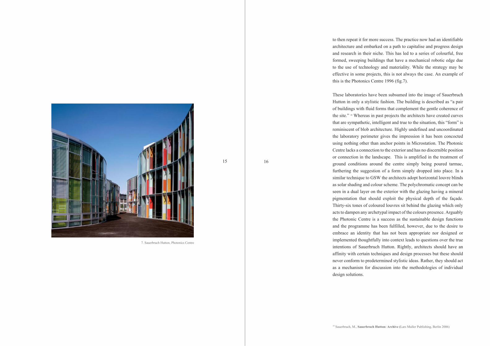
to then repeat it for more success. The practice now had an identifiable architecture and embarked on a path to capitalise and progress design and research in their niche. This has led to a series of colourful, free formed, sweeping buildings that have a mechanical robotic edge due to the use of technology and materiality. While the strategy may be effective in some projects, this is not always the case. An example of this is the Photonics Centre 1996 (fig.7).
These laboratories have been subsumed into the image of Sauerbruch Hutton in only a stylistic fashion. The building is described as “a pair of buildings with fluid forms that complement the gentle coherence of the site.” 10 Whereas in past projects the architects have created curves that are sympathetic, intelligent and true to the situation, this “form” is reminiscent of blob architecture. Highly undefined and uncoordinated the laboratory perimeter gives the impression it has been concocted using nothing other than anchor points in Microstation. The Photonic Centre lacks a connection to the exterior and has no discernible position or connection in the landscape. This is amplified in the treatment of ground conditions around the centre simply being poured tarmac, furthering the suggestion of a form simply dropped into place. In a similar technique to GSW the architects adopt horizontal louvre blinds as solar shading and colour scheme. The polychromatic concept can be seen in a dual layer on the exterior with the glazing having a mineral pigmentation that should exploit the physical depth of the façade. Thirty-six tones of coloured louvres sit behind the glazing which only acts to dampen any archetypal impact of the colours presence. Arguably the Photonic Centre is a success as the sustainable design functions and the programme has been fulfilled, however, due to the desire to embrace an identity that has not been appropriate nor designed or implemented thoughtfully into context leads to questions over the true intentions of Sauerbruch Hutton. Rightly, architects should have an affinity with certain techniques and design processes but these should never conform to predetermined stylistic ideas. Rather, they should act as a mechanism for discussion into the methodologies of individual design solutions.
10 Sauerbruch, M., Sauerbruch Hutton: Archive (Lars Muller Publishing, Berlin 2006)
15
7. Sauerbruch Hutton, Photonics Centre

I want that, but this will doDrawings to built works to photography
Regardless of the final design, Sauerbruch Hutton would make the public believe the Photonics Centre was among their best architecture. This is due to great PR work and an ability to sell their architecture through literature. As introduced to this paper, Jacques Herzog was of the opinion that “words and texts are seductions. Wonderful, but meaningless” and the Photonic Centre proved this. A drawing is embodied with the ability to generate thoughts and emotions that are unique in ones perception of a project. Nils Ole Lund was a pioneer of experimental collage that explored the downside of technology in architecture. Lund believed that through collages he could discuss his ideas “in a more direct way than writing articles, giving lectures or even designing houses.” 11 This paper proposes that the articulation between a drawing into a project can best demonstrate an understanding of the architectural vision. An architect’s ability to communicate their idea through drawing is an invaluable asset in the recognition of an identity and image.
Austrian Gunther Domenig was one such architect that managed to capture the essence of his designs on paper. Long before the convoluted computer architects started using parametric tools to give their visions a limited purpose, Domenig had designed and built the first three-dimensional facade.12 Steinhouse (completed 1980) was a twenty two year project for Domenig that began with a personal approach to the creative process that responded to the landscape, image and memory he was confronted with. Domenig was known to produce countless sketches (fig. 8) in a pursuit to conceive a house from shards of rock that allowed for light infiltration.13 The outcome is a spectacular geometric concrete ensemble that’s perforated with cavities referencing the configuration of the surrounding mountain-scape. Domenig had successfully transcended a concept into a drawing and sculpted the outcome into one of the most iconic Brutalist structures to date. The depth of Domenig’s methodical approach resulted in a work that defined him as an architect and compounded his reputation and image as one of the greats. By working with the context and situation Domenig designed a building in his style, to his philosophies but through development
11 Lund, N., Collage Architecture (Wilhelm Ernst, Berlin 1990)12 Dezeen, Gunther Domenig (1934 – 2012) (Dezeen, 20.06.2012)13 Domenig, G., Structures That Fit My Nature (S.C.I.A., 31.03.2005)
18178. Gunther Domenig, Steinhouse Concept Sketch
9. Gunther Domenig, Steinhouse 1990
rather than vision. . This example highlights the benefits to architects of creativity with no prejudice while cultivating ideas rather than being fixated on the outcome and forcing an image into a design. Gunther Domenig went on to design iconic architecture such as the T-Centre in Vienna and Documentation Centre in Nurnberg.
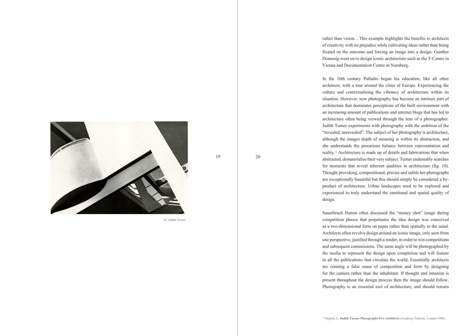
In the 16th century Palladio began his education, like all other architects, with a tour around the cities of Europe. Experiencing the culture and contextualising the vibrancy of architecture within its situation. However, now photography has become an intrinsic part of architecture that dominates perceptions of the built environment with an increasing amount of publications and internet blogs that has led to architecture often being viewed through the lens of a photographer. Judith Turner experiments with photography with the ambition of the “revealed, unrevealed”. The subject of her photography is architecture, although the images depth of meaning is within its abstraction, and she understands the precarious balance between representation and reality.14 Architecture is made up of details and fabrications that when abstracted, dematerialise their very subject. Turner undeniably searches for moments that reveal inherent qualities in architecture (fig. 10). Thought provoking, compositional, precise and subtle her photographs are exceptionally beautiful but this should simply be considered a by-product of architecture. Urban landscapes need to be explored and experienced to truly understand the emotional and spatial quality of design.
Sauerbruch Hutton often discussed the “money shot” image during competition phases that perpetuates the idea design was conceived as a two-dimensional form on paper rather than spatially in the mind. Architects often revolve design around an iconic image, only seen from one perspective, justified through a render, in order to win competitions and subsequent commissions. The same angle will be photographed by the media to represent the design upon completion and will feature in all the publications that circulate the world. Essentially architects are conning a false sense of composition and form by designing for the camera rather than the inhabitant. If thought and intuition is present throughout the design process then the image should follow. Photography is an essential tool of architecture, and should remain
14 Hejduk, J., Judith Turner Photographs Five Architects (Academy Editions, London 1980)
2019
10. Judith Turner
so, but architects should not rely on the exploitation capabilities that photographers hold to reveal hidden, or even absent, beauty. Even so, Edwin Heathcoat of the Financial Times has said that often the most powerful buildings are not necessarily the most photogenic and this may attributed to the architects focus on spatial dimensions and atmosphere rather than profile.
That’s original…Imitating a concept
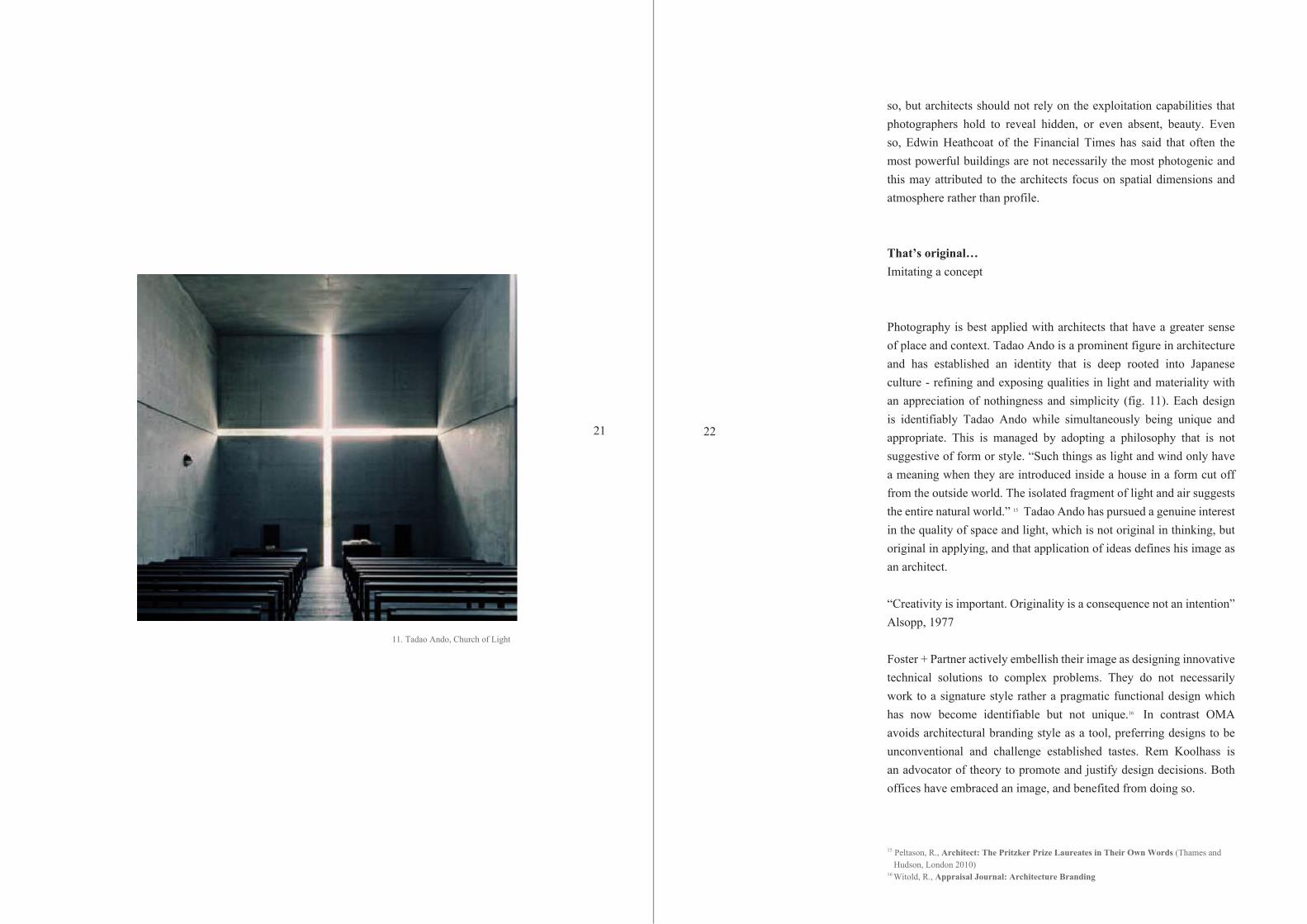
Photography is best applied with architects that have a greater sense of place and context. Tadao Ando is a prominent figure in architecture and has established an identity that is deep rooted into Japanese culture - refining and exposing qualities in light and materiality with an appreciation of nothingness and simplicity (fig. 11). Each design is identifiably Tadao Ando while simultaneously being unique and appropriate. This is managed by adopting a philosophy that is not suggestive of form or style. “Such things as light and wind only have a meaning when they are introduced inside a house in a form cut off from the outside world. The isolated fragment of light and air suggests the entire natural world.” 15 Tadao Ando has pursued a genuine interest in the quality of space and light, which is not original in thinking, but original in applying, and that application of ideas defines his image as an architect.
“Creativity is important. Originality is a consequence not an intention” Alsopp, 1977
Foster + Partner actively embellish their image as designing innovative technical solutions to complex problems. They do not necessarily work to a signature style rather a pragmatic functional design which has now become identifiable but not unique.16 In contrast OMA avoids architectural branding style as a tool, preferring designs to be unconventional and challenge established tastes. Rem Koolhass is an advocator of theory to promote and justify design decisions. Both offices have embraced an image, and benefited from doing so.
15 Peltason, R., Architect: The Pritzker Prize Laureates in Their Own Words (Thames and Hudson, London 2010) 16 Witold, R., Appraisal Journal: Architecture Branding
2221
11. Tadao Ando, Church of Light

Herzog de Meuron evolved as a practice by utilising fashion and trends, straining back from their artistic roots, yet refuse to acknowledge they have an aesthetically driven design. Jacques Herzog describes his initial naivety towards art and architecture that had a positive effect on their design philosophy, rendering it free from preconception. He also concedes it is “difficult to retain such innocence. Herzog de Meuron has never deliberately sought such unity – it came as a result of our work as a way of integrating various components of a project.” 17 Herzog believes that his designs are mainly pragmatic interpretations of the brief with a curiosity of depth between interior and exterior. While unanimously respected, this suggests a disconnection between their thoughts and the public perception of their architecture. This has arisen due to drawings, photographs and imagery that clearly depict an architectural language, most distinctly in the use of perforations, inherent throughout their designs. Herzog de Meuron is now at a stage of predictability that works for Foster + Partners, due to the commercial nature of their clients, but may not appeal to the artistic client seeking new and creative explorations into architecture.
It’s not all we do!Changing Sauerbruch Hutton
It has been established that drawings contribute significantly to the image of an architect. Within drawings it is possible to explore design philosophies and ambitions that can progress and mature over time. By following a practice’s drawings and imagery it is possible to document this development.
Matthias Sauerbruch’s affiliation with OMA has clearly brought a vision and stylistic instinct to early competitions by Sauerbruch Hutton. Exodus by OMA 1990 (fig.12) was a conceptual envisagement of London as a city prison that is based on the physical and emotional impact Berlin experienced during the cold war.18 Koolhass argues that the psychological and symbolic impact of the Berlin wall was “infinitely more powerful” than the artefact itself. Exodus was creating a wall named “the strip” that divided London in half but acted as a
17 Herzog, J., Order Structure Space: A Conservation with Jacques Herzog 18 Koolhass, R., Junkspace (MIT Press, 2001)
242312. OMA, Exodus
13. Sauerbruch Hutton, GSW
service to the city reforming against isolation and inequality creating a haven that people will desire. Not dissimilar is the concept behind GSW tower by Sauerbruch Hutton. Set in berlin overcoming contextual and social issues surrounding the wall they managed to design somewhat into reality OMA’s vision of a structure that act as a catalyst for progression. These two projects are closely represented visually in the styles of drawings with clear influences from Exodus found in GSW (fig. 13). Sauerbruch Hutton embraced the theorist artistic avant-garde architecture and reputation.
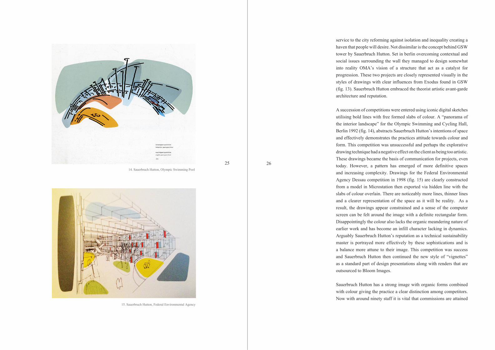
A succession of competitions were entered using iconic digital sketches utilising bold lines with free formed slabs of colour. A “panorama of the interior landscape” for the Olympic Swimming and Cycling Hall, Berlin 1992 (fig. 14), abstracts Sauerbruch Hutton’s intentions of space and effectively demonstrates the practices attitude towards colour and form. This competition was unsuccessful and perhaps the explorative drawing technique had a negative effect on the client as being too artistic. These drawings became the basis of communication for projects, even today. However, a pattern has emerged of more definitive spaces and increasing complexity. Drawings for the Federal Environmental Agency Dessau competition in 1998 (fig. 15) are clearly constructed from a model in Microstation then exported via hidden line with the slabs of colour overlain. There are noticeably more lines, thinner lines and a clearer representation of the space as it will be reality. As a result, the drawings appear constrained and a sense of the computer screen can be felt around the image with a definite rectangular form. Disappointingly the colour also lacks the organic meandering nature of earlier work and has become an infill character lacking in dynamics. Arguably Sauerbruch Hutton’s reputation as a technical sustainability master is portrayed more effectively by these sophistications and is a balance more attune to their image. This competition was success and Sauerbruch Hutton then continued the new style of “vignettes” as a standard part of design presentations along with renders that are outsourced to Bloom Images.
Sauerbruch Hutton has a strong image with organic forms combined with colour giving the practice a clear distinction among competitors. Now with around ninety staff it is vital that commissions are attained
262514. Sauerbruch Hutton, Olympic Swimming Pool
15. Sauerbruch Hutton, Federal Environmental Agency
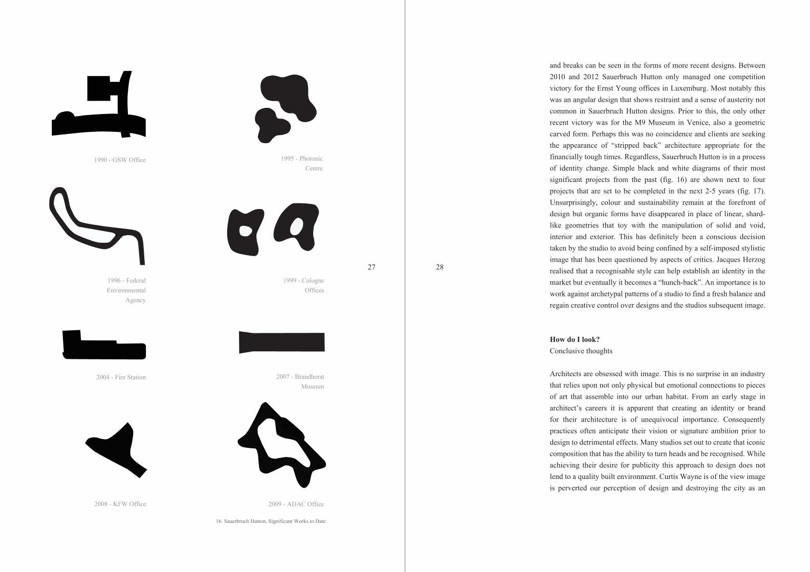
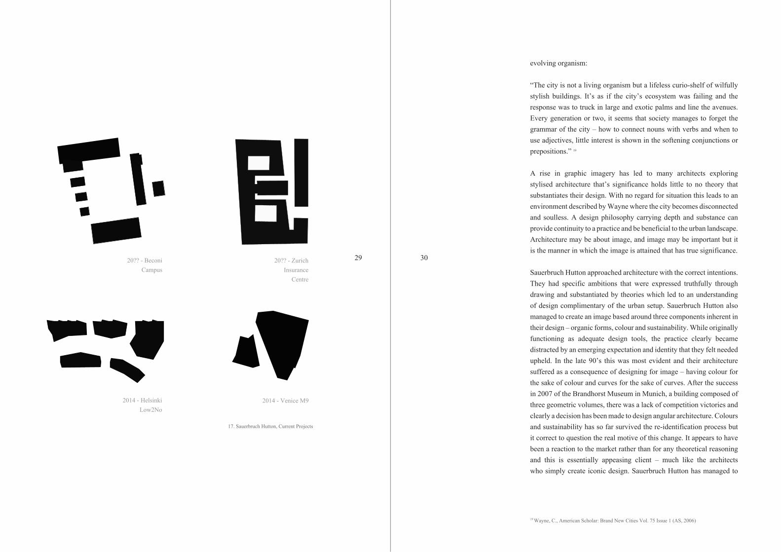
and breaks can be seen in the forms of more recent designs. Between 2010 and 2012 Sauerbruch Hutton only managed one competition victory for the Ernst Young offices in Luxemburg. Most notably this was an angular design that shows restraint and a sense of austerity not common in Sauerbruch Hutton designs. Prior to this, the only other recent victory was for the M9 Museum in Venice, also a geometric carved form. Perhaps this was no coincidence and clients are seeking the appearance of “stripped back” architecture appropriate for the financially tough times. Regardless, Sauerbruch Hutton is in a process of identity change. Simple black and white diagrams of their most significant projects from the past (fig. 16) are shown next to four projects that are set to be completed in the next 2-5 years (fig. 17). Unsurprisingly, colour and sustainability remain at the forefront of design but organic forms have disappeared in place of linear, shard-like geometries that toy with the manipulation of solid and void, interior and exterior. This has definitely been a conscious decision taken by the studio to avoid being confined by a self-imposed stylistic image that has been questioned by aspects of critics. Jacques Herzog realised that a recognisable style can help establish an identity in the market but eventually it becomes a “hunch-back”. An importance is to work against archetypal patterns of a studio to find a fresh balance and regain creative control over designs and the studios subsequent image.
How do I look?Conclusive thoughts
Architects are obsessed with image. This is no surprise in an industry that relies upon not only physical but emotional connections to pieces of art that assemble into our urban habitat. From an early stage in architect’s careers it is apparent that creating an identity or brand for their architecture is of unequivocal importance. Consequently practices often anticipate their vision or signature ambition prior to design to detrimental effects. Many studios set out to create that iconic composition that has the ability to turn heads and be recognised. While achieving their desire for publicity this approach to design does not lend to a quality built environment. Curtis Wayne is of the view image is perverted our perception of design and destroying the city as an
2827
1990 - GSW Office 1995 - Photonic Centre
1996 - Federal Environmental
Agency
1999 - Cologne Offices
2007 - Brandhorst Museum
2008 - KFW Office 2009 - ADAC Office
2004 - Fire Station
16. Sauerbruch Hutton, Significant Works to Date
evolving organism:
“The city is not a living organism but a lifeless curio-shelf of wilfully stylish buildings. It’s as if the city’s ecosystem was failing and the response was to truck in large and exotic palms and line the avenues. Every generation or two, it seems that society manages to forget the grammar of the city – how to connect nouns with verbs and when to use adjectives, little interest is shown in the softening conjunctions or prepositions.” 19
A rise in graphic imagery has led to many architects exploring stylised architecture that’s significance holds little to no theory that substantiates their design. With no regard for situation this leads to an environment described by Wayne where the city becomes disconnected and soulless. A design philosophy carrying depth and substance can provide continuity to a practice and be beneficial to the urban landscape. Architecture may be about image, and image may be important but it is the manner in which the image is attained that has true significance.
Sauerbruch Hutton approached architecture with the correct intentions. They had specific ambitions that were expressed truthfully through drawing and substantiated by theories which led to an understanding of design complimentary of the urban setup. Sauerbruch Hutton also managed to create an image based around three components inherent in their design – organic forms, colour and sustainability. While originally functioning as adequate design tools, the practice clearly became distracted by an emerging expectation and identity that they felt needed upheld. In the late 90’s this was most evident and their architecture suffered as a consequence of designing for image – having colour for the sake of colour and curves for the sake of curves. After the success in 2007 of the Brandhorst Museum in Munich, a building composed of three geometric volumes, there was a lack of competition victories and clearly a decision has been made to design angular architecture. Colours and sustainability has so far survived the re-identification process but it correct to question the real motive of this change. It appears to have been a reaction to the market rather than for any theoretical reasoning and this is essentially appeasing client – much like the architects who simply create iconic design. Sauerbruch Hutton has managed to
19 Wayne, C., American Scholar: Brand New Cities Vol. 75 Issue 1 (AS, 2006)
302920?? - Beconi Campus
20?? - ZurichInsurance
Centre
2014 - HelsinkiLow2No
2014 - Venice M9
17. Sauerbruch Hutton, Current Projects
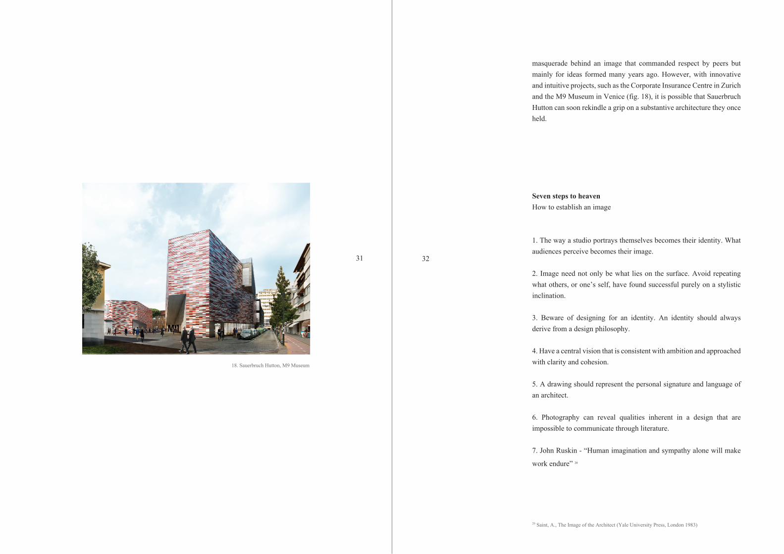
masquerade behind an image that commanded respect by peers but mainly for ideas formed many years ago. However, with innovative and intuitive projects, such as the Corporate Insurance Centre in Zurich and the M9 Museum in Venice (fig. 18), it is possible that Sauerbruch Hutton can soon rekindle a grip on a substantive architecture they once held.
Seven steps to heavenHow to establish an image
1. The way a studio portrays themselves becomes their identity. What audiences perceive becomes their image.
2. Image need not only be what lies on the surface. Avoid repeating what others, or one’s self, have found successful purely on a stylistic inclination.
3. Beware of designing for an identity. An identity should always derive from a design philosophy.
4. Have a central vision that is consistent with ambition and approached with clarity and cohesion.
5. A drawing should represent the personal signature and language of an architect.
6. Photography can reveal qualities inherent in a design that are impossible to communicate through literature.
7. John Ruskin - “Human imagination and sympathy alone will make
work endure” 20
20 Saint, A., The Image of the Architect (Yale University Press, London 1983)
3231
18. Sauerbruch Hutton, M9 Museum

Bibliography
Alsopp, B., A Modern Theory of Architecture (Routledge & Keegan Paul,
London 1977)
Bergdoll, B., 2G: Twenty Years by Matthias Sauerbruch and Louisa
Hutton, Issue 52 (Gustavo Gili, Barcelona 2010)
Bjorke Ingels Group, Yes is More: An Archicomic on Architectural
Evolution (Taschen, Copenhagen 2010)
El Croquis, Dominique Perrault 1990-2001 issue 104 (El Croquis, Madrid
2001)
Haupt, E., Marketing and Communication for Architects (Birkhauser,
Berlin 2002)
Hejduk, J., Judith Turner Photographs Five Architects (Academy
Editions, London 1980)
Hubertus, B. Architecture + Dialog: Position, Concepts, Vision (Sulgen,
Niggli 2011)
Iloniemi, L., Architecture in Practice: Is it All About Image? (Wiley
Academy, Sussex 2006)
Kant, E., Logic from the German Emmanuel Kant (Simpkin and Marshall,
London 1819)
Koolhass, R., Junkspace (MIT Press, 2001)
Lund, N., Collage Architecture (Wihelm Ernst, Berlin 1990)
Marconi, J., Image Marketing: Using Public Perception to Attain
Business Objectives (NTC Publishing, Chicago 1996)
Noever, P., Visionary Clients for New Architecture (Prestel Publishing,
Munich 2000)
Ollins, W., The New Guide to Identity: How to Create and Maintain
Change Through Managing Identity (Gower Publishing, Cambridge 2006)
Peltason, R., Architect: The Pritzker Prize Laureates in Their Own
Words (Thames and Hudson, London 2010)
Saint, A., The Image of the Architect (Yale University Press, London 1983)
Sauerbruch, M., Sauerbruch Hutton: Archive (Lars Muller Publishing,
Berlin 2006)
Sauerbruch, M., Sauerbruch Hutton: Colour in Architecture (Distanz, Berlin
2012)
Scully, J., Odyssey: Pepsi to Apple… The Journey of a Marketing Impresario
(Harper and Row, New York 1987)
Server, F., Contemporary Architectural Images (Arco, Barcelona 1998)
Wayne, C., American Scholar: Brand New Cities Vol. 75 Issue 1 (AS, 2006)
Witold, R., Appraisal Journal: Architecture Branding
Zenghelis, Z., Shapes in Space (Academy Editions, London 1992)
Zumthor, P., Atmosphere (Birkhauser, Basel 2006)
Lectures
Domenig, G., Structures That Fit My Nature (Southern California Institute of
Architecture, 31.03.2005)
accessed at http://sma.sciarc.edu/theme/repurposing/
Articles
Gunther Domenig (1934 – 2012) (Dezeen, 20.06.2012)
accessed at http://www.dezeen.com/2012/06/20/gunther-domenig-1934-2012/
Face Value (bdonline, 25.06.2001)
accessed at http://www.bdonline.co.uk/1008613.article
Imaging All The People (bdonline, 19.09.2000)
accessed at http://www.bdonline.co.uk/1337.article
“I tried hard to find a drawing model or scheme I liked. I didn’t” (bdonline,
02.07.2002)
accessed at http://www.bdonline.co.uk/1019502.article