tutorial 4 analyzing and charting financial data
DESCRIPTION
Tutorial 4 Analyzing and Charting Financial Data. Objectives. Use the PMT function to calculate a loan payment Create an embedded pie chart Apply styles to a chart Add data labels to a pie chart Format a chart legend Create a clustered column chart Create a stacked column chart. - PowerPoint PPT PresentationTRANSCRIPT

Microsoft Excel 2013® ®
Tutorial 4Analyzing and Charting Financial Data

XPXPXP
New Perspectives on Microsoft Excel 2013 2
Objectives• Use the PMT function to calculate a loan
payment• Create an embedded pie chart• Apply styles to a chart• Add data labels to a pie chart• Format a chart legend• Create a clustered column chart• Create a stacked column chart
XPXPXP
New Perspectives on Microsoft Excel 2013 3
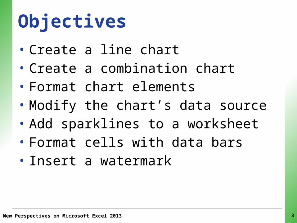
Objectives• Create a line chart• Create a combination chart• Format chart elements• Modify the chart’s data source• Add sparklines to a worksheet• Format cells with data bars• Insert a watermark
XPXPXP
New Perspectives on Microsoft Excel 2013 4
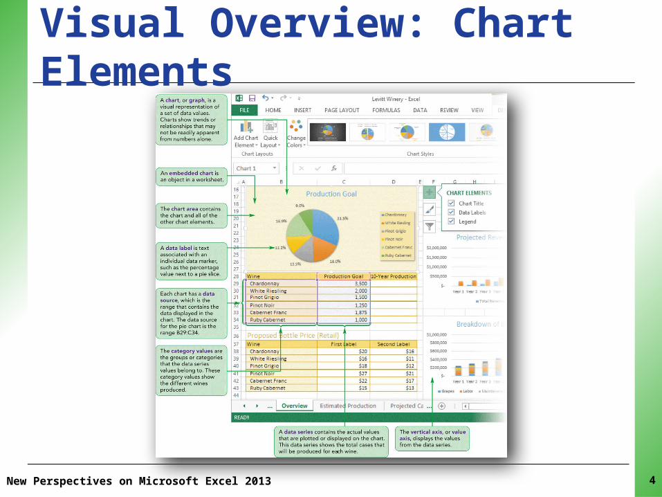
Visual Overview: Chart Elements
XPXPXP
New Perspectives on Microsoft Excel 2013 5
Visual Overview: Chart Elements

XPXPXPIntroduction to Financial Functions• Excel provides a wide range of financial
functions related to loans and investments:– The PMT function can be used to calculate the
installment payment and payment schedule required to completely repay a loan
– Future value– Present value– Calculating the interest part of a payment– Calculating the principle part of a payment– Loan interest rate
New Perspectives on Microsoft Excel 2013 6

XPXPXP
New Perspectives on Microsoft Excel 2010 7
Introduction to Financial Functions
XPXPXP
New Perspectives on Microsoft Excel 2010 8
Introduction to Financial Functions• Cost of a loan to the borrower is largely based
on three factors:–Principal: amount of money being loaned– Interest: amount added to the principal by
the lender– Time required to repay the loan
XPXPXP
New Perspectives on Microsoft Excel 2010 9
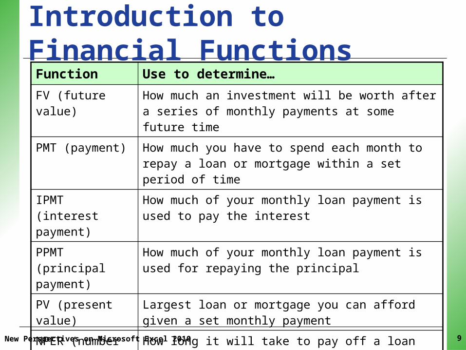
Introduction to Financial FunctionsFunction Use to determine…FV (future value) How much an investment will be worth after a series of
monthly payments at some future time
PMT (payment) How much you have to spend each month to repay a loan or mortgage within a set period of time
IPMT (interest payment)
How much of your monthly loan payment is used to pay the interest
PPMT (principal payment)
How much of your monthly loan payment is used for repaying the principal
PV (present value) Largest loan or mortgage you can afford given a set monthly payment
NPER (number of periods)
How long it will take to pay off a loan with constant monthly payments
RATE The interest rate of a loan or an investment based on periodic, constant payments

XPXPXP
New Perspectives on Microsoft Excel 2010 10
Introduction to Financial Functions
• Using the PMT Function– To calculate the costs associated with a loan,
you must have the following information:• The annual interest rate• The number of payment periods per year• The length of the loan in terms of the total
number of payment periods• The amount being borrowed• When loan payments are due
XPXPXPIntroduction to Financial Functions
New Perspectives on Microsoft Excel 2010 11
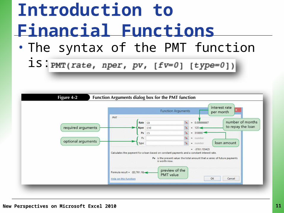
• The syntax of the PMT function is:

XPXPXP
New Perspectives on Microsoft Excel 2010 12
Introduction to Financial Functions

XPXPXPCreating a Chart• Charts show trends or relationships in data
that are easier to see in a graphic representation rather than viewing the actual numbers or data
• Creating a chart is a several-step process:– Selecting the data to display in the chart– Choosing the chart type– Moving the chart to a specific location– Sizing the chart– Formatting the chart’s appearance
New Perspectives on Microsoft Excel 2013 13
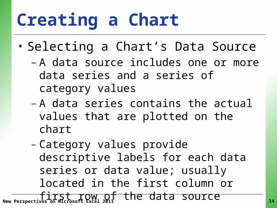
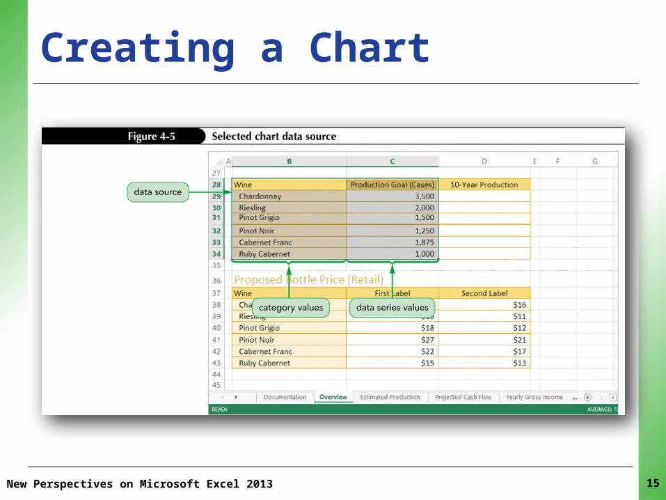
XPXPXPCreating a Chart• Selecting a Chart’s Data Source– A data source includes one or more data series and
a series of category values– A data series contains the actual values that are
plotted on the chart– Category values provide descriptive labels for each
data series or data value; usually located in the first column or first row of the data source
New Perspectives on Microsoft Excel 2013 14
XPXPXP
New Perspectives on Microsoft Excel 2013 15
Creating a Chart
XPXPXP
New Perspectives on Microsoft Excel 2013
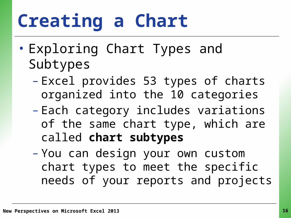
Creating a Chart• Exploring Chart Types and Subtypes– Excel provides 53 types of charts organized into the
10 categories – Each category includes variations of the same chart
type, which are called chart subtypes– You can design your own custom chart types to
meet the specific needs of your reports and projects
16

XPXPXPCreating a Chart
New Perspectives on Microsoft Excel 2013 17

XPXPXPCreating a Chart• Exploring Chart Types and Subtypes– A pie chart is a chart in the shape of a circle
divided into slices like a pie• Each slice represents a single value from a data series• Larger data values are represented with bigger pie slices• The relative sizes of the slices let you visually compare
the data values and see how much each contributes to the whole
– Pie charts are most effective with six or fewer slices, and when each slice is large enough to view easily
New Perspectives on Microsoft Excel 2013 18
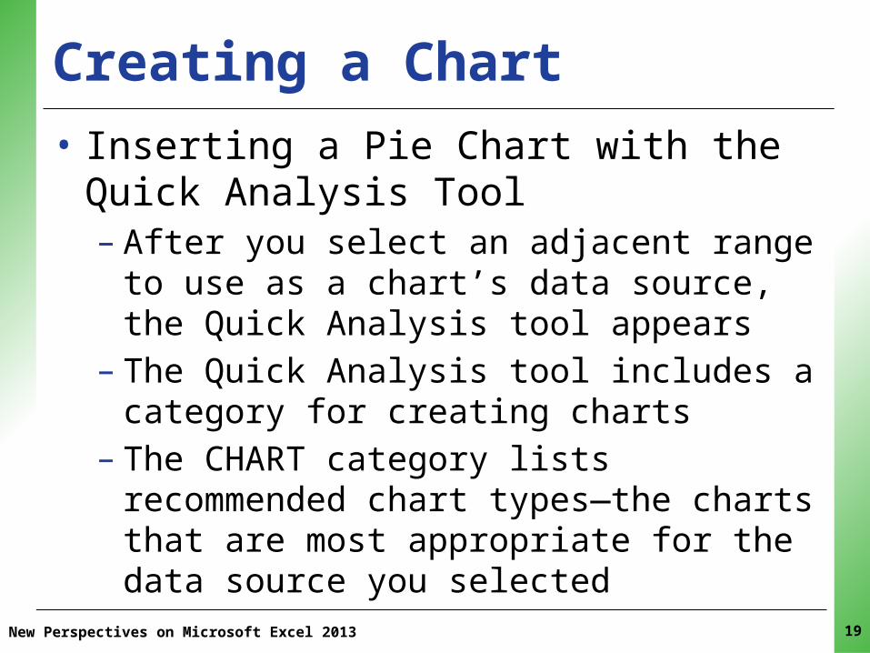
XPXPXPCreating a Chart• Inserting a Pie Chart with the Quick Analysis
Tool– After you select an adjacent range to use as a
chart’s data source, the Quick Analysis tool appears
– The Quick Analysis tool includes a category for creating charts
– The CHART category lists recommended chart types—the charts that are most appropriate for the data source you selected
New Perspectives on Microsoft Excel 2013 19

XPXPXPCreating a Chart• Inserting a Pie Chart with the Quick Analysis
Tool1. Make sure the correct range is selected2. Click the Quick Analysis button in the lower-right
corner of the selected range 3. Click the CHARTS category4. Click Pie to select the pie chart
New Perspectives on Microsoft Excel 2013 20

XPXPXPCreating a Chart
New Perspectives on Microsoft Excel 2013 21

XPXPXP
New Perspectives on Microsoft Excel 2013 22
Creating a Chart• Moving and Resizing Charts– Excel charts are either placed in their own chart
sheets or embedded in a worksheet– When you create a chart, it is embedded in the
worksheet that contains the data source– Selecting the chart displays:• A selection box (used to move or resize the chart)• Sizing handles (used to change the chart’s width and
height)

XPXPXP
New Perspectives on Microsoft Excel 2013
Creating a Chart
23
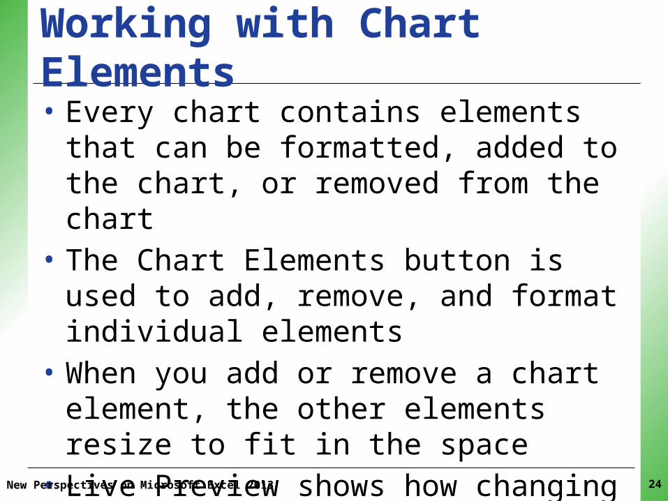
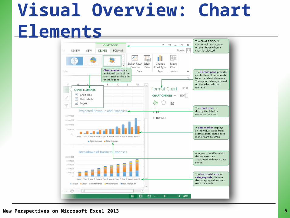
XPXPXPWorking with Chart Elements• Every chart contains elements that can be
formatted, added to the chart, or removed from the chart
• The Chart Elements button is used to add, remove, and format individual elements
• When you add or remove a chart element, the other elements resize to fit in the space
• Live Preview shows how changing an element will affect the chart’s appearance
New Perspectives on Microsoft Excel 2013 24

XPXPXPWorking with Chart Elements
New Perspectives on Microsoft Excel 2013 25
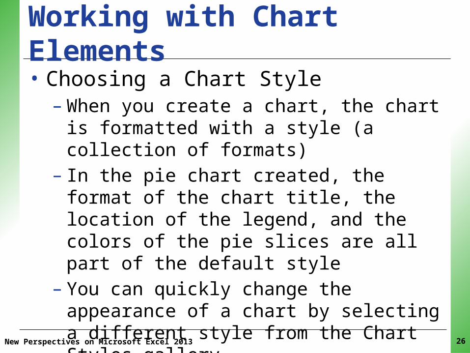
XPXPXPWorking with Chart Elements• Choosing a Chart Style– When you create a chart, the chart is formatted
with a style (a collection of formats)– In the pie chart created, the format of the chart
title, the location of the legend, and the colors of the pie slices are all part of the default style
– You can quickly change the appearance of a chart by selecting a different style from the Chart Styles gallery
– Live Preview shows how a chart style will affect the chart
New Perspectives on Microsoft Excel 2013 26

XPXPXPWorking with Chart Elements
New Perspectives on Microsoft Excel 2013 27
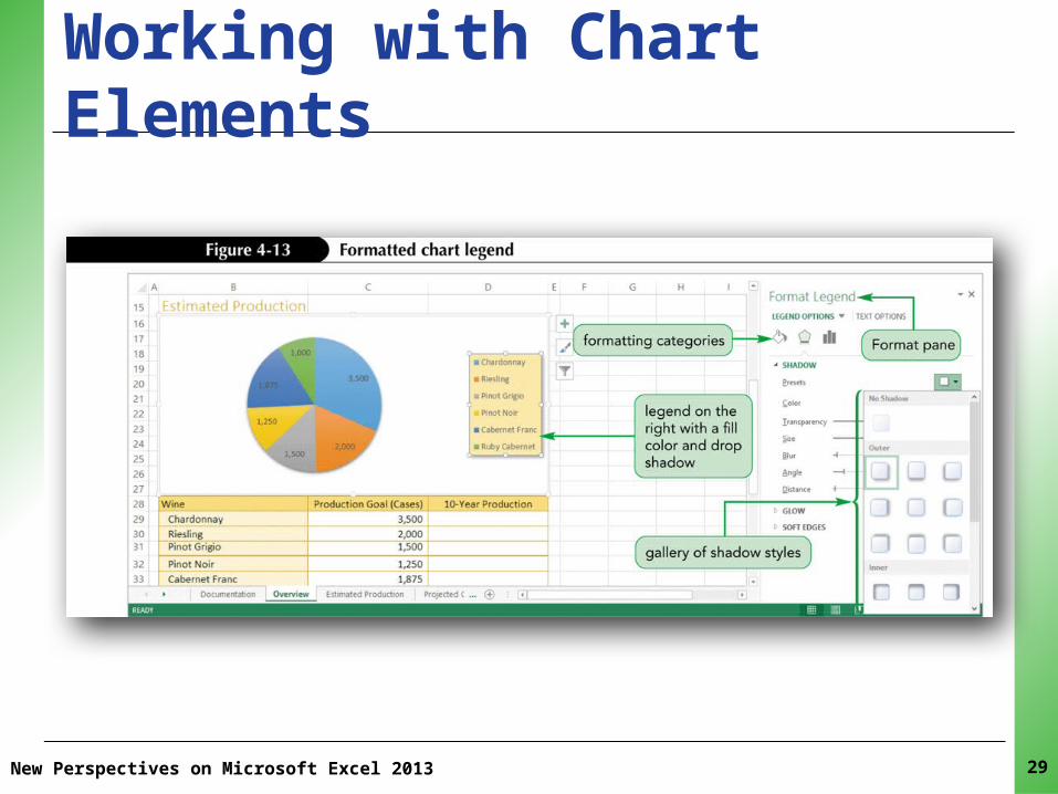
XPXPXPWorking with Chart Elements• Formatting the Pie Chart Legend– You can fine-tune a chart style by formatting
individual chart elements– From the Chart Elements button, you can open a
submenu for each element that includes formatting options, such as the element’s location within the chart
– You can also open a Format pane, which has more options for formatting the selected chart element
– The Chart Elements button also provides access to the Format pane with more design options
New Perspectives on Microsoft Excel 2013 28
XPXPXPWorking with Chart Elements
New Perspectives on Microsoft Excel 2013 29

XPXPXPWorking with Chart Elements• Formatting Pie Chart Data Labels– Modify the content and appearance of data labels• Move the labels to the center of the pie slices or place
them outside of the slices• Set the labels as data callouts• Change the text and number styles used• Drag and drop individual data labels, placing them
anywhere within the chart
– When a data label is placed far from its pie slice, a leader line is added to connect the data label to its pie slice
New Perspectives on Microsoft Excel 2013 30

XPXPXP
New Perspectives on Microsoft Excel 2013
Working with Chart Elements
31
XPXPXPWorking with Chart Elements• Setting the Pie Slice Colors– A pie slice is an example of a data marker that
represents a single data value from a data series– You can format the appearance of individual data
markers to make them stand out from the others– Pie slice colors should be as distinct as possible to
avoid confusion– Depending on the printer quality or the monitor
resolution, it might be difficult to distinguish between similarly colored slices or data
New Perspectives on Microsoft Excel 2013 32

XPXPXPWorking with Chart Elements• Formatting the Chart Area– The chart’s background (called the chart area) can
be formatted using:• Fill colors• Border styles• Special effects such as drop shadows and blurred edges
– The chart area fill color used in the pie chart is white, which blends in with the worksheet background
New Perspectives on Microsoft Excel 2013 33
XPXPXPPerforming What-If Analyses with Charts• A chart is linked to its data source• Changes made to the data source affect the
chart; a visual representation of changes• Makes charts a powerful tool for data
exploration and what-if analysis• Excel uses chart animation to slow down the
effect of changing data source values, making it easier to see how changing one value affects the chart
New Perspectives on Microsoft Excel 2013 34

XPXPXPPerforming What-If Analyses with Charts• Another type of what-if analysis is to limit the
data to a subset of the original values in a process called filtering
• Rather than creating a new chart, you can filter an existing chart to only show specific data
New Perspectives on Microsoft Excel 2013 35
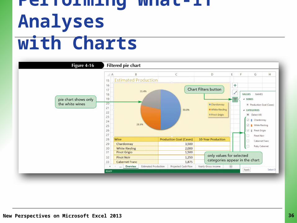
XPXPXPPerforming What-If Analyses with Charts
New Perspectives on Microsoft Excel 2013 36

XPXPXP
New Perspectives on Microsoft Excel 2013 37
Creating a Column Chart• Column chart– Displays values in different categories as columns– Height of each column is based on its value
• Bar chart– Column chart turned on its side– Length of each bar is based on its value
• Better to use column and bar charts than pie charts when the number of categories is large or the data values are close in value

XPXPXP
New Perspectives on Microsoft Excel 2013 38
Creating a Column Chart• Better to use column and bar charts than pie
charts when the:– Number of categories is large– Data values are close in value
• Easier to compare height or length than area• Column charts can include several data series

XPXPXPCreating a Column Chart
New Perspectives on Microsoft Excel 2013 39
• Comparing Column Chart Subtypes– Column and bar charts can display multiple data
series– You can plot three data series against one category

XPXPXPCreating A Column Chart• Comparing Column Chart Subtypes– The clustered column chart displays the data
series in separate columns side-by-side so that you can compare the relative heights of the columns The stacked column chart places the data series values within combined columns showing how much is contributed by each series
– The 100% stacked column chart makes the same comparison as the stacked column chart except that the stacked sections are expressed as percentages
New Perspectives on Microsoft Excel 2013 40

XPXPXP
New Perspectives on Microsoft Excel 2013 41
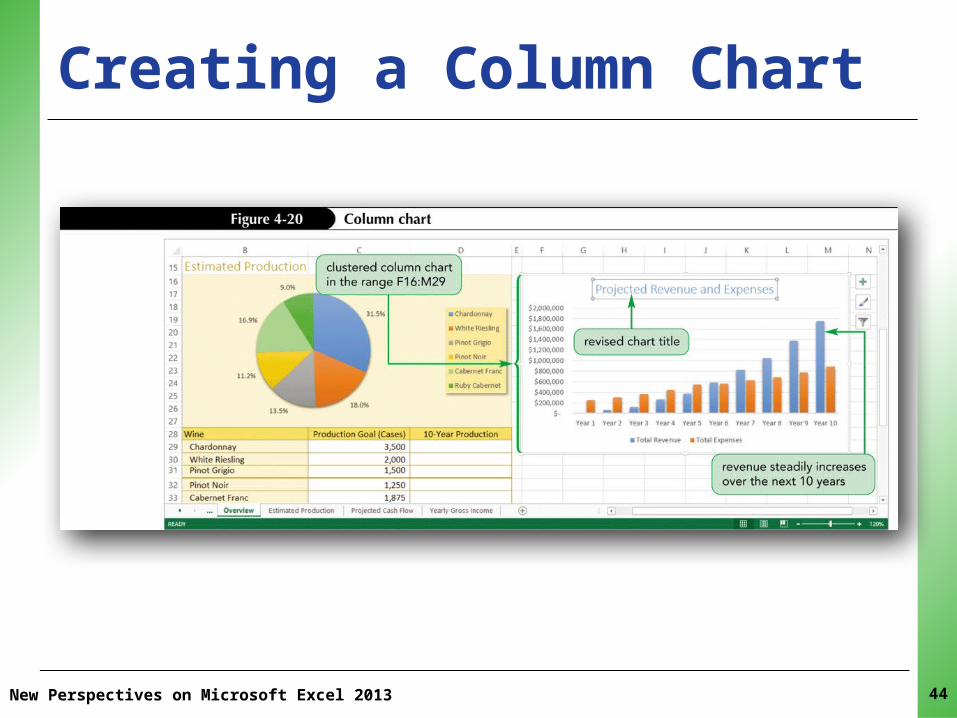
Creating a Column Chart• Creating a Clustered Column Chart
1. Select data source2. Select type of chart to create3. Move and resize the chart4. Change chart’s design, layout, and format by:• Selecting one of the chart styles, or• Formatting individual chart elements
XPXPXP
New Perspectives on Microsoft Excel 2013 42
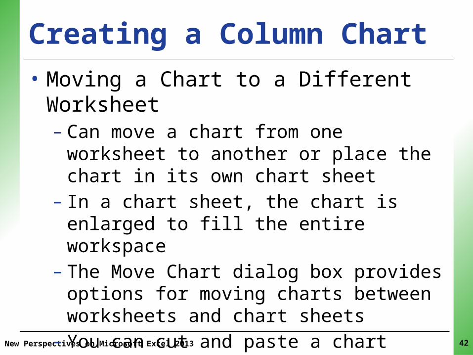
Creating a Column Chart• Moving a Chart to a Different Worksheet– Can move a chart from one worksheet to another
or place the chart in its own chart sheet– In a chart sheet, the chart is enlarged to fill the
entire workspace– The Move Chart dialog box provides options for
moving charts between worksheets and chart sheets
– You can cut and paste a chart between workbooks

XPXPXPCreating a Column Chart• Changing and Formatting a Chart Title– When a chart has a single data series, the name of
the data series is used for the chart title– When a chart has more than one data series, the
“Chart Title” placeholder appears as the temporary title of the chart
– You can replace the placeholder text with a more descriptive title
New Perspectives on Microsoft Excel 2013 43
XPXPXPCreating a Column Chart
New Perspectives on Microsoft Excel 2013 44

XPXPXPCreating a Column Chart• Creating a Stacked Column Chart
New Perspectives on Microsoft Excel 2013 45

XPXPXPVisual Overview: Charts, Sparklines, and Data Bars
New Perspectives on Microsoft Excel 2013 46

XPXPXPVisual Overview: Charts, Sparklines, and Data Bars
New Perspectives on Microsoft Excel 2013 47

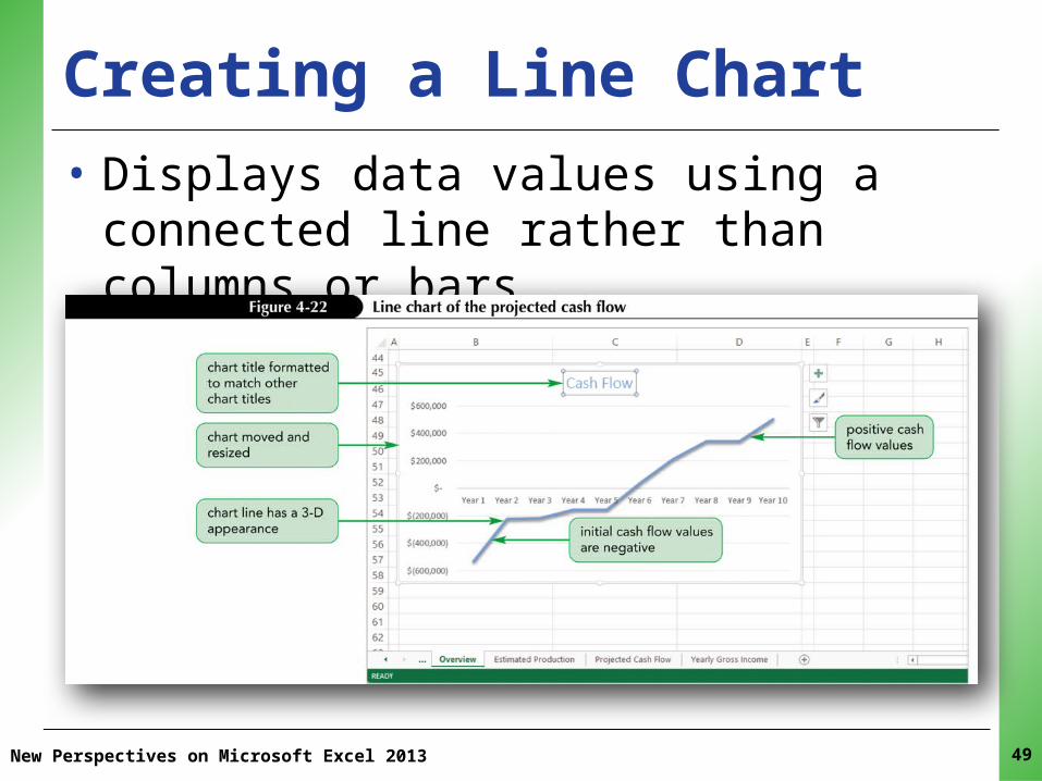
XPXPXPCreating a Line Chart• Line charts are typically used when the data
consists of values drawn from categories that follow a sequential order at evenly spaced intervals
• Like column charts, a line chart can be used with one or more data series
• When multiple data series are included, the data values are plotted on different lines with varying line colors
New Perspectives on Microsoft Excel 2013 48
XPXPXP
New Perspectives on Microsoft Excel 2013
Creating a Line Chart • Displays data values using a connected line
rather than columns or bars
49
XPXPXPWorking with Axes and Gridlines• A chart’s vertical and horizontal axes are based
on the values in the data series and the category values
• In many cases, the axes display the data in the most visually effective and informative way
• Sometimes you will want to modify the axes’ scale, add gridlines, and make other changes to better highlight the chart data
New Perspectives on Microsoft Excel 2013 50
XPXPXP
New Perspectives on Microsoft Excel 2013 51
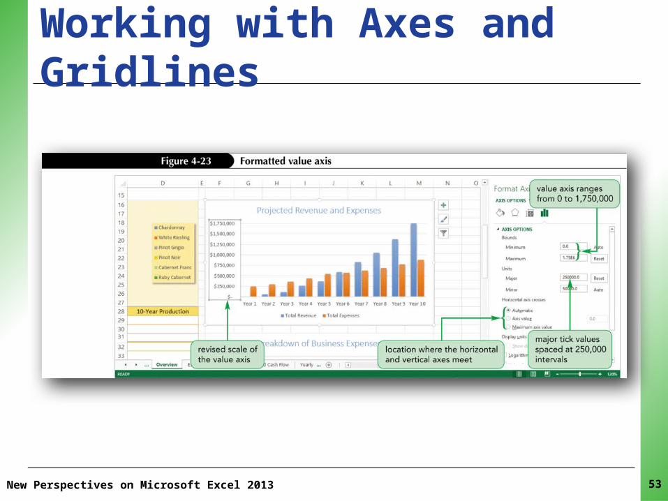
Working with Axes and Gridlines• Editing the Scale of the Vertical Axis– Range of values (scale) of an axis is based on the
values in the data source– Vertical (value) axis: range of values in the data– Horizontal (category) axis: category values– Excel divides the scale into regular intervals,
marked on the axis with tick marks and labels• More tick marks at smaller intervals could make the
chart difficult to read • Fewer tick marks at larger intervals could make the
chart less informative

XPXPXPWorking with Axes and Gridlines • Editing the Scale of the Vertical Axis– Major tick marks identify the main units on the
chart axis– Minor tick marks identify the smaller intervals
between the major tick marks– Some charts involve multiple data series• Plot one data series against a primary axis, which
usually appears along the left side of the chart• Plot the other against a secondary axis, which is usually
placed on the right side of the chart• The two axes can be based on entirely different scales
New Perspectives on Microsoft Excel 2013 52
XPXPXP
New Perspectives on Microsoft Excel 2013 53
Working with Axes and Gridlines

XPXPXPWorking with Axes and Gridlines • Adding Gridlines– Gridlines are horizontal and vertical lines that help
you compare data and category values• Gridlines may or may not appear in a chart• You can add or remove them separately
– Gridlines are placed at the major tick marks or can be set to appear at the minor tick marks
– The chart style used for the two column charts and the line chart includes horizontal gridlines
– You can add vertical gridlines to help further separate one set of values from another
New Perspectives on Microsoft Excel 2013 54

XPXPXPWorking with Axes and Gridlines • Working with Column Widths– You can set the spacing between one column and
another in your column charts– You can define the width of the columns
New Perspectives on Microsoft Excel 2013 55
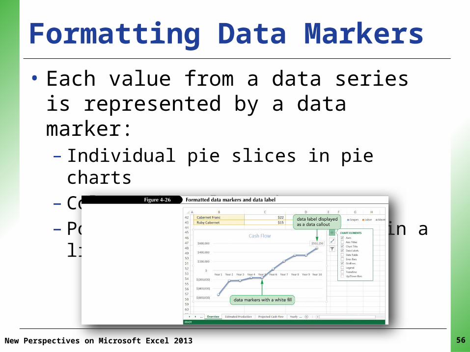
XPXPXPFormatting Data Markers
New Perspectives on Microsoft Excel 2013 56
• Each value from a data series is represented by a data marker:– Individual pie slices in pie charts– Columns in column charts– Points connected by the line in a line chart
XPXPXPFormatting the Plot Area• The plot area includes only that portion of the
chart in which the data markers have been placed or plotted
• You can format the plot area by changing its fill and borders, and by adding visual effects
• Changes to the plot area are often madein conjunction with the chart area
New Perspectives on Microsoft Excel 2013 57

XPXPXPFormatting the Plot Area
New Perspectives on Microsoft Excel 2013 58
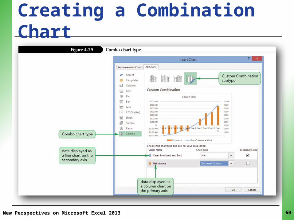
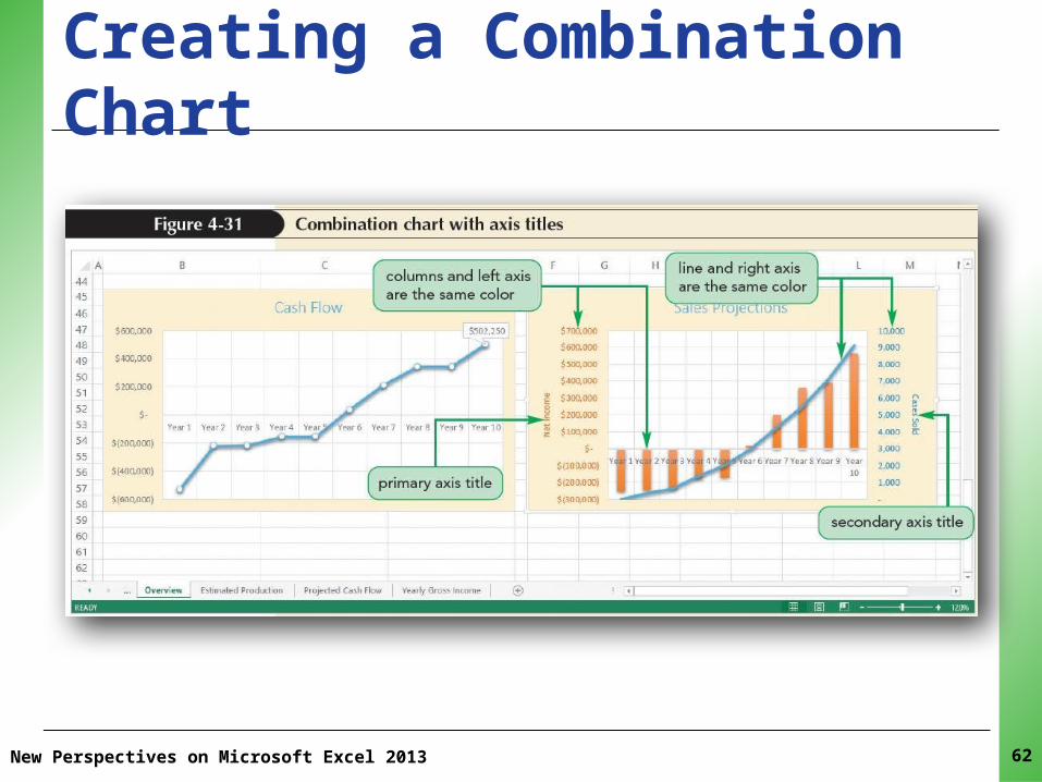
XPXPXPCreating a Combination Chart• A combination chart combines two chart types
within a single chart• Enable you to show two sets of data using the
chart type that is best for each data set• Can have data series with vastly different
values• You can create dual axis charts, using primary
and secondary axes
New Perspectives on Microsoft Excel 2013 59
XPXPXPCreating a Combination Chart
New Perspectives on Microsoft Excel 2013 60
XPXPXPCreating a Combination Chart• Working with Primary and Secondary Axes– When a chart has primary and secondary vertical
axes, it is helpful to identify exactly what each axis is measuring
– Add an axis title (a descriptive text that appears next to the axis) to the chart
– You can add, remove, and format axis titles
New Perspectives on Microsoft Excel 2013 61
XPXPXPCreating a Combination Chart
New Perspectives on Microsoft Excel 2013 62
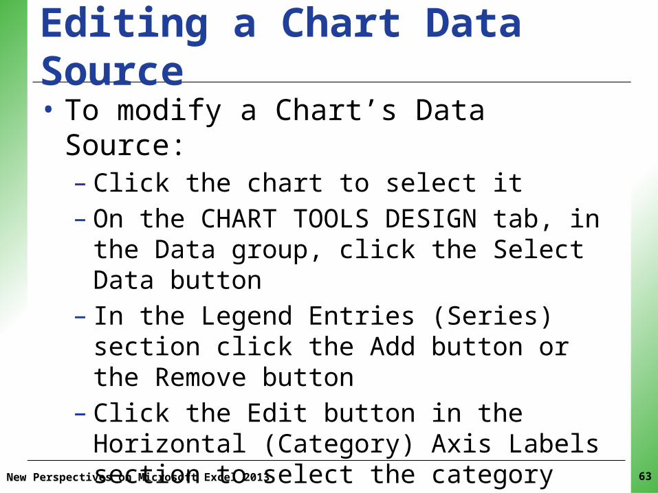
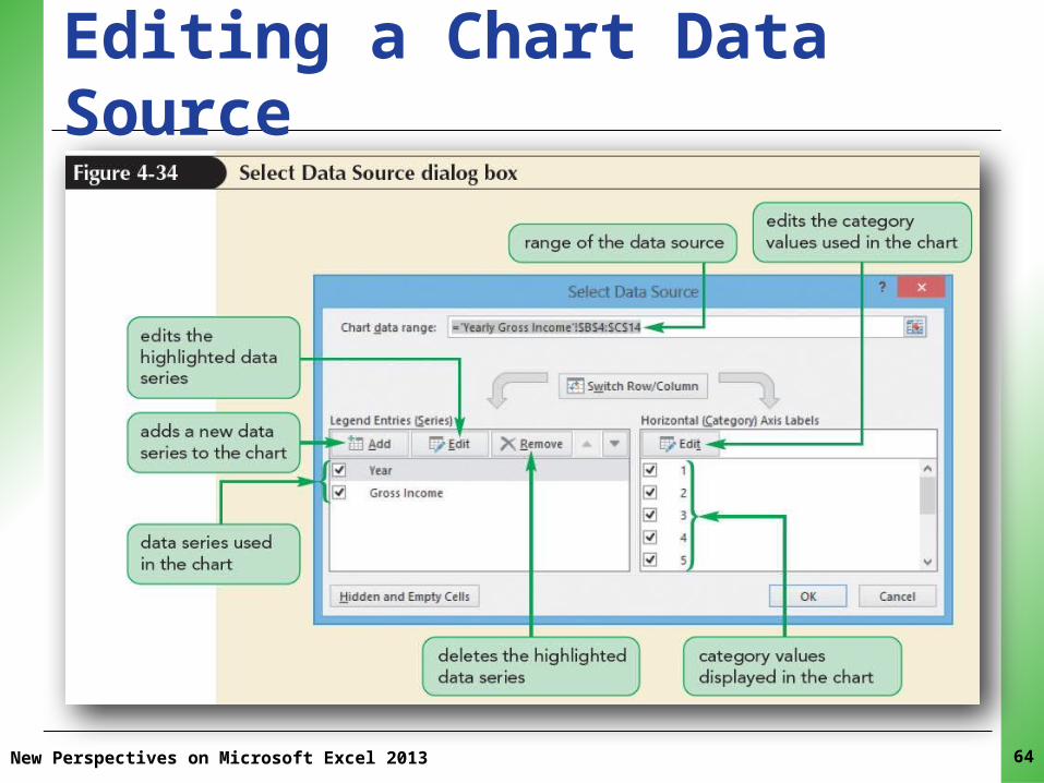
XPXPXPEditing a Chart Data Source• To modify a Chart’s Data Source:– Click the chart to select it– On the CHART TOOLS DESIGN tab, in the Data
group, click the Select Data button– In the Legend Entries (Series) section click the Add
button or the Remove button– Click the Edit button in the Horizontal (Category)
Axis Labels section to select the category values for the chart
New Perspectives on Microsoft Excel 2013 63
XPXPXPEditing a Chart Data Source
New Perspectives on Microsoft Excel 2013 64

XPXPXPCreating Sparklines• A sparkline is a chart that is displayed entirely
within a worksheet cell• Sparklines are compact in size; don’t include
chart elements (legends, titles, or gridlines)• The goal of a sparkline is to convey the
maximum amount of information within a very small space
• Sparklines are useful when you don’t want charts to overwhelm the rest of your worksheet or take up valuable page space
New Perspectives on Microsoft Excel 2013 65
XPXPXPCreating Sparklines• You can create the following three types of
sparklines:– A line sparkline for highlighting trends– A column sparkline for column charts– A win/loss sparkline for highlighting positive and
negative values
New Perspectives on Microsoft Excel 2013 66

XPXPXP
New Perspectives on Microsoft Excel 2013 67
Creating Sparklines
• Three types of sparklines:– Line sparkline:
Highlights trends– Column sparkline:
For column charts– Win/Loss sparkline:
Highlights positive and negative values

XPXPXPCreating Sparklines
New Perspectives on Microsoft Excel 2013 68
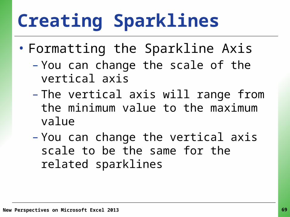
XPXPXPCreating Sparklines• Formatting the Sparkline Axis– You can change the scale of the vertical axis– The vertical axis will range from the minimum
value to the maximum value– You can change the vertical axis scale to be the
same for the related sparklines
New Perspectives on Microsoft Excel 2013 69

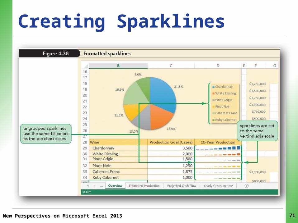
XPXPXPCreating Sparklines• Working with Sparkline Groups– The sparklines in the location range are part of a
single group– Clicking any cell in the location range selects all of
the sparklines in the group– Any formatting applied to one sparkline affects all
of the sparklines in the group (ensures that the sparklines for related data are formatted consistently)
– To format each sparkline differently, you must first ungroup them
New Perspectives on Microsoft Excel 2013 70
XPXPXPCreating Sparklines
New Perspectives on Microsoft Excel 2013 71

XPXPXP
New Perspectives on Microsoft Excel 2013 72
Creating Data Bars• Conditional format that adds a horizontal bar to
background of a cell containing a number• Length based on value of each cell in the range• Dynamic—the lengths of data bars automatically
update if cell’s value changes
XPXPXP
New Perspectives on Microsoft Excel 2013 73
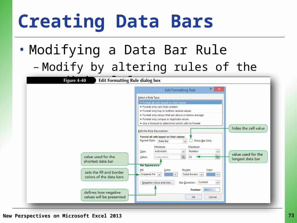
Creating Data Bars• Modifying a Data Bar Rule– Modify by altering rules of the conditional format

XPXPXPInserting a Watermark
New Perspectives on Microsoft Excel 2013 74
• A watermark is text or an image that appears in the background behind other content
• Insert into the header or footer of a worksheet