tybsc it sem 6 gis
TRANSCRIPT

GIS UNIT
1,2,3,4,5,6
TYBSC(IT) SEM 6
COMPILED BY : SIDDHESH ZELE
302 PARANJPE UDYOG BHAVAN, NEAR KHANDELWAL SWEETS, NEAR THANE
STATION , THANE (WEST)
PHONE NO: 8097071144 / 8097071155 / 8655081002
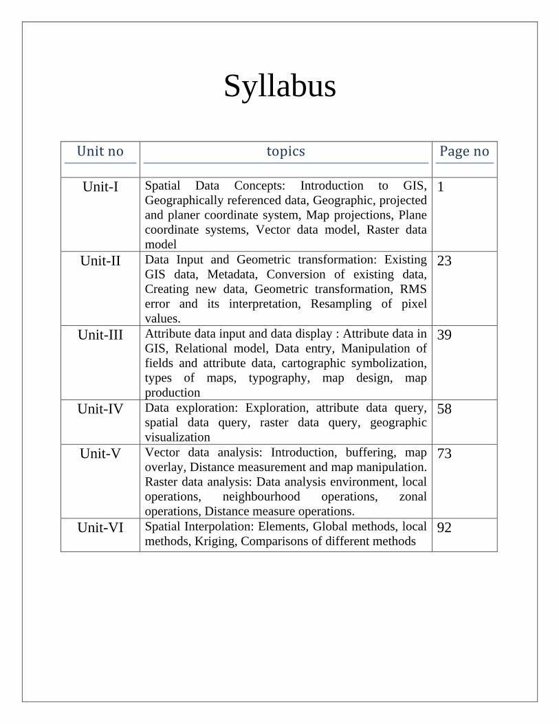
Syllabus
Unit no topics Page no
Unit-I Spatial Data Concepts: Introduction to GIS,
Geographically referenced data, Geographic, projected
and planer coordinate system, Map projections, Plane
coordinate systems, Vector data model, Raster data
model
1
Unit-II Data Input and Geometric transformation: Existing
GIS data, Metadata, Conversion of existing data,
Creating new data, Geometric transformation, RMS
error and its interpretation, Resampling of pixel
values.
23
Unit-III Attribute data input and data display : Attribute data in
GIS, Relational model, Data entry, Manipulation of
fields and attribute data, cartographic symbolization,
types of maps, typography, map design, map
production
39
Unit-IV Data exploration: Exploration, attribute data query,
spatial data query, raster data query, geographic
visualization
58
Unit-V Vector data analysis: Introduction, buffering, map
overlay, Distance measurement and map manipulation.
Raster data analysis: Data analysis environment, local
operations, neighbourhood operations, zonal
operations, Distance measure operations.
73
Unit-VI Spatial Interpolation: Elements, Global methods, local
methods, Kriging, Comparisons of different methods 92

TYBSC-IT SEM 6 GIS
1 ADD:302 PARANJPE UDYOG BHAVAN, OPP MAHESH TUTORIALS, THANE STATION, THANE(W)
PH:8097071144/55

TYBSC-IT SEM 6 GIS
2 ADD:302 PARANJPE UDYOG BHAVAN, OPP MAHESH TUTORIALS, THANE STATION, THANE(W)
PH:8097071144/55
Spatial Data Concepts
Q.1 What is GIS?
(A) A geographic Information system (GIS) is a computer system for capturing, storing, querying,
analyzing, and displaying geospatial data. Also called geographically referenced data, geospatial
data are data that describe both the locations and the characteristics of spatial features such as
roads, land parcels, and vegetation stands on the Earth's surface. The ability of a GIS to handle and
process geospatial data distinguishes GIS from other information systems. It also establishes GIS
as a technology important to such occupations as market research analysts, environmental
engineers, and urban and regional planners, which are also listed at the U.S. Department of
Labor's website.
Q.2 Explain applications of GIS.
(A) From its beginnings, GIS has been important in natural resource management, including land-use
planning, natural hazard assessment, wildlife habitat analysis, riparian zone monitoring, and
timber management. Here are some examples on the Internet:
• The U.S. Geological Survey has the National Map program that provides nationwide geospatial
data for applications in natural hazards, risk assessment, homeland security, and many other
areas (http://nationalmap.usgs.gov).
• The U.S. Census Bureau maintains an On-Line Mapping Resources website, where Internet
users can map public geographic data of anywhere in the United States
(http://www.census.gov/geo/www/maps/).
• The U.S. Department of Housing and Urban Development has a mapping program that
combines housing development information with environmental data
(http://www.hud.gov/offices/cio/emaps/index.cfm).
• The U.S. Department of Health and Human Services warehouse provides access to information
about health resources, including community health centers
(http:// datawarehouse.hrsa.gov/).
In more recent years GIS has been used for crime analysis, emergency planning, land records
management, market analysis, and transportation applications. Here are some examples on
the Internet:
• The Department of Homeland Security's National Incident Management System (NIMS)
identifies GIS as a supporting technology for managing domestic incidents (http:/I
www.dhs.gov/).
• The National Institute of Justice uses GIS to map crime records and to analyze their spatial
patterns by location and time (http://www.ojp.usdoj.gov/nij/maps/).
• The Federal Emergency Management Agency links a flood insurance rate map database to
physical features in a GIS database (http://www.fema.gov/plan/
prevent/fhm/mm_main.shtml).

TYBSC-IT SEM 6 GIS
3 ADD:302 PARANJPE UDYOG BHAVAN, OPP MAHESH TUTORIALS, THANE STATION, THANE(W)
PH:8097071144/55
• Larimer County, Colorado allows public access to the county's land records in a GIS database
(http://www.larimer.org/).
Integration of GIS with the global positioning system (GPS), wireless technology, and the Internet
has also introduced new and exciting applications (e.g.. Tsou 2004). Here are some examples:
• Location-based services (LBS) technology allows mobile phone users to be located and to
receive location information, such as nearby ATMs and restaurants.
• Interactive-mapping websites let users select map layers for display and make their own
maps.
• In-car navigation systems find the shortest route between an origin and destination and
provide tum-by-tum directions to drivers.
• Mobile mapping allows field workers to collect and access geospatial data in the field.
• Precision farming promotes site-specific farming activities such as herbicide or fertilizer
application.
Q.3 Explain components of GIS.
(A) Like any other information technology, GIS requires the following four components to work with
geospatial data:
• Computer System : The computer system includes the computer and the operating system to
run GIS. Typically the choices are PCs that use the Windows operating system (e.g., Windows
2000, Windows XP) or workstations that use the UNIX or Linux operating system. Additional
equipment may include monitors for display, digitizers and scanners for spatial data input.
GPS receivers and mobile devices for fieldwork, and printers and plotters for hard-copy data
display.
• GIS Software : The GIS software includes the program and the user interface for driving the
hardware. Common user interfaces in GIS are menus, graphical icons, command lines, and
scripts.
• People : People refers to GIS professionals and users who define the purpose and objectives,
and provide the reason and justification for using GIS.
• Data : Data consist of various kinds of inputs that the system takes to produce information.
• Infrastructure (METHOD) : The infrastructure refers to the necessary physical, organizational,
administrative, and cultural environments that support GIS operations. The infrastructure
includes requisite skills, data standards, data clearinghouses, and general organizational
patterns.
Q.4 Explain the following terms - (a) Spatial Data, (b) Attribute Data
(A) (a) Spatial Data

TYBSC-IT SEM 6 GIS
4 ADD:302 PARANJPE UDYOG BHAVAN, OPP MAHESH TUTORIALS, THANE STATION, THANE(W)
PH:8097071144/55
Spatial data describe the locations of spatial features, which may be discrete or continuous.
Discrete features are individually distinguishable features that do not exist between
observations. Discrete features include points (e.g. wells), lines (e.g., roads), and areas (e.g.,
land use types). Continuous features are features that exist spatially between observations.
Examples of continuous features are elevation and precipitation. A GIS represents these
spatial features on the Earth's surface as map features on a plane surface. This transformation
involves two main issues: the spatial reference system and the data model.
The locations of spatial features on the Earth's surface are based on a geographic coordinate
system with longitude and latitude values, whereas the locations of map features are based
on a plane coordinate system with x-y-coordinates. Projection is the process that can
transform the Earth's spherical surface to a plane surface and bridge the two spatial reference
systems. But because the transformation always involves some distortion, hundreds of plane
coordinate systems that have been developed to preserve certain spatial properties are in
use. To align with one another spatially for GIS operations, map layers must be based on the
same coordinate system. A basic understanding of projection and coordinate systems is
therefore crucial to users of spatial data.
(b) Attribute Data
Attribute data describe the characteristics of spatial features. For raster data, each cell has a
value that corresponds to the attribute of the spatial feature at that location. A cell is tightly
bound to its cell value. For vector data, the amount of attribute data to be associated with a
spatial feature can vary significantly. A road segment may only have the attributes of length
and speed limit, whereas a soil polygon may have dozens of properties, interpretations, and
performance data. How to join spatial and attribute data is therefore important in the case of
vector data.
Q.5 Explain GIS Operations.
(A) GIS OPERATIONS:
Although GIS activities no longer follow a set sequence, to explain what we do in GIS. we can
group GIS activities into spatial data input, attribute data management, data display, data
exploration, data analysis, and GIS modeling (Following Table 1). This section provides an overview
of GIS operations.
Spatial Data Input
The most expensive part of a GIS project is data acquisition. We can acquire data by using existing
data or by creating new data. Digital data clearinghouses have become commonplace on the
Internet in recent years. It is therefore wise to look at what exists in the public domain before
deciding to either buy data from private companies or create new data.

TYBSC-IT SEM 6 GIS
5 ADD:302 PARANJPE UDYOG BHAVAN, OPP MAHESH TUTORIALS, THANE STATION, THANE(W)
PH:8097071144/55
Table 1 : A classification of GIS operations.
Spatial data Input 1. Data entry: use existing data, create new data
2. Data editing
3. Geometric transformation
4. Projection and reprojection
Attribute data management 1. Data entry and verification
2. Database management
3. Attribute data manipulation
Data display 1. Cartographic symbolization
2. Map design
Data exploration 1. Attribute data query
2. Spatial data query
3. Geographic visualization
Data analysis 1. Vector data analysis: buttering, overlay, distance
measurement, spatial statistics, map manipulation
2. Raster data analysis: local, neighborhood, zonal, global,
raster data manipulation
3. Terrain mapping and analysis
4. View shed and watershed
5. Spatial interpolation
6. Geocoding and dynamic segmentation
7. Path analysis and network applications
GIS modeling 1. Binary models
2. Index models
3. Regression models
4. Process models
Attribute Data Management
To complete a GIS database, we must enter and verify attribute data through digitizing and editing. At-
tribute data reside as tables in a relational database. An attribute table is organized by row and
column. Each row represents a spatial feature, and each column or field describes a characteristic.
Attribute tables in a database must be designed to facilitate data input, search, retrieval, manipulation,
and output. Two basic elements in the design of a relational database are the key and the type of data
relationship: the key establishes a connection between corresponding records in two tables, and the
type of data relationship dictates how the tables are actually joined or linked. In practice, attribute data
management also includes such tasks as adding or deleting fields and creating new fields from existing
fields.

TYBSC-IT SEM 6 GIS
6 ADD:302 PARANJPE UDYOG BHAVAN, OPP MAHESH TUTORIALS, THANE STATION, THANE(W)
PH:8097071144/55
Data Display
Because maps are most effective in communicating spatial information, mapmaking is a routine
GIS operation. A map is derived from data query and analysis, and prepared maps for data
visualization and presentation. A map for presentation usually has a number of elements: title,
subtitle, body, legend, north arrow, scale bar. acknowledgment, neat line and border. These
elements work together to bring spatial information to the map reader. The first step in map
making is to assemble map elements. Windows based GIS packages have simplified this process by
providing choice for map element.
Data Exploration
Usually a precursor to data analysis, data exploration involves the activities of exploring the
general trends in the data, taking a close look at data subsets, and focusing on possible relation-
ships between data sets. Effective data exploration requires interactive and dynamically linked
visual tools. A Windows-based GIS package is ideal for data exploration. We can display maps,
graphs, and tables in multiple but dynamically linked windows so that, when we select a data
subset from a table, it automatically highlights the corresponding features in a graph and a map.
This kind of interactivity increases capacity for information processing and synthesis. Because
geospatial data consist of spatial and attribute data, data exploration can be approached from
spatial data, or attribute data, or both. Additionally, data exploration in GIS can employ map
based tools such as data classification, data aggregation, and map comparison.
Data Analysis
Table 1 classifies data analysis into seven groups. The first two groups include basic analytical
tools. For vector data, these tools include buffering, overlay, distance measurement, spatial
statistics, and map manipulation. Buffering creates buffer zones by measuring straight-line
distances from selected features. Overlay, recognized by many as the most important GIS tool,
combines geometries and attributes from different layers to create the output (Figure 1).
Distance measurement calculates distances between spatial features. Spatial statistics detect
spatial dependence and patterns of concentration among features. And map manipulation tools
manage and alter layers in a database. Common to GIS for analyzing raster data on grouped into
local neighborhood zonal and global operation.
Fig. 1

TYBSC-IT SEM 6 GIS
7 ADD:302 PARANJPE UDYOG BHAVAN, OPP MAHESH TUTORIALS, THANE STATION, THANE(W)
PH:8097071144/55
GIS Models and Modeling
A model is a simplified representation of a phenomenon or a system, and GIS modeling refers
to the use of a GIS and its functionalities in building a model with geospatial data (i.e.. a
spatially explicit model). GIS models can be grouped into four general types: binary, index,
regression, and process models.
Q.6 Explain Geographic Coordinate System
(A) Geographic Coordinate System
The geographic coordinate system is the location reference system for spatial features on the
Earth's surface (Figure 2). The geographic coordinate system is defined by longitude and latitude.
Both longitude and latitude are angular measures: longitude measures the angle east or west
from the prime meridian, and latitude measures the angle north or south of the equatorial plane
(Figure 3).
Q.7 Explain the term 'Datum'.
(A) Datum
A datum is a mathematical model of the Earth, which serves as the reference or base for
calculating the geographic coordinates of a location (Burkard 1984; Moffitt and Bossler 1998). The
definition of a datum consists of an origin, the parameters of the spheroid selected for the
computations, and the separation of the spheroid and the Earth at the origin. Many countries
have developed their own datums for local surveys. Among these local datums are the European
Fig. 3 : A longitude reading is
represented by a on the left, and a
latitude reading is represented by b on
the right. Both longitude and latitude
readings are angular measures.
Fig. 2 : The geographic coordinate system.

TYBSC-IT SEM 6 GIS
8 ADD:302 PARANJPE UDYOG BHAVAN, OPP MAHESH TUTORIALS, THANE STATION, THANE(W)
PH:8097071144/55
Datum, the Australian Geodetic Datum, the Tokyo Datum, and the Indian Datum (for India and
several adjacent countries).
Until the late 1980s. Clarke 1866, a ground-measured spheroid, was the standard spheroid for
mapping in the United States. Clarke 1866's semi-major axis (equatorial radius) and semi-minor
axis (polar radius) measure 6.378.206.4 meters (3962.96 miles) and 6,356,583.8 meters (3949.21
miles), respectively, with the flattening of 1/294.979. NAD27 (North American Datum of 1927) is a
local datum based on the Clarke 1866 spheroid, with its origin at Meades Ranch in Kansas.
In 1986 the National Geodetic Survey (NGS) introduced NAD83 (North American Datum of 1983), an
Earth-centered (also called geocentered) datum based on the GRS80 (Geodetic Reference System
1980) spheroid. GRS80's semi-major axis and semi-minor axis measure 6,378,137.0 meters (3962.94
miles) and 6,356,752.3 meters (3949.65 miles), respectively, with the flattening of 1/298.257. In
the case of
Q.8 What are map projections? What are their types?
(A) The process of projection transforms the spherical Earth's surface to a plane (Robinson et al. 1995;
Dent 1999; Slocum et al. 2005). The outcome of this transformation process is a map projection: a
systematic arrangement of parallels and meridians on a plane surface representing the geographic
coordinate system.
Types of Map Projections
Map projections can he grouped by either the preserved property or the projection surface.
Cartographers group map projections by the preserved property into the following four classes:
conformal, equal area or equivalent, equidistant, and azimuthal or true direction. A conformal
projection preserves local angles and shapes. An equivalent projection represents areas in correct
relative size. An equidistant projection maintains consistency of scale along certain lines. And an
azimuthal projection retains certain accurate directions. The preserved property of a map projection
is often included in its name such as the Lambert conformal conic projection or the Albers equal-
area conic projection.
The conformal and equivalent properties are mutually exclusive. Otherwise a map projection can
have more than one preserved property, such as conformal and azimuthal. The conformal and
equivalent properties are global properties, meaning that they apply to the entire map projection.
The equidistant and azimuthal properties are local properties and may be true only from or to the
center of the map projection.
The preserved property is important for selecting an appropriate map projection for thematic
mapping. For example, a population map of the world should be based on an equivalent
projection. By representing areas in correct size, the population map can create a correct

TYBSC-IT SEM 6 GIS
9 ADD:302 PARANJPE UDYOG BHAVAN, OPP MAHESH TUTORIALS, THANE STATION, THANE(W)
PH:8097071144/55
impression of population densities. In contrast, an equidistant projection would be better for
mapping the distance ranges from a missile site.
Cartographers often use a geometric object and a globe (i.e., a sphere) to illustrate how to con-
struct a map projection. For example, by placing a cylinder tangent to a lighted globe, one can
draw a projection by tracing the lines of longitude and latitude onto the cylinder. The cylinder in
this example is the projection surface, also called the developable surface, and the globe is called
the reference globe. Other common projection surfaces include a cone and a plane. Therefore,
map projections can be grouped by their projection surfaces into cylindrical, conic, and azimuthal.
A map projection is called a cylindrical projection if it can be constructed using a cylinder, a conic
projection if using a cone, and an azimuthal projection if using a plane.
The use of a geometric object helps explain two other projection concepts: case and aspect. For a
conic projection, the cone can be placed so that it is tangent to the globe or intersects the globe
(Figure 4). The first is the simple case, which results in one line of tangency, and the second is the
secant case, which results in two lines of tangency. A cylindrical projection behaves the same way
as a conic projection in terms of case. An azimuthal projection, on the other hand, has a point of
tangency in the simple case and a line of tangency in the secant case. Aspect describes the
placement of a geometric object relative to a globe. A plane, for example, may be tangent at any
point on a globe. A polar aspect refers to tangency at the pole, an equatorial aspect at the
equator, and an oblique aspect anywhere between the equator and the pole (Figure 5).
Fig. 4 : Case and projection.
Fig. 5 : Aspect and
Projection
TYBSC-IT SEM 6 GIS
10 ADD:302 PARANJPE UDYOG BHAVAN, OPP MAHESH TUTORIALS, THANE STATION, THANE(W)
PH:8097071144/55
Q.9 Explain Projected Coordinate System
(A) A projected coordinate system, also called a plane coordinate system, is built on a map projection.
Projected coordinate systems and map projections are often used interchangeably. For example,
the Lambert conformal conic is a map projection but it can also refer to a coordinate system. In
practice, however, projected coordinate systems are designed for detailed calculations and
positioning, and are typically used in large-scale mapping such as at a scale of 1:24,000 or larger .
Accuracy in a feature's location and its position relative to other features is therefore a key
consideration in the design of a projected coordinate system.
To maintain the level of accuracy desired for measurements, a projected coordinate system is
often divided into different zones, with each zone defined by a different projection center.
Moreover, a projected coordinate system is defined not only by the parameters of the map
projection it is based on but also the parameters (e.g., datum) of the geographic coordinate
system that the map projection is derived from. All mapping systems are based on a spheroid
rather than a sphere. The difference between a spheroid and a sphere may not be a concern for
general mapping at small map scales but can be a matter of importance in the detailed mapping of
land parcels, soil polygons, or vegetation stands.
Three coordinate systems are commonly used in the United States: the Universal Transverse
Mercator (UTM) grid system, the Universal Polar Stereographic (UPS) grid system, and the State
Plane Coordinate (SPC) system. As a group, coordinates of these common systems are sometimes
called real-world coordinates. This section also includes the Public Land Survey System (PLSS). Al-
though the PLSS is a land partitioning system and not a coordinate system, it is the basis for land
parcel mapping. Additional readings on these systems can be found in Robinson et al. (1995).
Muehrcke et al. (2001). and Slocum et al. (2005).
Q.10 Explain the state plane coordinate system.
(A) The SPC system was developed in the 1930s to permanently record original land survey monu-
ment locations in the United States. To maintain the required accuracy of one part in 10,000 or
less, a state may have two or more SPC zones. As examples. Oregon has the North and South SPC
zones and Idaho has the West, Central and East SPC zones (Figure 6). Each SPC zone is mapped
onto a map projection. Zones that are elongated in the north-south direction (e.g., Idaho's SPC
zones) use the transverse Mercator and zones that are elongated in the east-west direction (e.g.,
Oregon's SPC zones) use the Lambert conformal conic. (The only exception is zone 1 of Alaska,
which uses the oblique Mercator to cover the panhandle of Alaska,) Point locations within each
SPC zone are measured from a false origin located to the southwest of the zone.
Because of the switch from NAD27 to NAD83, there are SPC27 and SPC83. Besides the change of the
datum, SPC83 has a few other changes. SPC83 coordinates are published in meters instead of feet.
The states of Montana, Nebraska, and South Carolina have each replaced multiple zones with a

TYBSC-IT SEM 6 GIS
11 ADD:302 PARANJPE UDYOG BHAVAN, OPP MAHESH TUTORIALS, THANE STATION, THANE(W)
PH:8097071144/55
single SPC zone. California has reduced SPC zones from seven to six. And Michigan has changed from
transverse Mercator to Lambert conformal conic projections.
Some states in the United States have developed their own statewide coordinate system. Mon-
tana, Nebraska, and South Carolina all have a single SPG zone, which can serve as the statewide
coordinate system. Idaho is another example. Idaho is divided into two UTM zones (11 and 12)
and three SPC zones (West, Central, and East). These zones work well as long as the study area is
within a single zone. When a study area covers two or more zones, the data sets must be
converted to a single zone for spatial registration. But the conversion to a single zone also means
that the data sets can no longer maintain the accuracy level designed for the UTM or the SPC
coordinate system. The Idaho statewide coordinate system, adopted in 1994 and modified in
2003, is still based on a transverse Mercator projection but its central meridian passes through the
center of the stale (114° W). (A complete list of parameters of the Idaho statewide coordinate
system is included in Task 1 of the applications section.) Changing the location of the central
meridian means one zone for the entire state.
Q.11 Describe the Public Land Survey System
(A) The PLSS is a land partitioning system (Figure 7). Using the intersecting township and range
lines, the system divides the lands mainly in the central and western states into 6X6 mile
squares or townships. Each township is further partitioned into 36 square-mile parcels of 640
acres, called sections. (In reality, many sections are not exactly 1 mile by 1 mile in size.)
Land parcel layers are typically based on the PLSS. The Bureau of Land Management (BLM) is
developing a Geographic Coordinate Data Base (GCDB) of the PLSS for the western United
Fig. 6 : SPC83 zones in the conterminous United States. The thinner
lines are county boundaries, and the bold lines are state boundaries.
This map corresponds to the SPC83 table on the inside of this book's
back cover.

TYBSC-IT SEM 6 GIS
12 ADD:302 PARANJPE UDYOG BHAVAN, OPP MAHESH TUTORIALS, THANE STATION, THANE(W)
PH:8097071144/55
States (http://www.blm.gov/gcdb/). Generated from BLM survey records, the GCDB contains
coordinates and other descriptive information for section comers and monuments recorded in
the PLSS. Legal descriptions of a parcel layer can then be entered using, for example, bearing
and distance readings originating from section corners.
Q.12 Explain what is meant by 'Vector Data Model'.
(A) Vector Data Model
The vector data model uses the geometric objects of point, line, and area to represent simple
spatial features (Figure 8). Dimensionality and property distinguish the three types of geometric
objects as well as the features they represent.
Fig. 8 : Point, line, and area features.
A point has 0 dimension and has only the property of location. A point may also be called a node,
vertex, or 0-cell. A point feature is made of a point or a set of separate points. Wells, benchmarks,
and gravel pits are examples of point features.
A line is one-dimensional and has the property of length. A line has two end points and points in
between to mark the shape of the line. The shape of a line may be a smooth curve or a connection
of straight-line segments. Smooth curves are typically fitted by mathematical equations such as
splines. Straight-line segments may represent human-made features such as canals and streets, or
they may simply be approximations of curves. A line is also called an edge, link, chain, or 1-cell. A
line feature is made of lines. Roads, streams, and contour lines are examples of line features.
An area is two-dimensional and has the properties of area (size) and perimeter. Made of con-
nected lines, an area may be alone or share boundaries with other areas. An area may contain
holes, such as a national forest containing private land parcels (holes). The existence of holes
means that the area has both external and internal boundaries. An area is also called a polygon,
face, zone, or 2-cell. An area feature is made of polygons. Examples of area features include
timber stands, land parcels, and water bodies.
The representation of simple features using points, lines, and areas is not always straightforward
because it can depend on map scale. For example, a city on a 1:1,000,000 scale map may appear
as a point, but the same city may appear as an area on a 1:24,000 scale map. Occasionally, the
representation of vector data can also depend on the criteria established by government mapping
agencies (Robinson et al. 1995). A stream may appear as a single line near its headwaters but as
TYBSC-IT SEM 6 GIS
13 ADD:302 PARANJPE UDYOG BHAVAN, OPP MAHESH TUTORIALS, THANE STATION, THANE(W)
PH:8097071144/55
an area along its lower reaches. In this case, the width of the stream determines how it should be
represented on a map. The U.S. Geological Survey (USGS) uses single lines to represent streams
less than 40 feet wide on 1:24,000 scale topographic maps and double lines for larger streams.
Therefore, a stream may appear as a line or an area depending on its width and the criterion used
by the government agency.
Q.13 Explain 'TIGER' database.
(A) An early application of topology in preparing geospatial data is the TIGER (Topologically Integrated
Geographic Encoding and Referencing) database from the U.S. Census Bureau (Broome and Meixler
1990). The TIGER database contains legal and statistical area boundaries such as counties, census
tracts, and block groups, which can be linked to the census data, as well as roads, railroads, streams,
water bodies, power lines, and pipelines. The database also includes the address range on each side
of a street segment.
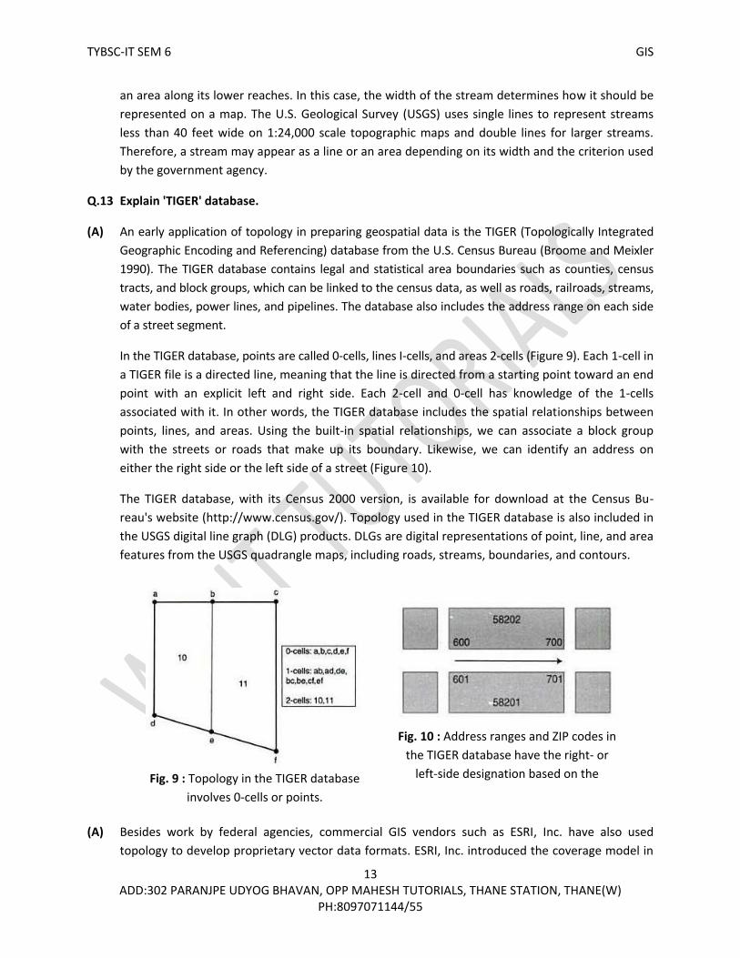
In the TIGER database, points are called 0-cells, lines I-cells, and areas 2-cells (Figure 9). Each 1-cell in
a TIGER file is a directed line, meaning that the line is directed from a starting point toward an end
point with an explicit left and right side. Each 2-cell and 0-cell has knowledge of the 1-cells
associated with it. In other words, the TIGER database includes the spatial relationships between
points, lines, and areas. Using the built-in spatial relationships, we can associate a block group
with the streets or roads that make up its boundary. Likewise, we can identify an address on
either the right side or the left side of a street (Figure 10).
The TIGER database, with its Census 2000 version, is available for download at the Census Bu-
reau's website (http://www.census.gov/). Topology used in the TIGER database is also included in
the USGS digital line graph (DLG) products. DLGs are digital representations of point, line, and area
features from the USGS quadrangle maps, including roads, streams, boundaries, and contours.
(A) Besides work by federal agencies, commercial GIS vendors such as ESRI, Inc. have also used
topology to develop proprietary vector data formats. ESRI, Inc. introduced the coverage model in
Fig. 9 : Topology in the TIGER database
involves 0-cells or points.
1-cells or lines, and 2-cells or areas.
Fig. 10 : Address ranges and ZIP codes in
the TIGER database have the right- or
left-side designation based on the
direction of the street.

TYBSC-IT SEM 6 GIS
14 ADD:302 PARANJPE UDYOG BHAVAN, OPP MAHESH TUTORIALS, THANE STATION, THANE(W)
PH:8097071144/55
the 1980s to separate GIS from CAD (computer-aided design) at the time. AutoCAD by Autodesk
was, and still is, the leading CAD package. A data format used by AutoCAD for the transfer of data
files is called DXF (drawing exchange formal). DXF maintains data in separate layers and allows the
user to draw each layer using different line symbols, colors, and text. But DXF files do not support
topology.
Coverage is a topology-based vector data format. A coverage can be a point coverage, line cov-
erage, or polygon coverage. The coverage model supports three basic topological relationships
(Environmental Systems Research Institute, Inc. 1998):
Connectivity: Arcs connect to each other at nodes.
Area definition: An area is defined by a series of connected arcs.
Contiguity: Arcs have directions and left and right polygons.
Other than the use of terms, these three topological relationships are similar to the topological
relationships in the TIGER database.
For example, a road network for traffic volume analysis is typically a topology-based line coverage.
The connectivity relationship ensures that roads (arcs) meet perfectly at road junctions (nodes).
And the contiguity relationship makes it possible to distinguish northbound from southbound
roads and to associate traffic analysis zones on each side of the road.
Q.15 Explain 'Raster Data Model'.
(A) A raster data model is variously called a grid, a raster map a surface cover, or an image
in GIS. A raster represents a continuous surface, but for data storage and analysis, a raster is
divided into rows, columns, and cells. Cells are also called pixels with images. The origin of
rows and columns is typically at the upper-left corner of the raster. Rows function as y-
coordinates and columns as x-coordinates. Each cell in the raster is explicitly defined by its
row and column position.
Raster data represent points with single cells, lines with
sequences of neighboring cells, and areas with collections of
contiguous cells (Figure 11). Although the raster data model
lacks the vector model's precision in representing the location
of spatial features, it has the distinct advantage of having fixed
cell locations (Tomlin 1990). In computing algorithms, a raster
can be treated as a matrix with rows and columns, and its cell
values can be stored in a two-dimensional array. All commonly
used programming languages can easily handle arrayed
variables. Raster data are therefore much easier to
manipulate, aggregate, and analyze than vector data.
Fig. 11 : Representation of point,
line, and area features: roster
formal on the left and vector format
on the right.

TYBSC-IT SEM 6 GIS
15 ADD:302 PARANJPE UDYOG BHAVAN, OPP MAHESH TUTORIALS, THANE STATION, THANE(W)
PH:8097071144/55
Q.16 Explain the terms : (a) Cell Value (b) Cell Size (c) Raster Bands (d) Spatial Reference
(A) (a) Cell Value
Each cell in a raster carries a value, which represents the characteristic of a spatial
phenomenon at the location denoted by its row and column. Depending on the coding of its
cell values, a raster can be either an integer or a floating-point raster. An integer value has no
decimal digits, whereas a floating-point value does. Integer cell values usually represent
categorical data, which may or may not be ordered. A land cover raster may use 1 for urban
land use, 2 for forested land, 3 for water body, and so on. A wildlife habitat raster, on the
other hand, may use the same integer numbers to represent ordered categorical data of
optimal, marginal, and unsuitable habitats. Floating-point cell values represent continuous,
numeric data. For example, a precipitation raster may have precipitation values of 20.15,
12.23, and so forth.
A floating-point raster requires more computer memory than an integer raster. This difference
can become an important factor for a GIS project that covers a large area. There are a couple
of other differences. We can access the cell values of an integer raster through a value
attribute table. But a floating-point raster usually does not have a value attribute table
because of its potentially large number of records. We can use individual cell values to query
and display an integer raster. But die same operation on a floating-point raster should be
based on value ranges, such as 12.0 to 19.9, because the chance of finding a specific value is
small.
Where does the cell value apply within the cell? The answer depends on raster data
operation. Typically the cell value applies to the center of the cell in operations that involve
distance measurements. Examples include resampling pixel values and calculating physical
distances. Many other raster data operations are cell-based, instead of point-based, and
assume that die cell value applies to the entire cell.
(b) Cell Size
The cell size determines the resolution of the raster data model. A cell size of
10 meters means that each cell measures 100 square meters (10 x 10 meters). A cell size of 30
meters, on the other hand, means that each cell measures 900 square meters (30 x 30
meters). Therefore a 10-meter raster has a finer (higher) resolution than a 30-mctcr raster.
A large cell size cannot represent the precise location of spatial features, thus increasing the
chance of having mixed features such as forest, pasture, and water in a cell (Box 5.1). These
problems lessen when a raster uses a smaller cell size. But a small cell size increases the data
volume and the data processing lime.

TYBSC-IT SEM 6 GIS
16 ADD:302 PARANJPE UDYOG BHAVAN, OPP MAHESH TUTORIALS, THANE STATION, THANE(W)
PH:8097071144/55
(c) Raster Bands
A raster may have a single band or multiple bands. Each cell in a multiband raster is associated
with more than one cell value. An example of a multi-band raster is a satellite image, which may
have five, seven, or more bands at each cell location. Each cell in a single-band raster has only
one cell value. An example of a single-band raster is an elevation raster, which has one elevation
value at each cell location.
(d) Spatial Reference
Raster data must have the spatial reference information so that they can align spatially with
other data sets in a GIS. For example, to superimpose an elevation raster on a vector-based
soil layer, we must first make sure that both data sets are based on the same coordinate
system. A raster that has been processed to match a projected coordinate system is often
called a georeferenced raster.
Two adjustments are necessary in associating a projected coordinate system with a raster.
First, the origin of a projected coordinate system is at the lower-left comer whereas the origin
of a raster is typically at the upper-left corner. Second, projected coordinates must correspond
to the rows and columns of the raster. The following example illustrates what these two
adjustments mean.
Suppose an elevation raster has the following information on the number of rows, number of
columns, cell size, and area extent expressed in UTM (Universal Transverse Mercator)
coordinates:
• Rows: 463. columns: 318, cell size: 30 meters
• x-, y-coordinates at the lower-left comer 499995.5177175
• x-, y-coordinates at the upper-right comer: 509535.5191065
We can verify that the numbers of rows and columns are correct by using the bounding UTM
coordinates and the cell size:
• Number of rows = (5191065 – 5177175) / 30 = 463
• Number of columns = (509535 – 499995) / 30 = 318
We can also derive the UTM coordinates that define each cell. For example, the cell of row 1,
column 1 has the following UTM coordinates (Figure 12)
499995.5191035 or (5191065 – 30) at the lower left corner
500025 or (499995 + 30), 5191065 at the upper-right corner
500010 or (499995 + 15), 5191050 or (5191065 - 15) at the cell center

TYBSC-IT SEM 6 GIS
17 ADD:302 PARANJPE UDYOG BHAVAN, OPP MAHESH TUTORIALS, THANE STATION, THANE(W)
PH:8097071144/55
Q.17 Describe types of Raster Data
(A) A large variety of data that we use in GIS are encoded in raster format. These data all share the
same basic elements of the raster data model.
Satellite Imagery
Remotely sensed satellite data are familiar to GIS users. The spatial resolution of a satellite image re-
lates to the ground pixel size. For example, a spatial resolution of 30 meters means that each pixel in
the satellite image corresponds to a ground pixel of 900 square meters. The pixel value, also called
the brightness value, represents light energy reflected or emitted from the Earth's surface (Jensen
1996: Lillesand et al. 2004). The measurement of light energy is based on spectral bands from a con-
inuum of wavelengths known as the electromagnetic spectrum. Panchromatic images are comprised
of a single spectral band, whereas multispectral Images are comprised of multiple bands.
USGS Digital Elevation Models (DEMs)
A digital elevation model (DEM) consists of an array of uniformly spaced elevation data. A DEM is
point-based, but it can easily be converted to raster data by placing each elevation point at the
center of a cell. Most GIS users in the United States use DEMs from the USGS. USGS DEMs include
the 7.5-minute DEM, 30-minute DEM, 1-degree DEM, and Alaska DEM.
Non-USGS DEMs
A basic method for producing DEMs is to use a stereoplotter and aerial photographs with over-
lapped areas. The stereoplotter creates a 3-D model, which allows the operator to compile eleva-
tion data. Although this method can produce highly accurate DEM data at a finer resolution than
USGS DEMs, it is expensive for coverage of large areas.
Fig. 12 : UTM coordinates for the extent and the
center of a 30-meter celI.
TYBSC-IT SEM 6 GIS
18 ADD:302 PARANJPE UDYOG BHAVAN, OPP MAHESH TUTORIALS, THANE STATION, THANE(W)
PH:8097071144/55
Global DEMs
DEMs at different resolutions are now available on the global scale. SRTM DEMs are available for
land areas outside the United States but at a coarser spatial resolution of 3 are-seconds (about 90
meters at the equator) (http://edcsns17.cr.usgs.gov/srtmdted2). These global-scale DEMs are
called SRTM DTED (digital terrain elevation data) Level 1 as opposed to DTED Level 2 for the
United States and territorial islands. Because SRTM DTED Level 1 elevation values are derived
from SRTM DTED Level 2 values, they have the same vertical accuracy of better than 16 meters at
coincident points.
Digital Orthophotos
A digital orthophoto quad (DOQ) is a digitized image prepared from on aerial photograph or other
remotely sensed data, in which the displacement caused by camera tilt and terrain relief has been
removed. The USGS began producing DOQs in 1991 from 1:40,000 scale aerial photographs of the
National Aerial Photography Program. These USGS DOQs are georeferenced (NAD83 UTM
coordinates) and can be registered with topographic and other maps.
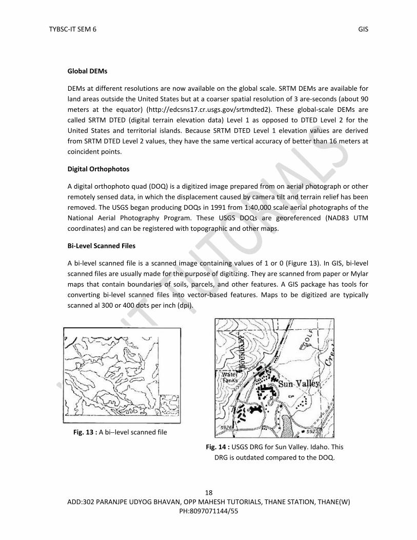
Bi-Level Scanned Files
A bi-level scanned file is a scanned image containing values of 1 or 0 (Figure 13). In GIS, bi-level
scanned files are usually made for the purpose of digitizing. They are scanned from paper or Mylar
maps that contain boundaries of soils, parcels, and other features. A GIS package has tools for
converting bi-level scanned files into vector-based features. Maps to be digitized are typically
scanned al 300 or 400 dots per inch (dpi).
Fig. 13 : A bilevel scanned file
showing soil lines.
Fig. 14 : USGS DRG for Sun Valley. Idaho. This
DRG is outdated compared to the DOQ.

TYBSC-IT SEM 6 GIS
19 ADD:302 PARANJPE UDYOG BHAVAN, OPP MAHESH TUTORIALS, THANE STATION, THANE(W)
PH:8097071144/55
Digital Raster Graphics (DRGs)
A digital raster graphic (DRG) is a scanned image of a USGS topographic map (Figure 14). The USGS
scans the 7.5-minute topographic map at 250 dpi, thus producing a DRG with a ground resolution
of 2.4 meters. The USGS uses up to 13 colors on each 7.5-minute DRG. Because these 13 colors are
based on an 8-bit (256) color palette, they may not look exactly the same as on the paper maps.
USGS DRGs are georeferenced to the UTM coordinate system, most likely based on NAD27.
Graphic Files
Maps, photographs, and images can be stored as digital graphic files. Many popular graphic files are
in raster format, such as TIFF (tagged image file format), GIF (graphics interchange format), and JPEG
(Joint Photographic Experts Group). The USGS distributes DOQs in TIFF or GeoTIFF. GeoTIFF is a
georeferenced version of TIFF. By having the spatial reference information of the image, DOQs can
be readily used with other GIS data.
GIS Software-Specific Raster Data
GIS packages use raster data that are imported from DEMs, satellite images, scanned images,
graphic files, and ASCII files or are converted from vector data. These raster data are named
differently. For example, ESRI, Inc. calls raster data grids.
Q.18 Explain the terms (a) Cell by Cell Encoding (b) Run-length Encoding (c) Quad tree
(A) (a) Cell by Cell Encoding
The cell-by-cell encoding method provides the simplest raster data structure. A raster is stored
as a matrix, and its cell values are written into a file by row and column (Figure 15).
Functioning at the cell level, this method is an ideal choice if the cell values of a raster change
continuously.
DEMs use the cell-by-cell data structure because the neighboring elevation values are rarely
the same. Satellite images also use the cell-by-cell encoding method for data storage. With
multiple spectral bands, however, each pixel in a satellite image has more than one value.
Multiband imagery is typically stored in the following three formats. The band sequential
(.bsq) method stores the values of an image band as one file. Therefore, if an image has seven
bands, the data set has seven consecutive files, one file per band. The band interleaved by line
(.bil) method stores, row by row, the values of all the bands in one file. Therefore the file
consists of row 1, band 1; row 1, band 2 ... row 2. band 1; row 2, band 2 ... and so on. The
band interleaved by pixel (.bip) method stores the values of all the bands by pixel in one file.
The file is therefore comprised of pixel (1,1), band 1; pixel (1,1), band 2 ... pixel (2, 1), band 1;
pixel (2, 1), band 2 ... and so on.

TYBSC-IT SEM 6 GIS
20 ADD:302 PARANJPE UDYOG BHAVAN, OPP MAHESH TUTORIALS, THANE STATION, THANE(W)
PH:8097071144/55
(b) Run-length Encoding
The cell-by-cell encoding method becomes inefficient if a raster contains many redundant cell
values. For example, a bi-level scanned file from a soil map has many 0s representing non-
inked areas and only occasional 1s representing the inked soil lines. Raster models with many
repetitive cell values can be more efficiently stored using the run-length encoding (RLE)
method, which records the cell values by row and by group. A group refers to adjacent cells
with the same cell value. Figure 16 shows the run-length encoding of the polygon in gray. For
each row, the starting cell and the end cell denote the length of the group ("run") that falls
within the polygon.
A bi-level scanned file of a 7.5-minute soil quadrangle map, scanned at 300 dpi, can be over 8
megabytes (MB) if it is stored on a cell-by-cell basis. But using the RLE method, the file is
reduced to about 0.8 MB at a 10:1 compression ratio. RLE is therefore a method for encoding
as well as compressing raster data. Many GIS packages use RLE in addition to the cell-by-cell
encoding method for storing raster data. They include GRASS, IDRISI, and ArcGIS.
Fig. 15 : The cellbycell data structure records
each cell value by row and column. The gray
cells have the cell value of 1.
Fig. 16 : The run-length encoding
method records the gray cells by
row. Row 1 has two adjacent gray
cells in columns 5 and 6. Row 1 is
therefore encoded with one run,
beginning in column 5 and ending in
column 6. The same method is used
to record other rows.

TYBSC-IT SEM 6 GIS
21 ADD:302 PARANJPE UDYOG BHAVAN, OPP MAHESH TUTORIALS, THANE STATION, THANE(W)
PH:8097071144/55
c) Quad tree
Instead of working along one row at a time, quad tree uses recursive decomposition to divide
a raster into a hierarchy of quadrants (Samet 1990). Recursive decomposition refers to a
process of continuous subdivision until every quadrant in a quad tree contains only one cell
value.
Figure 17 shows a raster with a polygon in gray, and a quad tree that stores the feature. The
quad tree contains nodes and branches (subdivisions). A node represents a quadrant.
Depending on the cell value(s) in the quadrant, a node can be a nonleaf node or a leaf node. A
nonleaf node represents a quadrant that has different cell values. A nonleaf node is therefore
a branch point, meaning that the quadrant is subject to subdivision. A leaf node, on the other
hand, represents a quadrant that has the same cell value. A leaf node is therefore an end
point, which can be coded with the value of the homogeneous quadrant (gray or white). The
depth of a quad tree, or the number of levels in the hierarchy, can vary depending on the
complexity of the two-dimensional feature.
After the subdivision is complete, the next step is to code the two-dimensional feature using
the quad tree and a spatial indexing method. For example, the level-1 NW quadrant (with the
spatial index of 0) in Figure 17 has two gray leaf nodes. The first, 02, refers to the level-2 SE
quadrant, and die second, 032, refers to the level-3 SE quadrant of the level-2 NE quadrant.
Fig. 17 : The regional quad tree method
divides a raster into a hierarchy of
quadrants. The division stops when a
quadrant is made of cells of the same
value (gray or white). A quadrant that
cannot be subdivided is called a leaf
node. In the diagram, the quadrants are
indexed spatially: 0 for NW, 1 for SW. 2
for SE. and 3 for NE. Using the spatial
indexing method and the hierarchical
quad tree structure, the gray cells can be
coded as 02,032, and so on.

TYBSC-IT SEM 6 GIS
22 ADD:302 PARANJPE UDYOG BHAVAN, OPP MAHESH TUTORIALS, THANE STATION, THANE(W)
PH:8097071144/55
The string of (02, 032) and others for the other three Ievel-1 quadrants completes the coding
of the two-dimensional feature.
Regional quad tree is an efficient method for storing area data, especially if the data contain
few categories. This method is also efficient for data processing (Samet 1990). Quad tree has
other uses in GIS as well. Researchers have proposed using a hierarchical quad tree structure
for storing, indexing, and displaying global data (Tobler and Chen 1986; Dutton 1999; Ottoson
and Hauska 2002; Platings and Day 2004). Quad tree is also useful as a spatial index method.
Spatial indexing helps locate spatial data, both raster and vector, easily and quickly. Oracle, for
example, uses quad tree as a method in indexing spatial data in Oracle Spatial.

TYBSC-IT SEM 6 GIS
23 ADD:302 PARANJPE UDYOG BHAVAN, OPP MAHESH TUTORIALS, THANE STATION, THANE(W)
PH:8097071144/55

TYBSC-IT SEM 6 GIS
24 ADD:302 PARANJPE UDYOG BHAVAN, OPP MAHESH TUTORIALS, THANE STATION, THANE(W)
PH:8097071144/55
Q.1 Explain how to use existing GIS data and where to obtain it.
(A) To find existing GIS data for a project is often a matter of knowledge, experience, and luck. Since
the early 1990s, government agencies at different levels in the United States as well as other
countries have set up websites for sharing public data and for directing users to the source of the
desired information (Onsrud and Rushton 1995; Masser 1999; Jacoby et al. 2002). The Internet is
also a medium for finding existing data from nonprofit organizations and private companies. But
searching for GIS data, especially data of different kinds for a GIS project, can be difficult (Falke
2002). A keyword search will probably result in thousands of matches, but most hits are irrelevant
to the user Internet addresses may be changed or discontinued. Data on the Internet may be in a
format that is incompatible with the GIS package used for a project, or to be usable for a project,
the data may need extensive processing such as clipping the study area from a large data set or
merging several data sets.
Common types of GIS data on the Internet are data that many organizations regularly use for GIS
activities. These are called framework data, which typically include seven basic layers: geodetic
control (accurate positional framework for surveying and mapping), orthoimagery (rectified
imagery such as orthophotos), elevation, transportation, hydrography, governmental units, and
cadastral information (http://www.fgdc. gov/framework/). In recent years some thematic data
such as environmental data have also become available online.
Public data are downloadable from the Internet. Most data are free or available for fees that cover
their cost of processing. All levels of government let GIS users access their public data through
clearinghouses in the United States. The following sections describe public data that are available
at the federal, state, regional, metropolitan, and county levels as well as data from private
companies.
Federal Geographic Data Committee :
The Federal Geographic Data Committee (FGDC) is a 19-member interagency committee
(http://www.fgdc.gov/). FGDC leads the development of policies, metadata standards, and
training to support the National Spatial Data Infrastructure (NSDI) and coordination efforts. The
NSDI is aimed at the sharing of geospatial data throughout all levels of government, the private
and nonprofit sectors, and the academic community. The FGDC website provides a link to the
Geospatial Data Clearinghouse, a collection of 250 spatial data nodes in the United States and
overseas.
Geospatial One-Stop :
The Geospatial One-Stop (GOS) is a geospatial data portal established by the Federal Office of
Management and Budget in 2003 as an e-government initiative (http://www.geo-one-stop. gov/).
The main objective of GOS is to expand collaborative partnerships at all levels of government to
help leverage investments in geospatial data and to reduce the duplication of data. The initial GOS
acted as a data clearinghouse for government agencies to post metadata describing their data

TYBSC-IT SEM 6 GIS
25 ADD:302 PARANJPE UDYOG BHAVAN, OPP MAHESH TUTORIALS, THANE STATION, THANE(W)
PH:8097071144/55
resources. In the second phase of development launched in July 2005, GOS changed its function to
that of an interactive portal, allowing users to access geospatial data from federal, state, local, and
private sources and to use the data in their own environments.
U.S. Geological Survey :
Through its National Map program, the U.S. Geological Survey (USGS) is the major provider of GIS
data in the United States. Its website (http;// geography.usgs.gov/) offers pathways to USGS
national mapping and remotely sensed data and to thematic data clearinghouses on biological,
geologic, and water resources data. Public data available from the USGS include both vector and
raster data.
Digital Line Graphs (DLGs) are digital representations of point, line, and area features from the
USGS quadrangle maps at the scales of 1:24,000, 1:100,000, and 1:2,000,000. DLGs include such
data categories as hypsography (i.e., contour lines and spot elevations), hydrography, boundaries,
transportation, and the U.S. Public Land Survey System. DLGs contain attribute data and are topo-
logically structured. It should be noted that the term DLG also refers to a data format.
National Land Cover Data (NLCD) 1992 includes 21 thematic classes for the conterminous United
States. NLCD 1992 were compiled from the Thematic Mapper (TM) imagery of the early 1990s and
other geospatial ancillary data sets. The 21 classes resemble the Anderson level II land use/land
cover scheme used by the USGS in the 1970s and early 1980s (Anderson et al. 1976). A new
project called National Land Cover Characterization 2001 (NLCD 2001) uses the Landsat 7 ETM +
imagery to compile land cover data for all 50 states and Puerto Rico. Information on both NLCD
1992 and 2001 is available at http://landcover.usgs.gov/.
USGS digital elevation models (DEMs) can be downloaded at three designated websites
(http://data.geocomm.com/, http://www.mapmart.com/, http://www.atdi-us.com/). They include
7.5-minute. 15-minute and 30-minute DEMs. The 7.5-minute DEMs have either a 30-meter or 10-
meter resolution. The National Elevation Dataset (NED) is a recent effort made by the USGS to
provide 1:24,000 scale DEMs nationwide (1:63,360 scale DEMs for Alaska) (http://ned.usgs.gov/).
The NED uses a seamless data distribution system so that DEMs to be downloaded are based on
user-defined areas. The NED also updates its data sets bimonthly to incorporate the "best
available" DEM data.
Other GIS-related data available from the USGS include Landsat 7 ETM+ data. TM data, digital
orthophoto quads (DOQs), digital raster graphics (DRGs), and aerial photographs from the
National Aerial Photography Program. In 2000, the USGS initiated America View, a program de-
signed to make satellite data from the U.S. government more accessible to the public through a
network of state consortia (http://americaview. usgs.gov/). The pilot consortium, Ohio View, of-
fered Landsat 7 and ASTER data for the State of Ohio and elsewhere (http://www.ohloview.org/).
The USGS expects to expand the program to all 50 states.
TYBSC-IT SEM 6 GIS
26 ADD:302 PARANJPE UDYOG BHAVAN, OPP MAHESH TUTORIALS, THANE STATION, THANE(W)
PH:8097071144/55
U.S. Census Bureau :
The U.S. Census Bureau offers the TIGER/Line files, which are extracts of geographic/ cartographic
information from its TIGER (Topologically Integrated Geographic Encoding and Referencing)
database. The TIGER/Line files contain legal and statistical area boundaries such as counties,
census tracts, and block groups, which can he linked to the census data, as well as roads, railroads,
streams, water bodies, power lines, and pipelines (Sperling 1995). TIGER/Line attributes include
the address range on each side of a street segment that can be used for address matching.
Several versions of the TIGER/Line files, including the Census 2000 version, are available for
download at the Census Bureau's website (http:// www.census.gov/).
Natural Resources Conservation Service :
The Natural Resources Conservation Service (NRCS) of the U.S. Department of Agriculture
distributes soils data nationwide through its website (http://solls.usda.gov/). There are two soil
databases: STATSGO and SSURGO. Compiled at 1:250,000 scales, the STATSGO (Stale Soil Geo-
graphic) database is suitable for broad planning and management uses. Compiled from field map-
ping at scales ranging from 1:12,000 lo 1:63,360, the SSURGO (Soil Survey Geographic) database is
designed for uses al the farm, township, and county levels.
Statewide Public Data: An Example
The Geospatial One-Stop website provides a link to every state in the United States for statewide GIS
data. An example is the Montana State Library (http://www.nris_state.mt.us/). This clearinghouse
offers both statewide and regional data. Statewide data include such categories as administrative
and political boundary, biological and ecologic, environmental, inland water resources, and
transportation networks. These data are available in Arclnfo export files and shape files for
downloading.
Regional Public Data: An Example
The Greater Yellowstone Area Data Clearinghouse (GYADC) (http://www.sdvc.uwyo. edu/gya/) is a
FGDC data node sponsored by a group of federal agencies, state agencies, universities, and non-
profit organizations. This data clearinghouse focuses on basic framework data for Yellowstone and
Grand Teton National Parks.
Metropolitan Public Data: An Example
Sponsored by 18 local governments in the San Diego region, the San Diego Association of Gov-
ernments (SANDAG) (http://www.sandag.cog.ca.us/) is an example of a metropolitan data clear-
inghouse. Data that can be downloaded from SANDAG's website include administrative bound-
aries, base map features, district boundaries, land cover and activity centers, transportation, and
sensitive lands/natural resources.

TYBSC-IT SEM 6 GIS
27 ADD:302 PARANJPE UDYOG BHAVAN, OPP MAHESH TUTORIALS, THANE STATION, THANE(W)
PH:8097071144/55
County-Level Public Data: An Example
Many counties in the United States offer GIS data for sale. Clackamas County in Oregon, for
example, distributes data in Arclnfo export files, shape files, and DXF tiles through its GIS division
(http://www.co.clackamas.or.us/gis/). Examples of data sets include zoning boundaries, flood
zones, tax lots, school districts, voting precincts, park districts, and fire districts.
GIS Data from Private Companies
Many GIS companies are engaged in software development, technical service, consulting, and data
production. Some also provide free sample data or can direct GIS users to suitable sources. ESRI,
Inc., for example, offers the Geography Network (http://www.geographynetwork.com/), a
clearinghouse with data provided by organizations worldwide. (The Geography Network can be
accessed directly from ArcMap.)
Some companies provide specialized GIS data for their customers. For example. Tele Atlas
(http://www.teleatlas.com/) offers road and address databases for urban centers and rural areas. In
contrast, online GIS data stores tend to carry a variety of geospatial data. Examples of GIS data
stores include GIS Data Depot (http://data.geocomm.com/), Map-Mart
(http://www.mapmart.com/), and LAND INFO International (http://www.land info.com/).
Q.2. What is metadata? What constitutes metadata?
(A) Metadata provide information about geospatial data (Guptill 1999). They are therefore an
integral part of GIS data and are usually prepared and entered during the data production
process. Metadata are important to anyone who plans to use public data for a GIS project
(Comber et al. 2005). First, metadata let us know if the data meet our specific needs for area
coverage, data quality, and data currency. Second, metadata show us how to transfer, process,
and interpret geospatial data. Third, metadata include the contact for additional information.
The FGDC has developed the content standards for metadata and provides detailed information
about the standards at its website (http://www.fgdc.gov/). These standards have been adopted
by federal agencies in developing their public data. FGDC metadata standards describe a data
set based on the following categories:
• Identification information basic information about the data set, including title, geographic data covered, and currency.
• Data quality information information about the quality of the data set, including positional and attribute accuracy, completeness, consistency, sources of information, and methods used to produce the data.
• Spatial data organization information information about the data representation in the data set, such as method for data representation (e.g., raster or vector) and number of spatial objects.

TYBSC-IT SEM 6 GIS
28 ADD:302 PARANJPE UDYOG BHAVAN, OPP MAHESH TUTORIALS, THANE STATION, THANE(W)
PH:8097071144/55
• Spatial reference information description of the reference frame for and means of encoding coordinates in the data set, such as the parameters for map projections or coordinate systems, horizontal and vertical datums, and the coordinate system resolution.
• Entity and attribute information information about the content of the data set, such as the entity types and their attributes and the domains from which attribute values may be assigned.
• Distribution information information about obtaining the data set.
• Metadata reference information information on the currency of the metadata information and the responsible party.
Q.3. Explain how existing data is converted in GIS.
(A) Conversion of Existing Data
Public data are delivered in a variety of formats. Unless the data format is compatible with the
GIS package in use. we must first convert the data. Data conversion is defined here as a
mechanism for converting GIS data from one format to another Data conversion can he easy or
difficult: it depends upon the specificity of the data format. Proprietary data formats require
special translators for data conversion, whereas neutral or public formats require a GIS package
that has translators to work with the formats.
Direct Translation
Direct translation uses a translator in a GIS package to directly convert geospatial data from one
formal to another (Figure1). Direct translation used to be the only method for data conversion
before the development of data standards and open GIS. Many users Mill prefer direct
translation because it is easier to use than other methods. ArcToolbox in ArcGIS, for example,
can translate Arclnfo's interchange files, MGE and Microstation's DGN files. AutoCAD's DXF and
DWG files, and Maplnfo files into shapefiles or geodatabases. Likewise, GeoMedia can access
and integrate data from ArcGIS. AutoCAD, Maplnfo, MGE, and Microstation.
Neutral Format :
A neutral format is a public or de facto format for data exchange. For example, DLG is a neutral
format originally developed by the USGS for DLG files.
Fig. 1 : The MIF to Shapefile tool in ArcGIS
converts a Maplnfo file to a shapefile.

TYBSC-IT SEM 6 GIS
29 ADD:302 PARANJPE UDYOG BHAVAN, OPP MAHESH TUTORIALS, THANE STATION, THANE(W)
PH:8097071144/55
The Spatial Data Transfer Standard (SDTS) is a neutral format approved by the Federal
Information Processing Standards (FIPS) Program in 1992 (http://mcmcweb.er.usgs .gov/sdts/).
Several federal agencies have converted some of their data to SDTS format. They include the
USGS, U.S. Army, U.S. Army Corps of Engineers, Census Bureau, and U.S. National Oceanic and
Atmospheric Administration. The USGS, for example, has converted many DLG files into SDTS
format. These files are sometimes called SDTS/DLG files, GIS vendors such as ESRI. Inc.,
Intergraph, and Maplnfo provide translators in their software packages for importing SDTS data
(Figure 2).
In practice, SDTS uses "profiles" to transfer spatial data. Each profile is targeted at a particular type
of spatial data. Currently there are five SDTS profiles:
• The Topological Vector Profile (TVP) covers DLG, TIGER, and other topology-based vector data.
• The Raster Profile and Extensions (RPE) accommodate DOQ, DEM, and other raster data.
• The Transportation Network Profile (TNP) covers vector data with network topology.
• The Point Profile supports geodetic control point data.
• The Computer Aided Design and Drafting Profile (CADD) supports vector-based CADD data, with
or without topology.
USGS 7.5-minute DEMs that can be downloaded online are typically in SDTS format. So are USGS
DLG files. Creating an elevation raster from an SDTS raster profile transfer is relatively
straightforward. But creating a topology-based vector data set from an SDTS topological vector
profile transfer can be challenging because a topological vector profile transfer may contain
composite features such as routes and regions in addition to topology.
The vector product format (VPF) is a standard format, structure, and organization for large
geographic databases that are based on the georelational data model. The National Geospatial-
Intelligence Agency (NGA) uses VPF for digital vector products developed at a variety of scales
(http://www.nga.mil/). NGA's vector products for drainage systems, transportation, political
boundaries, and populated places are also part of the global database that is being developed by
the International Steering Committee for Global Mapping (ISCGM) (http://www.iscgm.org/cgi-
Fig. 2 : To accommodate users of different GIS packages, a government
agency can translate public data into a neutral format such as SDTS
format. Using the translator in the GIS package, the user can convert the
public data into the format used in the GIS.

TYBSC-IT SEM 6 GIS
30 ADD:302 PARANJPE UDYOG BHAVAN, OPP MAHESH TUTORIALS, THANE STATION, THANE(W)
PH:8097071144/55
bin/fswiki/wiki.cgi). Similar to an SDTS topological vector profile, a VPF file may contain composite
features of regions and routes.
Although a neutral format is typically used for public data from government agencies, it can also
be found with "industry standards" in the private sector. A good example is the DXF (drawing
interchange file) format of AutoCAD. Another example is the ASCII format. Many GIS packages
can import ASCII files, which have point data with x, y-coordinates, into digital data sets.
Q.4. Explain various methods of creating new GIS Data.
(A) Creating New Data
Address geocoding, also called address matching, can create point features from street addresses.
Street addresses are therefore an important data source for creating new data.
Remotely Sensed Data :
Satellite images can be digitally processed to produce a wide variety of thematic data for a GIS
project. Land use/land cover data such as USGS National Land Cover Data are typically derived
from satellite images. Other types of data include vegetation types, crop health, eroded soils,
geologic features, the composition and depth of water bodies, and even snowpack. Satellite
images provide timely data and, if collected at regular intervals, they can also provide temporal
data that are valuable for recording and monitoring changes in the terrestrial and aquatic
environments.
Some GIS users fell in the past that satellite images did not have sufficient resolution, or were not
accurate enough, for their projects. This is no longer the case with high-resolution satellite images.
Ikonos and QuickBird images can now be used to extract detailed features such as roads, trails,
buildings, trees, riparian zones, and impervious surfaces.
Field Data :
Two important types of field data are survey data and global positioning system (GPS) data.
Survey data consist primarily of distances, directions, and elevations. Distances can be measured
in feet or meters using a tape or an electronic distance measurement instrument. The direction
of a line can be measured in azimuth or bearing using a transit, theodolite, or total station. An
azimuth is an angle measured clockwise from the north end of a meridian to the line. Azimuths
range in magnitude from 0° to 360°. A bearing is an acute angle between the line and a
meridian. The bearing angle always has the accompanied letters that locate the quadrant (i.e.,
NE, SE, SW, or NW) in which the line falls. In the United States, most legal plans use bearing
directions. An elevation difference between two points can be measured in feel or meters using
levels and rods.
In GIS, field survey typically provides data for determining parcel boundaries. An angle and a
distance can define a parcel boundary between two stations (points). For example, the
TYBSC-IT SEM 6 GIS
31 ADD:302 PARANJPE UDYOG BHAVAN, OPP MAHESH TUTORIALS, THANE STATION, THANE(W)
PH:8097071144/55
description of N45°30W 500 feet means that the course (line) connecting the two stations has a
bearing angle of 45 degrees 30 minutes in the NW quadrant and a distance of 500 feet. A parcel
represents a close traverse, that is. a series of established stations lied together by angle and
distance (Kavanagh 2003). A close traverse also begins and ends at the same point. Coordinate
geometry (COGO), a study of geometry and algebra, provides the methods for creating
geospatial data of points, lines, and polygons from survey data.
Text Files with x-,y-Coordinates :
Geospatial data can be generated from a text file that contains x-, y-coordinates.
The x-, y-coordinates can be geographic (in decimal degrees) or projected. Each pair of x-, y-
coordinates creates a point. Therefore, we can create spatial data from a file that records the
locations of weather stations, epicenters, or a hurricane track.
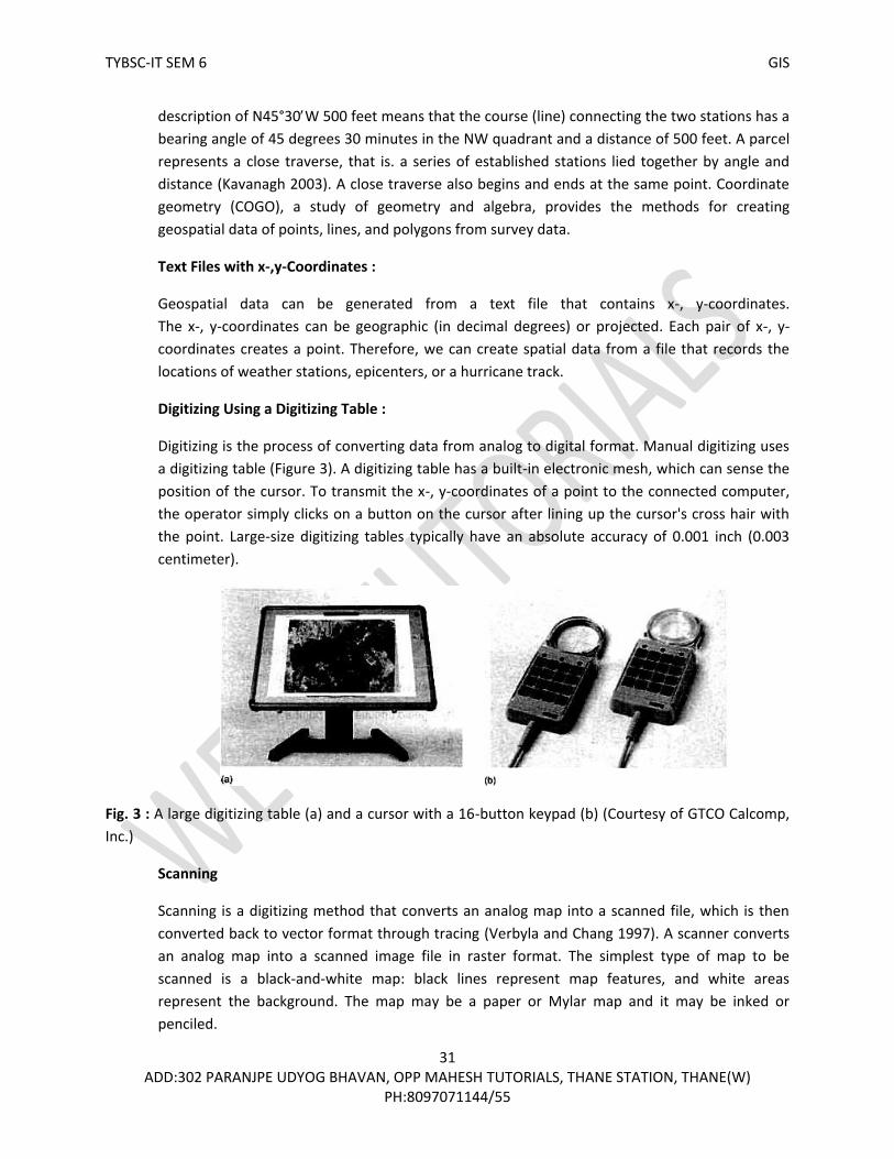
Digitizing Using a Digitizing Table :
Digitizing is the process of converting data from analog to digital format. Manual digitizing uses
a digitizing table (Figure 3). A digitizing table has a built-in electronic mesh, which can sense the
position of the cursor. To transmit the x-, y-coordinates of a point to the connected computer,
the operator simply clicks on a button on the cursor after lining up the cursor's cross hair with
the point. Large-size digitizing tables typically have an absolute accuracy of 0.001 inch (0.003
centimeter).
Fig. 3 : A large digitizing table (a) and a cursor with a 16-button keypad (b) (Courtesy of GTCO Calcomp,
Inc.)
Scanning
Scanning is a digitizing method that converts an analog map into a scanned file, which is then
converted back to vector format through tracing (Verbyla and Chang 1997). A scanner converts
an analog map into a scanned image file in raster format. The simplest type of map to be
scanned is a black-and-white map: black lines represent map features, and white areas
represent the background. The map may be a paper or Mylar map and it may be inked or
penciled.

TYBSC-IT SEM 6 GIS
32 ADD:302 PARANJPE UDYOG BHAVAN, OPP MAHESH TUTORIALS, THANE STATION, THANE(W)
PH:8097071144/55
Scanning converts the map into a binary scanned file in raster format; each pixel has a value of either 1
(map feature) or 0 (background). Map features are shown as raster lines, a series of connected pixels on
the scanned file (Figure 4). The pixel size depends on the scanning resolution, which is often set at 300
dots per inch (dpi) or 400 dpi for digitizing. A raster line representing a thin inked line on the source map
may have a width of 5 to 7 pixels (Figure 5).
On-Screen Digitizing :
On-screen digitizing, also called heads-up digitizing, is manual digitizing on the computer monitor using a
data source such as a DOQ as the background. DOQs combine the image characteristics of a photograph
with the geometric qualities of a map. Easily integrated in a GIS. DOQs are the ideal background for
digitizing. On-screen digitizing is an efficient method for editing or updating an existing layer such as
adding new trails or roads that are not on an existing layer but are on a new DOQ. Likewise, we can use
the method to update new clear-cuts or burned areas in a vegetation layer.
Importance of Source Maps :
Despite the increased availability of high-resolution remotely sensed data and GPS data, maps are still a
dominant source for creating new GIS data. Digitizing, either manual digitizing or scanning, converts an
analog map to its digital format. The accuracy of the digital map is therefore directly related to the
accuracy of the source map. The digital map can be only as good or as accurate as its source map.
A variety of factors can affect the accuracy of the source map. Maps such as USGS quadrangle maps are
secondary data sources because these maps have gone through the cartographic processes of
compilation, generalization, and symbolization. Each of these processes can affect the accuracy of the
mapped data. For example, if the compilation of the source map contains errors, these errors will be
passed on to the digital map.
Fig. 4 : A binary scanned file: The
lines are soil lines, and the black
areas are the background.
Fig. 5 : A raster line in a scanned file
has a width of several pixels.

TYBSC-IT SEM 6 GIS
33 ADD:302 PARANJPE UDYOG BHAVAN, OPP MAHESH TUTORIALS, THANE STATION, THANE(W)
PH:8097071144/55
Q.5. What is geometric transformation?
(A) Geometric Transformation
Geometric transformation is the process of using a set of control points and transformation
equations to register a digitized map, a satellite image, or an aerial photograph onto a projected
coordinate system. As its definition suggests, geometric transformation is a common operation
in GIS, remote sensing, and photogrammetry. But the mathematical aspects of geometric
transformation are from coordinate geometry (Moffitt and Mikhail 1980).
Q.6. Explain Map-to-Map and Image-to-Map transformations.
(A) Map-to-Map and Image-to-Map Transformation
A newly digitized map, either manually digitized or traced from a scanned file, is based on
digitizer units. Digitizer units can be in inches or dots per inch. Geometric transformation
converts the newly digitized map into projected coordinates in a process often called map-to-
map transformation.
Image-to-map transformation applies to remotely sensed data (Jensen 1996; Richards and Jia
1999). The term suggests that the transformation changes the rows and columns (i.e., the image
coordinates) of a satellite image into projected coordinates. Another term describing this kind of
transformation is georeferencing (Verbyla and Chang 1997; Lillesand et al. 2004). A
georeferenced image can register spatially with other feature or raster layers in a GIS database,
as long as the coordinate system is the same.
Whether map-to-map or image-to-map, a geometric transformation uses a set of control points
to establish a mathematical model that relates the map coordinates of one system to another or
image coordinates to map coordinates. The use of control points makes the process somewhat
uncertain. This is particularly true with image-to-map transformation because control points are
selected directly from the original image. Misplacement of the control points can make the
transformation result unacceptable.
Q.7. List the various transformation methods. Explain Affine method.
(A) Transformation Methods
Different methods have been proposed for transformation from one coordinate system to
another (Taylor 1977; Moffitt and Mikhail 1980). Each method is distinguished by the geometric
properties it can preserve and by the changes it allows. The effect of transformation varies from
changes of position and direction, to a uniform change of scale, to changes in shape and size
(Figure 6). The following summarizes these transformation methods and their effect on a
rectangular object.
• Equiarea transformation allows rotation of the rectangle and preserves its shape and size.

TYBSC-IT SEM 6 GIS
34 ADD:302 PARANJPE UDYOG BHAVAN, OPP MAHESH TUTORIALS, THANE STATION, THANE(W)
PH:8097071144/55
• Similarity transformation allows rotation of the rectangle and preserves its shape but not
size.
• Affine transformation allows angular distortion of the rectangle but preserves the
parallelism of lines (i.e., parallel lines remain as parallel lines).
• Projective transformation allows both angular and length distortions, thus allowing the
rectangle to be transformed into an irregular quadrilateral.
Fig. 6 : Different types of Fig. 7 : Differential scaling, rotation, skew
geometric transformations. and translation in the affine transformation.
These transformation methods are available in GIS packages such as ArcGIS and MGE. The
general rules suggest the use of the affine transformation for map-to-map or image-to-map
transformations and the projective transformation for aerial photographs with relief
displacement. Also available in GIS packages are general polynomial transformations that use
surfaces generated from second- or higher-order polynomial equations to transform satellite
images with high degrees of distortion and topographic relief displacement. The process of
general polynomial transformations is commonly called warping (Jensen 1996).
Affine Transformation
The affine transformation allows rotation, translation, skew, and differential scaling on a
rectangular object, while preserving line parallelism (Pet-tofrezzo 1978; Loudon et al. 1980;
Chen et al. 2003). Rotation rotates the object's x- and y-axes from the origin. Translation shifts
its origin to a new location. Skew allows a non-perpendicularity (or affinity) between the axes,
thus changing its shape to a parallelogram with a slanted direction. And differential scaling
changes the scale by expanding or reducing in the x and/or y direction. Figure 7 shows these
four transformations graphically.
Mathematically, the affine transformation is expressed as a pair of first-order polynomial
equations:

TYBSC-IT SEM 6 GIS
35 ADD:302 PARANJPE UDYOG BHAVAN, OPP MAHESH TUTORIALS, THANE STATION, THANE(W)
PH:8097071144/55
X = Ax + By + C (1)
Y= Dx + Ey + F (2)
where x and y are the input coordinates that are given, X and Y are the output coordinates to be
determined, and A, B, C. D, E, and F are the transformation coefficients. The affine
transformation is also called the six-parameter transformation because it involves six estimated
coefficients.
The same equations apply to both digitized maps and satellite images. But there are two
differences. First, x and y represent point coordinates in a digitized map, but they represent
columns and rows in a satellite image. Second, the coefficient E is negative in the case of a
satellite image. This is because the origin of a satellite image is located at the upper-left corner,
whereas the origin of a projected coordinate system is at the lower-left corner.
Operationally, an affine transformation of a digitized map or image involves three steps (Figure
8). First, update the x- and y-coordinates of selected control points to real-world coordinates. If
real-world coordinates are not available, we can derive them by projecting the longitude and
latitude values of the control points. Second, run an affine transformation on the control points
and examine the RMS error. If the RMS error is higher than the expected value, select a different
set of control points and rerun the affine transformation. If the RMS error is acceptable, then
the six coefficients of the affine transformation estimated from the control points are used in
the next step. Third, use the estimated coefficients and the transformation equations to
compute the new x- and y-coordinates of map features in the digitized map or pixels in the
Fig. 8 : A geometric transformation
typically involves three steps. Step 1
updates the control points to real-
world coordinates. Step 2 uses the
control points to run an affine
transformation. Step 3 creates the
output by applying the transformation
equations to the input features.

TYBSC-IT SEM 6 GIS
36 ADD:302 PARANJPE UDYOG BHAVAN, OPP MAHESH TUTORIALS, THANE STATION, THANE(W)
PH:8097071144/55
image. The outcome from the third step is a new map or image that is based on a user-defined
projected coordinate system.
Q.8. What is RMS (Root Mean Square) Error? What are its acceptable value ranges?
(A) Root Mean Square (RMS) Error
The affine transformation uses the coefficients derived from a set of control points to transform
a digitized map or a satellite image. The location of a control point on a digitized map or an
image is an estimated location and can deviate from its actual location. A common measure of
the goodness of the control points is the RMS error, which measures the deviation between the
actual (true) and estimated (digitized) locations of the control points.
How is an RMS error derived from a digitized map? After the six coefficients have been
estimated, we can use the digitized coordinates of the first control point as the inputs (i.e., the x
and y values) to Eq. (1) and Eq. (2) and compute the X and Y values, respectively. If the digitized
control point were perfectly located, the computed X and Y values would be the same as the
control point's real-world coordinates. But this is rarely the case. The deviations between the
computed (estimated) X and Y values and the actual coordinates then become errors associated
with the first control point on the output. Likewise, to derive errors associated with a control
point on the input, we can use the point's real-world coordinates as the inputs and measure the
deviations between the computed x and y values and the digitized coordinates.
The procedure for deriving RMS errors also applies to GCPs used in an image-to-map
transformation. Again, the difference is that columns and rows of a satellite image replace
digitized coordinates.
Mathematically, the input or output error for a control point is computed by:
2 2
act est act est(x x ) +(y y ) (3)
where xact, and yact are the x and y values of the actual location, and xest, and yest are the x and y
values of the estimated location.
The average RMS error can be computed by averaging errors from all control points:
n n
2 2
act, i est, i act, i est, i
i = 1 i = 1
(x x ) + (y y ) n
l (4)
where n is the number of control points, xact, i and yact, i are the x and y values of the actual
location of control point i, and xest, i and yest, i are the x and y values of the estimated location of
control point i.

TYBSC-IT SEM 6 GIS
37 ADD:302 PARANJPE UDYOG BHAVAN, OPP MAHESH TUTORIALS, THANE STATION, THANE(W)
PH:8097071144/55
Q.9. Explain the concept of 'Resampling of Pixel Values', the methods and the advantages of
Resampling.
(A) Resampling of Pixel Values
The result of geometric transformation of a satellite image is a new image based on a projected
coordinate system. But the new image has no pixel values. The pixel values must be filled
through resampling. Resampling in this case means filling each pixel of the new image with a
value or a derived value from the original image.
Resampling Methods
Three common resampling methods are nearest neighbor, bilinear interpolation, and cubic
convolution. The nearest neighbor resampling method fills each pixel of the new image with the
nearest pixel value from the original image. For example, Figure 9 shows that pixel A in the new
image will take the value of pixel a in the original image because it is the closest neighbor. The
nearest neighbor method is computationally efficient. The method has the additional property
of preserving the original pixel values, which is important for categorical data such as land cover
types and desirable for some image processing such as edge detection.
Both bilinear interpolation and cubic convolution fill the new image with distance-weighted
averages of die pixel values from the original image.
Fig. 9 : Because a in the original image is closest to pixel A in the new image, the pixel value at a is
assigned lo be the pixel value at A using the nearest neighbor technique.
The bilinear interpolation method uses the average of the four nearest pixel values from three
linear interpolations, whereas the cubic convolution method uses the average of the 16 nearest
pixel values from five cubic polynomial interpolations (Richards and Jia 1999). Cubic convolution
tends to produce a smoother output man bilinear interpolation but requires a longer processing
time.
Other Uses of Resampling
Geometric transformation of satellite images is not the only operation that requires resampling.
Resampling is needed whenever there is a change of cell location or cell size between the input

TYBSC-IT SEM 6 GIS
38 ADD:302 PARANJPE UDYOG BHAVAN, OPP MAHESH TUTORIALS, THANE STATION, THANE(W)
PH:8097071144/55
raster and the output raster. For example, projecting a raster from one coordinate system to
another requires resampling to fill in the cell values of the output raster. Resampling is also
involved when a raster changes from one cell size to another (e.g., from 10 to 15 meters).
Pyramiding is a common technique for displaying large raster data sets. Resampling is used with
pyramiding to build different pyramid levels. Regardless of its application, resampling typically
uses one of the three methods covered to produce the output raster.
Pyramiding: GIS packages have adopted pyramiding for displaying large raster data sets.
Pyramiding build difference pyramid levels to represent reduced or lower resolutions of larger
raster. Because a lower resolution raster required lern memory space, it can display

TYBSC-IT SEM 6 GIS
39 ADD:302 PARANJPE UDYOG BHAVAN, OPP MAHESH TUTORIALS, THANE STATION, THANE(W)
PH:8097071144/55

TYBSC-IT SEM 6 GIS
40 ADD:302 PARANJPE UDYOG BHAVAN, OPP MAHESH TUTORIALS, THANE STATION, THANE(W)
PH:8097071144/55
Q.1. Explain Attribute Data in GIS.
(A) Attribute data in GIS
Attribute data are stored in tables. An attribute table is organized by row and column. Each
row represents a spatial feature, each column describes a characteristics, and the intersection of
a column and a row shows the value of particular characteristic for a particular feature (Figure
1). A row is also called a record or a tuple, and a column is also called a field or an item.
Type of Attribute Table
There are two types of attribute tables. The first type is called the feature attribute table, which
has access to the spatial data. Every vector data set must have a feature attribute table. In the
case of the georelational data model, the feature attribute table uses the feature ID to link to
the feature’s geometry. In the case of the object-based data model, the feature attribute table
has a field that stores the feature’s geometry. Feature attribute tables also have default fields t
hat summarize the feature geometries such as length for line features and area and perimeter
for area features.
Label0ID pH Depth Fertility
1 6.8 12 High Row
2 4.5 4.8 Low
Column
Fig. 1 : A feature attribute table consists of rows and columns. Each row represents a spatial feature,
and each column represents a property or characteristic of the spatial
Database Management
The presence of feature attribute and nonspatial data tables means that a GIS requires a
database management system (DBMS) to manage these tables. A DBMS is a software package
that enables us to build and manipulate a database (Oz 2004). A DBMS provides tools for data
input, search, retrieval, manipulation, and output. Most commercial GIS packages include
database management tools for local databases. For example, as of version 9.1, ArcGIS Desktop
uses Microsoft Access for local database management.

TYBSC-IT SEM 6 GIS
41 ADD:302 PARANJPE UDYOG BHAVAN, OPP MAHESH TUTORIALS, THANE STATION, THANE(W)
PH:8097071144/55
Type of Attribute Data
One method for classifying attribute data is by data type. The data type determines how an
attribute is stored in a GIS. Depending on the GIS package, the available data types can vary.
Common data types are number, text (or character), date, and binary large object (BLOB). Data
types for numbers include integer (for numbers without decimal digits) and floats (for numbers
with decimal digits). Moreover, depending on the designated computer memory, an integer can
be short or long and a float can be single precision or double precision. BLOB stores images,
multimedia, and the geometry of spatial features as long sequences of binary numbers.
Q.2. Write a short note on Relation Model.
(A) A database is a collection of interrelated tables in digital format. There are at least four types of
database designs that have been proposed in the literature: flat file, hierarchical, network, and
relational.
A flat file contains all data in a large table. A feature attribute table is like a flat file. Another
example is a spreadsheet with data only. A hierarchical database organizes its data at different
levels and uses only the one-to-many association between levels. The simple example in (Figure
2) shows the hierarchical levels of zoning, parcel, and owner. Based on the one-to-many
association, each level is divided into different branches. A network database builds
connections across tables, as shown by the linkages between the tables in (Figure 2). A common
problem with both the hierarchical and the network database designs is that the linkages (i.e.,
access paths) between tables must be known in advance and built into the database at design
time. This requirement tends to make a complicated and inflexible database and limit the
database applications.
GIS vendors typically use the relational model for database management. A relational database is
a collection of tables, also called relations, which can be connected to each other by keys. A
primary key represents one or more attributes whose values can uniquely identify a record in a
table. Its counterpart in another table for the purpose of linkage is called a foreign key. Thus a key
common to two tables can establish connections between corresponding records in the tables. In,
(Figure 2) the key connecting zoning and parcel is the zone code and the key connecting parcel and
owner is the PIN (parcel ID number). When used together, the keys can relate zoning and owner.
Q.3. Write a note on SSURGO with example.
(A) The Natural Resources Conservation Service (NRCS) produces the Soil Survey Geographic
(SSURGO) database nationwide (http://soils. usda.gov/). The NRCS collects SSURGO data from
field mapping, archives the data in 7.5-minute quadrangle units, and organizes the database by
soil survey area. A soil survey area may consist of a county, multiple counties, or parts of
multiple counties. The SSURGO database represents the most detailed level of soil mapping by
the NRCS in the United States.

TYBSC-IT SEM 6 GIS
42 ADD:302 PARANJPE UDYOG BHAVAN, OPP MAHESH TUTORIALS, THANE STATION, THANE(W)
PH:8097071144/55
The SSURGO database consists of spatial data and tabular data. For each soil survey area, the spatial
data contain a detailed soil map. The soil map is made of soil map units, each of which may be
composed of one or more noncontiguous polygons. As the smallest area unit for soil mapping, a soil
map unit represents a set of geographic areas for which a common land-use management strategy is
suitable. Interpretations and properties of soil map units are provided by links between soil maps and
data that exist in more than 50 tables in the SSURGO database. For example, the Component table
shows if a soil map unit comprises a single dominant soil or two or more soil components. The NRCS
provides metadata that describe each table and the keys that link tables.
The sheer size of the SSURGO database can be overwhelming at first. But the database is not difficult to
use if we have a proper understanding of the relational model.
(a) Flat file
PIN Owner Zoning
P101 Wang Residential (1)
P101 Chang Residential (1)
P102 Smith Commercial (2)
P102 Jones Commercial (2)
P103 Costello Commercial (2)
P104 Smith Residential (1)
(b) Hierarchical

TYBSC-IT SEM 6 GIS
43 ADD:302 PARANJPE UDYOG BHAVAN, OPP MAHESH TUTORIALS, THANE STATION, THANE(W)
PH:8097071144/55
Fig. 2 : Four types of database (a) flat file, (b) hierarchical, (c) network, and (d) relational.
Q.4. Explain with example what is meant by Normalization.
(A) Preparing a relational database such as SSURGO involves following certain rules. An important
rule is called normalization. Normalization is a process of decomposition, taking a table with all
the attribute data and breaking it down into small tables while maintaining the necessary
linkages between them (Vetter 1987). Normalization is designed to achieve the following
objectives:
To avoid redundant data in tables that waste space in the database and may cause data integrity
problems.
To ensure that attribute data in separate tables can be maintained and updated separately and
can be linked whenever necessary.
To facilitate a distributed database.
An example of normalization is offered here, Table 1 shows attribute data for a parcel map. The
table contains redundant data: owner addresses are repeated for Smith and residential and
commercial zoning are entered twice. The table also contains uneven records: depending on the
parcel, the fields of owner and owner address can have either one or two values. An unnormalized
table such as Table 1 cannot be easily managed or edited. To begin with, it is difficult to define the
fields of owner and owner address and to store their values. A change of the ownership requires

TYBSC-IT SEM 6 GIS
44 ADD:302 PARANJPE UDYOG BHAVAN, OPP MAHESH TUTORIALS, THANE STATION, THANE(W)
PH:8097071144/55
that all attribute data be updated in the table. The same difficulty applies to such operations as
adding or deleting values.
Table 2 represents the first step in normalization. Often called the first normal form. Table 2 no longer
has multiple values in its cells, but the problem of data redundancy has increased. P101 and P102
are duplicated except for changes of the owner and the owner address. Smith’s address is included
twice. And the zoning descriptions of residential and commercial are listed three times each. Also,
identifying the owner address is not possible with PIN alone but requires a compound key of PIN
owner.
Table 1 : An Unnormalized Table
PIN Owner Owner address Sale date Aeres Zone code Zoning
P101 Wang 101 Oak St 11098 1.0 1 Residential
Chang 200 Maple St
P102 Smith 300 Spruce Rd 10668 3.0 2 Commercial
Jones 105 Ash St
P103 Costello 206 Elm St 3797 2.5 2 Commercial
P104 Smith 300 Spruce Rd 73078 1.0 1 Residential
Table 2 : First Step in Normalization
PIN Owner Owner address Sale date Aeres Zone code Zoning
P101 Wang 101 Oak St 11098 1.0 1 Residential
P101 Chang 200 Maple St 11098 1.0 1 Residential
P102 Smith 300 Spruce Rd 10668 3.0 2 Commercial
P102 Jones 105 Ash St 10668 3.0 2 Commercial
P103 Costello 206 Elm St 3797 2.5 2 Commercial
P104 Smith 300 Spruce Rd 73078 1.0 1 Residential

TYBSC-IT SEM 6 GIS
45 ADD:302 PARANJPE UDYOG BHAVAN, OPP MAHESH TUTORIALS, THANE STATION, THANE(W)
PH:8097071144/55
Q.5. Explain types of relationships among database tables.
(A)
Fig. 3 : Four types of data relationships between tables; onetoone, onetomany, manytoone, and
manytomany.
A relational database may contain four types of relationships (also called cardinalities) between
tables, or more precisely, between records in tables : oneto one, onetomany,
manytoone, and manytomany (Figure 3). The onetoone relationship means that one
and only one record in a table is related to one and only record in another table. The
onetomany relationship means that one record in a table may be related to many records in
another table. For example, the street address of an apartment complex may include several
households. The manytoone relationship means that many records in a table may be related
to one record in another table. For example, several households may share the same street

TYBSC-IT SEM 6 GIS
46 ADD:302 PARANJPE UDYOG BHAVAN, OPP MAHESH TUTORIALS, THANE STATION, THANE(W)
PH:8097071144/55
address. The manyto-many relationship means that many records in a table may be related to
many records in another table. For example, a timber stand can grow more than one species
and a species can grow in more than one stand.
Q.6. Explain the various steps in Attribute Data Entry.
(A) Field Definition
The first step in attribute data entry is to define each held in the table. A field definition usually
includes the filed name, data width, data type, and number of decimal digits. The width refers to
the number of spaces to lie reserved for a field. The width should be large enough for the largest
number, including the sign, or the longest string in the data. The data type must follow data types
allowed in the GIS package. The number of decimal digits is part of the definition for the float data
type. In ArcGIS, the precision defines the number of digits, and the scale defines the number of
decimal digits, for the float data type.
The field definition can be confusing at times. For example, the map unit key in the SSURGO
database is defined as text, although it is coded as numbers such as 79522, 79523 and so on. Of
course, we cannot perform computations with these map unit key numbers.
Methods of Data Entry
Suppose a map has 4000 polygons, each with 50 fields of attribute data. This could require
entering 200,000 values. How to reduce time and effort in attribute data entry is of interest to
any GIS user.
Just as we look for existing spatial data, we should determine if an agency has already entered
attribute data in digital format. If yes, we can simply import the digital data file into a GIS. The data
format is important for importing. Most GIS packages can import delimited text files and dBASE
files as well as data from other database management systems. If attribute data files do not exist,
then typing is the only option. But the amount of typing can vary depending on which method or
command is used. For example, an editing command in a GIS package works with one record at a
time. One way to save time is to follow the relational database design and to take advantage of
keys and lookup tables.
Attribute Date Verification
Attribute data verification has two stops. The first is to make sure that attribute data are
properly linked to spatial data: the label or feature ID should be unique and should not contain
null (empty) values. The second step is to verify the accuracy of attribute data. Data verification
is difficult because inaccuracies can be attributed to a large number of factors including
observation errors, outdated data, and data entry errors.

TYBSC-IT SEM 6 GIS
47 ADD:302 PARANJPE UDYOG BHAVAN, OPP MAHESH TUTORIALS, THANE STATION, THANE(W)
PH:8097071144/55
There are at least two traditional methods for checking for data entry errors. First, attribute
data can be printed for manual verification, This is like using check plots to check the accuracy of
spatial data. Second, computer programs can be written to verify data accuracy. For example, a
computer program can be written to catch logical errors in soil attribute data such as data type
and numeric range. The same program may also test attribute data against a master set of valid
attributes to catch logical errors such as having incompatible components in the same soil map
unit.
Q.7. Explain how to Manipulate fields of Attribute Data in GIS.
(A) Manipulation of Fields and Attribute Data
Database management tasks involve tables as well as fields and field values in tables. Field
management includes adding or deleting fields and creating new attributes through
classification and computation of existing attribute data.
Adding and Deleting Fields
We regularly download data from the Internet for GIS projects. Often the downloaded data set
contains far more attributes than we need. It is a good idea to delete those fields that are not
needed. This not only reduces confusion in using the data set but also saves computer time for
data processing. Deleting a field is straightforward. The process requires specifying an attribute
table and the field in the table to be deleted. Obviously the table involved in the process cannot
be used by another program or application.
Classification of Attribute Data
New attribute data can be created from existing data through data classification. Based on an
attribute or attributes, data classification reduces a data set to a small number of classes. For
example, elevations may be grouped into < 500, 500 to 1000, and so on. Another example is to
classify by elevation and slope: class 1 has < 500 in elevation and 0 to 10% slope, class 2 has >
500 in elevation and 10 to 20% slope, and so on.
Computation of Attribute Data
New attribute data can also be created from existing data through computation. Operationally,
it involves two steps: defining a new field, and computing the new field values from the values
of an existing attribute or attributes. The computation is through a formula, which can ho coded
manually or by using a dialog with controls for various mathematical functions.
Q.8. Explain the term 'Cartographic Symbolization' with its various aspects.
(A) Spatial Features and Map Symbols
Spatial features are characterized by their locations and attributes. To display a Spatial feature
on a map, we use a map symbol to indicate the feature’s location and a visual variable, or visual

TYBSC-IT SEM 6 GIS
48 ADD:302 PARANJPE UDYOG BHAVAN, OPP MAHESH TUTORIALS, THANE STATION, THANE(W)
PH:8097071144/55
variables, with the symbol to show the feature’s attribute data. For example, a thick line in red
may represent an interstate highway and a thin line in black may represent a state highway. The
line symbol shows the location of the highway in both cases, but the line width and color two
visual variables with the line symbolseparate the interstate from the state highway. Choosing
the appropriate map symbol and visual variables is therefore the main concern for data display
and mapmaking (Robinson et al. 1995; Dent 1999; Slocum et al. 2005).
The choice of map symbol is simple for raster data: the map symbol applies to cells whether the
spatial feature to be depicted is a point, line, or area. The choice of map symbol for vector data
depends on the feature type. The general rule is to use point symbols for point features, line symbols
for line features, and area symbols for area features. But this general rule does not apply to
volumetric data or aggregate data. There are no volumetric symbols for data such as elevation,
temperature, and precipitation. Instead, .3D surfaces and isolines are often used to map volumetric
data. Aggregate data such as county populations are data
reported at an aggregate level. A common approach is to assign aggregate data to the center of each
county and display the data using point symbols.
Use of Color
Because color adds a special appeal to a map, map makers will choose color maps over black
and white maps whenever possible. But color is probably the, most misused visual variable,
according to published critiques of computer-generated maps (Monmonier 1006). The use of
color in mapmaking must begin with an understanding of the visual dimensions of hue value,
and chroma.
Hue is the quality that distinguishes one color from another, such as red from blue. Hue can also
be defined as the dominant wavelength of light making up a color. We tend to relate different
hues with different kinds of data. Value is the lightness or darkness of a color, with black at the
lower end and white at the higher end. We generally perceive darker symbols on a map as being,
more impor-darker, or greater in terms of magnitude (Robinson el al. 1995). Also called saturation
or intensity, chroma refers to the richness, or brilliance, of a color. A fully saturated color is pure,
whereas a low saturation approaches gray. We generally associate higher intensity symbols with
greater visual importance.
Data Classification
Data classification involves the use of a classification method and a number of classes for
aggregating data and map features. A GIS package typically offers different data classification
methods. The following summarizes five commonly used methods :
Equal interval : This classification method divides the range of data values into equal
intervals. (e.g. 0110, 1120, 2130, etc.)

TYBSC-IT SEM 6 GIS
49 ADD:302 PARANJPE UDYOG BHAVAN, OPP MAHESH TUTORIALS, THANE STATION, THANE(W)
PH:8097071144/55
Equal frequency : Also called quantile, this classification method divides the total number of
data values by the number of classes and ensures that each class contains the same number
of data values.
Mean and standard deviation : This classification method sets the class breaks at units of
the standard deviation (0.5, 1.0, etc.) above or below the mean.
Natural breaks : Also called the Jenks optimization method, this classification method
optimizes the grouping of data values (Slocum et al. 2005). The method uses a computing
algorithm to minimize differences between data values in the same class and to maximize
differences between classes.
User defined : This method lets the user choose the appropriate or meaningful class breaks.
Par example, in mapping rates of population change by state, the user may choose zero or
the national average as a class break.
With changes in the classification method, the number of classes, or both, the same data can
produce different-looking maps and different spatial patterns. This is why mapmakers usually
experiment with data classification before deciding on a classification scheme for the final map.
Although the decision is ultimately subjective, it should be guided by map purpose and map
communication principles.
Q.9. Explain the various types of maps in GIS Packages.
(A) TYPES OF MAPS
Cartographers classify maps by function and by symbolization. By function, maps can be general
reference or thematic. The general reference map is used for general purposes, For example, a
U.S. Geological Survey (USGS) quadrangle map shows a variety of spatial features, including
boundaries, hydrology, transportation, contour lines, settlements, and land covers. The
thematic map is also called the special purpose map, because its main objective is to show the
distribution pattern of a theme, such as the distribution of population densities by county in a
state.
By map symbol, maps can be qualitative or quantitative. A qualitative map uses visual variables
that are appropriate for portraying qualitative data, whereas a quantitative map uses visual
variables that are appropriate for communicating quantitative data. The following describes
several common types of quantitative maps (Figure 4) (Robinson et al. 1995; Dent 1999; Slocum
et al. 2005).

TYBSC-IT SEM 6 GIS
50 ADD:302 PARANJPE UDYOG BHAVAN, OPP MAHESH TUTORIALS, THANE STATION, THANE(W)
PH:8097071144/55
The dot map uses uniform point symbols to show spatial data, with each symbol representing a
unit value. One-to-one dot mapping uses the unit value of one, such as one dot representing
one crime location. But in most cases, it is one-to-many dot mapping and the unit value is
greater than one. The placement of dots becomes a major consideration in one-to-many dot
mapping.
The choropleth map symbolizes, with shading, derived data based on administrative units. An
example is a map showing average household income by county. The derived data are usually
classified prior to mapping and are symbolized using a color scheme for quantitative data.
Fig 4 : Six common types of quantitative maps

TYBSC-IT SEM 6 GIS
51 ADD:302 PARANJPE UDYOG BHAVAN, OPP MAHESH TUTORIALS, THANE STATION, THANE(W)
PH:8097071144/55
Therefore, the appearance of the choropleth map can be greatly affected by data classification.
Cartographers often make several versions of the choropleth map from the same data and
choose onetypically one with a good spatial organization of classesfor final map production.
The dasymetric map is a variation of the simple choropleth map. By using statistics and
additional information, the dasytmetric map delineates areas of homogeneous values rather
than following administrative boundaries (Robinson et al. 1995) (Figure 5). Dasymetric mapping
used to be a time-consuming task, but the analytical functions of a GIS have simplified the
mapping procedure (Holloway et al. 1999; Eicher and Brewer 2001; Holt et al. 2004).
A GIS package such as ArcGIS uses the term graduated color map to cover the choropleth and
dasymetric maps because both map types use a graduated color scheme to show the variation
in spatial data.
The graduated symbol map uses differentsized symbols such as circles, squares, of triangles to
represent different ranges of values. For example, we can use graduated symbols to represent
cities of different population ranges. Two important issues to this map type are the range of
sizes and the discernible difference between sizes. Both issues are obviously related to the
number of graduated symbols on a map.
A proportional symbol map is a map that uses a specific symbol size for each numeric value
rather than a range of values. Therefore, one circle size may represent a population of 10,000,
another 15,000, and so on.
The chart map uses either pie charts or bar charts. A variation of the graduated circle, the pie
chart can display two sets of quantitative data: the circle size can be made proportional to a
value such as a county population, and the subdivisions can show the makeup of the value, such
as the racial composition of the county population. Bar charts use vertical bars and their height
to represent quantitative data. Bar charts are particularly useful for comparing data side by side.
The flow map displays different quantities of flow data such as traffic volume and stream flow
by varying the line symbol width. Similar to the graduated symbols, the flow symbols usually
represent ranges of values.
Fig.5 : map symbols follow the boundaries in the choropleth map (a) but not in
the dasymetric map (b).

TYBSC-IT SEM 6 GIS
52 ADD:302 PARANJPE UDYOG BHAVAN, OPP MAHESH TUTORIALS, THANE STATION, THANE(W)
PH:8097071144/55
The isarithmic map uses a system of isolines to represent a surface. Each isoline connects points
of equal value.
Q.10. Explain the role of Typography in GIS.
(A) Type Variations
Type can vary in typeface and form. Typeface refers to the design character of the type. Two
main groups of typefaces are serif (with serif) and sans serif (without serif). Serifs are small,
finishing touches at the ends of line strokes, which tend to make running text in newspapers and
books easier to read. Compared to serif types, sans serif types appear simpler and bolder.
Although rarely used in books or other text-intensive materials, a sans serif type stands up well
on maps with complex map symbols and remains legible even in small sizes. Sans serif types
have an additional advantage in mapmaking because many of them come in a wide range of
type variations.
Type form variations include type weight (bold, regular, or light), type width (condensed or
extended), upright versus slanted (or roman versus italic), and uppercase versus lowercase
(Figure 6). A font is a complete set of all variants of a given typeface. Fonts on a computer are
those loaded from the printer manufacturer and software packages. They are usually enough for
mapping purposes. If necessary, additional fonts can be imported into a GIS package.
Helvetica Normal
Helvetica Italic
Helvetica Bold
Helvetica BoldItalic
Times Roman Normal
Times Roman Italic
Times Roman Bold
Times Roman BoldItalic
Fig 6 : Type variations in weight and roman versus italic.

TYBSC-IT SEM 6 GIS
53 ADD:302 PARANJPE UDYOG BHAVAN, OPP MAHESH TUTORIALS, THANE STATION, THANE(W)
PH:8097071144/55
Selection of Type Variations
Type variations for text symbols can function in the same way as visual variables for map
symbols. How does one choose type variations for a map? A practical guideline is to group text
symbols into qualitative and quantitative classes. Text symbols representing qualitative classes
such as names of streams, mountains, parks, and so on can vary in typeface, color, and upright
versus italic. In contrast, text symbols representing quantitative classes such as names of
different-sized cities can vary in type size, weight, and uppercase versus lowercase. Grouping
text symbols into classes simplifies the process of selecting type variations.
Besides classification, cartographers also
recommend legibility, harmony, and conventions
for type selection (Dent 1999). Legibility is difficult
to control on a map because it can be influenced
not only by type variations but also by the
placement of text and the contrast between text
and the background symbol. As GIS users, we have
the additional problem of having to design a map
on a computer monitor and to print it on a larger
plot. Experimentation may be the only way to
ensure type legibility in all parts of the map.
Placement of Text in the Map Body
Text elements in the map body, also called labels, are directly associated with the spatial
features. In most cases, these labels are names of the spatial features. But they can also be
some attribute values such as contour readings or precipitation amounts. Other text elements
on a map such as the title and the legend are not tied to any specific locations. Instead, the
placement of these text elements (i.e., graphic elements) is related to the layout of the map.
As a general rule, a label should be placed to show the location or the area extent of the named
spatial feature. Cartographers recommend placing the name of a point feature to the upper
right of its symbol, the name of a line feature in a block and parallel to the course of the feature,
and the name of an area feature in a manner that indicates its area extent. Other general rules
suggest aligning labels with either the map border or lines of latitude, and placing labels entirely
on land or on water.
Fig 7 : The look of the map is not
harmonious because of too many typefaces.

TYBSC-IT SEM 6 GIS
54 ADD:302 PARANJPE UDYOG BHAVAN, OPP MAHESH TUTORIALS, THANE STATION, THANE(W)
PH:8097071144/55
Q.11. Explain Map Design with reference to : (a) Layout (b) Visual Hierarchy.
(A)
(a) Layout
Layout, or planar organization, deals with the arrangement and composition of various map
elements, Major concerns with layout are focus, order, and balance. A thematic map should
have a clear focus, which is usually the map body or a part of the map body. To draw the map
reader’s attention, the focal element should be placed near the optical center, just above the
map’s geometric center. The focal element should be differentiated from other map element by
contrast in line width, texture, value detail, and color.
After viewing the focal element, the reader should be directed to the rest of the map in an
ordered fashion. For example, the legend and the title are probably the next elements that the
viewer needs to look at after the map body. To smooth the transition, the mapmaker should
clearly place the legend and the title on the map, with perhaps a box around the legend and a
larger type size for the title to draw attention to them.
A finished map should look balanced. It should not give the map reader an impression that the
map “looks” heavier on the top, bottom, or side. But balance does not suggest the breaking
down of the map elements and placing them, almost mechanically, in every part of the map.
Although in that case the elements would be in balance, the map would be disorganized and
confusing. Mapmakers therefore should deal with balance within the context of organization
and map communication.
Cartographers used to thumbnail sketches to experiment with balance on a map. Now they use
computers to manipulate map elements on a layout page. ArcGIS, for example, offers two basic
methods for layout design. The first method is to use a layout template. These templates are
grouped as general, industry, USA, and would. Each group has a list of choices. For example, the
layout templates for the United States include USA, conterminous USA, and five different regions
of the country. The idea of using a layout template is to use a built-in design option to quickly
compose a map.
(b) Visual Hierarchy
Visual hierarchy is the process of developing a visual plan to introduce the 3D effect or depth
to maps (Fig. 8). Mapmakers create the visual hierarchy by placing map elements at different
visual levels according to their importance to the map’s purpose. The most important element
should be at the top of the hierarchy and should appear closest to the map reader. The least
important element should be at the bottom. A thematic map may consist of three or more levels
in a visual hierarchy.

TYBSC-IT SEM 6 GIS
55 ADD:302 PARANJPE UDYOG BHAVAN, OPP MAHESH TUTORIALS, THANE STATION, THANE(W)
PH:8097071144/55
The concept of visual hierarchy is an extension of the figure-ground relationship in visual
perception (Arnheim 1965). The figure is more important visually, appears closer to the viewer,
has form and shape, has more impressive color, and has meaning. The ground is the
background. Cartographers have adopted the depth cues for developing the figure-ground
relationship in map design.
Probably the simplest and yet most effective principle in creating a visual hierarchy is
interposition or superimposition (Dent 1999). Interposition uses the incomplete outline of an
object to make it appear as though it is behind another. Examples of interposition abound in
Fig. 9 : The interposition effect in map design
Fig. 8: A visual hierarehy example.
The two black circles are on top
(closest to the map reader), followed
by the gray polygon. The grid, the
least important, is on the bottom.
Fig.10 : A map looks confusing if it
uses too many boxes to highlight
individual elements

TYBSC-IT SEM 6 GIS
56 ADD:302 PARANJPE UDYOG BHAVAN, OPP MAHESH TUTORIALS, THANE STATION, THANE(W)
PH:8097071144/55
maps, especially in newspapers and magazines. Continents on a map look more important or
occupy a higher level in visual hierarchy if the lines of longitude and latitude stop at the coast. A
map title, a legend, or an inset map looks more prominent if it lies within a box, with or without
the drop shadow. When the map body is deliberately placed on top of the neat line around a
map, the map body will stand out more (Figure 9). Because interposition is so easy to use, it can
be over used or misused. A map looks confusing if several of its elements compete for the map
leader’s attention (Figure 10).
Q.12. Explain the process of Map Production.
(A) GIS users design and make maps on the computer screen. These soft-copy maps can be used in a
variety of ways. They can be printed, exported for use on the Internet, used in overhead
computer projection systems, exported to other software packages, or further processed for
publishing.
Map production is a complex topic. We are often surprised that color symbols from the color
printers do not exactly match those on the computer screen. This discrepancy results from the
use of different media and color models.
Data display on the computer screen uses either CRT (cathode ray tube) or LCD (liquid crystal
display). It used to be that desktop computers used CRTs and laptop or portable computers
used LCDs. But now more desktop computers are also using LCDs to take advantage of the thin,
flat screen. A CRT screen has a built in line mesh of pixels, and each pixel has colored dots called
phosphors. When struck by electron from an electron gun, a dot lights up and slowly grows dim.
An LCD screen uses two sheets of polarizing materials with a liquid crystal solution between
them. Each pixel on an LCD screen can be turned on or off independently. Besides being thinner
and lighter. LCD screens have two oilier advantages over CRT screens: they consume less power,
and they produce sharper, flicker-free images.
With either a CRT or an LCD, a color symbol we see on a screen is made of pixels, and the color
of each pixel is a mixture of RGB (red, green, and blue). The intensity of each primary color in a
mixture determines its color. The number of intensity levels each primary color can have
depends on the number of bit-planes assigned to the electron gun in a CRT screen or the
variation of the voltage applied in an LCD screen. Typically, the intensity of each primary color
can range over 256 shades. Combining the three primary colors produces a possible palette of
16.8 million colors (256 x 256 X 256).

TYBSC-IT SEM 6 GIS
57 ADD:302 PARANJPE UDYOG BHAVAN, OPP MAHESH TUTORIALS, THANE STATION, THANE(W)
PH:8097071144/55
Fig. 11: The RGB (red, green and blue) color model
Blue
(0,0,255)
Blue
(0,0,0)
Blue
(0,255,255)
Blue
(255,255,255)
Red
(255,0,0)
Yellow
(255,255,0)
Green
(0,255,0)
Magenta
(255,0,255)

TYBSC-IT SEM 6 GIS
58 ADD:302 PARANJPE UDYOG BHAVAN, OPP MAHESH TUTORIALS, THANE STATION, THANE(W)
PH:8097071144/55

TYBSC-IT SEM 6 GIS
59 ADD:302 PARANJPE UDYOG BHAVAN, OPP MAHESH TUTORIALS, THANE STATION, THANE(W)
PH:8097071144/55
Q.1. Explain the term 'Data Exploration' with its various aspects.
(A) Similar to statistics, data exploration in GIS lets the user view the general patterns in the data
set, query data subsets, and hypothesize about possible relationships between data sets
(Anselin 1999; Andrienko et al. 2001; Haining 2003). But there are two important differences.
First, data exploration in a GIS involves both spatial and attribute data. Second, the media for
data exploration in GIS include maps and map features. For example, in studying soil conditions,
we want to know not only how much of the study area is rated poor but also where those poor
soils are distributed on a map. Therefore, besides descriptive statistics and graphics, data
exploration in GIS must also cover attribute data query, spatial data query, and map
manipulation.
Descriptive Statistics : Descriptive statistics summarize the values of a data set. They include the
following :
Range: the difference between the minimum and maximum values.
Median: the midpoint value, or the 50th percentile.
First quartile: the 25th percentile.
Third quartile: the 75th percentile.
Mean: the average of data values. The mean can be calculated by
n
i
i 1
x n
, where xi is the ith value and n is the number of values.
Variance: the average of the squared deviations of each data value about the mean. The
variance can be calculated by n
2
i
i 1
x mean n
Standard deviation: the square root of the variance.
Z score: a standardized score that can be computed by (x mean)/s, where s is the standard
deviation.
Graphs
Different types of graphs are used for data exploration. A line graph displays data as a line. The line
graph example in figure 1 shows the rate of population change in the United States along the y-axis and
the state along the x-axis. Notice a couple of “peaks” in the line graph.

TYBSC-IT SEM 6 GIS
60 ADD:302 PARANJPE UDYOG BHAVAN, OPP MAHESH TUTORIALS, THANE STATION, THANE(W)
PH:8097071144/55
A bar chart, also called a histogram, groups data into equal
intervals and uses bars to show the number of frequency of
values falling within each class. A bar chart may have
vertical bars or horizontal bars. Figure 2 uses a vertical bar
chart to group rates of population change in the United
States into six classes. Notice one bar at the high end of the
histogram.
A cumulative distribution graph is one type of line graph
that plots the ordered data values against the cumulative
distribution values. The cumulative distribution value of
the ith ordered value is typically calculated as (i 0.5)/n,
where n is the number of values. This computational
formula converts the values of a data set to within the
range of 0.0 to 1.0. Figure 3 show a cumulative distribution
graph.
Fig. 1 : A line graph
Fig. 2 : A histogram (bar chart)
Fig. 3 : A cumulative distribution graph
Fig. 5 : A bubble plot showing percent
population change 1990-2000, percent persons
under 18 years old in 2000, and state population
in 2000.
Fig. 4 : A scatterplot plotting percent
persons 18 years old in 2000 against
percent population change, 1990-2000.
A weak-positive relationship is present
between the two variables.

TYBSC-IT SEM 6 GIS
61 ADD:302 PARANJPE UDYOG BHAVAN, OPP MAHESH TUTORIALS, THANE STATION, THANE(W)
PH:8097071144/55
scatterplot uses markings to plot the values of two variables along the x and yaxes. Figure 4 plots
percent population change19902000 against percent persons under 18 years old in 2000 by state in
the United States. The scatterplot suggests a weak positive relationship between the two variables.
Bubble plots are a variation of scatterplots. Instead of using constant symbols as in a scatterplot, a bubble
plot has varying sized bubbles that are made proportional to the value of a third variable. Figure 5 is a
variation of Figure 4, the additional variable shows by the bubble size is the state population ins 2000. As
an illustration, Figure 5 only shown states in the Mountain region, one of the nine regions defined by the
U.S. Census Bureau.
Boxplots, also called the “box and whisker” plots, summarized the distribution of five statistics from a
data set the minimum, first quartile, median, third quartile, and maximum. By examining the position of
the statistics in a boxplot, we can tell if the distribution of data values is symmetric or skewed and if
there are unusually data points (i.e. outliers). Figure 6 shows a boxplot based on the rate of population
change in the United States. This data set is clearly skewed toward the higher end. Figure 7 summarizes
three basic types of data sets in terms of distribution of data values. Boxplots are therefore useful for
comparisons between different data sets.
Fig. 6 : A boxplot based on the
percent population change 1990-
2000 data set.
Fig. 7 : Boxplot (a) suggests that the data values follow
a normal distribution. Boxplot (b) shows a positively
skewed distribution with a higher concentration of
data values near the high end. The x’s in (b) may
represent outliers, which are more than 1.5 box
lengths from the end of the box. Boxplot (c) shows a
negatively skewed distribution with a higher
concentration of data values near the low end.

TYBSC-IT SEM 6 GIS
62 ADD:302 PARANJPE UDYOG BHAVAN, OPP MAHESH TUTORIALS, THANE STATION, THANE(W)
PH:8097071144/55
Some graphs are more specialized. Quantile-quantile plots, also called QQ plots, compare the
cumulative distribution of a data set with that of some theoretical distribution such as the
normal distribution, a bell-shaped frequency distribution.
The points in a QQ plot fall along a straight line if the data set follows the theorectical distribution.
Figure 8 plots the rate of population change against the standardized value from a normal
distribution. It shows that the data set is not normally distributed. The main departure occurs at the
two highest values, which are also highlighted in previous graphs.
Some graphs are designed for spatial data.
Figure 9, for example, shows a plot of spatial
data values by raising a bar at each point
location so that the height of the bar is
proportionate to its value. This kind of plot
allows the user to see the general trends
among the data values in both the x-
dimension (east-west) and y-dimension
(north-south).
Dynamic Graphics
When graphs are displayed in multiple and dynamically linked windows, they become dynamic
graphs. We can directly manipulate data points in dynamic graphs. For example, we can pose a
query in one windows and get the response in other windows, all in the same visual field. By
viewing selected data points highlighted in multiple windows, we can hypothesize any patterns
or relationships that may exist in the data. This is why multiple linked views have been
described as the optimal framework for posing queries about data (Buja et al. 1996).
Fig. 8 : A QQ plot plotting percent population change, 1990-2000
against the standardized value from a normal distribution.
Fig.9 : A 3D plot showing annual precipitation
at 105 weather stations in Idaho. A north-to-
south decreasing trend is apparent in the plot.

TYBSC-IT SEM 6 GIS
63 ADD:302 PARANJPE UDYOG BHAVAN, OPP MAHESH TUTORIALS, THANE STATION, THANE(W)
PH:8097071144/55
Fig. 10 : The scatterplot on the left is dynamically linked to the map on the right. The “brushing” of two
data points in the scatterplot highlights the corresponding states (Washington and New Mexico) on the
map.
A common method for manipulating dynamic graphs is brushing, which allows the user to
graphically select a subset of points from a scatter plot and views related data points in other
graphics (Backer and Cleveland, 1987). Brushing can be extended to maps (Monmonier 1989).
Figure 10 illustrates a brushing example that links a scatter plot and a map. May GIS packages
including ArcGIS have implemented brushing in the graphical user interface?
Q.2. Explain the term 'Attribute Data Query' with its various aspects.
(A) Attribute Data Query
Attribute data query retrieves a data subset by working with attribute data. The selected data
subset can be simultaneously examined in the table, displayed in charts, and linked to the
highlighted features in the map. The selected data subset can also be saved for further
processing.
Attribute data query requires the use of expressions, which must be interpretable by a GIS of a
database management system. The structure of these expressions varies from one system to
another, although the general concept is the same. ArcGIS, for example, uses SQL (Structured
Query Language) for query expressions
SQL (Structured Query Language)
SQL is a data query language designed for relational databases. IBM developed SQL in the 1970s,
and many commercial database management systems such as Oracle. Informix, DB2, Access,
and Microsoft SQL Server have since adopted the query language. A new development is to
extend SQL to object-oriented database management systems and to spatial data (Shekhar and
Chawla 2003).

TYBSC-IT SEM 6 GIS
64 ADD:302 PARANJPE UDYOG BHAVAN, OPP MAHESH TUTORIALS, THANE STATION, THANE(W)
PH:8097071144/55
To use SQL to access a database, we must follow the structure (i.e., syntax) of the query
language. The basic syntax of SQL, with the keywords in italic, is
select < attribute list >
from < relation >
where < condition >
The select keyword selects field(s) from the database the from keyword selects table(s) from the
database, and the Where keyword specifies the condition or criterion for data query. The following
shows three examples of using SQL to query the tables in Figure 11. The Parcel table has the fields
PIN (string type), Sale_date (date type), Acres (double type). Zone_code (integer type), and Zoning
(string type), with the data type in parentheses. The Owner table has the fields PIN (string type) and
Owner_name (string type).
Query Expressions
Query expressions, or the where conditions, consist of Boolean expressions and connectors. A
simpie Boolean expression contains two operands and a logical operator. For example, Parcel.
PIN = ‘P101’ is an expression in which PIN and P101 are operands and = is a logical operator. In
this example, PIN is the name of a field, P101 is the field value used in the query, and the
expression selects the record that has the PIN value of P101. Operands may be a field, a
number, or a string. Logical operators may be equal to (=), greater than (>), less than (<), greater
than or equal to (> =), less than or equal to (< =), or not equal to (< >).
Boolean expressions may contain calculations that involve operands and the arithmetic
operators +, , X, and /. Suppose length is a field measured in feet. We can use the expression,
“length” X 0.3048 > 100, to find those records that have the length value of greater than 100
meters. Longer calculations, such as "length" X 0.3048 50 > 100, evaluate the X and /
Fig. 11: PIN (parcel ID number) relates the Owner and Parcel tables and allows the
use of SQL with both tables.

TYBSC-IT SEM 6 GIS
65 ADD:302 PARANJPE UDYOG BHAVAN, OPP MAHESH TUTORIALS, THANE STATION, THANE(W)
PH:8097071144/55
operators first from left to right and then the + and operators. We can use parentheses to
change the order of evaluation. For example, to subtract 50 from length before multiplication by
0.3048, we can use the following expression : (“length” 50) x 0.3048 > 100.
Type of Operation
Attribute data query begins with a complete data set. A basic query operation is to select a
subset and divide the data set into two groups: one containing selected records and the other
unselected records. Given a selected data subset, three types of operations can act on it: add
more records to the subset, remove records from the subset, and select a smaller subset (Figure
12). Operations can also be performed between the selected and unselected subsets. We can
switch between the selected and the unselected subsets, or we can clear the selection by
bringing back all records.
These different types of operations allow greater flexibility in data query. For example, instead
of using an expression of Parcel. Acres > 2 AND Parcel.Zone_code = 2, we can first use
Parcel.Acres > 2 to select a subset and then use Parcel.Zone_code = 2 to select a subset from the
previously selected subset. Although this example may be trivial, the combination of query
expressions and operations can be quite useful for examining various data subsets in data
exploration.
Q.3. Explain how an attribute query is executed on a relational GIS database.
(A) Relational Database Query
Relational database query works with a relational database, which may consist of many separate
but interrelated tables. A query of a table in a relational database not only selects a data subset
in the table but also selects records related to the subset in other tables. This feature is
42
35
20
40 50
Select 5
Fig. 12 : Three types of operation may be performed on the selected
of 40 records; add more records to the subset (+2), remove records
from the subset (5), or select a smaller subset (20).

TYBSC-IT SEM 6 GIS
66 ADD:302 PARANJPE UDYOG BHAVAN, OPP MAHESH TUTORIALS, THANE STATION, THANE(W)
PH:8097071144/55
desirable in data exploration because it allows the user to examine related data characteristics
from multiple linked tables.
To use a relational database, we must be familiar with the overall structure of the database, the
designation of keys in relating tables, and a data dictionary listing and describing the fields in
each table. For data query involving two or more tables, we can choose to either join or relate
the tables. A join operation combines attribute data from two or more tables into a single table.
A relate operation dynamically links the tables but keeps the tables separate. When a record in
one table is selected, the link will automatically select and highlight the corresponding record or
records in the related tables. An important consideration in choosing a join or relate operation is
the type of data relationship between tables. A join operation is appropriate for the onetoone
or manytoone relationship but inappropriate for the onetomany or manytomany
relationship. A relate operation, on the other hand, can be used with all four types of
relationships.
Table : A Data Set for Query Operation Examples
Cost Soiltype Area Cost Soiltype Area
1 Ns1 500 6 Tn4 300
2 Ns1 500 7 Tn4 200
3 Ns1 400 8 N3 200
4 Tn4 400 9 N3 100
5 Tn4 300 10 N3 100
Q.4. Explain the term 'Spatial Data Query' with all its aspects.
(A) Spatial Data Query
Spatial data query refers to the process of retrieving a data subset from a layer by working
directly with features. We may select features using a cursor, a graphic, or the spatial
relationship between features. As the geographic interface to the database, spatial data query
complements attribute data query in data exploration.
Similar to attribute data query, the results spatial data query can be simultaneously inspected in
the map, linked to the highlighted records in the table, and displayed in charts. They can also be
saved as a new data set for further processing.

TYBSC-IT SEM 6 GIS
67 ADD:302 PARANJPE UDYOG BHAVAN, OPP MAHESH TUTORIALS, THANE STATION, THANE(W)
PH:8097071144/55
Feature Selection by Cursor
The simplest spatial data query is to select a feature by pointing at it or to select features by
dragging a box around them.
Feature Selection by Graphic
This query method uses a graphic such as a circle, a box, a line, or a polygon to select features
that fall inside or are intersected by the graphic object (Figure 13). We can draw the graphic for
selection by using the mouse pointer. Examples of query by graphic include selecting restaurants
within a 1-mile radius of a hotel, selecting land parcels that intersect a proposed highway, and
finding owners of land parcels within a proposed nature reserve.
Feature Selection by Spatial Relationship
This query method selects features based on their spatial relationships to other features.
Features to be selected may be in the same layer as features for selection. Or, more commonly,
they are in different layers. An example of the first type of query is to find roadside rest areas
within a radius of 50 miles of a selected rest area, in this case, features to be selected and for
selection are in the same layer. An example of the second type of query is to find rest areas
within each county. Two layers are required for this query one layer showing county boundaries
and the other roadside rest areas.
Spatial relationships used for query include the following :
Containment selects features that fall completely within features for selection. Examples
include finding schools within a selected county, and finding state parks within a selected
state.
Fig. 13: Select features by a circle centered at Sun Valley

TYBSC-IT SEM 6 GIS
68 ADD:302 PARANJPE UDYOG BHAVAN, OPP MAHESH TUTORIALS, THANE STATION, THANE(W)
PH:8097071144/55
Intersect selects features that intersect features for selection. Examples include selecting
land parcels that intersect a proposed road, and finding urban areas that intersect an active
fault line.
Proximity—selects features that are within a specified distance of features for selection.
Examples include finding state parks within 10 miles of an interstate highway, and finding
pet shops within 1 mile of selected streets. If features to be selected and features for
selection share common boundaries and if the specified distance is 0, then proximity
becomes adjacency. Examples of spatial adjacency include selecting land parcels that are
adjacent to a flood zone, and finding vacant lots that are adjacent to a new theme park.
Combining Attribute and Spatial Data Queries :
So far we have approached data exploration through attribute data query or spatial data query.
In many cases data exploration requires both types of queries. For example, both are needed to
find gas stations that are within 1 mile of a freeway exit in southern. California and have an
annual revenue exceeding $2 million each. Assuming that the layers of gas stations and freeway
exits are available, there are at least two ways to answer the question.
1. Locate all freeway exits in the study area, and draw a circle around each exit with a 1 mile
radius. Select gas stations within the circles through spatial data query. Then use attribute
data query to find gas stations that have annual revenues exceeding $2 million.
2. Locate all gas stations in the study area, and select those stations with annual revenues
exceeding $2 million through attribute data query. Next, use spatial data query to narrow
the selection of gas stations to those within 1 mile of a freeway exit.
The first option queries spatial data and then attribute data. The process is reversed with the
second option. Assuming that there are many more gas stations than freeway exits, the first
option may be a better option, especially if the gas station map must be linked to other attribute
tables for getting the revenue data.
The Combination Of spatial and attribute data queries opens wide the possibilities of data
exploration. Some GIS users might even consider this kind of data exploration to be data
analysis because that is what they need to do to solve most of their routine tasks.
Q.5. Explain the term 'Raster Data Query' with all its aspects.
(A) Raster Data Query
Although the concept and even some methods for data query are basically the same for both
raster data and vector data, there are enough practical differences to warrant a separate section
on raster data query.

TYBSC-IT SEM 6 GIS
69 ADD:302 PARANJPE UDYOG BHAVAN, OPP MAHESH TUTORIALS, THANE STATION, THANE(W)
PH:8097071144/55
Query by Cell Value
The cell value in a raster typically represents a specific attribute value (e.g.. land-use type,
elevation value, etc.) at the cell location. Therefore, the operand in raster data query
is the raster itself rather than a field as in the case of vector data query. This is illustrated in the
following examples.
A raster data query uses a Boolean statement to separate cells that satisfy the query statement
from cells that do not. The expression, [road] = 1, queries a road raster that has the cell value of
1. The Operand [road] refers to the raster and the operand 1 refers to a cell value, which may
represent the interstate category. This next expression, [elevation] > 1243.26, queries a floating-
point elevation raster that has the cell value greater than 1243.26. Again the operand
[elevation] refers to the raster itself. Because a floating-point elevation raster contains
continuous values, querying a specific value is not likely to find any cell in the raster.
Raster data query can also use the Boolean Connectors of AND, OR, and NOT to string together
separate expressions. A compound statement with separate expressions usually applies to
multiple rasters, which may be integer, or floating point, or a mix of both types. For example,
the statement, ([slope] = 2) AND ([aspect] = 1), selects cells that have the value of 2 (e.g., 10-
20% slope) in the slope raster, and 1 (e.g., north aspect) in the aspect
raster (Figure 14). Those cells that satisfy the statement have cell value of 1 on the output, while
other cells value of 0.
Fig. 14: Raster data query involving two rasters: slope = 2 and aspect = 1.
Selected cells are coded 1 and others 0 in the output raster.

TYBSC-IT SEM 6 GIS
70 ADD:302 PARANJPE UDYOG BHAVAN, OPP MAHESH TUTORIALS, THANE STATION, THANE(W)
PH:8097071144/55
Querying multiple rasters directly is unique to raster data. For vector data, all attributes to be
used in a compound expression must be from a table or a joint attribute table. Another
difference is that a GIS package such as ArcGIS has dialogs specifically designed for vector data
query but does not have them for raster data query. The user interface for raster data query is
often mixed with raster data analysis.
Query by Select Features
We can query a raster by using features such as points, circles, boxes, or polygons. The query
returns an output raster with values tor cells that correspond to the point locations or fall within
the features for selection. Other cells on the output carry no data. Again, this type of raster data
query shares the same user interface as data analysis.
Q.6. Explain Geographic Visualization and its various techniques.
(A)
(a) Data Classification :
Data classification can be a tool for data exploration, especially if the classification is based on
descriptive statistics. Suppose we want to explore rates of unemployment by state in the United
States. To get a preliminary look at the data, we may place rates of unemployment into classes
of above and below the national average (Figure 15(a)). Although generalized, the map divides
the country into contiguous regions, which may suggest some regional factors for explaining
unemployment.
To isolate those states dial arr way above or below the national average, we can classify rates of
unemployment by using the mean and standard deviation method (Figure 15(b)), We can now
focus our attention on states that are, for example, more than one standard deviation above the
mean.
Fig. 15 : Two classification schemes : above or below the national average
(a), and mean and standard deviation (SD) (b).

TYBSC-IT SEM 6 GIS
71 ADD:302 PARANJPE UDYOG BHAVAN, OPP MAHESH TUTORIALS, THANE STATION, THANE(W)
PH:8097071144/55
Classified maps can he linked with tables, graphs, and Statistics for more data exploration activities
(Egbert and Slocum 1992). Pot example, we can link the maps in Figure 15 with a table showing
percent change in median household income and find out whether states that have lower
unemployment rates tend to have higher rates of income growth, and versa.
(b) Spatial Aggregation
Spatial aggregation is functionally similar to data classification except that it groups data spatially.
Figure 16, shows percent population change in the United States by state and by region. Used by the
U.S. Census Bureau for data collection, regions are spatial aggregates of states. As shown in 16(b), a
map by region gives more general view of population growth in the country than a map by state
does. Other geographic levels used by the U.S. Census Bureau are county, census tract, block group,
and block. Because these levels of geographic units form a hierarchical order, we can explore the
effect of spatial scaling by examining data at different spatial scales.
If distance is the primary factor in a study, we can aggregate spatial data by distance measures from
points, lines, or areas. An urban area, for example, may be aggregated into distance zones away
from the city center or from its streets (Batty and Xie 1994). Unlike the geography of census, these
distance zones require additional data processing such as buffering and areal interpolation.
Spatial aggregation for raster data means aggregating cells of the input raster to produce a coarser-
resolution raster. For example, we can aggregate cells of a raster by a factor of 3. Each cell in the
output raster corresponds to a 3-by-3 matrix in the input raster, and the cell value is a computed
statistic such as mean, median, minimum, maximum, or sum from the nine input cell values.
Fig.16 : Two levels of spatial aggregation : by state (a), and by region (b)
TYBSC-IT SEM 6 GIS
72 ADD:302 PARANJPE UDYOG BHAVAN, OPP MAHESH TUTORIALS, THANE STATION, THANE(W)
PH:8097071144/55
(c) Map Comparison
Map comparison can help a GIS user sort out the relationship between different maps. For example,
the display of wildlife locations on a vegetation layer may reveal the association between the
wildlife species and the distribution of vegetation covers.
If the maps to be compared consist of only point or line features, they can be coded in different
colors and superimposed on one another in a single view. But this process becomes difficult if they
include polygon features or raster data. One option is to use transparency as a visual variable. A
semitransparent layer allows another layer to show through. For example, to compare two raster
layers, we can display one layer in a color scheme and the other in semitransparent shades of gray.
The gray shades simply darken the color symbols and do not produce confusing color mixtures.
Another example is to use transparency for displaying temporal changes such as land cover change
between 1990 and 2000. Because one layer is semitransparent, we can follow the areal extent of a
land cover type from both years. But it is difficult to apply transparency to more than two layers.
There are three other options for comparing polygon or raster layers. The first option is to place all
polygon and raster layers, along with other point and line layers, onto the screen but to turn on and
off polygon and raster layers so that only one of them is viewed at a time. Used by many websites
for interactive mapping, this option is designed for casual users.

TYBSC-IT SEM 6 GIS
73 ADD:302 PARANJPE UDYOG BHAVAN, OPP MAHESH TUTORIALS, THANE STATION, THANE(W)
PH:8097071144/55
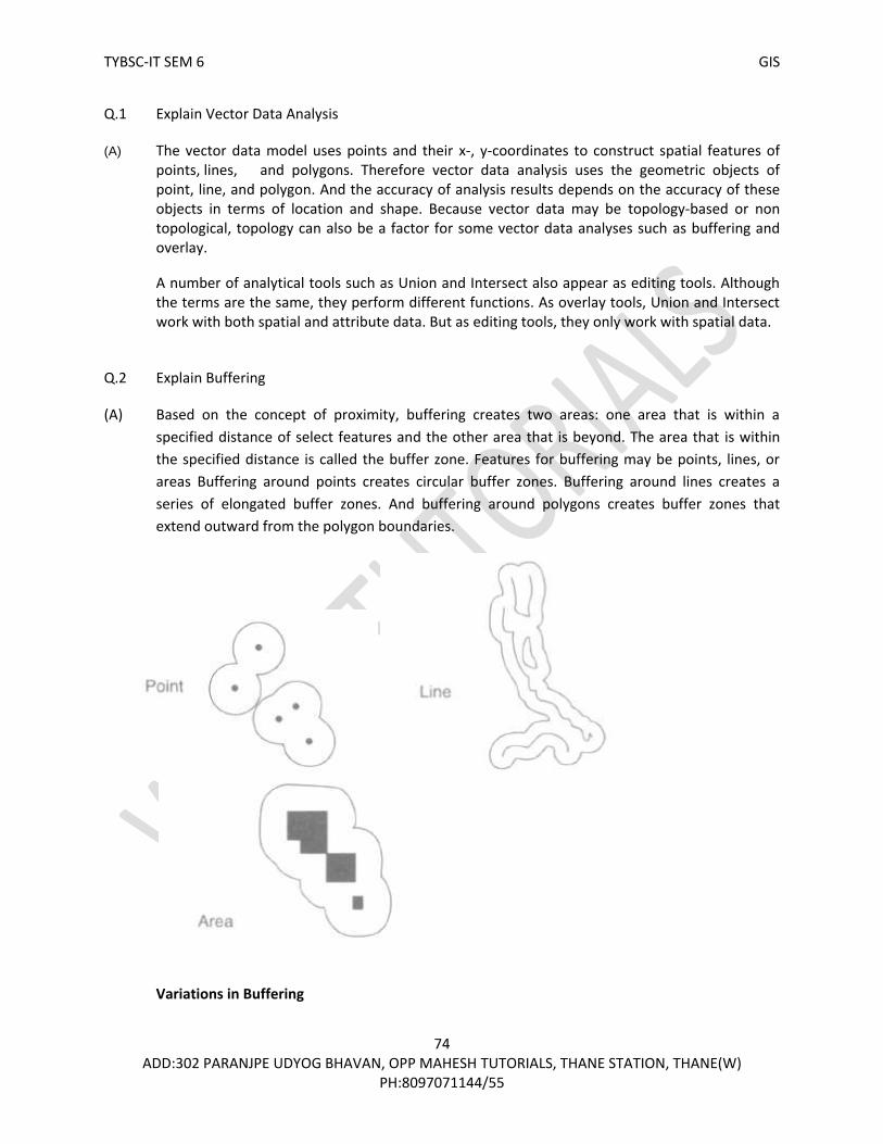
TYBSC-IT SEM 6 GIS
74 ADD:302 PARANJPE UDYOG BHAVAN, OPP MAHESH TUTORIALS, THANE STATION, THANE(W)
PH:8097071144/55
Q.1 Explain Vector Data Analysis
(A) The vector data model uses points and their x-, y-coordinates to construct spatial features of points, lines, and polygons. Therefore vector data analysis uses the geometric objects of point, line, and polygon. And the accuracy of analysis results depends on the accuracy of these objects in terms of location and shape. Because vector data may be topology-based or non topological, topology can also be a factor for some vector data analyses such as buffering and overlay.
A number of analytical tools such as Union and Intersect also appear as editing tools. Although the terms are the same, they perform different functions. As overlay tools, Union and Intersect work with both spatial and attribute data. But as editing tools, they only work with spatial data.
Q.2 Explain Buffering
(A) Based on the concept of proximity, buffering creates two areas: one area that is within a
specified distance of select features and the other area that is beyond. The area that is within
the specified distance is called the buffer zone. Features for buffering may be points, lines, or
areas Buffering around points creates circular buffer zones. Buffering around lines creates a
series of elongated buffer zones. And buffering around polygons creates buffer zones that
extend outward from the polygon boundaries.
Variations in Buffering

TYBSC-IT SEM 6 GIS
75 ADD:302 PARANJPE UDYOG BHAVAN, OPP MAHESH TUTORIALS, THANE STATION, THANE(W)
PH:8097071144/55
The buffer distance or buffer size does not have to be constant; it can vary according to the values of a given field (Figure 2). For example, the width of the riparian buffer can vary depending on its expected function and the intensity of adjacent land use.
Figure 2
Buffering with different buffer distances A feature may have more than one buffer zone. As an example, a nuclear power plant may be buffered with distances of 5, 10, 15, and 20 miles, thus forming multiple rings around the plant (Figure 3). These buffer zones, although spaced equally from the plant, are not equal in area. The second ring from the plant in fact covers an area about three times larger than the first ring. One must consider this area difference if the buffer zones are part of an evacuation plan.
Figure 3 Buffering with four rings.

TYBSC-IT SEM 6 GIS
76 ADD:302 PARANJPE UDYOG BHAVAN, OPP MAHESH TUTORIALS, THANE STATION, THANE(W)
PH:8097071144/55
Q.3 Applications of Buffering (A) Buffering creates a buffer zone data set, which sets the buffering operation apart from the use of proximity measures for spatial data query Spatial data query using the proximity relationship can select spatial features that are located within a certain distance of other features but cannot create a buffer zone data set.
A buffer zone is often treated as a protection zone and is used for planning or regulatory purposes:
A city ordinance may stipulate that no liquor stores or pornographic shops shall be within 1000 feet of a school or a church.
Government regulations may set 2-mile buffer zones along streams to minimize sedimentation from logging operations.
A national forest may restrict oil and gas well drilling within 500 feet of roads or highways.
Q.4 Explain what is Overlay and its types (A) An overlay operation combines the geometries and attributes of two feature layers to create the output. The geometry of the output represents the geometric intersection of features from the input layers.
Figure 4 illustrates an overlay operation with two polygon layers. Each feature on the output contains a combination of attributes from the input layers, and this combination differs from its neighbors.
There are two groups of overlay operations. The first group uses two polygon layers as inputs. The second group uses one polygon layer and another layer, which may contain points or lines. Overlay operations can therefore be classified by feature type into point-in-polygon, line-in-polygon, and polygon-on-polygon.
Figure 4
Overlay combines the geometries and attributes from two layers into a single layer. The dashed lines are for illustration only and are not included in the output.

TYBSC-IT SEM 6 GIS
77 ADD:302 PARANJPE UDYOG BHAVAN, OPP MAHESH TUTORIALS, THANE STATION, THANE(W)
PH:8097071144/55
To distinguish the layers in the following discussion, the layer that may be a point, line, or polygon layer is called the input layer, and the layer that is a polygon layer is called the overlay layer. In a point-in-polygon overlay operation, the same point features in the input layer are included in the output but each point is assigned with attributes of the polygon within which it falls (Figure 5). For example, a point-in-polygon overlay can find the association between wildlife locations and vegetation types.
In a line-in-polygon overlay operation, the output contains the same line features as in the input layer but each line feature is dissected by the polygon boundaries on the overlay layer (Figure 6). Thus the output has more line segments than does the input layer. Each line segment on the output combines attributes from the input layer and the underlying polygon. For example, a line-in-polygon overlay can find soil data for a proposed road. The input layer includes the proposed road. The overlay layer contains soil polygons. And the output shows a dissected proposed road, each road segment having a different set of soil data from its adjacent segments.
Figure 5
Point-in-polygon overlay. The input is a point layer. The output is also a point layer but has attribute data from the polygon layer.
Figure 6
Line-in-polygon overlay. The input is a line layer. The output is also a line layer. But the output differs from the input in two aspects: the line is broken into two segments, and the line segments have attribute data from the polygon layer.

TYBSC-IT SEM 6 GIS
78 ADD:302 PARANJPE UDYOG BHAVAN, OPP MAHESH TUTORIALS, THANE STATION, THANE(W)
PH:8097071144/55
The most common overlay operation is polygon-on-polygon, involving two polygon layers. The output combines the polygon boundaries from the input and overlay layers to create a new set of polygons (Figure 7). Each new polygon carries attributes from both layers, and these attributes differ from those of adjacent polygons. For example, a polygon-on-polygon overlay can analyze the association between elevation zones and vegetation types.
Q.5 Explain Overlay methods? (A) all overlay methods are based on the Boolean connectors AND, OR, and XOR. An overlay operation is called Intersect if it uses the AND connector.
An overlay operation is called Union if it uses the OR connector.
An overlay operation that uses the XOR connector is called Symmetrical Difference or Difference.
And an overlay operation is called Identity or Minus if it uses the following expression: [(input layer) AND (identity layer)] OR (input layer).
Union preserves all features from the inputs (Figure 8). The area extent of the output combines the area extents of both input layers. Union requires that both input layers be polygon layers.
Intersect preserves only those features that fall within the area extent common to the inputs (Figure 9). The input layers may contain different feature types, although in most cases, one of them (the input layer) is a point, line, or polygon layer and the other (the overlay layer) is a
Figure 7
Polygon-on-polygon overlay. In the illustration, the two layers for overlay have the same area extent. The output combines the geometries and attributes from the two layers into a single polygon layer.
Figure 8 The Union method keeps all areas of the two input layers in the output.

TYBSC-IT SEM 6 GIS
79 ADD:302 PARANJPE UDYOG BHAVAN, OPP MAHESH TUTORIALS, THANE STATION, THANE(W)
PH:8097071144/55
polygon layer. Intersect is often a preferred method of overlay because any feature on its output has attribute data from both of its inputs.
Symmetrical Difference preserves features that fall within the area extent that is common to only one of the inputs (Figure 12.11). In other words, Symmetrical Difference is opposite to Intersect in terms of the output’s area extent. Symmetrical Difference requires that both input layers be polygon layers.
Identity preserves only features that fall within the area extent of the layer defined as the input layer (Figure 12.12). The other layer is called the identity layer. The input layer may contain points, lines, or polygons, and the identity layer is a polygon layer.
Figure 9 The Intersect method preserves only the area common to the two input
layers in the output.
Figure 10 The Symmetrical Difference method preserves areas common to only one
of the input layers in the output.
Figure 11 The Identity method produces an
output that has the same extent as the input layer. But the output
includes the geometry and attribute data from the identity layer.

TYBSC-IT SEM 6 GIS
80 ADD:302 PARANJPE UDYOG BHAVAN, OPP MAHESH TUTORIALS, THANE STATION, THANE(W)
PH:8097071144/55
Q.6. What is Overlay of Shapefiles and what is its common error(silvers)
(A) Unlike the coverage model, both shapefile and geodatabase allow polygons to have multiple components, which may also overlap with one another. This means that overlay operations can actually be applied to a single feature layer: Union creates a new feature by combining different polygons, and Intersect creates a new feature from the area where polygons overlap. But when used with a single layer, Union and Intersect are basically editing tools for creating new features. Many shapefile users are aware of a problem with the overlay output: the area and perimeter values are not automatically updated.
Silvers A common error from overlaying polygon layers is slivers, very small polygons along correlated or shared boundary lines (e.g., the study area boundary) of the input layers (Figure 12). The existence of slivers often results from digitizing errors. Because of the high precision of manual digitizing or scanning, the shared boundaries on the input layers are rarely on top of one another. When the layers are overlaid, the digitized boundaries intersect to form slivers. Other causes of slivers include errors in the source map or errors in interpretation. Polygon boundaries on soil and vegetation maps are usually interpreted from field survey data, aerial photographs, and satellite images.
Most GIS packages incorporate some kind of tolerance in overlay operations to remove slivers. ArcGIS, for example, uses the cluster tolerance, which forces points and lines to be snapped together if they fall within the specified distance (Figure 13). The cluster tolerance is either defined by the user or based on a default value.
Figure 12 The top boundary has a series of slivers. These slivers are formed between the coastlines from the
input layers in overlay.

TYBSC-IT SEM 6 GIS
81 ADD:302 PARANJPE UDYOG BHAVAN, OPP MAHESH TUTORIALS, THANE STATION, THANE(W)
PH:8097071144/55
Slivers that remain on the output of an overlay operation are those beyond the cluster tolerance. Therefore, one option to reduce the sliver problem is to increase the cluster tolerance.
Q.7 Distance Measurement (A) Distance measurement refers to measuring straightline (euclidean) distances between features. Measurements can be made from points in a layer to points in another layer, or from each point in a layer to its nearest point or line in another layer.
In both cases, distance measures are stored in a field. A GIS package such as ArcGIS may include distance measurement as an analysis tool or as a join operation between two tables. Distance measures can be used directly for data analysis. Chang et al. (1995), for example, use distance measures to test whether deer relocation points are closer to old-growth/clear-cut edges than random points located within the deer’s relocation area. Fortney et al. (2000) use distance measures between home locations and medical providers to evaluate geographic access to health services. Distance measures can also be used as inputs to data analysis. The Gravity Model, a spatial interaction model commonly used in migration studies and business applications, uses distance measures between points as the input.
Q.8. Map Manipulation Tools are available in a GIS package for manipulating and managing maps in a database. Like buffering and overlay, these tools are considered basic GIS tools often needed for data preprocessing and data analysis. Map manipulation is easy to follow graphically, even though terms describing the various tools may differ between GIS packages.
Figure 13 A cluster tolerance can remove many slivers along the top boundary (A) but can also
snap lines that are not slivers (B).

TYBSC-IT SEM 6 GIS
82 ADD:302 PARANJPE UDYOG BHAVAN, OPP MAHESH TUTORIALS, THANE STATION, THANE(W)
PH:8097071144/55
Dissolve aggregates features that have the same attribute value or values (Figure 14). For example, we can aggregate roads by highway number or counties by state. An important application of Dissolve is to simplify a classified polygon layer. Classification groups values of a selected attribute into classes and makes obsolete boundaries of adjacent polygons, which have different values initially but are now grouped into the same class. Dissolve can remove these unnecessary boundaries and creates a new, simpler layer with the classification results as its attribute values. Another application is to aggregate both spatial and attribute data of the input layer. For instance, to dissolve a county layer, we can choose state name as the attribute to dissolve and county population to aggregate. The output is a state layer with an attribute showing the state population (i.e., the sum of county populations). Clip creates a new layer that includes only those features of the input layer that fall within the area extent of the clip layer (Figure 15). Clip is a useful tool, for example, for cutting a map acquired elsewhere to fit a study area. The input may be a point, line, or polygon layer, but the clip layer must be a polygon layer. Append creates a new layer by piecing together two or more layers (Figure 12.23). For example, Append can put together a layer from four input layers, each corresponding to the area extent of a USGS 7.5-minute quadrangle. The output can then be used as a single layer for data query or display. But the
Figure 14 Dissolve removes boundaries of polygons that have the same attribute value in (a) and creates a simplified layer (b).
Figure 15 Clip creates an output that contains only those features of the input layer that fall within the area extent of the clip layer.

TYBSC-IT SEM 6 GIS
83 ADD:302 PARANJPE UDYOG BHAVAN, OPP MAHESH TUTORIALS, THANE STATION, THANE(W)
PH:8097071144/55
boundaries separating the inputs still remain on the output and divide a feature into separate features if the feature crosses the boundary. Select creates a new layer that contains features selected from a user-defined query expression (Figure 17). For example, we can create a layer showing high-canopy closure by selecting stands that have 60 to 80 percent closure from a stand layer. Eliminate creates a new layer by removing features that meet a user-defined query expression (Figure 18). For example, Eliminate can implement the minimum mapping unit concept by removing polygons that are smaller than the defined unit in a layer. Update uses a “cut and paste” operation to replace the input layer with the update layer and its features (Figure 19). As the name suggests, Update is useful for updating an existing layer with new features in limited areas. It is a better option than redigitizing the entire map. Erase removes from the input layer those features that fall within the area extent of the erase layer (Figure 20). Suppose a suitability analysis stipulates that potential sites cannot be within 300 meters of any stream. A stream buffer layer can be used in this case as the erase layer to remove itself from further consideration.
Figure 16 Append pieces together two adjacent layers into a single layer but does not remove the shared boundary between the layers.
Figure 17 Select creates a new layer (b) with selected features from the input layer (a).

TYBSC-IT SEM 6 GIS
84 ADD:302 PARANJPE UDYOG BHAVAN, OPP MAHESH TUTORIALS, THANE STATION, THANE(W)
PH:8097071144/55
Split divides the input layer into two or more layers (Figure 21). A split layer, which shows area subunits, is used as the template for dividing the input layer. For example, a national forest can' split a stand layer by district so that each district office can have its own layer. In ArcGIS, Clip and Split are also editing tools. These editing tools work with features rather than layers. For example, the editing tool of Split splits a line at a specified location or a polygon along a line sketch. The tool does not work with layers. It is therefore important that we understand the function of a tool before using it.
Figure 18 Eliminate removes some small slivers along the top boundary (A).
Figure 19 Update replaces the input layer with the update layer and its features.
Figure 20 Erase removes features from the input layer that fall within the area extent of the erase layer.
Figure 21
Split uses the geometry of the split layer to divide the input layer into four separate layers.

TYBSC-IT SEM 6 GIS
85 ADD:302 PARANJPE UDYOG BHAVAN, OPP MAHESH TUTORIALS, THANE STATION, THANE(W)
PH:8097071144/55
Q.9 Explain Raster data analysis and data analysis environment
(A) The raster data model uses a regular grid to cover the space and the value in each grid cell to represent the characteristic of a spatial phenomenon at the cell location. This simple data structure of a raster with fixed cell locations not only is computationally efficient, but also facilitates a large variety of data analysis operations.
raster data analysis is based on cells and rasters. Raster data analysis can be performed at the level of individual cells, or groups of cells, or cells within an entire raster. Some raster data operations use a single raster; others use two or more rasters. Data Analysis Environment The analysis environment refers to the area for analysis and the output cell size. The area extent for analysis may correspond to a specific raster, or an area defined by its minimum and maximum x-,y-coordinates, or a combination of rasters. The union option uses an area extent that encompasses all input rasters, whereas the intersect option uses an area extent that is common to all input rasters. An analysis mask can also determine the area extent for analysis. An analysis mask limits analysis to cells that do not carry the cell value of “no data.” No data differs from zero. Zero is a valid cell value, whereas no data means the absence of data.
Q.10 explain Local Operations in raster data analysis. (A) Constituting the core of raster data analysis, local operations are cell-by-cell operations. A local
operation can create a new raster from either a single input raster or multiple input rasters. The
cell values of the new raster are computed by a function relating the input to the output or are
assigned by a classification table.
Local Operations with a Single Raster
Given a single raster as the input, a local operation computes each cell value in the output raster
as a mathematical function of the cell value in the input raster.
a large number of mathematical functions are available in a GIS package.(Figure 22)
Converting a floating-point raster to an integer raster, for example, is a simple local operation that uses the integer function to truncate the cell value at the decimal point on a cell-by-cell basis. Converting a slope raster measured in percent to one measured in degrees is also a local operation but requires a more complex mathematical expression. In Figure 23, the expression [slope_d] = 57.296 X arctan ([slope_p]/100) can convert slope_p measured in percent to slope_d measured in degrees. Because computer packages typically use radian instead of degree in trigonometric functions, the constant 57.296 (360/2π, π = 3.1416) changes the angular measure to degrees.
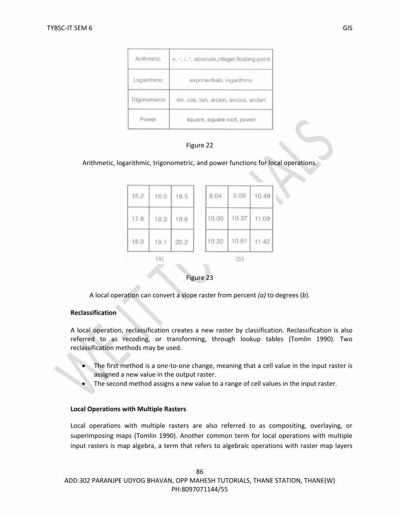
TYBSC-IT SEM 6 GIS
86 ADD:302 PARANJPE UDYOG BHAVAN, OPP MAHESH TUTORIALS, THANE STATION, THANE(W)
PH:8097071144/55
Figure 22
Arithmetic, logarithmic, trigonometric, and power functions for local operations.
Figure 23
A local operation can convert a slope raster from percent (a) to degrees (b).
Reclassification A local operation, reclassification creates a new raster by classification. Reclassification is also referred to as recoding, or transforming, through lookup tables (Tomlin 1990). Two reclassification methods may be used.
The first method is a one-to-one change, meaning that a cell value in the input raster is assigned a new value in the output raster.
The second method assigns a new value to a range of cell values in the input raster.
Local Operations with Multiple Rasters
Local operations with multiple rasters are also referred to as compositing, overlaying, or
superimposing maps (Tomlin 1990). Another common term for local operations with multiple
input rasters is map algebra, a term that refers to algebraic operations with raster map layers

TYBSC-IT SEM 6 GIS
87 ADD:302 PARANJPE UDYOG BHAVAN, OPP MAHESH TUTORIALS, THANE STATION, THANE(W)
PH:8097071144/55
(Tomlin 1990; Pullar 2001). Because local operations can work with multiple rasters, they are
the equivalent of vector-based overlay operations.
A greater variety of local operations have multiple input rasters than have a single input raster.
Besides mathematical functions that can be used on individual rasters, other measures that are
based on the cell values or their frequencies in the input rasters can also be derived and stored
on the output raster. Some of these measures are, however, limited to rasters with numeric
data.
Summary statistics, including maximum, minimum, range, sum, mean, median, and standard
deviation, are measures that apply to rasters with numeric data. Figure 24, for example, shows
a local operation that calculates the mean from three input rasters. If a cell contains no data in
one of the input rasters, the cell also carries no data in the output raster by default.
Other measures that are suitable for rasters with numeric or categorical data are statistics such
as majority, minority, and number of unique values. For each cell, a majority output raster
tabulates the most frequent cell value among the input rasters, a minority raster tabulates the
least frequent cell value, and a variety raster tabulates the number of different cell values.
Figure 25, for example, shows the output with the majority statistics from three input rasters.
Figure 24 The cell value in (d) is the mean calculated from three input rasters (a. b, and c) in a local operation. The shaded cells have no data.
Figure 25 The cell value in (d) is the majority statistic derived from three input rasters (a, b, and c) in a local operation. The shaded cells have no data.

TYBSC-IT SEM 6 GIS
88 ADD:302 PARANJPE UDYOG BHAVAN, OPP MAHESH TUTORIALS, THANE STATION, THANE(W)
PH:8097071144/55
Q.11 explain neighborhood operation and its applications?
(A) A neighborhood operation involves a focal cell and a set of its surrounding cells. The
surrounding cells are chosen for their distance and/or directional relationship to the focal cell.
Common neighborhoods include rectangles, circles, annuluses, and wedges (Figure 26). A
rectangle is defined by its width and height in cells, such as a 3-by-3 area centered at the focal
cell. A circle extends from the focal cell with a specified radius. An annulus or doughnut-shaped
neighborhood consists of the ring area between a smaller circle and a larger circle centered at
the focal cell. And a wedge consists of a piece of a circle centered at the
focal cell. As shown in Figure 26, some cells are only partially covered in the defined
neighborhood. The general rule is to include a cell if the center of the cell falls within the
neighborhood.
An important application of neighborhood operations is data simplification The moving average method, for instance, reduces the level of cell value fluctuation in the input raster (Figure 27). Edge enhancement, for example, can use a range filter, essentially a neighborhood operation using the range statistic (Figure 28). The range measures the difference between the maximum and minimum cell values within the defined neighborhood. The opposite of edge enhancement is a smoothing operation that is based on the (Figure 29). The majority operation assigns the most frequent cell value within the neighborhood to the focal cell, thus creating a smoother raster than the original raster.
Figure 26
Four common neighborhood types: rectangle (a), circle(,b), annulus (c), and wedge (d). The cell marked with an x is the focal cell.

TYBSC-IT SEM 6 GIS
89 ADD:302 PARANJPE UDYOG BHAVAN, OPP MAHESH TUTORIALS, THANE STATION, THANE(W)
PH:8097071144/55
Figure 27 The cell values in (b) are the neighborhood means of the shaded cells in (a) using a 3-by-3 neighborhood. For example, 1.56 in the output raster is calculated from ( 1 + 2 + 2 + 1 + 2 + 2 + 1 + 2 + 1)/9.
Figure 28 The cell values in (b) are the neighborhood range statistics of the shaded cells in (a) using a 3-by-3 neighborhood. For example, the upper-left cell in the output raster has a cell value of 100, which is calculated from (200 — 100).
Figure 29 The cell values in (b) are the neighborhood majority statistics of the shaded cells in (a) using a 3-by-3 neighborhood. For example, the upper-left cell in the output raster has a cell value of 2 because there are five 2s and four 1s in its neighborhood.

TYBSC-IT SEM 6 GIS
90 ADD:302 PARANJPE UDYOG BHAVAN, OPP MAHESH TUTORIALS, THANE STATION, THANE(W)
PH:8097071144/55
Q.12 explain zonal operations and zonal statistics? (A) A zonal operation works with groups of cells of same values or like features. These groups are called zones. Zones may be contiguous or noncontiguous. A contiguous zone includes cells that are spatially connected, whereas a noncontiguous zone includes separate regions of cells.
Zonal Statistics A zonal operation may work with a single raster or two rasters. Given a single input raster, zonal operations measure the geometry of each zone in the raster, such as area, perimeter, thickness, and centroid (Figure 30). The area is the sum of the cells that fall within the zone times the cell size. The perimeter of a contiguous zone is the length of its boundary, and the perimeter of a noncontiguous zone is the sum of the length of each region. The thickness calculates the radius (in cells) of the largest circle that can be drawn within each zone. And the centroid is the geometric center of a zone located at the intersection of the major axis and the minor axis of an ellipse that best approximates the zone.
Q.13 Explain physical distance measures operations The physical distance measures the straight-line or euclidean distance, whereas the cost distance measures the cost for traversing the physical distance. Physical distance measure operations calculate straight-line distances away from cells designated as the source cells. For example, to get the distance between cells (1 ,1 ) and (3, 3) in Figure 31, we can use the following formula:
or cell size X 2.828. If the cell size were 30 meters, the distance would be 84.84 meters.
Figure 30 Thickness and centroid for two large watersheds (zones). Area is measured in square kilometers, and perimeter and thickness are measured in kilometers. The centroid of each zone is marked with an x.

TYBSC-IT SEM 6 GIS
91 ADD:302 PARANJPE UDYOG BHAVAN, OPP MAHESH TUTORIALS, THANE STATION, THANE(W)
PH:8097071144/55
Figure 31 A straight-line distance is measured from a cell center to another cell center. This illustration shows the straight-line distance between cell (1,1) and cell (3,3).

TYBSC-IT SEM 6 GIS
92 ADD:302 PARANJPE UDYOG BHAVAN, OPP MAHESH TUTORIALS, THANE STATION, THANE(W)
PH:8097071144/55

TYBSC-IT SEM 6 GIS
93 ADD:302 PARANJPE UDYOG BHAVAN, OPP MAHESH TUTORIALS, THANE STATION, THANE(W)
PH:8097071144/55
Q.1 What is interpolation
(A)
• Process of creating a surface based on values at isolated sample points.
• Sample points are locations where we collect data on some phenomenon and record the spatial
coordinates
• We use mathematical estimation to “guess at” what the values are “in between” those points
• We can create either a raster or vector interpolated surface
• Interpolation is used because field data are expensive to collect, and can’t be collected
everywhere
Q.2 Elements of Spatial Interpolation
(A) Control Points.
• Control Points are points with known values. • Also called known points , sample points , or observations, control points provide the data
necessary for the development of interpolator (e.g.. Mathematical equation) for spatial interpolation.
• The number and distribution of control points can greatly influence the accuracy of spatial interpolation.
Type of Spatial Interpolation. Spatial Interpolation can be grouped into :-
1. Global Interpolation:- It uses every known point available to estimate an unknown value.
2. Local Interpolation:- It uses a sample of known points to estimate an unknown value.
Similarly Spatial Interpolation can be grouped into Exact and Inexact interpolation, Stochastic and Deterministic interpolation

TYBSC-IT SEM 6 GIS
94 ADD:302 PARANJPE UDYOG BHAVAN, OPP MAHESH TUTORIALS, THANE STATION, THANE(W)
PH:8097071144/55
• Global vs. Local o A global interpolation method uses every known point available to estimate an
unknown value. o A local interpolation method, on the other hand, uses a sample of known points to
estimate an unknown value.
Three search methods for sample points: (a) find the closest points to the point to be estimated, (b) find
points within a radius, and (c) find points within each of the four quadrants.
• Exact vs. Inexact
o Exact interpolation predicts a value at the point location that is the same as its known
value. In other words, exact interpolation generates a surface that passes through the
control points. In contrast,
o inexact interpolation or approximate interpolation predicts a value at the point location
that differs from its known value.
• Deterministic vs. Stochastic
o A deterministic interpolation method provides no assessment of errors with predicted
values.
o A stochastic interpolation method, on the other hand, offers assessment of prediction errors
with estimated variances.
Q.3 Explain Global methods, local methods, Kriging?
(A)

TYBSC-IT SEM 6 GIS
95 ADD:302 PARANJPE UDYOG BHAVAN, OPP MAHESH TUTORIALS, THANE STATION, THANE(W)
PH:8097071144/55
Global Methods
o Trend Surface Models :- An inexact method , trend surface analysis approximates points with known values with a polynomial equation. The equation or the interpolator can then be used to estimate values at other points.
where the attribute value z is a function of x and y coordinates. The b coefficients are estimated from the known points.
o Regression Models :- A regression model relates a dependent variables in a linear equation (an
interpolator), which can then be used for predictions or estimation.
Local Methods
o Thiessen Polygons:-It assumes that any point within a polygon is closer to the polygon’s known
point than any other known points.
o Density Estimation:-Density estimation measures cell densities in a raster by using a sample of
known points. There are simple and kernel density estimation methods.

TYBSC-IT SEM 6 GIS
96 ADD:302 PARANJPE UDYOG BHAVAN, OPP MAHESH TUTORIALS, THANE STATION, THANE(W)
PH:8097071144/55
o Inverse Distance Weighted Interpolation :- Inverse distance weighted (IDW) interpolation is an
exact method that enforces the condition that the estimated value of a point is influenced more by nearby known points than by those farther away. The general equation for the IDW method is Inverse distance weighted (IDW) interpolation is an exact method that enforces the condition that the estimated value of a point is influenced more by nearby known points than by those farther away. The general equation for the IDW method is points used in estimation, and k is the specified power.

TYBSC-IT SEM 6 GIS
97 ADD:302 PARANJPE UDYOG BHAVAN, OPP MAHESH TUTORIALS, THANE STATION, THANE(W)
PH:8097071144/55
o Thin-Plate Splines : Splines for spatial interpolation are conceptually similar to splines for line smoothing except that in spatial interpolation they apply to surfaces rather than lines. Thin-plate splines create a surface that passes through the control points and has the least possible change in slope at all points (Franke 1982). In other words, thin-plate splines fit the control points with a minimum curvature surface.
o Kringing:Kringing is a geostatistical method for spatial interpolation. Kringing differs from the interpolation methods discussed so far because kringing can assess the quality of prediction with estimated prediction errors.
ThinPlateSplines:-Thin Plate Splines create a surface that passes through the control points and has the least possible changes in slope at all the points.