type compendium
DESCRIPTION
TypeTRANSCRIPT
Cover Sheet
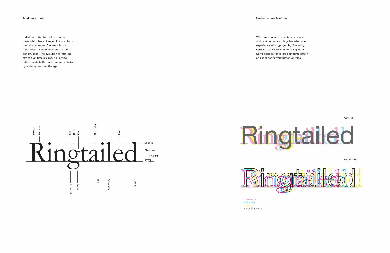
Individual letter forms have unique
parts which have changed in visual form
over the centuries. A nomenclature
helps identify major elements of their
construction. The evolution of lettering
styles over time is a result of optical
adjustments to the basic components by
type designers over the ages.
Anatomy of Type
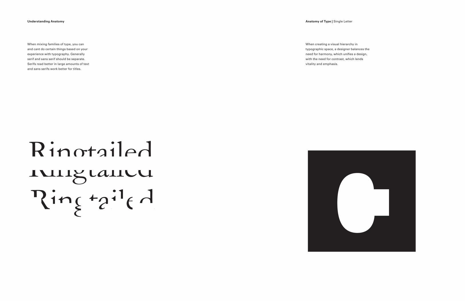
When mixing families of type, you can
and cant do certain things based on your
experience with typography. Generally
serif and sans serif should be separate.
Serifs read better in large amounts of text
and sans serifs work better for titles.
Understanding Anatomy
Ringtailed
Ear
Loo
p
Ascen
der
Tail
Co
un
ter
Descen
der
Sh
ou
lder
Eye
Bo
wl
Lin
k
Str
oke
Sh
ou
lder
Capline
Meanline
Baseline
x-height
Ringtailed Ring-Ringtailed Ringtailed With Fill
Without Fill
Garamond BaskervilleUniversHelvetica Neue
When mixing families of type, you can
and cant do certain things based on your
experience with typography. Generally
serif and sans serif should be separate.
Serifs read better in large amounts of text
and sans serifs work better for titles.
Understanding Anatomy Anatomy of Type | Single Letter
RingtailedRingtailedRingtailed
When creating a visual hierarchy in
typographic space, a designer balances the
need for harmony, which unifies a design,
with the need for contrast, which lends
vitality and emphasis.
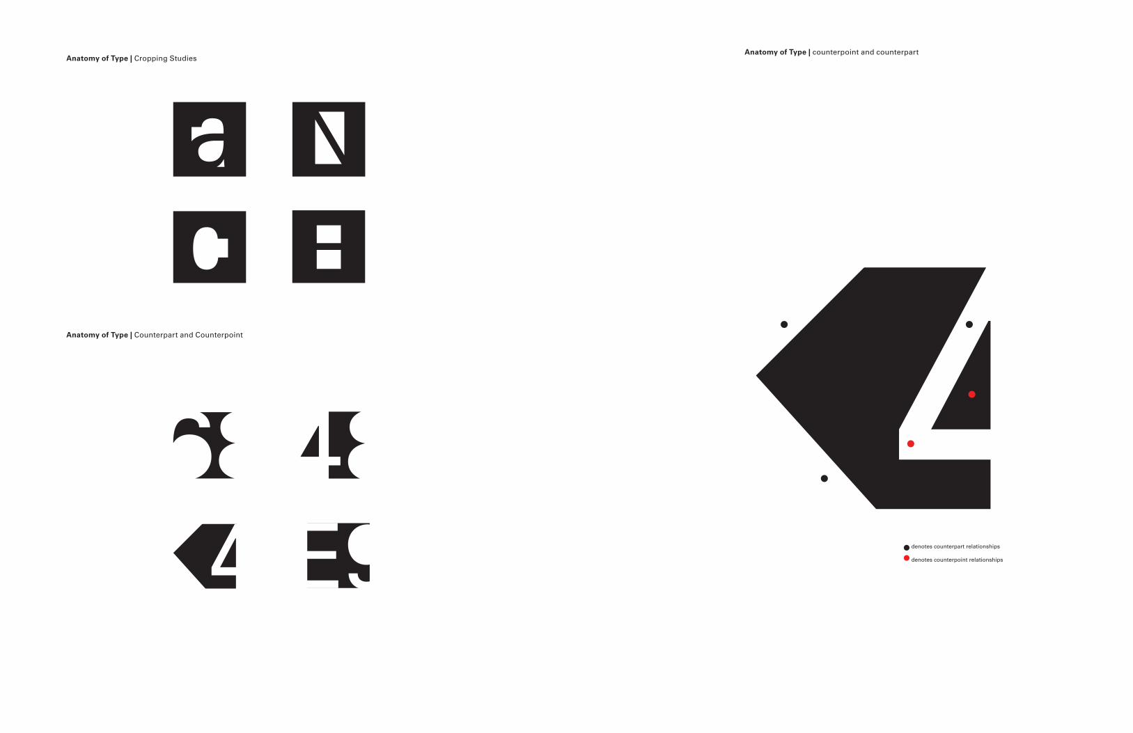
Anatomy of Type | counterpoint and counterpartAnatomy of Type | Cropping Studies
Anatomy of Type | Counterpart and Counterpoint
denotes counterpart relationships
denotes counterpoint relationships
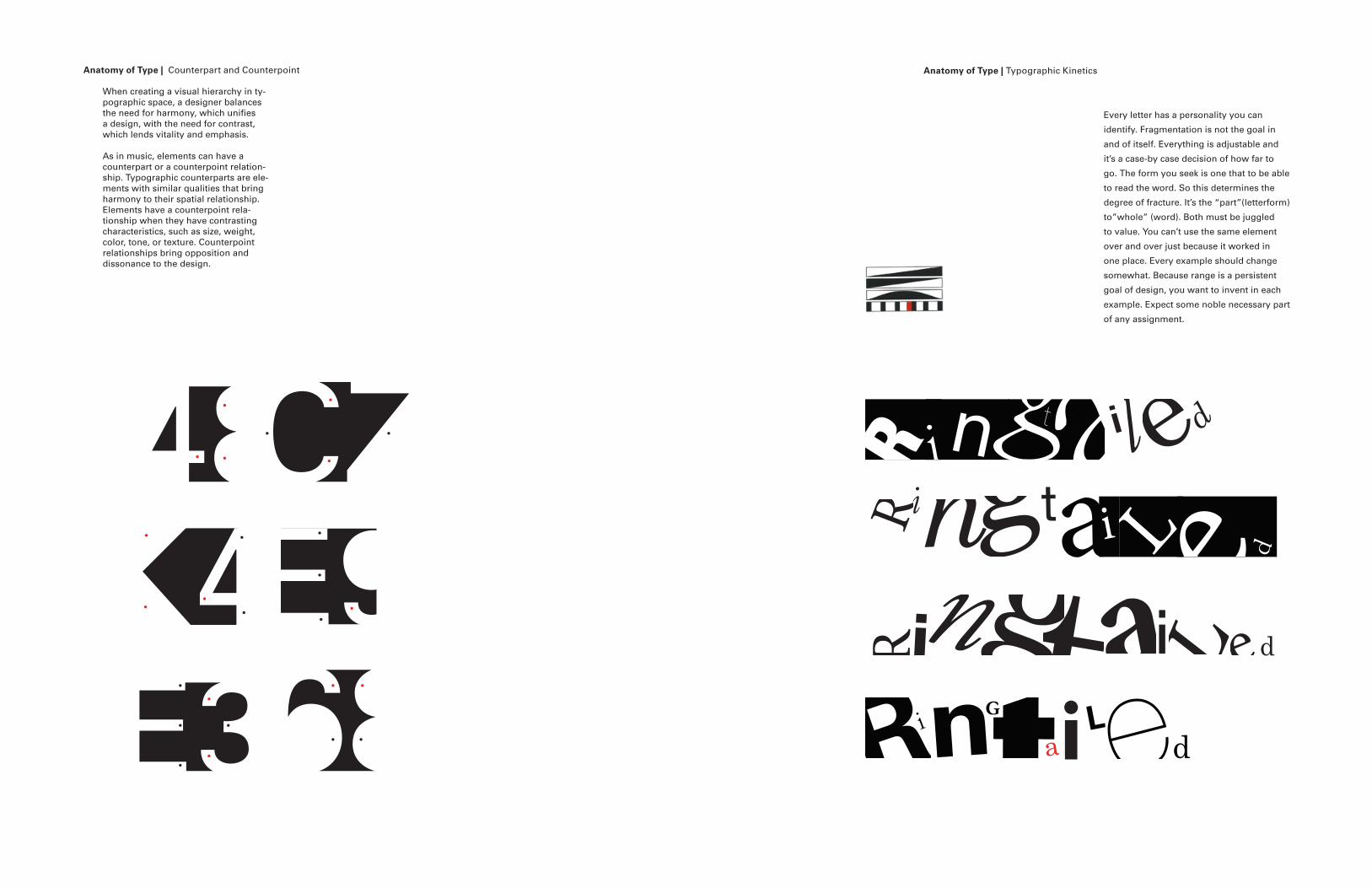
When creating a visual hierarchy in ty-pographic space, a designer balances the need for harmony, which unifies a design, with the need for contrast, which lends vitality and emphasis.
As in music, elements can have a counterpart or a counterpoint relation-ship. Typographic counterparts are ele-ments with similar qualities that bring harmony to their spatial relationship. Elements have a counterpoint rela-tionship when they have contrasting characteristics, such as size, weight, color, tone, or texture. Counterpoint relationships bring opposition and dissonance to the design.
Every letter has a personality you can
identify. Fragmentation is not the goal in
and of itself. Everything is adjustable and
it’s a case-by case decision of how far to
go. The form you seek is one that to be able
to read the word. So this determines the
degree of fracture. It’s the “part”(letterform)
to”whole” (word). Both must be juggled
to value. You can’t use the same element
over and over just because it worked in
one place. Every example should change
somewhat. Because range is a persistent
goal of design, you want to invent in each
example. Expect some noble necessary part
of any assignment.
R igt ai l ed
Ringt i L e d
Ring at i Led
Ri taLed
na
nG i
Anatomy of Type | Typographic Kinetics Anatomy of Type | Counterpart and Counterpoint
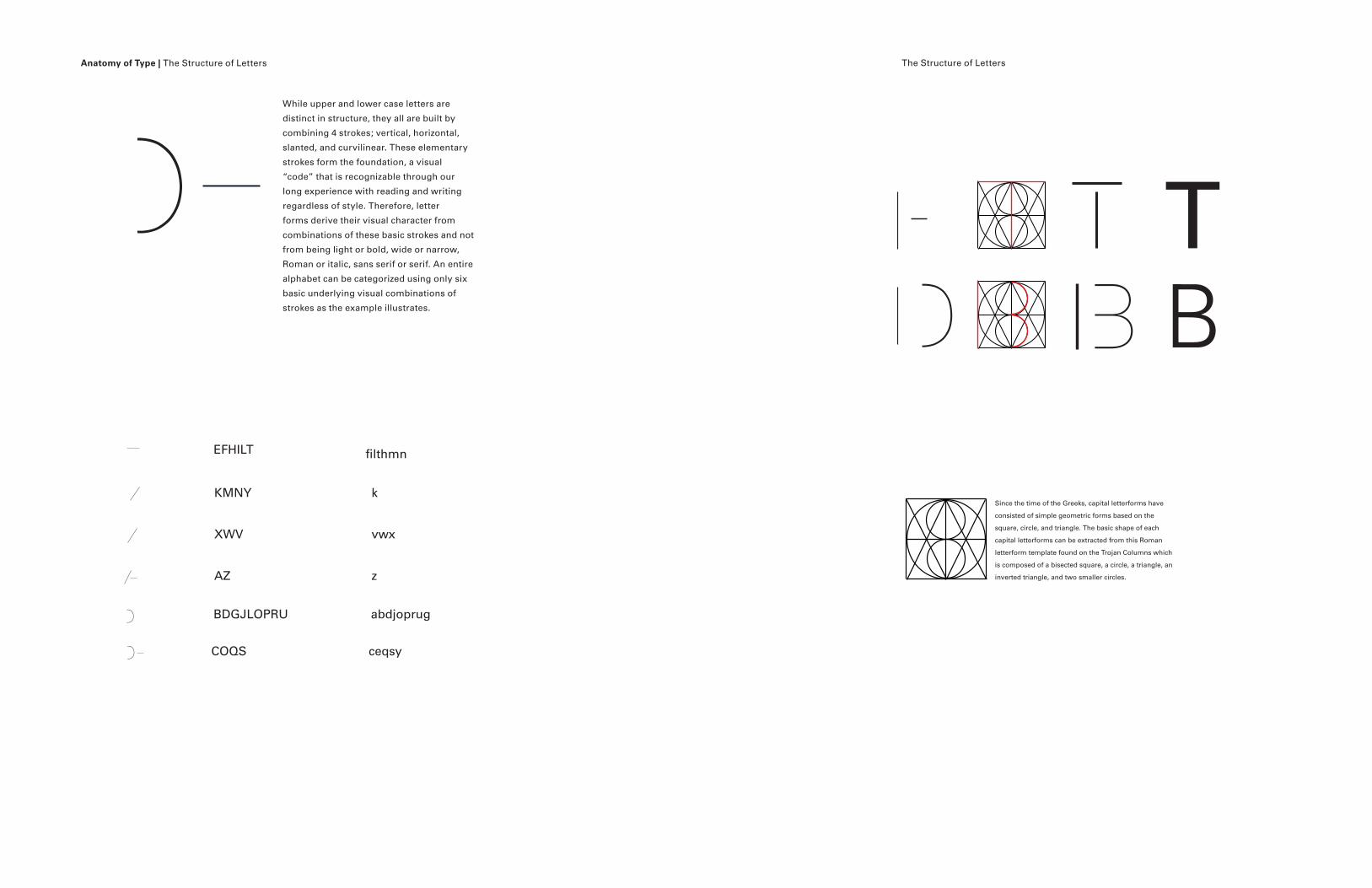
While upper and lower case letters are
distinct in structure, they all are built by
combining 4 strokes; vertical, horizontal,
slanted, and curvilinear. These elementary
strokes form the foundation, a visual
“code” that is recognizable through our
long experience with reading and writing
regardless of style. Therefore, letter
forms derive their visual character from
combinations of these basic strokes and not
from being light or bold, wide or narrow,
Roman or italic, sans serif or serif. An entire
alphabet can be categorized using only six
basic underlying visual combinations of
strokes as the example illustrates.
Anatomy of Type | The Structure of Letters The Structure of Letters
XWV
EFHILT
AZ
KMNY
BDGJLOPRU
COQS
filthmn
k
vwx
z
abdjoprug
ceqsy
C
C
C TD B B
Since the time of the Greeks, capital letterforms have
consisted of simple geometric forms based on the
square, circle, and triangle. The basic shape of each
capital letterforms can be extracted from this Roman
letterform template found on the Trojan Columns which
is composed of a bisected square, a circle, a triangle, an
inverted triangle, and two smaller circles.
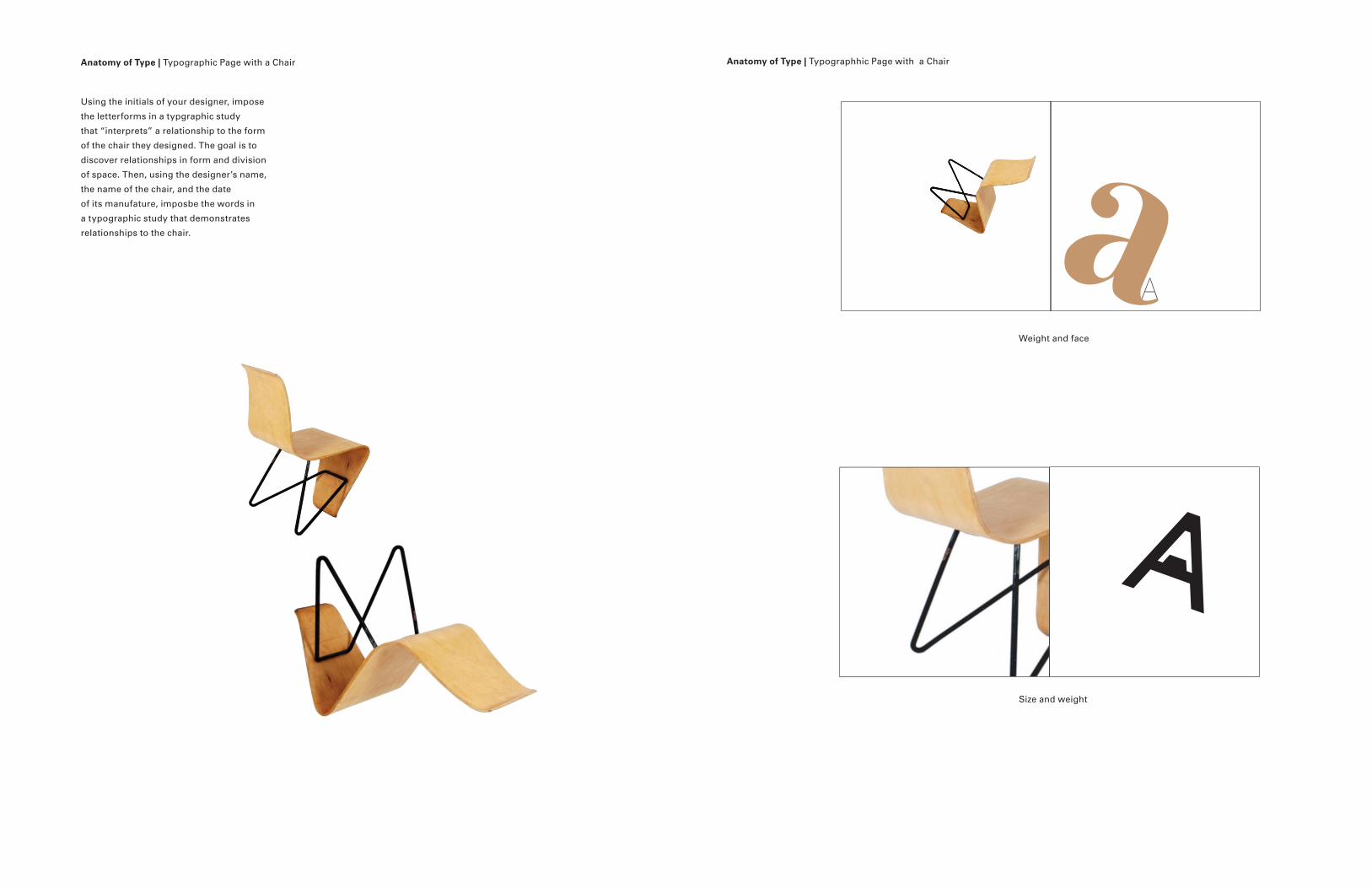
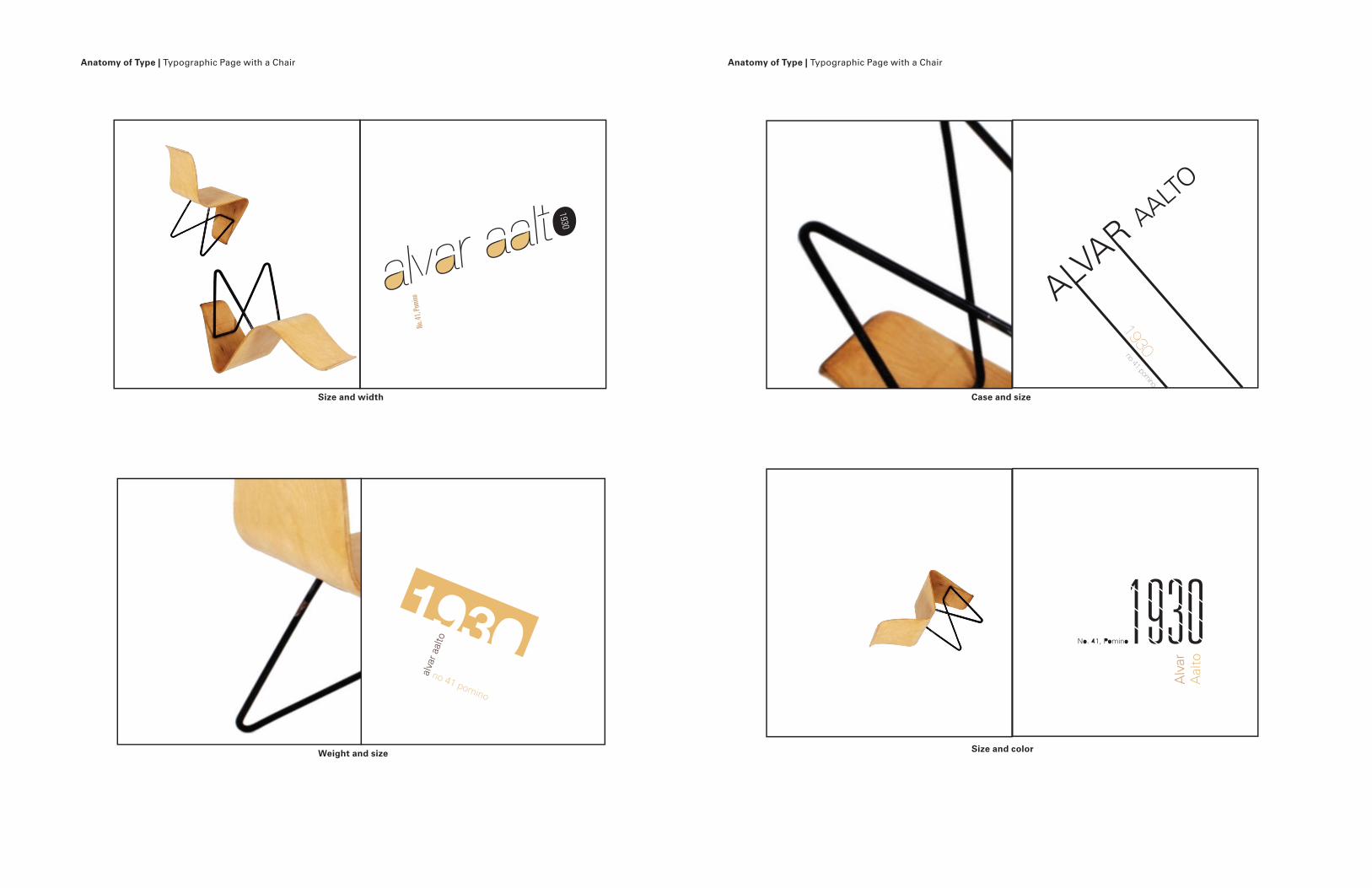
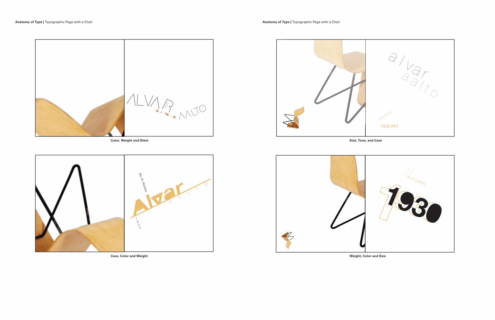
Using the initials of your designer, impose
the letterforms in a typgraphic study
that “interprets” a relationship to the form
of the chair they designed. The goal is to
discover relationships in form and division
of space. Then, using the designer’s name,
the name of the chair, and the date
of its manufature, imposbe the words in
a typographic study that demonstrates
relationships to the chair.
Anatomy of Type | Typographic Page with a Chair Anatomy of Type | Typographhic Page with a Chair
Weight and face
Size and weight
a
Anatomy of Type | Typographic Page with a Chair Anatomy of Type | Typographic Page with a Chair
Weight and face Size, weight and face
Size and case Size and weight
a
Anatomy of Type | Typographic Page with a Chair Anatomy of Type | Typographic Page with a Chair
No. 4
1, Po
mino
Size and width Case and size
Size and colorWeight and size
Anatomy of Type | Typographic Page with a Chair Anatomy of Type | Typographic Page with a Chair
Color, Weight and Slant
Case, Color and Weight
Size, Tone, and Case
Weight, Color and Size
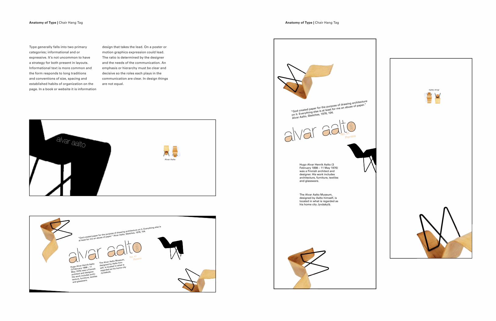
No. 41 Pomino
“God created paper for the purpose of drawing architecture
on it. Everything else is at least for me an abuse of paper.”
Alvar Aalto, Sketches, 1978, 104.
The Alvar Aalto Museum, designed by Aalto himself, is located in what is regarded as his home city Jyväskylä.
Hugo Alvar Henrik Aalto (3 February 1898 – 11 May 1976) was a Finnish architect and designer. His work includes architecture, furniture, textiles and glassware.
Alvar Aalto
Type generally falls into two primary
categories; informational and or
expressive. It’s not uncommon to have
a strategy for both present in layouts.
Informational text is more common and
the form responds to long traditions
and conventions of size, spacing and
established habits of organization on the
page. In a book or website it is information
design that takes the lead. On a poster or
motion graphics expression could lead.
The ratio is determined by the designer
and the needs of the communication. An
emphasis or hierarchy must be clear and
decisive so the roles each plays in the
communication are clear. In design things
are not equal.
Anatomy of Type | Chair Hang Tag Anatomy of Type | Chair Hang Tag
The Alvar Aalto Museum,
designed by Aalto him-
self, is located in what is
regarded as his home city
Jyväskylä.
Hugo Alvar Henrik Aalto
(3 February 1898 – 11
May 1976) was a Finnish
architect and designer.
His work includes archi-
tecture, furniture, textiles
and glassware.
No. 41 Pomino
“God created paper for the purpose of drawing architecture on it. Everything else is
at least for me an abuse of paper.” Alvar Aalto, Sketches, 1978, 104.
Alvar Aalto