understanding statistical process control (spc) charts different types of spc charts and when to use...
TRANSCRIPT
1
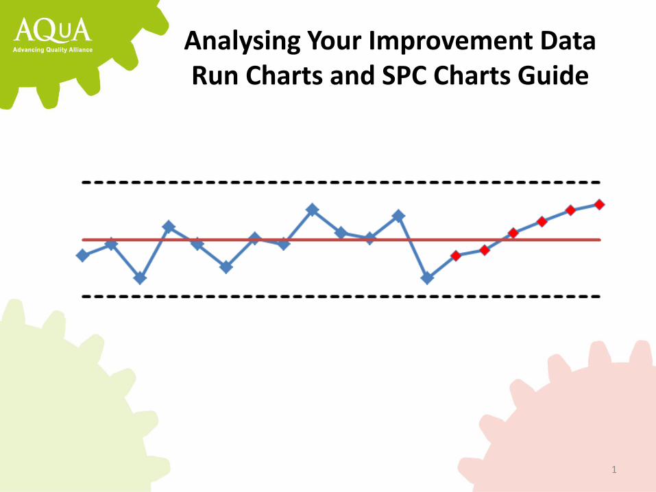
Analysing Your Improvement Data Run Charts and SPC Charts Guide
2
Data over time and variation
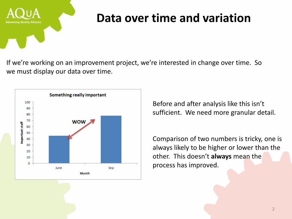
If we’re working on an improvement project, we’re interested in change over time. So we must display our data over time.
Before and after analysis like this isn’t sufficient. We need more granular detail. Comparison of two numbers is tricky, one is always likely to be higher or lower than the other. This doesn’t always mean the process has improved.
3
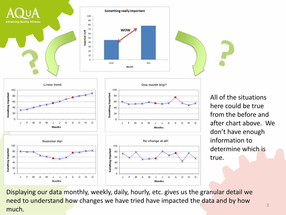
All of the situations here could be true from the before and after chart above. We don’t have enough information to determine which is true.
Displaying our data monthly, weekly, daily, hourly, etc. gives us the granular detail we need to understand how changes we have tried have impacted the data and by how much.
4
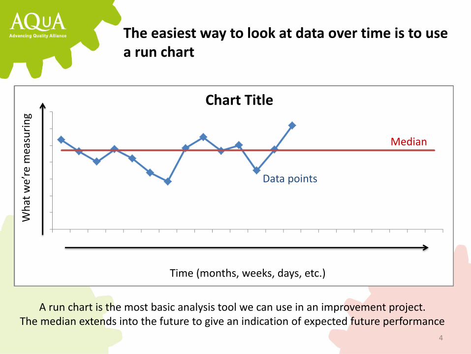
The easiest way to look at data over time is to use a run chart
Chart Title
Time (months, weeks, days, etc.)
Wh
at w
e’re
mea
suri
ng
Median
Data points
A run chart is the most basic analysis tool we can use in an improvement project. The median extends into the future to give an indication of expected future performance
5
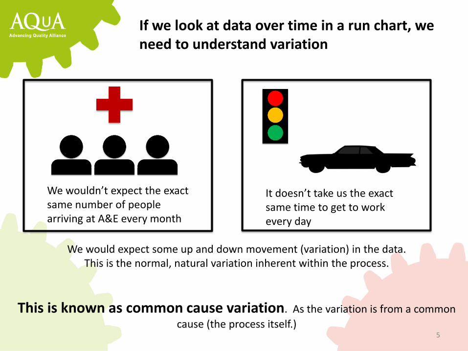
If we look at data over time in a run chart, we need to understand variation
We wouldn’t expect the exact same number of people arriving at A&E every month
It doesn’t take us the exact same time to get to work every day
We would expect some up and down movement (variation) in the data. This is the normal, natural variation inherent within the process.
This is known as common cause variation. As the variation is from a common
cause (the process itself.)
6
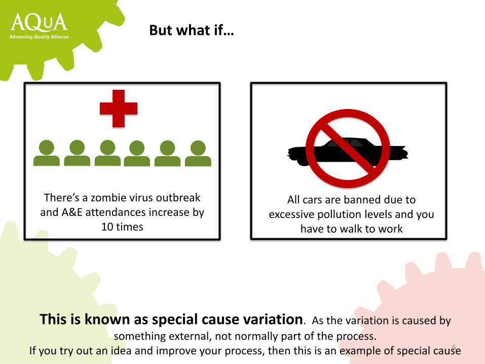
But what if…
There’s a zombie virus outbreak and A&E attendances increase by
10 times
All cars are banned due to excessive pollution levels and you
have to walk to work
This is known as special cause variation. As the variation is caused by
something external, not normally part of the process. If you try out an idea and improve your process, then this is an example of special cause

7
Understanding the difference between these types of variation is vital.
Common cause Special cause
Natural, normal, inherent up and down movement
Present in all processes over time May be quite high, may be quite low
An external influence Not normally present
Could be a ‘one off’ or a process change
Try it out! Write your signature out 5 times. The results will be similar, but have slight variations, even though the process of writing has remained the same (common cause). Now try a signature with your weaker hand. The process has been changed (special cause)
Common cause Special cause

8
How can we distinguish between common cause and special cause variation in our run charts?
It’s a matter of chance! There are patterns we can look for in our data that are extremely unlikely to occur by chance alone (common cause). It’s much more likely that these patterns occur due to something external affecting the process
For Example
• Imagine flipping a coin • The odds of it coming up heads are 50% • Flip the coin again. The odds of 2 heads in a row is 25% • Flip it again. The odds of 3 heads in a row is 12.5% • By the time you get 6 heads in a row the chance is around 1.6% • This is quite unlikely unless we tampered with the coin in some way
9
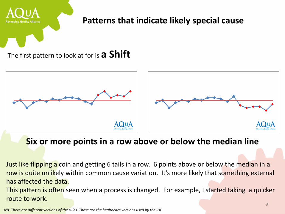
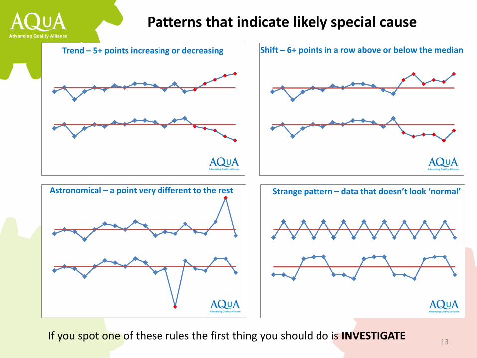
Patterns that indicate likely special cause
The first pattern to look at for is a Shift
Six or more points in a row above or below the median line
Just like flipping a coin and getting 6 tails in a row. 6 points above or below the median in a row is quite unlikely within common cause variation. It’s more likely that something external has affected the data. This pattern is often seen when a process is changed. For example, I started taking a quicker route to work.
NB. There are different versions of the rules. These are the healthcare versions used by the IHI
10
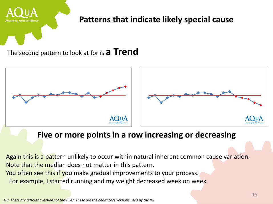
Patterns that indicate likely special cause
The second pattern to look at for is a Trend
Five or more points in a row increasing or decreasing
Again this is a pattern unlikely to occur within natural inherent common cause variation. Note that the median does not matter in this pattern. You often see this if you make gradual improvements to your process. For example, I started running and my weight decreased week on week.
NB. There are different versions of the rules. These are the healthcare versions used by the IHI
11
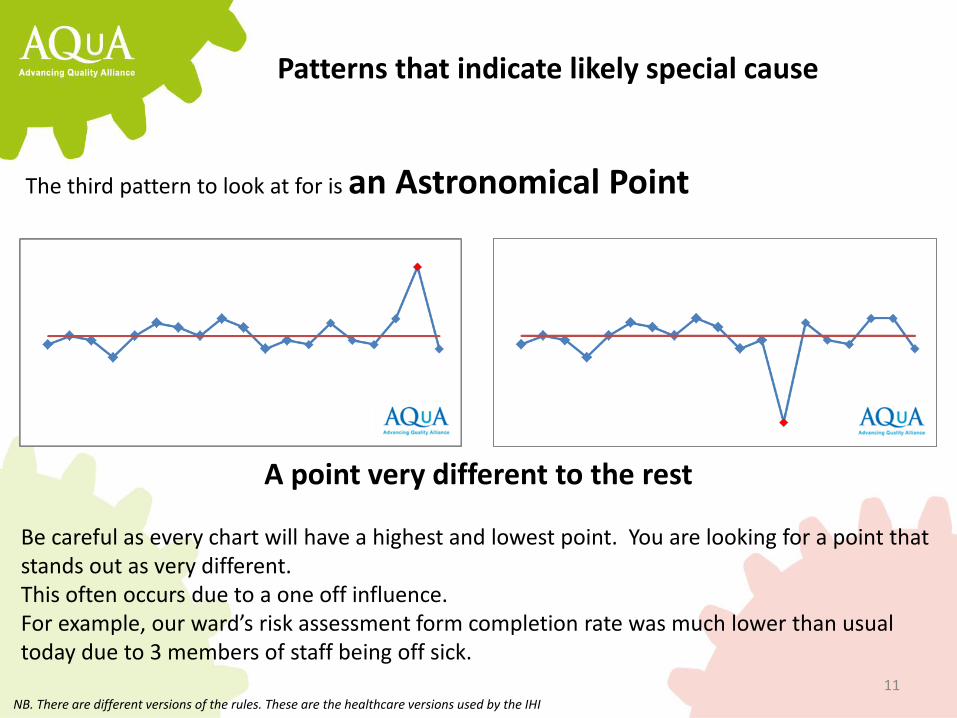
Patterns that indicate likely special cause
The third pattern to look at for is an Astronomical Point
A point very different to the rest
Be careful as every chart will have a highest and lowest point. You are looking for a point that stands out as very different. This often occurs due to a one off influence. For example, our ward’s risk assessment form completion rate was much lower than usual today due to 3 members of staff being off sick.
NB. There are different versions of the rules. These are the healthcare versions used by the IHI
12
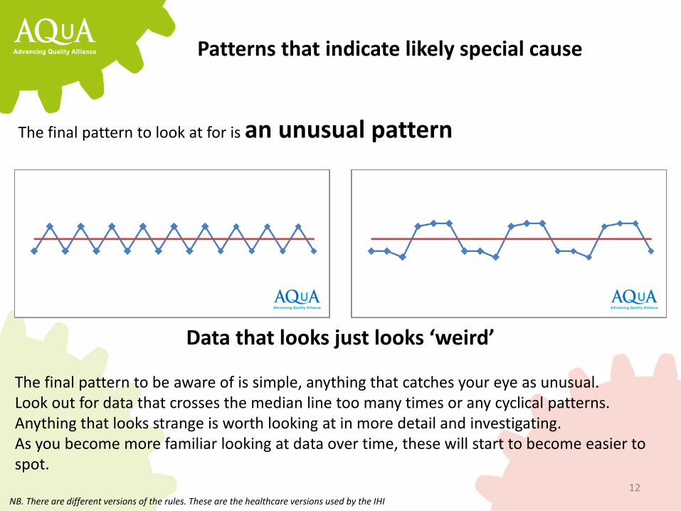
Patterns that indicate likely special cause
The final pattern to look at for is an unusual pattern
Data that looks just looks ‘weird’
The final pattern to be aware of is simple, anything that catches your eye as unusual. Look out for data that crosses the median line too many times or any cyclical patterns. Anything that looks strange is worth looking at in more detail and investigating. As you become more familiar looking at data over time, these will start to become easier to spot.
NB. There are different versions of the rules. These are the healthcare versions used by the IHI
13
Trend – 5+ points increasing or decreasing
Astronomical – a point very different to the rest
Shift – 6+ points in a row above or below the median
Strange pattern – data that doesn’t look ‘normal’
Patterns that indicate likely special cause
If you spot one of these rules the first thing you should do is INVESTIGATE
14
A run chart and knowledge of those 4 patterns is a great starting point...
For 70-80% of improvement projects this is enough knowledge to help you understand change over time and use an improvement approach to your data. However if you have lots of data points (20-30) then a more advanced tool may give you better sensitivity at detecting change.
15
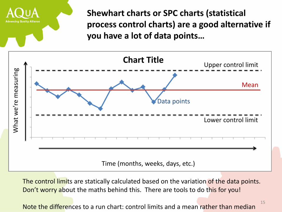
Chart Title
Time (months, weeks, days, etc.)
Wh
at w
e’re
mea
suri
ng
Mean
Data points
Lower control limit
Shewhart charts or SPC charts (statistical process control charts) are a good alternative if you have a lot of data points…
Upper control limit
The control limits are statically calculated based on the variation of the data points. Don’t worry about the maths behind this. There are tools to do this for you! Note the differences to a run chart: control limits and a mean rather than median
16
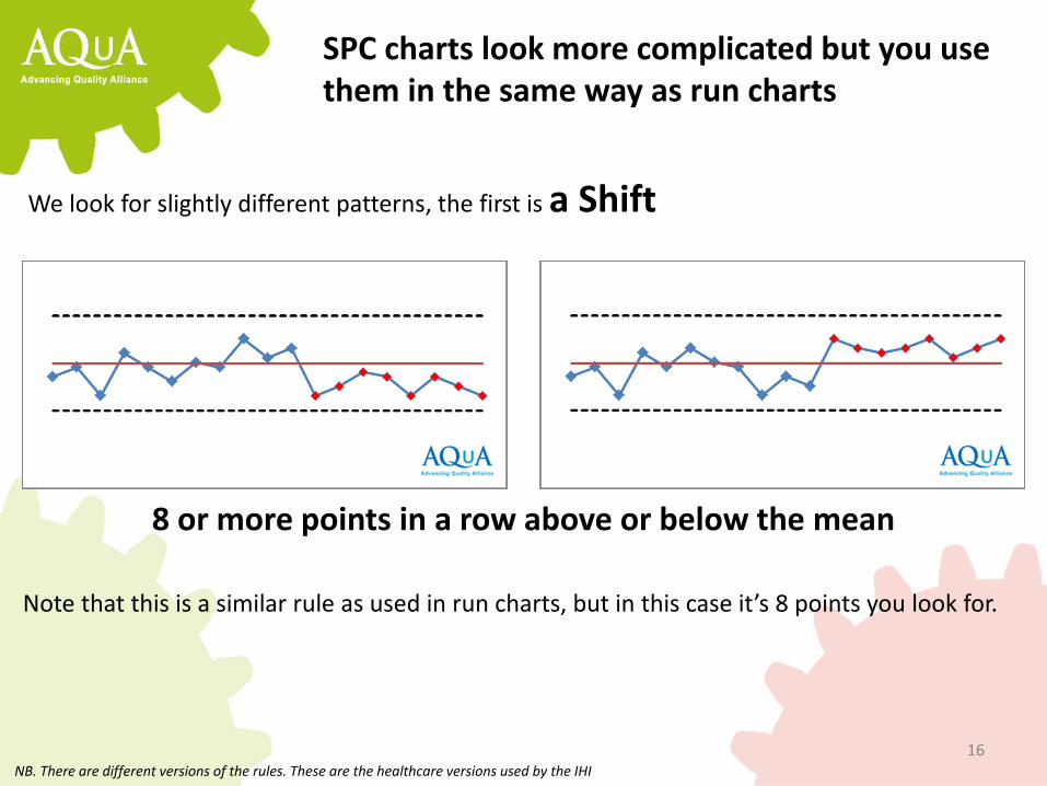
SPC charts look more complicated but you use them in the same way as run charts
We look for slightly different patterns, the first is a Shift
8 or more points in a row above or below the mean
NB. There are different versions of the rules. These are the healthcare versions used by the IHI
Note that this is a similar rule as used in run charts, but in this case it’s 8 points you look for.
17
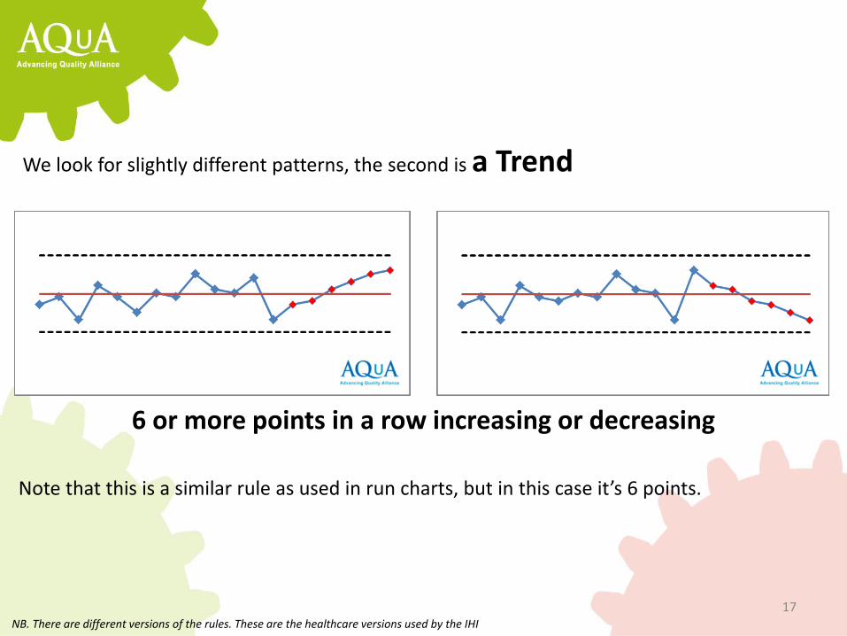
We look for slightly different patterns, the second is a Trend
6 or more points in a row increasing or decreasing
NB. There are different versions of the rules. These are the healthcare versions used by the IHI
Note that this is a similar rule as used in run charts, but in this case it’s 6 points.
18
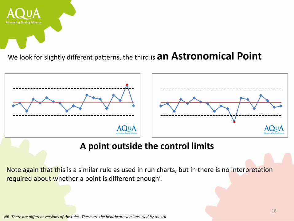
We look for slightly different patterns, the third is an Astronomical Point
A point outside the control limits
NB. There are different versions of the rules. These are the healthcare versions used by the IHI
Note again that this is a similar rule as used in run charts, but in there is no interpretation required about whether a point is different enough’.

19
We look for slightly different patterns, the forth is named Outer Thirds
2 out of 3 points in the outer thirds of the limits
NB. There are different versions of the rules. These are the healthcare versions used by the IHI
These can be an early indicator that another of the rules is likely to occur. It indicates that the process is becoming unstable.

20
We look for slightly different patterns, the fifth is named Inner Thirds
15 points in a row within the inner third of the limits
NB. There are different versions of the rules. These are the healthcare versions used by the IHI
These often occur when a change to the process dramatically reduces the variation. You also see it in falsified data.
21
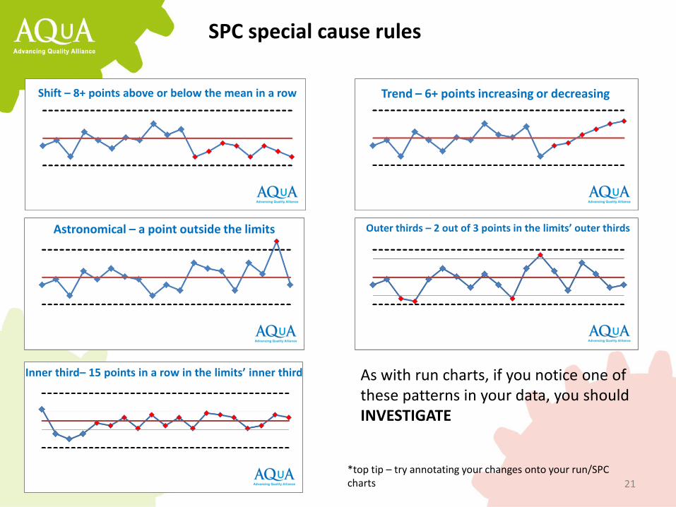
SPC special cause rules
As with run charts, if you notice one of these patterns in your data, you should INVESTIGATE
*top tip – try annotating your changes onto your run/SPC charts
Trend – 6+ points increasing or decreasing Shift – 8+ points above or below the mean in a row
Astronomical – a point outside the limits Outer thirds – 2 out of 3 points in the limits’ outer thirds
Inner third– 15 points in a row in the limits’ inner third
22
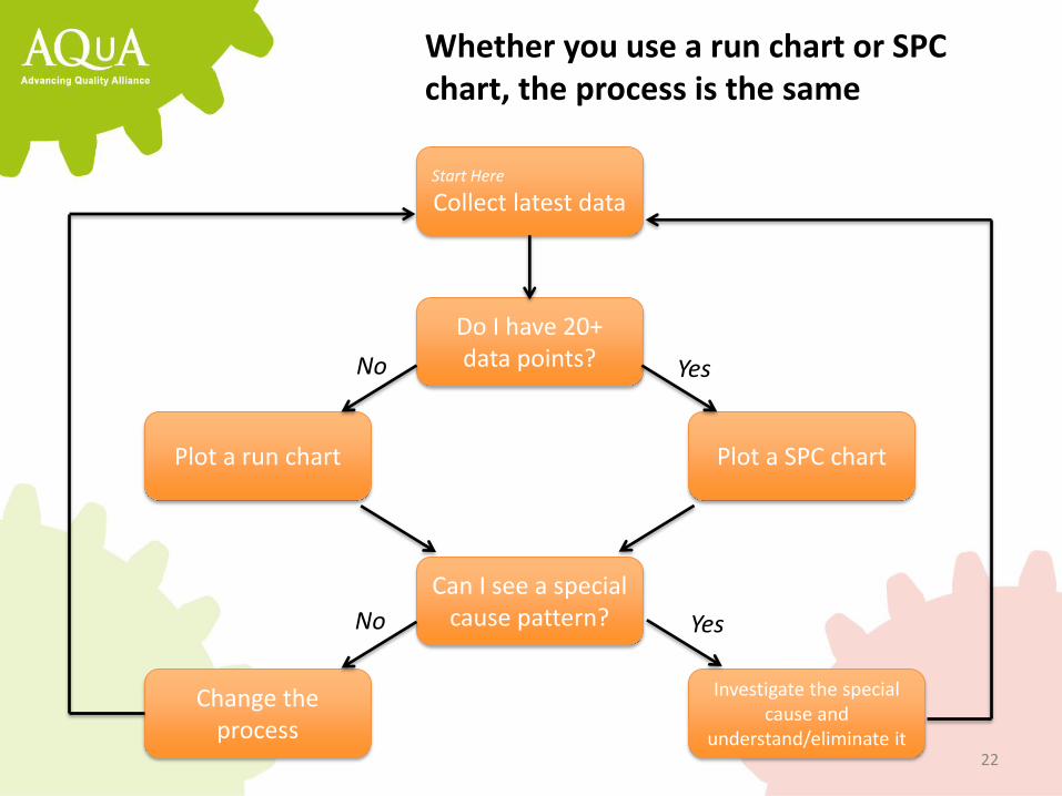
Whether you use a run chart or SPC chart, the process is the same
Start Here
Collect latest data
Do I have 20+ data points?
Plot a run chart Plot a SPC chart
Can I see a special cause pattern?
Change the process
Investigate the special cause and
understand/eliminate it
No
No
Yes
Yes
23
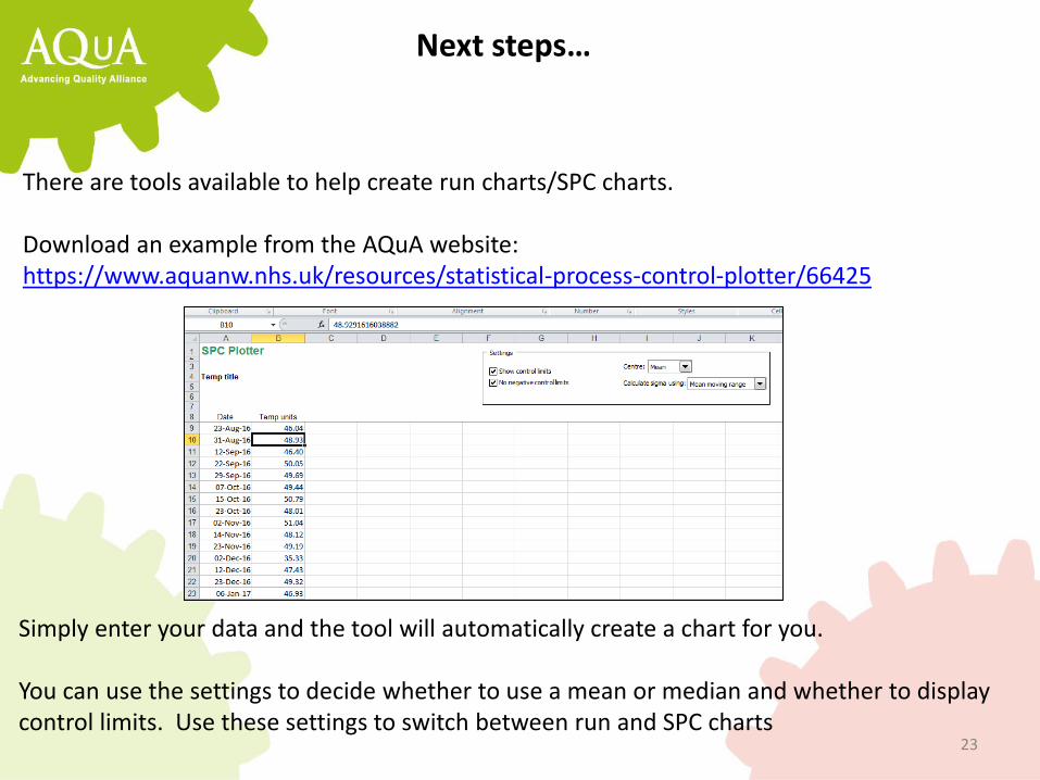
Next steps…
There are tools available to help create run charts/SPC charts. Download an example from the AQuA website: https://www.aquanw.nhs.uk/resources/statistical-process-control-plotter/66425
Simply enter your data and the tool will automatically create a chart for you. You can use the settings to decide whether to use a mean or median and whether to display control limits. Use these settings to switch between run and SPC charts