understanding the user in your web site audience
TRANSCRIPT

Web Usability
Understanding the User in your Web Site AudienceSeptember 21, 2001
Northwest OH Chapter - PRSAKeith Instone
[email protected]://keith.instone.org/http://usableweb.com/

About Me
• Web Usability Consultant• Argus Associates: Information Architect
& Usability Specialist• Usable Web• BGSU Computer Science• The Web Usability Anti-Guru: It
depends
Overview
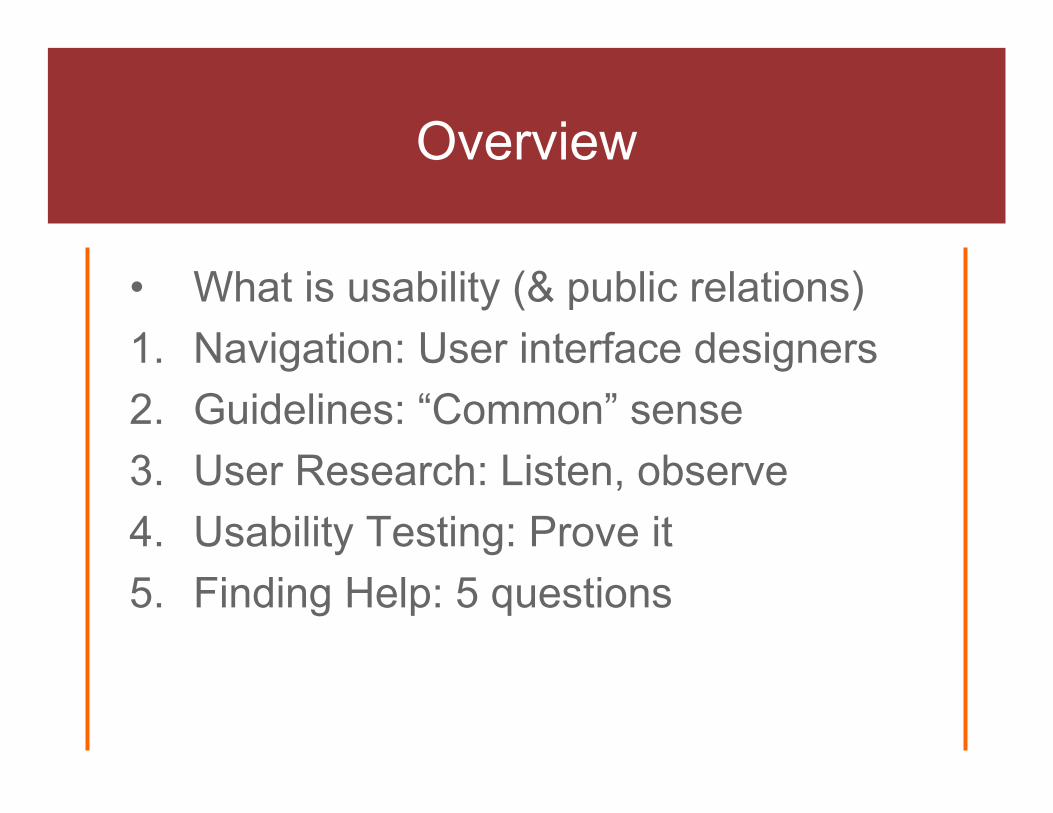
• What is usability (& public relations)1. Navigation: User interface designers2. Guidelines: “Common” sense3. User Research: Listen, observe4. Usability Testing: Prove it5. Finding Help: 5 questions

“Don’t Make me Think” (Steve Krug)
• We don’t read pages, we scan them• We don’t make optimal choices, we
satisfice• We don’t figure out how things work, we
muddle through

Why this is so hard

Jakob Nielsen’s Usability Attributes
Easy to learn• For first time use
Efficient to use• Important for repeat usage, measure it
Easy to remember• Recognition > recall
Few errors• Design errors away, easy to recover from errors
Satisfying• You got your job done, and it was fun along the
way

Standard (Academic) Definition
The extent to which a product can be used by specified users to achieve specified goals with effectiveness, efficiency and satisfaction in a specified context of use.
• It depends• You can measure it

What is Public Relations? (ask.com)
• activities and policies used to create public interestin a person, idea, product, institution, or business establishment
• the goal of the public relations consultant is to create, through the organization of news and advertising, an advantageous image for his client
• principal instrument is the press release, which provides the mass media with the raw material and background for a news story
• identifies, establishes and maintains mutually beneficial relationships between an organization and various publics (Cutlip etal)

Web Usability & Public Relations
• Public interest: consumer usage of a web site• Advantageous image: easy-to-use is part of a
good online image• Press release, mass media: The Press are an
important user group BUT the trend on the web is for more direct contact with the public [http://nngroup.com/reports/pr/ ($250)]
• Relationships: the Internet is an increasingly important layer/channel, and the public’s user interface is often perceived as the “brand”

What I find interesting at PRSA Conference (October, Atlanta)
• Seminar: Web Site Writing that WOWS Users• General Session: Are you talking to ME?
(understanding audiences)• Workshop: Trouble with Teens (4 segments)• Workshop: Reach African-Americans (case
study to wear seat belts)• Workshop: Using Anthropological Research
in Marketing Communications

Concept: Navigation
• Everyone becomes a user interface designer
• If they cannot find it, they cannot buy it• Conventions forming, but…• …It depends

My Navigation Framework
Global
LocalContent
Local & Contextual
Contextual
Global
Breadcrumb
Global Navigation
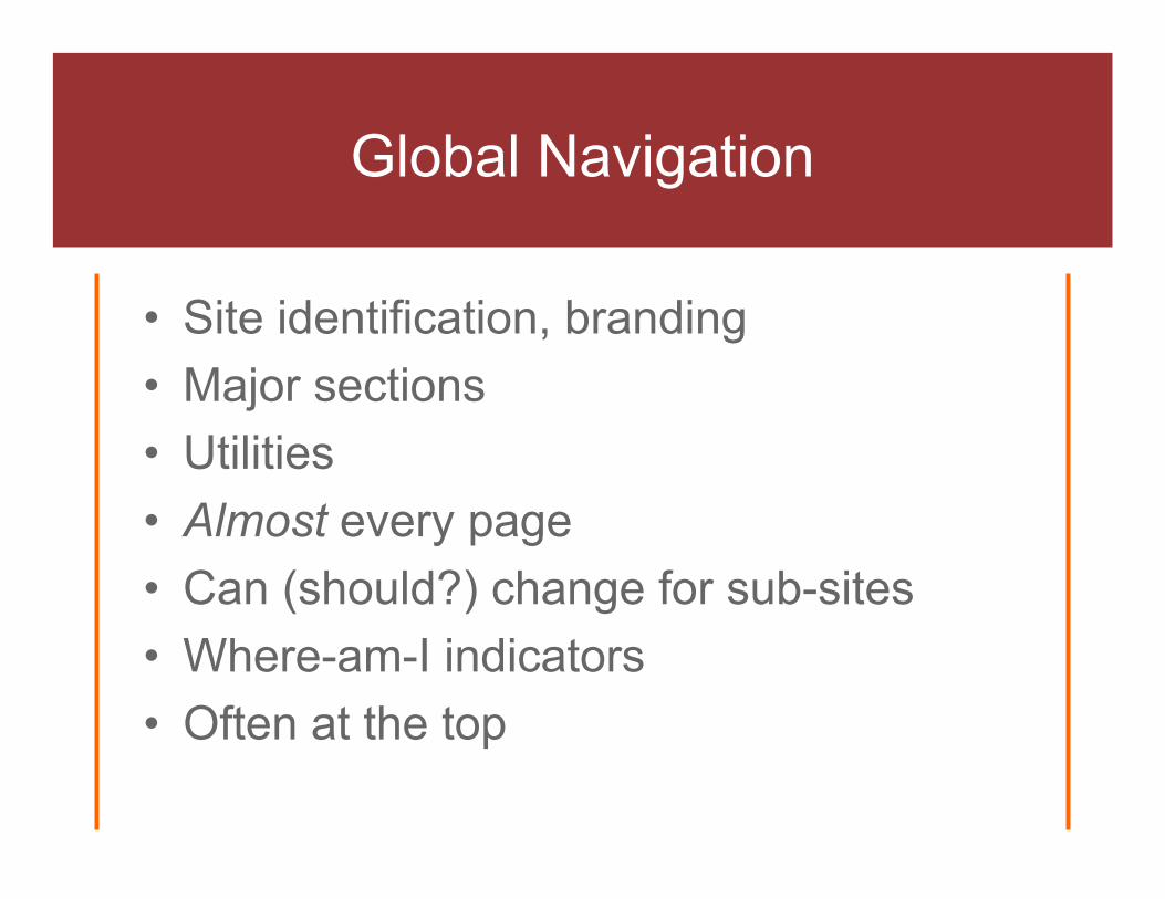
• Site identification, branding• Major sections• Utilities• Almost every page• Can (should?) change for sub-sites• Where-am-I indicators• Often at the top

Local Navigation
• Specific to this section of the site• Varies from section to section, but
consistent• Parent, sibling, child relationships• Where-am-I indicators• Often on the left


Amazon Global & Local Navigation

Contextual Navigation
• Specific to this page• Cuts across hierarchy• Hand-made or automated

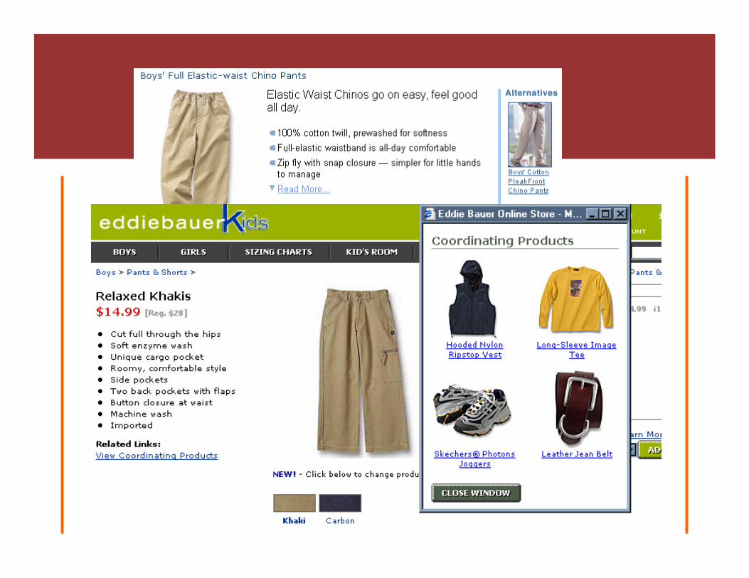
Examples of Contextual Navigation


Breadcrumb Navigation
• The metaphor is path (go “back”)• Most implementations are location• Do user get them? What are they good
for?
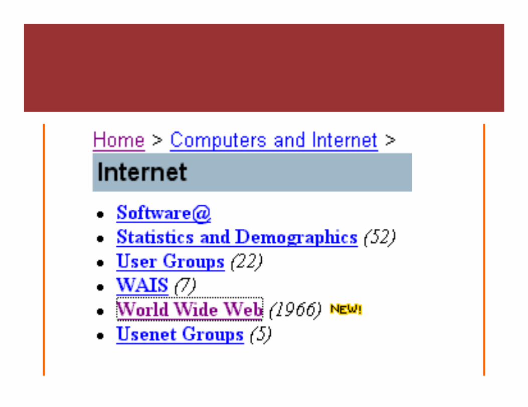

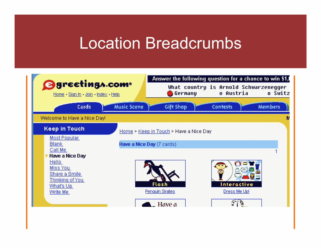
Location Breadcrumbs
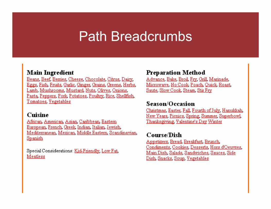
Path Breadcrumbs

Path Breadcrumbs
The Point: That’s Nice, but Navigation Questions Remain
• How should you integrate global & local navigation?
• When should you support comparison and/or coordination shopping?
• Are breadcrumbs useful? Location or path? What about the browser? What syntax should you use? What if you have a database?

Concept: Guidelines
• Inspections (without users)– Expert review (e.g. Navigation Stress Test)– Heuristic evaluation (merged opinions)
• Guidelines– Many to choose from– Most from experience, not research
(usability.gov/guidelines/)

Navigation Stress Test
• “Randomly” selected (deeper) pages• Printed out for lower fidelity, no peeking• Where am I?• What is here?• Where can I go?• http://keith.instone.org/navstress/

Navigation Question Mark Up on the Paper
What is this page about? Draw a rectangle around the title of the page or write it on the paper yourself
What site is this? Circle the site name, or write it on the paper yourself
What are the major sections of this site?
Label with X
What major section is this page in? Draw a triangle around the X
What is “up” 1 level from here? Label with U
How do I get to the home page of this site?
Label with H
How do I get to the top of this section of the site?
Label with T
What does each group of links represent?
Circle the major groups of links and label:• D: More details, sub-pages of this one• N: Nearby pages, within same section as this page• S: Pages on same site but not as near
Navigation Stress Test Questions

Nielsen’s Usability Heuristics
• Visibility of system status • Match between system and the real world • User control and freedom • Consistency and standards • Error prevention • Recognition rather than recall • Flexibility and efficiency of use • Aesthetic and minimalist design • Help users recognize, recover from errors • Help and documentation

Web Heuristics
• System status, Recognition: Where am I? Where can I go next?
• Match with real world: Labels in users’ language• User control: Forcing font, sizes, widths• Standards: HTML and web standards• Error prevention: Forms• Flexibility: Bookmarkable and linkable• Minimalist: Progressive detail• Error recovery: Search• Help: Embedded documentation

Guidelines to Conventions and Templates
• Principles: goals which guide design decisions
• Guidelines: specific to a particular domain of design (see Usable Web’s Comprehensive Guidelines)
• Conventions: specific design decisions youhave chosen to follow for your site
• Templates: layouts that “enforce” the conventions

Sample Guidelines
1. Animation should not disrupt your reader’s concentration (Yale)
2. Provide useful content on each page (Sun)
3. Write in inverted pyramids (Nielsen)4. Your users need to know where they
are (IBM)

Possible Conventions
1. Animation must be at top of page so it can be scrolled out of sight
2. Navigation pages include a sentence about each link
3. First paragraph of every page summarizes the entire page
4. Highlight current sections in global and local navigation

The Point: Guidelines help, but not the only answer
• Common sense is not very common• There is a lot of low-hanging fruit• Guidelines are nice but not very useful
in the trenches• Embed your design decisions in
templates

Concept: User Research
• Interviews– Q&A
• Observations– Environment, work in context
• Activities– Fun, think out of the box
• Participation– Group problem solving, awareness

Interviews
• Just talking with (listening to) users• User wants vs. user needs• What they think vs. how they act• One-on-one vs. group think

Observations
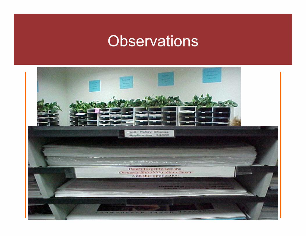
• Anthropology – “Users in the Mist”• Ethnography - Culture
Observations
• Anthropology – “Users in the Mist”• Ethnography - Culture

Activities
• Talking gets boring, let’s do something• Card sorting• Exploratory usability testing• Paper prototyping: perform a task, build
a page

Participation
• “Participatory design”• Users involved in design process (but
not designing directly)– Get buy-in– Provide insights
• Stakeholders involved in design process– Meet & understand users

User Research Outcomes
ListsUsers, environments, content, tasks, issues, roles, insights
DiagramsTask flowcharts, workflow, affinity
TablesUsers x Task, Users x Content
Profiles and Scenarios and PersonaeUsers, environments, tasks, photographs
A basis for making informed design decisionsA user-centered way of strategic thinking

Other User Research
• Surveys• Log analysis• Focus groups• User feedback

The Point:There is still so much to learn
• User research, not just audience research
• Users are not designers, but designers are better with empathy & understanding
• Context, context, context
Concept: Usability Testing
• Give representative users realistic tasks, watch quietly, be amazed

Concept: Usability Testing
• Give representative users realistic tasks, watch quietly, be amazed

First Reactions
• “It is such a rush. This is what I want to be doing!”
• “Not good news. A real eye-opener. We gottaget the developers involved so they can see where people are struggling.”
• “The testing was not too hard, but now how do we get the results taken seriously?”

Planning usability testing
• Purpose and audience of site• Usability goals• Tasks• Participants, scheduling, payment• Materials• Setting• ...Expect to hear bad news

Doing usability testing
• Introduction for participant, list of tasks• Watch quietly• Record behavior (take notes, tape)• Interact with participant• Debriefing, questionnaire, payment

Benefiting from usability testing
• Tabulate data• Findings• Recommendations• Actions

Levels of Commitment
• Opportunistic usability testing– Anything is better than nothing
• Quick and dirty– Some planning, but not too much
• Multi-purpose rooms– “Hey, lovebirds, at least get a room”
• Full usability labs– Cha-ching
Opportunistic
• Do mini usability tests whenever/wherever opportunity arises
• 15 minutes = opportunity• Violin lessons, after short meetings,
cleaning lady, nosy relatives• Jakob’s 1-hour usability test: tradeshow,
laptop, 50-line email

Quick and Dirty
• Shortcuts on the planning: get convenient participants, not ideal ones
• Convenient locations• Realistic (self-made) tasks, sometimes• Debriefing very important: ask why• Shortcuts on the write-up

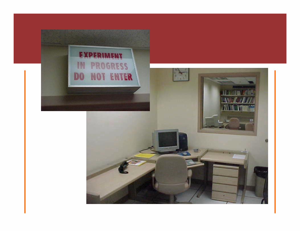
Multi-Purpose Rooms
• Use available space as laboratory-for-a-day• Bring in portable equipment• Convert an empty office into a full-time lab• Use a lab for other things to help justify cost• Since people coming to you, do more
planning

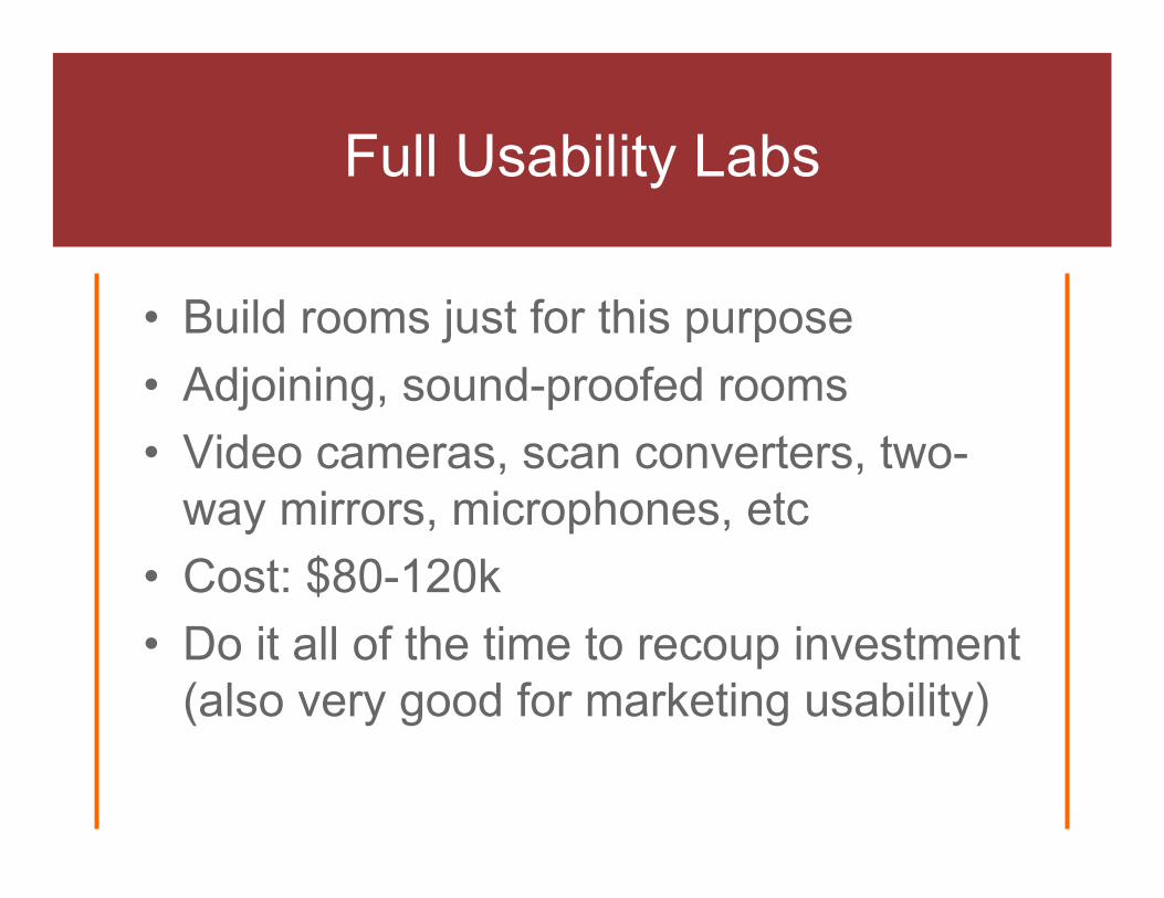
Full Usability Labs
• Build rooms just for this purpose• Adjoining, sound-proofed rooms• Video cameras, scan converters, two-
way mirrors, microphones, etc• Cost: $80-120k• Do it all of the time to recoup investment
(also very good for marketing usability)

Microsoft Lab Layout
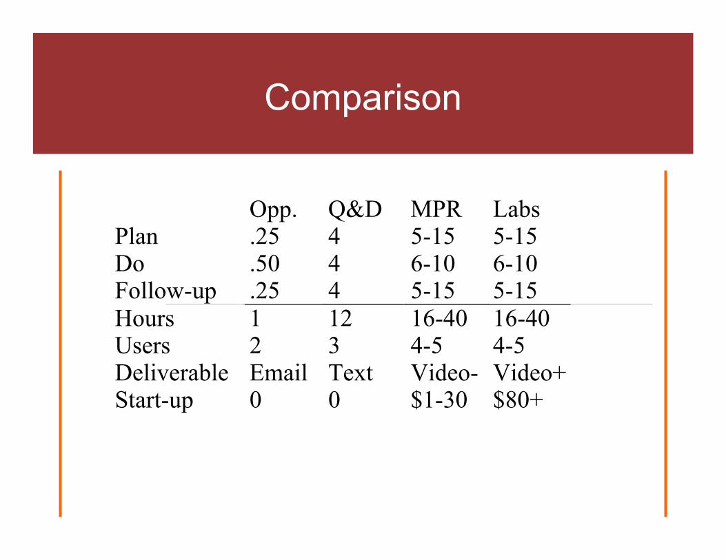
Comparison
Opp. Q&D MPR LabsPlan .25 4 5-15 5-15Do .50 4 6-10 6-10Follow-up .25 4 5-15 5-15Hours 1 12 16-40 16-40Users 2 3 4-5 4-5Deliverable Email Text Video- Video+Start-up 0 0 $1-30 $80+

Variations of Usability Testing
• Most common: Make specific parts better (3-5 users, repeat often)
• User research: one of many such activities• Benchmarking, external (comparative
analysis)• Benchmarking, internal (ROI)• Prototyping: paper, computer• Quality assurance (usability goals)• Research (“statistically significant”)• Shock usability testing (get CEO to notice)
The Point:It’s painful but worth it
• I’ve always been surprised & learned something
• Easy to do on a small scale, can also become institutionalized
• Flexible: qualitative & quantitative

Re-cap of the Concepts
1. Navigation: crucial element of the experience, framework evolving, but it depends
2. Guidelines: some of this is “common sense”3. User Research: there is so much we still do
not know, user-centered design one way to learn more
4. Usability Testing: versatile technique based on observing users trying to do something

5 Questions to Ask Web Developers
• Do they really know about usability or is it just a new fad for them?
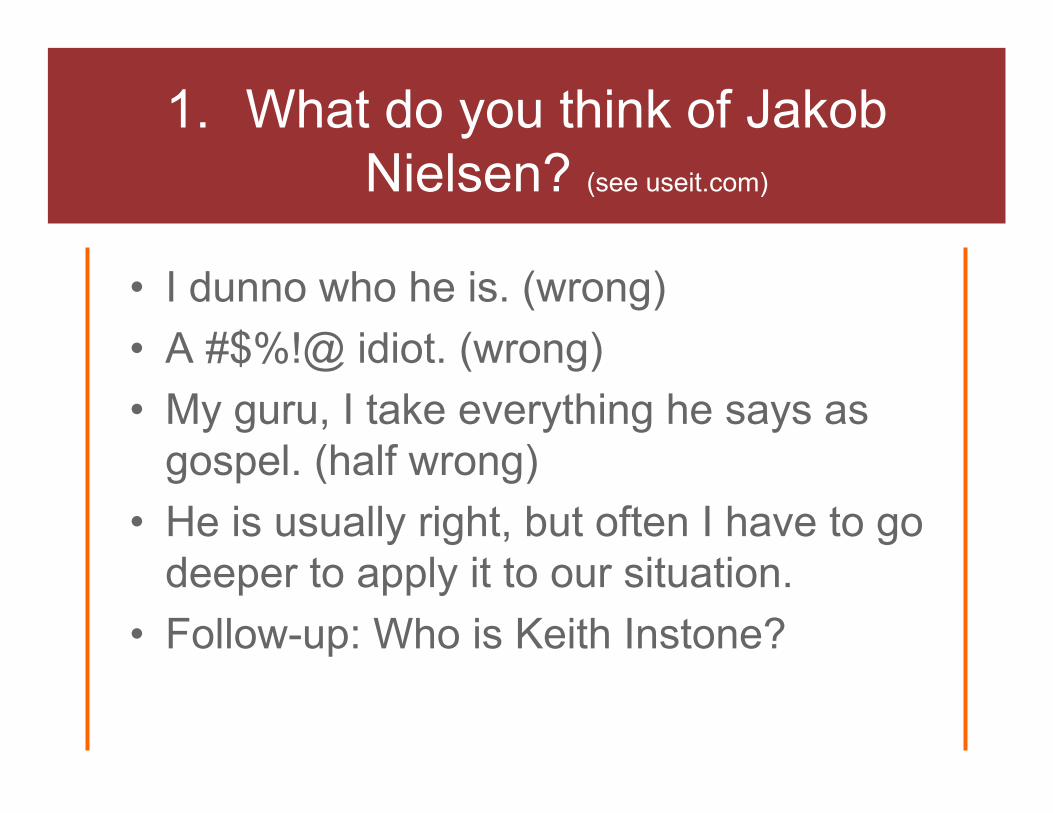
1. What do you think of Jakob Nielsen? (see useit.com)
• I dunno who he is. (wrong)• A #$%!@ idiot. (wrong)• My guru, I take everything he says as
gospel. (half wrong)• He is usually right, but often I have to go
deeper to apply it to our situation.• Follow-up: Who is Keith Instone?

2. What is the difference between usability testing and heuristic evaluation?
• Huh? (wrong)• Oh, those are some of those usability things – we do
them all of the time. (No they don’t, wrong)• Heuristic evaluation is a type of testing. (wrong)• Usability testing involves real users while heuristic
evaluation is only an expert’s opinion. • We use heuristic evaluation to catch the low hanging
fruit on very early designs and then test with users later. (common)

3. What do you know about Flash?
• Oooh, it is cool, I just spent a week learning it and want to try some things out on your site. (wrong)
• It sucks and should never be used on the web. (wrong)
• I know its limitations and value on the web (it is not appropriate for most sites today) and I can bring in the Flash experts if they are needed.

4. Should we have a site map on our site?
• No, I have never found them to be very useful. (wrong)
• Of course, all sites should have one. (wrong)
• It depends. Who is your audience, what are they trying to do at your site, …

5. Which are better: location or path breadcrumbs?
• Huh? (likely)
