uniform (or rectangular) distribution
TRANSCRIPT

1
Math 140 Introductory Statistics
Professor Silvia Fernández
Chapter 2Based on the book Statistics in Action
by A. Watkins, R. Scheaffer, and G. Cobb.
Visualizing Distributions
Recall the definition:The values of a summary statistic (e.g. the average age of the laid-off workers) and how often they occur. Four of the most common basic shapes:
Uniform or RectangularNormalSkewedBimodal (Multimodal)
Uniform (or Rectangular) Distribution
Each outcome occurs roughly the same number of times.Examples.
Number of U.S. births per month in a particular year (see Page 25)Computer generated random numbers on a particular interval.Number of times a fair die is rolled on a particular number.
19232412
18930411
19332910
1763539
1783418
1923457
1823246
1953115
1893424
1983133
1912892
2183051
Deaths(in thousands)
Births (in thousands)
Month
Uniform (or Rectangular) Distribution
Births in US (1997)
0
100
200
300
400
1 5 8 11
Month
Num
ber i
n Th
ousa
nds
Births
192324121893041119332910176353917834181923457182324619531151893424198313319128922183051
Deaths(in thousands)
Births (in thousands)
Month

2
Normal Distributions
These distributions arise fromVariations in measurements.(e.g. pennies example, see 2.3 page 31)Natural variations in population sizes(e.g. weight of a set of people)Variations in averages of random samples.(e.g. Average age of 3 workers out of 10, see 1.10 in page 14)
Pennies example
Average age of 3 workers out of 10 Normal DistributionsIdealized shape shown below (see 2.4 page 32)Properties:
Single peak: The x-value of it is called the mean.The mean tells us where is the center of the distribution.The distribution is symmetric with respect to the mean.
Mean

3
Normal Distributions
Idealized shape shown below (see 2.4 page 32)Properties:
Inflection points: Where concavity changes.Roughly 2/3 of the area below the curve is between the inflection points.
Mean
InflectionPoints
Normal DistributionsIdealized shape shown below (see 2.4 page 32)Properties:
The distance between the mean and either of the inflection points is called the standard deviation (SD)The standard deviation measures how spread is the distribution.
Mean
SD SD
Skewed DistributionsThese are similar to the normal distributions but they are not symmetric. They have values bunching on one end and a long tail stretching in the other directionThe tail tells you whether the distribution is skewed left or skewed right.
Skewed Left Skewed Right
Skewed DistributionsSkewed distributions often occur because of a “wall”, that is, values that you cannot go below or above. Like zero for positive measurements, or 100 for percentages.To find out about center and spread it is useful to look at quartiles.
Skewed Left Skewed Right

4
Example of a skewed right distribution Median and Quartiles
Median: the value of the line dividing the number of values in equal halves. (Or the area under the curve in equal halves.)Repeat this process in each of the two halves to find the lower quartile (Q1) and the upper quartile (Q3).Q1, the median, and Q3 divide the number of values in quarters. The quartiles Q1 and Q3 enclose 50% of the values.
Visualizing Median and Quartiles Bimodal Distributions.
Previous distributions have had only one peak (unimodal) but some have two (bimodal) or even more (multimodal).
Bimodal Distribution

5
Example of a bimodal distribution Using the calculator (TI-83)
For more information go to www.keymath.com/x7065.xml and look for the Calculator Notes for Chapters 0, 1, and 2.You should know how to
Generate a list of n random integer numbers between min and max.
Example: To generate a list of 7 integer numbers between 2 and 10 (inclusive) type
MATH PRB 5.randInt( Enter 2, 10, 7) Enter
Using the calculator (TI-83)
How to generate a list of n random numbers between 0 and 1 (exclusive).
Example: Generate 5 random numbers between 0 and 1.MATH PRB 1.randInt( Enter 5) Enter
How to store a list of numbers.Example: Store the previous list of 5 random
numbers between 0 and 1 on L1.2nd ANS → 2nd L1
Using the calculator (TI-83)
Example: Store the list 1,2,3,4,5 to L1.STAT 1.Edit Enter Move to the first row of column L1 using the
arrows.Type each of the numbers on the list followed
by ENTER.Compute binomial coefficients.
Example: Compute 10 choose 3.10 MATH PRB nCr Enter 3
6
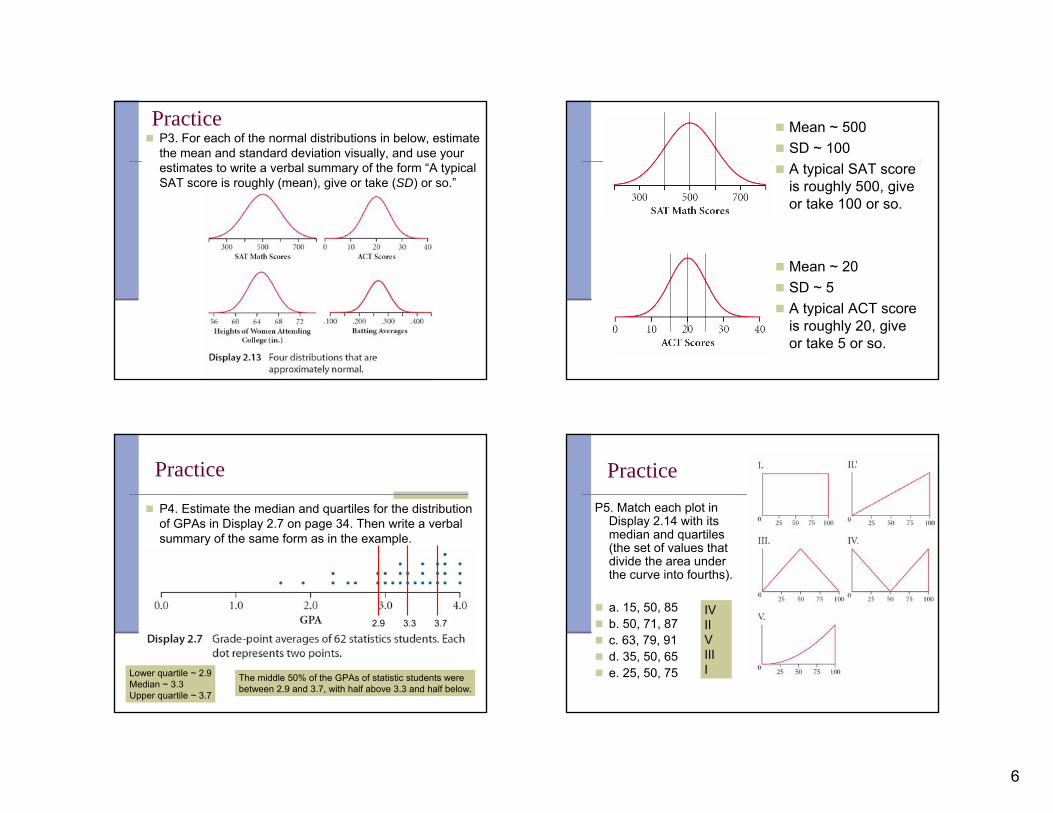
PracticeP3. For each of the normal distributions in below, estimate the mean and standard deviation visually, and use your estimates to write a verbal summary of the form “A typical SAT score is roughly (mean), give or take (SD) or so.”
Mean ~ 500SD ~ 100A typical SAT score is roughly 500, give or take 100 or so.
Mean ~ 20SD ~ 5A typical ACT score is roughly 20, give or take 5 or so.
Practice
P4. Estimate the median and quartiles for the distribution of GPAs in Display 2.7 on page 34. Then write a verbal summary of the same form as in the example.
2.9 3.3 3.7
Lower quartile ~ 2.9Median ~ 3.3Upper quartile ~ 3.7
The middle 50% of the GPAs of statistic students were between 2.9 and 3.7, with half above 3.3 and half below.
PracticeP5. Match each plot in
Display 2.14 with its median and quartiles (the set of values that divide the area under the curve into fourths).
a. 15, 50, 85b. 50, 71, 87c. 63, 79, 91d. 35, 50, 65e. 25, 50, 75
IVIIVIIII
7
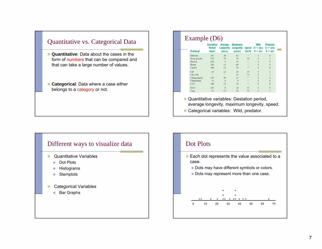
Quantitative vs. Categorical Data
Quantitative: Data about the cases in the form of numbers that can be compared and that can take a large number of values.
Categorical: Data where a case either belongs to a category or not.
Quantitative variables: Gestation period, average longevity, maximum longevity, speed.Categorical variables: Wild, predator.
Example (D6)
Different ways to visualize data
Quantitative VariablesDot PlotsHistogramsStemplots
Categorical VariablesBar Graphs
Dot Plots
Each dot represents the value associated to a case.
Dots may have different symbols or colors.Dots may represent more than one case.
5 15 25 35 45 55 65 75

8
Dot Plots
Dot Plots work best whenRelatively small number of values to plotWant to keep track of individualsWant to see the shape of the distributionHave one group or a small number of groups that we want to compare
HistogramsGroups of cases represented as rectangles or barsThe vertical axis gives the number of cases (called frequencyor count) for a given group of values.By convention borderline values go to the bar on the right.There is no prescribed number for the width of the bars.
Relative Frequency HistogramsThe height of each bar is the proportion of values in that range.(always a number between 0 and 1)The sum of the heights of all the bars equals 1. To change a regular histogram to a relative frequency histogram just divide the frequency of each bar by the total number of values in the data set.
This histogram shows the relative frequencydistribution of life expectancies for 203 countries around the world.
How many countries have a life expectancy of at least 70 but less than 75 years? .30 x 203 = 60.9
What proportion of the countries have a life expectancy of 70 years or more?.30+.19+.07 = .56 = 56 %
Histograms (Relative Frequency)
Histograms work best whenLarge number of values to plotDon’t need to see individual valuesWant to see the general shape of the distributionHave one or a small number of distributions we want to compareWe can use a calculator or computer to draw the plots

9
StemplotsAlso called stem-and-leaf plots.
Numbers on the left are called stems (the first digits of the data value)
Numbers on the right are the leaves. (the last digit of the data value)
Mammal speeds: 11,12,20,25,30,30,30,32,35,39,40,40,40,42,45,48,50,70.
1 1 22 0 53 0 0 0 2 5 94 0 0 0 2 5 85 06 7 0
3 | 9 represents 39 miles per hour.
Stemplots (split)Each original stem becomes two stems.
The unit digits 0,1,2,3,4 are associated with the first stem and they are placed on the first line.
The unit digits 5,6,7,8,9 are associated with the second stem and they are placed on the second line from that stem.
1 1 2-2 0 - 53 0 0 0 2 - 5 94 0 0 0 2 - 5 85 0-6-7 0
3 | 9 represents 39 miles per hour.
Stemplot vs split stemplot
1 1 22 0 53 0 0 0 2 5 94 0 0 0 2 5 85 06 7 0
3 | 9 represents 39 miles per hour.
Mammal speeds: 11,12,20,25,30,30,30,32,35,39,40,40,40,42,45,48,50,70.
1 1 2-2 0 - 53 0 0 0 2 - 5 94 0 0 0 2 - 5 85 0-6-7 0
3 | 9 represents 39 miles per hour.
Stemplots
Stemplots work best whenPlotting a single quantitative variableSmall number of values to plotWant to keep track of individual values (at least approximately)Have two or more groups that we want to compare

10
Bar Graphs
One bar for each category.The height of the bar tells the frequency.Bar graphs have categories in the horizontal axis, as opposed to histograms which have measurements.
05
1015202530354045
Non-Predator Predator Both
Domestic Wild Total
2.3 Measures of Center and Spread
Before we used visual methods (estimations) to find out center (e.g. mean) and spread (e.g. SD). Now we will learn how to calculate them exactly.
Measures of CenterMeanMedian
Measures of SpreadStandard DeviationInter Quartile Range
Measures of Center
MeanThe average of the data values denoted x.
Calculated as:
Example. Data Set: 5,12,34,18,37,11,9,21,30,6
n
xx
∑==values of number
values of sum
3.1810
63021911371834125=
+++++++++=x
Measures of Center
MedianThe value that divides the data into equal
halves. Denoted median or Q2.
Calculated as:List all values in increasing order and find the middle one.If there are n values then the middle one is (n+1)/2If n is even use the fact that the mid-value between a and b is (a+b)/2

11
Measures of Center
Median (examples)Data set: 5,12,34,18,37,11,9,21,30,6.Ordered data set:
5,6,9,11,12,18,21,30,34,37
2. Data set: 6, 5 , 9, 12, 30, 18, 11, 34, 21.Ordered data set:
5,6,9,11,12,18,21,30,34Median = 12
152
1812 =+
=median
Measure of spread around the Mean
Most useful measure of spread when working with random samples. The deviation of a value is how far apart is it from the mean.
Unfortunately it is easy to see that
Standard DeviationThere are two kinds σn
and σn-1.The default is σn-1.
They are calculated as:
xx −
0)( =−∑ xx
n
xxn
∑ −=
2)(σ
1)( 2
1 −∑ −
=− n
xxnσ
Measure of spread around the Mean
Example. Data: 2,7,8,12,12,19106/)191212872( ,6 =+++++== xn
n
xxn
∑ −=
2)(σ
1)( 2
1 −∑ −
=− n
xxnσ
81919421242124-289-3764-82
xx − 2)( xx −x
166060Sum
2599.56
166≈=nσ
7619.55
1661 ≈=−nσ
Measure of spread around the Median
Q1 = First Quartile or Lower Quartile.Q3 = Third Quartile or Upper Quartile.
These are calculated as the medians of each of the two halves determined by the original median.In case n is odd then the original median is removed from each of the two halves.
Inter Quartile RangeIQR = The distance between
the Lower Quartile and the Upper Quartile.
About 50% of the values are between Q1 and Q3.
13 QQIQR −=

12
Five Number Summarymin = Minimum (value)Q1 = Lower or First QuartileQ2 = MedianQ3 = Upper or Third Quartilemax = Maximum (value)
Example: Mammal speeds,11,12,20,25,30,30,30,32,35,39,40,40,40,42,45,48,50,70.
In addition we also haveRange = max – min
IQR = Q3 – Q1
Range = 70 – 11 = 59IQR = 42 – 30 = 12
min = 11Q1 = 30Median = (35+39)/2 = 37Q3 = 42max = 70.
Box PlotsA Box Plot is a graphical display of a five-point summary.
min maxQ3Q2Q1
IQR
Range
11 30 37 42 70
min = 11Q1 = 30Median = (35+39)/2 = 37Q3 = 42max = 70.Range = 70 – 11 = 59IQR = 42 – 30 = 12
Example: Mammal speeds,11,12,20,25,30,30,30,32,35,39,40,40,40,42,45,48,50,70.
Modified Box PlotsA Modified Box Plot also takes into account the outliers.An outlier is a value which is more than 1.5 times the IQRfrom the nearest quartile.
IQR = 42 – 30 = 12(1.5)IQR = (1.5)12 = 1830 – 18 = 12 > 11, so 11 is an outlier.42 + 18 = 60 <70, so 70 is an outlier.
Example: Mammal speeds,11,12,20,25,30,30,30,32,35,39,40,40,40,42,45,48,50,70.
min maxQ3Q2Q1
IQR
Range
11 30 37 42 70
Q3Q2Q1
11 30 37 42 70
Box Plots (Modified)
Box Plots and Modified Box Plots are useful when plotting a single quantitative variable and:
We want to compare shape, center, and spread of two or more distributions.The distribution has a large number of values Individual values do not need to be identified.(Modified) We want to identify outliers.
13
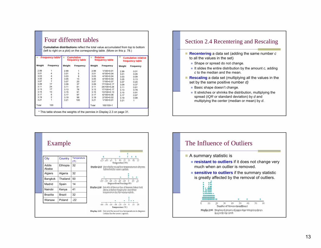
Four different tables
Frequency table*
Weight Frequency
2.99 13.01 43.03 43.05 43.07 73.09 173.11 243.13 173.15 133.17 63.19 23.21 1
Total 100
Cumulative frequency table
Weight Frequency
2.99 13.01 53.03 93.05 133.07 203.09 373.11 613.13 783.15 913.17 973.19 993.21 100
Relative frequency table
Weight Frequency
2.99 1/100=0.013.01 4/100=0.043.03 4/100=0.043.05 4/100=0.043.07 7/100=0.073.09 17/100=0.173.11 24/100=0.243.13 17/100=0.173.15 13/100=0.133.17 6/100=0.063.19 2/100=0.023.21 1/100=0.01
Total 100/100=1
Cumulative relative frequency table
Weight Frequency
2.99 0.013.01 0.053.03 0.093.05 0.133.07 0.203.09 0.373.11 0.613.13 0.783.15 0.913.17 0.973.19 0.993.21 1
Cumulative distributions reflect the total value accumulated from top to bottom (left to right on a plot) on the corresponding table. (More on this p. 78.)
* This table shows the weights of the pennies in Display 2.3 on page 31.
Section 2.4 Recentering and Rescaling
Recentering a data set (adding the same number c to all the values in the set)
Shape or spread do not change. It slides the entire distribution by the amount c, adding c to the median and the mean.
Rescaling a data set (multiplying all the values in the set by the same positive number d)
Basic shape doesn’t change. It stretches or shrinks the distribution, multiplying the spread (IQR or standard deviation) by d and multiplying the center (median or mean) by d.
Example
-22PolandWarsaw
32BrazilBrazilia
41KenyaNairobi
14SpainMadrid
50ThailandBangkok
32AlgeriaAlgiers
32EthiopiaAddis Ababa
Temperature (oF)
CountryCity
The Influence of Outliers
A summary statistic is resistant to outliers if it does not change very much when an outlier is removed. sensitive to outliers if the summary statistic is greatly affected by the removal of outliers.
14
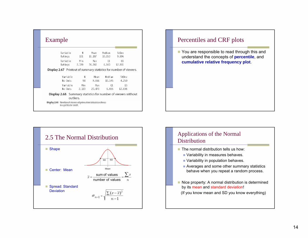
Example Percentiles and CRF plots
You are responsible to read through this and understand the concepts of percentile, and cumulative relative frequency plot.
2.5 The Normal Distribution
Shape
Center: Mean
Spread: Standard Deviation
n
xx
∑==values of number
values of sum
1)( 2
1 −∑ −
=− n
xxnσ
Mean
SD SD
Applications of the Normal Distribution
The normal distribution tells us how:Variability in measures behaves.Variability in population behaves.Averages and some other summary statistics behave when you repeat a random process.
Nice property: A normal distribution is determined by its mean and standard deviation! (If you know mean and SD you know everything)

15
The Two Main Problems.
The distribution of the SAT scores for the University of Washington was roughly normal in shape, with mean 1055 and standard deviation 200.
1. What percentage of scores were 920 or below?(Unknown percentage problem)
2. What SAT score separates the lowest 25% of the SAT scores from the rest?(Unknown value problem)
Unknown percentage problem.
The distribution of the SAT scores for the University of Washington was roughly normal in shape, with mean 1055 and standard deviation 200.
1. What percentage of scores were 920 or below?
Unknown value problem.The distribution of the SAT scores for the University of Washington was roughly normal in shape, with mean 1055 and standard deviation 200.
2. What SAT score separates the lowest 25% of the SAT scores from the rest?
Which one is it?
1. Unknown percentage problem.Given x, Find P.
2. Unknown value problem.Given P, Find x.

16
The Standard Normal Distribution.
It is the normal distribution with Mean = 0, and standard deviation = 1.The area under the curve equals 1 (or 100%)
0 1 -1
SD SD
The Standard Normal Distribution.
It is the normal distribution with Mean = 0, and standard deviation = 1.The area under the curve equals 1 (or 100%)The Standard Normal Distribution is important because any normal distribution can be recenteredand/or rescaled to the standard normal distribution. This process is called standarizing or converting to standard units.Also, the two main problems can be easily solved in the Standard Normal Distribution with the help of tables or a calculator.
The Two Main Problems in the Standard Normal Distribution.Unknown Percentage. (Given z, find P )
With Table A (end of the textbook)Use the units and the first decimal to locate the row and the closest hundredths digits to locate the column. The number found is the percentage of the number of values below z.
With CalculatorEnter normalcdf(-99999, z) to get the percentage of the number of values below z.
Example (given z find P)
CalculatorP = normalcdf(-99999,1.23)= .8906513833~ 89.07%
Table A Look for -row labeled 1.2-column labeled .03The intersection shows P =.8907 = 89.07%

17
The Two Main Problems in the Standard Normal Distribution.Unknown Value Problem. (Given P, find z )
With Table ALook for P in the body of the table. (or the number closest to it). Read back the row and column for that number. Use the row as the units and tenths of z, and the column as the hundredths digits of z. Note that Pmust be a percentage (written as a proportion, that is, a number between 0 and 1) of the number of values below a certain value z.
With CalculatorEnter invNorm(P) to get the value z such that Pequals the percentage of the number of values belowz.
Example (given P find z-score)
Calculatorz=invNorm(.75)= .6744897495~ .67
Table A The value closest to .75 in the body of table A is .7486, which is in row .6 and column .07.Then the z-score is .67
Standarizing
When we standarize a value x it becomes z. We call z the z -score.
Standard units = number of standard deviations that a given x value lies above or below the mean.
StandarizingAs we said before, to standarize we just need to (re)center and (re)scale.
Step1. Centering (This makes mean = 0)Q: How far and which way to the mean?
A: Subtract the mean from all values.
Step 2. Rescaling (this makes SD = 1)Q: How many standard deviations is that?
A:
Divide all values from Step 1 by the SD.
xx −
SD
xx −
SD
xxz
−=

18
Unstandarizing (reverse)
Solve for x in the previous formula to get
where z is the z-score.
SDzmeanSDzxx •+=•+=
Value ↔ z-score (x ↔ z)
Standardizing (from x to z)
Unstandardizing (from z to x)
SD
xxz
−=
)(SDzxx +=
The two main problems (summary)
Unknown percentagegiven x, find Px to z to P
normalcdf(-99999, z)
Table: row and column
SD
xxz
−=
Unknown valuegiven P, find xP to z to x
invNorm(P)
Table: body
)(SDzxx +=
Example (p. 88 – given x find P)
Standardize (get z)
z-score=1.4444
4444.17.21.7074
74
=−
=−
=
=
SD
xxz
x
Percentage below 74 inP = normalcdf(-99999,1.4444)~ .9257 = 92.57%Percentage above 74 in1-.9257 = .0743 = 7.43%
or simplyP = normalcdf(74,99999, 70.1,2.7) ~ .0743 = 7.43%

19
Example (p. 89 – given P find x)
Get z-score
z =invNorm(.75)= .6744897495z-score = .6745
(given) 75.%75 ==P
Unstandardize (get x)
in 486.66)5.2(6745.8.64
)(
=+=+= SDzxx
or simplyx = invNorm(.75,64.8,2.5) = 66.486
Example (p. 91 – given P find x)
According to the table on page 87, the distribution of death rates from cancer per 100,000 residents by state is approximately normal*, with mean 196 and SD 31. The middle 90% of death rates are between what two numbers?
*Provided that Alaska and Utah, which are outliers because of their unusually young populations, are left out.
Example (p. 91 – given P find x) cont.
According to the table on page 87, the distribution of death rates from cancer per 100,000 residents by state is approximately normal*, with mean 196 and SD 31. The middle 90% of death rates are between what two numbers?Get z-scores (middle 90% is between 5% and 95%)5% =.05 corresponds to z = -1.64485
95%= .95 corresponds to z = 1.64485
Unstandardize
So the middle 90% of states have between 146 and 246 deaths per 100,000 residents.
00965.145)31)(64485.1(196)()( =−+=+=+= SDzmeanSDzxx
99035.246)31)(64485.1(196)()( =+=+=+= SDzmeanSDzxx
*Provided that Alaska and Utah, which are outliers because of their unusually young populations, are left out.
Or simply x1 = invNorm(.05,196,31) = 145.0095x2 = invNorm(.95,196,31) = 246.9905
Problem 4 – Homework 2Introduced in 2000, the Honda Insight was the first hybrid car sold in the U.S. The mean gas mileage for the model year 2006 Insight with an automatic transmission is 57.6 miles per gallon on the highway. Suppose the gasoline mileage of this automobile is approximately normally distributed with a standard deviation of 2.8 miles per gallon.
(a) What proportion of 2006 Honda Insights with automatic transmission gets 60 miles per gallon or less on the highway?
(b) What proportion of 2006 Honda Insights with automatic transmission gets between 58 and 62 miles per gallon on the highway?

20
Problem 1 – Homework 2The scores of students on an exam are normally distributed with a mean of 395 and a standard deviation of 58.
(a) What is the lower quartile score for this exam?
(b) What is the upper quartile score for this exam?
Problem 4 – Homework 1
Which of the following are true? A. At least three quarters of the data values represented in D1 are greater than the median value of D3 . B. The data represented in D2 is symmetric. C. The data for D1 has a greater median value than the data for D3 . D. The data represented in boxplot D3 is skewed to the right. E. All the data values for boxplot D1 are greater than the median value for D2 . F. At least one quarter of the data values for D3 are less than the median value for D2
Problem 2 – Homework 2IQ scores have a mean of 100 and a standard deviation of 15. Greg has an IQ of 118.
What is the difference between Greg's IQ and the mean?
Convert Greg's IQ score to a z score:
Problem 3 – Homework 2Mike took 4 courses last semester: History, Spanish, Calculus, and Biology. The means and standard deviations for the final exams, and Mike's scores are given in the table below. Convert Mike's score into z scores.
On what exam did Mike have the highest relative score?
94.51077Biology881270Calculus381244Spanish491653History
Mike's z-score
Mike's score
Standard deviation
MeanSubject

21
Problem 5 – Homework 1The boxplot below represents annual salaries of attorneys in thousands of dollars in Los Angeles. About what percentage of the attorneys have salaries between $186,000 and $288,000?
A. 20%B. 50%C. 25%D. None of the Above
Problem 8 – Homework 1Consider the following data set. Give the five number summary listing values in numerical order:
Data set: 27, 67, 26, 47, 78, 81, 73, 95, 88, 42, 96, 34, 82, 87, 37, 64, 56, 42, 100