unit 6, lesson 1: organizing data · unit 6, lesson 1: organizing data let’s find ways to...
TRANSCRIPT

Unit 6, Lesson 1: Organizing DataLet’s find ways to show patterns in data
1.1: Notice and Wonder: Messy Data
Here is a table of data. Each row shows two measurements of a triangle.
length of short side (cm) length of perimeter (cm)
0.25 1
2 7.5
6.5 22
3 9.5
0.5 2
1.25 3.5
3.5 12.5
1.5 5
4 14
1 2.5
What do you notice? What do you wonder?
GRADE 8 MATHEMATICS
NAME DATE PERIOD
Unit 6: Associations in Data Lesson 1: Organizing Data 1
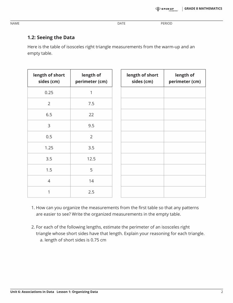
1.2: Seeing the Data
Here is the table of isosceles right triangle measurements from the warm-up and anempty table.
1. How can you organize the measurements from the first table so that any patternsare easier to see? Write the organized measurements in the empty table.
2. For each of the following lengths, estimate the perimeter of an isosceles righttriangle whose short sides have that length. Explain your reasoning for each triangle.
a. length of short sides is 0.75 cm
length of shortsides (cm)
length ofperimeter (cm)
0.25 1
2 7.5
6.5 22
3 9.5
0.5 2
1.25 3.5
3.5 12.5
1.5 5
4 14
1 2.5
length of shortsides (cm)
length ofperimeter (cm)
GRADE 8 MATHEMATICS
NAME DATE PERIOD
Unit 6: Associations in Data Lesson 1: Organizing Data 2

b. length of short sides is 5 cm
c. length of short sides is 10 cm
Are you ready for more?
In addition to the graphic representations of data you have learned, there are othersthat make sense in other situations. Examine the maps showing the results of theelections for United States president for 2012 and 2016. In red are the states where amajority of electorate votes were cast for the Republican nominee. In blue are the stateswhere a majority of the electorate votes were cast for the Democrat nominee.
1. What information can you see in these maps that would be more difficult to see in abar graph showing the number of electorate votes for the 2 main candidates?
2. Why are these representations appropriate for the data that is shown?
GRADE 8 MATHEMATICS
NAME DATE PERIOD
Unit 6: Associations in Data Lesson 1: Organizing Data 3
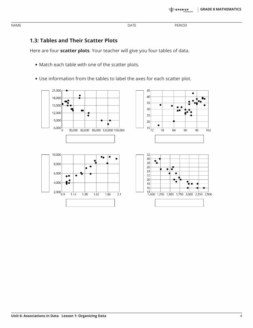
1.3: Tables and Their Scatter Plots
Here are four scatter plots. Your teacher will give you four tables of data.
Match each table with one of the scatter plots.
Use information from the tables to label the axes for each scatter plot.
•
•
GRADE 8 MATHEMATICS
NAME DATE PERIOD
Unit 6: Associations in Data Lesson 1: Organizing Data 4
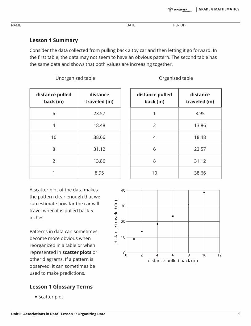
Lesson 1 Summary
Consider the data collected from pulling back a toy car and then letting it go forward. Inthe first table, the data may not seem to have an obvious pattern. The second table hasthe same data and shows that both values are increasing together.
Lesson 1 Glossary Terms
scatter plot
Unorganized table
distance pulledback (in)
distancetraveled (in)
6 23.57
4 18.48
10 38.66
8 31.12
2 13.86
1 8.95
Organized table
distance pulledback (in)
distancetraveled (in)
1 8.95
2 13.86
4 18.48
6 23.57
8 31.12
10 38.66
A scatter plot of the data makesthe pattern clear enough that wecan estimate how far the car willtravel when it is pulled back 5inches.
Patterns in data can sometimesbecome more obvious whenreorganized in a table or whenrepresented in scatter plots orother diagrams. If a pattern isobserved, it can sometimes beused to make predictions.
•
GRADE 8 MATHEMATICS
NAME DATE PERIOD
Unit 6: Associations in Data Lesson 1: Organizing Data 5

Unit 6, Lesson 1: Organizing Data1. Here is data on the number of cases of whooping cough from 1939 to 1955.
year number of cases
1941 222,202
1950 120,718
1945 133,792
1942 191,383
1953 37,129
1939 103,188
1951 68,687
1948 74,715
1955 62,786
1952 45,030
1940 183,866
1954 60,866
1944 109,873
1946 109,860
1943 191,890
1949 69,479
1947 156,517
a. Make a new table that orders the data by year.
b. Which years in this period of time had fewer than100,000 cases of whooping cough?
GRADE 8 MATHEMATICS
NAME DATE PERIOD
Unit 6: Associations in Data Lesson 1: Organizing Data 1
c. Based on this data, would you expect 1956 to have closer to 50,000 cases or closer to 100,000cases?
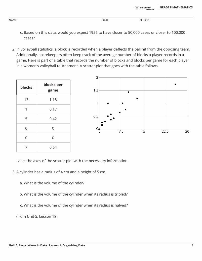
2. In volleyball statistics, a block is recorded when a player deflects the ball hit from the opposing team.Additionally, scorekeepers often keep track of the average number of blocks a player records in agame. Here is part of a table that records the number of blocks and blocks per game for each playerin a women’s volleyball tournament. A scatter plot that goes with the table follows.
Label the axes of the scatter plot with the necessary information.
3. A cylinder has a radius of 4 cm and a height of 5 cm.
a. What is the volume of the cylinder?
b. What is the volume of the cylinder when its radius is tripled?
c. What is the volume of the cylinder when its radius is halved?
(from Unit 5, Lesson 18)
blocksblocks per
game
13 1.18
1 0.17
5 0.42
0 0
0 0
7 0.64
GRADE 8 MATHEMATICS
NAME DATE PERIOD
Unit 6: Associations in Data Lesson 1: Organizing Data 2

Unit 6, Lesson 2: Plotting DataLet’s collect and display some data about the class.
2.1: Representing Data
Lin surveyed 30 students about the longest time they had ever run. Andre asked themabout their favorite color. How could Lin and Andre represent their data sets? Would theyrepresent them in the same way? Why or why not?
2.2: Gathering Data
Are older students always taller? Do taller students tend to have bigger hands? Toinvestigate these questions, the class will gather data.
A person’s arm span is the distance between the tips of their index fingers, whentheir arms are fully spread out.A person’s hand span is the distance from the tip of their thumb to the tip of theirlittle finger, when their fingers are fully spread out.
1. Each partner should:
Measure the other partner’s height, arm span, and hand span for their righthand to the nearest centimeter.
Record the other partner’s measurements and age (in months) in the table.
height(cm)
arm span(cm)
hand span(cm)
age(months)
partnerA
partnerB
•
•
◦
◦
GRADE 8 MATHEMATICS
NAME DATE PERIOD
Unit 6: Associations in Data Lesson 2: Plotting Data 1

m.openup.org/1/8-6-2-3
2. One partner records the data from your table in a table of data for the entire class.
2.3: Scatter Plots
1. What types of graphical representations could be used to showthe class’s height measurements? Make a graphicalrepresentation of the class’s height measurements.
2. Choose a color and use it to plot a point on the coordinate plane that representsyour own height and hand span. Then, in the same color, plot a second point thatrepresents your partner's height and hand span.
3. In a different color, plot the height and hand span of each student in your class,making a scatter plot of the heights and hand spans for the entire class.
GRADE 8 MATHEMATICS
NAME DATE PERIOD
Unit 6: Associations in Data Lesson 2: Plotting Data 2

4. Based on your scatter plot, answer these questions:a. Do taller students in your class tend to have bigger hands? Explain how you
know.
b. Is hand span a linear function of height? Explain how you know.
Are you ready for more?
Although the data may be accurate, displaying the data incorrectly can tell the wrongstory. What is wrong with each of these graphic representations of the data?
GRADE 8 MATHEMATICS
NAME DATE PERIOD
Unit 6: Associations in Data Lesson 2: Plotting Data 3
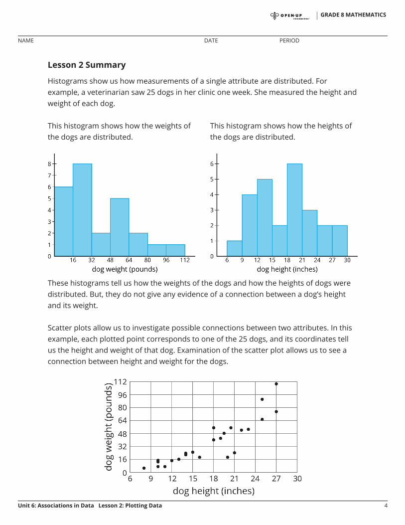
Lesson 2 Summary
Histograms show us how measurements of a single attribute are distributed. Forexample, a veterinarian saw 25 dogs in her clinic one week. She measured the height andweight of each dog.
These histograms tell us how the weights of the dogs and how the heights of dogs weredistributed. But, they do not give any evidence of a connection between a dog’s heightand its weight.
Scatter plots allow us to investigate possible connections between two attributes. In thisexample, each plotted point corresponds to one of the 25 dogs, and its coordinates tellus the height and weight of that dog. Examination of the scatter plot allows us to see aconnection between height and weight for the dogs.
This histogram shows how the weights ofthe dogs are distributed.
This histogram shows how the heights ofthe dogs are distributed.
GRADE 8 MATHEMATICS
NAME DATE PERIOD
Unit 6: Associations in Data Lesson 2: Plotting Data 4

Unit 6, Lesson 2: Plotting Data1. In hockey, a player gets credited with a “point” in their statistics when they get an assist or goal. The
table shows the number of assists and number of points for 15 hockey players after a season.
Make a scatter plot of this data. Make sure to scale and label the axes.
2. Select all the representations that are appropriate for comparing bite strength to weight for different
assists points
22 28
16 18
46 72
19 29
13 26
9 13
16 22
8 18
12 13
12 17
37 50
7 12
17 34
27 58
18 34
GRADE 8 MATHEMATICS
NAME DATE PERIOD
Unit 6: Associations in Data Lesson 2: Plotting Data 1
carnivores.
A. HistogramB. Scatter plotC. Dot plotD. TableE. Box plot
3. When is it better to use a table? When is it better to use a scatter plot?
4. There are many cylinders with radius 6 meters. Let represent the height in meters and representthe volume in cubic meters.
a. Write an equation that represents the volume as a function of the height .
b. Sketch the graph of the function, using 3.14 as an approximation for .
c. If you double the height of a cylinder, what happens to the volume? Explain this using theequation.
d. If you multiply the height of a cylinder by , what happens to the volume? Explain this using the
graph.
(from Unit 5, Lesson 17)
GRADE 8 MATHEMATICS
NAME DATE PERIOD
Unit 6: Associations in Data Lesson 2: Plotting Data 2

Unit 6, Lesson 3: What a Point in a Scatter PlotMeansLet’s investigate points in scatter plots.
3.1: The Giant Panda
A giant panda lives in a zoo. What does the pointon the graph tell you about the panda?
GRADE 8 MATHEMATICS
NAME DATE PERIOD
Unit 6: Associations in Data Lesson 3: What a Point in a Scatter Plot Means 1

m.openup.org/1/8-6-3-23.2: Weight and Fuel Efficiency
The table and scatter plot show weights and fuel efficiencies of 18cars.
GRADE 8 MATHEMATICS
NAME DATE PERIOD
Unit 6: Associations in Data Lesson 3: What a Point in a Scatter Plot Means 2

Are you ready for more?
After a board game competition, the tournament director collects 50 dice from thegames played and rolls each one until he gets bored and tries a different one. The scatterplot shows the number of times he rolled each die and the number of 6s that resulted
carweight
(kg)
fuelefficiency
(mpg)
A 1,549 25
B 1,610 20
C 1,737 21
D 1,777 20
E 1,486 23
F 1,962 16
G 2,384 16
H 1,957 19
I 2,212 16
J 1,115 29
K 2,068 18
L 1,663 19
M 2,216 18
N 1,432 25
O 1,987 18
P 1,580 26
Q 1,234 30
R 1,656 23
1. Which point in the scatter plot represents Car L’smeasurements?
2. What is the fuel efficiency of the car with the greatestweight?
3. What is the weight of the car with the greatest fuelefficiency?
4. Car S weighs 1,912 kilograms and gets 16 miles pergallon. On the scatter plot, plot a point thatrepresents Car S’s measurements.
5. Cars N and O, shown in the scatter plot, are made bythe same company. Compare their weights and fuelefficiencies. Does anything surprise you about thesecars?
6. A different company makes Cars F and G. Comparetheir weights and fuel efficiencies. Does anythingsurprise you about these cars?
GRADE 8 MATHEMATICS
NAME DATE PERIOD
Unit 6: Associations in Data Lesson 3: What a Point in a Scatter Plot Means 3
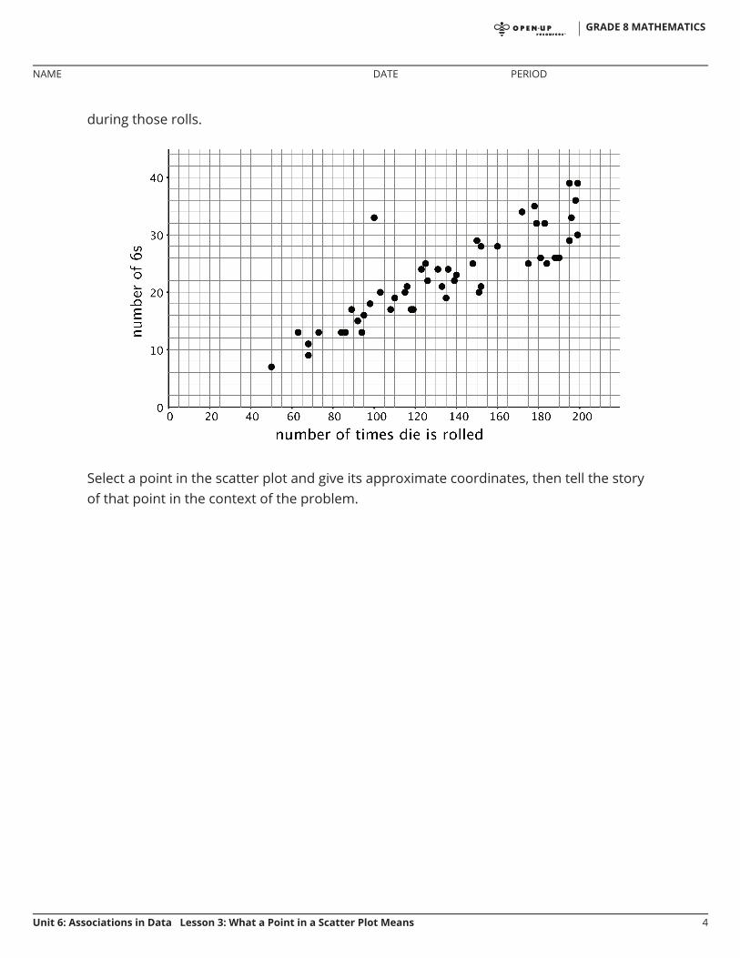
during those rolls.
Select a point in the scatter plot and give its approximate coordinates, then tell the storyof that point in the context of the problem.
GRADE 8 MATHEMATICS
NAME DATE PERIOD
Unit 6: Associations in Data Lesson 3: What a Point in a Scatter Plot Means 4
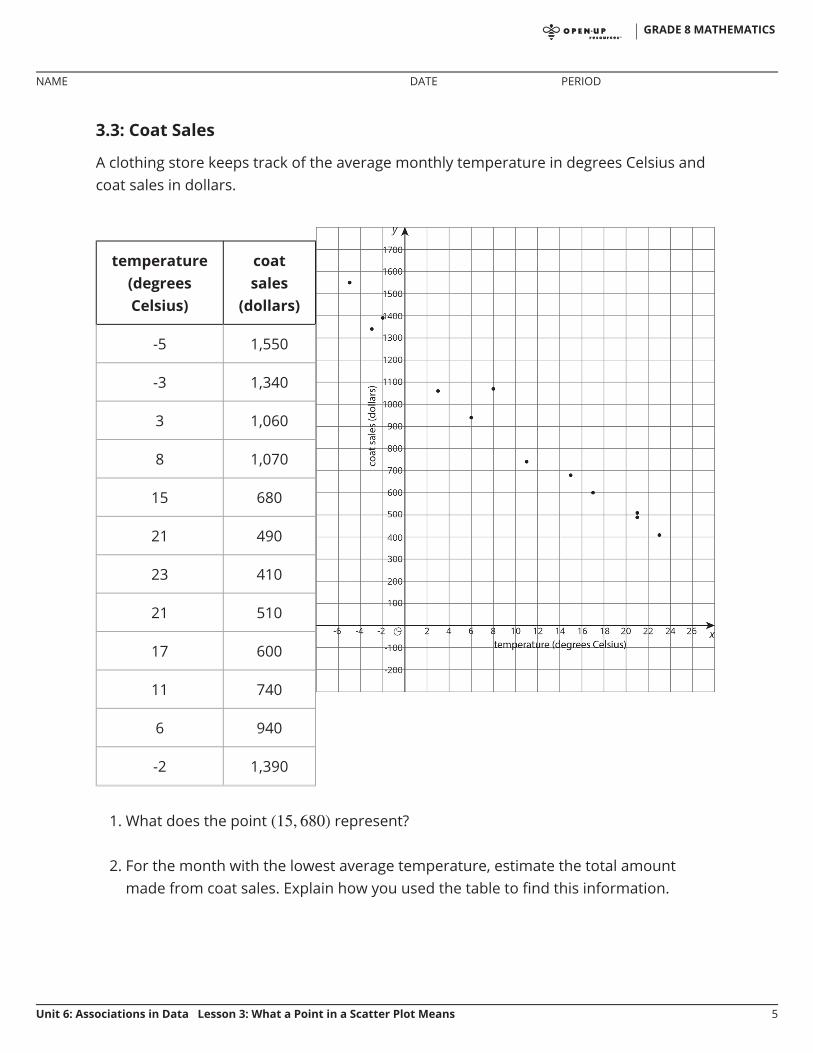
3.3: Coat Sales
A clothing store keeps track of the average monthly temperature in degrees Celsius andcoat sales in dollars.
1. What does the point represent?
2. For the month with the lowest average temperature, estimate the total amountmade from coat sales. Explain how you used the table to find this information.
temperature(degreesCelsius)
coatsales
(dollars)
-5 1,550
-3 1,340
3 1,060
8 1,070
15 680
21 490
23 410
21 510
17 600
11 740
6 940
-2 1,390
GRADE 8 MATHEMATICS
NAME DATE PERIOD
Unit 6: Associations in Data Lesson 3: What a Point in a Scatter Plot Means 5

3. For the month with the smallest coat sales, estimate the average monthlytemperature. Explain how you used the scatter plot to find this information.
4. If there were a point at what would it represent? Use the scatter plot toestimate a value for .
5. What would a point at represent? Use the scatter plot to estimate a value for .
6. Would it make sense to use this trend to estimate the value of sales when theaverage monthly temperature is 60 degrees Celsius? Explain your reasoning.
GRADE 8 MATHEMATICS
NAME DATE PERIOD
Unit 6: Associations in Data Lesson 3: What a Point in a Scatter Plot Means 6

Lesson 3 Summary
Scatter plots show two measurements for each individual from a group. For example,this scatter plot shows the weight and height for each dog from a group of 25 dogs.
We can see that the tallest dogs are 27 inches, and that one of those tallest dogs weighsabout 75 pounds while the other weighs about 110 pounds. This shows us that dogweight is not a function of dog height because there would be two different outputs forthe same input. But we can see a general trend: Taller dogs tend to weigh more thanshorter dogs. There are exceptions. For example, there is a dog that is 18 inches tall andweighs over 50 pounds, and there is another dog that is 21 inches tall but weighs lessthan 30 pounds.
When we collect data by measuring attributes like height, weight, area, or volume, we callthe data numerical data (or measurement data), and we say that height, weight, area, orvolume is a numerical variable. Upcoming lessons will discuss how to identify anddescribe trends in data that has been collected.
GRADE 8 MATHEMATICS
NAME DATE PERIOD
Unit 6: Associations in Data Lesson 3: What a Point in a Scatter Plot Means 7

Unit 6, Lesson 3: What a Point in a Scatter Plot Means1. Here is a table and a scatter plot that compares points per game to free throw attempts for a
basketball team during a tournament.
player free throw attempts points
player A 5.5 28.3
player B 2.1 18.6
player C 4.1 13.7
player D 1.6 10.6
player E 3.1 10.4
player F 1 5
player G 1.2 5
player H 0.7 4.7
player I 1.5 3.7
player J 1.5 3.5
player K 1.2 3.1
player L 0 1
player M 0 0.8
player N 0 0.6
GRADE 8 MATHEMATICS
NAME DATE PERIOD
Unit 6: Associations in Data Lesson 3: What a Point in a Scatter Plot Means 1

2. Select all the representations that are appropriate for comparing exam score to number of hours ofsleep the night before the exam.
A. HistogramB. Scatter plotC. Dot plotD. TableE. Box plot
(from Unit 6, Lesson 2)
3. A cone has a volume of cm3 and height . Complete this table for volume of cylinders with thesame radius but different heights.
a. Circle the point that represents the data for Player E.
b. What does the point represent?
c. In that same tournament, Player O on another teamscored 14.3 points per game with 4.8 free throwattempts per game. Plot a point on the graph thatshows this information.
GRADE 8 MATHEMATICS
NAME DATE PERIOD
Unit 6: Associations in Data Lesson 3: What a Point in a Scatter Plot Means 2

height (cm) volume (cm3)
(from Unit 5, Lesson 17)
GRADE 8 MATHEMATICS
NAME DATE PERIOD
Unit 6: Associations in Data Lesson 3: What a Point in a Scatter Plot Means 3

Unit 6, Lesson 4: Fitting a Line to DataLet’s look at the scatter plots as a whole.
4.1: Predict This
Here is a scatter plot that shows weights and fuel efficiencies of 20 different types ofcars.
If a car weighs 1,750 kg, would you expect its fuel efficiency to be closer to 22 mpg or to28 mpg? Explain your reasoning.
GRADE 8 MATHEMATICS
NAME DATE PERIOD
Unit 6: Associations in Data Lesson 4: Fitting a Line to Data 1

m.openup.org/1/8-6-4-24.2: Shine Bright
Here is a table that shows weights and prices of 20 differentdiamonds.
weight (carats) actual price (dollars) predicted price (dollars)
1 3,772 4,429
1 4,221 4,429
1 4,032 4,429
1 5,385 4,429
1.05 3,942 4,705
1.05 4,480 4,705
1.06 4,511 4,760
1.2 5,544 5,533
1.3 6,131 6,085
1.32 5,872 6,195
1.41 7,122 6,692
1.5 7,474 7,189
1.5 5,904 7,189
1.59 8,706 7,686
1.61 8,252 7,796
1.73 9,530 8,459
1.77 9,374 8,679
1.85 8,169 9,121
1.9 9,541 9,397
2.04 9,125 10,170
GRADE 8 MATHEMATICS
NAME DATE PERIOD
Unit 6: Associations in Data Lesson 4: Fitting a Line to Data 2

The scatter plot shows the prices and weights of the 20 diamonds together with thegraph of .
The function described by the equation is a model of the relationshipbetween a diamond’s weight and its price.
This model predicts the price of a diamond from its weight. These predicted prices areshown in the third column of the table.
1. Two diamonds that both weigh 1.5 carats have different prices. What are theirprices? How can you see this in the table? How can you see this in the graph?
2. The model predicts that when the weight is 1.5 carats, the price will be $7,189. Howcan you see this in the graph? How can you see this using the equation?
GRADE 8 MATHEMATICS
NAME DATE PERIOD
Unit 6: Associations in Data Lesson 4: Fitting a Line to Data 3
m.openup.org/1/8-6-4-3
3. One of the diamonds weighs 1.9 carats. What does the model predict for its price?How does that compare to the actual price?
4. Find a diamond for which the model makes a very good prediction of the actualprice. How can you see this in the table? In the graph?
5. Find a diamond for which the model’s prediction is not very close to the actual price.How can you see this in the table? In the graph?
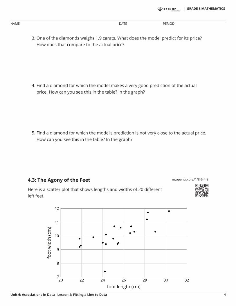
4.3: The Agony of the Feet
Here is a scatter plot that shows lengths and widths of 20 differentleft feet.
GRADE 8 MATHEMATICS
NAME DATE PERIOD
Unit 6: Associations in Data Lesson 4: Fitting a Line to Data 4

1. Estimate the lengths of the longest foot and the shortest foot.
2. Estimate the widths of the widest foot and the narrowest foot.
3. Here is the same scatter plot together with the graph of a model for the relationshipbetween foot length and width.
Circle the data point that seems weird when compared to the model. What lengthand width does that point represent?
GRADE 8 MATHEMATICS
NAME DATE PERIOD
Unit 6: Associations in Data Lesson 4: Fitting a Line to Data 5

Lesson 4 Summary
Sometimes, we can use a linear function as a model of the relationship between twovariables. For example, here is a scatter plot that shows heights and weights of 25 dogstogether with the graph of a linear function which is a model for the relationshipbetween a dog’s height and its weight.
We can see that the model does a good job of predicting the weight given the height forsome dogs. These correspond to points on or near the line. The model doesn’t do a verygood job of predicting the weight given the height for the dogs whose points are far fromthe line.
For example, there is a dog that is about 20 inches tall and weighs a little more than 16pounds. The model predicts that the weight would be about 48 pounds. We say that themodel overpredicts the weight of this dog. There is also a dog that is 27 inches tall andweighs about 110 pounds. The model predicts that its weight will be a little less than 80pounds. We say the model underpredicts the weight of this dog.
Sometimes a data point is far away from the other points or doesn’t fit a trend that all theother points fit. We call these outliers.
Lesson 4 Glossary Terms
outlier•
GRADE 8 MATHEMATICS
NAME DATE PERIOD
Unit 6: Associations in Data Lesson 4: Fitting a Line to Data 6
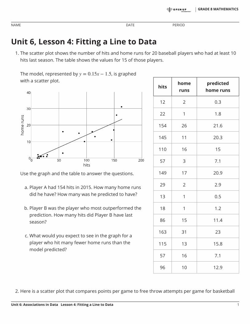
Unit 6, Lesson 4: Fitting a Line to Data1. The scatter plot shows the number of hits and home runs for 20 baseball players who had at least 10
hits last season. The table shows the values for 15 of those players.
2. Here is a scatter plot that compares points per game to free throw attempts per game for basketball
The model, represented by , is graphedwith a scatter plot.
Use the graph and the table to answer the questions.
a. Player A had 154 hits in 2015. How many home runsdid he have? How many was he predicted to have?
b. Player B was the player who most outperformed theprediction. How many hits did Player B have lastseason?
c. What would you expect to see in the graph for aplayer who hit many fewer home runs than themodel predicted?
hitshomeruns
predictedhome runs
12 2 0.3
22 1 1.8
154 26 21.6
145 11 20.3
110 16 15
57 3 7.1
149 17 20.9
29 2 2.9
13 1 0.5
18 1 1.2
86 15 11.4
163 31 23
115 13 15.8
57 16 7.1
96 10 12.9
GRADE 8 MATHEMATICS
NAME DATE PERIOD
Unit 6: Associations in Data Lesson 4: Fitting a Line to Data 1

players in a tournament. The model, represented by , is graphed with the scatterplot. Here, represents free throw attempts per game, and represents points per game.
a. Circle any data points that appear to be outliers.
b. What does it mean for a point to be far above the line in this situation?
c. Based on the model, how many points per game would you expect a player who attempts 4.5 freethrows per game to have? Round your answer to the nearest tenth of a point per game.
d. One of the players scored 13.7 points per game with 4.1 free throw attempts per game. How doesthis compare to what the model predicts for this player?
GRADE 8 MATHEMATICS
NAME DATE PERIOD
Unit 6: Associations in Data Lesson 4: Fitting a Line to Data 2

Unit 6, Lesson 5: Describing Trends in ScatterPlotsLet’s look for associations between variables.
5.1: Which One Doesn’t Belong: Scatter Plots
Which one doesn’t belong?
GRADE 8 MATHEMATICS
NAME DATE PERIOD
Unit 6: Associations in Data Lesson 5: Describing Trends in Scatter Plots 1

m.openup.org/1/8-6-5-25.2: Fitting Lines
Your teacher will give you a piece of pasta and a straightedge.
1. Here are two copies of the same scatter plot. Experiment with drawing lines to fit thedata. Pick the line that you think best fits the data. Compare it with a partner’s.
GRADE 8 MATHEMATICS
NAME DATE PERIOD
Unit 6: Associations in Data Lesson 5: Describing Trends in Scatter Plots 2
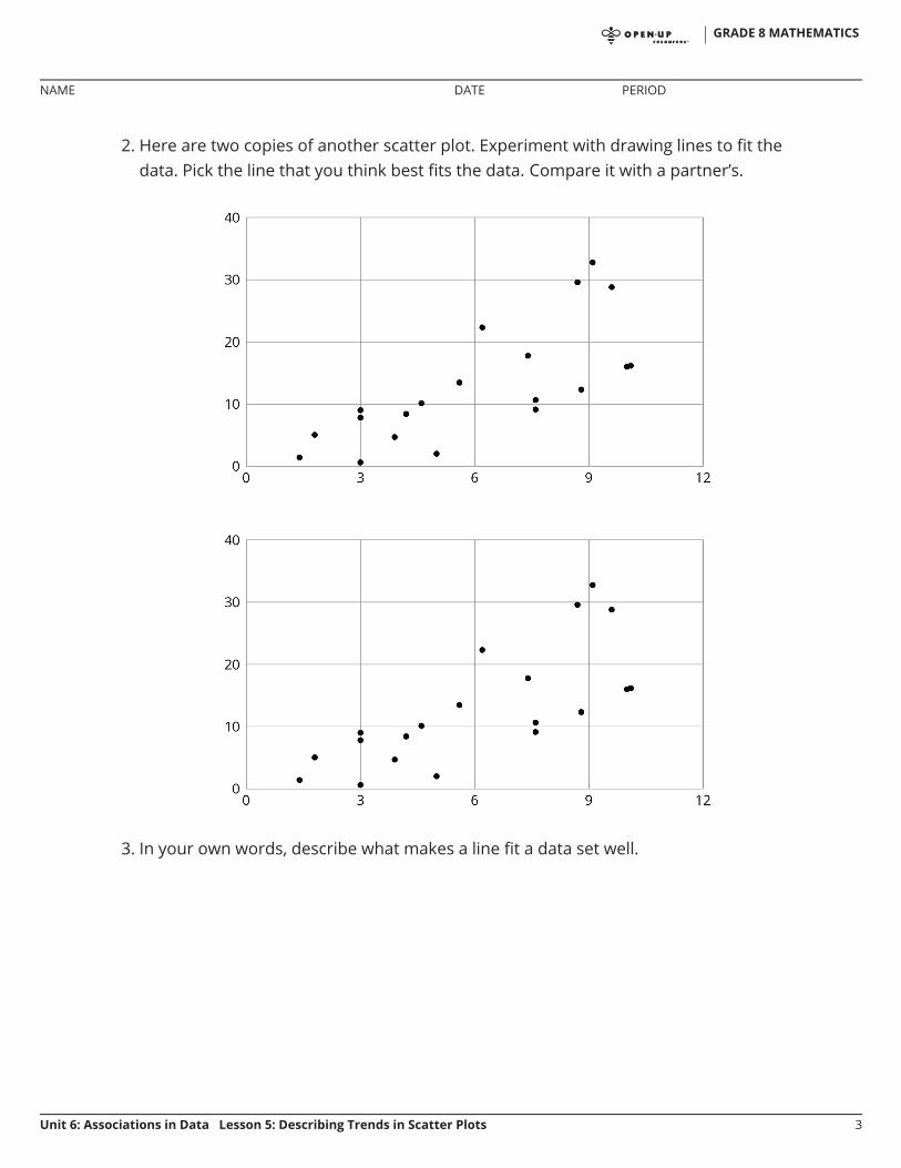
2. Here are two copies of another scatter plot. Experiment with drawing lines to fit thedata. Pick the line that you think best fits the data. Compare it with a partner’s.
3. In your own words, describe what makes a line fit a data set well.
GRADE 8 MATHEMATICS
NAME DATE PERIOD
Unit 6: Associations in Data Lesson 5: Describing Trends in Scatter Plots 3

5.3: Good Fit Bad Fit
The scatter plots both show the year and price for the same 17 used cars. However, eachscatter plot shows a different model for the relationship between year and price.
1. Look at Diagram A.a. For how many cars does the model in Diagram A make a good prediction of its
price?
b. For how many cars does the model underestimate the price?
c. For how many cars does it overestimate the price?
2. Look at Diagram B.a. For how many cars does the model in Diagram B make a good prediction of its
price?
b. For how many cars does the model underestimate the price?
c. For how many cars does it overestimate the price?
3. For how many cars does the prediction made by the model in Diagram A differ bymore than $3,000? What about the model in Diagram B?
GRADE 8 MATHEMATICS
NAME DATE PERIOD
Unit 6: Associations in Data Lesson 5: Describing Trends in Scatter Plots 4
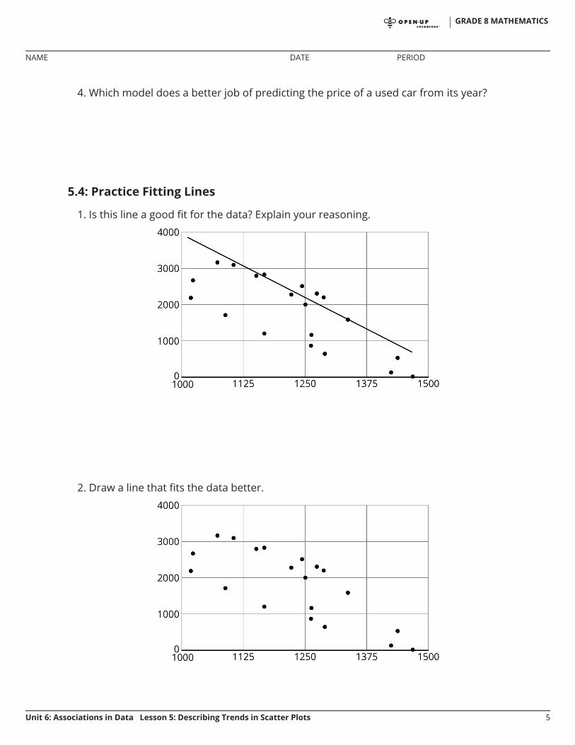
4. Which model does a better job of predicting the price of a used car from its year?
5.4: Practice Fitting Lines
1. Is this line a good fit for the data? Explain your reasoning.
2. Draw a line that fits the data better.
GRADE 8 MATHEMATICS
NAME DATE PERIOD
Unit 6: Associations in Data Lesson 5: Describing Trends in Scatter Plots 5

3. Is this line a good fit for the data? Explain your reasoning.
4. Draw a line that fits the data better.
GRADE 8 MATHEMATICS
NAME DATE PERIOD
Unit 6: Associations in Data Lesson 5: Describing Trends in Scatter Plots 6
Are you ready for more?
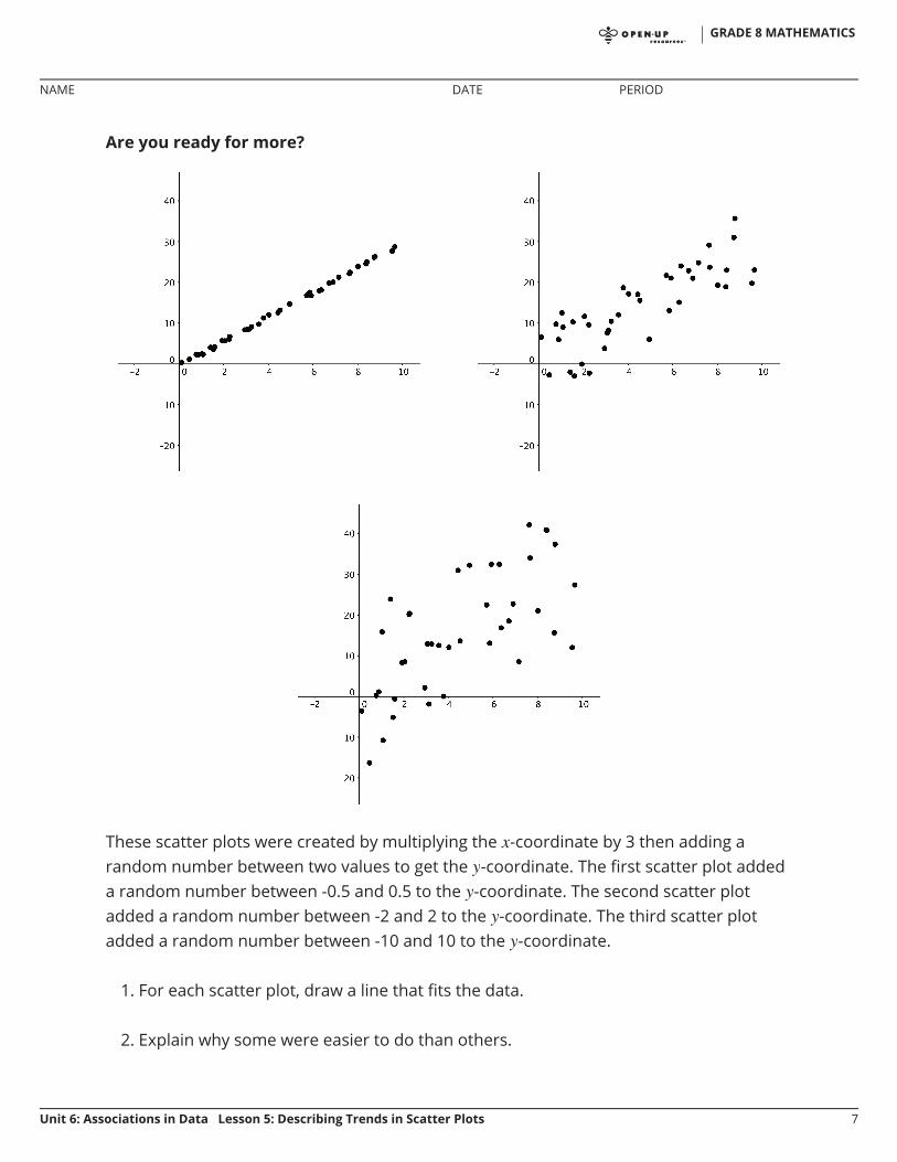
These scatter plots were created by multiplying the -coordinate by 3 then adding arandom number between two values to get the -coordinate. The first scatter plot addeda random number between -0.5 and 0.5 to the -coordinate. The second scatter plotadded a random number between -2 and 2 to the -coordinate. The third scatter plotadded a random number between -10 and 10 to the -coordinate.
1. For each scatter plot, draw a line that fits the data.
2. Explain why some were easier to do than others.
GRADE 8 MATHEMATICS
NAME DATE PERIOD
Unit 6: Associations in Data Lesson 5: Describing Trends in Scatter Plots 7
Lesson 5 Summary
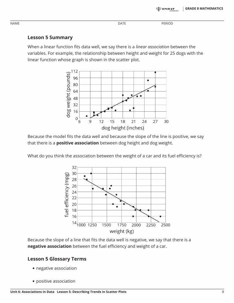
When a linear function fits data well, we say there is a linear association between thevariables. For example, the relationship between height and weight for 25 dogs with thelinear function whose graph is shown in the scatter plot.
Because the model fits the data well and because the slope of the line is positive, we saythat there is a positive association between dog height and dog weight.
What do you think the association between the weight of a car and its fuel efficiency is?
Because the slope of a line that fits the data well is negative, we say that there is anegative association between the fuel efficiency and weight of a car.
Lesson 5 Glossary Terms
negative association
positive association
•
•
GRADE 8 MATHEMATICS
NAME DATE PERIOD
Unit 6: Associations in Data Lesson 5: Describing Trends in Scatter Plots 8

Unit 6, Lesson 5: Describing Trends in Scatter Plots1. a. Draw a line that you think is a good fit for this data. For this data, the inputs are the horizontal
values, and the outputs are the vertical values.
b. Use your line of fit to estimate what you would expect the output value to be when the input is10.
2. Here is a scatter plot that shows the most popular videos in a 10-year span.
a. Use the scatter plot to estimate the number of views for the most popular video in this 10-yearspan.
b. Estimate when the 4th most popular video was released.
(from Unit 6, Lesson 3)
GRADE 8 MATHEMATICS
NAME DATE PERIOD
Unit 6: Associations in Data Lesson 5: Describing Trends in Scatter Plots 1
3. A recipe for bread calls for 1 teaspoon of yeast for every 2 cups of flour.
a. Name two quantities in this situation that are in a functional relationship.
b. Write an equation that represents the function.
c. Draw the graph of the function. Label at least two points with input-output pairs.
(from Unit 5, Lesson 8)
GRADE 8 MATHEMATICS
NAME DATE PERIOD
Unit 6: Associations in Data Lesson 5: Describing Trends in Scatter Plots 2

Unit 6, Lesson 6: The Slope of a Fitted LineLet's look at how changing one variable changes another.
6.1: Estimating Slope
Estimate the slope of the line.
6.2: Describing Linear Associations
For each scatter plot, decide if there is an association between the two variables, anddescribe the situation using one of these sentences:
For these data, as ________________ increases, ________________ tends to increase.
For these data, as ________________ increases, ________________ tends to decrease.
For these data, ________________ and ________________ do not appear to be related.
•
•
•
GRADE 8 MATHEMATICS
NAME DATE PERIOD
Unit 6: Associations in Data Lesson 6: The Slope of a Fitted Line 1
GRADE 8 MATHEMATICS
NAME DATE PERIOD
Unit 6: Associations in Data Lesson 6: The Slope of a Fitted Line 2

6.3: Interpreting Slopes
For each of the situations, a linear model for some data is shown.
1. What is the slope of the line in the scatter plot for each situation?
2. What is the meaning of the slope in that situation?
GRADE 8 MATHEMATICS
NAME DATE PERIOD
Unit 6: Associations in Data Lesson 6: The Slope of a Fitted Line 3

Are you ready for more?
The scatter plot shows the weight and fuel efficiency data used in an earlier lesson alongwith a linear model represented by the equation .
1. What is the value of the slope and what does it mean in this context?
2. What does the other number in the equation represent on the graph? What does itmean in context?
GRADE 8 MATHEMATICS
NAME DATE PERIOD
Unit 6: Associations in Data Lesson 6: The Slope of a Fitted Line 4

3. Use the equation to predict the fuel efficiency of a car that weighs 100 kilograms.
4. Use the equation to predict the weight of a car that has a fuel efficiency of 22 mpg.
5. Which of these two predictions probably fits reality better? Explain.
6.4: Positive or Negative?
1. For each of the scatter plots, decide whether it makes sense to fit a linear model tothe data. If it does, would the graph of the model have a positive slope, a negativeslope, or a slope of zero?
2. Which of these scatter plots show evidence of a positive association between thevariables? Of a negative association? Which do not appear to show an association?
GRADE 8 MATHEMATICS
NAME DATE PERIOD
Unit 6: Associations in Data Lesson 6: The Slope of a Fitted Line 5
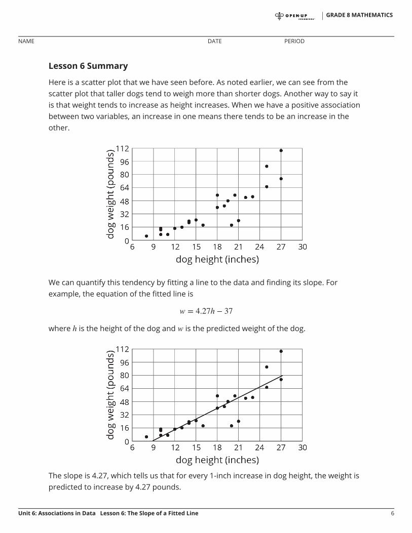
Lesson 6 Summary
Here is a scatter plot that we have seen before. As noted earlier, we can see from thescatter plot that taller dogs tend to weigh more than shorter dogs. Another way to say itis that weight tends to increase as height increases. When we have a positive associationbetween two variables, an increase in one means there tends to be an increase in theother.
We can quantify this tendency by fitting a line to the data and finding its slope. Forexample, the equation of the fitted line is
where is the height of the dog and is the predicted weight of the dog.
The slope is 4.27, which tells us that for every 1-inch increase in dog height, the weight ispredicted to increase by 4.27 pounds.
GRADE 8 MATHEMATICS
NAME DATE PERIOD
Unit 6: Associations in Data Lesson 6: The Slope of a Fitted Line 6

In our example of the fuel efficiency and weight of a car, the slope of the fitted lineshown is -0.01.
This tells us that for every 1-kilogram increase in the weight of the car, the fuel efficiencyis predicted to decrease by 0.01 miles per gallon. When we have a negative associationbetween two variables, an increase in one means there tends to be a decrease in theother.
GRADE 8 MATHEMATICS
NAME DATE PERIOD
Unit 6: Associations in Data Lesson 6: The Slope of a Fitted Line 7
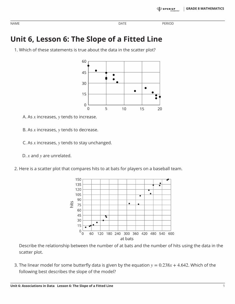
Unit 6, Lesson 6: The Slope of a Fitted Line1. Which of these statements is true about the data in the scatter plot?
A. As increases, tends to increase.
B. As increases, tends to decrease.
C. As increases, tends to stay unchanged.
D. and are unrelated.
2. Here is a scatter plot that compares hits to at bats for players on a baseball team.
Describe the relationship between the number of at bats and the number of hits using the data in thescatter plot.
3. The linear model for some butterfly data is given by the equation . Which of thefollowing best describes the slope of the model?
GRADE 8 MATHEMATICS
NAME DATE PERIOD
Unit 6: Associations in Data Lesson 6: The Slope of a Fitted Line 1

A. For every 1 mm the wingspan increases, the length of the butterfly increases 0.238 mm.B. For every 1 mm the wingspan increases, the length of the butterfly increases 4.642 mm.C. For every 1 mm the length of the butterfly increases, the wingspan increases 0.238 mm.D. For every 1 mm the length of the butterfly increases, the wingspan increases 4.642 mm.
4. Nonstop, one-way flight times from O’Hare Airport in Chicago and prices of a one-way ticket areshown in the scatter plot.
(from Unit 6, Lesson 4)
5. Solve:
(from Unit 4, Lesson 14)
a. Circle any data that appear to beoutliers.
b. Use the graph to estimate thedifference between any outliersand their predicted values.
GRADE 8 MATHEMATICS
NAME DATE PERIOD
Unit 6: Associations in Data Lesson 6: The Slope of a Fitted Line 2
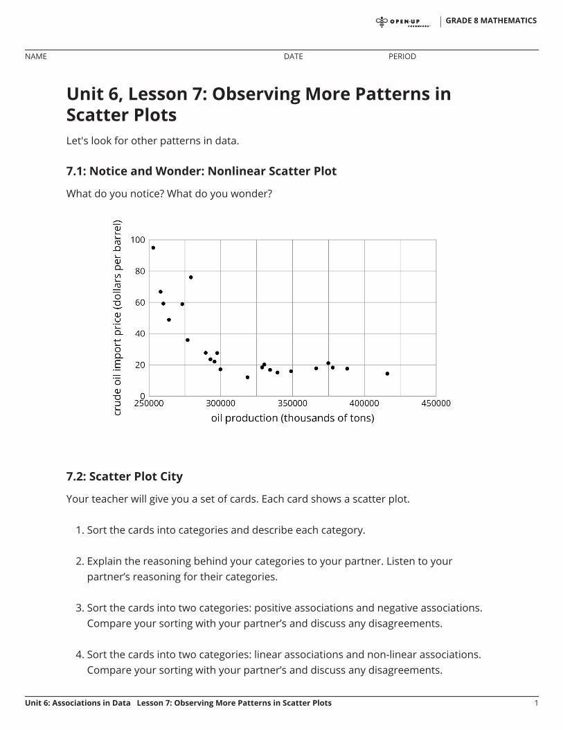
Unit 6, Lesson 7: Observing More Patterns inScatter PlotsLet's look for other patterns in data.
7.1: Notice and Wonder: Nonlinear Scatter Plot
What do you notice? What do you wonder?
7.2: Scatter Plot City
Your teacher will give you a set of cards. Each card shows a scatter plot.
1. Sort the cards into categories and describe each category.
2. Explain the reasoning behind your categories to your partner. Listen to yourpartner’s reasoning for their categories.
3. Sort the cards into two categories: positive associations and negative associations.Compare your sorting with your partner’s and discuss any disagreements.
4. Sort the cards into two categories: linear associations and non-linear associations.Compare your sorting with your partner’s and discuss any disagreements.
GRADE 8 MATHEMATICS
NAME DATE PERIOD
Unit 6: Associations in Data Lesson 7: Observing More Patterns in Scatter Plots 1

7.3: Clustering
How are these scatter plots alike? How are they different?
GRADE 8 MATHEMATICS
NAME DATE PERIOD
Unit 6: Associations in Data Lesson 7: Observing More Patterns in Scatter Plots 2

Lesson 7 Summary
Sometimes a scatter plot shows an association that is not linear:
We call such an association a non-linear association. In later grades, you will studyfunctions that can be models for non-linear associations.
Sometimes in a scatter plot we can see separate groups of points.
We call these groups clusters.
GRADE 8 MATHEMATICS
NAME DATE PERIOD
Unit 6: Associations in Data Lesson 7: Observing More Patterns in Scatter Plots 3

Unit 6, Lesson 7: Observing More Patterns in Scatter Plots1. Literacy rate and population for the 12 countries with more than 100 million people are shown in the
scatter plot. Circle any clusters in the data.
2. Here is a scatter plot:
Select all the following that describe the association in the scatter plot:
A. Linear associationB. Non-linear associationC. Positive associationD. Negative associationE. No association
GRADE 8 MATHEMATICS
NAME DATE PERIOD
Unit 6: Associations in Data Lesson 7: Observing More Patterns in Scatter Plots 1
3. For the same data, two different models are graphed. Which model more closely matches the data?Explain your reasoning.
(from Unit 6, Lesson 5)
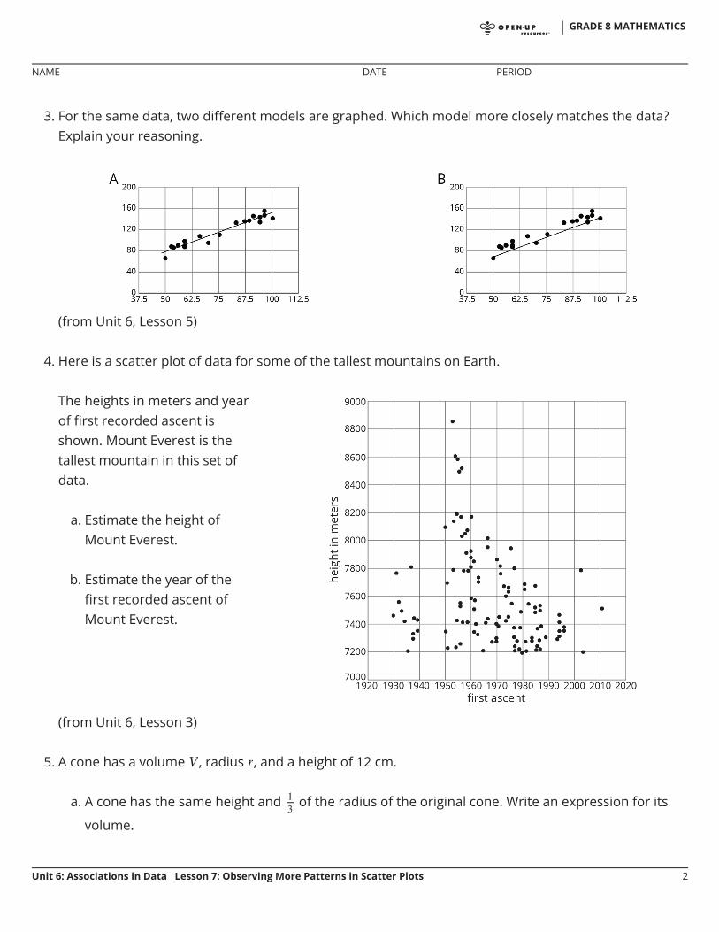
4. Here is a scatter plot of data for some of the tallest mountains on Earth.
(from Unit 6, Lesson 3)
5. A cone has a volume , radius , and a height of 12 cm.
a. A cone has the same height and of the radius of the original cone. Write an expression for its
volume.
The heights in meters and yearof first recorded ascent isshown. Mount Everest is thetallest mountain in this set ofdata.
a. Estimate the height ofMount Everest.
b. Estimate the year of thefirst recorded ascent ofMount Everest.
GRADE 8 MATHEMATICS
NAME DATE PERIOD
Unit 6: Associations in Data Lesson 7: Observing More Patterns in Scatter Plots 2

b. A cone has the same height and 3 times the radius of the original cone. Write an expression for itsvolume.
(from Unit 5, Lesson 18)
GRADE 8 MATHEMATICS
NAME DATE PERIOD
Unit 6: Associations in Data Lesson 7: Observing More Patterns in Scatter Plots 3

Unit 6, Lesson 8: Analyzing Bivariate DataLet’s analyze data like a pro.
8.1: Speed vs. Step Length
A researcher found an association between a dog’s stride length and its speed: the longera dog’s steps, the faster it goes. The predicted speed in meters per second, , as afunction of step length in meters, , is
What does the rate of change of the function tell you about the association betweenstride length and speed?
GRADE 8 MATHEMATICS
NAME DATE PERIOD
Unit 6: Associations in Data Lesson 8: Analyzing Bivariate Data 1
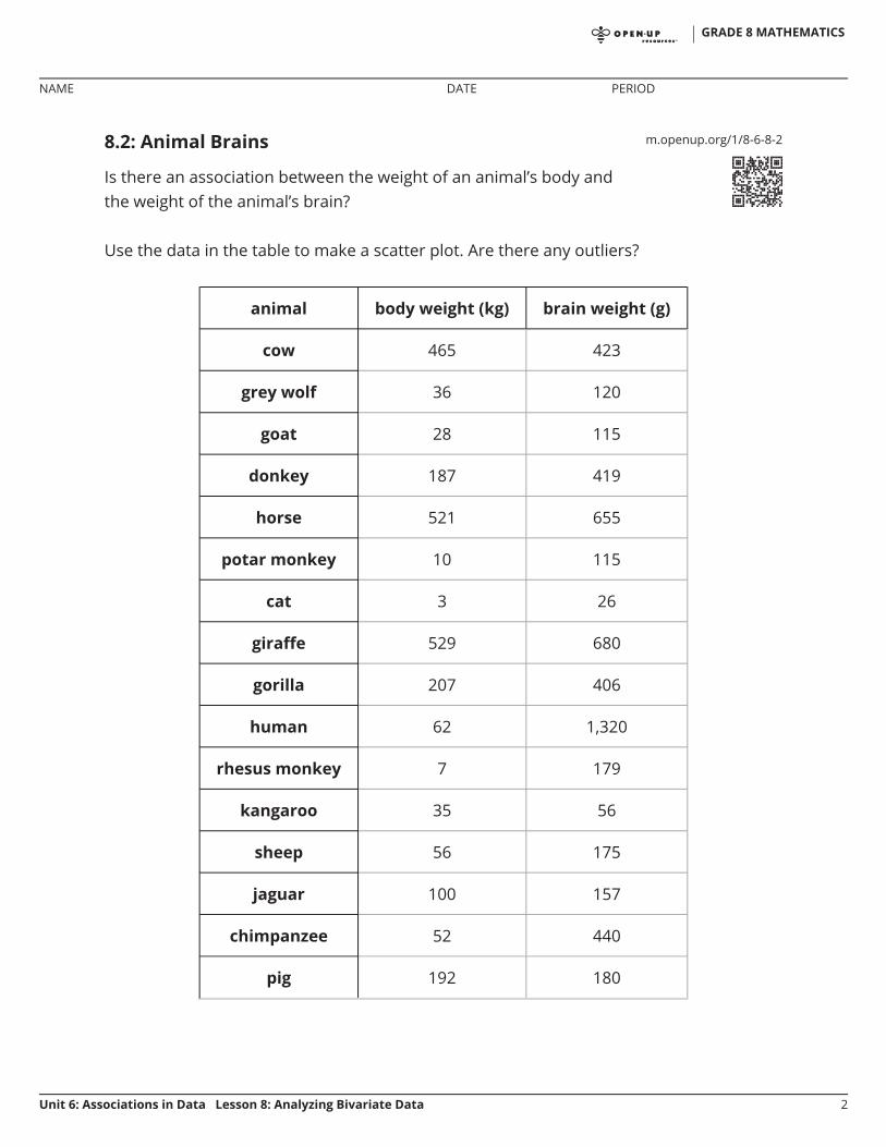
m.openup.org/1/8-6-8-28.2: Animal Brains
Is there an association between the weight of an animal’s body andthe weight of the animal’s brain?
Use the data in the table to make a scatter plot. Are there any outliers?
animal body weight (kg) brain weight (g)
cow 465 423
grey wolf 36 120
goat 28 115
donkey 187 419
horse 521 655
potar monkey 10 115
cat 3 26
giraffe 529 680
gorilla 207 406
human 62 1,320
rhesus monkey 7 179
kangaroo 35 56
sheep 56 175
jaguar 100 157
chimpanzee 52 440
pig 192 180
GRADE 8 MATHEMATICS
NAME DATE PERIOD
Unit 6: Associations in Data Lesson 8: Analyzing Bivariate Data 2

1. After removing the outliers, does there appear to be an association between bodyweight and brain weight? Describe the association in a sentence.
2. Using a piece of pasta and a straightedge, fit a line to your scatter plot, and estimateits slope. What does this slope mean in the context of brain and body weight?
GRADE 8 MATHEMATICS
NAME DATE PERIOD
Unit 6: Associations in Data Lesson 8: Analyzing Bivariate Data 3

3. Does the fitted line help you identify more outliers?
Are you ready for more?
Use one of the suggestions or find another set of data that interested you to look forassociations between the variables.
Number of wins vs number of points per game for your favorite sports team indifferent seasonsAmount of money grossed vs critic rating for your favorite moviesPrice of a ticket vs stadium capacity for popular bands on tour
After you have collected the data,
1. Create a scatter plot for the data.
2. Are any of the points very far away from the rest of the data?
3. Would a linear model fit the data in your scatter plot? If so, draw it. If not, explainwhy a line would be a bad fit.
4. Is there an association between the two variables? Explain your reasoning.
•
••
GRADE 8 MATHEMATICS
NAME DATE PERIOD
Unit 6: Associations in Data Lesson 8: Analyzing Bivariate Data 4
m.openup.org/1/8-6-8-38.3: Equal Body Dimensions
Earlier, your class gathered data on height and arm span.
1. Sometimes a person’s arm span is the same as their height. Is this true for anyone inthe class?
2. Make a scatter plot for the arm span and height data, and describe any association.
3. Is the line a good fit for the data? If so, explain why. If not, find the equation ofa line that fits the data better.
4. Examine the scatter plot. Which person in your class has the largest ratio betweentheir arm span and their height? Explain or show your reasoning.
GRADE 8 MATHEMATICS
NAME DATE PERIOD
Unit 6: Associations in Data Lesson 8: Analyzing Bivariate Data 5

Lesson 8 Summary
People often collect data in two variables to investigate possible associations betweentwo numerical variables and use the connections that they find to predict more values ofthe variables. Data analysis usually follows these steps:
1. Collect data.
2. Organize and represent the data, and look for an association.
3. Identify any outliers and try to explain why these data points are exceptions to thetrend that describes the association.
4. Find a function that fits the data well.
Although computational systems can help with data analysis by graphing the data,finding a function that might fit the data, and using that function to make predictions, it isimportant to understand the process and think about what is happening. Acomputational system may find a function that does not make sense or use a line whenthe situation suggests that a different model would be more appropriate.
GRADE 8 MATHEMATICS
NAME DATE PERIOD
Unit 6: Associations in Data Lesson 8: Analyzing Bivariate Data 6
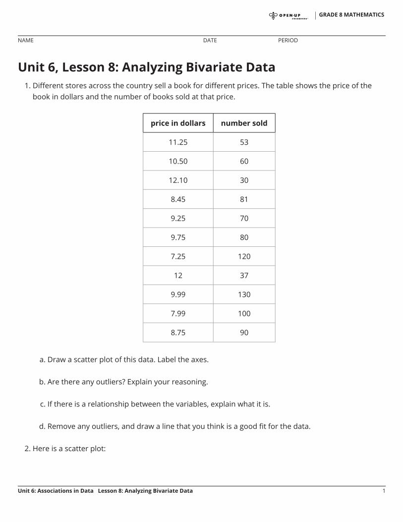
Unit 6, Lesson 8: Analyzing Bivariate Data1. Different stores across the country sell a book for different prices. The table shows the price of the
book in dollars and the number of books sold at that price.
price in dollars number sold
11.25 53
10.50 60
12.10 30
8.45 81
9.25 70
9.75 80
7.25 120
12 37
9.99 130
7.99 100
8.75 90
a. Draw a scatter plot of this data. Label the axes.
b. Are there any outliers? Explain your reasoning.
c. If there is a relationship between the variables, explain what it is.
d. Remove any outliers, and draw a line that you think is a good fit for the data.
2. Here is a scatter plot:
GRADE 8 MATHEMATICS
NAME DATE PERIOD
Unit 6: Associations in Data Lesson 8: Analyzing Bivariate Data 1

Select all the following that describe the association in the scatter plot:
A. Linear associationB. Non-linear associationC. Positive associationD. Negative associationE. No association
(from Unit 6, Lesson 7)
3. Using the data in the scatter plot, what can you tell about the slope of a good model?
A. The slope is positive.B. The slope is zero.C. The slope is negative.
GRADE 8 MATHEMATICS
NAME DATE PERIOD
Unit 6: Associations in Data Lesson 8: Analyzing Bivariate Data 2

D. There is no association.
(from Unit 6, Lesson 6)
GRADE 8 MATHEMATICS
NAME DATE PERIOD
Unit 6: Associations in Data Lesson 8: Analyzing Bivariate Data 3

Unit 6, Lesson 9: Looking for AssociationsLet’s look for associations in data.
9.1: Notice and Wonder: Bar Association
What do you notice? What do you wonder?
9.2: Matching Representations Card Sort
Your teacher will hand out some cards.
Some cards show two-way tables like this:
has cell phone does not have cell phone total
10 to 12 years old 25 35 60
13 to 15 years old 40 10 50
16 to 18 years old 50 10 60
total 115 55 170
GRADE 8 MATHEMATICS
NAME DATE PERIOD
Unit 6: Associations in Data Lesson 9: Looking for Associations 1

Some cards show bar graphs like this:
Some cards show segmented bar graphs like this:
The bar graphs and segmented bar graphs have their labels removed.
1. Put all the cards that describe the same situation in the same group.
2. One of the groups does not have a two-way table. Make a two-way table for thesituation described by the graphs in the group.
3. Label the bar graphs and segmented bar graphs so that the categories representedby each bar are indicated.
4. Describe in your own words the kind of information shown by a segmented bargraph.
Are you ready for more?
One of the segmented bar graphs is missing. Construct a segmented bar graph that
GRADE 8 MATHEMATICS
NAME DATE PERIOD
Unit 6: Associations in Data Lesson 9: Looking for Associations 2

matches the other representations.
GRADE 8 MATHEMATICS
NAME DATE PERIOD
Unit 6: Associations in Data Lesson 9: Looking for Associations 3

9.3: Building Another Type of Two-Way Table
Here is a two-way table that shows data about cell phone usage among children aged 10to 18.
has cell phone does not have cell phone total
10 to 12 years old 25 35 60
13 to 15 years old 40 10 50
16 to 18 years old 50 10 60
total 115 55 170
1. Complete the table. In each row, the entries for “has cell phone” and “does not havecell phone” should have the total 100%. Round entries to the nearest percentagepoint.
has cell phone does not have cell phone total
10 to 12 years old 42%
13 to 15 years old 100%
16 to 18 years old 17%
This is still a two-way table. Instead of showing frequency, this table shows relativefrequency.
2. Two-way tables that show relative frequencies often don’t include a “total” row at thebottom. Why?
3. Is there an association between age and cell phone use? How does the two-way tableof relative frequencies help to illustrate this?
GRADE 8 MATHEMATICS
NAME DATE PERIOD
Unit 6: Associations in Data Lesson 9: Looking for Associations 4

Are you ready for more?
A pollster attends a rally and surveys many of the participants about whether theyassociate with political Party A or political Party B and whether they are for or againstProposition 3.14 going up for vote soon. The results are sorted into the table shown.
for against
party A 832 165
party B 80 160
A news station reports these results by saying, “A poll shows that about the samenumber of people from both parties are voting against Proposition 3.14.”A second news station shows this graphic.
1. Are any of the news reports misleading? Explain your reasoning.
2. Create a headline, graphic, and short description that more accurately representsthe data in the table.
•
•
GRADE 8 MATHEMATICS
NAME DATE PERIOD
Unit 6: Associations in Data Lesson 9: Looking for Associations 5

Lesson 9 Summary
When we collect data by counting things in various categories, like red, blue, or yellow,we call the data categorical data, and we say that color is a categorical variable.
We can use two-way tables to investigate possible connections between two categoricalvariables. For example, this two-way table of frequencies shows the results of a study ofmeditation and state of mind of athletes before a track meet.
meditated did not meditate total
calm 45 8 53
agitated 23 21 44
total 68 29 97
If we are interested in the question of whether there is an association betweenmeditating and being calm, we might present the frequencies in a bar graph, groupingdata about meditators and grouping data about non-meditators, so we can compare thenumbers of calm and agitated athletes in each group.
Notice that the number of athletes who did not meditate is small compared to thenumber who meditated (29 as compared to 68, as shown in the table).
GRADE 8 MATHEMATICS
NAME DATE PERIOD
Unit 6: Associations in Data Lesson 9: Looking for Associations 6
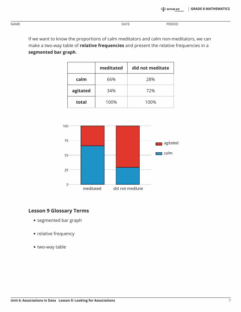
If we want to know the proportions of calm meditators and calm non-meditators, we canmake a two-way table of relative frequencies and present the relative frequencies in asegmented bar graph.
meditated did not meditate
calm 66% 28%
agitated 34% 72%
total 100% 100%
Lesson 9 Glossary Terms
segmented bar graph
relative frequency
two-way table
•
•
•
GRADE 8 MATHEMATICS
NAME DATE PERIOD
Unit 6: Associations in Data Lesson 9: Looking for Associations 7

Unit 6, Lesson 9: Looking for Associations1. A scientist wants to know if the color of the water affects how much animals drink. The average
amount of water each animal drinks was recorded in milliliters for a week and then graphed. Is thereevidence to suggest an association between water color and animal?
cat intake (ml) dog intake (ml) total (ml)
blue water 210 1200 1410
green water 200 1100 1300
total 410 2300 2710
2. A farmer brings his produce to the farmer’s market and records whether people buy lettuce, apples,both, or something else.
bought apples did not buy apples
bought lettuce 14 58
did not buy lettuce 8 29
Make a table that shows the relative frequencies for each row. Use this table to decide if there is anassociation between buying lettuce and buying apples.
GRADE 8 MATHEMATICS
NAME DATE PERIOD
Unit 6: Associations in Data Lesson 9: Looking for Associations 1

3. Researchers at a media company want to study news-reading habits among different age groups.They tracked print and online subscription data and made a 2-way table.
internet articles print articles
18–25 year olds 151 28
26–45 year olds 132 72
45–65 year olds 48 165
a. Create a segmented bar graph using one bar for each row of the table.
b. Is there an association between age groups and the method they use to read articles? Explainyour reasoning.
4. Using the data in the scatter plot, what is a reasonable slope of a model that fits this data?
A. -2.5B. -1C. 1D. 2.5
(from Unit 6, Lesson 6)
GRADE 8 MATHEMATICS
NAME DATE PERIOD
Unit 6: Associations in Data Lesson 9: Looking for Associations 2

Unit 6, Lesson 10: Using Data Displays to FindAssociationsLet’s use data displays to find associations.
10.1: Sports and Musical Instruments
For a survey, students in a class answered these questions:
Do you play a sport?
Do you play a musical instrument?
1. Here is a two-way table that gives some results from the survey. Complete the table,assuming that all students answered both questions.
playsinstrument
does not playinstrument
total
plays sport 5 16
does not playsport
total 15 25
2. To the nearest percentage point, what percentage of students who play a sport don’tplay a musical instrument?
3. To the nearest percentage point, what percentage of students who don’t play a sportalso don’t play a musical instrument?
•
•
GRADE 8 MATHEMATICS
NAME DATE PERIOD
Unit 6: Associations in Data Lesson 10: Using Data Displays to FindAssociations
1

10.2: Sports and Music Association
Your teacher will give you a two-way table with information about the number of peoplein your class who play sports or musical instruments.
1. Complete this table to make a two-way table for the data from earlier. The table willshow relative frequencies by row.
playsinstrument
does not playinstrument
rowtotal
plays sport 100%
does not playsport
100%
2. Make a segmented bar graph for the table. Use one bar of the graph for each row ofthe table.
GRADE 8 MATHEMATICS
NAME DATE PERIOD
Unit 6: Associations in Data Lesson 10: Using Data Displays to FindAssociations
2

3. Complete the table to make a two-way table for the data from earlier. The table willshow relative frequencies by column.
plays instrument does not play instrument
plays sport
does not play sport
column total 100% 100%
4. Using the values in the table, make a segmented bar graph. Use one bar of the graphfor each column of the table.
5. Based on the two-way tables and segmented bar graphs, do you think there is anassociation between playing a sport and playing a musical instrument? Explain howyou know.
GRADE 8 MATHEMATICS
NAME DATE PERIOD
Unit 6: Associations in Data Lesson 10: Using Data Displays to FindAssociations
3

10.3: Colored Erasers
An eraser factory has five machines. One machine makes the eraser shapes. Then eachshape goes through the red machine, blue machine, yellow machine, or green machineto have a side colored.
The manager notices that an uncolored side of some erasers is flawed at the end of theprocess and wants to know which machine needs to be fixed: the shape machine orsome of the color machines. The manager collected data on the number of flawed andunflawed erasers of each color.
unflawed flawed total
red 285 15 300
blue 223 17 240
yellow 120 80 200
green 195 65 260
total 823 177 1000
1. Work with a partner. Each of you should make one segmented bar graph for the datain the table. One segmented bar graph should have a bar for each row of the table.The other segmented bar graph should have one bar for each column of the table.
2. Are the flawed erasers associated with certain colors? If so, which colors? Explainyour reasoning.
GRADE 8 MATHEMATICS
NAME DATE PERIOD
Unit 6: Associations in Data Lesson 10: Using Data Displays to FindAssociations
4

Are you ready for more?
Based on the federal budgets for 2009, the table shows where some of the federalmoney was expected to go. The values are in billions of U.S. Dollars.
United States Japan United Kingdom
defense 718.4 42.8 49.2
education 44.9 47.5 113.9
1. Why would a segmented bar graph be more useful than the table of data to see anyassociations between the country and where the money is spent?
2. Create a segmented bar graph that represents the data from the table.
3. Is there an association between the country’s budget and their spending in theseareas? Explain your reasoning.
GRADE 8 MATHEMATICS
NAME DATE PERIOD
Unit 6: Associations in Data Lesson 10: Using Data Displays to FindAssociations
5

Lesson 10 Summary
In an earlier lesson, we looked at data on meditation and state of mind in athletes.
Is there an association between meditation and state of mind?
The bar graph shows that more athletes were calm than agitated among the group thatmeditated, and more athletes were agitated than calm among the group that did not. Wecan see the proportions of calm meditators and calm non-meditators from thesegmented bar graph, which shows that about 66% of athletes who meditated werecalm, whereas only about 27% of those who did not meditate were calm.
This does not necessarily mean that meditation causes calm; it could be the other wayaround, that calm athletes are more inclined to meditate. But it does suggest that there isan association between meditating and calmness.
GRADE 8 MATHEMATICS
NAME DATE PERIOD
Unit 6: Associations in Data Lesson 10: Using Data Displays to FindAssociations
6

Unit 6, Lesson 10: Using Data Displays to Find Associations1. An ecologist is studying a forest with a mixture of tree types. Since the average tree height in the area
is 40 feet, he measures the height of the tree against that. He also records the type of tree. The resultsare shown in the table and segmented bar graph. Is there evidence of an association between treeheight and tree type? Explain your reasoning.
under 40 feet 40 feet or taller total
deciduous 45 30 75
evergreen 14 10 24
total 59 40 99
2. Workers at an advertising agency are interested in people’s TV viewing habits. They take a survey ofpeople in two cities to try to find patterns in the types of shows they watch. The results are recordedin a table and shown in a segmented bar graph. Is there evidence of different viewing habits? If so,explain.
reality news comedy drama
Chicago 50 40 90 20
Topeka 45 70 40 45
GRADE 8 MATHEMATICS
NAME DATE PERIOD
Unit 6: Associations in Data Lesson 10: Using Data Displays to FindAssociations
1
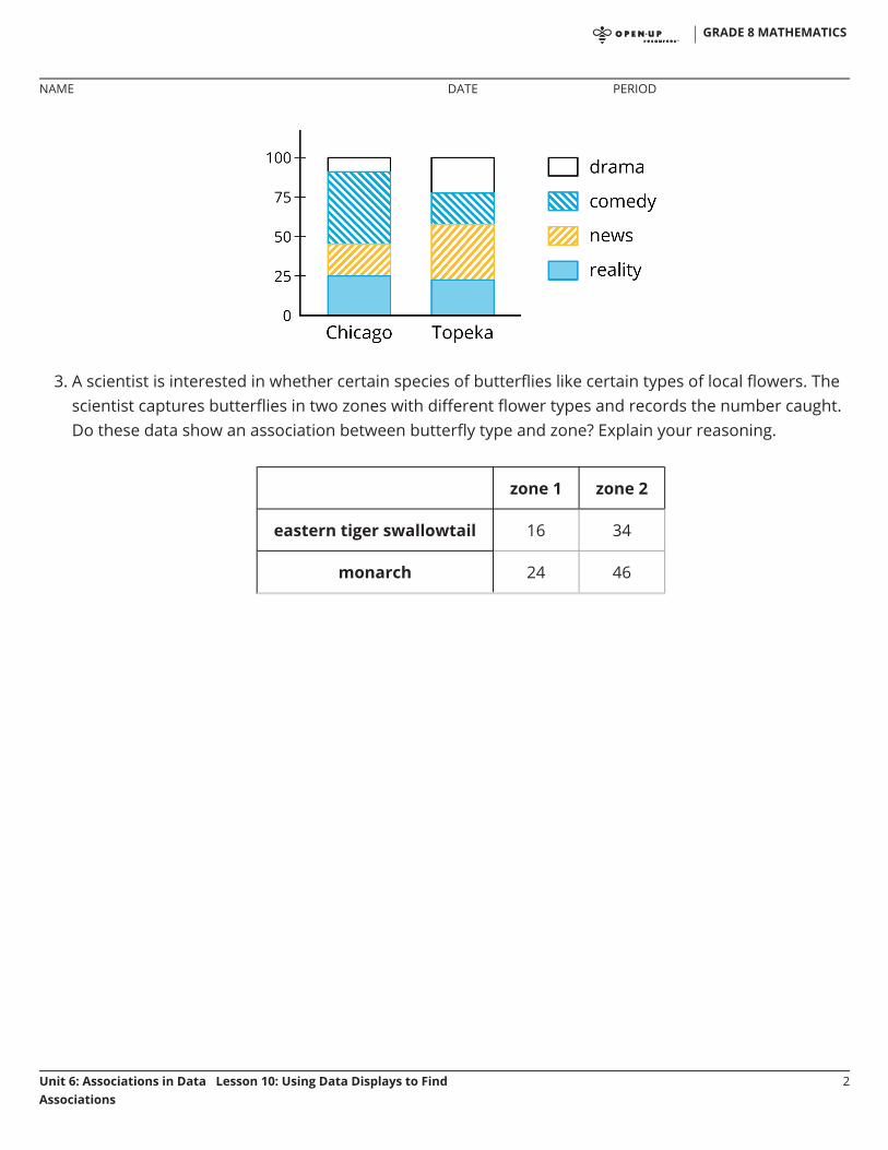
3. A scientist is interested in whether certain species of butterflies like certain types of local flowers. Thescientist captures butterflies in two zones with different flower types and records the number caught.Do these data show an association between butterfly type and zone? Explain your reasoning.
zone 1 zone 2
eastern tiger swallowtail 16 34
monarch 24 46
GRADE 8 MATHEMATICS
NAME DATE PERIOD
Unit 6: Associations in Data Lesson 10: Using Data Displays to FindAssociations
2
Unit 6, Lesson 11: Gone In 30 SecondsLet’s gather and analyze some timing data.
11.1: Measuring 30 Seconds
In this activity, you’ll get two chances to guess at how long 30 seconds is, then look for anassociation between the two guesses of all students.
1. Work with a partner. Follow the instructions listed here to gather your data.One of you will hold a stopwatch where the other person cannot see it.
The person holding the stopwatch says “go” and starts the timer.
The other person says “stop” when they think 30 seconds have passed.
The person holding the stopwatch will stop the timer, then report and record thetime to the nearest second.
The person holding the stopwatch will give a second chance, repeating theexperiment.
After both times are recorded, switch roles.
2. Record the group data in this table. When you finish, a group member should givethe data to the teacher.
name time 1 time 2
3. Look at your data. Comparing Time 1 to Time 2, do you think there is a positiveassociation, a negative association, or no association? Discuss your thinking withyour group.
◦
◦
◦
◦
◦
◦
GRADE 8 MATHEMATICS
NAME DATE PERIOD
Unit 6: Associations in Data Lesson 11: Gone In 30 Seconds 1

4. What are some ways you could organize and represent the entire class's data?
GRADE 8 MATHEMATICS
NAME DATE PERIOD
Unit 6: Associations in Data Lesson 11: Gone In 30 Seconds 2

5. Make a scatter plot of the entire class’s data and look for patterns. Identify anyoutliers and the type of any association you observe.
6. Draw two lines on your scatter plot: a vertical line and a horizontal line, eachrepresenting 30 seconds for one trial. Use the table for the class’s data to completethis two-way table.
Time 2 < 30sec
Time 2 = 30sec
Time 2 > 30sec
total
Time 1 < 30sec
Time 1 = 30sec
Time 1 > 30sec
total
7. Use the two-way table to decide whether there is an association between Time 1 andTime 2. Explain how you know.
GRADE 8 MATHEMATICS
NAME DATE PERIOD
Unit 6: Associations in Data Lesson 11: Gone In 30 Seconds 3