unit 7: normal curves - learner · unit 7: normal curves | student guide | page 1 unit 7: ... a...
TRANSCRIPT
Unit 7: Normal Curves | Student Guide | Page 1
Unit 7: Normal Curves
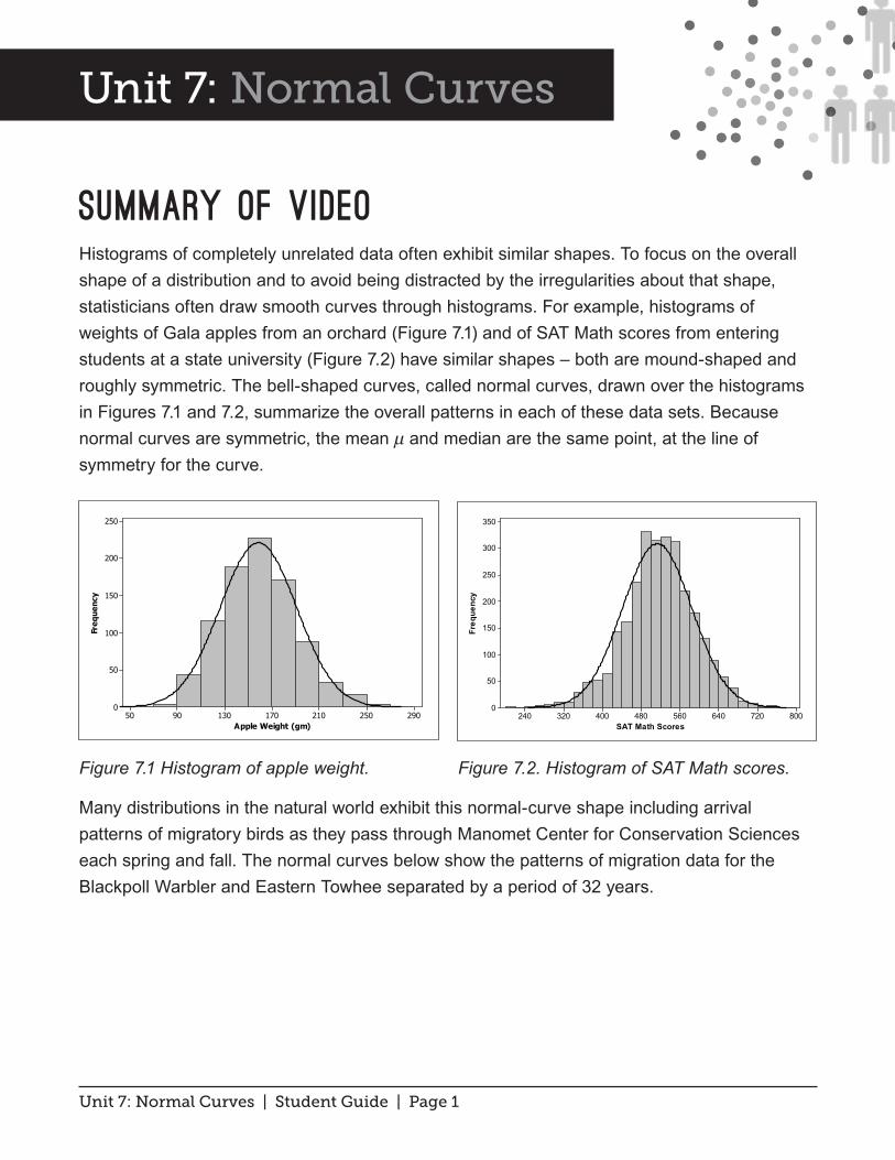
Summary of VideoHistograms of completely unrelated data often exhibit similar shapes. To focus on the overall shape of a distribution and to avoid being distracted by the irregularities about that shape, statisticians often draw smooth curves through histograms. For example, histograms of weights of Gala apples from an orchard (Figure 7.1) and of SAT Math scores from entering students at a state university (Figure 7.2) have similar shapes – both are mound-shaped and roughly symmetric. The bell-shaped curves, called normal curves, drawn over the histograms in Figures 7.1 and 7.2, summarize the overall patterns in each of these data sets. Because normal curves are symmetric, the mean μ and median are the same point, at the line of symmetry for the curve.
Figure 7.1 Histogram of apple weight. Figure 7.2. Histogram of SAT Math scores.
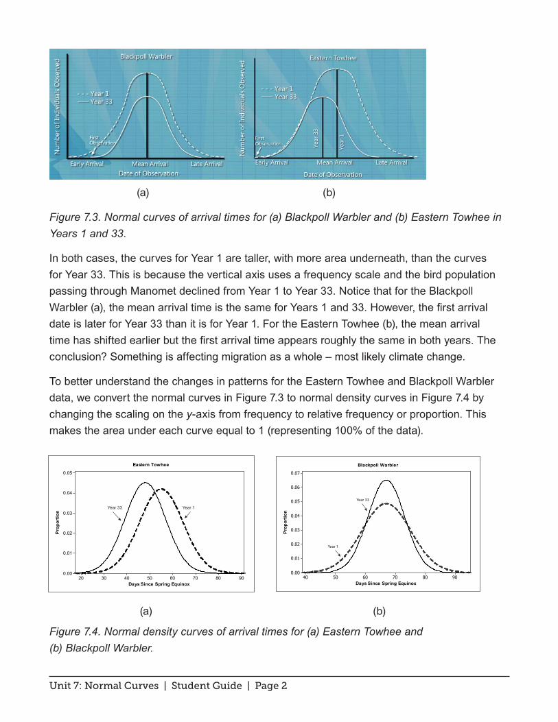
Many distributions in the natural world exhibit this normal-curve shape including arrival patterns of migratory birds as they pass through Manomet Center for Conservation Sciences each spring and fall. The normal curves below show the patterns of migration data for the Blackpoll Warbler and Eastern Towhee separated by a period of 32 years.
2902502101701309050
250
200
150
100
50
0
Apple Weight (gm)
Freq
uenc
y
800720640560480400320240
350
300
250
200
150
100
50
0
SAT Math Scores
Freq
uenc
y
Unit 7: Normal Curves | Student Guide | Page 2
(a) (b)
Figure 7.3. Normal curves of arrival times for (a) Blackpoll Warbler and (b) Eastern Towhee in Years 1 and 33.
In both cases, the curves for Year 1 are taller, with more area underneath, than the curves for Year 33. This is because the vertical axis uses a frequency scale and the bird population passing through Manomet declined from Year 1 to Year 33. Notice that for the Blackpoll Warbler (a), the mean arrival time is the same for Years 1 and 33. However, the first arrival date is later for Year 33 than it is for Year 1. For the Eastern Towhee (b), the mean arrival time has shifted earlier but the first arrival time appears roughly the same in both years. The conclusion? Something is affecting migration as a whole – most likely climate change.
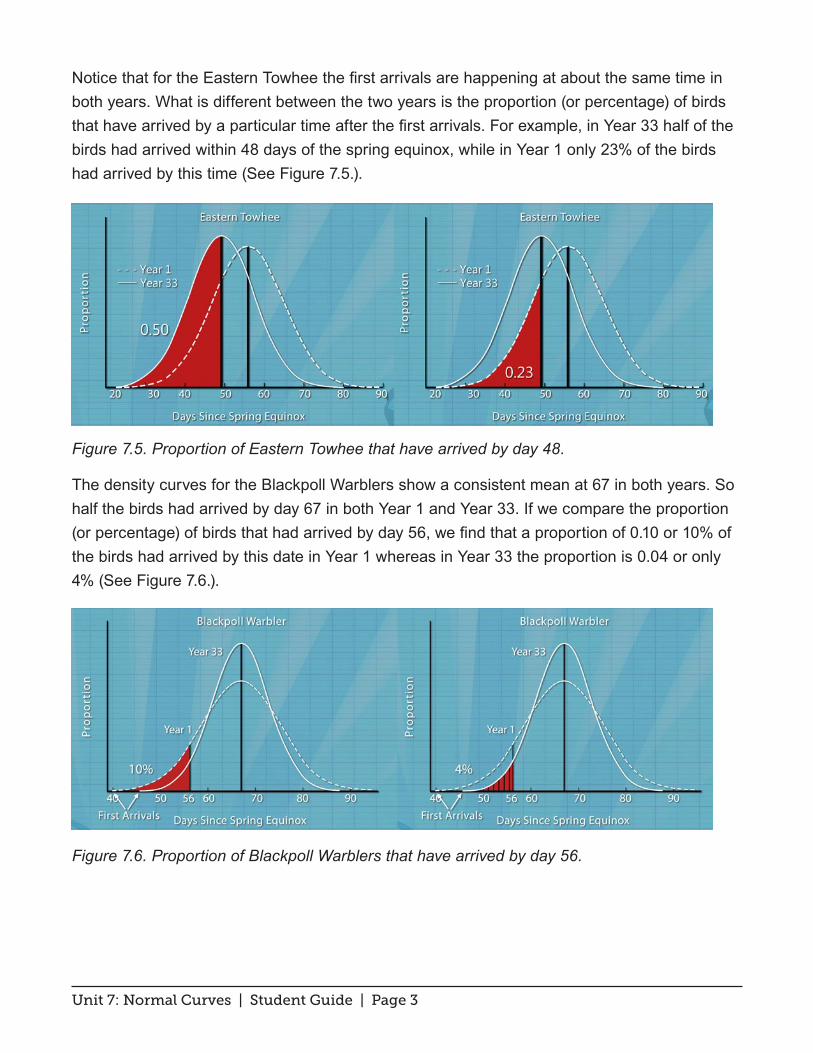
To better understand the changes in patterns for the Eastern Towhee and Blackpoll Warbler data, we convert the normal curves in Figure 7.3 to normal density curves in Figure 7.4 by changing the scaling on the y-axis from frequency to relative frequency or proportion. This makes the area under each curve equal to 1 (representing 100% of the data).
(a) (b)
Figure 7.4. Normal density curves of arrival times for (a) Eastern Towhee and (b) Blackpoll Warbler.
9080706050403020
0.05
0.04
0.03
0.02
0.01
0.00
Days Since Spring Equinox
Prop
ortio
n
Eastern Towhee
Year 1Year 33
908070605040
0.07
0.06
0.05
0.04
0.03
0.02
0.01
0.00
Days Since Spring Equinox
Prop
ortio
n
Blackpoll Warbler
Year 1
Year 33
Unit 7: Normal Curves | Student Guide | Page 3
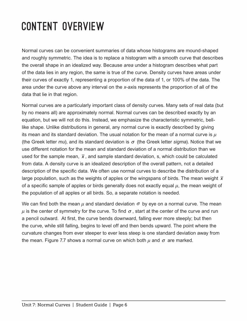
Notice that for the Eastern Towhee the first arrivals are happening at about the same time in both years. What is different between the two years is the proportion (or percentage) of birds that have arrived by a particular time after the first arrivals. For example, in Year 33 half of the birds had arrived within 48 days of the spring equinox, while in Year 1 only 23% of the birds had arrived by this time (See Figure 7.5.).
Figure 7.5. Proportion of Eastern Towhee that have arrived by day 48.
The density curves for the Blackpoll Warblers show a consistent mean at 67 in both years. So half the birds had arrived by day 67 in both Year 1 and Year 33. If we compare the proportion (or percentage) of birds that had arrived by day 56, we find that a proportion of 0.10 or 10% of the birds had arrived by this date in Year 1 whereas in Year 33 the proportion is 0.04 or only 4% (See Figure 7.6.).
Figure 7.6. Proportion of Blackpoll Warblers that have arrived by day 56.

Unit 7: Normal Curves | Student Guide | Page 4
So, the percentage of birds that used to arrive by day 56 is more than double what it is now. Notice the later first arrival for Year 33 compared to Year 1. The only thing causing the observed later first arrival is that fewer birds are migrating – making it tougher for researchers to spot the rarer birds. The scientists at Manomet say it is important to take into account population sizes when looking at migration times especially if the only data available are those easily-influenced first arrival dates.

Unit 7: Normal Curves | Student Guide | Page 5
Student Learning Objectives
A. Understand that the overall shape of a distribution of a large number of observations can be summarized by a smooth curve called a density curve.
B. Know that an area under a density curve over an interval represents the proportion of data that falls in that interval.
C. Recognize the characteristic bell-shapes of normal curves. Locate the mean and standard deviation on a normal density curve by eye.
D. Understand how changing the mean and standard deviation affects a normal density curve.
• Know that changing the mean of a normal density curve shifts the curve along the horizontal axis without changing its shape.
• Know that increasing the standard deviation produces a flatter and wider bell-shaped curve and that decreasing the standard deviation produces a taller and narrower curve.
Unit 7: Normal Curves | Student Guide | Page 6
Content Overview
Normal curves can be convenient summaries of data whose histograms are mound-shaped and roughly symmetric. The idea is to replace a histogram with a smooth curve that describes the overall shape in an idealized way. Because area under a histogram describes what part of the data lies in any region, the same is true of the curve. Density curves have areas under their curves of exactly 1, representing a proportion of the data of 1, or 100% of the data. The area under the curve above any interval on the x-axis represents the proportion of all of the data that lie in that region.
Normal curves are a particularly important class of density curves. Many sets of real data (but by no means all) are approximately normal. Normal curves can be described exactly by an equation, but we will not do this. Instead, we emphasize the characteristic symmetric, bell-like shape. Unlike distributions in general, any normal curve is exactly described by giving its mean and its standard deviation. The usual notation for the mean of a normal curve is μ (the Greek letter mu), and its standard deviation is σ (the Greek letter sigma). Notice that we use different notation for the mean and standard deviation of a normal distribution than we used for the sample mean, x , and sample standard deviation, s, which could be calculated from data. A density curve is an idealized description of the overall pattern, not a detailed description of the specific data. We often use normal curves to describe the distribution of a large population, such as the weights of apples or the wingspans of birds. The mean weight x of a specific sample of apples or birds generally does not exactly equal μ, the mean weight of the population of all apples or all birds. So, a separate notation is needed.
We can find both the mean μ and standard deviation σ by eye on a normal curve. The mean μ is the center of symmetry for the curve. To find σ , start at the center of the curve and run a pencil outward. At first, the curve bends downward, falling ever more steeply; but then the curve, while still falling, begins to level off and then bends upward. The point where the curvature changes from ever steeper to ever less steep is one standard deviation away from the mean. Figure 7.7 shows a normal curve on which both μ and σ are marked.

Unit 7: Normal Curves | Student Guide | Page 7
Figure 7.7. Normal curve showing mean and standard deviation.
As mentioned in the previous paragraph, the mean is the center of symmetry of a normal density curve. So, changing the mean simply shifts the curve along the horizontal axis without changing its shape. Take, for example, Figure 7.8, which shows hypothetical normal curves describing weights of two types of apples. The standard deviations of the two curves are the same, but their means are different. The mean of the solid curve is at 130 grams and the mean of the dashed curve is at 160 grams.
Figure 7.8. Two normal density curves with different means.
The standard deviation controls the spread of a distribution. So, changing σ does change the
µ
σ
2802502201901601301007040Apple Weight (gm)
Unit 7: Normal Curves | Student Guide | Page 8
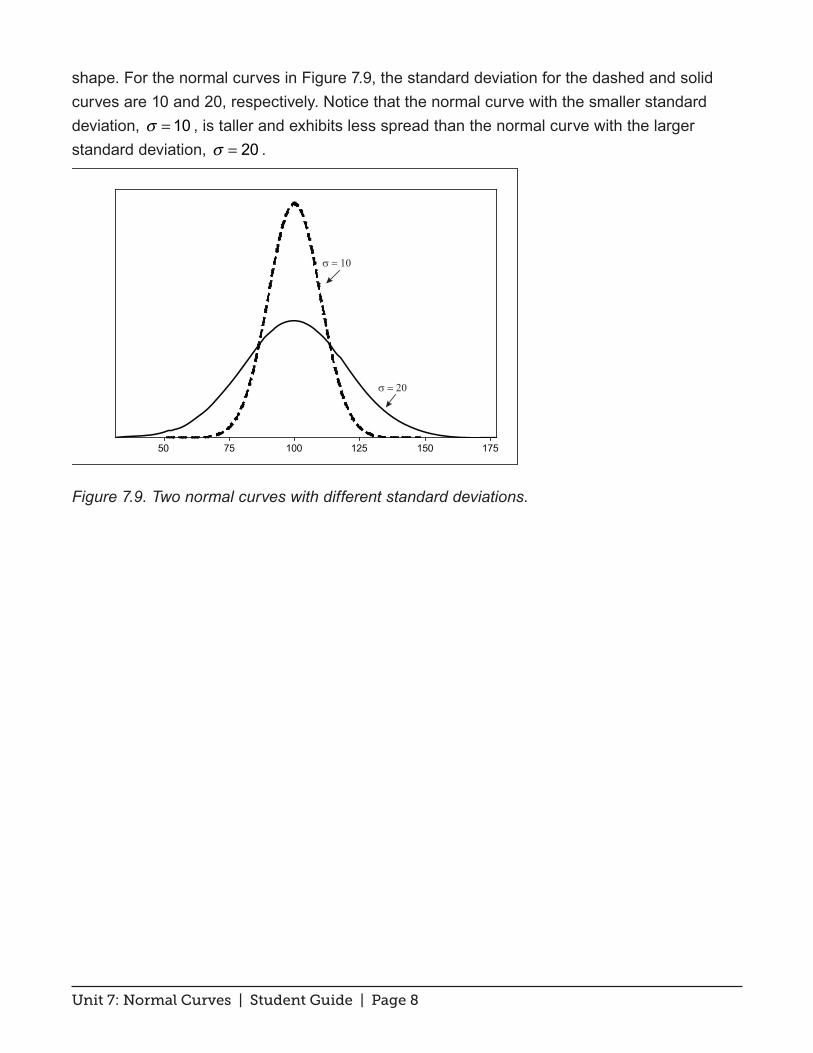
shape. For the normal curves in Figure 7.9, the standard deviation for the dashed and solid curves are 10 and 20, respectively. Notice that the normal curve with the smaller standard deviation, σ = 10 , is taller and exhibits less spread than the normal curve with the larger standard deviation, σ = 20 .
Figure 7.9. Two normal curves with different standard deviations.
1751501251007550
σ = 20
σ = 10

Unit 7: Normal Curves | Student Guide | Page 9
Key Terms
A normal density curve is a bell-shaped curve. A density curve is scaled so that the area under the curve is 1. The center line of the normal density curve is at the mean μ. The change of curvature in the bell-shaped curve occurs at μ – σ and μ + σ .
A normal distribution is described by a normal density curve. Any particular normal distribution is completely specified by its mean μ and standard deviation σ .
Unit 7: Normal Curves | Student Guide | Page 10
The Video
Take out a piece of paper and be ready to write down answers to these questions as you watch the video.
1. Describe the characteristic shape of a normal curve.
2. How can you spot the mean of a normal curve?
3. If one normal curve is low and spread out and another is tall and skinny, which curve has the larger standard deviation?
4. Focus on the distribution of arrival times for the Eastern Towhee for Years 1 and 33. Has the mean arrival date in Year 33 increased, decreased or remained the same as the mean in Year 1?
5. The mean of the arrival times for the Blackpoll Warbler passing through Manomet in Years 1 and 33 is roughly the same. In Year 33 has the percentage of birds that have arrived by day 56 increased, decreased or remained the same as what it was in Year 1?
Unit 7: Normal Curves | Student Guide | Page 11
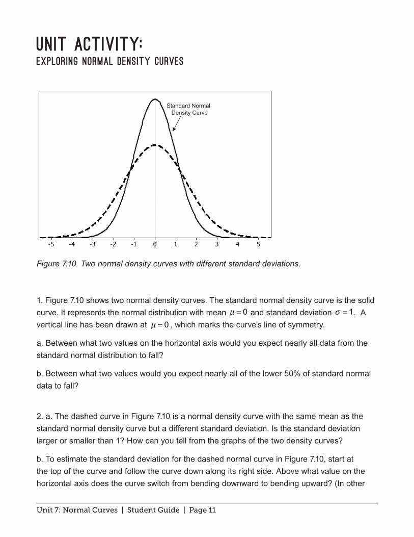
Unit Activity: Exploring Normal Density Curves
Figure 7.10. Two normal density curves with different standard deviations.
1. Figure 7.10 shows two normal density curves. The standard normal density curve is the solid curve. It represents the normal distribution with mean µ = 0 and standard deviation σ = 1. A vertical line has been drawn at µ = 0 , which marks the curve’s line of symmetry.
a. Between what two values on the horizontal axis would you expect nearly all data from the standard normal distribution to fall?
b. Between what two values would you expect nearly all of the lower 50% of standard normal data to fall?
2. a. The dashed curve in Figure 7.10 is a normal density curve with the same mean as the standard normal density curve but a different standard deviation. Is the standard deviation larger or smaller than 1? How can you tell from the graphs of the two density curves?
b. To estimate the standard deviation for the dashed normal curve in Figure 7.10, start at the top of the curve and follow the curve down along its right side. Above what value on the horizontal axis does the curve switch from bending downward to bending upward? (In other
543210-1-2-3-4-5
Standard Normal Density Curve
Unit 7: Normal Curves | Student Guide | Page 12
words, at what point does the curve go from falling ever more steeply to falling less and less steeply?) Use this point to estimate the standard deviation for the dashed normal density curve.
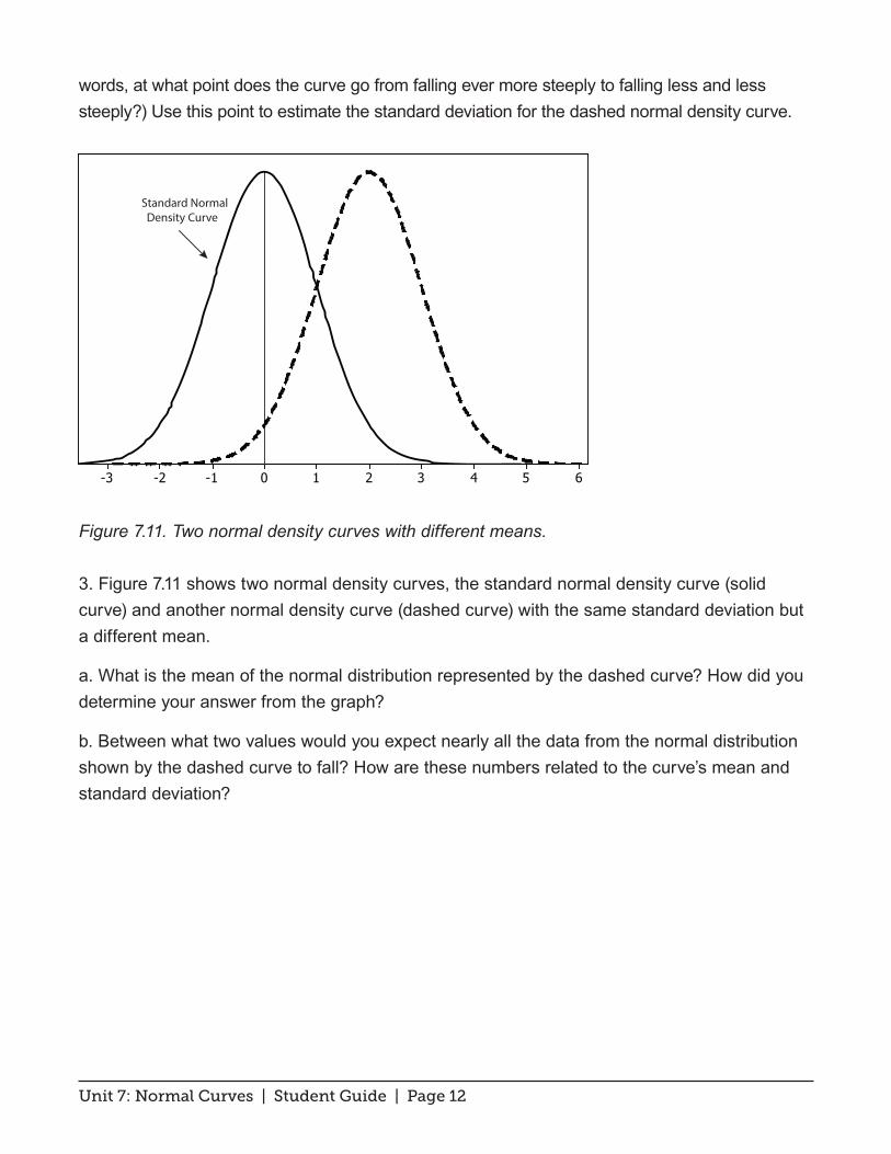
Figure 7.11. Two normal density curves with different means.
3. Figure 7.11 shows two normal density curves, the standard normal density curve (solid curve) and another normal density curve (dashed curve) with the same standard deviation but a different mean.
a. What is the mean of the normal distribution represented by the dashed curve? How did you determine your answer from the graph?
b. Between what two values would you expect nearly all the data from the normal distribution shown by the dashed curve to fall? How are these numbers related to the curve’s mean and standard deviation?
6543210-1-2-3
Standard Normal Density Curve
Unit 7: Normal Curves | Student Guide | Page 13
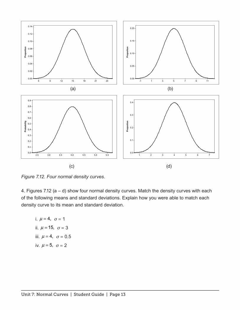
(a) (b)
(c) (d)
Figure 7.12. Four normal density curves.
4. Figures 7.12 (a – d) show four normal density curves. Match the density curves with each of the following means and standard deviations. Explain how you were able to match each density curve to its mean and standard deviation.
i. µ = 4, σ = 1
ii. µ = 15, σ = 3
iii. µ = 4, σ = 0.5
iv. µ = 5, σ = 2
242118151296
0.14
0.12
0.10
0.08
0.06
0.04
0.02
0.00
Prop
ortio
n
5.55.04.54.03.53.02.5
0.9
0.8
0.7
0.6
0.5
0.4
0.3
0.2
0.1
0.0
Prob
abili
ty
1197531-1
0.20
0.15
0.10
0.05
0.00
Prop
ortio
n
7654321
0.4
0.3
0.2
0.1
0.0
Prop
ortio
n
Unit 7: Normal Curves | Student Guide | Page 14
Exercises
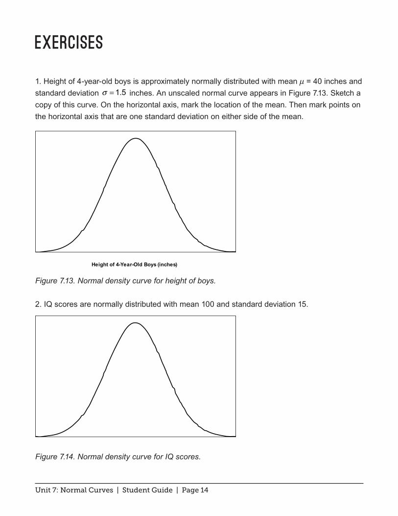
1. Height of 4-year-old boys is approximately normally distributed with mean μ = 40 inches and standard deviation σ = 1.5 inches. An unscaled normal curve appears in Figure 7.13. Sketch a copy of this curve. On the horizontal axis, mark the location of the mean. Then mark points on the horizontal axis that are one standard deviation on either side of the mean.
Figure 7.13. Normal density curve for height of boys.
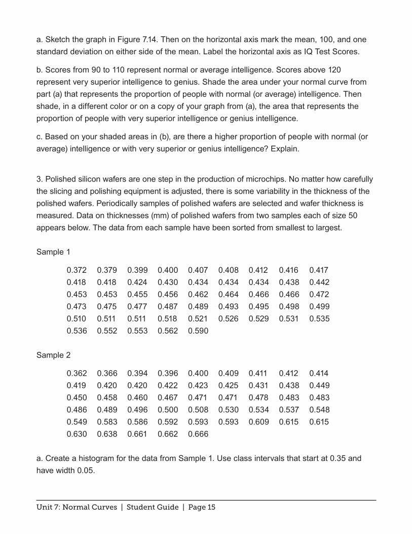
2. IQ scores are normally distributed with mean 100 and standard deviation 15.
Figure 7.14. Normal density curve for IQ scores.
Height of 4-Year-Old Boys (inches)
Unit 7: Normal Curves | Student Guide | Page 15
a. Sketch the graph in Figure 7.14. Then on the horizontal axis mark the mean, 100, and one standard deviation on either side of the mean. Label the horizontal axis as IQ Test Scores.
b. Scores from 90 to 110 represent normal or average intelligence. Scores above 120 represent very superior intelligence to genius. Shade the area under your normal curve from part (a) that represents the proportion of people with normal (or average) intelligence. Then shade, in a different color or on a copy of your graph from (a), the area that represents the proportion of people with very superior intelligence or genius intelligence.
c. Based on your shaded areas in (b), are there a higher proportion of people with normal (or average) intelligence or with very superior or genius intelligence? Explain.
3. Polished silicon wafers are one step in the production of microchips. No matter how carefully the slicing and polishing equipment is adjusted, there is some variability in the thickness of the polished wafers. Periodically samples of polished wafers are selected and wafer thickness is measured. Data on thicknesses (mm) of polished wafers from two samples each of size 50 appears below. The data from each sample have been sorted from smallest to largest.
Sample 1
0.372 0.379 0.399 0.400 0.407 0.408 0.412 0.416 0.417 0.418 0.418 0.424 0.430 0.434 0.434 0.434 0.438 0.442 0.453 0.453 0.455 0.456 0.462 0.464 0.466 0.466 0.472 0.473 0.475 0.477 0.487 0.489 0.493 0.495 0.498 0.499 0.510 0.511 0.511 0.518 0.521 0.526 0.529 0.531 0.535 0.536 0.552 0.553 0.562 0.590
Sample 2
0.362 0.366 0.394 0.396 0.400 0.409 0.411 0.412 0.414 0.419 0.420 0.420 0.422 0.423 0.425 0.431 0.438 0.449 0.450 0.458 0.460 0.467 0.471 0.471 0.478 0.483 0.483 0.486 0.489 0.496 0.500 0.508 0.530 0.534 0.537 0.548 0.549 0.583 0.586 0.592 0.593 0.593 0.609 0.615 0.615 0.630 0.638 0.661 0.662 0.666
a. Create a histogram for the data from Sample 1. Use class intervals that start at 0.35 and have width 0.05.
Unit 7: Normal Curves | Student Guide | Page 16
b. Does it seem reasonable that a normal curve could represent the thicknesses of polished wafers produced under these control settings? If so, superimpose a normal curve over your histogram from part (a). If not, superimpose a smooth curve of a different shape that summarizes the pattern in the histogram.
c. The target thickness is 0.5 mm. Does the balance point (mean) of your smoothed curve from part (b) appear to be at 0.5 mm, smaller than 0.5 mm or larger than 0.5 mm?
4. Repeat question 3, this time using the data from Sample 2.
Unit 7: Normal Curves | Student Guide | Page 17
Review Questions
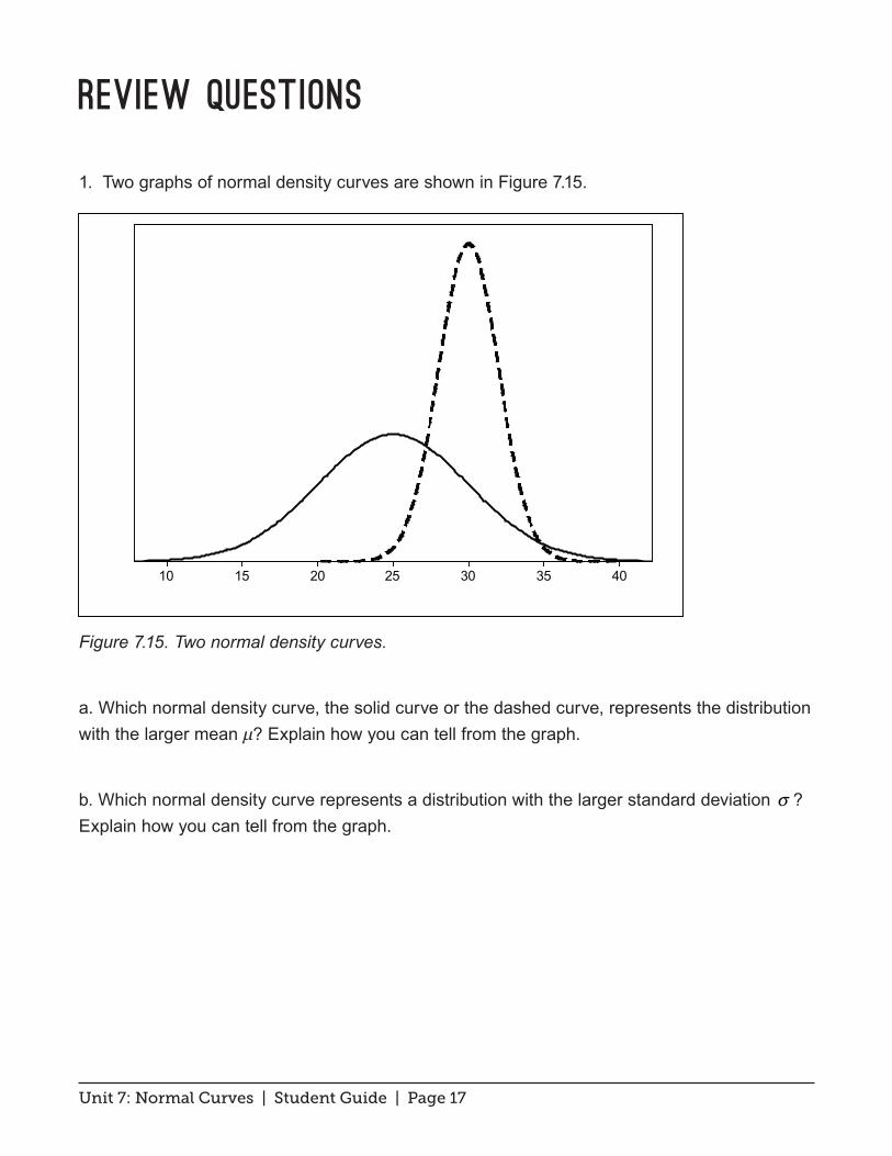
1. Two graphs of normal density curves are shown in Figure 7.15.
Figure 7.15. Two normal density curves.
a. Which normal density curve, the solid curve or the dashed curve, represents the distribution with the larger mean μ? Explain how you can tell from the graph.
b. Which normal density curve represents a distribution with the larger standard deviation σ ? Explain how you can tell from the graph.
40353025201510

Unit 7: Normal Curves | Student Guide | Page 18
2. Figure 7.16 shows a density curve of a distribution that is not normal.
Figure 7.16. A triangular density curve.
a. What is the mean of this distribution? How can you tell from the graph?
b. The area under the density curve over a particular interval gives the proportion of data that fall in that interval. What proportion of data from this distribution would fall below 1.5? Explain your calculations.
c. What proportion of data would fall within 0.5 units of the mean? Explain how you arrived at your answer. Draw a diagram that helps explain how to get to your answer. Explain how your diagram works.
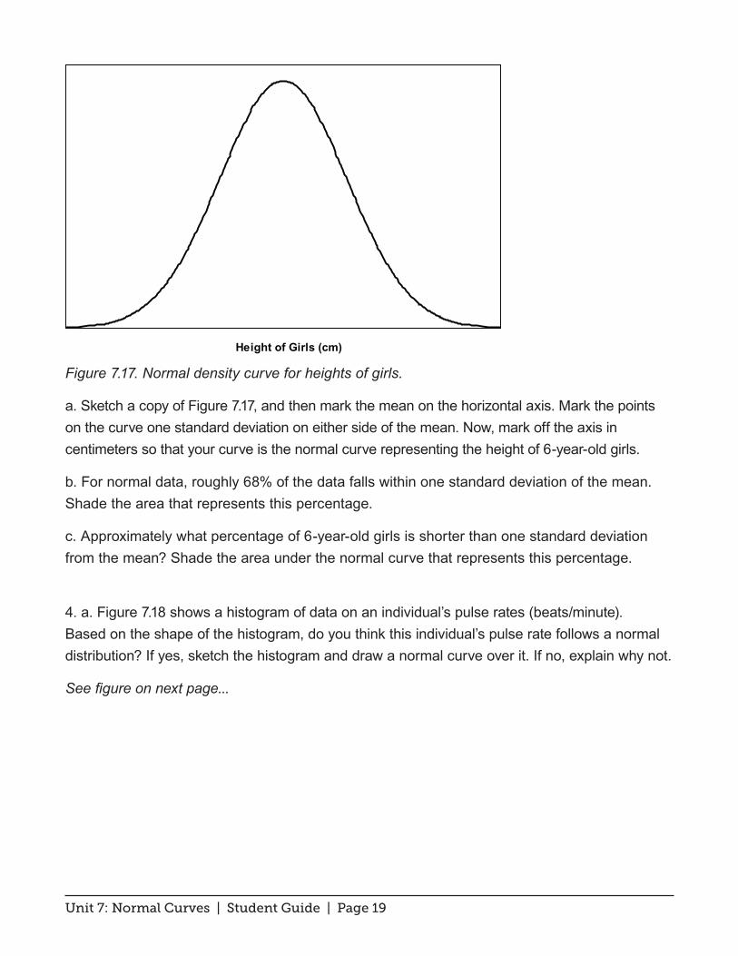
3. The distribution of the height of 6-year-old girls is approximately normal with mean µ = 115 cm and standard deviation σ = 4 cm . An unscaled normal curve appears in Figure 7.17.
3.02.52.01.51.0
1.0
0.8
0.6
0.4
0.2
0.0
Prop
ortio
n
Unit 7: Normal Curves | Student Guide | Page 19
Figure 7.17. Normal density curve for heights of girls.
a. Sketch a copy of Figure 7.17, and then mark the mean on the horizontal axis. Mark the points on the curve one standard deviation on either side of the mean. Now, mark off the axis in centimeters so that your curve is the normal curve representing the height of 6-year-old girls.
b. For normal data, roughly 68% of the data falls within one standard deviation of the mean. Shade the area that represents this percentage.
c. Approximately what percentage of 6-year-old girls is shorter than one standard deviation from the mean? Shade the area under the normal curve that represents this percentage.
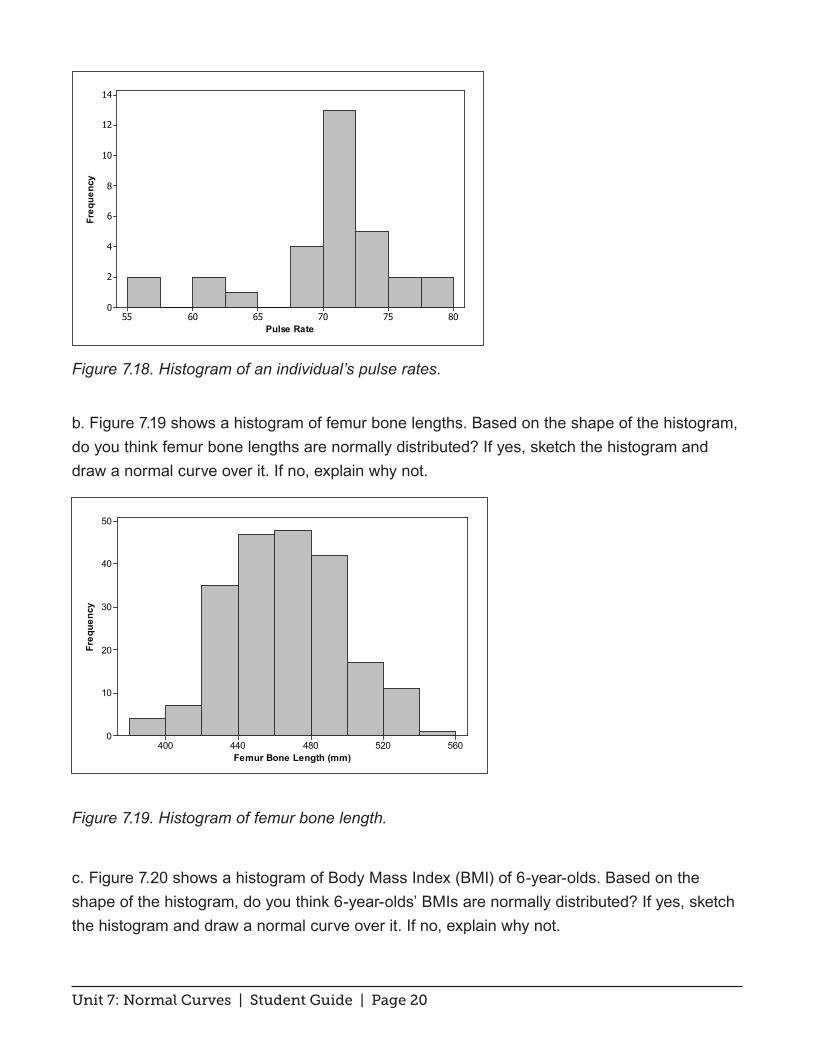
4. a. Figure 7.18 shows a histogram of data on an individual’s pulse rates (beats/minute). Based on the shape of the histogram, do you think this individual’s pulse rate follows a normal distribution? If yes, sketch the histogram and draw a normal curve over it. If no, explain why not.
See figure on next page...
Height of Girls (cm)
Unit 7: Normal Curves | Student Guide | Page 20
Figure 7.18. Histogram of an individual’s pulse rates.
b. Figure 7.19 shows a histogram of femur bone lengths. Based on the shape of the histogram, do you think femur bone lengths are normally distributed? If yes, sketch the histogram and draw a normal curve over it. If no, explain why not.
Figure 7.19. Histogram of femur bone length.
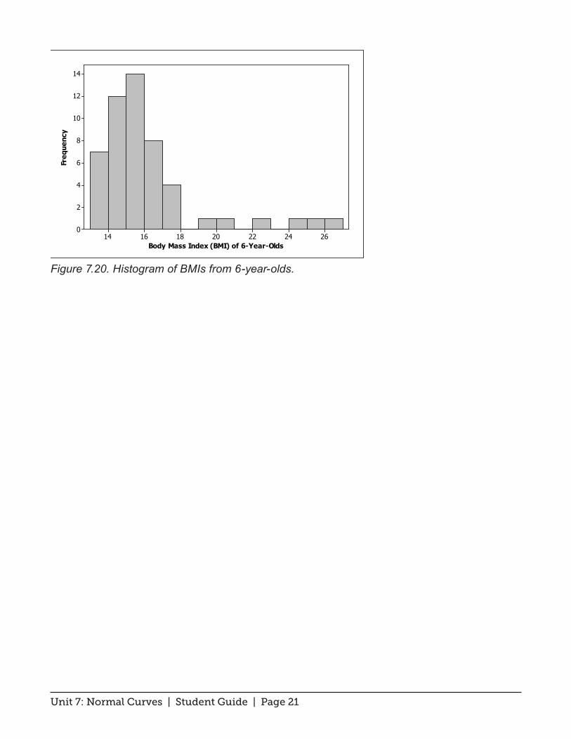
c. Figure 7.20 shows a histogram of Body Mass Index (BMI) of 6-year-olds. Based on the shape of the histogram, do you think 6-year-olds’ BMIs are normally distributed? If yes, sketch the histogram and draw a normal curve over it. If no, explain why not.
560520480440400
50
40
30
20
10
0
Femur Bone Length (mm)
Freq
uenc
y
807570656055
14
12
10
8
6
4
2
0
Pulse Rate
Freq
uenc
y
Unit 7: Normal Curves | Student Guide | Page 21
Figure 7.20. Histogram of BMIs from 6-year-olds.
26242220181614
14
12
10
8
6
4
2
0
Body Mass Index (BMI) of 6-Year-Olds
Freq
uenc
y