upper east side type specimen
DESCRIPTION
Type specimen booklet for Upper East Side Includes characters A-Z and 0-9 and small description of the typefaces influences.TRANSCRIPT

- UPPER EAST SIDE TYPEFACE -
.upper east side .
. type specimen .


- UPPER EAST SIDE TYPEFACE -
In response to the collection Subway by Bruce Davidson, Upper East Side is a typeface that emulates the 1980s NYC gangland culture, and the hustle and bustle of the subway system that was documented by Davidson. Integrating pattern and changing strokes this sans-serif typeface is influenced primarily in response to the exhibition, takes the structure of platforms and subway lines to create a bold solid base to the font, juxtaposed with the pattern and light stokes marry the unpredictable and ‘colourful’ life of the subway gangs that are documented. The typeface being primarily a display font rather than used for body copy seems to stand well with the ideals of 1980s New York, its all about standing out. Whether it be gang-colours or fur coats.
Designed with an experimental approach, the only thing the designer was subject to during working on the project was East Coast Hip hop and the photography from the exhibition, subseuently these aspects lead to the fashioning of the type and the overall stylisation.
UPPER EAST SIDE REGULAR
This book showcases the typeface and inclues a selection the original sketches that were the basis of the final family.
Bruce Davidsons’ SubwaySubway acts as metaphors for a larger human experience, as the somewhat surreal images showcase extreme diversity and a theater of human behavior. Recording the animated energy of train carriages and station platforms across the busy metropolis. The dark moody images from Subway, laden with lighting effects, showcase the grit, beauty, and strong ambiance of New York’s colorful underworld. By using an extreme wide-angle lens and utilizing light and color to accentuate subjects, Davidson also takes a stylistic leap in Subway, whereas in Central Park he depicts the park as a magical and ethereal setting, a place of renewal in the middle of one of the world’s largest cities. He shows the convergence of people from completely different classes and backgrounds, from the homeless to privileged, the young and the old, to the homosexuals and the oddballs.


- UPPER EAST SIDE TYPEFACE -


- UPPER EAST SIDE TYPEFACE -


- UPPER EAST SIDE TYPEFACE -


- UPPER EAST SIDE TYPEFACE -


- UPPER EAST SIDE TYPEFACE -


- UPPER EAST SIDE TYPEFACE -


- UPPER EAST SIDE TYPEFACE -


- UPPER EAST SIDE TYPEFACE -


- UPPER EAST SIDE TYPEFACE -


- UPPER EAST SIDE TYPEFACE -


- UPPER EAST SIDE TYPEFACE -


- UPPER EAST SIDE TYPEFACE -


- UPPER EAST SIDE TYPEFACE -


- UPPER EAST SIDE TYPEFACE -


- UPPER EAST SIDE TYPEFACE -


- UPPER EAST SIDE TYPEFACE -


- UPPER EAST SIDE TYPEFACE -


- UPPER EAST SIDE TYPEFACE -


- UPPER EAST SIDE TYPEFACE -


- UPPER EAST SIDE TYPEFACE -


- UPPER EAST SIDE TYPEFACE -


- UPPER EAST SIDE TYPEFACE -


- UPPER EAST SIDE TYPEFACE -


- UPPER EAST SIDE TYPEFACE -


- UPPER EAST SIDE TYPEFACE -


- UPPER EAST SIDE TYPEFACE -


- UPPER EAST SIDE TYPEFACE -
numerals


- UPPER EAST SIDE TYPEFACE -


- UPPER EAST SIDE TYPEFACE -


- UPPER EAST SIDE TYPEFACE -


- UPPER EAST SIDE TYPEFACE -

- UPPER EAST SIDE TYPEFACE -
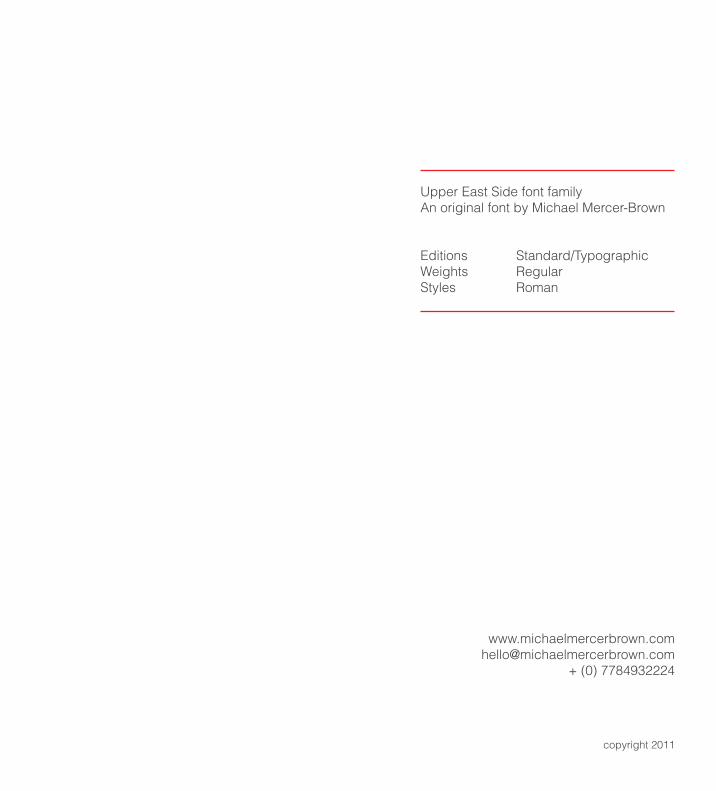
Upper East Side font familyAn original font by Michael Mercer-Brown
Editions Standard/TypographicWeights RegularStyles Roman
+ (0) 7784932224
copyright 2011
_
Upper East Side
designed by Michael Mercer-Brown.
Copyright 2011
_