usability lab final report - census.gov · a usability evaluation of the statistical abstract web...
TRANSCRIPT

STUDY SERIES (Survey Methodology #2007-22)
A Usability Evaluation of the Statistical Abstract Web Site
Erica Olmsted-HawalaSherae Daniel
Statistical Research DivisionU.S. Census Bureau
Washington, D.C. 20233
Report Issued: September 7, 2007
Disclaimer: This report is released to inform interested parties of research and to encourage discussion. The views
expressed are those of the authors and not necessarily those of the U.S. Census Bureau.

A USABILITY EVALUATION OF THE STATISTICAL ABSTRACT WEB SITE
Human-Computer Interaction Memorandum Series # 109
Submitted to:
Lars Johanson, Administrative and Customer Services Division (ACSD) Carollynn Hammersmith and Laura Yax, System Support Division (SSD)
Submitted by:
Erica Olmsted-Hawala and Sherae Daniel, Statistical Research Division (SRD)
June 11, 2007
U. S. Census Bureau
Washington, D. C. 20233
Disclaimer: This report is released to inform interested parties of research and to encourage discussion. The views expressed are those of the authors and not necessarily those of the U.S. Census Bureau.
1
Abstract Originally published in book format, the Statistical Abstract is the authoritative and comprehensive summary of statistics on the social, political, and economic organization of the United States. As an alternative to the paper format, the Web site strives to provide the content of the Statistical Abstract in an on-line medium. In the spring of 2007, the Census Bureau’s usability lab evaluated the usability of the Statistical Abstract Web site. The site had undergone some design changes, and this study focused on the re-designed elements of the site. The methods used in the study are detailed in this report, along with the findings and recommendations. The researchers report on their methods of obtaining the three components of usability: accuracy, efficiency and satisfaction. We identify a prioritized list of usability problems with possible solutions. Finally, we suggest ways to incorporate user-centered design into the Statistical Abstract Web site. Some of the high-priority findings include user difficulties in understanding how to view the data, struggling specifically with the Excel and .pdf format; user difficulties with search results, terminology, link labels and content location on the site.
2

Executive Summary This usability evaluation was performed on the Statistical Abstract Web site. The Statistical Abstract, originally in book format, is the authoritative and comprehensive summary of statistics on the social, political, and economic organization of the United States. The Web site puts out the Statistical Abstract content in an on-line format. The Web site had undergone some changes and this study focused on the re-designed elements of the site. Testing took place at the Census Bureau’s Usability Laboratory in March of 2007. Usability Goals The Statistical Abstract Web site, http://www.census.gov/compendia/statab/, strives to provide the statistical abstract of the United States, which is a book, in an on-line medium. The usability goal for success was that the test participants successfully find the target information 80-100% of the time, within a reasonable amount of time. The goal for satisfaction was to have the QUIS site reaction ratings at or above the midpoint of the scale. Methods Participants were recruited from the local metropolitan DC area via Craigslist.org, an on-line community board that posts classified ads. From those who responded to the call for volunteers, six participants were selected by the researchers. Eight tasks were tested with these participants. The tasks were primarily simple finds where the user was asked for a specific piece of information. Prior to testing, the test administrator (TA) gave the participant an introduction to the session. During the introduction, the think-aloud technique was described by the test administrator and practiced by the participant; the task cards were presented, and the consent form was signed. The TA then left the participant in the testing room and administered prompts and probes about the users’ actions from the usability lab control room. The usability lab’s videotaping system recorded the participants’ behaviors and comments. Results We measured the sites accuracy, efficiency, and user’s subjective satisfaction. Findings for accuracy, efficiency, and satisfaction were compared to usability goals established with the design team.
Accuracy: The average overall accuracy score was 36 percent. Efficiency: The average overall time-on-task for users was 5 minutes 47 seconds. Satisfaction: The average overall user satisfaction score with the site was 4.5 on a
7 point scale. Findings and Recommendations We identified areas of the site that caused users problems. Reasons for the performance deficits may be found in the list of Usability Problems and Solutions section of this report. Usability problems of high importance and their recommendations are summarized below.
3

1. The Excel table format is the primary way users viewed the data. All users expressed some amount of frustration with data displayed in Excel tables. For14 of the 48 failed tasks (29% of the time), users were not able to find the information on the table.
Recommendation: Our primary recommendation for this study is to display the individual tables in another format in addition to Excel. First and foremost, put the individual tables in .pdf format. As time and resources allow, put the tables into html format as well. Have these other options (.pdf and html tables as links) available where currently there is only an Excel link. By having the individual tables in .pdf format, more users would be able to get to and understand the information on your site. Make sure the Excel tables open with the top left of the document in view.
2. Four of six users saw the .pdf option and of the four, two of them saw it only once during the entire session. On the rare occasions that users went into the .pdf files, there were problems with the display of the .pdf document
Recommendation: Make the .pdf option easier to locate by offering individual tables in .pdf format at the point where a user sees the table title (This is the same recommendation as found in finding one above). Having .pdfs of the individual tables would solve the problem of users struggling to navigate through a large .pdf document with multiple tables. The individual pdf tables would allow users to see and use the pdf option more readily.
3. Users experienced a number of problems with the search function; for example, search results were not always usable. Some of the queries users typed into the search did not return the expected information. Search results returned link names that had no meaning for the users, and the search tool was not available on every page.
Recommendation: Re-name the metadata label of tables so that, as the search tool “crawls” the table, it pulls up a usable name to click on rather than the current six digit number-letter combination. Consider putting a “Search the Abstract” tool on every page of the abstract. Discuss with Lisa Wolfisch (System Support Division) or someone on her staff about how to do the following: 1. Maximize the search tool’s capabilities 2. Minimize the searching of the main page 3. Maximize the searching of the pages and data beneath the main page.
4. There were some problems with terminology, link labels and content location on the site. Sometimes users expected to find information in one area of the site, yet it was located in another area. Other users were confused by the terminology or Census “jargon.” Some of the time users found the information in unexpected locations; at other times users did not find the content.
Recommendation: Consider re-organizing, re-naming, and double listing some content items. Card sorting might be one way to identify content that needs to be re-organized, re-named, and double listed. Reduce the use of Census jargon both in the tables and on the navigation paths to the tables.
4

Table of Contents
Executive Summary...................................................................................................................................... 3
Table of Contents.......................................................................................................................................... 5
List of Figures ............................................................................................................................................... 6
List of Tables................................................................................................................................................. 7
I. Introduction.............................................................................................................................................. 8 1.1 Purpose........................................................................................................................................... 8 1.2 Scope.............................................................................................................................................. 8 1.3 Goals .............................................................................................................................................. 8
II. Methods and Procedures ....................................................................................................................... 9 2.1 Participants...................................................................................................................................... 9 2.2 Test Administrator and Observers .................................................................................................. 9 2.3 Facilities and Equipment................................................................................................................. 9 2.4 Usability Materials........................................................................................................................ 10 2.5 Usability Testing Procedure.......................................................................................................... 10 2.6 Usability Goals.............................................................................................................................. 12 2.7 Interaction between Test Administrator (TA) and Participant ...................................................... 13 2.8 Logging......................................................................................................................................... 14 2.9 Performance Measurement Methods............................................................................................. 14 2.10 Identifying and Prioritizing Usability Problems ......................................................................... 15
III. Results.................................................................................................................................................. 16 3.1 User Accuracy Scores ................................................................................................................... 16 3.2 User Efficiency Scores.................................................................................................................. 16 3.3 User Satisfaction Scores................................................................................................................ 19 3.4 Positive Findings........................................................................................................................... 20 3.5 Usability Problems and Solutions ................................................................................................. 21 High priority ....................................................................................................................................... 21 Medium Priority.................................................................................................................................. 29
V. References .............................................................................................................................................. 35
IV. Appendices............................................................................................................................................ 36 Appendix A: List of Tasks .................................................................................................................. 36 Appendix B. Announcement Posted on Craig’s List ......................................................................... 37 Appendix C. Behavior codes ............................................................................................................. 38 Appendix D: Consent Form ................................................................................................................ 39 Appendix E: Initial Questionnaire ...................................................................................................... 40 Appendix F: Script.............................................................................................................................. 42 Appendix G: QUIS ............................................................................................................................. 44
5

List of Figures
Figure 1. Screen shot of statistical abstract with focus on far right hand column, which users seemed to see and use at appropriate times. .................................................... 20
Figure 2. For task 1 on oil imports, users arrived at this table and had no idea what they were looking at because they could not see the column or row headers. ................. 21
Figure 3. Users looked at this table and often gave a state answer when they were supposed to be giving the city. Users scrolled up and down on this table but rarely scrolled across. .......................................................................................................... 23
Figure 4. Screen shot one click in, after clicking on the “Arts, Entertainment & Recreation” link. There does not appear to be any other way to view the tables except in Excel. Many users never saw the .pdf option, which is not visible from this page. ................................................................................................................... 24
Figure 5. Screen shot of .pdf section of population tables in the Statistical Abstract. Most users never saw the .pdf options but those that did struggled to get to the exact table they were after.................................................................................................. 25
Figure 6. Screen shot example of search result returning the link “07S1315” after searching on “foreigners population.” This link label has no meaning, and users overlooked it or hesitated to click it.......................................................................... 26
Figure 7. Screen shot of bottom of page where users clicked into all Census search because they wanted a “search” function, and this is what they found on the page. 26
Figure 8. Screen shot of stat abstract one click in (Arts, Entertainment, & Recreation: Travel and Tourist) with the option to “Search the Abstract” appearing on the page. Users would be more likely to see and use the search if it were on every page. ...... 27
Figure 9. Screen shot of main statistical abstract page with focus on the middle section of the page, the “Top 5 Data Links.” The tables listed here did not attract user attention, perhaps because none were the focus of the task scenarios...................... 29
Figure 10. Screen shot of statistical abstract main page. Users often missed the links along the top.............................................................................................................. 31
Figure 11. Screen shot of the Statistical Abstract Order page. This page confused users on what they had to do to order the print version of the Statistical Abstract............ 32
6

List of Tables
Table 1. Efficiency Goals by User and Task Complexity ............................................... 12
Table 2. User Accuracy Scores........................................................................................ 16
Table 3. User Efficiency Scores....................................................................................... 19
Table 4. Overall Satisfaction Scores from the Questionnaire for User Interaction Satisfaction (QUIS)................................................................................................... 19
7

I. Introduction
The Census Bureau’s current statistical abstract Web site (http://www.census.gov/compendia/statab/) was recently redesigned. In the summer of 2005, the statistical abstract staff worked with a summer intern to conduct a card-sorting study. The purpose of the study was to get a better understanding of how users grouped information and understood terminology. This information fed into the redesign of the site, which the statistical abstract staff worked on with System Support Division (SSD) staff. The redesigned site adopted a topic-based organization of content, which followed to some extent the terminology and format of the printed book abstract. The current round of usability testing took place from March 16 through March 23, 2007. The Statistical Abstract Usability team consists of the following members: Erica Olmsted-Hawala and Sherae Daniel from the Statistical Research Division (SRD), Carollynn Hammersmith and Laura Yax from System Support Division (SSD), and Lars Johanson from the Administrative and Customer Services Division (ACSD).
1.1 Purpose The current testing of the statistical abstract Web site had several purposes:
• To determine whether the new redesigned site worked for users • To identify problem areas and potential solutions to problems • To determine whether the navigation by way of the pop-up windows worked for
users In general, we sought to distinguish design features that work particularly well along with those that do not work for the site’s users.
1.2 Scope Testing focused on key issues identified by the design team, not every possible task that users might perform using the site. Thus, we aimed to evaluate topics relevant to navigation, search results sets, terminology, and labeling expectations.
1.3 Goals Together with the design team, we came up with a list of goals for the project. The goal for accuracy was that users complete the tasks successfully 80 to 100% of the time. The goal for efficiency was that users complete simple find tasks within two minutes and more complex tasks within three minutes and 30 seconds. The goal for satisfaction was that users rate all areas at or above the midpoint of the post-test site scale or the Questionnaire for User Interaction Satisfaction (QUIS). The goal for overall average site satisfaction was to be above the midpoint of the QUIS.
8

II. Methods and Procedures In this section we provide the characteristics of the participants and explain how we recruited participants. We describe our facilities, the computing environment, and the videotaping of test sessions. After this we describe our usability materials: the consent form, the questionnaire on computer use and internet experience, introduction to a testing session, and the satisfaction questionnaire. Next, we describe the usability testing procedure, logging, and the performance measurement methods (accuracy, efficiency, and satisfaction).
2.1 Participants SRD recruited six participants. To recruit participants, SRD staff posted a promotional notice on Craig's List.org, under community, volunteers (see Appendix B). Of the many potential participants who replied, six were recruited on a first-come-first-served-basis. The participants were required to have at least two years experience with computers and the Internet. In addition participants were selected for their self-reported, regular Internet usage: at least twice a week, to search for information. Payment to Participants. Participants were not federal employees and were paid $40.00 for participating in the study.
2.2 Test Administrator and Observers The same researcher administered the tasks to all six of the participants during the testing sessions. Additionally, no more than four observers were present in the Usability Lab room at the time of administration. The benefit of this was that the single test administrator was able to monitor patterns that emerged from the testing sessions in total, and the observers, after the sessions were completed discussed with the researcher each user’s task behavior and navigational choices.
2.3 Facilities and Equipment Participant Room. The usability participants came to the Census Bureau’s Usability Laboratory in Suitland, MD for the testing sessions. The participant sat in a small room, facing a one-way glass and wall-mounted camera, under a ceiling-mounted camera, and in front of a Liquid Crystal Display (LCD) monitor placed on a table at standard desktop height. The workstation included a standard keyboard and mouse. Two microphones picked up sound in each testing room. The participant and Test Administrator (TA) communicated via an audio intercom arrangement. Computing Environment. The participant’s workstation consisted of a Dell OptiPlex GX150 personal computer with a Pentium IV processor and 512 MB of RAM, a Dell 17-
9

inch LCD monitor set at 800 by 600 resolution with 256-bit or higher color, a standard 101/102 key quiet keyboard, and a PS2 IntelliMouse with a wheel. The operating system was Windows 2000 for all participants. Audio and Video Recording. Video of the participant was received by Computer Digital wall-mounted camera, with remote position, focus, and zoom controls. Video of the application on the participant’s monitor was fed through a PC Video Hyperconverter Gold Scan Converter, mixed in a picture-in-picture format with the camera video, and recorded via a Sony DSR-20 digital Videocassette Recorder on 124-minute, Sony PDV metal-evaporated digital videocassette tape. Audio was picked-up from one desk and one ceiling microphone near the participant, and from a push-to-talk console microphone in the test administration room. The audio sources were mixed in a Shure audio system, eliminating feedback, and fed to the videocassette recorder.
2.4 Usability Materials Consent Forms. All participants signed a form consenting to be videotaped. A sample of the consent form is provided in Appendix D. Taping began after each participant signed his or her consent form. Initial Questionnaire on Computer Use and Internet Experience. Participants were given a short questionnaire to assess their experience with computers and the Internet (Appendix E). Script: Introduction to a Testing Session. A copy of the introduction read to participants is provided in Appendix F. A major purpose of the introduction was to assure participants that they were assisting in evaluating the software, not having their own abilities tested. During the introduction, the participants had several opportunities to ask questions and practiced the think-aloud protocol. Satisfaction Questionnaire. A tailored version of the Questionnaire for User-Interaction Satisfaction (QUIS) appears in Appendix G. The QUIS items have been adopted by consensus of the Statistical Abstract Usability Team. The original QUIS was developed and validated at the University of Maryland (Chin, Diehl and Norman, 1988). After the last task, users indicated their satisfaction, overall and with specific aspects of the application, on a shortened, 11-item version of the QUIS. We used a 7-point answer scale, where one (1) indicated a low level of satisfaction and seven (7) a high level. For all items, a low score indicates a negative judgment, a high score a positive reaction. We interpret a middle score as indicating neutrality.
2.5 Usability Testing Procedure Before any testing began, we conducted one practice session or “dry run.” We used a Census Bureau employee as a participant in the dry run. Based on the dry run, we
10

tweaked the tasks and the protocol slightly. For example, if there was a slight ambiguity in a task question, we reworded the question to make it clearer. Event Sequence from greeting the participants to dismissing them. The typical session progressed as follows:
Equipment was turned on and operating TA greeted the participant Participant was brought to the testing room and seated facing monitor TA sat down with participant and read an introductory explanation TA explained that we wanted participant to use the Think Aloud protocol Participant practiced Think Aloud protocol by going to a Web site of their choice,
often www.craigslist.org and searched for something while thinking aloud Participant filled out pre-questionnaire Participant signed a videotaping consent form TA gave participant tasks, left the room, and re-established voice contact with
participant from the adjacent test administration room TA started video and audio recording, read final instructions, and administered
the testing session Participant filled out a participant satisfaction questionnaire TA paid the participant; participant signed a receipt for cash payment. TA thanked and dismissed the participant
Tasks: Each user was given eight tasks to accomplish. Total time allotted for the tasks was approximately one hour. See Appendix A for a list of the tasks. The tasks were representative of what typical users come to the site to do. Tasks were primarily simple finds, where users were required to find a single item or piece of information. The tasks were intended to give usability feedback on certain features of the site. The design team was interested in some of the following issues:
How do the pop-up windows perform for the users? What is user satisfaction with the pop-up windows? Will users know how to get into certain subject matter areas that may not be
obvious (e.g., religion under general population heading)? Do users know how to read the table and navigate around table to find
information? What do users do when they want more information than is given in a table?
Presentation of Tasks to Participant. The participant was given each task on a separate piece of paper and told that while the numbering might not seem right, the tasks were in the correct order. The TA asked the participant to read the task out loud and then asked the participant to talk about what they planned to do upon reading the task, e.g., “go ahead and read each task out loud. As you work, remember to think out loud.” If the participant had any questions about the task or on how to get started, the TA answered them.
11

Starting Page for Task. The TA started the participant on the main Statistical Abstract Web page (http://www.census.gov/compendia/statab/). After this, any of the pages participants went to as they worked on their task were acceptable and allowed throughout the duration of the session.
2.6 Usability Goals Working with the design team, we established usability goals for accuracy, efficiency, and user satisfaction. 2.6.1 Goal for Accuracy = Task Completion The goal for accuracy was that all users complete the tasks correctly 80 to 100 percent of the time. In the session log, all failures were given a context and, where possible, a reason why the user could not answer the task correctly. 2.6.2 Goals for Efficiency = Time-on-task for task level Efficiency is generally conceptualized as speed of task completion. When tasks differ in difficulty, however, this variation needs to be considered in calculating efficiency scores. Another factor is the experience level of the user. An easy task may take an expert less than one minute to complete, while it may take a novice three minutes to complete. The expert may finish a difficult task in two minutes, while it takes the novice longer. In this particular study, all our users were novice users so when calculating efficiency scores we considered primarily task difficulty. We sorted the tasks into two groups judged by level of difficulty. As an estimator of difficulty or effort, we used the complexity of the task, i.e., whether the user had to compare different pieces of information as opposed to just find a piece of information. Simple tasks were judged to be easier to accomplish than complex tasks and thus should have had a lower average completion time. Task 5 was the only task that was considered by the team to be a complex find because it required the participant to compare a number to other numbers listed while at the same time required the participant to take into consideration the size of the country (a different number in a different column). Thus task 5 was rated as being more complex in its level of difficulty and should have a longer average completion time. Working with the design team, we established efficiency goals for our novice users by task complexity. They are listed in Error! Reference source not found. below. Table 1. Efficiency Goals by User and Task Complexity
User Type\Task Complexity Simple find Complex find (Task 5) Novice 2 minutes 3 minutes
12

2.6.3 Goals for Satisfaction = QUIS The goal for satisfaction was to have the QUIS site reaction ratings at or above the midpoint of the scale, or 4 on a 7-point scale.
2.7 Interaction between Test Administrator (TA) and Participant Each participant was asked to “think aloud” while working on the tasks, that is, to provide a running commentary about the issues, expectations and decisions involved in accomplishing the work. Think aloud was described and practiced before the sessions began. The TA encouraged the participant to resume commenting whenever he or she fell silent. The think-aloud procedure potentially causes participants’ performance to slow down somewhat, and is not used in studies where exact measures of performance time are more important than discovering the respondents’ cognitive processes. In the latter, a “retrospective” think-aloud is sometimes used; asking the participant to recall issues, expectations, and decisions after each task has been completed. In this study, the concurrent think-aloud procedure was followed. Test Administrator Probes and Questions. The TA used ad hoc questions to teach and motivate the participant to provide the kinds of comments needed to understand participant problems and their possible causes. The TA did not provide help to the participant as a matter of course during the session. Self blame. Whenever the participant apologized for “being stupid” or expressed other self-blame, the TA explained that the application was designed for participants “with your characteristics,” so the problems you experience are the fault of the design, not you. Doubts about performance. When participants expressed doubt that we were getting anything meaningful out of watching their performance, the TA explained that we were learning what was wrong with the application from them, and that their comments were providing exactly the kind of information we needed. Frustration. If the participant expressed frustration, the TA would provide assurance that “we need to know that information,” and that we were getting important insights about what needed to be fixed. Silence. When a participant stopped the think aloud commentary during a task, the TA probed with statements or questions like, “What are you thinking about?” “Is that what you expected to happen?” “Keep talking,” or “What do you think will happen next?” Test Administrator reactions to question correctness. The TA avoided answering any direct question about the correctness of an answer or action. If the participant asked whether an answer was correct after a task was finished, the TA asked whether they felt is was correct and what were their impressions of the task/site.
13

2.8 Logging The note-taker logged notes onto a computer file using Noldus Observer V5.0 logging software. The note-taker typed a two-key code to indicate the observation category (see Appendix C) and entered a more detailed description of the comment. The software added a time code to each observation. Time codes and comments were used in data analysis and report preparation, described later.
2.9 Performance Measurement Methods Next we explain how we measured the three components of usability: accuracy, efficiency and satisfaction. 2.9.1 Accuracy Accuracy. Each task is scored either correct or incorrect. These are the basis for the average accuracy performance scores. Criteria for scoring correctness. A task was scored correct if the participant announced the correct answer. The average accuracy score is the mean of two means: (1) the number of tasks scored correct divided by the total number of tasks across questions and (2) the number of tasks scored correct divided by the total number of tasks across participants. 2.9.2 Efficiency Efficiency is generally conceptualized as the speed of task completion. When tasks differ in difficulty, however, this variation needs to be considered in calculating efficiency scores. For each task we noted completion time (start to stop). We got this information from our logs. Task timing procedures in the data logs: Participants were given as much time as they needed to complete the task. Most sessions were in the range of an hour. For the task, the data logger started the timer after the participant finished reading out the task and stopped when the participant verbalized the answer, or if they didn’t find an answer, that they were ready to move on. Later, the data analyst transferred the logging data to a spreadsheet and subtracted the ending time of each task from the starting time of each task to determine the time taken to complete each task.
14

We include both the efficiency scores for the tasks as well as the average overall time it took to complete the task as a whole. 2.9.3 Satisfaction Satisfaction. The subjective satisfaction score is derived from ratings made by the participants after the test. Final Questionnaire for User-Interaction Satisfaction: After the session was finished, participants indicated their satisfaction, overall and with specific aspects of the application, on a shortened, 11-item version of the QUIS, the Questionnaire for User Interaction Satisfaction (Chin, Diehl and Norman, 1988). See Appendix G. Scoring procedures: Average Overall Satisfaction: The numeric answers to the QUIS are averaged for (a) each participant and (b) across participants. The QUIS is used to compute average Overall Satisfaction on a 7-point Likert scale. For example, participants were asked to rate their overall reaction to the site by circling a number from 1 through 7 with 1 being the lowest possible score and 7 being the highest.
2.10 Identifying and Prioritizing Usability Problems To identify site design elements that caused participants to have problems, the data logger and TA reviewed the videotapes and logging data for instances where participants were either unable to get an answer, got an incorrect answer, were inefficient at getting an answer, or expressed frustration with the site while seeking an answer. By noting participant behavior and comments, the analysts inferred the likely cause (in the site design) for the difficulty in each instance. The analysts then grouped similar design problems into broader problem categories and wrote the descriptions and recommendations given in the text. The analysts assigned each problem a priority code, based on its effect on performance, as follows: High Priority: Design problems that caused some participants not to achieve their task objective or to get an incorrect answer. Medium Priority: Design problems that misled, distracted, or slowed down the participant but were usually overcome and the task objective eventually reached. Design problems that caused participant dissatisfaction. Low Priority: Potential problems that the analyst identified on the basis of a general knowledge of user-centered design principles, but that were not observed to affect participant performance during the test.
15

III. Results
3.1 User Accuracy Scores The overall accuracy score was 36 percent. This is substantially lower than the goal of 80 to 100 percent accuracy. Accuracy scores ranged from 13 to 63 percent across users and from 0 to 67 percent across tasks. Two Tasks, 5 and 8 and shaded in gray below, were not answered correctly by any user. Task 5 was the only task rated as being more complex in its level of difficulty. For Task 8, none of the users clicked on the “Earlier Editions” link, one of the navigation links across the top of the Web page. See Table 2. For a list of the tasks see Appendix A. Table 2. User Accuracy Scores. (c = task success, x = task failure, *indicates that the task was considered a more complex task, gray shading indicates tasks that were not answered correctly by any user)
user 1 user 2 user 3 user 4 user 5 user 6 Across Tasks Task 1 c x c x c c 67 Task 2 x x c c x x 33 Task 3 x x x c x x 17 Task 4 c x x c x x 33 Task 5* x x x x x x 0 Task 6 c x c c x x 50 Task 7 c c x c x c 67 Task 8 x x x x x x 0 Avg 50 13 38 63 25 25 36
3.2 User Efficiency Scores User efficiency scores are presented in
16

Table 3 for each user and task. The numbers in the cells reflect the amount of time the user took to complete the task. The means reflect the average times-on-task. Average efficiency scores for individual users ranged from five minutes and 4 seconds to seven minutes and 52 seconds. Across tasks, they ranged from two minutes and 48 seconds to nine minutes and seven seconds. The average overall time for users was five minutes 47 seconds; this is longer than the goal of two minutes for simple tasks and three minutes for complex tasks. Task 5, shaded gray in the table below, was the only task that was considered a complex find. Bolded times in the table below signify tasks that were answered successfully. See
17

Table 3 on the next page.
18

Table 3. User Efficiency Scores—in minutes. (Bold indicates a task completed successfully, * indicates it was a complex task.)
user 1 user 2 user 3 user 4 user 5 user 6 Mean Task 1 9:57 2:24 6:43 10:48 6:28 6:49 7:11 Task 2 7:32 3:24 5:35 7:05 5:18 8:24 6:13 Task 3 11:55 16:08 8:15 3:57 9:05 2:49 8:41 Task 4 2:49 3:53 1:26 3:45 2:56 4:07 3:09 Task 5* 15:14 9:38 8:09 10:49 3:44 7:10 9:07 Task 6 6:17 3:57 5:53 1:08 7:22 7:10 5:17 Task 7 3:52 4:04 4:00 0:31 3:51 0:31 2:48 Task 8 5:21 3:32 3:27 3:24 1:50 5:37 3:51 Mean 7:52 5:52 5:26 5:10 5:04 5:19 5:47
3.3 User Satisfaction Scores The overall user satisfaction score with the site was 4.5 on a 7 point scale, which is slightly above the satisfaction goal of 4 set for the site. Values below the mean, (those under 4,) suggest usability issues. See questions 1, 8 and 10b in Table 4 below. Table 4. Overall Satisfaction Scores from the Questionnaire for User Interaction Satisfaction (QUIS). (Scale from 1 to 7 where 1 is negative and 7 is positive.)
User Satisfaction with Statistical Abstract Web site Average 1. Tasks can be performed in a straight-forward manner Always --- Never 3.83
2. Organization of information on the site Confusing ---Very clear 4.33
3. Use of terminology throughout the site Inconsistent --- consistent 5.50
4. Arrangement of information on the screen Illogical --- Logical 4.00
5. Census Bureau-specific terminology Too frequent --- Appropriate 5.33
6. Characters on the computer screen Hard to read --- Easy to read 4.50
7. Learning to operate the site Difficult --- Easy 4.50
8. Experienced and inexperienced user’s needs are taken into consideration Never --- Always 3.33
9. The use of “pop-up” or “fly-over” windows was Frustrating --- Satisfying 6.50
10a. Overall reactions to the site: Terrible --- Wonderful 4.83
10b. Overall reactions to the site: Frustrating --- Satisfying 3.33
10c. Overall reactions to the site: Difficult --- Easy 4.33
Overall Average User Satisfaction 4.5
19
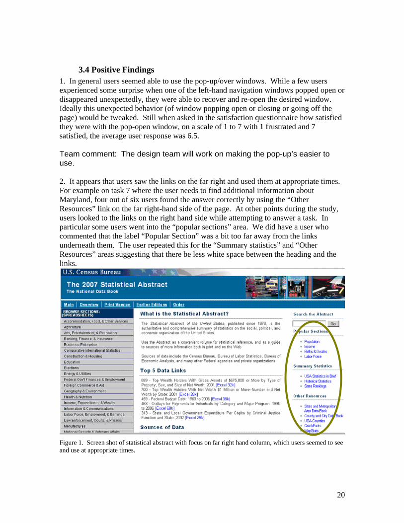
3.4 Positive Findings 1. In general users seemed able to use the pop-up/over windows. While a few users experienced some surprise when one of the left-hand navigation windows popped open or disappeared unexpectedly, they were able to recover and re-open the desired window. Ideally this unexpected behavior (of window popping open or closing or going off the page) would be tweaked. Still when asked in the satisfaction questionnaire how satisfied they were with the pop-open window, on a scale of 1 to 7 with 1 frustrated and 7 satisfied, the average user response was 6.5. Team comment: The design team will work on making the pop-up’s easier to use. 2. It appears that users saw the links on the far right and used them at appropriate times. For example on task 7 where the user needs to find additional information about Maryland, four out of six users found the answer correctly by using the “Other Resources” link on the far right-hand side of the page. At other points during the study, users looked to the links on the right hand side while attempting to answer a task. In particular some users went into the “popular sections” area. We did have a user who commented that the label “Popular Section” was a bit too far away from the links underneath them. The user repeated this for the “Summary statistics” and “Other Resources” areas suggesting that there be less white space between the heading and the links.
Figure 1. Screen shot of statistical abstract with focus on far right hand column, which users seemed to see and use at appropriate times.
20

3.5 Usability Problems and Solutions
High priority 1. The Excel table format is the primary way users viewed the data. All users expressed some amount of frustration with data displayed in Excel tables, and 14 out of the 48 failed tasks (29% of the time) failed because users were not able to find the information on the table. Users experienced the following problems with the Excel tables:
Users did not understand the data in the table because they had difficulty reading column and row headings and relating that information back to the data point they were looking at. See Figure 2.
o Users said scrolling back and forth was frustrating. o Users confused which line they were looking at
Because users can’t see the column and row headers, they wonder what the numbers mean.
Figure 2. For task 1 on oil imports, users arrived at this table and had no idea what they were looking at because they could not see the column or row headers.
21

Users were not aware of data they could not see and expected information to open with the top left of a document in view. See Figure 3.
o At times, users did not expect additional data to the right1. Even those who did sometimes scroll to the right, did not always remember to do this and on certain tables they forgot or said they expected to see the information lower down on the table (In general, scrolling down is not as problematic for users as scrolling across). Some users did not see the horizontal scroll bar within the table. While the information is being viewed in an Excel table, users are on the Web so the problems users have with horizontal scrolling in a Web environment pertain to the data displayed in the Excel format.2
o A number of the Excel tables opened at the bottom of the table where users had no context for what they were looking at. Users expected to be dropped into the top of a table. Given this expectation, many users did not realize that they were at the bottom of the table and needed to scroll up. Instead of scrolling up, some users immediately followed the “sources” link.
Users did not know how to use the Excel program or were not familiar with it.
A few users commented that they had never worked with Excel and were not sure how to use the software. None of the users knew about or tried to freeze panes or hide columns. The closest users came to playing around with the Excel program was using the zoom, which often made the text too small to read.
1 Horizontal scrolling on Web pages is considered bad practice. In Research-Based Web Design & Usability Guidelines, where the relative importance is 5 out of a 5-point scale and the strength of evidence is 4 on a 5-point scale, the guideline is to “use an appropriate layout to eliminate the need for users to scroll horizontally.” (HHS, 2006). Some users will not realize that they need to scroll horizontally and, thus, they will miss any information not visible on the screen (without scrolling). 2 This was true using the browser Firefox which opened Excel in its own window. The IE browser opens the Excel table right inside the IE browser window, which reinforces the feeling of being in a Web environment (i.e., no horizontal scrolling).
22

Users did not think to scroll to the right to find cities when looking at this table. Users either scrolled down saying they “expected to see cities below states” o or they gave the state answer (NY) instead of the city.
Figure 3. Users looked at this table and often gave a state answer when they were supposed to be giving the city. Users scrolled up and down on this table but rarely scrolled across.
Recommendation: Our primary recommendation for this user interface is to display the individual tables in another format in addition to Excel. First and foremost, put the individual tables in .pdf format. As time and resources allow, put the tables into html format as well. Have these other options (.pdf and html tables as links) available where currently there is only an Excel link. If you provide the individual tables in .pdf format, more users will be able to get to and understand the information on your site. Make sure the Excel tables open with the top left of the document in view. 2. Four out of six users saw the .pdf option; and, of the four, two saw it only once during the entire session. On the rare occasions that users went into the .pdf files, there were problems with the display of the .pdf document:
Most users did not see the .pdf option (See Figure 4) and when they did see it, often they were not expecting it to open the entire section of the Statistical Abstract; rather they expected it to open the specific table that they were looking for.
23

Figure 4. Screen shot one click in, after clicking on the “Arts, Entertainment & Recreation” link. There does not appear to be any other way to view the tables except in Excel. Many users never saw the .pdf option, which is not visible from this page.
Users only see Excel. They do not know about the .pdf option to view the data.
After the entire section of the .pdf opened (instead of the individual table), if a
user scrolled up or down too quickly he/she would get lost in some other table of the section. Sometimes the user would not even realize that they were looking at a totally different table.
When looking at the “Bookmark” area of the .pdf a user could not read the entire list of table titles. The user had maximized the bookmark area and the tables became very small. Once she had found the table she wanted, she looked to the right of the screen to view the table but because it had been minimized so much she couldn’t read the tables. She had trouble trying to get the tables back into view. The user clicked the “Back” button to return the screen to the original size but that action merely took her back to the Statistical Abstract page. This was not what she expected and she was frustrated that she had found the table title she wanted but didn’t know how to view it. See Figure 5.
24

Example of “Bookmark” section expanded and the “Table” view minimized so that one can’t read the information in the table side.
Figure 5. Screen shot of .pdf section of population tables in the Statistical Abstract. Most users never saw the .pdf options but those that did struggled to get to the exact table they were after.
The data in the .pdf table does not exactly match the data in the Excel format. When a user looked for information in the .pdf after looking at the Excel table (Task 5 on life expectancy), she thought the .pdf did not have the same information and thus said she could not answer the question. (The difference was that the .pdf had the population information in a footnote while the Excel format had each country’s population listed in one of the columns. Remembering that the population count had been in a column on the far right, in the .pdf, this user understandably scrolled over to the right looking for the population column, but it wasn’t there.)
Recommendation: As in finding one, make the .pdf option easier to locate by offering individual tables in .pdf format at the point where a user sees the table title. Having .pdfs of the individual tables would solve the problem of users struggling to navigate through a large .pdf document with multiple tables. The individual pdf tables would allow users to see and use the pdf option more readily. 3. Users experienced a number of problems with the search function.
Search results were not always usable. Some of the queries users typed into the search did not return the expected information. For example, users found it frustrating when the results highlighted a link for the entire statistical abstract rather than what the user was expecting: a link for a specific subsection of the
25

abstract. One theory, suggested by Lisa Wolfisch of SSD, was that the search tool was pulling from the main page where the terminology was listed in the left-hand column rather than offering the linked page that the term led to.
Search results returned link names that had no meaning for the users, which made users hesitant or unwilling to click on them. For example, a link labeled “07s0038” was the link the user needed, but because it had no meaning, the user did not want to click it
Figure 6. Screen shot example of search result returning the link “07S1315” after searching on “foreigners population.” This link label has no meaning, and users overlooked it or hesitated to select it.
The search tool was not available on every page. As a result, once deeper into the
site, some users said they wanted to search but could not find the search tool because they only looked at the immediate page they were on. They did not realize that the search tool was only available on the main page. Some users went into the all-Census search from the small blue links on the bottom of the screen rather than into a statistical abstract search (see Figure 7).
Figure 7. Screen shot of bottom of page where users clicked into all-Census search because they wanted a “search” function, and this is what they found on the page.
26

Recommendation:
Re-name the metadata label of tables so that, as the search tool “crawls” the table, it pulls up a usable name to click on rather than the current six digit number-letter combination.
Team comment: Team member Laura Yax recommends looking at the document properties (under file) and writing in space provided the table title and key words. This will help the search engine pick up meaningful labels to display in results section.
Discuss with Lisa Wolfisch or someone on her staff about how to do the following:
4. Maximize the search tool’s capabilities 5. Minimize the searching of the main page 6. Maximize the searching of the pages and data beneath the main page.
Consider putting a “Search the Abstract” tool on every page of the abstract, see Figure 8 below.
Team comment: Will look into putting this search on every page
Figure 8. Screen shot of stat abstract one click in (Arts, Entertainment, & Recreation: Travel and Tourist) with the option to “Search the Abstract” appearing on the page. Users would be more likely to see and use the search if it were on every page.
27

4. There were some problems with terminology, link labels and content location on the site. Sometimes users expected to find information in one area of the site, yet it was located in another area. Other users were confused by the terminology or Census “jargon.” Some of the time users found the information in unexpected locations; at other times, users did not find the content:
Users looked for tourism and expected to see it under “accommodation, food, and other services” because they said as tourists they would need both accommodation and food.
A user looked for information on top oil imports in an “international” section because on an earlier international question she had used the international comparative statistics section. She was looking for the international section because, she said, it would help her answer the oil question. (This particular user had not found the international information from the left-hand column label ‘comparative international statistics’ but rather had come upon the international statistics information from the search results. Consequently because she didn’t realize that international was under “comparative” she never found the international statistics section again even though she said she wanted to find it.
Users looked for poverty under population, poverty, or even vital stats but not under wealth.
Users looked for information on cigarette smoking under health or wholesale/ retail trade; none of the users looked under manufactures.
Users looked for life-expectancy under births and deaths, not under vital stats. One user said that he expected vital stats to be about health stats like heartbeat
rates. Users looked for international statistics either interspersed throughout the various
sections (e.g., looked for international life expectancy under births/deaths of the vital stats section) or under “international” not under the “C’s” for comparative international statistics.
When reading the words “Organization of Petroleum Exporting Countries” on table 905, most users did not appear to make the connection to the more commonly heard acronym, “OPEC.”
Recommendations: Consider re-organizing, re-naming, and double listing some content items. Card sorting might be one way to identify content that needs to be re-organized, re-named, and double listed. Reduce the use of Census jargon both in the tables and on the navigation paths to the tables. Team comment: Based on user results, the team has already made the following label changes:
From “Arts. Entertainment & Recreation” to “Arts, Recreation & Travel.” From “Income, Expenditures, & Wealth” to “Income, Expenditures, Poverty
& Wealth” From “Vital Statistics” to “Births, Deaths, Marriages & Divorces”
28

Medium Priority 5. The first section “What is the Statistical Abstract?” appeared to work to give users a quick understanding of what they were looking at. However the third paragraph in this section mentions the source, and again lower down on the page, this information is repeated in the section “Sources of Data.” Most users did not pay attention to the sources, and it seemed redundant to users when they had just read the information a moment earlier. The place where people paid attention to the source was on the table itself. Recommendation: The test under “What is the Statistical Abstract?” appeared to work for users, though the section “Sources of Data” was redundant and could be removed. This change could potentially open up the main section of page to highlight more data tables. See the recommendations section of the Medium Finding 2 below. 6. While the idea of having a “Top 5 Data Links” section is a good one, the current tables do not seem to highlight the depth or breadth of content in the Statistical Abstract. See Figure 9. In addition this area is not very readable, which may be another reason why users avoided it.
Figure 9. Screen shot of main statistical abstract page with focus on the middle section of the page, the “Top 5 Data Links.” The tables listed here did not attract user attention, perhaps because none were the focus of the task scenarios.
Recommendation: Since many users will not know what kind of information is available on the Statistical Abstract, consider using the “Top 5 Data Links” section to highlight some of the more interesting topic areas that users might not anticipate, such as a table on religion, a table on oil imports, or a table on the environment, and so forth.
29

This might be a place to show data tables that have a connection to current news reports. Or if you remove the “Sources of Data” section, as recommended above, you could use this area to create a new section that would highlight the depth and breadth of information in the Statistical Abstract, something like “Interesting and Unusual Data.” Suggestions to improve readability might be to alternate a gray background for every other listed item and include an excel icon (or .pdf or html) to make the file type more visible. Also delete the numeric coding, at the front of the table title if it is not meaningful. Consider putting the link at the front of the title rather than at the end, this way all the links will line up and will be easier to scan. As with all suggested changes, we recommend additional usability testing to confirm that the suggested changes work for the users. This initial page could be the focus of a quick low-fidelity study to validate whether proposed changes work for users. Team comment: Work has begun on the following:
Removing number before the table title Shading alternate backgrounds of table information Choosing different tables to highlight based on top user search queries Adding additional tables in the location where currently the “Sources of
Data” section resides. Tables will highlight some of the variety and depth of information available on site.
7. Users didn’t appear to consistently see the links at the top of the Web page. On the two tasks that related to the links on the top of the screen, three users out of six noticed the “Order” link, and one of them went into the “Print” link before navigating into the “Order” link. For the task on the population in the year 1925, none of the users clicked on the “Earlier Editions” link. For this reason all user work on Task 8 was marked as “failure”3.
3Three users found a table that listed out the decennial census from 1790 to 2000. They found the numbers for 1920 and 1930 and said they would take an average. The other three users found a table that did list a number for 1925 under “Resident” population as 115,829.
30

Users didn’t appear to see the links along the top of the Web page
Figure 10. Screen shot of statistical abstract main page. Users often missed the links along the top. The color scheme used for these links likely makes them blend into the banner.
Recommendation: Run a few users through the eye-tracking software to identify where they are looking. If users are not seeing the links along the top, these links could be located elsewhere on the site. Consider getting rid of the links along the top. Team comment: Team will change the word “Order,” which might not have as much meaning, to the more common user request of “Buy a book.” 8. For the three users who managed to locate the Order page, the text was confusing to follow. One user missed the section on how to order and instead homed in on the black heading “order information,” which instructs the public to call the phone number listed to get the statistical abstract. One user tried to click on the blue heading words “Print version—2007 edition” because they said they thought it was a link. It was not immediately clear that one needed to click on the “(GPO)” link to order a book copy. The heading “Order a copy” is too far away from the blue word “(GPO)”. One user said “there is no link here under the print version section.” See Figure 11 on the next page.
31

Users missed the link (GPO). The words that drew the user’s eye were “Order Information.” The headings are too far away from the instruction and link. One user tried to click on the words “Print version-2007 edition” because they said they thought it was a link.
Figure 11. Screen shot of the Statistical Abstract Order page. This page confused users on what they had to do to order the print version of the Statistical Abstract. Recommendations: Consider re-writing this page. Make it clear how to order a printed copy. Put the heading “Order a book” closer to the instructions. Write instructions in step format, as follows: How to Order a Printed/Bound Copy of the 2007 Statistical Abstract:
1. Follow link to the government book store [make the words government book store the link].
2. Choose paper bound edition [make the words “paper bound edition” links directly into the paper bound page of the GPO Web site]
OR 3. Choose cloth bound edition [make the words “cloth bound edition” links directly
into the cloth bound page of the GPO Web site] Team comment: Team plans to make these recommended changes.
32

9. Users experienced some confusion when links were not presented in a way or did not act in a way that is now considered a Web standard. Users expected to see the color of the link labels change from blue to purple after they had clicked on them. At times users were confused with which blue words were links. Some users either hovered over or clicked on the blue headings expecting them to be links. (See Finding 8 on the “Order” page above.) Recommendation: Use the Web-standard link colors throughout the site: Unvisited links: Underlined blue; Visited links: Underlined purple.
33

Implications of Usability Findings for User Interface Designers Based on user performance and commentary during the think aloud, we were able to identify a number of problems and offer recommendations that could make for a better design of the Statistical Abstract Web site. Users faced the following challenges:
Viewing the data. Understanding search results. Interpreting confusing terminology.
Implementation of the primary recommendations is central to the success of the Web site. Users need a way to view the data in a format that is familiar to them. By offering multiple views, the designers have a higher chance of displaying the data in a user-recognized format. Users rely on searching for content if they can’t immediately find it on the site. By improving search results so that the link labels are meaningful to the user, the search tool becomes a reliable way into the data. Finally by reducing the amount of Census jargon on the site and using synonyms where appropriate, the site content immediately becomes more available to the general public. Each of the usability recommendations can be generalized to other user-interface design contexts and can remind designers to consider user needs in all their design activities. A general design goal throughout all studies is to remove sources of difficulty from the user's experience with the human-computer interface.
34

V. References
Chin, J. P., Diehl, V. A. and Norman, K. L. (1988). Development of an instrument measuring user satisfaction of the human-computer interface. Proceedings of SIGCHI '88, (pp. 213-218), New York: ACM/SIGCHI. Research-Based Web Design & Usability Guidelines. US Department of Health and
Human Services: Washington DC, 2006.
35

IV. Appendices
Appendix A: List of Tasks 1. After listening to a discussion on the United States’ energy policy and its dependence
on oil from foreign countries, you are interested in knowing which country supplied the most oil to the United States in 2005.
2. You are thinking of opening a Tobacco shop, but before you spend your energies on
it, you want to know exactly how many cigarettes were smoked by adults in 2005. 3. Some Russian friends of yours from Kiev want to visit the US. They have asked you
which city is the one most often visited by foreigners. Find the city that had the highest number of foreign tourists in 2005.
4. You are a librarian and interested in getting the statistical abstract in book form for
the library collection. What would you do? 5. For a paper you’re writing on life expectancy around the world, you need to know
which country, with a population of at least 12 million people, had the highest life expectancy in 2005.
6. You are writing a paper on poverty and need to know the percentage of Americans
that live below the poverty level. 7. You live in the State of Maryland and want to find more information about your state.
Please find other publications containing statistical information about Maryland. 8. For a history paper you’re working on you’d like to know what the population was in
the US in 1925.
36

Appendix B. Announcement Posted on Craig’s List EARN $40 for participating in research study for the U.S. Census Bureau. The U.S. Census Bureau is seeking participants to try out a new Web site. By taking part in the study you can provide valuable feedback we will use to make the Census Bureau’s Web site better and more user-friendly for everyone who may use it in the future. To participate, people must meet certain qualifications:
Are you age 18 years or older? Have you used the Internet for at least a year? Do you use the Internet at least twice a week?
If you answered “yes” to all three questions, you are qualified to participate! The study will take about an hour and will be conducted at Census Bureau headquarters in Suitland, MD, between the hours of 8:30 a.m. and 5:30 p.m. The Census Bureau is metro accessible (Green line, Suitland Road) and free visitor parking is also available. Each participant receives a stipend of $40.00 for expenses. If you would like more information, call 301-763-1784 or email [email protected]. Refer to code INT when you call or email.
37

Appendix C. Behavior codes Behavior Codes TA Talk TA asks questions or gives feedback User Talk User talk out loud User Action User makes some action Comment User comments on site Highlight Highlight for report Confusion User is disoriented Navigate User talks about where they are going, or goes to a new place Off site User goes to a different site Return to site User returns to the site being tested Part correct User completes tasks with an answer that is partially correct Internal comment Loger makes an internal comment about user action or behavior Other Other code User action User makes some action
38

Appendix D: Consent Form CONSENT FORM
The Census Bureau routinely tests products used for collecting data or disseminating data in order to produce the best products possible. You have volunteered to take part in a study to improve a product used for disseminating Census Bureau data. In order to have a complete record of your comments, your interview session will be audio-taped/video-taped. We plan to use the tapes to improve the product. Staff involved in this product design research will have access to the tapes. The tapes may also be used for training others to conduct this type of research and in presentations to professional audiences. I have volunteered to participate in this Census Bureau product design study, and I give permission for my tapes to be used for the purposes stated above. Furthermore, I understand that the data dissemination product being tested is still preliminary in nature and not yet ready to be released to the public. I understand that I may not publicize, critique, or otherwise discuss or characterize the project until the final product is officially released by the Census Bureau.
__________________________________ Participant’s Signature __________________________________ Printed Name __________________________________
39

Appendix E: Initial Questionnaire
Initial Questionnaire 1. What computer applications do you use?
Mark (X) all that apply
e-mail Internet
Word processing (MS-Word, WordPerfect, etc.) Spreadsheets (Excel, Lotus, Quattro, etc.)
Databases (MS-Access, etc.) Accounting or tax software Engineering, scientific or statistical software Other applications, please specify _______________________________________
2. How comfortable are you in learning software
applications that are new to you? Circle one number for each
Not at all Very Comfortable Comfortable
1 2 3 4 5
3. Computer windows can minimized, resized, and scrolled through. How comfortable are you in manipulating a window?
4. How comfortable are you using and navigating
through the Internet? 5. How often do you work with any type of data
through a computer? 6. How often do you perform complex analyses of
data through a computer? 7. How often do you use the Internet to find data?
1 2 3 4 5
1 2 3 4 5
Never Very Often
1 2 3 4 5
1 2 3 4 5
1 2 3 4 5
40

8. How often do you use Web sites or printed reports
to get data? 9. How familiar are you with the Statistical Abstract (terms, data, etc)? 10. How familiar are you with the Census.gov Web site (terms, data, etc.) 11. How familiar are you with Census Bureau terminology?
1 2 3 4 5
Not at all Very familiar familiar
1 2 3 4 5
1 2 3 4 5
1 2 3 4 5
41

Appendix F: Script Script for Statistical Abstract Web site Thank you for your time today. We will be evaluating a new design of the Census Bureau Web site by having you work on several tasks. Your experience with the site is an essential part of our work. We are going to use your comments to give feedback to the developers of the site. Your comments and thoughts will help the developers make changes to improve the site. I did not create the site, and am really like a third party that has come in to assist in evaluating it. So please don’t feel like you have to hold back on your thoughts to be polite. Tell us both your positive and negative reactions to the site. And remember, there are no right or wrong answers. We aren’t evaluating you but rather how well the site works. Unless you have a serious objection, we would like to video tape you during the study. We use it to help analyze the data for this project, mainly because we cannot remember everything. Will this be all right? Give User Pre-questionnaire Give User Consent form For the next 60 minutes I’ll ask you to work on 8 tasks. I’d like you to tell me your impressions and thoughts as you work through the tasks. We would like you to “think aloud” as you work on your tasks. This means that as you work on a task, talk to us about what you are doing, what you are going to do, and why. Tell us why you clicked on a link or where you expect the link to take you.
Now we’ll take a moment and practice the think aloud protocol by looking at the craigslist.com
Task look for something of interest on craigslist.com and talk about what you are thinking about as you do it.
Do you have any questions about the “think aloud” process we ask you to use?
Do you have any other questions now? We’ll be able to see and hear you, so if you have any questions during the session please just ask us. Give User Tasks
42

When ready to begin first task: Begin each task by reading the task question out loud. As you work remember to please think out loud. Once you have found the information you are looking for please state your answer aloud. For example, say, “My answer is ---” or “This is my final answer.” After each task I will return you to the homepage where you can begin the next task.
43

Appendix G: QUIS Questionnaire for User Interaction Satisfaction (QUIS)
Instructions: For each item, please circle the number that most appropriately reflects your impressions about using this Web site.
1. Tasks can be performed in a straight-forward manner: Never 1 2 3 4 5 6 7 Always
2. Organization of information on the site:
Confusing 1 2 3 4 5 6 7 Very clear
3. Use of terminology throughout the site: Inconsistent 1 2 3 4 5 6 7 Consistent
4. Arrangement of information on the screen:
Illogical 1 2 3 4 5 6 7 Logical
5. Census Bureau-specific terminology: Too frequent 1 2 3 4 5 6 7 Appropriate
6. Characters on the computer screen:
Hard to read 1 2 3 4 5 6 7 Easy to read 7. Learning to operate the site:
Difficult 1 2 3 4 5 6 7 Easy
8. Experienced and inexperienced user’s needs are taken into consideration: Never 1 2 3 4 5 6 7 Always
9. The use of “pop-up” or “fly-over” windows was:
Frustrating 1 2 3 4 5 6 7 Satisfying 10. Overall reactions to the site:
Terrible 1 2 3 4 5 6 7 Wonderful Frustrating 1 2 3 4 5 6 7 Satisfying
Difficult 1 2 3 4 5 6 7 Easy
11. Please add any additional comments:
44

45