user-centered design for knowledge imbalance analysis: a
TRANSCRIPT

User-Centered Design for Knowledge ImbalanceAnalysis: A Case Study of ProWD
Nadyah Hani Ramadhana1, Fariz Darari1,4, Panca O. Hadi Putra1, Werner Nutt2,Simon Razniewski3, and Refo Ilmiya Akbar1
1 Faculty of Computer Science, Universitas Indonesia, Depok, Indonesia2 Free University of Bozen-Bolzano, Bozen-Bolzano, Italy
3 Max Planck Institute for Informatics, Saarbrucken, Germany4 Tokopedia-UI AI Center of Excellence, Jakarta, Indonesia
Abstract. Not all topics within a knowledge graph are represented at the samedepth, which might lead to biased conclusions derived from the graph. Tools havebeen created in an effort to highlight knowledge imbalances, one of which isProWD, built to analyze imbalances in the Wikidata knowledge graph. However,as often found, the usability aspect of Semantic Web tools is commonly over-looked, resulting in their limited acceptance. In this paper, we utilize the stan-dard approach to improve usability, i.e., the User-Centered Design (UCD), forProWD. We employ the full range of steps of UCD to improve the user expe-rience of ProWD despite the complex nature of knowledge graph concepts un-derlying ProWD. The result of the ProWD redesign is then evaluated using theSystem Usability Scale (SUS) and User Experience Questionnaire (UEQ) scores,as well as the task success rate and completion time, suggesting that the overallusability of ProWD has successfully improved.
Keywords: Knowledge Imbalance · Wikidata · User-Centered Design
1 Introduction
The increasing utilization of knowledge graphs (KGs) makes it necessary to ensuretheir quality. One of the most popular KGs is Wikidata, which is part of the free-contentWikimedia family with its main goal to collaboratively collect structured data to be usedby anyone [15]. In a commercial context, Wikidata is used by companies like Ama-zon5 and Google.6 In terms of quantity, there are over 1.1 billion statements describing88 million items7 on Wikidata about various topics, ranging from humans and cats tomovies and museums. Given such a vast quantity, the question arises as to whetherall topics within Wikidata (or any KG, in general) are represented in a well-balancedmanner. This question is particularly important as failing to notice the existence of im-balances in a KG might lead to misleading conclusions derived from the KG.
5 https://www.wired.com/story/inside-the-alexa-friendly-world-of-wikidata/6 https://ahrefs.com/blog/google-knowledge-graph/7 https://wikidata-todo.toolforge.org/stats.php
Copyright c© 2020 for this paper by its authors. Use permitted under Creative Commons Li-cense Attribution 4.0 International (CC BY 4.0).

Related Work. In terms of data quality, the problem of analyzing the existence of knowl-edge imbalances touches mainly two aspects: completeness and coverage. Data com-pleteness concerns the degree to which all necessary information is provided, whereasdata coverage refers to the level of detail of the information stored [17]. Knowledgeimbalances occur whenever there are disparities of completeness as well as coveragebetween different topics in a KG.
In the context of Wikidata, identifying and measuring knowledge imbalances aredeemed to be an important step to advance knowledge equity in Wikidata [18]. A num-ber of initiatives have been undertaken to address knowledge imbalances in Wikidata.Denelezh is a tool developed to track the gender gap in Wikidata [7]. Via Denelezh, onemay, for example, compare the number of male vs. female humans in Wikidata. In [1],a map-based visualization shows which locations worldwide have how many Wikidataitems. Through the visualization, one might observe that there is a stark difference be-tween the number of Wikidata items located in North America vs. South America. Re-coin [2] measures the different levels of completeness among Wikidata items, rangingfrom very basic information to very detailed information.
ProWD. Let us now draw attention to ProWD. ProWD is a framework to measureknowledge imbalances in Wikidata [16]. ProWD generalizes the above initiatives inthe sense that ProWD can be leveraged to any domain instead of only the gender orgeographical domain. The framework measures knowledge imbalances based on Class-Facet-Attribute (CFA) profiles. A class groups similar items, which might comprisemultiple facets, thus allowing attribute completeness to be compared. For example, viaProWD one may compare the completeness of the attribute “date of birth” and “edu-cated at” between US inventors vs. Nigerian inventors, as illustrated in Fig. 1. In thefigure, we observe that 95.65% and 49.07% US inventors have the “date of birth” and“educated at” information, respectively. On the other hand, 100% (i.e., all) and 83.33%Nigerian inventors have the “date of birth” and “educated at” information, respectively.Moreover, the absolute number of Nigerian inventors seems to be far less than that ofUS inventors. The ProWD tool is available at http://prowd.id:3333/.8
Problem and Contribution. While ProWD indeed offers basic functionalities in identi-fying knowledge imbalances in Wikidata, little concern was given to the extent to whichthe ProWD tool can be used by its users to achieve their goals with effectiveness andsatisfaction. This very notion of usability [10] is nevertheless commonly overlooked byKG application developers [4]. The novelty and intricacies of the KG concepts under-lying ProWD as well as the fact that ProWD was developed without any rigorous useranalysis and testing, raise questions about its usability.
In an effort to improve the usability of ProWD, one could prioritize the (potential)users in such a way that their particular needs can be accommodated more accurately.A process commonly used in the development of a product, putting the user experienceand usability front and center, is the User-Centered Design (UCD). The UCD approachis widely investigated and utilized in academia and industry [12]. Adapting and imple-menting the UCD approach towards the development of ProWD is challenging for two
8 A demo video of the tool is also available at https://youtu.be/3jcXXx1uQU4.

Fig. 1. Comparison of the completeness of attributes between US inventors and Nigerian inven-tors on the original ProWD (Source: http://prowd.id:3333/#/profile/compare/123)
reasons: (i) knowledge graphs are a new abstract concept, and (ii) the imbalance analy-sis of such a graph is even more abstract. With that being said, this paper contributes tothe adaptation and implementation of the UCD approach in the KG setting to improveProWD, a knowledge imbalance analysis tool.
Paper Structure. The rest of the paper is outlined as follows. Sec. 2 provides a briefbackground of the research. The next four sections correspond to adapting the stepsof UCD in improving the usability of ProWD: understanding ProWD’s context of use(Sec. 3), specifying ProWD user requirements (Sec. 4), redesigning ProWD (Sec. 5),and evaluating the redesigned ProWD (Sec. 6). Sec. 7 concludes our paper.
2 Background
Knowledge Graphs. A knowledge graph (KG) describes real-world entities and theirrelationships [3]. Resource Description Framework (RDF) is the standard data modelby W3C for KGs [8]. For example, the statement Bob is a human can be modeled inRDF as a Subject-Predicate-Object triple (Bob, is, human). To query RDF data,one could use SPARQL, which provides rich query constructs, enabling the creationof complex SPARQL queries [8]. Wikidata is an open, cross-domain KG, providingstructured data to anyone [15]. Wikidata provides RDF support which can be queriedvia its SPARQL endpoint.

User-Centered Design. UCD is a design process comprising four activities: (i) under-stand the context of use, (ii) specify user requirements, (iii) design alternative solu-tions, and (iv) evaluate against requirements [10]. UCD prioritizes user needs in thedesign and development process of a product. To evaluate a product in UCD, severalusability metrics can be used, such as the success rate and time on task, as well asquestionnaire-based metrics like the System Usability Scale (SUS) [14] and User Expe-rience Questionnaire (UEQ) [13]. The SUS measures the overall usability of a system,while the UEQ measures six scales of a product: (i) attractiveness, (ii) perspicuity, (iii)efficiency, (iv) dependability, (v) stimulation, and (vi) novelty.
3 Understanding ProWD’s Context of Use
To improve upon an existing application, one must understand the context of use of theapplication. From this section onwards, we refer to the original version of ProWD [16]as ProWD-V1 and the redesigned version of ProWD resulting from our researchas ProWD-V2. ProWD was developed in a technology-driven manner and was made toshed light on imbalances that might exist within Wikidata. This technology-driven de-velopment led to the application being less user-friendly as the users were not involvedin the development process.
The creators of ProWD wishes to advance ProWD to be utilized more widely byusers outside the Wikimedia community (WM Community). The creators observed andconcluded that the main challenges of ProWD are: (i) the abstract notion of the Wikidataknowledge graph and its imbalance analysis, and (ii) the lack of an existing ProWD userbase. To tackle those challenges, one needs to be able to convey properly such abstractconcepts, and to analyze (and accommodate) the generic and specific user requirementsof ProWD.
To confirm this, we initiated a meeting with representatives of the WM Commu-nity of Jakarta (the capital of Indonesia) to gather feedback and insights about theirexpectations towards ProWD. The WM Community of Jakarta is considered to be rep-resentative of the Wikidata Community as they are experienced with Wikidata and areinterested in the issue of imbalance and the potential of ProWD as a tool. The meetinguncovered several potential usability issues. The target users identified were as follows:(i) data journalists, as Wikidata could become a data source for news topics, (ii) dataprofessionals, as Wikidata might enrich their data analysis, and (iii) AI researchers, asWikidata could be utilized for training data to build AI models.
4 Specifying ProWD User Requirements
Having identified the potential user base, we wanted to collect their requirements. Togather those requirements, the targeted users participated in usability testing and areinterviewed. As ProWD-V1 has already existed, a heuristic evaluation is done to gatherthe requirements of how the application can be improved [6]. Hence the process ofspecifying the requirements is two-fold: (i) heuristic evaluation to gather generic userrequirements, and (ii) evaluation based on specific requirements from the appropriatelychosen test-participants from the defined user base.

Fig. 2. Compare two facet values feature on ProWD-V1
4.1 Heuristic Evaluation
The heuristic evaluation using Nielsen’s ten usability heuristics [11] shows how theuse of technical terms with a lack of further documentation in ProWD-V1, hence con-fusing the users. An example is the term “Class-Facet-Attribute” in the landing pageof ProWD-V1, which confuses the users as there is no further information on what itexactly means and how it ties to the purpose of the application.
Within the “see full profile”, “compare two facet values”, and “multi-dimensionalanalysis”, the users are burdened with a large cognitive load as they need to keepscrolling back and forth to look back within the same page, which is against the “Recog-nition rather than recall” heuristic. ProWD-V1 is lacking in providing alerts about thestatus of the system, for example, whether a page is loading or an error occurs for thepage. Fig. 2 illustrates such usability issues in ProWD-V1.
4.2 User Research and Testing
Selection of Test-Participants. The test-participants were chosen based on the contextof use, namely, WM community members and potential Wikidata users. A total of fiveusers from each distinct user group were selected. In selecting the test-participants, themethod used was purposive sampling.9 To lessen the bias as much as possible, we chosetest-participants who would be critical towards systems such as ProWD based on theirexperience, occupation, and their sensitivity and interest towards knowledge, culture,data, and education.
The selection process led us to have five WM community members and five poten-tial Wikidata users comprising data analysts, journalists, and teachers/researchers: (i)the WM community members are all from Jakarta and are those in high-profile posi-tions which presumably would have valuable and critical feedback for ProWD as theyhave the biggest drive for ProWD’s purpose; (ii) since ProWD’s functionality is quite
9 That is, intentional selection of informants based on their ability to elucidate a specific theme,concept, or phenomenon.

similar to that of a dashboard, data analysts would be familiar with the kind of taskthat ProWD supports and would be able to give valuable feedback; (iii) lastly, the cho-sen journalist and teachers are people who are highly sensitive towards social/culturalissues, e.g., gender bias.
User Research and Persona. To create a clear and constant reference to the users, a per-sona can be created [9]. The test-participants were interviewed to discover more abouttheir personality, needs, and expectations using a semi-structured interview. The inter-view reveals that 100% of the test-participants have previously encountered a form ofimbalance in general knowledge, while 90% state that more information on the imbal-ances would be insightful for their work. These confirm that ProWD has a potential inhelping these users. From the interview, we also observe that users have a varying de-gree of Wikidata proficiency, so we divide the target users into two main personas. Thefirst persona is the WM Community Member, who is an expert on Wikidata structuresand is tenacious in learning new systems. They have a drive for general knowledge andwant to highlight underrepresented topics. The second persona is the Knowledge En-thusiast, who has no experience with Wikidata, though is potentially interested with it.The knowledge enthusiasts value reliability and are sensitive towards their domain ofinterest. Each of the two personas has their own end goal: The WM Community Mem-ber wants to understand the knowledge imbalance situation to be able to prioritize heractions, while the Knowledge Enthusiast wants to have an understanding of the qualityof general knowledge and identify topic imbalances.
Usability Testing Setup. Now that we have gathered information regarding the users,we want to know how users complete tasks using ProWD-V1. From observing the usersin completing tasks, we could gather requirements on the things to keep and things toimprove from ProWD-V1, for this purpose, the users participated in a usability testingsession using six tasks formulated based on the heuristic evaluation and context of useof ProWD. From the usability testing, specific requirements in the form of qualitativefeedback and quantitative data in the form of success rates, time on task, SUS, and UEQwere collected. The collected data was then analyzed to measure the impacts of the re-design (ProWD-V2). The six tasks were categorized into typical and secondary tasks.The typical tasks were: (i) primary tasks, which are tasks to create new dashboard (CN),gather info on profile page (PP), compare subclasses (CP), discover insights (AP), and(ii) secondary tasks, for which the users are prompted to generate feedback on the land-ing page (LP), and the process of opening previously created dashboards (OP), whichare the generic experience of new and returning users. The selected topic for the testingis “humans with the inventor occupation.” This topic was selected as inventors are gen-erally known to the public, e.g., Albert Einstein. In the testing sessions, we observedhow the users conducted the tasks and instructed them to think aloud to identify anycognitive obstacles throughout the testing sessions.
Post-test and Documentation. For analysis purposes, the screen and audio of the test-ing session were recorded. The user interview took 30-60 minutes each and required asimilar amount of time to evaluate and analyze. After the usability testing session, theusers answered a usability survey which consists of SUS and UEQ. Gathered from the

testing, the qualitative feedback suggests that even with their pre-existing knowledge,WM Community Members are still confused about the profile creation section of theapplication. The terms used on ProWD-V1 are still rather confusing and figuring outthe facets and attributes of the profile becomes more difficult. Meanwhile, the Knowl-edge Enthusiasts were confused from the get-go, they neither had an idea of what thedata shown means and how it is important or relevant to them, nor did they compre-hend the visualizations the application provides. To simplify, coming into ProWD-V1,the users are faced with foreign terms, coupled with confusing navigation and lack ofdocumentation, the users get easily frustrated.
5 Redesigning ProWD
Now that we have gathered the context of use and user requirements of ProWD, alter-native design solutions were formulated. At this stage, several design tools and methodswere utilized in the process of redesigning the application, from creating a user journeyto further analyze where ProWD can become helpful for the users to an in-depth analy-sis of the 6 tasks. The user requirements also gave insights in the information the userswant and need from the application. Hence an information architecture was created tomap these information so that the users can find them more intuitively. Then a proto-type of ProWD-V2 was created based on the analysis of the user requirements usingthe tools previously mentioned.
5.1 User Journey Mapping
As previously mentioned, each persona has their own end goal in doing and complet-ing their job. Understanding how ProWD could help these personas reach their goalshelped us orient the application towards the users’ needs. For this purpose, a customerjourney map was created. “A journey map is a visualization of the process that a per-son goes through in order to accomplish a goal.” Journey maps can help determine theusers’ frustration, pain points, and delight. [5] The end goals of the personas whichwere identified from the interviews highlighted possible opportunities in which ProWDcan become a helpful tool for these personas. For the WM Community Members, theirend goal is to “be able to understand the knowledge imbalance situation better.” ProWDcan be helpful to this persona for comparing projects so that they can focus their effortsbetter by also creating an easily identifiable and comparable metric. As for the Knowl-edge Enthusiasts whose end goal is to “be able to have an understanding of the qualityof general knowledge and identify topic reliability,” ProWD can be helpful to identifydominating or popular topics in general knowledge.
5.2 Task Analysis and Information Architecture of ProWD
To analyze the efficiency of the 6 tasks previously tested, a task analysis is done tobreak-down the tasks to a finer scale. As ProWD visualizes knowledge imbalance, thetasks are partially cognitive and physical which creates a challenge in doing task anal-ysis. To tackle this, a hierarchical analysis of physical subtasks was performed so thatthe users’ physical interaction with the application could be broken down into its el-ements and analyzed to minimize any unnecessary flow. One example of a task with

both physical and cognitive challenges is the Compare Page (CP task) shown in Fig. 3.An example of minimization of a subtask is done to the “Select or Edit the ComparisonDimension” subtask, which in ProWD-V1 required the user to do tedious actions ofaround 11 steps to simply edit the comparison dimensions. The task analysis simplifiedthe process by decreasing the action to just 5 steps in ProWD-V2, this optimization isdone to each physical subtask.
Fig. 3. Task analysis for the Compare Page (CP) Task
For the more cognitive tasks, we analyze things that can be improved based on theuser feedback from the usability testing sessions. The user journey map (Sec. 5.1) showsthat ProWD can help the WM Community Member persona by “creating an easily iden-tifiable and comparable metric,” the creation of this metric can also be helpful to tacklethe cognitive task to “Get insight from the imbalance difference” as seen in Fig. 3.Hence, the Gini coefficient was selected as a metric for imbalance. The Gini coefficientis a rough measure of the amount of imbalances in wealth distribution with a value of 0(ideally balanced) to 1 (totally imbalanced), which is visualized by using the so-calledLorenz curve. It has been used as a measure of inequality in the economic field by cal-culating the Gini coefficient for income distribution of each country around the worldto measure the wealth inequality. This research utilizes the Gini coefficient to visualizethe imbalance in information wealth.10 Other than the mentioned examples, the require-ments previously gathered also shows the need to provide additional information, e.g.,“what does ProWD enable?” and “how do I navigate ProWD?”. Now that we have aplan on the information we want to add and dismiss in the form of information and fea-tures for ProWD-V2, an information architecture blueprint was created. An example ofthis information architecture activity is the mapping of the content within the comparepage, which now includes the Gini coefficient comparison, the shared and unique prop-erties of each subclass, additional documentation for each data, this mapping process isdone for each feature within ProWD-V2.
5.3 Prototype of ProWD V2
Now that each feature’s plan is mapped, it is time to actualize these improvements intothe form of an actual application by creating a prototype. The improvements done are oftwo kinds: (1) changes done based on the more generic UI/UX elements categorization,10 https://en.wikipedia.org/wiki/Gini coefficient

and (2) a more specific categorization based on tasks exclusive to ProWD’s system. TheUI/UX elements improved aspects are those of (1a) the types of information presented,which in the new design, an addition of a new visualization of topic imbalance using theLorenz curve to represent the Gini coefficient as mentioned in Sec. 2. A new functionto be able to view properties exclusive to compared subclasses using set operations isalso incorporated in ProWD-V2. Based on the (1b) data visualization element, to aidthe users in comparing data visually, bar charts are used to represent the informationover using donut charts previously used in ProWD-V1. (1c) the flow of interaction isalso modified. The modification of the flow is the result of the task analysis previouslydone, an example of this is within ProWD-V2, after the dashboard creation process, theusers are immediately redirected into their new dashboard instead of having to browsefor it in ProWD-V1.
Fig. 4. Compare page of ProWD-V2
In regard to (1d) the layouting of components, modifications in ProWD-V2 allowthe users to do less scrolling as all information can be seen in one page. Another im-portant element is (1e) the words or vocabulary used to deliver the information. An ex-ample of an improvement in this regard is renaming “Profiles” as “Dashboards”, sinceaccording to the feedback from the test-participants, the term “profile” is commonlyunderstood as a user profile, while the behavior of the feature is more similar to thatof a dashboard. Instead of the “Class-Facet-Attribute configuration”, we used the term“topic” throughout the application, as this term topic again more commonly understood.
This would also tie-in with the function of ProWD, which is to visualize topics ofinterest. Other modification of vocabulary are renaming “Multi-Dimensional Analysis”as “Discover” and the “Gini Coefficient” as “Topic Imbalance”. Last but not least, (1f )the colors were changed in ProWD-V2. A colour palette was created as a guideline forthe design of ProWD-V2, this helps to create a internal consistency for components and

actions within ProWD. A predominantly plain white background is also used to createa minimalistic interface which helps to highlight the presented data.
The more task-specific improvements of the application concern (2a) the landingpage. By presenting an easy and simple tagline, the users are presented with a simpledefinition of the function of ProWD. Another characteristic within the landing pageis an onboarding feature to help the users understand the concepts and background ofWikidata and ProWD. Generally, the idea of the changes on the landing page is toprovide information the users need to understand and use ProWD’s features. Regardingmodifications more specific to the (2b) dashboard creation task, users now are onlyrequired to input the “class” and “filters” instead of having to select specific attributesand naming the dashboard immediately. Examples are also provided to assist the usersin understanding the dashboard creation process.
Stepping into the main features of the application, (2c) within the profile featurepage, a component was added to specifically give more information to the users whenthey need it, with other modifications pointing into the previously elaborated UI/UXelements improvements. The (2d) compare page was modified to create a more efficientflow when the users want to further specify the dimensions of the comparison they wantto make, while (2e) the multi-dimensional analysis page, which is called the “discoverpage” on ProWD-V2, was altered to visualize the information in a less textual form.An example of our improvement results, can be seen in Fig. 4 which is for the comparepage.
5.4 ProWD V2 Implementation
The prototype was then implemented using ReactJS11 and Flask.12 It can be accessed onhttps://prowd.id.13 The flow of data begins from the front-end of the application sendinga request to the back-end which then fetches the live data from Wikidata query.14 Byusing live data provided by Wikidata’s endpoint, we get the benefit of having directlyupdated data of the items in Wikidata. However, fetching live data also has its limitationin that it limits us to only be able to fetch 10,000 items at once.
When an analyzed topic consists of more than 10,000 items, the system will notifythe user that the displayed data is in fact only a sample of the population. These 10,000items are selected based on the Wikidata SPARQL query service’s default indexing. Theproperties of the item, not including the external identifiers, will be considered as thewealth of each item. By assuming the properties to represent the (knowledge) wealth ofeach item, we can measure the imbalances of the knowledge provided by those itemsby comparing the number of distinct properties each item has for a certain class.
6 Evaluating the Redesigned ProWD
After the redesigned ProWD (ProWD-V2) was implemented, measuring the effects ofthe improvement effort could give us an insight into how UCD affected the usability11 https://reactjs.org/12 https://flask.palletsprojects.com/en/1.1.x/13 A demo video of ProWD-V2 is available: https://bit.ly/prowd-v2-demo14 https://query.wikidata.org/
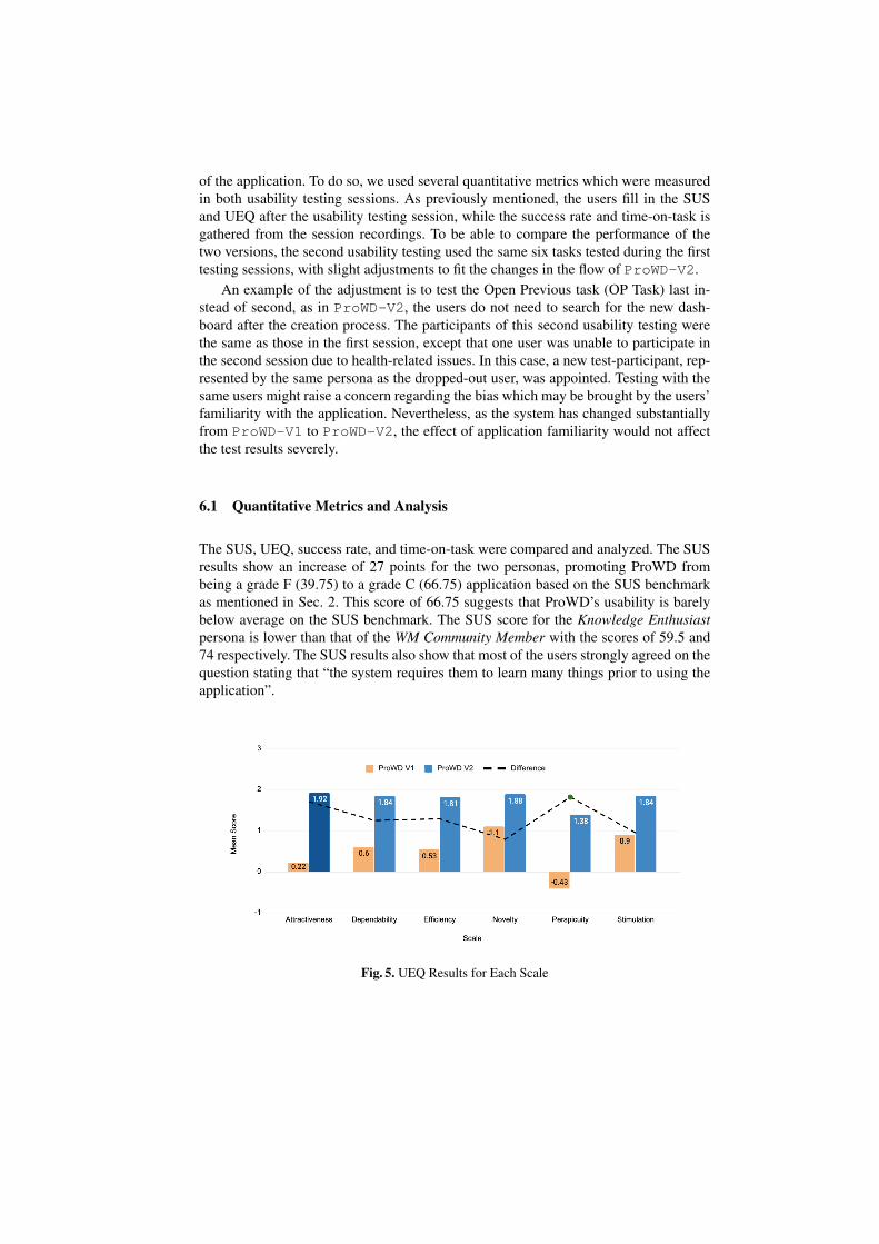
of the application. To do so, we used several quantitative metrics which were measuredin both usability testing sessions. As previously mentioned, the users fill in the SUSand UEQ after the usability testing session, while the success rate and time-on-task isgathered from the session recordings. To be able to compare the performance of thetwo versions, the second usability testing used the same six tasks tested during the firsttesting sessions, with slight adjustments to fit the changes in the flow of ProWD-V2.
An example of the adjustment is to test the Open Previous task (OP Task) last in-stead of second, as in ProWD-V2, the users do not need to search for the new dash-board after the creation process. The participants of this second usability testing werethe same as those in the first session, except that one user was unable to participate inthe second session due to health-related issues. In this case, a new test-participant, rep-resented by the same persona as the dropped-out user, was appointed. Testing with thesame users might raise a concern regarding the bias which may be brought by the users’familiarity with the application. Nevertheless, as the system has changed substantiallyfrom ProWD-V1 to ProWD-V2, the effect of application familiarity would not affectthe test results severely.
6.1 Quantitative Metrics and Analysis
The SUS, UEQ, success rate, and time-on-task were compared and analyzed. The SUSresults show an increase of 27 points for the two personas, promoting ProWD frombeing a grade F (39.75) to a grade C (66.75) application based on the SUS benchmarkas mentioned in Sec. 2. This score of 66.75 suggests that ProWD’s usability is barelybelow average on the SUS benchmark. The SUS score for the Knowledge Enthusiastpersona is lower than that of the WM Community Member with the scores of 59.5 and74 respectively. The SUS results also show that most of the users strongly agreed on thequestion stating that “the system requires them to learn many things prior to using theapplication”.
Fig. 5. UEQ Results for Each Scale

As seen in Fig. 5, the UEQ scores show an increase on each of the measuredscales with the highest increase on the perspicuity scale. Though the perspicuity ofProWD-V2 is better than the one of ProWD-V1, it is still the lowest being above av-erage as opposed to good and excellent for the other scales. The scales with the highestscores are novelty and attractiveness. The low perspicuity score is also aligned with thestrongly agreed SUS statement previously discussed. This suggests that the users thinkthat the application is more attractive and easier to digest compared to the previousversion, though further research might be needed to make things clearer for the users.
The success rate increase of 25.9% implies that on ProWD-V2, users are morelikely to successfully complete tasks. There are only 2 failed task runs on ProWD-V2 ascompared to 13 failed task runs on ProWD-V1. The specific task with the highestincrease in success rate is the Create New (CN) task where the users create a newdashboard, though it is the task with the lowest success rate compared to other taskson ProWD-V2. This may suggest that the biggest hurdle in utilizing ProWD-V2 iswhere the users are initializing a dashboard, which may also correspond with the lowperspicuity based on the UEQ. The average task completion time shows that users takethe longest time on the Profile Page task (PP) on ProWD-V2. This suggests that theusers might need more time to complete each subtask within the Profile Page as com-pared to the time needed in the same page on ProWD-V1. Though with the increase intime on PP Task, the success rate of the same task is higher on ProWD-V2 comparedto ProWD-V1.
6.2 Qualitative Feedback
Generally, the usability has improved according to the quantitative metrics. Thoughto gather more task and user-specific feedback, the qualitative feedback needs to betaken into account. The qualitative feedback of ProWD-V2 indicates a generally pos-itive reception of the new design. The improvements done on the types of informa-tion presented aspect are the strongest changes which affected the feedback positively.The users stated, “This page is nice, easy to understand, (at first glance) it looks sci-entific though is actually simple to use.” The new visualizations and added featureson ProWD-V2 resulted in positive feedback from the users. The improvement whichseems to be the weakest in effect is the layouting/placement aspect where the test-participants’ sentiments toward the changes does not differ greatly.
Other than the commentary feedback, the users’ behaviour throughout the testingsession was taken into account. When creating a new dashboard, users tended to imme-diately input instead of exploring the examples. This behavior caused the users to mis-understand the necessary inputs to create a correct dashboard. Within the dashboard,the tabular information is still misunderstood by the users. This causes them to take alonger time to assess the other information in the dashboard. This feedback shows thatthere is room for improvement, pointing to the iterative nature of UCD.
7 Conclusions
Systems regarding abstract concepts, such as knowledge graphs and their imbalances,can benefit from adapting UCD to improve their usability. With ProWD not having an
existing user base, we had to select appropriate test-participants who are critical towardssuch a system and fit with the context of use. The redesign process considered UI/UXelements and task-specific improvements, resulting in a significant increase wrt. theSUS and UEQ metrics. Moreover, users are more likely to complete tasks successfullyby 25.9% on ProWD-V2 compared to ProWD-V1. For future work, we plan to con-duct more iterations of UCD on ProWD, expand the 10,000 items limit, and streamlineProWD to regular activities by the Wikimedia community.
Acknowledgements
Our research was supported by the project grant “Knowledge Graph-based AI – Analy-sis and Applications” by Universitas Indonesia. We thank Dinda Mutiara Qur’ani Putrifor her help in analyzing the interview data. We also thank the anonymous reviewersfor their detailed feedback. We are grateful to Lydia Pintscher and Elisabeth Giesemannfor their support in the creation of a blog post of this research work.15
References
1. Addshore: Wikidata Map May–November 2019. Available online:https://addshore.com/2020/04/wikidata-map-may-november-2019/ (accessed on 15 August2020)
2. Balaraman, V., Razniewski, S., Nutt, W.: Recoin: Relative Completeness in Wikidata. In:WWW (Companion Volume) (2018)
3. Ehrlinger, L., Woß, W.: Towards a definition of knowledge graphs. In: SEMANTiCS(Posters, Demos, SuCCESS) (2016)
4. Garcıa, R., Gimeno, J.M., Perdrix, F., Gil, R., Oliva, M., Lopez, J.M., Pascual, A., Sendın,M.: Building a Usable and Accessible Semantic Web Interaction Platform. WWW 13(1),143–167 (2010)
5. Gibbons, S.: Journey Mapping 101 (2018), https://www.nngroup.com/articles/journey-mapping-101/
6. He, X., Zhang, R., Rizvi, R., Vasilakes, J., Yang, X., Guo, Y., He, Z., Prosperi, M., Huo, J.,Alpert, J., Bian, J.: ALOHA: developing an interactive graph-based visualization for dietarysupplement knowledge graph through user-centered design. In: BMC Medical Informaticsand Decision Making. vol. 19, p. 150 (2019)
7. Hir, E.L.: Denelezh—Gender Gap in Wikidata. Available online:https://www.denelezh.org/gender-gap/ (accessed on 15 August 2020)
8. Hitzler, P., Krtzsch, M., Rudolph, S.: Foundations of Semantic Web Technologies. Chapman& Hall/CRC, 1st edn. (2009)
9. Idoughi, D., Seffah, A., Kolski, C.: Adding user experience into the interactive service designloop: a persona-based approach. In: Behaviour & Information Technology. vol. 31, pp. 287–303. Taylor & Francis (2012)
10. International Organization for Standardization: ISO 9241-210:2019. ISO Standard (2019),https://www.iso.org/standard/77520.html
11. Nielsen, J.: 10 usability heuristics for user interface design (1995), Available online:https://www.nngroup.com/articles/ten-usability-heuristics/ (accessed on 16 August 2020)
15 https://blog.wikimedia.de/2020/09/16/prowd-detecting-knowledge-imbalances-on-wikidata/

12. Salinas, E., Cueva, R., Paz, F.: A systematic review of user-centered design. In: Techniquesin International Conference on HCI. pp. 253–267 (07 2020)
13. Schrepp, M., Hinderks, A., Thomaschewski, J.: Construction of a Benchmark for the UserExperience Questionnaire (UEQ). IJIMAI 4(4), 40–44 (2017)
14. Tullis, T., Albert, W.: Measuring the User Experience: Collecting, Analyzing, and PresentingUsability Metrics. Morgan Kaufmann, USA (2008)
15. Vrandecic, D., Krotzsch, M.: Wikidata: A free collaborative knowledgebase. Commun. ACM57(10), 78–85 (Sep 2014)
16. Wisesa, A., Darari, F., Krisnadhi, A., Nutt, W., Razniewski, S.: Wikidata Completeness Pro-filing Using ProWD. In: K-CAP (2019)
17. Zaveri, A., Rula, A., Maurino, A., Pietrobon, R., Lehmann, J., Auer, S.: Quality Assessmentfor Linked Data: A Survey. Semantic Web 7(1), 63–93 (2016)
18. Zia, L., Johnson, I., Mansurov, B., Morgan, J., Redi, M., Saez-Trumper, D., Taraborelli, D.:Knowledge Gaps – Wikimedia Research 2030 (2019)