user guide - rbcafe 2015r41/userguide-userinterface.pdf · the user guide is divided into several...
TRANSCRIPT

User Guide
Book 2
2015 Release 4 Xojo, Inc.

Preface

Xojo User Guide
Book 2: User Interface
ii
© 2015 Xojo, Inc.
Version 2015 Release 1

This Xojo User Guide is intended to describe Xojo for both developers new to Xojo and those with significant experience with it.
The User Guide is divided into several “books” that each focus on a specific area of Xojo: Fundamentals, User Interface, Framework and Development.
The User Guide is organized such that it introduces topics in the order they are generally used.
The Fundamentals book starts with the Xojo Integrated Development Environment (IDE) and then moves on to the Xojo Programming Language, Modules and Classes. It closes with the chapter on Application Structure.
The User Interface book covers the Controls and Classes used to create Desktop and Web applications.
The Framework book builds on what you learned in the User Interface and Fundamentals books. It covers the major framework areas in Xojo, including: Files, Text, Graphics and Multimedia, Databases, Printing and Reports, Communication
and Networking, Concurrency and Debugging. It finishes with two chapters on Building Your Applications and then a chapter on Advanced Framework features.
The Development book covers these areas: Deploying Your Applications, Cross Platform Development, Web Development, Migrating from Other Tools, Code Management and Sample Applications.
CopyrightAll contents copyright 2014 by Xojo, Inc. All rights reserved. No part of this document or the related files may be reproduced or transmitted in any form, by any means (electronic, photocopying, recording, or otherwise) without the prior written permission of the publisher.
TrademarksXojo is a registered trademark of Xojo, Inc. All rights reserved.
This book identifies product names and services known to be trademarks, registered trademarks, or service marks of their respective holders. They are used throughout this book in an
Section 1
About the Xojo User Guide
3

editorial fashion only. In addition, terms suspected of being trademarks, registered trademarks, or service marks have been appropriately capitalized, although Xojo, Inc. cannot attest to the accuracy of this information. Use of a term in this book should not be regarded as affecting the validity of any trademark, registered trademark, or service mark. Xojo, Inc. is not associated with any product or vendor mentioned in this book.
4

The Guide uses screen snapshots taken from the Windows, OS X and Linux versions of Xojo. The interface design and feature set are identical on all platforms, so the differences between plat-forms are cosmetic and have to do with the differences between the Windows, OS X, and Linux graphical user interfaces.
• Bold type is used to emphasize the first time a new term is used and to highlight important concepts. In addition, titles of books, such as Xojo User Guide, are italicized.
• When you are instructed to choose an item from one of the menus, you will see something like “choose File ↠ New Pro-ject”. This is equivalent to “choose New Project from the File menu.”
• Keyboard shortcuts consist of a sequence of keys that should be pressed in the order they are listed. On Windows and Linux, the Ctrl key is the modifier; on OS X, the ⌘ (Command) key is the modifier. For example, when you see the shortcut “Ctrl+O” or “⌘-O”, it means to hold down the Control key on a Windows or Linux computer and then press the “O” key or hold down the ⌘ key on OS X and then press the “O” key. You re-lease the modifier key only after you press the shortcut key.
• Something that you are supposed to type is quoted, such as “GoButton”.
• Some steps ask you to enter lines of code into the Code Edi-tor. They appear in a shaded box:
ShowURL(SelectedURL.Text)
When you enter code, please observe these guidelines:
• Type each printed line on a separate line in the Code Editor. Don’t try to fit two or more printed lines into the same line or split a long line into two or more lines.
• Don’t add extra spaces where no spaces are indicated in the printed code.
• Of course, you can copy and paste the code as well.
Whenever you run your application, Xojo first checks your code for spelling and syntax errors. If this checking turns up an error, an error pane appears at the bottom of the main window for you to review.
Section 2
Conventions
5

1. Overview
1.1. Event-Driven Programming
1.2. Layout Editor Overview
1.3. Other Layout Editor Features
2. Desktop
2.1. Windows
2.2. Control Hierarchy
2.3. Controls: Buttons
2.4. Controls: Pickers
2.5. Controls: Inputs
2.6. Controls: Decor
2.7. Controls: Organizers
2.8. Controls: Indicators
2.9. Controls: Viewers
2.10. Controls: Controllers
2.11. Controls; Microsoft Office Automation
2.12. Controls: Reports
2.13. Dialog Boxes
2.14. Toolbars
2.15. Menus
2.16. Control Sets and Dynamic Controls
2.17. Container Controls
2.18. Keyboard Access
2.19. Creating Custom Controls
3. Web
3.1. Web Page
Section 3
Table of Contents
6

3.2. Control Hierarchy
3.3. Controls: Buttons
3.4. Controls: Pickers
3.5. Controls: Inputs
3.6. Controls: Decor
3.7. Controls: Indicators
3.8. Controls: Viewers
3.9. Controls: Controllers
3.10. Dialog Boxes
3.11. Containers
3.12. Styles
3.13. Other
4. iOS
4.1. Overview
7

Chapter 1
Overview
Learn about the Layout Editor used to design Windows and Web Pages for your applications.
CONTENTS
1. Overview
1.1. Event-Driven Programming
1.2. Layout Editor Overview
1.3. Other Layout Editor Features

Your users interact with your applications by clicking the mouse and typing on the keyboard. Each time the user clicks the mouse on a part of your application’s interface or types something in a field, an event occurs. The event is simply the action the user took (the mouse click or the key press) and where it took place (on this button, on that menu item, or in this TextField). Some events can indirectly cause other events. For example, when the user selects a menu item (causing an event) that opens a window, it causes another event — the opening of the window.
With event-driven programming, each object you create can include, as part of itself, the code that executes in response to the various events that can occur for that type of object. For example, a PushButton can include the code you wish to execute when the PushButton is pushed. An object can even respond to events you might not have thought it could — such as responding as the user moves the pointer over it. When the user causes an event, the application checks to see if the object the event was directed towards has any code that needs to execute in response to that event. If the object has code for the event, then it is called and then it waits for the user to cause
another event to occur. This continues until something causes the application to quit, usually the user’s choosing Exit from the File menu (Quit on OS X).
As mentioned earlier, the user can also indirectly cause events to occur. Buttons, for example, have an event called Action which occurs when the user clicks the button. The code that handles the response to an event is called (appropriately enough) an event handler. Suppose the button’s Action event handler has code that opens another window. When the user clicks the button, the Action event handler opens a window and an Open event is sent to the window. This is not an event the user caused directly. The user caused this event indirectly by clicking the button whose code opened the new window.
There are many events that can occur to each object in your application. The good news is that you don’t have to learn about all of them. You simply need to know where to look for them so that, if you want to respond to an event, you can find out if the object is able to respond to that event.
Section 1
Event-Driven Programming
9

Designing Your User InterfaceThe window and web page layout editors are the primary editors you use to design the user interface for your application. The procedures for editing layouts are the same, regardless of whether you are working with Windows on Desktop applications or Web Pages in Web applications.
Layout AreaThe Layout Area displays as either a window or a web page, depending on the type of project. In either case, you add controls to the area by dragging them from the Library or the Navigator onto the Layout Area.
ToolbarThe Layout Editor has its own toolbar with the following features, in order from left to right:
AddThe Add button is use to add code-related items to the window or web page. This includes:
• Event Handler (refer to the Event Handler topic below)
• Menu Handler
• Method
• Note
• Property
• Computed Property
• Constant
• Delegate
• Enumeration
• Event Definition
• External Method
• Shared Computed Property
Section 2
Layout Editor Overview
10
Figure 1.1 Layout Editor Toolbar

• Shared Method
• Shared Property
• Structure
View LayoutThis button is grouped with View Code and is a toggle. When viewing a Layout, this button is selected.
When not viewing a layout, you can click this button to quickly switch back to the Layout Editor to see the last item you were working on.
View CodeThis button is grouped with View Layout and is a toggle. When viewing a Layout, this button can be used to switch back to the code editor for the last item being edited.
Set Default Value
The Set Default Value button allows you to set the default value for various controls. Refer to the Default Values topic below.
Lock PositionThe Lock Position button is used to lock controls so that they cannot be moved. You can use this feature to prevent your user interface from being accidentally changed.
Show Tab OrderShow Tab Order displays each control in Tab Order view. When in this view, each control has a number displayed on it that indicates its tab order, with lines drawn to the next control in the tab order. This view gives you a great way to visualize the tab order for your layout.
Drag the numbers around to change the tab order for the controls.
Show MeasurementsThe Show Measurements button allows you to better visualize your layout. When you click enable Show Measurements view, you can move the mouse around your layout to see various measurements, such as how far a control is from the top of the window or web page.
Select multiple controls to see various measurements, including distances between the controls.
11
Figure 1.2 Tab Order View

OrderingThe Ordering buttons (Order Forward, Order Front, Order Backward and Order Back) are used to change the ordering of the controls on the layout.
FillThe Fill Width and Fill Height buttons expand the selected control to fill the remaining space in its container.
AlignmentThe Alignment buttons (Align Left, Align Right, Align Top and Align Bottom) are used to align controls on the layout with each other.
SpacingThe Space Horizontally and Space Vertically buttons align the selected controls so that they are spaced equally apart.
ShelfYou can also add non-visual controls to the layout. A non-visual control is any control that is not actually displayed as part of the user interface (a Timer, for example).
When you add a non-visual control to the layout, a Shelf is automatically displayed at the bottom of the Layout Editor and the non-visual control is added to it.
In web applications, Web Dialogs are also treated as non-visual controls because they do not appear as part of the web page unless they are displayed by your code.
Default ValuesControls on the Layout Editor can have their default value specified by pressing Return while the control is selected, by clicking the Pencil rollover icon that appears when you move the mouse over a control, or by clicking the Set Default Value button on the Layout Editor Toolbar
. This opens a pop-out window to enter the default value. For example, with a PushButton, you can specify the Caption. To close the pop-out window, press Return, click outside the pop-out window or click the “Set Default Value” button on the Layout Editor toolbar.
Figure 1.4 A Window with a Timer in the Shelf
12
Figure 1.3 Setting the Default Value for a PushButton
Figure 1.5 Navigator Showing Event Handlers

Event HandlersTo add an event handler to your control, you click the Add button and select Event Handler.
This opens the Add Event Handler Window which displays the events that are available for the control (or the window or web page if that is what was selected). You can click on each event to view the description of the event. Select an event and click OK to create an Event Handler.
Event handlers appear in the Navigator underneath the selected control. You can click on an event handler to see its code.
Alignment GuidesAs you move controls around on a layout you will see additional alignment guides to help with positioning.
SubclassesTo use subclasses of controls in your layout, drag them from the Navigator to the Layout Area.
13

Duplicating ControlsYou can duplicate the selected control or controls by choosing Edit ↠ Duplicate (Ctrl+D or ⌘-D on OS X) or by holding down the Control key (Option key on OS X) and dragging the selected control.
Selecting ControlsControls can be selected in these ways: clicking on it, navigating to it using the Tab key, or using the “Select” item in the contextual menu.
The contextual menu contains two items for selecting controls, Select and Select All. The Select All command selects all controls in the layout and Select has a submenu that lists all of the layout’s controls. This enables you to select any control even if it is not currently visible. Choose a control from the submenu to select it.
Selecting Invisible ControlsIt’s possible for a control to disappear from the Layout Editor. For example, if you give a control a large enough negative or positive Left or Top property, it will disappear off the edge of the Layout
Editor. Or, if you give it Width and Height properties of zero, it will remain in its position but become invisible. You would have a tough time clicking on it to select it. Additionally, the control could have other controls layered on top of it and completely obscuring it.
Negative values of the Left property are not recommended. If you want to temporarily move a control off the window or web page, a preferred strategy is to move it to the right of the window and onto the visible pasteboard (the gray area that surrounds the window or web page in the Layout Editor). Enlarge the Workspace window, if necessary, so that the control is still visible. Do not move the control further to the right than needed, as this can increase memory usage.
However, you can always use the Navigator or the contextual menu to select a control that is not visible on the Layout Editor. The Select submenu will always list all controls that belong to the window even if they are not visible.
If you want to hide a control at run-time then you should instead use its Visible property. A control marked as Visible = OFF will
Section 3
Other Layout Editor Features
14

still appear on the Layout Editor, but will not appear when the application runs.
Changing Control Position on a LayoutA control’s position can be changed by dragging the control using the mouse, by using the arrow keys (to move it one pixel at a time in the horizontal or vertical directions) and by changing the properties in the Position group in the Inspector.
The Left and Top properties determine the location of the top-left corner of the control, while the Width and Height properties determine its size. You can always use these properties to position and size controls precisely.
You can also select multiple controls and change their position and size settings as a group.
Using Alignment GuidesWhen you drag a control, you can align it with other objects in the window by taking advantage of built-in horizontal and vertical alignment guides. When the object you are dragging is near the horizontal and/or vertical side of another object, alignment guides temporarily appear, allowing you to position the object precisely.
Locking PropertiesAny visible control has four Boolean properties that you can use to “lock” the control’s horizontal or vertical edges to the corresponding horizontal or vertical edges of the window or web
page. These properties are LockLeft, LockRight, LockTop, and LockBottom. You can set these in the Inspector using the Locking control.
When one of these properties is locked (indicated by the closed lock icon), the space between the designated edge of the control and the corresponding edge of the window or web page remain the same when it resizes.
You use these properties to have the control resize or move when its parent resizes. For example, if you use a Text Area as a text processing window, you will want to align the edges of the control to the window and then use the LockLeft, LockRight, LockTop, and LockBottom properties to resize the control automatically when the user resizes the window.
On web pages you can also center controls horizontally and vertically within the page. You do this by unselecting all the vertical or horizontal lock icons for the control.
Lock Position in the Layout EditorWhen you are finished adjusting a control’s location in a window, you can lock it into place. This will prevent you from accidentally
15
Figure 1.6 Locking Properties

moving it when you select it to read or change its properties. When a control is locked to its position, its size is also locked. To lock a control, right-click on the control and choose Lock Position from its contextual menu. A locked control is shown in the Layout Editor with a small padlock icon in the lower left corner. You can continue to select the locked control, read and edit its properties, and adjust its Tab Order (if applicable).
If you lock a child control, it keeps its position relative to its parent, but it moves if you move the parent control. For example, if you lock Radio Buttons inside a Group Box, you can move the Group Box and the Radio buttons will move along with the Group Box. However, you cannot move a locked Radio Button inside the Group Box.
You can unlock the control by right-clicking on it and choosing Unlock Control from the contextual menu.
Changing Control Properties with the InspectorSome changes to a control can be made without the Inspector. For example, controls can be rearranged by simply dragging them from one place to another inside the window. And some controls may have values that can be changed using the Set Default Value feature. However, most of the changes you make to controls will be made using the Inspector.
The Inspector displays the properties of the currently selected control that can be changed from the Layout Editor. If more than one control is selected, the Inspector displays only those properties common to all of the selected controls.
Some properties are entered by typing, while others with on/off-type values are represented by an On/Off switch. If the property is set by typing, you can use either the Enter or the Return key to make the new value take effect.
Boolean PropertiesThe values of Boolean properties are shown as ON/OFF switches in the Inspector. A value of False is indicated by having the switch in the OFF position and a value of True is indicated by the ON position.
You change a value by clicking on the ON/OFF switch.
Text PropertiesProperties such as the text that appears in a Text Field or the caption of a Button are entered simply by typing into the field. If the text you want to enter is long, you can click the pencil icon
( ) next to the field to bring up a window with a larger text editing area.
16
Figure 1.7 A Locked Button
Figure 1.8 Boolean Switch in Inspector

ConstantsYou can also choose to enter a constant as a value in the Inspector. For example, you can create a constant that contains the caption for all of the “Accept” Buttons in your application. If you want to change the caption, you only need to change the value of the constant rather than edit the values for each Button.
Constants are especially useful for applications that are deployed in more than one language. Instead of using literal text as property values, you use constants for all text that the user sees. This includes menus and menu items as well as windows. Each constant can be different text for each language.
Typically, constants used in this manner are collected in a module. For more information about how to set up constants in this manner, see the Localization topic in the Appendix.
To use a constant for the text, precede the name of the constant by the number sign, #, as the value for a property in the Inspector. For example, if you want to use a global constant (in a module) named “Save”, you would refer to it in the Properties pane as “#Save”. If it were a public constant in TextModule, you would refer to in the Properties pane as “#TextModule.Save”.
Choice ListsSome properties that require you to choose a value from a fixed list are displayed as pop-up menus. Such properties have a
downward-pointing arrow to the right. Simply choose the desired value from the pop-up menu.
For controls that accept a picture as a property value, you can select the picture by choosing from the pop-up menu associated with the property. All pictures that have been added to the project are listed automatically. In addition, the last menu item is “Browse”. If the desired picture has not been added to the project, you can choose Browse to locate the picture via an open-file dialog box. When you assign a picture to the property in this way, the picture that you select is automatically added to the Project.
Color PropertiesColor properties display the selected color. These colors can be changed by clicking on the color in the Inspector and using the Color Picker to choose a color.
Understanding Control LayersEach control in a window has its own layer. This layer is like a sheet of transparent plastic on which each control is placed. It
17
Figure 1.10 Specify the Initial State of a Check Box
Figure 1.9 A Pop-up Menu in the Inspector

determines whether one control is in front of the other. The Layout Editor toolbar provides commands for moving a control forward one layer, to the front, backwards one layer, and to the very back of the layers. Control layers determine the order in which your application selects the controls as the user presses the Tab key.
Understanding The Focus
The focus is a visual cue that tells the user which control receives keystrokes. Controls that can get focus vary by platform.
18
Control OS X Windows Linux
Text Field Yes Yes Yes
Text Area Yes Yes Yes
Combo Box Yes Yes Yes
Canvas Yes Yes Yes
Push Button Yes Yes Yes
Bevel Button Yes Yes Yes
List Box Yes Yes Yes
Slider No Yes Yes
Popup Menu No Yes Yes
Check Box No Yes Yes

Chapter 2
Desktop
Learn about all the user interface controls used to create Desktop applications.
CONTENTS2. Desktop
2.1. Windows
2.2. Control Hierarchy
2.3. Controls: Buttons
2.4. Controls: Pickers
2.5. Controls: Inputs
2.6. Controls: Decor
2.7. Controls: Organizers
2.8. Controls: Indicators
2.9. Controls: Viewers
2.10. Controls: Controllers
2.11. Controls: Microsoft Office Automation
2.12. Controls: Reports
2.13. Dialog Boxes
2.14. Toolbars
2.15. Menus
2.16. Control Sets and Dynamic Controls
2.17. Container Controls
2.18. Keyboard Access
2.19. Creating Custom Controls

Typically, most of a Desktop application’s user interface will be in the application’s windows.
You create your user interface by creating its windows and adding interface controls such as Buttons and Check Boxes. By default, a Desktop application project has one window (Window1) that is displayed automatically when the application runs. Typically, you will begin designing your application’s interface by adding controls to this window and enabling the controls by writing code.
To add additional windows to an application:
• Add a new window to the project by clicking the Insert button on the toolbar or menu and selecting Window.
• Set the window’s Type and other properties using the Inspector.
• Add controls to the window from the Library.
• Add code as needed.
• Add code to display the window in the finished application.
There are a wide variety of window types you can add to your projects.
Section 1
Windows
20

Window TypesYour Desktop applications can have several different types of windows. The window type is set by its Type property. Some types, however, are rarely used in modern applications and are retained only for historical reasons. A few specialized windows are supported on OS X only. The types of windows are:
DocumentThe Document window is the most common type of window. When you add a new window to a project, this is the default window type. It is also the window type for the default window, Window1. Document windows are most often used when the window should stay open until the user dismisses it by clicking its close box (if it has one) or clicking a button programmed to close the window. The user can click on other windows to bring them to the foreground, moving the document window behind the others.
Document windows can have a close box, a maximize box, and can be user-resizable.
Note: On Windows and Linux, the default menu bar, MainMenuBar, appears in the window by default. You can choose to display the window with no menubar by setting the MenuBar property of the window to None, or, if you have created additional menu bars, choose a different menu bar.
Movable Modal dialogThis type of window stays in front of the application’s other open windows until it is closed. Use a Movable Modal window when you need to briefly communicate with the user without allowing the user to have access to the rest of the application. Because the window is movable, the user will be able to drag the window to another location in case they need to see information in other windows.
On Windows, a Movable Modal window has minimize, maximize, and close buttons in the Title bar. In Windows MDI interfaces, the window opens in the center area of the screen rather than in the center area of the MDI window. Therefore, the Movable Modal window may open outside the MDI window.
21
Figure 2.1 Document Window on OS X
Figure 2.2 Document Window on Windows
Figure 2.4 Movable Modal Window on OS X
Figure 2.3 Movable Modal Window on Windows

On Linux, the window has minimize and close buttons in its Title bar.
On OS X, Movable Modal windows do not have a close box, so you need to include a button that the user can click to dismiss the window unless the window will dismiss itself after the application finishes a particular task.
Modal dialogThese windows are very similar to Movable Modal windows. The only difference is that Modal Dialog windows have no Title bar, so they cannot be moved. On Windows, a Modal Dialog box has no minimize, maximize, or close buttons. In Windows MDI applications, a Modal Dialog window opens in the center area of the screen rather than the center area of the MDI window. Therefore, a Modal Dialog box may open outside of the application’s MDI window. On Linux, Modal Dialogs are modal but have a Title bar and close and minimize buttons.
FloatingLike Movable Modal and Modal Dialog windows, a Floating window stays in front of all other windows. The difference is that the user can still click on other windows to access them. If you have more than one Floating window open, clicking on another Floating window will bring that window to the front, but all open Floating windows will be in front of all non-floating windows.Because they are always in front of other types of windows, their size should be kept to a minimum or they will quickly get in the user’s way. This type of window is most commonly used to provide tools the user will frequently access.
Plain BoxThese windows function as Modal Dialog windows. The only real difference is their appearance. Plain Box windows are sometimes used for splash screens and for applications that need to hide the desktop.On Windows MDI applications, a Plain Box window opens in the center area of the screen rather than the center area of the MDI
22
Figure 2.5 Modal Dialog on OS X
Figure 2.6 Modal Dialog on Windows
Figure 2.7 Floating Window on OS X
Figure 2.8 Floating Window on Windows

window. Therefore, a Plain Box window may open outside the MDI window.
Shadowed BoxLike Plain Box windows, Shadowed Box windows function as Modal Dialog windows. The only difference is their appearance. Shadowed Box windows are not commonly used.
On OS X, a Shadowed Box window works like a Modal Dialog box with a minimize button.
Rounded (legacy)
Retained for legacy purposes. This type is the same as a document window.
Global Floating
A Global Floating window looks like a Floating window, except that it is able to float in front of other applications’ windows, even when you bring another application window to the front. This doesn’t work for a Floating window. A “regular” Floating window floats only in front of its own application’s windows.
On Windows MDI applications, a Global Floating window can float outside of the MDI window. By default, it opens in the top-left area of the screen.
Sheet Window (OS X-only)
A Sheet Window is a special type of OS X dialog box that drops down from the window title bar. A Sheet Window behaves like a Modal dialog window, except that the animation makes it appear to drop down from the parent window’s Title bar. It can’t be moved from that position and it puts the user interface in a modal state. The user must respond to the choices presented in the Sheet window.
On Windows and Linux, Sheet windows behave like Movable Modal Dialogs.
Metal Window (OS X-only)
A Metal window uses a metallic background on OS X. This window type is not commonly used.
On Windows and Linux, a Metal window looks like a regular Document window.
Drawer Window (OS X)
A Drawer window is an OS X window that slides out from a parent window. It is available only on OS X Carbon. This window type is not commonly used.
On Windows and Linux, a window of this type appears as a separate floating window.
23

Modeless Dialog
The Modeless Dialog window is similar to the Modal Dialog, except that it is paired with a parent window (usually a Document window). Unlike a Modal Dialog, it allows you to access the parent window while it is displayed. If you hide the parent window, the Modeless dialog hides as well. If you show the parent window, the dialog reappears.
The Modeless Dialog is supported on Windows and Linux. On OS X, it behaves as a Document window.
WindowClass: Window
You cannot subclass windows. However, you can create a class with methods and properties that Windows can inherit. To do so, create a new class (perhaps BaseWindow) and set its Super to “Window”. Then, in the Windows you create change their Super from “Window” to the name of the class you created (BaseWindow).
EventsActivate, Deactivate The window is being activated (forefront) or deactivated.
CancelCloseCalled when the window was asked to close. You can prevent the window from closing by returning True.
CloseThe window is closing. Called after CancelClose.
ConstructContextualMenu, ContextualMenuActionUsed to create and process contextual menus.
ContentsChangedCalled when the ContentsChanged property value has changed.
DragEnter, DragExit, DragOver, DropObject Used for handling drag and drop.
24

EnableMenuItemsCalled when a menu bar is clicked.
KeyDown, KeyUp For handling key presses.
Maximize, Minimize, Restore Called when the window is maximized, minimized or restored by either the user clicking the window buttons or calling the related methods.
MouseDown, MouseDrag, MouseEnter, MouseExit, MouseMove, MouseUp, MouseWheel Process mouse-related events.
MovedCalled when the window has been moved.
OpenCalled when the window opens for the first time. Use this event handler for any initialization code.
PaintUse this method to draw directly on the window using the supplied Graphics object.
Resized, ResizingCalled as the window is resizing and when it has finished resizing.
PropertiesBackColor, HasBackColorAllows you to specify a different background color for the window. BackColor is only used if HasBackColor is True.
BackdropSpecifies a picture that is displayed in the window background.
CloseButton, MaximizeButton, MinimizeButtonEnable or disable these buttons in the window title bar.
CompositeEnabled Composite control layering on OS X Carbon applications. This property is not used on Cocoa or other platforms.
ContentsChangedUsed to indicate that the window contents have changed. On OS X, this displays a “red dot” in the window close button when True.
Control, ControlCount Used to iterate through the controls on the Window.
DockItemProvides access to the DockItem class to manipulate the dock icon associated with the window on OS X.
FocusReturns the RectControl that currently has focus on the window.
25

FrameUsed to set the window type (see previous topic).
FullScreenWhen True, the window is full screen. To hide the menu bar, also set MenuBarVisible = False.
FullScreenButtonWhen True, the special full screen button is added to the window on OS X. Pressing puts the app into OS X full screen mode.
HandleThe handle of the window is used when interfacing with OS APIs.
Height, Left, Top, WidthControls the window position and size.
ImplicitInstance When True, you can refer to the window by its name anywhere in the project. When False, you need to have an explicit instance in order to access the window.
LiveResizeIndicates that the window will be redrawn as it is being resized (OS X only).
MacProcIDUsed to create custom window types on OS X.
MaxHeight, MaxWidth, MinHeight, MinWidth The maximum and minimum sizes that the window can have.
MenuBar The MenuBar used by the window. On OS X, if this is blank, App.MenuBar is used. On Windows and Linux, if this is blank, then the window does not have a menu.
MenuBarVisibleHides all system-wide UI, such as menu bars, dock, start menu, task bar, etc.
MouseCursorAllows you to set the mouse cursor to use when the mouse cursor is over the window.
MouseX, MouseY Indicates the position of the mouse when it is over the window.
PlacementThe location where the window appears when it opens:
• Default
• Parent Window
• Main Screen
• Parent Window Screen
• Stagger
Resizeable Indicates that the window can be resized by the user.
26

TitleThe window title.
TrueWindowFor a window, this always returns itself.
VisibleControls the visibility of the window.
MethodsAcceptFileDrop, AcceptPictureDrop, AcceptRawDataDrop, AcceptTextDrop, NewDragItemSpecifies the drops that are allowed on the window.
CloseCloses the window.
DrawInto Draws the window contents into a graphics object.
FocusNext, FocusPrevious Used to move focus between controls on the window.
GetPIDGets the process ID.
HideMakes the window invisible. This is the same as setting Visible = False.
Maximize, Minimize, RestoreProgrammatically change the window size.
Refresh, RefreshRectUsed to refresh the window contents.
SetFocusGives the window focus, taking it from any control that might have had focus.
Show, ShowModal, ShowModalWithin Used to show the window. Use Show for non-modal windows. Use ShowModal for modal windows, use ShowModalWithin for sheet windows.
UpdateNow Flushes the drawing buffer on OS X.
27

Me vs. Self: Referring to Class Properties and Methods From Within the Class and SubclassWhen you add a control such as a PushButton to a window, a subclass of the control is created for you and added to the window. Code that you add to the control subclass on the window can refer to both its own properties and methods as well as the properties and methods of the window.
By default, all code without a prefix refers to the properties and method of the window (Self). If you want to access a property or method of the subclass, you should prefix it with the Me keyword.
For example, consider the Visible property which is on both a Button and the window itself. If you want to make the button invisible when it is clicked, you have to make sure you use the proper Visible property in the Action event handler. Simply writing this code:
Visible = False // Hides window
will hide the window because the Visible property defaults to the window.
To access the Button property, do this:
Me.Visible = False // Hides button
To be even clearer, you can use the Self keyword to specifically state that you want to use the Window property. To hide the window, you could instead write:
Self.Visible = False // Hides window
To prevent confusion, you should refrain from using the Me prefix outside of control event handlers.
Implicit Window InstancesUnlike other classes, you can access windows directly using their name. For example:
Window2.Show
Shows Window2.
This syntax is allowed because an “implicit instance” of the window is automatically created for you if its ImplicitInstance property is True (the default). This makes it easier to access your
28

windows. Without this ability, you would have to instead write this code to show Window2:
Dim w As New Window2w.Show
You would also have to retain a reference to Window2 if you want to access it elsewhere.
Although an implicit instance is convenient, there are side effects. For example, accessing properties of a window using its implicit instance can show the window, which might not be what you expect:
Window2.Title = “Test”
User Interface GuidelinesThe quality of your application interface determines how useful and usable it is. An intuitive interface is one of the most critical things in a successful application. Studies have shown that if a user can’t accomplish something within the first 15 minutes of using an application, he will give up in frustration. Beyond simply being intuitive, the more polished an application’s interface is, the more professional it will appear to the user. Remember that without realizing it, your users will be comparing your application’s interface to all of the other applications they have used.
The alignment guides in the Layout Editor help you make sure all your controls are aligned and positioned properly. But there is more to a professional, polished interface than simply aligning controls.
Each supported platform has its own conventions. User interface guidelines are available from the following sources:
• Windows: Microsoft’s User Interface guidelines at: http://msdn.microsoft.com/en-us/library/aa894348.aspx
• OS X: Apple Human Interface guidelines: http://developer.apple.com/documentation/UserExperience/Conceptual/AppleHIGuidelines/XHIGIntro/XHIGIntro.html
• Linux KDE Desktop: KDE user interface guidelines: http://techbase.kde.org/Projects/Usability/HIG
29

• Linux Gnome Desktop: Gnome user interface guidelines: http://library.gnome.org/devel/hig-book/stable/ KDE and Gnome are the most popular Linux desktops and are used by default in several major Linux distributions. However, there are others. Linux also supports a greater degree of desktop customization than Windows and OS X.
30

The built-in controls have an inheritance hierarchy. The base class is called Control and it contains several common events, properties and methods. RectControl subclasses Control and adds additional events, properties and methods. Most desktop controls subclass RectControl, although a few have another subclass in between.
Section 2
Control Hierarchy
31
Figure 2.9 Desktop Control Hierarchy

ControlEventsCloseCalled when the control is closed.
OpenCalled when the control is opened. Use this to do any control initialization.
PropertiesHandleThe handle can be used to interface with OS APIs.
IndexThe Index is used with Control Sets.
MouseX, MouseYThe X and Y coordinates of the mouse cursor in pixels.
NameThe name of the control.
PanelIndexWhen a control is on a PagePanel or TabPanel, this value indicates the panel on which it resides.
ScopeSet to Public or Private. Private controls cannot be accessed outside the Window.
WindowIdentifies the parent window of the control.
MethodsCloseCall this method to remove the control from the window.
RectControlEventsConstructContextualMenu, ContextualMenuActionUsed to create contextual menus and then respond when they are clicked.
DragEnter, DragExit, DragOver, DropObject Used to handle drag and drop to or from the control.
KeyDown, KeyUpIndicates key presses.
MouseEnter, MouseExit, MouseMove, MouseWheelIndicates mouse actions in the control.
PropertiesActiveIndicates when the control is active (in the foreground).
32

AutoDeactivateUsed on OS X to indicate that the control should be deactivated when its parent window is deactivated.
EnabledAllows you to enable or disable a control. A disabled control cannot be clicked and cannot receive focus.
HelpTagThe text of the tooltip that is displayed when the mouse cursor hovers over the control.
Left, Top, Height, WidthThe position and size of the control in pixels.
LockBottom, LockLeft, LockRight, LockTopControls how the control moves or is resized when the parent control or window resizes.
MouseCursorThe mouse cursor to display when the mouse cursor moves over the control.
ParentIdentifies the parent control. If this is Nil, then the window itself is the parent.
TabStop When True, the control accepts focus when the user tabs into it using the keyboard.
TrueWindowThe reference to the actual window containing the control. This is used for controls that are deeply nested in other controls or on ContainerControls.
VisibleUse to set the visibility of the control.
WindowThe parent window of the control. For controls on a ContainerControl, Window is the ContainerControl. Use TrueWindow to get the actual Window that the ContainerControl is on.
MethodsAcceptFileDrop, AcceptPictureDrop, AcceptRawDataDrop, AcceptTextDrop Used to specify the type of drops that are supported by the control.
DrawIntoThis method draws the control into a supplied Graphics object.
Invalidate, Refresh, RefreshRectUsed to refresh the control. Invalidate lets the operating system
33

update the control when appropriate. Refresh forces the control to update immediately. You should use Invalidate in most cases to reduce flicker, especially on Windows.
SetFocusGives the control focus.
Other Common EventsThese events are on many, but not all, controls.
MouseUp, MouseDown Called when the mouse button is pressed and released. Note that MouseUp is only called if you return True from MouseDown.
GotFocus, LostFocus Called when the control gets and loses focus.
EnableMenuItemsCalled when a menu bar is clicked, allowing you to specify whether certain menu items are enabled or disabled.
Activate/DeactivateCalled when the control is activated or deactivated.
DoubleClickCalled when the user double-clicks on the control.
34

ButtonClass: PushButton
In the Library, there are three buttons from which to choose: Default Button, Cancel Button and Generic Button.
When clicked, a Button appears to depress giving the user feedback that they have clicked it. Buttons are typically used to take an immediate and obvious action when pressed, like printing a report or closing a window.
EventsActionMost often, you use the Action event handler of the button. In this event handler you put the code that should do something when the button is pressed.
If the code in the Action event handler should be called by other means (e.g. a menu), then you should move the code to a
method of the window and instead call the method from the Button Action event handler and the Menu event handler.
PropertiesCaption (Default Property) Button text can be changed using the Caption property.
ButtonStyle As PushButton.ButtonFrameStyleOn OS X Cocoa, you can change the look of the Button in the Inspector using this property. Available styles are:
• Bevel
• Gradient
• Help
• Push
• Recessed
• Round
• Rounded
Section 3
Controls: Buttons
35
Figure 2.10 Buttons on OS X
Figure 2.11 Buttons on Windows

• RoundedTextured
• Square
• Textured
MethodsPushThe Push method can be called to simulate the button press. If you actually just want to call the code in the Action event, move it to a method as described above.
Button FocusButtons can have the focus on Windows. When a Button gets the focus, a marquee surrounds the PushButton’s caption. Pressing the Spacebar while the PushButton has the focus pushes the button, i.e., executes its Action event handler.
On a window, the default button can also be “pushed” by pressing Return/Enter. The Cancel button can be pushed by pressing Esc.
Bevel ButtonClass: BevelButton
The Bevel Button control provides very similar functionality as the Button but it is much more flexible. With a Bevel Button you can:
• Add an image to the button
• Control the alignment of the text and/or the positioning of the text with respect to the image
• Add a popup menu to the button
• Control the feedback the user receives when the button is clicked
EventsActionThe Action event is called when the Bevel Button is pushed.
PropertiesBevelThe Bevel can be a variety of values in the Inspector, although not all types are used on all platforms:
• Small Bevel
36
Figure 2.12 Example Bevel Buttons

• Normal Bevel
• Large Bevel
• Rounded BevelOS X only. Defaults to Small Bevel on Windows and Linux.
• No Bevel
• RoundOS X only. Defaults to Small Bevel on Windows and Linux.
• Large RoundOS X only. Defaults to Small Bevel on Windows and Linux.
• DisclosureOS X only. Defaults to Small Bevel on Windows and Linux.
BackColor, HasBackColor, TextColorUsed to alter the default colors of the button (only for Windows and Linux).
CaptionThe text that appears in the Bevel Button can be changed using the Caption property.
CaptionAlign, CaptionPlacement, CaptionDelta These properties control the display of the Caption within the Bevel Button.
Icon, IconAlign, IconDX, IconDY These properties specify an optional Icon for the Bevel Button and its location.
HasMenuUsed to attach a menu to the Bevel Button.
Value, ButtonTypeThe following types are available:
• ButtonBehaves as a normal Button.
• TogglesButton selection remains after it is clicked and can be toggled by repeated clicking. When selected, Value = True.
• StickyButton selection “sticks” after it has been clicked. When selected, Value = True.
TextFont, TextSize, Bold, Italic, Underline Controls the display of the Caption text.
37
Figure 2.13 Bevel Button Styles on OS X
Figure 2.14 Bevel Button Styles on Windows

MethodsAddRow, AddSeparator, DeleteAllRows, InsertRow, List, RemoveRowUsed to manually add MenuItems to the Bevel Button (if the HasMenu property is set to True).
ExamplesIt is possible to create many interesting designs using Bevel Buttons.
In Figure 2.2, the speaker image was saved as a transparent PNG file and the BackColor property of the BevelButton was used to provide the neutral gray background. In that way, the BackColor is the background for both the text and the picture (rightmost image). BackColor is supported on Windows and Linux only.
On Windows only, the “No Bevel” option supports mouse-over effects. When the mouse is not in the region of the button, only the button text is visible. When the mouse enters the region of the button, the button itself is shown. On all non-Windows operating systems, the “No Bevel” option appears the same as “Small”. On Windows, a BevelButton with the “No Bevel” size selected behaves as shown in Figure 2.14.
Handling FocusWhen a BevelButton gets the focus, a selection rectangle surrounds its label. When it has the focus, the user can press the button by pressing either the Spacebar or the Enter key.
BevelButtons can get the focus on Windows and Linux and you must set the AcceptFocus property to True to enable a BevelButton to get the focus.
38

Disclosure TriangleClass: DisclosureTriangle
A Disclosure Triangle control is used to hide and show information, e.g., the List view of files and folders in a Finder window. You can control the direction of the Disclosure Triangle (left or right) and whether it is in the “disclosed” (down) state.
EventsActionIndicates that the Disclosure Triangle has been clicked.
PropertiesFacingAn Integer that controls whether the triangle is pointing to the left (0) or the right (1, the default).
ValueSpecifies the orientation of the Disclosure Triangle. When True, the indicator is pointing down, when False the indicator is pointing either left or right (depending on the Facing property).
FocusWhen a Disclosure Triangle gets the focus, a selection rectangle appears around the control. The user can toggle its state by pressing either the Spacebar or the Enter key. You must set the AcceptFocus property to True to enable a DisclosureTriangle to
get the focus. DisclosureTriangles can get the focus only on Windows.
ExampleThis code in the Action event handler for a Disclosure Triangle displays or hides a ListBox on the window:
ListBox1.Visible = Me.Value
39
Figure 2.15 Disclosure Triangle
Popup ArrowClass: PopupArrow
The Popup Arrow controls places an arrow in the window that points in any of four directions. Two sizes of arrows are available.
PropertiesFacingYou control both the direction and size of the popup arrow using this property. You get a choice of four orientations in two sizes: North (2), South (3), East (0), and West(1), Small North (6), Small South (7), Small East (4) and Small West (5). Typically, you use a PopupArrow control as part of a custom control. The orientation of the arrow indicates whether the custom control can display additional information or options.
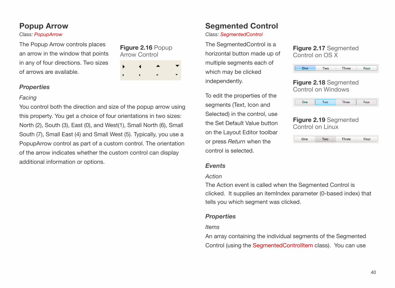
Segmented ControlClass: SegmentedControl
The SegmentedControl is a horizontal button made up of multiple segments each of which may be clicked independently.
To edit the properties of the segments (Text, Icon and Selected) in the control, use the Set Default Value button on the Layout Editor toolbar or press Return when the control is selected.
EventsActionThe Action event is called when the Segmented Control is clicked. It supplies an itemIndex parameter (0-based index) that tells you which segment was clicked.
PropertiesItemsAn array containing the individual segments of the Segmented Control (using the SegmentedControlItem class). You can use
40
Figure 2.17 Segmented Control on OS X
Figure 2.18 Segmented Control on Windows
Figure 2.19 Segmented Control on Linux
Figure 2.16 Popup Arrow Control

this array to see the segments, to add or remove segments or to change the properties of segments.
MacControlStyleOn OS X Cocoa, you can configure the appearance of the Segmented Control by setting the MacControlStyle property:
Value Description
0 Automatic
1 Capsule
2 Round Rect
3 Rounded
4 Textured Rounded
5 Textured Square
6 Small Square
SegmentsThis property can only be set in the Layout Editor and is used to specify the segments and their names.
SelectionTypeAn Integer that indicates how the segments can be used:
Value Type Description
0 Single
Only one segment can be depressed. The group of segments behaves like a
group of RadioButtons. One is selected, the others are
deselected automatically.
1 Multiple
The segments behave like a series of checkboxes. Two or more can be selected at the
same time.
2 None
Each button behaves like a PushButton. When a segment
is selected, it is depressed (highlighted) only for the
duration of the press or click.
MethodsSizeToFitSizes the Segmented Control to fit into its space. Call this method after changing the Segmented Control segments.
ExampleThis code in the SegmentedControl action event handler performs specific actions depending on which segment in the control was clicked:
41

Select Case itemIndexCase 0 // First button clickedCase 1 // Second button clickedEnd Select
This code in the Open event handler for a SegmentedControl uses the SegmentedControlItem class to select the last segment manually:
Dim si As SegmentedControlItem
// Get last segmentsi = Me.Items(Me.Items.Ubound)si.Selected = True
42

Scroll BarClass: ScrollBar
Scroll Bars can be presented vertically or horizontally. To add a Scroll Bar, simply drag the Vertical Scroll Bar or the Horizontal Scroll Bar from the Library to the Window Layout Editor.
The Scroll Bar can display in two different sizes (shown in Figure 2.8). To turn a Scroll Bar into a mini-scrollbar, narrow the short side of the Scroll Bar. To resize it, you can either drag the object in the Window Layout Editor or change the control’s property. As you narrow the control, it will “snap” to its mini thickness.
EventsValueChangedCalled when the scroll bar value has changed.
PropertiesLineStep An Integer that indicates the amount the scroll bar changes when one of its arrows is clicked (default is 1).
LiveScroll When True, the ValueChanged event is called as the scroll bar thumbnail is dragged. When False, ValueChanged is called when dragging of the thumbnail stops.
Minimum, MaximumThe minimum and maximum values returned by the Scroll Bar.
PageStep The Integer amount that the scroll bar changes when the empty track of the scroll bar is clicked.
ValueAn Integer used to get or set current position of the scroll bar.
Section 4
Controls: Pickers
43
Figure 2.20 Scroll Bars on OS X
Figure 2.21 Scroll Bars on Windows
Figure 2.22 Scroll Bars on Linux

FocusWhen a ScrollBar gets the focus on Windows, the thumb’s color changes. The ability of a ScrollBar to get the focus can be turned off by deselecting its AcceptFocus property.
Up / Down ArrowsClass: UpDownArrows
The Up Down Arrows control is commonly used as an interface for scrolling. You use two events, Up and Down, to determine whether the user has clicked an arrow.
When an UpDownArrows control gets the focus, a selection rectangle appears around the control. The user can press the Up and Down arrow keys on the keyboard to press the top and bottom arrows in the control. You must set the AcceptFocus property to True to enable an UpDownArrows control to get the focus. UpDownArrows can get the focus only on Windows.
EventsDownCalled when the down arrow is clicked.
UpCalled when the up arrow is clicked.
Example
44
Figure 2.23 Up / Down Arrows on OS X
Figure 2.24 Up / Down Arrows on Windows

This code increases or decreases the value in a Text Field as the arrows are clicked.
In the Down event handler:
TextField1.Text = Str(Val(TextField1.Text)-1)
In the Up event handler:
TextField1.Text = Str(Val(TextField1.Text)+1)
Check BoxClass: CheckBox
Use Check Boxes to let the user choose a preference. A Check Box can be in one of three states: Unchecked, Checked, and Indeterminate. One of the states can be selected by default.
Check Boxes should not cause an immediate and obvious action to occur except perhaps to enable or disable other controls.
EventsActionCalled when the check box is clicked.
PropertiesCaptionUsed to set or change the caption text for the check box.
StateUsed to get or set the state (unchecked, checked or indeterminate) of the checkbox. Changing State also changes
Figure 2.25 Check Boxes on OS X, Windows and Linux
45

the Value property (check or indeterminate set Value to True, unchecked sets Value to False). Use the CheckedStates enumeration (CheckedStates.Unchecked, CheckedStates.Checked, CheckedStates.Indeterminate) to set or check the state rather than directly using Integer values.
ValueTrue if the check box is checked (or indeterminate), False if it is not checked.
FocusWhen a CheckBox gets the focus, a marquee surrounds the CheckBox label. Pressing the Spacebar while the CheckBox has the focus toggles the control between its unchecked and checked states.
Popup MenuClass: PopupMenu
Popup Menu controls are useful when you have a single column of data to present in a limited amount of space. It presents a list of items and the user can choose one item. On OS X, when the user displays the Popup Menu’s items, the selected item is indicated by a checkmark.
You can add default values to the Popup Menu by using the Set Default Value button on the toolbar, clicking the Pencil icon when hovering over the control or pressing Return while the control is selected.
EventsChange Called when the selected item in the popup menu has changed.
PropertiesListThis property takes one parameter, an index of the row. It returns the text of the item in the popup menu specified by the index
Figure 2.26 Popup Menu
46

parameter.If the index does not exist, then an OutOfBoundsException is raised.
ListCount As IntegerAn Integer containing the number of rows in the popup menu.
ListIndex As IntegerAn Integer used to get or set the currently selected row in the popup menu.
Text As StringContains the text of the currently selected row.
MethodsAddRow, AddRowsTakes as a parameter a string or an array of strings to add a row or rows to the Popup Menu.
AddSeparatorAdds a separator line (only on OS X).
DeleteAllRowsRemoves all rows from the Popup Menu.
InsertRowTakes as a parameter the row and name of item to insert into the Popup Menu.
RemoveRowTakes as a parameter the number of the row to remove.
RowTag Takes as a parameter the number of the row to which to assign the tag. The tag can be any value or class (variant).
FocusOn Windows, when a PopupMenu receives the focus the currently selected item is highlighted. Like the ListBox, it also responds to the up and down arrow keys and provides the same type selection functionality. For example, if the user types an “O” while the PopupMenu has the focus, the first entry with an “O” in it is highlighted. When a PopupMenu gets the focus on Linux, the currently selected item is highlighted. You can change the selected menu item with the up and down arrow keys.
ExamplesThis code in the Popup Menu Open event handler adds map directions to it:
47
Figure 2.27 Set Default Value for Popup Menu

Me.AddRow("North")Me.AddRow("South")Me.AddRow("East")Me.AddRow("West")
This code in the Change event handler displays the selected direction:
If Me.ListIndex >= 0 Then MsgBox(Me.List(Me.ListIndex))End If
This could also be written more simply as:
MsgBox(Me.Text)
Data ControlClass: DataControl
The Data Control control is a “composite“ control that provides a very easy way to build a front-end interface to a database. It consists of four record navigation buttons (First Record, Previous Record, Next Record, and Last Record) and a caption. When linked to a database and controls that display data, you can create a fully-functional database front-end with no programming.
Refer to the Language Reference for more information on Data Control.
Figure 2.28 Data Control
48

Radio ButtonClass: RadioButton
Radio Buttons are used to present the user with two or more choices, where one of the choices can be selected by default. Selecting one Radio Button causes the Radio Button that is currently selected to become unselected. They are called Radio Buttons because they act just like the row of buttons for changing radio stations on car radios. Pushing one button deselects the current radio station and selects the new station. Radio Buttons should always be displayed in groups of at least two.
If you have multiple sets of Radio Buttons on a Window, they should be grouped in a container, such as a Canvas, Rectangle or Group Box.
EventsActionCalled when the Radio Button is selected.
PropertiesCaptionUsed to get or set the Radio Button caption text.
ValueTrue when the Radio Button is selected, False when it is not selected.
49
Figure 2.30 Radio Buttons on OS X
Figure 2.29 Radio Buttons on Windows
Figure 2.31 Radio Buttons on Linux

SliderClass: Slider
The Slider has the same functionality as a Scroll Bar control. However, Scroll Bar controls are usually associated with scrolling text or a picture and not with assigning numeric values. The Slider control provides an interface that is clearly for increasing or decreasing a numeric value. Like the Scroll Bar, the Slider control can appear horizontally (which is the default) or vertically. You can create a vertical Slider by changing its height so that it is greater than its width. Unlike the Scroll Bar control, the Slider control automatically maintains the correct proportions regardless of the dimensions you give it.
EventsValueChangedCalled when the Slider position is moved.
PropertiesLineStep An Integer that indicates the amount the scroll bar changes when one of its arrows is clicked (default is 1).
LiveScroll When True, the ValueChanged event is called as the scroll bar thumbnail is dragged. When False, ValueChanged is called when dragging of the thumbnail stops.
Minimum, MaximumThe minimum and maximum values returned by the Slider.
PageStep The Integer amount that the scroll bar changes when the empty track of the scroll bar is clicked (default is 20).
TickStyle On OS X Cocoa, Windows and Linux you can use this property to set if and where tick marks appear for the Slider.
ValueAn Integer used to get or set current position of the scroll bar.
Focus
When a Slider gets the focus (on Windows and Linux), a marquee surrounds the control. Pressing the Up or Left arrow key decreases the value of the Slider and pressing the Down or Right
50
Figure 2.32 Sliders on OS X
Figure 2.33 Sliders on Windows
Figure 2.34 Sliders on Linux

arrow key increases the value of the Slider. The amount that the value is changed by each key press is controlled by the Slider’s LineStep property. By default, the Slider has a range of 0 to 100 and LineStep is 1. The user can also click anywhere along the slider’s track to change the slider’s value. The amount that the Slider moves with each click is controlled by the Slider’s PageStep property.
51

Text FieldClass: TextField
Text Fields display text in a single-line text entry field, such as the To: field in your Mail client. In contrast, the Text Area control is a multi-line field that displays text similarly to a text editor or word processor.
The Text Field supports the Edit menu’s Cut, Copy, and Paste menu items and keyboard shortcuts automatically. This functionality is built into the default Desktop Application project. If you rename or otherwise modify the Cut, Copy, and Paste menu items, you can disable automatic functionality.
You can specify a mask for a Text Field which filters data entry on a character-by-character basis. For example, if you are using a Text Field for a
telephone number entry area, you can specify that only numbers can be entered and you can restrict the entry to the correct number of characters.
EventsKeyDownCalled when a key is pressed while the Text Field has focus. The key that was typed is available as a parameter.
SelChangeCalled when the selected text changes.
TextChange Called when the text was changed, either by typing or through code (by setting the Text property).
ValidationError Called when something is typed that does not match the Mask settings (if a Mask is applied).
PropertiesAlignmentLets you specify if the text should be left, center or right aligned.
Section 5
Controls: Inputs
52
Figure 2.36 Text Fields on Linux
Figure 2.35 Text Fields on OS X

Use the Text Field constants: TextField.AlignDefault, TextField.AlignLeft, TextField.AlignCenter, TextField.AlignRight.
CueText Enables you to specify a prompt text string that suggests a data entry value. A user can enter the cue text themselves or enter another value. It does not serve as a default value.Note: Works on OS X Cocoa, Windows and Linux.
Format Specifies the format string that is used to format the text when the Text Field loses focus.
MaskSpecifies a mask that can be used to validate user input. If the user types a character that does not match the mask, the ValidationError event handler is called.
LimitTextSpecifies the maximum number of characters that can be entered in the Text Field.
ReadOnlyIndicates if the Text Field is read-only. The user cannot type into a read-only Text Field, but copying the text works.
SelLength, SelStart, SelText Used to specify and set selected text in the Text Field.
Text Used to get or set the text in the Text Field.
MethodsCharPosAtLineNum, CharPosAtXY, InsertPosAtXY, LineNumAtCharPosThese methods are used to determine character positions based on various values such as the line number or mouse coordinates.
Copy, Paste, SelectAll Used to copy the text to the clipboard, paste text from the clipboard or select all text in the Text Area.
FocusTextFields on any platform display the focus by showing a blinking insertion point and accepting text entry. The behavior of the TextField when the Tab key is pressed is controlled by the AcceptTabs property. If this property is False, pressing the Tab causes the TextField to lose the focus and the next control in the entry order gains the focus. If AcceptTabs is True, the TextField accepts the Tab character for data entry, just as any text character. The TextField keeps the focus. By default, AcceptTabs is False.
53
Figure 2.37 Mask for a Phone Number

Password FieldClass: TextField
A Password Field is a subclass of Text Field that has the Password property set to ON in the Inspector. For privacy, text typed in the field is replaced with bullet characters and Copy is disabled.
Text AreaClass: TextArea
The Text Area control is a multi-line text field, such as a text editor or word processor. In contrast to a Text Field, it can contain multiple lines and styled text. A Text Area field with the Styled property set can display text in multiple fonts, styles, and sizes and have both horizontal and vertical scrollbars. Individual paragraphs can be left, centered, or right aligned via the StyledText class.
The Text Area supports the Edit menu’s Cut, Copy, and Paste menu items and keyboard shortcuts automatically. This functionality is built into the default Desktop Application project. If you rename or otherwise modify the Cut, Copy, and Paste menu items, you can disable the automatic functionality.
54
Figure 2.38 Styled Text Displayed in a Text Area

Text Area has these additions to the Events, Properties and Methods of Text Field:
PropertiesSelOutline, SelPlain, SelShadow, SelTextColor, SelTextFont, SelTextSize, SelUnderline Used to identify the type of style is applied to the selected text.
StyledSet this to True (ON) in the Inspector to allow the Text Area to contain styled text.
StyledTextProvides access to the StyledText class used by the Text Area when it contains styled text.
MethodsSetTextAndStyleUse this method to supply text and style for text to display in the Text Area.
ToggleSelectionBold, ToggleSelectionCondense, ToggleSelectionExtend, ToggleSelectionItalic, ToggleSelectionOutline, ToggleSelectionShadow, ToggleSelectionUnderline Toggles the specified styled text attribute for the selected text.
Combo BoxClass: ComboBox
The Combo Box control works like a combination of a Text Field and a Popup Menu. The user can either enter text in the Combo Box or choose an item from the attached Popup Menu. A menu selection can be modified after it is selected. Unlike a real Text Field, you cannot use a mask to filter data entry or operate it as a Password Field.
EventsChange Called when the selected item in the popup menu has changed.
TextChange Called when the text was changed, either by typing or through code (by setting the Text property).
PropertiesListThis property takes one parameter, an index of the row. It returns the text of the item in the menu specified by the index parameter.If the index does not exist, then an OutOfBoundsException is raised.
55
Figure 2.39 Combo Box Displaying Auto-Completed Entry

ListCount As IntegerAn Integer containing the number of rows in the menu.
ListIndex As IntegerAn Integer used to get or set the currently selected row in the menu.
Text As StringContains the text of the currently selected row.
MethodsAddRow, AddRowsTakes as a parameter a string or an array of strings to add a row or rows to the menu.
AddSeparatorAdds a separator line (only on OS X).
DeleteAllRowsRemoves all rows from the menu.
InsertRowTakes as parameters the row and name of item to insert into the menu.
RemoveRowTakes as parameters the number of the row to remove.
RowTag Takes as a parameter the number of the row to which to assign the tag. The tag can be any value or class (variant).
FocusComboBoxes on any platform display the focus by highlighting the selected item and showing a blinking insertion point. On OS X, a ComboBox with the focus also has a focus ring. When a ComboBox has the focus, you can scroll through the list of choices with the up and down arrow keys and select an item by pressing the Return key. Of course, you can also edit or replace the selected item.
56

CanvasClass: Canvas
A Canvas control can be used to display a picture from a file or graphics drawn in code. The Canvas control has access to the drawing tools belonging to the Graphics class; with these tools you can programmatically draw objects within the Canvas. If your application requires a type of control that is not built-in, you can use a Canvas control and the Graphics drawing commands to create the controls you need.
The Canvas control can get the focus, so you can emulate any other type of control that you would like to get the focus.
Canvas controls can be used to create extremely sophisticated controls, such as the Navigator in Xojo itself.
EventsPaintThe Paint event is called when the Canvas needs to redraw itself. This could be called automatically by the operating system or by a call to Refresh or Invalidate.Use the supplied graphics object (g) for all Canvas drawing.
PropertiesAcceptFocusSince Canvas controls are often used to create custom controls, you use this property if you want the Canvas to be able to get focus.
AcceptTabsNormally tabs move the focus to the next control. If you want the Canvas to instead trigger the KeyDown event, set AcceptTabs to True.
BackdropSpecifies the image that is used as the background for the Canvas. You often get better performance and reduced flickering by drawing your image in the Paint event rather than using Backdrop.
DoubleBufferIndicates that all Canvas drawing should be double-buffered in order to reduce flicker. This property is only meaningful on Windows since OS X and Linux both double-buffer automatically.When DoubleBuffer is True, you should also set EraseBackground to False to prevent flickering.
Section 6
Controls: Decor
57

EraseBackgroundIndicates whether the entire Canvas should be erased before it is redrawn. This property is only meaningful on Windows. Setting it to False can eliminate flicker.
UseFocusRingSince Canvas controls are often used to create custom controls, you use this property if you want the Canvas to have a focus ring around it when it has focus (OS X only).
MethodsInvalidateCall this method to tell the operating system to redraw the Canvas when it is doing other redrawing. You can optionally specify a parameter to erase the background before redrawing.
RefreshCall this method to immediately redraw the Canvas. You can optionally specify a parameter to erase the background before redrawing. Calling this method frequently can slow your application. In most cases it is better to call Invalidate instead.
RefreshRectImmediately redraws only the portion of the Canvas specified by the supplied X, Y, Width and Height coordinates. You can optionally specify a parameter to erase the background before redrawing.
ScrollUse the Scroll method to scroll the contents of the Canvas.
Handling FocusSince the Canvas control can get the focus, you can use it to create custom controls of any type that can get the focus. For example, you can use the Canvas to simulate controls that don’t get the focus on OS X, such as buttons and pop-up menus. Unlike other controls that can get the focus, the ability of a Canvas to accept the focus is turned off by default. In order for a Canvas control to receive the focus, you must set the AcceptFocus property to True. This can be done either in code or in the Inspector. The Canvas control also has an AcceptTabs property that indicates whether pressing Tab selects the next control in the window or sends the Tab keystroke to the Canvas control for processing. If AcceptTabs is off, pressing Tab causes the Canvas control to lose the focus. The next control in the entry order gets the focus. If AcceptTabs is on, the Canvas control detects the Tab key as if it were any other key and allows your code to detect and respond to the Tab key.
If the AcceptFocus and UseFocusRing properties are set to True, the Canvas control indicates focus on OS X by drawing a border around the control.
On Windows and Linux, the UseFocusRing property has no effect. There is no visual indicator of focus that works automatically. However, it is easy to simulate a focus ring by
58

manually drawing it in the Paint event handler. See the Canvas control entry in the Language Reference for an example of how to do this.
Group BoxClass: GroupBox
A Group Box can be displayed with or without a caption. If a window has more than one group of Radio Button controls, one of the groups must be contained within a Group Box control in order for the Radio Button groups to function independently.
PropertiesCaptionUsed to get or set the text of the Group Box.
59
Figure 2.40 Group Box on OS X

LabelClass: Label
Used to display text that the user cannot select or edit. Label controls are commonly used to label other controls (like Popup Menus or Text Fields) or provide titles for groups of controls. The text of the label can be controlled via code (using the Text property of the control), so you can use it to display dynamic text that is read-only.
EventsAcceleratorKeyThis event is called when the Accelerator Key is pressed on Windows. Specify an Accelerator Key by prefixing a character in the Text property with an ampersand (“&”).
PropertiesCaption, TextUsed to get or set the text of the Label.
LineClass: Line
A Line control draws a line that can be of any length, width, color, and direction. By default, lines are 100 pixels in length, 1 pixel in width, black, and diagonal.Figure 2.41 Label in front of a
Popup Menu (OS X, Windows, Linux)
60
Figure 2.42 Line

OvalClass: Oval
Draws an oval with a single pixel, black border, and filled with white. All of these properties can be modified. The “ovalness” of the Oval is controlled by its height and width. For example, an Oval with the same width and height is a perfect circle.
PlacardClass: Placard
A Placard is a control often used to group controls. It can also be used as an information panel.
61
Figure 2.44 A Label Displayed in a Placard Control
Figure 2.43 Oval Control

RectangleClass: Rectangle
A Rectangle control draws a rectangle that can be of any length, width, border color, and fill color. By default, rectangles are 100 pixels in length and width, with a black border that is 1 pixel thick and a white center. Because you can control the color of the left and top borders independently from the right and bottom borders, you can easily create rectangles that appear to be sunken or raised.
Round RectangleClass: RoundRectangle
RoundRectangles are similar to regular Rectangle controls. The differences are that you don’t have the independent color control for the border (because it is one continuous line) but you can control the width and height of the arcs that make up the round corners.
Figure 2.45 Rectangles with Default, Sunken and Raised Appearances on OS X, Windows and Linux
62
Figure 2.46 Round Rectangle Control

SeparatorClass: Separator
The Separator control simply places a vertical or horizontal line in the window.
63
Figure 2.48 Separator on OS X
Figure 2.47 Separator on Linux

Page PanelClass: PagePanel
The Page Panel is an invisible control that allows you to group controls into multiple panels (or pages). Only the controls on the current panel are visible. This control has no tabs or other navigation widgets, nor does it have a visible border. Only the controls on each panel are visible. You are responsible for providing the method of navigating from one panel to another, which you do by changing the Value property programmatically.
In the Layout Editor, you navigate among panels in a Page Panel control using the widget at the bottom of the control.
There are two ways to navigate between existing panels. Click in the center of the navigation widget to get access the “Go to Page” command that shows a drop-down menu of page numbers. Select a page number from this menu to go directly to the panel on that page. Or, click the left or right arrows to the left or right of the page number in the widget to go to the next or previous panel.
You add, delete, and reorder panels using the Panel Editor. You can display the Panel editor by clicking the Panels button in the Inspector of a Page Panel. In addition to using the Up/Down buttons to reorder the panels, you can also drag them into the order you want.
EventsChange The Change event handler is called when the Value property changes.
Section 7
Controls: Organizers
64
Figure 2.49 Navigating to a Specific Page in a Page Panel
Figure 2.50 Page Panel Editor

PropertiesPanelCountReturns the number of panels.
ValueUsed to get or set the currently displayed panel. Panels are numbered starting with 0.
MethodsAppend, Insert, RemoveThese methods are used to add, insert or remove panels.
Controls that are added to a Page Panel are referenced in your code by just using the control name as if it were not in a Page Panel:
PushButton1.Caption = "OK"
Tab PanelClass: TabPanel
A Tab Panel presents separate groups of controls on one or more tabs. The user can switch tabs by clicking on the tab control (usually at the top of the Tab Panel).
By default, a TabPanel control has two panels. You add, modify, rearrange, or delete panels and tab labels using the Panel Editor. Click the value of the Panels property of the Tab
Panel to display the Panel Editor.
The Panel Editor works the same as it does for a Page Panel except that you can also rename the panels. You want to do this because the name is what appears in the tabs of the control. To rename a tab, click on it once to get focus and then a second time to edit the name. Type the new name and press enter.
65
Figure 2.51 Panel Editor for a Tab Panel
Figure 2.52 Tab Panel on OS X

EventsChangeThe Change event handler is called when the Value property changes.
PropertiesPanelCountReturns the number of panels.
SmallTabsThis property can be set in the Inspector to use small tab buttons on OS X.
ValueUsed to get or set the current panel. Panels are numbered starting with 0.
MethodsAppend, Insert, RemoveThese methods are used to add, insert or remove panels.
CaptionSpecify the panel number as a parameter to set the caption text for the tabs.
Controls that are added to a Tab Panel are referenced in your code by just using the control name as if it were not in a Tab Panel:
PushButton1.Caption = "OK"
66

Progress WheelClass: ProgressWheel
The Progress Wheel control is often displayed to indicate that a time-consuming operation is in progress.
PropertiesVisibleSet Visible to True to show the Progress Wheel. When it is visible, it displays a spinning animation.
Progress BarClass: ProgressBar
Progress Bars are designed to indicate that some function of your application is progressing (hence the name) towards its goal or to show capacity. Unlike Scroll Bars and Sliders, Progress Bars are designed to display a value. They cannot be used for data entry. Also, they appear only in a horizontal orientation.
PropertiesMinimumSpecifies the minimum value of the Progress Bar.
MaximumSpecifies the maximum value of the Progress Bar.
ValueThe current value of the Progress Bar.
Section 8
Controls: Indicators
67
Figure 2.53 Progress Wheel Control
Figure 2.55 Progress Bar on Windows
Figure 2.54 Progress Bar on OS X

Indeterminate Progress BarClass: ProgressBar
The Indeterminate Progress Bar is a Progress Bar with its maximum value property set to 0.
Indeterminate ProgressBars are sometimes referred to as “Barber Poles” since they look like barber poles on OS X. On Windows and Linux, an indeterminate progress bar takes the form of a single block that moves back and forth.
68

List BoxClass: ListBox
List Box controls display a scrolling list of values in one or more columns. The user can use the mouse or the arrow keys to choose an item. List Box controls can contain one or more columns of data, can be hierarchical, and can allow single row selection or multiple row selection. You can change the number of columns of any List Box by setting the ColumnCount property in the Inspector.
When a List Box has focus on OS X, a focus ring is drawn around the List Box. When a List Box gets the focus on Windows or Linux, a marquee is drawn either around the previously selected item (i.e., the highlighted item) or the first item in the List Box if there is no previously selected item. The marquee may be difficult to see because the item is also highlighted. If the previously selected item is not currently displayed (i.e., the user has scrolled it out of view), there is no visible change in the appearance of the List Box.
When a List Box has the focus, it responds to the Up and Down arrow keys. Pressing either arrow key changes the selected (highlighted) text. It also receives any other keys the user types. This allows you to provide type selection functionality where typing selects the item that matches the characters being typed.
Note: If a List Box is the only control in the window that can get the focus, it will initially get the focus and keep it.
Check Box-style cells in List Boxes can store one of three states: Checked, Unchecked and Indeterminate. They work the same way as the Check Box control. For more information, see Check Boxes in the Pickers section.
Section 9
Controls: Viewers
69
Figure 2.56 Different ListBox Layouts

You can also shade cells, rows, and columns programmatically.
You can customize row and column borders. This illustration shows the four types of horizontal and vertical rules that can be drawn programmatically. The Default style is “None.”
You can also apply these ruling styles to selected cells or even selected cell borders. For example, in this figure a cell containing a phone number is highlighted using Thick Solid borders while the remainder of the List Box uses Thin Dotted rules.
When you add a header with column labels to a List Box, the user can sort the data in the List Box by clicking on a column header or you can sort the rows of the List Box programmatically. The sort direction is indicated by a sort direction arrow in the header area.
The default sorting method works for alphabetic values, but does not produce valid results for numbers and dates. If you need to sort these data types, you do so using the CompareRows event of the List Box. This figure shows how code in the CompareRows event handler compares the values of adjacent rows in the Age column to get the desired sort order.
70
Figure 2.57 List Box with Custom Shading
Figure 2.58 Four Types of Custom Borders
Figure 2.59 Custom Border Around a Selected Cell
Figure 2.60 Sorting using the Name Column Header

For multicolumn List Boxes, you can control whether the user can resize columns by dragging column borders. You can enable column resizing on a column-by-column basis or for the entire
List Box. If user resizing is enabled, you can also specify minimum and maximum column sizes. If resizing is enabled, the pointer turns to a column resizing pointer when it is moved to a column border. For example, this figure shows the Phone column being resized to make more room for the Email column.
You can allow in-line data entry in ListBoxes. You can programmatically switch a cell’s mode from normal (i.e., view only) to in-line editable. When the cell is editable, it has the focus and has a focus ring around it. The contents of the cell are initially selected and typing replaces the entry. When the user clicks on another cell or tabs out of the editable cell, the cell’s contents are saved and its mode reverts to view only.
For both single and multicolumn List Boxes, you can allow the user to drag rows to rearrange them. When you drag, the target for the drop is indicated by a solid line between rows as show below.
A List Box can be scrolled either horizontally or vertically. The List Box control has built-in scrollbars. You can choose to add either
71
Figure 2.61 Using a Custom Sort to Sort Numbers Properly
Figure 2.62 Resizing Columns
Figure 2.63 Inline Data Entry
Figure 2.64 Dragging a Row

or both to a List Box via its properties in the Inspector. If you want to customize the scrollbar area, you can deselect the built in scrollbar and instead place a Scrollbar control and other controls in the scrollbar’s area.
See the entry in the Language Reference for the List Box control for additional details and examples.
EventsCellAction, CellBackgroundPaint, CellClick, CellGotFocus, CellKeyDown, CellLostFocus, CellTextChange, CellTextPaintThese events are called for cell-specific changes.
ChangeThe change event is called when the selected row of the List Box changes, either by the user clicking on a new row or by code changing the row.
CollapseRow, ExpandRowCalled when a folder in a hierarchical List Box is expanded or collapsed.
CompareRowsUse this event to implement custom sorting for a column. Normally a column is sorted alphabetically, which results in incorrect ordering for columns containing only numbers. Use this event to sort the numbers properly.
DragReorderRows, DragRowCalled when rows of the List Box are dragged.
HeaderPressedAllows you to override the sorting of a column in the List Box.
SortColumnCalled when the user has clicked on a column, also allowing you to prevent the sorting.
PropertiesAutoHideScrollBarsUsed to hide the scrollbars until they are needed.
BorderSpecifies the opacity of the border.
CellAlignment, CellAlignmentOffsetUsed to specify cell alignments for specific cells (AlignDefault, AlignLeft, AlignCenter, AlignRight, AlignDecimal).
Figure 2.65 Horizontal Scrolling
72

Use CellAlignmentOffset (or ColumnAlignmentOffset) to control alignment for decimal values.
CellBorderBottom, CellBorderLeft, CellBorderRight, CellBorderTop Controls the borders that are displayed in individual cells (BorderDefault, BorderNone, BorderThinDotted, BorderThinSolid, BorderThickSolid, BorderDoubleThinSolid).
CellCheckUsed to check or uncheck a checkbox that is in a cell.
CellTag, ColumnTag, RowTagUsed to get or set the tag value (a Variant) for a specific cell, column or row.
CellType, ColumnType Specifies the type of a cell or column (TypeDefault, TypeNormal, TypeCheckBox, TypeEditable).
ColumnProvides access to the ListColumn class to alter column-specific properties such as widths and resizability.
ColumnAlignment, ColumnAlignmentOffsetUsed to specify cell alignments for a column (AlignDefault, AlignLeft, AlignCenter, AlignRight, AlignDecimal).Use ColumnAlignmentOffset (or ColumnAlignmentOffset) to control alignment for decimal values.
ColumnCountThe number of columns (1-based).
ColumnSortDirection Controls the sort direction for a column (SortDescending, SortNone, SortAscending).
ColumnWidthsA text string that specifies the widths to use for all the columns. You can specify widths as fixed pixel sizes, percentages or even calculations.
ColumnsResizableIndicates that columns can be resized by the user by dragging the separator in the column header. The List Box must have a header in order for the columns to be resizable.
DefaultRowHeightThe default row height for all the rows. All rows always have the same height.
EnableDrag, EnableDragReorder Enables row dragging, dropping and reordering.
ExpandedFor hierarchical List Boxes, indicates if the specified folder row is currently expanded.
GridLinesHorizontal, GridLinesVerticalSpecifies the type of grid lines to use (BorderDefault,
73

BorderNone, BorderThinDotted, BorderThinSolid, BorderThickSolid, BorderDoubleThinSolid).
HasHeadingIndicates that the ListBox should have a heading. A heading is required in order to sort and resize columns.
HeadingWhen HasHeading is True, contains an array of the column heading names.
Hierarchical A hierarchical List Box has rows that can be expanded to show children (for rows added using AddFolder).
InitialValueA list of the initial values displayed in the List Box. Separate columns using tab characters. When HasHeading is True, the first row is the name of the headings.
LastIndexThe last row added to the List Box by AddRow, AddFolder, InsertRow or InsertFolder.
ListCountThe number of rows in the List Box (1-based).
ListIndexThe currently selected row in the List Box (0-based). Returns -1 when no row is selected.
RequiresSelectionWhen True, a row remains selected even when the user clicks on an empty area of the List Box.
ScrollPosition, ScrollPositionX Controls the vertical and horizontal scroll positions.
SelCount, Selected If multiple selections are allowed, SelCount returns the number of selected rows. Selected is used to check if a row is selected.
SelectionTypeSpecifies whether to allow single or multiple row selection (SelectionSingle, SelectionMultiple).
SortedColumnSpecifies the current sort column, but does not sort the data (call the Sort method).
Text The text of the first column of the currently selected row.
UseFocusRingIndicates if the focus ring is drawn around the List Box.
MethodsAddFolder, InsertFolder For hierarchical List Boxes, adds a folder (a row that may have children) to the end or inserts a folder at the specified position.
74

AddRow, InsertRowAdds a row to the end or inserts a row at the specified position.
CellGets or sets the value of a specific cell (row, column).
CellBold, CellItalic, CellUnderlineUsed to set bold, italic and underline font settings for a specific cell.
CellHelpTagSpecifies the value that appears as a tooltip when the mouse hovers over the cell.
ColumnFromXY, RowFromXY Returns either the column or row under the coordinates of the mouse cursor.
DeleteAllRowsRemoves all rows from the List Box.
EditCellActivates in-line editing for the specified cell.
HeaderTypeUsed to allow or prevent the user from sorting a column by clicking on its header.
PressHeaderCauses the specified header to be pressed.
RowPicture Allows you to specify a picture that appears on the far left of the List Box for each row. You can have a different picture for each row.
RowTag A tag value for a row.
SortSorts the columns of the List Box, using the values specified in SortedColumn and ColumnSortDirection properties.
75

HTML ViewerClass: HTMLViewer
The HTMLViewer control renders HTML (like any web browser application) and provides basic navigation functions. Using the language, you can pass it an HTML file, the HTML text itself, or tell it to load the HMTL specified by a URL. If the HTML is valid, it renders it. The Online Language Reference window uses the HTML Viewer control.
The following example is a very simple web browser that uses an HTML Viewer control. The user types in a URL into the TextField at the top of the window and clicks the Go button. If it is a valid URL, the web page appears in the HTML Viewer control.
EventsCancelLoadReturn True to cancel loading the page.
DocumentBeginCalled when the HTML page starts to load.
DocumentCompleteCalled when the HTML page has finished loading.
DocumentProgressChangedCalled when the progress has been updated.
NewWindowCalled when the user clicks a link that would normally open a new
window (or a new tab). Return an instance of an HTML Viewer to use to display the link. Use this code to display the link in the current HTML Viewer:
// Use the current HTMLViewer (Me)// to display the new window.Return Me
SecurityChangedCalled when the security of the page has changed (from HTTP to HTTPS, for example).Note: Does not work on Linux.
StatusChangedCalled when the Status text has changed.
TitleChanged Called when the title of the web page has changed.
PropertiesCanGoBack, CanGoForward Indicates if there is a prior or next page in the navigation history.
IsAvailableReturns True if the platform supports HTML Viewer.
UserAgent Allows you to get or set the user agent sent to the server.
76

MethodsCancelCancels any current operations.
GoBack, GoForwardUsed to navigate back or forward in the page history.
LoadPageUsed to load a page either by supplying a string or file containing the HTML.
LoadURLLoads a page using the supplied URL.
PrintPrints the contents of the HTML Viewer. Requires WebKit 1.1.5 or newer on Linux.
ZoomTextIn, ZoomTextOut Used to zoom the text in the HTML Viewer in or out.
77

Image WellClass: ImageWell
The ImageWell control provides an area in which you can display a BMP or PNG image on Windows and Linux or a JPG or PNG image on OS X. You can easily program the ImageWell control to accept a dragged picture.
PropertiesImage The image to display.
Movie PlayerClass: MoviePlayer
The MoviePlayer control displays the standard movie controller for your platform.
From the Inspector, you can select a movie from your project that will be associated with a MoviePlayer control. You can also determine the default appearance of the movie controller.
To add a movie to your project, just drag it to the Navigator.
EventsControllerSizeChanged Called when the size of the Controller has changed.
PlayCalled when the movie starts playing.
StopCalled when the movie stops playing.
Figure 2.67 Obligatory cat video playing in Movie Player
78
Figure 2.66 Image Displayed in Image Well

PropertiesAutoPlayWhen True, the movie starts playing as soon as it is assigned to the Movie property.
AutoResizeWhen True, the Movie Player control resizes to fit the actual size of the movie specified in the Movie property.
Controller, ControllerHeight, ControllerWidthUsed to specify the type of controller to display. You can choose from: None, Mini controller or Full controller.
DurationReturns the duration of the currently playing movie. If the movie is not playing, Duration is 0.
EditingEnabled When True, the Clear, Trim and Undo methods allow you to edit the movie.
HasStepUsed to show or hide the forward and reverse arrows in the movie controller.
LoopingWhen True, the movie will repeat from the beginning when it reaches the end.
Movie The Movie to play or edit.
PalindromeWhen True, the movie is played in reverse (from the end) when it reaches the end. Looping must also be True in order for this to work.
PlaySelection If a selection has been made (using SelStart and SelLength) then setting this to True will only play the selection when the Play method is called.
PlayerTypeSpecifies the type of player to use on Windows. You can choose between Preferred, QuickTime or Windows Media Player.
PositionThe current play position of the movie (in seconds).
QTVRNode, QTVRNodeCount, QTVRPan, QTVRPanMax, QTVRPanMin, QTVRPanTiltSpeed, QTVRTilt, QTVRTiltMax, QTVRTiltMin, QTVRZoom, QTVRZoomMax, QTVRZoomMin, QTRVZoomSpeed Used to control QuickTime VR movies.
SelLength, SelStart Used to select a portion of the movie. SelStart is the start
79

position and SelLength is the length to select (both are in seconds).
SpeakerUsed to hide or show the volume control icon in the controller.
VolumeSpecifies the volume for playback.
MethodsClear, Trim, UndoUse these methods to edit a movie selection if EditingEnabled is True.
PlayPlays the movie from the current Position and calls the Play event.
QTVRHotSpotCount, QTVRHotSpotID, QTVRNoteTypeObject, QTVRNodeTypePanorama, QTVRToggleHotSpotNames, QTVRTriggerHotSpotUsed to control QuickTime VR movies.
StopStops playing the movie and calls the Stop event.
OLE ContainerClass: OLEContainer
The OLEContainer control enables you to embed ActiveX controls in your interface. ActiveX is a Windows-only feature. The ActiveX controls that you add to your project are derived from OLEContainer class.
EventsShowObjectCalled when the ActiveX object is ready to be displayed.
PropertiesDesignModeIndicates whether the container is in design mode.
ProgramIDThe ActiveX control program ID as specified in the Registry. Often this is a GUID.
MethodsCreate Creates an ActiveX control based on the ProgramID. Returns True if the control was created, False if not.
DestroyRemoves the ActiveX control allowing the container to be used with another control.
80

ShowPropertyPagesDisplays the ActiveX control property pages (not all controls have property pages).
OpenGL SurfaceClass: OpenGLSurface
The OpenGLSurface control allows you to directly access an OpenGL object in your application. This simply provides an interface for OpenGL drawing. The commands that are available are not part of Xojo, but are part of the OpenGL standard. You will need to be familiar with the OpenGL API in order to program this control.
The OpenGL module provides access to the OpenGL commands described in the OpenGL Web site and official guide.
http://www.opengl.org http://www.glprogramming.com/red
EventsConfigure For advanced configuration of the OpenGL context.
ErrorCalled when an OpenGL context cannot be created.
RenderDo you OpenGL drawing in this event handler.
PropertiesColorBitsThe depth of the color buffer (default is 24).
81

DepthBits The depth of the depth buffer (default is 24).
DoubleBufferSpecifies whether the surface is double-buffered to reduce flicker. This defaults to True.
MethodsMakeCurrentSets the OpenGLSurface as the current thread’s OpenGL context.
Render Calls the Render event.
82

The controls in this section are all non-visual. They do not appear on the Window in the built application and the user cannot see or interact with them. When added to a Window, they appear on the Shelf of the Layout Editor.
Adding these controls to the Layout is merely a convenience to give you easy access to their event handlers. Although you can also create these controls in using the New operator you will not have access to the event handlers unless you first subclass the control (and access the event handlers there) or use the AddHandler command to map event handlers to methods on the window. AddHandler is covered in the Advanced chapter of the Framework Guide.
Database QueryClass: DatabaseQuery
The DatabaseQuery control can be used to send SQL queries to the database. This function can also be done with the language (without using the DatabaseQuery control at all). When you add a DatabaseQuery control to a window, it is not visible in the built application.
To use the DatabaseQuery control, you write an SQL statement and assign it to the SQLQuery property of the control. The SQLQuery is executed automatically when its window appears. It also has one method, RunQuery, which runs the query stored in the SQLQuery property.
Database Query is covered in more detail in the Databases chapter of the Frameworks Guide.
Section 10
Controls: Controllers
83

IPC SocketClass: IPCSocket
The IPCSocket performs interprocess communications between two applications running on the same computer. Use it to send and receive messages. Like other sockets, the IPCSocket control displays an icon when placed in a window in the Window Editor but has no interface.
The IPCSocket can be instantiated via code since it is not a subclass of Control. This allows you to easily write code that does communications without adding the control to a window.
IPC Socket is covered in more detail in the Devices and Networking chapter of the Frameworks Guide.
Note PlayerClass: NotePlayer
Plays musical notes using QuickTime on OS X and MIDI on Windows.
PropertiesInstrumentThe number of the musical instrument to play. Refer to the Language Reference for a list of the available instruments and their values.
MethodsPlayNote Plays a note using the supplied pitch and velocity.
NotePlayer1.Instrument = 20NotePlayer1.PlayNote(60, 60)
84

XojoScriptClass: XojoScript
The XojoScript control allows the end user to write and execute Xojo code within a compiled application. Scripts are compiled into machine code.
You pass the code that you want to run via the Source property and execute it by issuing the Run method. Please see the Language Reference for details on the functions, control structures, and commands supported by the XojoScript control.
XojoScript is covered in more detail in the Advanced chapter of the Frameworks Guide.
SerialClass: Serial
Although the Serial control displays an icon when placed in a window in the Window Editor, it is not visible in the built application. It is designed only for executing code to communicate via the serial port. For more information, see the Serial control in the Language Reference for more details.
The Serial control can be instantiated via code since it is not a subclass of Control. This allows you to easily write code that does communications without adding the control to a window.
Serial is covered in more detail in the Devices and Networking chapter of the Frameworks Guide.
85

Server SocketClass: ServerSocket
The ServerSocket class enables you to support multiple TCP/IP connections on the same port. When a connection is made on that port, the ServerSocket hands the connection off to another socket, and continues listening on the same port. It includes the ability to replenish its supply of TCPSockets as connections are made. Without the ServerSocket, it is difficult to implement this functionality due to the latency between a connection coming in, being handed off, creating a new listening socket, and restarting the listening process. If you had two connections coming in at about the same time, one of the connections may be dropped because there was no listening socket available on that port.
Server Socket is covered in more detail in the Devices and Networking chapter of the Frameworks Guide.
Spotlight QueryClass: SpotlightQuery
Used to perform Spotlight searches on OS X. It does nothing on other operating systems. SpotlightQuery appears in the list of Built-in controls in the Inspector, but since it is not subclassed from Control, you can instantiate it via code.
86

TCP SocketClass: TCPSocket
Although the TCPSocket control displays an icon when placed in a window in the Window Editor, it has no user interface. It is designed only for executing code to communicate with other computers on the Intranet or Internet using TCP/IP.
The TCPSocket control can be instantiated via code since it is not a subclass of Control. This allows you to easily write code that does communications without adding the control to a window.
TCP Socket is covered in more detail in the Devices and Networking chapter of the Frameworks Guide.
ThreadClass: Thread
The Thread class is used to have processing run in the background, which is very useful way to keep the user interface responsive while a process is running.
Thread is covered in detail in the Concurrency chapter of the Frameworks Guide.
87

TimerClass: Timer
The Timer executes some code once or repeatedly after a period of time has passed.
Timer is covered in more detail in the Concurrency chapter of the Frameworks Guide.
UDP SocketClass: UDPSocket
The UDPSocket supports communications via a UDP (User Datagram Protocol) connection. It also can be created via code because it is not derived from the Control class.
UDP is the basis for most high speed, highly distributed network traffic. It is a connectionless protocol that has very low overhead, but is not as secure as TCP. Since there is no connection, you do not need to take nearly as many steps to prepare when you wish to use a UDP socket.
UDP sockets can operate in various modes, which are all very similar, but have vastly different uses. Perhaps the most common use is “multicasting.” Multicasting is a lot like a chat room: you enter the chatroom, and are able to hold conversations with everyone else in the chatroom.
UDP Socket is covered in more detail in the Devices and Networking chapter of the Frameworks Guide.
88

These classes are used to automate the Microsoft Office applications Excel, Word and PowerPoint. They interface with those applications using Visual Basic for Applications (VBA).
For more information on these classes and how to use them, refer to the Online Language Reference in the Documentation Wiki.
Excel ApplicationClass: ExcelApplication
Used to automate Microsoft Excel. Supported on the Windows platform only.
Word ApplicationClass: WordApplication
Used to automate Microsoft Word. Supported on the Windows platform only.
PowerPoint ApplicationClass: PowerPointApplication
Used to automate Microsoft PowerPoint. Supported on the Windows platform only.
Section 11
Controls: Microsoft Office Automation
89

The Reports controls are used for designing your report layouts. Reporting is described in detail in the Printing and Reports chapter of the Framework Guide.
Report FieldA Report Field maps to the data that you are displaying in the report.
Report LabelA simple static label to display on the report.
Report PictureA picture (from the project) to display on the report.
Report LineDraws a line on the report.
Report OvalDraws an oval on the report.
Report RectangleDraws a rectangle on the report.
Report Round RectangleDraws a round rectangle on the report.
Report DateUsed to display the current date on the report.
Report Page NumberUsed to display the report page number.
Section 12
Controls: Reports
90

There are two built in language commands that create message dialog boxes automatically. They bypass the process of creating a window, adding it to the project, and adding controls to it via the Controls pane and the Window Editor. These commands are the MsgBox function and the MessageDialog class.
These commands create a limited range of dialog boxes. They can have an icon, some text, and one or more buttons, but they cannot be used to create any other type of dialog box that displays information in a different form. The only user input that is supported is the selection of a button to click. Also, you do not have the ability to arrange the buttons, text, and icon freely. If you need any of these extra features, you should create a modal window instead (see Using a Window as a Dialog Box in this section).
MsgBoxUse the MsgBox function when you want to present a brief message to the user in the form of a modal dialog box. Simply pass the text that you want to display to the MsgBox function. For example, the following message could be shown when a file upload has completed successfully:
MsgBox("File transfer complete!")
This line of code displays a message box with the message and one button that the user can click to dismiss the window.
The MsgBox function has two optional parameters that provide some customization. You can pass an integer that
Section 13
Dialog Boxes
91
Figure 2.68 A Simple Dialog Box Created with MsgBox

indicates that the function should display additional buttons, indicate which of these additional buttons is the default button, and set the icon that is displayed.
If you use the optional parameters, the MsgBox function returns an integer that tells you which button the user clicked. If you display more than the one button, you should examine the value returned by the MsgBox function.
Note: If the string that you pass to MsgBox contains a null character or unprintable characters, you should first filter them out prior to using the MsgBox function. The null character will terminate the string, no matter where it appears.
MessageDialogUse the MessageDialog class when you need to design more complex dialog boxes than are possible with MsgBox. With the MessageDialog class, you can present up to three buttons and control their text and functionality. You can also present subordinate explanatory text below the main message.
However, since MessageDialog is a class, you cannot accomplish all of this with one line of code. You need to declare a variable as type MessageDialog, instantiate it, set its properties, and handle the result returned, which tells you which button the user pressed.
A MessageDialog can have up to three buttons: ActionButton, CancelButton, and AlternateActionButton. They have the following properties:
Property Description
Caption The text displayed in the button.
Visible Set to True to show the button.
92
Figure 2.69 Example Message Dialogs on Windows, OS X and Linux

By default, only the ActionButton is shown, but you can show the others simply by setting their Visible properties to True.
In addition, you can set the text of the message, the subordinate explanation, the type of icon shown in the dialog (no icon, Note, Warning, Stop, or Question), and the title.
Note: Not all of the icons are presented in OS X.
You present the customized dialog by calling the ShowModal method of the MessageDialog class.
Dim dialog As New MessageDialogdialog.Message = "Do you want to save changes to this document before closing?"dialog.ActionButton.Caption = "Save"dialog.CancelButton.Visible = Truedialog.CancelButton.Caption = "Cancel"dialog.AlternateActionButton.Visible = Truedialog.AlternateActionButton.Caption = "Don't Save"Dim dialogButton As MessageDialogButtondialogButton = dialog.ShowModalWithin(Self)Select Case dialogButton Case dialog.ActionButton // Save Case dialog.AlternateActionButton // Don't save Case dialog.CancelButton // CancelEnd Select
After the user clicks a button, the MessageDialog returns a MessageDialogButton object, which is either an ActionButton, CancelButton, or AlternateActionButton. By determining the type of object that was returned, you learn which button the user pressed. You can also examine the returned object’s properties, if necessary.
93

Using a Window as a Dialog BoxThere will be times when you need a more advanced dialog box, perhaps with additional controls or a more sophisticated layout than what MsgBox and MessageDialog offer.
To do this, you add a Window in your project and set its Type property in the Inspector to one of these values:
• Movable ModalA modal dialog box with a title bar that the user can use to drag it around the screen.
• Modal DialogA modal dialog box that cannot be moved around the screen by the user.
• Sheet WindowAvailable only on OS X, a sheet window drops down from the main (parent) window. Because of this you do not see the title bar on OS X. On Windows and Linux, a Sheet Window behaves the same as a Movable Modal window.
It is important that you add a way for the dialog to close. Typically you use a button for this and in its Action event handler call Self.Close to close the dialog.
To make a value available for the caller to check, create a public property on the dialog window and set it to the value before you close the dialog.
This code (in the Action event handler of a button on a dialog) gets the selected text from a ListBox, assigns it to the SelectedName property and closes the dialog:
If NameList.ListIndex >= 0 Then SelectedName = NameList.Text Self.CloseEnd If
This is the code that calls the dialog window and assigns the SelectedName to a Label on the window:
Dim dialog As New DialogWindowdialog.ShowModalResultLabel.Text = dialog.SelectedName
94

Toolbars appear at the top of a window and provide quick access to commonly used functionality. You create toolbars by adding them to your project using the Insert ↠ Toolbar command on the toolbar or menu.
Toolbar EditorThe Toolbar Editor is used to design your toolbar. You can add buttons to the toolbar, which can have one of the following styles:
• Push button
• Separator
• Toggle button
• Dropdown button
• Separate dropdown button
• Space
• Flexible space
To add a button to the toolbar, click the “Add Tool Item” button in the Toolbar Editor toolbar.
Use the Inspector to change the properties of the buttons that you add to the toolbar.
After adding items to the toolbar, you can reorder them by dragging an item to the left or right. You can preview the toolbar on other platforms by clicking one of the Toolbar preview mode buttons in the Toolbar toolbar.
Section 14
Toolbars
95
Figure 2.70 Toolbar Editor

ToolbarClass: Toolbar
You can have multiple toolbars in your application, but you can only add a single toolbar to each window.
EventsActionThe Action event handler is where your code handles button presses. The supplied Item parameter tells you the button that was clicked so that you can perform the appropriate action.
DropDownMenuActionThis event handler is called when a button that has a drop-down menu has an item on the menu selected.
OpenThe standard event where you would do any initialization, such as assigning icons or drop-down menus.
PropertiesEach button that you add to the toolbar in the Toolbar Editor is accessible as a property of the toolbar. For example, if you add a button called EditButton to the Toolbar, you can access it by referring to it by name:
Toolbar1.EditButton.Caption = "Edit"
VisibleUse the Visible property to hide or show the toolbar.
MethodsAppendUsed to add a button to the end of the toolbar.
CountTells you the number of buttons on the toolbar.
Insert Used to insert a button at a specific position on the toolbar.
ItemAllows you to directly access the buttons on the toolbar by specifying a zero-based index to a button.
RemoveUsed to remove a button from the toolbar.
ToolButtonClass: ToolButton
A ToolButton is a button that you add to the toolbar. When the user clicks a button (that is clickable, not all styles can be clicked), the toolbar Action event handler is called.
PropertiesCaptionThe text that displays on the button.
96

DropDownMenuAssign the menu to display (only used by buttons with the Drop-down button or Separate dropdown button styles).
EnabledUsed to enable or disable a button.
HelpTagThis value is displayed when the mouse hovers over the button.
IconThe icon for the button. You can use any size icon you like, but for best results all the icons for all your buttons should be the same size. 32x32 is a common button size.
NameThe name you give the button can be accessed as a property of the toolbar when the toolbar has been added to a window.
PushedFor toggle buttons, allows you to specify and check whether the button is pushed.
StyleThe style describes how the button works. There are several styles:
• Push button: Works like a standard button. The user can click it.
• Separator: A separator is a vertical line in the toolbar. The user cannot click a separator. Not supported on OS X 10.7 and later.
• Toggle button: A toggle button retains it selection when clicked. The behavior of multiple toggle buttons varies by platform. On OS X, only one toggle button may be selected at one time. On Windows, multiple toggle buttons may be selected at one time.
• Dropdown Button: This is a Push button with an attached menu. Clicking the button displays the menu. On Windows an arrow is drawn next to the button icon to indicate there is a menu. You can only specify the menu in code, usually the Open event handler for the toolbar.When the user selects an item from the menu, the DropDownAction event handler on the toolbar is called.
• Separate Dropdown button: The ToolButton is a drop-down menu with a separate down arrow on its right. Use the Caption and Icon properties to assign the Toggle button’s label and icon. The user can click on the button separately from the menu. When the user clicks just the button, the Action event handler is called.To specify the menu, assign it to the DropDownMenu property of the ToolButton class. Handle the selected menu item in the DropDownMenuAction event of the Toolbar class.Supports Windows and Linux only. On OS X, this style behaves the same as Dropdown button.
97

• Space: Creates a space in the toolbar. The user cannot click the space. Supported on OS X and Linux.
• Flexible space: Creates a variable-width space that is used to right-align buttons on the toolbar. All buttons that are to the right of the Flexible space appear on the right-hand side of the toolbar. Supported on OS X and Linux.
Adding a Toolbar to a WindowTo add a toolbar to a window, you drag it from the Navigator to the Window Layout Editor. The toolbar is added to the Shelf.
When your application runs, the toolbar is automatically added to the top of the window and your controls are shifted accordingly.
On OS X, if the window is not wide enough to show all the toolbar buttons, an icon displays which can be clicked to allow you to still access the other toolbar icons that do not fit.
Adding multiple toolbars to a window is not supported.
Handling Toolbar Button PressesWhen a toolbar button is pressed, the Action event handler for the toolbar itself is called. This event supplies an item parameter that contains the information about which button was pressed.
If a dropdown menu item was selected, the DropDownMenuAction event handler is called with a parameter telling you what menu was selected.
For example, here is the Action event handler for a simple toolbar with Open and Save buttons. It tests the Name property for each button.
Select Case Item.NameCase "OpenButton" MsgBox("Open clicked.")Case "SaveButton" MsgBox("Save clicked.")End Select
Here is a DropDownMenuAction event handler for a Clipboard Dropdown button with three items in the menu:
If item.Name = "ClipButton" Then Select Case hitItem.Text Case "Cut" MsgBox("Chose Cut.") Case "Copy" MsgBox("Chose Copy.") Case "Paste" MsgBox("Chose Paste.") End SelectEnd If
98

Adding Toolbar Buttons in CodeIn addition to setting up the toolbar using the Toolbar Editor, you can also do all the toolbar setup programmatically.
You need to do this if you are using either of the Dropdown buttons as you can only specify the menu in code.
You might also want to do this if you have buttons you want to dynamically enable or disable, or even show or hide.
This code in the toolbar Open event handler adds a menu to a Dropdown button:
Dim baseMenu As New MenuItemDim m as MenuItemm = New MenuItem("Cut")baseMenu.Append(m)m = New MenuItem("Copy")baseMenu.Append(m)m = New MenuItem("Paste")baseMenu.Append(m)Me.ClipButton.DropdownMenu = baseMenu
99

Most applications have a Menu Bar. The location of the menu bar varies by platform. On OS X, there is only a single menu bar and it appears at the top of the screen. On Windows, each window can have its own menu bar. Linux can work either way, depending on the distribution.
When you create a desktop project, a default menu bar is added automatically, called MainMenuBar. For most applications this is usually sufficient.
You create additional menu bars by adding them to your project using the Insert ↠ Menu Bar command on the toolbar or menu.
Menu EditorThe Menu Editor is used to create your menu bars. A menu bar consists of top-level menus (called menus) and their items (called menu items). Regardless, both are subclasses of MenuItem.
The default menu bar, MainMenuBar, has two menus: File and Edit, each with their own menu items.
Use the toolbar buttons to add menus and menu items (as described in the Overview chapter of the Fundamentals Guide).
Keyboard ShortcutsYou can assign keyboard shortcuts to menu items, but remember that the operating system looks for a shortcut starting from the leftmost menu. That means that if you assign the same keyboard shortcut to two different menu items, one of them won’t work. There are also several specific keyboard shortcuts that are reserved for specific functions.
Section 15
Menus
100
Figure 2.71 Menu Editor

Accelerator keysThe Windows and Linux platforms also have the concept of keyboard accelerators. In addition to the keyboard equivalent, which work on all platforms, you can also add a keyboard accelerator for each menu and menu item. When you designate a key as the keyboard accelerator, it is underlined in the menu name or menu item. The user can display the menu or invoke the menu item by holding down Alt and pressing the accelerator key. With a comprehensive system of accelerators, a user can use the menu system without using the mouse at all.
To designate the accelerator key, precede the letter by an ampersand (“&”) in the menu or MenuItem Text property. For example, if you are creating a menu named “Actions” and you want to make the keyboard accelerator the “A”, you would enter “&Actions” in the Text property. To make the “t” the accelerator key, enter “Ac&tions”.
To display an ampersand in the menu, you need to double it like this: “&&”.
Note: Accelerators do not work on OS X and are not displayed, but you still need to use a double-ampersand “&&” to display a single ampersand in a menu.
Adding a SubmenuSubmenus are menu items that display an additional menu to their right. The menu item itself is not selectable, clicking it displays the submenu whose items can be selected.
If you wish, you can continue to add a submenu to an existing submenu, creating a three-level hierarchical menu system. However, submenus can be difficult to navigate for most users. Deeply nested submenus are not a good design because they are hard for most users to navigate and make it harder to find menu items.
Adding a Menu Item to the OS X Apple and Application MenusOS X applications add a new menu between the Apple menu and the standard File menu. When you create an OS X application, this menu gets the Mac App Name entered in the OS X Build Settings.
Although both the Apple menu and the Application menu appear in the Menu Editor, you cannot directly add menu items to them. Instead you use these MenuItem subclasses to move the menu at runtime:
PrefsMenuItemFor your preferences menu item, put the menu item where you want it to appear under Windows and Linux and set its Super class to PrefsMenuItem. A MenuItem based on the PrefsMenuItem class will be moved automatically to the Application menu for the OS X build.
101

AppleMenuItemSimilarly, use the AppleMenuItem class for any menu items that should appear in the application menu on OS X.
The Exit (or Quit) menu itemThe QuitMenuItem class is intended only for the Quit (or Exit) menu item. When a QuitMenuItem is selected, your application quits. It also moves the menu item to the application menu for OS X builds.
Moving Menus and Menu ItemsA menu item can be moved to a new position in the menu by dragging the menu item.
You can also move menus within the menu bar. In a similar fashion, drag a menu in the menu bar and move it to the left or right. Drop the menu when it is between the desired menus.
Converting a Menu Item to a MenuTo convert a Menu Item into a Menu, select the menu item and then click the Convert To Menu button in the Menu Editor toolbar. The menu item is then removed from its menu and appears in the menubar. From there you can drag it to another position in the menu bar if you wish.
Removing Menu ItemsTo remove a menu item from a menu, select it in the menu (not the Navigator) and press the Delete key or choose Edit->Delete from the menu.
Adding A Menu Item SeparatorMenu item separators are lines that appear in between menu items to logically group items together. To add a menu item separator, simply select a menu item and click the Add Separator button in the Menu Editor toolbar. The separator will appear just below the selected menu item. If you wish, you can drag it vertically to a new location.
The Default Menu BarThe default menu bar, MainMenuBar, is automatically set as the MenuBar for the App and for each new window that you create.
The menu that appears for a window depends on the platform being used. Since each window on Windows has a menu bar, you must specify the MenuBar property on the window in order for a menu bar to appear. Linux is similar.
On OS X, if the MenuBar property for a window is not specified, then the App.MenuBar property is used for the menu instead.
Implicit InstanceYou may have noticed that you can refer to a MenuBar globally by its name. This is because an "implicit instance" is automatically
102

created for you. If you use this global name, then you get the same MenuBar instance everywhere you use it. If you modify the MenuBar in code, the modification will appear everywhere the MenuBar is used.
If you would rather have separate instances of the MenuBar, you should assign it in code manually in the Window.Open event:
Self.MenuBar = New MainMenuBar
On OS X, if a window does not have a MenuBar specified, then the window uses the MenuBar specified on Application.MenuBar.
On Windows and Linux, if a window does not have a MenuBar specified, then the window displays without a MenuBar even if one is specified in Application.MenuBar.
Menu HandlersWhen a user clicks a menu, this calls a Menu Handler. A Menu Handler is added to your window manually.
Click the Add button on the Window and select “Menu Handler”. This adds an empty Menu Handler to the window. In the Inspector you can change the MenuItem Name (by using the ComboBox) to select the name of an existing Menu Item in the menu bar that is assigned to the window.
In the menu handler itself, you can write the code that should run when the menu is selected.
103

MenuItemClass: MenuItem
EventsActionThe Action event is called when the menu is selected. You will only see this event if you create a MenuItem subclass.
EnableMenu Called when the menu gets focus. You will only see this event if you create a MenuItem subclass.
PropertiesAutoEnableWhen True, the menu will be automatically enabled if there is code in its menu handler.
CheckedWhen True, a check mark is displayed to the left of the menu item.
EnabledUse this in the EnabledMenuItems event to enable menu items where AutoEnable is False.
IconAllows you to attach an icon to the menu item. The icon displays to the left of the text. Icon should be 16x16 for best results.
AlternateMenuModifier, Key, KeyboardShortCut, MacControlKey, MacOptionKey, MenuModifier, PCAltKey Used to specify the shortcut key for the menu item.
Text The text that displays for the menu. To create an accelerator key for Windows, prefix the character with “&”. Use two in a row “&&” to display the “&” as part of the text.
VisibleMakes the menu item visible or invisible.
MethodsAppend, Close, Insert, RemoveUsed to create and remove menu items dynamically.
ChildReturns a child menu item, looking it up by its name.
CloneUsed to clone a menu item so that it can be used in another menu.
CountReturns the number of children for a menu item.
EnableSets the Enabled property = True.
ItemReturns a child menu item, looking it up by its index.
104

PopupDisplays the menu items children as a Popup Menu. You can optionally supply x and y coordinates.
Dynamic MenusSometimes you may need to create a menu dynamically. Examples of this include a menu that shows recently opened files, a menu that shows the names of the currently open windows or a menu that shows the name of available fonts.
To do this you create a MenuItem subclass and use the Append and Insert methods of the MenuItem class to add instances of your subclass to the menu bar.
Here is an example that adds a Font menu.
Create a new MenuItem subclass (called FontMenuItem). In its Action event add this code:
MsgBox("Selected Font: " + Self.Text)
Reminder: To create a MenuItem subclass, create a new class and set its Super to MenuItem.
Now you can use this subclass to create a font menu. In the Open event of the default window, add this code:
mFontMenu = New MenuItem("Font")MenuBar1.Append(mFontMenu)Dim fCount As Integer = FontCountDim fMenu As FontMenuItemFor i As Integer = 0 To fCount-1 fMenu = New FontMenuItem(Font(i)) mFontMenu.Append(fMenu)Next
This code creates a new top-level menu called “Font” and adds to it a menu item for each font that is installed on your system.
When you run the application and click the Font menu, you will see a list of all the fonts. Click on a font and a dialog appears telling you the name of the one you clicked.
Contextual MenusContextual menus are menus that appear when the user choose to see them. This is most often by right-clicking (or Ctrl-clicking on OS X) somewhere, but contextual menus can also be displayed using a keyboard shortcut on Windows.
All controls have two events that you use to create and handle contextual menus: ConstructContextualMenu and ContextualMenuAction.
105

In ConstructContextualMenu, you can dynamically create the contextual menu (by appending menu items to the base parameter). Return True from the event to display the contextual menu:
base.Append(New MenuItem("Test 1"))base.Append(New MenuItem("Test 2"))base.Append(New MenuItem("Test 3"))
Return True
In ContextualMenuAction, you can test the HitItem parameter to perform actions:
If hitItem <> Nil Then MsgBox(hitItem.Text)End If
Return True
Special MenusThere a few menu items that should have specific names in order for you to get automatic OS-provided functionality.
In particular, if you add a Help menu, you should make sure its text property is set to just “Help” (or the localized equivalent). This will allow OS X to automatically provide the Spotlight “Search” menu item that lets the user search all the menu items for specific text.
A top-level menu with the text “Edit” (or the localized equivalent), Cocoa apps automatically get “Start Dictation” and “Insert Special Characters...” menus added.
Additionally, items in the EditMenu should also retain the names they are given by default if you want them to automatically work in TextFields, TextAreas and other controls: EditCut, EditCopy, EditPaste, EditClear, EditSelectAll, EditUndo and EditRedo. You can change their Text property, but do not change the Name property).
106

Control SetsControl Sets serve two purposes. One is to allow you to have a collection of controls that share a single set of event handlers. The other is to create controls dynamically while your application is running. In both cases, you create a control set by selecting a control and then changing the value for the Member Of property in the Inspector (located in the Control Set group).
To create a new Control Set for the selected control, choose New Control Set from the popup menu. This creates a Control Set with the name of the selected control.
You add other controls to the Control Set by clicking on them and selecting the Control Set name to add them to.
Each control in the same Control Set has a different index value.
Note: Control Sets were previously known as Control Arrays. They
were renamed because they are not arrays and really don’t have anything to do with arrays.
Note: Container Controls cannot be in a Control Set.
Sharing Event HandlersIf you have multiple controls on the window that are part of a Control Set, the controls share their events. However, each event now has a new index property that you use to identify the control.
Section 16
Control Sets and Dynamic Controls
107
Figure 2.74 Event that is Part of a Control Set
Figure 2.72 Creating a New Control Set
Figure 2.73 A Control in a Control Set

Controls Sets are a handy way to manage multiple controls that share similar functionality.
Dynamic ControlsThere may be situations where you can’t build the entire interface ahead of time and need to create some or all of the interface elements programmatically. This can be done provided that the window already contains a control of the type you wish to create and that control belongs to a Control Set. In this case, the existing control is used as a template. For example, if you wish to create a Button via code, there must already be a Button on the window that you can “clone.” Remember that controls can be made invisible, so there is no need for your template control to be visible to the user. Once you have created a new instance of the control, you can then change any of its properties.
Suppose you need to clone a Button that is already in the window, named PushButton1.
To create a new PushButton control via code, do this:
1. In the Inspector for the PushButton, select New Control Set from the Member Of popup menu in the Control Set group.When the new controls are created while the application is running, they become additional elements of this Control Set.In this example, a new PushButton is created when the user clicks on the original PushButton.
2. In the Action event of PushButton1, Dim a variable of type PushButton. Assign the variable a reference to a new control using the New operator and use the name of the Control Set. This example shows a new PushButton being created using the PushButton1 Control Set. When the new control is created, it is moved to the right of the template control:
Dim pb As PushButtonpb = New PushButton1 //create clonepb.Caption = "Clone"pb.Left = Me.Left + Me.Width + 10
3. Click the Run button. When the application launches, click the “Original” button. This creates a new PushButton to the right of the original. If you click “Clone,” you will create another clone to the right of the first two, and so on.
Since any new control you create in this manner shares the same event handler code as the template control, you may need to differentiate between them in your code. You use the index property of the control (passed in as a parameter to the event handler) to identify the control being used.
If your code needs to create different kinds of controls and store the reference to the new control in one variable, you can declare the variable as being of the type of object that all the possible
108

controls you might be creating have in common (e.g, the super class or an interface). For example, if a variable can contain a reference to a new RadioButton or a new CheckBox, the variable can be declared as a RectControl because both RadioButtons and CheckBoxes inherit from the RectControl class. Keep in mind, however, since the variable is a RectControl, the properties specific to a RadioButton or CheckBox will not be accessible without casting.
Here is the preceding example using RectControl and casting:
Dim rc As RectControlrc = New PushButton1 //create clonePushButton(rc).Caption = "Clone"PushButton(rc).Left = Me.Left + Me.Width + 10
109

Container ControlClass: ContainerControl
The Container Control is a special control that can contain any other control (including other Container Controls). A Container Control can be used to:
• Organize groups of controls into reusable interface components
• Create custom controls made up of other controls
• Increase encapsulation and simplify complex window layouts
• Create dynamic window layouts
To use a Container Control on a window, you first have to add one to your project using the Insert ↠ Container Control menu from the Insert button or menu.
When you click on a Container Control in the Navigator, a Layout Editor very similar to the Window Layout Editor appears. In this Layout Editor, you can add controls to the Container Control.
You have two ways to add a Container Control to your windows. First, you can drag it from the Navigator onto the Window Layout Editor. Or you can find it in the Library in the Project Controls section and drag it from there to the Window Layout Editor.
A ContainerControl itself is invisible in built applications. Your application only see the controls on the Container Control and not the Container Control itself.
Container Controls are commonly used to simplify window layouts. You can add Container Controls to a window as described above or dynamically at run-time.
In addition to adding Container Controls to Windows, Container Controls can be added to another Container Control.
Note: Container Controls cannot be in a Control Set.
In general, a Container Control shares many of its events, properties and methods with a Window, with these additions:
MethodsEmbedWithinAllows you to dynamically add a Container Control to a window,
Section 17
Container Controls
110

another Container Control or another control programmatically. The following code in the Open event handler of a Window adds a Container Control to the window in the top left corner:
Dim cc As New MyContainercc.EmbedWithin(Self, 0, 0)
EmbedWithinPanelAllows you to add a Container Control to a specific page in a Tab Panel or Page Panel. This is useful for app that contain a variable number of pages. You can add a page at run-time and then use a Container Control to add all the user interface controls to the page.
The following code adds a new tab to a Tab Panel and then adds a Container Control to it:
MainTab.Append("New Tab")Dim tabNum As IntegertabNum = MainTab.PanelCount-1
Dim cc As New MyContainercc.EmbedWithinPanel(MainTab, tabNum)
Subclassing Container ControlsA Container Control that has been added to a layout cannot have its containing controls modified on the layout. You have to go back to the Container Control and change the controls using its Layout Editor.
If you want to add additional controls to a Container Control without modifying the original Container Control, create a new Container Control and add the first Container Control to it. There is no limit to the number of Container Controls you can embed in this manner.
You cannot subclass Container Controls created with the Layout Editor. However, you can create a class with methods and properties that Container Controls can inherit. To do so, create a new class (perhaps BaseContainer) with the properties and methods you want and set its Super to “ContainerControl”. Then, in the Container Controls you create change their Super from “ContainerControl” to the name of the class you created (BaseContainer). These Container Controls will now have access to the properties and methods from BaseContainer.
Benefits of Using Container ControlsThere are many great reasons to use Container Controls in your projects instead of creating windows with lots and lots of controls.
111

Reusable ControlsSince a Container Control can be easily added to Windows, you can reuse these controls in multiple places without recreating the entire layout and any required code. The Container Control itself also makes it easy to encapsulate any specific methods or properties that are needed to tie all the controls together.
Custom ControlsEven more generically, you can create your own custom controls using Container Controls. Xojo includes an example project that demonstrates how to create an OKCancelContainer whose buttons are properly position themselves on Windows/Linux and OS X (where OK/Cancel typically appears as Cancel/OK).
Such a Container Control can be easily reused in all your projects.
Simplify LayoutsUse a Container Control to simplify you Window layouts. Instead of adding dozens (or hundreds) of controls onto a Window, which makes it more complex and potentially adds lots of fragile dependencies, instead group your layout into multiple Container Controls, each having only the controls they need.
Most Window layouts have multiple areas that are mostly independent from each other. Consider a Mail app which typically has a section on the left with mailboxes, a section at the top with messages and a section at the bottom that shows the email
message itself. This could easily be three Container Controls, one for each area of the user interface.
You may then find that your window layout will instead have just a few Container Controls on it and is now much easier to work with while at the same time benefitting from better code organization and data separation.
Dynamic Window LayoutsBecause Container Controls can also be added at run-time, you can use them to create flexible user interfaces. A common example of this is an interface that has a variable number of tabs, such as a web browser.
You can have a Container Control that consists of an HTMLViewer and a TextField for the URL address. When the user chooses to add a new tab, you append the tab to the Tab Panel and then dynamically add the Container Control to the new tab page.
112

Full Keyboard Access on OS XOS X includes a system-wide feature called full keyboard access. This feature enables a user to do work with only the keyboard that ordinarily is done using both the keyboard and the mouse. For example, the standard OS X interface calls for mouse gestures to operate the menu system and the dock. With full keyboard access, when the menu bar has the focus, menu items can be highlighted by the up and down arrow keys and an item is selected by pressing Spacebar. Full Keyboard Access is enabled in the Keyboard Shortcuts panel of the Keyboard System Preference. Click the All Controls radio button to enable Full Keyboard Access.
When full keyboard access is on, you can select and set values for controls via the keyboard that normally do not have the focus. When a control accepts keystrokes via full keyboard access, it has a halo. For example, when full keyboard access is on, the user can select radio buttons via the keyboard only.
Please note that full keyboard access is a OS X system-wide option that the end-user must select using System Preferences. The OS X version of Xojo supports full keyboard access if the
user chooses to turn it on. However, you cannot turn it on for them, so you can’t assume that all (or any) of your users will be using full keyboard access.
Section 18
Keyboard Access
113
Figure 2.75 Full Keyboard Access setting in OS X System Preferences

Custom ControlsYou can create your own custom controls by subclassing any of the built-in controls.
For example, desktop applications do not have a “Link” control, which would be useful to open the default browser to the specified URL.
To create such a control, you could start by subclassing the Label control.
1. Drag a Label from the Library to the Navigator. This adds a new control called “CustomLabel”. Change its name to “LinkLabel”.
2. Using the Add button on the Editor toolbar for Link, choose Property. Change its name to “URL” with Type “String”.
3. Using the Add button on the Editor toolbar for Link, choose Event Handler and then select the MouseDown event.
4. Add this code:
ShowURL(URL)
5. Now you can drag LinkLabel onto a Window and set the URL property in its open event:
Me.URL = "http://www.wikipedia.org"
You might also want to change its Text property to be “Wikipedia”.
6. Run the project and click on the LinkLabel. Your default browsers opens to the Wikipedia web site.
Section 19
Creating Custom Controls
114

Customizing the Inspector for Custom ControlsWhen creating custom controls, you may want to make some of your properties so they can be set at design time in the Inspector. Using the LinkLabel example above, it would be better if you could set the URL property in the Inspector rather than having to put code in the Open event.
To do this, open the contextual menu for LinkLabel in the Navigator and select Inspector Behavior. This opens the Inspector Behavior dialog.
In this dialog, you can control all the properties that appear in the Inspector, including any new ones that you add. If you scroll down, you will see the URL parameter. Simply check the box next to its name and click OK to have the property displayed in the Inspector. Now you can specify the URL in the Inspector and remove the Open event from the LinkLabel.
Other Features of the Inspector Behavior DialogThe Inspector Behavior dialog allows you to control all aspects of what appears in the Inspector. You can:
• Add or remove group headingsUse the “+” or “-” buttons below the list or use the contextual menu.
• Change the order of the properties, including moving them to different groupsDrag properties around as needed.
• Set or modify default valuesDouble-click in the Default Value column for the property to set or modify the default value.
• Change whether a property is shown or hiddenCheck the property to display it; uncheck it to hide it.
• Add enumerationsUse the Enumerations control on the right to add values that the user can select from a list.
115
Figure 2.76 Inspector Behavior Window

Chapter 3
Web
Learn about all the user interface controls used to create Web applications.
CONTENTS
3. Web
3.1. Web Page
3.2. Control Hierarchy
3.3. Controls: Buttons
3.4. Controls: Pickers
3.5. Controls: Inputs
3.6. Controls: Decor
3.7. Controls: Indicators
3.8. Controls: Viewers
3.9. Controls: Controllers
3.10.Dialog Boxes
3.11.Containers
3.12.Styles
3.13.Other

A Web application’s user interface exists in your application’s web pages. You create your user interface by creating web pages and adding interface controls such as Buttons and Check Boxes. By default, a Web Application project has one web page (WebPage1) that is displayed automatically when the application runs. Typically, you will begin designing your application’s interface by adding controls to this web page and enabling the controls by writing code.
To add additional web pages to an application:
• Add a new web page to the project by clicking the Insert button on the toolbar or menu and selecting Web Page.
• Add controls to the web page from the Library.
• Add code as needed.
• Add code to display the web page in the finished application.
Web Pages have a hierarchy. The base class is WebObject. WebControl subclasses WebObject. WebView subclasses WebControl. WebPage subclasses WebView.
WebPageClass: WebPage
EventsCloseThe web page is closing.
ContextualMenuActionCalled when an item in a ContextualMenu was selected.
DoubleClickCalled when the user double-clicks on the web page.
HiddenCalled when the control is about to be hidden because another page is about to be shown.
Section 1
Web Page
117
Figure 3.1 A Web Page and its Properties in the Inspector

KeyPressedCalled when the user presses a key while the web page has focus.
MouseDown, MouseDrag, MouseEnter, MouseMove, MouseUpCalled when the specified mouse actions occur in the page.
OpenCalled when the web page has been created but before it is displayed. Unlike with desktop projects, you should instead use the Shown event to initialize the web page or any of its controls.
ResizedCalled after the browser page is resized.
ShownUse the Shown event instead of the Open event to initialize the web page or any of its controls.
PropertiesContextualMenuAssign a WebMenuItem to display the menu when the user contextual-clicks on the page.
ControlID A session-specific identifier for the page.
CursorUsed along with System.WebCursors to change the cursor when the pointer is in the page.
EnabledWhen False, disables all controls on the page.
HelpTag Set to the text you want displayed in a tooltip when the mouse is hovered over the page.
ImplicitInstance, IsImplicitInstanceWhen ImplicitInstance is True, you can refer to the web page by its name (instead of having to declare an explicit instance using New).IsImplicitInstance allows you to check if the page was created implicitly.
Height, WidthUsed to get the height and width of the page.
MinHeight, MinWidthIf the browser size is set smaller than the minimum width or height, scroll bars appear so that you can still see the content.
NameThe name of the web page.
StyleAssign a Style to this property to change the look and feel of the web page (such as its background color).
Title The text that appears in the Title Bar of the web browser.
118

VisibleHides all the contents of the page.
MethodsCloseCloses the page.
ScrollToScrolls the page to the specified coordinates. This affects scrolling for all subsequently displayed pages as well.
ShowDisplays the page. If ImplicitInstantiation is True, then you can show a page simply by using WebPageName.Show.
119

The built-in controls have an inheritance hierarchy. The base class is called WebObject and it contains several common events, properties and methods. WebControl subclasses WebObject and adds additional events, properties and methods. The web controls you add to a page all subclass WebObject.
Section 2
Control Hierarchy
120
Figure 3.2 Web Control Hierarchy

WebObjectClass: WebObject
PropertiesNameThe name of the control.
PageThe web page containing the control.
ParentThe parent container of the control.
WebControlClass: WebControl
EventsCloseThe control is being closed because the page is being closed.
ContextualMenuActionCalled when a contextual menu item has been selected.
DoubleClickCalled when the user double-clicks on the control.
GotFocus, LostFocusCalled when the control gets or loses focus.
HiddenThe control is about to be hidden because the page is being closed.
KeyPressedCalled when a key is pressed while the control has focus. The Details parameters provides information about the key (KeyEvent).
MouseDown, MouseDrag, MouseExit, MouseMove, MouseUpCalled when the specific mouse action has occurred.
OpenCalled when the control has been created but before it has been
121
Figure 3.3 Locking Control

displayed. Unlike with desktop projects, you should instead use the Shown event to initialize controls.
ResizedCalled after the control size changes.
ShownCalled after the control has been shown in the browser. Use this event to initialize controls instead of Open.
PropertiesContextualMenuAssign a WebMenuItem to display the menu when the user contextual-clicks on the page.
ControlID A session-specific identifier for the control.
CursorUsed along with System.WebCursors to change the cursor when the pointer is within the control.
EnabledEnable or disable the control.
Height, Left, Top, WidthGet or sets the control size and position on the page.
HelpTagSet to the text you want displayed in a tooltip when the mouse is hovered over the control.
HorizontalCenter, VerticalCenter Specifies that the control should remain centered horizontally or vertically within the page.
LockBottom, LockHorizontal, LockLeft, LockRight, LockTop, LockVertical Specifies the control’s position in relation to the web browser edges. These properties can be specified using the Locking control in the Inspector. Click the appropriate lock icon to set LockBottom, LockLeft, LockRight and LockTop.To set LockHorizontal or LockVertical unlock both the vertical or horizontal locks.
StyleAssign a Style to change the appearance of the control.
VisibleDetermines the visibility of the control.
ZindexSpecifies the layer of the control. The backmost control has a value of zero.
MethodsCloseRemoves a control that was created dynamically at run-time. Has no effect on controls created in the Layout Editor.
122

PresentContextualMenuAllows you to manually display the contextual menu assigned to the ContextualMenu property.
SetFocusSets focus to the control.
123

ButtonClass: WebButton
The Button is implemented as a native browser control. By default, the button appearance is determined by the defaults for the browser and platform it is running on.
Buttons are typically used to evoke an action.
The Set Default Value feature can be used to change the caption.
EventsActionMost often, you use the Action event handler of the button. In this event handler you put the code that should do something when the button is pressed.
If the code in the Action event handler should be called by other means (e.g. a toolbar), then you should move the code to a method of the web page and instead call the method from the Button Action event handler and the toolbar event handler.
PropertiesCaptionButton text can be changed using the Caption property.
Section 3
Controls: Buttons
124
Figure 3.4 Button in a Web Browser

Segmented ControlClass: WebSegmentedControl
The SegmentedControl is a horizontal button made up of multiple segments. Each segment can be clicked independently of the others.
To edit the properties of the segments (Text, Icon and Selected) in the control, use the Set Default Value button on the Layout Editor toolbar or press Return when the control is selected.
EventsActionThe Action event is called when the Segmented Control is clicked. It supplies a SegmentIndex parameter (0-based) that tells you which segment was clicked.
PropertiesSegmentCountThis property can only be set in the Layout Editor and is used to specify the number of segments.
SelectionTypeAn Integer that indicates how the segments can be used:
Value Type Description
0 Single
Only one segment can be depressed. The group of segments behaves like a
group of RadioButtons. One is selected, the others are
deselected automatically.
1 Multiple
The segments behave like a series of checkboxes. Two or more can be selected at the
same time.
2 None
Each button behaves like a PushButton. When a segment
is selected, it is depressed (highlighted) only for the
duration of the press or click.
MethodsSegmentUse to set the Text property of a segment identified by the index parameter (index is zero-based).
125
Figure 3.5 Segmented Control

ToolbarClass: WebToolbar
This control adds a toolbar to a web page.
To add buttons to the toolbar, use the Set Default Value button on the Layout Editor toolbar, click the small pencil overlay or press Return when the control is selected to put the toolbar in Edit Mode.
While in Edit Mode, you can add new buttons by clicking the “+” indicator in the top left of the toolbar. You can remove buttons by clicking the “-” on the button. You can click on an individual button to see its properties in the Inspector.
There are several types of buttons you can add to a toolbar:
• ButtonA Button can be either a standard push button or a toggle button.
• MenuThis type of button displays a drop-down menu when it is
clicked. The actual menu has to be added programmatically (usually in the Open event handler).
• SeparatorAdds a vertical separator to the toolbar. It cannot be clicked.
•SpaceAdds a fixed space to the toolbar. It cannot be clicked.
•Flexible spaceA flexible space fills all space to the right of the toolbar. Buttons added after the flexible space appear right-justified on the right side of the toolbar.
• ContainerA container allows you to add any container control to the toolbar. Used to add any type of control you want to the toolbar. Refer to Container Controls for more information.
Using Styles you can dramatically alter the look of the toolbar and its buttons. With styles you can set the appearance of buttons in
126
Figure 3.6 A Toolbar in Edit Mode
Figure 3.7 Toolbar Example

their normal, toggled, and disabled states and buttons in their normal and disabled states.
EventsButtonActionCalled when a toolbar button is clicked. Supplies the button that was clicked as an Item parameter (of type WebToolbarButton).
MenuActionCalled when a toolbar menu is clicked. Supplies the button that was clicked (Item) and the menu that was clicked (Choice).
PropertiesButtonDisabledStyle, ButtonStyle, ItemStyle, ToggleDisabledStyle, ToggledStyleUsed to set the style to use for these button states.
ItemCountIndicates the number of buttons on the toolbar.
MethodsItemAtIndex, ItemWithNameUsed to get a specific button by either its index (0-based) or its name.
Button PropertiesClass: WebToolbarButton
Item NameThe name of the button.
CaptionThe caption for the button.
Has IconIndicates if the button has an icon.
IconIf the button has an icon, this is the image to use.
ToggledChange the button from a normal push button to a toggle button that stays selected when clicked.
EnabledUse to enable or disable the button.
Menu PropertiesClass: WebToolbarMenu
Item NameThe name of the button.
CaptionThe caption for the button.
Has IconIndicates if the button has an icon.
IconIf the button has an icon, this is the image to use.
127

EnabledUsed to enable or disable the button.
MenuThe menu to display when the button is clicked. You can only assign this programmatically.
Container PropertiesClass: WebToolbarContainer
Item NameThe name of the container.
CaptionThe caption for the container.
Target The name of the container control class to display.
SizeThe size (width) of the container.
ExampleWhen a button on the toolbar is clicked, the ButtonAction event handler is called. You can use the supplied Item parameter to determine which button was clicked:
Select Case item.NameCase "SaveButton" MsgBox("You clicked Save.")End Select
To add a menu to a menu button, you have to create the menu programmatically using the WebMenuItem class and then assign it to the Menu property. This code in the Shown event handler of the toolbar assigns a menu to a menu button on a toolbar called ChartsButton:
// Create the menuDim chartMenu As New WebMenuItemchartMenu.Append(New WebMenuItem("Line"))// Assign it to the button Dim chartButton As WebToolbarMenuchartButton = WebToolbarMenu(Me.ItemWithName("ChartsButton"))chartButton.Menu = chartMenu
Because ItemWithName returns a WebToolbarItem, the value has to be cast to the correct type, in this case WebToolbarMenu.
When a menu is selected, the MenuAction event handler is called. You can use it to determine both the menu button and menu selection on the button:
128

Select Case item.NameCase "ChartsButton" MsgBox(choice.Text)End Select
129

Vertical Scroll Bar, Horizontal Scroll BarClass: WebScrollBar
Scrollbars can be presented vertically or horizontally. In general, controls that need to have Scrollbars already have them built-in, so you are not likely to need this control often.
EventsValueChangedCalled when the scroll bar value has changed.
PropertiesLineStepAn Integer that indicates the amount the scroll bar changes when one of its arrows is clicked (default is 1).
Minimum, Maximum The minimum and maximum values returned by the Scroll Bar.
PageStep The Integer amount that the scroll bar changes when the empty track of the scroll bar is clicked.
ValueAn Integer used to get or set current position of the scroll bar.
Section 4
Controls: Pickers
130
Figure 3.8 Vertical and Horizontal Scroll Bars

Check BoxClass: WebCheckbox
Use Check Boxes to let the user choose a preference. A Check Box can be checked or unchecked.
Check Boxes should not cause an immediate and obvious action to occur except perhaps to enable or disable other controls.
EventsValueChangedCalled when the check box is clicked.
PropertiesCaptionUsed to set or change the caption text for the check box.
ValueTrue if the check box is checked, False if it is not checked.
CheckBox1.Value = True
Popup MenuClass: WebPopupMenu
Popup Menu controls are useful when you have a single column of data to present in a limited amount of space. It presents a list of items and the user can choose one item.
You can add default values to the Popup Menu by using the Set Default Value button on the toolbar, clicking the Pencil icon when hovering over the control or pressing Return while the control is selected.
EventsSelectionChangedCalled when the selected item in the popup menu has changed.
PropertiesListThis property takes one parameter, an index of the row. It returns the text of the item in the popup menu specified by the index parameter.
131
Figure 3.9 Check Boxes Figure 3.10 Popup Menu
Figure 3.11 Set Default Value for Popup Menu

If the index does not exist, then an OutOfBoundsException is raised.
ListCount As IntegerAn Integer containing the number of rows in the popup menu.
ListIndex As IntegerAn Integer used to get or set the currently selected row in the popup menu.
Text As StringContains the text of the currently selected row.
MethodsAddRowTakes as a parameter a string or an array of strings to add a row or rows to the Popup Menu.
DeleteAllRowsRemoves all rows from the Popup Menu.
IndexOfRowReturns the row number in the list of the supplied value.
InsertRowTakes as a parameter the row and name of item to insert into the Popup Menu.
RemoveRowTakes as a parameter the number of the row to remove.
RowTag Takes as a parameter the number of the row to which to assign the tag. The tag can be any value or class (variant).
ExamplesThis code in the Shown event handler populates a Popup Menu:
Me.AddRow("North")Me.AddRow("East")Me.AddRow("South")Me.AddRow("West")
This code in the SelectionChanged event handler displays the selected direction:
If Me.ListIndex >= 0 Then MsgBox(Me.List(Me.ListIndex))End If
This could also be written more simply as:
MsgBox(Me.Text)
132

Radio GroupClass: WebRadioGroup
Used to provide a collection of radio buttons for the user to choose from. It enables you to create a single control that
contains a row by column array of radio buttons. The default for a Radio Group is one column and two rows.
In a WebRadioGroup control, the number of rows and columns is controlled by the ColumnCount and RowCount properties in the Inspector.
To edit the cells of a Radio Group, use the Set Default Value feature. Once active, you can click on each cell to set its properties (Caption, Enabled, Visible, Tag and Selected).
EventsSelectionChangedCalled when the radio button selection has changed.
PropertiesCellCaptionUse to set the caption for a specific radio button (cell). Supply the row and column as parameters.
CellEnabledUse to enable or disable a specific radio button (cell).
CellSelected, CellValue Use to select or deselect a specific radio button (cell).
CellTag Use to get or set the tag value for a specific radio button (cell).
CellVisibleUse to get or set the visibility of a specific radio button (cell).
ColumnCountThe number of columns in the radio group.
RowCountThe number of rows in the radio group.
MethodsSelectByCaption, SelectByTag Allows you to select a specific radio button in the Radio Group by specifying its Caption or Tag value.
SelectedCaption Returns the Caption of the selected radio button.
SelectedCellReturns the row and column indexes of the selected radio button.
SelectedTag Returns the Tag of the selected radio button.
133
Figure 3.12 Radio Group
Figure 3.13 Editing a Radio Group

SliderClass: WebSlider
The Slider control provides an interface that is used for increasing or decreasing a numeric value. Like the Scroll Bar, the Slider can appear horizontally (which is the default) or vertically. You can create a vertical Slider by changing its height so that it is greater than its width. Unlike the Scroll Bar, the Slider automatically maintains the correct proportions regardless of the dimensions you give it.
You can use the Set Default Value feature to set the default position of the slider.
EventsValueChangedCalled when the slider value has changed.
PropertiesMinimum, Maximum The minimum and maximum values returned by the Scroll Bar.
ValueAn Integer used to get or set current position of the scroll bar.
Figure 3.14 Slider Control
134

Text FieldClass: WebTextField
Text Fields display text in a single-line text entry field, such as the login field seen on many web pages.
Use the Set Default Value feature to set the default text for the text field.
EventsKeyPressedCalled when a key has been pressed while the field has focus. The Details parameters tells you which key was pressed. Remember that events such as this call back to the server to process the code. Due to latency between the browser and the server you do not want to have time consuming code in this event handler.
TextChangedCalled when the text has been changed, but only after the user has pressed return, enter or the field has lost focus.
PropertiesAutoCapitalize, AutoComplete, AutoCorrect Activates the corresponding feature for iOS browsers. Has no effect on other browsers or platforms.
CueTextGets or sets the cue text (prompt text) that is displayed within the Text Field.
ReadOnlyUse to get or set the read-only setting. When read-only, the user cannot type in the field, but they can copy text from it.
Text Contains the text displayed in the text field.
TypeA text field can have these types:
• Normal
Section 5
Controls: Inputs
135
Figure 3.16 Text Field
Figure 3.15 Setting Default Text for Text Field

• Password
• E-Mail Address
• Number
• Telephone Number
• URL
Password FieldClass: WebTextField
A Text Field with its type preset to Password. This field works on all browsers.
E-mail Address FieldClass: WebTextField
A Text Field with its type preset to Email. Only supported on iOS.
Number FieldClass: WebTextField
A Text Field with its type preset to Number. Supported on Safari, Chrome and iOS.
Telephone FieldClass: WebTextField
A Text Field with its type preset to Telephone. Only supported on iOS.
URL FieldClass: WebTextField
A Text Field with its type preset to URL. Only supported on iOS.
136
Figure 3.17 Password Field
Figure 3.18 Number Field

Text AreaClass: WebTextArea
The Text Area control is a multi-line text field, such as what you might use to post on a discussion forum for example.
Unlike the Text Area for desktop applications, the Text Area for web applications does not support styled text.
Use the Set Default Value feature to specify the default text for the text area.
EventsKeyPressedCalled when a key has been pressed while the control has focus. The Details parameters tells you which key was pressed. Remember that events such as this call back to the server to process the code. Due to latency between the browser and the server you do not want to have time consuming code in this event handler.
TextChangedCalled when the text has been changed, but only after the control has lost focus.
PropertiesReadOnlyUse to get or set the read-only setting. When read-only, the user cannot type in the Text Area, but they can copy text from it.
Text Contains the text displayed in the Text Area.
MethodsAppendTextUse AppendText to quickly add text to the Text Area. AppendText is faster than using the + operator on the Text property to add text.
InsertText InsertText can be used to insert text into a specific place in the Text Area.
137
Figure 3.20 Set Default Text for Text Area
Figure 3.19 Text Area on a Web Page

Search FieldClass: WebSearchField
A Search Field is used for entering values that relate to searching. It operates similarly to a Text Field, but has a different look and extra features such a list of recently entered values and cue text.
A Search Field does not do any searching; it is used to get the text for searching.
Use the Set Default Value feature to specify the default text.
EventsKeyPressedCalled when a key has been pressed while the field has focus. The Details parameters tells you which key was pressed. Remember that events such as this call back to the server to process the code. Due to latency between the browser and the server you do not want to have time consuming code in this event handler.
TextChangedCalled when the text has been changed, but only after the user
has pressed return, enter or the field has lost focus. You should call your searching code from this event handler.
PropertiesCueTextThe prompt text that appears in the field. This is not actual text. Think of it as a Label that is inside the field.
Text Contains the text displayed in the text field.
Figure 3.21 Search Field
138
Figure 3.22 Search Field Showing Search Menu

File UploaderClass: WebFileUploader
File Uploader allows you to create a list of files to upload to the web server.
File Uploader has its own user interface that cannot be changed. The user can add files to the upload list one at a time. To upload the files, you call the Upload method, usually from an accompanying button.
Uploaded files larger than 256K are written directly to the temporary folder if it is writeable. The file is kept in memory if the temporary folder is not writeable or the file is 256K or smaller.
For files kept in memory, be aware of the maximum available RAM you have on your web server.
EventsFileAddedCalled when a file has been added to the list using the “+” button. You can use this event handler to only allow files of certain types to be added.
FileRemoveCalled when a file has been removed from the list using the “-” button.
UploadBeginCalled when the upload begins.
UploadCompleteCalled when all the files have finished uploading. Supplies an array of WebUploadedFiles that may exist on disk or in memory. In order to retain the files, you need to save them as the files in the temporary folder are deleted (and ones in memory are released) when the event handler returns.
PropertiesFileCountThe number of files that are currently in the list.
Limit The maximum number of files that can be added to the list.
MethodsFileAtIndexReturns the name of the file in the list at the specified index (0-based).
RemoveFileAtIndexRemoves the file from the list at the specified index (0-based).
Figure 3.23 File Uploader
139

UploadStarts the upload process. Usually you call this method from an accompanying button.
ExamplesThis code in the Action event handler for a button starts uploading the files that have been added to the File Uploader:
FileUploader1.Upload
After the upload has completed, you can process the files in the UploadComplete event handler. This code saves the uploaded files to disk:
Dim bs As BinaryOutputStreamDim f As FolderItem
For Each file As WebUploadedFile In Files f = New FolderItem(file.Name) Try bs = BinaryStream.Create(f, True) bs.Write(file.Data) bs.Close Catch e As IOException // Error, skip file Continue End TryNext
However, it is simpler and uses less memory to just call the Save method to save the file to a permanent location:
140

Dim saveFile As FolderItem
For Each file As WebUploadedFile In Files saveFile = New FolderItem(file.Name) Try file.Save(saveFile) Catch e As IOException // File Error, skip file Continue End TryNext
141

CanvasClass: WebCanvas
A Canvas control can be used to display a picture from a file or a graphics drawn in code. The Canvas control has access to the drawing tools belonging to the Graphics class; with these tools you can programmatically draw objects within the Canvas. If your application requires a type of control that is not built-in, you can use a Canvas control and Graphics drawing commands to create the controls you need.
EventsPaintThe Paint event is called when the Canvas needs to redraw itself. This could be called automatically by the web browser or by a call to Refresh.Use the supplied web graphics object (g) for all Canvas drawing.
MethodsInvalidateCall this method to tell the web browser to redraw the Canvas when it is doing other redrawing.
RefreshCall this method to immediately redraw the Canvas. You can optionally specify a parameter to erase the background before redrawing. Calling this method frequently can slow your application. In most cases it is better to call Invalidate instead.
SupportedUse to check if the current browser session supports the Canvas.
WebGraphicsClass: WebGraphics
The Paint event supplies a WebGraphics object (g) as a parameter that you use to draw to the Canvas. WebGraphics contains properties and methods for drawing. It is covered in detail in the Graphics and Multimedia chapter of the Frameworks Guide.
ExampleThis code in the Canvas Paint event handler draws shapes and text in the Canvas:
Section 6
Controls: Decor
142

g.ForeColor = &cff0000g.FillRect(10, 10, 50, 50)
g.ForeColor = &c0000ffg.DrawString("Hello!", 50, 100)
LabelClass: WebLabel
The WebLabel control is used to display text that the user cannot select or edit.
PropertiesText The text that is displayed in the Label.
Figure 3.24 Label with a Text Field
143

LinkClass: WebLink
The Link control opens the URL when clicked. By default, it displays the link as blue and underlined — the default style for a link. Use the URL property in the Inspector to set the link target and change the Text property to something that suggests the destination link. By default, the Text property is “Untitled” and the URL is set to “http://www.xojo.com”.
PropertiesTarget Determines where the URL is displayed. Options are:
• Self
• New Window
• Current Window
• Parent Frame
TextThe text of the link. This does not have to match the URL. For example, the Text could be “Visit Xojo on the Web” and the URL could be “http://www.xojo.com”.
URLThe URL that will be opened when the user clicks the Link.
RectangleClass: WebRectangle
A Rectangle control draws a rectangle that can be of any length, width, border color, and fill color. By default, rectangles are 100 pixels in length and width, with a black border that is 1 pixel thick and a white center. You can style the Rectangle by applying a Style.
The following illustrations shows two example WebRectangles in its standard shape and one with an applied style that rounds the corners.
144
Figure 3.26 Standard Rectangle
Figure 3.27 Rectangle with a Style that Rounds the Corners
Figure 3.25 Link Control

SeparatorClass: WebSeparator
The Separator control simply places a vertical or horizontal line in the window. You can use to help organize other objects.
Figure 3.28 Separator
145

Progress WheelClass: WebProgressWheel
The ProgressWheel control is often displayed to indicate that a time-consuming operation is in progress.
PropertiesVisibleSet Visible to True to show the Progress Wheel. When it is visible, it displays a spinning animation.
Progress BarClass: WebProgressBar
ProgressBars are designed to indicate that some function of your application is progressing (hence the name) towards its goal or to show capacity. Unlike Scroll Bars and Sliders, Progress Bars are designed to display a value. They cannot be used for data entry. Also, they appear only in a horizontal orientation.
PropertiesIndeterminate The Progress Bar displays as indeterminate when True.
MaximumSpecifies the maximum value of the Progress Bar.
ValueThe current value of the Progress Bar.
Section 7
Controls: Indicators
146
Figure 3.29 Progress Wheel
Figure 3.30 Progress Bar

Indeterminate Progress BarClass: WebProgressBar
A Progress Bar that has its Indeterminate property set to True. How this Progress Bar displays depends on the browser and OS. The Maximum and Value properties are not used.
ExamplesTo update a Progress Bar, you should use a Timer. This code in the Action event handler for a Timer (Mode = Multiple and Period = 500) moves a Progress Bar. When the maximum is reached, the Timer is disabled:
Static counter As Integercounter = counter + 1If counter <= ProgressBar1.Maximum Then ProgressBar1.Value = counterElse Me.Enabled = FalseEnd If
Note: The Static keyword declares a variable whose value is remembered between event calls.
147
Figure 3.31 Indeterminate Progress Bar

List BoxClass: WebListBox
List Box controls display a scrolling list of values in one or more columns. The user can use the mouse or the arrow keys to choose an item.
You can change the number of columns of any List Box simply by setting the ColumnCount property in the Inspector.
You can use a Style object to style a List Box in standard ways and you can use the PrimaryRowColor and AlternateRowColor properties to apply different background colors to alternate rows.
Use the Set Default Value feature to change the headers of the List Box in the Layout Editor. Click once on the header to select it and then click again on the column you wish to edit. You can also
use the Set Default Value feature to add default rows to the List Box.
Section 8
Controls: Viewers
148
Figure 3.32 List Box
Figure 3.33 Editing the List Box Default Values

EventsCellClickCalled when the user clicks within a specific cell in the List Box. The Row and Column (zero-based) are supplied as parameters.
SelectionChangedCalled when the row selection has changed.
PropertiesAlternateRowColor, PrimaryRowColorUsed to specify the background colors of rows.
CellTagSpecifies a tag value for a specific cell. As it is a variant, a tag can contain any value.
ColumnCountUse to get or set the number of columns.
ColumnWidth, ColumnWidthsThese properties are used to set a specific column width or the width for all the columns.
HasHeadingWhen True, the List Box has a heading for each column.
HeadingIf there is a heading, this property is used to specify the heading for a column.
ListProvides access to the first column of data.
ListIndexIdentifies the currently selected row.
RowCountThis is the total number of rows.
RowHeight, MinimumRowHeightUsed to get the height of the row and to set what the minimum allowable height should be.
MethodsAddRowCall this method to add a row (after the last row) and specify the values for the cells in the row.
Cell Used to get or set the values of a specific cell.
CellStyle, ColumnStyleUse this method to apply a Style to a specific cell or a specific row.
DeleteAllRowsRemoves all the rows from the List Box.
InsertRowAdds a row at the specified position.
149

RemoveRowRemoves the specified row.
RowTagUsed to assign a tag value to the specified row.
SelectedIndicates if the specified row is selected.
HTML ViewerClass: WebHtmlViewer
The HTML Viewer control renders HTML (like any web browser application). Typically, this is used to display pages that are not part of the web application.
You can pass this control the HTML text itself or tell it to load the HMTL specified by a URL. If the HTML is valid, it renders it. You can specify the default URL via the URL property in the Inspector for the control.
PropertiesURL Specify the URL in the Inspector to set the web page that is displayed when the Web Viewer first opens.
150
Figure 3.34 HTML Viewer Displaying Wikipedia

MethodsLoadPageUse this method to load HTML (as a string) that you provide.
PrintPrints the contents of the HTML Viewer (some browsers will print the entire web page).
ShowURLUsed to display the web page at the supplied URL.
ExampleThis code shows Wikipedia in a HTMLVIewer Viewer:
HTMLViewer1.ShowURL("http://www.wikipedia.org")
Image WellClass: WebImageView
The Image Well control provides an area in which you can display a JPEG or PNG image from your project, or link to a picture at an URL. To specify a picture, use the Picture property in the Inspector. To specify a picture on the web use the URL property.
EventsPictureChangedCalled when the Picture changes.
PropertiesPicture Specifies the picture (JPG or PNG) to display.
ProtectImageSpecifies whether the user is allowed to drag the image.
URL Specifies a URL of a picture (JPG or PNG) to display.
151

Movie PlayerClass: WebMoviePlayer
The Movie Player plays a video in a Web Page. The video can be specified in the Inspector or via code. You can independently specify up to three versions of the same video. You specify the versions by providing separate URLs. The three versions are for:
• a desktop client
• a web client that uses WiFi
• a web client that uses cellular service.
This means you can easily specify different encodings and bitrates depending on the type of device and its connection speed. The client app chooses the most appropriate version to present. Normally, you use the Desktop URL for the large-size, high-bandwidth encoding; the WiFi URL for a smaller-size, high-bandwidth encoding for Mobile clients on WiFi service, and a
small-size, low-bandwidth encoding for Mobile clients who have cellular service.
The Movie Player control uses the browser’s native HTML5 video capabilities, if available. If the browser cannot play the video in the encoding that you provided, then it will attempt to play the video using Flash. If Flash is used, it requires Flash 9.0.32 or later.
Two interesting properties can be set in the Inspector. The AllowFullScreen property displays the widget that toggles between full-screen and the size of the control in the app. The AutoPlay property starts the movie automatically when the control is displayed.
Events
PropertiesAllowFullScreenWhen True, displays a button on the movie to allow the user to have it display using the full screen.
AutoPlayWhen True, the movie begins playing when the control is displayed.
DesktopURL, MobileCellularURL, MobileWiFiURLSpecifies the various movie URLs to use depending on the type of browser and its connection to the Internet.
152
Figure 3.35 Movie Player with a Movie Playing

MethodsFastForward, FastForwardStop Used to activate or stop fast forwarding of the movie.
FastRewind, FastRewindStopUsed to activate or stop fast rewinding of the movie.
GoToBeginning, GoToEnding Jumps to the beginning or ending of the movie.
MuteMutes or unmutes the movie sound.
PlayStarts playing the movie. If the movie is already playing then this stops the movie.
ResetResets the Movie Player control. Call this method after changing any of the movie URLs.
Map ViewerClass: WebMapViewer
The Map Viewer uses Google Maps to display a map that is centered at a user-specified location. The location can be specified by its latitude and longitude coordinates or by a location, such as “Boston, MA”.
You will typically also use the WebMapLocation and WebDeviceLocation classes with Map Viewer.
EventsCenterChangedCalled when the map has been re-centered.
TypeChangedCalled when the type of the map has changed.
PropertiesLatitude, LongitudeAllow you to specify or check the latitude and longitude of the center of the displayed map. Call Update to relocate the map after making changes.
153
Figure 3.36 Map Viewer Displaying Boston, MA

MapTypeUsed to specify the type of map that is displayed: Roadmap, Satellite, Hybrid, Terrain.
MethodsAddLocationAdds a WebMapLocation to the map. This displays a “pin” at the location.
GoToLocationCenters the map on the passed WebMapLocation.
RemoveLocationRemoves a WebMapLocation from the map.
UpdateCenters the map after changes to Latitude and Longitude.
ExamplesTo add a location to a Map Viewer, first create a new instance of WebMapLocation:
Dim location As New WebMapLocation("Boston, MA")
MyMapViewer.AddLocation(location)MyMapViewer.GoToLocation(location)
YouTube MovieClass: WebYouTubeMovie
The YouTube Movie controls provides a simple way of displaying a YouTube movie. You simply provide the URL to the YouTube movie in the Inspector.
The control displays the standard movie controller for your platform, so you don’t need to manage the other aspects of the user interface in any way.
PropertiesURLSet this to the URL of the YouTube movie that you want to play
154
Figure 3.37 Infamous Keyboard Cat Video Playing in YouTube Movie Control

The controls in this section are all non-visual. They do not appear on the Window in the built application and the user cannot see or interact with them. When added to a Window, they appear on the Shelf of the Layout Editor.
Adding these controls to the Layout is merely a convenience to give you easy access to their event handlers. Although you can also create these controls in using the New operator you will not have access to the event handlers unless you first subclass the control (and access the event handlers there) or use the AddHandler command to map event handlers to methods on the window. AddHandler is covered in the Advanced chapter of the Framework Guide.
Database QueryClass: DatabaseQuery
The DatabaseQuery control can be used to send SQL queries to the database. This function can also be done with the language (without using the DatabaseQuery control at all). When you add a DatabaseQuery control to a window, it is not visible in the built application.
To use the DatabaseQuery control, you write a SQL statement and assign it to the SQLQuery property of the control. The SQLQuery is executed automatically when its window appears. It also has one method, RunQuery, which runs the query stored in the SQLQuery property.
Database Query is covered in more detail in the Databases chapter of the Frameworks Guide.
Section 9
Controls: Controllers
155

XojoScriptClass: XojoScript
The XojoScript control allows the end user to write and execute Xojo code within a compiled application. Scripts are compiled into machine code.
You pass the code that you want to run via the Source property and execute it by issuing the Run method. Please see the Language Reference for details on the functions, control structures, and commands supported by the XojoScript control.
XojoScript is covered in more detail in the Advanced chapter of the Frameworks Guide.
SerialClass: Serial
Although the Serial control displays an icon when placed in a window in the Window Editor, it is not visible in the built application. It is designed only for executing code to communicate via the serial port. For more information, see the Serial control in the Language Reference for more details.
The Serial control can be instantiated via code since it is not a subclass of Control. This allows you to easily write code that does communications without adding the control to a window.
Serial is covered in more detail in the Devices and Networking chapter of the Frameworks Guide.
156

ThreadClass: Thread
Thread is covered in detail in the Concurrency chapter of the Frameworks Guide.
TimerClass: WebTimer
The Timer executes some code once or repeatedly after a period of time has passed.
Timer is covered in more detail in the Concurrency chapter of the Frameworks Guide.
A Timer in a web application is similar to a Timer in a desktop application.
157

AnimatorClass: WebAnimator
The WebAnimator control is used to move, resize, rotate, scale, and change the opacity of other controls on a web page. If the browser supports 2D and/or 3D hardware acceleration, then the Animator uses it.
EventsAnimationCompleteCalled when the animation has finished playing.
PropertiesHardware2DSupported, Hardware3DSupportedIndicates whether 2D or 3D transformations are supported by the browser.
MoveSupportedIndicates if move animations are supported by the browser.
OpacitySupportedIndicates if opacity animations are supported by the browser.
ResizeSupportedIndicates if resize animations are supported by the browser.
ScaleSupportedIndicates whether the browser supports scale animations.
XRotationSupported, YRotationSupported, ZRotationSupported Indicates the types of rotation animations supported by the browser.
XSkewSupported, YSkewSupportedIndicates the type of skew animations supported by the browser.
MethodsAddKeyFrameInserts a key frame at the specified time (in seconds).
AddNextKeyFrameAdds a key frame after the last key frame.
KeyFrameTimeUsed to get or set the current KeyFrame.
MoveMoves the specified control to the new coordinates in the time specified by the duration.
OpacityChanges the opacity of the specified control to the percentage in the time specified by the duration.
PlayCall Play to actually play the animations.
Resize Resizes the specified control to the width and height in the time specified by the duration.
158

RotateX, RotateY, RotateZRotates the specified control (in degrees) in the time specified by the duration.
ScaleResizes the specified control (based on percentage) in the time specified by the duration.
SkewX, SkewYSkews the specified control (in degrees) in the time specified by the duration.
ExamplesThis example resizes a Text Area on a web page from its original size down to 30x30 in two seconds. First add an Animator and Text Area to a web page and name them ControlAnimator and ShrinkArea). Then add a Button to the page and put this code in its Action event handler:
ControlAnimator.Resize(ShrinkArea, 30, 30, 2)ControlAnimator.Play
Key Frames are used to queue up a collection of animations so that they can run all at once. For example, to have the above Text Area shrink and go back to its original size, you would put this code in the Action event handler of the button:
Dim w, h As Integer
w = ShrinkArea.Width
h = ShrinkArea.Height
ControlAnimator.Resize(ShrinkArea, 30, 30, 2)
ControlAnimator.AddKeyFrame(2)
ControlAnimator.Resize(ShrinkArea, w, h, 2)
ControlAnimator.Play
AddKeyFrame in this code adds a key frame at the two second mark, which is after the first animation has completed. Then the resize back to its original size is queued.
159

Device LocationClass: WebDeviceLocation
Use Device Location to access the HTML5 GeoLocation capabilities provided by the browser (if supported).
EventsDeviceLocationCalled when the location has been determined after calling RequestDeviceLocation. As parameters, provides latitude, longitude, accuracy, altitude, altitude accuracy, heading, speed and a time stamp.
Error Called if HTML5 GeoLocation is not supported.
PropertiesMaximumAgeSpecifies (in milliseconds) the age a location must be before a asking the device for a new location. Use this to prevent your app from requesting the location on a device too frequently and thus excessively draining its battery.
MethodsRequestDeviceLocationRequest the location of the device. The device will prompt the user for permission. You may also provide a timeout, maximum age and whether you want high precision.
Page SourceClass: WebPageSource
Use the Page Source control to add your own HTML to a web page before it is sent to the browser.
EventsEditSource The EditSource event is called at run-time and provides you with a way to modify the HTML source at run-time.
PropertiesLocationIndicates if the source should be added before the page content or after the page content. You can modify the Location in the Inspector. Use the EditSource event to specify source and location at run-time.
Source Specifies the HTML source to add. You can modify Source in the Inspector. Use the EditSource event to specify source and location at run-time.
160

There are two ways to create dialog boxes in web applications. You can use the simple MsgBox command to display a simple dialog box or you can create a full-featured dialog box by creating a WebDialog.
MsgBoxMsgBox can only be used to display a simple text message with a single OK button.
MsgBox("File transfer complete!")
This line of code displays a message box with the message and one button that the user can click to dismiss the window.
Section 10
Dialog Boxes
161
Figure 3.38 MsgBox

Web DialogsClass: WebDialog
Most of the time you will need a more advanced dialog box, perhaps with additional controls or a more sophisticated layout than what MsgBox offers.
To do this, you add a Web Dialog to your project, layout its design and add it to a web page. A web dialog has three display styles:
• SheetA sheet dialog drops down from the title or tab bar of the web browser. The rest of the page is inaccessible until the dialog is dismissed.
• PaletteA palette dialog is display in a floating box on the page. The user can drag this box around the page, but not outside of the page (or the web browser). A palette dialog can be closed using the close button on its title bar.
• ModalA modal dialog displays in the center of the page. The rest of the page is inaccessible until the dialog is dismissed.
On the dialog, you add the controls for the layout you need. In particular, remember to add a button that dismisses the dialog.
EventsDismissedThe Dismissed event is called when the dialog closes by calling its Hide or Show methods. It is also called when the close button on the title bar is clicked for palette dialogs.
PropertiesTypeYou specify the type in the Inspector to indicate how the web dialog displays. The type can be Sheet, Palette or Modal.
ExampleThe technique to use with WebDialogs is to create a public property on the web dialog to identify the button that was pressed to close it. In the Dismissed event of the web dialog on the web page, you check this property to see what button was pressed and proceed accordingly.
162
Figure 3.39 Sheet Dialog
Figure 3.40 Palette Dialog
Figure 3.41 Modal Dialog

Here is an example:
1. Create a new Web Dialog called “TestDialog” using the Insert button on the toolbar or the Insert menu. Or you can drag a “Modal Dialog” from the Library.
2. Change its Type property in the Inspector to “Modal”.
3. Add two buttons to TestDialog. Name the buttons “OKButton” and “CancelButton” and change their captions to “OK” and “Cancel” respectively.
4. Add a public property called SelectedButton As WebButton.
5. In the Action event for each button, add this code:
SelectedButton = MeSelf.Close
6. Now you can add the dialog to the web page.Drag the dialog from the Navigator to the default web page. The dialog appears in the shelf at the bottom of the Layout Editor and it is called TestDialog1.
7. Double-click on TestDialog1 to add an event handler. Choose the Dismissed event from the list and click OK.
8. In the code editor add this code:
Select Case Me.SelectedButton Case Me.OKButton MsgBox("OK pressed.") Case Me.CancelButton MsgBox("Cancel pressed.")End Select
9. Add a Button to the web page and name it “DialogButton” with a caption of “Test”.
10.Double-click DialogButton and add the Action event handler. Add this code:
TestDialog1.Show
What you have created is a simple dialog that gets displayed when you click the Test button on the web page. When you click either OK or Cancel on the dialog, the SelectedButton property gets set to the button that was pressed (referred to by Me) and the dialog is closed. This calls the Dismissed event handler, where your code checks the SelectedButton property of the dialog (that you just set) and displays a message telling you which button was clicked.
163

Container ControlClass: WebContainer
The Container Control is a special control that can contain any other control (including other Container Controls). A Container Control can be used to:
• Organize groups of controls into reusable interface components
• Create custom controls made up of other controls
• Increase encapsulation and simplify complex web page layouts
• Create dynamic web page layouts
To use a Container Control on a web page, you first have to add one to your project using the Insert ↠ Container Control menu from the Insert button or menu.
When you click on a Container Control in the Navigator, a Layout Editor very similar to the Web Page Layout Editor appears. In this Layout Editor, you can add controls to the Container Control.
You have two ways to add a Container Control to your web page. First, you can drag it from the Navigator onto the Web Page Layout Editor. Or you can find it in the Library in the Project Controls section and drag it from there to the Web Page Layout Editor.
A Container Control itself is invisible in built applications. Your application only see the controls on the Container Control and not the Container Control itself.
Container Controls are commonly used to simplify web page layouts. You can add Container Controls to a web page as described above or dynamically at run-time.
A Container Control shares most of its events, properties and methods with a Web Page, with these two additions:
PropertiesScrollBarsVisibleControls the behavior of scroll bars that are needed if the view of the Container Control is smaller than its contents. You can
Section 11
Containers
164

choose to have scrollbars added automatically (0), always (1), or never (2).
MethodsEmbedWithinAllows you to dynamically add a Container Control to a web page programmatically. The following code in the Shown event of a Web Page adds a Container Control to the web page in the top left corner:
Dim cc As New MyContainercc.EmbedWithin(Self, 0, 0)
165

StylesTo control the appearance of controls, you use Styles. A Style is an object that lets you specify information for a control, Text and Font, Borders, Shadows, Padding, Corner Radii, Opacity and Background. You can provide style information for these states: Normal, Hover, Pressed and Visited.
Every control in a web application has a Style property (in the Inspector) that can be set to a Style in your project.
For example, to have a Label whose text displays in bold, you would create a style, called BoldLabelStyle, and add a Font Style property. Set Font Style to Bold.
In your Label on the web page, select BoldLabel as its Style in the Inspector.
Styles allow you to have a more consistent theme and overall look for your web application. If you used BoldLabelStyle on all Labels that you wanted to be bold and then later decided you also wanted to make them both Italic and Bold, you would just change the BoldLabelStyle to include Italic. The change is automatically reflected in all the Labels in your project that use BoldLabelStyle without you having to do anything else.
Although Styles are not actual classes, they can be “inherited” by setting the Super of a Style to another Style. A Style with a specified Super gets all its style properties by default. You can change or override them as needed.
Section 12
Styles
166
Figure 3.42 Adding the Font Style Property to a Style
Figure 3.43 Assign the Style to a Label

Style EditorUse the Style Editor to create Styles for your web applications. It provides a simple unified interface for specifying all aspects of a control’s appearance.
To add a Style to your project, select “Web Style” from the Insert button on the toolbar or the Insert menu.
When you click on the Style, you see the Style Editor in its initial blank state. It contains controls for specifying when the style is used (Normal, Hover, Pressed and Visited) and a button to add Style Properties.
Style PropertiesThe properties of a Style are not properties in the traditional sense. For example, you can’t read their values or set their values via code. However, they feel very much like properties when you are editing them in the Style Editor, so they are called properties for the sake of simplicity.
The properties are organized into the following themes.
• Text and Fonts
• Borders
• Shadows
• Padding
• Corner Radii
• Miscellaneous
167
Figure 3.44 Style Editor
Figure 3.45 Style Properties

TEXT AND FONTS BORDERS
Property Description
Top BorderSpecifies the top border to
display, including type of line, size and its color.
Left BorderSpecifies the left border to
display, including type of line, size and its color.
Bottom BorderSpecifies the bottom border to display, including type of line,
size and its color.
Right BorderSpecifies the right border to
display, including type of line, size and its color.
168
Property Description
Font Family Specifies the font family.
Font StyleClick the icon that corresponds
to bold, italic, underlined, strikeout or overlined.
Font Size Specify the font size in pixels, points, percentage, mm or em.
Text AlignmentSpecify the alignment as left-
justified, centered, right-justified or center-justified.
Text ColorSpecifies the text color and
opacity using RGB or Grayscale.
Figure 3.46 The Text and Font Properties and their Settings
Figure 3.47 Border Property Settings

SHADOWS
Property Description
Text ShadowSpecify the vertical and
horizontal offsets, blur radius, and color.
Drop ShadowSpecify the vertical and
horizontal offsets, blur radius, and color.
PADDING
Property Description
Top PaddingSpecify the amount of padding in a chosen unit: pt, %, mm or
em.
Left PaddingSpecify the amount of padding in a chosen unit: pt, %, mm or
em.
Bottom PaddingSpecify the amount of padding in a chosen unit: pt, %, mm or
em.
Right PaddingSpecify the amount of padding in a chosen unit: pt, %, mm or
em.
169
Figure 3.48 Text Shadow Property Settings
Figure 3.49 Padding Properties and their Settings

CORNER RADII
Property Description
Top Left CornerSpecify the amount of padding in a chosen unit: pt, %, mm or
em.
Bottom Left CornerSpecify the amount of padding in a chosen unit: pt, %, mm or
em.
Bottom Right CornerSpecify the amount of padding in a chosen unit: pt, %, mm or
em.
Top Right CornerSpecify the amount of padding in a chosen unit: pt, %, mm or
em.
MISCELLANEOUS
Property Description
Opacity Specify a percentage for Opacity.
Background Specify either Solid or Gradient and the color and opacity.
170
Figure 3.50 Corner Radii Properties and their Settings
Figure 3.51 Miscellaneous Properties and their Settings

Link StatesAt the top of the Styles Editor there are four buttons that correspond to the four states that an object can be in.
Link State Description Comment
Normal The default state of an item.
An unvisited link in its unclicked state or content that isn’t a
link.
Hover The mouse is over the item.
The pointer hovers over the control in
position for a click but the user has not yet
clicked.
Pressed The mouse button is down on the item.
The properties of a control for a few
milliseconds while the pointer is actually
clicking it.
Visited The mouse has been clicked at least once on the item.
A control that has been clicked on.
Often a visited link has a different color
than a link in its unvisited state.
Each button reveals a group of style properties that are expressed when the object is in that state.
The Hover, Pressed, and Visited states all inherit from the Normal state. This means you would normally set up the properties for
the Normal state and then use the other three states to override or add to those properties.
171

MenusClass: WebMenuItem
A web application cannot have a menu bar like a desktop application, but it can have menus. Two places that menus are used are in Contextual menus for controls and for Menu Buttons on Toolbars.
In both cases, you use the WebMenuItem class to create your menu.
PropertiesCountThe number of children of this menu item.
EnabledIndicates if the menu is enabled or disabled.
MenuIDA unique String assigned to the menu item.
Text The menu item text.
TagA variant value to attach to the menu item.
MethodsAppendAdds a menu item as a child of the menu item.
ChildAttempts to find a child of the menu item by its Text.
CloneDuplicates the menu item and all its children.
FindItemRecursively locates a menu item with the specified MenuID.
RemoveRemoves the menu item at the specified position or by supplying a reference to the menu item.
Section 13
Other
172
Figure 3.52 Contextual Menu on a Button

ExamplesTo add a contextual menu to a Button, you create the menu in the Shown event handler and assign it to the ContextualMenu property of the Button:
Dim menu As New WebMenuitem
menu.Append(New WebMenuItem("Item 1"))menu.Append(New WebMenuItem("Item 2"))
Me.ContextualMenu = menu
Right-click on the button to show the menu.
To determine which menu was selected, use this code in the ContextualMenuAction event handler of the Button:
Select Case Item.TextCase "Item 1" MsgBox("Item 1 selected.")Case "Item 2" MsgBox("Item 2 selected.")End Select
KeyEventThe KeyEvent module contains names of keys that are returned in the KeyPressed event handler for web controls. You can compare the value in the Details parameter with the properties in KeyEvent to check for specific keys.
For example:
Select Case details.KeyCodeCase details.KeyArrowDown MsgBox("Down arrow")Case details.KeyArrowLeft MsgBox("Left arrow")Case details.KeyArrowRight MsgBox("Right arrow")Case details.KeyArrowUp MsgBox("Up arrow")End Select
173

Updating the User Interface via CodeIn order to update your user interface via code, the update must be initiated by a user interface event such as an event of the web page, a button clicked event, etc. This means that if you want to update your user interface using data from the application (for example, data read from a socket or created by a XojoScript and then stored in a property of the application or session classes), you will need to have a WebTimer control on a web page, container control or dialog, that fires and retrieves that information. The application itself, without a user interface event, cannot push data to the client.
Pushing Updates out to all ClientsIf you want to broadcast information out to all clients (browsers) using your application, you can do so by retaining a reference to the pages you want to update.
This still needs to be triggered by a user interface event, of course. For example, suppose you have a chat application and would like to broadcast a chat message from one user out to all the users with the chat application open in their browser.
Each time a ChatPage is opened, you can add it to a global array on the App class. Then when a user sends a message (probably by clicking a send button), you can have the application call a method on each of the chat pages that you have saved in the array.
The Chat project in the “Sample Applications” folder demonstrates this technique.
174

Chapter 4
iOS
This chapter contains information about controls used when creating iOS apps.

The iOS target can be used to create iOS apps for iPhone, iPad and related devices.
For information about iOS, including controls, classes, deployment and more, refer to the online documentation located here:
http://developer.xojo.com/ios-ui-overview
Also, be sure to review the 50+ iOS example projects that are included with your Xojo installation. There are many examples, including:
• Xojo Notes
• Tip Calculator
• Tic Tac Toe
• Control examples
• Declare examples
• Graphics examples
• Sound examples
And much more!
Section 1
Overview
176
Figure 4.1 Xojo Notes iOS App