using and reporting data - apic | · pdf fileusing and reporting data tying it all together...
TRANSCRIPT

1
Using and Reporting DataTying It All Together
Objectives
• Describe two methods to use to analyze surveillance data
• Identify four methods to report data• Describe how technology supports
infection surveillance, prevention and control

2
How can we use data to improve healthcare practices and outcomes?
First, we must analyze the data….
Data are raw facts and figures: they must be analyzed to create
meaningful information
that can tell us something
Then we can use the information…
Meaningful information can
guide interventions…
Interventions can reduce infection
rates
UTI Rate per 1,000 catheter-days
From: APIC Guide to the Elimination of Catheter-Associated Urinary Tract Infections, 2008

3
How do we use data?
• Tracking and trending
• Benchmarking and comparing
• Improving performance
• Mandatory reporting
Tracking and Trending
Watch for trends & changes over time • Compare data with previous periods • Monitor seasonal occurrences
– RSV, flu, etc.
• Identify outbreaks or clusters of infection• Detect sentinel event
Benchmarking and Comparing
• Compare our data against others
• Need appropriate benchmark or comparative data– Data must be collected and analyzed using
same methodology and criteria
• Use to detect areas for improvement
Ensure that you compare apples to apples

4
Improving Performance
• Use data/findings to improve performance– Promote the best patient/ resident outcomes
– Promote compliance with infection prevention practices
– Identify risk factors for infection and other adverse events, such as injuries
Measure → feed back data → implement change
Mandatory Reporting• Used to compare data reported from healthcare
facilities
CDC. First State-specific Healthcare-associated Infections Summary Data Report. http://www.cdc.gov/hai/statesummary.html
We analyze data using….
• Rates– HAIs, compliance with infection prevention practices
• Ratios– Device utilization (central line, ventilator, urinary
catheter)
– Standardized infection ratio (SIR)
5
Comparing Ourselves with Others: The Meaning of our Data and Findings
• The IP is expected to understand how facility rates are reported and compared:– How does our organization compare with
others?
– Are groups being compared truly similar?
– Is the sample size large enough to demonstrate a difference?
• Some statistical measurements used when comparing groups:– Mean (average)
– Median (midpoint)
– Range
– Percentile
– P-value
– Confidence interval
Comparing Ourselves with Others: Relevant Statistical Measures
Source: Wikimedia Commons
Mean, Median and Range
• MEAN is the average
• MEDIAN is the midpoint or middle value: where 50% of the values are above and 50% are below this number
• RANGE is the value that represents the difference between the highest and lowest values in the data set

6
Your data set is 1, 3, 6, 10, and 25
• MEAN (average) = 9– add up all numbers (45), then divide by how many
numbers there are (5)
• MEDIAN (midpoint) = 6– place the numbers in value order and find middle
number
• RANGE = 24– difference between 1 and 25
Mean, Median and Range Example
Percentiles
• Used to indicate relative position of a measurement with respect to other measurements in a set of data
• 50th percentile is the median– half of the values in the distribution are lower
and half are higher than the median value
• Used in comparative databases (NHSN, state)
CDC. NHSN Report, Data Summary for 2010, Device-associated Module.http://www.cdc.gov/nhsn/dataStat.html
Table 5. Pooled means of the distribution of urinary catheter-associated UTI rates, by type of location, DA module, 2010
Using Mean & Percentiles to Compare Rates
* CAUTI rates per 1,000 urinary catheter-days [#CAUTI / # urinary catheter-days x 1000]

7
Using Mean & Percentiles to Compare Device Utilization Ratios
Table 5. Pooled means of the distribution of urinary catheter utilization ratios, by type of location, DA module, 2010
CDC. NHSN Report, Data Summary for 2010, Device-associated Module.http://www.cdc.gov/nhsn/dataStat.html
** # urinary catheter-days / #patient-days
So...how do we use our findings to improve outcomes?
• Examine device-associated infection rates and DU ratios together so that infection prevention measures can be appropriately targeted – EXAMPLE: you find that the CAUTI rate for a
particular unit is consistently above the 90th percentile and the urinary catheter utilization ratio is routinely between the 75th and 90th percentile.
– Since the urinary catheter is a significant risk factor for UTI, you should promote practices that:
• Assess use and remove unnecessary catheters
• Focus on improving infection prevention strategies
For More Information on Using Percentiles in NHSN Reports to Compare Data see…
• CDC. NHSN Report, Data Summary for 2010, Device-associated Module at http://www.cdc.gov/nhsn/dataStat.html– Appendix A. How to calculate a device-
associated infection rate and device utilization ratio with Device-associated Module data
– Appendix B. Interpretation of percentiles of infection rates or device utilization ratios

8
How do we statistically compare groups or measurements?
Measures Used to Statistically Compare HAI
Rates
• P-value– A statistical measure used to determine
whether or not there is a significant difference between two rates
• Standardized Infection Ratio (SIR)– Used to compare a facility's risk-adjusted SSI
and CLABSI rates with rates in NHSN
P-value: Level of Significance
• We choose level of significance
• 0.05 is traditional cut-off value – If p-value is below 0.05 we state that the
finding is statistically significant (i.e., there is a difference between two measurements)
– If p-value is above 0.05 we state that the finding is not statistically significant (i.e., there is no difference between two measurements)

9
Using SIR and p-value
How do we interpret the SSI SIR?
• During 2009: 524 procedures performed; 13 SSIs identified
– Based on NHSN 2006-2008 baseline data, 6.687 SSIs were expected/predicted
– This results in SIR of 1.94 (13/6.687): signifies that our facility identified 94% more SSIs than expected
– p-value and 95% CI indicate that # observed SSIs is significantly higher than number of expected SSIs
http://www.cdc.gov/nhsn/PDFs/Newsletters/NHSN_NL_OCT_2010SE_final.pdf
Confidence Interval (CI)
Used in place of, or in addition to, p-value Stated probability usually 95%: can be
confident observed value would fall within CI in 95 of 100 studies
• Interpretation: – The narrower the interval, the more precise– If CI does not include 1.0, then statistical
significance implied (p less than 0.05)
Using SIR and Confidence Interval
CDC. First State-specific Healthcare-associated Infections Summary Data Report. 2010. http://www.cdc.gov/hai/statesummary.html
† Solid diamonds=SIR <1.0, solid X=SIR >1.0, open circle=SIR not different than 1.0

10
HOW SHOULD WE PRESENT AND REPORT
OUR DATA?
How to Present Data
• Use tables, graphs and charts to organize, summarize, and visually display data
• Always provide a written report to interpret your findings and explain their significance
Keys to a Good Presentation
• Decide what results are worth presenting
• Choose the most appropriate format for the information based on:– Type of data
– Your intended message
– Audience
11
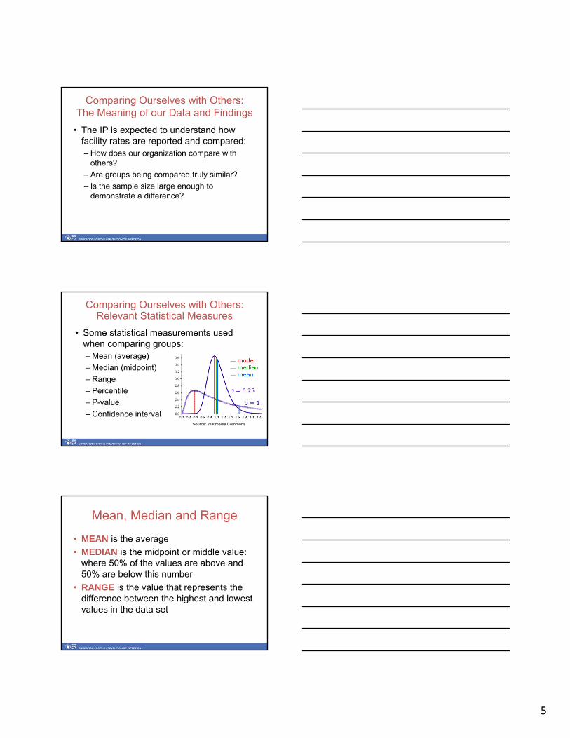
Never underestimate the importance of appearance!
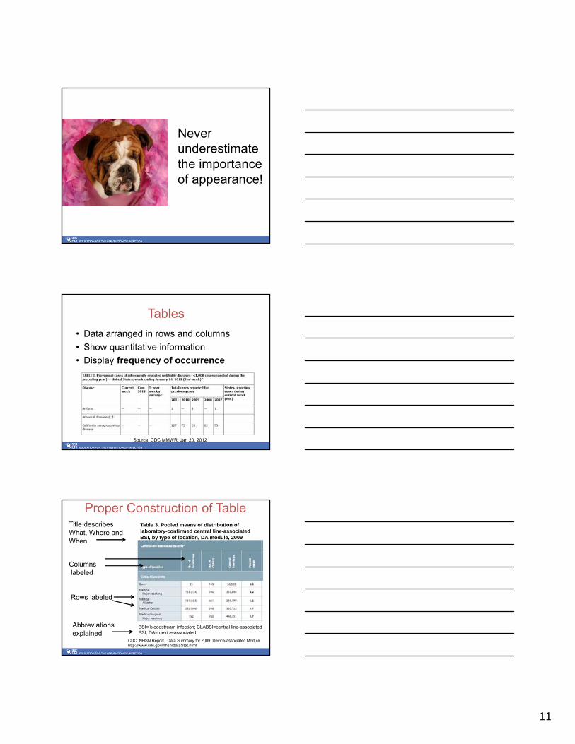
Tables
• Data arranged in rows and columns
• Show quantitative information
• Display frequency of occurrence
Source: CDC MMWR. Jan 20, 2012
Proper Construction of Table
Rows labeled
Columnslabeled
Table 3. Pooled means of distribution of laboratory-confirmed central line-associated BSI, by type of location, DA module, 2009
Title describes What, Where and When
BSI= bloodstream infection; CLABSI=central line-associated BSI; DA= device-associated
Abbreviations explained
CDC. NHSN Report, Data Summary for 2009, Device-associated Modulehttp://www.cdc.gov/nhsn/dataStat.html

12
Tables are used to organize data for charts and graphs
MonthCLABSIRate
Jan 3.4
Feb 0.0
Mar 0.0
Apr 0.0
May 9.3
Jun 0.0
Jul 0.0
Aug 2.3
Sep 0.0
Oct 1.2
Nov 0.2
Dec 0.0
0.0
1.0
2.0
3.0
4.0
5.0
6.0
7.0
8.0
9.0
10.0
Jan Feb Mar Apr May Jun Jul Aug Sep Oct Nov Dec
ICU CLABSIs per 1,000 central line days by month
# C
LAB
SI p
er 1
,000
CL
days
Month
Pie Charts
• Display groups of data in proportion to the whole set of data
• Show percentages of the whole
Proper Construction of a Pie Chart
• Has descriptive title
• Displays % of each slice
• Has legend or key to identify each slice
• Has method (color or other) to differentiate each slice
• Shows Total Number (=100%)
• Has explanation of all abbreviations
RN30%
PCA24%
Resident10%
OR tech8%
EA5%
MD7%
Other16%
Job category distribution of 58 personnel with needlesticks, St.
Anne's Hospital, 2011

13
Sample Pie Chart
RN30%
PCA24%
Resident10%
OR tech8%
EA5%
MD7%
Other16%
Job category distribution of 58 personnel with needlesticks, St.
Anne's Hospital, 2011
What does this chart need before it can be distributed?
Bar Charts
• Used to show relationships between different groups or categories
• Can be displayed vertically or horizontally
• Construct chart so it is self explanatory
Proper Construction of a Bar Chart
05
10152025303540
Nurs
e-R
N
Oth
er
MD
-R
esid
ent
MD
-A
tten
din
g
PC
A
OR
tech
EA
Lab tech
Med
ical
Stu
den
t
% o
f cases
Job Category
Job Categories of Workers Reporting Blood/Body Fluid Exposures, Hospital A, 2010 and 2011, Shown as Percent of Total Cases
N = 125 in 2010, 113 in 2011
2000
2001
Title
Legend
X-axis label
Plot area border
Y-axis label
Cell
PCA=patient care associate; EA=environmental associate; OR=operating room Abbreviations explained
14
Line Graphs
• Used to show data observed over time
• Three types we use:– Simple line graph
– Run chart
– Statistical process control chart
Simple Line Graph• Use to display data
observed over time– Y-axis: measurements
– X-axis: time
• Can be used to demonstrate when infection prevention measures were implemented
UTI Rate per 1,000 catheter-days
From: APIC Guide to the Elimination of Catheter-Associated Urinary Tract Infections, 2008
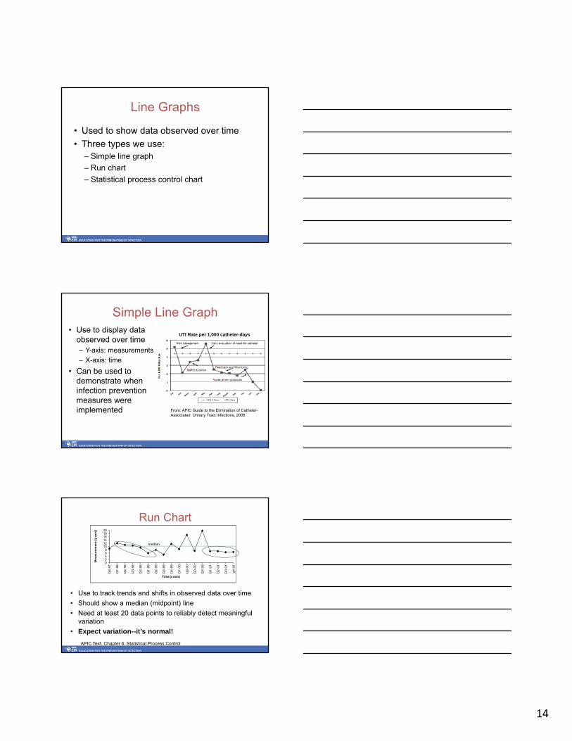
Run Chart
• Use to track trends and shifts in observed data over time
• Should show a median (midpoint) line
• Need at least 20 data points to reliably detect meaningful variation
• Expect variation--it’s normal!
02468
101214161820
Q4-9
7
Q1-9
8
Q2-9
8
Q3-9
8
Q4-9
8
Q1-9
9
Q2-9
9
Q3-9
9
Q4-9
9
Q1-0
0
Q2-0
0
Q3-0
0
Q4-0
0
Q1-0
1
Q2-0
1
Q3-0
1
q4-0
1
Measu
rem
en
t (y
axis
)
Time (x axis)
median
APIC Text. Chapter 6. Statistical Process Control

15
Statistical Process Control Chart
• Use to statistically measure and plot variation in a set of data
• Strict rules for construction; many types of SPC– Mean (average) used for center line– Upper and lower control limits plotted
• Need at least 25 data points to statistically detect special cause variation
Graphic source: Wikimedia Creative CommonsAPIC Text. Chapter 6. Statistical Process Control
Goal of Data Presentation
To synthesize and summarize data in a way that is easily understood by the intended audience
Which Graphic Display Shall I Use?
Table Summarize data; base for constructing graphs and charts
Line graph Display & monitor trends in rates or numbers over time
Bar Chart Compare size or frequency of different groups
Pie Chart Show pieces of a whole

16
Caution! Avoid Chart Junk• Keep it
simple• Focus on the
data• Avoid three-
dimensional charts and unnecessary elements
Graphic source: Wikimedia Commons
05
10152025303540
disposable syringe
butterfly needle
needle, unknown
suture needle
I.V. catheter lancet unknown scalpel needle, other
% o
f inj
urie
s
Type of sharp
Figure 12-14a. Types of sharps associated with injuries, Community Hospital, 1997 and 1998
1997
1998
WHICH IS EASIER TO READ?
Good Visual Presentation
• Keep It Simple!• Tables and graphs should be able to
stand alone• Good tables and graphs will not make
up for bad data• Only create visuals that will enhance
your message• Don’t misrepresent the data!

17
Components of a Good Surveillance Report
Tailor to recipients and include the following:• Methods used: who, what, when, where, & why• Data presentation:
– Numerator data (raw numbers)– Denominator data (# in population)– Rates/ratios, etc., including calculations– Use visual displays
• Discussion: explain and interpret data• Recommendations: actions needed• Identify stakeholders• Author(s) and date of report
A Few Words about Technology…
Use computers and information technology to collect, store, sort, retrieve, analyze, display, and report data

18
USE Technology
• Electronic information available from many sources– Have downloaded into IP
database– Avoid receiving paper reports
from lab, admissions, etc.
• Collaborate with IT resources– Let them know what you need– Influence development of
automated reports you need
Use Technology Tools
• Use available computers and systems in your organization
• Consider commercial surveillance programs – Data mining & automated surveillance
systems
• NHSN web-based program• Statistical software
– Commercial & web-based
Surveillance Software Programs
• Advantages– Can provide real time data analysis that
allows for timely intervention – Can support full house surveillance– Potential to allow more time for prevention,
education, and intervention• Disadvantages
– Cost– Need IT infrastructure and ongoing support– Learning curve to use

19
• Studies have found:– computer-based surveillance systems have
same or greater sensitivity and specificity as traditional chart review conducted by an IP
• Electronic systems should integrate laboratory, pharmacy, and census data to identify infections and outbreaks
• Technology enhances the role of the IP, it does not replace it.
Surveillance Software Programs
APIC Resources on Surveillance Technology
• Position Paper: The Importance of Surveillance Technologies in the Prevention HAIs– http://www.apic.org/Resource_/TinyMceFileManager/
Advocacy-PDFs/Surveillance_Technologies_position_paper_2009-5_29_09.pdf
• Starter Questions for Assessing Capabilities of Surveillance Technology & Their Vendors– http://www.apic.org/Resource_/TinyMceFileManager/
Practice_Guidance/Starter-Questions-for-Assessing-Capabilities-of-Surveillance-Technology.pdf
• Bibliography: Wright MO, Olmsted RN. Application of Information Systems for Infection Prevention & Control: A Select Bibliographic Compendium. June 2010.– http://www.apic.org/Resource_/TinyMceFileManager/
Practice_Guidance/Surveillance-technology-literature-references.pdf
• APIC Webinar. Surveillance Technology for Detecting HAIs: Panacea for public reporting? November 9, 2011
APIC Resources on Surveillance Technology

20
Summary
• We must understand how to analyze, report, and use surveillance data
• Surveillance data should be used to improve healthcare practices and outcomes
• We should optimize the use of computers and information technology to support infection surveillance, prevention and control activities
Resources/Bibliography
• APIC Text of Infection Control and Epidemiology, 3rd
ed. – Chapter 3. Surveillance– Chapter 5. Use of Statistics– Chapter 6. Statistical Process Control– Chapter 7. Risk-Adjusted Comparisons
• Perla RJ, Provost LP, Murray SK. The run chart: a simple analytical tool for learning from variation in healthcare processes. BMJ Qual Saf 2011;20:46-51. http://qualitysafety.bmj.com/content/20/1/46.full.pdf+html
• NHSN Home Page: www.cdc.gov/nhsn
Any Questions?