using control charts to keep an eye on variability of control charts see if process is “in...
TRANSCRIPT

Using Control Charts to Keep an Eye on Variability Operations Management Dr. Ron Lembke
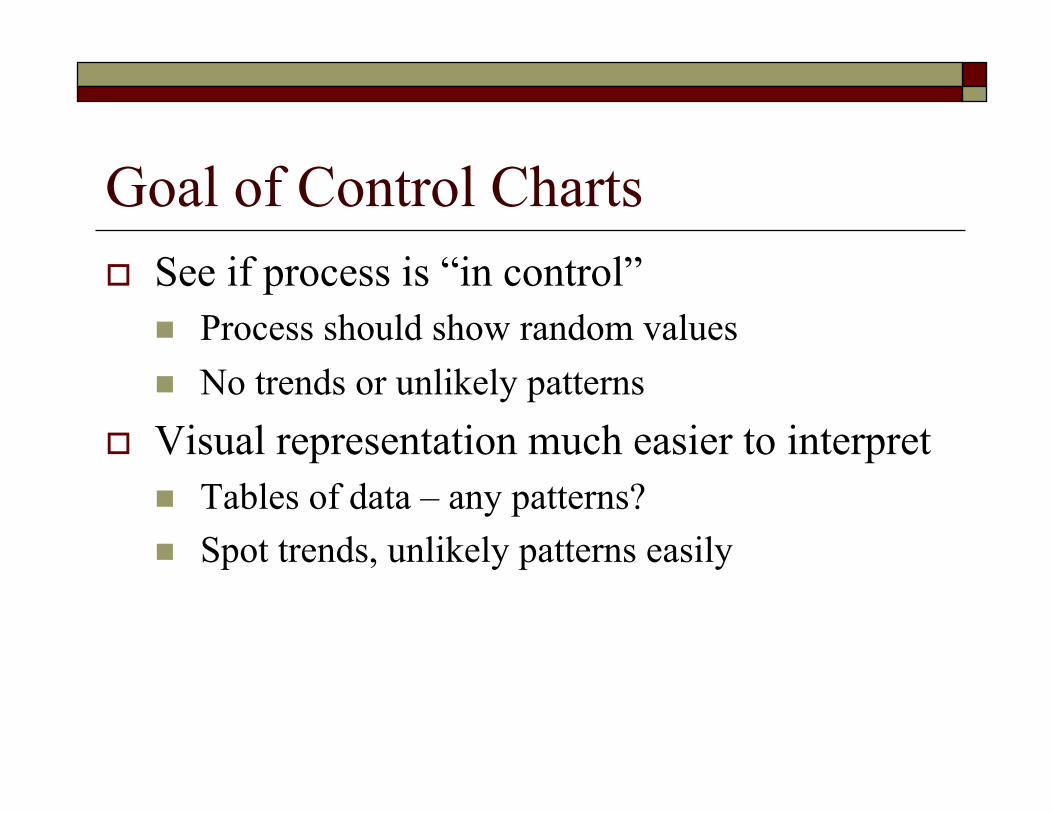
Goal of Control Charts See if process is “in control”
Process should show random values No trends or unlikely patterns
Visual representation much easier to interpret Tables of data – any patterns? Spot trends, unlikely patterns easily

NFL Control Chart?
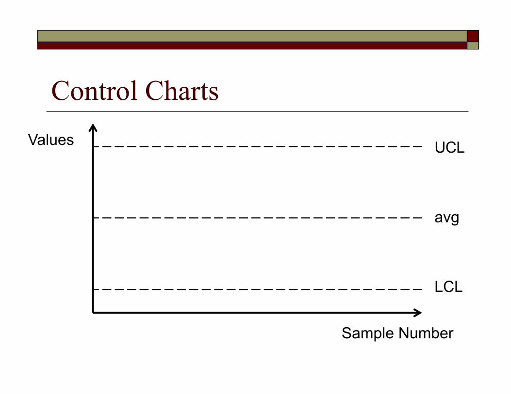
Control Charts
UCL
LCL
avg
Values
Sample Number
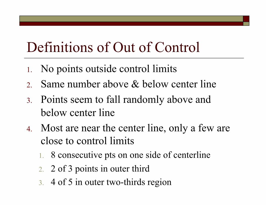
Definitions of Out of Control 1. No points outside control limits 2. Same number above & below center line 3. Points seem to fall randomly above and
below center line 4. Most are near the center line, only a few are
close to control limits 1. 8 consecutive pts on one side of centerline 2. 2 of 3 points in outer third 3. 4 of 5 in outer two-thirds region

Control Charts
Normal Too Low Too high
5 above, or below Run of 5 Extreme variability

Control Charts
UCL
LCL
avg 1σ 2σ
2σ 1σ
Control Charts
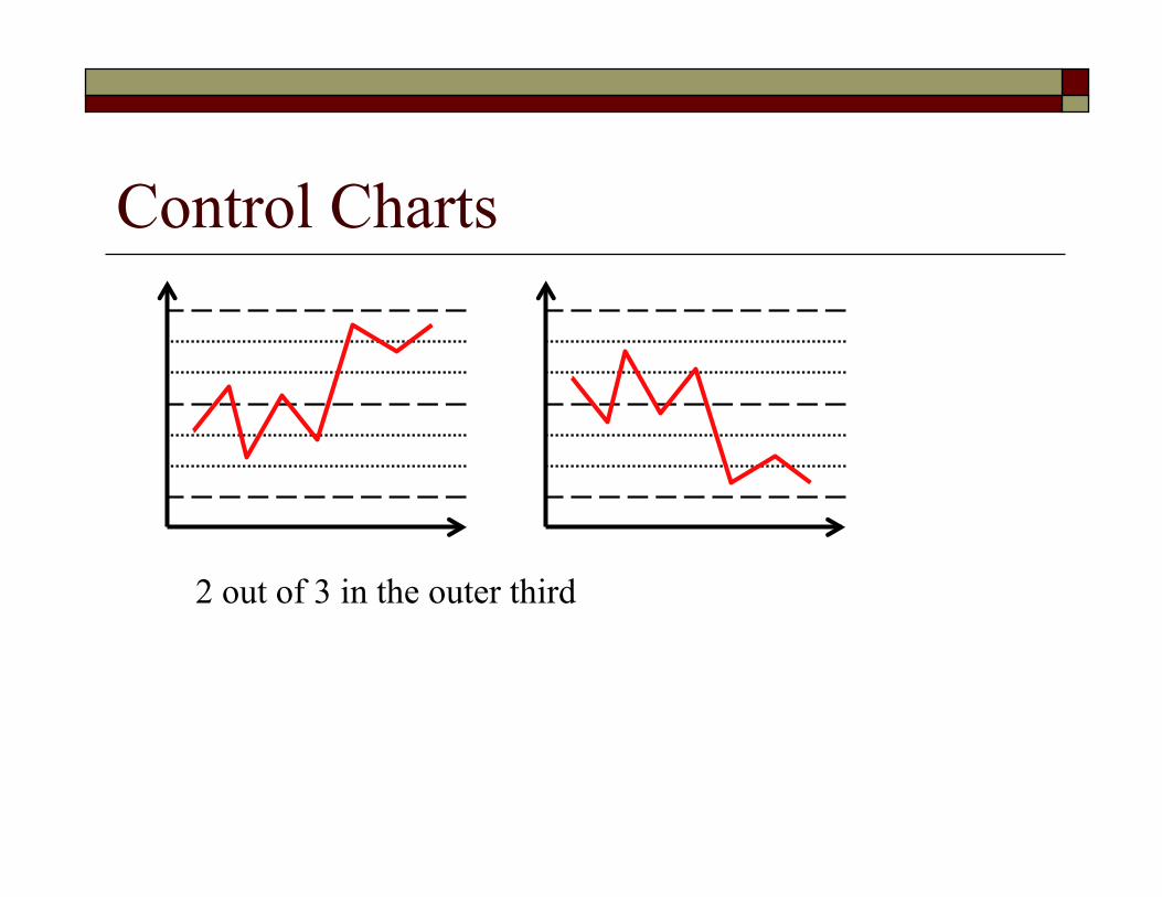
2 out of 3 in the outer third

Out of Control Point? Is there an “assignable cause?”
Or day-to-day variability?
If not usual variability, GET IT OUT Remove data point from data set, and recalculate
control limits
If it is regular, day-to-day variability, LEAVE IT IN Include it when calculating control limits

Attributes vs. Variables Attributes: Good / bad, works / doesn’t count % bad (P chart) count # defects / item (C chart) Variables: measure length, weight, temperature (x-bar
chart) measure variability in length (R chart)
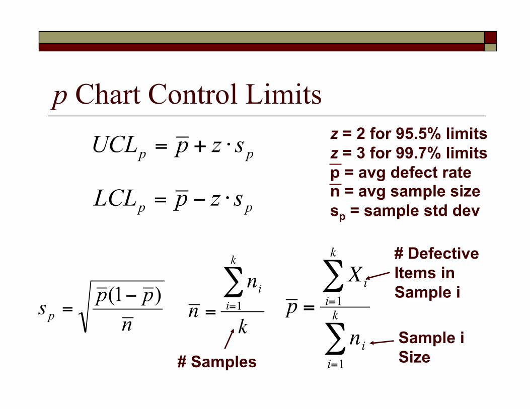
p Chart Control Limits
# Defective Items in Sample i
# Samples Sample i Size
z = 2 for 95.5% limits z = 3 for 99.7% limits p = avg defect rate n = avg sample size sp = sample std dev
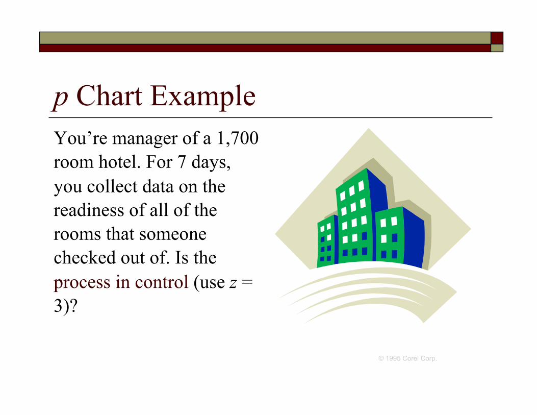
p Chart Example You’re manager of a 1,700 room hotel. For 7 days, you collect data on the readiness of all of the rooms that someone checked out of. Is the process in control (use z = 3)?
© 1995 Corel Corp.
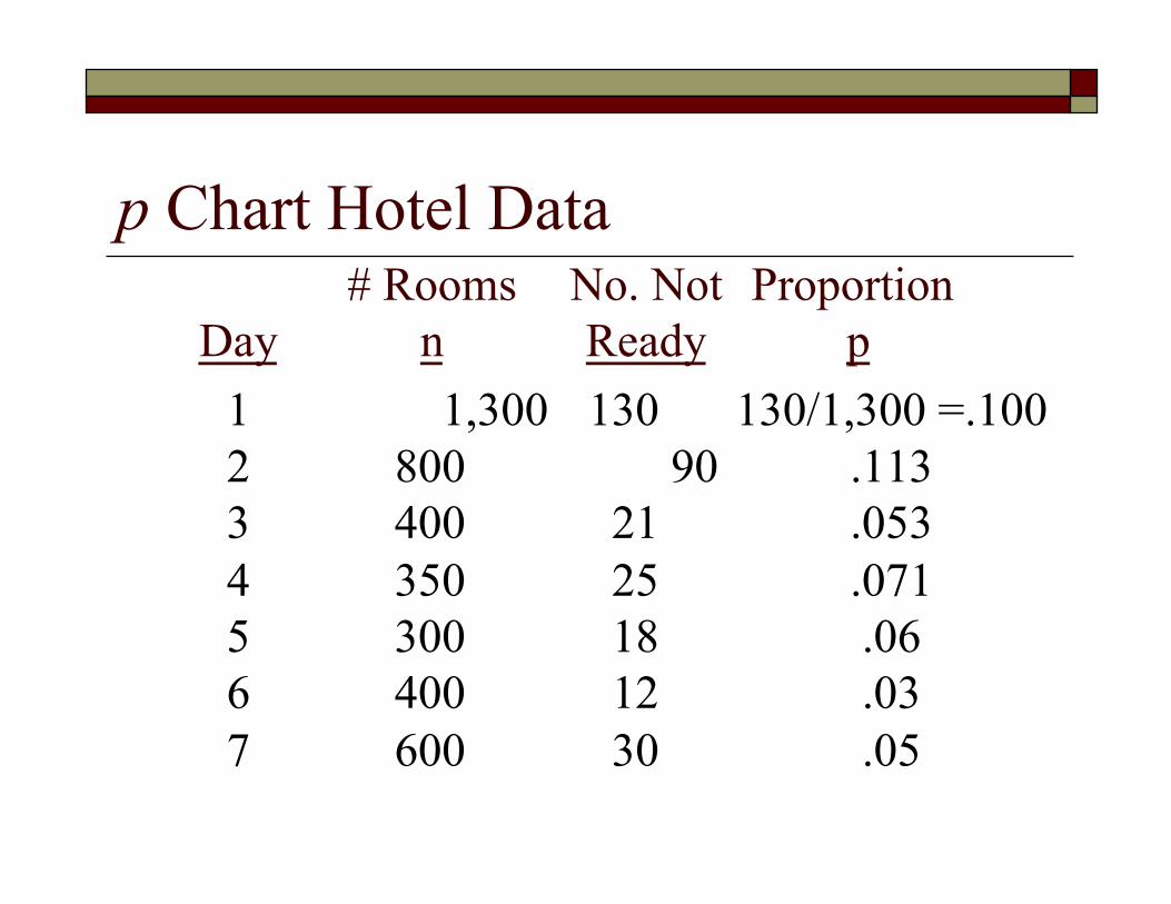
p Chart Hotel Data # Rooms No. Not Proportion
Day n Ready p 1 1,300 130 130/1,300 =.100 2 800 90 .113 3 400 21 .053 4 350 25 .071 5 300 18 .06 6 400 12 .03 7 600 30 .05

p Chart Control Limits

p Chart Solution
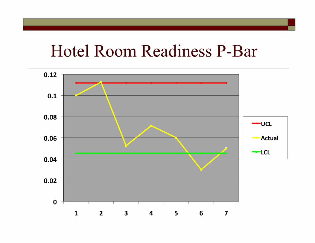
Hotel Room Readiness P-Bar
0
0.02
0.04
0.06
0.08
0.1
0.12
1 2 3 4 5 6 7
UCL
Actual
LCL
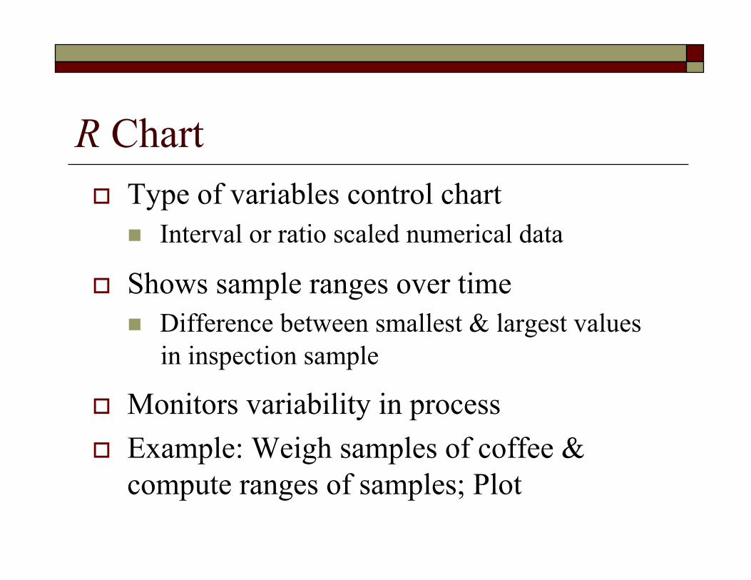
R Chart Type of variables control chart
Interval or ratio scaled numerical data
Shows sample ranges over time Difference between smallest & largest values
in inspection sample
Monitors variability in process Example: Weigh samples of coffee &
compute ranges of samples; Plot

Why Do We Need 2 Charts? Consistent, but the average is in the wrong place
UCL
LCL
UCL
LCL
X-Bar Chart R Chart The average works out ok, but way too much variability between points
X-Bar Chart R Chart
UCL
LCL
UCL
LCL
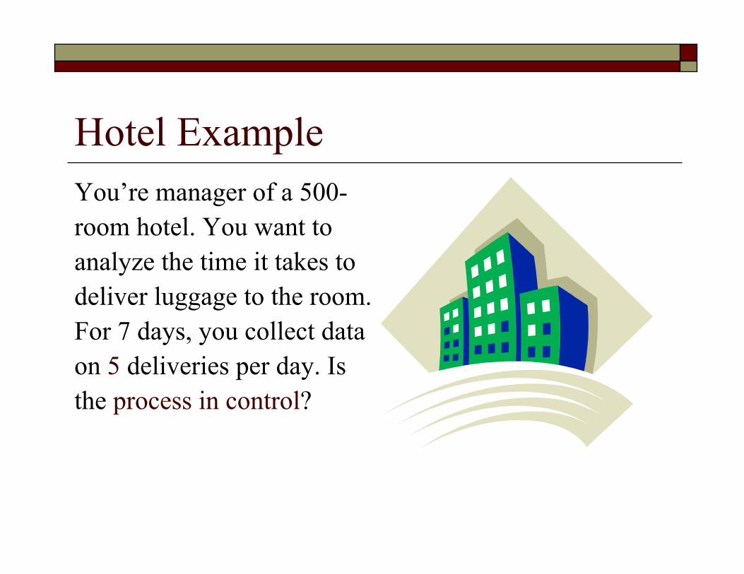
You’re manager of a 500-room hotel. You want to analyze the time it takes to deliver luggage to the room. For 7 days, you collect data on 5 deliveries per day. Is the process in control?
Hotel Example

Hotel Data Day Delivery Time
1 7.30 4.20 6.10 3.45 5.55 2 4.60 8.70 7.60 4.43 7.62 3 5.98 2.92 6.20 4.20 5.10 4 7.20 5.10 5.19 6.80 4.21 5 4.00 4.50 5.50 1.89 4.46 6 10.10 8.10 6.50 5.06 6.94 7 6.77 5.08 5.90 6.90 9.30
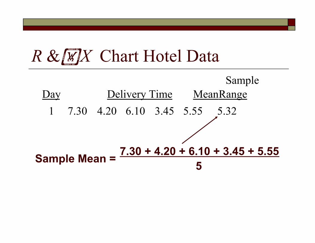
R &X Chart Hotel Data Sample
Day Delivery Time Mean Range 1 7.30 4.20 6.10 3.45 5.55 5.32
7.30 + 4.20 + 6.10 + 3.45 + 5.55 5 Sample Mean =

R &X Chart Hotel Data Sample
Day Delivery Time Mean Range 1 7.30 4.20 6.10 3.45 5.55 5.32 3.85
7.30 - 3.45 Sample Range =
Largest Smallest

R &X Chart Hotel Data Sample
Day Delivery Time Mean Range 1 7.30 4.20 6.10 3.45 5.55 5.32 3.85 2 4.60 8.70 7.60 4.43 7.62 6.59 4.27 3 5.98 2.92 6.20 4.20 5.10 4.88 3.28 4 7.20 5.10 5.19 6.80 4.21 5.70 2.99 5 4.00 4.50 5.50 1.89 4.46 4.07 3.61 6 10.10 8.10 6.50 5.06 6.94 7.34 5.04 7 6.77 5.08 5.90 6.90 9.30 6.79 4.22
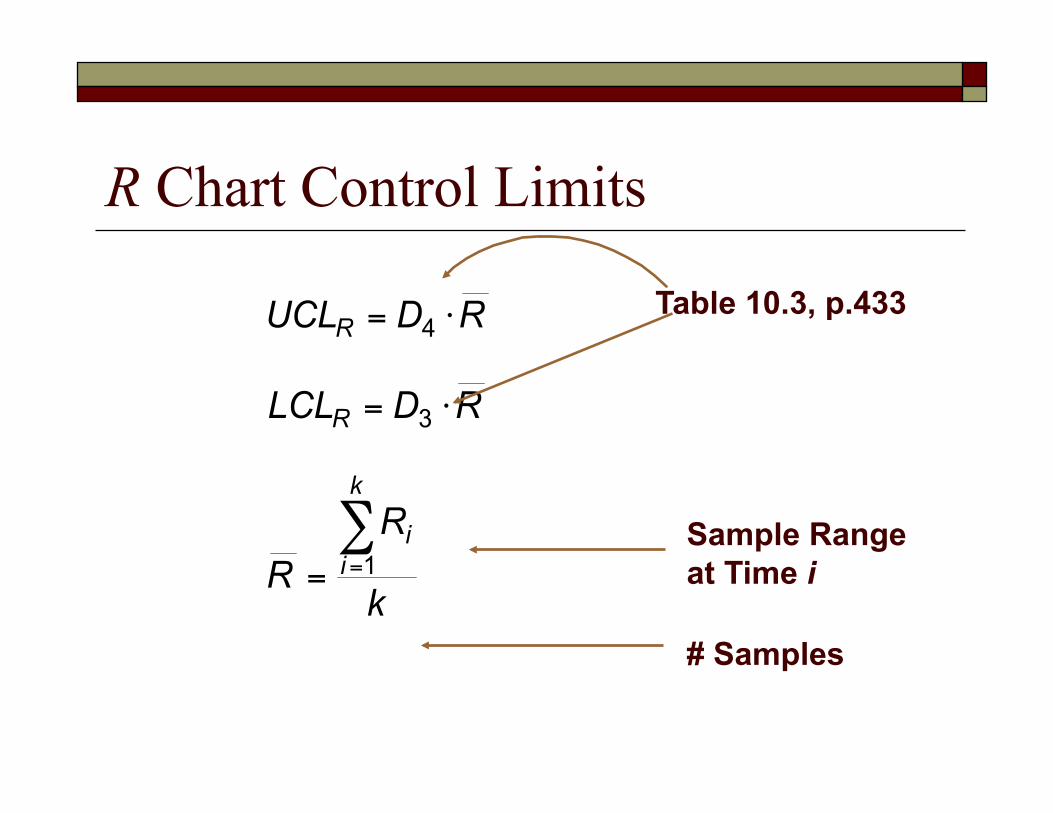
R Chart Control Limits
Sample Range at Time i
# Samples
Table 10.3, p.433

Control Chart Limits, p.161
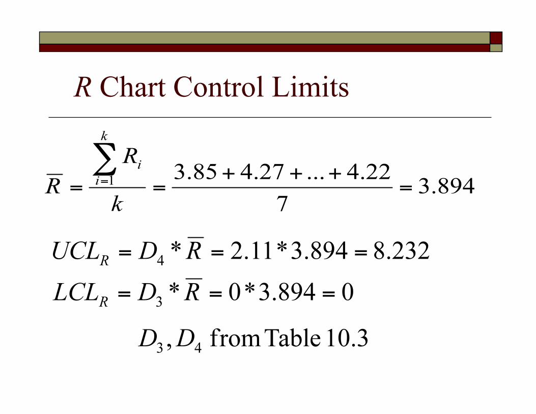
R Chart Control Limits

R Chart Solution
0
1
2
3
4
5
6
7
8
9
1 2 3 4 5 6 7
UCL Range LCL

X Chart Control Limits
Sample Range at Time i
# Samples
Sample Mean at Time i
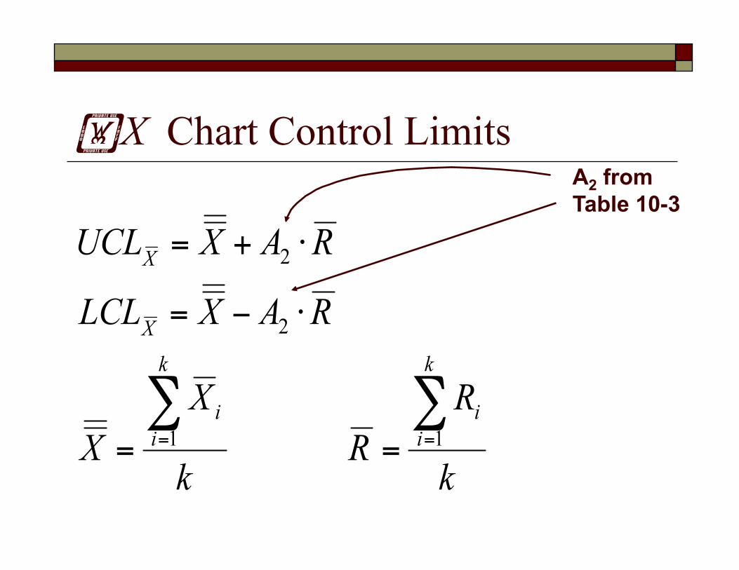
X Chart Control Limits A2 from Table 10-3
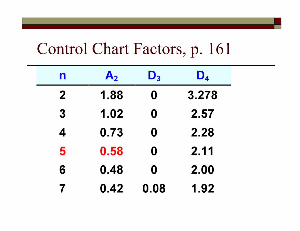
Control Chart Factors, p. 161
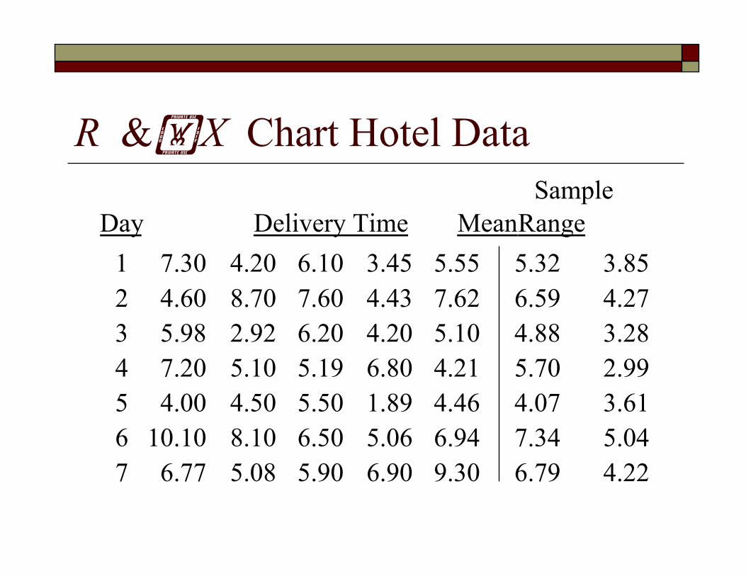
R &X Chart Hotel Data Sample
Day Delivery Time Mean Range 1 7.30 4.20 6.10 3.45 5.55 5.32 3.85 2 4.60 8.70 7.60 4.43 7.62 6.59 4.27 3 5.98 2.92 6.20 4.20 5.10 4.88 3.28 4 7.20 5.10 5.19 6.80 4.21 5.70 2.99 5 4.00 4.50 5.50 1.89 4.46 4.07 3.61 6 10.10 8.10 6.50 5.06 6.94 7.34 5.04 7 6.77 5.08 5.90 6.90 9.30 6.79 4.22
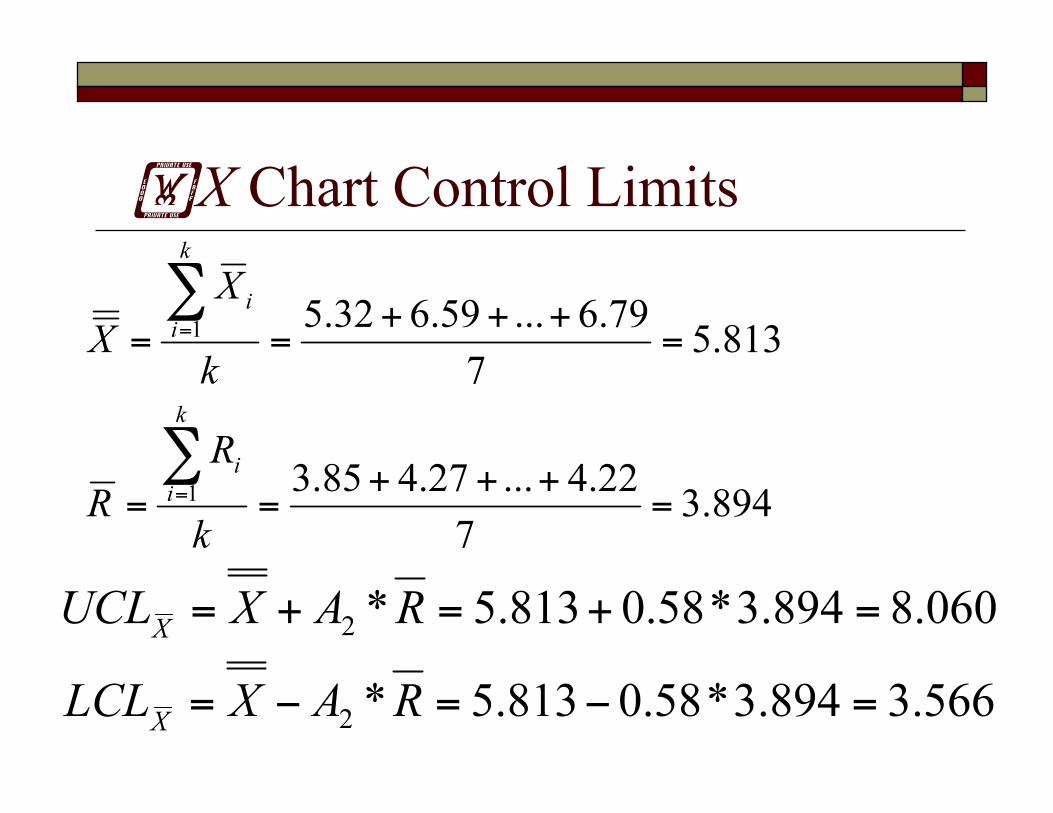
X Chart Control Limits

X Chart Solution*
0
1
2
3
4
5
6
7
8
9
1 2 3 4 5 6 7
UCL Mean LCL
Summary Overview of “In Control” Attribute vs. Continuous Control Charts P Charts X-bar and R charts