using css flexbox to customize your site - moodle...what is flexbox? flexbox is a new layout mode in...
TRANSCRIPT

Using CSS Flexbox to Customize Your SiteBy Daniel Hefley (CCA)

What is Flexbox?
Flexbox is a new layout mode in CSS3. The previous version of CSS defined four layout modes:
block layout for laying out documents
inline layout for laying out text
table layout for laying 2D tabular data
positioned layout for explicit positioning
Positioning and sizing elements cumbersome with block/floats layout.
Flexbox layout distributes space along a single row or column. This layout makes it easier to design a flexible responsive layout structure without using float or positioning.
Image credit: learntoprogram

The Flex Container & Flex Items
A Flexbox layout consists of a flex container that holds flex items.
Image credit: Flexbox Cheatsheet
<div class="flex-container"><div>item1</div><div>item2</div><div>item3</div>
</div>
} Flex items.flex-container {
display: flex;}

Flex AxesImage credit: Flexbox Cheatsheet
The flex container can be laid out horizontally or vertically. The direct children of a flex container are laid out along the main axis. These children can “flex” their sizes, growing to fill unused space in the container, or shrinking to avoid overflowing.
The flex container properties are:flex-direction: defines in which direction the container wants to stack the flex items.flex-wrap: specifies whether the flex items should wrap or not.justify-content: used to align the flex items.align-items: used to align the flex items vertically.align-content: used to align the flex lines.

The Row & Wrap
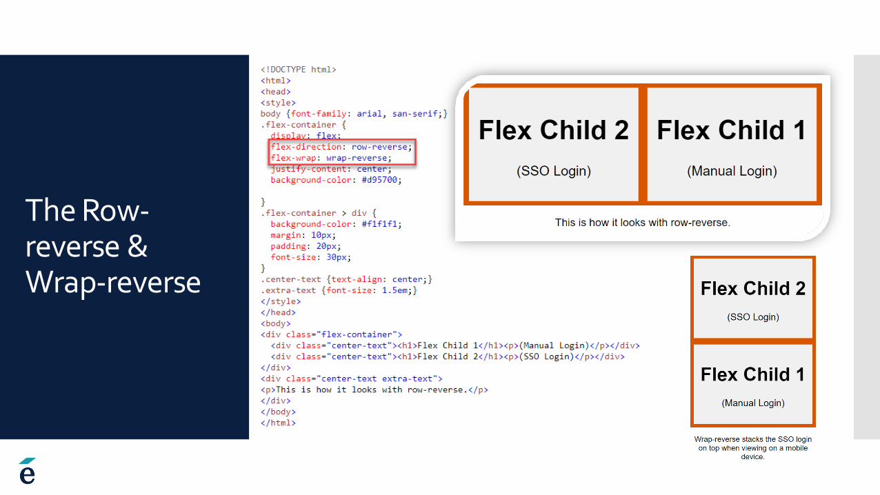
The Row-reverse & Wrap-reverse

The Column

The Column-reverse

Real World Example 1 –Boost Float

Real World Example 2 –Lambda Flex
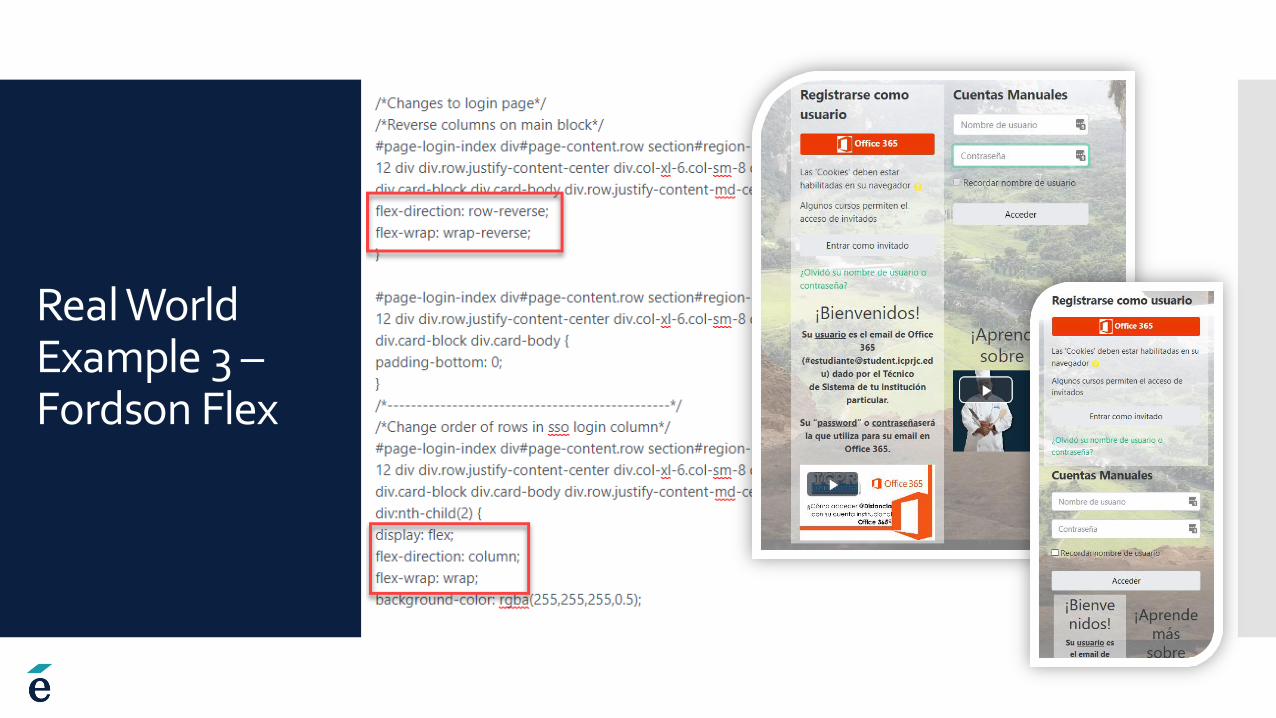
Real World Example 3 –Fordson Flex
Browser Support
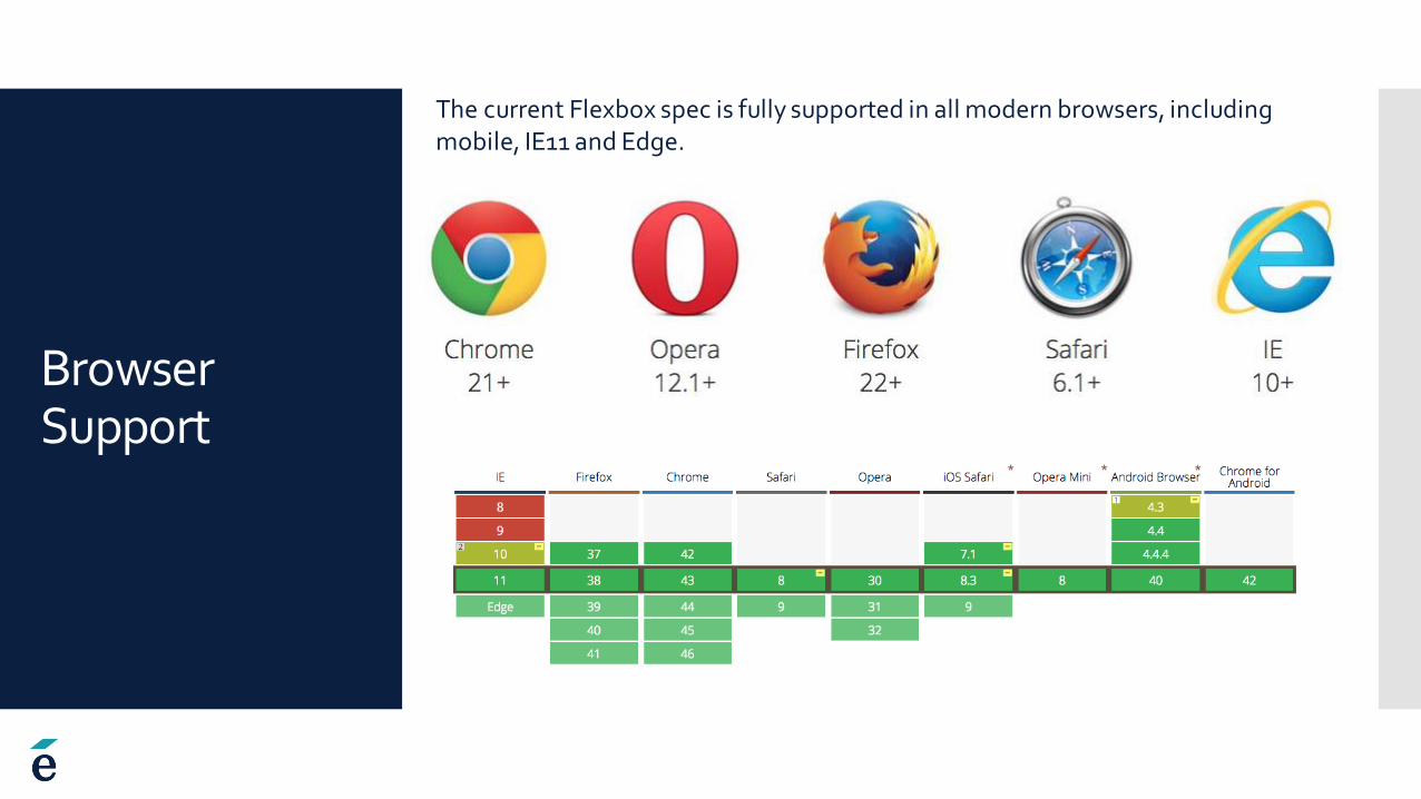
The current Flexbox spec is fully supported in all modern browsers, including mobile, IE11 and Edge.

Thank you! More information –
http://jonibologna.com/flexbox-cheatsheet/
https://css-tricks.com/snippets/css/a-guide-to-flexbox/
https://www.w3schools.com/Css/css3_flexbox.asp
https://cssreference.io/flexbox/
https://caniuse.com/#feat=flexbox