using graphics to present information preparing viewer-friendly slides
TRANSCRIPT
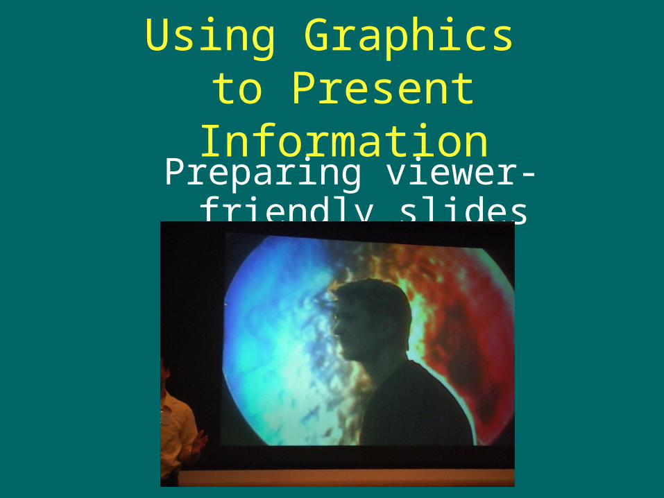
Using Graphics to Present Information
Preparing viewer-friendly slides
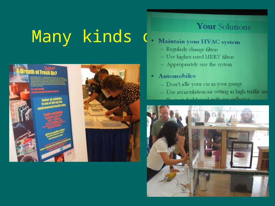
Many kinds of visuals
• Plan on using no more than 12-15 slides for a 12-15 minute talk.– Temptation is to have too many!
• Consider all delivery methods– You might consider other methods in
addition to computer projection.
Begin planning visuals as soon as outline is completed.
Creating Visuals
• Simplify the proposal or report graphics (graphs,
tables, etc.)
• Think BIG.
• Include mapping visuals.
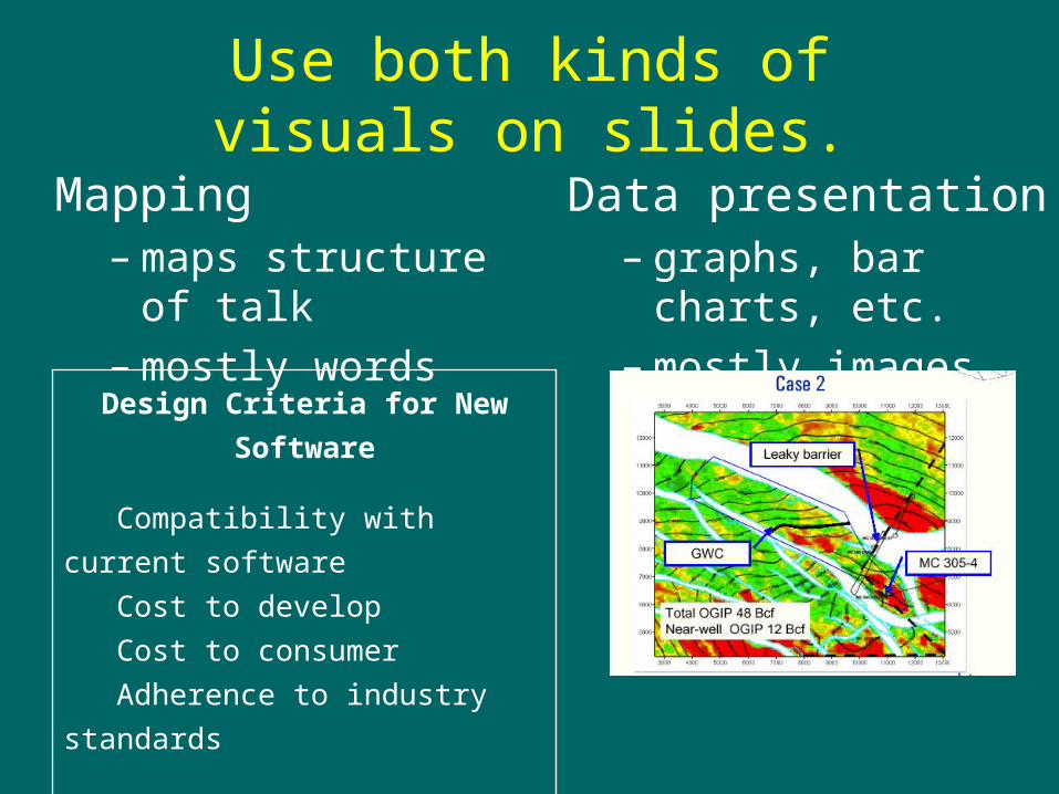
Use both kinds of visuals on slides.
Mapping– maps structure of talk– mostly words
Data presentation– graphs, bar charts, etc.– mostly images
Design Criteria for New Software
Compatibility with current software
Cost to develop
Cost to consumer
Adherence to industry standards
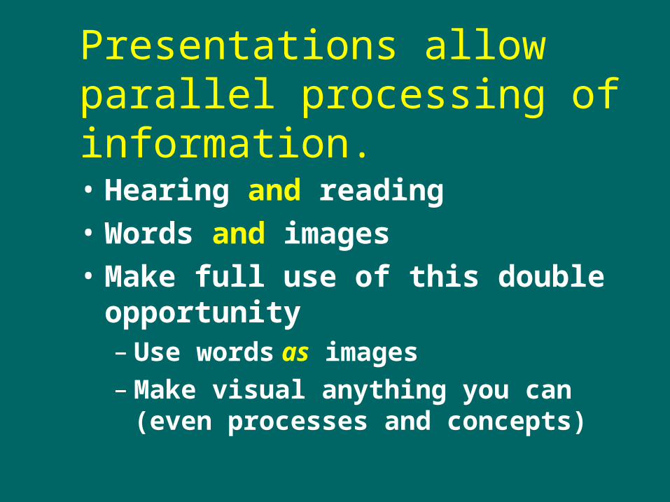
Presentations allow parallel processing of information.
• Hearing and reading
• Words and images
• Make full use of this double opportunity– Use words as images– Make visual anything you can (even
processes and concepts)
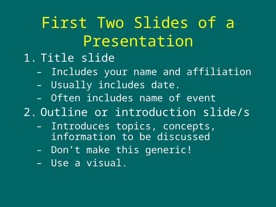
First Two Slides of a Presentation
1. Title slide– Includes your name and affiliation– Usually includes date.– Often includes name of event
2. Outline or introduction slide/s – Introduces topics, concepts, information to be
discussed– Don’t make this generic!– Use a visual.
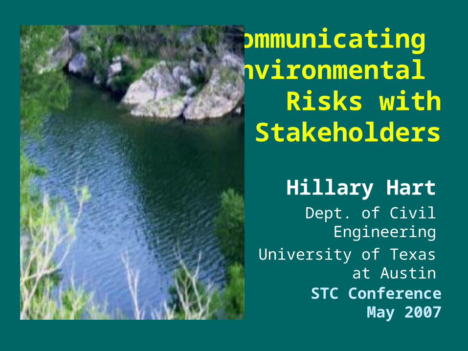
Communicating Environmental
Risks with Stakeholders
Hillary HartDept. of Civil Engineering
University of Texas at Austin
STC ConferenceMay 2007
Outline• Research objectives
• Background
• Methodology
• Results and Discussion
• Conclusions
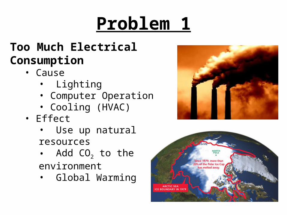
Problem 1Too Much Electrical Consumption
• Cause • Lighting • Computer Operation• Cooling (HVAC)
• Effect• Use up natural resources• Add CO2 to the environment• Global Warming
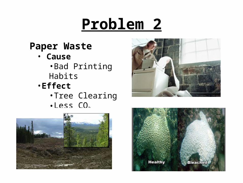
Problem 2 Paper Waste
• Cause•Bad Printing Habits
•Effect•Tree Clearing•Less CO2 Sequestered•Global Warming
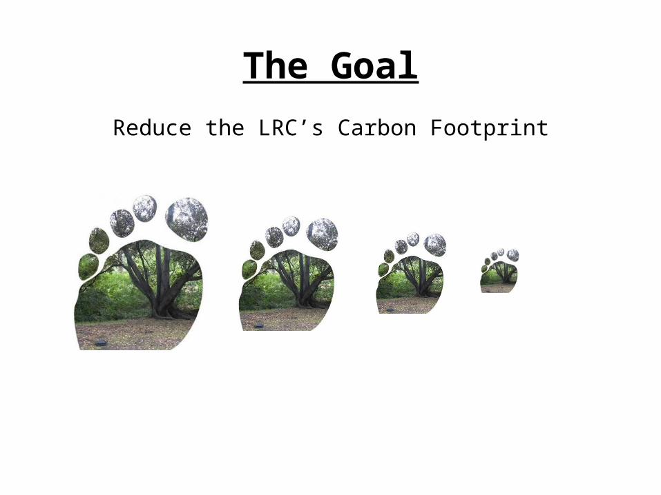
The Goal
Reduce the LRC’s Carbon Footprint
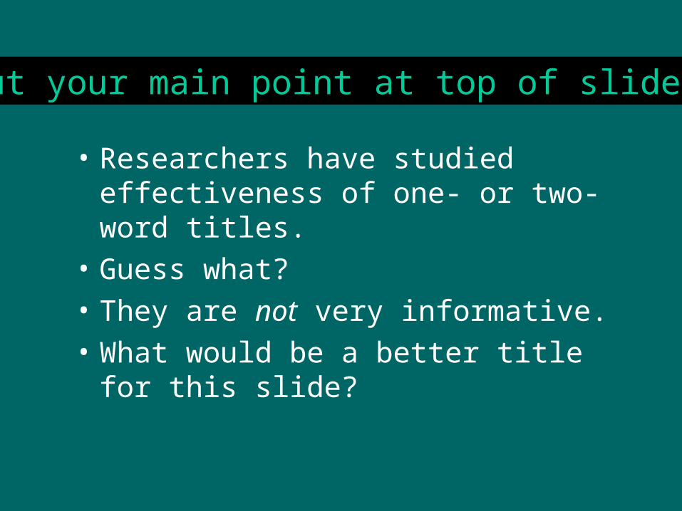
Titles
• Researchers have studied effectiveness of one- or two-word titles.
• Guess what?
• They are not very informative.
• What would be a better title for this slide?
Put your main point at top of slide.
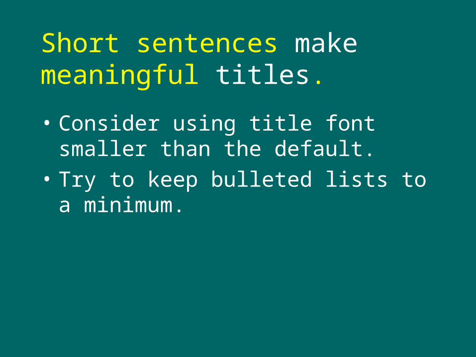
Short sentences make meaningful titles.
• Consider using title font smaller than the default.
• Try to keep bulleted lists to a minimum.
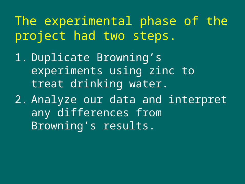
The experimental phase of the project had two steps.
1. Duplicate Browning’s experiments using zinc to treat drinking water.
2. Analyze our data and interpret any differences from Browning’s results.
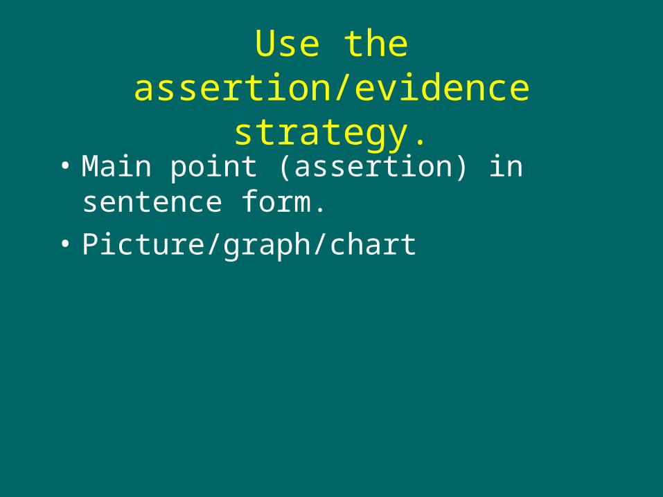
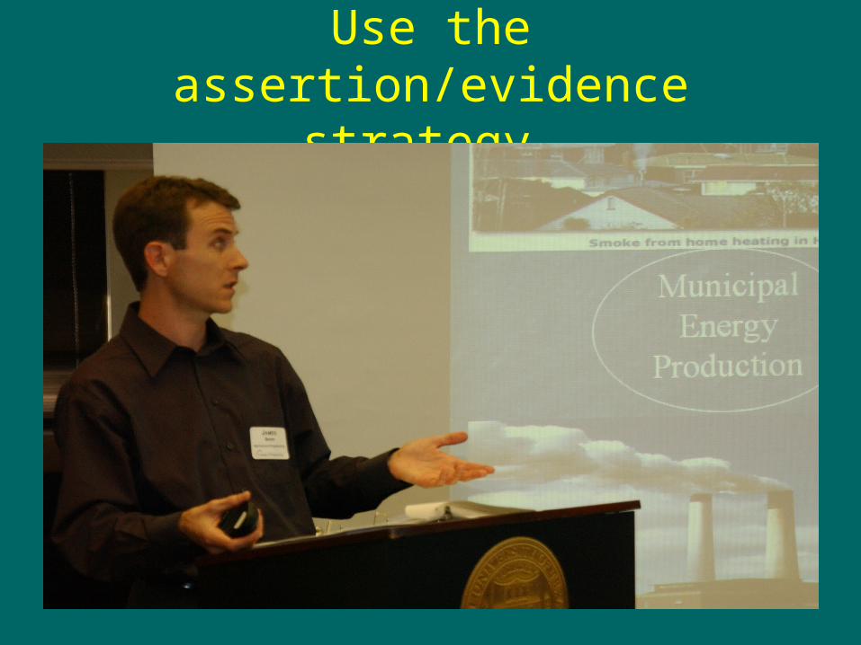
Use the assertion/evidence strategy.
• Main point (assertion) in sentence form.
• Picture/graph/chart

The field phase will determine applicability of the zinc method to drinking water-treatment systems in northeastern Ghana.
Photo: Katherine Alfredo 2005
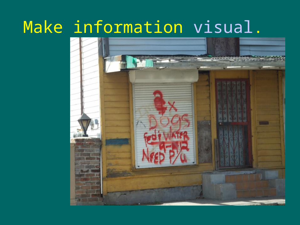
Make information visual.
PowerPoint encourages overuse of bulleted lists!
• Remember the “bad” slide?
Planning• Different retention rate
– Listening vs. reading– Talking vs. writing
• Listeners not in control• Audience not all technical• Presentation linear
– Thinking not linear• Easy to get off target• Use an outline• Divide into 3 parts• Build in visuals• Introduce yourself• Don’t stop in tracks at end
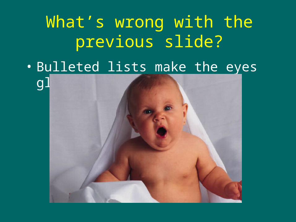
What’s wrong with the previous slide?
• Bulleted lists make the eyes glaze over.
Use the assertion/evidence strategy.
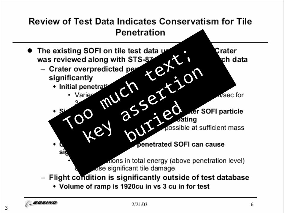
3
Too much text;
key assertio
n buried
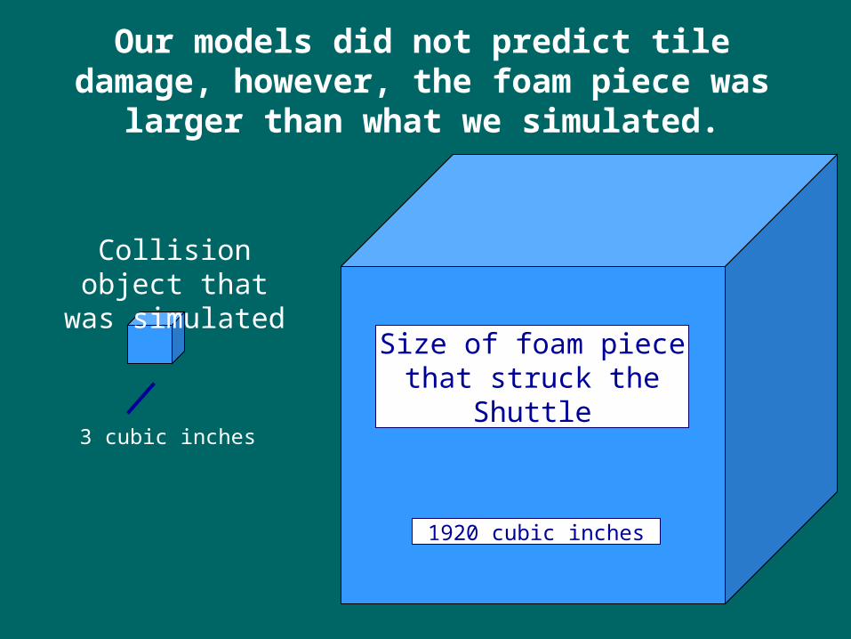
3 cubic inches
Collision object that was simulated
Size of foam piece that struck the Shuttle
1920 cubic inches
Our models did not predict tile damage, however, the foam piece was larger than what we simulated.
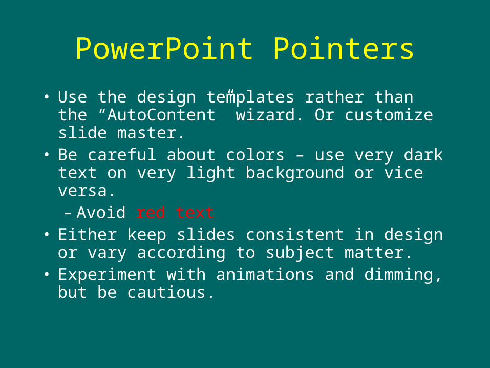
PowerPoint Pointers
• Use the design templates rather than the “AutoContent” wizard. Or customize slide master.
• Be careful about colors – use very dark text on very light background or vice versa.– Avoid red text
• Either keep slides consistent in design or vary according to subject matter.
• Experiment with animations and dimming, but be cautious.
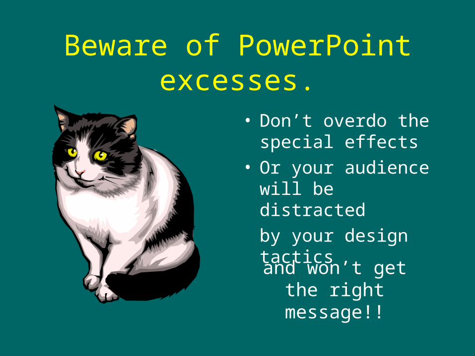
Beware of PowerPoint excesses.
• Don’t overdo the special effects
• Or your audience will be distracted
by your design tactics
and won’t get the right message!!
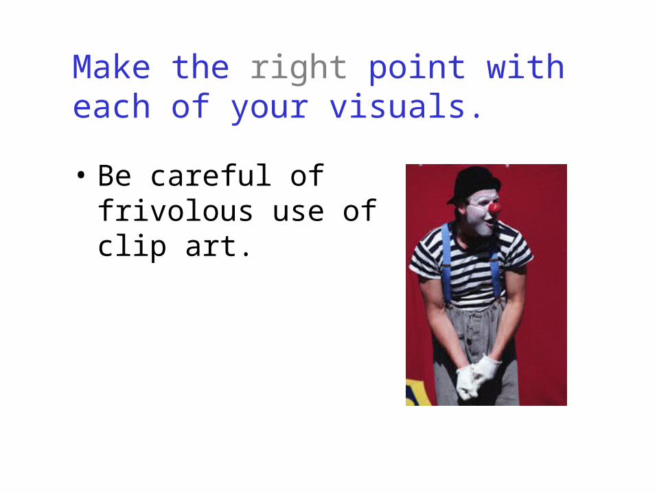
Make the right point with each of your visuals.
• Be careful of frivolous use of clip art.
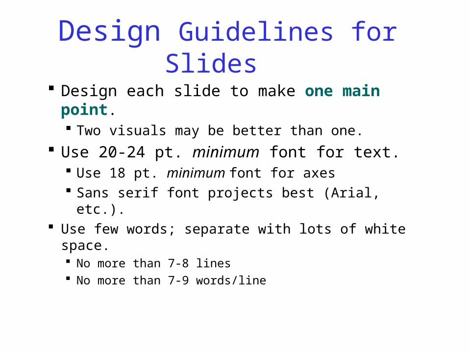
Design Guidelines for Slides
Design each slide to make one main point. Two visuals may be better than one.
Use 20-24 pt. minimum font for text. Use 18 pt. minimum font for axes Sans serif font projects best (Arial, etc.).
Use few words; separate with lots of white space. No more than 7-8 lines No more than 7-9 words/line
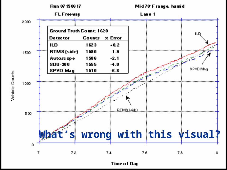
What’s wrong with this visual?
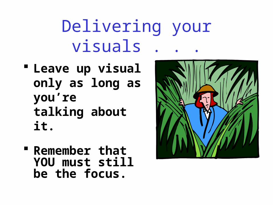
Delivering your visuals . . .
Leave up visual only as long as you’re talking about it.
Remember that YOU must still be the focus.
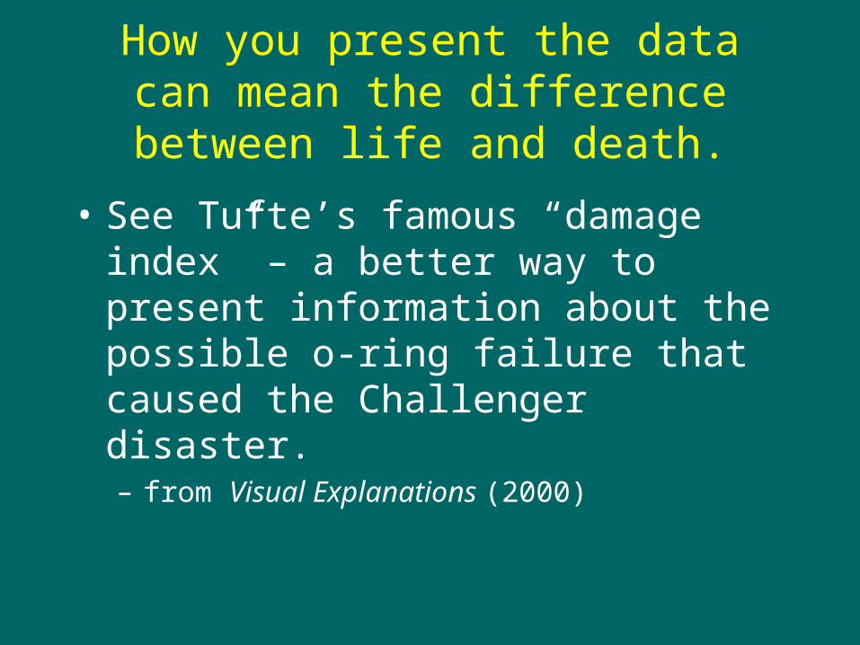
How you present the data can mean the difference between life and death.
• See Tufte’s famous “damage index” – a better way to present information about the possible o-ring failure that caused the Challenger disaster.– from Visual Explanations (2000)
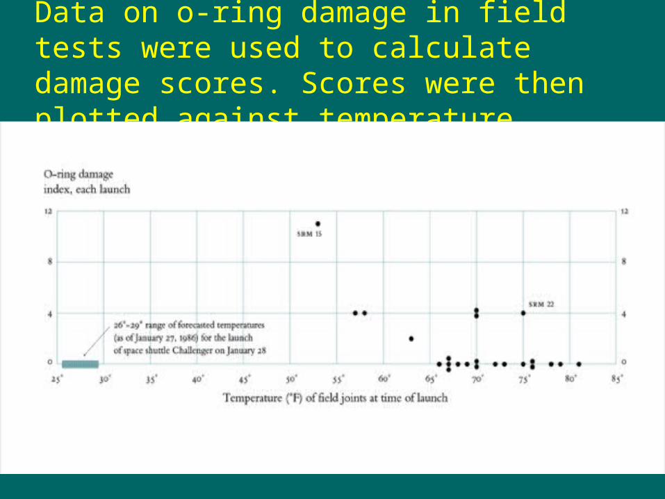
Data on o-ring damage in field tests were used to calculate damage scores. Scores were then plotted against temperature.